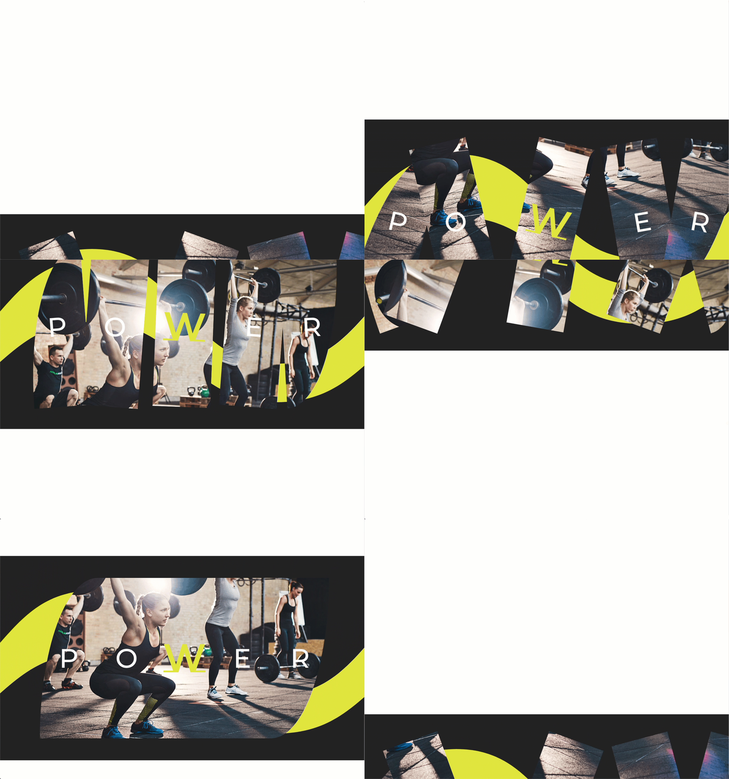
Combining scroll effects with parallax background images can create quite a magical design for your visitors. Since the parallax effect already puts the image in motion as the user scrolls down the page, adding additional scroll effects (like horizontal motion and rotation) can really set the design apart and open doors for more creative layouts.
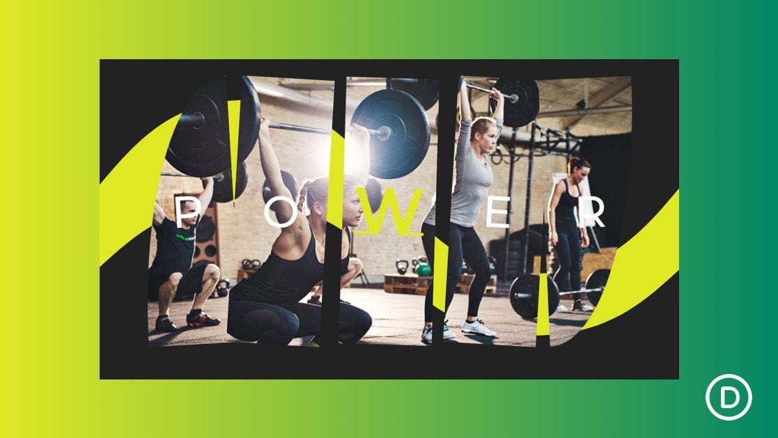
In this tutorial, we are going to walk through how to animate parallax background images using Divi and its scroll effects. We will be using the same background image on multiple text modules to design a unique layout for displaying a short block of text.
Let’s get started.
- 1 Sneak Peek
- 2 Download the Animated Parallax Background Image Layout for FREE
- 3 Download For Free
- 4 What You Need to Get Started
-
5
Creating the Animated Parallax Background Images with Divi’s Scroll Effects
- 5.1 Adding the Column
- 5.2 Creating the Text Module
- 5.3 Row Settings
- 5.4 Column 1 Settings
- 5.5 Creating Column 2
- 5.6 Creating Column 3
- 5.7 Creating Column 4
- 5.8 Creating Column 5
- 5.9 Updating the Text Module Letters
- 5.10 Update First Text Module Content for Mobile
- 5.11 Update Column 1 Settings
- 5.12 Hide the Rest of the Columns on Tablet and Phone Display
- 5.13 Update Column 5 Settings
- 5.14 Adding Background Design to Section
- 6 Final Result
- 7 Final Thoughts
Sneak Peek
Download the Animated Parallax Background Image Layout for FREE
To lay your hands on the layout from this tutorial, you will first need to download it using the button below. To gain access to the download you will need to subscribe to our newsletter by using the form below. As a new subscriber, you will receive even more Divi goodness and a free Divi Layout pack every Monday! If you’re already on the list, simply enter your email address below and click download. You will not be “resubscribed” or receive extra emails.
To import the layout to your page, simply extract the zip file and drag the JSON file into the Divi Builder.
Let’s get to the tutorial, shall we?
What You Need to Get Started

To get started, you will need to do the following:
- If you haven’t yet, install and activate the Divi Theme.
- Create a new page in WordPress and use the Divi Builder to edit the page on the front end (visual builder).
- Choose the option “Build From Scratch”.
After that, you will have a blank canvas to start designing in Divi.
Creating the Animated Parallax Background Images with Divi’s Scroll Effects
Adding the Column
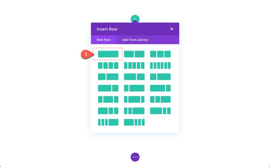
To start, create a one-column row.
Creating the Text Module
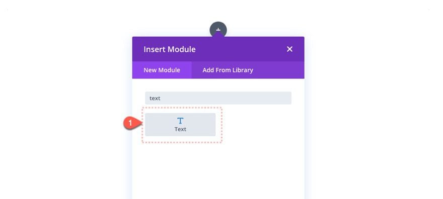
Then add a text module to the column.
Text Content
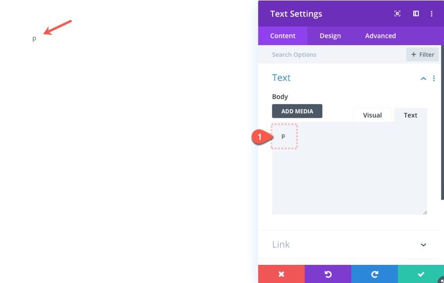
Add the letter “p” to the body content.
Add Parallax Background Image to Text Module
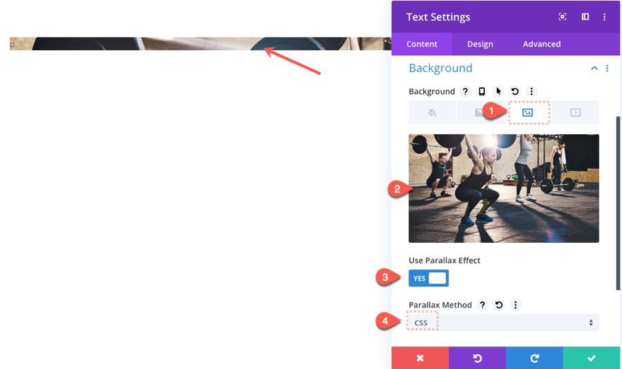
Next, add a parallax background image to the text module as follows:
- Background Image: insert image
- Use Parallax Effect: YES
- Parallax Method: CSS
Designing the Text
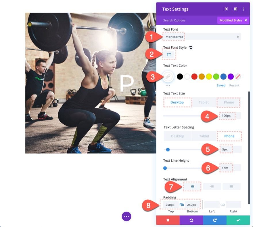
Under the design tab, update the following:
- Text Font: Montserrat
- Text Font Style: TT
- Text Text Color: #ffffff
- Text Text Size: 100px (desktop), 70px (phone)
- Text Letter Spacing: 5px (phone)
- Text Line Height: 1em
- Text Alignment: center
- Padding: 250px top, 250px bottom
The padding is what creates the necessary height needed to expose the parallax background image.
Row Settings
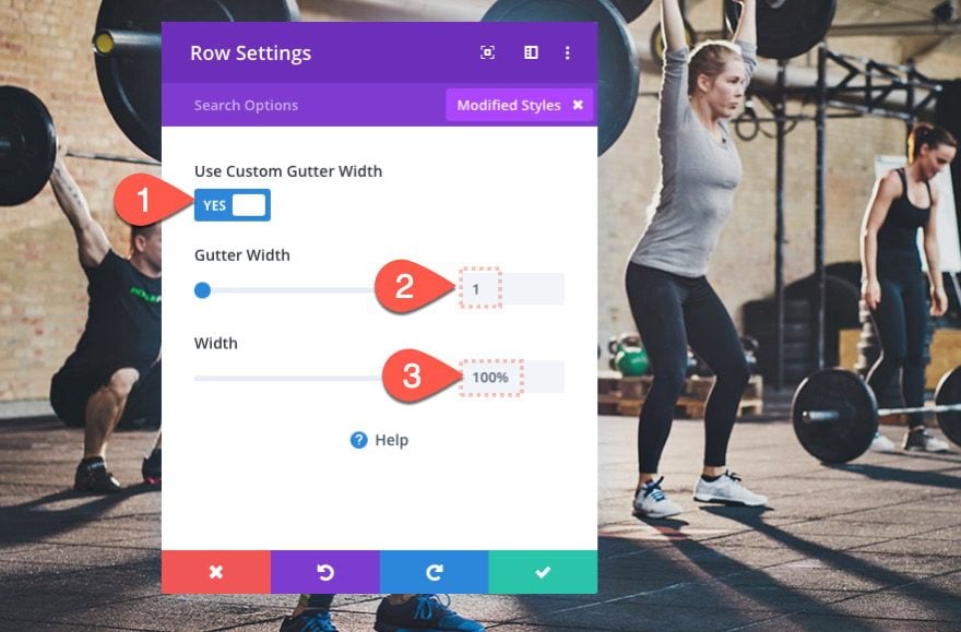
Now that our text module is done, open the row settings and update the following:
- Use Custom Gutter Width: YES
- Gutter Width: 1
- Width: 100%
Column 1 Settings
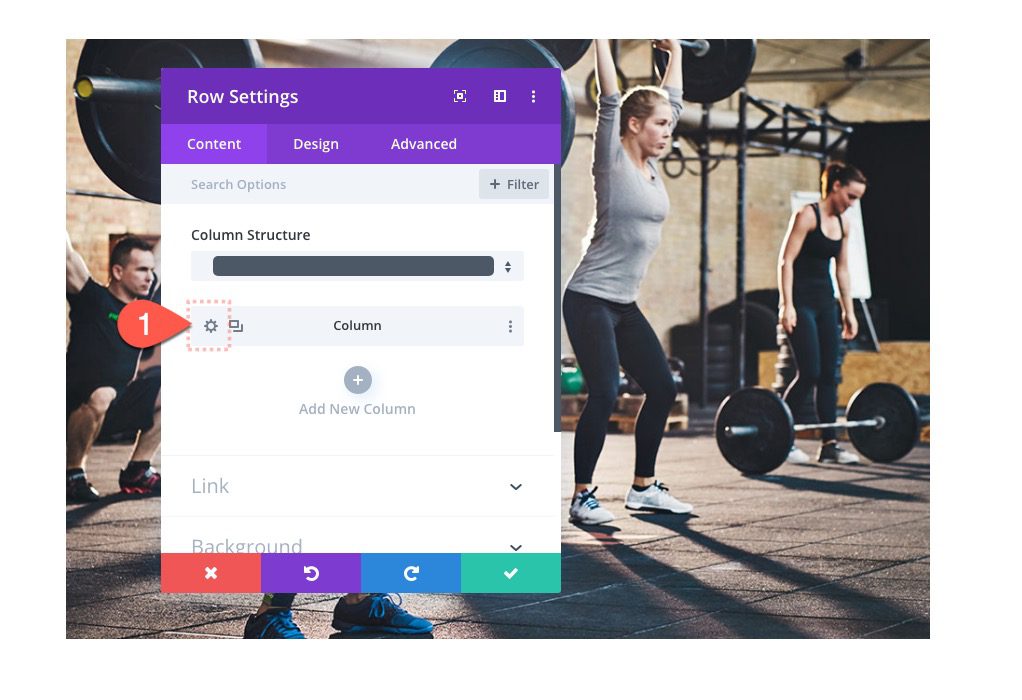
Then click to open the column settings.
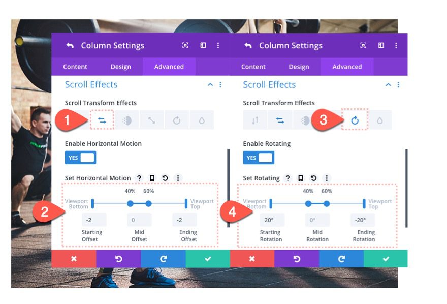
Under the Advanced tab, update the following scroll effects:
Under the Horizontal Motion effects tab…
- Enable Horizontal: YES
- Starting Offset: -2 (at 0% viewport)
- Mid Offset: 0 (at 40%-60%)
- Ending Offset: -2 (at 100%)
Under the Rotating effects tab…
- Enable Rotating: YES
- Starting Rotation: 20deg (at 0% viewport)
- Mid Rotation: 0deg (at 40%-60%)
- Ending Rotation: -20deg (at 100%)
Creating Column 2
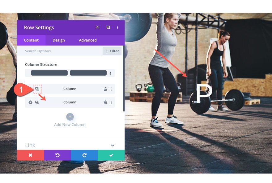
Even though we started with a one-column layout, we are going to create a total of 5 columns. It is just easier to duplicate the column with all its content and settings to create the next four needed for the design.
Duplicate the entire first column (with the text module) to create the second column.
Updating Column 2 Scroll Effects
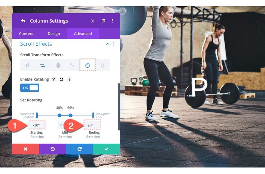
Then update the scroll effects for column 2 as follows:
Under the Rotating effects tab…
- Starting Rotation: -20deg
- Ending Rotation: 20deg
Creating Column 3
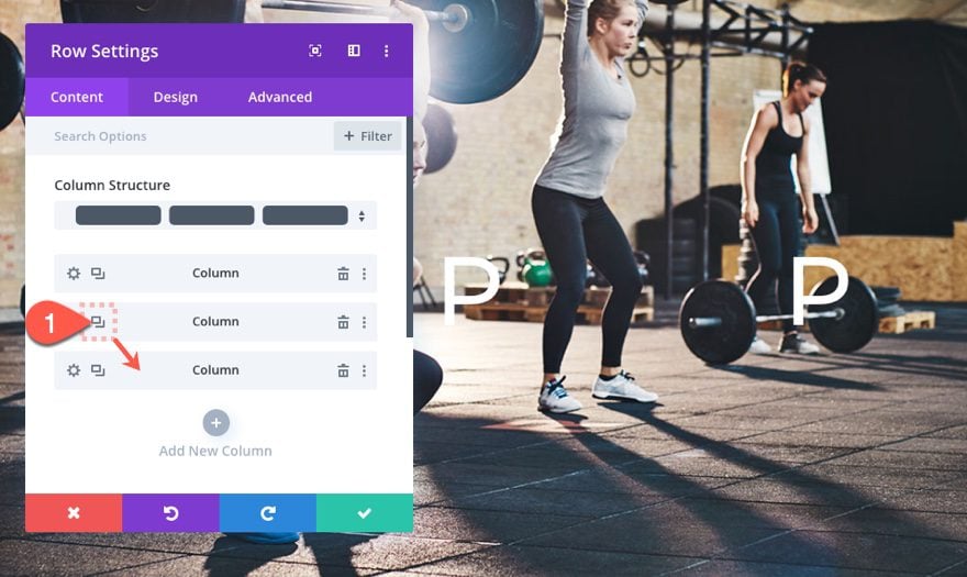
To create the Column 3, duplicate column 2.
Updating Column 3 Scroll Effects
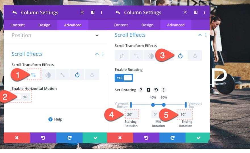
Then update column 3 settings as follows:
Under Horizontal Motion effects tab…
- Enable Horizontal Motion: NO
Under the Rotating Effect tab…
- Starting Rotation: 20deg
- Ending Rotation: 10deg
Creating Column 4
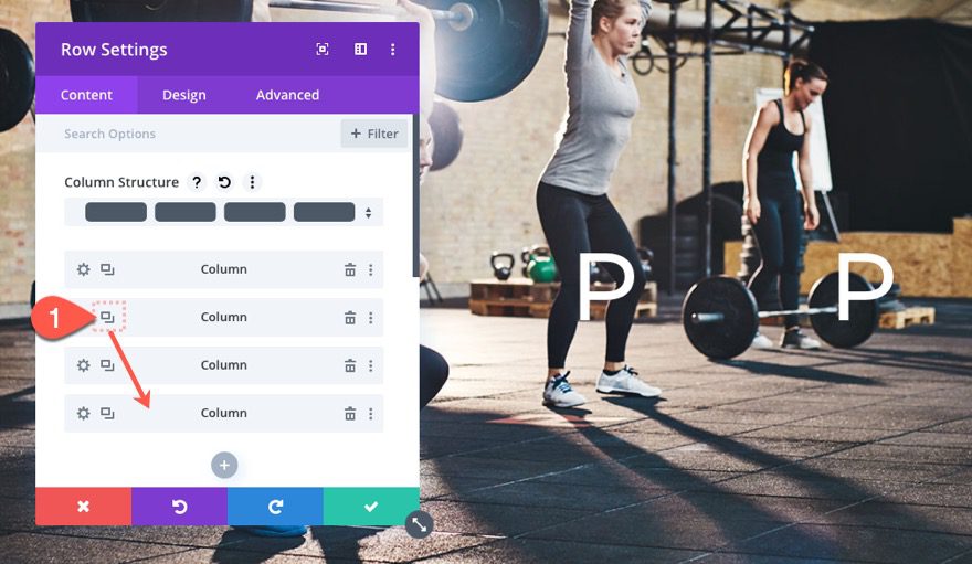
To create column 4, duplicate column 2 and then drag it to the bottom.
Updating Column 4 Scroll Effects
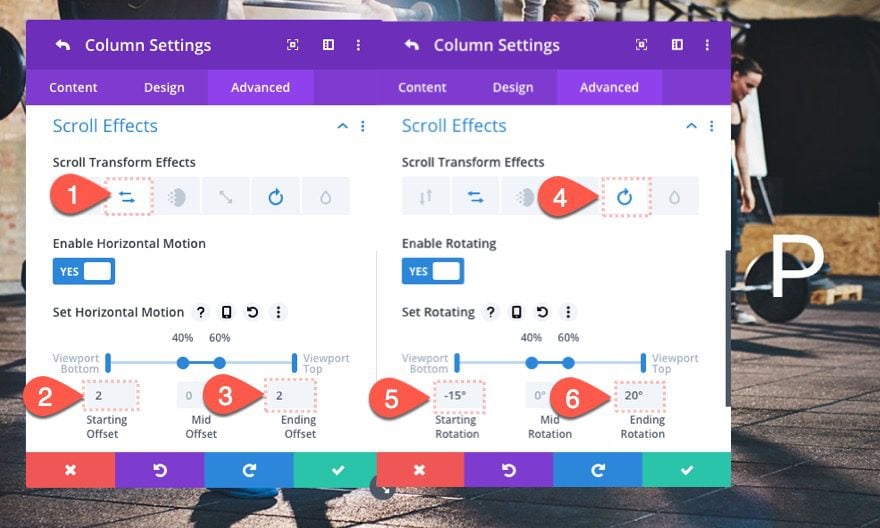
Then open the settings for column 4 and update the following:
Under the Horizontal Motion effects tab…
- Starting Offset: 2
- Ending Offset: 2
Under the Rotating Effects tab…
- Starting Rotation: -15deg
- Ending Rotation: 20deg
Creating Column 5
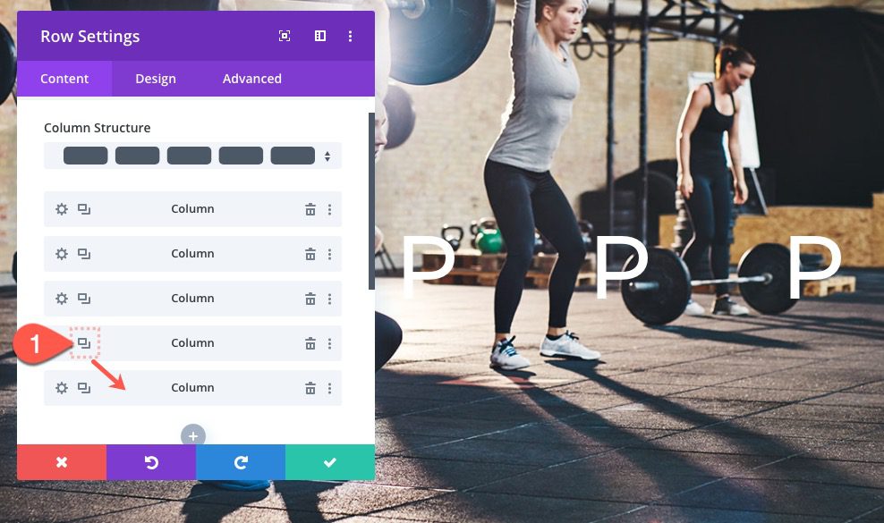
Finally, to create column 5, duplicate column 4.
Updating Column 5 Scroll Effects
Then update column 5 settings as follows:
Under the Rotating Effects tab…
- Starting Rotation: 15deg
- Ending Rotation: -15deg
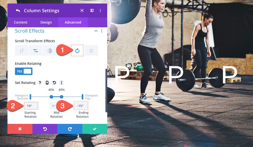
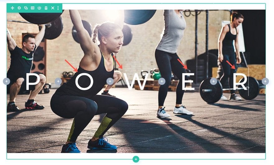
Updating the Text Module Letters
Next, use the inline text option to change the letters in each column so that they collectively spell the word “power”.
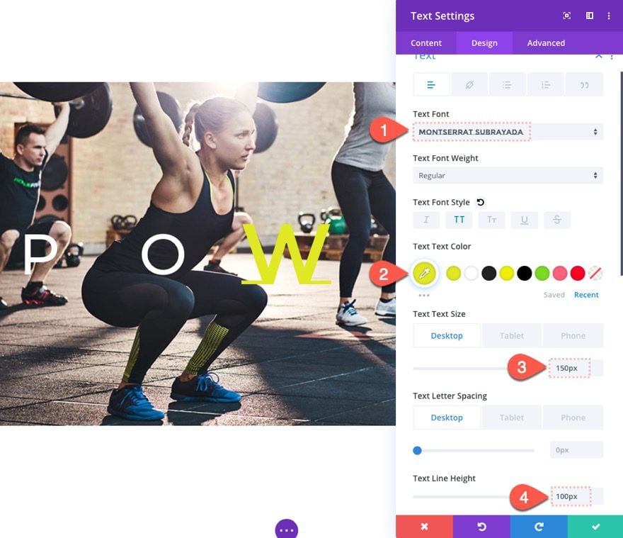
Updating Middle Text Module Design
Open the text module settings in column 3 and update the following:
- Text Font: Montserrat Subrayada
- Text Text Color: #e0e722
- Text Text Size: 150px (desktop)
- Text Line Height: 100px
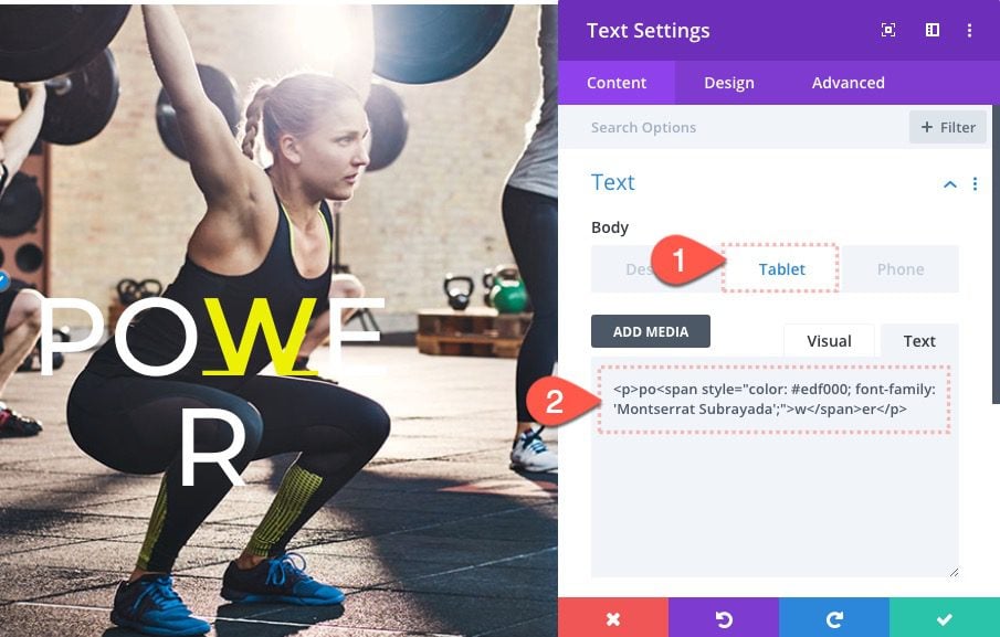
Update First Text Module Content for Mobile
In order to display a single text module on mobile, we need to update the text module in column 1 with the following content on tablet and phone display:
Body Content on Tablet and Phone:
<p>po<span style="color: #edf000; font-family: 'Montserrat Subrayada';">w</span>er</p>
Update Column 1 Settings
Next, open the settings for column 1 and update the following:
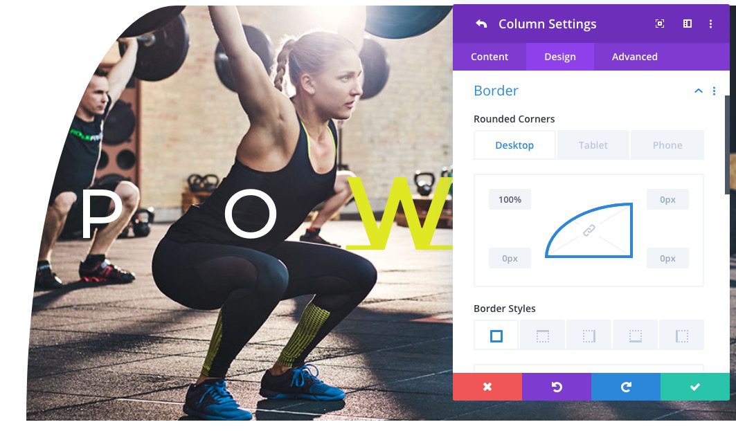
- Rounded Corners (desktop): 100% top left
- Rounded Corners (tablet and phone): 40% top left, 40% bottom right
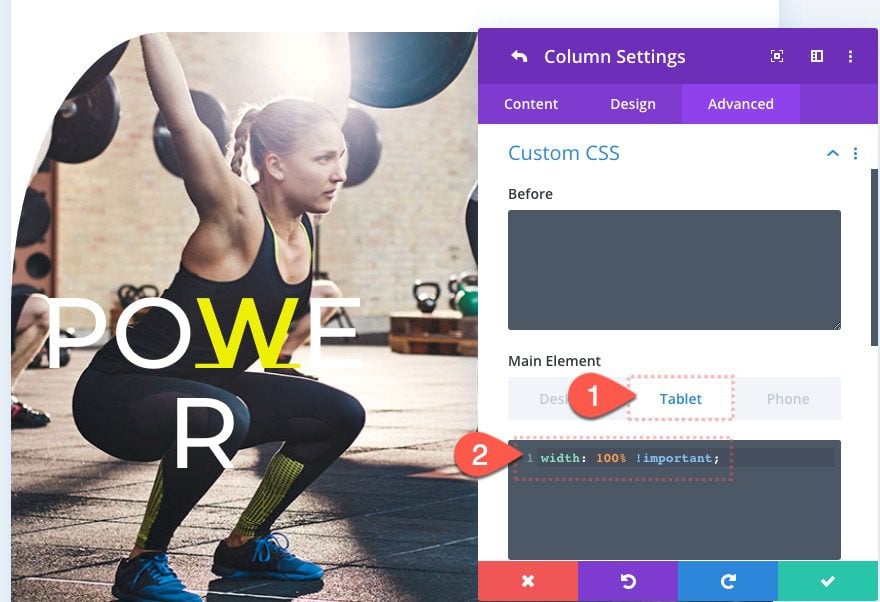
Under the advanced tab, add the following custom CSS to the tablet display of the main element:
width: 100% !important;
This will make sure the column spans the full width of the row on tablet and phone display.
Hide the Rest of the Columns on Tablet and Phone Display
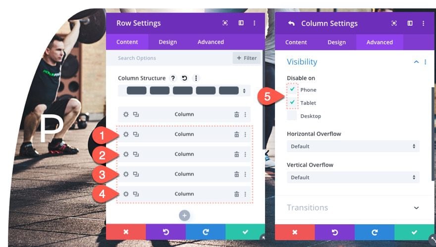
Now that column 1 will span the full width of the row on tablet and phone, we can hide/disable the rest of the columns on tablet and phone. To do this, open the settings for columns 2-5 and disable the visibility of each of the columns on phone and tablet.
Update Column 5 Settings
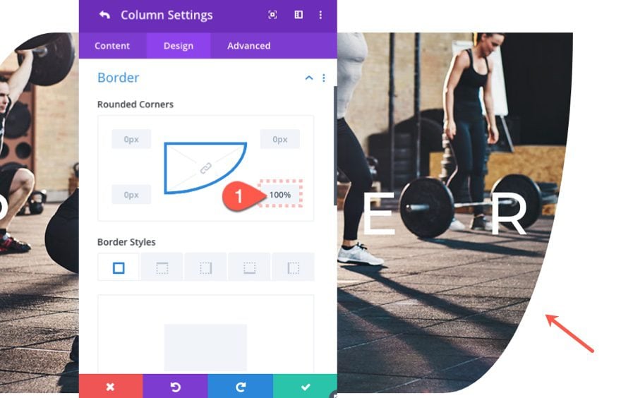
Then open the column 5 settings and add a complementary rounded corner as follows:
- Rounded Corners (desktop): 100% bottom right
Adding Background Design to Section
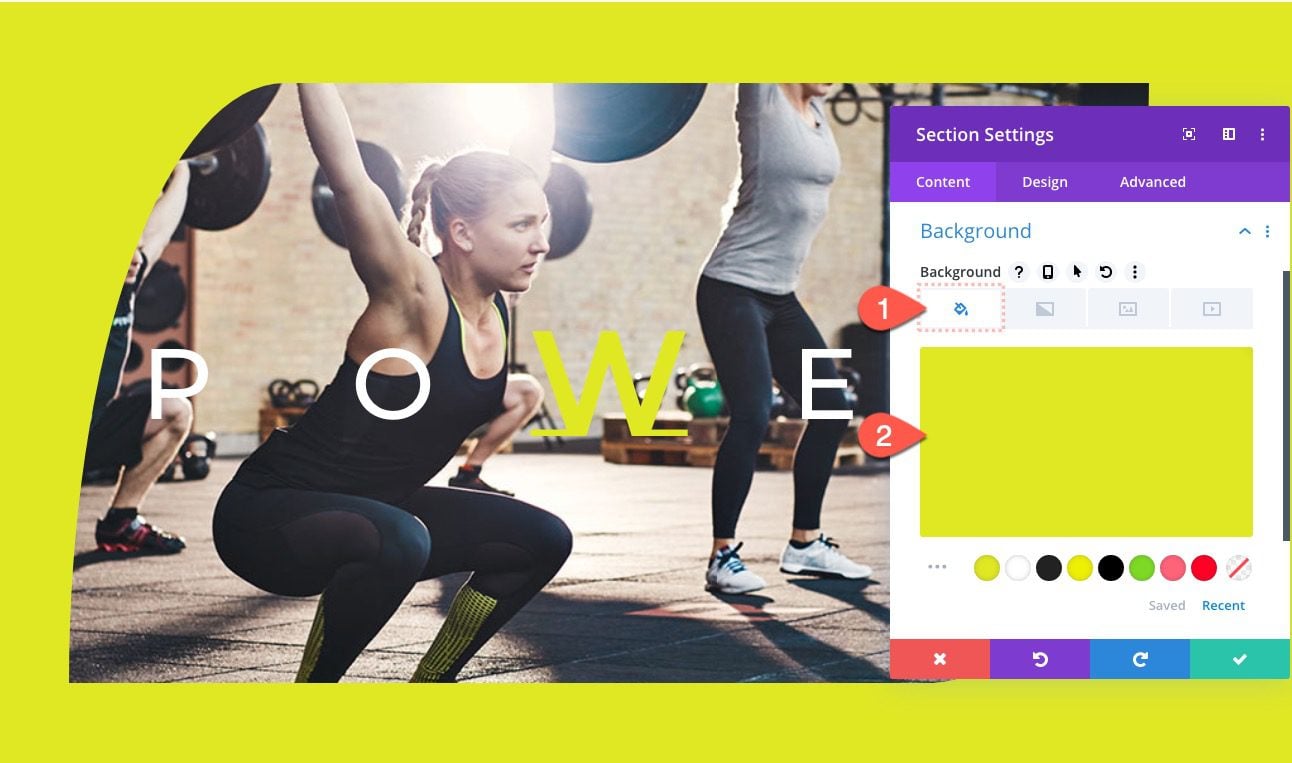
To finish off the design, update the section settings with a background design as follows:
- Background Color: #e0e722
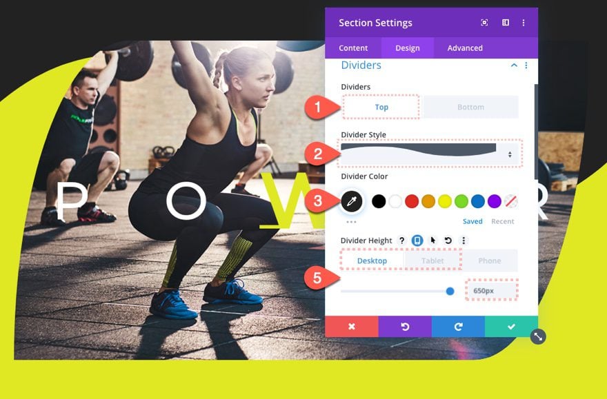
- Top Divider Style: See Screenshot
- Top Divider Color: #222222
- Top Divider Height: 650px (desktop), 500px (tablet and phone)
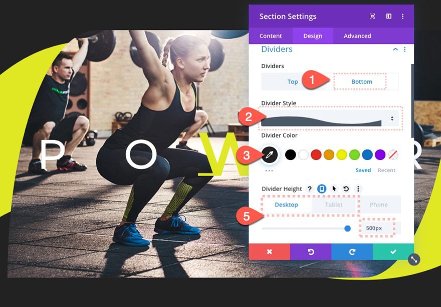
- Bottom Divider Style: See Screenshot
- Bottom Divider Color: #222222
- Bottom Divider Height: 500px (desktop), 400px (tablet and phone)
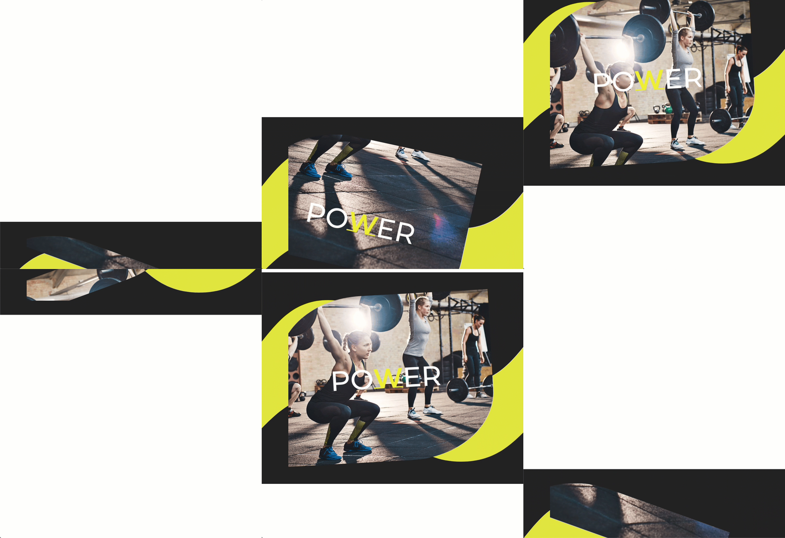
Final Result
Hre is the final design on desktop.

And here is the fallback design on tablet and phone display.

Final Thoughts
The parallax background images combine with scroll effects in truly magical ways. The only downside to using parallax background images is the lack of support for mobile, but with the responsive settings that Divi provides, we can easily create a fallback. I hope this elegant design will add some inspiration to your day.
I look forward to hearing from you in the comments.
Cheers!





doesn’t work with firefox, each column duplicates the same image! Anyway to fix this, in chrome, safari and edge works great
Your tutorials and guides are really helpful! helping me to execute my projects to the next level. Keep them coming
That’s wonderful to hear. Will do!
I was searching in the youtube from past 2 days to learn how to animate the parallax background but this tutorial solved all my myths and it’s the best I feel, thank you very much.
Awesome to hear!
Nice effect! Thanks a lot for the tutorial.
You’re welcome, Chris.
Great work indeed
Really great !
Thanks for this tutorial
Another awesome effect, thanks so much guys. Just one thing, is it just me or does it duplicate the same image in each column when using FireFox. Chrome and Safari seem fine though?
This is fantastic! Thank you very much 🙂
I have one question: Because of the margin of the section (80vh), there is a white space before and after, so I can’t put another section directly before and after.
Can this be solved somehow?
Sure. The margin is only added so that you can see the effect without any other page content before and after. Feel free to take out the margins and add additional sections/content above and below as needed. Glad you like it!
Really cool tutorial, Jason! Love the effects.
Thanks, Hannah!
you are genius! thanks a lot!!
Great to hear to liked it, Alex!