Adding animations to design elements on your page can definitely help you increase engagement. There are many animation options available in Divi and its Visual Builder and they’re quite straightforward to use. But you can also get creative with these animations and use them in a unique way. In this post, we’ll handle three examples of colliding animations which we’ll recreate step by step, using Divi’s built-in options only.
Let’s get to it!
- 1 Preview
- 2 Recreate Example #1: Colliding Text
- 3 Recreate Example #2: Colliding Dividers
-
4
Recreate Example #3: Colliding Grid
- 4.1 Add New Section
- 4.2 Add Row #1
- 4.3 Add Image Module to Column
- 4.4 Add Row #2
- 4.5 Add Blurb Module to Column 1
- 4.6 Clone Blurb Module 8 Times & Place 3 Duplicates in Each Remaining Column
- 4.7 Modify Blurb Module #1
- 4.8 Modify Blurb Module #2
- 4.9 Modify Blurb Module #3
- 4.10 Modify Blurb Module #4
- 4.11 Modify Blurb Module #5
- 4.12 Modify Blurb Module #6
- 4.13 Modify Blurb Module #7
- 4.14 Modify Blurb Module #8
- 4.15 Modify Blurb Module #9
- 4.16 Add Negative Bottom Margin to Image Module in Row #1
- 5 Preview
- 6 Final Thoughts
Preview
Before we dive into the tutorial, let’s take a quick look at the three examples we’ll recreate within this tutorial.
Example #1: Colliding Text
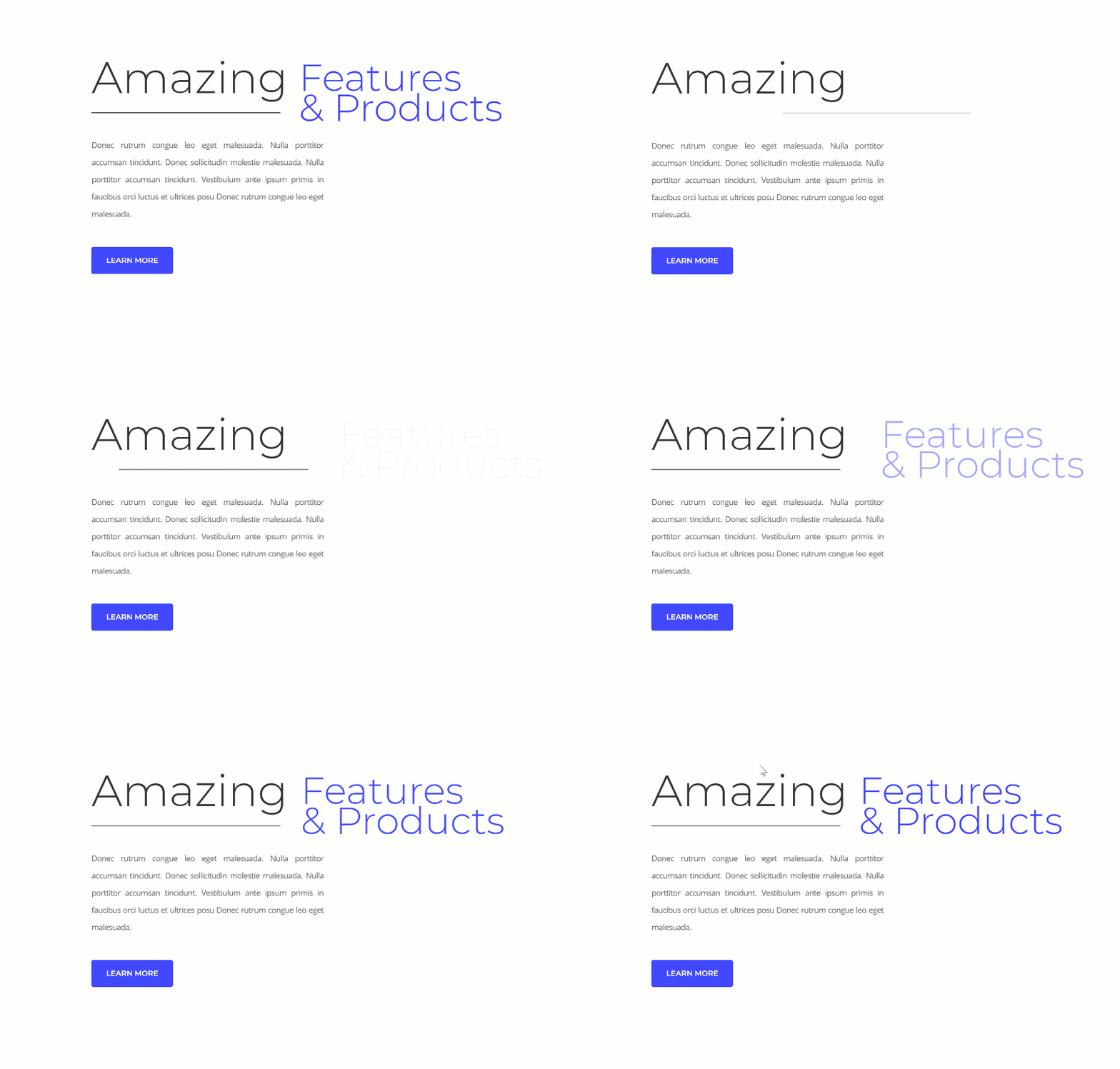
Example #2: Colliding Dividers
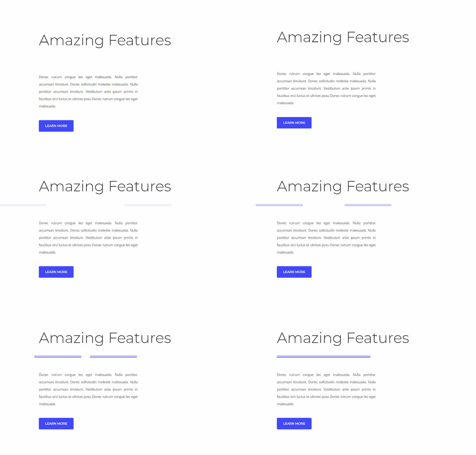
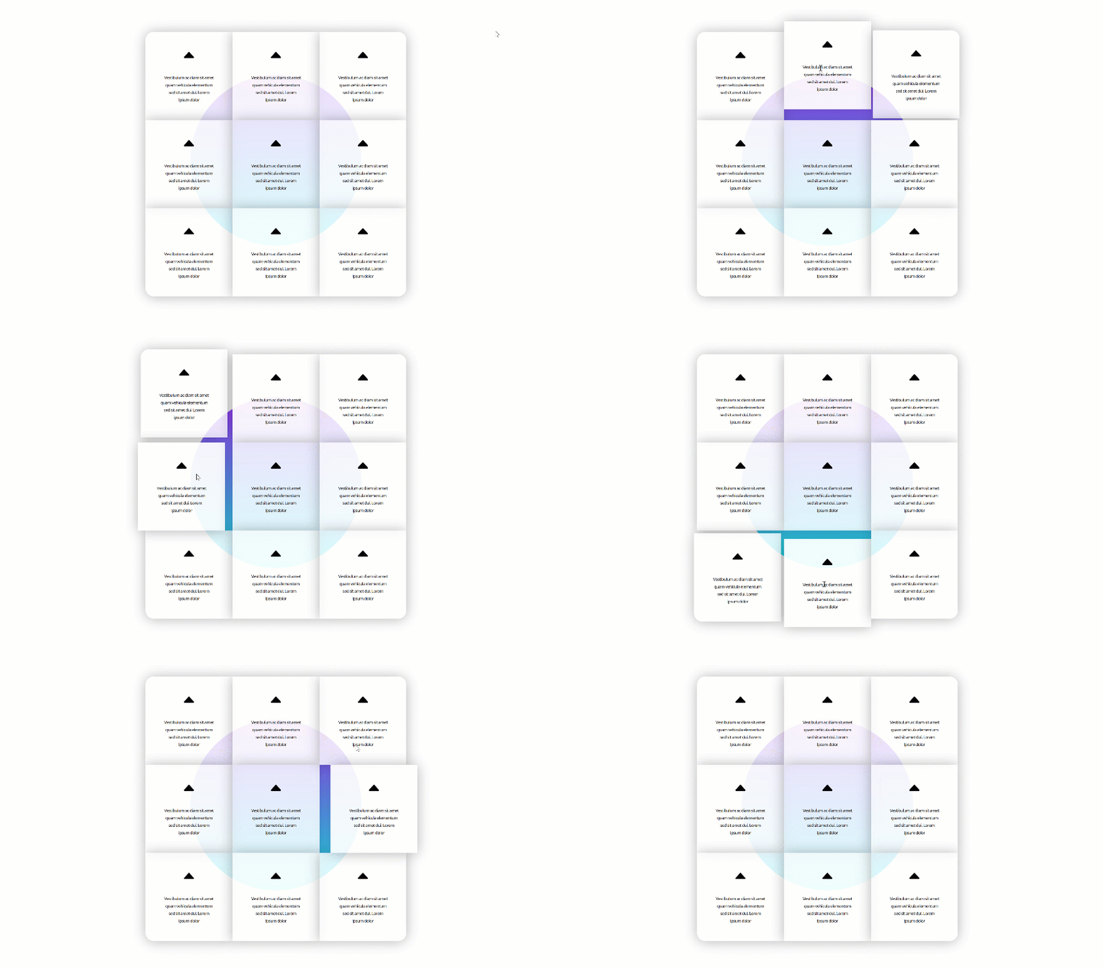
Example #3: Colliding Grid

Hover
Subscribe To Our Youtube Channel
Recreate Example #1: Colliding Text

Add Specialty Section
Structure
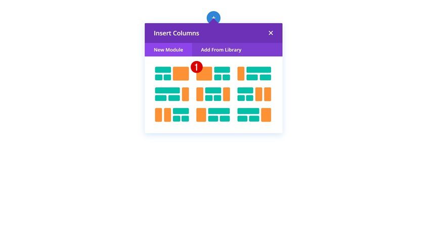
Let’s get started with the first example! Open a new or existing page and add a new specialty section using the following structure:
Sizing
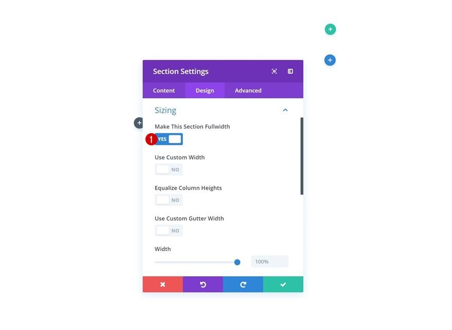
Without adding any modules or row, open the section settings and enable the ‘Make This Section Fullwidth’ option in the sizing settings.
Add Row #1
Column Structure
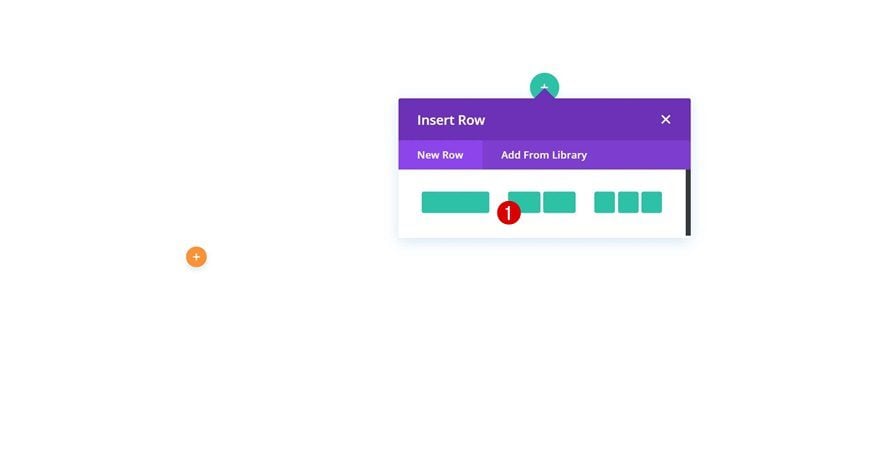
Continue by adding a row to the specialty section:
Sizing
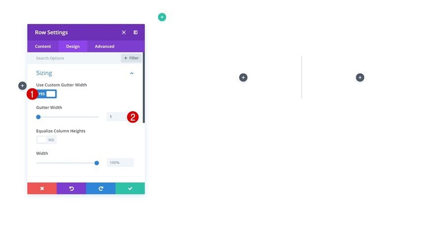
Open the row settings and make some changes to the sizing settings.
- Use Custom Gutter Width: Yes
- Gutter Width: 1
Spacing
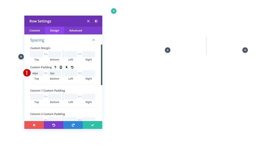
Change the custom padding values in the spacing settings as well.
- Top Padding: 44px
- Bottom Padding: 0px
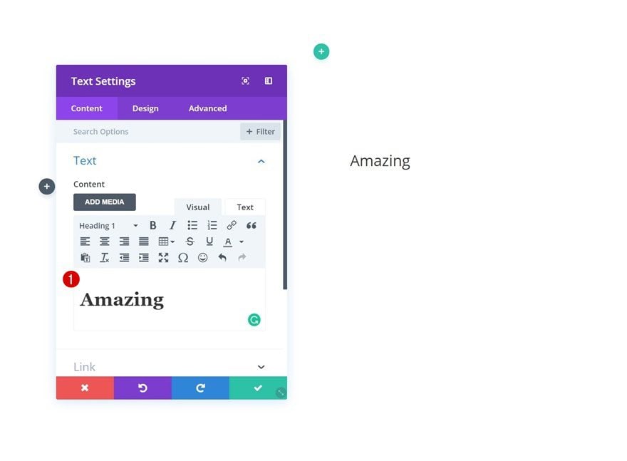
Add Text Module to Column 1
Add Content
Continue by adding a Text Module to the first column of the row and add some content.
Heading Text Settings
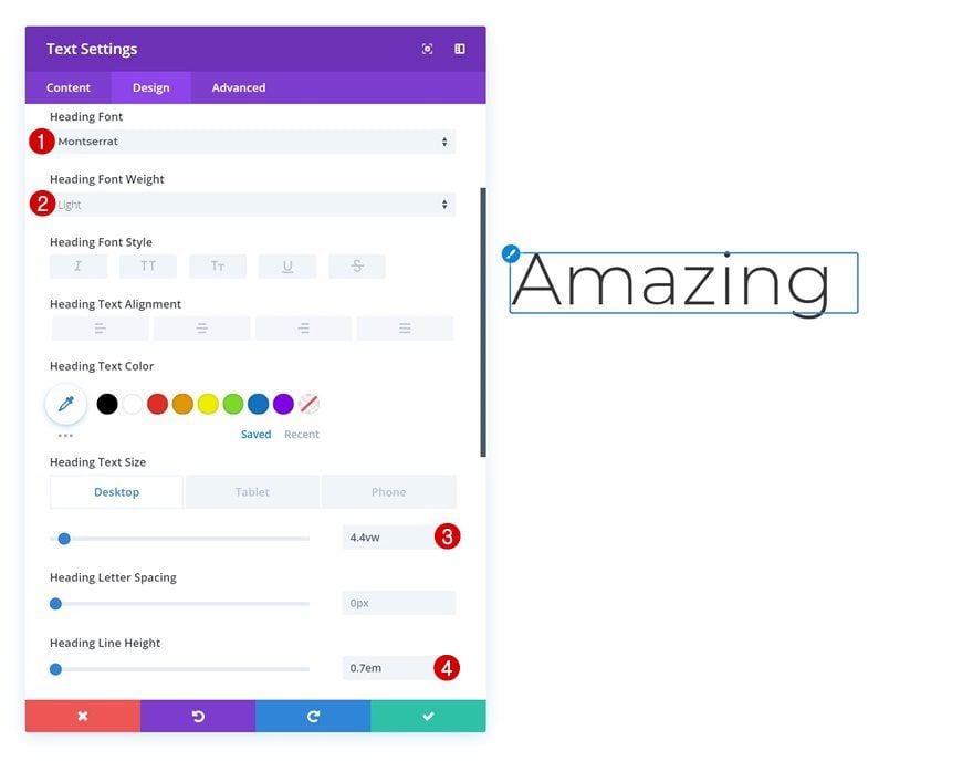
Change the heading text settings next.
- Heading Font: Montserrat
- Heading Font Weight: Light
- Heading Text Size: 4.4vw (Desktop), 8.2vw (Tablet), 40px (Phone)
- Heading Line Height: 0.7em
Add Divider Module to Column 1
Visibility
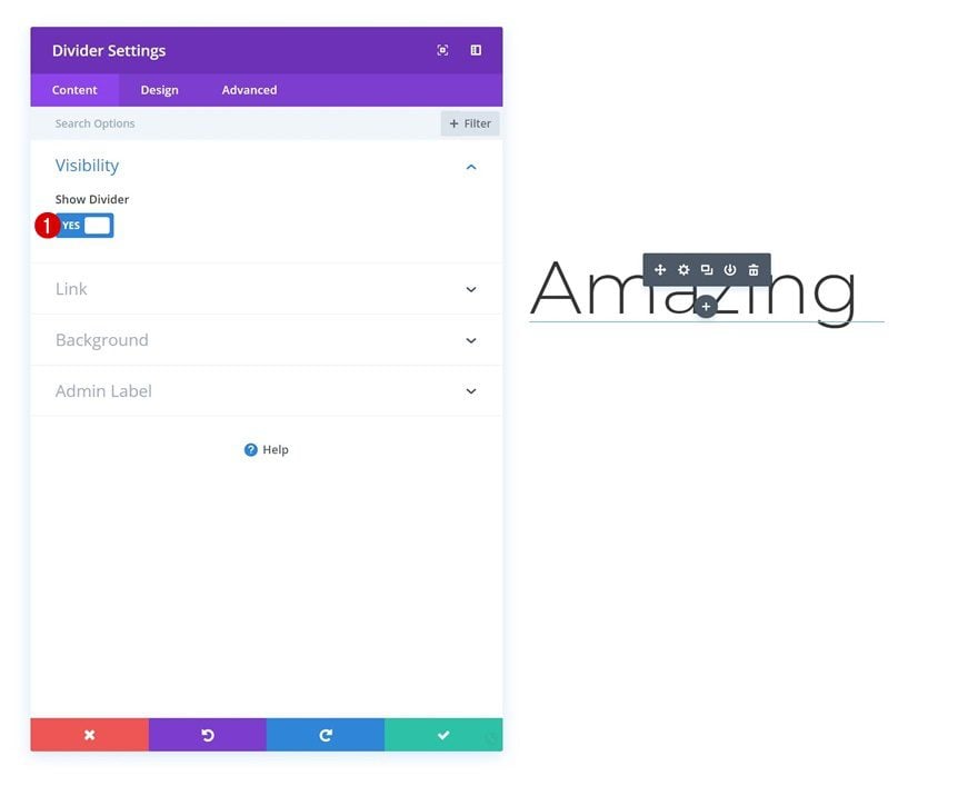
The second module needed in column 1 is a Divider Module. Make sure the divider shows up by enabling the ‘Show Divider’ option.
- Show Divider: Yes
Color
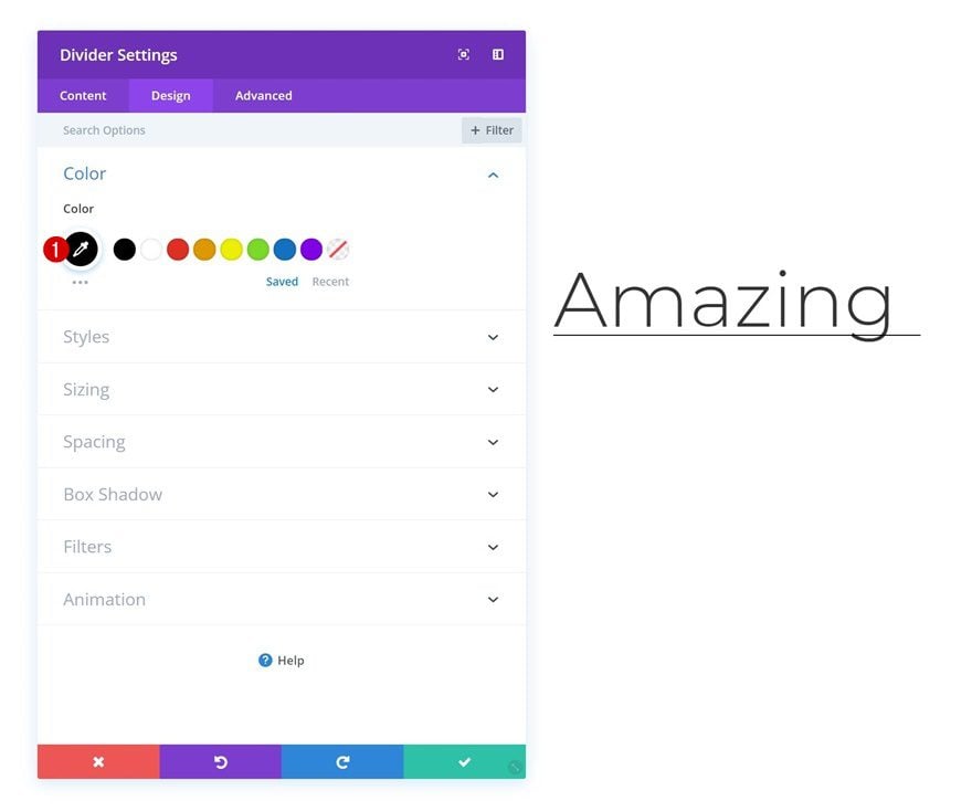
Move on to the design tab and change the divider color.
- Color: #000000
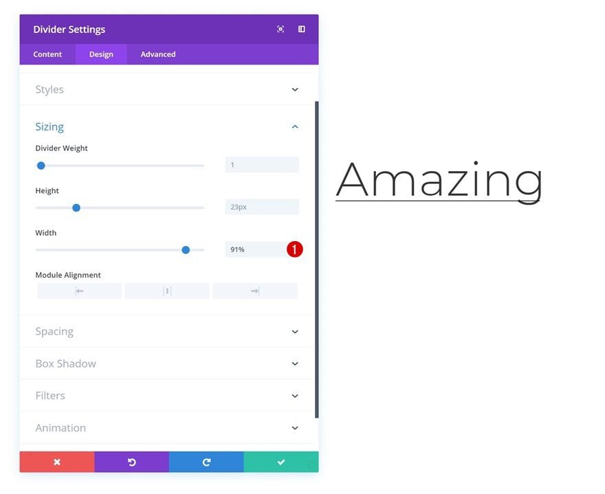
Sizing
Decrease the width of the divider as well.
- Width: 91%
Spacing
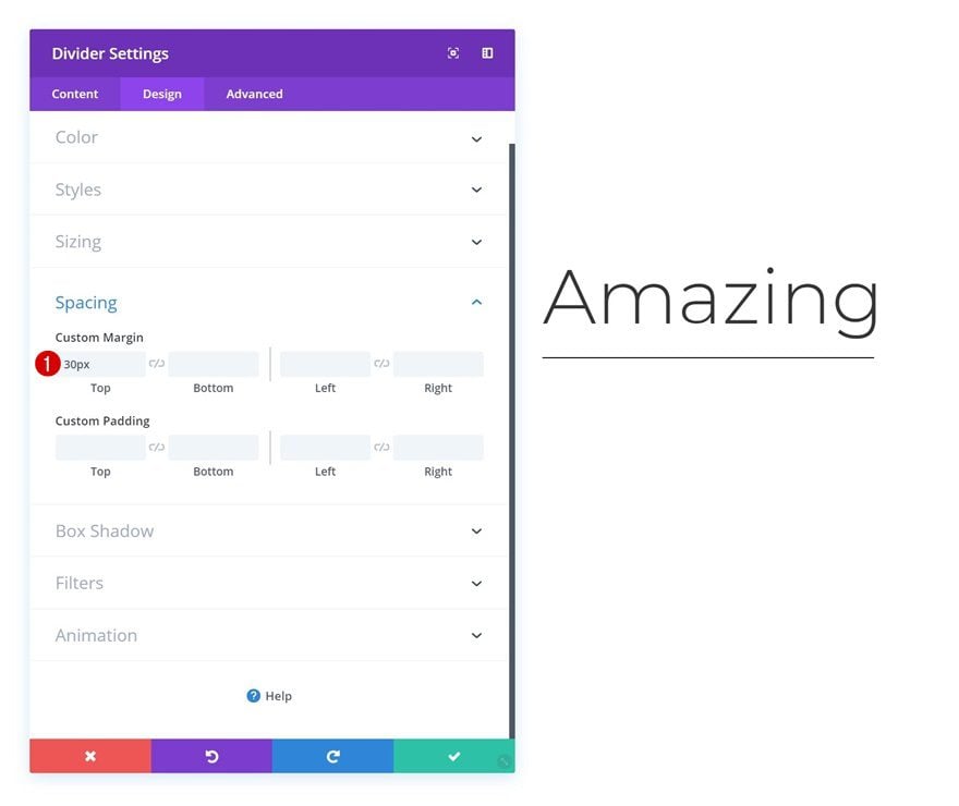
And add some top margin to create space between the Divider Module and the Text Module.
- Top Margin: 30px
Animation
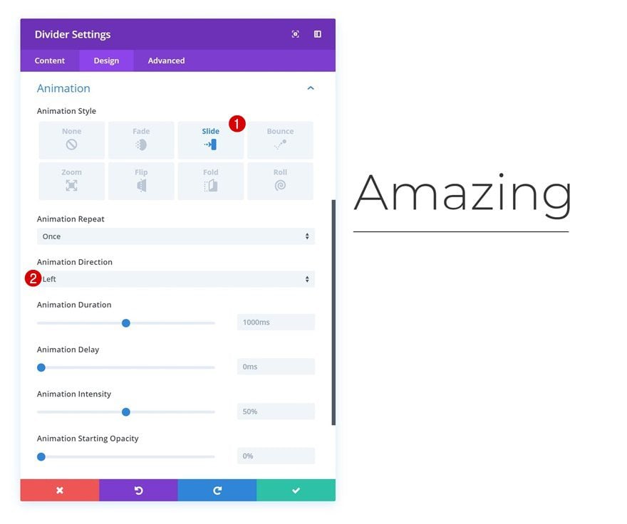
Lastly, add a subtle animation to the Divider Module.
- Animation Style: Slide
- Animation Direction: Left
Add Text Module to Column 2
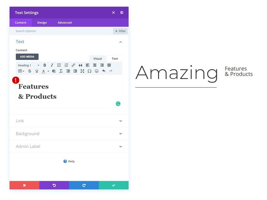
Add Content
Move on to the second column and add the second Text Module with some content of choice.
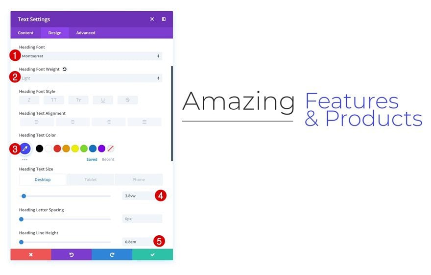
Heading Text Settings
Change the heading text settings next.
- Heading Font: Montserrat
- Heading Font Weight: Light
- Heading Text Color: #3f46ff
- Heading Text Size: 3.8vw (Desktop), 6.5vw (Tablet), 40px (Phone)
- Heading Line Height: 0.8em
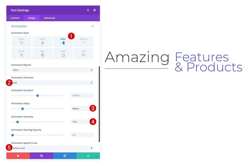
Animation
And add an animation to this module as well.
- Animation Style: Slide
- Animation Direction: Left
- Animation Delay: 600ms
- Animation Intensity: 10%
Add Row #2
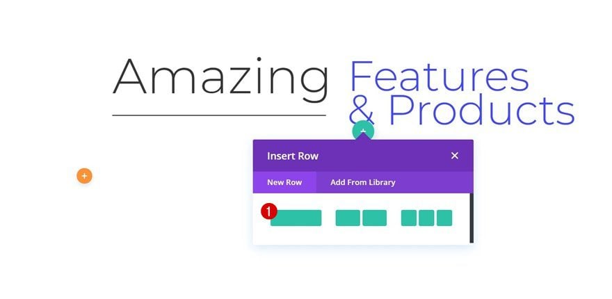
Column Structure
Continue by adding another row to the section using the following column structure:
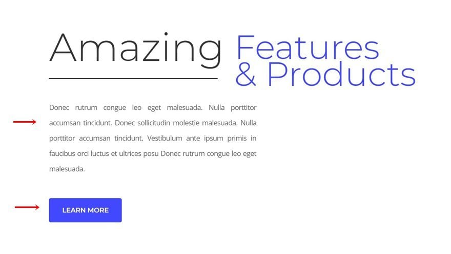
Add Remaining Modules
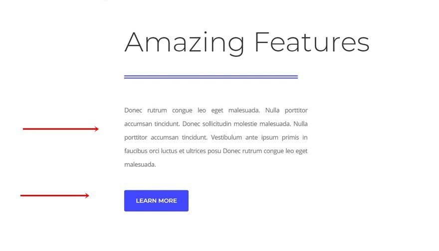
Add the other modules you want to show up in this new row and modify them to your needs.
Recreate Example #2: Colliding Dividers

Add Specialty Section
Structure
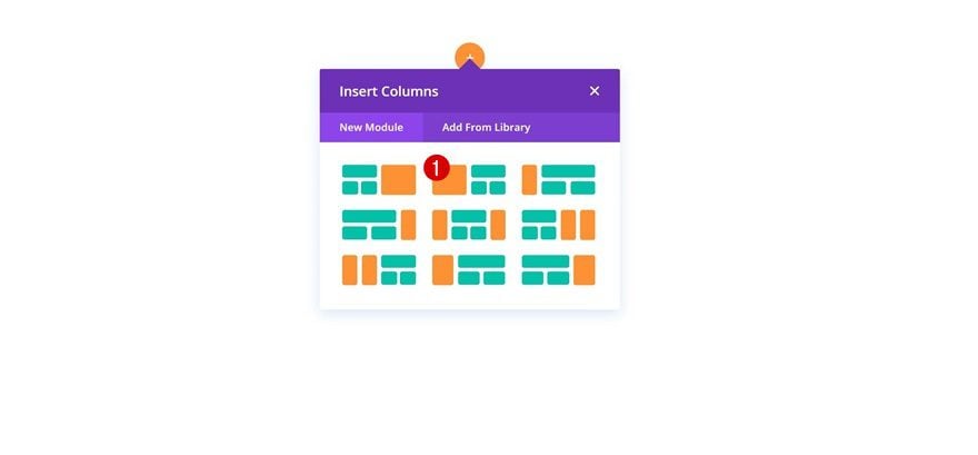
On to the next example! Add a new specialty section using the following structure:
Sizing
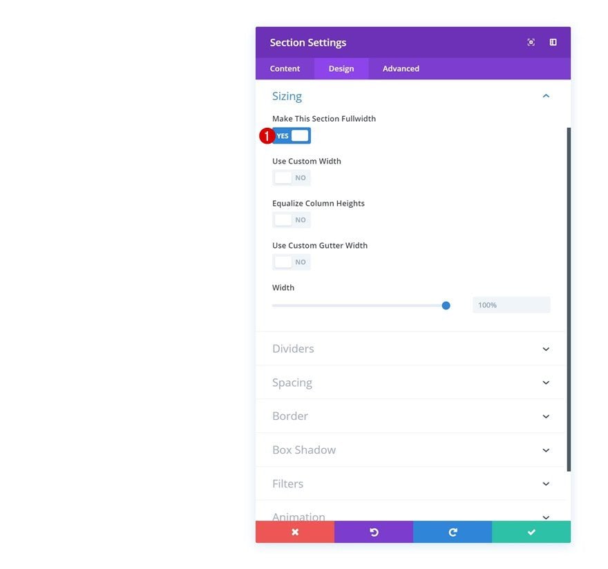
Without adding any rows or modules, open the section settings and enable the ‘Make This Section Fullwidth’ option.
- Make This Section Fullwidth: Yes
Add Row #1
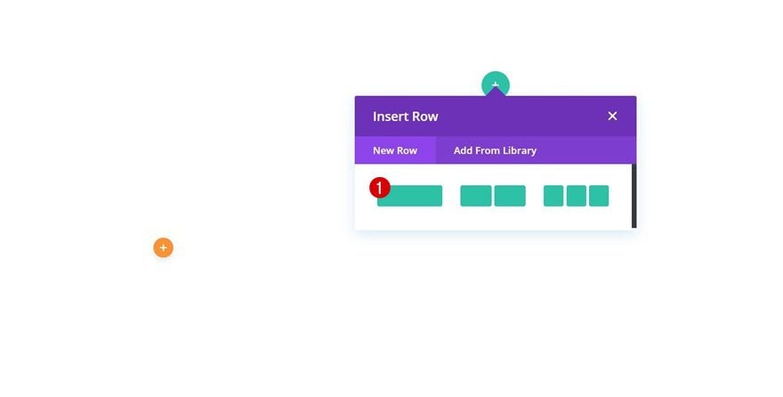
Column Structure
Continue by adding a new row using the following column structure:
Spacing
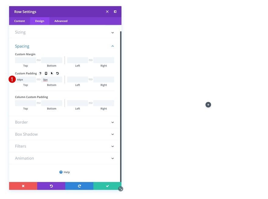
Open the row settings and modify the custom padding settings.
- Top Padding: 44px
- Bottom Padding: 0px
Add Text Module
Add Content
Next, add a Text Module to the row with some content of choice.
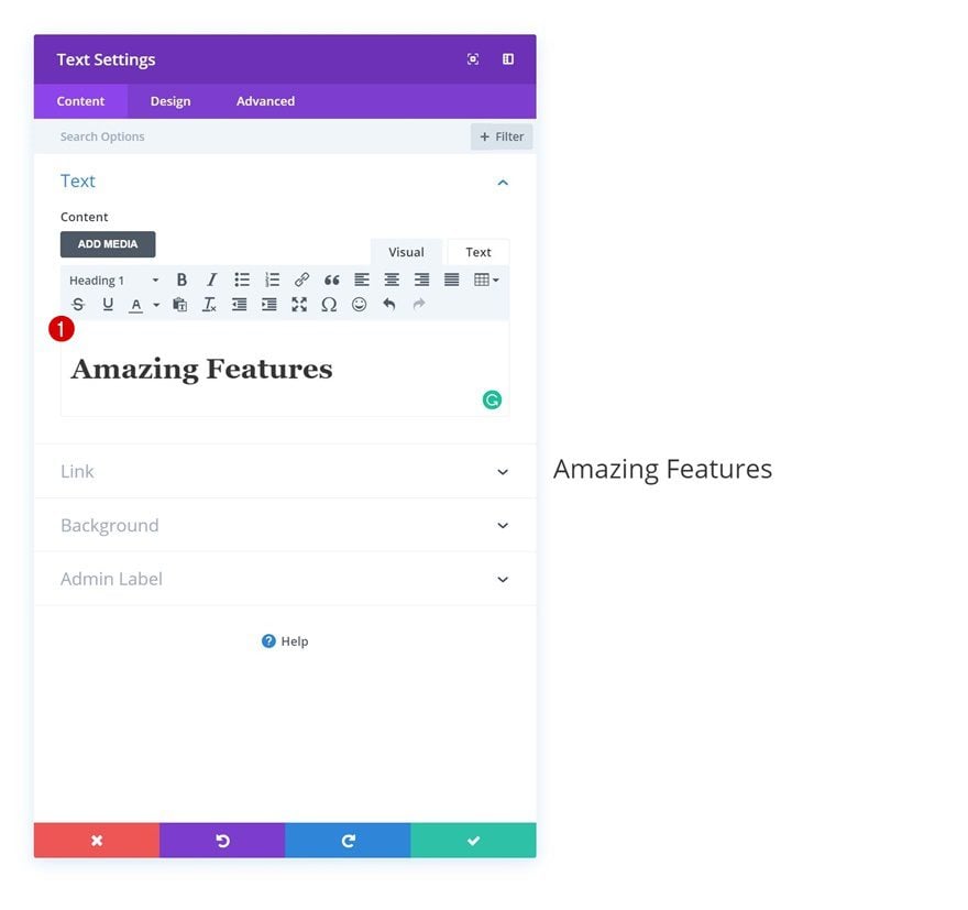
Heading Text Settings
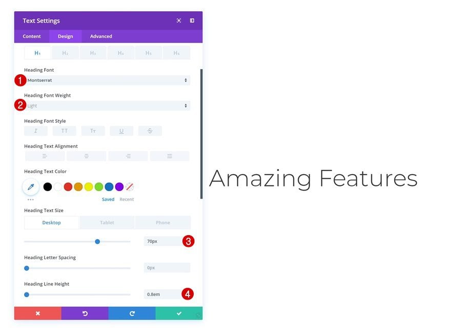
Move on to the design tab and change the heading text settings.
- Heading Font: Montserrat
- Heading Font Weight: Light
- Heading Text Size: 70px (Desktop), 50px (Tablet), 40px (Phone)
- Heading Line Height: 0.8em
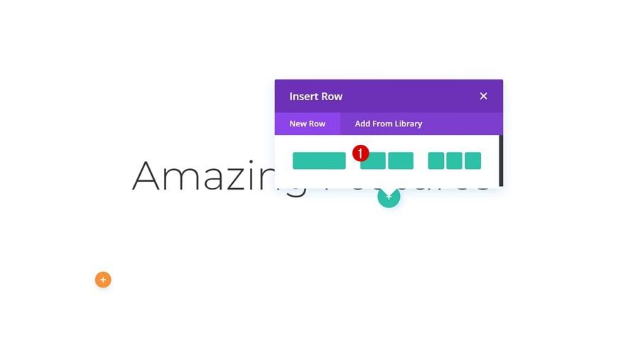
Add Row #2
Column Structure
Continue by adding another row using the following column structure:
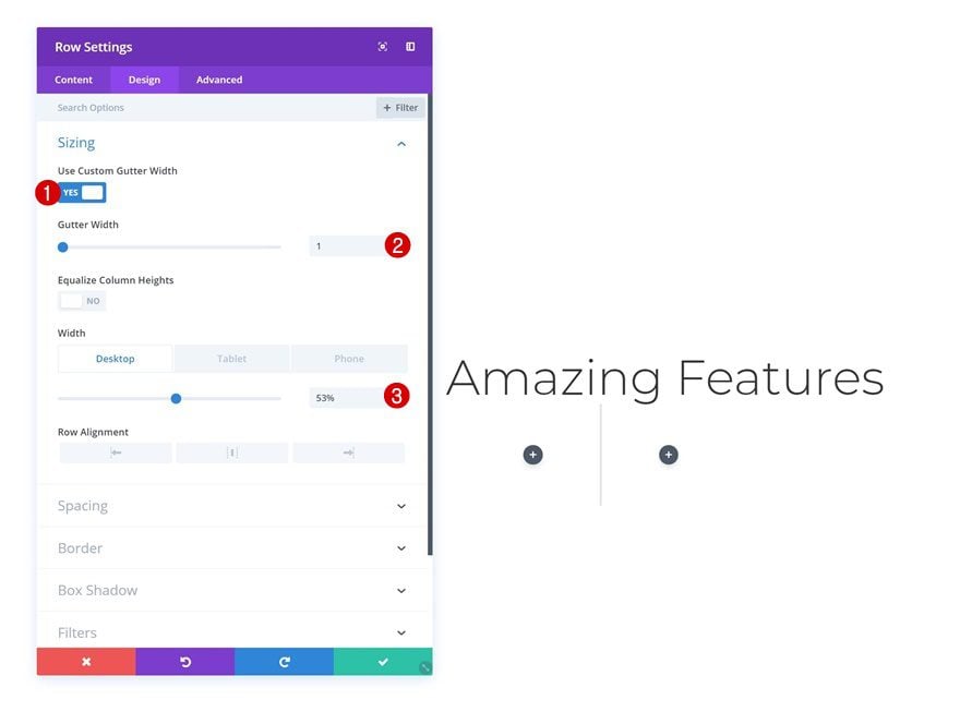
Sizing
Without adding any modules yet, open the row settings and modify the sizing settings.
- Use Custom Gutter Width: Yes
- Gutter Width: 1
- Width: 53% (Desktop), 100% (Tablet & Phone)
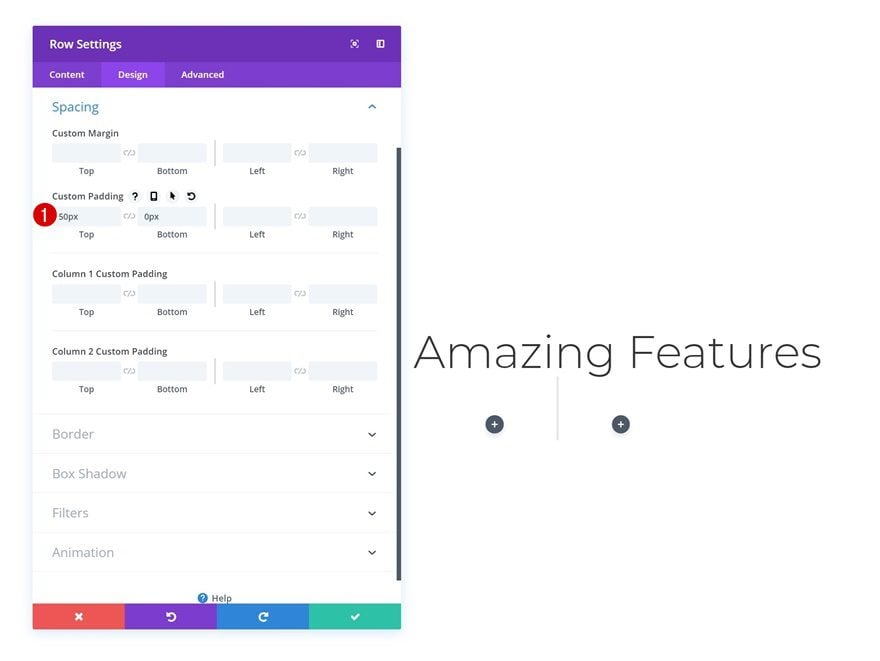
Spacing
Change the custom padding values as well.
- Top Padding: 50px
- Bottom Padding: 0px
Add Divider Module to Column 1
Visibility
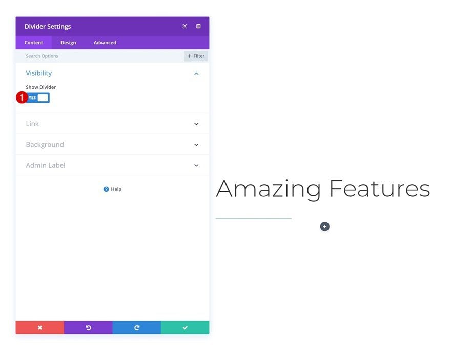
Once you’re done modifying the row settings, go ahead and add a Divider Module to the first column and make sure the divider shows up by enabling the ‘Show Divider’ option.
- Show Divider: Yes
Color
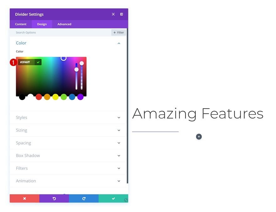
Change the divider color next.
- Divider Color: #3f46ff
Styles
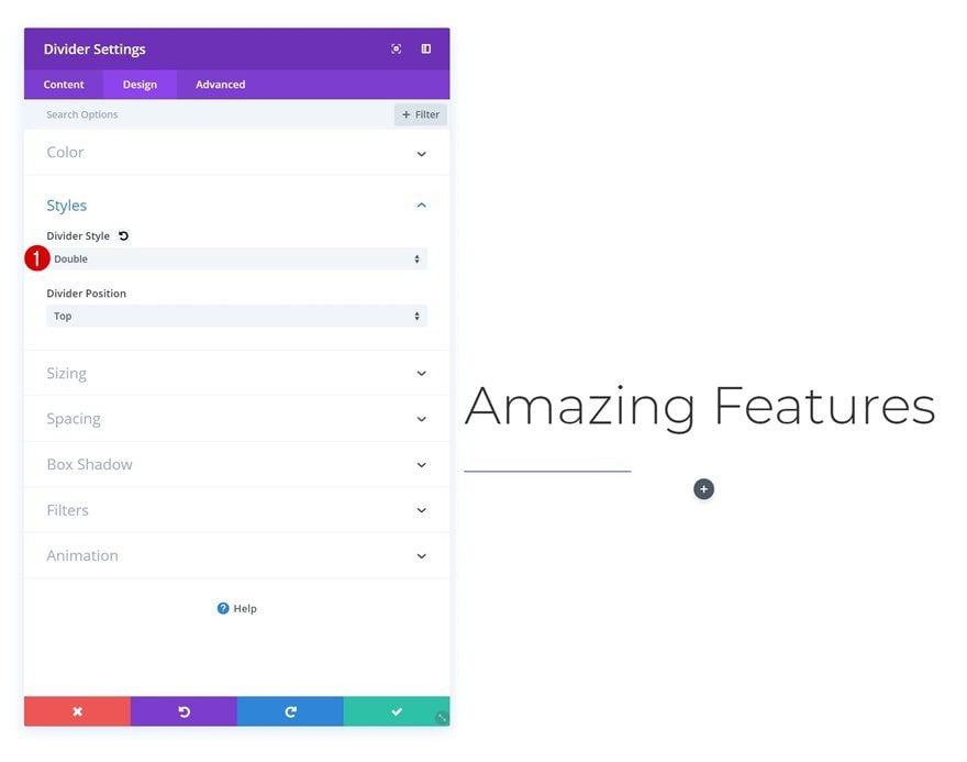
And change the divider style in the styles settings.
- Divider Style: Double
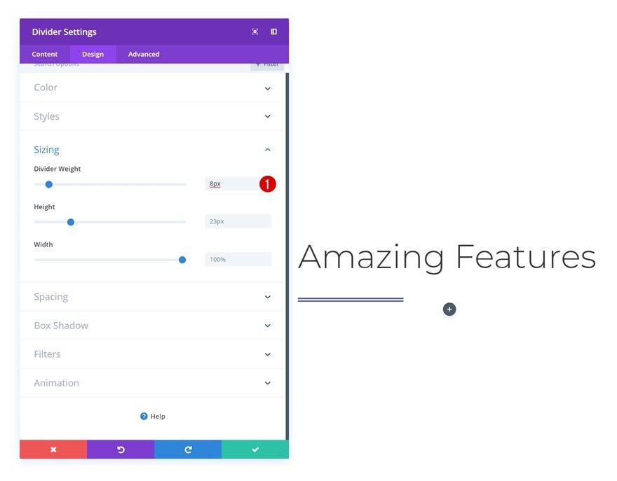
Sizing
Increase the divider weight in the sizing settings too.
- Divider Weight: 8px
Animation
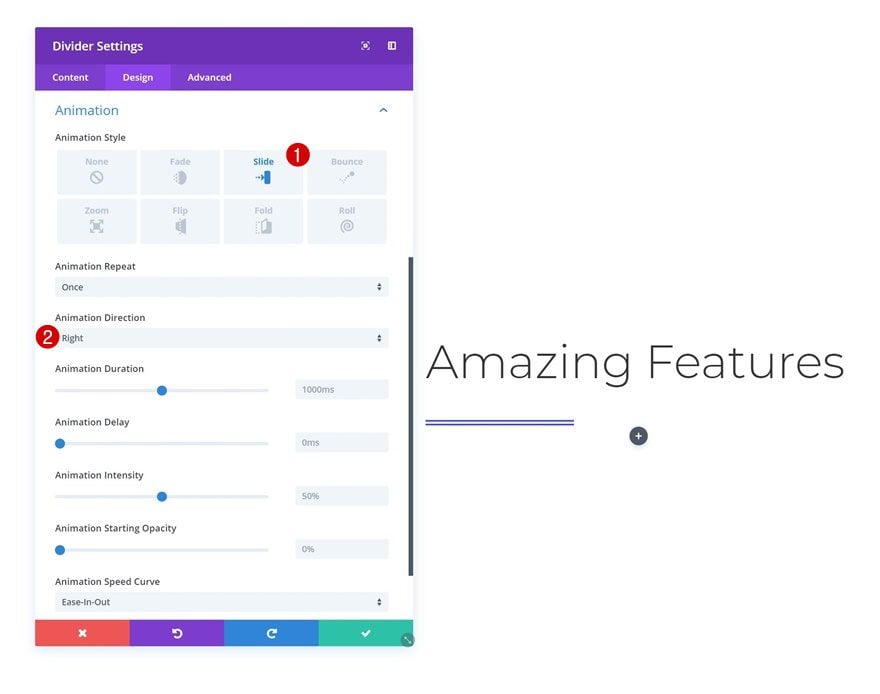
Lastly, add an animation to the Divider Module.
- Animation Style: Slide
- Animation Direction: Right
Clone Divider Module & Place in Column 2
Once you’re done modifying the Divider Module settings, go ahead and clone the module. Place the duplicate in the second column of the row.

Change Animation
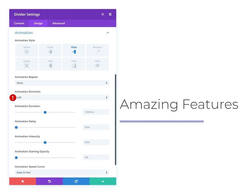
To create a colliding effect, change the animation direction of the duplicate Divider Module.
- Animation Style: Slide
- Animation Direction: Left
Add Row #3
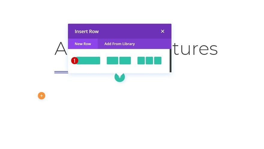
Column Structure
Continue by adding another row using the following column structure:
Add Remaining Modules
And add as many modules you want to finish the section design.
Recreate Example #3: Colliding Grid

Add New Section
Spacing
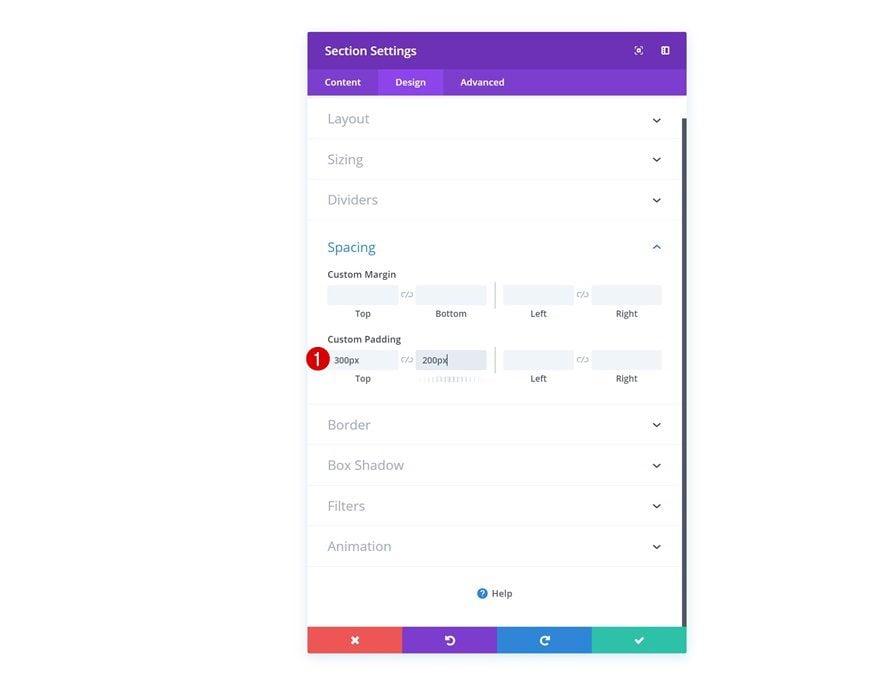
On to the next and last example! Add a regular section and open the settings. Go to the spacing settings add some custom padding values:
- Top Padding: 300px
- Bottom Padding: 200px
Add Row #1
Column Structure
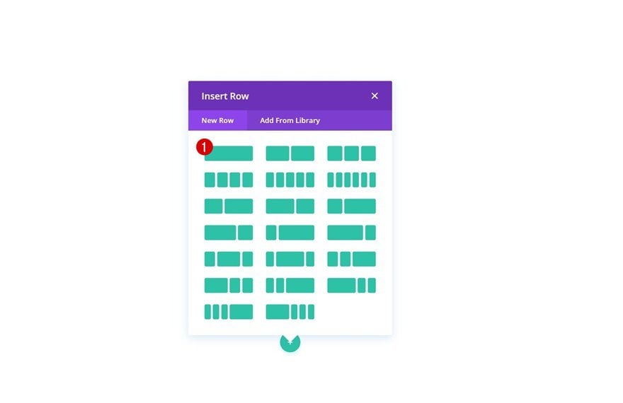
Continue by adding a new row using the following column structure:
Add Image Module to Column
Upload Shaped Image Overlay
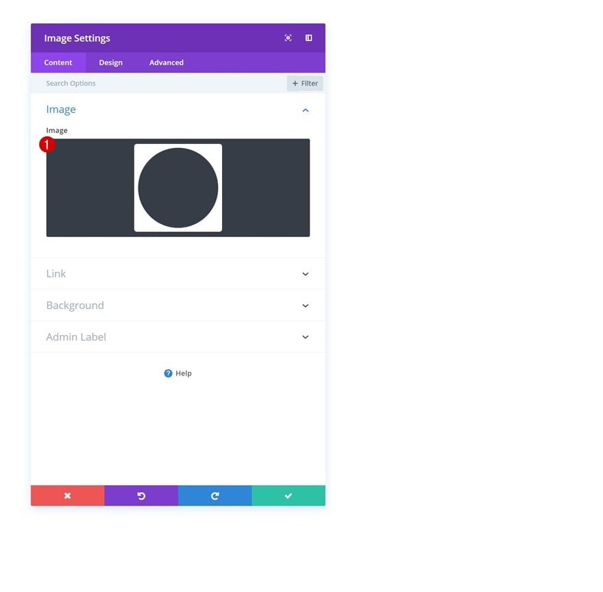
Save the following shaped image overlay to your desktop by right-clicking:

Once you’ve saved the shaped image overlay, go back to your Divi website and add an Image Module to the row. Upload the shaped image overlay file that you can find in your download folder.
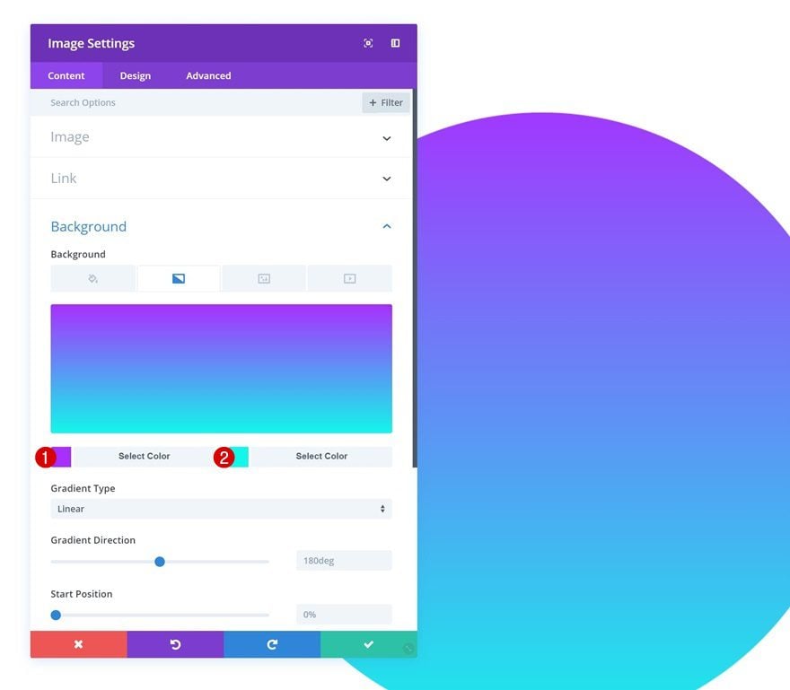
Gradient Background
Next, add a gradient background to the module.
- Color 1: #aa2bff
- Color 2: #09f7eb
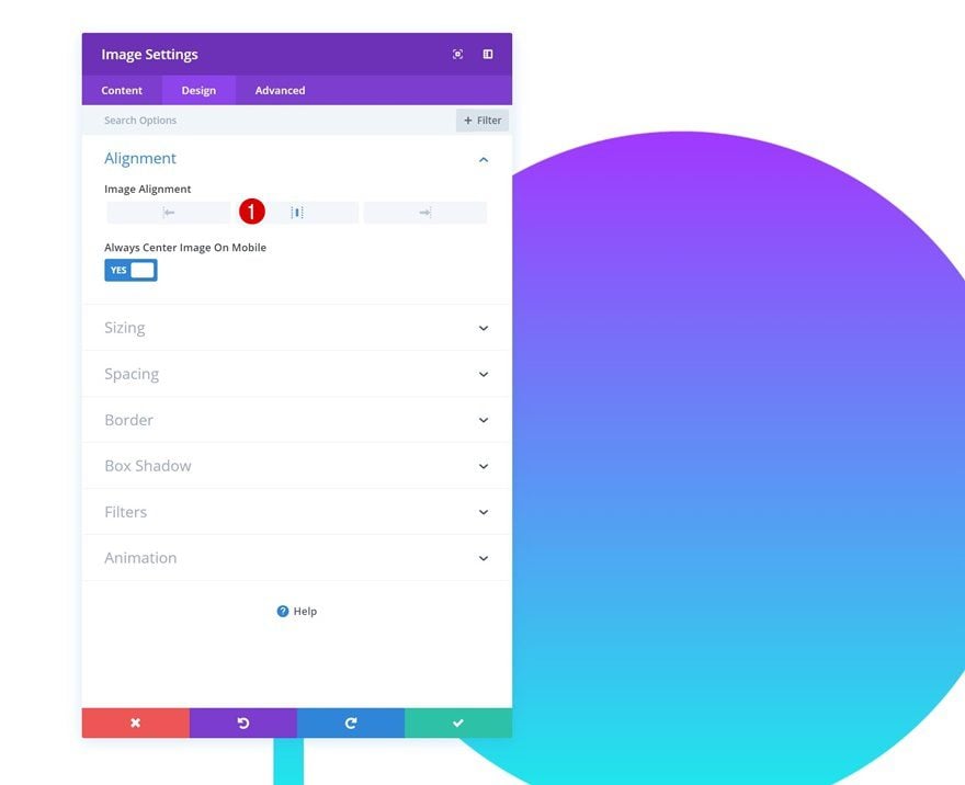
Alignment
Change the image alignment as well.
- Image Alignment: Center
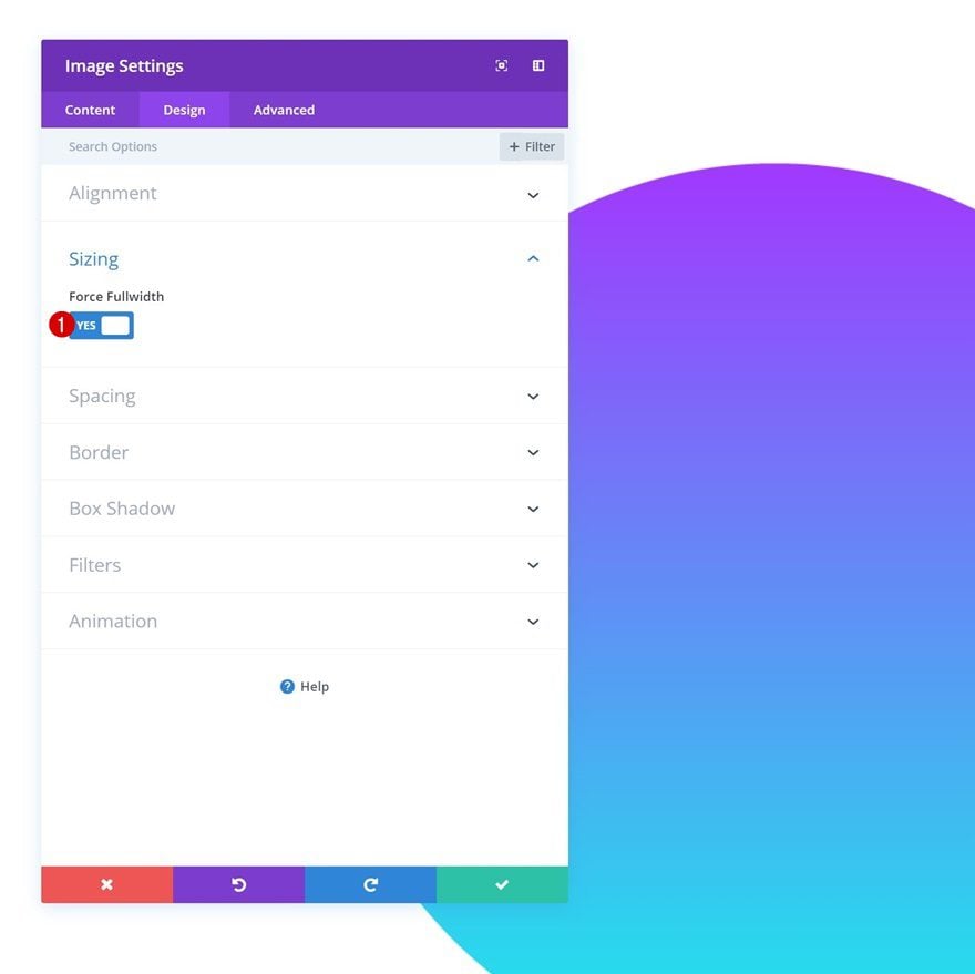
Sizing
And enable the ‘Force Fullwidth’ option in the sizing settings.
- Force Fullwidth: Yes
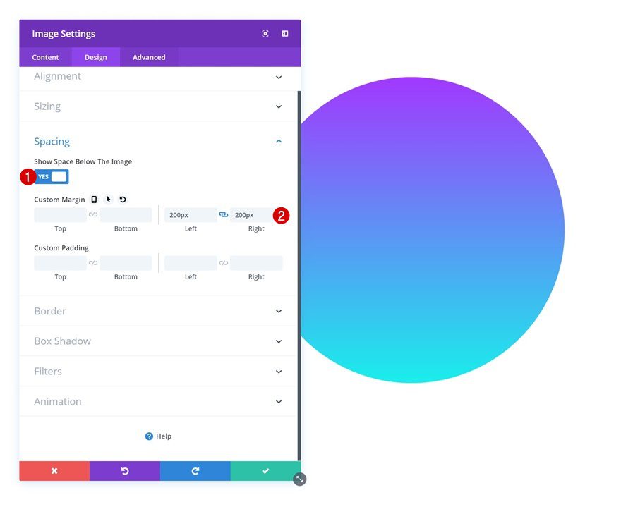
Spacing
Add some custom margin to the module too.
- Left Margin: 200px
- Right Margin: 200px
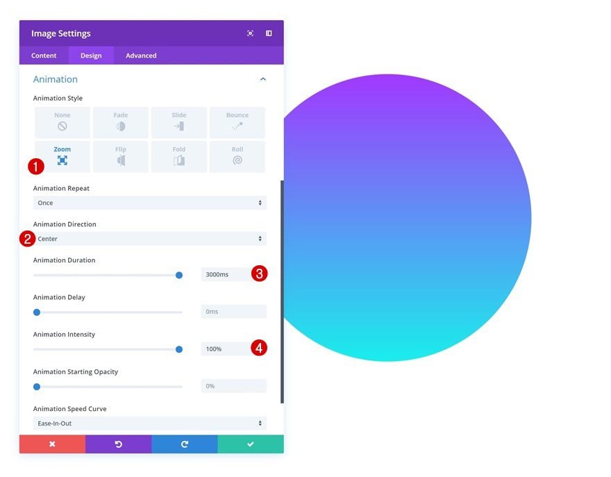
Animation
Lastly, add an animation to the module.
- Animation Style: Zoom
- Animation Direction: Center
- Animation Duration: 3000ms
- Animation Intensity: 100%
Add Row #2
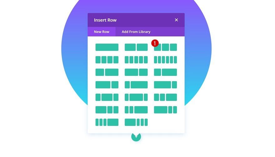
Column Structure
On to the second row. Use the following column structure:
Sizing
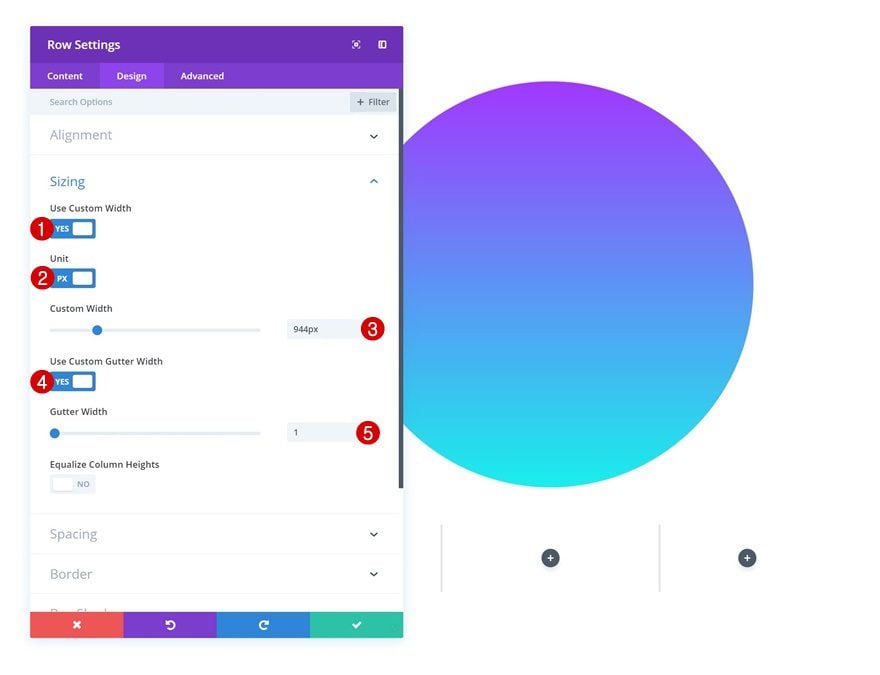
Without adding any modules yet, open the row settings and make some changes to the sizing settings.
- Use Custom Width: Yes
- Unit: PX
- Custom Width: 944px
- Use Custom Gutter Width: Yes
- Gutter Width: 1
Add Blurb Module to Column 1
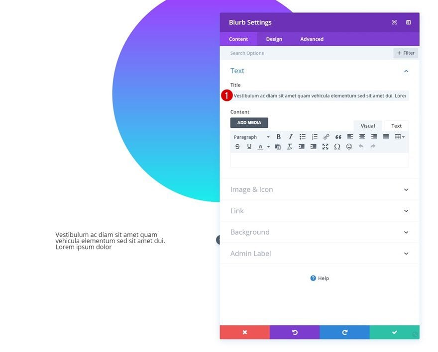
Add Content
Continue by adding a Blurb Module to the first column. Enter some content of choice.
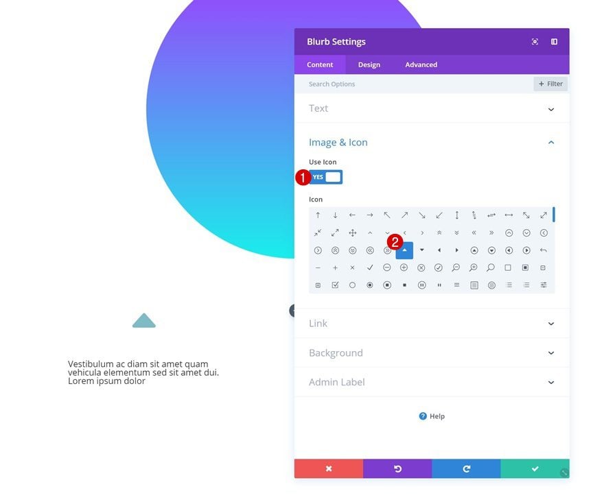
Icon
Select an icon next.
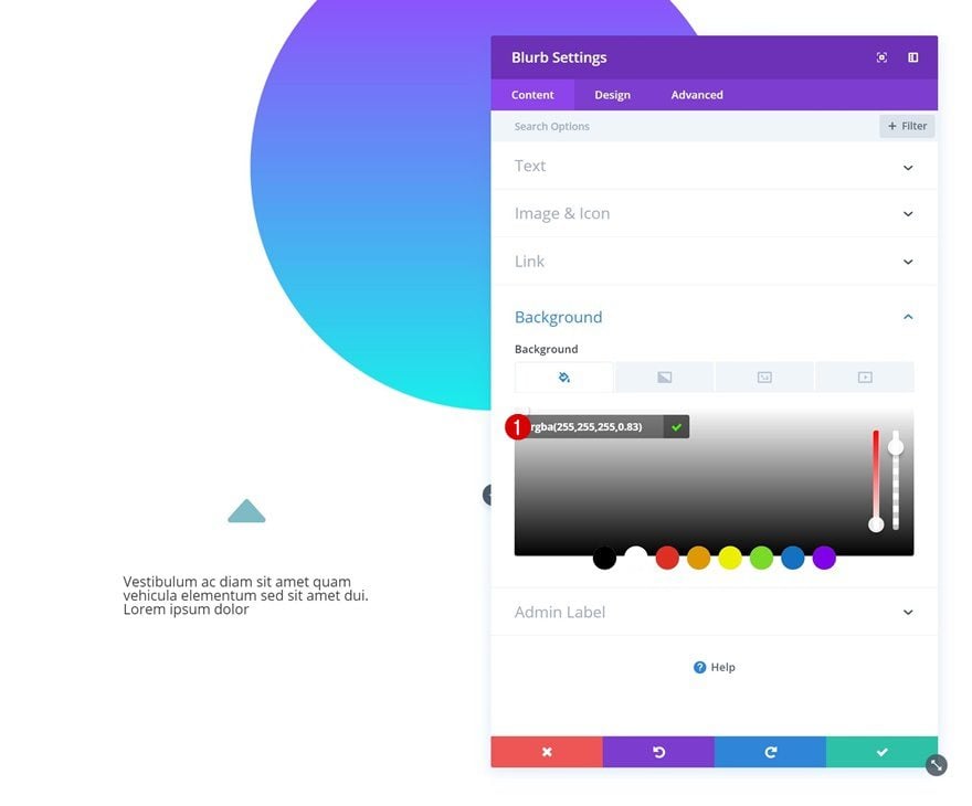
Background Color
And add a background color to the module as well.
- Background Color: rgba(255,255,255,0.83)
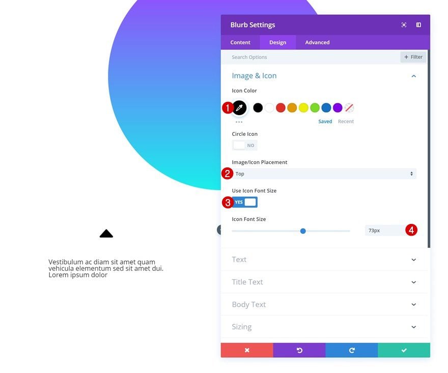
Icon Settings
Move on to the design tab and change the icon settings.
- Icon Color: #000000
- Icon Placement: Top
- Use Icon Font Size: Yes
- Icon Font Size: 73px
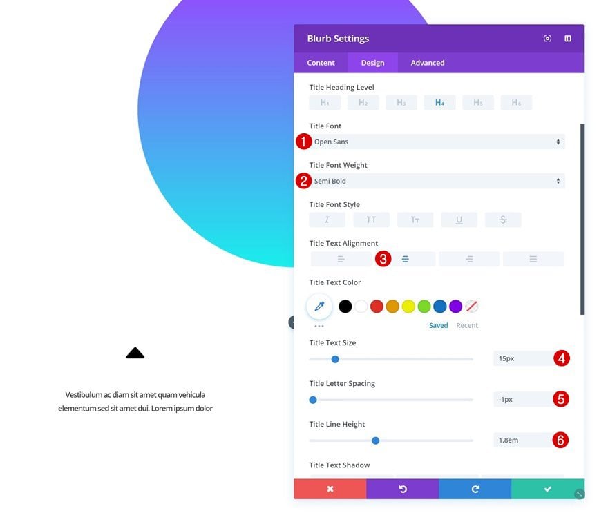
Title Text Settings
Modify the title text settings as well.
- Title Font: Open Sans
- Title Font Weight: Semi Bold
- Title Text Alignment: Center
- Title Text Size: 15px
- Title Letter Spacing: -1px
- Title Line Height: 1.8em
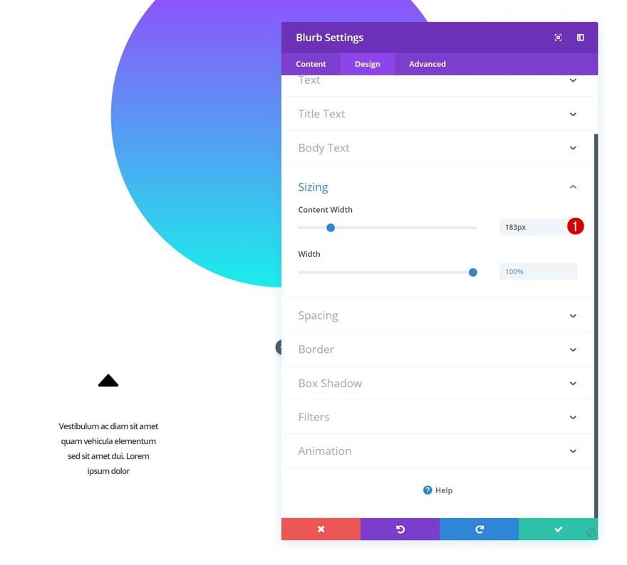
Sizing
And decrease the content width in the sizing settings.
- Content Width: 183px
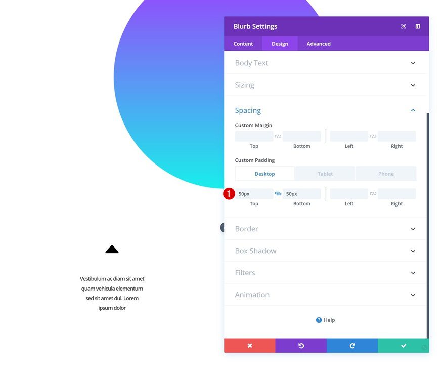
Spacing
We’ll add some custom top and bottom padding too.
- Top Padding: 50px
- Bottom Padding: 50px
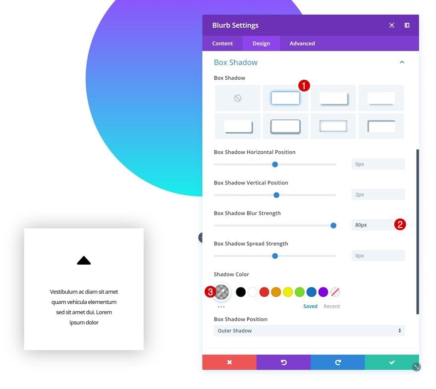
Box Shadow
Continue by giving the Blurb Module a subtle box shadow.
- Box Shadow Blur Strength: 80px
- Shadow Color: rgba(0,0,0,0.3)
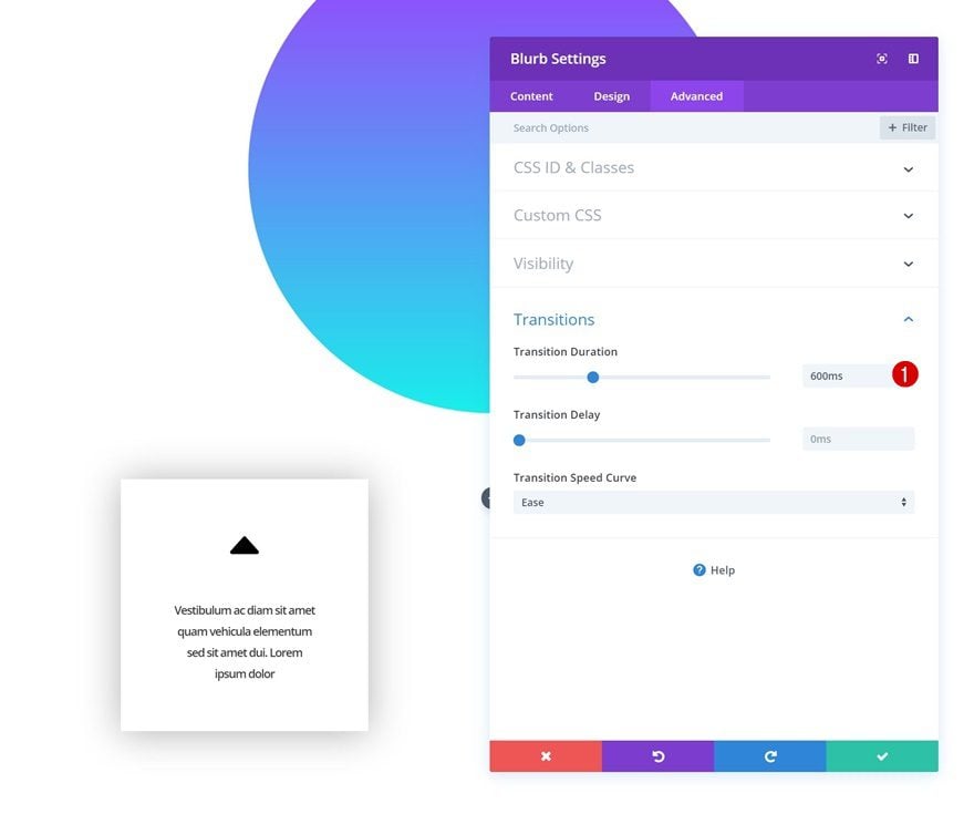
Transitions
And increase the transition duration in the advanced tab.
- Transition Duration: 600ms
Clone Blurb Module 8 Times & Place 3 Duplicates in Each Remaining Column
Now, once you’re done modifying the first Blurb Module, you can go ahead and clone it 8 times. Place three duplicates in the second column and three in the third. In the next part of this tutorial, we’ll make unique changes to each one of the Blurb Modules. To do that, we’ll follow the numbering below:
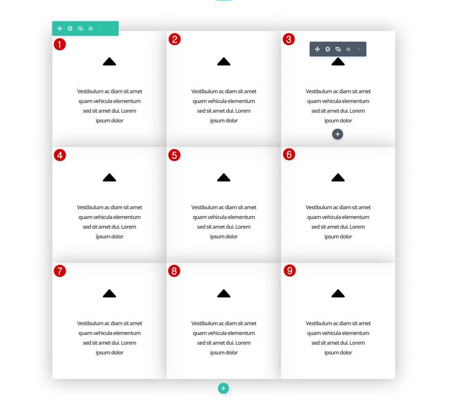
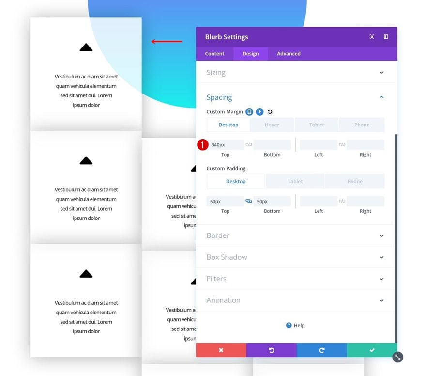
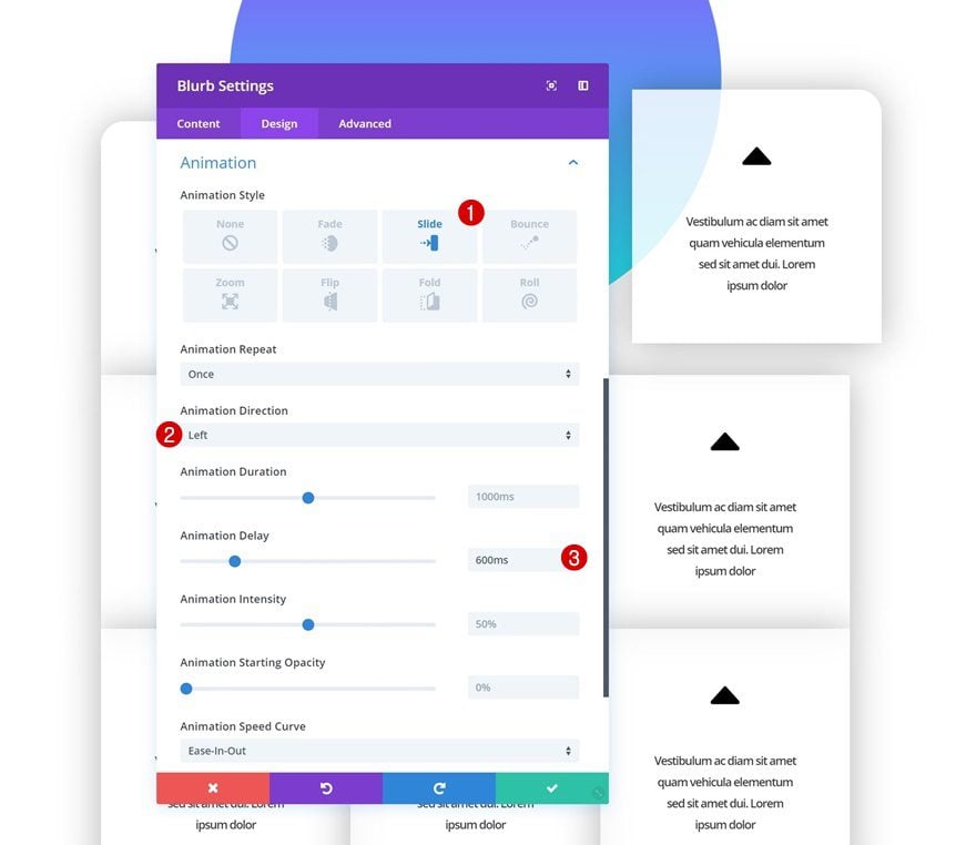
Modify Blurb Module #1
Spacing
Open the first Blurb Module and add some negative top margin.
- Top Margin: -340px (Desktop), 0px (Tablet & Phone)
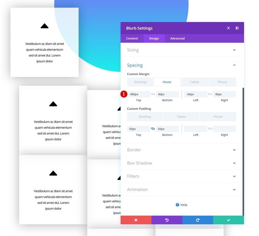
Hover Spacing
Change the margin values on hover.
- Top Margin: -380px
- Bottom Margin: 40px
- Left Margin: -40px
- Right Margin: 40px
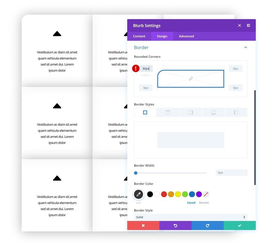
Rounded Corners
Continue by adding ’30px’ to the top left corner of the module.
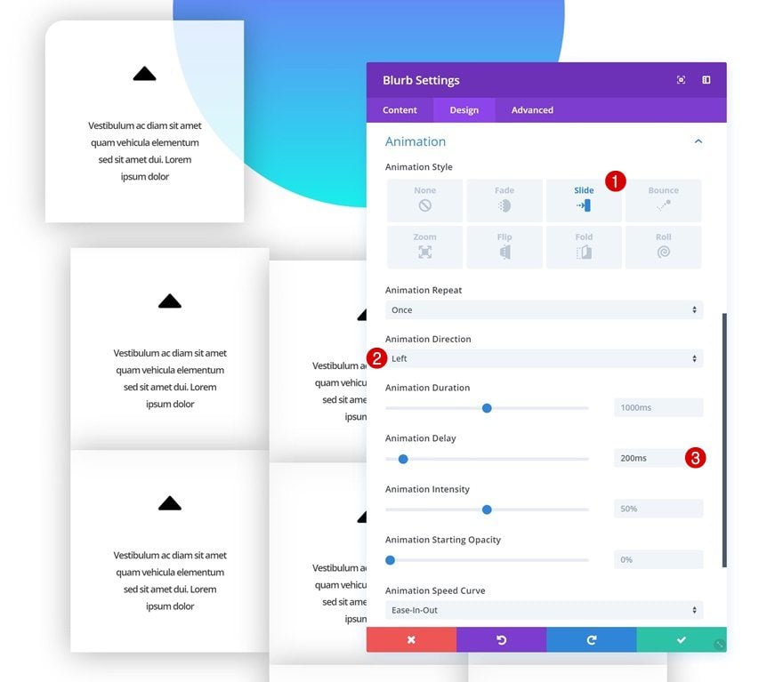
Animation
And add an animation.
- Animation Style: Slide
- Animation Direction: Left
- Animation Delay: 200ms
Modify Blurb Module #2
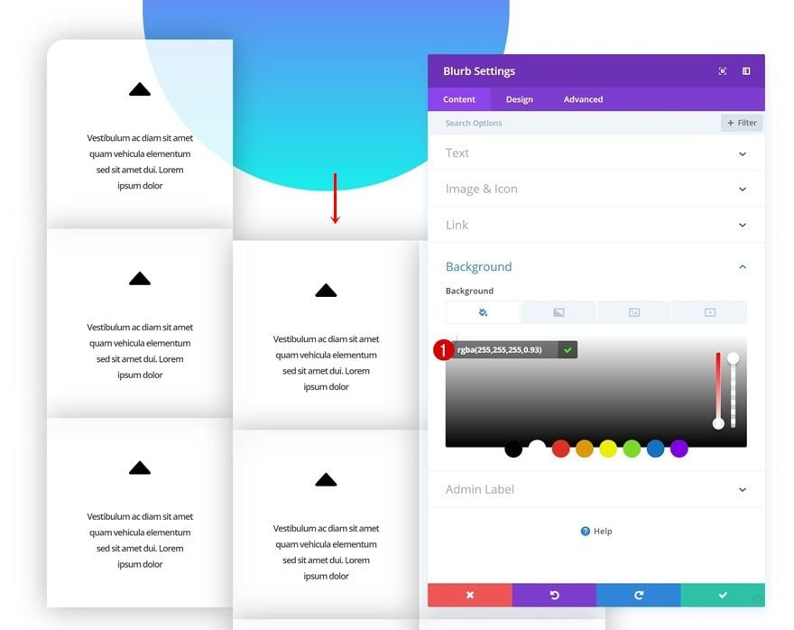
Background Color
Open the second Blurb Module and change the background color.
- Background Color: rgba(255,255,255,0.93)
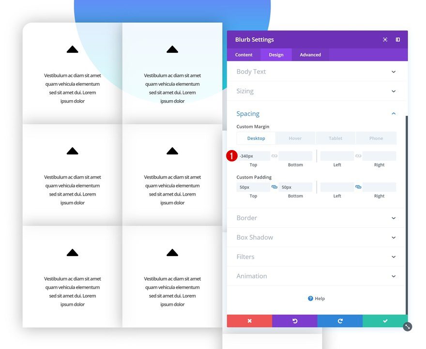
Spacing
Continue by adding some negative top margin to the module.
- Top Margin: -340px (Desktop), 0px (Tablet & Phone)
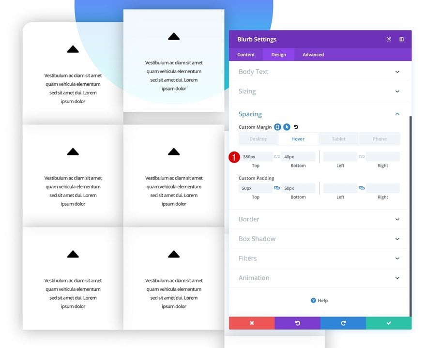
Hover Spacing
Change these margin values on hover.
- Top Margin: -380px
- Bottom Margin: 40px
Animation
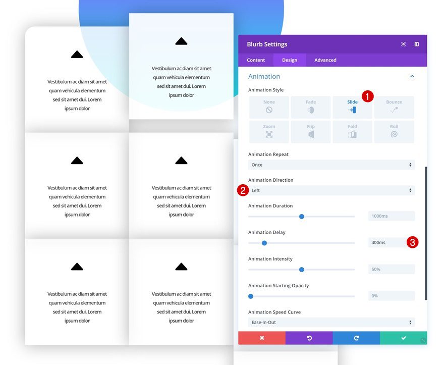
And add an animation to the module.
- Animation Style: Slide
- Animation Direction: Left
- Animation Delay: 400ms
Modify Blurb Module #3
Spacing
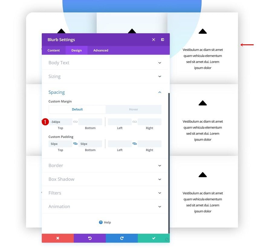
On to the third Blurb Module. Add some negative top margin.
- Top Margin: -340px (Desktop), 0px (Tablet & Phone)
Hover Spacing
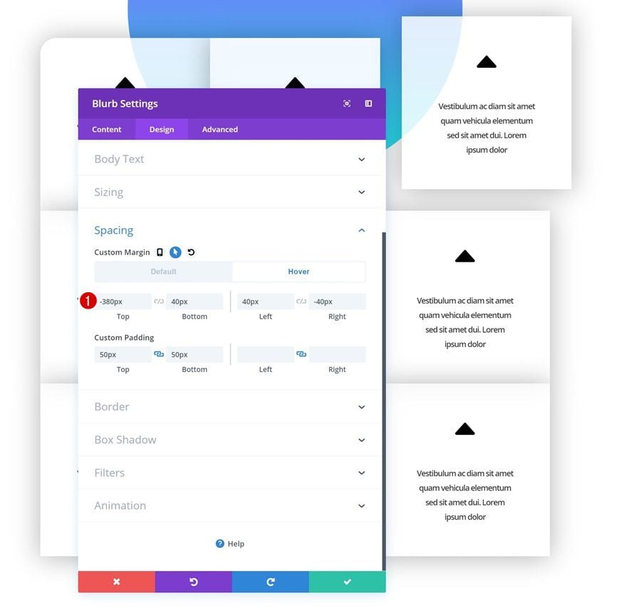
Modify the margin values on hover.
- Top Margin: -380px
- Bottom Margin: 40px
- Left Margin: 40px
- Right Margin: -40px
Rounded Corners
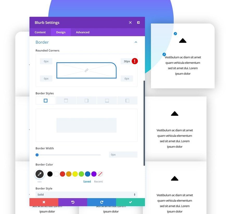
Add ’30px’ to the top right corner of the module as well.
Animation
And add an animation.
- Animation Style: Slide
- Animation Direction: Left
- Animation Delay: 600ms
Modify Blurb Module #4
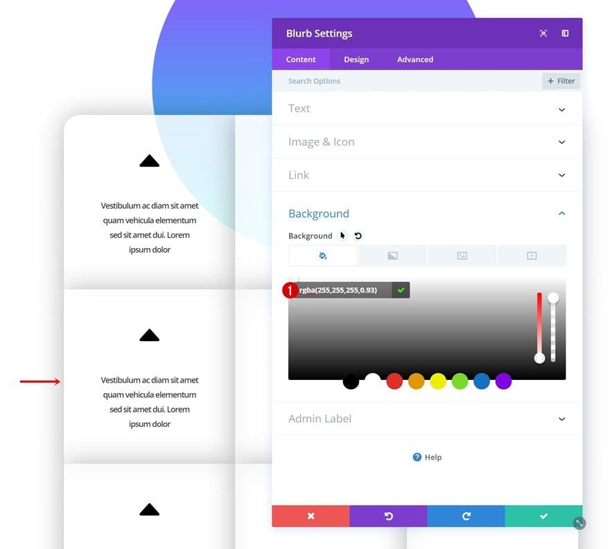
Background Color
On to the fourth module. Open the settings and change the background color.
- Background Color: rgba(255,255,255,0.93)
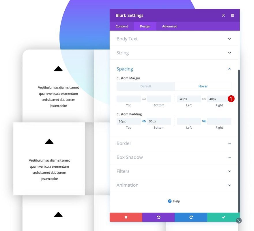
Hover Spacing
Add some hover margin values next.
- Left Margin: -40px
- Right Margin: 40px
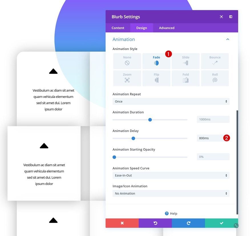
Animation
And add an animation as well.
- Animation Style: Fade
- Animation Delay: 800ms
Modify Blurb Module #5
Animation
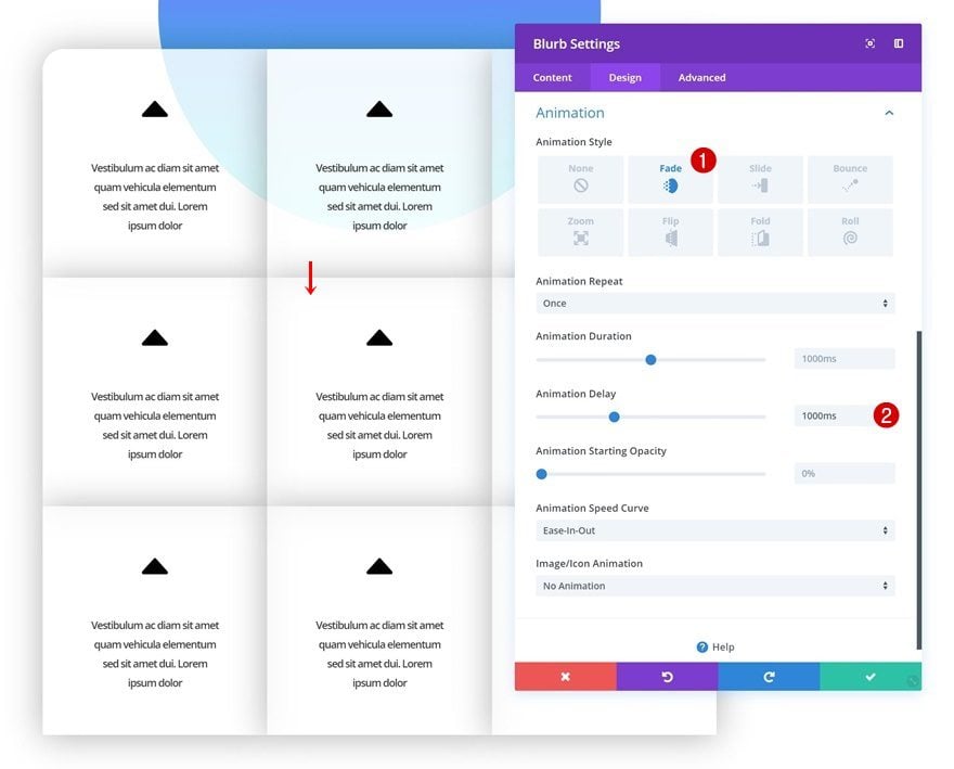
On to the fifth module. The only thing you’ll need to do here is adding an animation.
- Animation Style: Fade
- Animation Delay: 1000ms
Modify Blurb Module #6
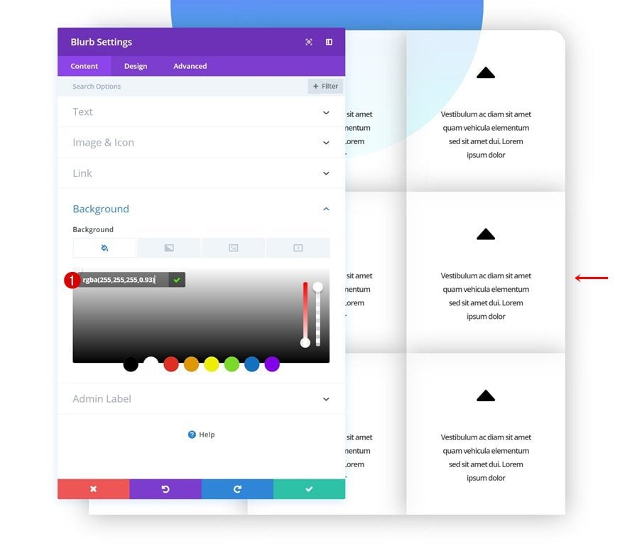
Background Color
Continue by opening the sixth module and change the background color.
- Background Color: rgba(255,255,255,0.93)
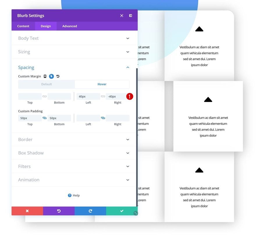
Hover Spacing
Change the spacing values on hover as well.
- Left Margin: 40px
- Right Margin: -40px
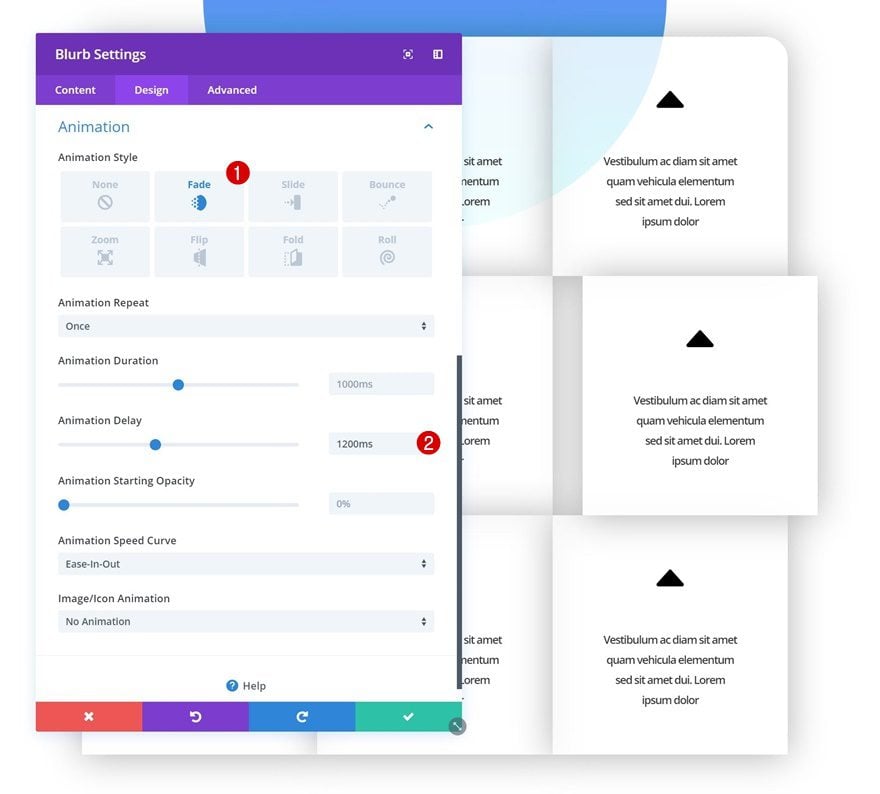
Animation
And add an animation.
- Animation Style: Fade
- Animation Delay: 1200ms
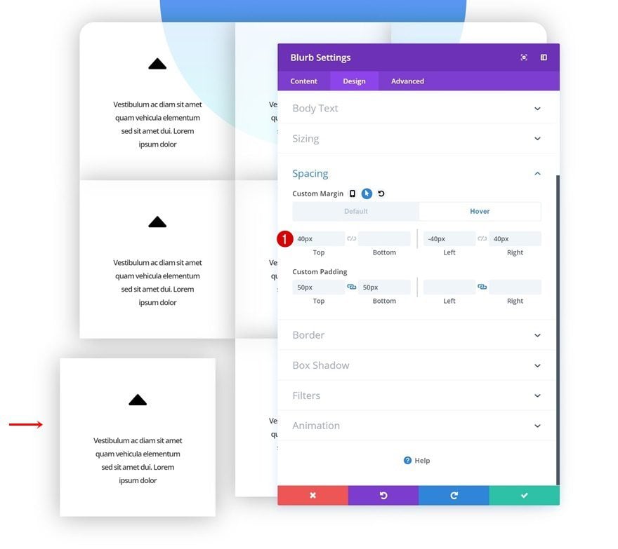
Modify Blurb Module #7
Hover Spacing
On to the seventh module. Add some hover margin values to the spacing settings.
- Top Margin: 40px
- Left Margin: -40px
- Right Margin: 40px
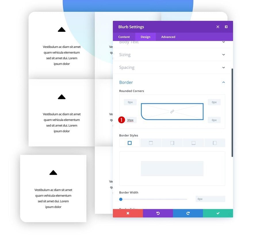
Rounded Corners
Continue by adding ’30px’ of border radius to the bottom left corner of the module.
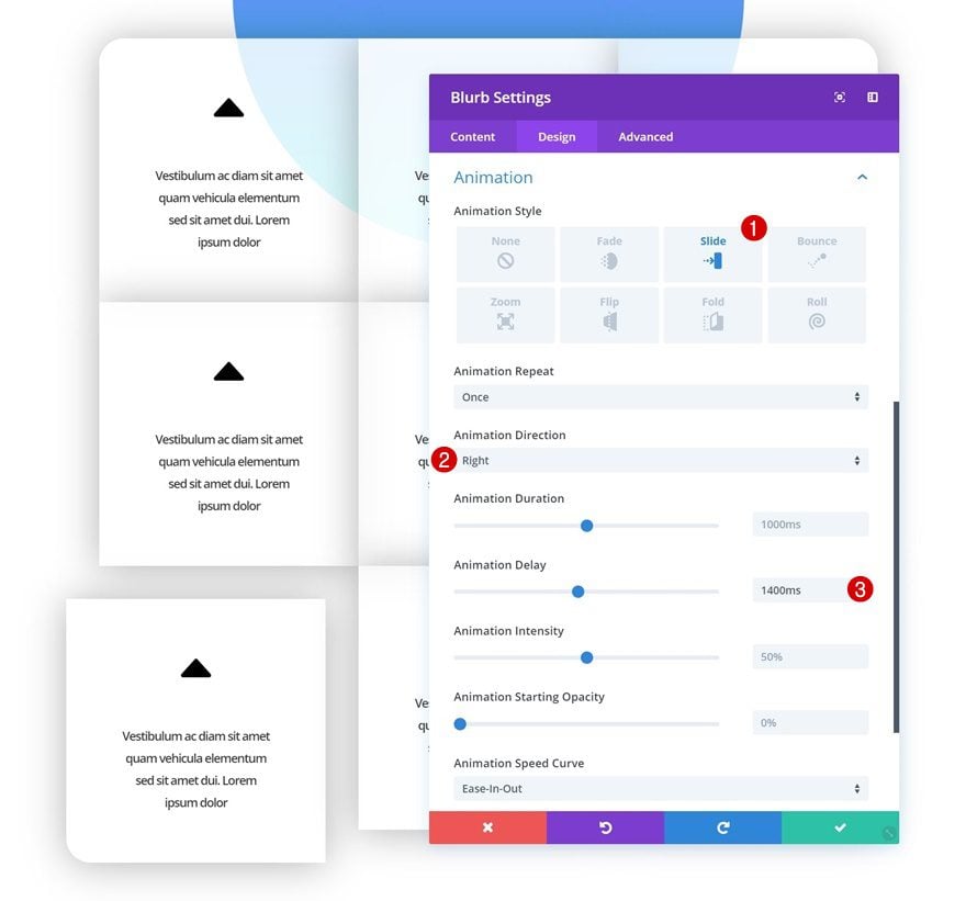
Animation
And add an animation.
- Animation Style: Slide
- Animation Direction: Right
- Animation Delay: 1400ms
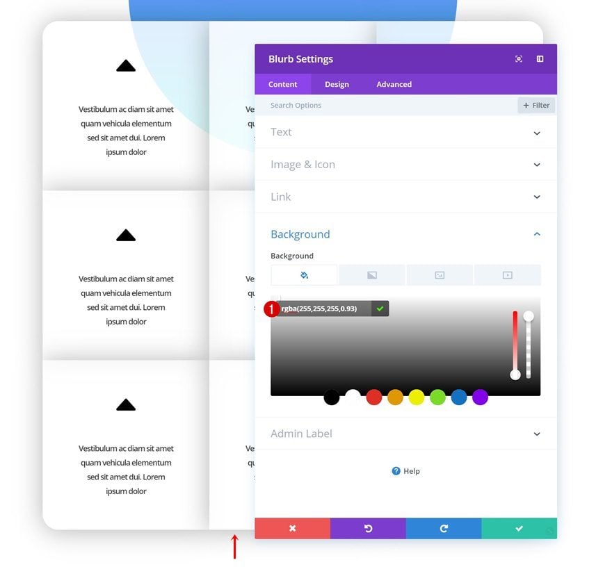
Modify Blurb Module #8
Background Color
Continue by opening the eighth module and change the background color.
- Background Color: rgba(255,255,255,0.93)
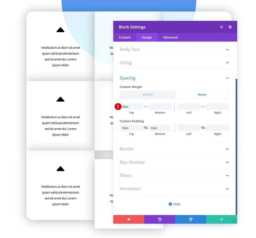
Hover Spacing
Add some custom margin on hover to the module next.
- Top Margin: 40px
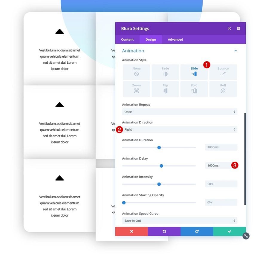
Animation
Add an animation to this Blurb Module as well.
- Animation Style: Slide
- Animation Direction: Right
- Animation Delay: 1600ms
Modify Blurb Module #9
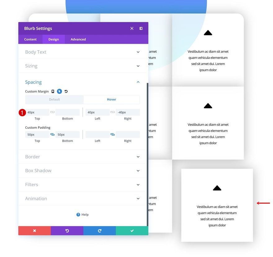
Hover Spacing
On to the ninth and last module! Go to the spacing settings and add some custom hover margin values.
- Top Margin: 40px
- Left Margin: 40px
- Right Margin: -40px
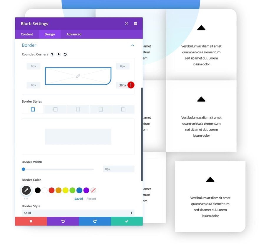
Rounded Corners
Add ’30px’ of border radius to the bottom right corner as well.
Animation
And add an animation.
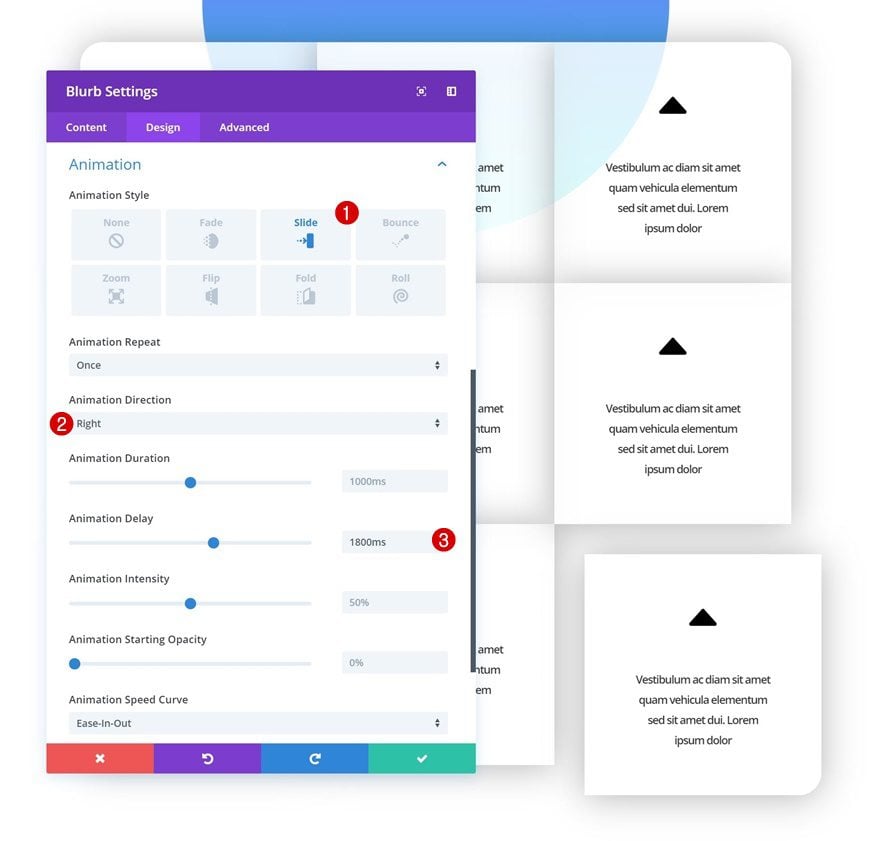
- Animation Style: Slide
- Animation Direction: Right
- Animation Delay: 1800ms
Add Negative Bottom Margin to Image Module in Row #1
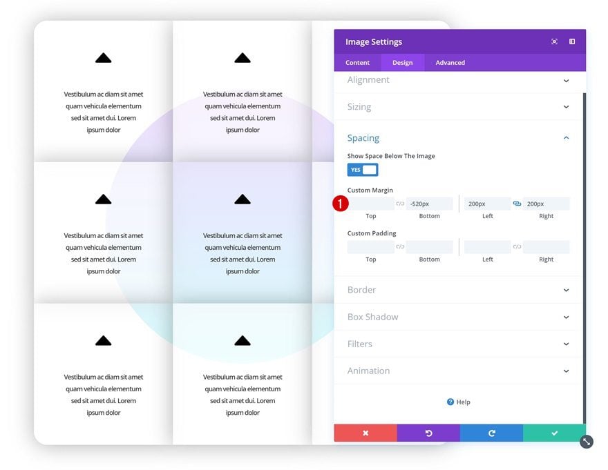
Now, to collide the circle we’ve created in the first part of this example and the grid, we’re going to give the Image Module (containing the shaped image overlay) some negative bottom margin.
- Bottom Margin: -520px
Preview
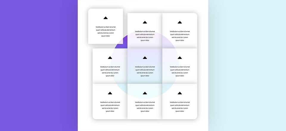
Now that we’ve gone through all the steps, let’s take a final look at the outcome we’ve achieved.
Example #1: Colliding Dividers

Example #2: Colliding Text

Example #3: Colliding Grid

Hover

Final Thoughts
Adding animations to your pages can help create more interaction between your visitors and you. Of course, you can just use the animation settings you have within the Visual Builder, but you can also take it one step further by applying colliding animations to design elements which will help you achieve stunning results. If you have any questions or suggestions, make sure you leave a comment in the comment section below!




Thank you, excellent work. Quick question, though, is it possible to get a rotation all parallax effect in Divi?
Sorry, wrong blog post
You often build design elements like this one for a desktop experience. Given that more and more content is consumed and therefor be aimed for mobile devices, could you build future design elemets with the mobile experience as primary focus? IMHO its simpler to build from a mobile experience towards a desktop experience then the other way around. What are your thoughts on this?
Thanks for sharing this informative blog with us.
Very nice! very good job 🙂 thx a lot :)))
can you put a link to drive, dropbox…?
mailto me I have done a json, I cant publish here the link. I have it in Dropbox
Hey Jörg, maybe you can send me a link to the messenger?
m.me/A.Bauer74
Thank you
this is great
Most users come to the site from a mobile device, most of the designs you make, look better on the computer and not on a mobile device and you do not refer to it here.
Is it possible to show how in mobile it will looks like?
And on a more general note – give mobile phone Reference to the training and bonuses you create, thank you.
PS – I would be happy to file json of this lesson
Regards
Sharon
hmm, I cant write a new post, dont know why, I have made a json, how can I send it to the users here?
can you put a link to drive, dropbox…?
Nice!
But can you give json all this block!=)
That would be great!
yes 🙂
+1
Thanks for your effort. Keep up the good work ??