It is always fun to win a prize. That’s why companies market their products and services online by giving away free stuff. It could be a coupon for a free dessert with your first order, or a free e-book when you subscribe to an email list. But sometimes, even freebies can get ignored on the web. Adding an elegant “winning spin” scroll effect might be a great way to give your CTA the attention it deserves while creating an engaging interaction for visitors.
In this tutorial, we are going to show you how to boost your CTAs with a “winning spin” scroll effect in Divi. As a user scrolls down the page, the winning prize spins into view to reveal the free offer in a unique way. And you can use this to promote almost any free offer you can think of.
Let’s get started.
Sneak Peek
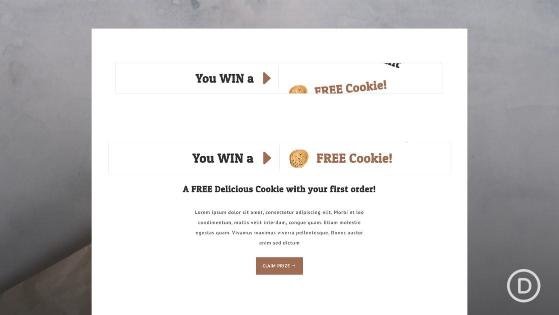
Here is a quick look at the design we’ll build in this tutorial.
Download the Layout for FREE
To lay your hands on the designs from this tutorial, you will first need to download it using the button below. To gain access to the download you will need to subscribe to our newsletter by using the form below. As a new subscriber, you will receive even more Divi goodness and a free Divi Layout pack every Monday! If you’re already on the list, simply enter your email address below and click download. You will not be “resubscribed” or receive extra emails.
To import the section layout to your Divi Library, navigate to the Divi Library.
Click the Import button.
In the portability popup, select the import tab and choose the download file from your computer.
Then click the import button.
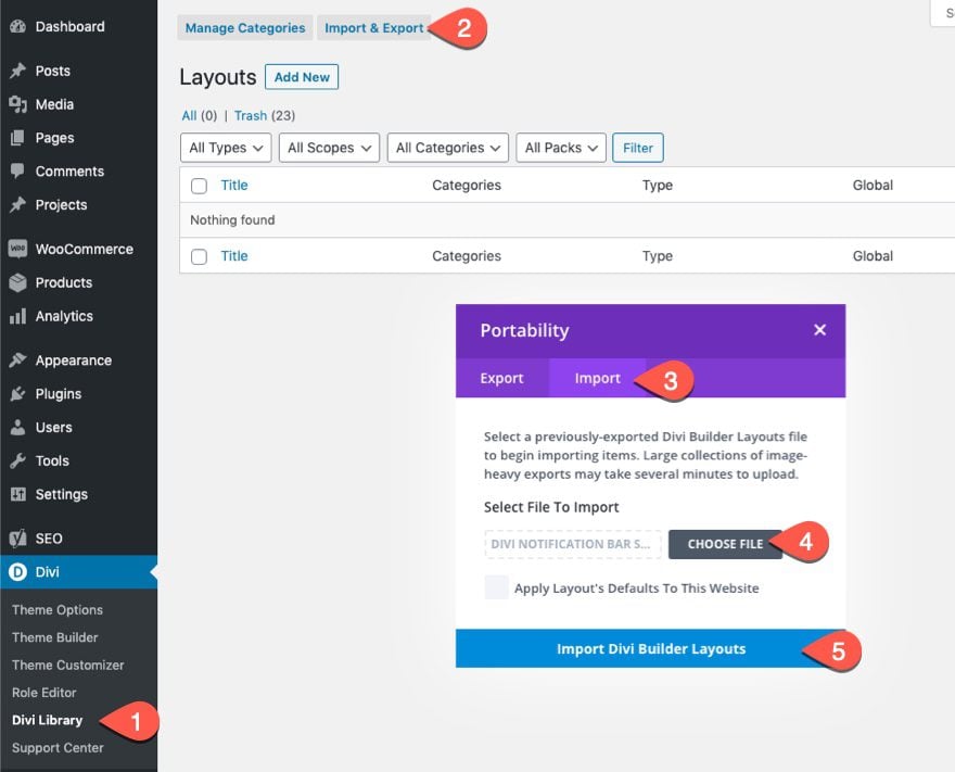
Once done, the section layout will be available in the Divi Builder.
Let’s get to the tutorial, shall we?
What You Need to Get Started
To get started, you will need to do the following:
- If you haven’t yet, install and activate the Divi Theme.
- Create a new page in WordPress and use the Divi Builder to edit the page on the front end (visual builder).
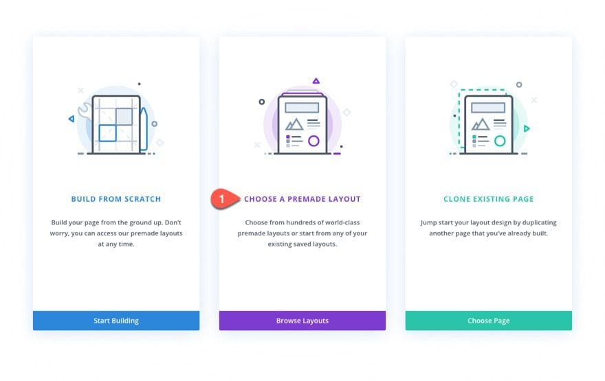
- Choose the option “Choose a Premade Layout”.
- Select the Bakery Homepage Layout and click to use the layout.
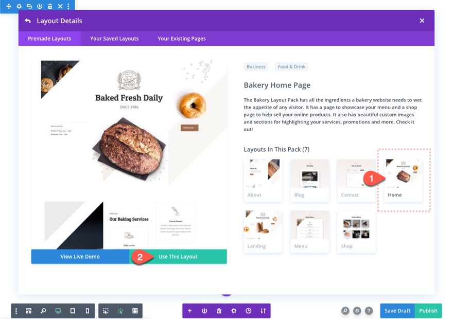
After that, you will are ready to start creating the CTA with a “winning spin” scroll effect in Divi.
Part 1: Creating the “Winning Spin” Scroll Effect
To start, deploy the layers view from the bottom settings menu within the Divi Builder. This will help keep manage our design elements better.
Add the Section, Row, and Columns
The premade layout comes with multiple sections with content already. We are going to add a new section to the page where we want the CTA to reside. For this tutorial, add a new regular section directly under the section labeled “Services”.
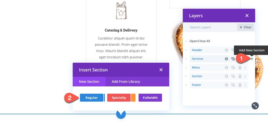
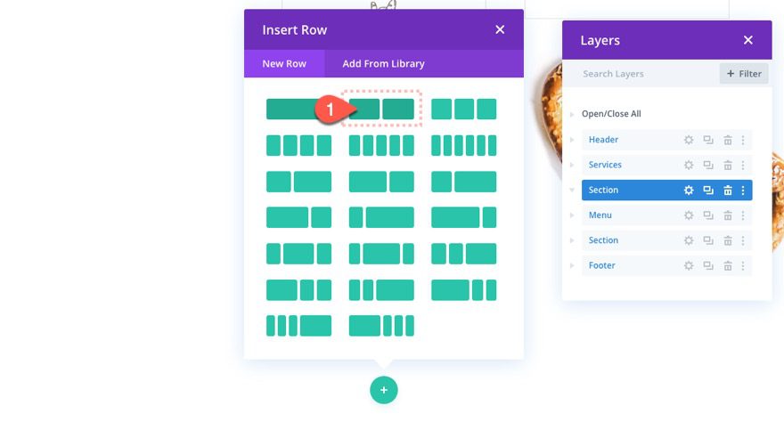
Inside the section, add a two-column row.
Row Settings
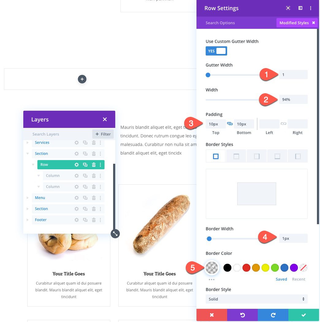
Before adding any modules, open the row settings, and update the following:
- Gutter Width: 1
- Width: 94%
- Padding: 10px top, 10px bottom
- Border Width: 1px
- Border Color: rgba(0,0,0,0.12)
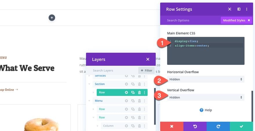
Under the advanced tab, add the following Custom CSS to the Main Element:
display:flex;
align-items: center;
Column 1 Border
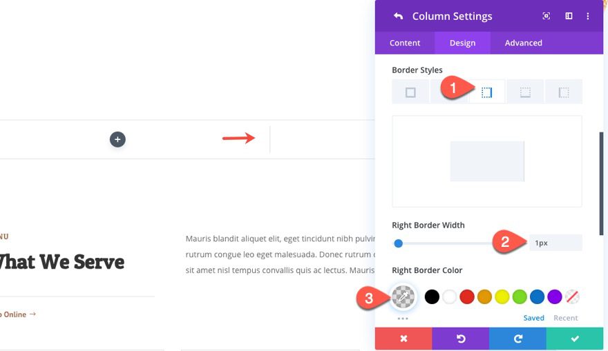
Once the Row settings are done, open the settings for column 1 and add a right border as follows:
- Right Border Width: 1px
- Right Border Color: rgba(0,0,0,0.12)
Creating the Spinner Arrow and Text using a blurb module
Next we are going to create the spinner arrow and text that will serve as the arrow that points to the winning selection.
Add Blurb Module
Add a new blurb module to the left column.
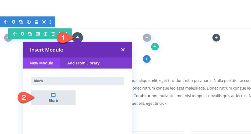
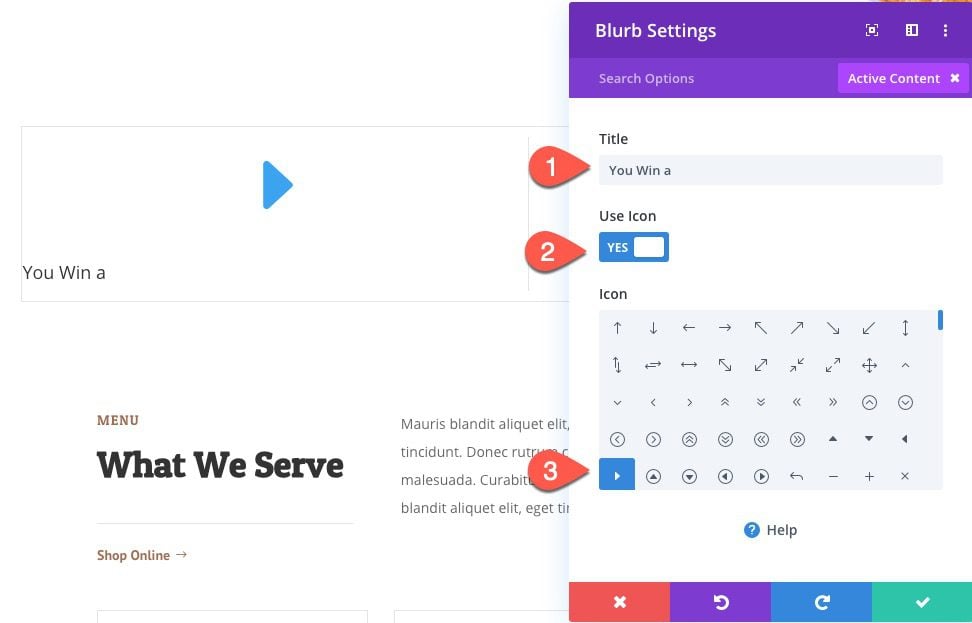
Blurb Content
Then update the blurb content with a new title and icon.
- Title: You Win a
- Icon: Right Arrow (see screenshot)
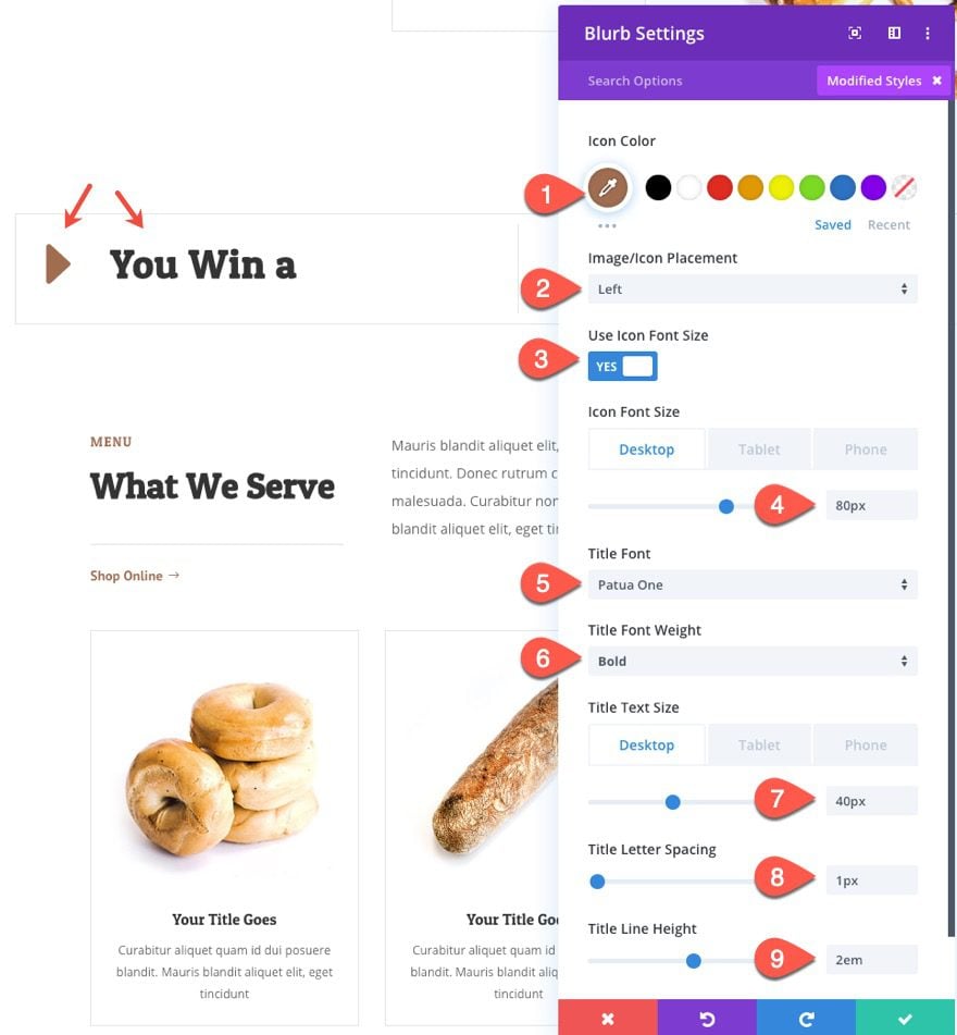
Blurb Design
Under the design tab, update the following:
- Icon Color: #a06d51
- Image/Icon Placement: Left
- Icon Font Size: 80px (desktop), 50px (tablet), 40px (phone)
- Title Font: Patua One
- Title Font Weight: Bold
- Title Text Size: 40px (desktop), 25px (tablet), 20px (phone)
- Title Letter Spacing: 1px
- Title Line Height: 2em
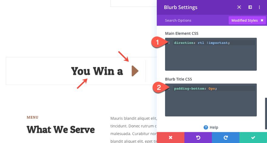
Blurb Custom CSS
Next, switch the order of the blurb content so that the arrow is on the right instead of the left by adding the following custom CSS to the main element:
direction: rtl !important;
Then take out the default padding under the blurb title by adding this custom CSS the Blurb Title:
padding-bottom: 0px
Creating the Prize Selections with Multiple Blurbs
In the right column we are going to add our prize selections that will spin and eventually settle on a winner. To do this we will create and position 4 blurb modules with a title and an image.
Creating Blurb 1
To create our first blurb in column 2, duplicate the blurb from column 1 and drag it into column 2.
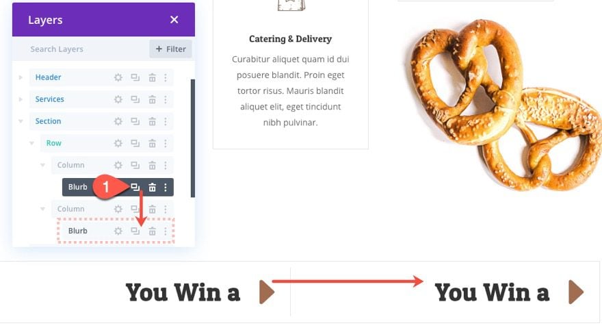
Open the settings for the duplicate blurb in column 2 and take out the custom CSS for the main element:
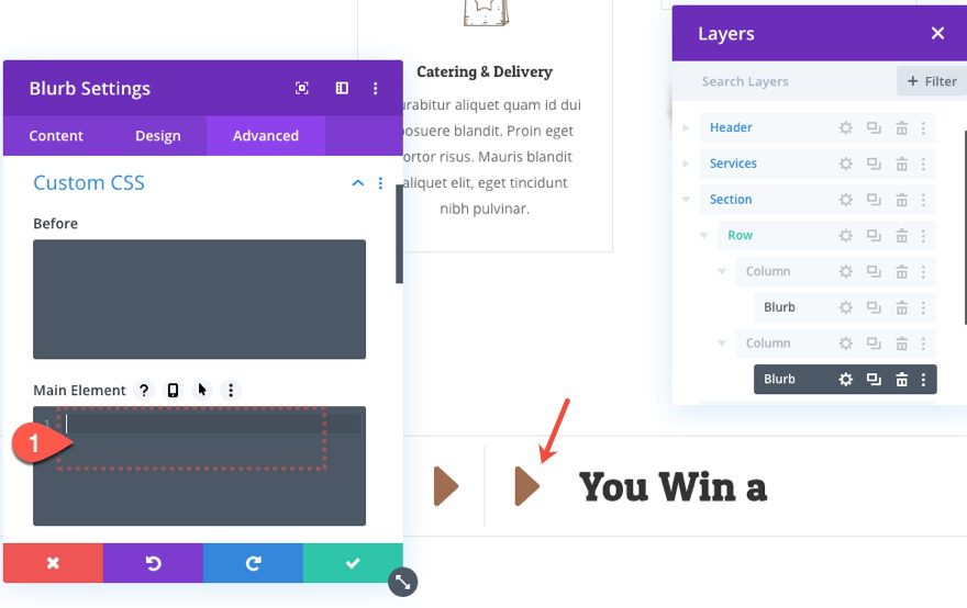
This will bring our icon back to the left.
Update Title and Image
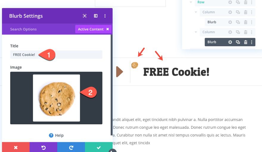
Then update the title and image as follows:
- Title: FREE Cookie!
- Image: upload image (around 100px by 100px)
Blurb 1 Design
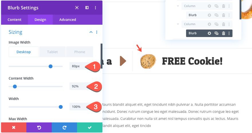
Then update the design settings as follows:
- Image Width: 80px (desktop), 50px (tablet), 40px (phone)
- Content Width: 92%
- Width: 100%
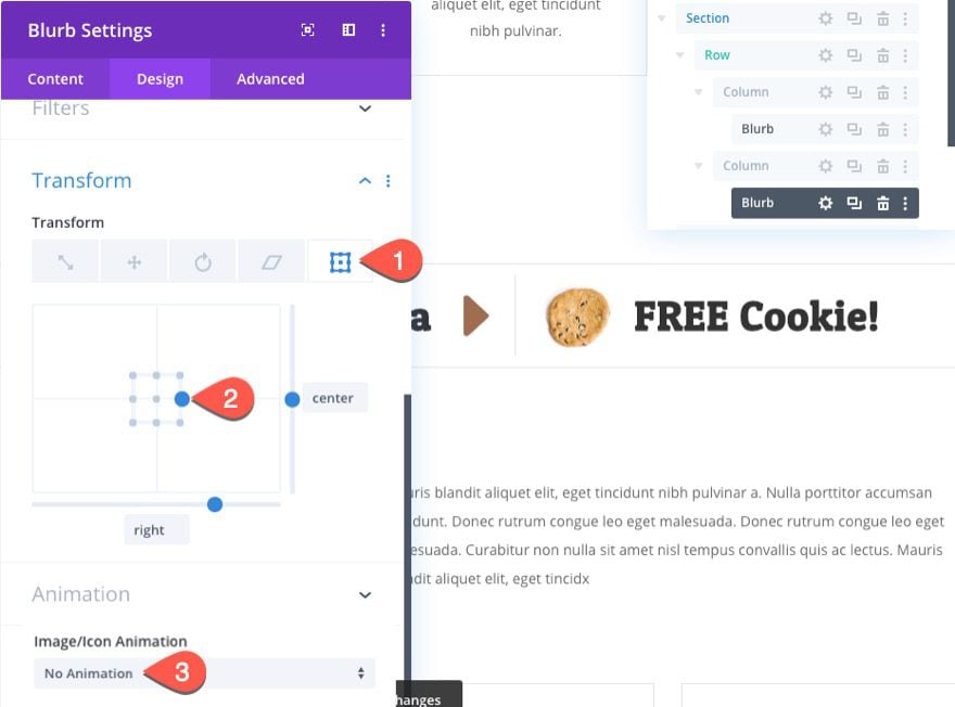
Transform Origin
We are going to be rotating the blurbs using the transform rotation option, so it is important to choose a transform-origin that makes sense for the way the blurbs should be rotated. We aren’t going to rotate the first one, but this will serve as a good template going forward.
Update the transform-origin for the blurb as follows:
- Transform Origin: right center
You should take out the image/icon animation as well.
Absolute Position
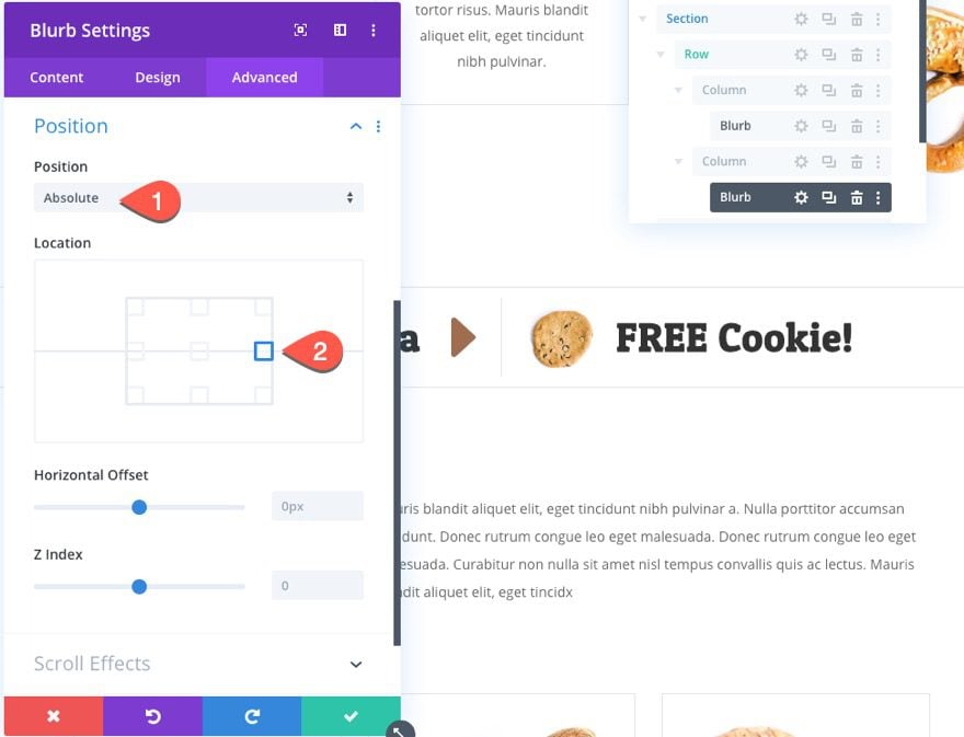
Under the advanced tab, give the blurb and absolute position as follows:
- Position: Absolute
- Location: right center
Creating Blurb 2
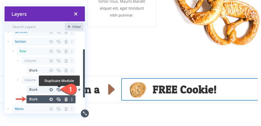
To create the second blurb, duplicate blurb 1.
Rotating Blurb 2
Then add a transform rotation as follows:
- Transform Rotation Z-Axis: 25deg
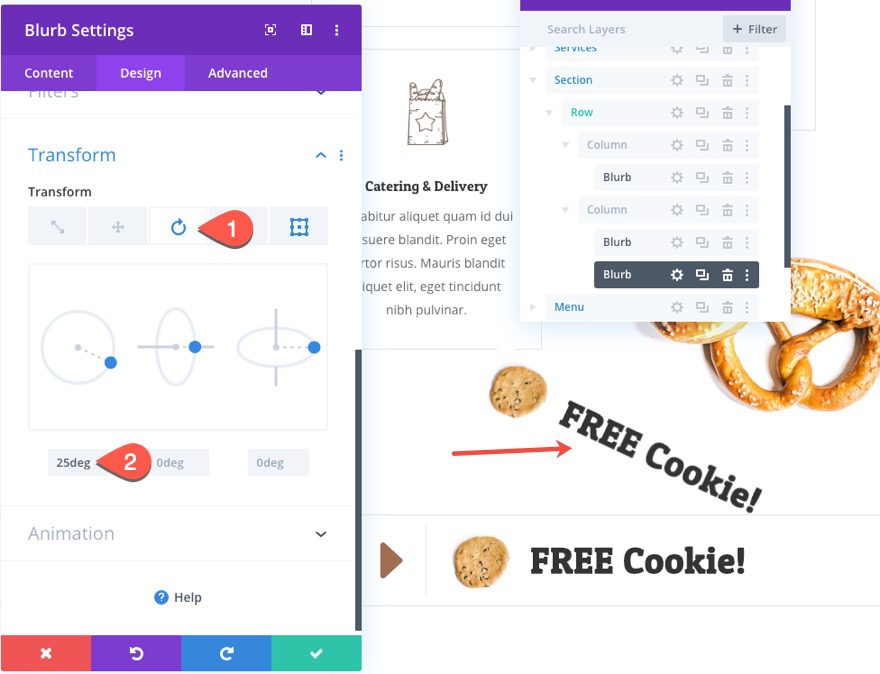
You will see that the blurb is now rotated out of the viewing area of the row.
Creating and Rotating Blurb 3
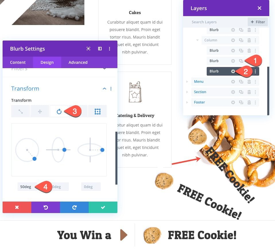
To create the third blurb, duplicate blurb 2. Then update the transform rotation as follows:
- Transform Rotation Z-Axis: 50deg
Creating and Rotating Blurb 4
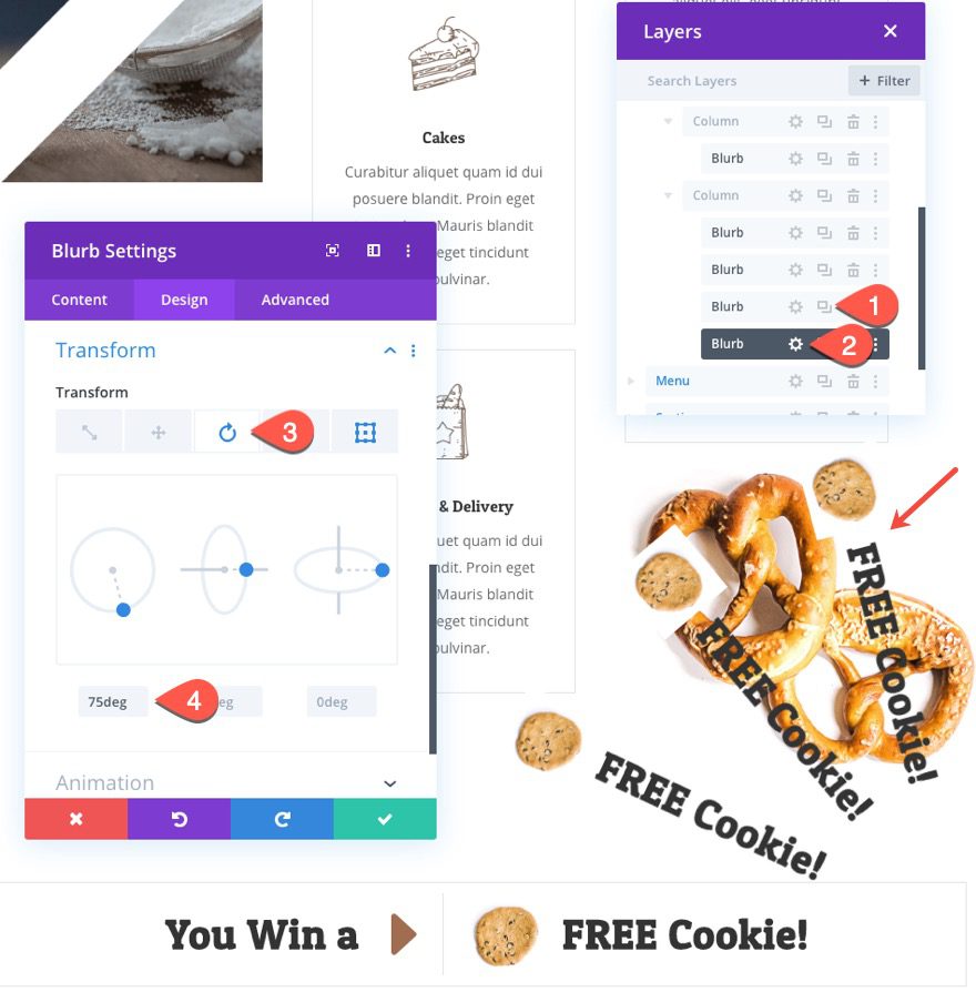
To create the fourth blurb, duplicate blurb 3. Then update the transform rotation as follows:
- Transform Rotation Z-Axis: 75deg
Update Blurb Title and Images
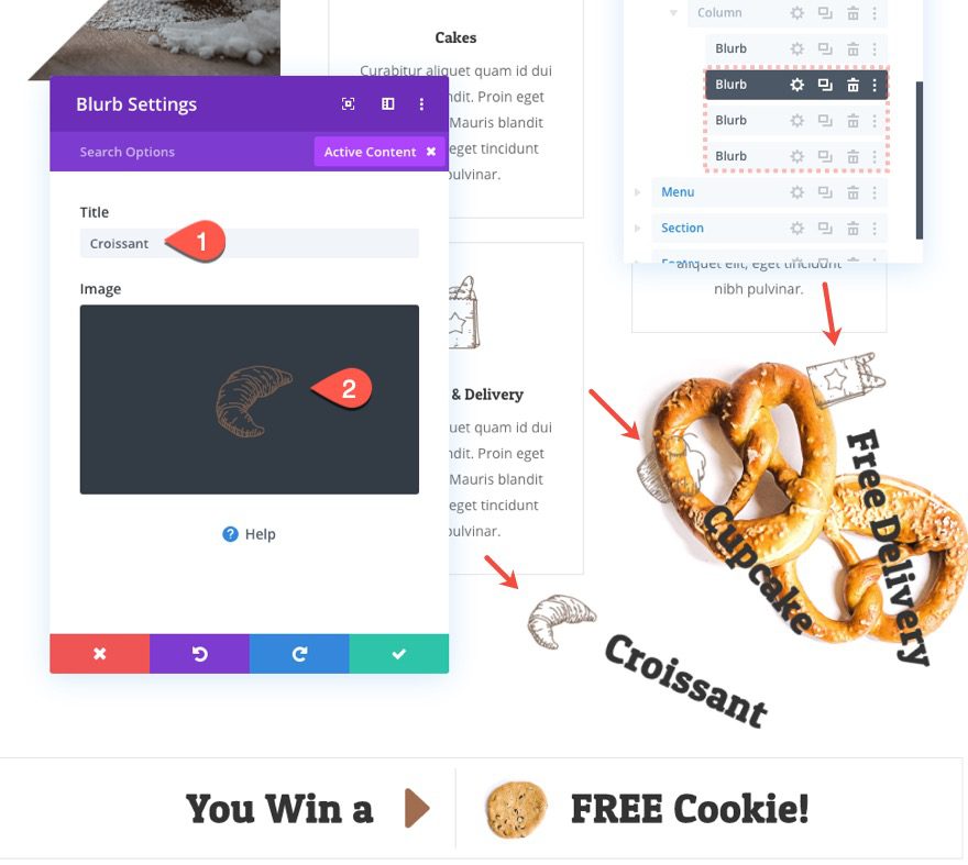
Once you are done adding the 4 blurbs, go back and update the title and image for each as needed.
Column Scroll Rotation
To add the scroll effect, we are going to rotate the entire column that holds the 4 rotated blurbs.
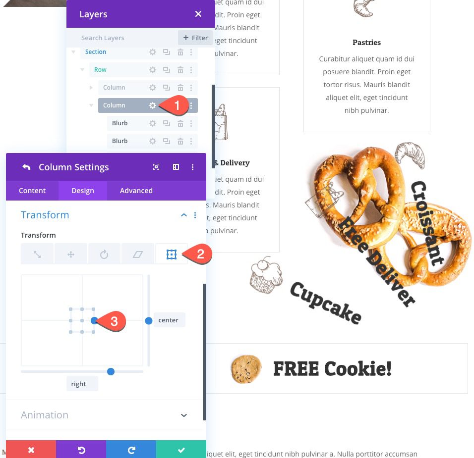
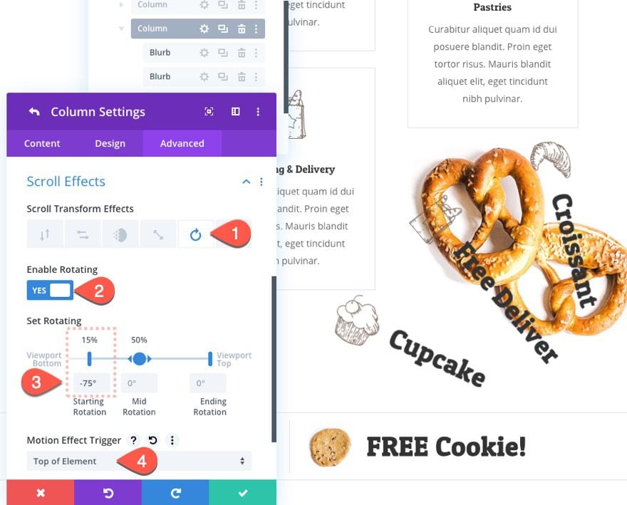
Open the settings for column 2 and update the following:
- Transform Origin: right center
Under the advanced tab, open the rotating scroll effect tab and update the following:
- Enable Rotating: YES
- Starting Rotation: -75% (at 15%)
Then update the motion effect trigger to “Top of Element”.
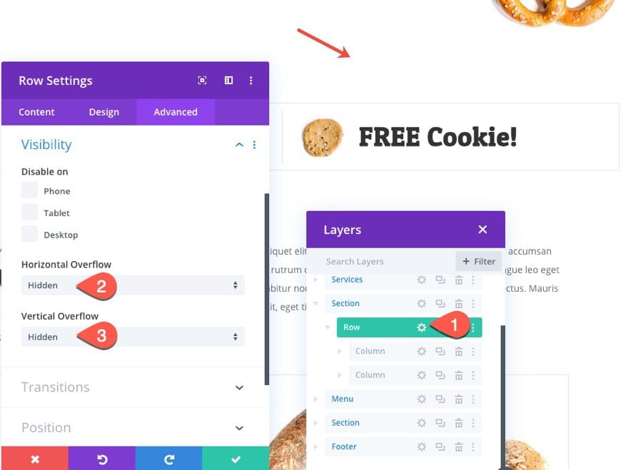
Now go back to the row settings and hide the overflow of the content by updating the following row setting:
- Horizontal Overflow: Hidden
- Vertical Overflow: Hidden
Part 2: Creating the Prize CTA
For this last part of the tutorial, we are going to create a CTA that will show information on the prize and a button. And, we are going to add a scroll effect to show the CTA after the “winning spin” animation is complete. This will mimic a surprize type of effect.
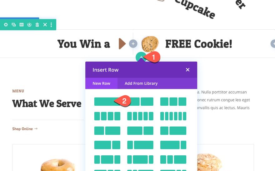
Add the Row
To start, add a one-column row directly under the row we just created.
Add Text Module
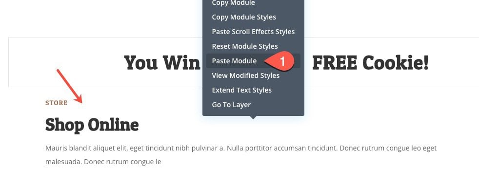
To add the content of our CTA, we are going to copy a text module from the premade layout on the page. Find and copy the text module with the title “Shop Online”.
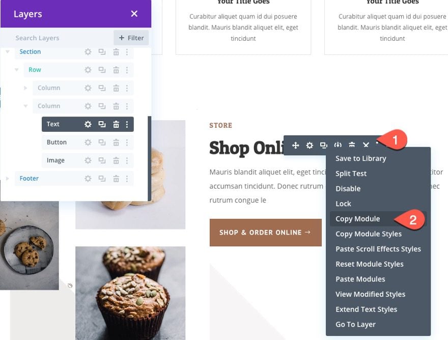
Then paste it into the row you just created.
Text Design
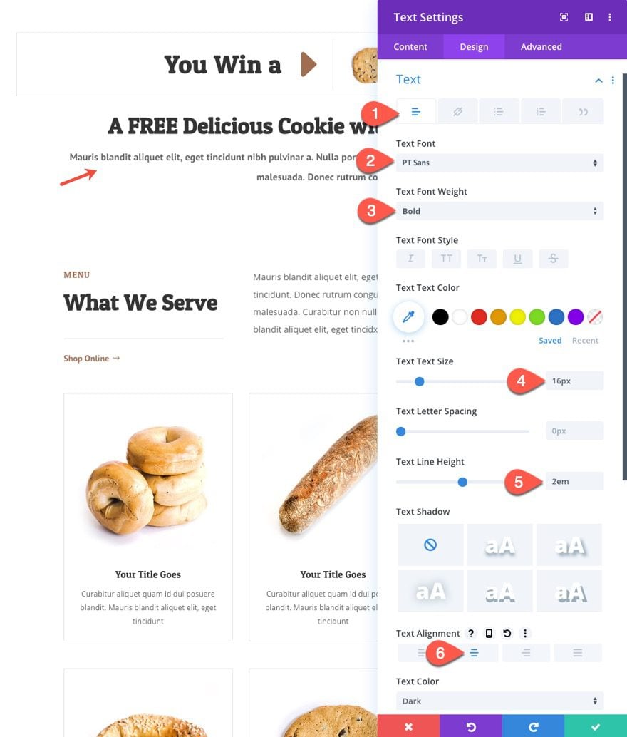
Update the text design as follows:
- Text Font: PT Sans
- Text Font Weight: Bold
- Text Text Size: 16px
- Text Line Height: 2em
- Text Alignment: Center
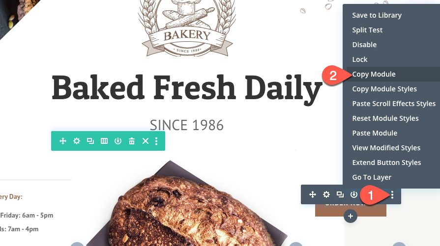
Next find the button at the top of the premade layout and copy it.
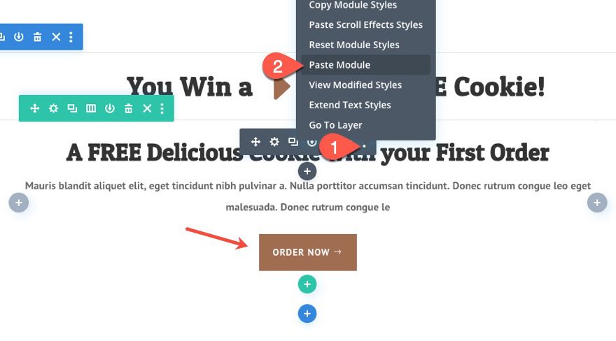
Then paste it directly under the text module.
Row Scroll Effect
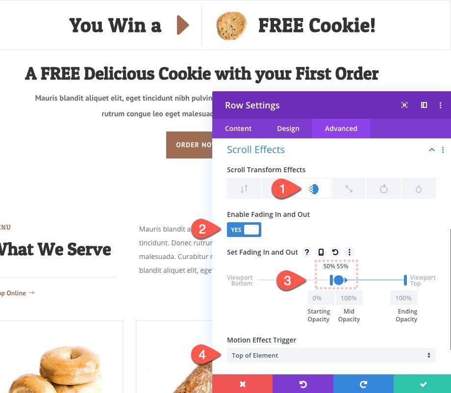
To show the CTA after the “winning spin” selects the prize, open the row settings and update the following Scroll effect:
Under the Fading in and Out tab…
- Enable Fading In and Out: YES
- Starting Opacity: 0% (at 50%)
- Mid Opacity: 100% (at 55%)
Final Result
Final Thoughts
Hopefully, this “winning spin” scroll effect gives you some fresh ideas for how to design a more engaging CTA on your own site. Building it takes a bit of finesse using Divi’s transform options and scroll effects. But once complete, the layout is really easy to update with your own unique content.
I look forward to hearing from you in the comments.
Cheers!



Please always add a live demo to the articles.
+1
How many commentators have actually done and succed this tutorial?
Am I the only one to have tried? Am I the only one to have failed?
Sorry, but this is not clear enough for a brand-new beginner.
It’s great to write a long post, it allows you to publish content. This editorial content is unfortunately useless, because it is orphaned: It lacks the video to know HOW to make certain popups appear, HOW to select certain options, etc…
To make it simple, I’m stuck at the beginning, and I don’t know how to the popup with the “Gutter Width: 1” option appear.
A video is as useful as having an eye over your shoulders. Without a video, a beginner is blind and can’t pass all the first steps.
Olivier,
I appreciate the feedback. I can see where those screenshots can be confusing. I’ll keep that in mind going forward. In the meantime, you can utilize the search bar in the popup to find any of the options in the screenshot. For example, open the row settings and start typing “gutter” and you will see the option appear. Hope that helps.
Thank you Jason,
Sorry, how am I stupid?
When I type “gutter” in the “search option” field, this warning -appears “nothing here” (or something like that, because I use Divi on a French website).
Divi is certainly a powerful tool.
But, its mastery is far too complicated for a beginner.
Please, post a video, because without a video, no beginner will ever be able to basically use Divi.
There will be a video for this tutorial. They are published after the written blog post. In the meantime, you can take advantage of our documentation videos or check out our video tutorials on our youtube channel.
https://www.elegantthemes.com/documentation/divi/
https://www.youtube.com/elegantthemes
It’s cute but potentially problematic since the “prize” is always the same.
True, it wasn’t created to be complete with real “contest winning” functionality. However, you could create multiple versions/prizes with Divi split testing. That might be a great way to offer different prizes and see which one converts best. Just a thought.
Thank you! Great post 🙂
Glad you liked it, Manfred!
So eye-catching and yet subtle and fun.
Great!
My thoughts exactly. Thanks.
I love this information, faithful follower of your articles.
I’m honored, Daniel. Thanks for the support.
Thanks for the spin scroll effect and the step-by-step guide 😎
You are most welcome!
you are a genius!
Not don’t know about that, but I’m glad you like it. 🙂