Every Barber shop needs a great looking website. And with the power of Divi behind you (and those wonderful free Divi layout packs) you can easily create a website any Barber would be proud to have.
Today, I’m going to show you how to build a website for a barber shop using Divi. I’ll be starting things off with the Coffee Shop Layout pack. I’m doing this for a few reasons:
1. The layout offers a great color scheme that fits a barber shop.
2. The page layouts are consistent with what a barber shop website would need.
For example, most barber shop offer products so the shop page is a nice inclusion. And the menu layout can easily be turned into a services page to list out all the different types of haircut services being offered. And I like the idea of turning that brew guide page into a process page walking you through the “perfect” haircut experience.
- 1 Sneak Peek
- 2 What you need for this Tutorial
- 3 Determine what a Barber Shop website Needs
- 4 Create Pages with New layouts
- 5 Create Your Primary Menu
- 6 Set your default color palette
- 7 Add your global accent color
- 8 Update Typography Settings in Theme Customizer
- 9 Customize the Primary Menu Bar
- 10 Choosing an Online Appointment Scheduler for Your Barbershop Site
- 11 Optimizing the Home Page
- 12 Optimizing the Shop Page
- 13 Optimizing the Contact Page
- 14 Creating your Book Appointment Page
- 15 Final Thoughts
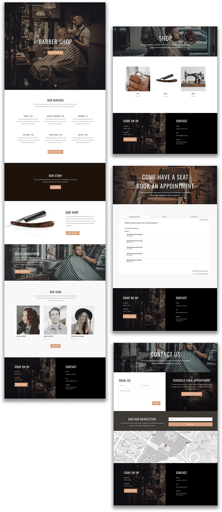
Sneak Peek
What you need for this Tutorial
- Divi Theme installed and activated.
- Coffee Shop Layout Pack Imported into your Divi Library. You can choose any layout you want really, but for the sake of this tutorial I’m going with the Coffee Shop Layout so we have a working example. I’m sure there will be a Barbershop Layout coming soon that will make things even easier 🙂 .
- Images – I will be using photos from Shutterstock and a few images taken from other layout packs. When building your own barbershop site, make sure you choose photos that are high quality with the right dimensions for the column that will be housing it (i.e. background images should be at least 1920×1080). You can also check out this ultimate guide to using images with Divi. If you are looking for a free solution for stock images, check out unsplash.com.
Determine what a Barber Shop website Needs
To build an effective website for a barber shop it should at least include the following (depending on the barbershop obviously):
- Contact Information (Including a contact form, hours of operation, address and phone number)
- Online appointment Scheduling or at least info on how to schedule an appointment.
- Prices
- Testimonials
- Staff information
- Info About the Company and History
- Online Shop or Products offered
- Great Photos (before and after shots, images of company location/building, shot of employees in action, and general photos of amazing high quality haircuts.
With this general list to guide us, we can start start customizing our layouts to include these elements and organize them effectively.
Create Pages with New layouts
For this Barber Shop site, I’m going to build out 4 pages using page layouts from the Coffee Shop Layout Pack. Here is the list of pages with the layout I’m using for each.
- Homepage – coffee shop landing
- Contact Page – coffee shop contact
- Book Appointment page – coffee shop blog
- Shop Page – coffee shop shop
At this point you will need to create your 4 pages and import the corresponding layout for each one.
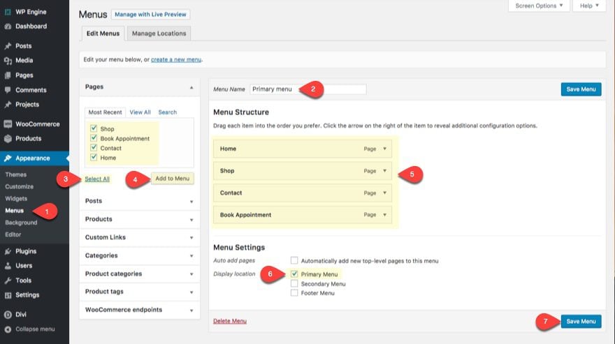
Now you will need to create a primary menu to serve as the navigation for your new site. Make sure you add your 4 pages to the menu.
Set your default color palette
Go to Divi > Theme Options and add the following colors in your default color palette:
#1d2528
#3d3a35
#dca47d
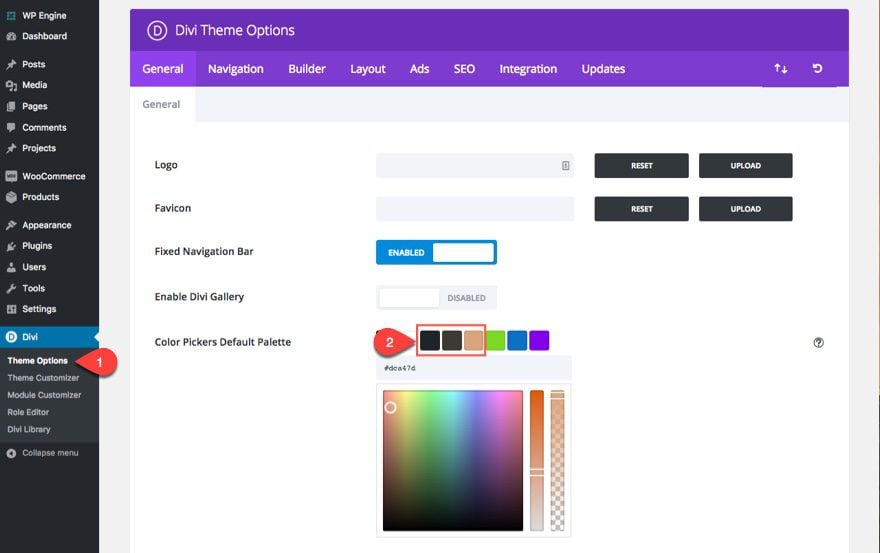
Although I want really use this much for the tutorial, you will thank me later whenever you are making more customizations to your own barber shop site, especially when you have to create new content not found in the layouts.
Add your global accent color
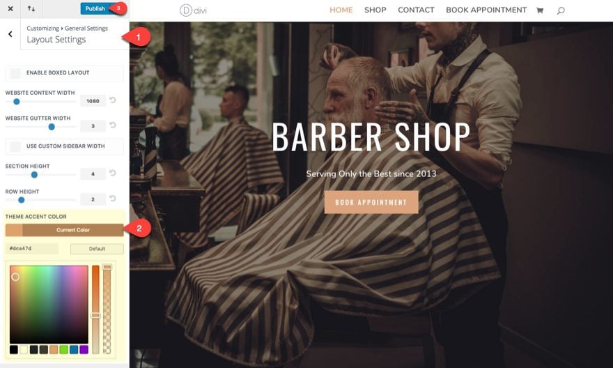
Go to Divi > Theme Customizer > General Settings > Layout Settings. Then change the global accent color to the following:
#dca47d
This color will be applied to over 20 locations throughut your theme (some places you may never see), but since this is the theme accent color of the layout we are using, it makes perfect since to add this color in order to update the default color for links and icons (at least).
Publish your theme customizer settings and refresh your page in order to see those changes take effect.
Update Typography Settings in Theme Customizer
Even though your layout will have custom typography settings at the module level, it’s important that you find out what your layout fonts are so that you can include them in your default typography settings within the theme customizer. This is necessary to match the font used throughout your Divi theme (outside your new layouts) with the font combinations used within your layouts. This will also make sure that any additional text you add when creating new modules will match the site.
Go to Divi > Theme Customizer > General Settings > Typography and update the following:
Body Text Size: 18px
Body Line Height: 1.8em
Heading Font Size: 42px;
Heading Letting spacing: 2px
Heading Line height: 1.5em
Heading Font Style: TT
Header Font: Oswald
Body Font: Nunito
Header Text Color: #333333
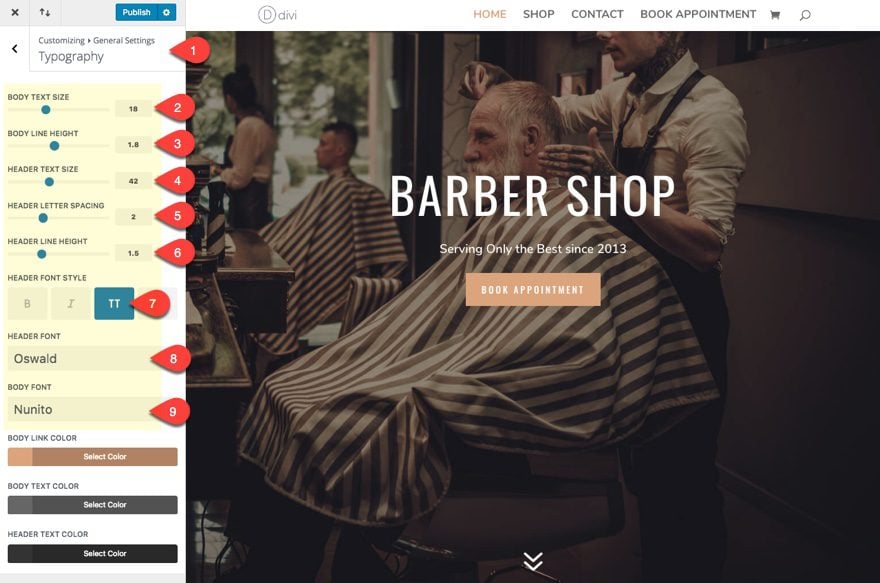
At this point, you can go ahead and make sure your primary menu bar is designed appropriately. There are many different ways we could customize the menu in a way that matches this layout, but for now I all I’m going to do is update the size of my text.
From the Theme Customizer go to Header & Navigation > Primary Menu Bar and update the following:
Text Size: 18px
Font Style: Bold (B), Uppercase (TT)
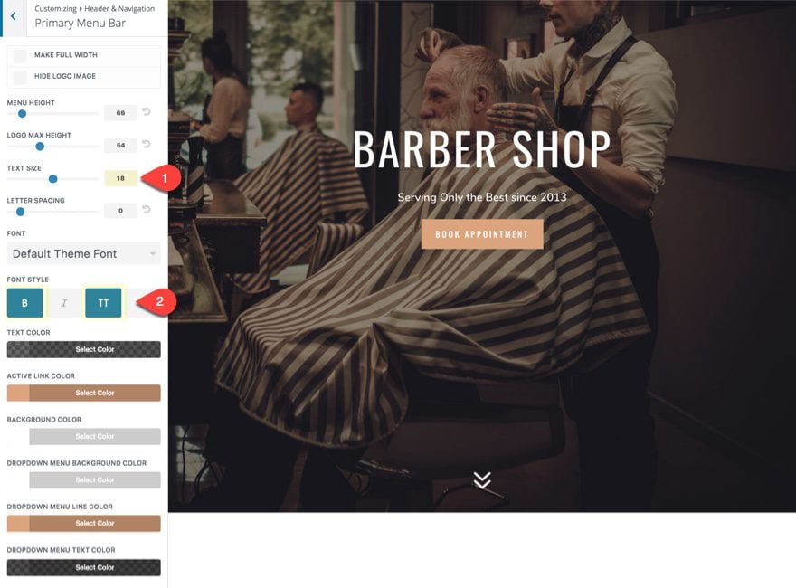
You should also notice that the default body text has been added as the font for the menu text. Also the active link color, the dropdown menu line color, and the hamburger menu icon on mobile have all automatically inherited the global accent color.
That about does it for the initial setup of your website.
If you need a reminder on how to setup your layout, check out these steps.
Choosing an Online Appointment Scheduler for Your Barbershop Site
Based on my research at the time of this post, I’m a little overwhelmed at the number of options out there ranging from free WordPress plugins to pricey SaaS companies.
The good news is that many of them seem to work well (at least the ones I’ve tried). So, if money is an issue, start trying out some of those free WordPress Plugins and work your way up until you have the functionality and design you want in an online booking service for your website.
One free options to check out would be Easy Appointments WordPress Plugin which seems to be catered toward Barbershop type appointments and has extensions to integrate personal calendars and payment gateways.
Calendly also has a free option but you will have to upgrade to unlock certain features like multiple event types and online payment. What I love about Calendly is the clean and simple UI. It is just easy to use and I can definitely see it working well for a barbershop.
Vcita is a great all-in-one solution for your business that extends beyond the realm of scheduling and will basically handle anything you throw at it (like integrating with Quickbooks). Here is a more detailed breakdown of Vcita.
AcuityScheduler is probably one of my favorites because of all the powerful scheduling features, but I must admit, there is a bit of a learning curve.
Squareup is a convenient software that has the ability to book appointments a accept payments all in one system. My barber actually uses this system and I must admit it works well (at least from a customer’s perspective). And you get to use that magstrip reader that can hookup to your ipad, giving you an easy checkout process within your physical store.
If you are committed to offering online booking capablities on your Barbershop website, my advice would be to go with one that is extremely reliable and easy to use. And if you find the perfect one for your business, the cost really shouldn’t matter at that point. Having an automated booking system that works for your business is worth way more than what you are going to pay monthly for any of the top WordPress booking plugins.
Optimizing the Home Page
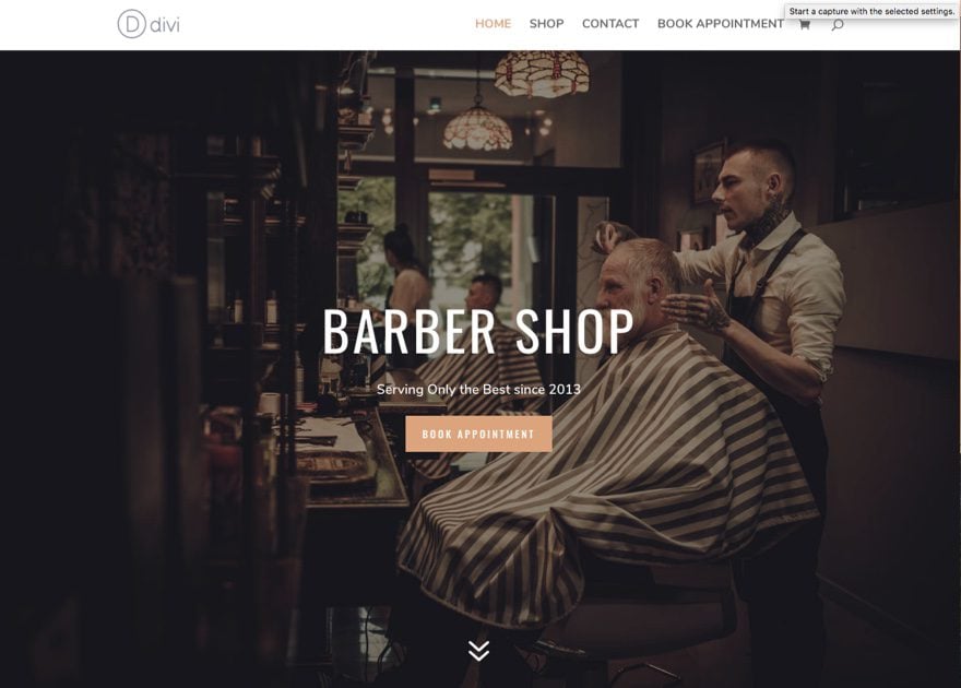
For the homepage, I definitely want to have a great looking header with a great looking background image. This sets the tone for the rest of the site. Out of the box the landing page has a great looking header. So I just need to update the image and the content to fit a barber shop.
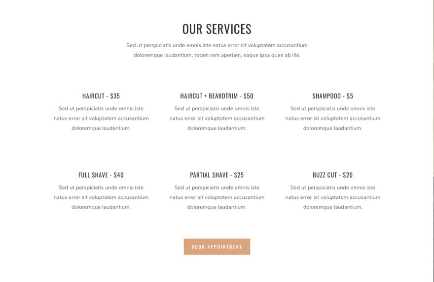
I converted the section under the header into a section that showcases the services and prices offered, along with a CTA to book an appointment.
I got rid of the video under the Our Story section and kept it simple with a short block of text. I copied and pasted a button from the above “services” section just in case I want to link to a separate about page.
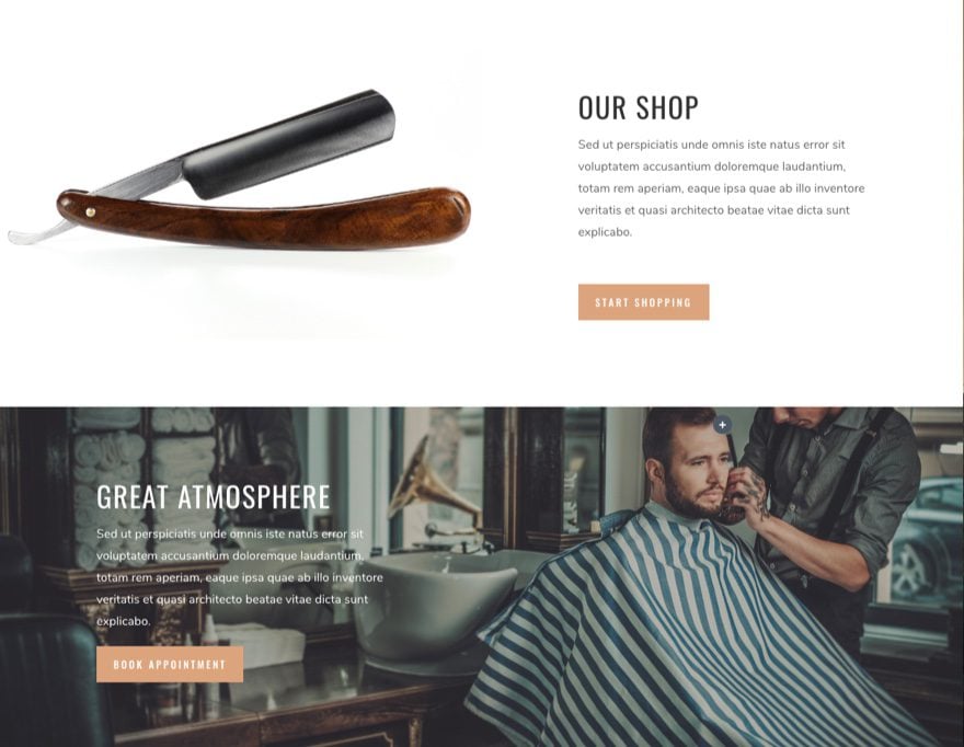
I also customized a few feature sections to promote the online store and atmosphere of the shop.
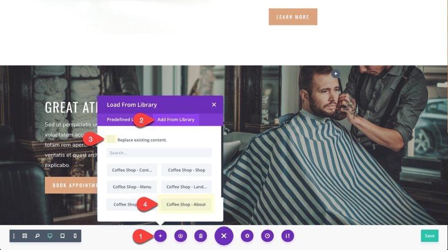
I wanted to showcase an “Our Team” section on the homepage, so I went ahead and grabbed that from the Coffee Shop About layout. To do this I actually added the coffee shop about layout to my home page and deleted all of the sections besides the one I wanted. Here’s how to do it.
Open your settings menu in the Visual Builder and select Load from Library then the Add From Library tab. Deselect the option to replace existing content (this will add the new layout to the bottom of your current layout as additional content). Then select the Coffee Shop About layout from the list.
Now all you need to do is delete everything you don’t want from the about page content imported below your homepage content (in this case, everything but the our team section). Then cut and paste (or drag) the our team section right above the footer content section.
I kept the layout of the footer contact info which I think works well on every page. The only thing I changed was the section background image.
Here is the homepage after my changes:

Optimizing the Shop Page
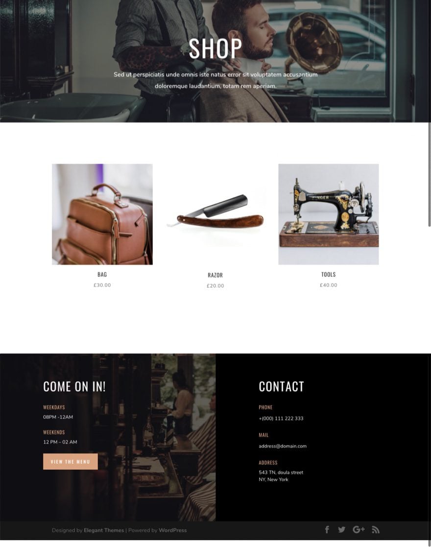
The Coffee Shop Shop layout already has the shop module ready to deploy featured products to your page. All you need to do is add new products to your WooCommerce shop. Then reload and watch them appear on your page.
Pretty simple.
You will of course need to add a new background image to you header and footer secion.
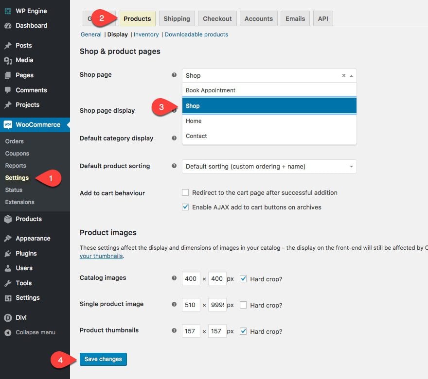
And don’t forget to select this page as your default Shop page from within WooCommerce. To do this go to WooCommerce > Settings > Products (tab) > Display and select this page from the dropdown menu next to “Shop Page”.
Here is our final shop page design:
Optimizing the Contact Page
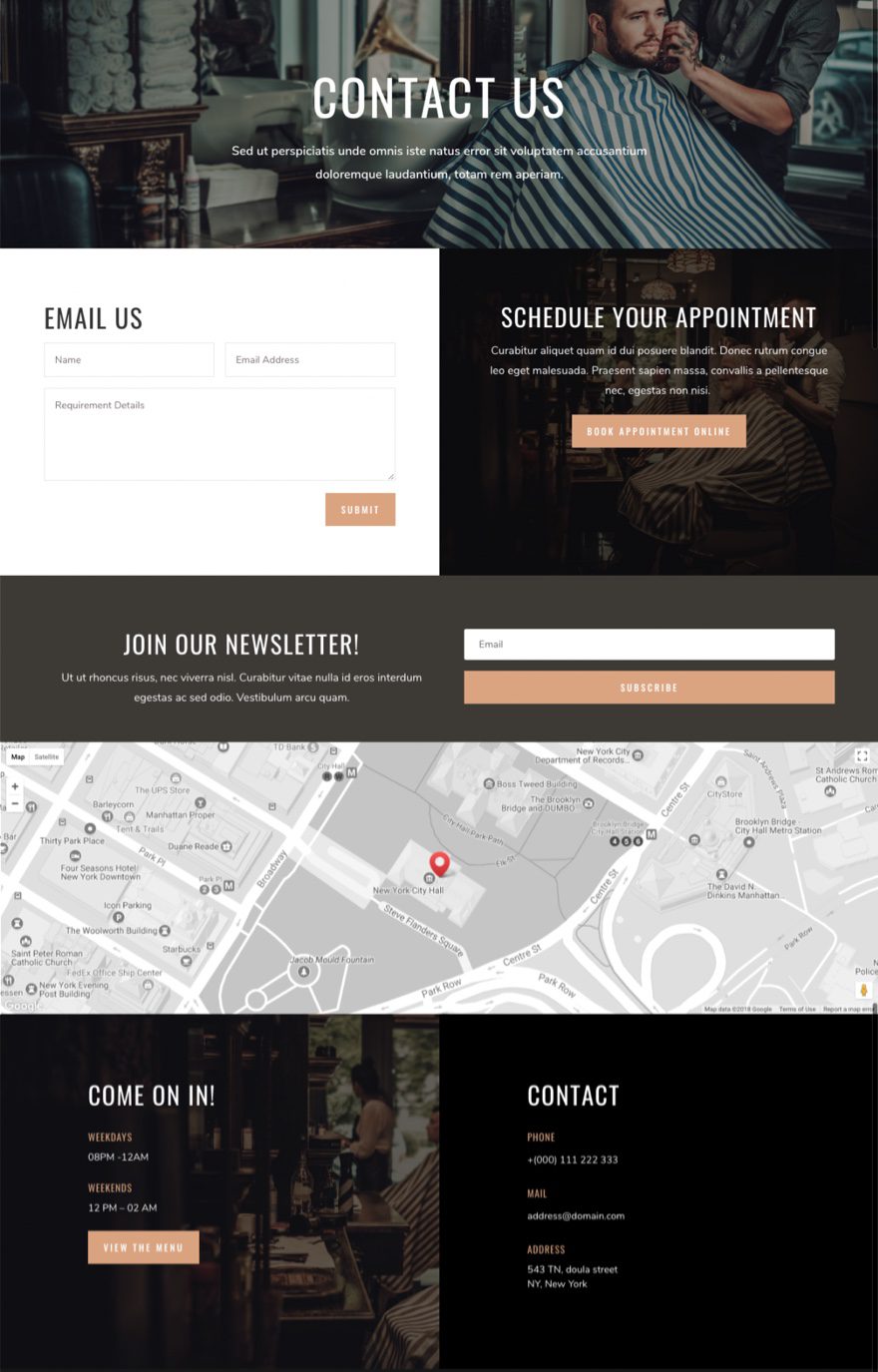
Aside from updated those background images and colors throughout, I added a CTA to book an appointment online. You may also opt to include an embedded booking form here as well if you don’t want a separate Book Appointment page.
Also, the map needs a Google API in order to work so don’t forget to take care of that in your Theme Options. You will also need to integrate your email service provider email list to your email optin form.
Creating your Book Appointment Page
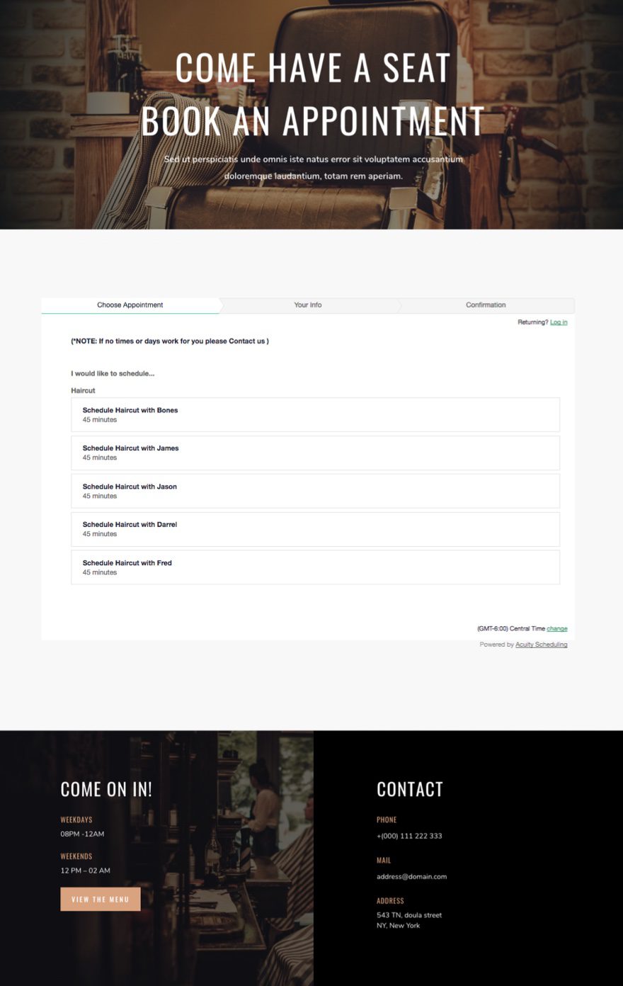
Instead of having your Book Appointment buttons redirect to a third-party website, embed your form on a page on your website. This is a great way to keep the user experience and design consistent throughout. Most (if not all) appointment scheduling solutions offer an embed code.
Here is an example of an appointment scheduling form built with AcuityScheduler that I embedded into a code module. All I did was update the background images on the header and footer, delete the blog module, add a code module in its place, and then add the shortcode supplied by AcuityScheduling.
Another option to create an online booking experience is to use the Appointment Booking plugin. It allows clients to choose barbers, select available time slots, and pay online with ease. Features like flexible scheduling, detailed schedules, and automated email reminders help keep your calendar organized and your clients on time.
Final Thoughts
Creating a new website for a Barbershop is a lot less overwhelming when you know what you need and you have the power of Divi (and Divi Layouts) at your disposal. My purpose for this tutorial was to give you some tips on what makes a good Barbershop layout and then some general guidelines on properly setting up your new layout to jumpstart the design process. I could have gone into more detail on the exact steps and settings used when making the customizations to the four pages, but since many of you will choose a different layout for your Barbershop, I thought a more conceptual approach was better suited for this post.
Feel free to share your own Divi Barbershop sites with us. We would all benefit from the inspiration.
I look forward to hearing from you in the comments.
Cheers!



I lost my shop page as soon as I installed the WooCommerce plugin and set the shop page to shop
wheres the demo link /download link
Thomas,
Sorry, no demo or download link. We normally only offer those when releasing our layout packs.
Thanks.
I am actually going to be building a new site for a barbershop so this is great!
Coffee shop or Barber shop? 😉
This is super amazing for me.It makes me happy too.
That’s great, Mark. Glad you liked it.
A magazine/newspaper site featuring 15-20 news posts per day would be cool
Thanks for the suggestion Paul.
I was super excited for a moment there because I thought you meant “Barbershop Quartet” website, which is something I use Divi for. Ah well…
Sorry 🙂
Great work. Thank you for sharing your knowledge. Can I get your advice about which layouts to use for Lawyer site. I am new with divi theme
Hmm. Maybe the Business Layout would work well. https://www.elegantthemes.com/blog/divi-resources/download-an-amazing-free-divi-business-layout-pack
Thank you, Jason. I will try