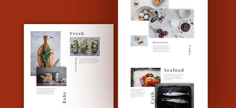
There is something beautiful about the organization of a good image layout or grid. But sometimes, beauty is found outside the boundaries of perfect symmetry. We’ve all seen examples of this kind of asymmetrical balance used in marketing. You can find them on restaurant menus, brochures, and countless websites with portfolios and galleries.
Today I’m going to show you how to build your own creative image layout using Divi. The concepts aren’t earth shattering (or unique for that matter), but my hope is that this will inspire you to think outside the box and create something that looks amazing. So for those of you who are wanting to shy away from perfect symmetry and mix things up, this is the tutorial for you.
Preparing the Design Elements
Here is what you will need to build this layout:
- Latest version of the Divi Theme installed and active
- Copy of the Free Restaurant Layout Pack. Import the Restaurant_Gallery.json file to the Divi Library. This will give you a head start on creating the new layout.
- If you choose to use your own images, I would make sure that their size is at least 800×500.
Building the Image Layout and Adding Content
This unique layout calls for a unique design process. Think of it like a making a scrapbook. We are going to lay out all our pieces before we start moving them around to find the right spot for each one. This process will also help you take more ownership of the design process and tweak things the way you want whenever you add your own content.
So, I think it best to add all of our rows and content (images, text) first. This will provide a basic framework so that we can visualize the whole before we start designing the parts.
Use the Restaurant Gallery Layout
For starters, let’s create a new page and upload the restaurant gallery layout to the page. The layout has a header and a footer section (which we will leave alone now. We will be using the images inside each of the four (four-column) rows to add to our new layout. You can choose to create your image modules from scratch if you prefer. I’m simply doing this to speed up the process.
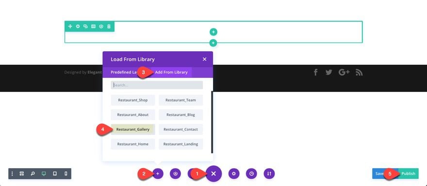
You can think of the existing content (all the images in the gallery) as resources you can use to fill in your new layout.
Add First Section Content
Create a new regular section with a new row with a two-column (one-half one-half) columns structure. Then drag it right under the header section of your layout.
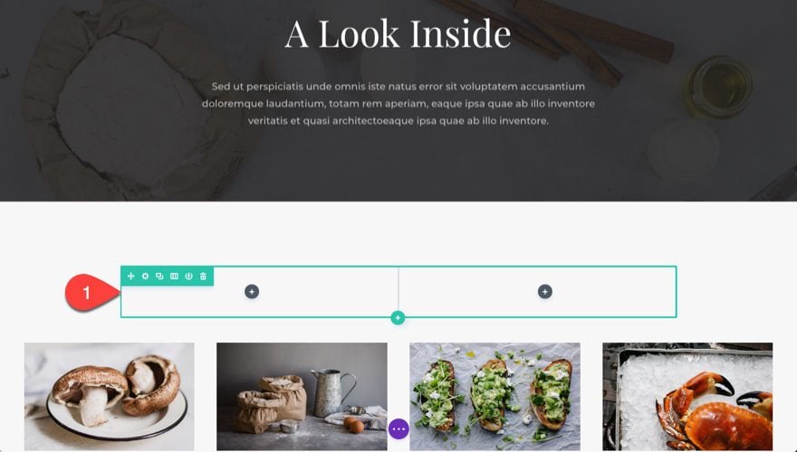
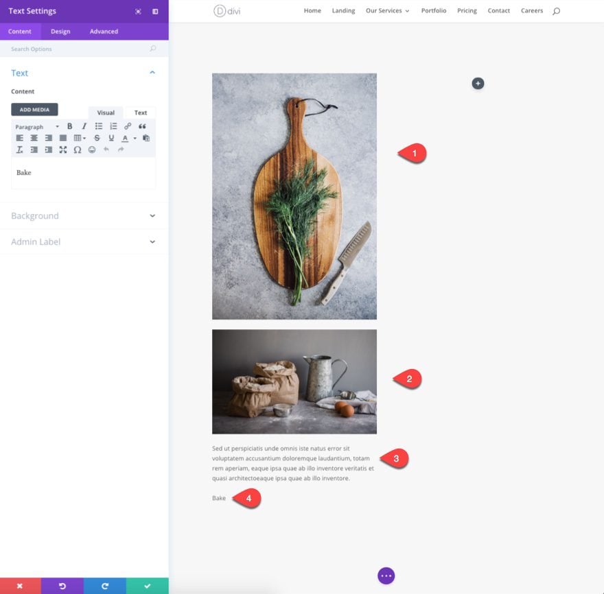
In the first column of your new row we are actually going to create an image module and grab a vertical image from our media gallery (This is the only image not found in the existing content below).
Next drag an image directliy under the previous image in the first column.
Then add a text module under the second image in the first column and add the following dummy text for now:
“Sed ut perspiciatis unde omnis iste natus error sit voluptatem accusantium doloremque laudantium, totam rem aperiam, eaque ipsa quae ab illo inventore veritatis et quasi architectoeaque ipsa quae ab illo inventore.”
Add another text module directly under that text module with the content text: “Bake”
That takes care of the first column in the first row.
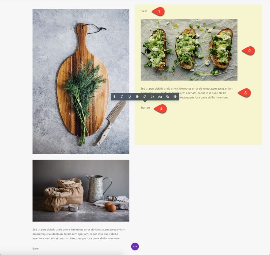
In the second column of the first row, add a text module with the content text: “Fresh”
Then drag an image module directly under that text module from the existing content at the bottom.
Copy the two text modules from the first column and paste them on second column under the image (making sure the paragraph dummy content stays above the single text content. Then change the word “Bake” to “Starters”.
Add Second Section Content
Next add a new regular section below the one you just created. Give it a row with a one-column structure.
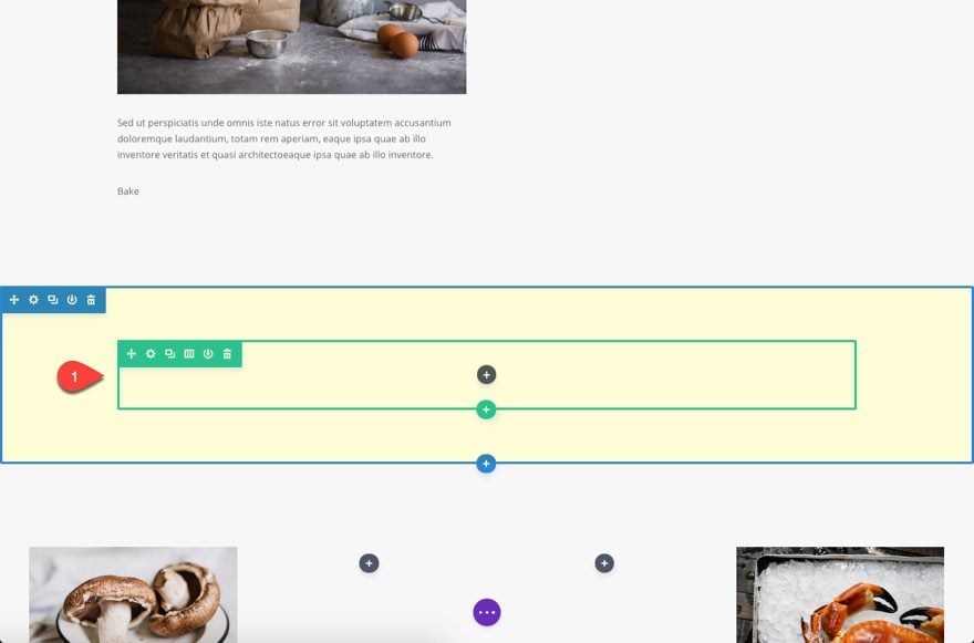
Drag two images (image modules) from the existing content below into the new one-column row. They will span the fullwidth of the row. That’s okay, we will be adjusting the size and position later on.
Add a new row directly under the previous and give it a three-column (one-third one-third one-third) structure.
Drag an image from the existing content below into the first (far left) column.
In the second (middle) column, add a text module with the content text: “Desserts”
Then copy any of the text modules with the paragraph dummy text in the first section and paste it under the “Desserts” text module.
In the third (far right) row, add a text module with the content text: “Coffee”.
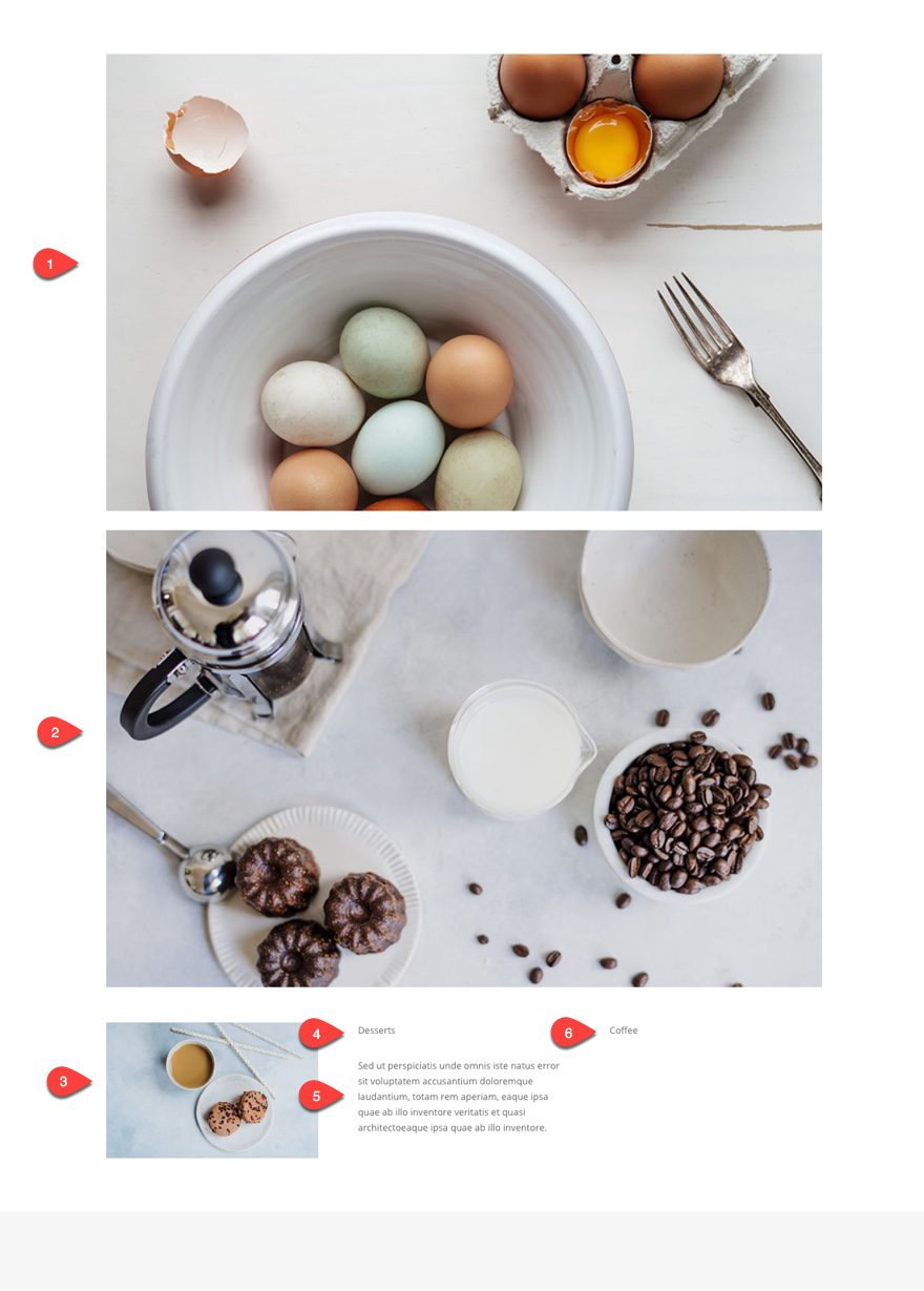
That’s it for the content of the second section.
Add Third Section Content
For the third and final section, add a regular section with a two-column (one-half one-half) row structure.
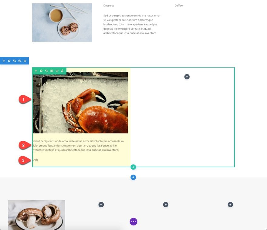
In the first (left) column, drag in an image from the existing content below. Under the image, copy and paste in the paragraph dummy text we’ve been using. Then add a text module below that dummy text with the content text: “Crab”
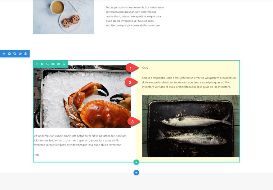
In the right column of the same row, enter a text module with the content text: “Seafood”
Then add the paragraph dummy text module under it.
Under the dummy text, drag in an image from the existing content below.
Well, that takes care of the framework and content of our layout. But before we start designing this layout, let’s erase the section containing our previous layout “helper” content.
Designing the Layout
Now that we have our framework (rows and columns) and our content (image and text modules) ready, we can now start the design process. To move things around we will be adjust the widths and margins of certain images so that they can do things like overlap. The secret to overlapping images is to use negative values to your margin settions to “pull” the images in the direction you want them to go. And, in addition to setting our text fonts, sizes and margins, I’ll be adding a few lines of inline custom CSS to rotate a few words to display vertically.
Let’s get started.
The First Wave of Design: Text Modules
Because the entire layout shares similar font design, I find it easier to update one text module settings first and then copy and paste the style to other text modules that share the settings. This avoids the repetition of adding the same general settings for each module one by one.
There are two fonts and three sizes used for the text in this layout. Playfair Display is used for the larger single words and Montserrat is used for the paragraph text.
Small Paragraph Text
Click to update the settings of the dummy text module in the first column of the first section (or anyone actually, it doesn’t matter) and update the following:
Text Font: Montserrat
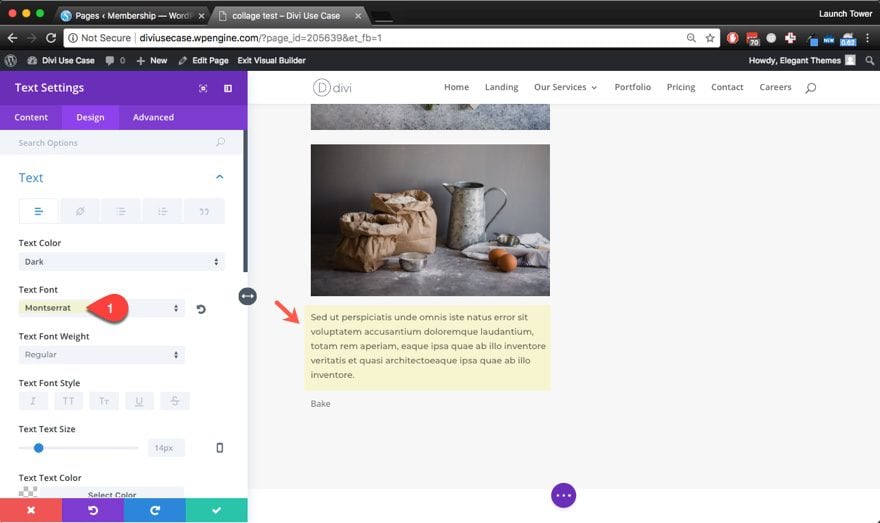
That’s really all that needs to be done. Using the nifty right click menu (or the shortkeys ctr+alt+C and ctr+alt+V), copy the style/design settings of the module and paste the design settings on each of the dummy paragraph text modules throughout the layout.
Large Single Word Text
Find the text module with the single text “Bake”. Update the settings as follows.
Text Font: Playfair Display
Text Font Weight: Bold
Text Text Size: 72px (D), 50px (T), 42px (S)
Text Letter Spacing: 12px
Text line Height: 1em
Now using the right click menu (or the shortkeys ctr+alt+C and ctr+alt+V), copy the style/design settings of the text module and paste the design settings on each of the text modules containing single words (Fresh, Starters, Desserts, Coffee, Seafood, and Crab).
Medium Single Word Text
We don’t want all of our single words to have the same large size, but it was quicker to paste in the design settings for all of them first before we make adustments to the few text modules that require a different size.
Locate the text module with the content text “Starters” and update the following settings:
Text Text Size: 42px (D), 32px (T), 32px (S)
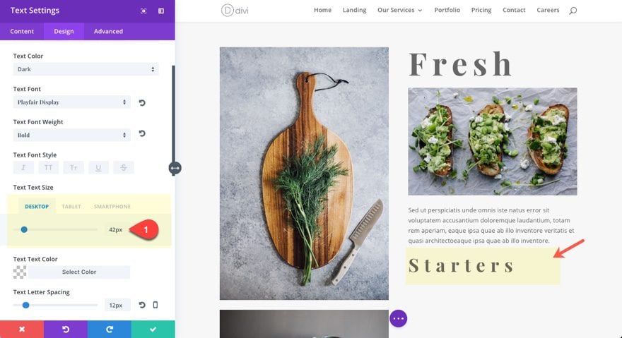
Now copy the design settings of the text module and paste the design settings on the text module with the word “Desserts” and the one with the word “Coffee”.
The Second Wave of Design: Sizes, Margins and Box Shadows
To adjust the margins for the images and text throughout the layout, I’m going to start at the top with the first (top) section and then continue to the second and third section.
Section One
In the left column of seciton one, update the image module settings of the first (top) image as follows:
Custom Margin: -30% bottom, -20% left
This does two things. First, it pulls the image below it upward so that it overlaps, and secondly, it pulls the image to the left.
Note: It is important to note that on the negative margin value can accomplish this kind of placement of the images. You might think that adding a margin of 30% top and 20% right would accomplish a similiar effect, but all this does is push the image down and shrink the image so that it has 20% margin on the right.
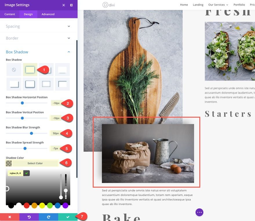
For the image directly below update the following settings in the design tab to give it a box shadow:
Box Shadow: [select first option]
Box Shadow Horizontal Position: -18px
Box Shadow Vertical Position: -18px
Box Shadow Blur Strength: 50px
Box Shadow Spread Strength: -7px
Shadow Color: rgba(0,0,0,0.3)
In the Text Module Below the image containing the dummy text, update the following:
Width: 65% (D), 100% (T), 100% (S)
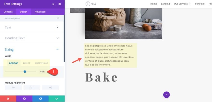
This is to create room for whenever we float the word “Bake” to display vertically to the right.
Next, update the dummy paragraph text module setting in the right column as follows:
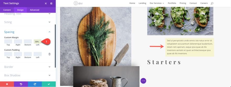
This will create room to float the word “Starters” to display vertically to the left of the paragraph.
Section Two
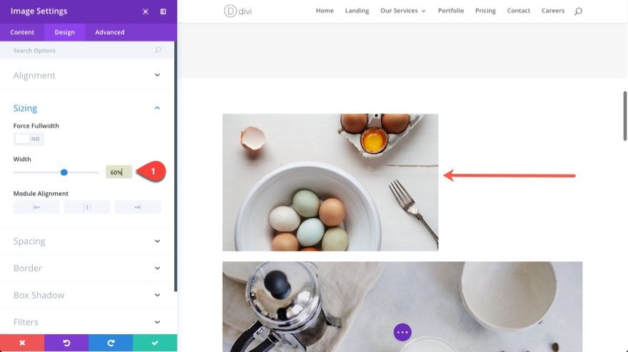
In the first row of the second section, update the size of the image in the left column as follows:
Force Fullwidth: NO
Width: 60% (D), 100% (T), 100% (S)
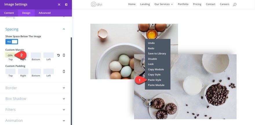
For the second image in the column, copy the design of the image in section one that has the box shadow and paste it to the image. Then update the following:
Force Fullwidth: NO
Width: 70% (D), 80% (T), 80% (S)
Module Alignment: Right
Custom Margin: -20% Top
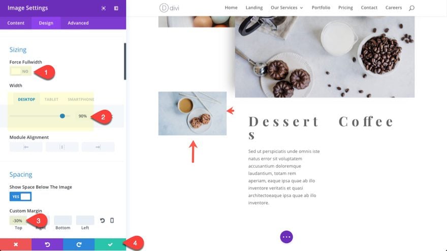
Next, go to the three-column row in the second section and update the settings for the image in the left column as follows:
Force Fullwidth: NO
Width: 90% (D), 50% (T), 50% (S)
Custom Margin: -30% Top
Section Three
For the last section, starting with the left column, update the dummy paragraph text module as follows:
Custom Margin: 50% Right (D), 0px Right (T), 0px Right (S)

In the right column update the Text Module containing the dummy paragraph text as follows:
Width: 65% (D), 100% (T), 100% (S)

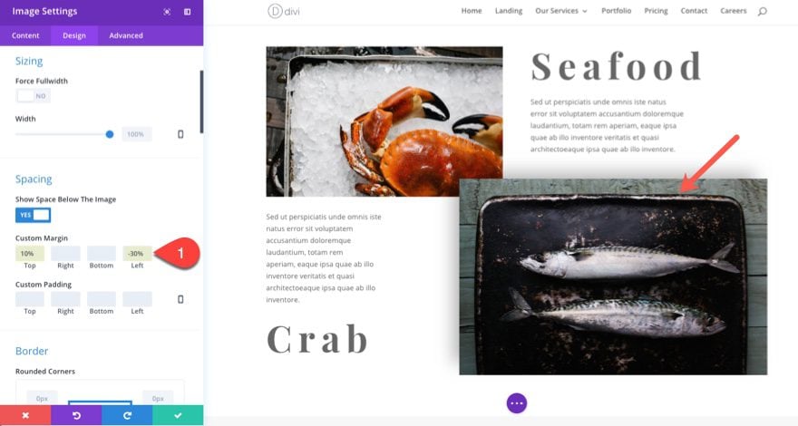
For the image directly under the dummy text in the right column, copy the design of the image in section one that has the box shadow and paste it to the image. Then update the following:
Force Fulwidth: NO
Custom Margin (Desktop): 10% Top, -30% Left
Custom Margin (Tablet): 0px Left;
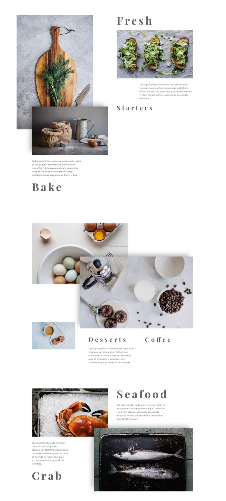
Here is what we have so far.
The Final Wave of Design: Making Text Vertical with Custom CSS
At this point all that is left to do is to rotate our text so that it displays vertically instead of horizontally. To do this, we will be using some custom CSS (the “transform:rotate” property) and some adjustments to margins to position the text for the vertical placement.
g>Note: I could add inline css under the advanced tab of each text module individually, but I figure adding the CSS to the page settings and then targeting each module with a class would give you more control over these settings. For example, you could add media queries to disable the vertical text display on mobile devices.
Open Page Settings in the bottom settings menu. Then click the Advanced Tab and enter the following CSS in the Custom CSS box:
.rotate-right {
-moz-transform:rotate(90deg);
-webkit-transform:rotate(90deg);
-o-transform:rotate(90deg);
-ms-transform:rotate(90deg);
transform: rotate(90deg);
-moz-transform-origin: right top 0;
-o-transform-origin: right top 0;
-ms-transform-origin: right top 0;
transform-origin: right top 0;
float: right;
}

.rotate-left {
-moz-transform:rotate(270deg);
-webkit-transform:rotate(270deg);
-o-transform:rotate(270deg);
-ms-transform:rotate(270deg);
transform: rotate(270deg);
-moz-transform-origin: left bottom 0;
-o-transform-origin: left bottom 0;
-ms-transform-origin: left bottom 0;
transform-origin:  left bottom 0;
float: right;
}
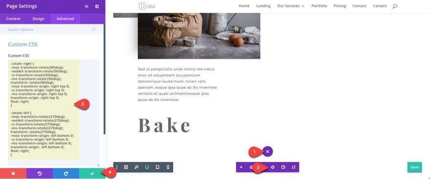
Notice the two classes I will be using are “rotate-right” and “rotate-left”. We will be using these CSS ID’s to target the text modules with the content text “Bake”, “Starters”, “Coffee”, and “Crab”.
For the text module containing “Bake”, update the following in the Design Tab:
Custom Margin (Desktop): 10% Top, -40% Right
Custom Margin (Tablet): 35% Top, -20% Right
Then go to the Advance Tab and add the following CSS Class:
rotate-left
For the text module containing “Starters” update the following in the Design tab:
Custom Margin: 20% Top, 75% Right
Then go to the Advance Tab and add the following CSS Class:
rotate-right
For the text module containing “Coffee” update the following in the Design tab:
Custom Margin (desktop): 80% Top, 15% Right
Custom Margin (tablet): 30% Top
Custom Margin (smartphone): 50% Top
Then go to the Advance Tab and add the following CSS ID:
rotate-right
For the text module containing “Crab” update the following in the Design tab:
Custom Margin (desktop): -20% Right
Custom Margin (tablet): 20% Top, -20% Right
Then go to the Advance Tab and add the following CSS ID:
rotate-left
That’s it!
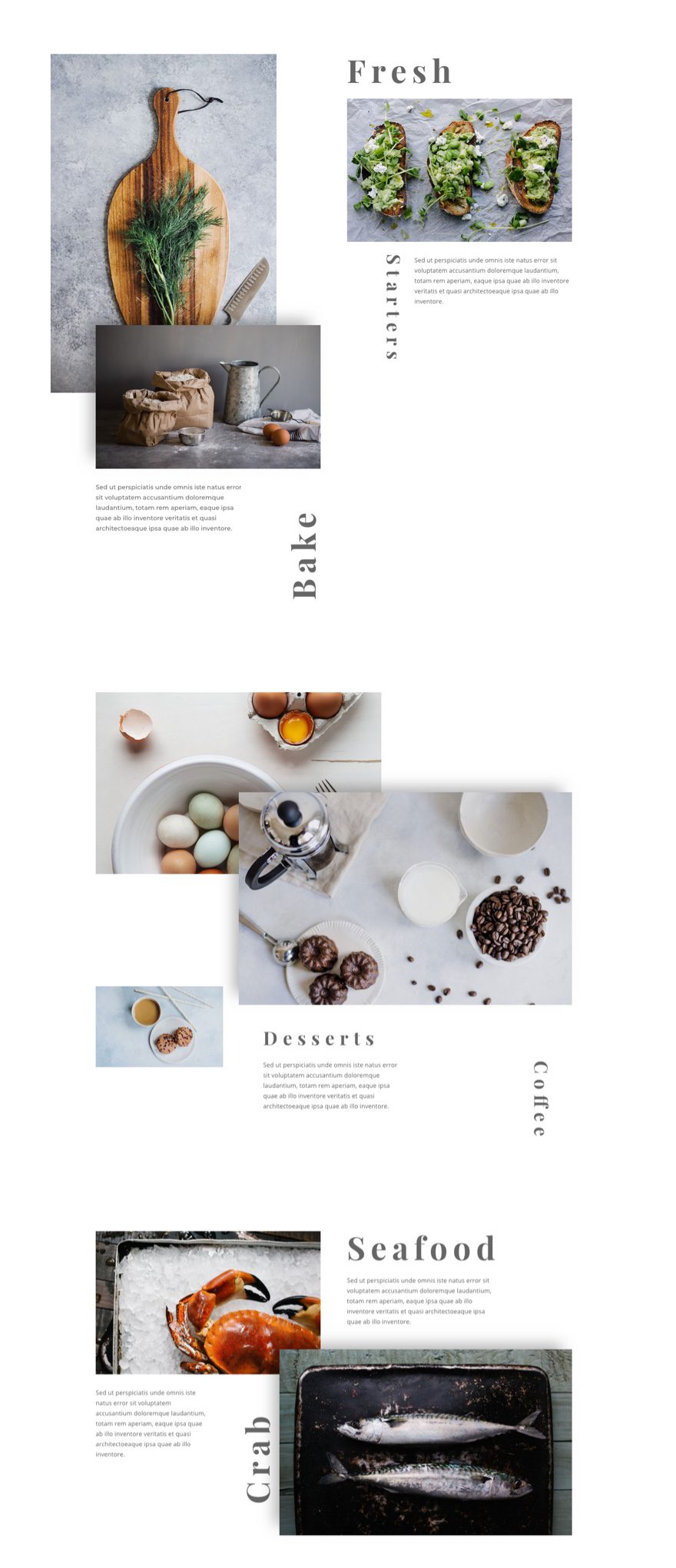
Save your settings and check out the results on the live site.
Responsive?
Because of the additional margin specifications made throughout the design, the layout looks great on mobile as well.

Final Thoughts
My ultimate goal for this tutorial is get those creative juices flowing. There is so much that can be done with margins to create the perfect layout. I purposefully didn’t modify the settings of the sections and rows in order to concentrate on moving around modules. However, you could take the layout to another level of design (especially for large monitors) by incorporating some additional margins and spacing for your rows and sections.
I hope this has been helpful.
Until next time, I’ll meet you in the comments.
Be sure to subscribe to our email newsletter and YouTube channel so that you never miss a big announcement, useful tip, or Divi freebie!



May I have this layout download link. I love this layout please give me the link. I want to download.
Thanks
This is great, thank you! I am wondering if it’s possible to change the order of the modules for mobile / tablet view? Right now the first module is shown as the second on mobile devices which makes the layout not suitable for my purpose. TIA 🙂
Lottie,
Maybe this will help… https://www.elegantthemes.com/blog/divi-resources/how-to-change-divis-column-stacking-order-on-mobile-devices
They for real encourage how to create duplicate content ???
The best thing to get penalized on search engines.
Not make a section visible on viewport and non existant are two different things..
Nevermind, seen the css method further down the page.
But first method should be removed since it goes against SEO best practices.
Love how your tutorials as so thorough. I’m having a little difficulty implementing this customisation:
Width: 90% (D), 50% (T), 50% (S)
I can’t see where to find these values. I can only see an option to customise the width under Sizing.
So so impressed with you guys and the Divi project.
Thanks, Mairéad
I got it – Desktop, Tablet, Smartphone
!!
Now it makes sense.
Thanks Mairead.
And yes, you are correct – Desktop, Tablet, Smartphone. I thought it was best to include the mobile sizing because of all the custom margins and sizes used throughout.
…are so thorough…
I luv luv this on the desktop, but on smartphone there are a gazillions of space in between the header that looks really weird. If you look at your pic each section have tons of space in between the bake, seafood and the image. How can we fix it for smartphone and the css you have provided? Once again this looks amazing,it truly feels like a magazine layout.Thanks a lot.
If you want to keep the vertical text on mobile, I would suggest adjusting the spacing for your columns and rows on mobile devices from within the visual builder.
It may help to disable the vertical text on mobile altogether. To do this I would wrap the custom css in the theme customizer with a media query like this:
@media (max-width: 980px) { .rotate-right { -moz-transform:rotate(90deg); -webkit-transform:rotate(90deg); -o-transform:rotate(90deg); -ms-transform:rotate(90deg); transform: rotate(90deg); -moz-transform-origin: right top 0; -o-transform-origin: right top 0; -ms-transform-origin: right top 0; transform-origin: right top 0; float: right; } .rotate-left { -moz-transform:rotate(270deg); -webkit-transform:rotate(270deg); -o-transform:rotate(270deg); -ms-transform:rotate(270deg); transform: rotate(270deg); -moz-transform-origin: left bottom 0; -o-transform-origin: left bottom 0; -ms-transform-origin: left bottom 0; transform-origin: left bottom 0; float: right; } }Can you control the order of the modules? I there like a bring to front option?
Lorena, were you able to figure this out? I am having the same issue too. It looks fine in the visual builder but not on the actual page itself.
Maybe this will help… https://www.elegantthemes.com/blog/divi-resources/how-to-change-divis-column-stacking-order-on-mobile-devices
Thanks, I tried and it works great.
One thing where “Then go to the Advance Tab and add the following CSS ID:”
should be, “Then go to the Advance Tab and add the following CSS class:”
I think I followed everything explicitely… (at least 90%), but rotating is not working (even when I define this as class in the child-theme-stylesheet), and the dimensions differ a lot between firefox and chrome
But at least,I learned a lot!
Connie,
I made a mistake. I wrote CSS ID when I meant to write CSS Class. So, make sure you have rotate-left and rotate-right entered as CSS Classes and NOT CSS IDs.
Sorry for the mixup.
Jason, that is one small glitch which I noticed, but still it is not working.
I will have to check wether that style is in conflict with another class…
thanks!
I had printed this “recipe” via pdf-printer and the printer added a space between the number and the unit, so it was “90 deg” and not “90deg”
now it is working!
Thanks for the inspiration!
Also, Should Bake, Starters etc. be defined as a header, H2 or H3 say?
Stephen, I left that up to the user since some may just want the text for aesthetic purposes, not headers.. But yes, depending on how you would use text, you can apply those tags if you want.
Great tutorial. But rotate-left and rotate-right should be applied as css classes, as I think was your intention by defining them with the period in the stylesheet.
Stephen,
You are right! Very sorry about the typo. I meant CSS Class, NOT CSS ID. Thanks for catching that.
Lovely!
Too cool for school! I dig it.
Thanks for the great pic. I really learn a lot,
This is great. Thank you Jason.
Very nice!
This is awesome. Would be great to share a json layout with us 🙂
Really really useful, thank you very much
Ok, now that is cool! Web based design is getting more and more interesting. Thanks!