Welcome to part 2 of this 2-part series where I am going to show you how to build a complete membership site by combining MemberPress and Divi. Join me as I walk you through how to setup your membership site with everything you need for selling an online course or product, including custom registration pages, email notifications, and three levels of membership that drips content over a period of time. Plus a whole lot more. I’ll also show you how to design your membership pages by using membership shortcodes in combination with the Divi builder. You don’t want to miss it!
I’m excited to continue our mission of building a complete membership site with Divi. In the previous post, I walked you through how to build out all the functionality of your membership site using MemberPress. So if you joined in on that process you should be well suited for today’s tutorial.
Today is all about Design. More specifically, I’ll be showing you how to design your membership site (even those membership pages created by MemberPress) using the Divi Builder. I’ll be using the Learning Management System Divi Layout pack to speeds up the design process considerably and for those rare times when MemberPress leaves us out in the cold and we can’t utilize the Divi Builder, I have some CSS for that as well. But overall my goal is less custom CSS and more Divi Builder.
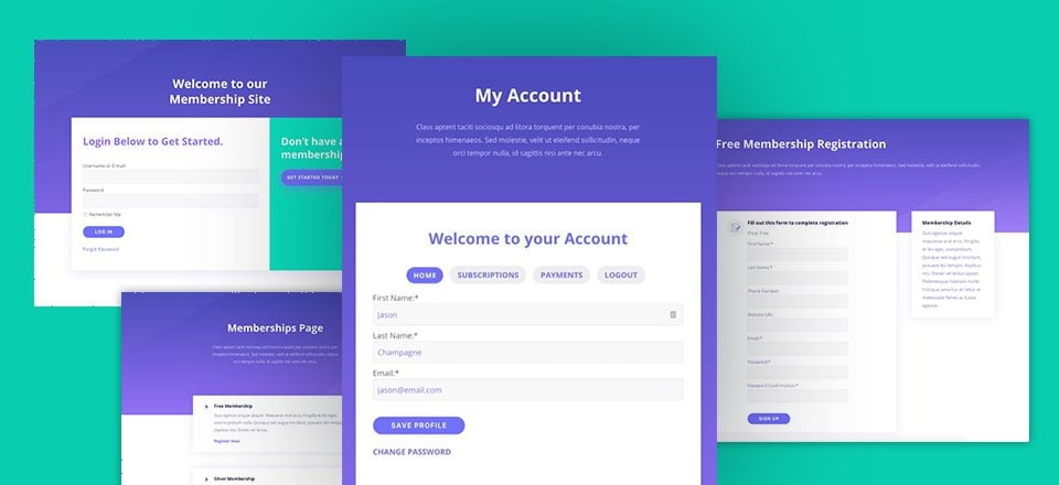
Sneak Peek
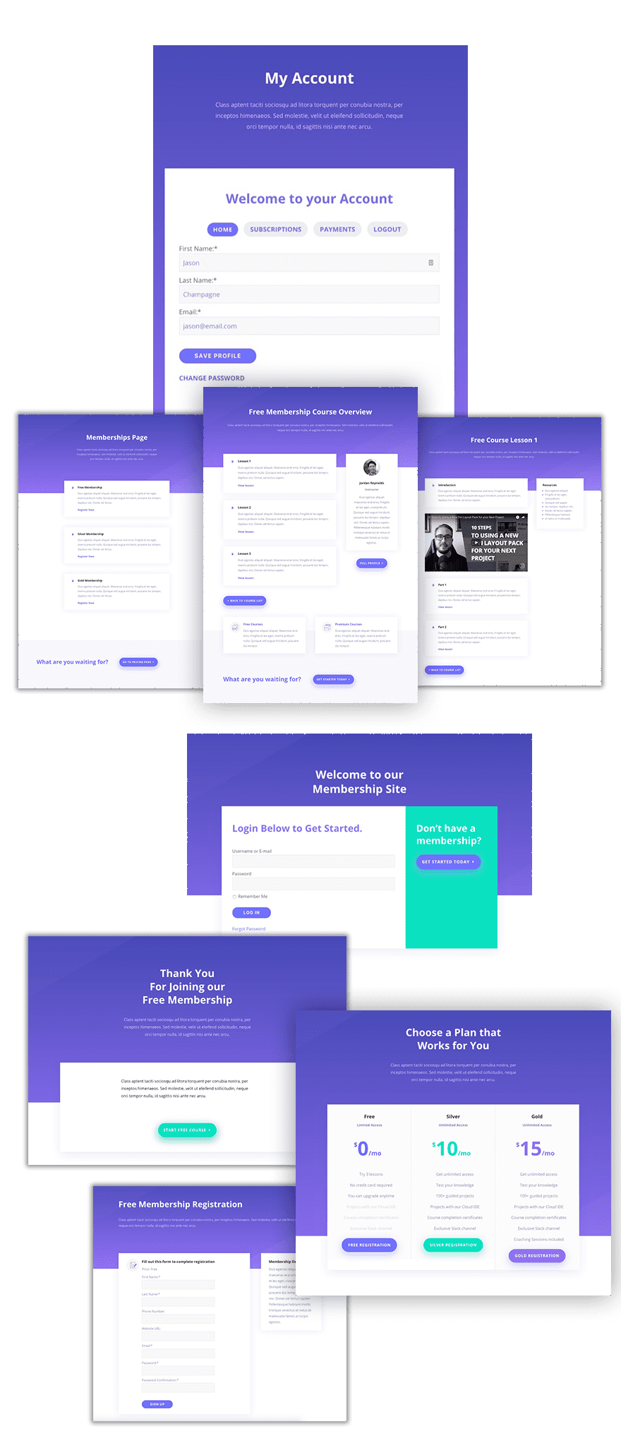
Checklist
Here are a few things you want to have before starting this tutorial.
The Learning Management System Layout Pack
I will be using the Learning Management System Layout Pack to design the membership pages in this tutorial. Make sure you grab your copy if you haven’t already and import it to your Divi Library.
For extra help on how to setup a Divi layout pack, check out these tips.
Membership Pages Created
So far you should have the following pages created. You don’t have to have content on these pages yet. They just need to be created in your WordPress Dashboard. Some of these pages are specific for a membership site offering an online course. You may need to adjust those for your own site.
- Memberships Page
- Pricing Page
- Membership Course Overview Page
- Lesson Page
- Registration Page(s)
MemberPress Front-end (Reserved) Pages Created
- Account Page
- Login Page
- Thank You Page
How to Build a Membership Site with Divi – Part 2
Subscribe To Our Youtube Channel
Theme Customizer Settings
Even though you may be using one of those beautify divi layouts, you don’t want to ignore your theme customizer settings. Of course this is where you need to go to design your header and navigation and footer since your imported Divi layouts have no effect on these elements. Also, since you will inevitably have pages or content not customizable by the Divi Builder, setting the theme customizer defaults is the way to target those elements outside of the Divi Builder.
To update the Theme Customizer, go to Divi > Theme Customizer. I’m only going to make a few changes but feel free to make more.
Change Theme Accent Color
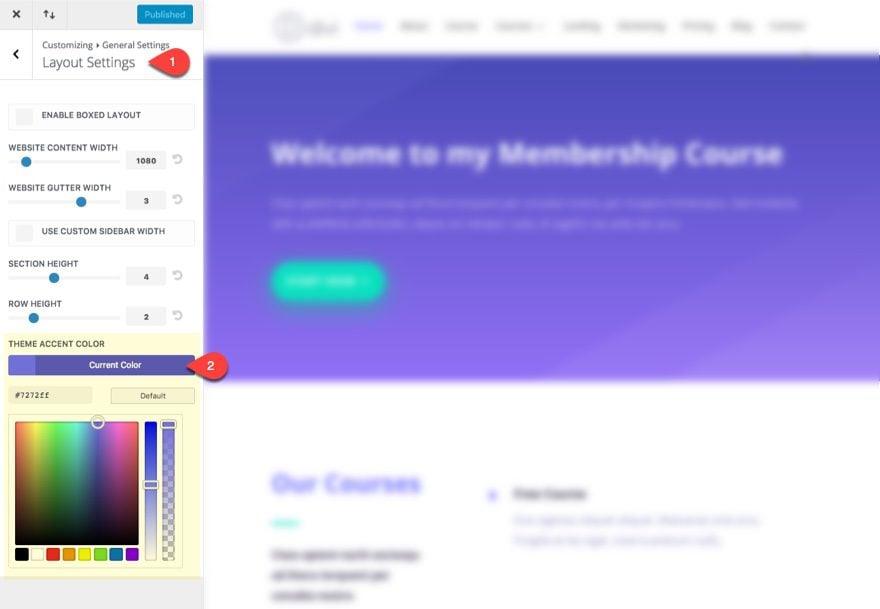
The theme accent color will affect many different elements throughout your site. More specifically to this tutorial, you will notice that whatever you set this color to will also be the default color of your links, even the ones found in MemberPress Shortcodes (like the account page). To update the theme accent color, go to General Settings > Layout Settings from the Theme Customizer menu. I’m adding the purple color used throughout the Coding School Layout: #7272ff.
Change the Typography Settings
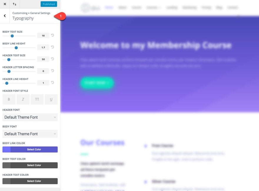
In the case of the Coding School Layout Pack I’m using for this tutorial, there really is no specific font set at the module level, so I can set a default font from the theme customizer and it will be applied to all layouts. Regardless, it is a good idea to set your typography settings here as a fallback for your site. To update the Typography Settings go to General Settings > Typography from the theme customizer menu.
Build a Generic Layout to Use for Membership Pages
A generic layout is basically a multipurpose layout you can use for those extra pages you may need. To build our generic layout, I’m going to use the Account Page. You should have already created an Account Page and assigned it as the default account page in MemberPress Options (see part 1 of this tutorial if not).
NOTE: There is a default account page that MemberPress can auto create for you. However, since this page isn’t able to deploy the Divi Builder, it is best to create your own Accounts page and assign that as your default account page. That way you can design it with the Divi Builder and then add the shortcode to generate the user account information form with a module.
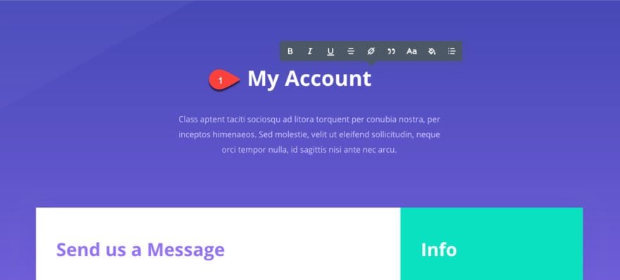
Now go and edit the Account Page. Deploy the visual builder and import the Contact Page Layout to your page. Update the Title of the page to say “My Account”.
Update the column layout for row containing the contact form and info to a one column layout.
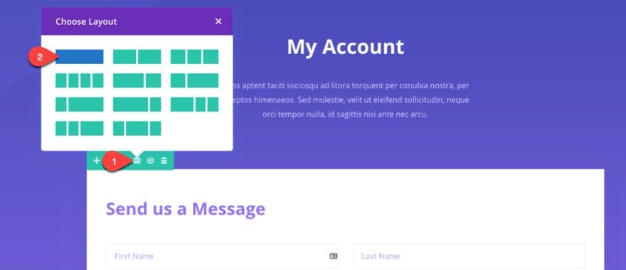
Next, delete all the modules inside the column so that there is nothing inside the one column row.
Using the right click menu, copy the text module hold a snippet of text right under “Frequently Asked Questions”. Then use the right click menu to paste it into the one column row you just created.
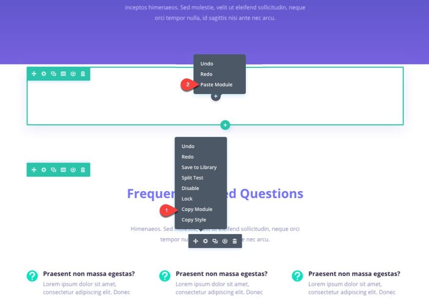
Now update the settings for the text module you just added with the following options under the Design tab:
Text Orientation: Left
Width: 100% (default)
Save your Page.
You can delete the rest of the sections below if you want to but it might be a good idea to leave them just in case you want any of those elements for certain pages.
Note: You Account page isn’t quite finished yet (we still need to add the shortcode) but that is coming real soon. Right now we just need to save this layout for our generic layout template.
Next, you need to save this layout to your Divi Library. Open your page settings menu (the purple icon at the bottom of your visual builder). Select Save to Library and give the new template the name “Generic Layout”. Then click Save to Library.
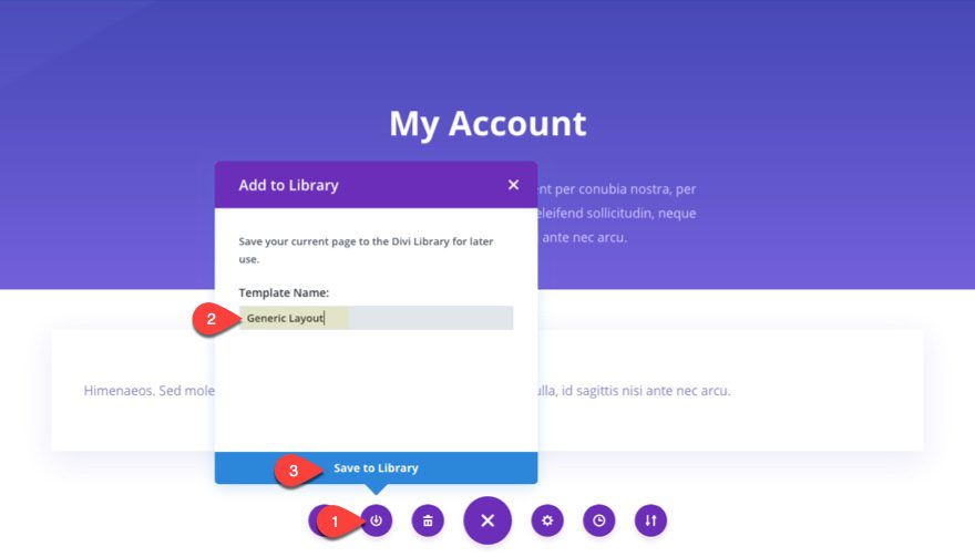
That’s it. Now you have a generic full width layout to use for other membership pages you might need throughout your site. All you need to do is pull this generic layout from your library for a convenient head start.
Now that we have our generic layout, let’s tackle those MemberPress Front End Pages.
A Word on Designing Membership Front End Pages
Membership front end pages are those pages specific to the functionality of membership. Typically these pages include an account page to manage user account information, a checkout page (for paid memberships), and a login or registration page. There may be more pages depending on the plugin.
As a general rule, there will be limitations to what Divi can do with pages generated by a third party plugin. If the page content is generated by a shortcode (like WooCommerce or MemberPress for example), you can use the shortcode within a module on a page able to deploy the Divi Builder. That way you can adjust the design of the generated content by adding the shortcode to a text module and modifying the design settings in the design tab of the module.
Designing MemberPress Front-end Pages
As I covered in part 1 of this Tutorial, MemberPress has 3 front end pages that you must reserve: Thank You Page, Account Page, and Login Page. These pages are selected under the pages tab of MemberPress Options. Since we won’t be using the default registration pages, we will also need to design a Registration page as well. But first, let’s finish what we started with our Account page.
Account Page
Layout Used: Generic Layout
Shortcode Used: [mepr-account-form]
Design Modifications: Since we already designed the Account page when building our generic layout, the main thing to do here is to add the shortcode to the text module and then update the design settings to target the text and links within the form displayed from the shortcode. For example, changing the text size to 18px will change all of account info text to 18px. And customizing the link text will also affect the account navigation menu links and other links throughout the account information.
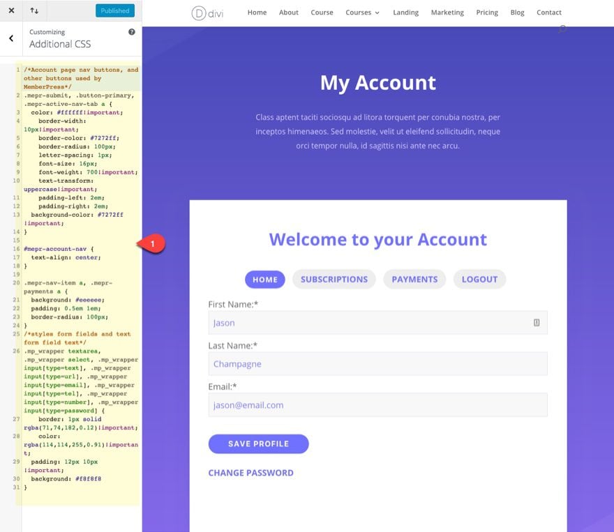
Custom CSS: Because of the limitation with targeting certain elements of the account information, I suggest adding the following Custom CSS to the Theme Customizer under Additional CSS:
/*Account page nav buttons, and other buttons used by MemberPress*/
.mepr-submit, .button-primary, .mepr-active-nav-tab a {
	color: #ffffff!important;
    border-width: 10px!important;
    border-color: #7272ff;
    border-radius: 100px;
    letter-spacing: 1px;
    font-size: 16px;
    font-weight: 700!important;
    text-transform: uppercase!important;
    padding-left: 2em;
    padding-right: 2em;
	background-color: #7272ff !important;
}

#mepr-account-nav {
	text-align: center;
}

.mepr-nav-item a, .mepr-payments a {
	background: #eeeeee;
	padding: 0.5em 1em;
  border-radius: 100px;
}
/*styles form fields and text form field text*/
.mp_wrapper textarea, .mp_wrapper select, .mp_wrapper input[type=text], .mp_wrapper input[type=url], .mp_wrapper input[type=email], .mp_wrapper input[type=tel], .mp_wrapper input[type=number], .mp_wrapper input[type=password] {
    border: 1px solid rgba(71,74,182,0.12)!important;
    color: rgba(114,114,255,0.91)!important;
	padding: 12px 10px !important;
	background: #f8f8f8
}
This CSS will add styling to the Account page navigation, form fields, form buttons, and links. It will also add similar styling to your registration forms and buttons as well.
Thank You Page
Layout Used: Generic Layout
Design Modifications: All there really is to do is update the layout with new content. One important addition is the CTA that leads the user to the course they registered for.
The Thank you page is where the user is redirected to once they complete the registration process. It is not a plugin specific page so you have the power of the Divi Builder for this one. Simply import the generic layout to the page from the Divi Library, update the title of the page and add content.
You can designate the default Thank you page in the MemberPress Options. And you can override this for each membership you create by selecting “Enable custom thank you page message” in the Registration tab of Membership Options at the bottom of the page.
Reminder: You may want to go ahead and create other thank you page for your other memberships so that you can customize the CTA for each one.

Login Page
Layout Used: Coding Contact Layout
Shortcode Used: [mepr-login-form]
Note: whatever Login page you select under the Page tab in MemberPress Options will have an option to Manually place the login form on the page when editing the page.
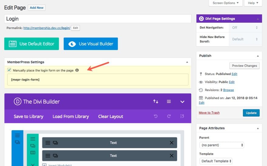
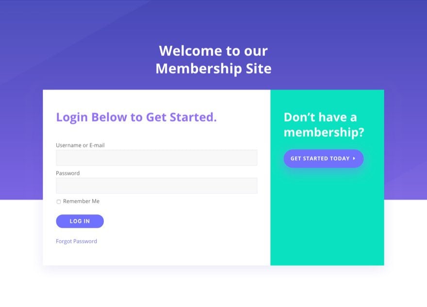
Design Modifications: I used the coding contact layout because I wanted to use the two column layout of the contact form section to include the login form and an adjacent CTA to register for a membership.
Custom CSS: Thankfully, the custom css we entered earlier for our account form has given us a great looking login form as well.
Registration Page(s)
Layout Used: Coding Course Layout
Shortcode used: depends on membership
Design Modifications: I changed the header section row to a one column row and deleted the image. Then I deleted all but one of the blurbs in the left content section and I added my registration form shortcode to the blurb module content.
Memberpress creates a registration page automatically with each membership you create. The registration form used on each of these pages is pulled from the registration form you build under the fields tab in the MemberPress Options.
However, you don’t have to use this registration page. When setting up your membership, you can find a list of shortcodes at the bottom of the Edit Membership page in the Membership Options box under the Registration tab by clicking membership Shortcodes. One of the shortcodes allows you to generate a registration form for that specific membership.
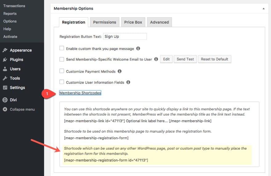
This is the shortcode you will need to add to the registration page you create for that membership.
Here is what the registration page looks like.
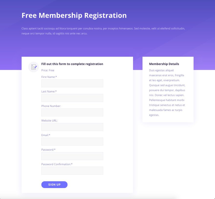
Note: Unfortunately, if the membership is paid and requires a check out process, the user will be redirected to the default registration page template to complete the purchase. Therefore, it would be a good idea to add some custom css to the default registration page in order to keep the design consistent through checkout.
No let me show you what layouts and modifications I used to create the rest of my membership pages.
Designing Membership Site Pages
Home Page
Layout Used: Coding Home
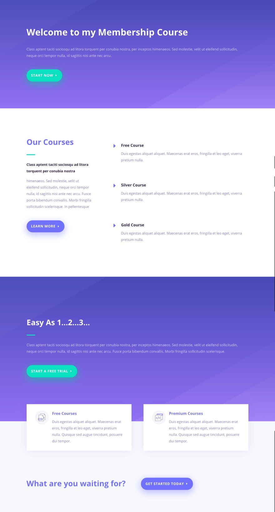
Design Modifications: I took out the image modules displaying graphics. I made the header section and “Easy As 1..2..3..” section one column layouts. I changed the buttons to text. and update the course section with my three courses I’m offering (free, silver, and gold). Took me about 3 minutes so don’t judge too harshly :).
Memberships Page
Layout Used: Coding Courses
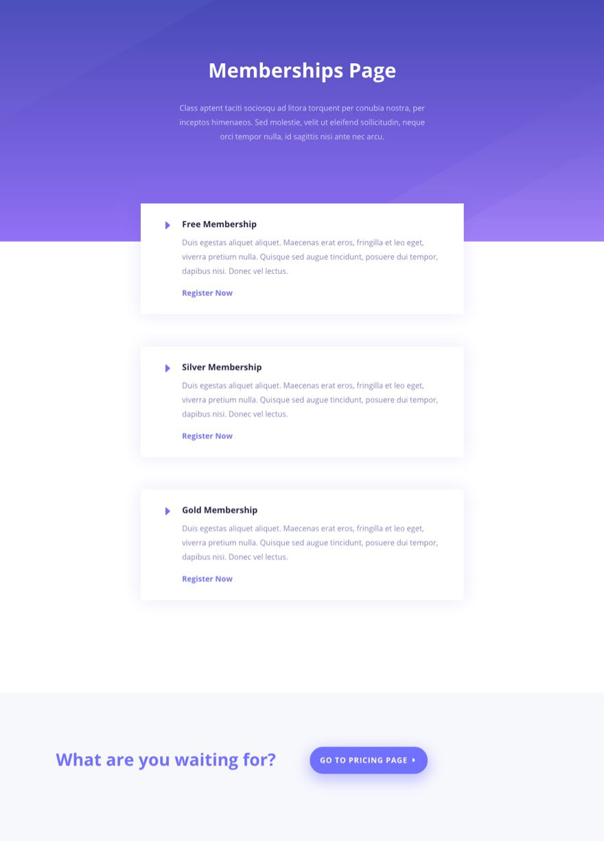
Design Modifications: I changed the Title. For the row containing the courses, I change the column layout to one column and a custom width of 680px. Then I deleted all but three boxes (they’re actually blurb modules). Added a link under each that would go to the corresponding registration page or the pricing page.
Pricing Page
Layout Used: Coding Pricing
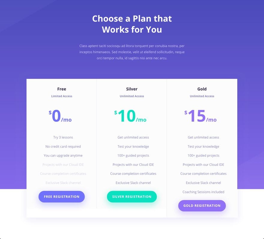
Modifications: This was easy. All I did was update the content of the pricing tables and added links to go the registration pages for each membership.
Membership Course Overview Page
Layout Used: Coding Course
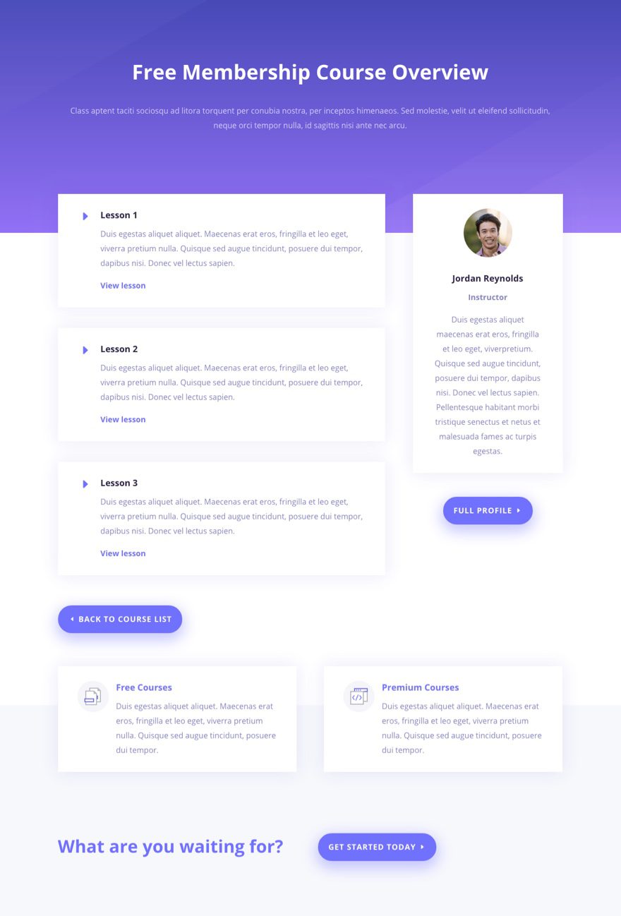
Modifications: This was also pretty simple. For the header section, I updated the content, made the column full width, and centered the text. then I update the content of the blurbs on the left of the page and added a link to view the lesson page for each one.
The image below show the membership course overview page for the free membership. You would need to create one for each of the memberships you offer. Also, I should remind you that this is the parent page of all the lesson pages (child pages) for this course (see part 1 for why this is important).
Lesson Page
Layout Used: Coding Course
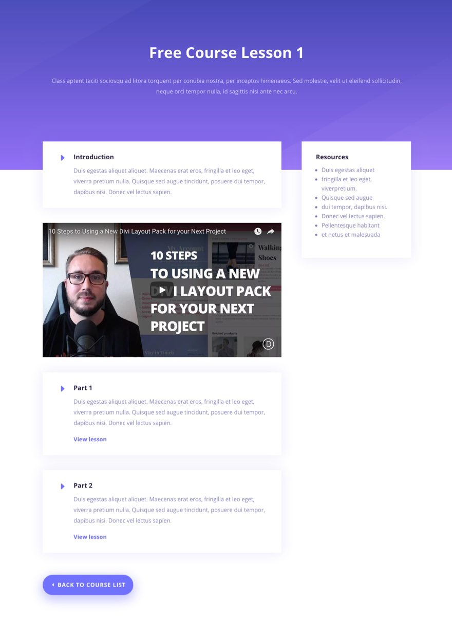
Modifications: Basically, I did the same modifications as I did for the Membership Course Overview Page except I updated the content and and sidebar contents.
The image below shows my Free Course Lesson 1 page. This page, along with the other lesson pages for the course, is a child page of the parent page Free Membership Course Overview Page.
Wrapping Up
As this 2 part series comes to a close, I hope you see just how powerful MemberPress and Divi can be together when building a Membership site. MemberPress has a lot to offer and I have to say it is pretty easy to use. A few things that stand out to me are MemberPress’s rule system to protect content and create drip sequences. The email notifications were also very easy to customize and edit. And I loved the ability to group memberships together in a way that members can change/buy different memberships from their account page.
On the design side of things, I thought Divi matched pretty well with MemberPress. The MemberPress Front-end pages weren’t automatically created for you (which was refreshing) and shortcodes were available to generate the content within Divi Modules. Yes, we still have design limitations in that certain content can’t be target from the Divi Builder. But having to add a few lines of Custom CSS to polish off an entire membership site is not too shabby if you ask me.
I look forward to hearing from you in the comments.
Cheers!



When is the next tutorial? This was awesome! I just stated building my membership website!
Great tutorial!
I am using Woocommerce Memberships to do this.
However, when it comes to styling I cant use the same css and I can’t find the css classes/id I should use.
Anyone, who have any ideas where I can find it? For example, how would I go to target the same elements as this css:
mepr-submit, .button-primary, .mepr-active-nav-tab a {}
Super thankful for help!
Some of the elements for woocommerce will be controlled by theme customizer, like default button style and fonts, etc. Check out this post if you haven’t already…
https://www.elegantthemes.com/blog/divi-resources/using-divis-fashion-layout-pack-to-create-an-online-store-with-woocommerce
I added a few lines of Custom CSS at the bottom to style the archive page elements a little better.
Hope it helps
I also use woo commerce membership plugin. Would love to know how to do that!
I read “How to Build a Membership Site with Divi – Part 1” article and enjoy that. I waiting for next part so today finally I get this. it’s very helpful. thanks for sharing with us. waiting for next update
Thank you guys! Really great video, I use woocommerce member ship but it’s still very help full to have an idea how to create the pages. Love the LMS layout pack! Thank you very much.
Would love to see this same type of layout build for Membermouse Membership Plugin.
This is awesome, I am going to use this style in a local bicycle group membership website. Perfect timing 🙂
Great to hear!
Thanks for this two-part series, it adds so much value to the community! The Divi theme rocks, your post rocks!!
What I particularly like in part two (among so many other things in this post) is you’ve provided a well rounded jumping point, where we can use what you’ve taught us, and build on this; customizing it (CSS for example – Thank you) further to specific needs (as you’ve done a fair bit of the “grunt work”).
Again, thanks for an awesome, practical, well rounded post series – The best part… It’s usable, not just theory.
Riger,
You have described my entire goal for this post. Glad to know it is appreciated. You very welcome! Thanks for the comment.
wow great !!! I think this post will very helpful for every web developer. Keep updating… thanks 🙂
Awesome series it was. I am thrilled for opening registration on my blog.
P.S. Thanks for introducing the memberpress.
This is a great resource.. I haven’t actually gotten a client who needs this specifically yet, but I can already see how I can offer it to them as an option or upsell.. Thanks Team! Keep it up!!
Great to hear!
You guy’s rawk, will there be a video for part 2 Jason per chance?
Thanks a lot
Yes 🙂
And you are welcome. Hope these design tips help.
I will marry you for sure.
I discovered Memberpress today and I’m very exiting to test it…
I’m like a child who open his Christmas gifts Ahah !
Mmmh I used the CSS code but I don’t have the same result, look like a CSS conflict or don’t erase the current plugin CSS rules…
(I use an EXTRA child theme but my style.css is empty)
This css code can be use only on divi theme ?
And where can I choose which field I want to show to public ? Because now, all off fields appear :/
Benjamin,
So glad you can benefit from the post.
Yes. This design and CSS is meant for the Divi Theme. I haven’t tested the CSS in Extra.
Which fields are your referring to? If you are referring to registration form fields or account form fields, you can customize the location of those fields under the Field tab options in MemberPress.
I explain this in the first part of the series: https://www.elegantthemes.com/blog/divi-resources/how-to-build-a-membership-site-with-divi-part-1