When you have a bunch of information to share with your visitors, and you want to make them see the bigger picture, using infographics is highly recommended. They make absorbing information a little easier because of their structure and interactivity. The first thing that pops into mind when needing an infographic is using Photoshop to create one and add it to an Image Module afterwards. However, this limits us. It, for instance, takes away the possibility for visitors to copy and paste a certain part of your infographic.
Luckily, you can do all kinds of things with the Divi Builder and creating a Blurb infographic is one of them. In this post, we’re going to show you how to create such an infographic in an easy and fast way.
Result
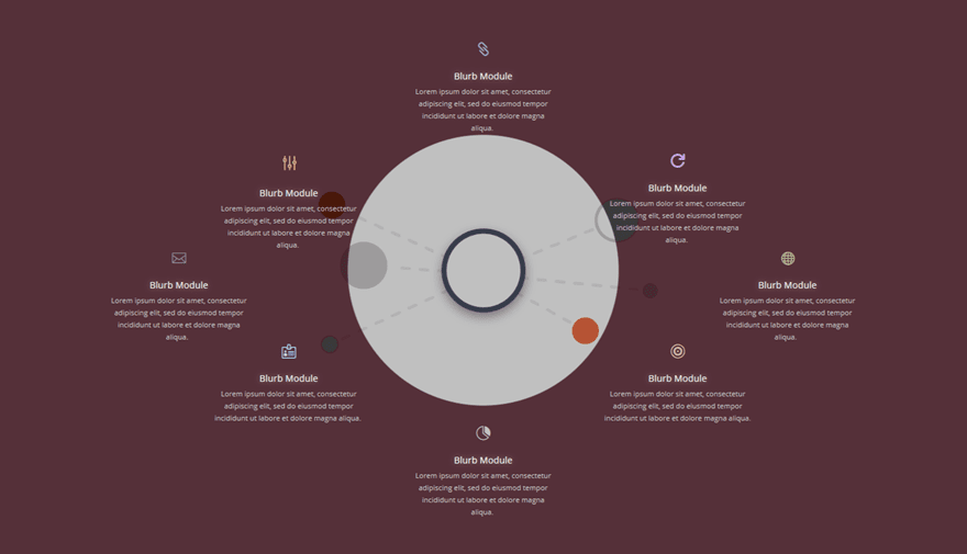
Before diving into the tutorial, let’s take a closer look at the Blurb infographic we’ll show you how to recreate, step by step.
On Desktop
On Tablet
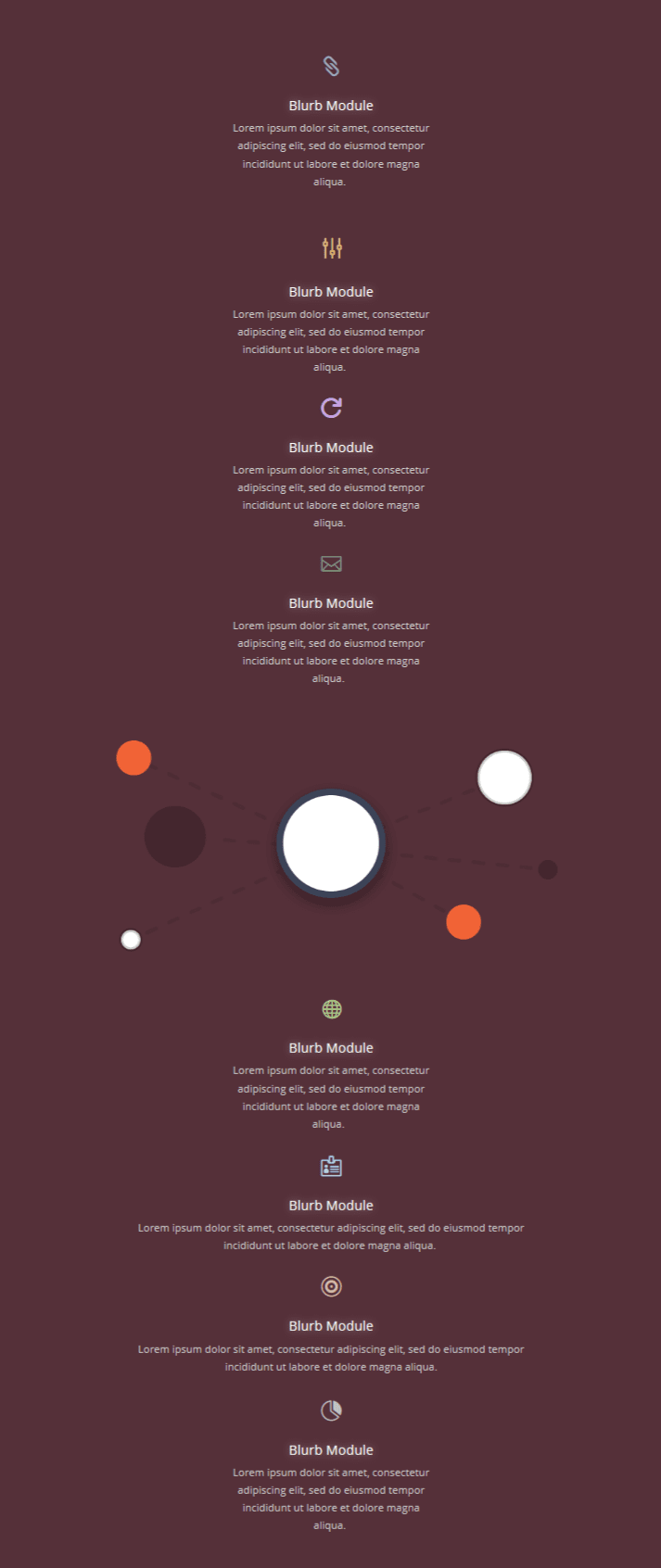
On Mobile

How to Create a Blurb Infographic with Divi
Subscribe To Our Youtube Channel
Download This Tutorial’s Free Illustration
To help you bring this tutorial to a good end, we’re going to provide you with the illustration that is being used in this tutorial for free. The illustration we’re providing you with is actually from our Design Agency Layout Pack. When you download the image resources below, you can unzip the folder and locate the image called writer-illustration_content-strategy.png to follow along.
Download the Free Illustration
Add a New Standard Section
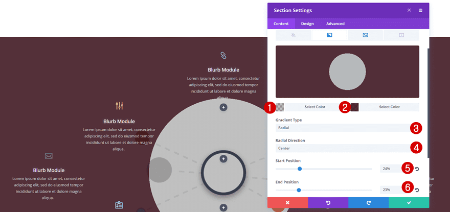
Gradient Background
Start by adding a new standard section to an existing page or a new page. Then, open the section settings and add the following gradient background:
- First Color: rgba(45,45,45,0.3)
- Second Color: rgba(45,0,11,0.81)
- Gradient Type: Radial
- Radial Direction: Center
- Start Position: 24%
- End Position: 23%
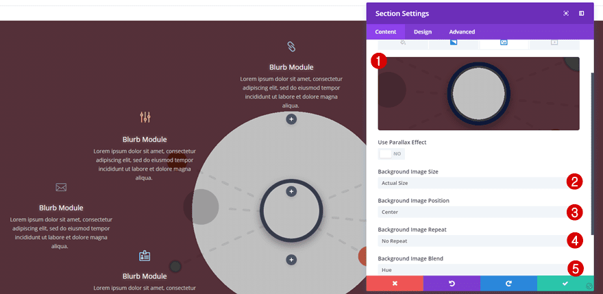
Background Image
Switch over to the background image tab, add the illustration you’ve downloaded at the beginning of this post and use the following settings:
- Background Image Size: Actual Size
- Background Image Position: Center
- Background Image Repeat: No Repeat
- Background Image Blend: Hue
Visibility
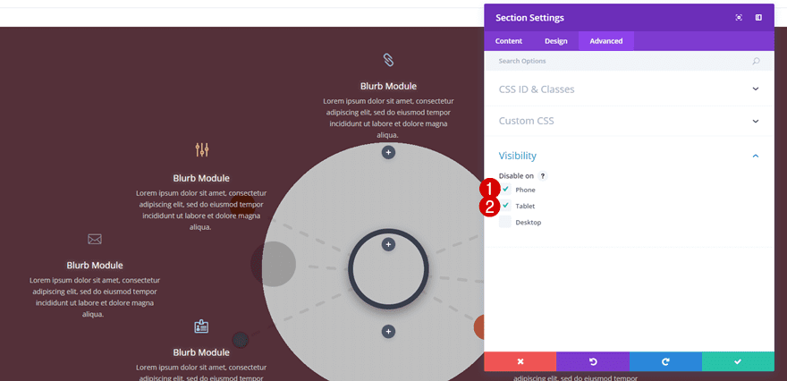
Lastly, disable the section on phone and tablet. Later on this post, we’ll create a section that matches tablets and mobiles as well.
Add 5 Standard Rows with Different Column Structures
We’ll be needing 5 different standard rows within the standard section. We’ll go over each one separately.
Row #1
Column Structure
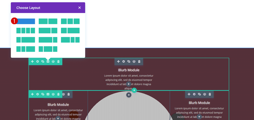
The first row you add needs one column only.
Spacing
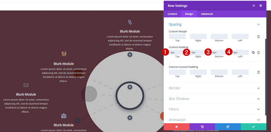
Within the Spacing subcategory of the row you’ve just created, make sure that all of the custom padding options are set to ‘0px’. This will make sure there’s no space between our rows.
Row #2
Column Structure
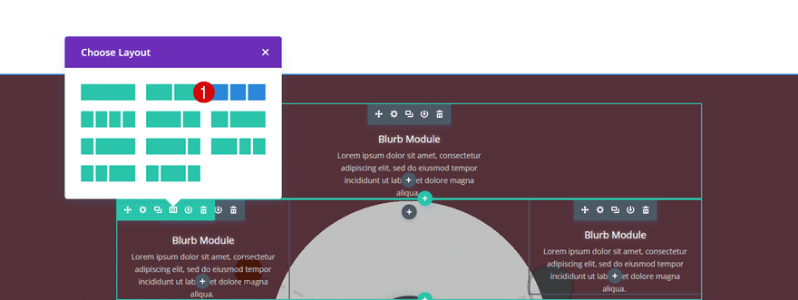
The second row needs three equal columns. We’ll be only be using two columns further down this post.
Spacing
Again, make sure to add ‘0px’ to all of the custom padding options.

Row #3
Column Structure
The third row we’ll be adding needs three equal columns as well.

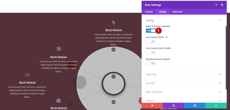
Sizing
Unlike the second row, we’re going to enable the ‘Make This Row Fullwidth’ option within the Sizing subcategory.
Spacing
This row needs ‘0px’ for all of the custom padding options as well.

Row #4
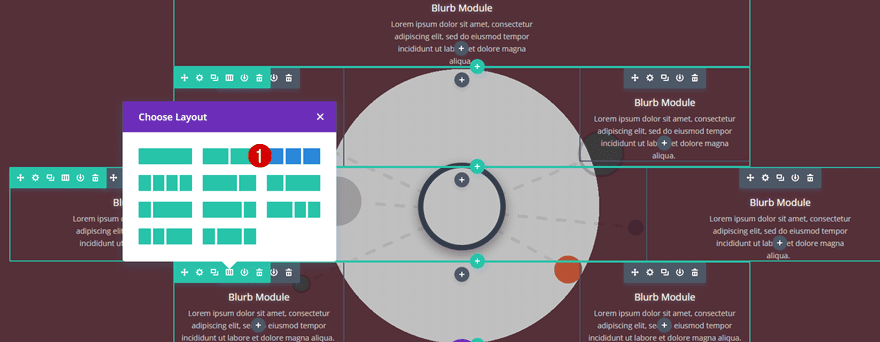
Column Structure
The fourth row is the same as the second row and needs three equal columns.
Spacing
Once again, make sure the top, right, bottom and left padding are set to ‘0px’.

Row #5
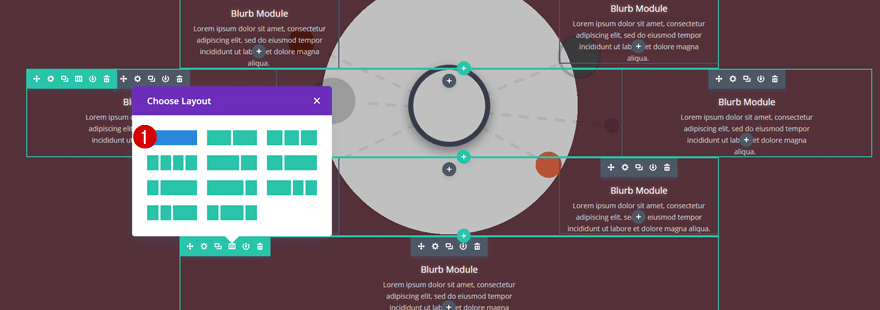
Column Structure
Last but not least, we’ll be needing the same column structure as we did for the first row; one column.
Spacing
And a custom padding of ‘0px’ for all the options.

Add Blurb Module
Choose an Icon
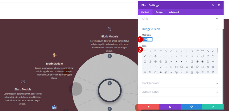
We’ll recreate the blurb module once and clone it afterwards. This saves you a bunch of time and allows you to make quick modifications. Start by adding a Blurb Module to the first row, enable the ‘Use Icon’ option within the Content tab and select an icon of choice.
Icon Settings
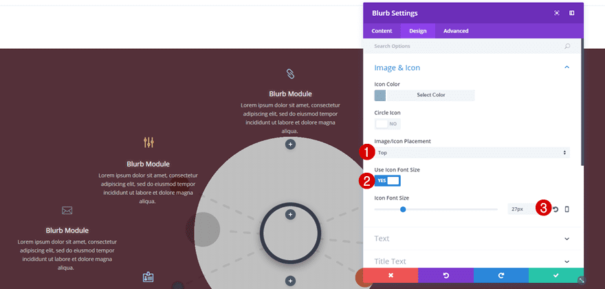
Then, move on to the Design tab, select an Icon Color of choice and use the following settings along with it:
- Image/Icon Placement: Top
- Use Icon Font Size: Yes
- Icon Font Size: 27px
Text Settings
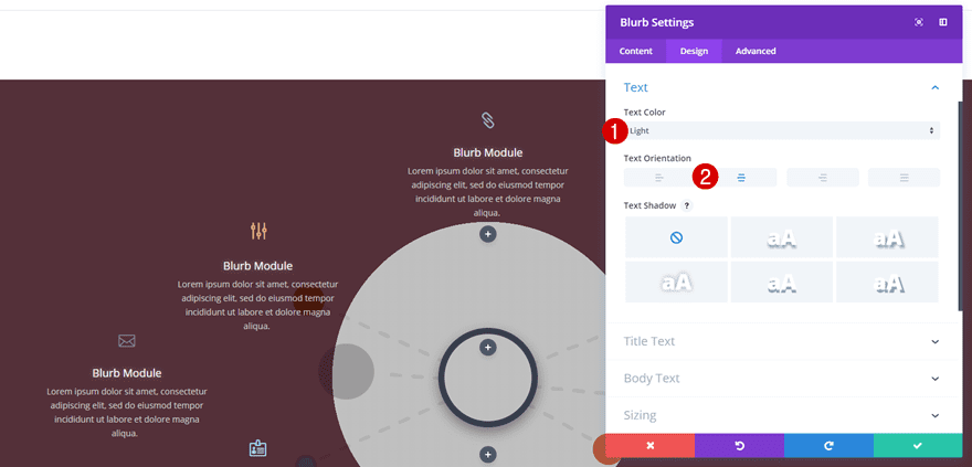
Next, open the Text subcategory, use a ‘Light’ Text Color and enable center Text Orientation.
Title Text
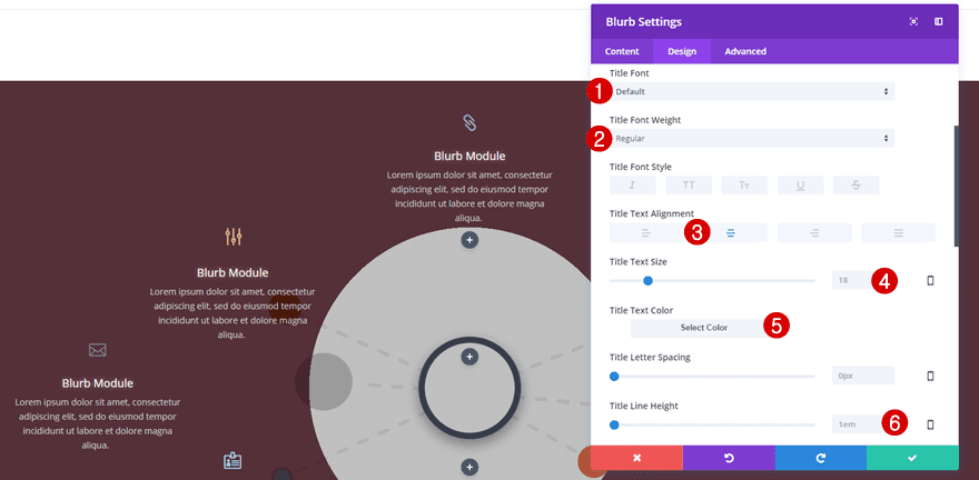
Move on to the Title Text subcategory and make use of the following settings next:
- Title Font: Default
- Title Font Weight: Regular
- Title Text Alignment: Center
- Title Text Size: 18px
- Title Text Color: #FFFFFF
- Title Line Height: 1em
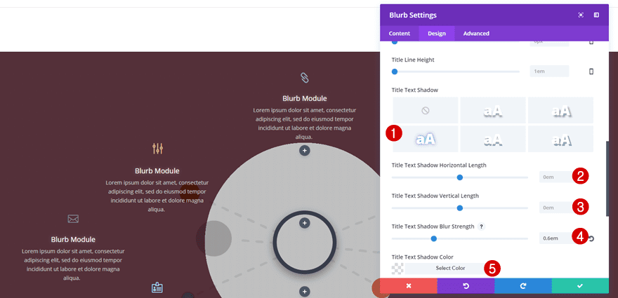
Scroll down the same subcategory and add some text shadow as well:
- Title Text Shadow Horizontal Length: 0em
- Title Text Shadow Vertical Length: 0em
- Title Text Shadow Blur Strength: 0.6em
- Title Text Shadow Blur Strength: rgba(255,255,255,0.94)
Body Text
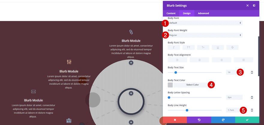
Then, open the Body Text subcategory and use the following settings for it:
- Body Font: Default
- Body Font Weight: Regular
- Body Text Size: 14px
- Body Text Color: #cccccc
- Body Line Height: 1.7em
Sizing
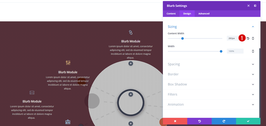
Lastly, open the Sizing subcategory and apply a Content Width of ‘282px’.
Clone Blurb Module 7 Times
Place in Following Columns
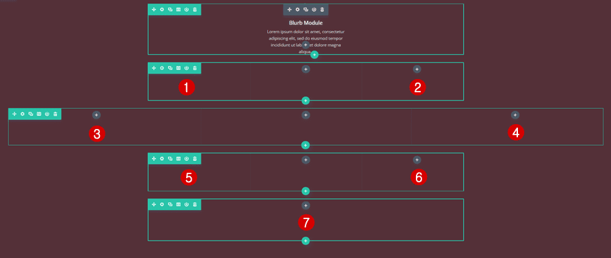
Once you’re done modifying the Blurb Module, you can go ahead, clone it 7 times and place it in the columns marked in the print screen below.
Change Icon
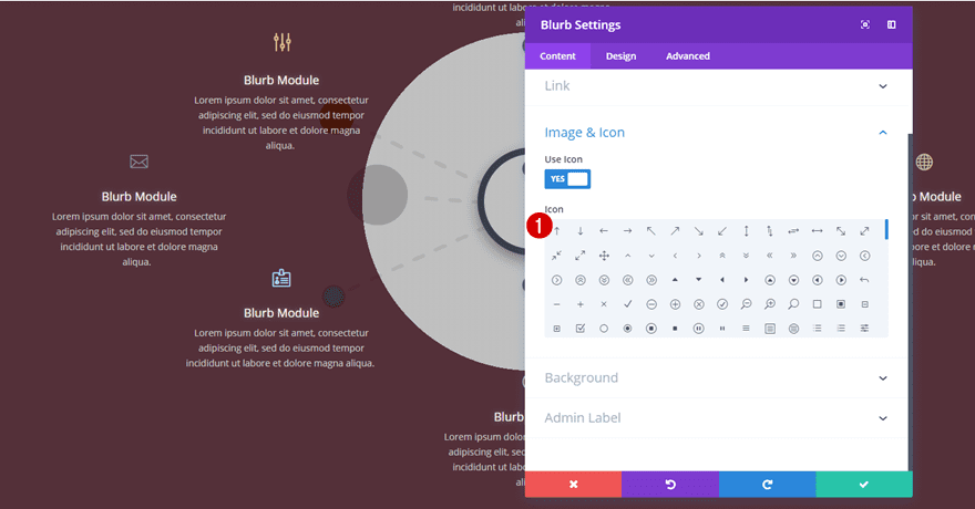
Obviously, you’ll want to make each one of the Blurb Modules unique. Go ahead, change the content and choose another icon within the Content tab.
Change Icon Color
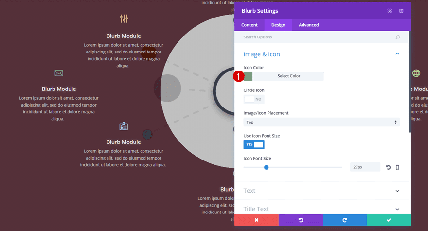
Change the Icon Color within the Design tab according to your needs for each one of the Blurb Modules as well.
Clone Section for Mobile & Tablet
Remove Gradient Background & Background Image
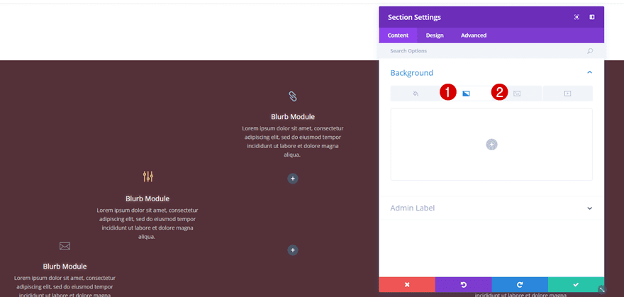
Your desktop version is finished. Now it’s time to start creating the tablet and phone version. Start by cloning the section you’ve created, open the section settings and remove the gradient background along with the background image.
Add Background Color
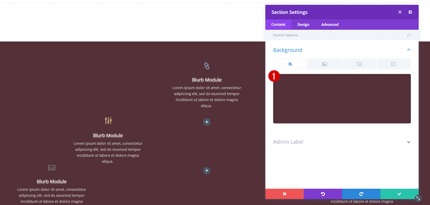
While you’re in the Background subcategory, add ‘rgba(45,0,11,0.81)’ as your background color.
Add Image Module
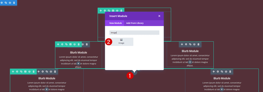
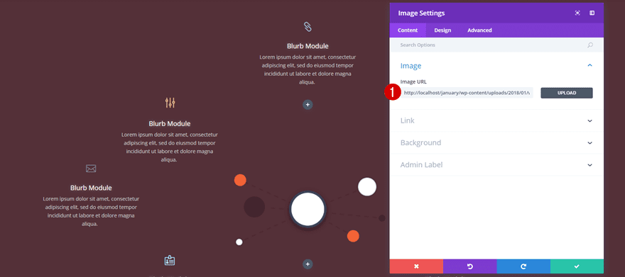
Next, you’ll need to add the illustration, which you’ve download at the beginning of this post, to an Image Module.
Change Visibility
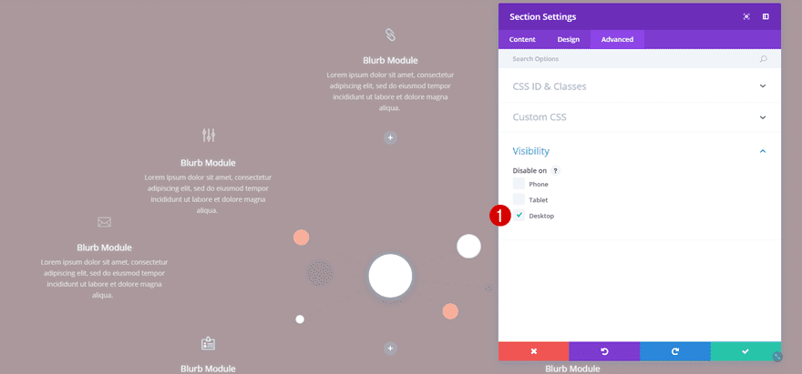
Last but not least, disable the section on desktop instead of on phone and tablet.
Result
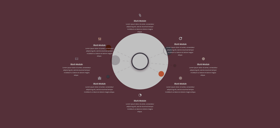
We’re done! Let’s take a look at the blurb infographic we’ve shown you how to recreate within this blog post!
On Desktop

On Tablet

On Mobile

Final Thoughts
In this post, we’ve shown you how to create a blurb infographic using Divi’s built-in options and a free infographic that you can download at the beginning of this post. Creating a blurb infographic can come in handy if you need to share a lot of content about a specific topic and you still want it to remain interactive and fun. If you have any questions or suggestions; make sure you leave a comment in the comment section below!



Thanks Donjete! It has worked me perfectly, both in inspiration and tutorial.
That was an excellent tutorial! I’m always trying to figure out how to better depict infographics without just throwing an image on the page.
Thank you so much for sharing!
Hello,
can it be that the file
writer-illustration_content-strategy.png
was not in the Design Agency Layout Pack
it as in the _divi-copywriter-layout-pack
I was in the midst of creating an infographics and then you show up in my inbox. MAGIC! Thank you.
Great idea! Will keep this in mind for something soon. Thank you!
Another creative tutorial of what’s possible with Divi.
Thank you so much for the creativity.
Geniale!
The concept is great and it looks awesome on a Desktop and even a tablet. However, it gets tricky on a cell.
Another item that looks perfect on Desktop and then not so great on tablet and mobile.
Is there a live demo to see it in action?
hi nice theory but where is “Live proof”?
Ohhh, great post, thank you for sharing 🙂
This is good to know… thanks!
Lovely!
Excellent. Infographics are highly effective in building a better comprehensive post. This guide will be very helpful for a beginner if he is willing to make an infograph.