Divi’s Scroll Effects allow us to create exceptional transition animations that can wow visitors with an eye-catching design. Images, in particular, can showcase the power of these scroll effects in surprising ways. In this tutorial, we are going to explain step-by-step how to create a breakaway image transition with Divi and its scroll effects. This effect was originally featured on the demo page. The effect involves slicing images beforehand using a photo editor like Photoshop (its pretty easy to do). After the images are sliced, all we need to do is add them to Divi and use the built-in scroll effects to make the magic happen.
Let’s get started.
Sneak Peek
Here is a peek at the design for today.

You can also see the original live demo of the design on the demo page under the title “Exercise Doesn’t Have to Be Boring”.
Download the Breakaway Image Transition Divi Layout for FREE
To lay your hands on the layout from this tutorial, you will first need to download it using the button below. To gain access to the download you will need to subscribe to our newsletter by using the form below. As a new subscriber, you will receive even more Divi goodness and a free Divi Layout pack every Monday! If you’re already on the list, simply enter your email address below and click download. You will not be “resubscribed” or receive extra emails.
To import the layout to your page, simply extract the zip file and drag the JSON file into the Divi Builder.
Let’s get to the tutorial, shall we?
What You Need to Get Started
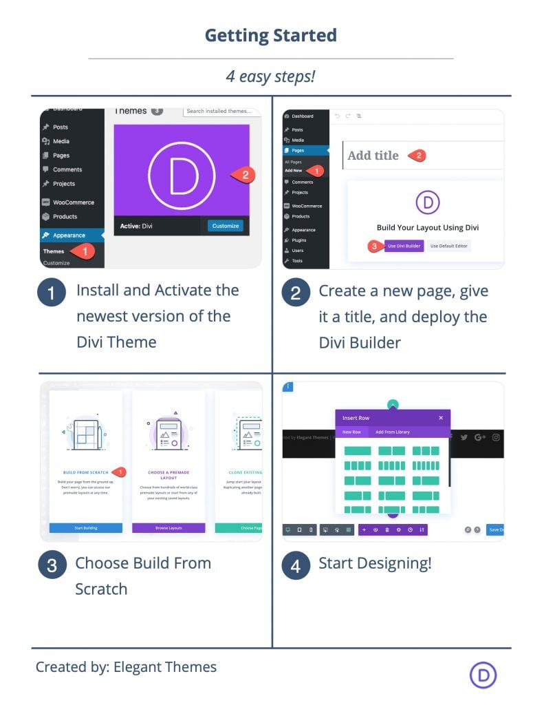
To get started, you will need to do the following:
- If you haven’t yet, install and activate the Divi Theme.
- Create a new page in WordPress and use the Divi Builder to edit the page on the front end (visual builder).
- Choose the option “Build From Scratch”.
After that, you will have a blank canvas to start designing in Divi.
Aside from the Divi setup above you will need:
- Two images (at least 1080px by 540px)
- A photo editing software like Photoshop to slice the images before adding them to Divi.
Part 1: Slicing the Images in Photoshop
Before we can start creating our design in Divi, we need to slice our two images that will be used for the breakaway transition scroll effect. Both images will need to be cropped so that they are exactly 1080px by 540px. After that, they need to be sliced into 8 equal parts (4 across, 2 down). Once ready we can save them to our computer and upload the image slices to our site. Let’s begin with the first image.
Image #1
Cropping the Image
The first thing we need to do is crop the image so that it has the exact dimensions of 1080px by 540px. You can use any image editing software to do this. In Photoshop, you can use the crop tool.
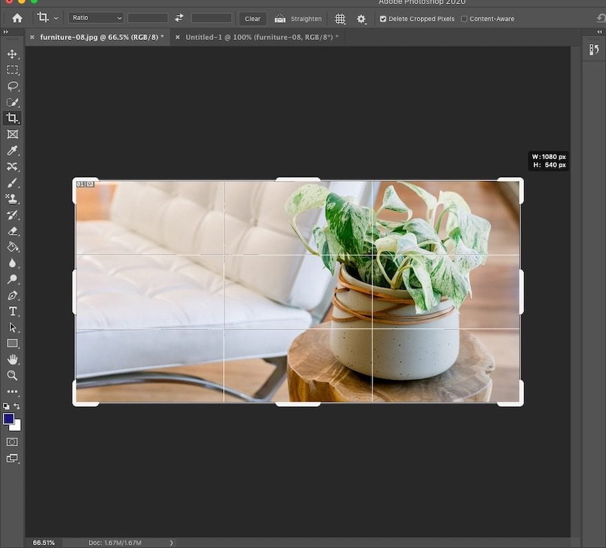
Slicing the Image
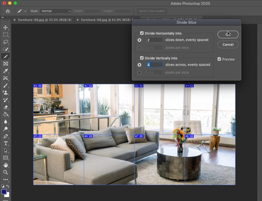
Next, click to use the slice tool and select the entire image. Right-click on the slice/image and select the Divide Slice option.
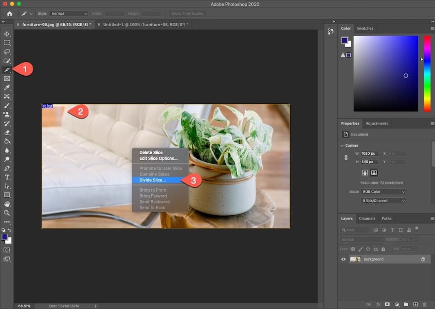
In the Divide Slice option box, update the following:
Divide Horizontally into:
- 2 slices down, evenly spaced
- 270 pixels per slice
Divide Vertically into:
- 4 slices across, evenly spaced
- 270 pixels per slice
Then click OK.
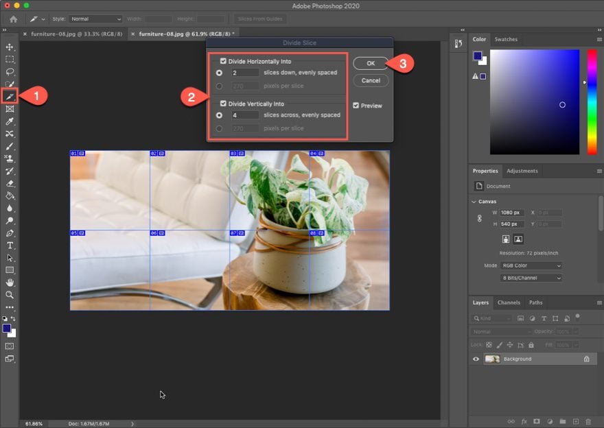
Saving the Image Slices
Now we have an image sliced into 8 equal blocks, each of them 270px by 270px.
To save the image slices, navigate to File > Export > Save for Web.
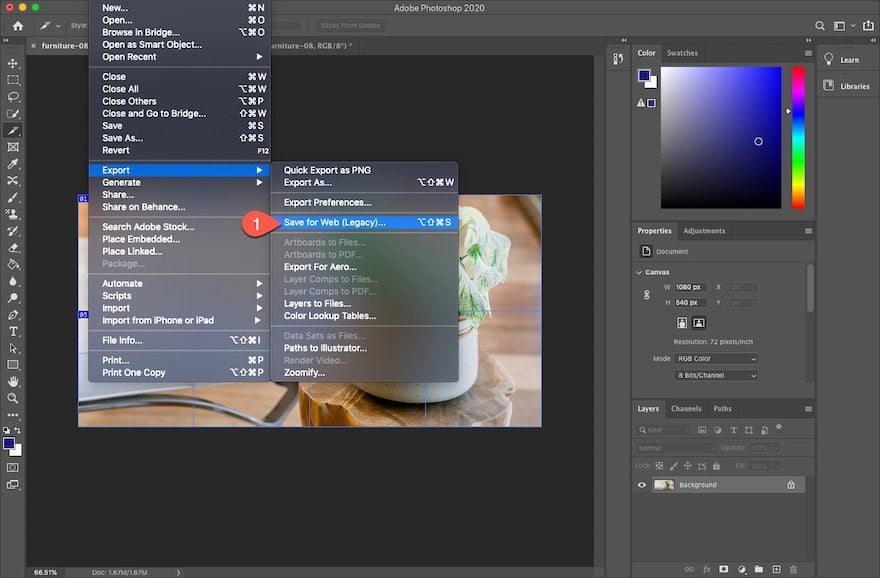
Then choose the file format and click Save.
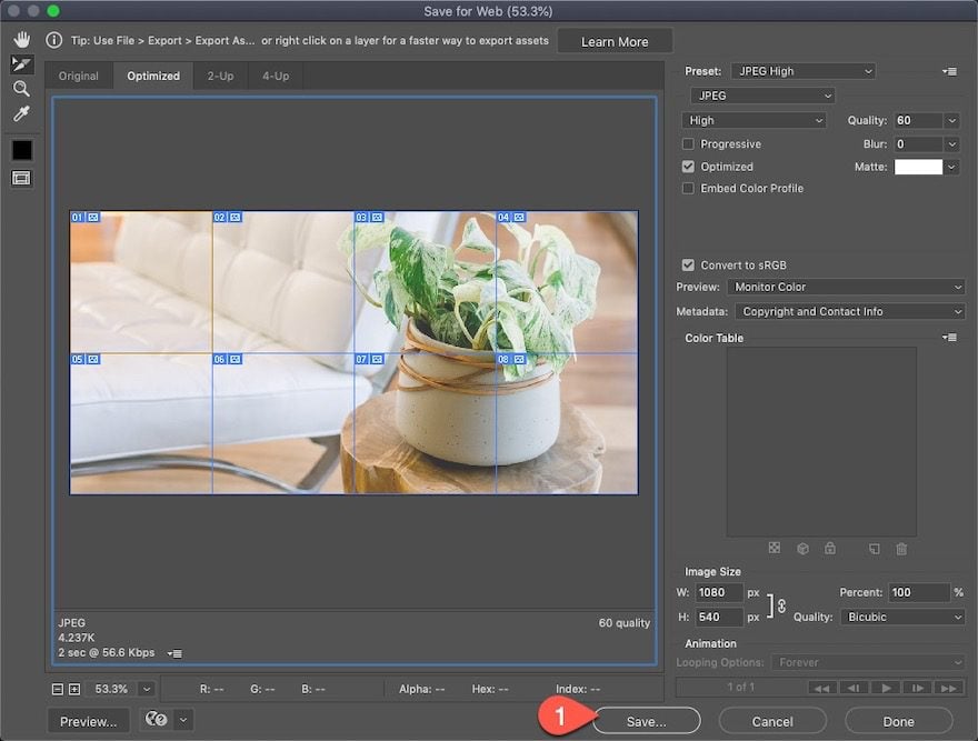
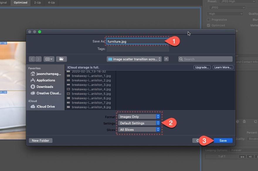
In the popup box, make sure to update the following:
- Save As: [enter name for image(s)]
- Format: Images Only
- Settings: Default Settings
- Slices: All Slices
Then click Save.
Now all of your image slices will be saved to the computer, ready to be uploaded to Divi.
Image #2
To create the second image needed for this breakaway image transition scroll effect, we should follow the same process (cropping, slicing, and saving) we used to create the first image.
Rotate Image Slices
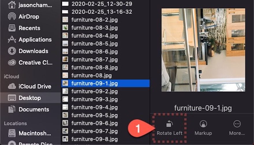
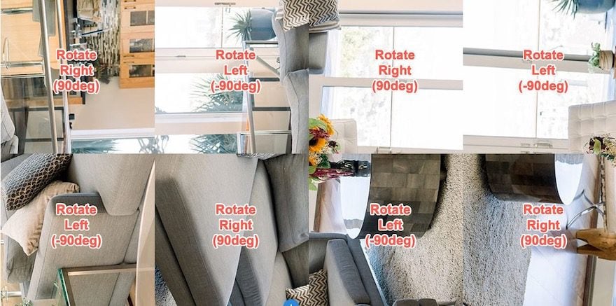
However, because of the way the rotating scroll effect works, each of the image slices that make up the second image will need to be rotated 90 degrees either to the left or to the right.
To rotate an image, you can use Photoshop or the built-in image editing software from your operating system (you can even use WordPress media gallery to edit and rotate the images after uploading them to your site.).
Here is a guide for how the images should be rotated within their original position when slicing the image.
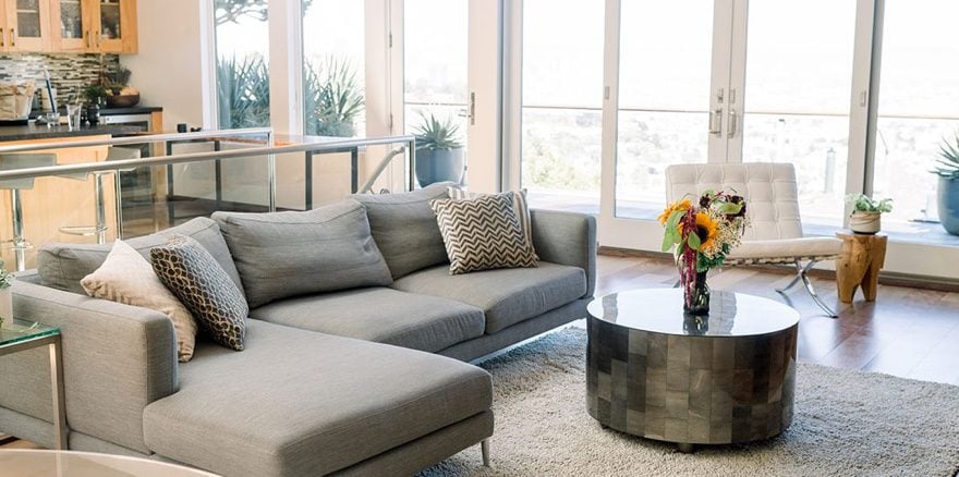
Here is the original image.
Here is how the image slices should be rotated before uploading them to your site.
This is necessary so that we can eventually get the following scroll effect.
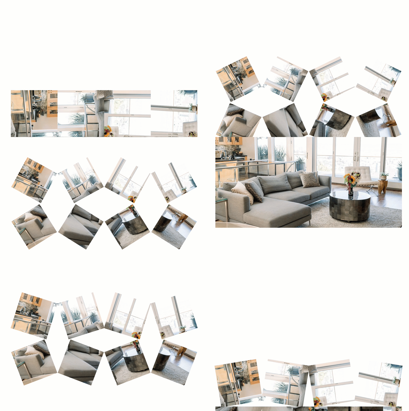
Now that both images are cropped, sliced, saved, and rotated, you are ready to add them to your Divi site. You should have a total of 16 images (8 from image one and 8 from image 2).
Part 2: Creating the Breakaway Image Transition Scroll Effect in Divi
Once the image slices are ready, we can begin the design process in Divi. Here’s how to do it.
Add Row #1
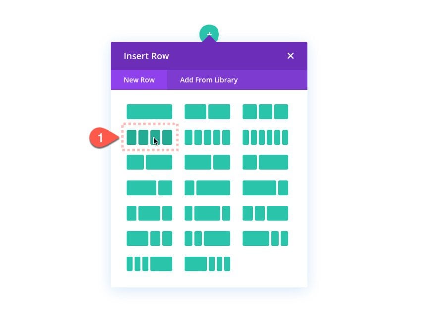
To start, create a four-column row.
Row Settings
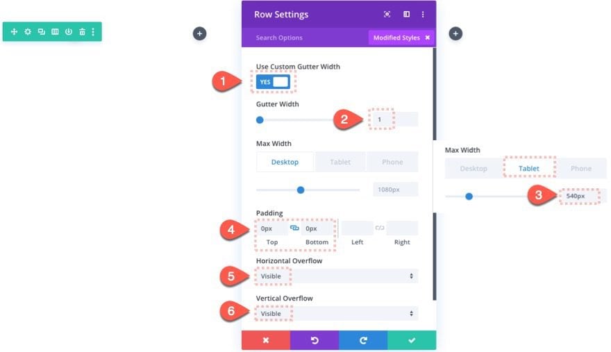
Open the row settings and update the following:
- Gutter Width: 1
- Max Width: 1080px (desktop), 540px (tablet and phone)
- Padding: 0px top, 0px bottom
- Horizontal Overflow: visible
- Vertical Overflow: visible
Update Section Padding
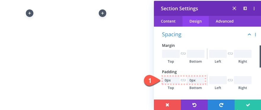
Since we are going to be positioning our second row absolutely on top of the first row, we need to take out the top (and bottom) padding of the section so that it doesn’t throw off the position of the second row. Open the section settings and update the following:
- Padding: 0px top, 0px left
Adding the Images
In the first row, we are going to add each of the 8 images/slices that make up the first image. The images should be positioned within the columns exactly how they were sliced in photoshop (4 across and 2 down).
Here is an illustration of each image labeled with a number. This is how it should look like after all the images have been added to the row.
Image #1
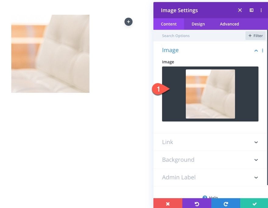
Add the first image module to column 1.
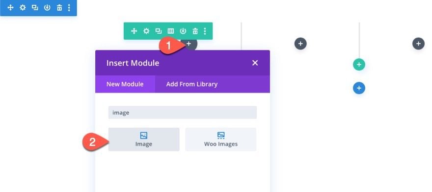
Then upload the first image slice to the module.
Scroll Effects
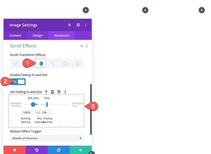
Under the advanced tab, add the following scroll effects to the image.
- Enable Fading In and Out: YES
- Starting Opacity: 100% (at 20% viewport)
- Mid Opacity: 100% (at 20% viewport)
- Ending Opacity: 0% (at 50% viewport)
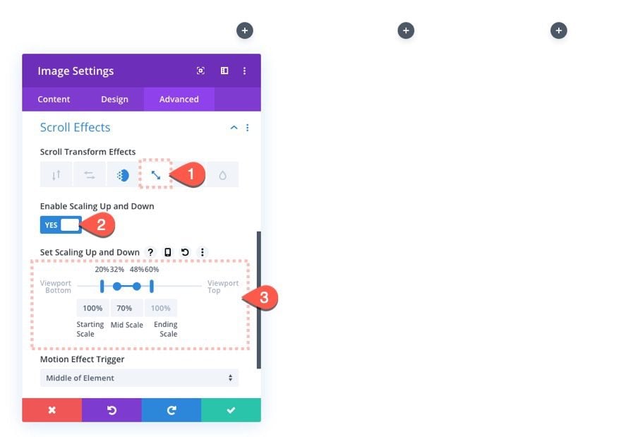
Click the Scale tab and update the following:
- Enable Scaling Up and Down: YES
- Starting Scale: 100% (at 20% viewport)
- Mid Scale: 70% (at 32% – 48% viewport)
- Ending Scale: 100% (at 60% viewport)
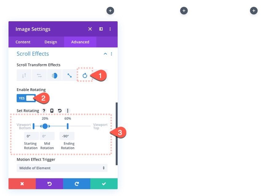
Click the rotate tab and update the following:
- Enable Rotating: YES
- Starting Rotation: 0 deg (at 0% viewport)
- Mid Rotation: 0 deg (at 20% viewport)
- Ending Rotation: -90 deg (at 60% viewport)
The scroll effect will look like this when scrolling down the page.

Image #2
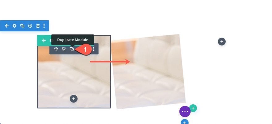
To create image #2, duplicate image #1 and place the duplicate in column 2.
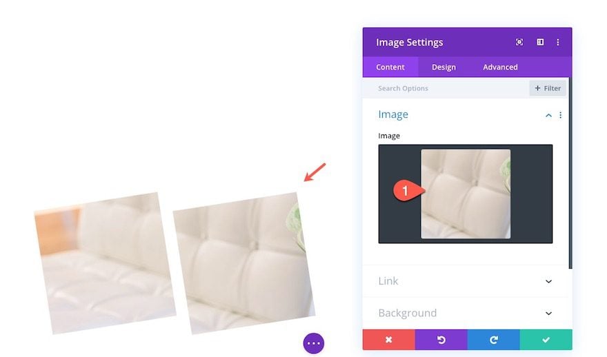
Update the duplicate image module with image #2.
Update Scroll Effect
We are going to keep most of the same scroll effects carried over from image #1. The only thing we need to change is the rotation. Go to the advanced tab and change the ending rotation to 90 deg (instead of -90 deg) so that it rotates the opposite direction.
- Ending Rotation: 90 deg
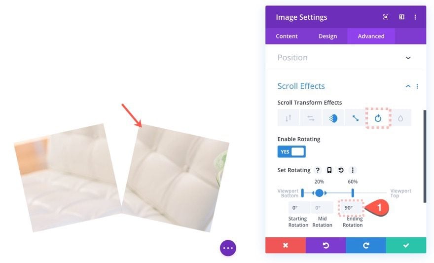
Image #3
To create image #3, copy and paste image #1 into column 3 and then change the image to image #3.
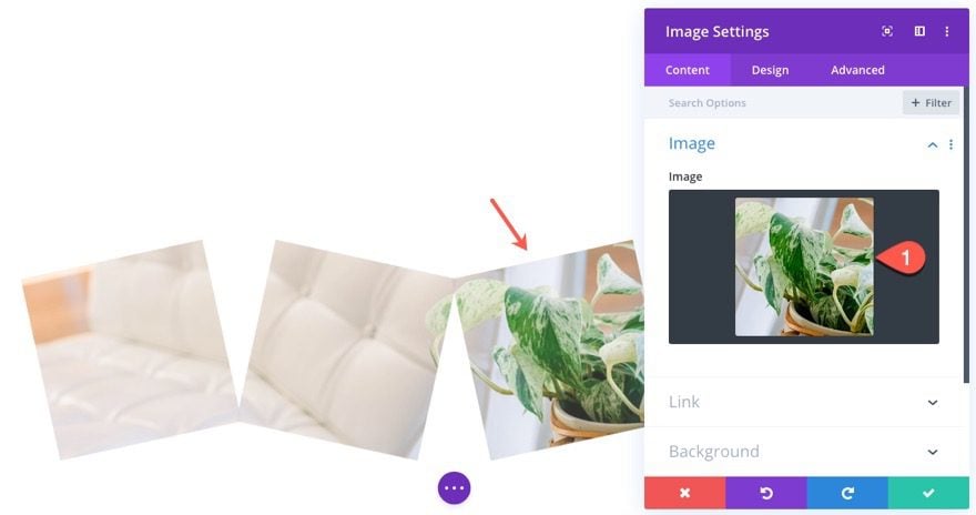
Image #4
To create image #4, copy and paste image #2 into column 4 and update the image to image #4.
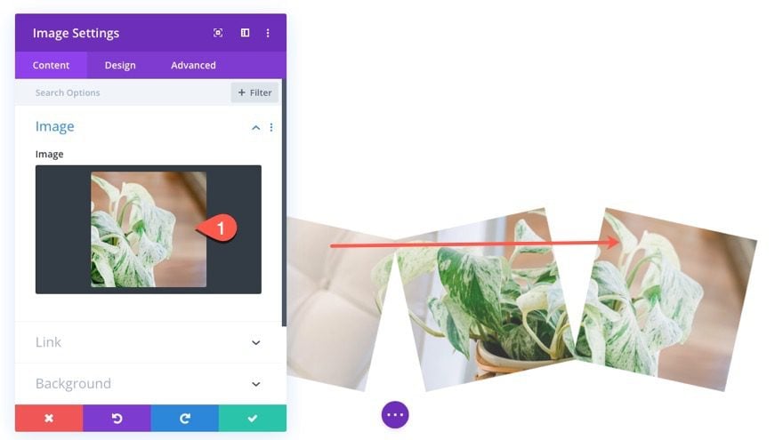
Image #5
To create image #5, duplicate image #1 so that the duplicate is directly underneath in column 1. 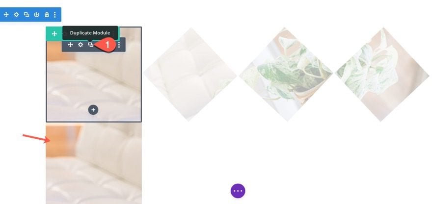
Update the image to image #5. Then update the Fading In and Out scroll effect as follows:
- Starting Opacity: 100% (at 0% viewport)
- Mid Opacity: 100% (at 0% viewport)
- Ending Opacity: 0% (at 40% viewport)
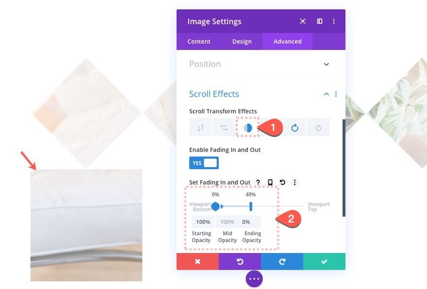
Then update the Scaling Up and Down scroll effect as follows:
- Starting Scale: 100% (at 0% viewport)
- Mid Scale: 70% (at 12% – 28% viewport)
- Ending Scale: 100% (at 40% viewport)
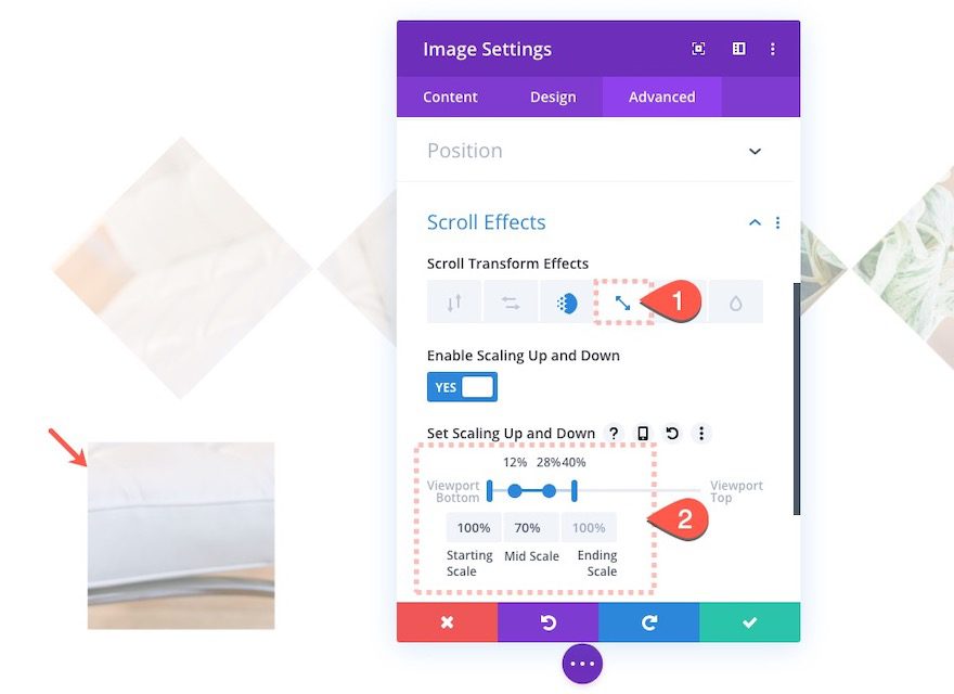
And finally, update the Rotating scroll effect as follows:
- Starting Rotation: 0 deg (at 0% viewport)
- Mid Rotation: 0 deg (at 0% viewport)
- Ending Rotatiion: 90 deg (at 40% viewport)
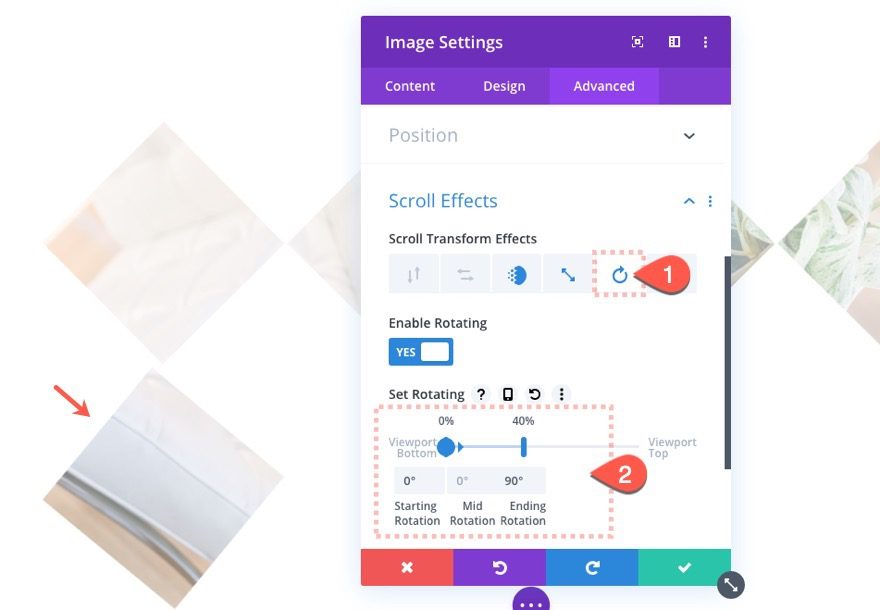
Image #6
To create image #6, duplicate image #5 and move it to column 2 (under image #2).
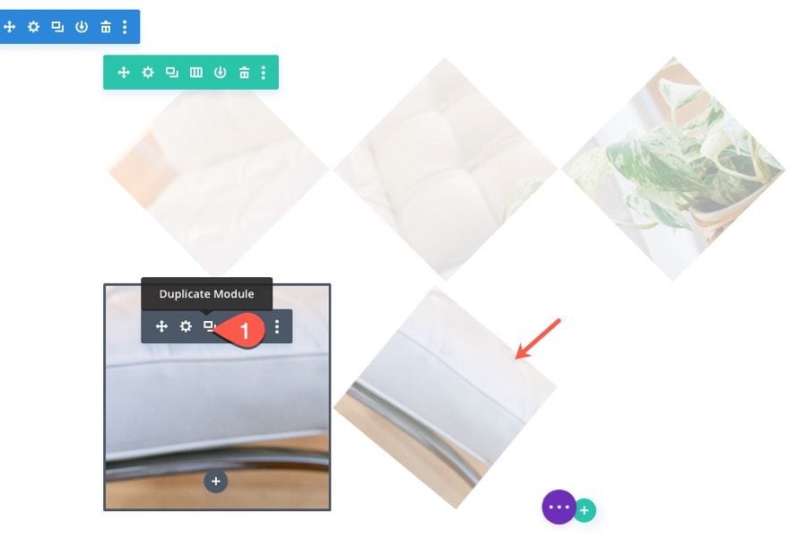
Update the image module with image #5. Then adjust the rotating scroll effect to the opposite direction (-90 deg) as follows:
- Ending Rotation: -90 deg
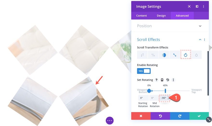
Image #7
To create image #7, duplicate image #5 and move it under image #3 in column 3. Then update the duplicate image module with image #7.
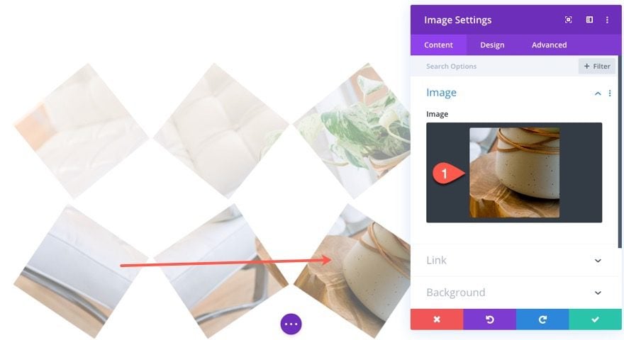
Image #8
To create image #8, duplicate image #6 and move it under image #4 in column 4. Then update the duplicate image module with image #8.
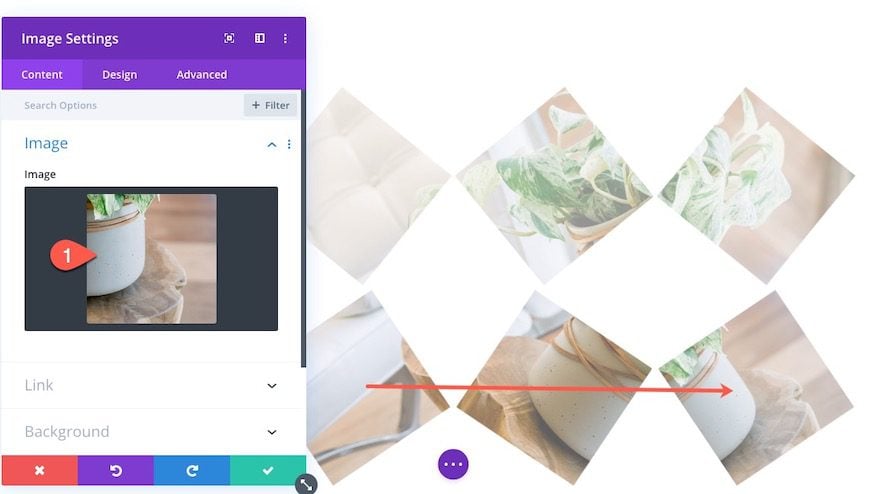
Now all of the image slices have been added to row #1 with the breakaway scroll effect.
Here is what the result looks like so far.

Add Row #2
The second row of images won’t take much time to design. All we need to do is duplicate row #1, update all of the images with the correct ones, and then give it an absolute position.
Go ahead and duplicate row #1.
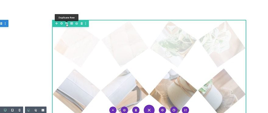
Update Row #2 Images
Remember the rotated images we created for image #2. Now, all we need to do is upload each of them to the correct image module location within row #2.
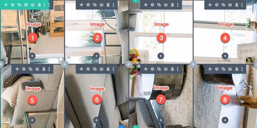
Update Image Scroll Effects
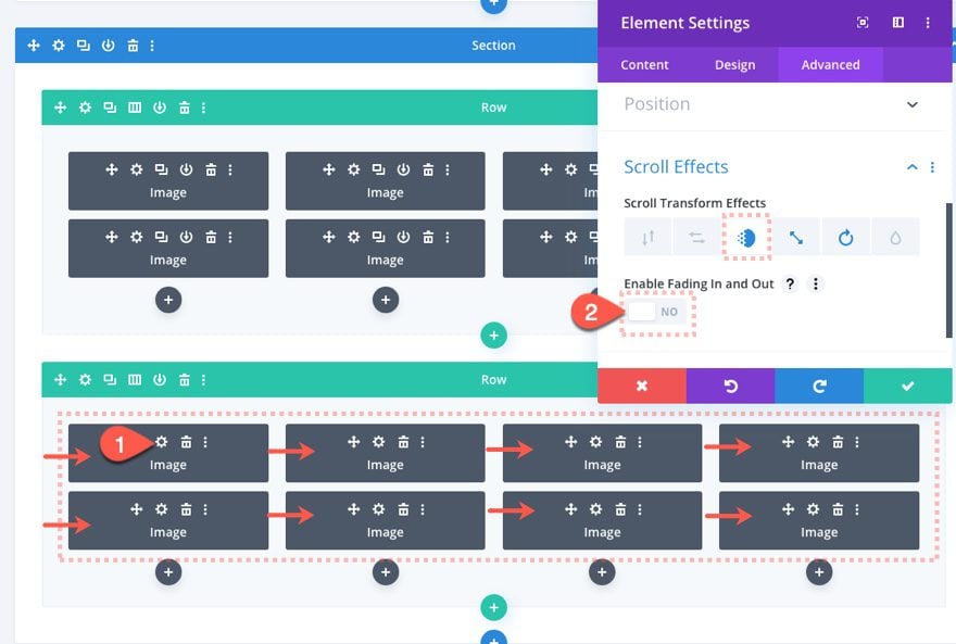
Once the new rotated images are in place, we need to take out the Fading In and Out scroll effect from all of the images in Row #2.
Do do this, deploy the wireframe view mode and use multi-select to select all 8 of the images in row #2. Then open the settings for one of the selected images to deploy the Element settings. Under the Fading In and Out scroll effect option, update the following:
- Enable Fading In and Out: NO
Position Row #2
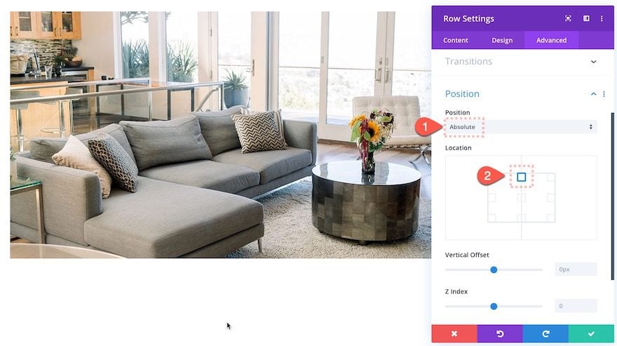
Our last step is to position row #2 directly behind row #1. An easy way to do this is to give the row and absolute position. Open the settings for row #2 and update the following:
- Position: Absolute
- Location: Top Center
Final Result
To see the result, you may need to give your section a significant amount of top and bottom margin or create other sections above and below the design. This will give you the room you need to see the scroll effect properly.
Let’s check out the final result.

And here it is on mobile.

Final Thoughts
This breakaway image transition is an impressive design by itself, but you can easily use it to convey a transformation type message to visitors (like a before and after). And you don’t have to settle for this design either. Feel free to experiment with different scroll effects to create even more amazing image transitions. Have any ideas?
I look forward to hearing from you in the comments.
Cheers!



what about the responsiveness of this? looks a mess on tablet and mobile contrary to the demo page which is responsive, any fix??
This is really nice to decorate any portfolio showcase. Thanks for sharing this feature.
nicee good
Thank you for sharing the feature. Image transition can be useful to show your portfolio in an elegant way.
Great! Thanks for this step by step guide.
Aha! I was trying to recreate this when the scroll effects demo came out but couldn’t get the full transition effect working 100%… easy when you know how. thanks 🙂
I also have this problem. Was your problem solved?
Your divi theme get superhit , i am going to buy a theme for my new blog should i buy divi theme or wait for your upcoming themes , Coz i trust elegantthemes
Nice, thanks for sharing.
Could be nice to have an explanation of of all effects rendred on the demo page https://elegantthemesexamples.com/motion-effects/.
Really looking forward to it.