This post is part 4 of 5 in our mini series titled 5 Impressive Ways to Style Divi’s Countdown Timer Module. Stay tuned this week for all five unique examples of Divi’s countdown module, with a tutorial on how to achieve each one!
Have you noticed that gradients seem to be making a comeback in the design world? Whether it’s subtle minor gradients for a texture effect, or multi-color animating gradients, design conscious companies of all sizes are embracing the gradient trend. That’s why in today’s post I’m going to show you how to create a gorgeous countdown timer with a subtle animated gradient background. Whatever you may be counting down to, or building suspense for, this countdown is sure to impress your website visitors.
Let’s get started!
The Divi Countdown Module: Before & After
You’re probably familiar with the default countdown timer module, but let’s take a look and compare to what we’ll be creating today:

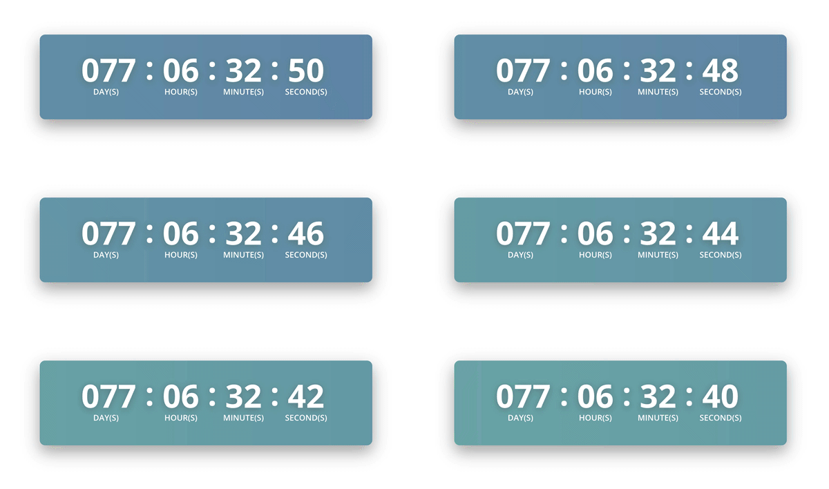
And here’s the countdown we’ll be creating today:
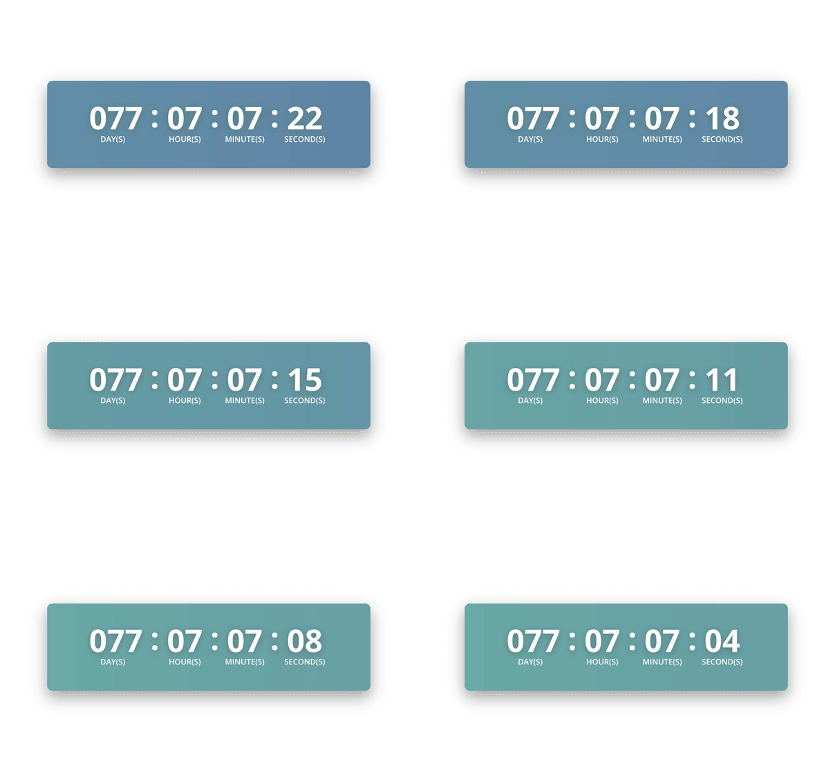
Due to the frame rate of animated GIFs, the gradient animation doesn’t look as smooth in the image above. Thankfully, it will look great on your Divi website!
In addition to the animated gradient, this countdown has a few shadows that helps the timer pop off the page. You can see this in the drop shadow of the entire countdown, as well as the text shadow of the numbers. This gives the countdown depth and texture that makes the countdown feel alive on your web page.
How to Create a Countdown Timer with an Animated Gradient Background
Subscribe To Our Youtube Channel
Preparing the Design Elements
This countdown timer is made with the built-in Divi controls, as well as some custom CSS, so there’s no images to find, download, or edit. However, we will need to use an online gradient animator to create the necessary CSS for us.
There’s a few free gradient generators out there, but the one I use and recommend is https://www.gradient-animator.com/
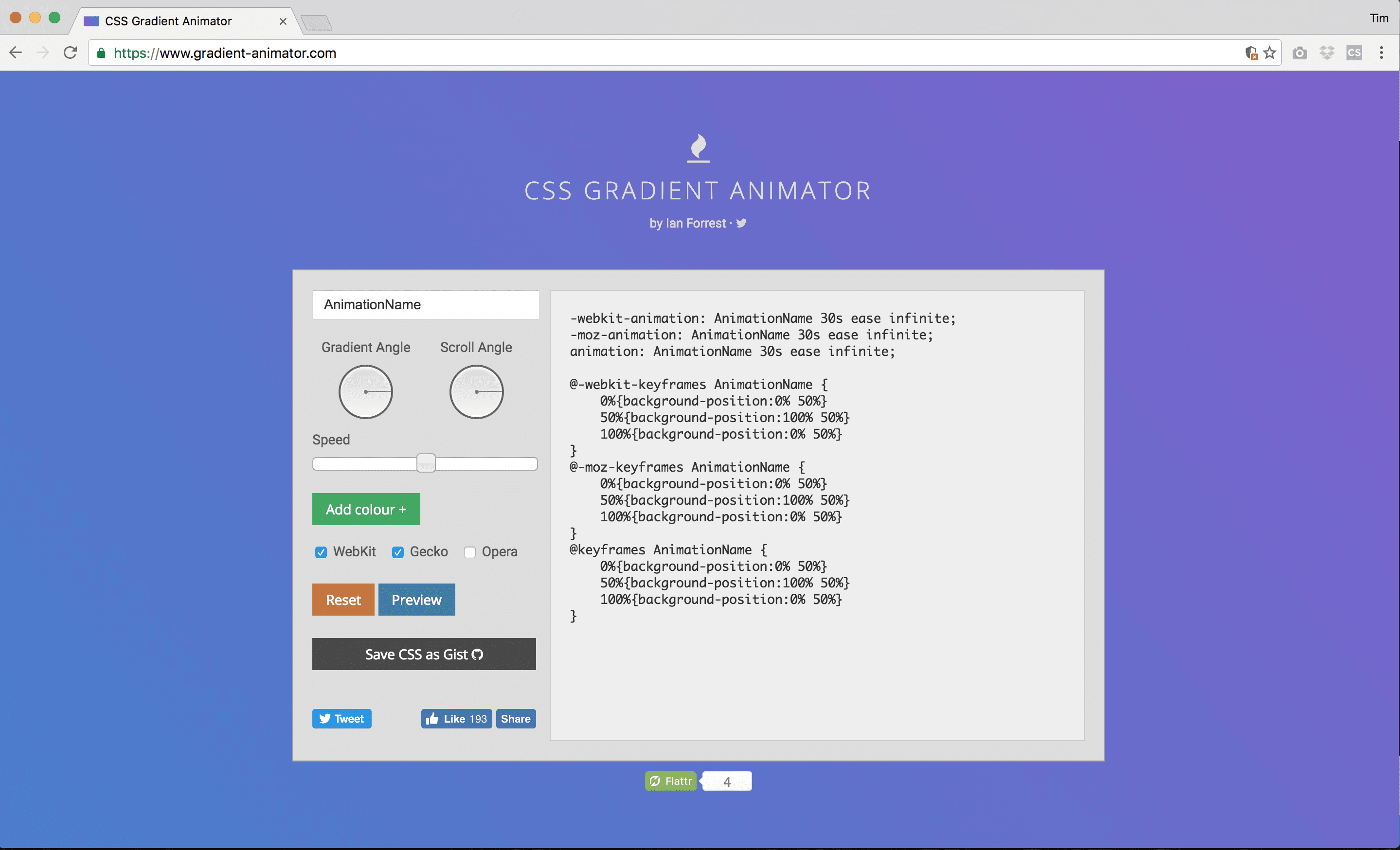
The first thing you need to do with the generator is add your colors. We’ll be using the following two colors:
#6990af; #74b2af;
Click the green ‘Add Colour’ button and add the first color. Then, do the same again to add the second color from above.
You can then click the preview button to see your gradient animation in action in the background. I left the other settings in their default state, but feel free to change the angles and speeds if you’d like.
Once your happy with the animation, copy the CSS code in the center of the page and paste it into a blank text file for safe keeping. We’ll be back for it in a bit.
Implementing the Design with Divi
Now that our animation has been created, we’re ready to start creating the countdown timer in Divi. As with the previous posts in this series, you can choose to create today’s countdown timer in a brand new page, or add it to an existing page.
To keep things as straightforward as possible for this tutorial, I’m going to be working in a new page. So, I’m going to create a new page, enable the Divi Builder, and then click the “Use Visual Builder” button.
If you’ve created a fresh page like I did, then there should already be a blank section. Otherwise, create a new section if you’re adding this to your existing Divi page.
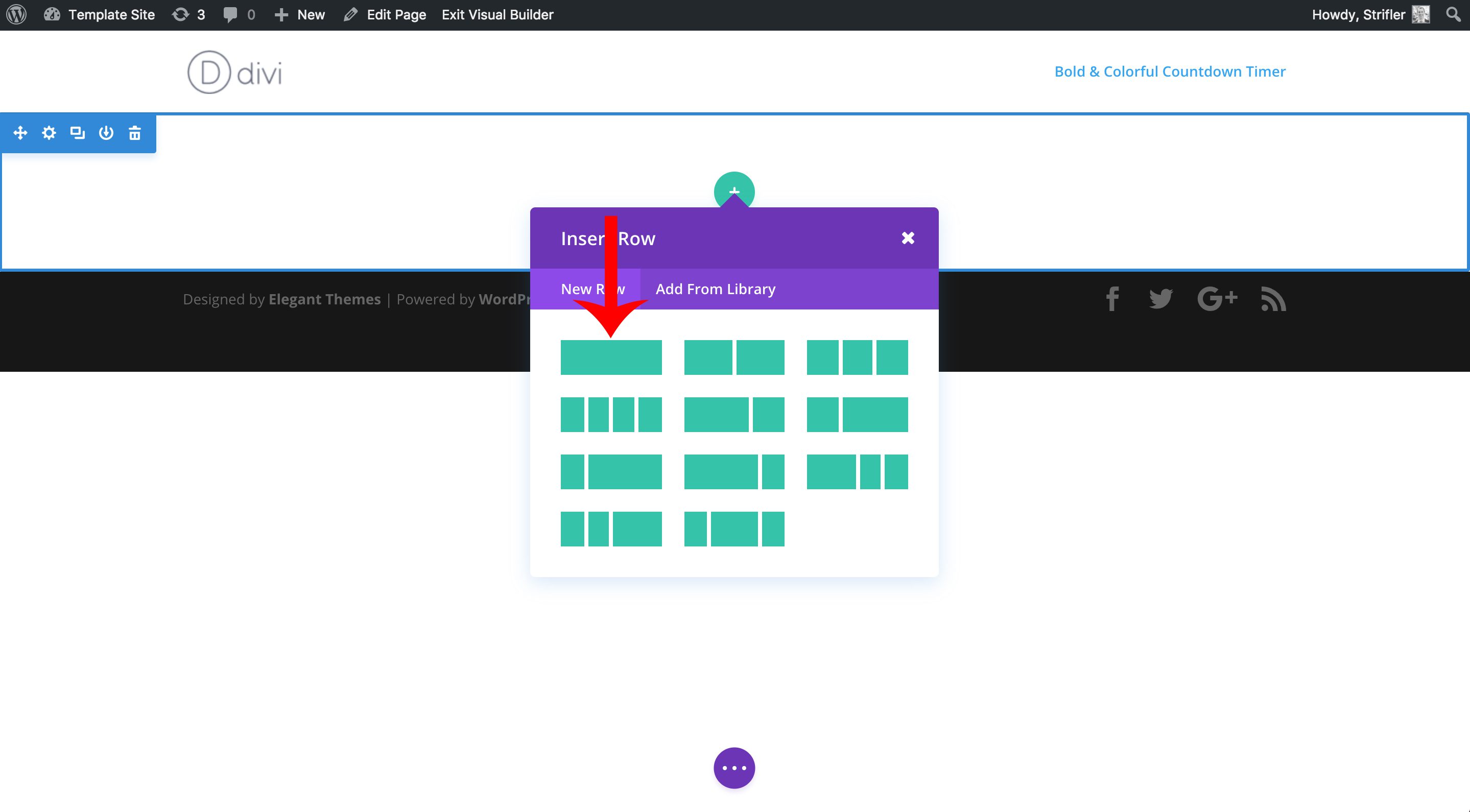
Now we’re going to add a row by clicking on the green (+) circle icon, then click on the icon for the one column row as indicated by the red arrow in the screenshot below.
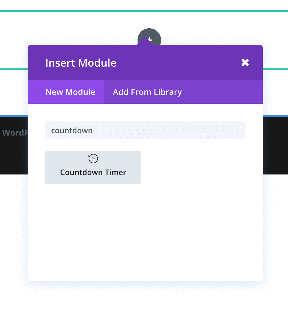
Next, Divi will automatically prompt you to choose a module from the list. So choose the countdown timer, or as a short cut, you can start typing the name and it will conveniently appear at the top.
Adjusting the Module Settings
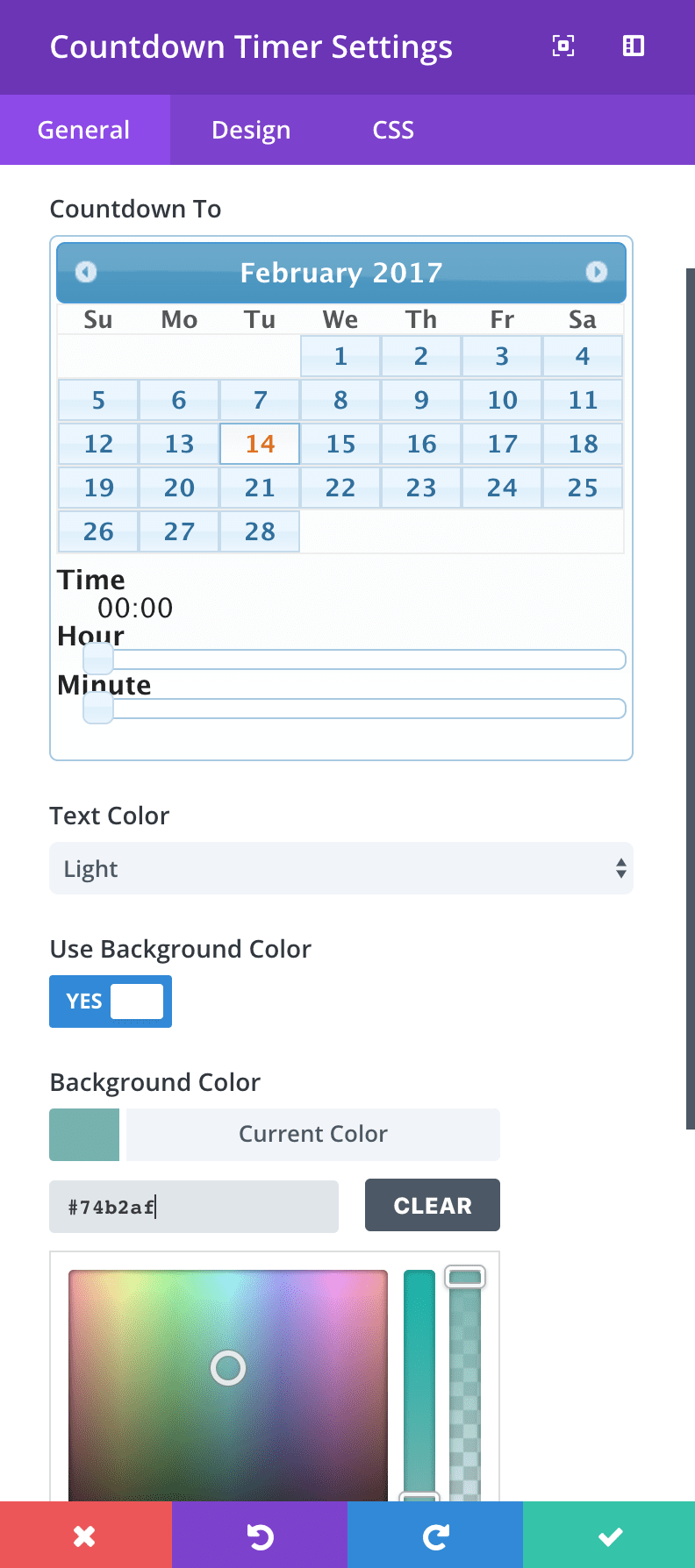
Once you’ve added the countdown timer module, you’ll have the countdown timer settings open in front of you. Go ahead and choose a date to count down to. Next, change the background color to #74b2af.
Next, click the tab for the Design settings:
- change Numbers Font and Labels Font to Bold and uppercase (TT icon)
- change Numbers Font size to 60px
- change Labels Font size to 15px
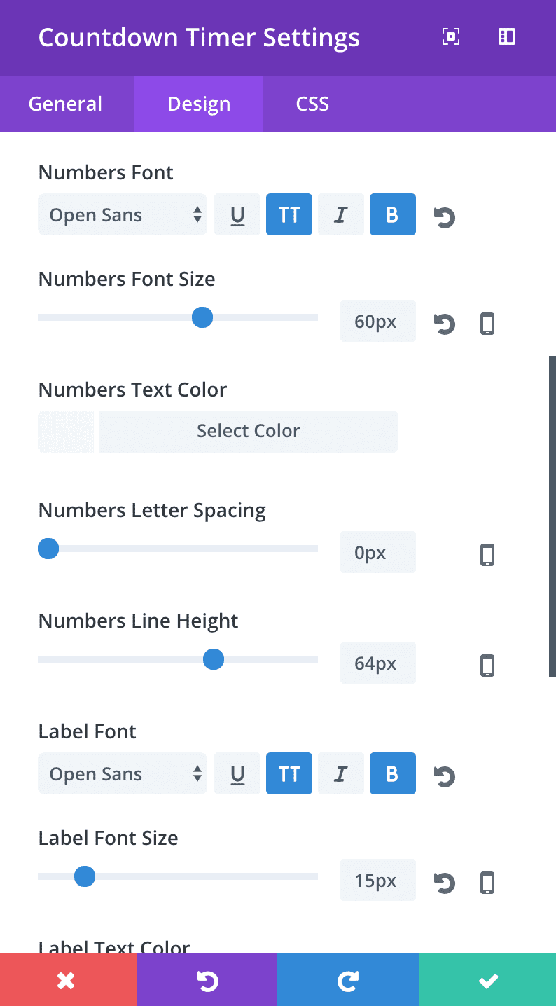
Now click save, and here’s what you should being seeing so far:

Still pretty basic though. We have some CSS to add, including our animated gradient!
Adding the Custom CSS
Before we can start adding the custom CSS, we need to add our own custom CSS classes so that we’ll only customize the CSS of this countdown timer we’re working on today, and not ALL countdown timers that are on the site or will be on the site.
Open up, the module settings, and click over to the CSS tab of the module settings, and add custom-countdown-4 as the CSS class.
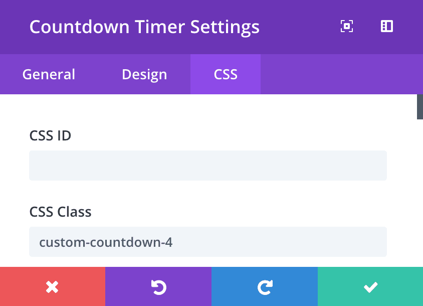
Okay, now that we have our custom class in place, we’re ready to add the custom CSS. You have several options of where you want to place the custom CSS, including the Divi Theme Options‘ custom CSS box, and the Divi Page Settings’ custom CSS box for the individual page.
I recommend adding it to the individual page settings custom CSS box through the visual builder so you can see it update in real time.
To open up page settings and it’s custom CSS box, click on the purple gear icon at the bottom of your screen, as shown below. If you don’t see the gear icon then click the purple button that you do see to expose the rest of the menu.
![]()
You can then copy and paste the below CSS into the custom CSS box.
.custom-countdown-4.et_pb_countdown_timer {
max-width: 620px;
margin-left: auto;
margin-right: auto;
border-radius: 10px;
box-shadow: 0px 12px 50px #a9a9a9;
}

.custom-countdown-4.et_pb_countdown_timer .section p {
text-shadow: 0px 3px 20px #658586;
}

.custom-countdown-4 .days {
margin-right: 23px;
}
.custom-countdown-4 .label {
font-weight: 600 !important;
text-shadow: none !important;
}
The CSS above get’s us almost all the way there! But you’ll notice that the background is just the static color. We still need to add the custom CSS for the gradient animation for the background.
Go back to where you saved the CSS that the generator outputted. We’re going to copy it into the page CSS, but first we need to add our custom class to it.
To do this, simply add .custom-countdown-4 { to the first part of the gradient animation code. And add a closing bracket ( } ) just before the @-webkit-keyframes code. You can optionally just copy my code below and paste below where you added the previous CSS code. But I wanted you to learn how to use the gradient animator so you can use it in the future too!
.custom-countdown-4 {
background: linear-gradient(270deg, #6990af, #74b2af);
background-size: 400% 400%;
-webkit-animation: AnimationName 30s ease infinite;
-moz-animation: AnimationName 30s ease infinite;
animation: AnimationName 30s ease infinite;
}
@-webkit-keyframes AnimationName {
 0%{background-position:0% 50%}
 50%{background-position:100% 50%}
 100%{background-position:0% 50%}
}
@-moz-keyframes AnimationName {
 0%{background-position:0% 50%}
 50%{background-position:100% 50%}
 100%{background-position:0% 50%}
}
@keyframes AnimationName {
 0%{background-position:0% 50%}
 50%{background-position:100% 50%}
 100%{background-position:0% 50%}
}
And that’s all the CSS we need to add! Don’t forget to save the page settings as well as the page itself!
As always, let’s admire out creation 🙂

Tomorrow: How to Add a Full Screen Background Video to Your Countdown Timer
Tomorrow’s post will be our final post of the Divi countdown timer module miniseries! We saved the best for last though, so come back tomorrow as I show you how to create an epic countdown timer with a modern yet unique background video that is sure to impress your website visitors!
Be sure to subscribe to our email newsletter and YouTube channel so that you never miss a big announcement, useful tip, or Divi freebie!



I always learn a lot from this kind of posts Tim. Thanks a lot for it! 😀
Hi Tim
Maybe this has been asked before or I am missing something…. For the Countdown Timer, can we set a redirect to send people to IF the Countdown has reached Zero?
Thanks,
Gordon
Hi Tim,
thanks for the in-depth tutorial!
Having a nice Countdown sure does add that sense of “urgency” which my subscribers seem to respond very well.
Lot’s of useful information to use and customise, – I’m still learning CSS so I very much appreciate the CSS code above!
It’s official :
from now on,the countdown timer is definitely going to be a standard part of my website!
That’s great to hear, and yes, creating the sense of urgency can significantly increase conversions 🙂
well most of the time i used plugins that have low level of functionality but this article provides a good space of information yet i’m not that much into the developing of plugins and coding but make sure my developer reads this article once again and we’ll create them for our website.
Thanks Tim Strifler for the useful into along with some cheesy coding part. I’m not a big fan of coding yet make sure we use the info provided by you to get the best output.