The Divi Theme Builder marks a new era and changes the way we design websites. One of the most important parts of this feature is being able to dynamically add global footers to your pages and posts. Once you’ve designed a footer, you can automatically add it to whatever kind of page or post you want using Divi and its Theme Builder. Now in this tutorial, we’ll guide you step by step through the process of creating and adding a global footer to your website. You’ll be able to download the template JSON file for free as well!
Let’s get to it.
- 1 Preview
- 2 Download The Custom Global Footer for FREE
- 3 Download For Free
- 4 1. Go to Divi’s Theme Builder
-
5
2. Add & Build Global Footer
- 5.1 Add Section #1
- 5.2 Add New Row to Section
- 5.3 Add Text Module to Column
- 5.4 Add Button Module to Column
- 5.5 Add Section #2
- 5.6 Add New Row to Section
- 5.7 Add Text Module #1 to Column
- 5.8 Add Divider Module to Column
- 5.9 Add Text Module #2 to Column
- 5.10 Clone Text Module #2 As Much as Needed
- 5.11 Clone Entire Column Twice
- 5.12 Add New Column
- 5.13 Add Social Media Follow Module to Column 4
- 5.14 Add Email Optin Module to Column 4
- 5.15 Add Dynamic Text Module to Column 4
- 6 Preview
- 7 Final Thoughts
Preview
Before we dive into the tutorial, let’s take a quick look at the global footer design across different screen sizes.
Desktop
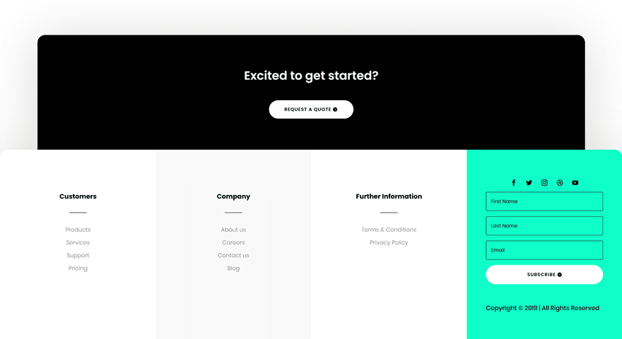
Mobile

To lay your hands on the free custom global footer, you will first need to download it using the button below. To gain access to the download you will need to subscribe to our newsletter by using the form below. As a new subscriber, you will receive even more Divi goodness and a free Divi Layout pack every Monday! If you’re already on the list, simply enter your email address below and click download. You will not be “resubscribed” or receive extra emails.
Subscribe To Our Youtube Channel
1. Go to Divi’s Theme Builder
Start by going to the Theme Builder in your Divi Theme Options.
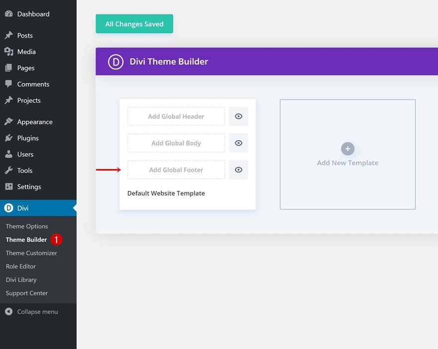
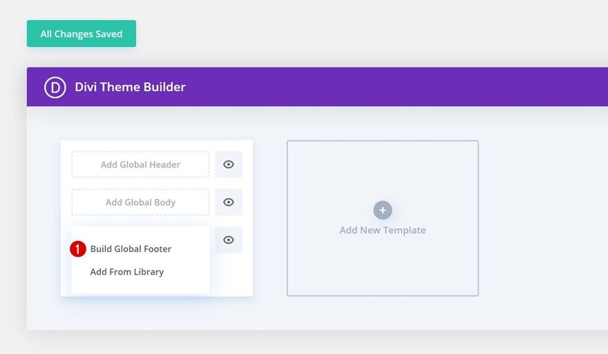
There, you can add a global footer from your Divi library or start building one from scratch. In this tutorial, we’ll create a custom footer from scratch so go ahead and pick the first option.
Add Section #1
Background Color
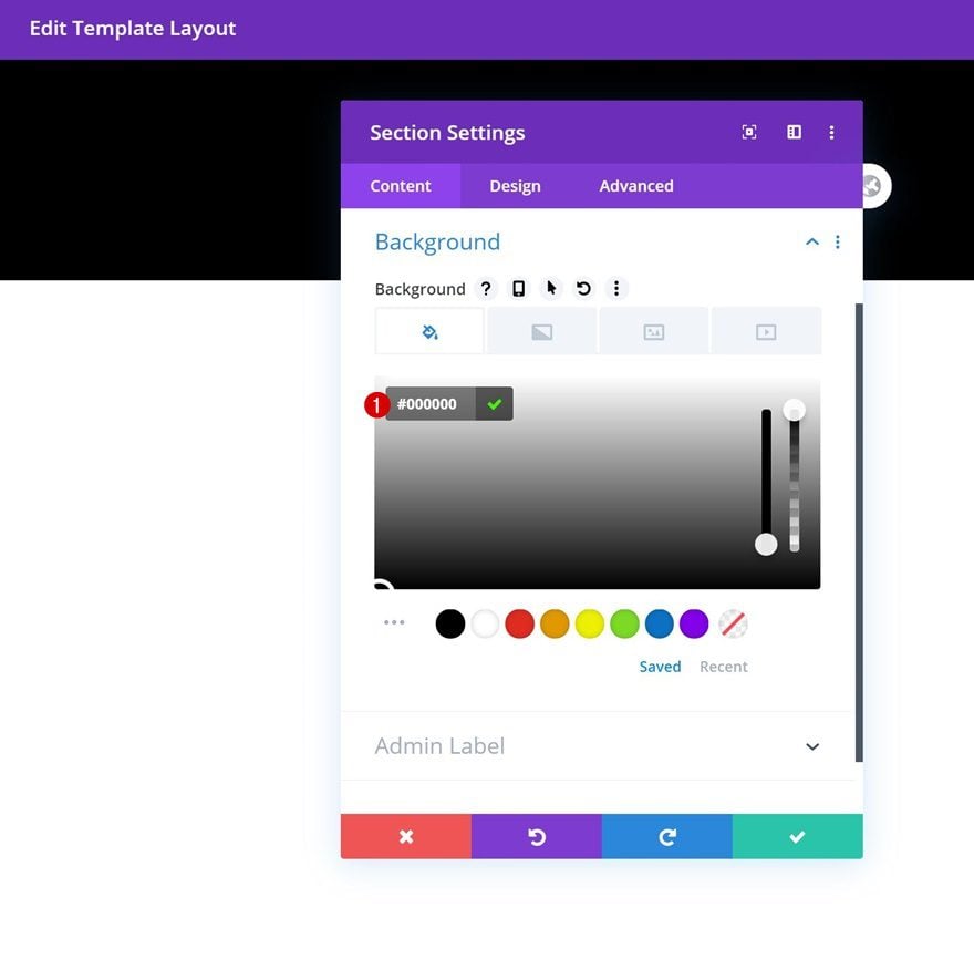
Time to start creating! Open the section you can find on the page and change the section’s background color.
- Background Color: #000000
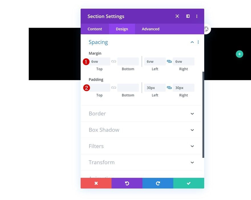
Spacing
Modify the section’s spacing settings next.
- Top Margin: 6vw
- Left Margin: 6vw
- Right Margin: 6vw
- Left Padding: 30px
- Right Padding: 30px
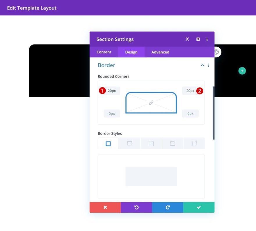
Border
Add some top left and right border next.
- Top Left: 20px
- Top Right: 20px
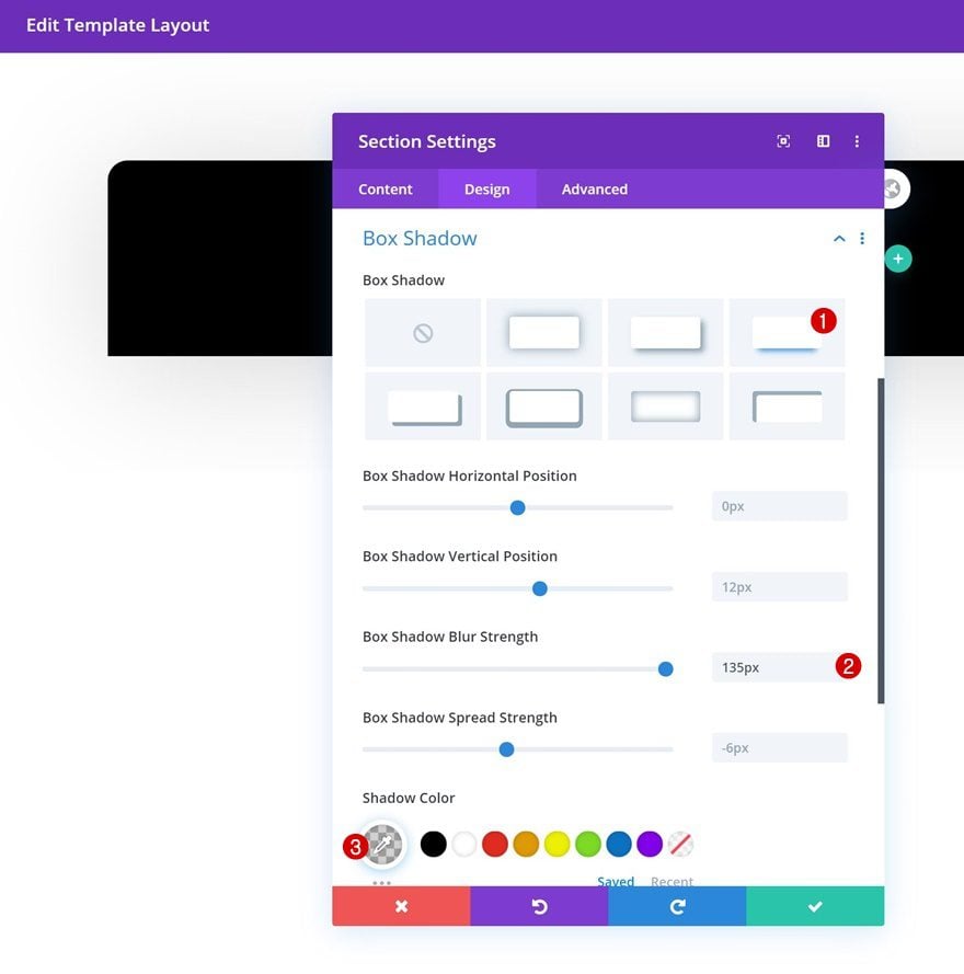
Box Shadow
Include a box shadow in the section settings too.
- Box Shadow Blur Strength: rgba(0,0,0,0.18)
- Shadow Color: rgba(0,0,0,0.18)
Add New Row to Section
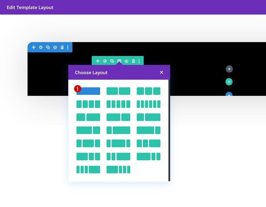
Column Structure
Continue by adding a row to your section using the following column structure:
Add Text Module to Column
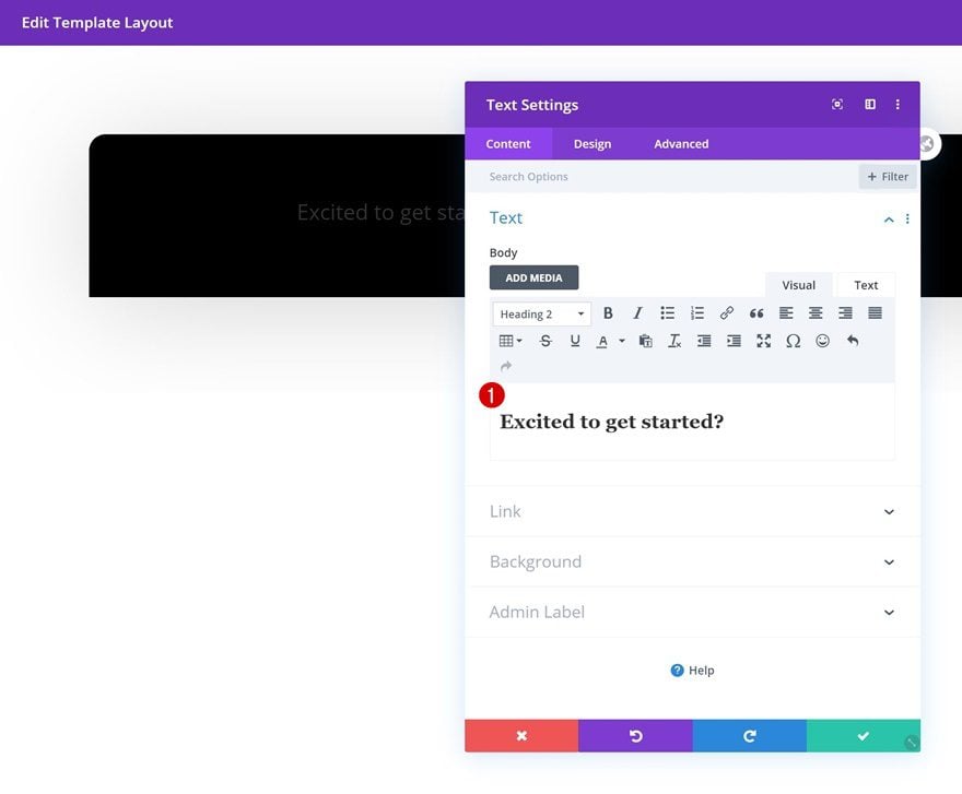
Add H2 Content
Add a Text Module with some H2 content.
H2 Text Settings
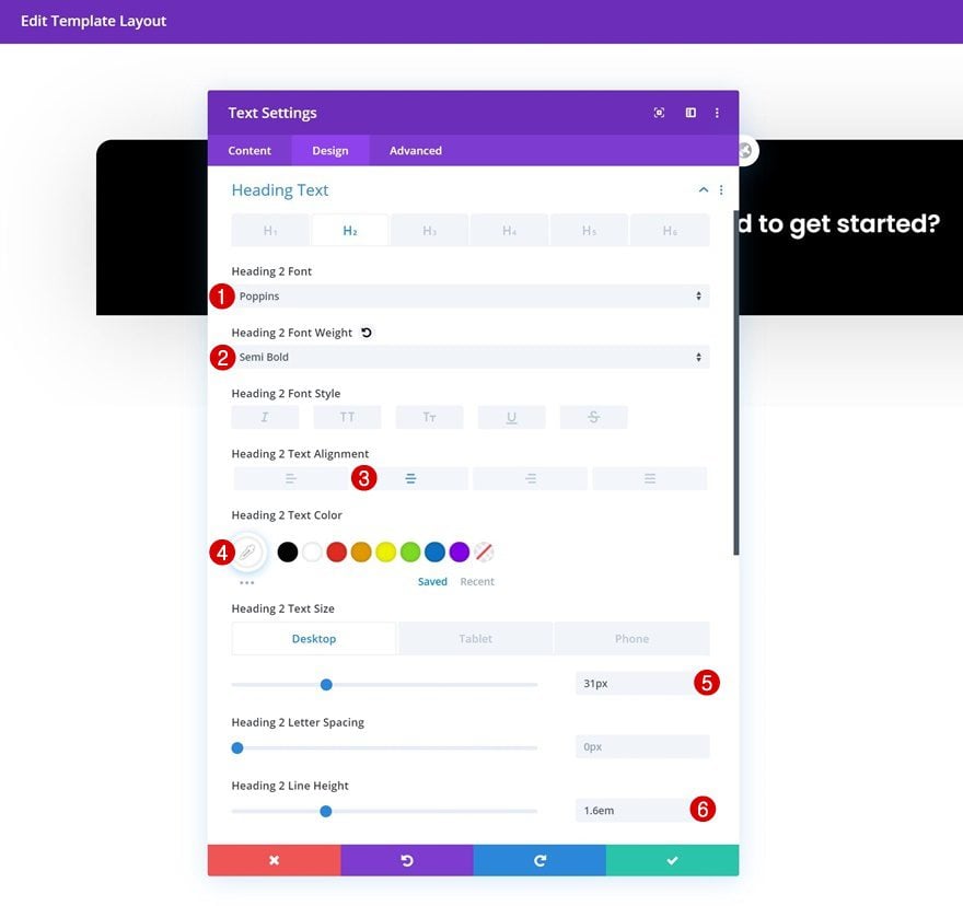
Move on to the module’s design tab and change the H2 text settings accordingly:
- Heading 2 Font: Poppins
- Heading 2 Font Weight: Semi Bold
- Heading 2 Text Alignment: Center
- Heading 2 Text Color: #ffffff
- Heading 2 Text Size: 31px (Desktop), 24px (Tablet), 18px (Phone)
- Heading 2 Line Height: 1.6em
Sizing
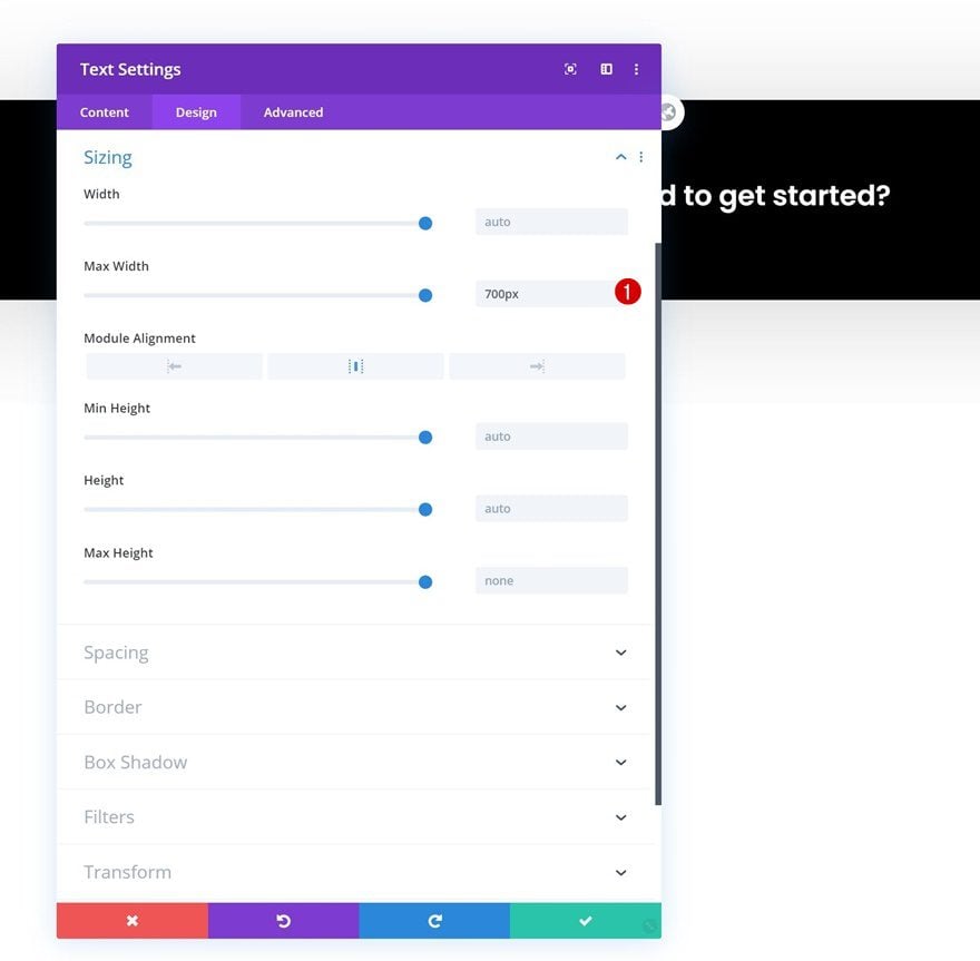
Add some max width to the module as well.
- Max Width: 700px
Add Copy
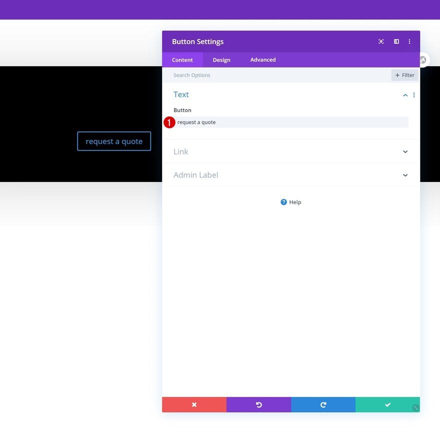
Add a Button Module right below the Text Module in your column and enter some copy of your choice.
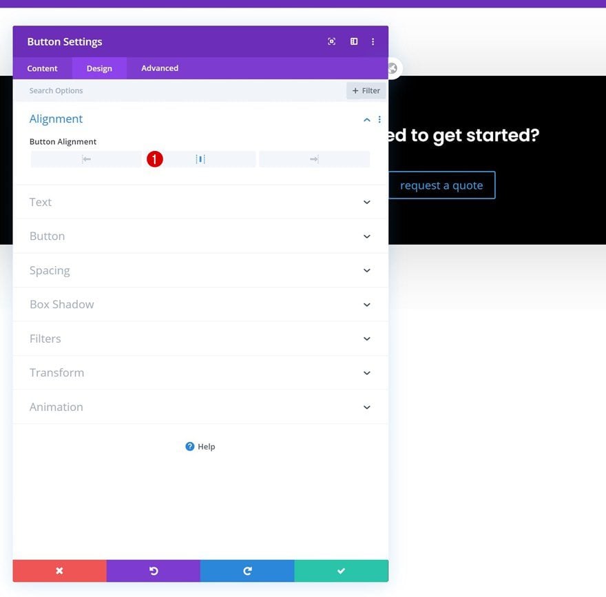
Alignment
Move on to the module’s design tab and change the button alignment to center.
- Button Alignment: Center
Button Settings
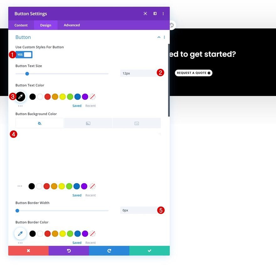
Continue by styling the button.
- Use Custom Styles For Button: Yes
- Button Text Size: 12px
- Button Text Color: #000000
- Button Background Color: #FFFFFF
- Button Border Width: 0px
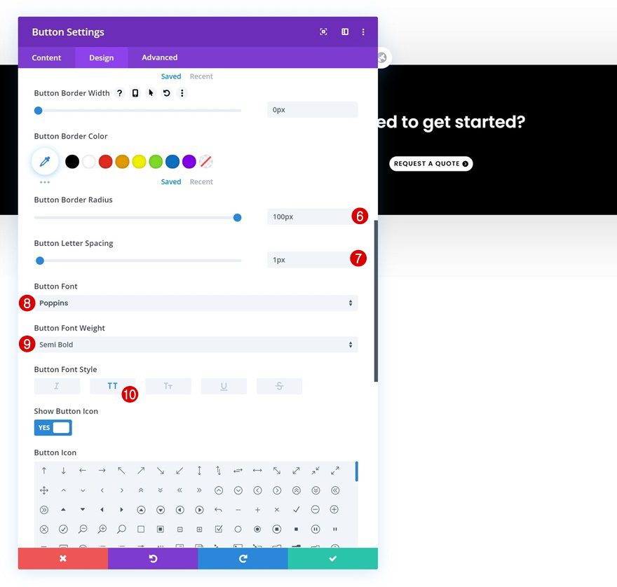
- Button Border Radius: 100px
- Button Letter Spacing: 1px
- Button Font: Poppins
- Button Font Weight: Semi Bold
- Button Font Style: Uppercase
Spacing
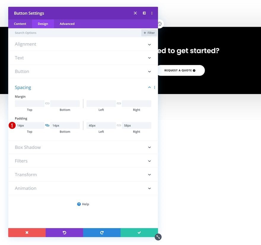
Add some custom padding values as well.
- Top Padding: 14px
- Bottom Padding: 14px
- Left Padding: 40px
- Right Padding: 58px
Add Section #2
Background Color
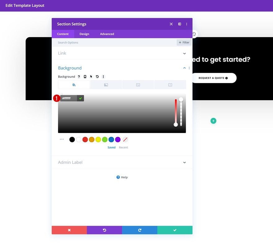
On to the next regular section! Choose a white section background color.
- Background Color: #ffffff
Spacing
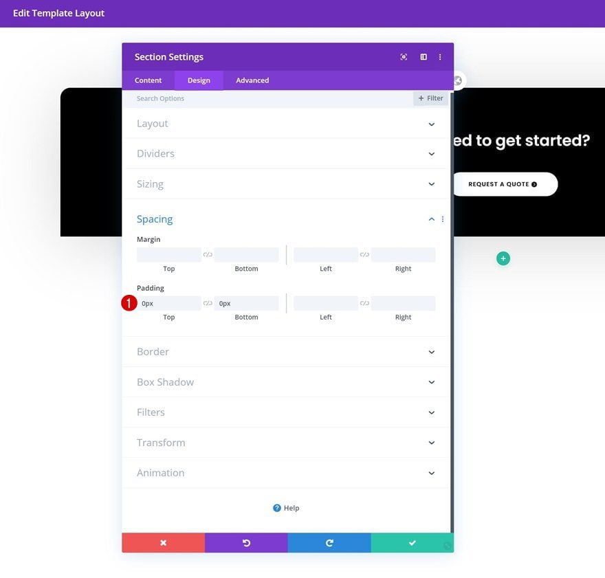
Remove all top and bottom padding next.
- Top Padding: 0px
- Bottom Padding: 0px
Border
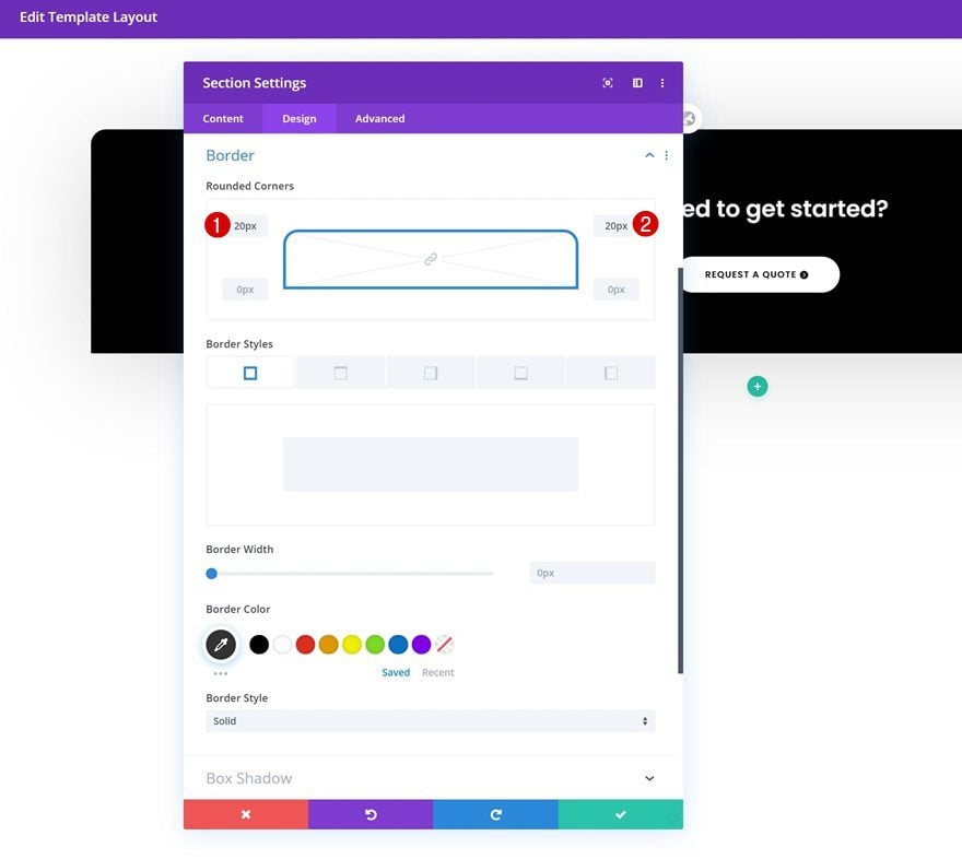
Add some border radius to the section too.
- Top Left: 20px
- Top Right: 20px
Box Shadow
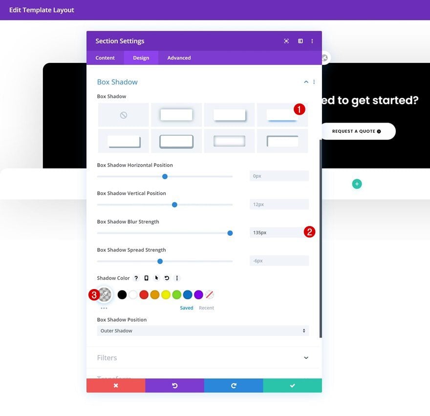
And complete the section’s settings by adding a subtle box shadow.
- Box Shadow Blur Strength: 135px
- Shadow Color: rgba(0,0,0,0.18)
Add New Row to Section
Column Structure
Once you’ve completed the section settings, add a new row using the following column structure:
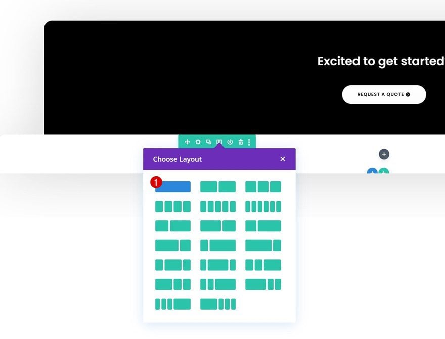
Sizing
Without adding any modules yet, open the row settings and allow the row to take up the entire width of the screen.
- Use Custom Gutter Width: Yes
- Gutter Width: 1
- Equalize Column Heights: Yes
- Width: 100%
- Max Width: 100%
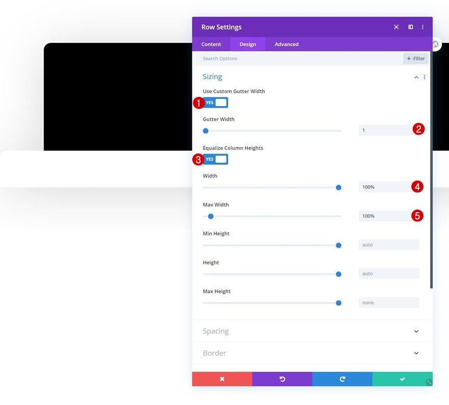
Spacing
Remove the row’s default top and bottom padding next.
- Top Padding: 0px
- Bottom Padding: 0px
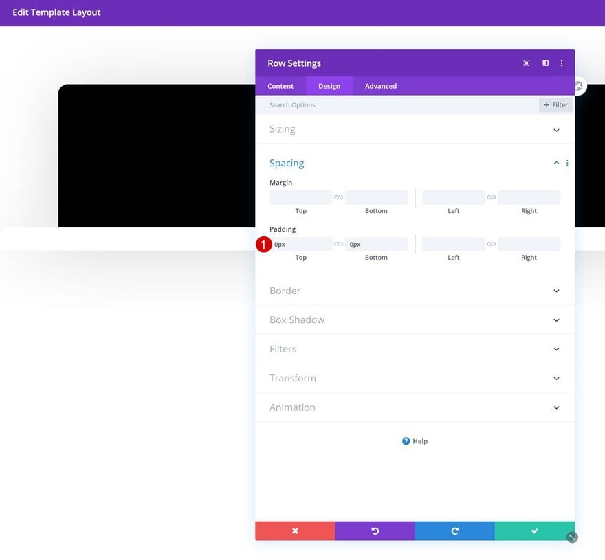
Column Spacing
Continue by opening the column settings and add some custom padding values across different screen sizes.
- Top Padding: 100px (Desktop), 50px (Tablet & Phone)
- Bottom Padding: 100px (Desktop), 50px (Tablet & Phone)
- Left Padding: 50px
- Right Padding: 50px
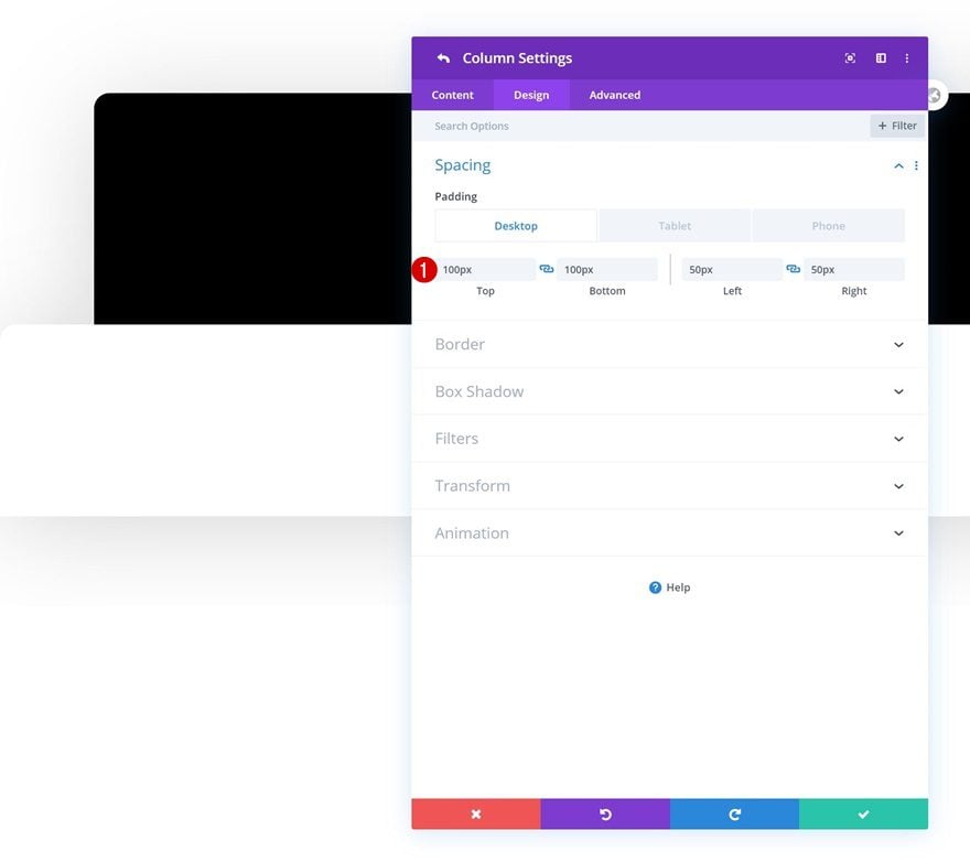
Add Text Module #1 to Column
Add Content
Time to start adding modules! Add a regular Text Module to column 1 and insert some content of your choice.
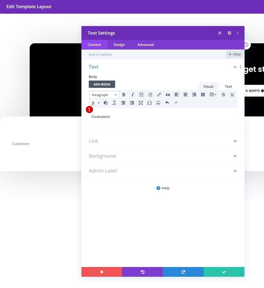
Text Settings
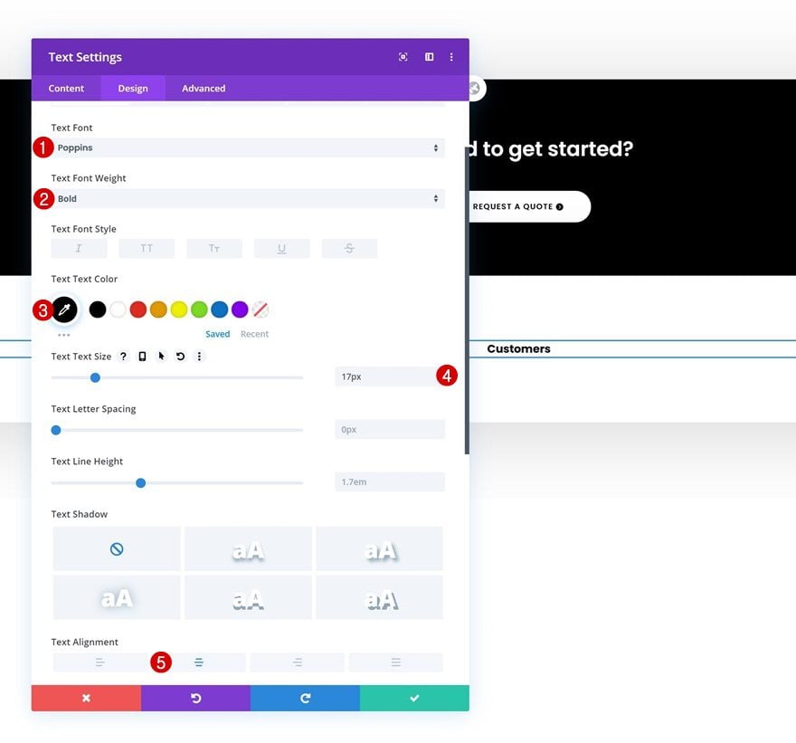
Move on to the module’s design tab and change the text settings accordingly:
- Text Font: Poppins
- Text Font Weight: Bold
- Text Color: #000000
- Text Size: 17px
- Text Alignment: Center
Spacing
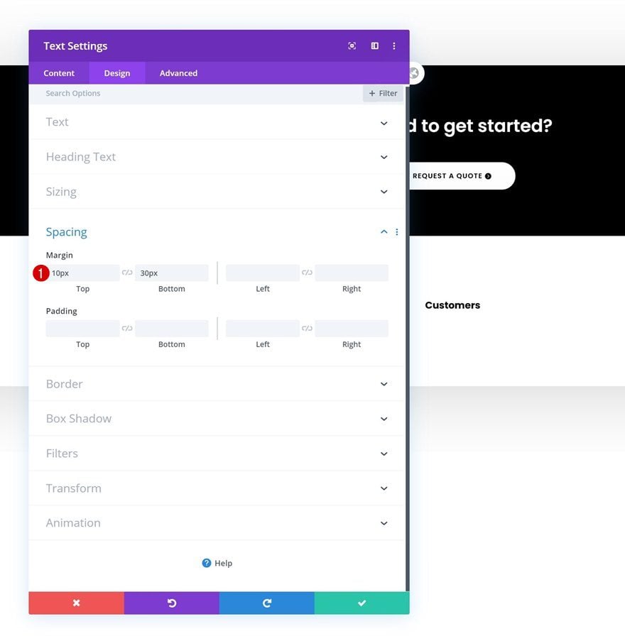
Add some custom top and bottom margin next.
- Top Margin: 10px
- Bottom Margin: 30px
Add Divider Module to Column
Visibility
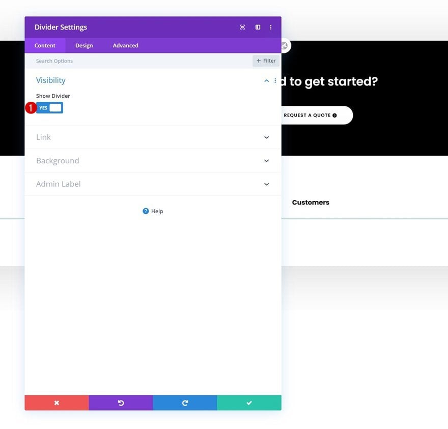
Right below the Text Module, add a Divider Module and make sure the ‘Show Divider’ option is enabled.
- Show Divider: Yes
Line
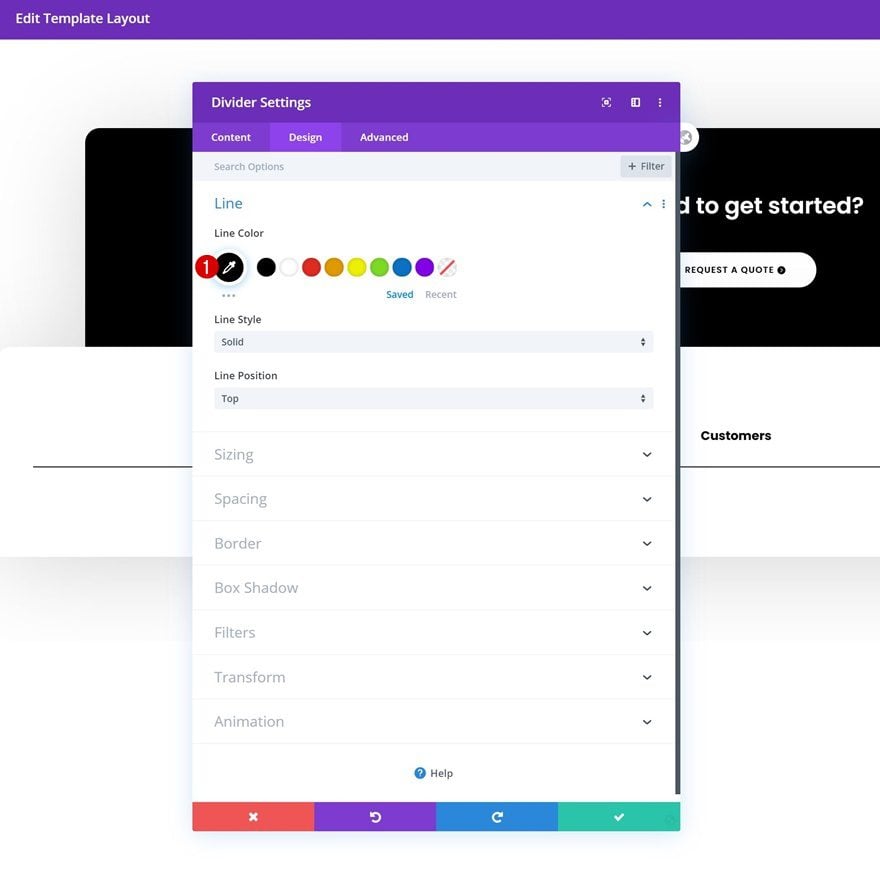
Change the line color into black.
- Line Color: #000000
Sizing
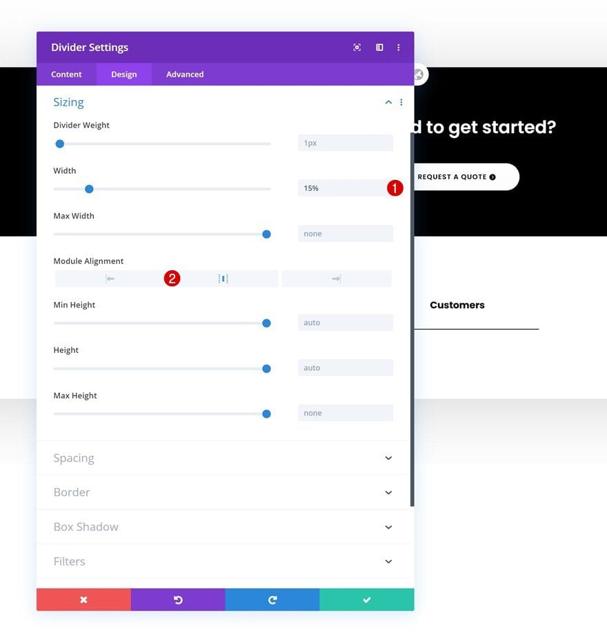
Modify the divider’s sizing settings too.
- Width: 15%
- Module Alignment: Center
Add Text Module #2 to Column
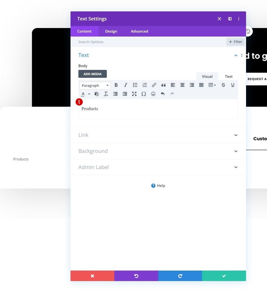
Add Content
Continue by adding another Text Module to the column.
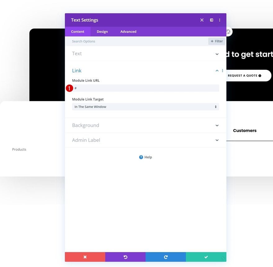
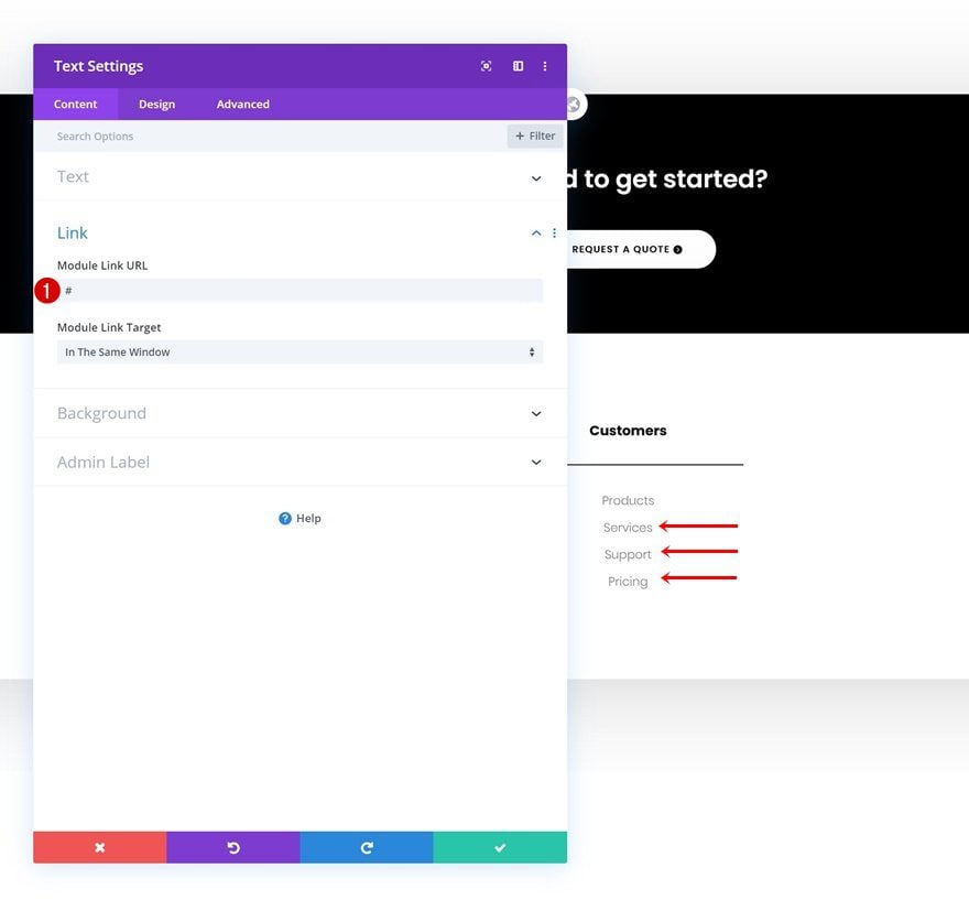
Add Link
Add a link to the page you want this module to refer to.
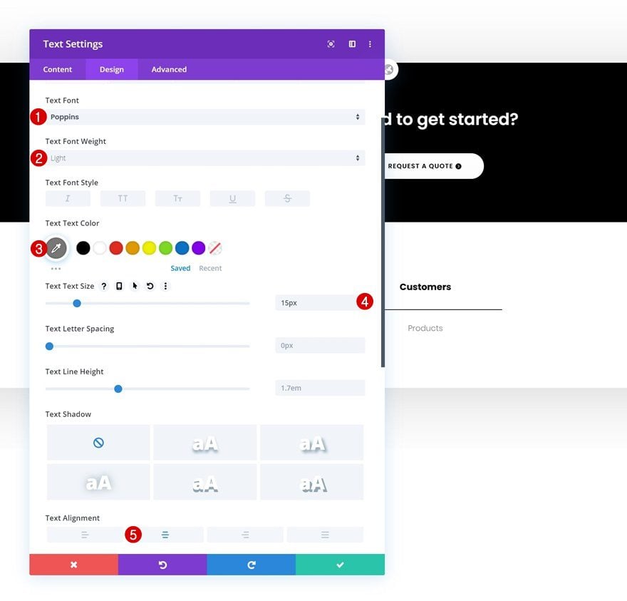
Text Settings
Then, move on to the design tab and change the text settings as follows:
- Text Font: Poppins
- Text Font Weight: Light
- Text Color: #777777
- Text Size: 15px
- Text Alignment: Center
Spacing
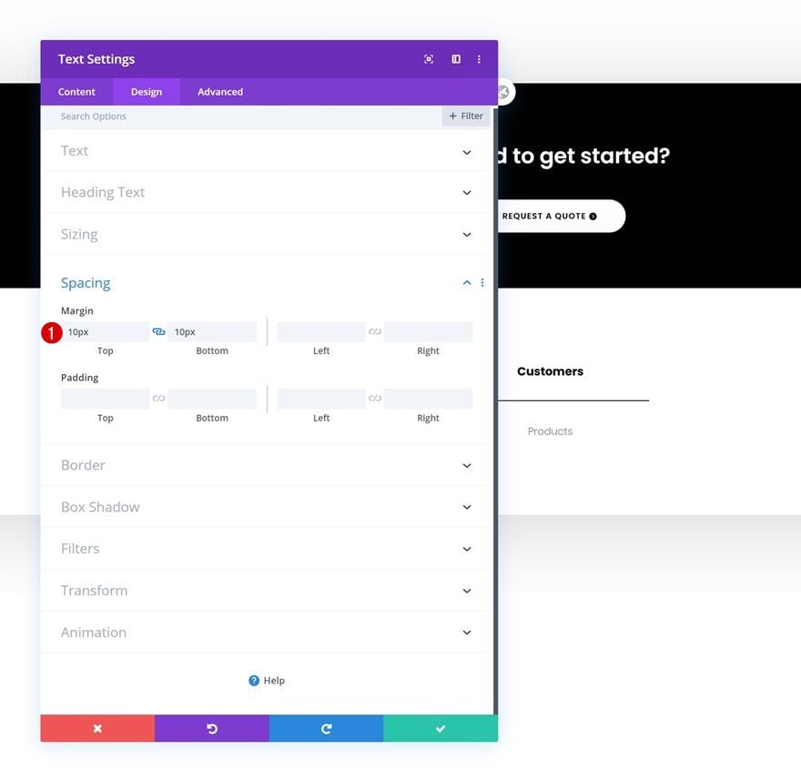
Add some top and bottom margin too.
- Top Margin: 10px
- Bottom Margin: 10px
Clone Text Module #2 As Much as Needed
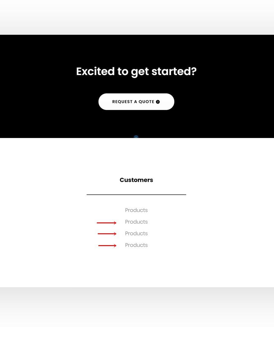
Once you’ve completed the second Text Module in the column, you can clone it up to as many times as you need it (depending on how many clickable footer items you want to include).
Change Content & Links
Make sure you change the module content and links for each duplicate.
Clone Entire Column Twice
Once you’ve completed the column and its modules, you can clone the entire column twice.
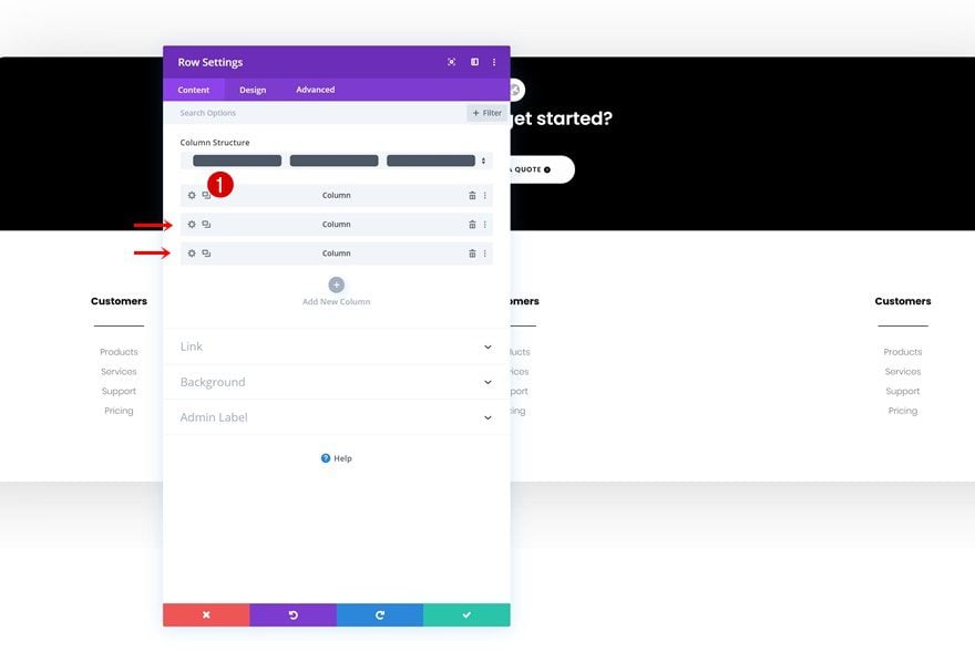
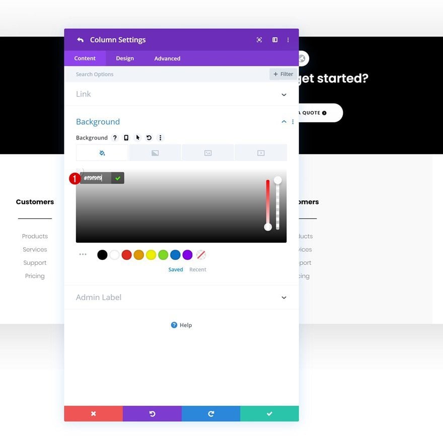
Column 2 Background Color
Then, open the column 2 settings and change the background color.
- Column 2 Background Color: #f9f9f9
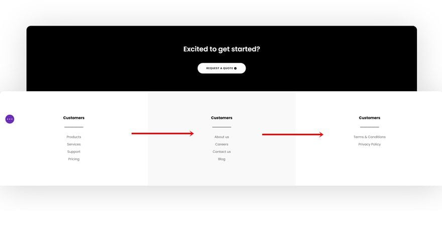
Change Content & Links
Make sure you change all the content and links in each duplicate column.
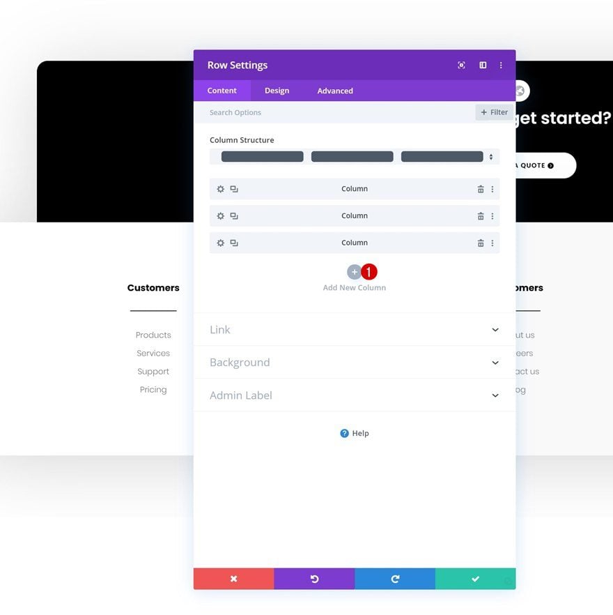
Add New Column
Then, add a fourth column to the row.
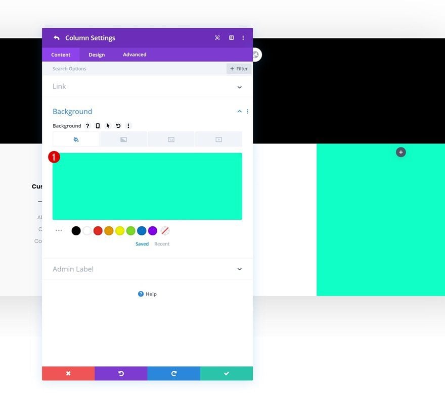
Background Color
Change the new column’s background color.
- Background Color: #0fffc7
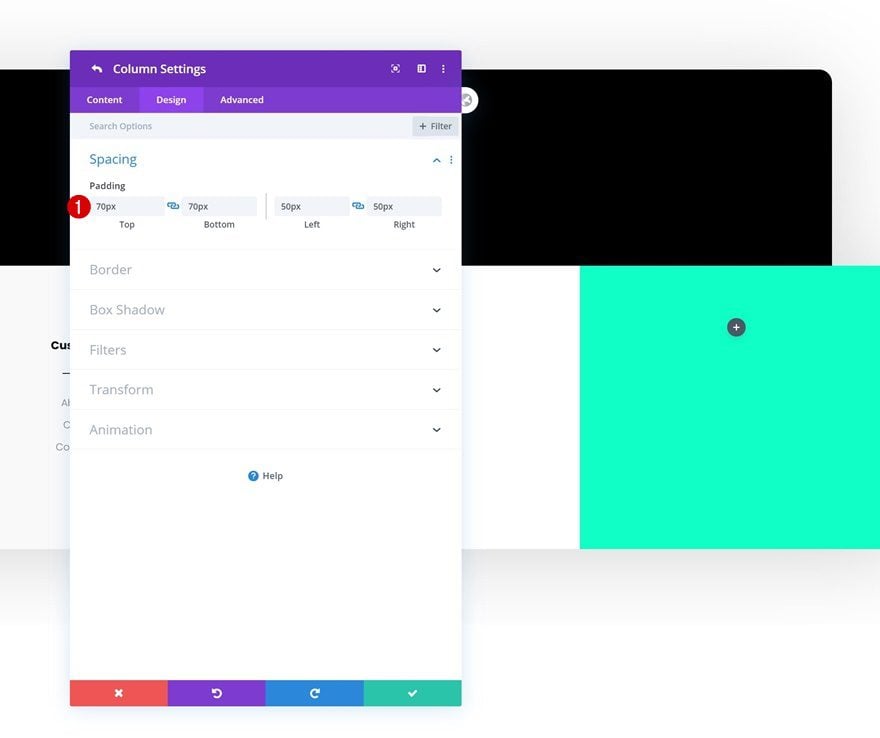
Spacing
Along with the column’s padding values.
- Top Padding: 70px
- Bottom Padding: 70px
- Left Padding: 50px
- Right Padding: 50px
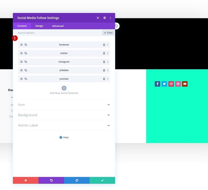
Add Social Networks
Continue by adding a Social Media Follow Module to column 4.
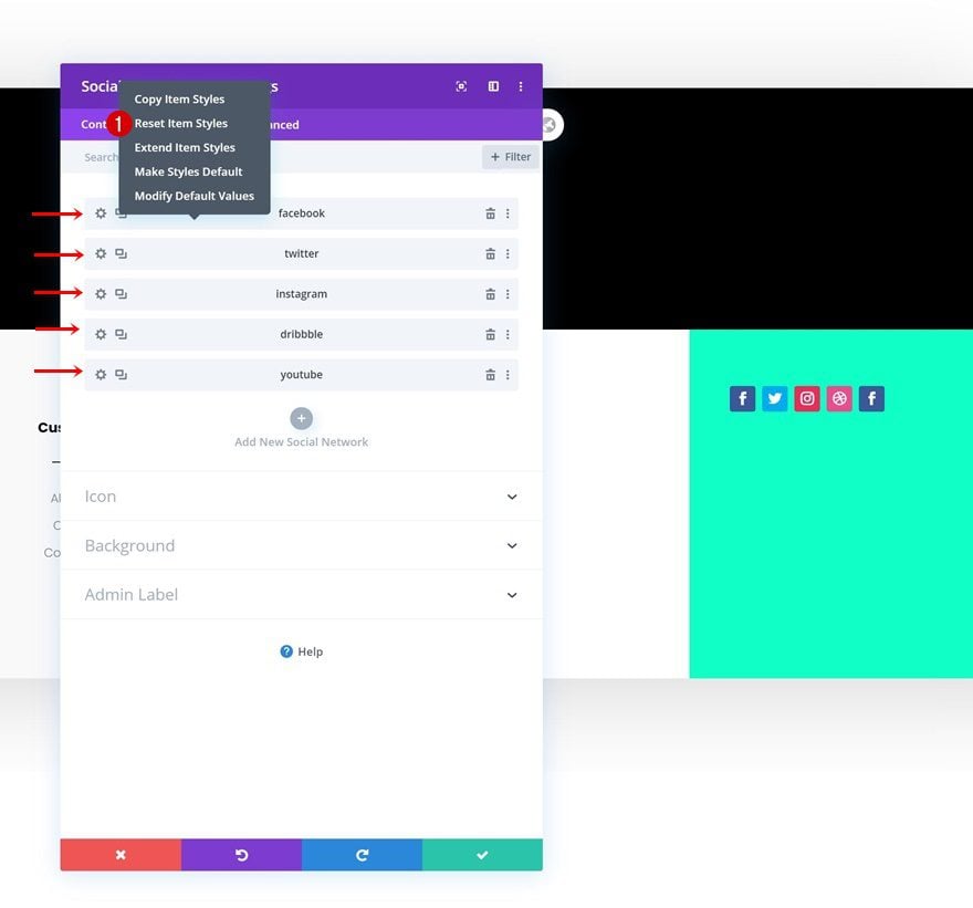
Reset Social Network Styles
Reset the item styles for each social network you add.
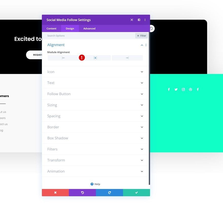
Alignment
Then, move on to the design tab and change the module alignment.
- Module Alignment: Center
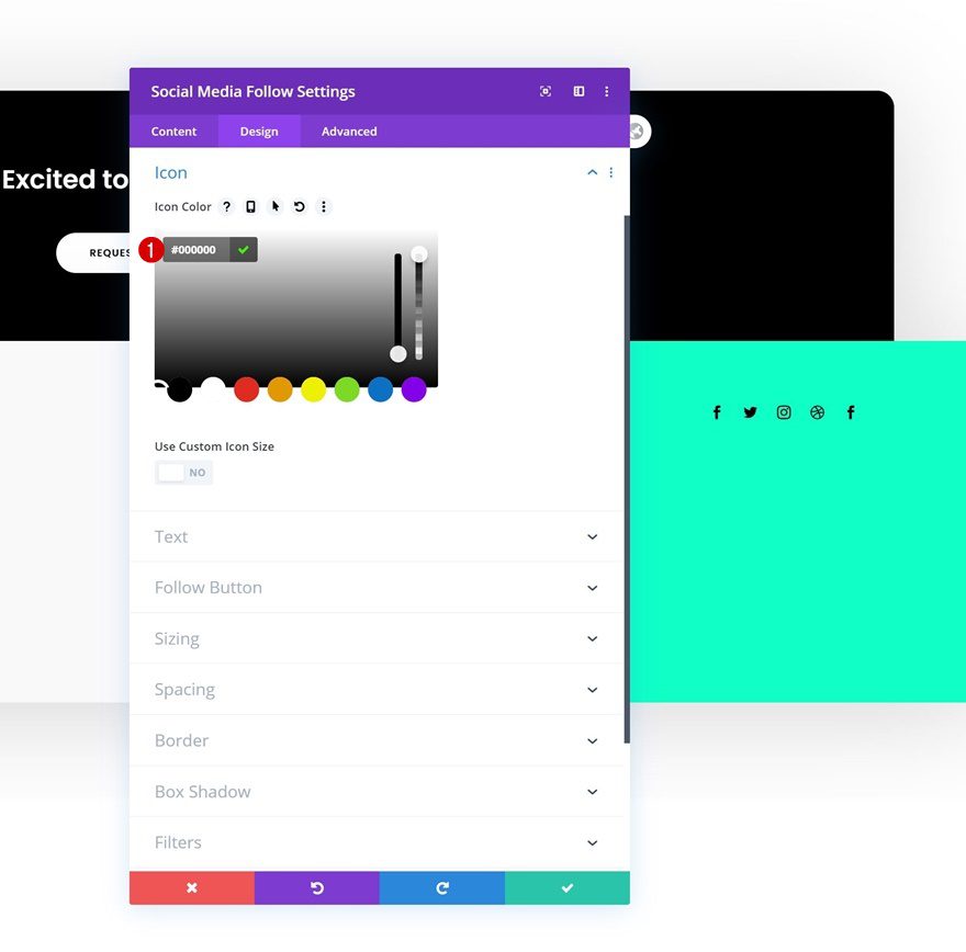
Icon Settings
Modify the icon color too.
- Icon Color: #000000
Add Email Optin Module to Column 4
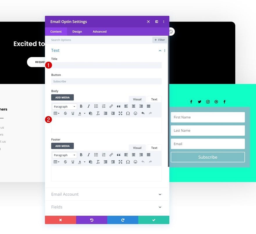
Remove Content
Continue by adding an Email Optin Module to column 4 and remove the title and body content.
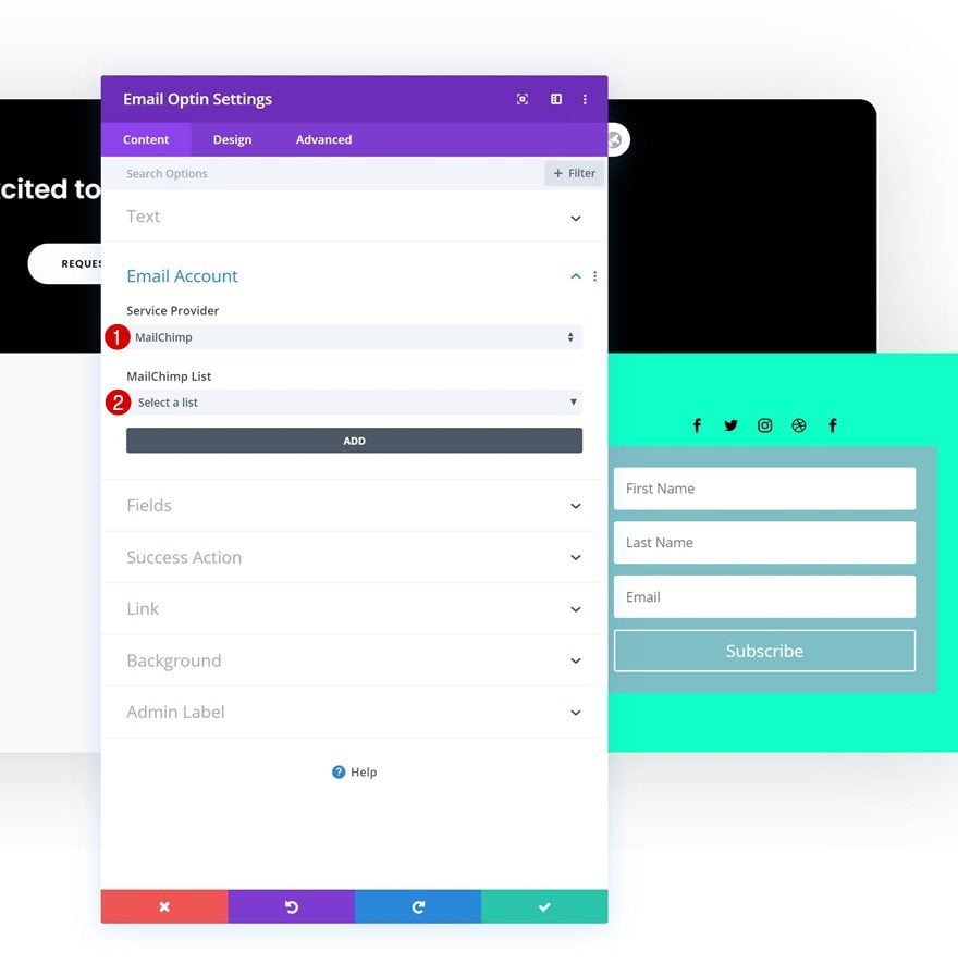
Email Account
Add an email account next. Without adding the email account, the module won’t show up once you’ve exited the builder.
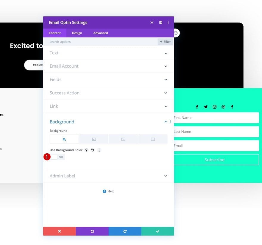
Remove Background Color
Continue by removing the module’s background color.
- Use Background Color: No
Fields Settings
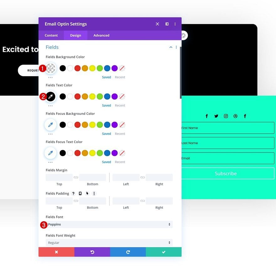
Move on to the design tab and change the fields settings as follows:
- Fields Background Color: rgba(0,0,0,0)
- Fields Text Color: #000000
- Fields Font: Poppins
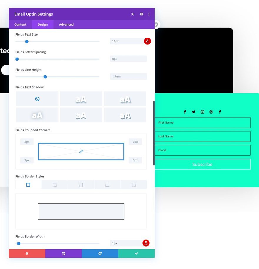
- Fields Text Size: 13px
- Fields Border Width: 1px
- Fields Border Color: #000000
Button Settings
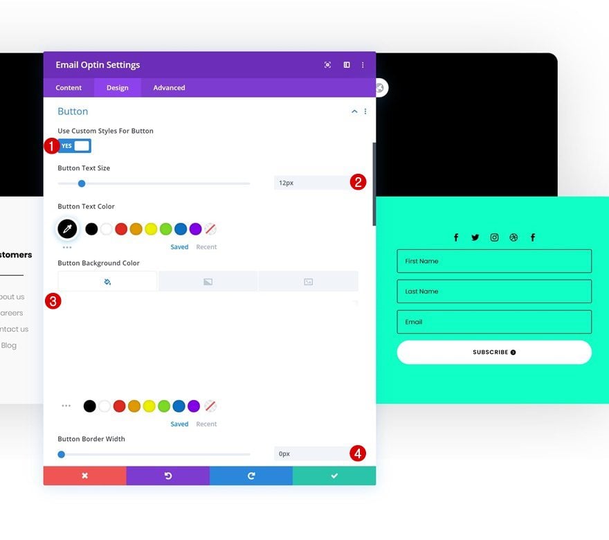
Style the button of your module as well.
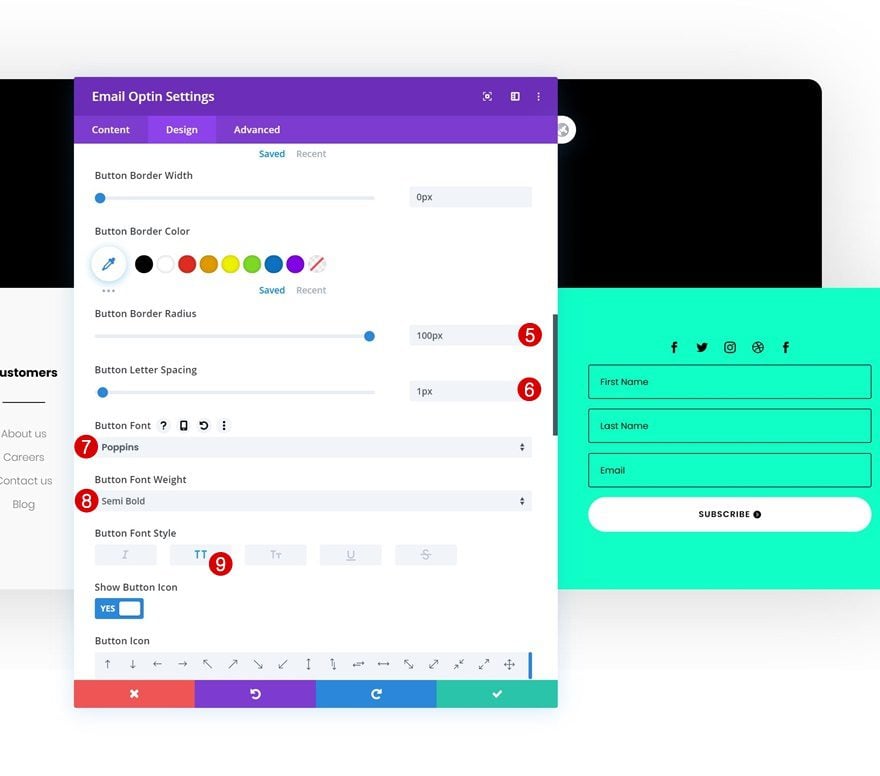
- Use Custom Styles For Button: Yes
- Button Text Size: 12px
- Button Text Color: #000000
- Button Background Color: #FFFFFF
- Button Border Width: 0px
- Button Border Radius: 100px
- Button Letter Spacing: 1px
- Button Font: Poppins
- Button Font Weight: Semi Bold
- Button Font Style: Uppercase
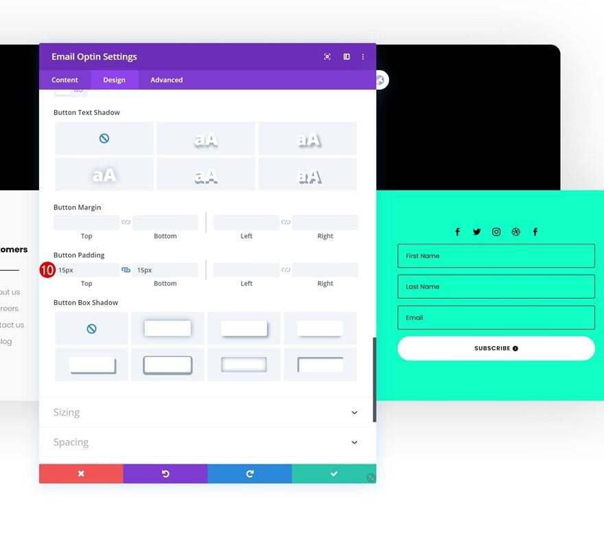
- Top Padding: 15px
- Bottom Padding: 15px
Add Dynamic Text Module to Column 4
Dynamic Content
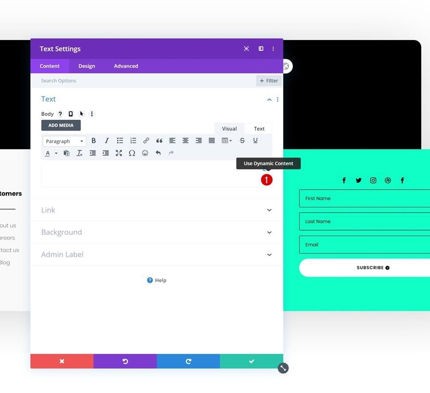
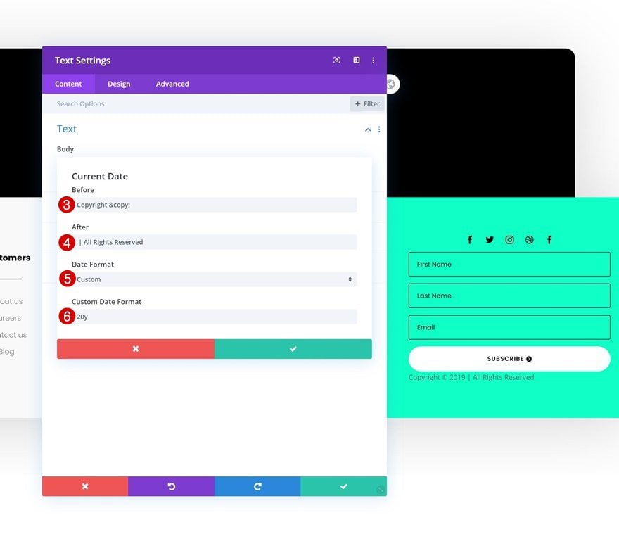
The next and last module we need to complete this design is a Text Module. Enable the dynamic content option in the content box.
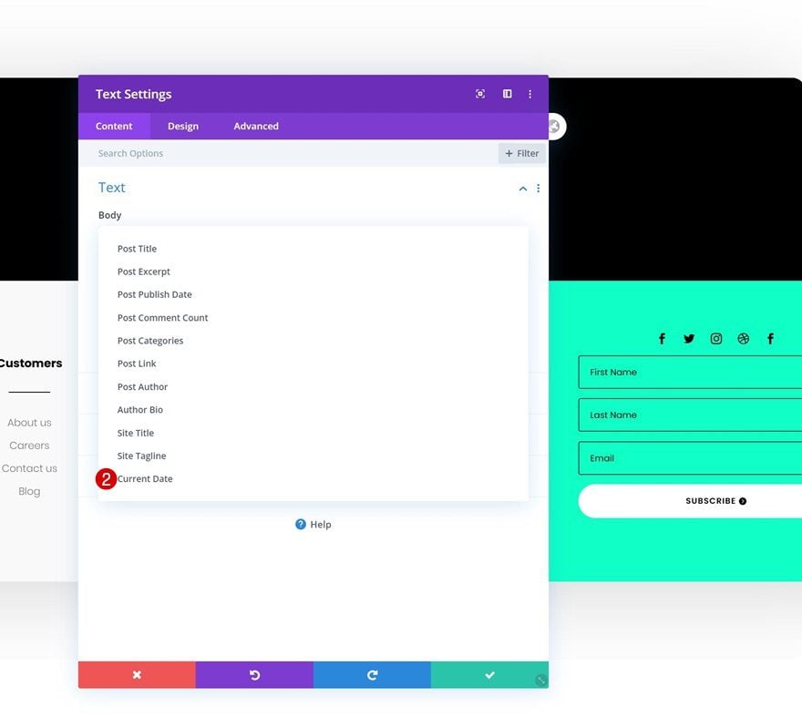
Then, select the ‘Current Date’ option.
- Dynamic Content: Current Date
And modify the dynamic content’s settings as follows:
- Before: Copyright ©
- After: | All Rights Reserved
- Date Format: Custom
- Custom Date Format: 20y
Text Settings
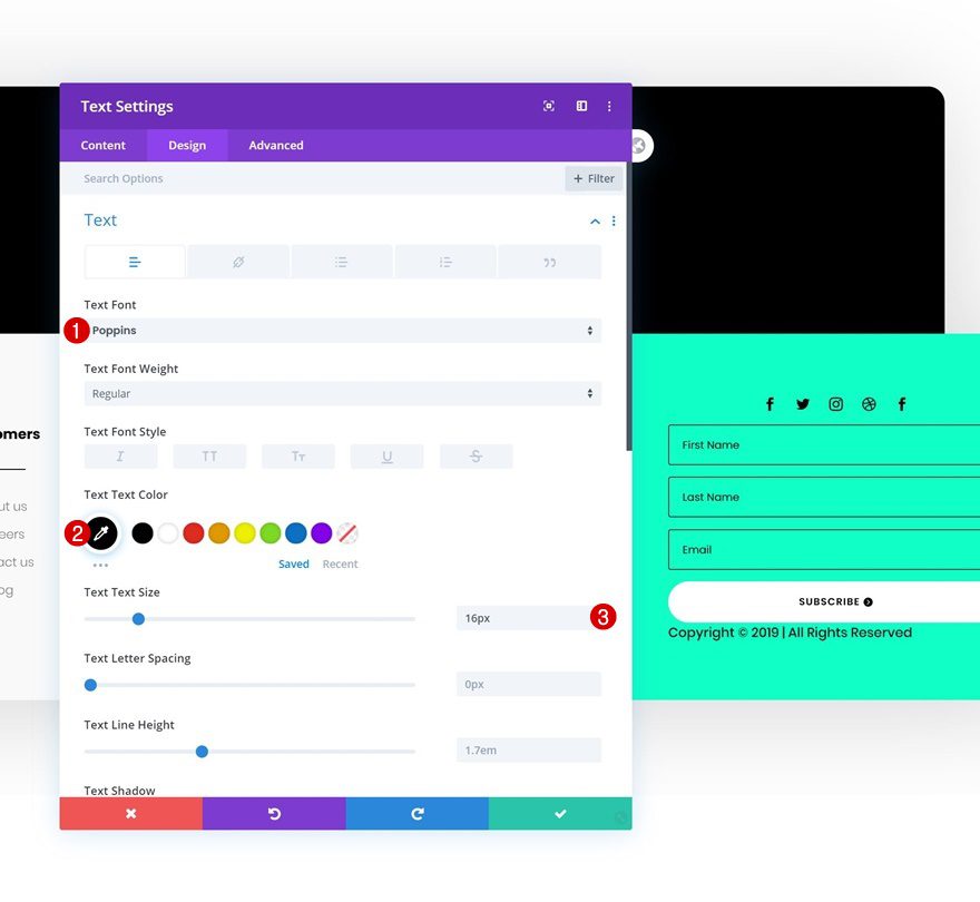
Then, move on to the design tab and change the text settings accordingly:
- Text Font: Poppins
- Text Color: #000000
- Text Size: 16px
Spacing
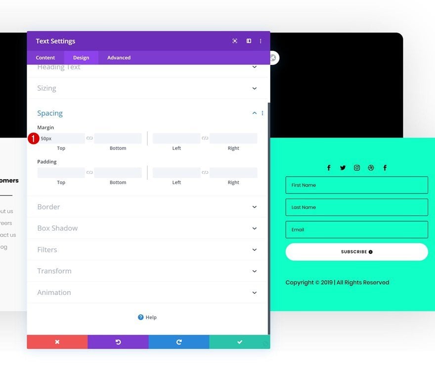
Complete the module’s settings by adding some top margin and you’re done!
- Top Margin: 50px
Preview
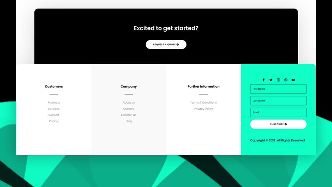
Now that we’ve gone through all the steps, let’s take a final look at the outcome across different screen sizes.
Desktop

Mobile

Final Thoughts
In this tutorial, we’ve shown you how easy it is to create a beautiful custom global footer with Divi’s new Theme Builder. The Theme Builder and Divi’s built-in module and design options help you save a lot of time and create stunning websites in no time. We hope this tutorial inspires you to create beautiful global footers for your upcoming Divi projects. If you have any questions or suggestions, feel free to leave a comment in the comment section below!
If you’re eager to learn more about Divi and get more Divi freebies, make sure you subscribe to our email newsletter and YouTube channel so you’ll always be one of the first people to know and get benefits from this free content.




What about this with polylang?
Hi, no matter where I upload the sample .json file I get an error” “This file should not be uploaded in this context” Anyone else get this error?
Could someone please explain where exactly to upload the ZIP file. I can’t seem to locate anywhere within the ‘Theme Builder’ menu.
Thank you for very detailed guide on footer builder using divi. Recently, I got some footer & header layout pack from divi. Is there anyway to preview them without activating them?
How about telling me how to save the project to the Library and actually be able to retrieve it to plunk it into a page? Your instructions are not always beginner-friendly.
Same here: I don’t understand how I actually add this footer to my website.
Wouldn’t you use the Menu Module to add the links in the footer so that they are dynamic to the pages in case the name changes down the road? Also, if using menu module, how to retain the text links for mobile and not the hamburger menu icon?
The footer appears unstyled in the site and styled correctlly in the theme builder. Any Ideas?
I have the same issue and fix for this?
E-mail Optin is not appearing on the 4th footer. I’ve tried to add a new “Email Optin” module but still not working 🙁
You have to complete the module’s functionality: add an email account + select a list before it’ll show up on the frontend of your design.
the json file doesn’t work. Getting a message “This file should not be imported in this context.”
Make sure you upload it in the theme builder, not the Divi library. WordPress dashboard > Divi > Theme Builder > Top right corner.
Super detailed tutorial. I kinda like it when you allow download first the the tutorial. I’m kinda lazy so this helps a ton.
Great article!