With the world living on mobile devices, it makes sense to provide clickable contact links on your website that take advantage of the mobile experience. These contact links, like a click-to-call link, can jumpstart a call on your mobile phone in a single click. Others, like a directions link, can open directions to a business address in Google Maps. These are really convenient for users and a must for certain businesses.
In this tutorial, we are going to show you how to create a Divi mobile contact bar with Click-to-Call, Email, SMS, and Directions Links. To do this we will be using the Divi builder to design the bar and the buttons on a global footer. Then we will add custom URLs to each contact link to bring home the functionality we need.
Let’s get started!
Sneak Peek
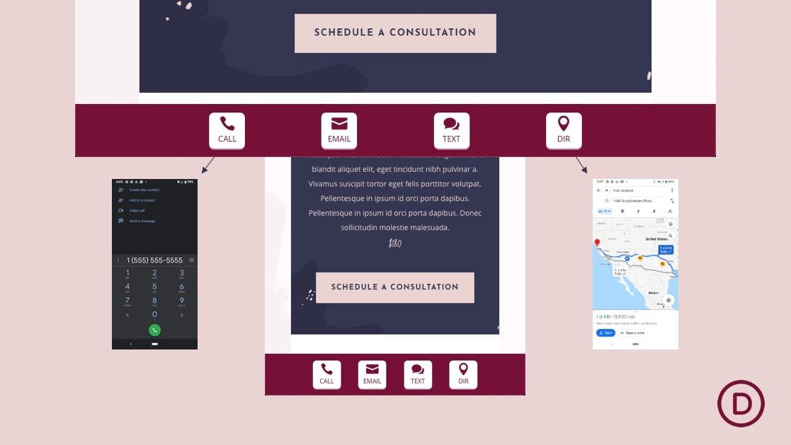
Here is a quick look at the design we’ll build in this tutorial.
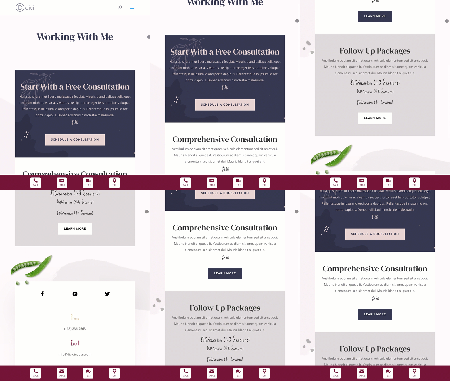
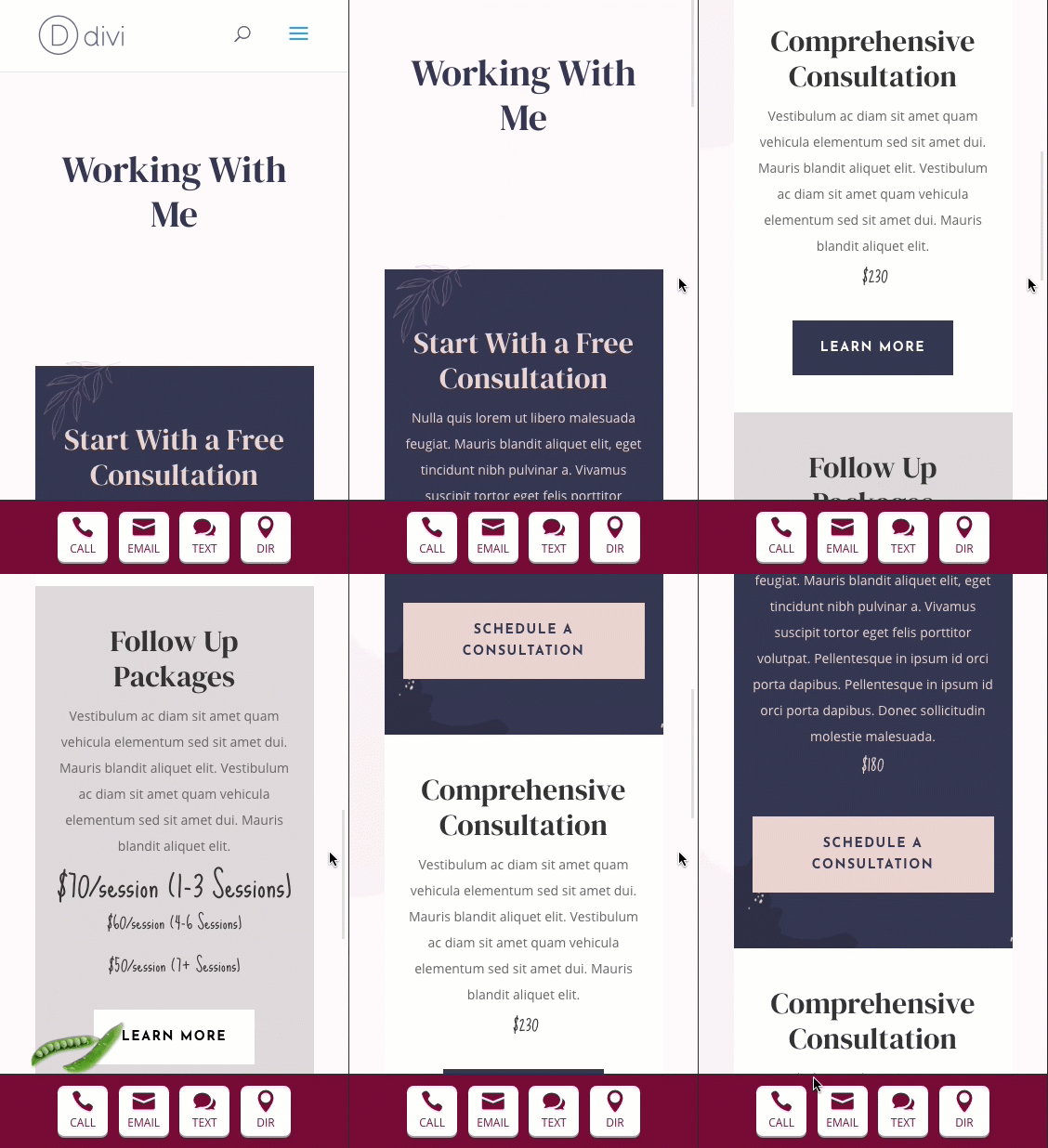
Download the Layout for FREE
To lay your hands on the designs from this tutorial, you will first need to download it using the button below. To gain access to the download you will need to subscribe to our newsletter by using the form below. As a new subscriber, you will receive even more Divi goodness and a free Divi Layout pack every Monday! If you’re already on the list, simply enter your email address below and click download. You will not be “resubscribed” or receive extra emails.
How to Add the Fixed Contact Bar Template Download to Your Divi Site
WARNING!: Adding this template will override the default website template (if you have one) on your Divi site. We suggest adding this to a test site so that you don’t mess anything up on a live site.
To import the fixed footer bar template to your own website, unzip the download zip file to access the JSON file.
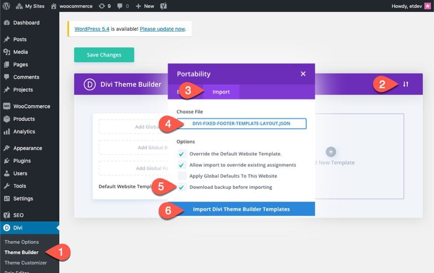
Then go the WordPress Dashboard and navigate to Divi > Theme Builder.
Then click the portability icon at the top right of the page.
Inside the portability popup, choose the JSON file you just unzipped and select the option “Download backup before importing”, just in case you had something in the default website template previously that you didn’t want to override.
Then click the Import button.
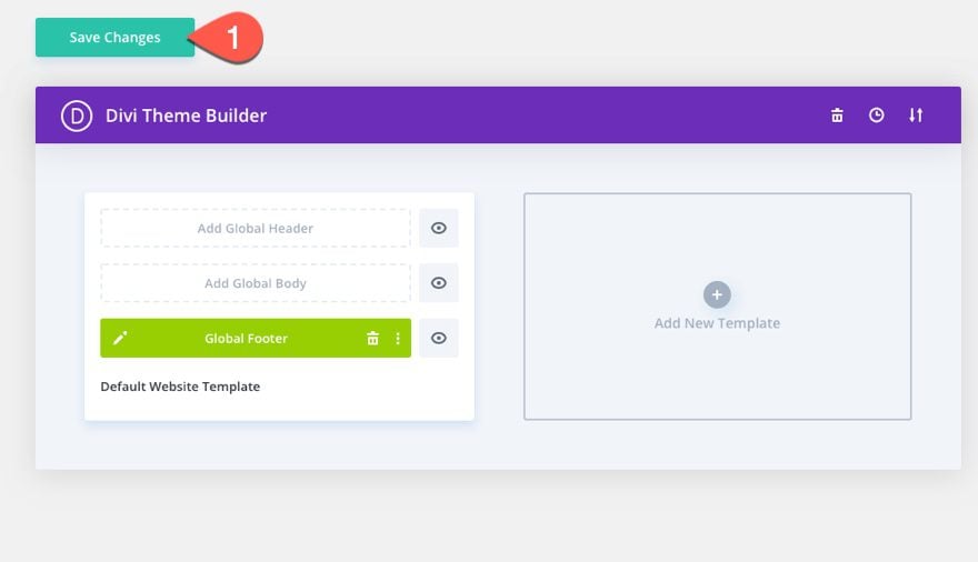
Lastly, save the Theme Builder changes and view a live page to see the fixed footer bar.
Now, let’s get to the tutorial, shall we?
For this tutorial, we are going to add a mobile contact bar to the global footer using the Divi Theme Builder. Start by navigating to Divi > Theme Builder. Then click the Global Footer Area inside the default website template. From the dropdown, select Build Global Footer.
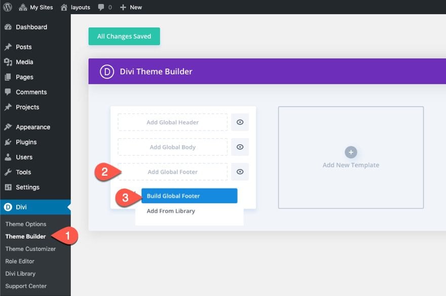
NOTE: If you already have a global footer, you can open edit the global footer and add the contact bar in addition to the current footer.
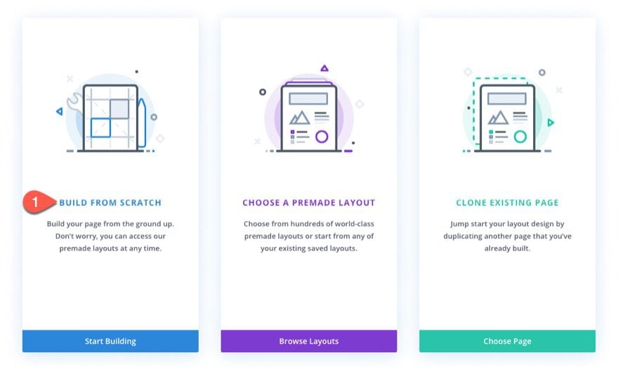
Choose the option “Build From Scratch”.
Part 2: Creating the Fixed Content Bar
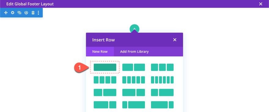
Inside the Global Footer Layout Editor, begin the design process by adding a one-column row to the default section.
Section Settings
Before we start adding modules, open the section settings give it a set height as follows:
- Height: 80px
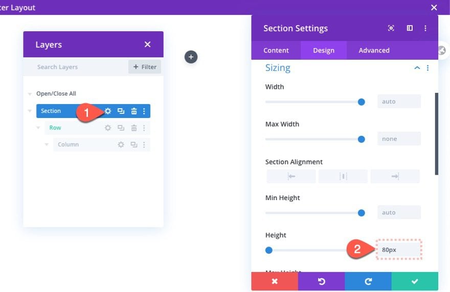
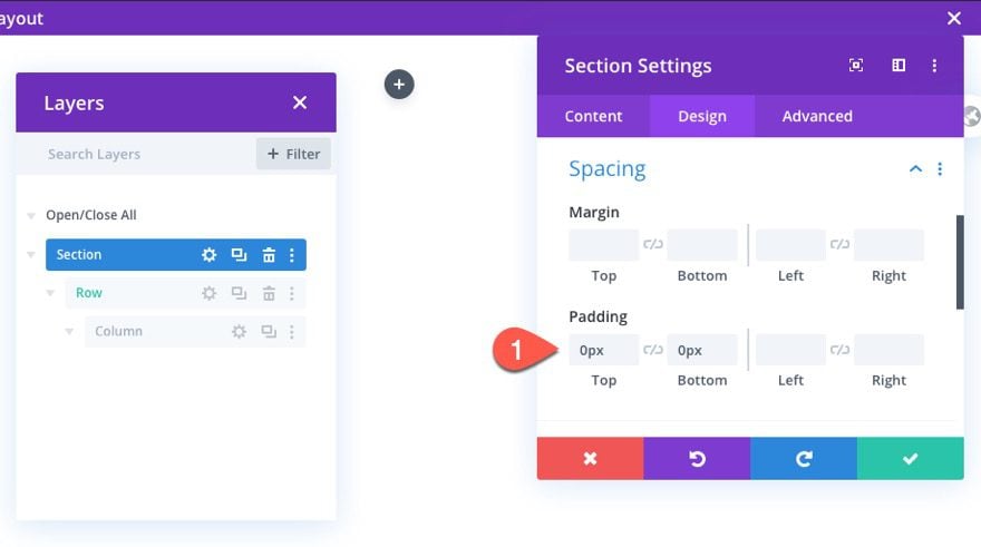
This is important for creating the space at the bottom of the page where the fixed row will eventually come to rest. We will also take out the default top and bottom padding as well.
- Padding: 0px top, 0px bottom
Row Settings
Now that our section is ready, we are ready to customize the row to serve as the fixed contact bar. Open the settings for the row and then update the following:
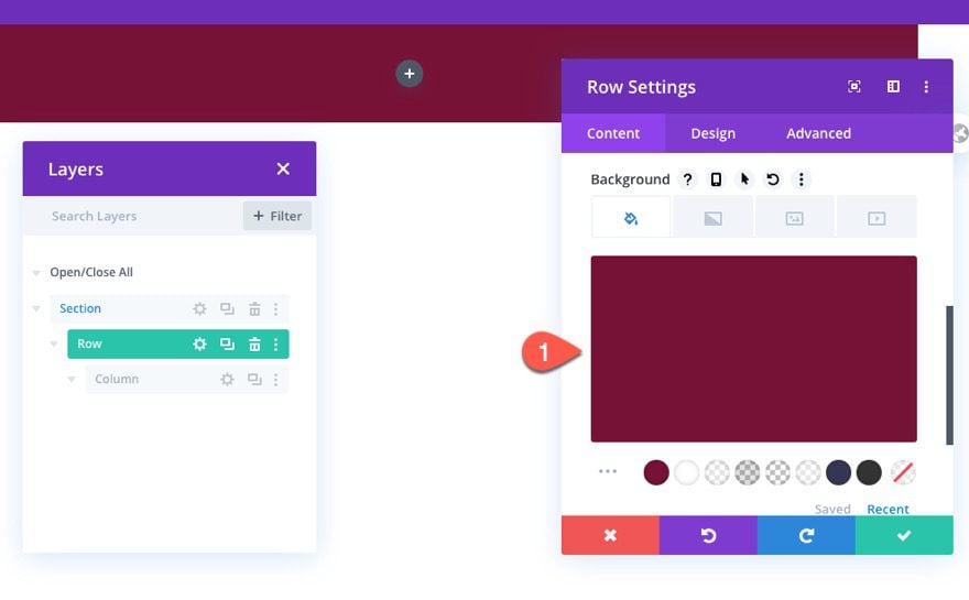
Background
- Background Color: #751136
Size
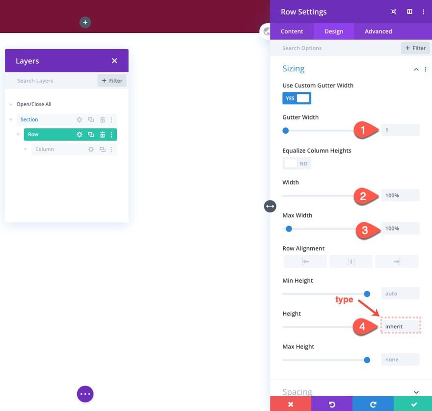
- Gutter Width: 1
- Width: 100%
- Max Width: 100%
- Height: inherit
Although the row will be fixed, we want the height of the row to match the height of the parent section so that the space at the bottom of the page will adequately contain the row. To do this we must type in the text “inherit” for the height.
Spacing
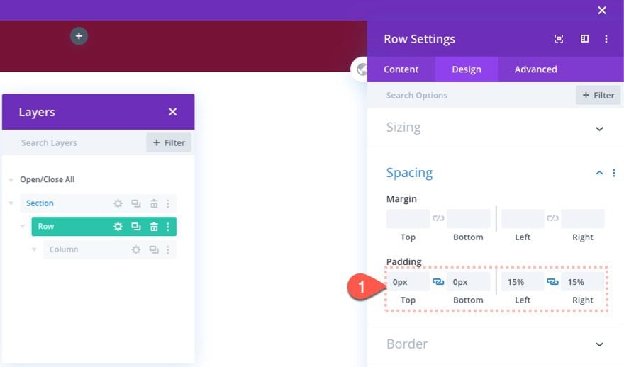
- Padding: 0px top, 0px bottom, 15% left, 15% right
Custom CSS
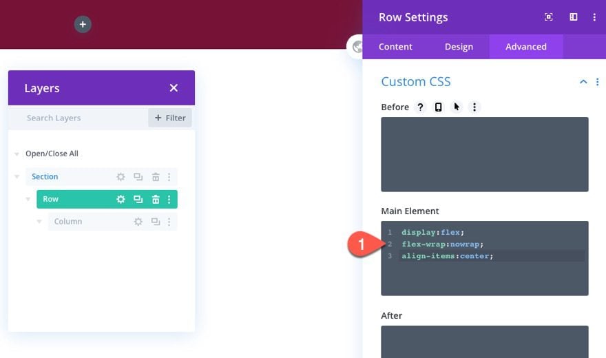
We want to make sure the content within the row stays vertically aligned and the columns do not break on mobile. To do this, add the following custom CSS to the row’s main element:
display:flex;
flex-wrap:nowrap;
align-items:center;
Fixed Positioning
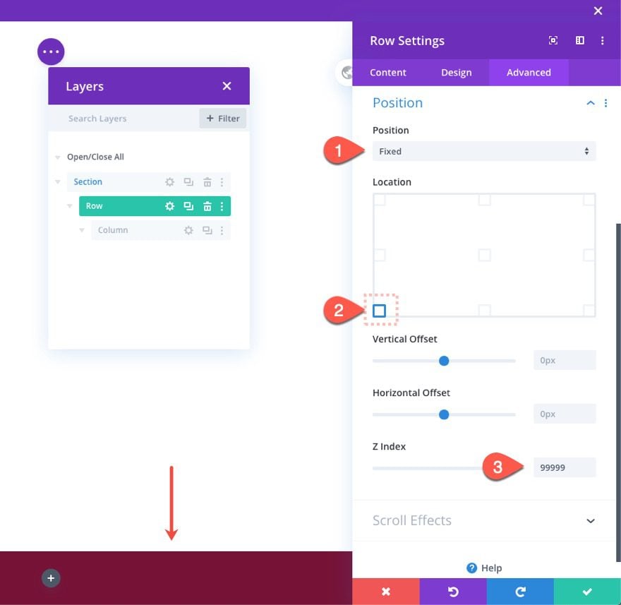
To make the row fixed so that it floats at the bottom of the screen, we need to give it a fixed position at the bottom left location as follows:
- Position: Fixed
- Location: bottom left
- Z Index: 99999
Part 3: Building the Call-to-Click, Email, SMS, and Direction Links
Now that our contact bar is complete, we are ready to add the clickable contact buttons along with the custom URLs.
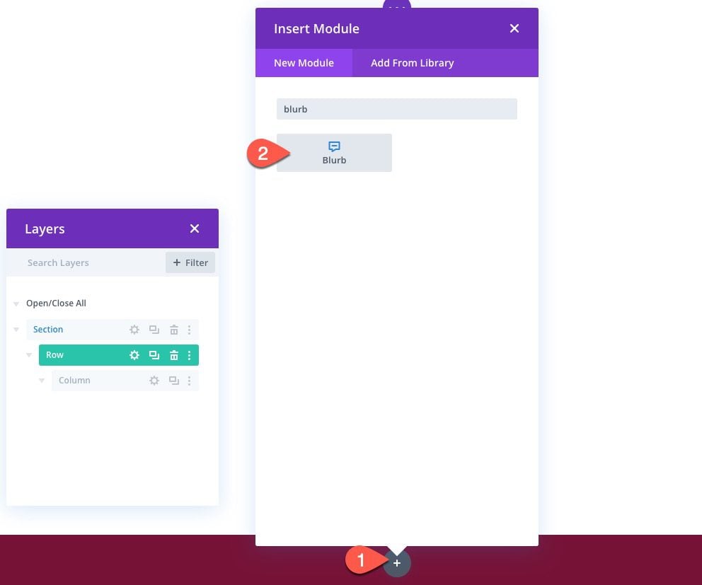
The first contact button we are going to create is the click-to-call button. To create it, add a new blurb module to the column.
Content
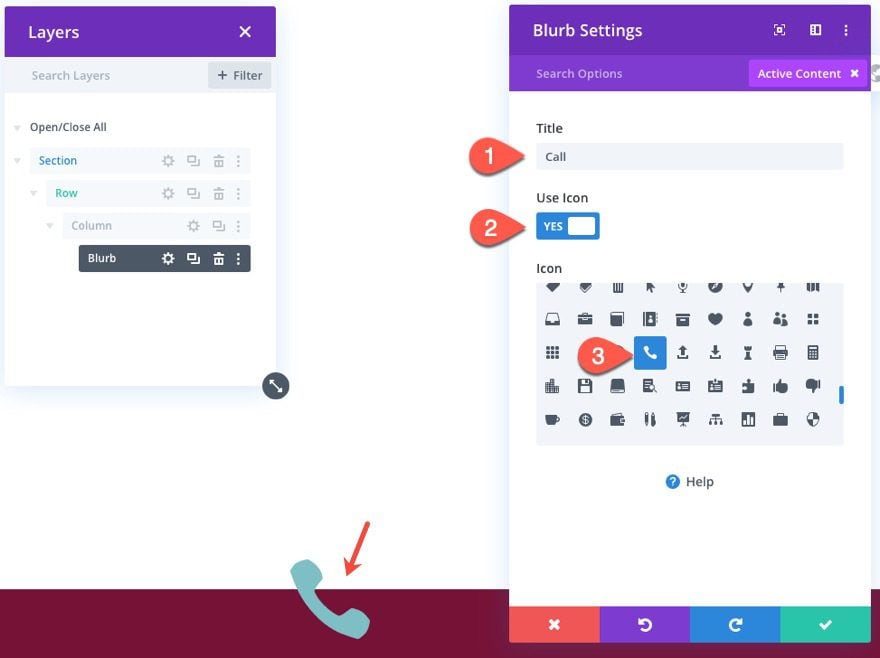
Under the content tab, add a Title and an Icon to the blurb as follows:
- Title: Call
- Use Icon: YES
- Icon: phone
Background
The give it a white background color:
- Background Color: #ffffff
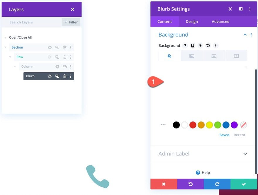
Design Settings
Jump over to the design tab, and update the settings as follows:
Icon
- Icon Color: #751136
- Use Icon Font Size: YES
- Icon Font Size: 2em
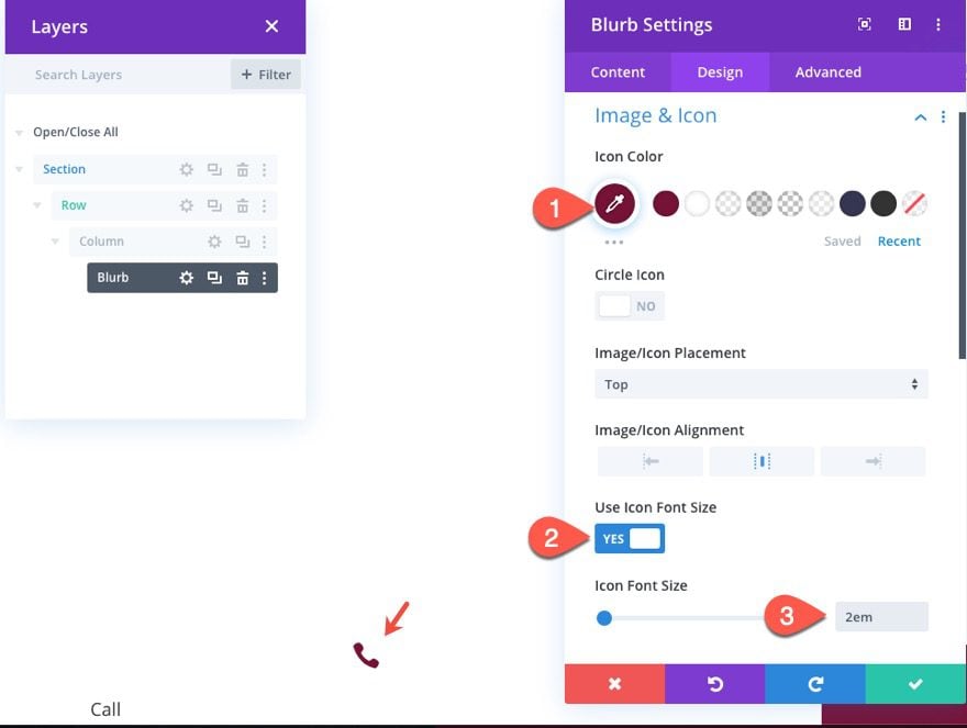
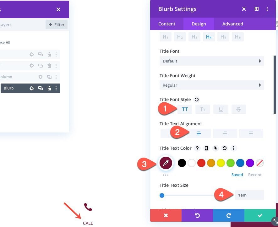
Title Font
- Tite Font Style: TT
- Title Text Alignment: Center
- Title Text Color: #751136
- Title Text Size: 1em
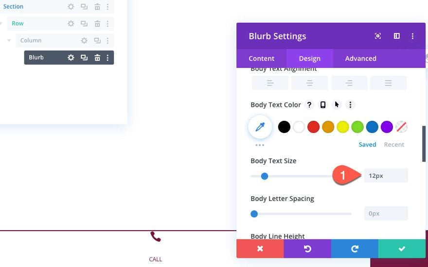
Body Text Size
If you noticed, we have been sizing the blurb elements using the “em” length unit. This is relative to the size of the body text. Therefore adjusting the size of the blurbs body text (even though it doesn’t have body text displayed) will adjust the size of all the blurb elements with the em length unit. This is simply a convenient way to change the size of the button going forward without having to adjust each element individually.
Update the body text as follows:
- Body Text Size: 12px
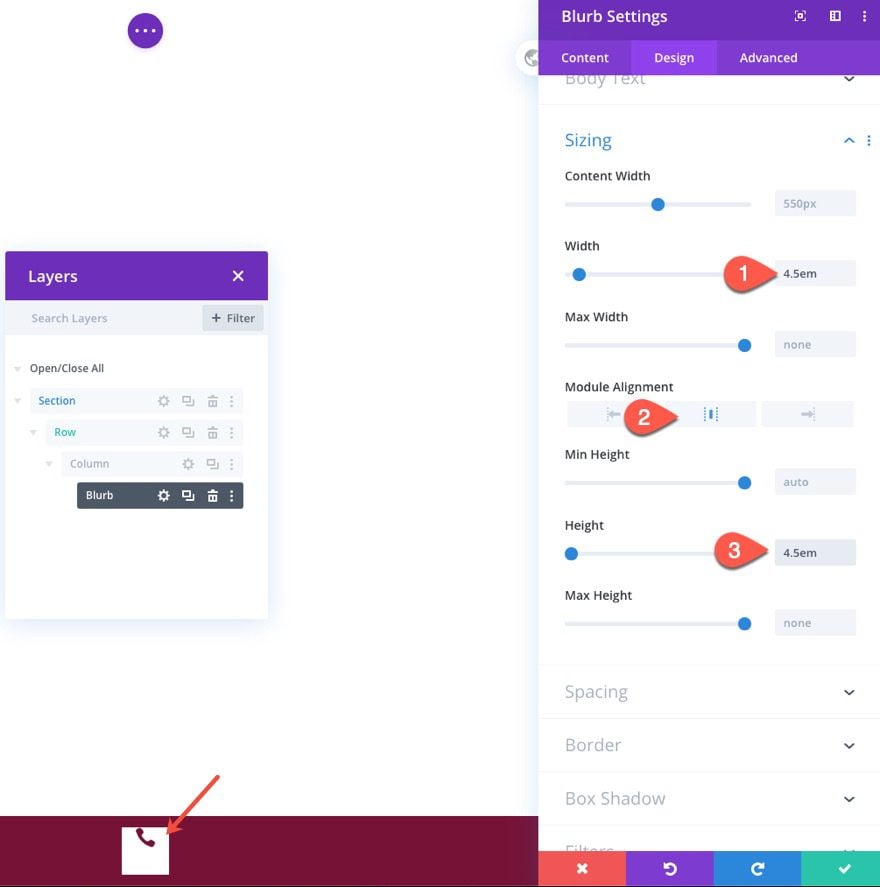
Size
Give the blurb a set height and width as follows:
- Width: 4.5em
- Module Alignment: center
- Height: 4.5em
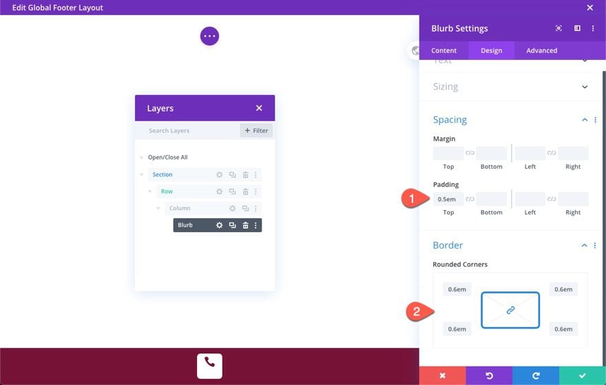
Padding and Corners
- Padding: 0.5em top
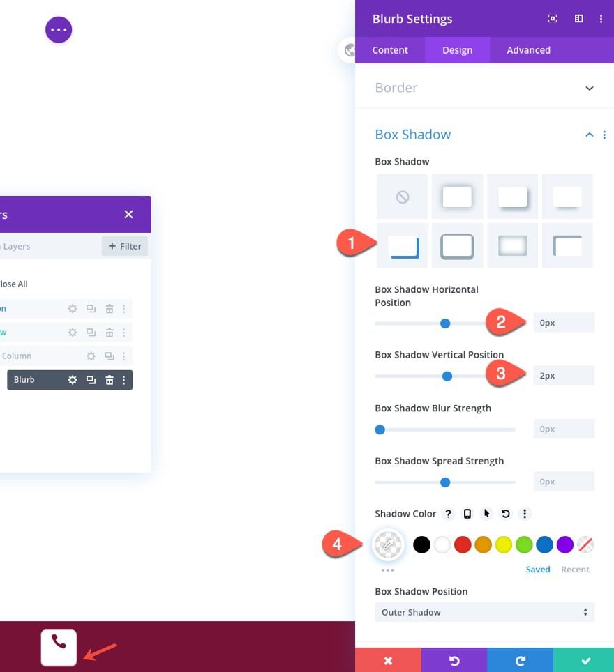
Box Shadow
- Box Shadow: see screenshot
- Box Shadow Horizontal Position: 0px
- Box Shadow Vertical Position: 2px
- Shadow Color: rgba(255,255,255,0.55)
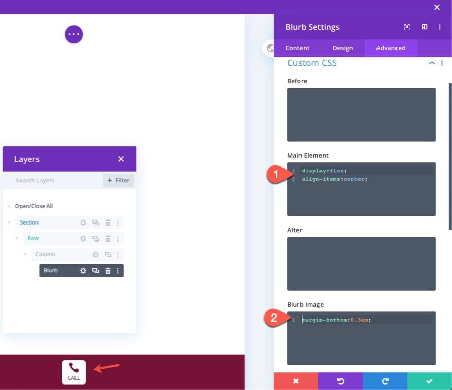
Custom CSS
In order to make the content of the blurb module vertically centered, add the following Custom CSS to the Main Element:
display:flex;
align-items:center;
And take out the spacing under the blurb icon by adding the following Blurb Image:
margin-bottom: 0.3em;
Adding the Call link URL
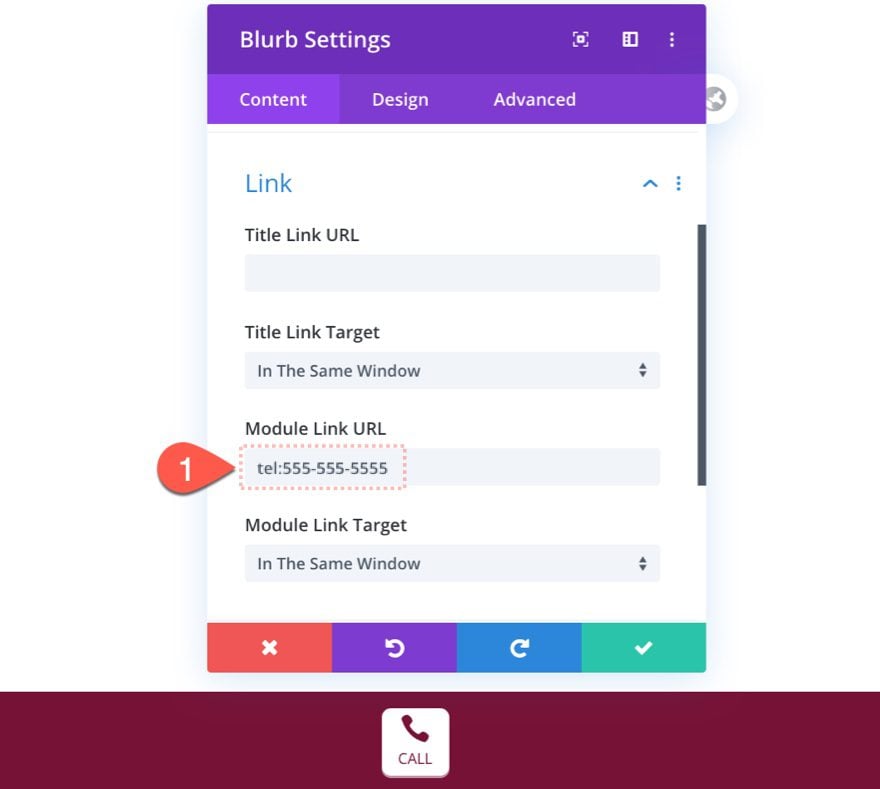
In order to add a call link URL that will initiate a call on a mobile phone, add the number after the prefix “tel:”.
- Module Link URL: tel:555-555-5555
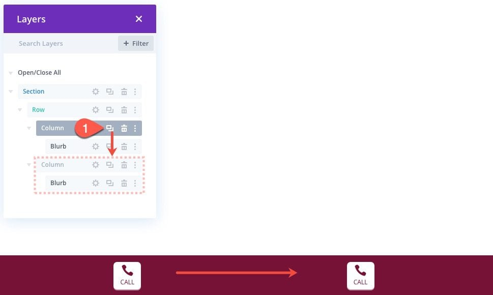
To create the email button, duplicate the entire column.
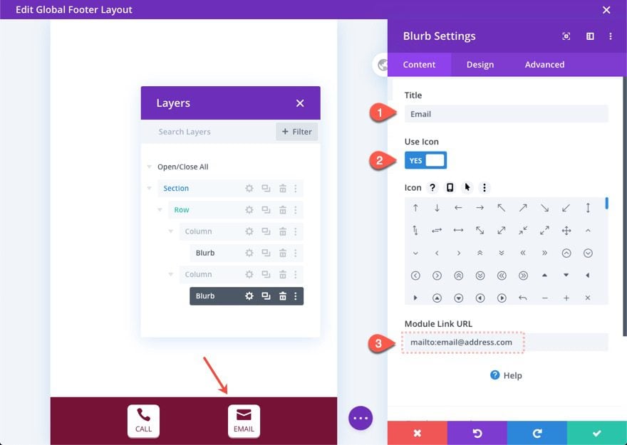
Adding the Email Icon and link URL
Then update the duplicate blurb in column 2 with a new Title and Icon.
In order to add a call link URL that will initiate an email on a mobile app, add the email address after the prefix “mailto:”.
- Module Link URL: mailto:[email protected]
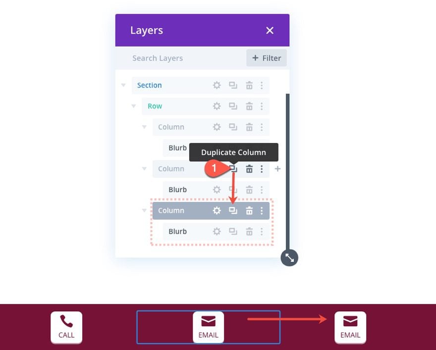
To create the SMS button, duplicate column 2.
Adding the SMS Icon and link URL
Then update the duplicate blurb in column 2 with a new Title and Icon.
In order to add a call link URL that will initiate an email on a mobile app, add the email address after the prefix “sms:”.
- Module Link URL: sms:+15555555555
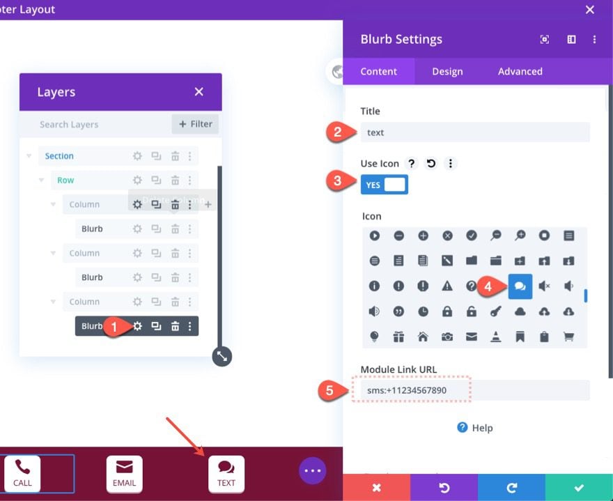
To create the SMS button, duplicate column 3.
Adding the Directions Icon and Link URL
Then update the duplicate blurb in column 3 with a new Title and Icon.
In order to add a call link URL that will initiate directions via Google Maps, use these Direction URL structures.
For this tutorial, we are going to add a directions link that will generate directions from the user’s current location to the GooglePlex in Mountain View, CA.
- Module Link URL:
https://www.google.com/maps/dir/?api=1&destination=1600+amphitheatre+pkwy+mountain+view+CA
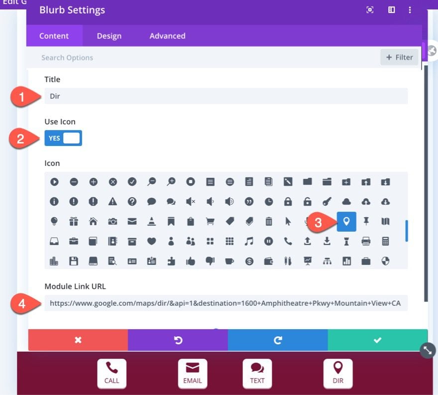
To add your own address to the URL, replace the text after “destination=” in the URL, making sure to separate the words with plus (“+”) symbols.

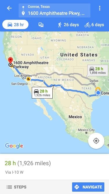
Clicking the button should give you something similar to this…
Hide Section on Desktop
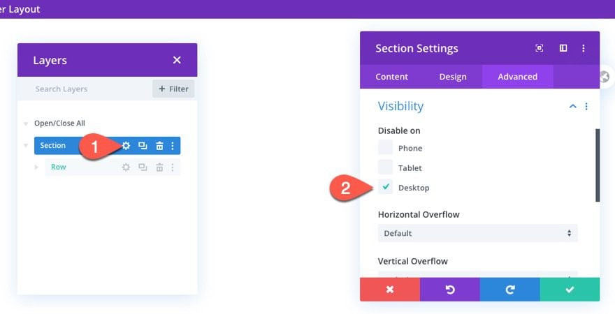
Because we want the contact bar only to show on mobile devices, we can disable the entire section on desktop. To do this, open the section settings and update the following:
- Disable On: Desktop
Final Results


More Contact Links
With HTML5, you’re not limited to phone numbers. You can add other calls to action such as email, messaging, fax, etc. HTML5 protocols include:
tel: – place a phone call
mailto: – open an email app
callto: open Skype
sms: – send a text message
fax: – send a fax
And if you want, you can also add a targeted Waze link for the Directions URL.
Final Thoughts
The contact bar seems like it would be a great addition to any company website that wants to make it convenient for users to contact them from a mobile device. And once you familiarize yourself with the structures of the link URLs, you are all set to any type of contact link you want.
For more, check out our post on Telephone Links.
I look forward to hearing from you in the comments.
Cheers!



I just have planning to develop Divi Mobile, this article helpful for me
I like this helpful article. I have Create a Divi Mobile Contact Bar is best guide to help design my site by read this article. Very helpful. Thanks
I like this helpful article. I have set Mobile call Email subscribe bar in my site by read this article. Very helpful. Thanks
Great tutorial, thanks! Can definitely see this applied to many sites. One question though: I have several “older” Divi-based sites running on child themes. Can I still use this layout with these?
Thanks again, looking forward to applying this layout.
Create a Divi Mobile Contact Bar is best guide to help design Call to Action fro mobile device specially this help more to local searched conversion faster.
Food delivery industry are looking for quick design to instant conversion and this would help establish it.
I have a consultation site, can i use this process on that site.
Because it seems very useful for my local audience.
Creating a mobile contact bar is really useful especially for service providing/consultanting sites.
And the way you teach us to create without any hassle, saved my time and efforts.
I know soon Divi will also going to be popular like other builders.