In a previous Divi tutorial, we’ve shown you how to create a completely dynamic open job position template with Divi’s Theme Builder and the Advanced Custom Fields plugin. In today’s tutorial, we’ll show you how you can dynamically feature the open job positions on your careers page. This tutorial is a sequel to the open job position template post, so make sure you recreate the template first and then come back to this tutorial.
Let’s get to it.
- 1 Preview
- 2 Download The Dynamic Careers Job Listing Layout for FREE
- 3 Download For Free
- 4 1. Add Careers Page
-
5
2. Start Building Careers Page on the Frontend
- 5.1 Add Section #1
- 5.2 Add New Row
- 5.3 Add Text Module to Column
- 5.4 Add Divider Module to Column
- 5.5 Add Section #2
- 5.6 Add New Row
- 5.7 Add Text Module to Column
- 5.8 Add Divider Module to Column
- 5.9 Add Blog Module to Column
- 5.10 Clone Row as Many Times as Needed
- 5.11 Add Code Module to Last Row’s Column
- 6 3. Save Page Design & View Result
- 7 Preview
- 8 Final Thoughts
Preview
Before we dive into the tutorial, let’s take a quick look at the outcome across different screen sizes.
Desktop
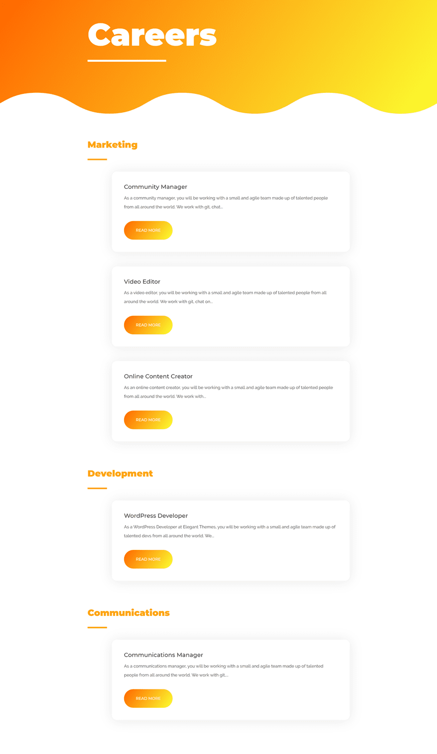
Mobile

Download The Dynamic Careers Job Listing Layout for FREE
To lay your hands on the free dynamic careers job listing layout, you will first need to download it using the button below. To gain access to the download you will need to subscribe to our newsletter by using the form below. As a new subscriber, you will receive even more Divi goodness and a free Divi Layout pack every Monday! If you’re already on the list, simply enter your email address below and click download. You will not be “resubscribed” or receive extra emails.
1. Add Careers Page
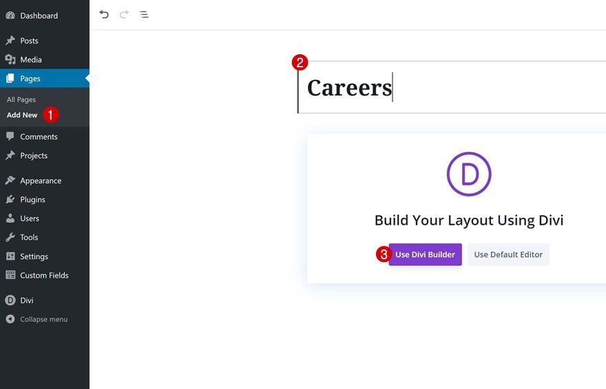
Add New Page & Switch Over to Visual Builder
Start by creating a new page, giving your page a title and switching over to Visual Builder.
2. Start Building Careers Page on the Frontend
Add Section #1
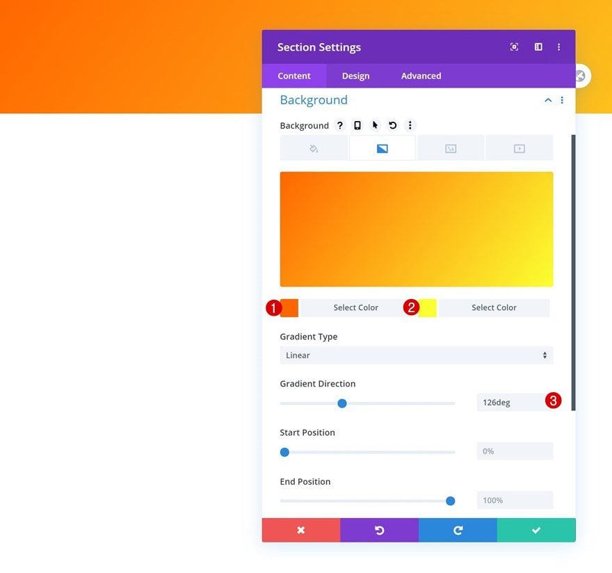
Gradient Background
Add the first section to the page, open the section settings and use a gradient background.
- Color 1: #ff6600
- Color 2: #fbff30
- Gradient Direction: 126deg
Bottom Divider
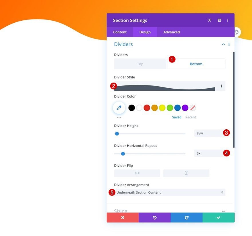
Use a bottom section divider as well.
- Divider Style: Find in List
- Divider Height: 8vw
- Divider Horizontal Repeat: 3x
- Divider Arrangement: Underneath Section Content
Spacing
Complete the section settings by adding some bottom padding.
- Bottom Padding: 200px
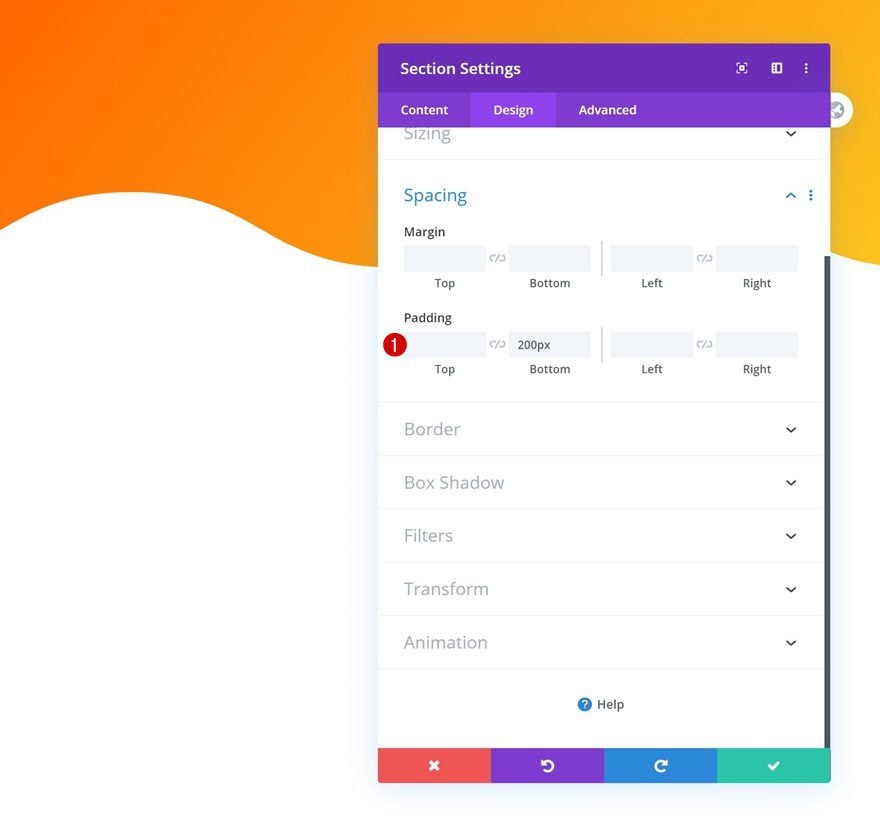
Add New Row
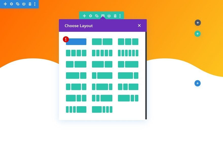
Column Structure
Continue by adding a new row to the section using the following column structure:
Add Text Module to Column
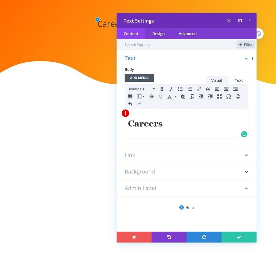
Add H1 Content
Add a Text Module to the row’s column with some H1 content of your choice.
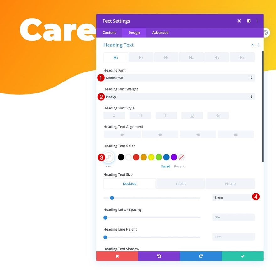
H1 Text Settings
Move on to the module’s design tab and change the H1 text settings accordingly:
- Heading Font: Montserrat
- Heading Font Weight: Heavy
- Heading Text Color: #ffffff
- Heading Text Size: 8rem (Desktop), 4rem (Tablet), 2.5rem (Phone)
Add Divider Module to Column
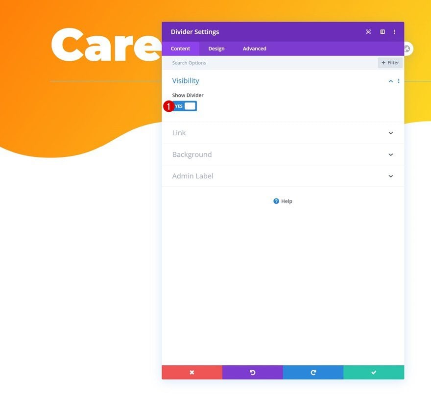
Visibility
Right below the Text Module, add a Divider Module. Make sure the ‘Show Divider’ option is enabled.
- Show Divider: Yes
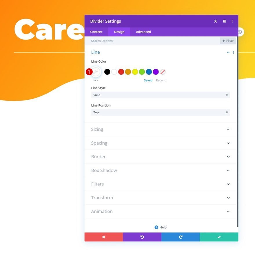
Line
Change the module’s line color next.
- Line Color: #ffffff
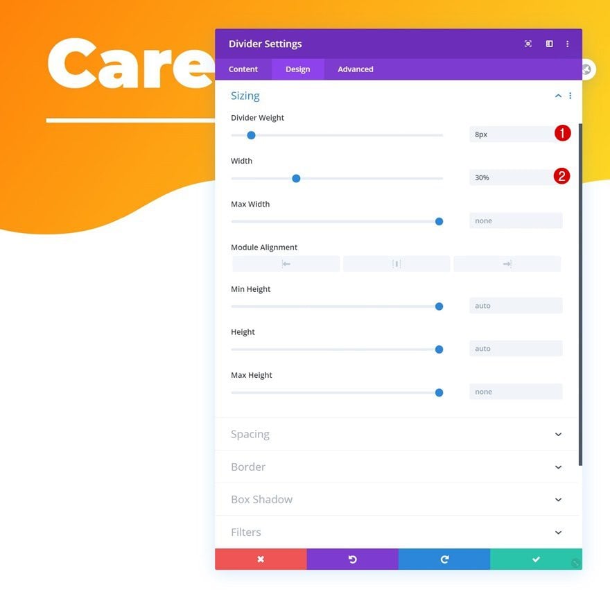
Sizing
And complete the module’s settings by changing the sizing settings.
- Divider Weight: 8px
- Width: 30%
Add Section #2
Add another regular section to the page.

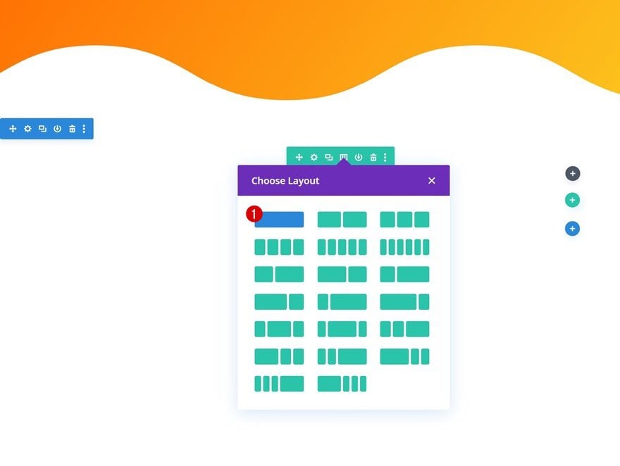
Add New Row
Column Structure
Add a new row to the section using the following column structure:
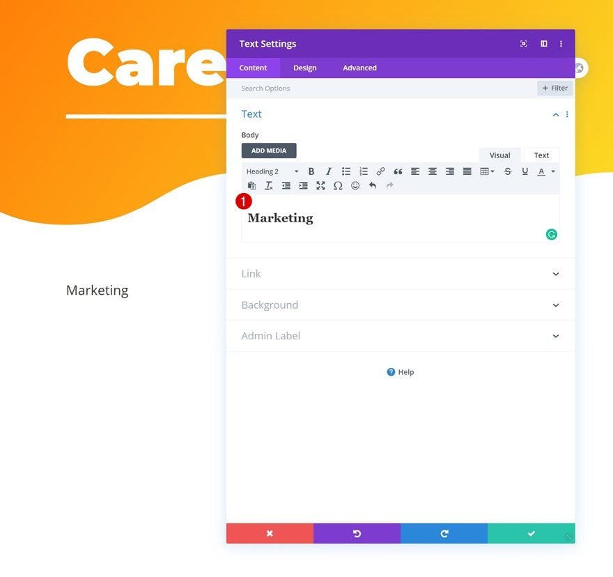
Add Text Module to Column
Add H2 Content
Add a Text Module to the row’s column and insert some H2 content of your choice.
H2 Text Settings
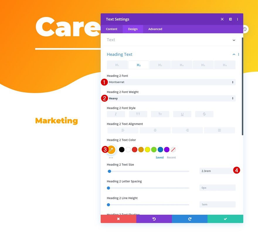
Modify the module’s H2 text settings as follows:
- Heading 2 Font: Montserrat
- Heading 2 Font Weight: Heavy
- Heading 2 Text Color: #ffa500
- Heading 2 Text Size: 2.3rem
Add Divider Module to Column
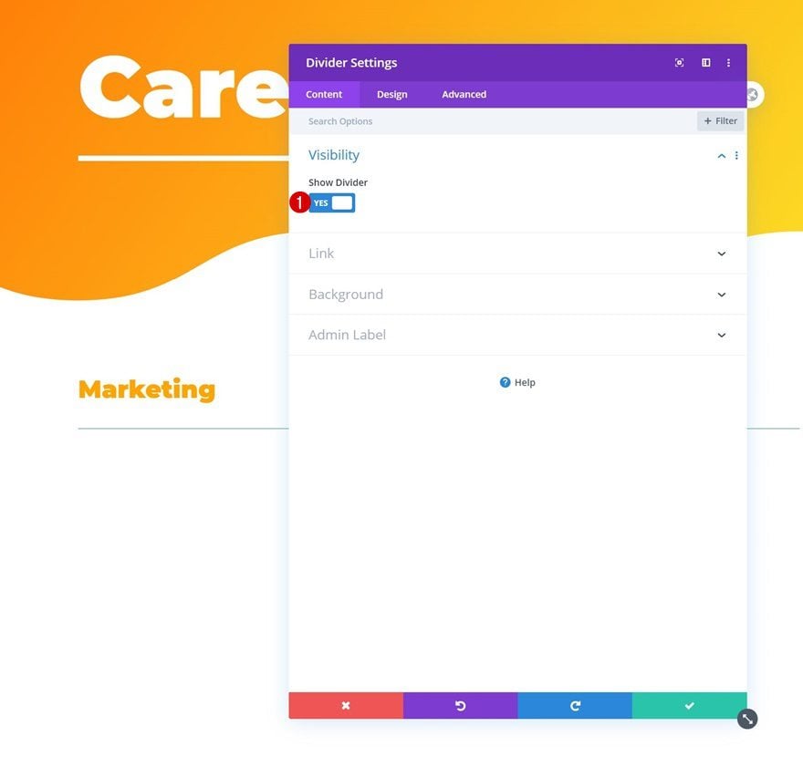
Visibility
The next module we need in this column is a Divider Module. Make sure the ‘Show Divider’ option is enabled.
- Show Divider: Yes
Line
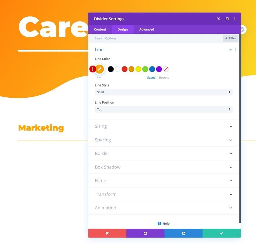
Modify the module’s line color next.
- Line Color: #ffa500
Sizing
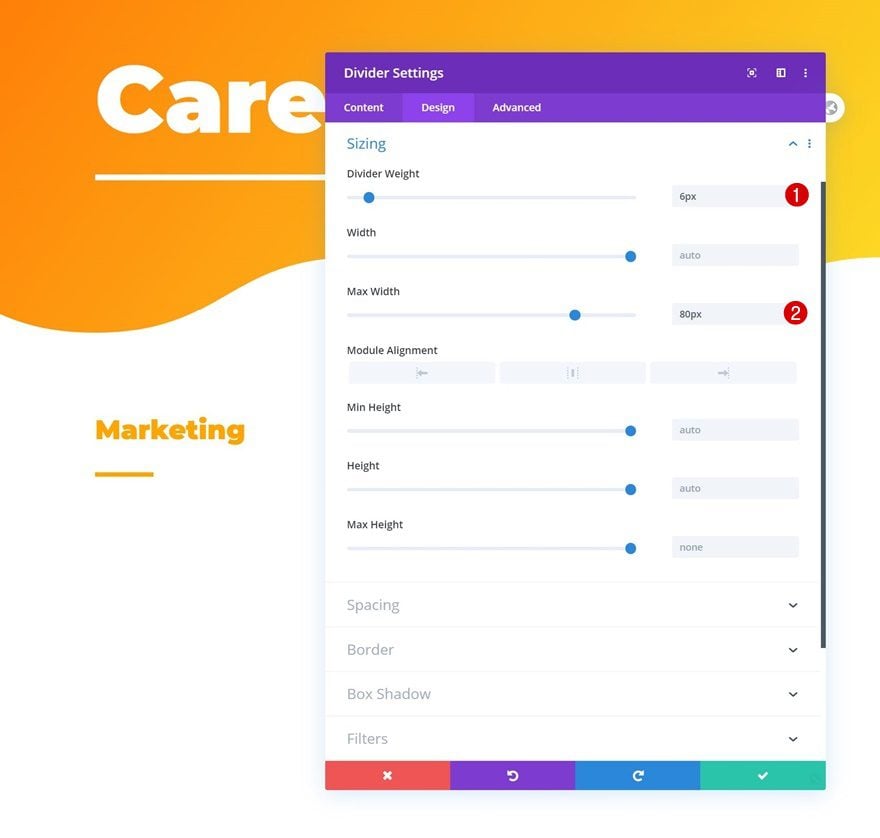
And complete the module’s settings by changing the divider weight and max width in the sizing settings.
- Divider Weight: 6px
- Max Width: 80px
Add Blog Module to Column
Content
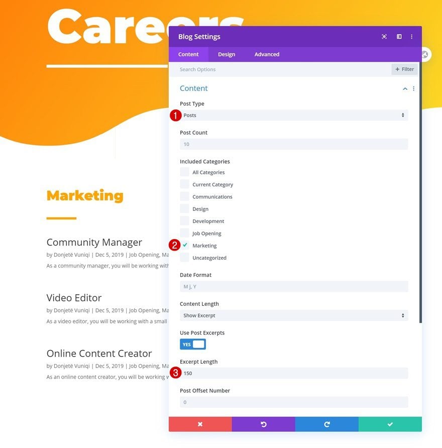
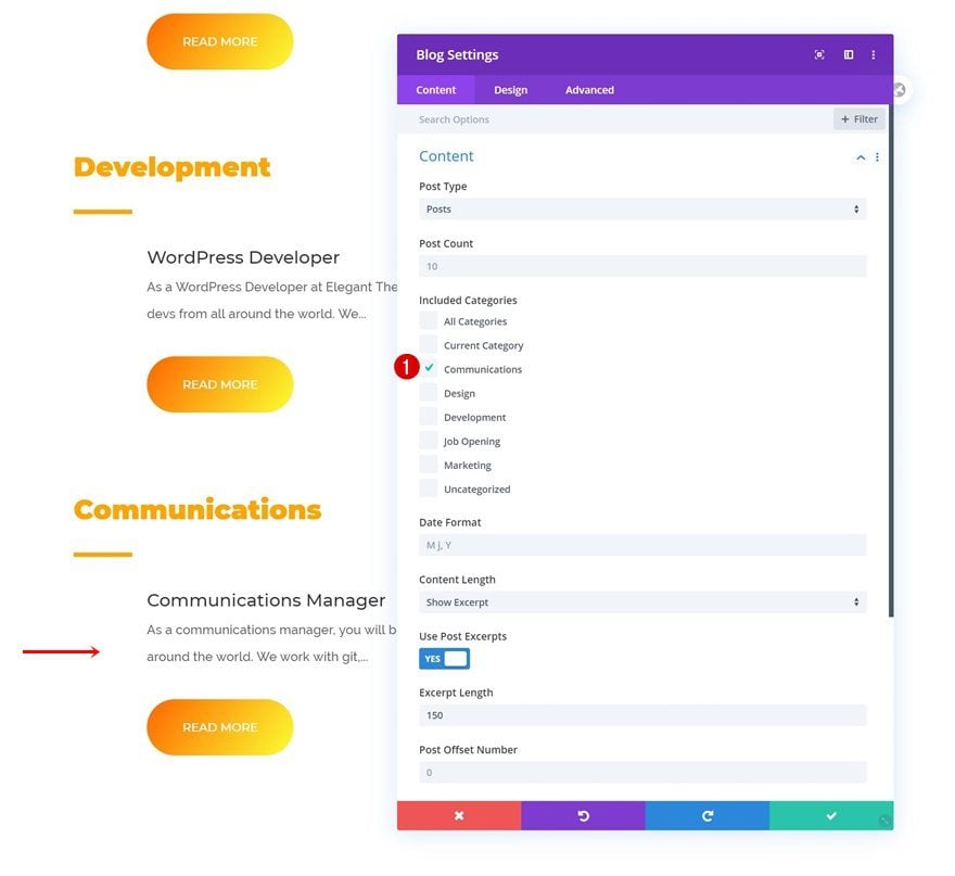
To display the different open job positions, we’ll use a Blog Module that we’ll customize to our needs. Make sure the following content settings apply:
- Post Type: Posts
- Include Categories: Marketing
- Excerpt Length: 150
Elements
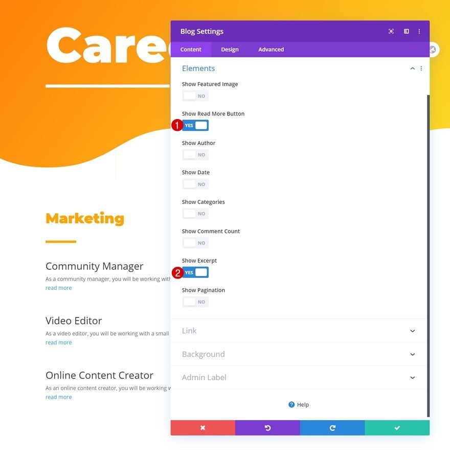
In the elements settings, the only two options we’re enabling are the following ones:
- Show Read More Button: Yes
- Show Excerpt: Yes
Layout
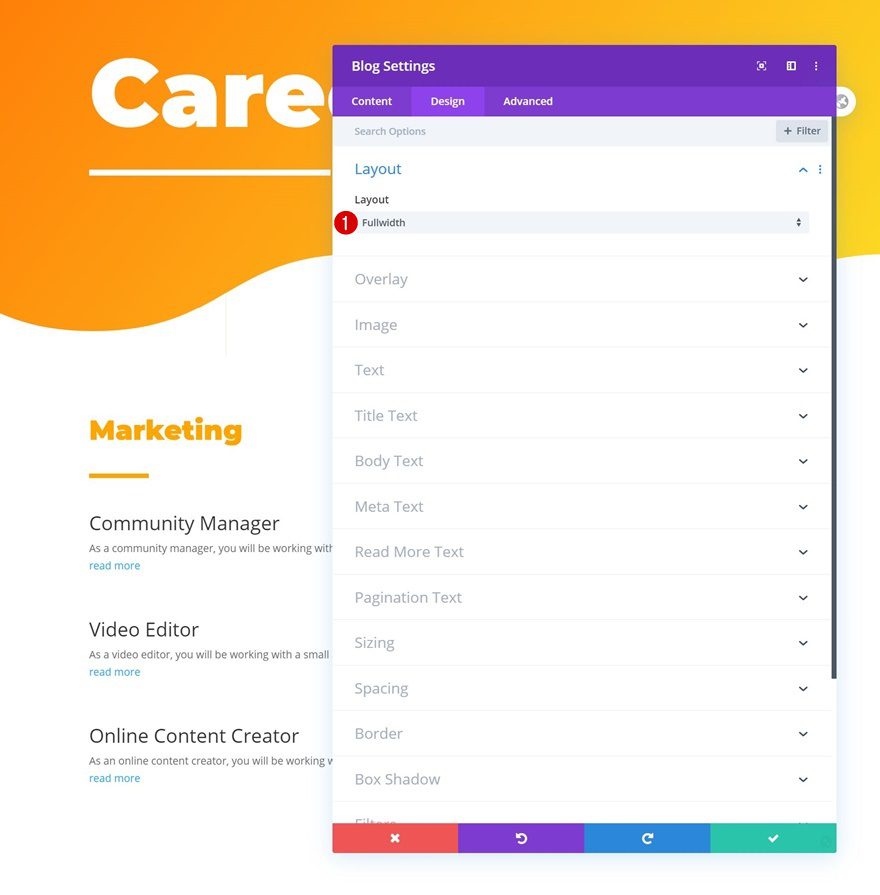
Move on to the module’s design tab and make sure you’re using a fullwidth layout.
- Layout: Fullwidth
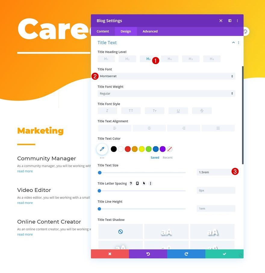
Title Text Settings
Change the title text settings too.
- Title Heading Level: H3
- Title Font: Montserrat
- Title Text Size: 1.5rem
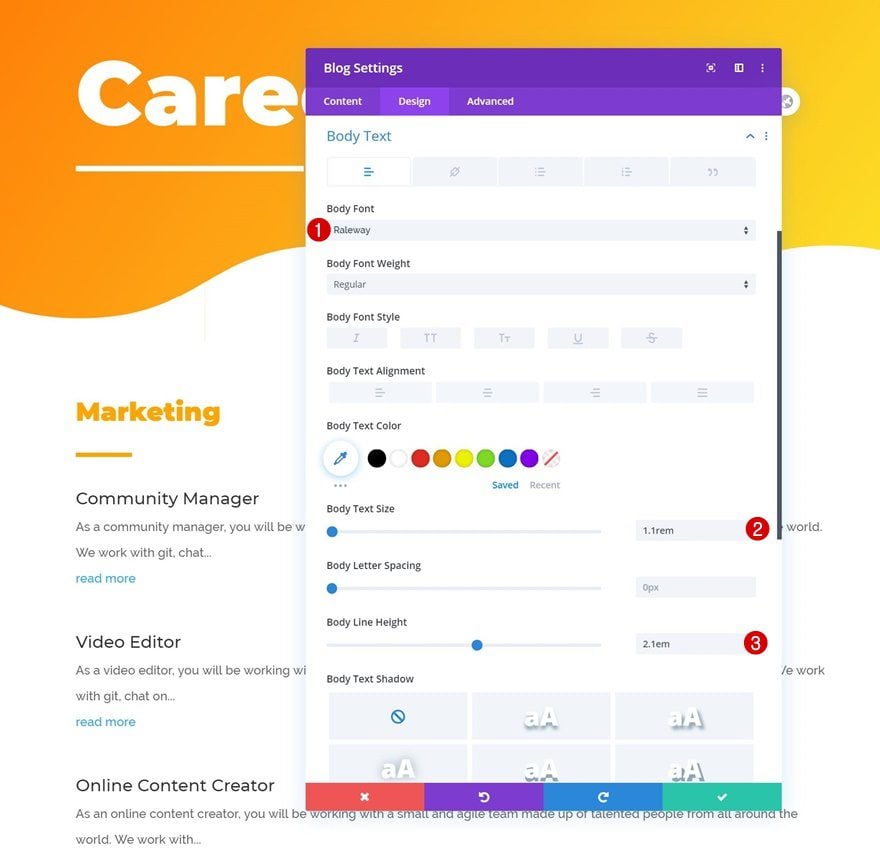
Body Text Settings
Then, modify the body text settings.
- Body Font: Raleway
- Body Text Size: 1.1rem
- Body Line Height: 2.1em
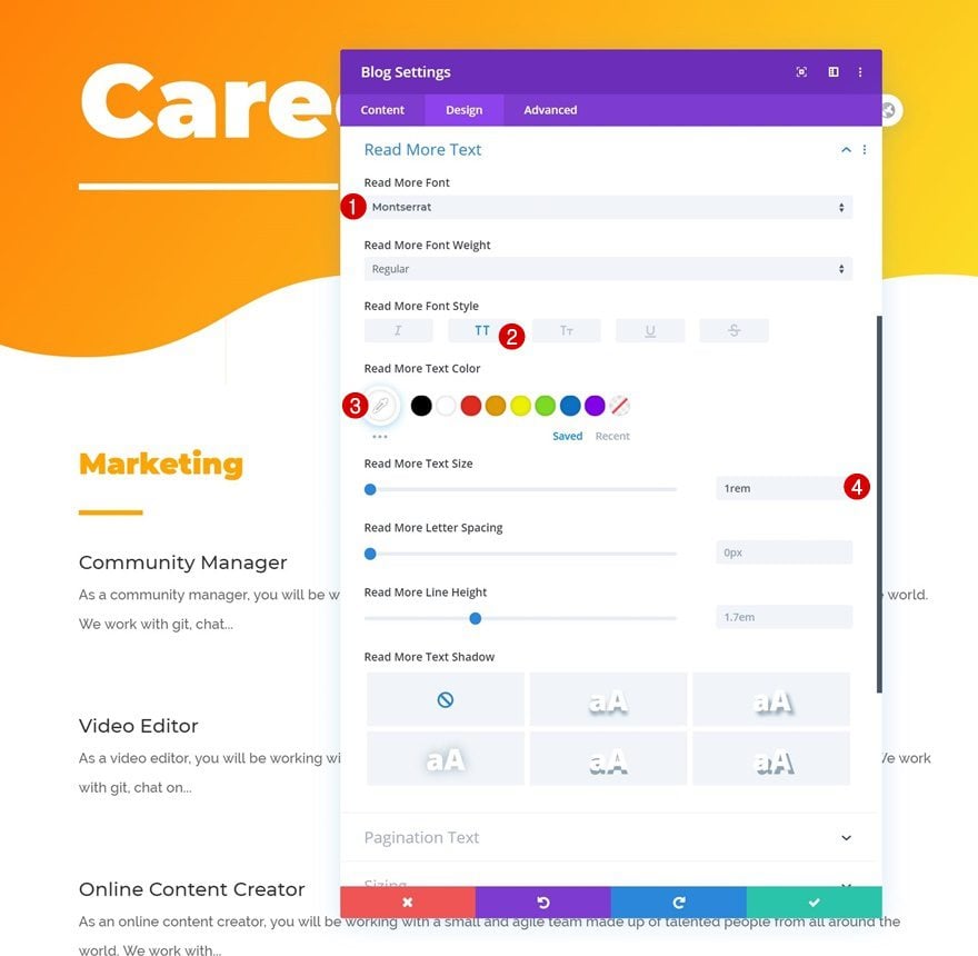
Read More Text Settings
Along with the read more text settings.
- Read More Font: Montserrat
- Read More Font Style: Uppercase
- Read More Text Color: #ffffff
- Read More Text Size: 1rem
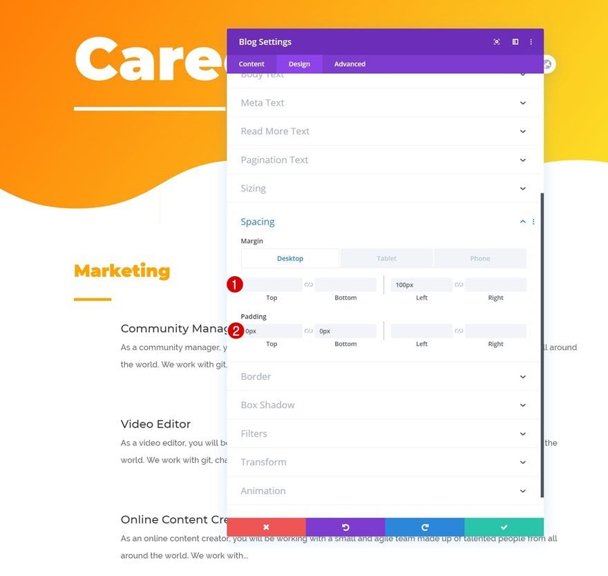
Spacing
Add some custom margin and padding values to the spacing settings.
- Left Margin: 100px (Desktop), 50px (Tablet), 0px (Phone)
- Top Padding: 0px
- Bottom Padding: 0px
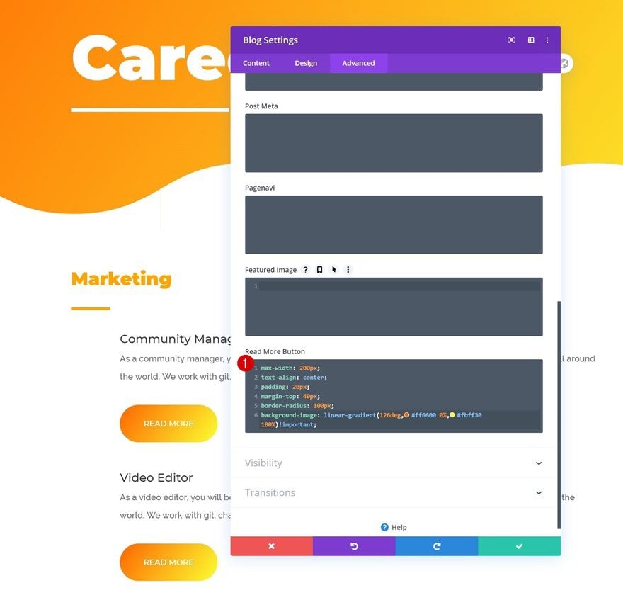
Read More Button CSS
And complete the module’s settings by adding some read more button CSS in the advanced tab.
max-width: 200px;
text-align: center;
padding: 20px;
margin-top: 40px;
border-radius: 100px;
background-image: linear-gradient(126deg,#ff6600 0%,#fbff30 100%)!important;
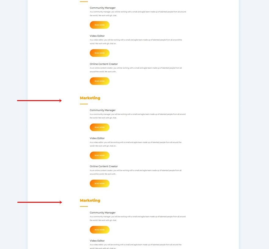
Clone Row as Many Times as Needed
Once you’ve completed the row and all its modules, you can clone it up to as many times as you want, depending on how many departments your company has.
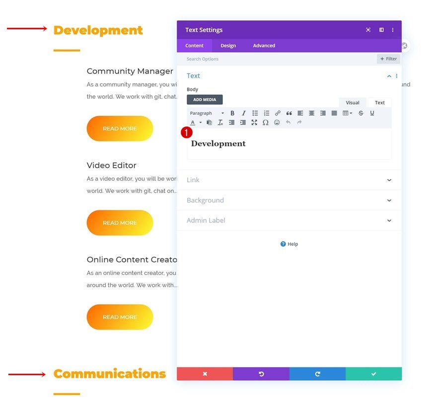
Change Text Module Content
Make sure you change the H2 content of each duplicate row.
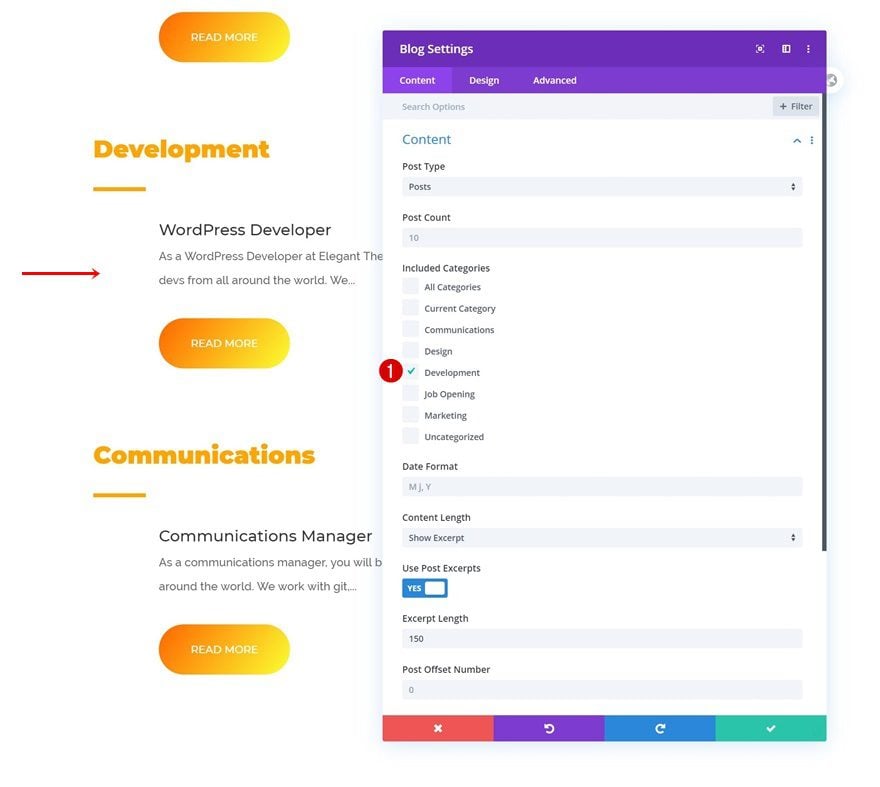
Change Blog Module Categories
Along with the Blog Module categories.
Add Code Module to Last Row’s Column
Insert CSS Code to Style Open Job Positions Individually
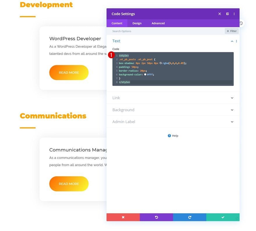
To complete the design, we’re going to add a Code Module to the last row on our page and insert the following lines of CSS code:
<style>
.et_pb_posts .et_pb_post {
box-shadow: 0px 2px 50px 0px rgba(0,0,0,0.09);
padding: 50px;
border-radius: 20px;
background-color: #fff;
}
</style>
3. Save Page Design & View Result
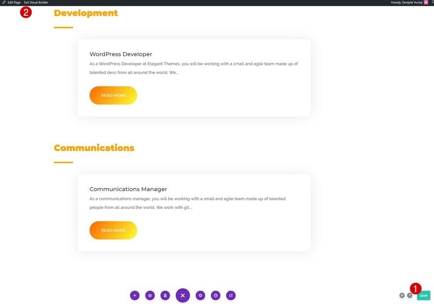
Once you’ve completed the page design, you can save all changes, exit the Visual Builder and view the result!
Preview
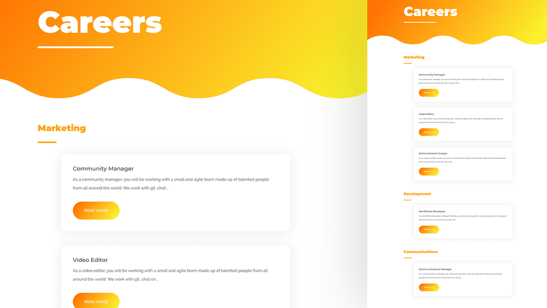
Now that we’ve gone through all the steps, let’s take a final look at the outcome across different screen sizes.
Desktop

Mobile

Final Thoughts
This tutorial is a sequel to a previous tutorial, where we’ve shown you how to create an open job position template. In this tutorial, we’ve taken it a step further and we’ve shown you how to feature those dynamic open job positions on your careers page using Divi’s Blog Module. You were able to download the JSON file for free as well! If you have any questions or suggestions, feel free to leave a comment in the comment section below.
If you’re eager to learn more about Divi and get more Divi freebies, make sure you subscribe to our email newsletter and YouTube channel so you’ll always be one of the first people to know and get benefits from this free content.



This is nice, but is there a way to allow for filtering the job positions? Like, by location or by department?
Thanks Donjete Vuniqi. So glad Divi is catching up…very soon I won’t be needing a plugin for “Job listing” website