Fixed footer bars can be a convenient way to keep important information about your website at the forefront as the user engages with your page content on any device. Like with Divi, a footer bar usually exists as a static element at the very bottom of the page after the main footer content. They include things like copyright text and social media icons. But, if you don’t that footer bar content hidden at the bottom of the page, you can build a custom footer bar that floats at the bottom of the screen as the user scrolls.
In this tutorial, we are going to design a completely custom fixed footer bar using Divi’s theme builder. This will come in handy for keeping those small but significant pieces of content in clear sight at all times.
Let’s get started.
- 1 Sneak Peek
- 2 Download the Layout for FREE
- 3 Download For Free
- 4 You have successfully subscribed. Please check your email address to confirm your subscription and get access to free weekly Divi layout packs!
- 5 Part 1: Adding a Global Footer
- 6 Part 2: Creating the Fixed Footer Bar
- 7 Part 2: Creating the Fixed Footer Bar Content
- 8 Final Result
- 9 Final Thoughts
Sneak Peek
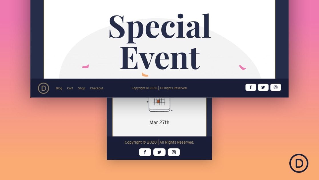
Here is a quick look at the fixed footer bar we will design.
Download the Layout for FREE
To lay your hands on the designs from this tutorial, you will first need to download it using the button below. To gain access to the download you will need to subscribe to our newsletter by using the form below. As a new subscriber, you will receive even more Divi goodness and a free Divi Layout pack every Monday! If you’re already on the list, simply enter your email address below and click download. You will not be “resubscribed” or receive extra emails.
WARNING!: Adding this template will override the default website template (if you have one) on your Divi site. We suggest adding this to a test site so that you don’t mess anything up on a live site.
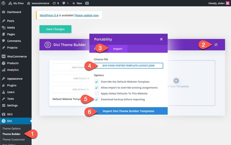
To import the fixed footer bar template to your own website, unzip the download zip file to access the JSON file.
Then go the WordPress Dashboard and navigate to Divi > Theme Builder.
Then click the portability icon at the top right of the page.
Inside the portability popup, choose the JSON file you just unzipped and select the option “Download backup before importing”, just in case you had something in the default website template previously that you didn’t want to override.
Then click the Import button.
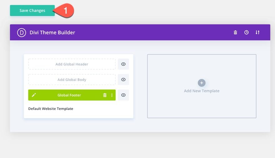
Lastly, save the Theme Builder changes and view a live page to see the fixed footer bar.
Now, let’s get to the tutorial, shall we?
Divi’s Theme Builder allows you to replace the default footer with a new one by updating the Default Website Template.
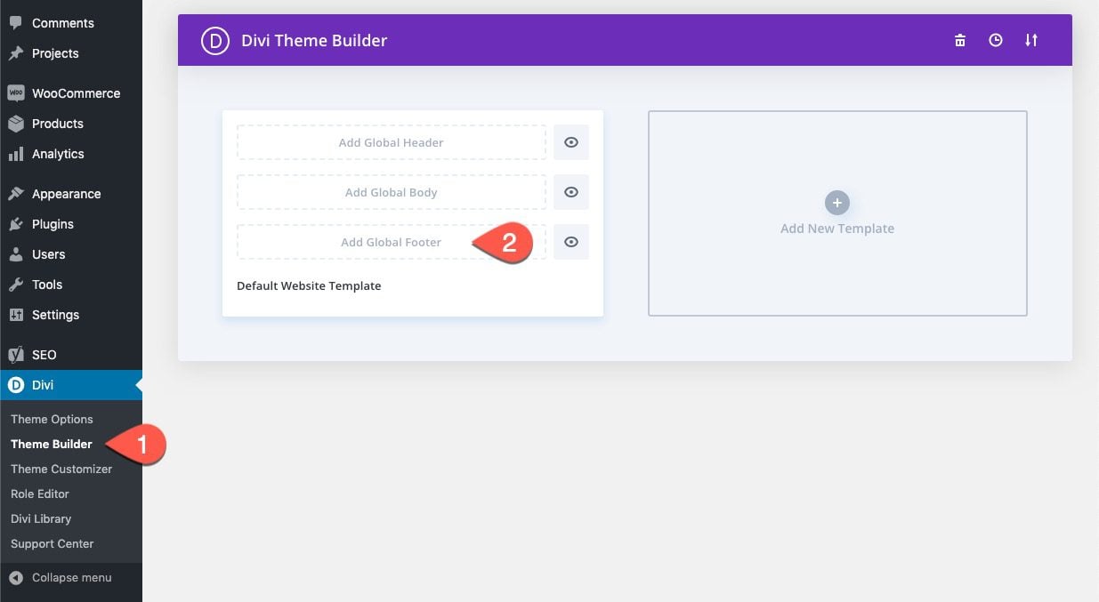
To create a global footer, go to the WordPress Dashboard and navigate to Divi > Theme Builder. Then click the “Add Global Footer” space inside the Default Website Template.
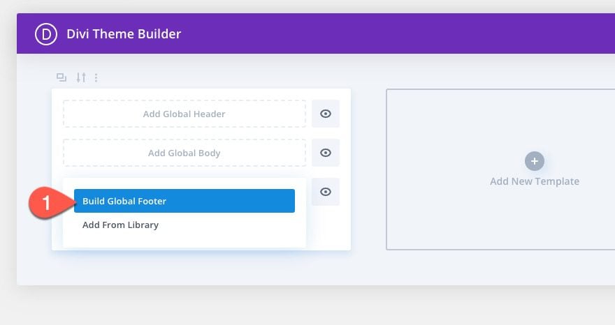
Then select the option “Build Global Footer” from the dropdown.
This will deploy the Template Layout Editor where you will immediately be prompted with the three choices for how you want to start building. Select “Build From Scratch”.
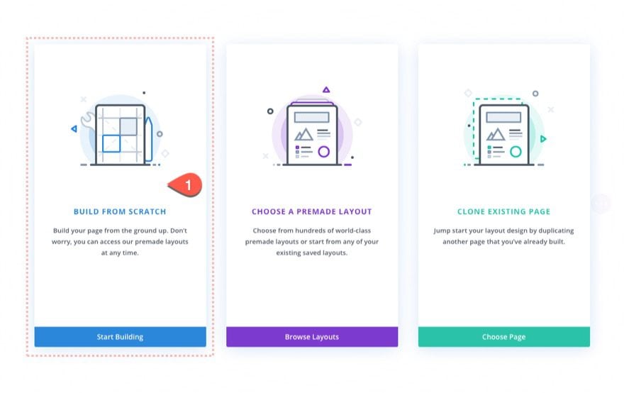
Now that we are editing from the template layout editor, we can start designing the fixed footer bar. Once done, you will have a fixed footer bar with three columns that are ready for content.
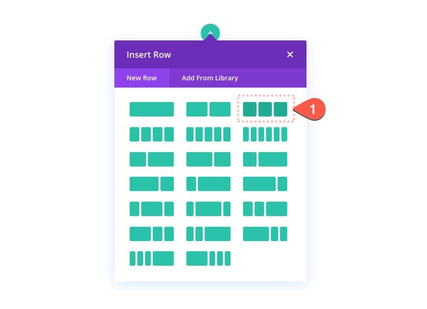
Add Three-Column Layout to Row
First, add a three-column layout to the row.
Section Height
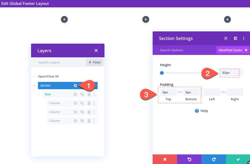
After the three-columns are added, let’s give a set height to the section. This is important for creating the space at the bottom of the page where the fixed row will eventually come to rest. We will also take out the default top and bottom padding as well.
To set the height and padding, open the section settings and update the following:
- Height: 85px
- Padding: 0px top, 0px bottom
Row Settings
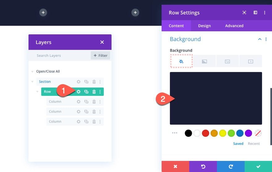
Now that our section is ready, we are ready to customize the row to serve as the fixed footer bar. Open the settings for the row and then update the following:
Background
- Background Color: #1a1e36
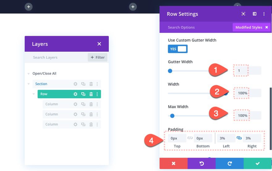
Size and Spacing
- Gutter Width: 1
- Width: 100%
- Max Width: 100%
- Padding: 0px top, 0px bottom, 3% left, 3% right
Custom CSS
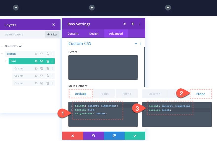
Although the row will be fixed, we want the height of the row to match the height of the parent section so that the space at the bottom of the page will adequately contain the row. And, we want to make sure the content within the row stays vertically aligned. To do this, add the following custom CSS to the row’s main element:
Desktop
height: inherit !important;
display:flex;
align-items: center;
Phone
height: inherit !important;
display:block;
Fixed Positioning
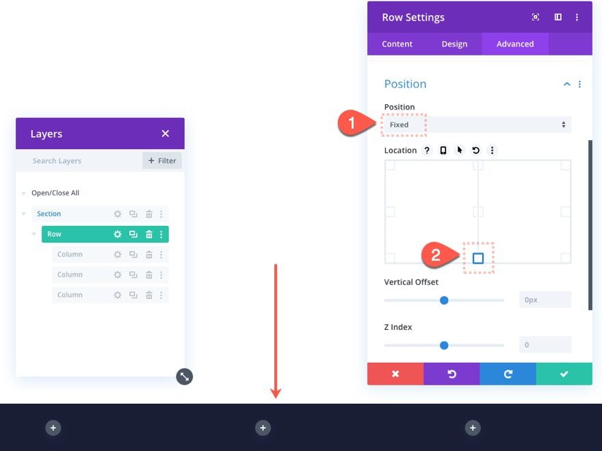
To make the row fixed so that it floats at the bottom of the screen, we need to give it a fixed position at the bottom center location as follows:
- Position: Fixed
- Location: bottom center
At this point, we have a footer bar in the fixed position ready for content. We can add any content we want to each of the three columns. But since this is a footer “bar” with a limited height of 85px, we need to limit the content amount. For this reason, we will add a small menu with a dynamic logo and 4 menu items in column 1. In column 2, we will add copyright text with a dynamic current year. In column 3, we will add three social media follow icons.
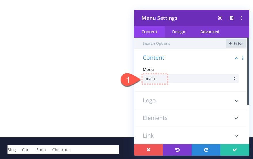
In column 1, add a menu module.
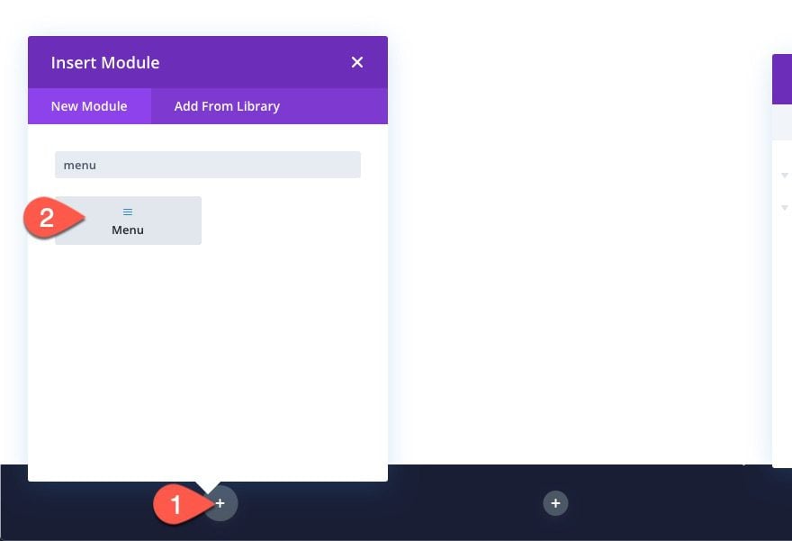
Select Menu
Then select one of the menus you have already built on your website. Make sure to keep the menu items to 4 or less.
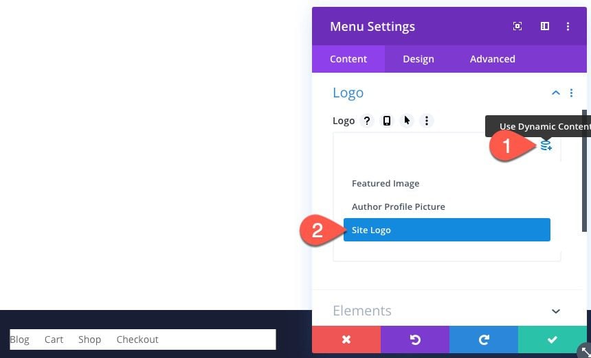
Add Site Logo as Dynamic Content
For the logo menu, we are going to add the site logo dynamically. Click the “Use Dynamic Content” icon while hovering over the logo preview area. Then select Site Logo from the dropdown.
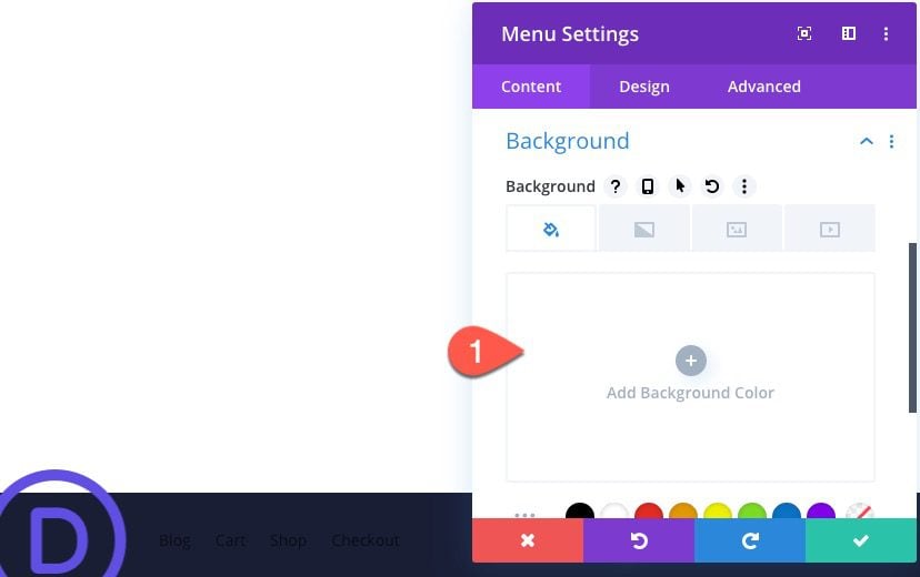
Remove Background
Then remove the default background from the menu so that it is transparent.
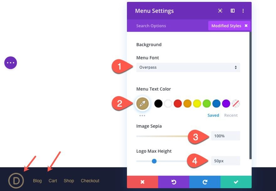
Menu Design
At this point, we are ready to add design to the menu. For this design, we are going to keep it simple and small. Update the following design settings:
- Menu Font: Overpass
- Menu Text Color: #b59c61
- Image Sepia: 100%
- Logo Max Height: 50px
Add Copyright Text to Column 2
Once the menu is in place, jump over to column 2 to add the copyright text.
Add Text Module
Add a new text module to column 2.
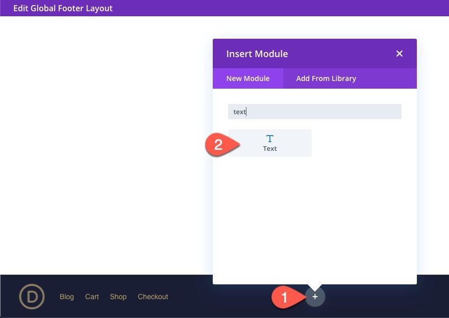
Add Current Date Dynamically with Before and After Text
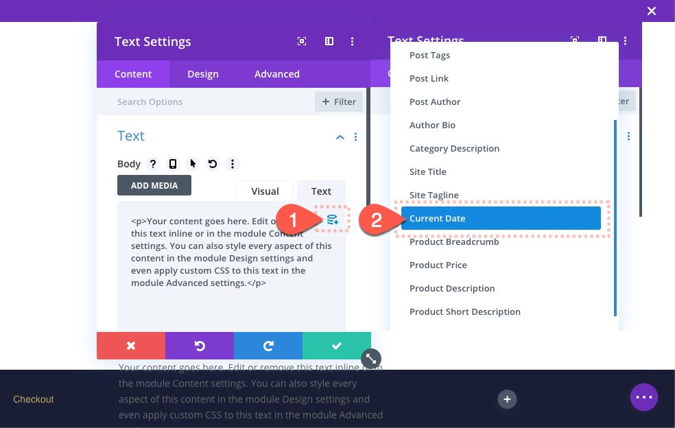
Here we are going to get creative with dynamic content to display the current year within the copyright text. This will make sure the year updates automatically for the life of the site.
To do this, click the “Use Dynamic Content” icon and select “Current Date” from the list.
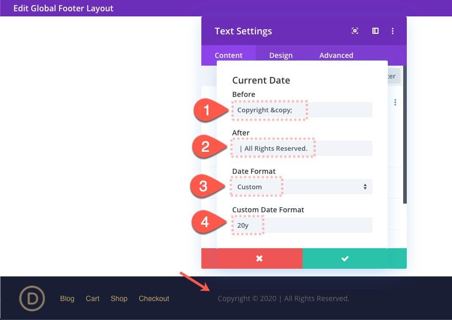
In the Current Date popup, update the following:
- Before:
-
Copyright ©
- After:
-
| All Rights Reserved
- Date Format: Custom
- Custom Date Format: 20y
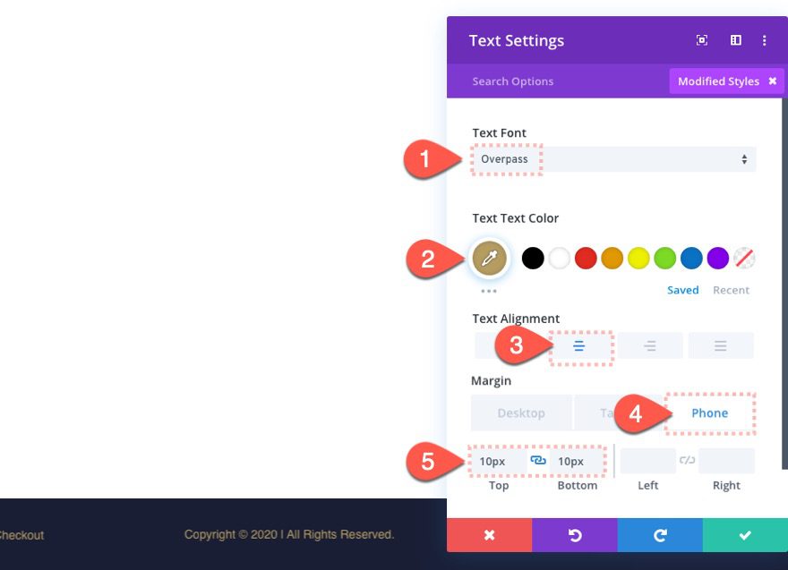
Text Design
The update the text design and margin as follows:
- Text Font: Overpass
- Text Text Color: #b59c61
- Text Alignment: center
- Margin (phone only): 10px top, 10px bottom
That takes care of the copyright text.
In column 3, add a social media follow module.
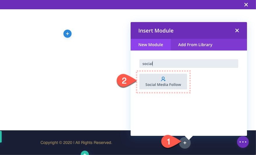
Add Social Networks
Under the content tab, add the social networks needed for the site. For this design, we are using three.
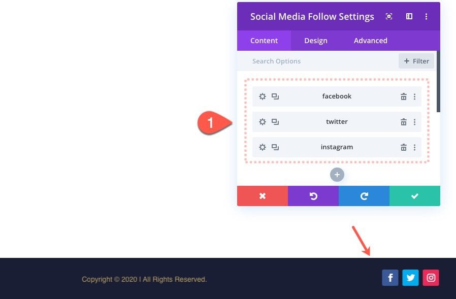
Social Media Follow Settings
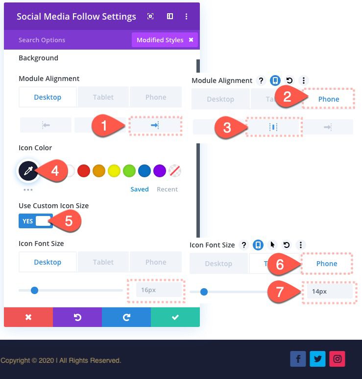
Then update the design settings for all the social media follow icons as follows:
- Module Alignment: right (desktop and tablet), center (phone)
- Icon Color: #1a1e36
- Use Custom Icon Size: YES
- Icon Font Size: 16px (desktop and tablet), 14px (phone)
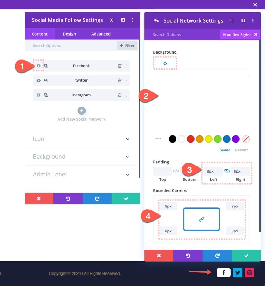
Update Social Network Settings
To update the individual social network icon design, open the settings for the first network and update the following:
- Background Color: #ffffff
- Padding: 8px right, 8px left
- Rounded Corners: 8px
Extend Social Network Settings to All
Then open the more settings menu for the first network and select “Extend Item Styles” from the list. In the extend styles popup, choose to extend the styles throughout “This Column” and click Extend.
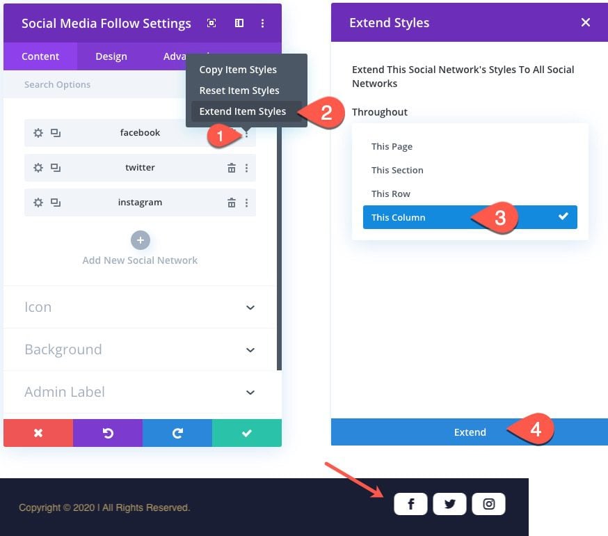
This will extend the design to the rest of the icons in the column.
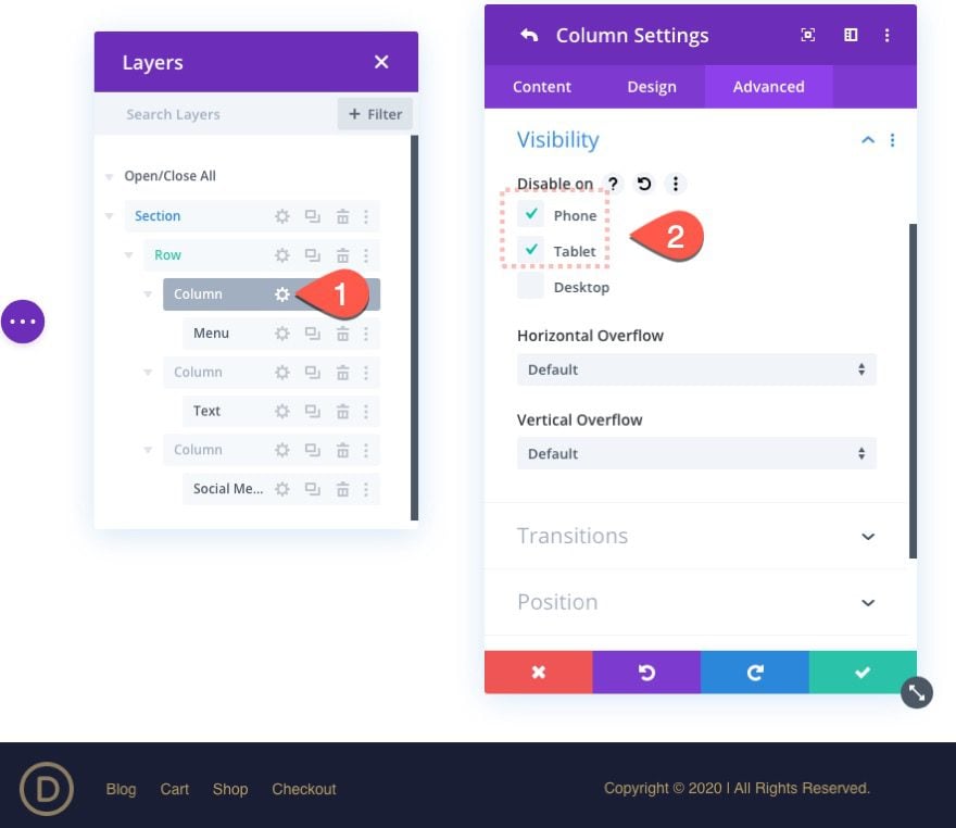
In order to make the footer bar mobile-friendly, we need to disable one of our columns with its content on tablet and phone display. For this example, we are going to disable the menu from showing by disabling column 1 on phone and tablet as follows:
Save Results
Make sure to save the layout before exiting the layout editor.

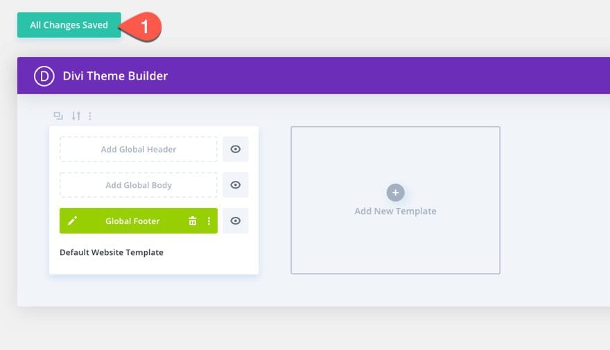
Then also make sure to save the changes for the Divi Theme Builder.
Final Result
To view the result, pull up a live page on your site. Here is what it looks like on a page using the Event Layout Pack.
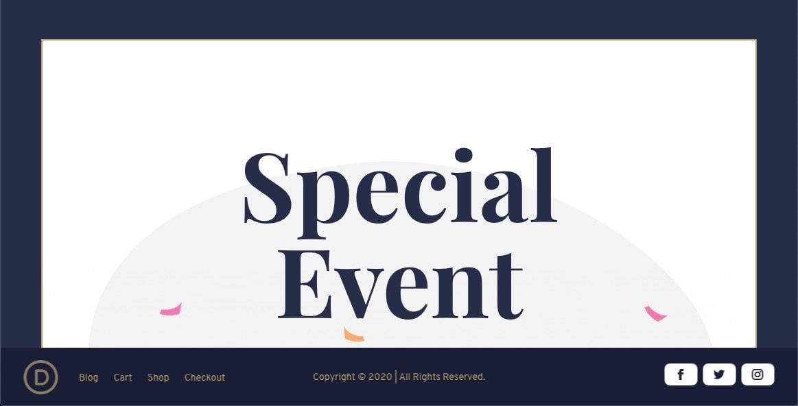
Watch how the footer stays fixed until coming to rest inside the section at the bottom of the page.
Final Thoughts
Adding a fixed footer bar makes good sense in some cases. The height of the bar is small enough so that it doesn’t distract or take up too much real estate on mobile. And it gives you the opportunity for adding important CTAs for better conversions and smoother user experience.
For this design, the space at the bottom of the page is created by setting a fixed height to the section and then allowing the fixed row to inherit the section height (despite being fixed). However, there are other ways to generate container space for things like this if you find the set height to limiting or unresponsive.
I hope it comes in handy.
I look forward to hearing from you in the comments.
Cheers!



How do I remove the footer in case I didn’t do it right.
Thanks
This is a pretty cool theme!
Thanks, gabriel.
Divi is the perfect theme, has so many good option and color combination so good I used Divi for my website
Great, David. Always good to hear.
Great job! Divi theme is so perfect, thanks
Thanks Ryan!
Good stuff. Thanks for sharing. Someone should merry this to fixed header with full page landing and morph from top page to following layout to this setup. Very nice. I may try that. Thanks for sharing.
Good idea, Tamer. Thanks for sharing.
nice theme i will sure try this soon in my upcoming projects. Till time be safe stay at home.
Great to hear, Manish. And Yes, I’ll be at home :). Thanks!
Thanks for gr8 feature.. may I know how to enable this only while scrolling down..as in most of the cases we will be having header with all those elements in the beginning of the page..
This article may be helpful if you apply the same concept to the footer. Haven’t tried it yet though. https://www.elegantthemes.com/blog/divi-resources/how-to-reveal-your-global-header-while-scrolling-up-hide-while-scrolling-down-with-divi
Looking forward to reading more. Great article.
Thanks for sharing this useful information with us I am so greatful.
That’s great! a point that would be serious in the year in terms of copyright, it is better to put Y (in capital so it gets the full year) alone and you don’t have to change the 20
Genius! Didn’t catch that. Thanks Tomas.