This post is part 1 of 5 in our mini series titled 5 Impressive Divi Gallery Layouts and How to Create Them. Stay tuned for all five unique examples of the gallery module and tutorials on how to achieve them!
Galleries are one of the most important tools in web design today. Whether you’re a designer wanting to showcase your work, a photographer wanting to display your photos, or a business wanting a prominent portfolio–-the need for online galleries goes on and on. With the Divi Gallery Module we can create awesome, eye catching galleries that’ll draw in our website visitors.
In this Divi mini series, we’re going to go over 5 Impressive Divi Gallery Layouts and how to create them. Some of these examples will be fairly simple and will just require some adjustments to the Divi module settings. Other’s will be a little more advanced and will require a little CSS and other customizations.
My hope is that whether you’re a newbie at Divi and web design or if you’re an experienced Divi expert, you’ll be able to apply these ideas and will be inspired to take your Divi galleries to the next level!
- 1 Today’s Before & After: The Divi Gallery Module
- 2 How to Create a Fullwidth Gallery with the Divi Gallery Module
- 3 Concept & Inspiration for the Fullwidth Gallery Module
- 4 Preparing Your Design Elements
- 5 Implementing the Fullwidth Gallery Module Design in Divi
- 6 Row Settings
- 7 Gallery Module Settings
- 8 Custom CSS in Divi Theme Options
- 9 Tomorrow: Using the Divi Gallery Module to Create a Tiled Gallery with Custom Padding!
Today’s Before & After: The Divi Gallery Module
Before we begin, let’s take a look at the default Divi Gallery Module and what we’re going to turn it into by the end of this tutorial.
When you add images to the Divi Gallery Module and do nothing else, here is what you get.
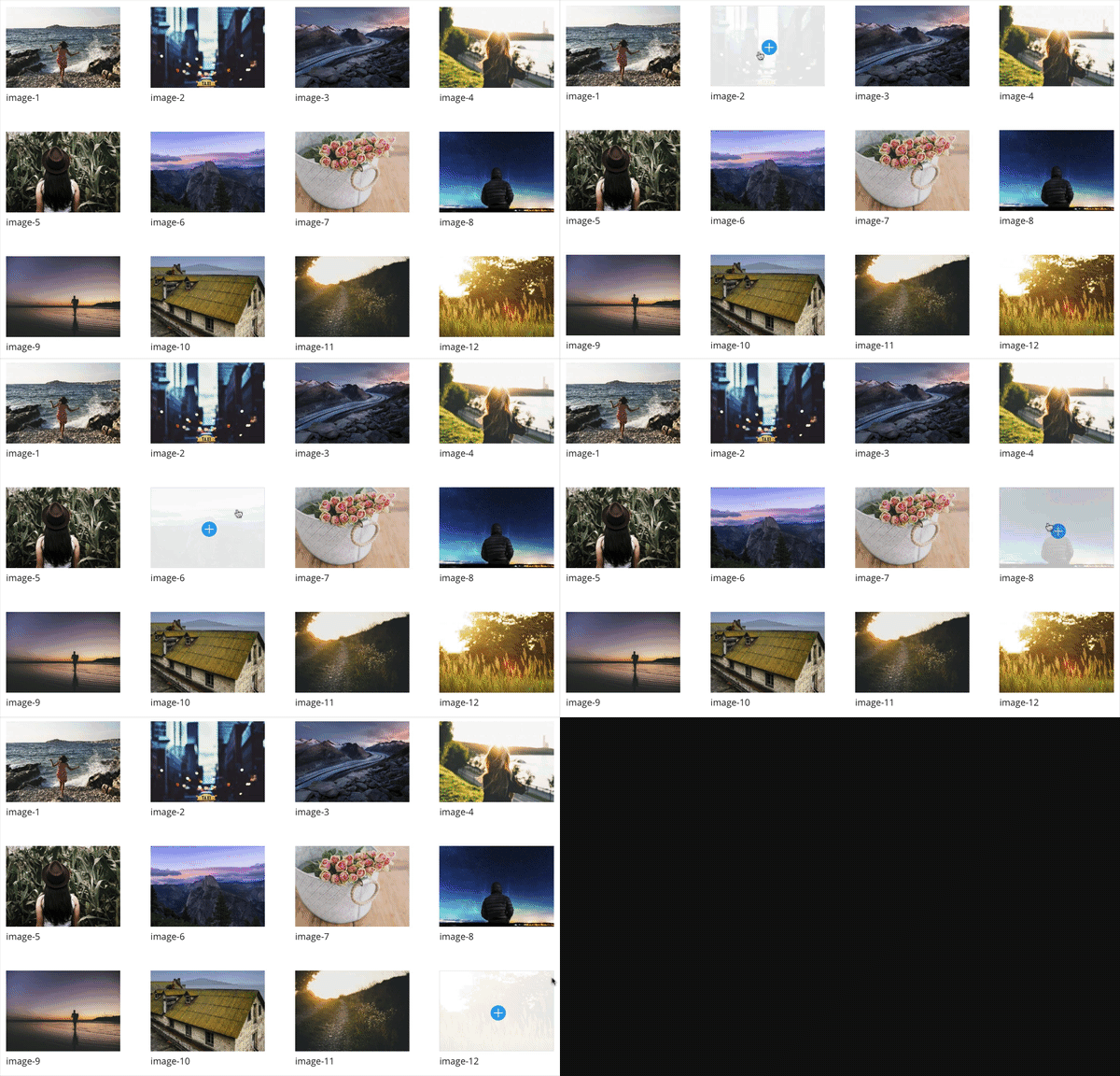
Default Gallery Module Hover Over
By default, the module has some padding between the photos, displays the image label and will be aligned in 4 columns. The hover over icon will pull the main theme color in and will have a transparent white overlay. Not bad for something out of the box, but let’s explore some ways to make our galleries “Pop.”
By the end of our tutorial today we’re going to get a lovely fullwidth gallery like the one you see below.
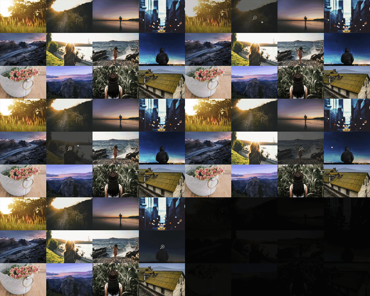
Example 1 – Fullwidth Gallery Hover Over
How to Create a Fullwidth Gallery with the Divi Gallery Module
Subscribe To Our Youtube Channel
Concept & Inspiration for the Fullwidth Gallery Module
The fullwidth gallery is pretty ubiquitous online but it occurred to me that some people using Divi may not know that they can make a few simple changes to the gallery module and achieve the same effect.
Preparing Your Design Elements
Before Diving into the tutorial below, you’ll want to do the following to prepare yourself and your design elements for a successful design implementation.
1) Optimize your images for web
When you create an online gallery, the most important thing to do first is to make sure your images (whether designs or photos) are the smallest possible file size before uploading. This will help your page load time and will help your website from getting bogged down by huge files. When you download images from a camera to your computer, they’re often VERY big file sizes and the same is true for a lot of design files. Optimizing your images for web is very important, particularly if your gallery contains 20 or more images.
I typically use Adobe Bridge or Adobe Photoshop but there are numerous programs out there to help optimize your images before you upload them to a website. There are also some free online tools like https://www.jpeg.io/ and https://compressor.io/ that’ll help resize and optimize your images.
Image size: I’ve found that images around 1200px wide are a good display size and for vertical images, I recommend not exceeding around 1000px height.
2) Label your files
A good practice when creating galleries is to label your image files so they’re not long camera file extensions. Not only will this help your file management (and sanity while sifting through photos) but it’s also good for SEO. When people search for businesses and services, well-labeled images will often be the first to pop up. Which can help drive traffic to you or your clients’ site.
3) Be sure your images are royalty free
Make sure the images in your galleries and design elements are copyright free. Online image lawsuits are no joke so be sure the work or images you display ARE YOUR OWN unless you have consent to use them. For the sake of these tutorials, I’m using royalty-free images from https://unsplash.com.
Implementing the Fullwidth Gallery Module Design in Divi
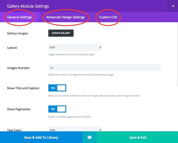
We’ll adjust settings in these areas.
For this design we’ll use the Divi Gallery Module and make adjustments in these 3 areas:
– General Settings
– Advanced Design Settings
– Custom CSS Settings
To begin, create a single section with a single row and single gallery module.
Row Settings
The first thing we need to do is set the row module to “fullwidth” and adjust the gutters so that the images line up right next to each other with no padding.
General Settings:
Make This Row Fullwidth: YES
Use Custom Gutter Width: YES
Gutter Width: 0
Keep Custom Padding on Mobile: YES
Save & Exit

Open row settings
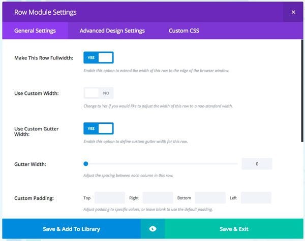
Adjust gutter settings.
Gallery Module Settings
Now we can move into the Gallery module itself and make the necessary changes to achieve our fullwidth design.
General Settings:
Gallery Images: Added the images to the gallery
Layout: Grid
Images Number: 12
Show Title and Caption: NO
Show Pagination: NO
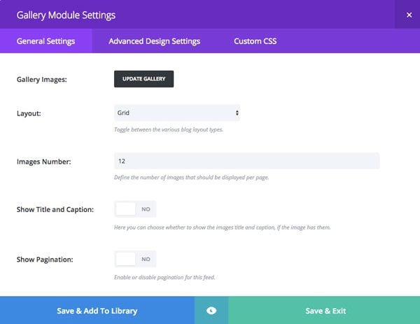
General Settings
Advanced Design Settings:
Zoom Icon Color: #ffffff
Hover Overlay Color: rgba(28,28,28,0.81)
Hover Icon Picker: Magnifying glass icon with plus sign
This is what you’ll see when you scroll over the image. I’ve chosen to use the magnifying glass icon to give the user the thought of “getting a closer look” at this image. You can try any icon you’d like on your design. I’m also inverting the default design and going with a white icon over a darker background overlay.
Save & Exit
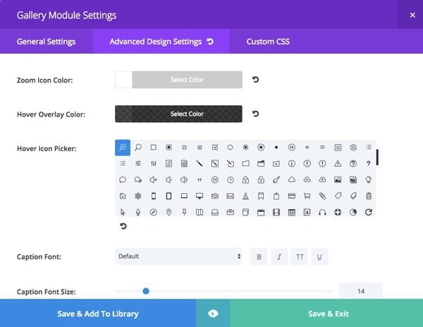
Advanced Design Settings
Custom CSS in Divi Theme Options
You’ll notice that when you open up an image, the image title displays at the lower left hand corner of the picture. 9 times out of 10, clients ask me to remove that. So I just make that standard practice now. I’ll be adding this affect to all the galleries in this mini series.
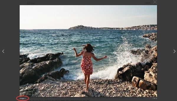
Remove Image Title
To remove the label, head to the Divi Theme Options panel by navigating to Divi > Theme Options and scroll down to Custom CSS and enter this code:
.mfp-title {
display: none;
}
That will remove the file name when the user opens up an image.

Your final design, the Fullwidth Gallery w/ the Divi Gallery Module!
And there you have it! A quick, yet efficient way to set your gallery apart from the standard look by creating a fullwidth gallery. Best part – we were able to achieve this look by just changing some standard Divi module settings with no extra code or CSS!
Tomorrow: Using the Divi Gallery Module to Create a Tiled Gallery with Custom Padding!
Check back tomorrow for example 2 – where we’ll explore how to create a tight-tile style gallery by simply adjusting the padding! The majority of my clients love this look and I’m excited to show you how to make it happen!
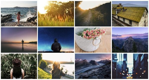
Example 2 – Tight tiled gallery with padding
Be sure to subscribe to our email newsletter and YouTube channel so that you never miss a big announcement, useful tip, or Divi freebie!



Can I create a gallery category wise like animal photography, Nature photography ?
Is it possible to change the opacity of the background when I enlarge the image.Its a bit distracting when the single image opens in the lightbox and I can still view the gallery behind.
Hi. I wonder if i can make a gallery with #hashtagged images in the Divi theme? I want to display images tagged with a specific hashtag on to my webbsite.
That’s not functionality that Divi comes with, but it may be possible with a plugin. I’m not aware of such a plugin off the top of my head though.
Hi Josh,
Is there a way to save the pages with galleries in the library that also “grabs” the page custom css? I seem to loose that when I try…
Thanks for great tutorial.
Is it possible to create a gallery as outlined in this tut (full width). But rather than go to an image, redirect to a separate page which, itself is a specific gallery? I have multiple unrelated galleries that I would like to use a full width gallery as a table of contents.
Also, is it possible to add text information in the mouse hover overlay state for said table of contents images? Assuming my first request is even possible.
Just tried it in a test environment and it looks beautiful. I’d love it if I could make it play a vimeo-movie after clicking the image, would that be possible?
Hello, Josh,
today I followed https://www.elegantthemes.com/blog/divi-resources/how-to-create-a-fullwidth-gallery-with-the-divi-gallery-module and created the Fullwidth Gallery. Then I saved it as a Global Module template. In the next step I tried to make use of my new Global Fullwidth Gallery module and found out, that the settings were not saved. I have been in shock.
I must again set the row and module settings, the same as I did earlier during Gallery creation. As for CSS setting I did not execute it at all, because the CSS design was differeent, than that, it was used in the proces of former creation.
Is it normal, or it is ET faul?
Hi Irina, if you posted any CSS in the page, then yes it’ll only save that CSS in that particular page. If you’re using the same effect for multiple pages/galleries, I usually always put the CSS in a Child Theme or in the Divi Options Custom CSS section. Then you should be good to go!
But where do I find the actual gallery mode? Total beginner asking. I cant seem to see it in my divi builder.
Hey Elle,
You’ll just click and insert the “Gallery Module” into whatever row you’d like. The video will walk you through that in detail if you’d like to check that out!
Elegant solution.
Hi, Nathan.
The Gallery module looks good. Can i ask few ideas ?
1. How about Images in the post using a gallery module to be seen only when clicked for NSFW photography. – Flipboard.
2. You have seen Google Doodle in the homepage – when a user click the play button, Gif plays. Can we also do it for images in the article.
3. In your Huge theme (from 2010) You guys didn’t add the Feature Post or Popular or Related post in the post. We have to add a plugin for that.
In Extra Theme they available – like wise can you do it for DIVI
Does different ratio images show up uncropped? I’m looking for something that would allow us to have a gallery page of different print ads in an orderly fashion. Some of the are way wider than other and some or way thinner than others.
Thank you for this Gallery mini series. I’m an artist, and often need to indicate a painting has been sold. The common way to do this is to place a red dot in the lower right hand corner of the image. Would it be possible to do this with the Divi Gallery module? If this could be introduced as a new feature of the module then that would be very useful indeed.
Thank you,
Peter.
That’s a really interesting request! I’ll see if we can include that in the future. This miniseries is already finished but we can certainly do more gallery tutorials in the future. In fact, I’ve just added it to our queue!
One more thing, is it possible to show text with the mouseover? Meaning, if I move the mouse to a pic, I would like to get a description displayed.
Hello Josh,
thank you for the tutorial.
A question: is it always necessary to prepare all the photos in the beginning having all the same size or there is a possipility to show them in the gallery in the same size, while in original they have different sizes (squere, rectangular, bigger, smaller..) ?
Can you please give us some suggestions?
Thank you a lot!
possibility, sorry 🙂
Thanks Josh for the tutorial. Much appreciated by us noobs.
I second the wish for a masonry and mosaic tilings! Not all of mine (or my clients) images are the same ratio. Also, while I got this functionality via another company’s plugin, being able to click on the Lightbox view to go to a custom link (in my case the WooCommerce page) would be soooooo wonderful.
Will you be covering a masonry image gallery? At the moment I have to use a plugin but would ideally like to not have to. This is a pretty common image display nowadays, with the likes of Pinterest etc. Grids are standard and not really that impressive…
would it ba hard to make masonry portfolio?
I’d like to hear about how to have a nice looking mix of landscape and horizontal images as well. Until Divi does that attractively, I will stick to using the Photoswipe Masonry plugin, but I’d prefer using one less plugin especially for a built-in function such as galleries.
I need mosaic for my clients. Photographers and designers don’t like to see their work cropped. If we could get a mosaic option in the Divi Gallery… wow, I would be so grateful. Currently I use a paid Plugin for the mosaic galleries for clients and myself.
That would be nice. But my real issue (should be everyone’s) is that the Divi gallery does NOT pick up the alt text from the media gallery. Instead it uses the file name as the alt tag. VERY BAD for SEO.
this was a good one. i was scracthing my head a couple of days before on how to make the gallery like this (with 1px space) and from what i read you gonna show tomorow? Keep them coming 🙂
Tx,
Any ideas for portrait photos?
I want to show landscape oriented images next to portrait oriented images and have it look good. I would also like to be able to do this in some sort of slider. Any suggestion on how too?
That’s what all photographers want ! No cropping optional in the overview, and a slide show / gallery which keeps the vertical size fixed, so that landscape, square or portrait photos do not make the gallery size jump from one picture to the next. As of today, all pictures should be prepared beforehand (adding blank space on the side of a portrait photo), it’s such a waste of time that, as a photo gallery, Divi is practically unusable.
This is awesome AND it feels a bit like putting the proverbial cart before the horse (except for use in the very simplest of websites). May I request that next you address the horse by doing a 5-part series on styling the filterable portfolio module?
To point you in the right direction, may I suggest the following themes as inspiration:
http://mawkaa.com/timelate/portfolio-full.html#
http://visia.themes.tf
http://www.themes.red-sun-design.com/redfolio/
http://themewich.com/gridstack/
Aloha and thanks for your great work.
Is that your themes ! Is it premium where i can buy it !
We can add the Divi builder plugin in these theme.
Sure we can do a miniseries on the the portfolio module!
Awesome!!! And what about having the same effect on woocommerce products? Is it possible with Divi and if so, how?
It’d probably just take some custom CSS but anything is possible with WordPress, woo and Divi!
What drives me crazy about this module is that it makes the photos so small. There doesn’t seem to be any way around it. 🙁 I need big pictures, not little ones.
Part 4 in this series will cover that! Check back on Thursday!
And so do the rest of us.
Elegant Themes: Being able to reduce padding like this is nice, but why spend time on an incremental tweak such as this when things need to be taken further? When it comes to the gallery module, Elegant Themes seems to be ignoring an important (and hardly new) trend: BIG images. Please give us some flexibility, so that 1-column, 2-column, or 3-column thumbnail galleries can be created, not just the dated-looking 4-column mini-thumb gallery that has seen little improvement over the last couple of years.
Hey Will, in part 4 in this series – I go over how to create different column layouts for the Divi Gallery. Check back on Thursday for that!
Sounds great, Josh. If there is any way to address another gallery module concern, that would be helpful, too. I’m referring to the problem where the thumbnails automatically crop & stretch the images. You can see this happening on the Divi theme demo page: https://www.elegantthemes.com/preview/Divi/gallery-grid/. If the thumbs could preserve the photo’s original aspect ratio, without cropping, that would be a welcome relief to all serious photographers who use the theme. The same comment applies to vertical/portrait images.
Please also show how to make the photos perfectly square instead of rectangular.
Yes! Square is needed.
congratulations, very interesting. It would be interesting to create a gallery with the filters, type portfolio.
Thanks Mario. I think we’re looking to add Filterable Portfolio Module Options as a mini series coming up!
is there a way to add a link to the image once expanded?
Excellent tutorial. Very practical. I look forward to the rest.
Thanks Simon! Yep they’re only going to get better 😉
Thank you for the tutorial – instant improvement on client websites
Thanks for finally addressing this. Anyway to code CSS to get Captions to display in Slider mode??? Thought saw someone coded CSS to get captions to display in “Slider” (Divi Soup?)
I started my first Gallery in Slider, but captions won’t display to switched to Grid. But pics look that way. Captions are a must–we’re teaching people to ID about 30 birds, some rare, or dull in color but not detail. Grid isn’t nearly as dramatic nor clear. Takes up too much page space too.