The way you present your services on your website says a ton about your company. Not only do you want the message to be clear, but you also want to share your services in a professional and attractive way. With Divi, you can make endless designs that elevate the message you’re trying to bring. In this post, we’re going to share a stunning services section along with the images and Photoshop files used to create it so you can modify them to your needs. We’ll also show you, step by step, how to achieve the exact same result by using Divi’s built-in options.
Result
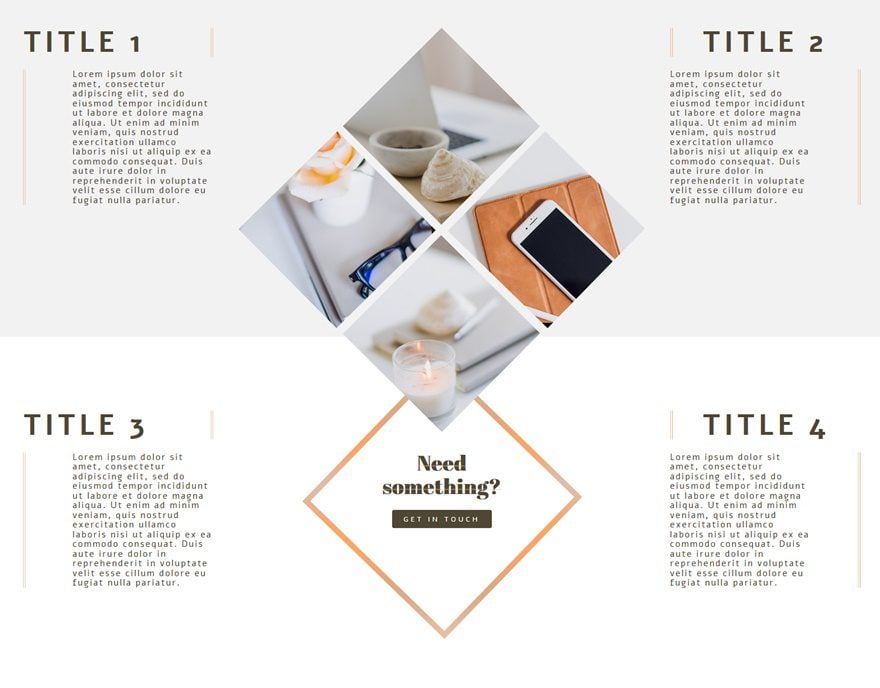
As usual, before we dive into the tutorial, let’s take a look at the services section we’ll be recreating on different screen sizes.
On Desktop
On Tablet
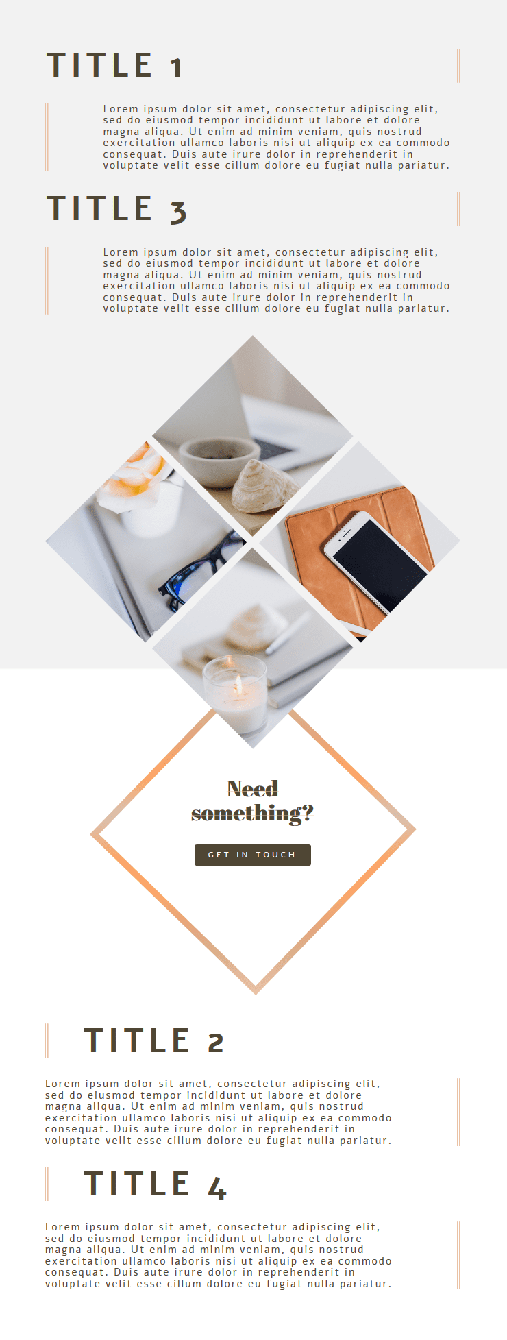
On Phone

Download This Tutorial’s Files
To lay your hands on the free images & Photoshop files, you will first need to download it using the button below. To gain access to the download you will need to subscribe to our newsletter by using the form below. As a new subscriber, you will receive even more Divi goodness and a free Divi Layout pack every Monday! If you’re already on the list, simply enter your email address below and click download. You will not be “resubscribed” or receive extra emails.
How to Create a Highly Visual Services Section for Your Next Project with Divi
Subscribe To Our Youtube Channel
Recreate Services Section
Section Settings
Gradient Background
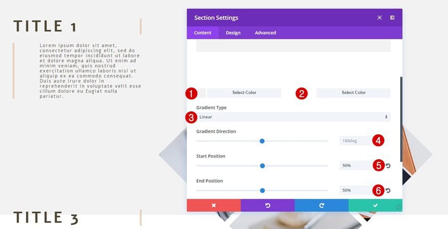
Start by adding a standard section and use the following gradient background for it:
- First Color: #f2f2f2
- Second Color: #ffffff
- Gradient Type: Linear
- Gradient Direction: 180deg
- Start Position: 50%
- End Position: 50%
Row Settings
Column Structure
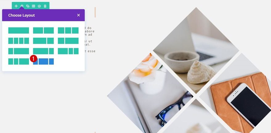
Then, add a row with the following column structure to your section:
Column 2 Background Image
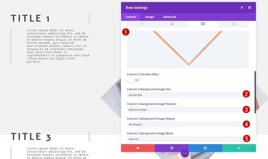
Continue by adding the ‘gradient-square.png‘ image file as the background image of your second column. You can always change the colors of this square by opening the included Photoshop file within your downloaded folder. Along with the background image, use the following settings:
- Column 2 Background Image Size: Actual Size
- Column 2 Background Image Position: Bottom Center
- Column 2 Background Image Repeat: No Repeat
- Column 2 Background Image Blend: Normal
Sizing
Then, move on to the Sizing subcategory and apply the following settings:
- Make This Row Fullwidth: Yes
- Use Custom Gutter Width: Yes
- Gutter Width: 2
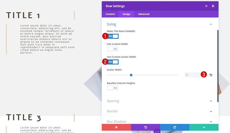
Image Module
Use Your Own Images in Photoshop File
After finishing the row settings, you can add an Image Module to the second column. You can use the ‘image-collage.png‘ image file which you can find in the downloaded folder. You’re free to use this image without any restrictions. Or, you can open the ‘image-collage.psd‘ Photoshop file and modify the images that are being used to match with your website.
Alignment
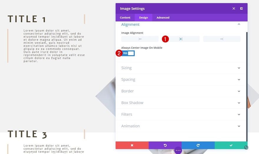
Within the Design tab, use center Image Alignment for your Image Module to center it on your page.
Text Module Below Image
Text Settings
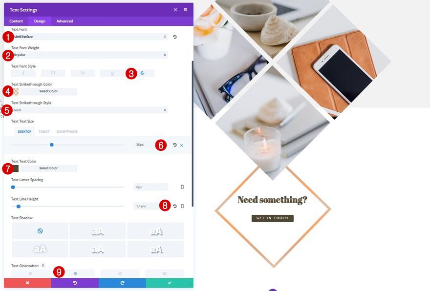
Now, add a Text Module right below the image you’ve added (in the same column) and use the following text settings:
- Text Font: Abril Fatface
- Text Font Weight: Regular
- Text Font Style: Strikethrough
- Text Strikethrough Color: rgba(233,193,165,0.51)
- Text Strikethrough Style: Solid
- Text Size: 36px (Desktop), 32px (Tablet), 25px (Phone)
- Text Color: #4f4634
- Text Line Height: 1.1em
- Text Orientation: Center
Sizing
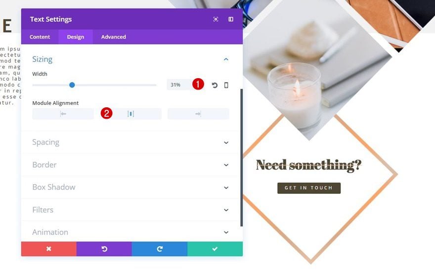
Move on to the Design tab of that Text Module and modify the Sizing subcategory:
- Width: 31%
- Module Alignment: Center
Alignment
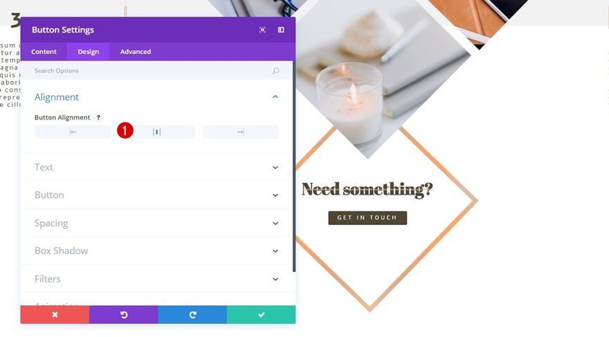
Right below the Text Module you’ve just created, add a Button Module as well. Move on to the Design tab and select a center Button Alignment.
Button Settings
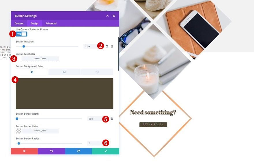
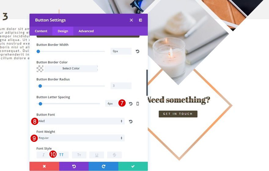
Then, open the Button subcategory and apply the following changes:
- Use Custom Styles for Button: Yes
- Button Text Size: 12px
- Button Text Color: #FFFFFF
- Button Background Color: #4f4634
- Button Border Width: 0px
- Button Border Radius: 3px
- Button Letter Spacing: 4px
- Button Font: Alef
- Font Weight: Regular
- Font Style: Uppercase
Spacing
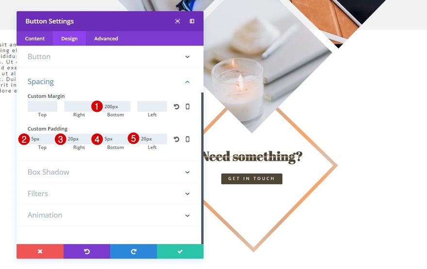
Next, make the following changes to the Spacing subcategory of your Button Module:
- Bottom Margin: 200px
- Top Padding: 5px
- Right Padding: 20px
- Bottom Padding: 5px
- Left Padding: 20px
Title Text Module
Text Settings
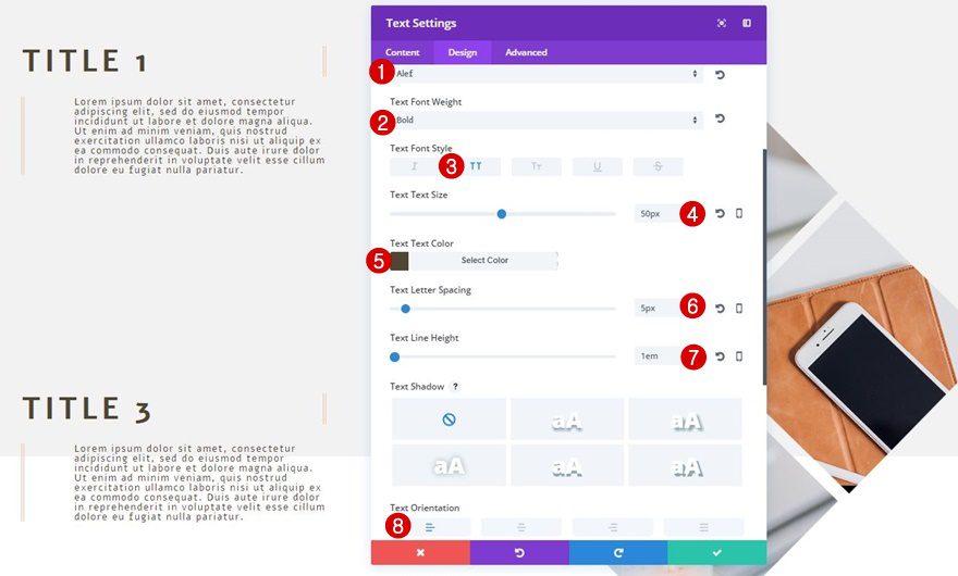
In the next part, we’re going to focus on to the Text Modules that share information about your services. Start off by adding a new Text Module to the first column of your row and apply the following text settings:
- Text Font: Alef
- Text Font Weight: Bold
- Text Font Style: Uppercase
- Text Size: 50px
- Text Color: #4f4634
- Text Letter Spacing: 5px
- Text Line Height: 1em
- Text Orientation: Left
Spacing
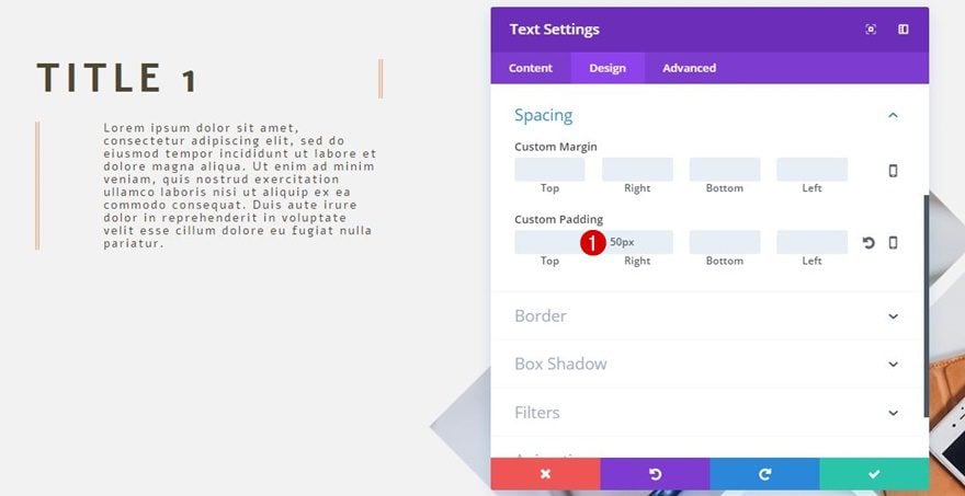
Next, go to the Design tab, open the Spacing subcategory and add ’50px’ to the right padding.
Border Settings
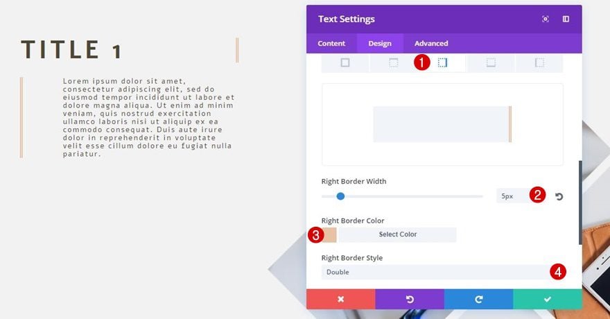
Lastly, add the following border to your Text Module:
- Right Border Width: 5px
- Right Border Color: #e9c1a5
- Right Border Style: Double
Body Text Module
Text Settings
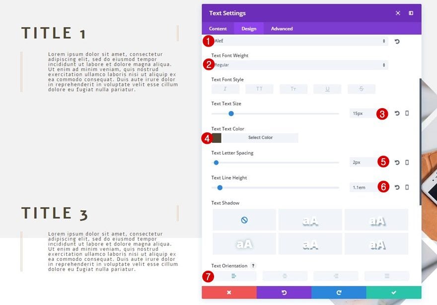
Add a new Text Module right below the one you’ve just created. Go to the Design tab and apply the following text settings:
- Text Font: Alef
- Text Font Weight: Regular
- Text Size: 15px
- Text Color: #4f4634
- Text Letter Spacing: 2px
- Text Line Height: 1.1em
- Text Orientation: Left
Spacing
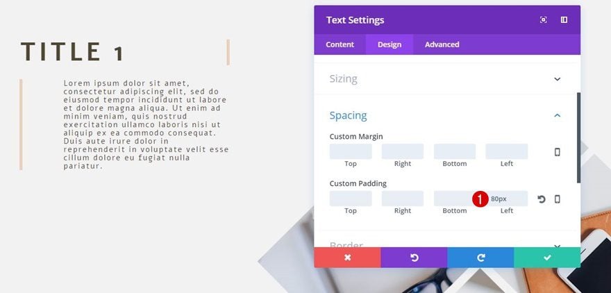
Move on to the Design tab and add ’80px’ to the left padding.
Border Settings
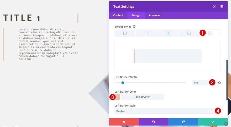
Lastly, use the following border settings for this Text Module:
- Left Border Width: 5px
- Left Border Color: #e9c1a5
- Left Border Style: Double
Clone Text Modules 4x
Go ahead, clone both Text Modules 4 times and place two sets in the third column so your services will be equally divided in your row.
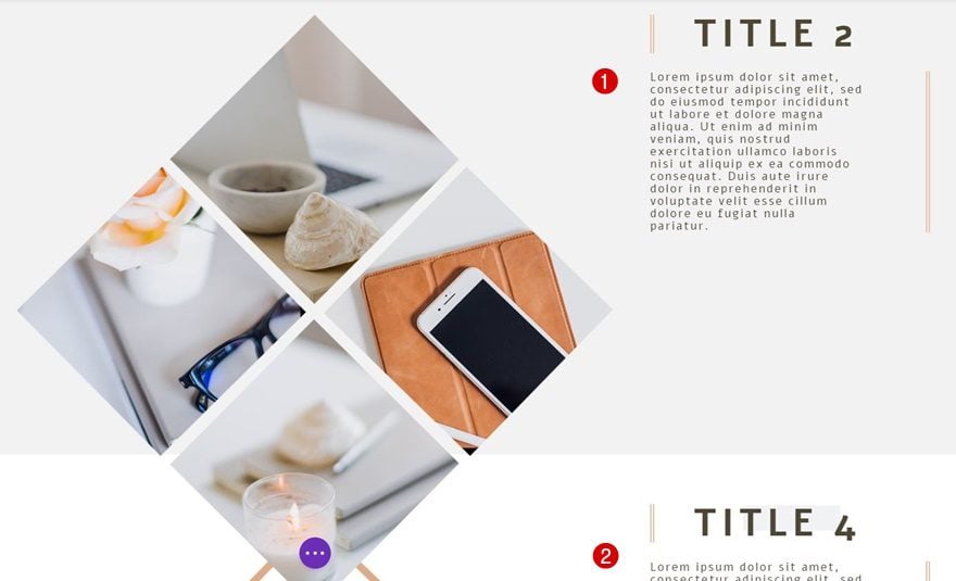
Change Text Modules 2 & 4
Spacing Title Text Module
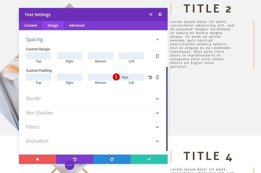
You’ll need to make some small adjustments to the Text Modules marked in the print screen above. First of all, add ’50px’ of left padding to the Title Text Module and remove the right padding.
Border Settings Title Text Module
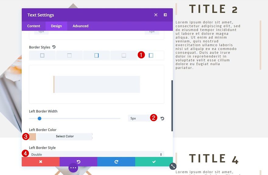
Then, open the Border subcategory and replace the right border style with a border style on the left instead.
Spacing Body Text Module
Continue by opening the Body Text Module, add ’80px’ to the right padding and remove the left padding.

Border Settings Body Text Module
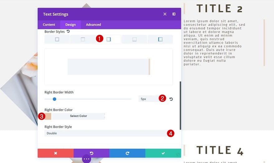
And, again, change the side of your border into the right side instead of the left in this case.
Change Text Modules 3 & 4
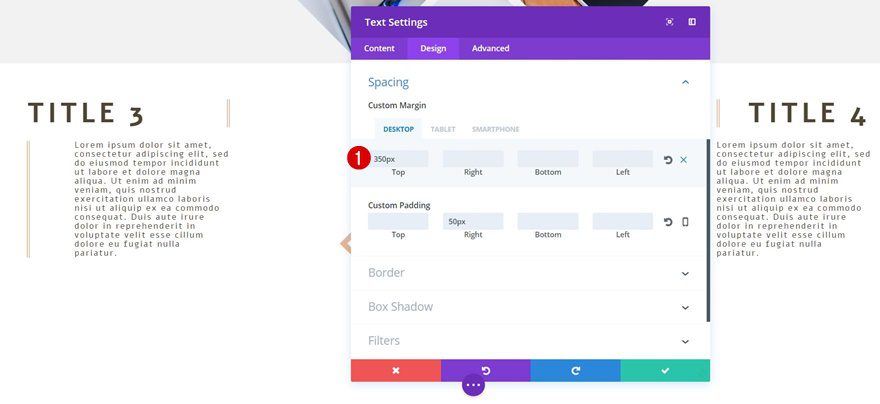
Top Margin Title Text Modules
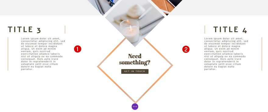
The last thing left to do is add ‘350px’ top margin to both of the bottom services on desktop only. Keep ‘0px’ for tablet and phone.
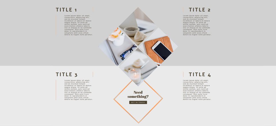
Result
We’re done! Let’s take a final look at the result on all screen sizes.
On Desktop

On Tablet

On Phone

Final Thoughts
In this post, we’ve helped you recreate a stunning services section that you can use for your next project or any future project you have. Besides showing you the needed Divi built-in settings, we’ve also shared the images and Photoshop files which will help you modify the services section to your needs with little effort needed. If you have any questions or suggestions, make sure you leave a comment in the comment section below!



Can someone please make a service company layout pak. Preferred ac company thanks a lot. There is a lot of service companys outher.
Please consider full website with lots of call to action.
Hi Donjete,
Your tutorials are always my favourite because you highlight ways to use Divi in a creative manner. This one is beautiful and unique and way more interesting than the standard services section, which I will replicate and save to my library. Thanks heaps for all your creative efforts.
Cheers
Gorgeous as always, luv it
This id beautiful. Thank you.
Hi,
Fantastic post and very helpful information share with us on how to create a high visual services section.
Thanks for sharing
“Clone Text Modules 4x”
–
It would be very helpful if you had also posted a screenshot of the whole line structure. I have namely at this point notched ..
Sorry, was meant well, but not quite thought out.
Now I have looked the video and everything is fine. THX
Nice design. Just one thing to watch out for as is the usual requirement to cover all screen sizes where Divi only provides for three screen sizes. You need to add some extra styling for media queries for larger screen sizes to maintain the integrity of the design. On my 24″ monitor TITLE 2 & TITLE 4 are positioned on the gradient line. For this I changed the top margin for these to 120% on Desktop and dropped the title text down to 24px went a long way to improve all the way down to tablet in landscape
where’s the demo???
Why is there always a calling for a demo. There are screenshots for 3 different devices. How hard is it to see how this would look?
Do you even make websites…?
+1 I think the same thing everytime someone asks that question, lol!