In today’s Divi blog post, we’re going to share some great tips on how to create your own blogging website in the same style as the Medium blog.
Medium is known to be one of the most used platforms for blogging. Not only do they have a big community of bloggers who engage with their audience on a regular basis, but their blogging platform also delivers a very nice user experience. That’s exactly what every blogger wants. They want to be sure they deliver the message in a clear way and in an environment where the reader feels comfortable.
However, blogging on Medium has its limitations. There are no benefits of SEO involved, for instance. By creating your own blog, that’s inspired by the Medium blog style, you can continue that familiar feeling they already have with the Medium blog and bring it over to your own website.
Let’s Get Started
Subscribe To Our Youtube Channel
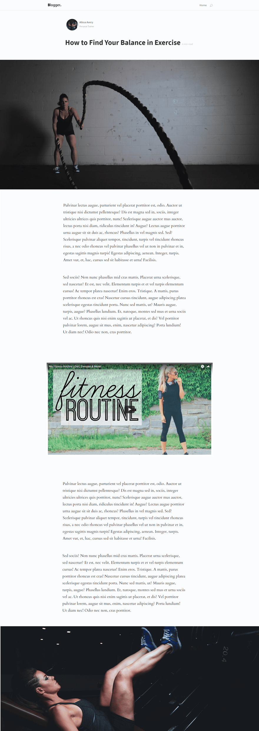
We’ll show you the most important parts of creating a Medium style blog and we’re also showing you, step by step, how to create some of the important parts. For example; how to make a Medium styled blog post template that you can use for all your posts. The template looks like this:
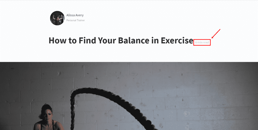
We’ll also show you how to add the Worth The Read and Highlight and Share plugins to make it look even more similar. The Worth The Read result looks like this:
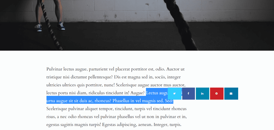
And the Highlight and Share will have the following effect:

One of the things you can clearly notice when visiting the Medium website is the simplicity of their menu. There are not too many options available which immediately makes it easier for the visitors to navigate. The visitors can explore the highlighted blog posts on the homepage and continue their stay from there.
Choose a logo that matches the simplicity of the rest of your website and make sure it’s subtle by giving it a small size in your menu. You definitely don’t want the logo to overpower the content that you’re sharing on your website.
Next, don’t include too many pages in your navigation. Since your website will all be about blogging, the homepage is probably enough. You can also consider adding an about page if you’d like to tell the visitors a little bit more about yourself.
Moving on, include a search icon so people can easily search through your blog posts with a few keywords. It’s all about the content you’re producing and making it easy to find.
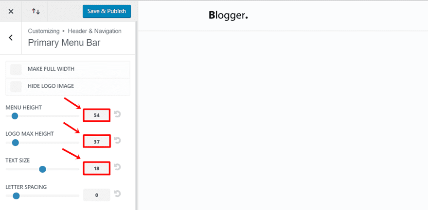
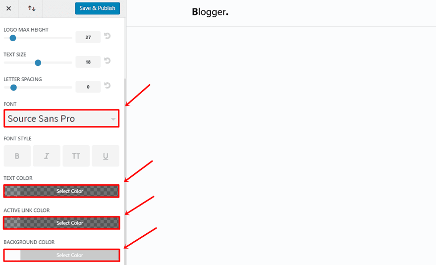
For the example above, we used the following settings for the Primary Menu Bar in the Theme Customizer:
- Menu Height: 54
- Logo Max Height: 37
- Text Size: 18
Use a Color Palette with Contrast & Simple Fonts
The Medium blog uses three main colors throughout their platform which makes the content easy to read. Although two of the colors may appear like they’re black and white, they’re slightly softer on the eyes. The third one is s a light gray but readable color. Make the following adjustments to the Primary Menu Bar in the Theme Customizer to change the colors and font that are being used in the primary menu:
- Font: Source Sans Pro
- Text Color: rgba(0,0,0,.44)
- Active Link Color: rgba(0,0,0,.44)
- Background Color: #fbfcfd
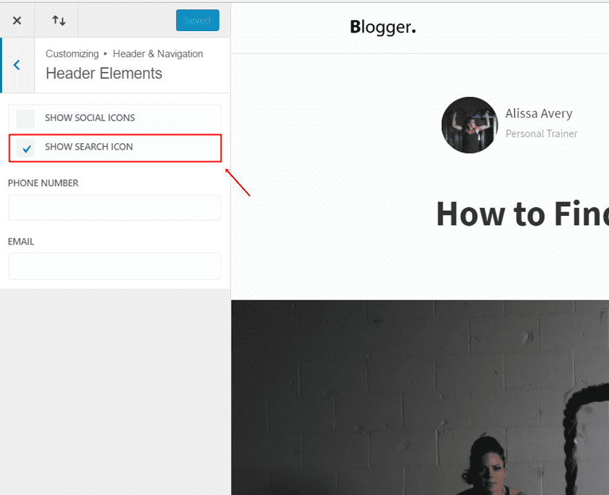
Include Search Icon
Furthermore, to include the Search Icon in your primary menu, go to Header & Navigation > Header Elements > Show search icon.
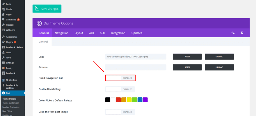
Another thing the Medium blog does is keep their navigation bar at the top of the page. That way, the visitors don’t unnecessarily get interrupted when they’re reading. To disable the fixed navigation bar on your Divi website, go to your WordPress panel > Divi > Theme Options > General Settings > Disable the Fixed Navigation Bar.
Style Your Homepage Blog Modules by Categories
Next, you want to style the homepage of your website by categories. Depending on the blog you’re creating, you can create different sections within your homepage that live up to what your visitors like to read the most. We recommend to at least make use of the following kind of categories: popular, latest and suggested. You can assign blog posts to these categories by creating different categories in the ‘Categories’ page of ‘Posts’ in your WordPress menu and by assigning each post to one or more categories within the post itself.
Another thing you really want to do is make the different blog modules and sections in your homepage easy to follow. To accomplish that, you can use the standard blog grid in the Divi builder or you can search for something a bit more advanced. We’ve listed three plugins below that you can consider using.
Divi Article Card Plugin
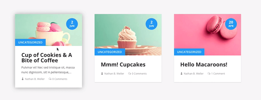
The Divi Article Card plugin is a free plugin that was shared on our blog during Divi 100. The style that’s being used in this plugin is clean and has a nice hover effect. It’s a simple effect but it can create that extra little touch for your blog.
The plugin is entirely for free, just go to the post and download it!
Divi Custom Blog Module
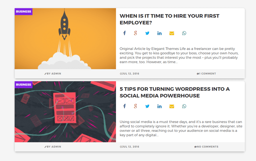
Another plugin that created a nice-looking Blog Module layout is the Divi Custom Blog Module. This one resembles the Medium blog posts more than the previous one does by having the featured image placed on the left side.
The price of the plugin is $20.
Divi Blog Extras
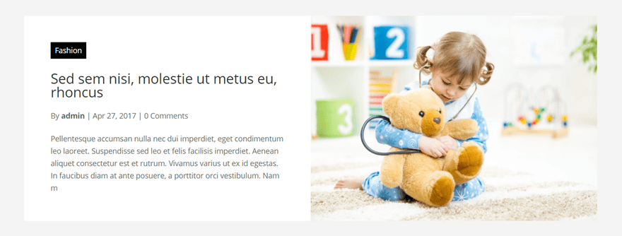
The last plugin that could help you bring your blog closer to looking like the Medium blog is Divi Blog Extras. This plugin has also a lot of different Blog module layouts that can help you build your Medium style blog.
The plugin retails at $15 for the Single Site License and $30 for the Extended License.
Create Blog Post Template
Medium has a standard blog post format for all the posts that are created. The design focuses on the essence of the post: the content. The blog post format that’s being used is in line with how the rest of the website is: simplistic. It cuts to the chase by using the combination of written content and media that you can insert throughout the post.
Divi offers those same possibilities. You can make your blog post as simple or as delicate as you want by using the different modules that the Divi builder provides. This is the example layout that we’ll show you how to create step by step:

Divi Post Settings
Start by adding a new post, giving it a title and activating the Divi builder. Next, make sure the Divi Post Settings are the following:
- Page Layout: Full Width
- Dot Navigation: Off
- Hide Nav Before Scroll: Default
- Post Title: Hide


To make the layout, we’re going to switch over to the Visual Builder. Start by adding a new section with two rows. Continue by adding an Image Module to the first column and two Text Modules to the second column. Open the settings of the section and add choose ‘#fbfcfd’ as your background color.
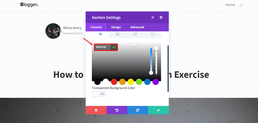
Image Module
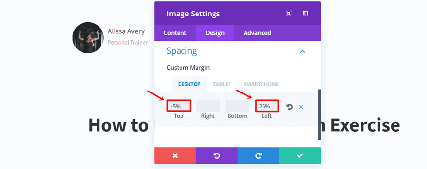
Open the Image Module, upload the image in the Content tab and put the Image Alignment to ‘Left’ in the Design tab. Moving on, add ‘-5%’ to the Top Margin and ‘25%’ to the left margin in the Spacing subcategory of the Design tab.
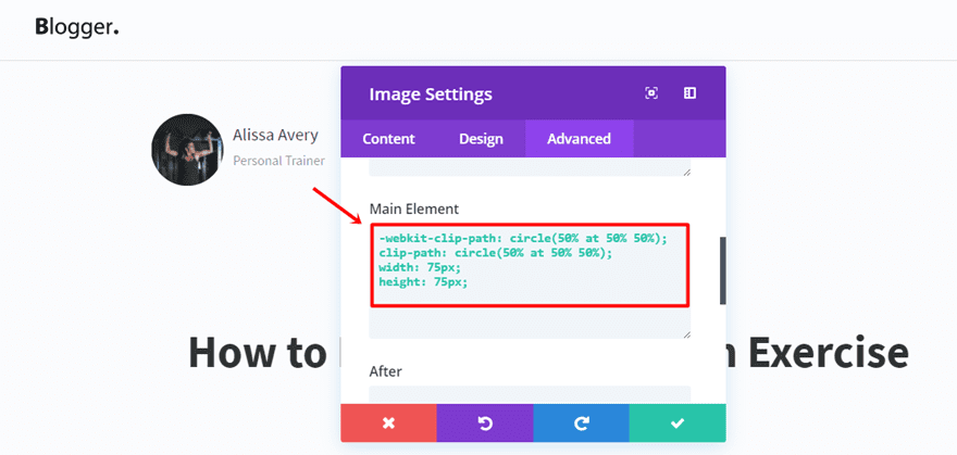
After that, add the following code to the Main Element in the Custom CSS subcategory of the Advanced tab:
-webkit-clip-path: circle(50% at 50% 50%);
clip-path: circle(50% at 50% 50%);
width: 75px;
height: 75px;
First Text Module
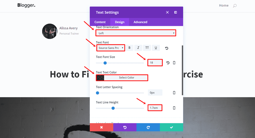
Add the author’s name in the Content Box within the Content tab and make the following adjustments to the Text subcategory of the Design tab:
- Text Orientation: Left
- Text Font: Source Sans Pro
- Text Font Size: 18
- Text Color: rgba(0,0,0,0.8)
- Text Line Height: 1.7em
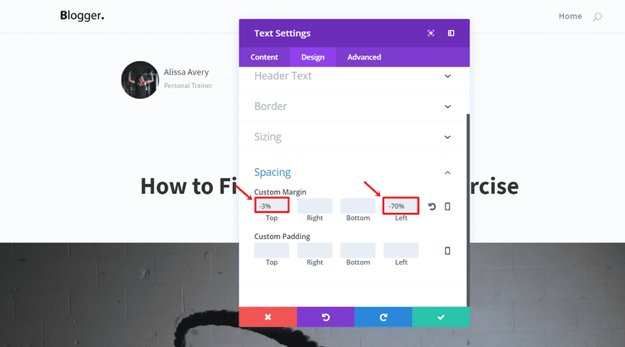
Scroll down the same tab to add ‘-3%’ to the Top Margin and ‘-70%’ to the Left Margin.
Second Text Module
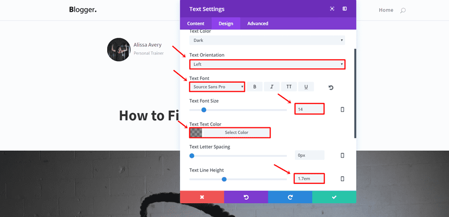
Type down the tagline in the second Text Module and make the following adjustments to the Text subcategory of the Design tab:
- Text Orientation: Left
- Text Font: Source Sans Pro
- Text Font Size: 14
- Text Color: rgba(0,0,0,0.44)
- Text Line Height: 1.7em
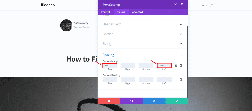
Additionally, scroll down the same tab and add ‘-5%’ to the Top Margin and ‘-70%’ to the Left Margin in the Spacing subcategory.
Row Visibility
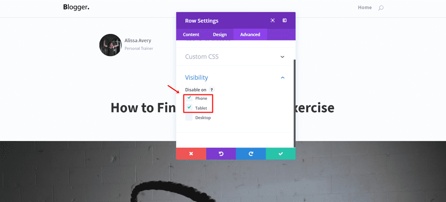
Finally, open the Row settings and disable the row on phones and tablets in the Visibility subcategory of the Advanced tab.
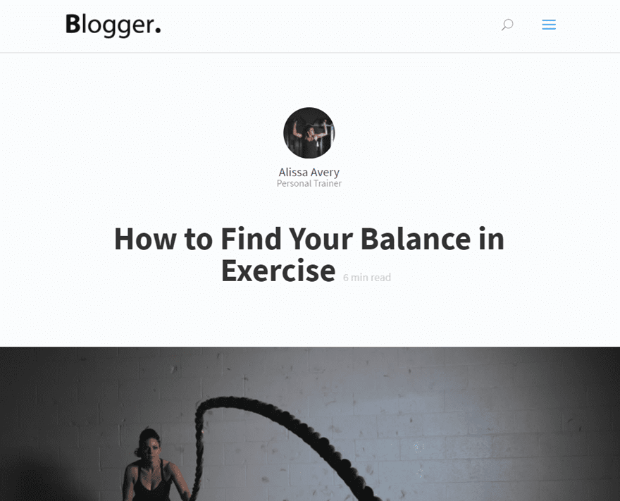
Add another row to the same section with a fullwidth row. Continue by cloning the Image Module and Text Modules in the previous row and placing them in the fullwidth row. We’ll have to make some modifications to each module to make them centered on the screen when someone opens the page on mobile or tablet.
Image Module
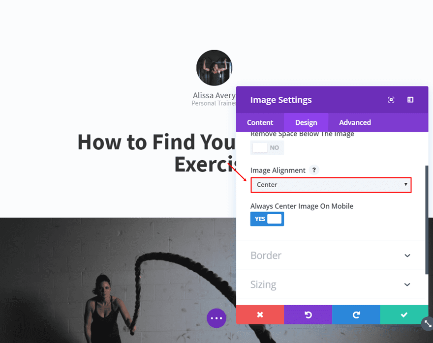
Open the Image Module and put the Image Alignment to ‘Center’.
First Text Module
Open the first Text Module and change the Text Orientation to ‘Center’ in the Text subcategory of the Design tab.
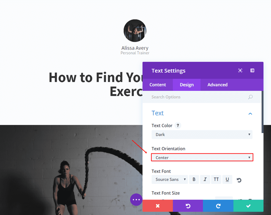
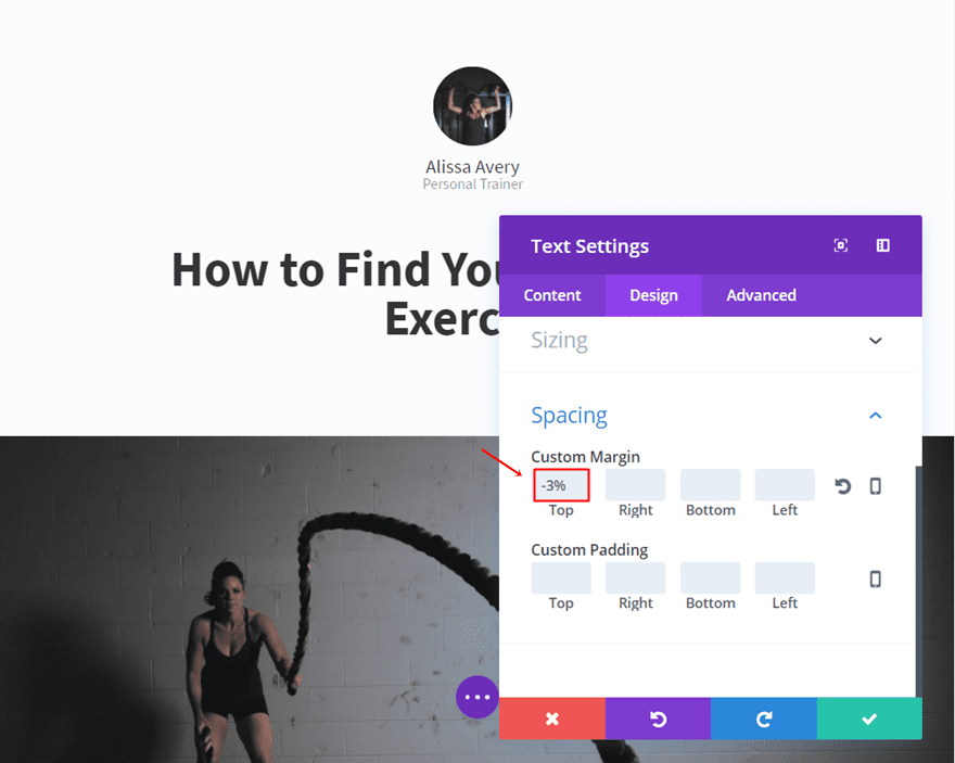
Scroll down the same tab, delete the Left Margin and keep the Top Margin.
Second Text Module
Furthermore, do the same thing for the second Text Module. Put the Text Orientation to ‘Center ‘ and delete the Left Margin in the Spacing subcategory of the Content tab.
Row Visibility
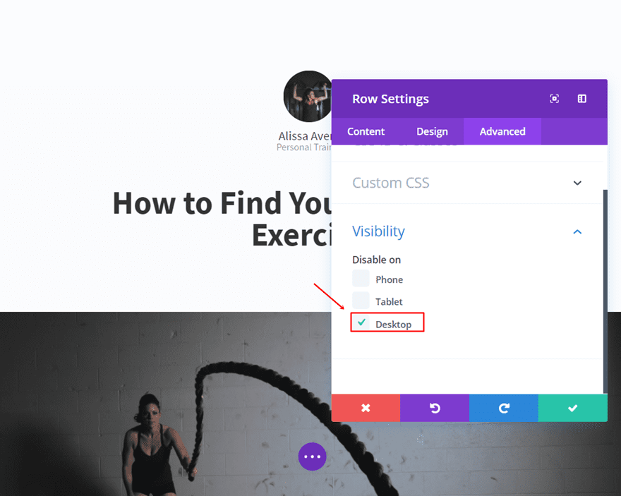
Finally, open the row settings and disable the row for desktops.
Post Title Module

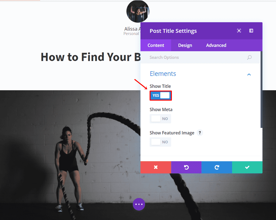
Since we’ve disabled the post title in our Divi Post Settings, we’re going to add a Post Title module into a fullwidth row within the same section we’ve used up until now.
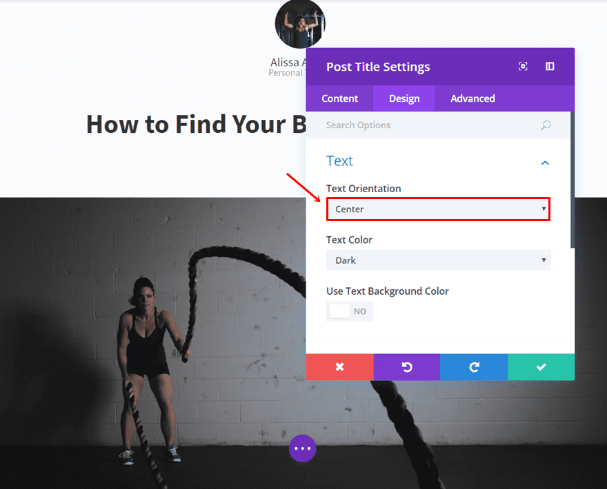
In the Elements subcategory of the Content tab, we can choose which elements we want to appear. Since we’ve already mentioned the author, we’ve disabled everything but the title.
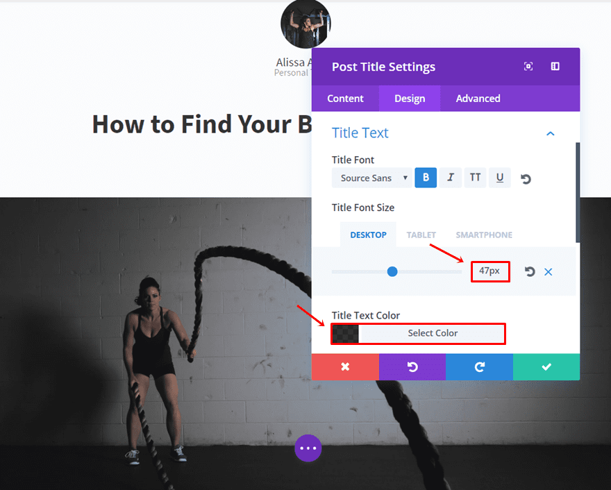
Furthermore; make the following adjustments to the Text and Title Text subcategories of the Design tab:
- Text Orientation: Center
- Title Font: Source Sans Pro
- Title Font Style: Bold
- Title Font Size: 47px (Desktop), 40 (Tablet), 35 (Phone)
- Title Text Color: rgba(0,0,0,0.8)
Fullwidth Images
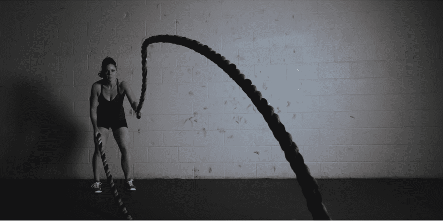
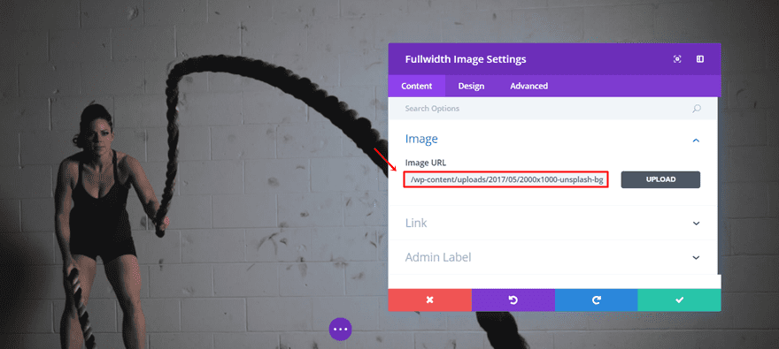
The first fullwidth image we’ll add is a representation of the featured image. Add a Fullwidth Section, place a Fullwidth Image Module in it and upload an image in the Content tab. It’s as simple as that.
Text Modules
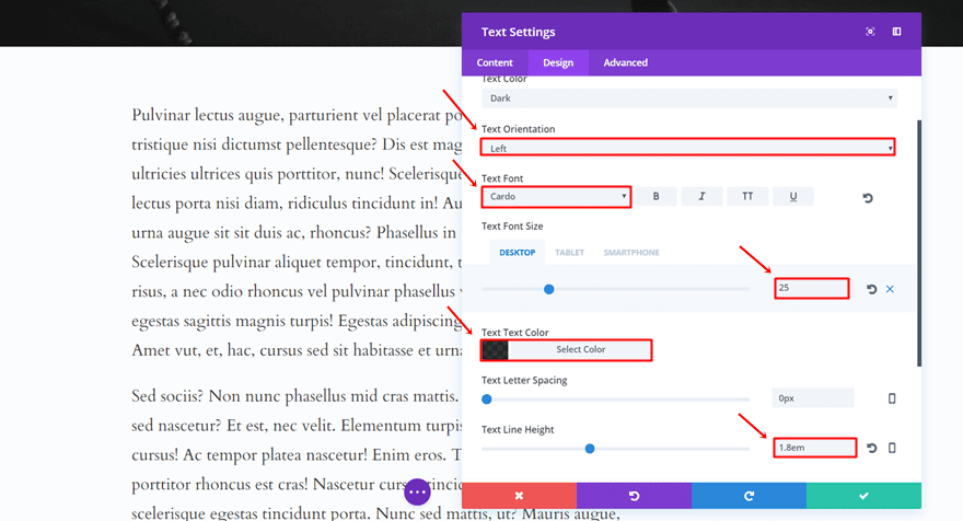
Moving on, we’ll create the Text Modules that are being used for the blog post. Add a standard section with a fullwidth row and put a Text Module in it. In this example, we’re using the ‘Cardo’ font family instead of ‘Georgia’ simply because ‘Cardo’ is a font family that is built-in.
Furthermore, open the settings of the Text module, type down some sample text in the Content box and go to the Design tab. Within the Text subcategory, make the following adjustments:
- Text Orientation: Left
- Text Font: Cardo
- Text Font Size: 25px (Desktop), 19px (Tablet), 17px (Phone)
- Text Color: rgba(0,0,0,0.8)
- Text Line Height: 1.8em
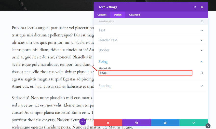
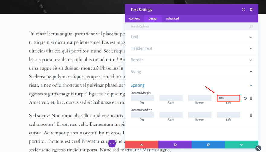
Scroll down the same tab, add ‘800px’ to the Max Width in the Sizing subcategory and add ‘10%’ to the Left Margin in the Spacing subcategory.
Video Module
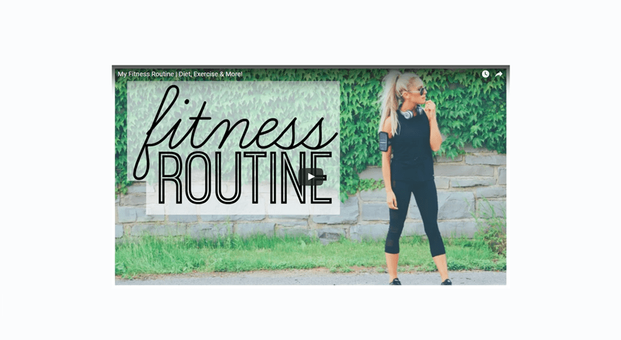
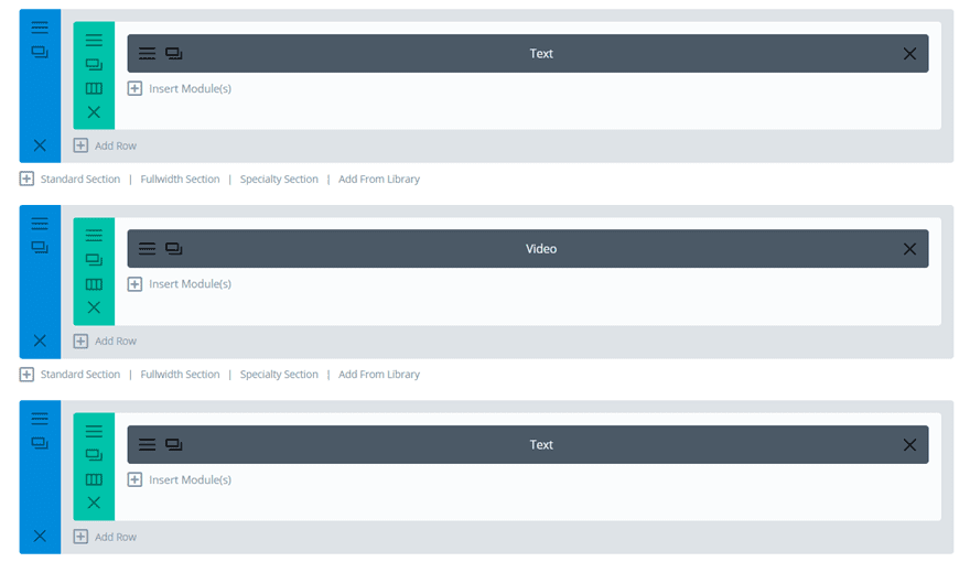
The last thing that can give added value to your blog post is integrating a video. To do this, you have to clone the previously made section with the Text Module and divide the total content you have between the two text modules. Right in between the two sections, we’re going to add another section with a fullwidth row. In that fullwidth row, we’re going to add a Video Module.
This is how the structure should look like in the backend:
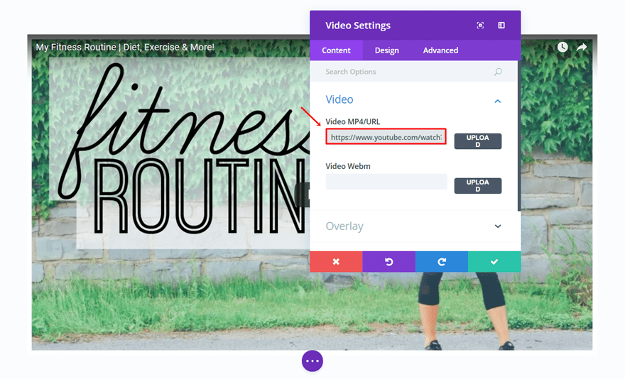
We didn’t make any adjustments to the Video Module besides adding the URL.
Save Template
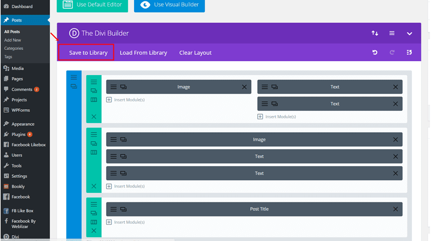
You can re-use the different sections to fit the blog post you’re creating by cloning them and changing the content. Once you’ve done that, you can save the blog post template by clicking on ‘Save to Library’ and giving it a name.
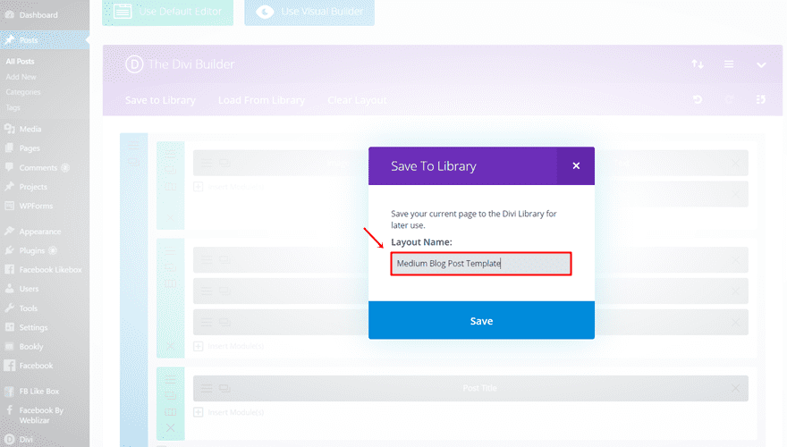
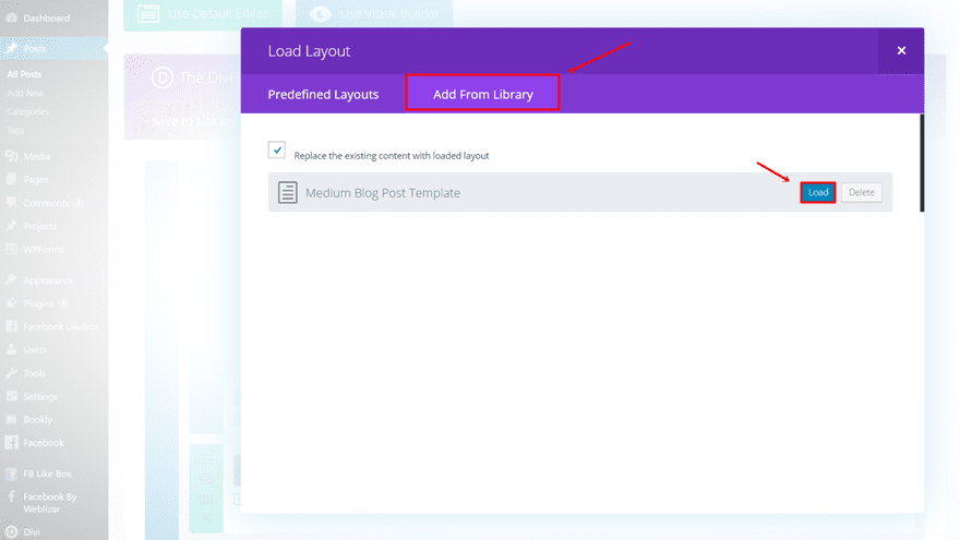
Next time you want to use the template, simply click on ‘Load From Library’ and load the template.

Worth The Read

A typical thing about creating a Medium blog is a number of minutes it takes to read a certain blog post. This usually appears right in the beginning of the page and gives users and estimation of how long it’ll take them to finish reading. In an era where time is the most precious thing, this helps people decide whether they want to read the blog post or not.
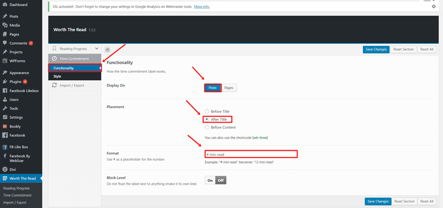
A free WordPress plugin that helps you get there is Worth The Read by Well Done Marketing. You can download it on the page we linked or search for it in the plugins. The nice thing about this plugin is that you can choose where you want the reading time to appear; pages, posts or both. You can also choose the placement and format.
After you’ve downloaded the plugin and activated it, click on the ‘Reading Progress’ option in its menu. Go ahead and make the changes you need to make. Putting a reading time is usually only used for posts so most people will likely choose only that option.
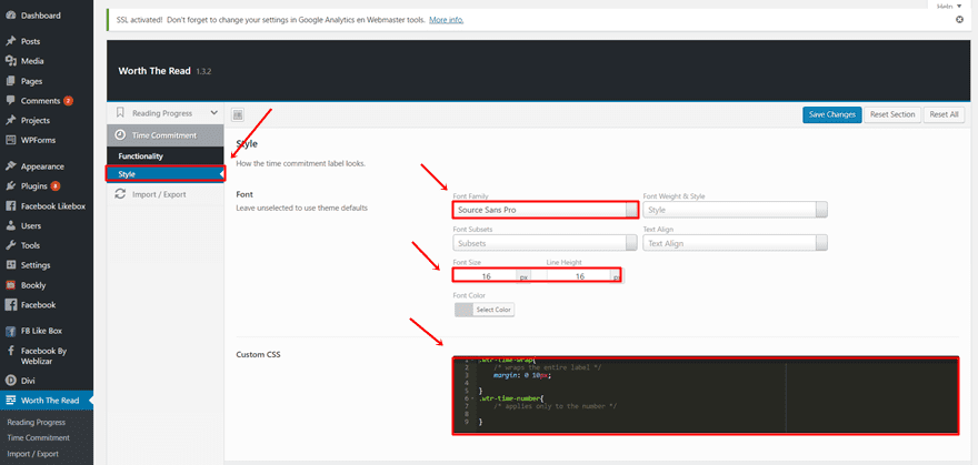
In the Style tab, you can choose the style you’d like to use. Make sure you use the same font like in the title. You can also add custom CSS code if you want to make any extra modifications.

Another really typical thing about Medium is the possibility to highlight something, share it or comment on it if you like it. It gives added value to the blog post by letting it engage with the people who are reading it. We found a plugin that helps you do something similar; the Highlight and Share plugin which is also free to use.
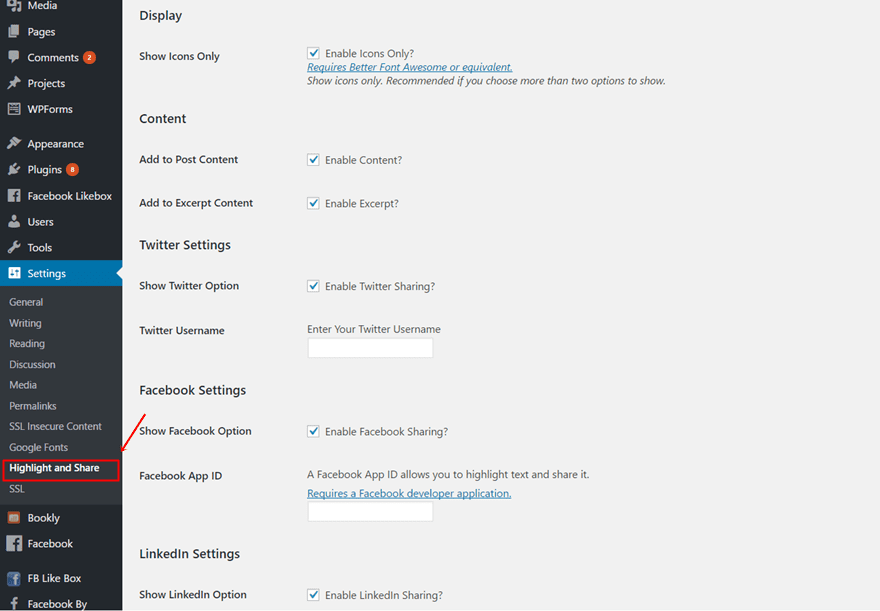
You can decide which social media channels people can share on by going to Settings > Highlight and Share > Enabling the social media channels you’d like to use.
Wrapping up
After having read this post, you should be able to start building your Medium style blog that contains some of the most relevant parts of Medium. You have plenty of possibilities to keep it simple like the Medium blog does but still infuse it with some personal touches. If you have any questions or suggestions; make sure you leave a comment in the comment section below so we can stay in touch with our awesome Divi community!
Be sure to subscribe to our email newsletter and YouTube channel so that you never miss a big announcement, useful tip, or Divi freebie!
Featured Image by Julia Tim / shutterstock.com




Great article … would love to see a live link to the final result (or did I miss it?)
Thanks for all the great videos. I look forward to seeing what you do and it’s always so clear and easy to follow.
Tip: “Simplistic” is not really a synonym for “minimal.” The word “simplistic” is derogatory meaning TOO simple. Use words like minimal or simple instead. (Sorry, I had to. It’s a pet peeve;)
I have read your article, it is the great article, I’m really enjoyable to read. I will wait for more articles. thank!
All these modifications are nice, but I have to be honest. EG needs to stop beating around the bush and just improve the default blog module for Divi. There is no reason for Divi to have such weak customization options for something as common as blogging other premium themes including their own Extra, do it so much better.
Seriously, why is EG so adamant on using the excuse that Divi was not designed with blogging as a primary feature when blogs are considered to be a primary feature of every theme worth purchasing?
I loved the idea of using the plugin Worth The Read and I installed it right away after reading this post. Unfortunately, I had to deactivate it as it was causing issues on my site. Really a pity because it looked great and it was a nice touch to the posts.
Thanks for all the awesome tips!
An interesting and enlightening post giving good information on how to use some of the functionality of Divi to create the look and feel we are looking for.
However I don’t take too kindly to being asked to purchase a plugin for $20 when I was under the impression the Divi could handle the layouts needed.
Excellent! I was looking for a blog post template and a good tutorial! Thank you!
Simply falling in love with Divi. What a great theme to use. For my next blog, I’m going to use Divi definitely
Thanks Donjete !
Very details post for customize DIVI medium style for me !
uau! fantastic tut!
Little tips for customize our blogs
I have found perfect your CSS for a Person Module that could not to turn the photo into circular. Thanks for all the inspiration Donjete!
So great!! I wish i could have ready blog post layout with all settings included…;-)