A playlist page is an effective way to present similar content in a way that’s easy for the user to access. Divi Video Slider modules are a great way to build a playlist page with video content, such as courses and tutorials. In this article, we’ll see how to create a playlist page with Divi’s Video Slider module using multiple sections and several supporting modules.
Let’s get started.
- 1 Playlist Page Preview
- 2 Create a Playlist Page
-
3
Style the Video Playlist Page
- 3.1 Style the Playlist Page Video Slider Title Text Module
- 3.2 Style the Playlist Page Video Slider Module
- 3.3 Style the Playlist Page Video Slider Description Title Text Module
- 3.4 Style the Playlist Page Video Slider Description Text Module
- 3.5 Style the Playlist Page Person Module
- 3.6 Duplicate the Playlist Page’s Section
- 3.7 Style the Playlist Page Second Section
- 3.8 Style the Third Section
- 4 Playlist Page Results
- 5 Ending Thoughts
Playlist Page Preview
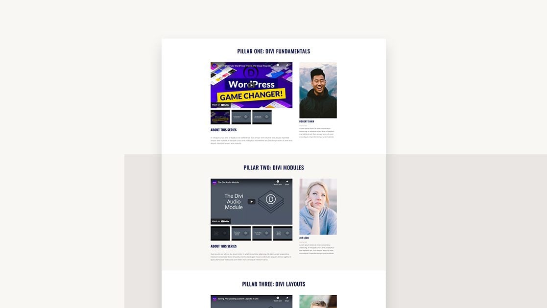
First, here’s a look at what we’ll build.
Desktop
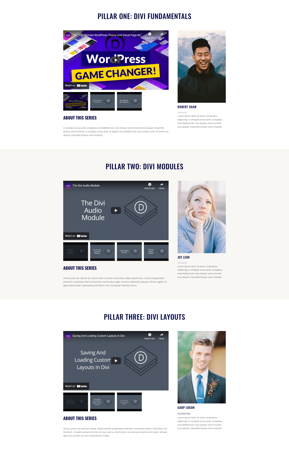
Phone

Create a Playlist Page
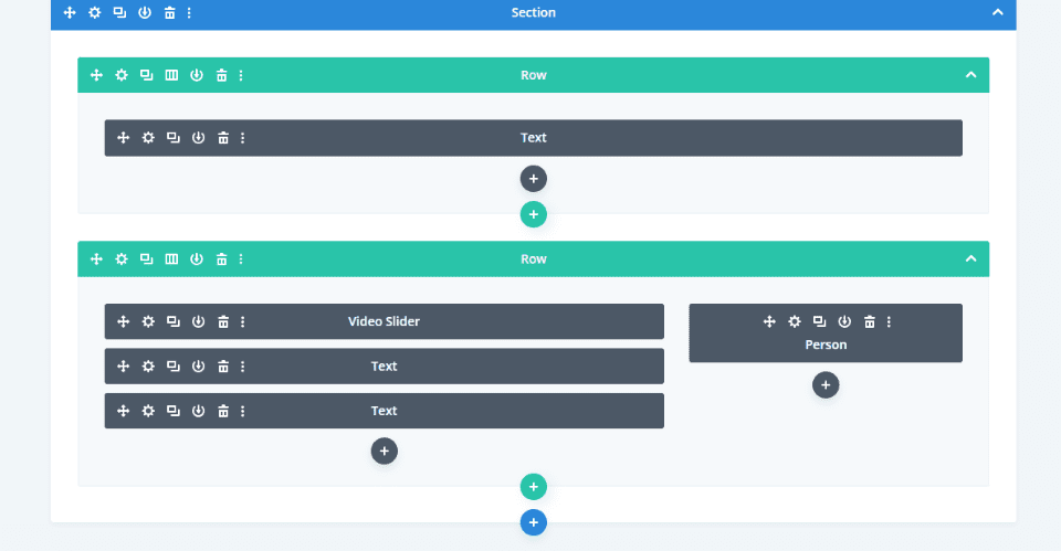
Our page will have three sections with two rows each. Each section will have 5 modules. Once we’ve created the first section, we’ll copy it twice and make changes to create the second and third sections.
Our first section and rows will use the default styling. I’m using the styling queues from the free Print Shop Layout Pack that’s available within Divi. To make it easy to follow, I’ll build the page with the Wireframe View and style it with the Desktop View.
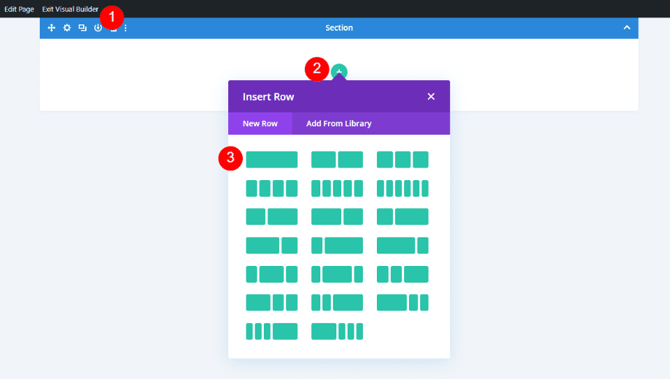
Full Width Row
First, create a new page, enable the Visual Builder, and add a full width row.
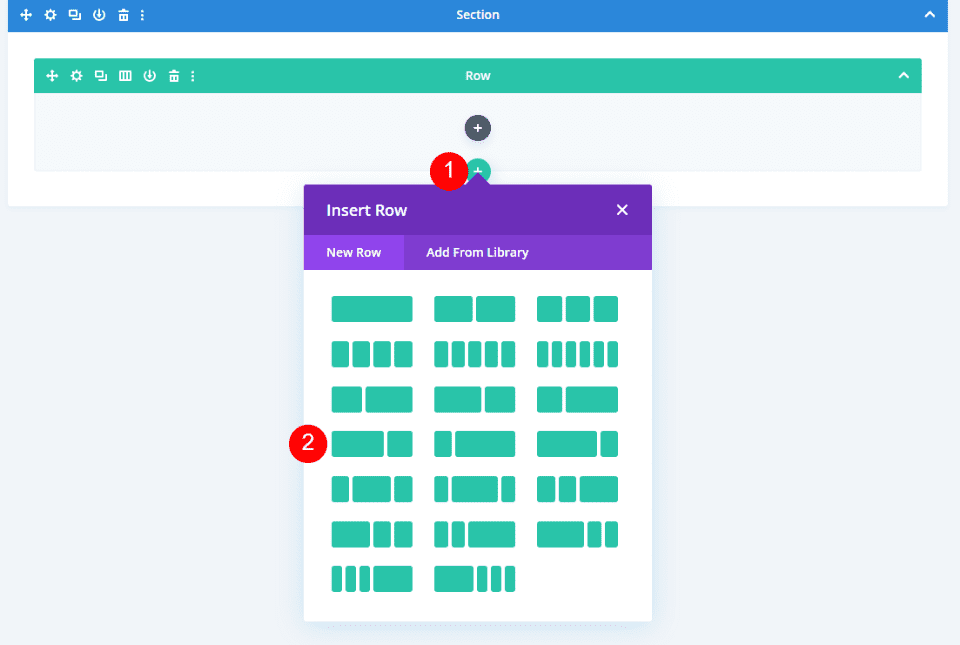
2/3 1/3 Row
Under this row, add a 2/3, 1/3 row.
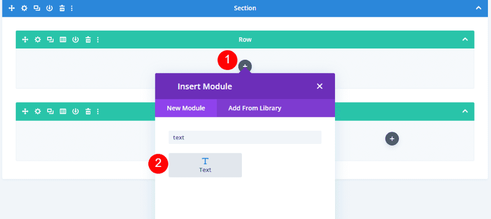
Add the Video Slider Title Text Module
In the full width row, add a Text module.
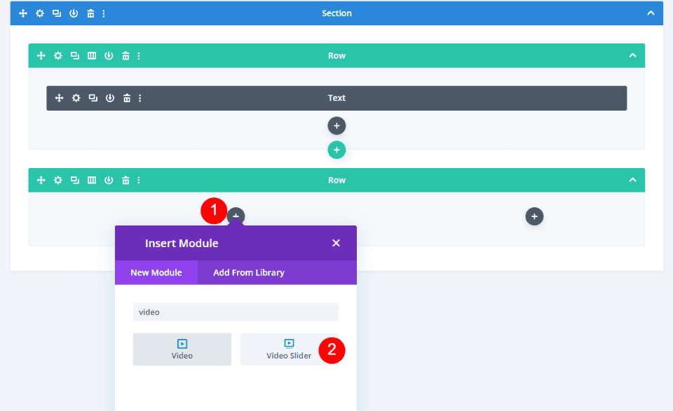
Add a Video Slider Module
Next, add a Video Slider module to the left column of the 2/3, 1/3 row.
Add a Video Slider Description Title Text Module
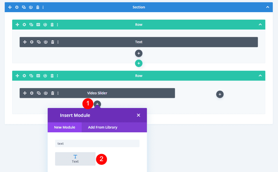
Next, add a Text module under the Video Slider module. This will be used to introduce the description.
Add a Video Slider Description Text Module
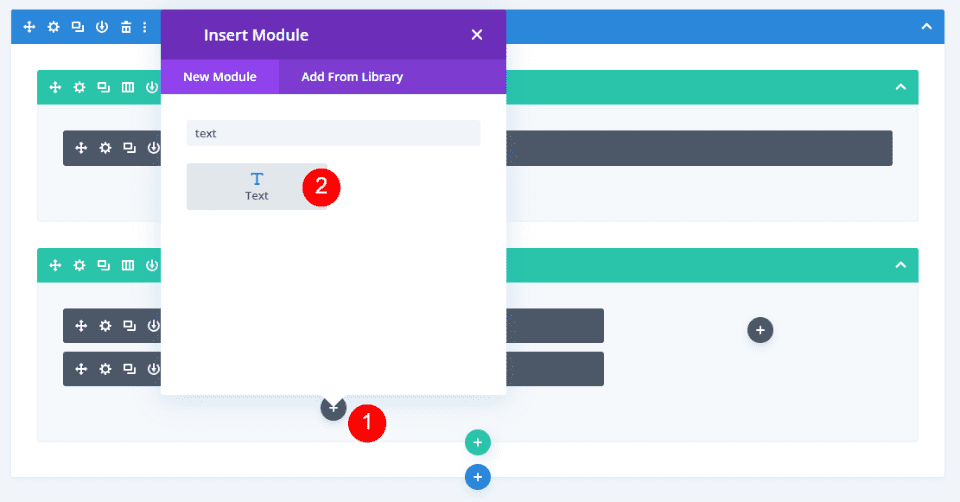
Next, add the Text module that will contain the description. This goes under the Description Title module.
Add the Person Module
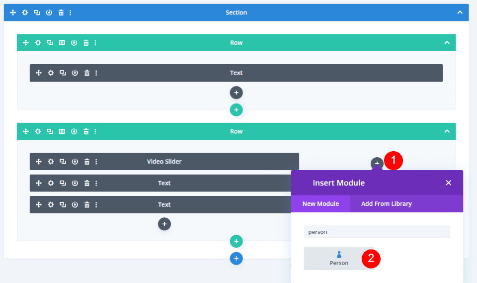
Finally, add a Person module in the right column of the 2/3, 1/3 row.
Style the Video Playlist Page
Your page will now look like mine. This is the Wireframe View. Now it’s time to style the modules. We’ll switch to the Desktop View. Because of the way I built the page, mine will not show the default content.
Style the Playlist Page Video Slider Title Text Module
Open the settings for the first Text module.

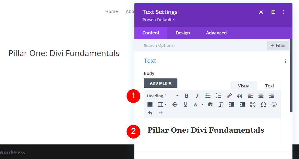
Change the Text Level to Heading 2 and add the title Pillar One: Divi Fundamentals (or your title) to the body content.
- Text Level: H2
- Body Content: Pillar One: Divi Fundamentals
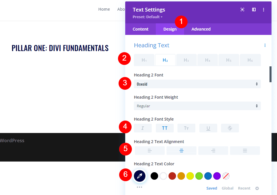
Next, go to the Design tab. Select the H2 Heading Text and change the Font to Oswald. Set the Style to TT, the Alignment to Center, and the Color to #000645.
- Heading Level: H2
- Font: Oswald
- Style: TT
- Alignment: Center
- Color: #000645
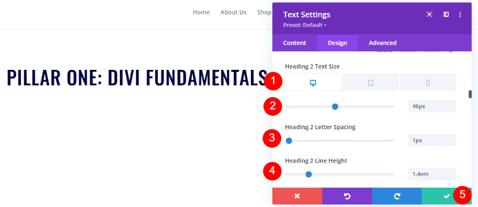
Next, set the Font size to 46px for Desktop, 32px for Tablet, and 20px for Phone. Change the Letter Spacing to 1px and the Line Height to 1.4em. Close the module’s settings.
- Font Size: Desktop 46px, Tablet 32px, Phone 20px
- Letter Spacing: 1px
- Line Height: 1.4em
Style the Playlist Page Video Slider Module
Next, we’ll add the content and style the Video Slider module. Hover over the module and click the gear icon to open its settings.

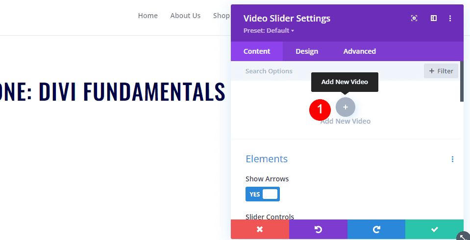
Click Add New Video.
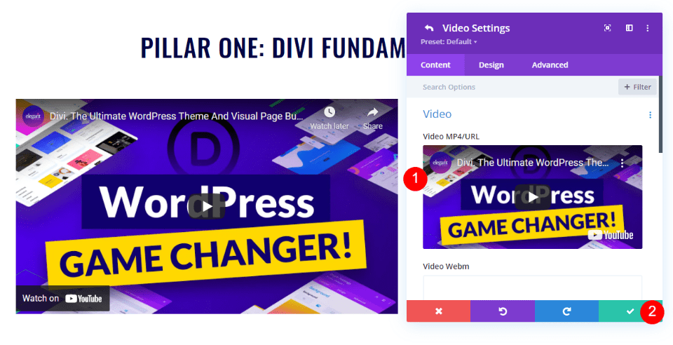
Add your video and close the submodule.
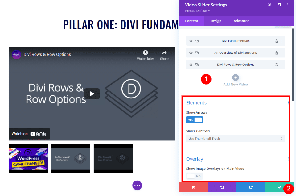
Continue the process until you’ve added all your videos for the first section. I’m using the default settings, but you can also use Dot Navigation in place of the Slider Track and enable Overlays if you don’t want to show the default featured image for the videos.
Style the Playlist Page Video Slider Description Title Text Module
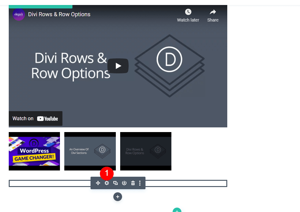
Next, open the settings for the Text module directly under the Video Slider. This will be used as our description’s title.
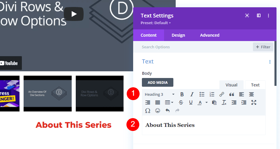
Change the Body Text to Heading 3 and enter the text About This Series into the Body Content area.
- Text Level: Heading 3
- Content: About This Series
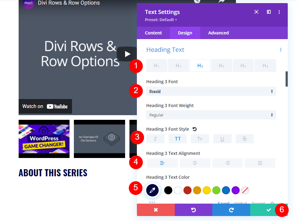
Next, go to the Design tab. Select Heading Text H3 and change the Font to Oswald, the Style to TT, the Alignment to Left, and the color to #000645. Close the module’s settings.
- Heading Text: H3
- Font: Oswald
- Style: TT
- Alignment: Left
- Color: #000645
Style the Playlist Page Video Slider Description Text Module
Next, open the settings for the next Text module. This will contain the description of the video series.
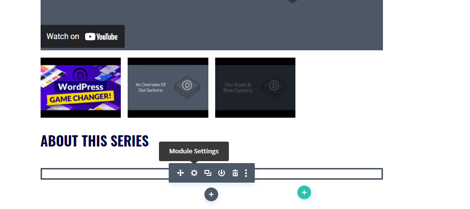
Enter the description of the series into the Body Content area.
- Content: video description
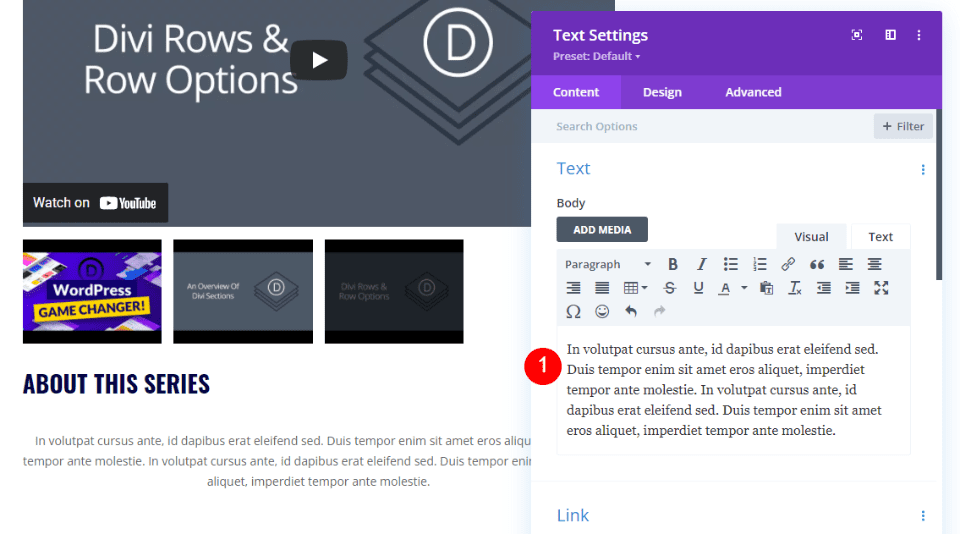
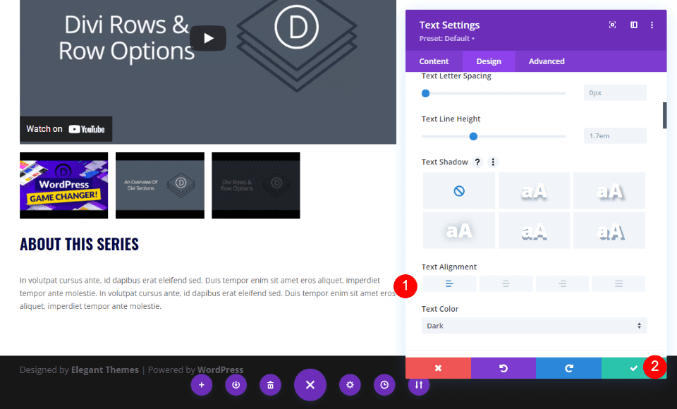
Next, go to the Design tab and scroll down to Text Alignment. Set the Alignment to Left. We’ll leave the rest of its settings at their defaults. Close the module’s settings.
- Alignment: Left
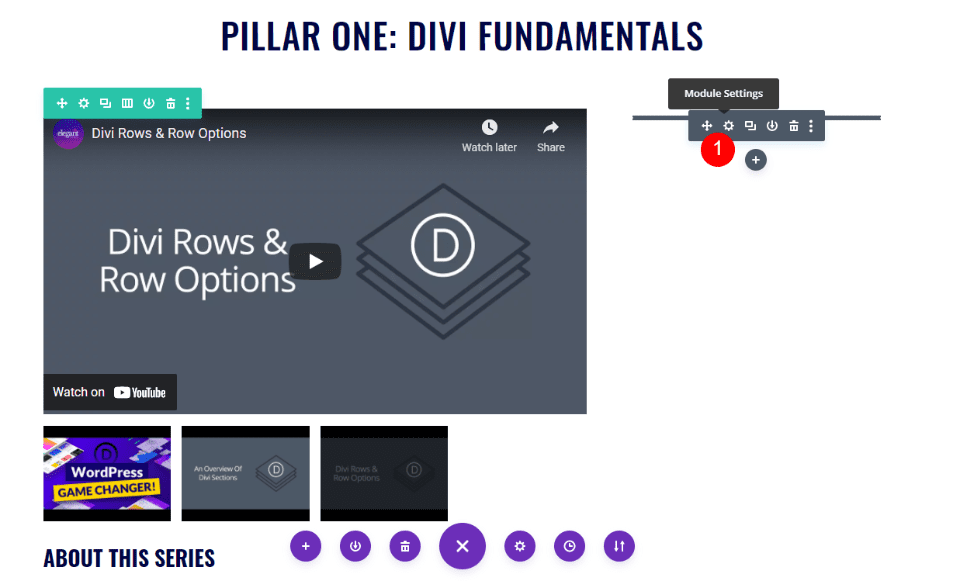
Style the Playlist Page Person Module
Finally, open the settings for the Person module.
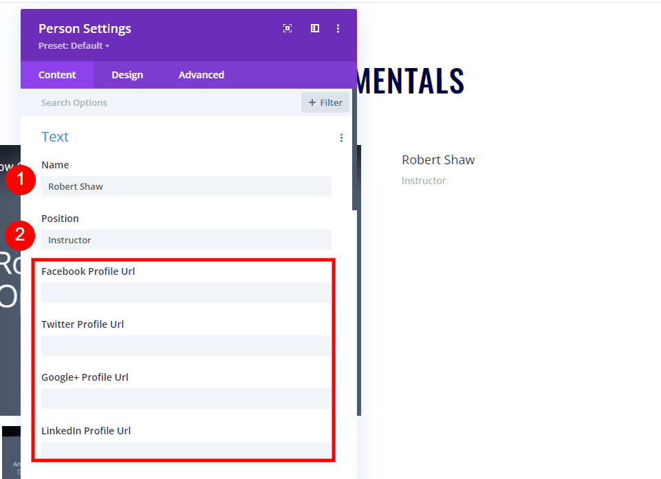
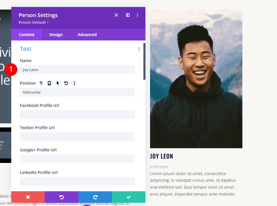
In the General tab, under Text, enter the person’s name into the Name field and type Instructor in the Position field. Enter any of the social media links you want. I’m leaving them blank for this tutorial.
- Name: person’s name
- Position: Instructor
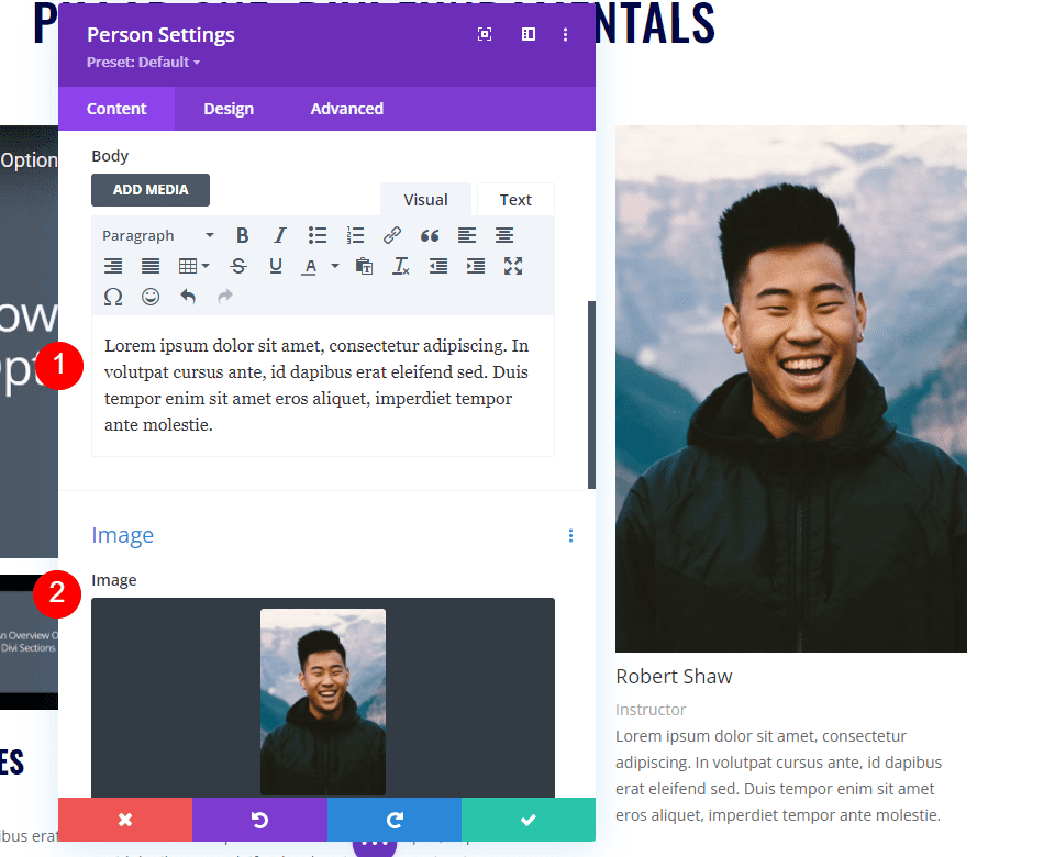
Scroll down to the content area and add the description of the instructor. Under Image, select an image from your media library.
- Content: description
- Image: person’s image
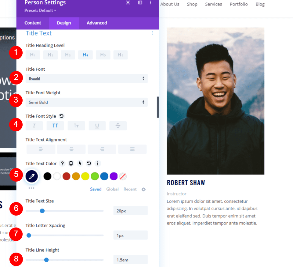
Title Text
Go to the Design tab and scroll to Title Text. Choose the H4 Heading Level. Set the Font to Oswald, the Weight to Semi Bold, the Style to TT, and the Color to #000645. Set the Size to 20px, the Spacing to 1px, and the Line Height to 1.5em.
- H4
- Oswald
- Semi Bold
- TT
- #000645
- 20px
- Spacing 1px
- Line height 1.5em
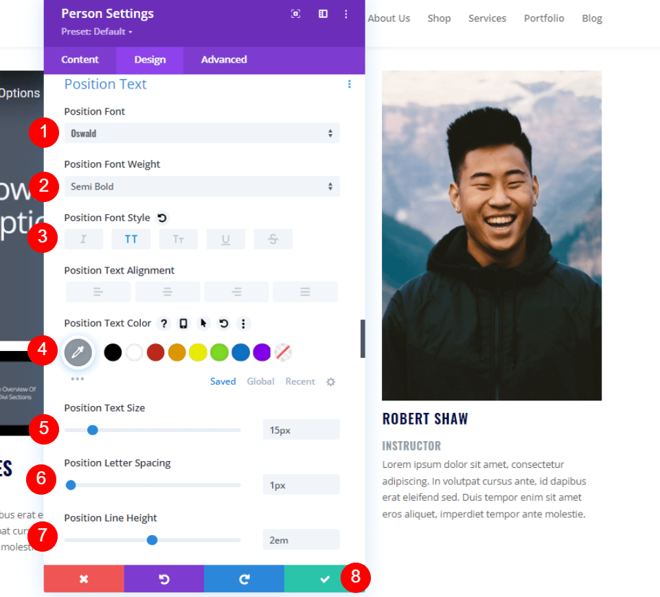
Position Text
Finally, scroll down to Position Text. Choose Oswald for the Font and set the Weight to Semi Bold. Set the Style to TT, the Color to #8f9ca4, the Size to 15px, the Line Spacing to 1px, and the Line Height to 1.5em. Close the module’s settings.
- Font: Oswald
- Weight: Semi Bold
- Style: TT
- Color: #8f9ca4
- Size: 15px
- Spacing: 1px
- Line Height: 2em
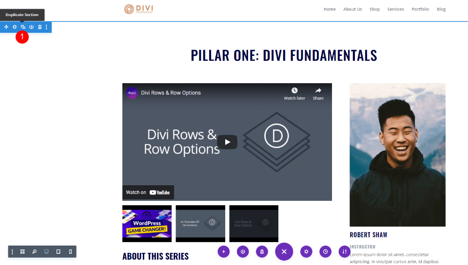
Duplicate the Playlist Page’s Section
Now that the Section is designed and styled the way we want, hover over its settings and make 2 duplicates.
Style the Playlist Page Second Section
For the second section, we’ll change the background color, so it stands apart from the others. We’ll also change the content of the modules.
Section Settings
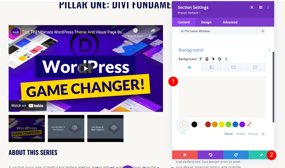
Next, open the settings for the second section.
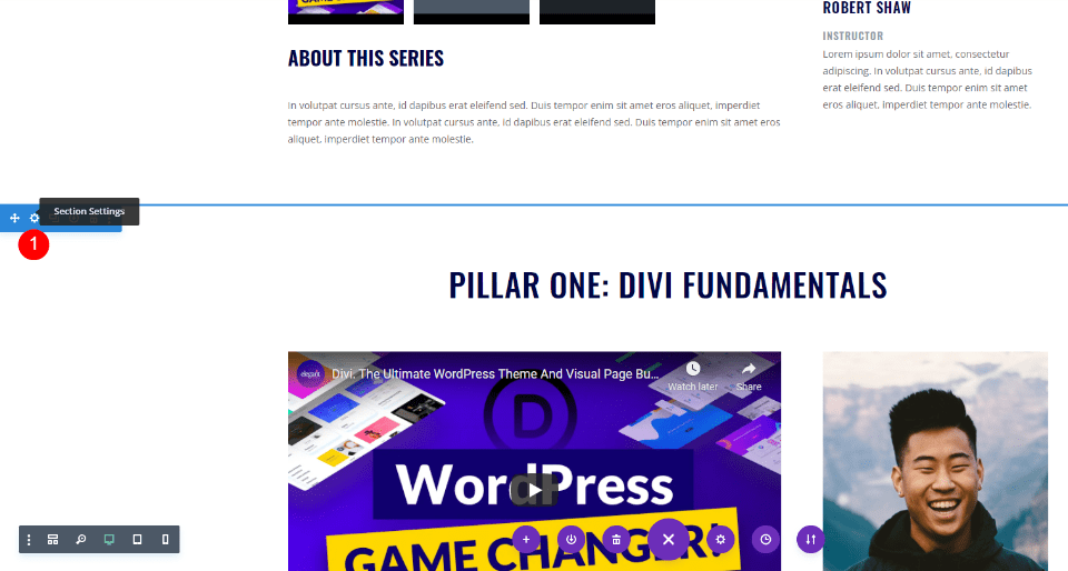
Scroll down to Background and set the color to #f9f7f4. Close the settings.
- Background Color: #f9f7f4
Second Video Slider Title Text Module
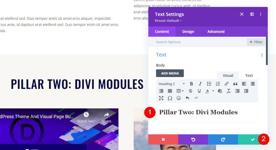
Open the title for the second section and change it to reflect the second set of videos. I’m calling this section Pillar Two: Divi Modules. Close the settings.
- Content: Pillar Two: Divi Modules
Second Video Slider Module
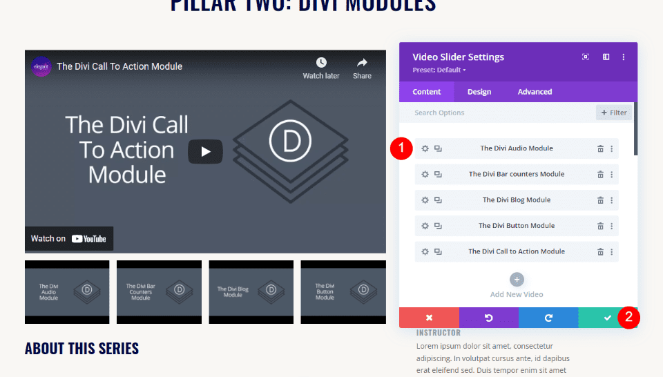
Open the settings for the second section’s Video Slider module. Replace the videos with those for the second section. Close the settings.
- Submodules: choose videos
Second Video Slider Description Title Text Module
This title will remain the same, so we won’t need to make changes.

Second Video Slider Description Text Module
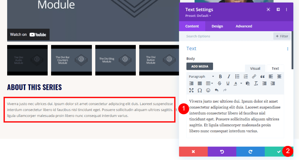
Next, open the Text module with the second video description and create the description for the second set of videos.
- Body Content: video description
Second Person Module
If a different instructor teaches the second set of videos, open the second Person module and replace the name. also, change or add the social media URLs if you’re using them.
- Name: instructor’s name
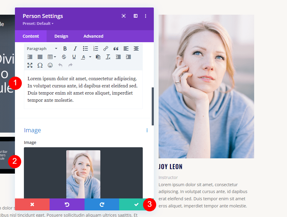
Next, scroll down to the Body Content and Image area and replace the person’s description and image.
- Body Content: person’s description
- Image: person’s image
Style the Third Section
For the third section, we’ll change the content of the modules. This section will use the default settings, so we can move on to the first title.
Third Video Slider Title Text Module
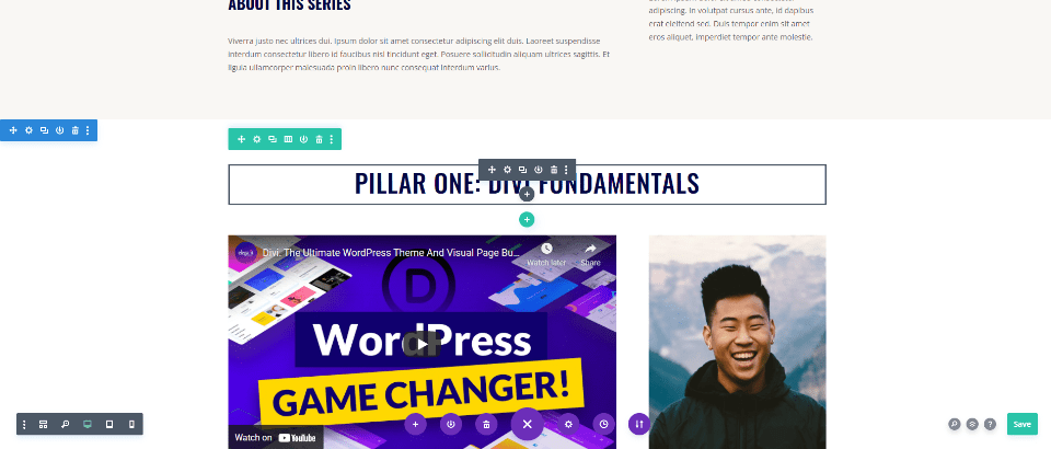
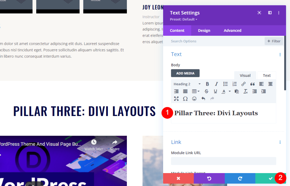
Open the title Text module and change the title to match this set of videos. Close the module’s settings.
- Body Content: Pillar Three: Divi Layouts
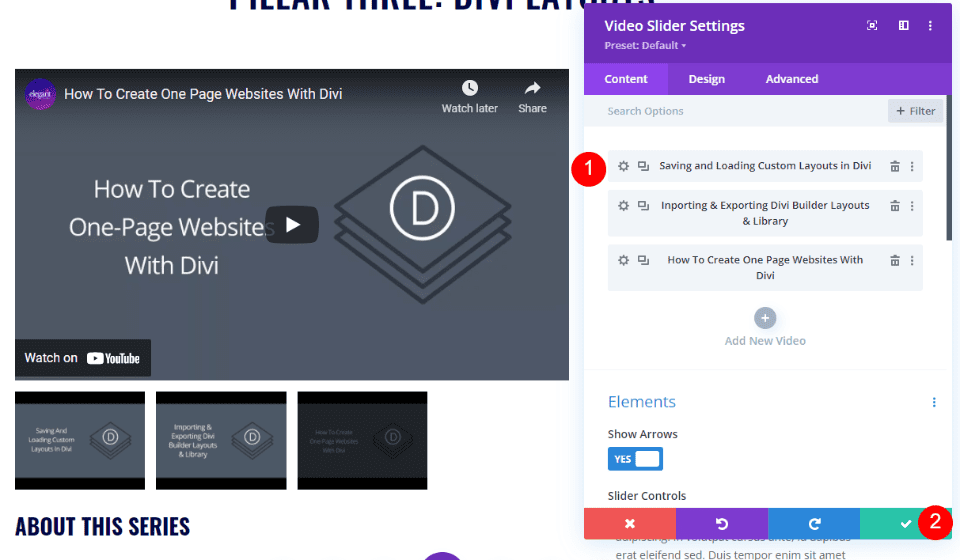
Third Video Slider Module
Open the third Video Slider module and replace the videos with those for this set. Change the Amin Labels if you want and close the module’s settings.
- Add New Video: replace each video
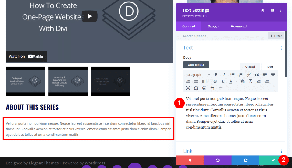
Third Video Slider Description Text Module
Open the Text module for the third section’s video description. Create a description for this set of videos. Close the Text module’s settings.
- Body Content: video description
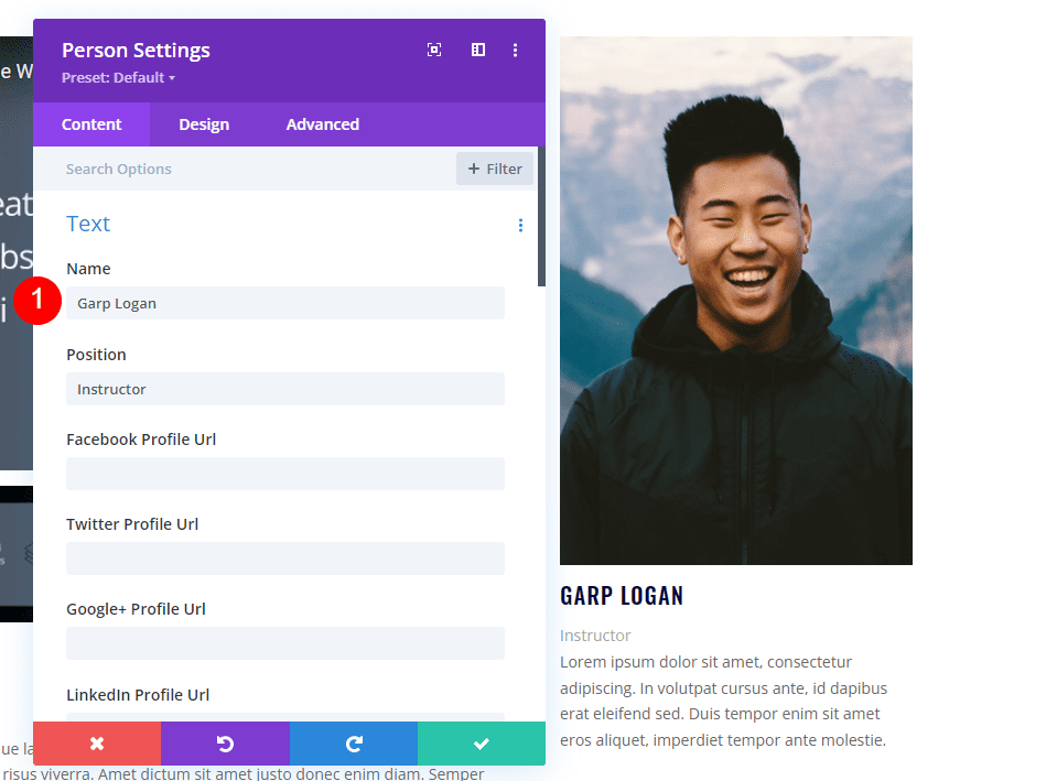
Third Person Module
Finally, open the Person module for this section and replace the name if it’s different from the first set of videos. If it’s the same person as the second set, simply copy that module, paste it into this column, and delete this module. Change or add social network links if you’re using them.
- Name: Instructor’s name
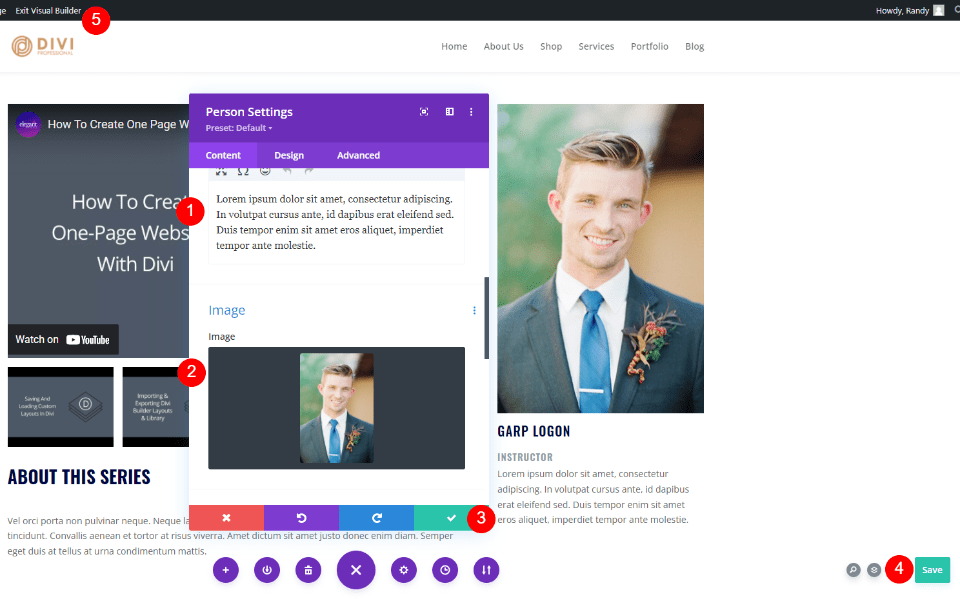
Scroll down to the Body Content and Image area and replace them to match this person’s information. Close the module, save your page, and exit the Visual Builder.
- Body Content: person’s description
- Image: person’s image
Playlist Page Results
Here’s how our playlist page looks on desktop and phone.
Desktop

Phone

Ending Thoughts
That’s our look at how to create a playlist page with Divi’s Video Slider module. It’s a simple process and creating duplicates once you’ve styled the first section makes creating the second and third sections much easier. We only have to change the content and we’re done. Divi’s Video Slider module is an excellent choice for any playlist page with videos.
We want to hear from you. Have you built a playlist page with Divi’s Video Slider module? Tell us about your experience in the comments.



Leave A Reply