Creating a popup login form in Divi can be an effective way to boost the design and user experience of logging in and out of your site. The idea is to create a login form that shows in a popup box whenever the user clicks a login button on the header of the page. This is more convenient than redirecting the user to a custom Login page. Plus, it allows web developers to create a custom design of the login form (at least on the initial front end) which can be a refreshing alternative to the traditional WordPress login experience.
In this tutorial, we are going to create a popup login form with custom login and logout buttons in Divi. Using the Divi Login Module and a couple of button modules, we will create a seamless popup login experience on the front end by allowing users to log in and log out without being redirected to a different page.
Granted, this solution is limited to the front-end login form design, which means that any errors that occur (or if the user needs to reset a password) will redirect to the traditional WordPress login form/page design found at “wp-login.php”. However, for those looking for a custom login design on the front-end without having to use a plugin, then this may be the solution for you.
Let’s get started!
Sneak Peek
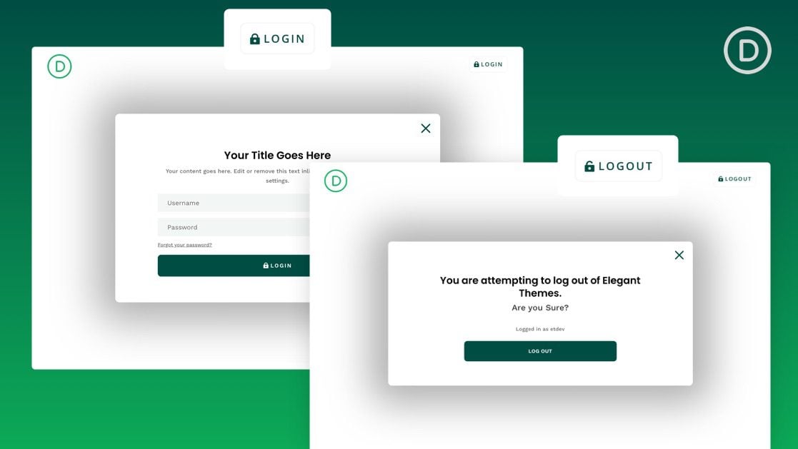
Here is a quick look at the design we’ll build in this tutorial.
Notice how the login button and logout buttons change respectively. And, once the user logs in, they remain on the current page. Plus the popup login form shows different “warning” content whenever the user attempts to log out.
Download the Template for FREE
To lay your hands on the designs from this tutorial, you will first need to download the file using the button below. To gain access to the download you will need to subscribe to our newsletter by using the form below. As a new subscriber, you will receive even more Divi goodness and a free Divi Layout pack every Monday! If you’re already on the list, simply enter your email address below and click download. You will not be “resubscribed” or receive extra emails.
How to Upload The FREE Template
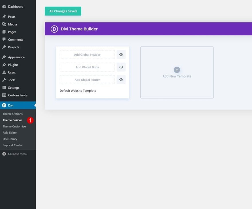
To upload the template, navigate to the Divi Theme Builder in the backend of your WordPress website.
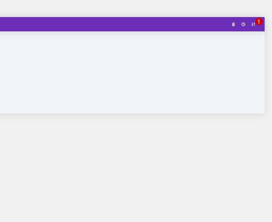
Then, in the top right corner, you’ll see an icon with two arrows. Click on the icon.
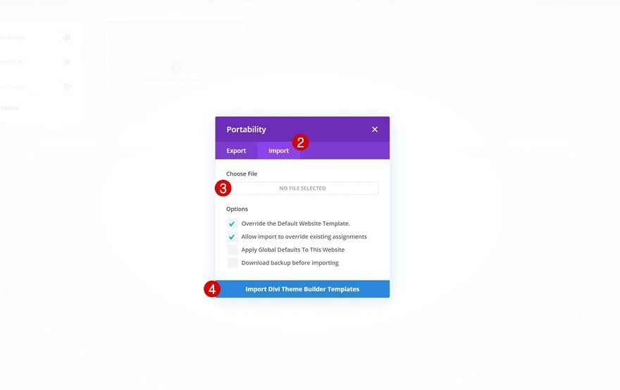
Navigate to the import tab, upload the JSON file which you were able to download in this post and click on ‘Import Divi Theme Builder Templates‘.
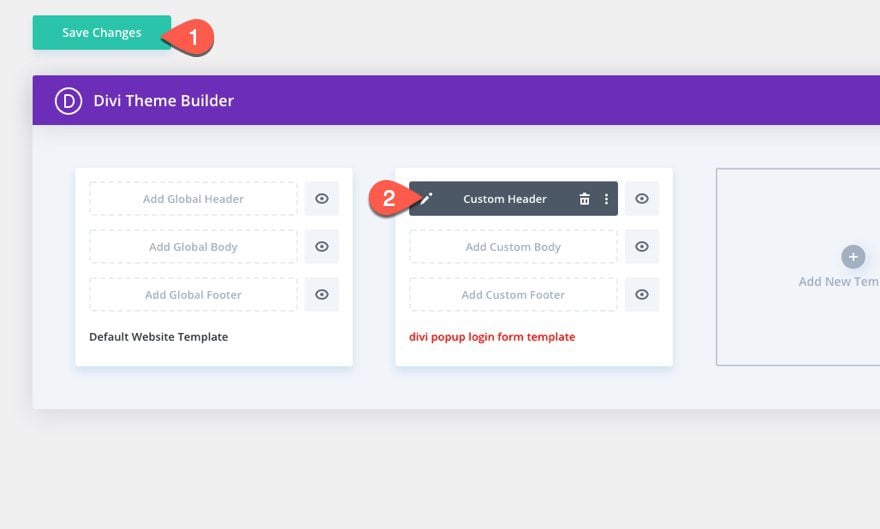
Once you’ve uploaded the file, you’ll notice a new global header and footer in your default website template. Save the Divi Theme Builder changes as soon as you want the template to be activated.
To modify the header template’s elements, start by opening the template.
Let’s get to the tutorial, shall we?
What You Need to Get Started
Although you can add this popup login form and custom login/logout buttons to any custom header, we are going to use a premade header to speed up the process and get a jump start on the design.
If you haven’t yet, install and activate the Divi Theme.
Import Crowdfunding Header Template to Theme Builder
To get started, download the free header and footer for Divi’s Crowdfunding Layout Pack. To do this, go to the blog post.
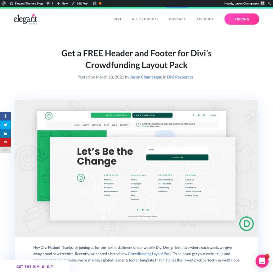
Then enter your email to download the zip file.
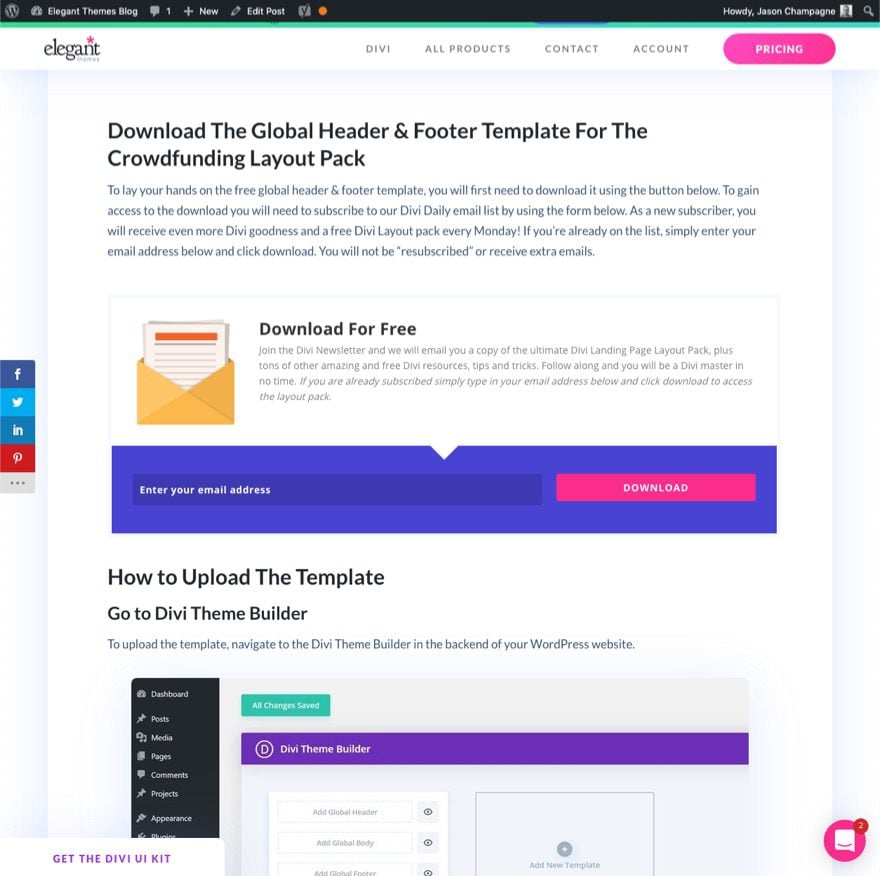
After that, unzip the file so that it is ready for import.
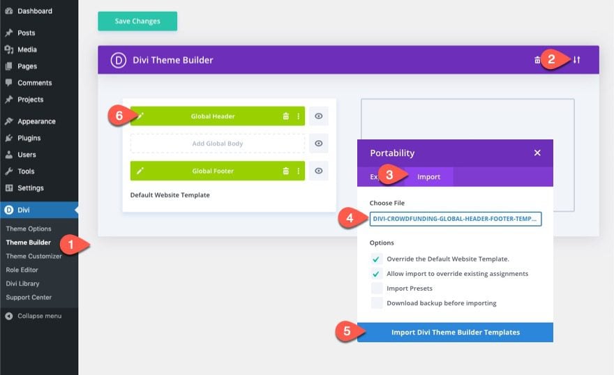
To import the file to the theme builder, follow these steps:
- Navigate to Divi > Theme Builder.
- Click the Portability Icon.
- In the Portability popup, select the import tab.
- Choose the unzipped file previously downloaded to be imported.
- Click the Import button.
- Click the edit icon to edit the imported header.
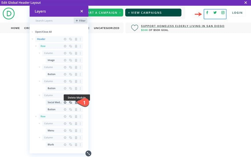
Once in the Global Header Layout editor, open the layers view so that you can see all of the elements easily.
In the top row of the header section, delete the social media follow module next to the Login button in column 3.
Creating the Login Button
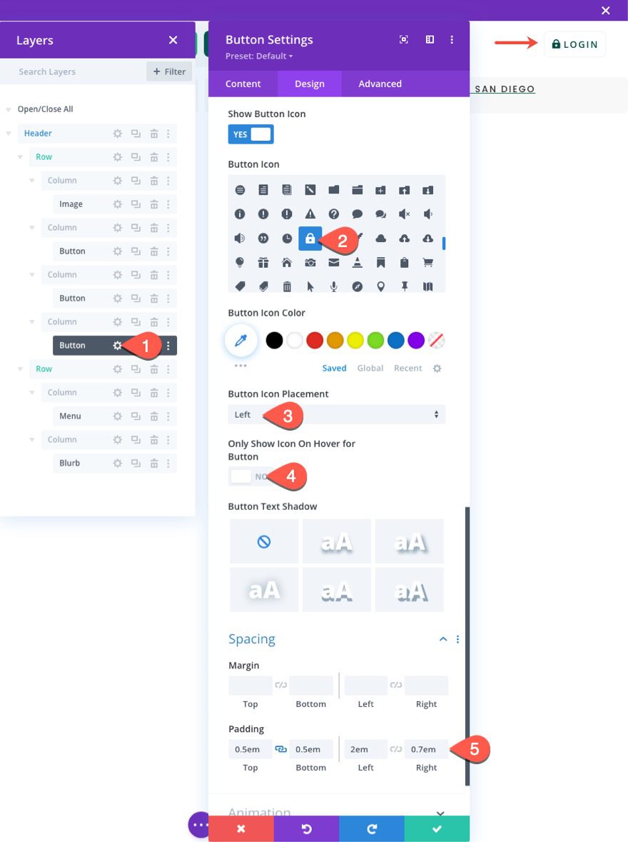
To create our login button, open the settings for the button module in column3 of the top row.
Update the following under the design tab:
- Button Icon: lock icon (see screenshot)
- Button Icon Placement: Left
- Only Show Icon On Hover for Button: NO
- Padding: 0.5em top, 0.5em bottom, 2em left, 0.7em right
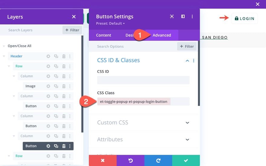
Under the Advanced tab, give the button two custom CSS Classes as follows:
- CSS Class: et-toggle-popup et-popup-login-button
Creating the Logout Button
To create our logout button, duplicate the existing Login button in column 3.
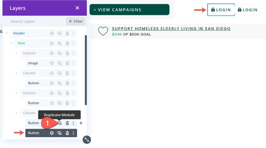
To help distinguish the two buttons, you can update the label of each respectively. Then, open the settings for the duplicate button module in column3.
Change the button text to read “Logout”.
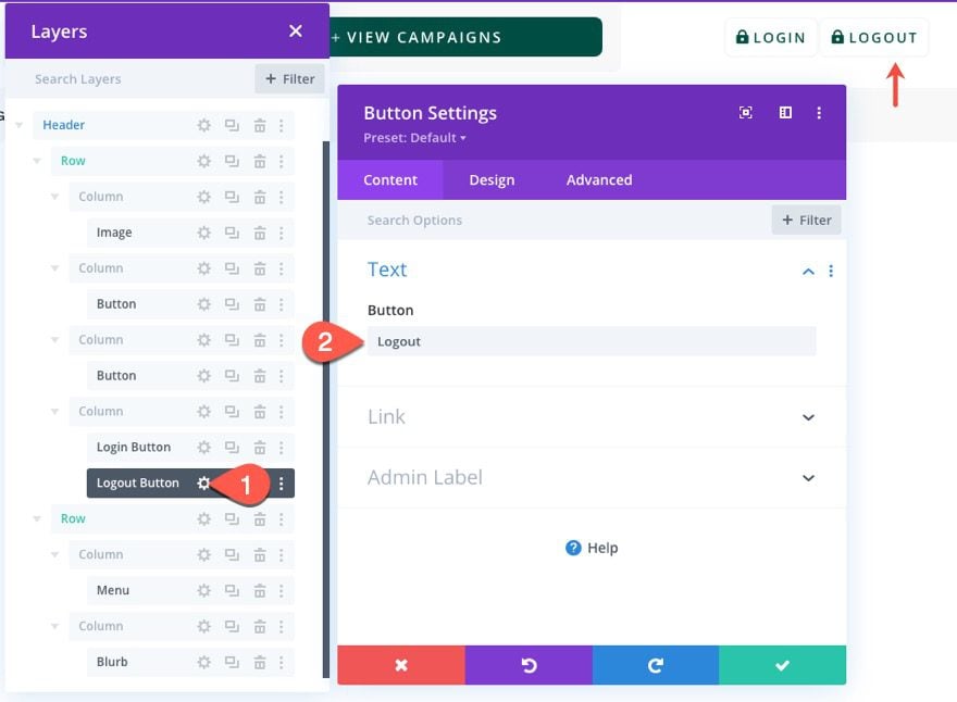
Update the following under the design tab:
- Button Icon: unlock icon (see screenshot)
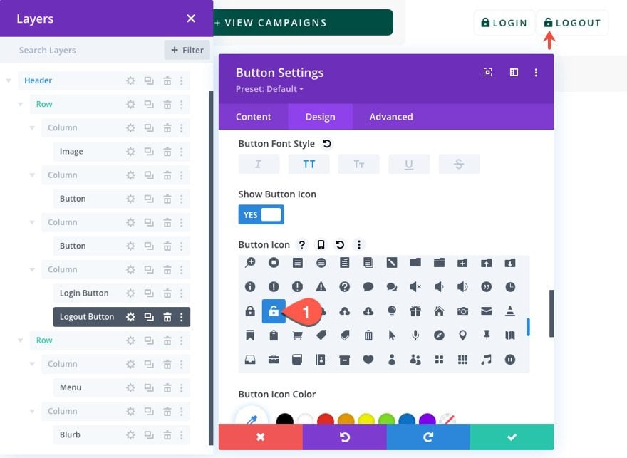
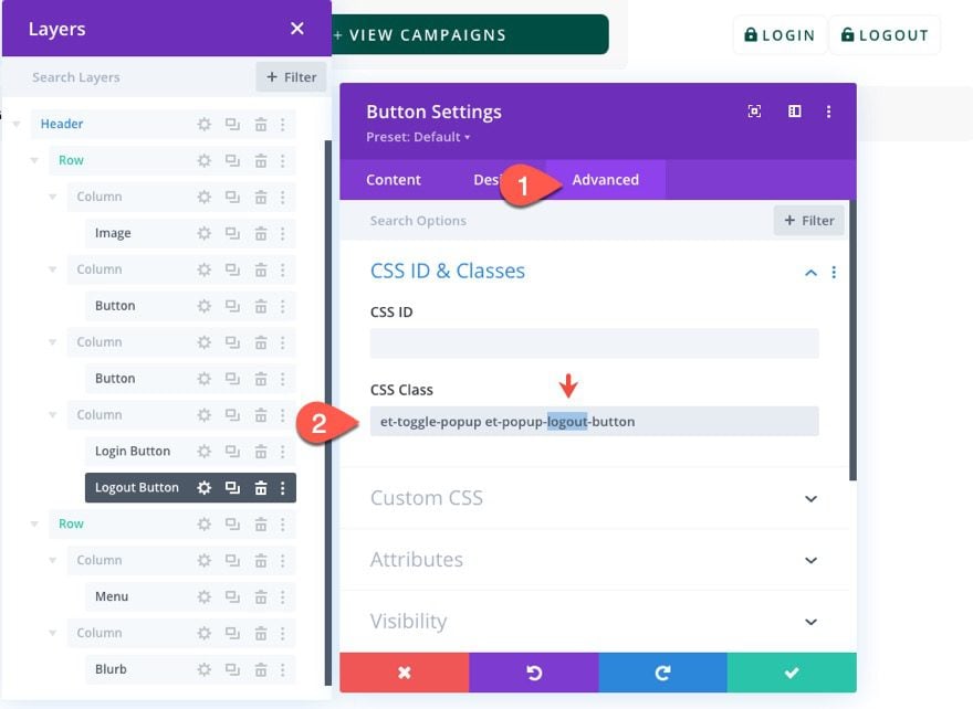
Under the Advanced tab, update the button CSS Classes as follows:
- CSS Class: et-toggle-popup et-popup-logout-button
The first class will remain the same but the second class will be different.
Part 2: Creating the Popup Section
Once the buttons are finished, we are ready to create the popup section that will serve as our popup containing the login form(s).
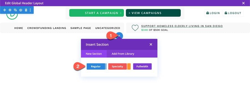
Under the header section, add a new regular section.
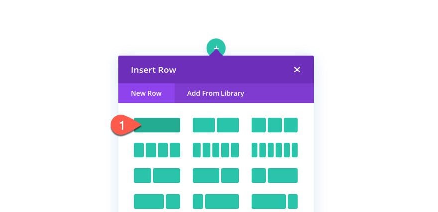
Then insert a one-column row inside the section.
Section Settings
Before updating the row, open the section settings.
Under the content tab, give the section a white background color:
- Background Color: #ffffff
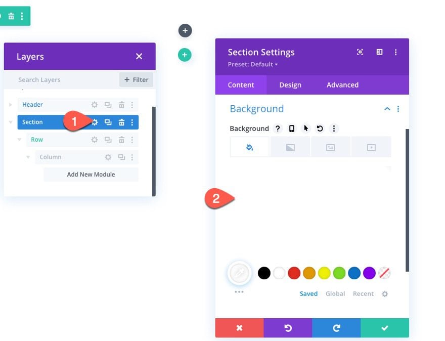
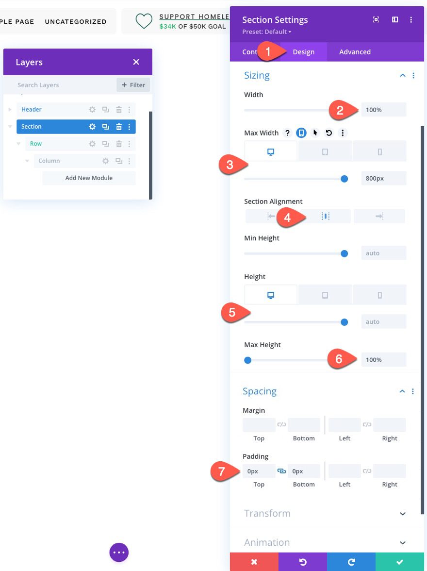
Under the design tab, update the following:
- Width: 100%
- Max Width: 800px (desktop), 80% (tablet), 100% (phone)
- Section Alignment: Center
- Height: auto (desktop and tablet), 100% (phone)
- Max Height: 100%
- Padding: 0px top, 0px bottom
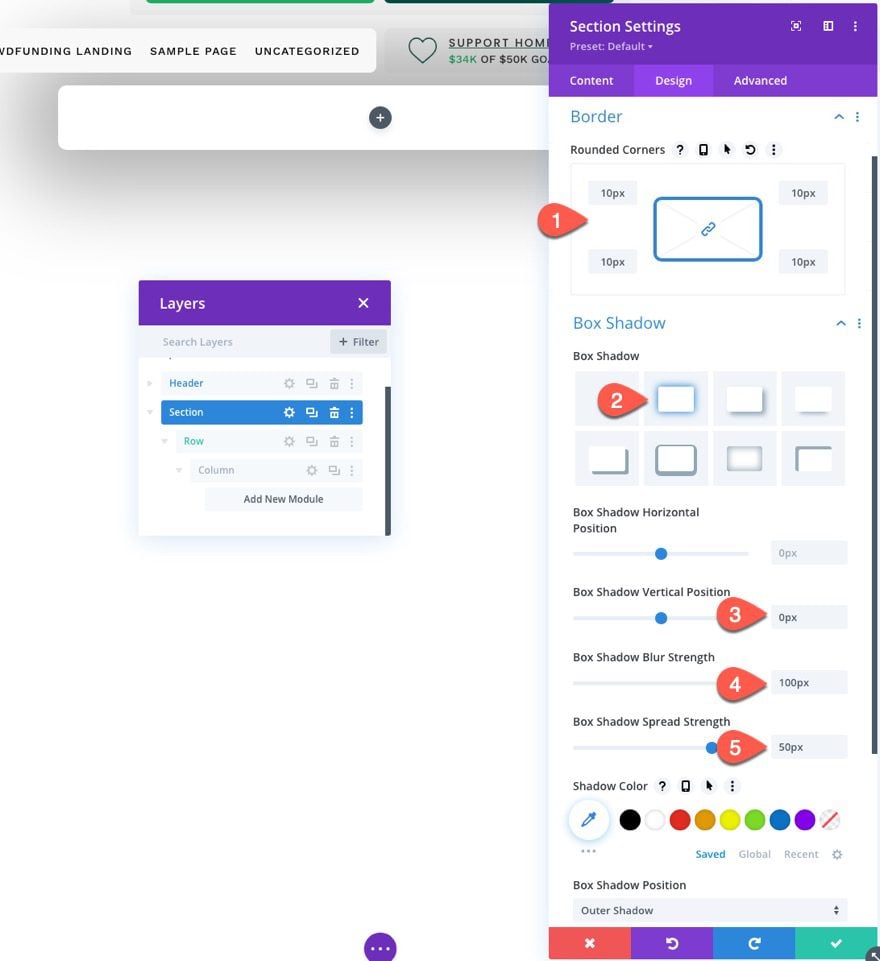
- Rounded Corners: 10px
- Box Shadow: see screenshot
- Box Shadow Vertical Position: 0px
- Box Shadow Blur Strength: 100px
- Box Shadow Spread Strength: 50px
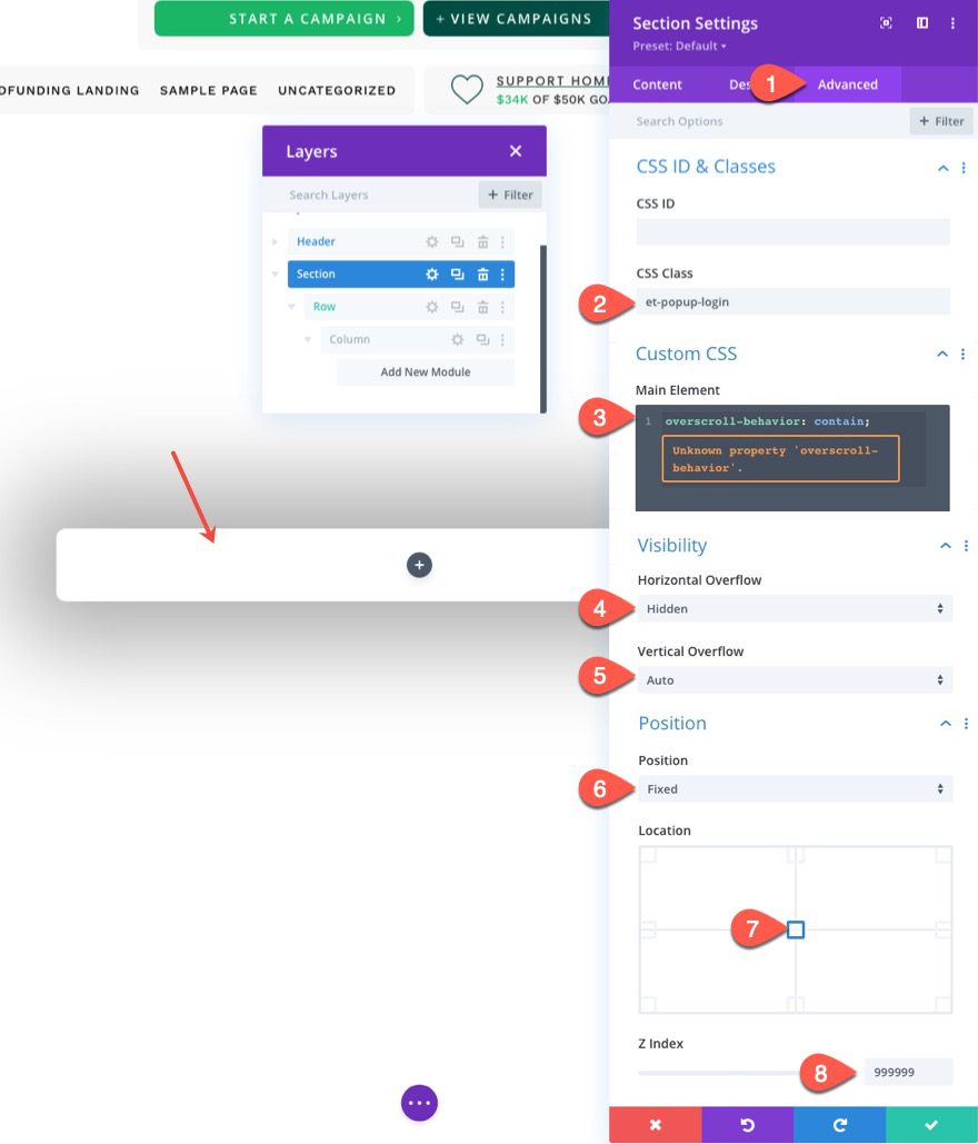
Under the Advanced tab, update the following:
Add a custom CSS Class.
- CSS Class: et-popup-login
Add a snippet of custom CSS to the Main Element:
overscroll-behavior: contain;
Update the Visibility and Position options.
- Horizontal Overflow: hidden
- Vertical Overflow: auto
- Position: Fixed
- Location: Center Center
- Z Index: 999999
Row Settings
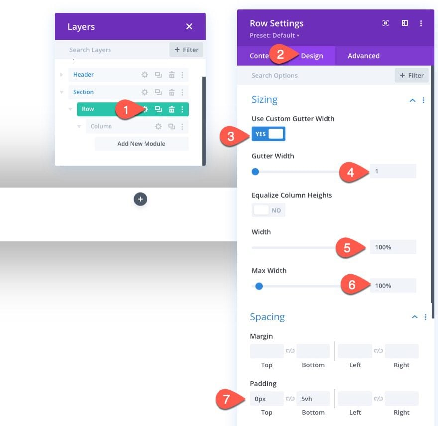
Once the section settings are in place, open the settings for the row and update the following design settings:
- Use Custom Gutter Width: YES
- Gutter Width: 1
- Width: 100%
- Max Width: 100%
- Padding: 0px top, 5vh bottom
Part 3: Creating the Close Popup Icon
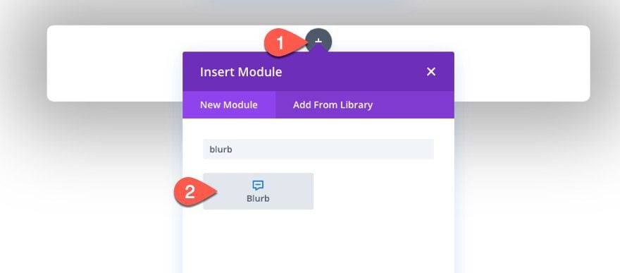
To create the Close Popup Icon that will close/hide the popup on click, we are going to use a blurb module.
Add a new blurb module to the row.
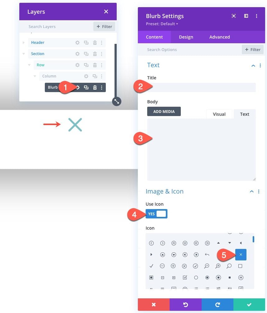
Open the setting for the blurb module, and delete the Title and Body text.
Then add the icon as follows:
- Use Icon: YES
- Icon: “x” icon (see screenshot)
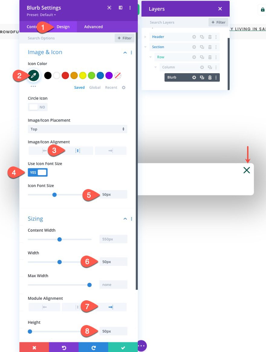
Under the design tab, update the following:
- Icon Color: #004e43
- Image/Icon Alignment: Centered
- Use Icon Font Size: YES
- Icon Font Size: 50px
- Width: 50px
- Module Alignment: Right
- Height: 50px
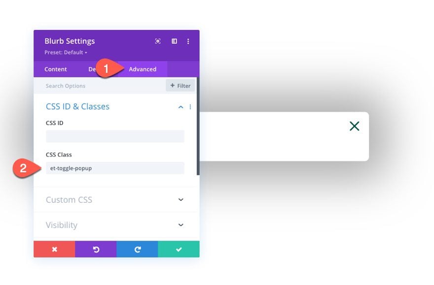
Under the Advanced tab, add a CSS class to the blurb as follows:
- CSS Class: et-toggle-popup
Part 4: Creating the “Logged Out” and “Logged In” Login Forms
In order to have different content and design for the login form when logging in and logging out, we are going to create two different login form modules. The first will be the login form that will show whenever the user is “logged out”. The second will be the login form that will show whenever the user is “logged in”.
Creating the “Logged Out” Form
To create the “Logged Out” Login Form, add a new login form module under the blurb module icon inside the row.
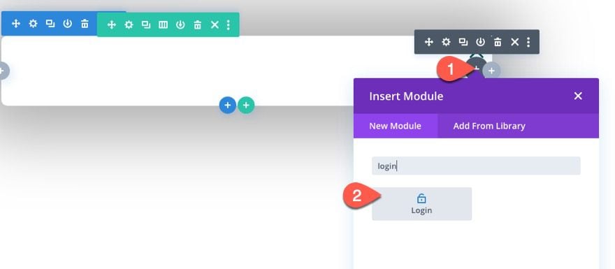
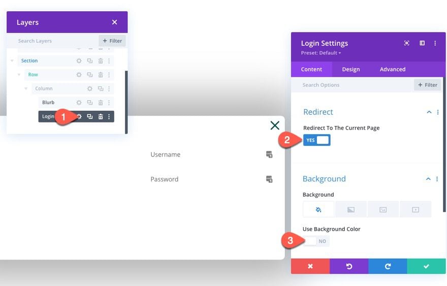
Open the login module settings and update the following:
Content tab
- Redirect To The Current Page: YES
- Use Background Color: NO
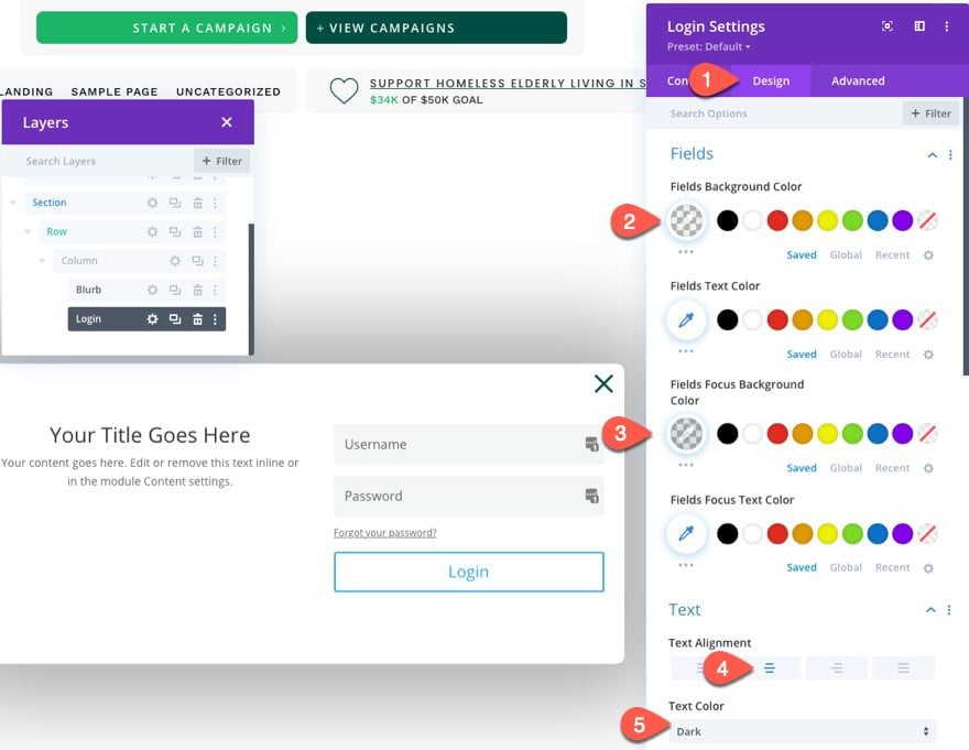
Design Tab
- Fields Background Color: rgba(0,78,67,0.05)
- Fields Focus Background Color: rgba(0,78,67,0.15)
- Text Alignment: Center
- Text Color: Dark
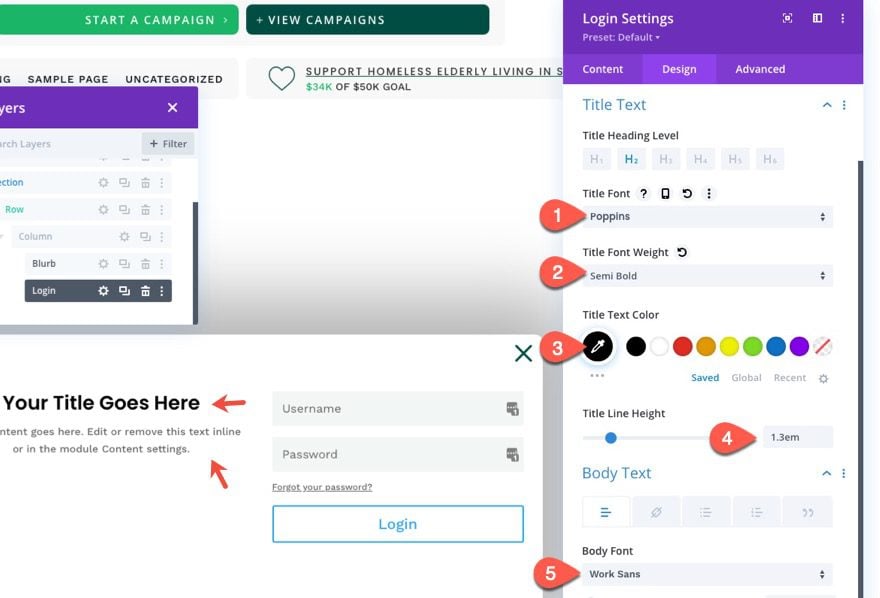
- Title Font: Poppins
- Title Font Weight: Semi Bold
- Title Text Color: #000000
- Title Line Height: 1.3em
- Body Font: Work Sans
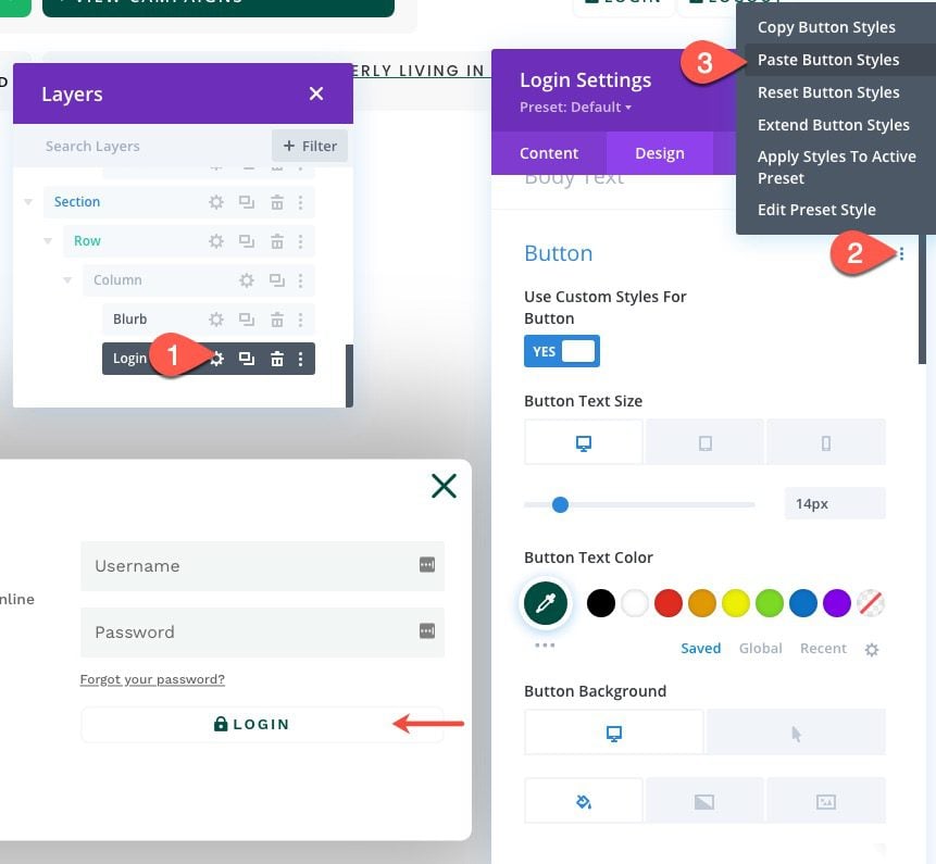
To update the button styles, copy the button styles of the Login Button we created in the third column of the row in the Header section.

Then paste the button styles to the button option group in the Login Settings under the design tab.
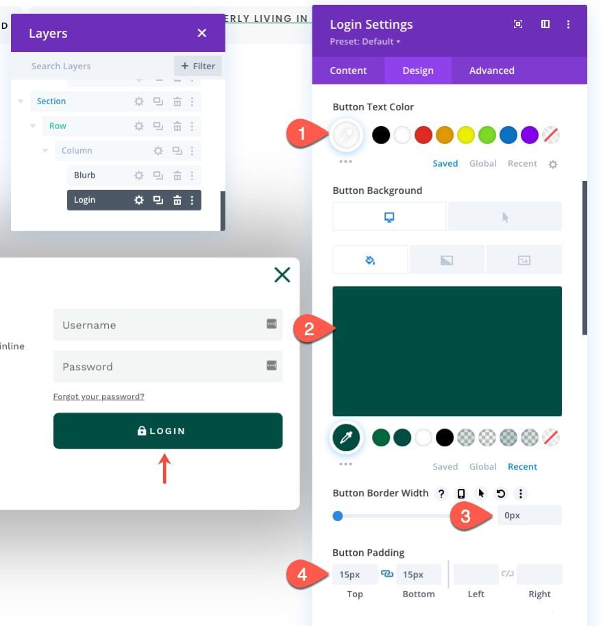
Then update the button styles for the login form as follows:
- Button Text Color: #ffffff
- Button Background Color: #004e43
- Button Background Color (hover): #00683c
- Button Border Width: 0px
- Button Padding: 15px top, 15px bottom
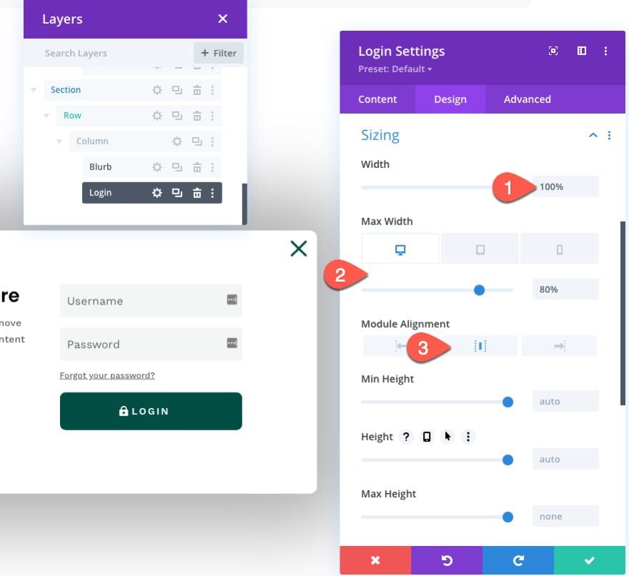
Then update the sizing options as follows:
- Width: 100%
- Max Width: 80% (desktop), 90% (tablet), 95% (phone)
- Module Alignment: Center
Advanced Tab
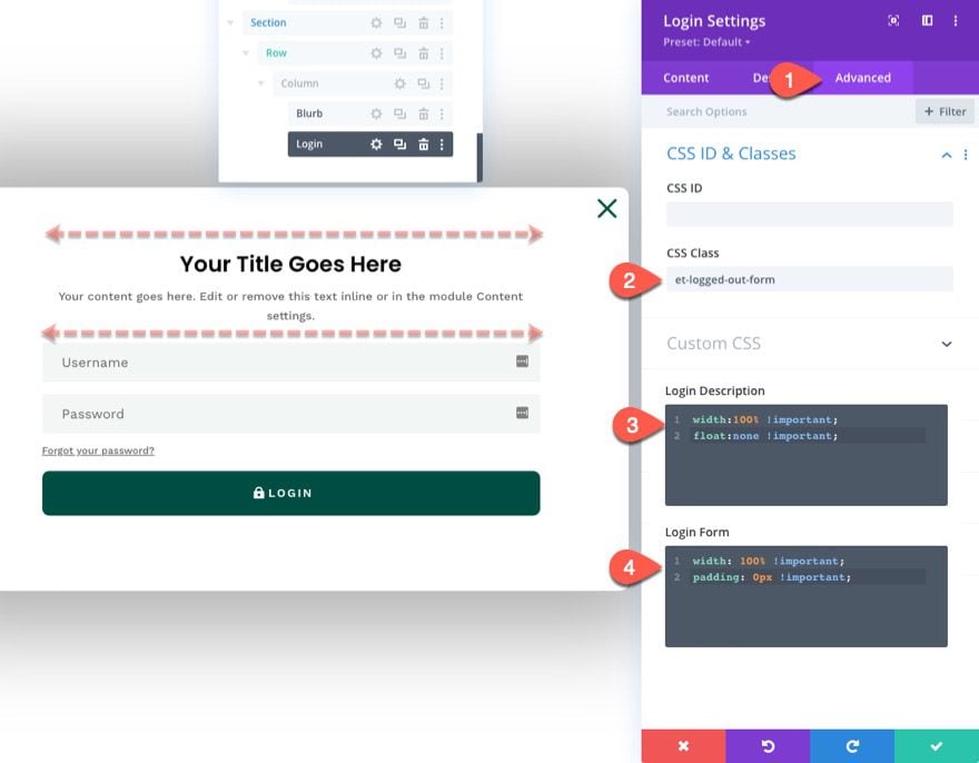
Under the Advanced Tab, update the CSS Class and Custom CSS as follows:
- CSS Class: et-logged-out-form
Custom CSS for Login Description:
width: 100% !important;
float: none !important;
Custom CSS for Login Form:
width: 100% !important;
padding: 0px !important;
This will make sure the login form module spans the full width of the row/column even on desktop.
Creating the “Logged In” Form
Now that the “Logged Out” version of the form is complete, we need to create the “Logged In” version which will have different content and styling to maximize the user experience.
To create the “Logged Out” login form, duplicate the existing login form.
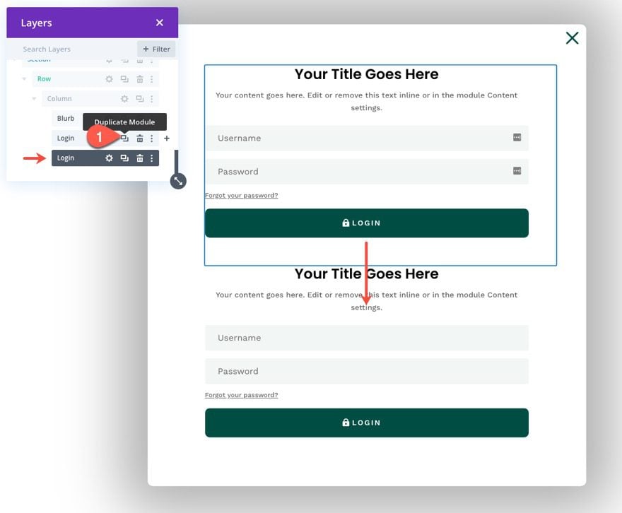
Then update the label for each of the login forms respectively.
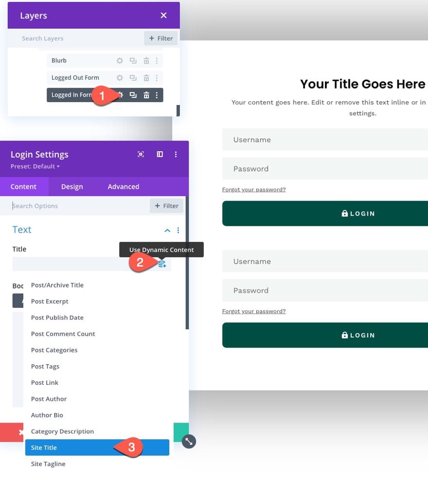
Open the settings for the duplicate (the “Logged In” form) and add the Site Title as dynamic content to the Title of the login form module.
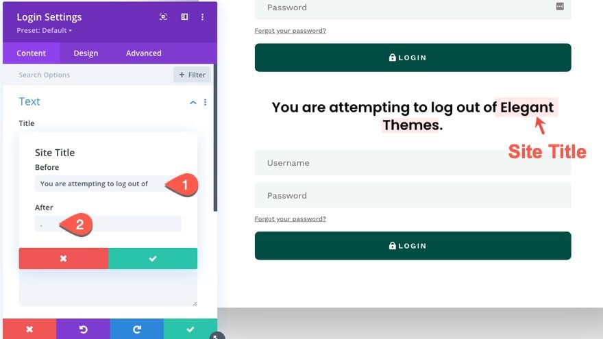
Next open the settings for the site title dynamic content and update the before and after content as follows:
- Before: “You are attempting to log out of “
- After: “. “
This will create a nice dynamic notification for users attempting to log out of the site.
Then add the following H3 heading to the body:
<h3>Are you sure?</h3>
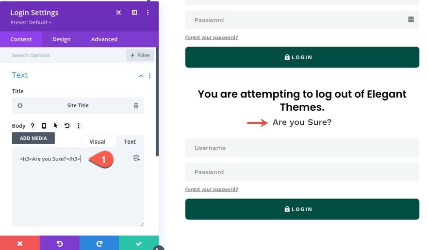
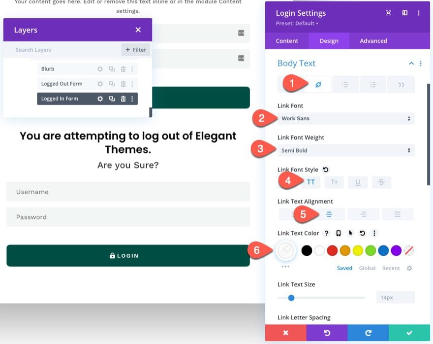
If you have ever seen the login form module content when logged in, you know that there is a custom message that includes a custom “logout” link. To style this link to look like a button, we need to customize the body link font/text settings as follows:
- Select the link tab under body text options.
- Link Font: Work Sans
- Link Font Weight: Semi Bold
- Link Font Style: TT
- Link Text Alignment: center
- Link Text Color: #ffffff
NOTE: You won’t be able to preview these results until you view the form on a live page.
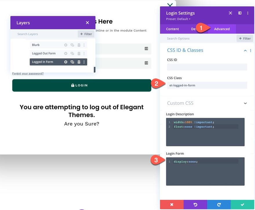
Under the Advanced tab, update the CSS Class and Custom CSS as follows:
- CSS Class: et-logged-in-form
Custom CSS for Login Form:
display:none;
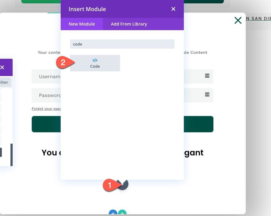
Part 5: Adding the Custom Code
To add the custom CSS and JQuery needed for the functionality of the popup login form, create a new code module under the last login form module.
The CSS
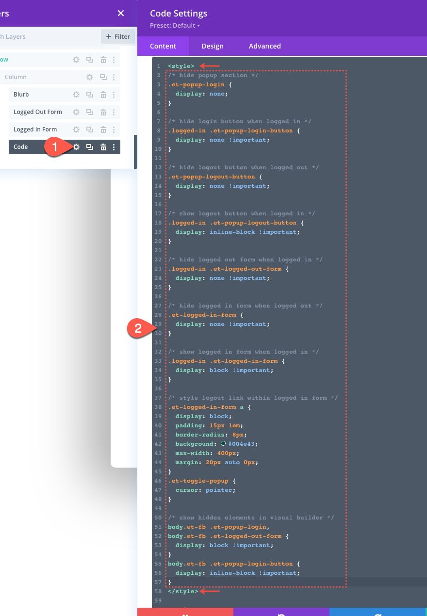
Open the code module settings and paste the following CSS to the code box, making sure to wrap the CSS in the necessary style tags.
/* hide popup section */
.et-popup-login {
  display: none;
}

/* hide login button when logged in */
.logged-in .et-popup-login-button {
  display: none !important;
}

/* hide logout button when logged out */
.et-popup-logout-button {
  display: none !important;
}

/* show logout button when logged in */
.logged-in .et-popup-logout-button {
  display: inline-block !important;
}

/* hide logged out form when logged in */
.logged-in .et-logged-out-form {
  display: none !important;
}

/* hide logged in form when logged out */
.et-logged-in-form {
  display: none !important;
}

/* show logged in form when logged in */
.logged-in .et-logged-in-form {
  display: block !important;
}

/* style logout link within logged in form */
.et-logged-in-form a {
  display: block;
  padding: 15px 1em;
  border-radius: 8px;
  background: #004e43;
  max-width: 400px;
  margin: 20px auto 0px;
}
.et-toggle-popup {
  cursor: pointer;
}

/* show hidden elements in visual builder */
body.et-fb .et-popup-login,
body.et-fb .et-logged-out-form {
  display: block !important;
}
body.et-fb .et-popup-login-button {
  display: inline-block !important;
}
Notice that the CSS uses the “logged-in” class that is built-in to WordPress in order to hide/show the corresponding login/logout buttons and “logged in”/”logged out” login forms whenever the user is logged in or logged out.
The JQuery
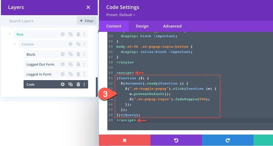
Under the ending style tag, paste the following JQuery making sure to wrap the code in the necessary script tags.
(function ($) {
  $(document).ready(function () {
    $(".et-toggle-popup").click(function (e) {
      e.preventDefault();
      $(".et-popup-login").fadeToggle(500);
    });
  });
})(jQuery);
This snippet simply toggles the popup section whenever the user clicks any of the three elements with the class “et-toggle-popup” (the login and logout buttons plus the “x” blurb icon).
That’s it!
Don’t forget to save the changes you made on the template in the Theme Builder. Once saved, you can view the results on a live page.
Final Result
Here are the final results on desktop, tablet, and phone.
Notice how the login button and logout button change. And, once the user logs in, the user remains on the current page. Plus, the popup login form shows different “warning” content whenever the user attempts to log out.
Final Thoughts
Hopefully, building this popup login form and the custom login/logout buttons will give you some insight on how to use Divi’s login form in creative ways. Feel free to adjust the design and content of each login form (or buttons) to create a unique login experience on your own website.
I look forward to hearing from you in the comments.
Cheers!



The anchor links in the Customizer header jump exactly to the right place on my website. As soon as I activate my own global header with the same menu in the Divi Builder, the routes of the anchor links are far too short. How can that be? Greetings Dietmar 😀
Looks like a bug, please reach out to the Support Team by creating a conversation on our website so they can help you further on troubleshooting the anchor link issue.
I know this is a bit old this post. Everything works, except the logout when we click the clogout button the the user is redirected again to the default “you are attempting to log out of ….” Do you really want to log out? Is there a way to redirect to the home page?
Hi, the article is very interesting, I managed to configure everything correctly but the result can only be seen on PC, on tablets and smartphones nothing can be seen, what could it depend on? Regards.
I can understand people needing a Login/Logout, However I have no clue what this has to do with with a Fundraising Campaign? Or why that is even included in a Popup Login Form with Login/Logout Buttons? Fundraising Campaign should be a separate tutorial. I suspect the Fundraising Campaign requirement has made most Divi users shy away from this page.
It’s obvious that Jason Champagne has abandon his own post, perhaps he just don’t know the answers to the last dozen questions?
Great pop up to login / logout.
One thing: If I change any page, the form is always on top of the other sections and rows when I work in Divi builder (front builder).
Is there a workaround for that?
Thnx
Have the same problem :/ Is their any solution?
Some users are saying the form “times out” and they are unable to fully type in their credentials. Any suggestions on where to start troubleshooting?
Great tutorial! How do you remove the “Logged in as {username}” from the Log Out button?
This works fantastically, and makes my site so much cooler! Thanks for sharing this at exactly the point in time I was trying to design login/out!
What would need to change so that on login, the visitor stays on the current page, but on log out, gets redirected to a specific page, i.e., the home page? On my site now, when a member logs off from a profile or account page, they end up seeing garbled content.
Never mind! Figured it out! Forgot about the ‘Redirect to current page’ setting in the module.
Still, thanks for the timely post.
Hello!!
Thanks to this post I have managed to have a spectacular login on my website, so I can only thank you and for the large amount of resources and information.
All the best!
I bought the annual plan to access Divi. The resources provided by Divi is very overwhelming but at the same time, it is very user-friendly. Even a person with little experience in WordPress development services can use Divi theme builder easily.
Thanks for sharing this article. This article really helps me to create a pop form on my divi theme website.
Glad to hear it!
Hello… Thank you very much for this video, it’s what I was searching !!
My problem is : I try to make a third button “registration”. But it’s a mess in my code 😭 !
Have you any advice? I tried to put the third form in the popup but I don’t know if it’s a good idea. I have to manage the display of the button, of the form …🥵 !
I put the link of my website, the login device is in the third (last) part.
Any help or advice would be awesome !
THHHXXX
Such useful content! I love when people like you make learning easier for other people. As a service provider, building this popup login form really going to help me a lot.
Thanks, Kelvin. Glad to help!
Will this work with woo commerce?
Amarnath,
I looked into this briefly. You could try using the
[woocommerce_my_account]shortcode inside a text module and put that inside the popup section. This would display the login form when logged out and the account page content when logged in. However, you may need to customize the code to handle errors when filling out the form. It will redirect to the account page and have duplicate page content (one in the popup section and one on the page).I tried importing the JSON file (divi-popup-login-form-header-template) on two of my websites, and it refuses to import on either. I get an error (orange X) each time.
Kim,
Sorry about that. I’m unable to duplicate this error on my end. Maybe our support team can help.
Very cool!
I can see us using this over and over.
Thanks
Thanks, Clare! Glad it was helpful.