Text marquees provide a scrolling area of text to your website that engage readers with useful snippets of content.They are also called tickers (or news tickers) and are often used to show a steady stream of news updates at the top or bottom of a page. Usually the scrolling animation is done with a single line of content in a loop so that the information is displayed repeatedly. Unfortunately, the html <marquee> tag is obsolete so we are counting on CSS and JavaScript to create marquees these days. However, with Divi, you can create a simple marquee without having to worry about custom code.
In this tutorial, we will walk you through how easy it is to create a simple text marquee with Divi. We will even cover how to pause the scrolling text animation on hover and how to add a large text marquee as a unique design element for your headers.
Let’s get started.
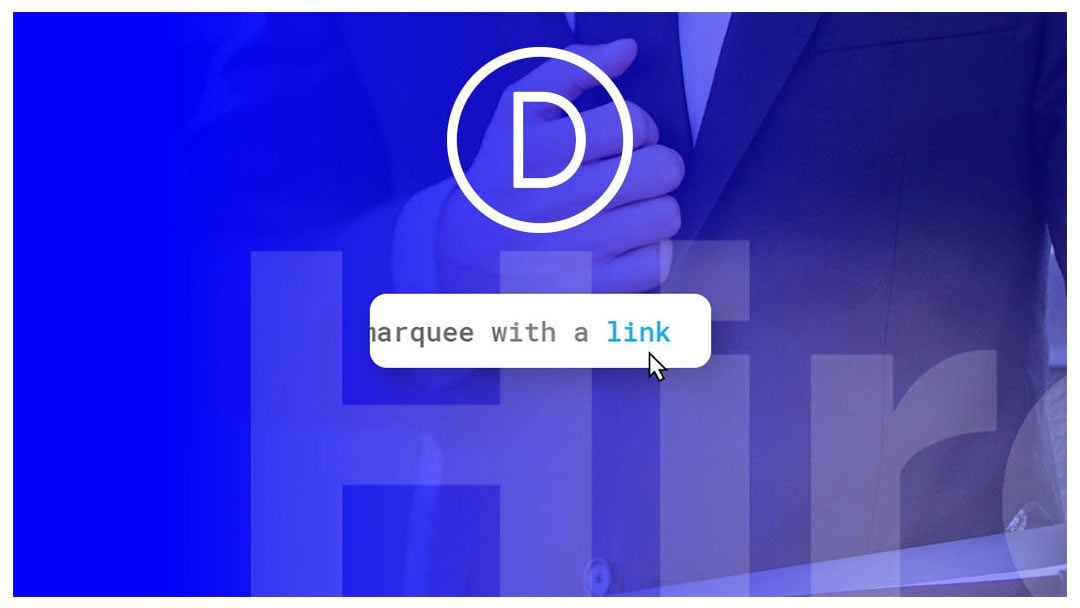
Sneak Peek


Download the Layout for FREE
To lay your hands on the designs from this tutorial, you will first need to download it using the button below. To gain access to the download you will need to subscribe to our newsletter by using the form below. As a new subscriber, you will receive even more Divi goodness and a free Divi Layout pack every Monday! If you’re already on the list, simply enter your email address below and click download. You will not be “resubscribed” or receive extra emails.
Subscribe To Our Youtube Channel
To import the layout to your page, simply extract the zip file and drag the json file into the Divi Builder.
Let’s get to the tutorial shall we?
What You Need to Get Started
To get started, you will need to have the following:
- The Divi Theme installed and active
- A new page created to build from scratch on the front end (visual builder)
After that, you will have a blank canvas to start designing in Divi.
Part 1: Creating a Simple Text Marquee in Divi

For this first example, we are going to create a simple text marquee for a line of text. To do this, we’ll give a row a max width with the overflow hidden. Then we will add a looping slide animation to a text module containing the line of text so that it slides across the row repeatedly coming into view like a marquee.
Here’s how to do it.
First, create a regular section with a one column row.
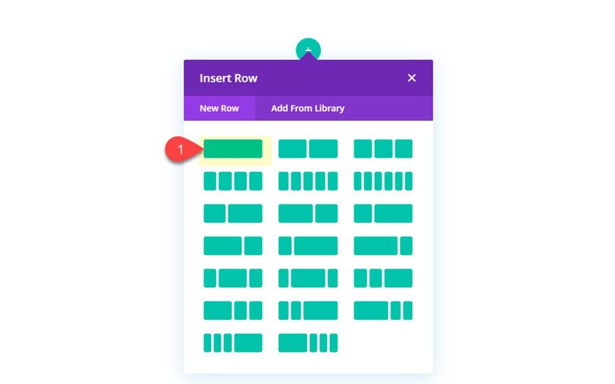
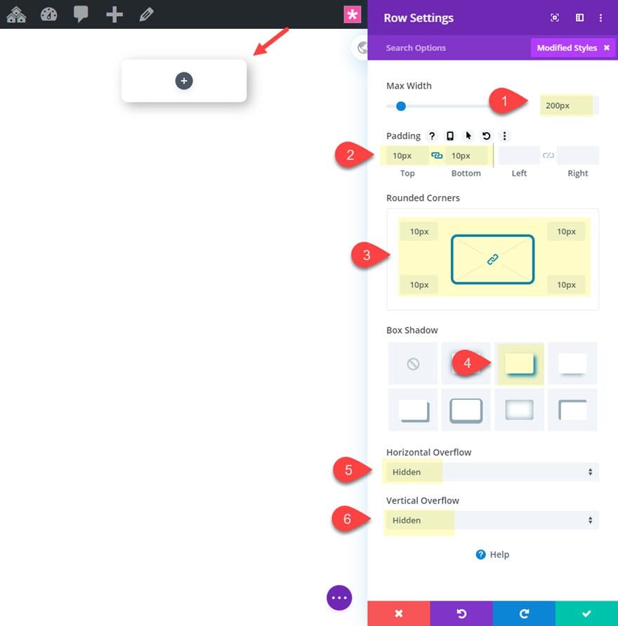
Then, before adding a module, update the row with a fixed width, a box shadow and a border radius as follows:
- Max Width: 200px
- Padding: 10px top, 10px bottom
- Round Corners: 10px
- Box Shadow: see screenshot
- Horizontal Overflow: Hidden
- Vertical Overflow: Hidden
Add the Text Module
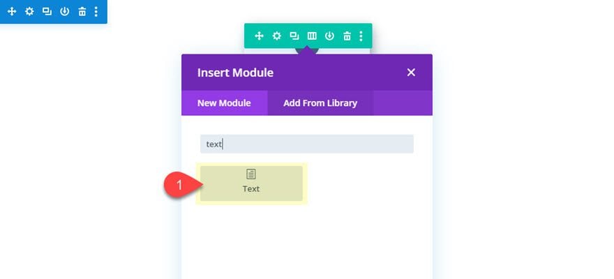
Once the row is finished, add a new text module to the row.
Then update the body content with a single line of text. For now make sure the line of text doesn’t break into another line.
- Body: “This is a sentence”
Text Module Design
Update the text module design settings as follows:
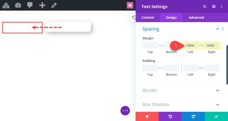
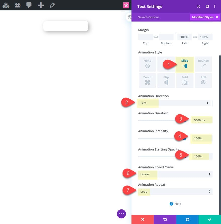
- Margin: -100% left, 100% right
This positions the text module outside the left of the row. Because the row has overflow visibility hidden, the module will be hidden until we add animation to bring it into view.
- Animation Style: Slide
- Animation Direction: Right
- Animation Duration: 5000ms
- Animation Intensity: 100%
- Animation Starting Opacity: 100%
- Animation Speed Curve: Linear
- Animation Repeat: Loop
Result
Now let’s check out the result.

Creating Longer Lines of Text
In the simple text marquee design above, we have limited the width of the line of text to the same width of the row. However, if we want to create a longer line of text with the same row width, we will need to modify the settings a bit.
First, on the text module and replace the body text with the following:
<p>This is a sentence in a marquee with a <a href="#">link</a></p>
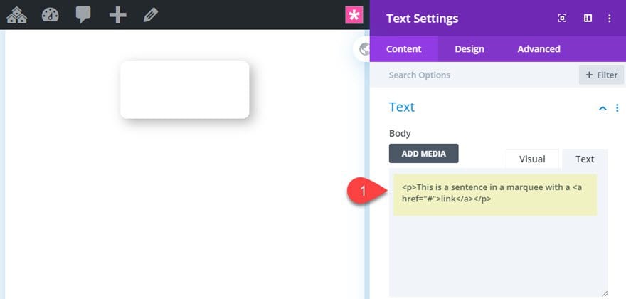
Add More Width and Margin to Accommodate for the Longer Line of Text
As you may notice, the text is now breaking into three lines instead of one.

Therefore, we need to adjust the margin and animation intensity.
- Width: 207%
- Margin: -207% left, 207% right
- Animation Intensity: 75%
The trick here is to increase the width and update the margin values so that you provide just enough room for the single line of text. Then adjust the animation intensity so that there isn’t a big break in between the looping animation.
Result
Here is the final result.

Pausing the Marquee Text Animation on Hover
Since this marquee includes a link, it will be difficult for users to actually click the link while it is moving. However, we can add a small snippet of css to the text module that will pause the animation on hover.
Add a CSS Snippet to Pause the Animation on Hover
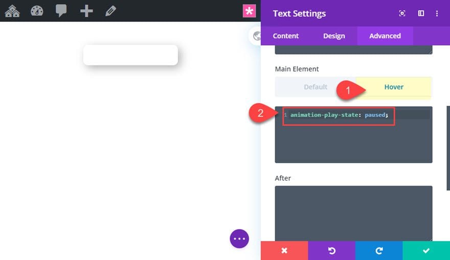
To add the css snippet, open the text module settings and add the following custom CSS to the main element under the hover tab:
animation-play-state: paused;
Final Result
Now check out the final result. Notice how the text animation will pause when the cursor hovers over the text, allowing the user to click the link.

Part 2: Creating a Text Marquee as a Responsive Design Element in Divi

Now that we understand how to create a simple text marquee in Divi, we can take the same concept to create a responsive text marquee design element. This would work well to create unique animation designs for headers or section headings.
To do this we are going to use Divi’s Job Recruiter Home Page premade layout.
Add the Premade Layout
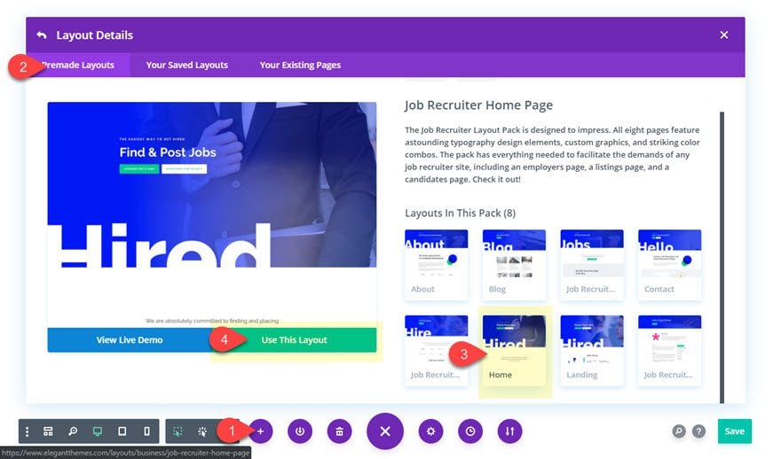
To add the layout to your page, open the settings menu at the bottom of the Divi builder and click the plus symbol. From the load from library popup, select the job recruiter layout pack. Then click to use the home page layout.
Delete Extra Content with the Layout
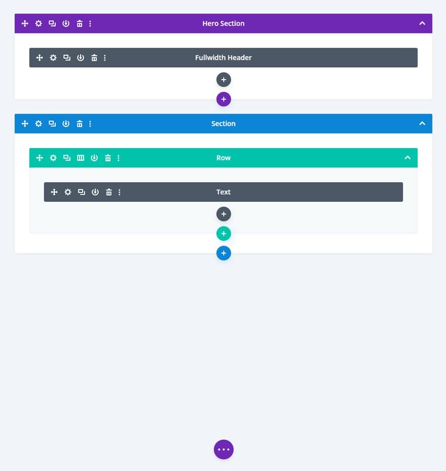
Once the layout has been loaded to the page, deploy the wireframe view mode and delete all the content of the layout except for the fullwidth header and the section directly below it.
Creating the Text Marquee Animation
As you can see, the word “hired” is already be used as a large text design element in a text module in the second section. We are going to turn that text module into a responsive text marquee design element. The key to make the text marquee responsive is to make sure the row and text module span the full width of the browser window. We can do this using a width of 100%. Then we can use the vw length unit for the text size. This will make the text scale nicely with the browser widths. After that we will apply the same principles that we used to make our simple text marquee example earlier.
Here’s how to do it.
Update the Row Settings
As mentioned before, the row needs to be 100% for this responsive text marquee design to work. This allows our text module to use vw length units which are relative to the width of the browser. Since our premade layout already has a row with 100% width, we don’t have to do anything.
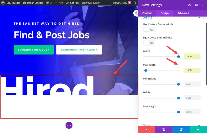
However, we do need to adjust the rest of the settings as follows.
- Margin: -24vw bottom
- Transform Translate Y axis: -24vw
- Horizontal Overflow: Hidden
- Vertical Overflow: Hidden
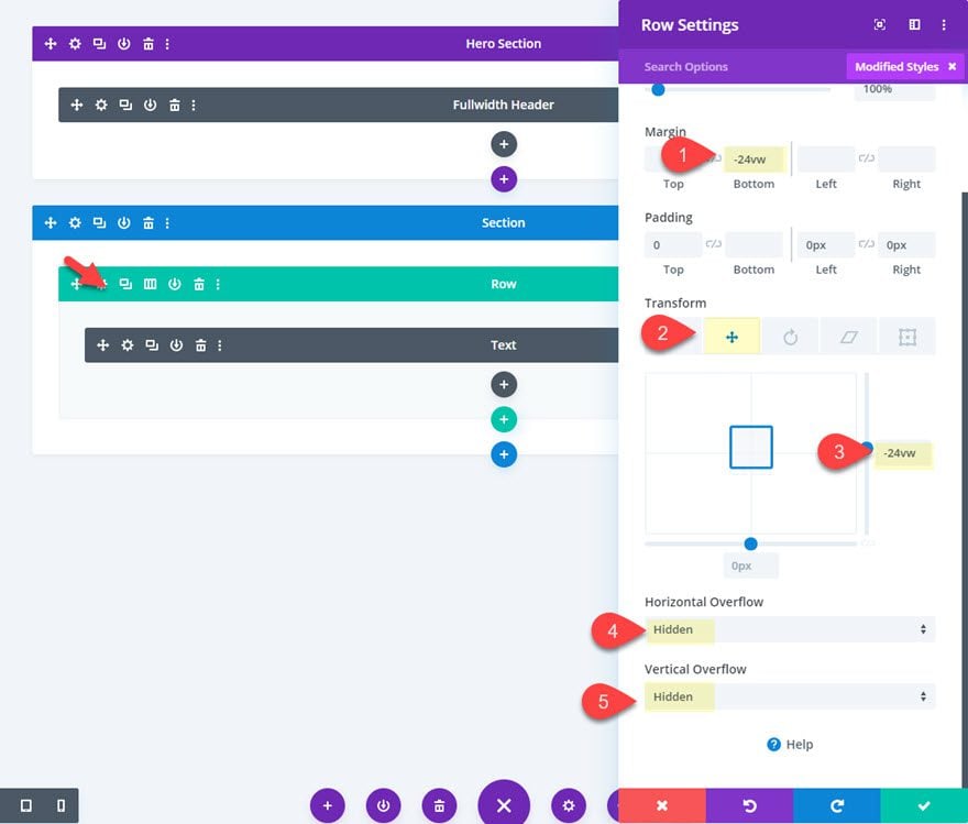
The negative bottom margin is to get rid of the negative space left over whenever we move the row up using transform translate. And we need to hide the overflow of the row for our text marquee effect.
Update Text Module Text Design
Now all you need to do us update the text module to convert it into a large text marquee design element.
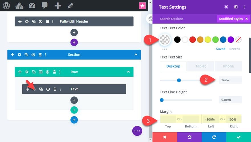
Open the text module and update the following:
- Text Text Color: rgba(255,255,255,0.16)
- Text Text Size: 36vw
- Margin: -100% left, 100% right
The text size is using a vw length unit so the text will scale nicely with the width of the browser.
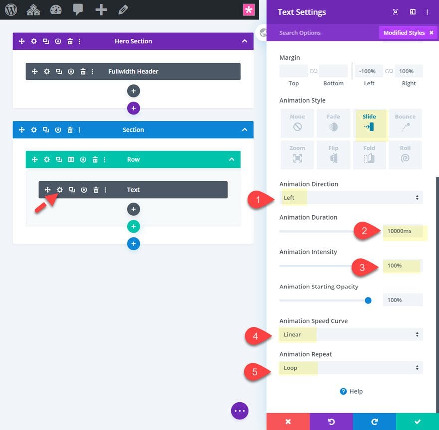
Add Animation to the Text Module
- Animation Style: Slide
- Animation Direction: Left
- Animation Duration: 10000ms
- Animation Intensity: 100%
- Animation Speed Curve: Linear
- Animation Repeat: Loop
Final Design
Now check out the final design.

Final Thoughts
Text marquees can be a convenient tool to have in web design. They aren’t limited to function strictly as news tickers either. They can also add a nice animation element to your web design. And the best part is that Divi makes it easy to create and design them in all kinds of beautiful ways. I hope this tutorial will help you create some simple text marquees whenever the time comes that you need one.
I look forward to hearing from you in the comments.
Cheers!



There is a small typo in the text of your first example: “Animation Direction: Right” should be “Animation Direction: Left”
My animation duration won’t go above 2000, no matter what I do. This means the text is just flying by 🙂 Any ideas please?
Nice one thanks for sharing this. It helped me a lot.
This is pretty cool specially the third example, I believe what would made this even better was if you could achieve this with the scroll motion. As you scroll it moves.
Now that would of been the cream on top.
However I like the feel this has on a section.
Hi Jason,
Thank you for this excellent tutotiel!
I did not know that we could do this with DIVI and especially without slider plugin, nor CSS!
And for full-screen or wide-screen images, is it possible to do this infinite scroll?
Looking forward to reading you 😉
Hubert,
Yes! I’m actually thinking about doing a post on that. Technically, this would working with any element in Divi. Thanks.
Thanks you for the idea and making of!
Joost
I shall save this in my future projects file.
Cool!
Damn this is cool. Is this a blog or a tutorial Jason ? I really appreciate the way you taught me how to implement it..
Love it! I am going to implement this in my site now.
Thanks again!
Keep posting Keep sharing with us.
Regards
That’s great to hear! Thanks for the comment, Geet.
The small one is the old-style marquee text, but the bigger one is better. :), thank you for this tutorial.
Glad you liked it, Haji. Thanks.
I was using a plugin to do this but I’m glad I can do it without the extra overhead.
One question. I’d like to use a long sentence for the text but when I do that the text wraps and show on 2 lines. Is there a way to avoid this?
– Thanks
Did you read the section above titled “Creating Longer Lines of Text”? Is that what you are talking about?
Thank you for this very good tutorial
You are most welcome, Bruno.
i miss the HTML Marquee //
That did make things easy didn’t it 🙂
Great stuff Jason! Like it when it is toned down as example 2 does. Have a great weekend!
Thanks. Yeah I really like it as a subtle design element. Hope you have a great weekend as well.
Thanks.
I still don’t understand why I did not think of this simple thing
I tell myself that all the time. haha