This post is part 1 of 5 in our miniseries How to Create an Elegant Wedding Website with Divi. In this series, we’ll guide you through the most important parts of creating a wedding website for yourself or a client with Divi.
Setting up a wedding announcement page is a creative way to let your guests know you’re getting married. By providing them with your website URL, they’ll stay in touch. They’ll also be able to see the wedding details online whenever they want to.
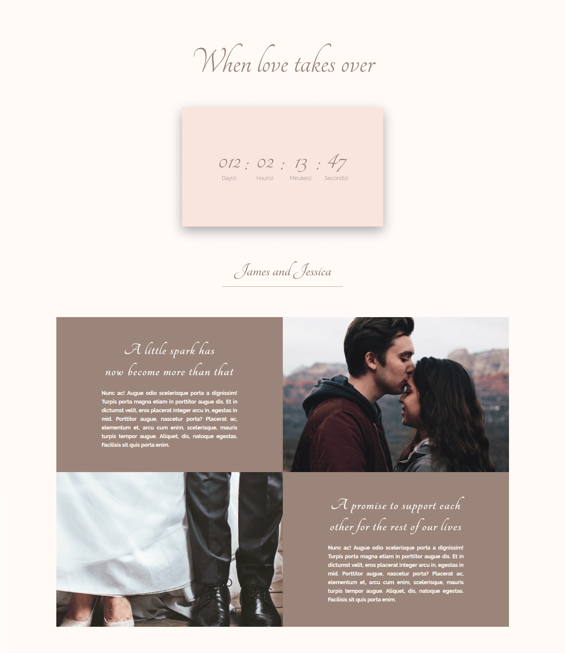
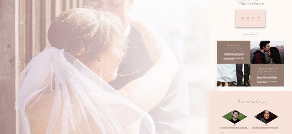
Let’s have a look at the homepage layout that we’re going to help you build step by step:
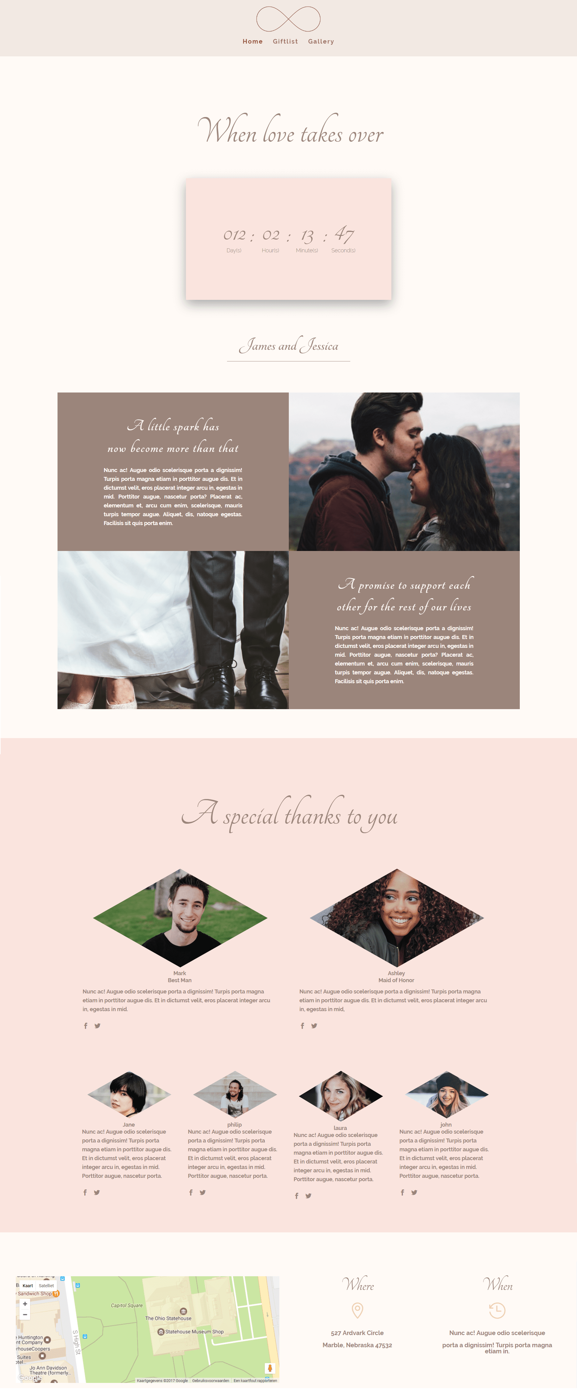
We’ll show you exactly how to create an announcement page, a gallery page and a giftlist page for your wedding website. This first post is dedicated to making the announcement page. But before we go there, we want to make sure guests can find their way through your website smoothly.
That’s why you’ll have to make a proper and elegant navigation menu first.
Start by going to Divi > Theme Options > and upload the logo you’d like to use throughout your whole website.
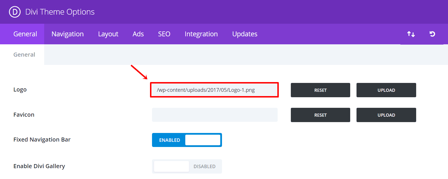
Click Save Changes and move on to the pages of your WordPress website. Add a new page where you’ll be creating the announcement page. Do the same thing for the gallery page and gift list page that we’ll show you how to create in the upcoming posts.
Let’s leave the content empty for now and go to the Theme Customizer of your website to modify the navigation menu. Start by adding the pages of your website to your menu by going to Menus > Add a menu > Add the pages to your menu. This menu should be the primary menu of your website.
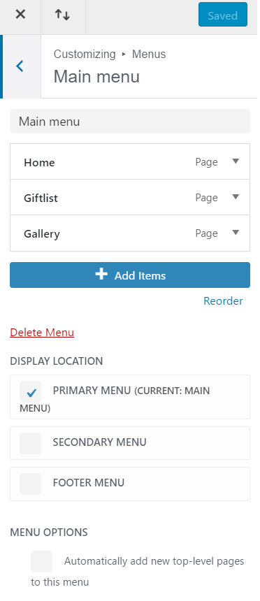
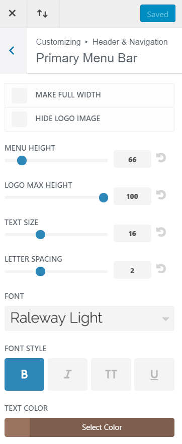
Next, go to Header & Navigation > Primary Menu Bar and make the following changes:
- Menu Height: 66
- Adjust the Logo Max Height depending on the dimensions of the image
- Text Size: 16
- Letter Spacing: 2
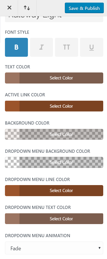
- Font: Raleway Light
- Font style: Bold
- Text color: #9b7461
- Background color: rgba(155,116,97,0.13)
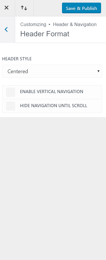
Now, go back to Header & Navigation and change the header style to ‘Centered’ within Header Format.
Save & Publish the changes you made.
Get Started on the Announcement Page
The website has four sections, and each of them contributes its value to the website – making your wedding announcement complete. We’re going to explain each section in detail, and we’ll show you how exactly you can create the same design as the layout shown above.
Hero Section (Including Countdown)
The first part of the design is the header. We decided to make guests feel immediately interacted with the website and the wedding by putting a Countdown Module in it. Inside the Divi builder, the header section looks like this:
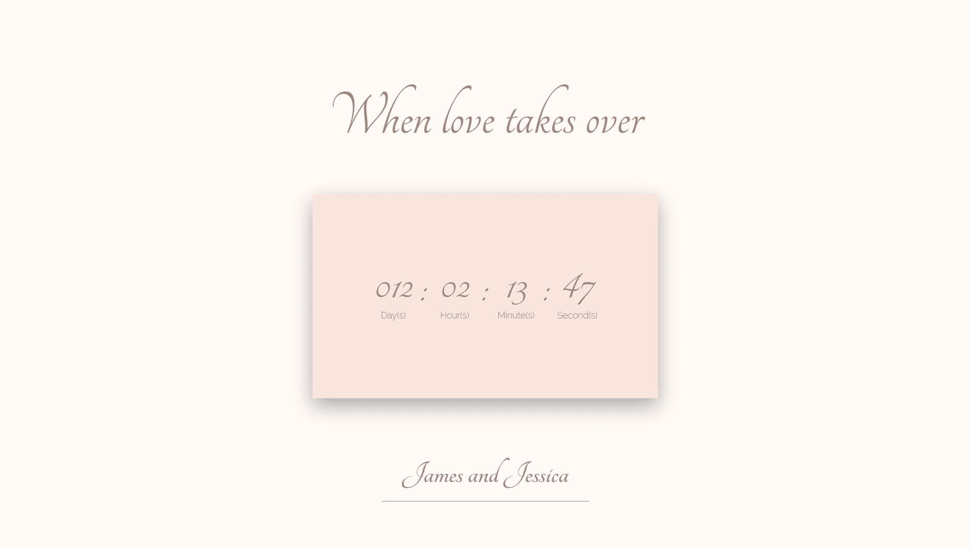
We’re going to use a standard section with a full one row in fullwidth modus in this part of the website. In the row section, you’ll have to add three modules; two Text Modules and one Countdown Module. The Countdown Module is located in the middle of both text modules.
Get Started With the First Text Module
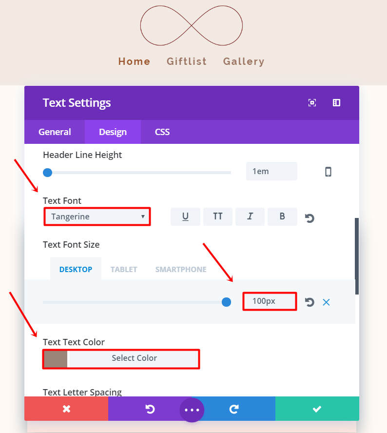
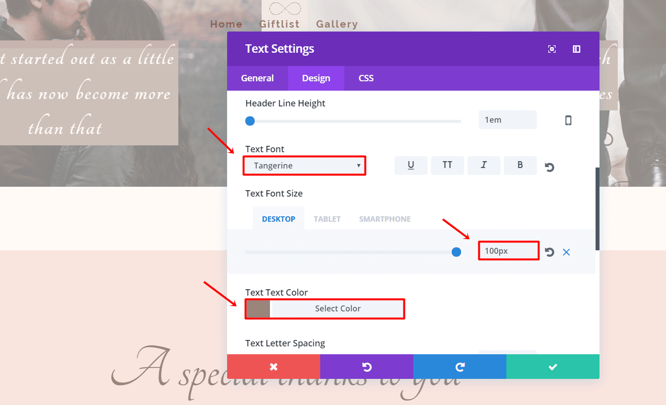
Start by adding a Text Module to the row. Write the text you want to use, change the Text Orientation to ‘Center’ and apply the following changes to the Advanced Design Settings tab:
- Text Font Size: 100px (desktop), 80px (tablet), 66px (phone)
- Text Font: Tangerine
- Text Color: #9b857b
In the same tab, scroll down and change the margins of your Text Module by adding ‘10%’ to the top and ‘5%’ to the bottom.
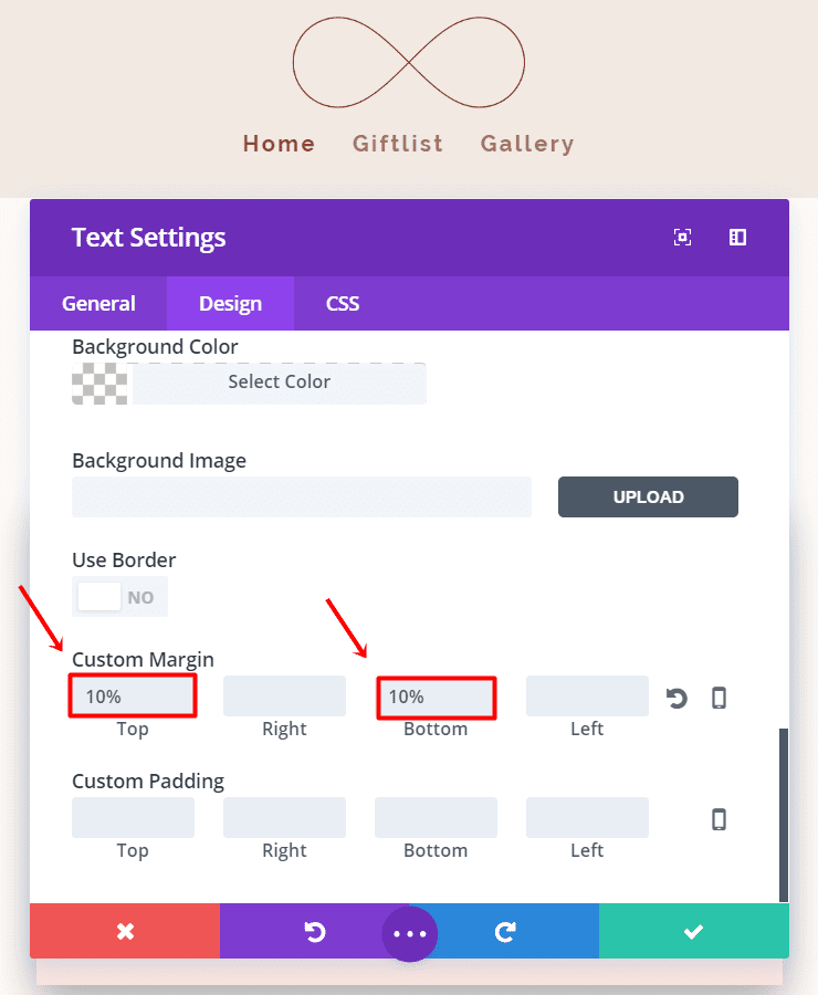
Click on Save & Exit.
Counting Module (Desktop)
Add a Countdown Module below the Text Module you just created. In the General Settings tab, add the date and time of the wedding and change the background color to ‘#fae4de’. We’ll use this countdown on desktops only, go ahead and disable it for tablets and phones.
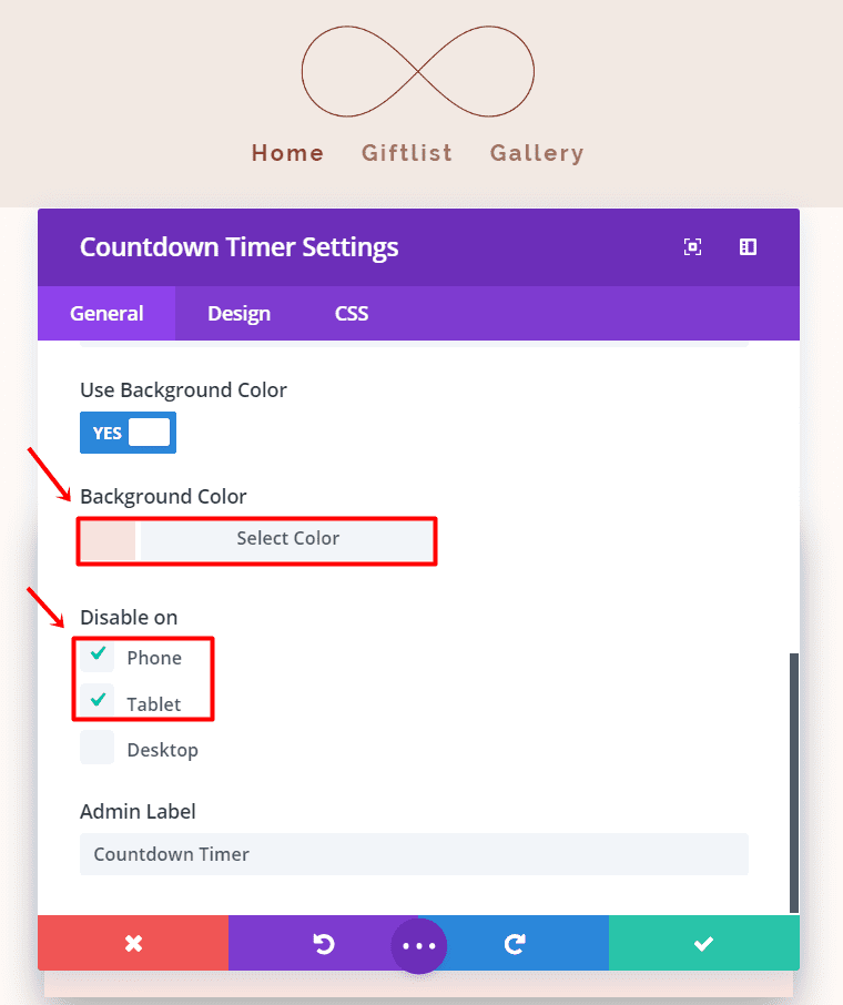
Move on to the Advanced Design Settings and make the following changes:
- Numbers Font: Tangerine
- Numbers Font Size: 74px
- Numbers Font Color: #9b857b
- Numbers Line Height: 70px
- Label Font: Raleway Light
- Label Font Size: 14px
- Label Text Color: #9b857b
- Label Line Height: 25px
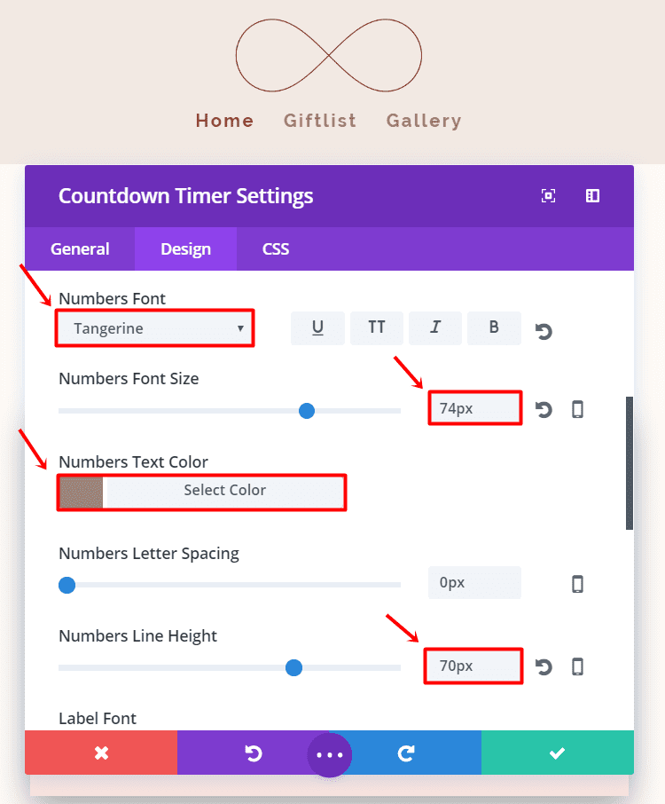
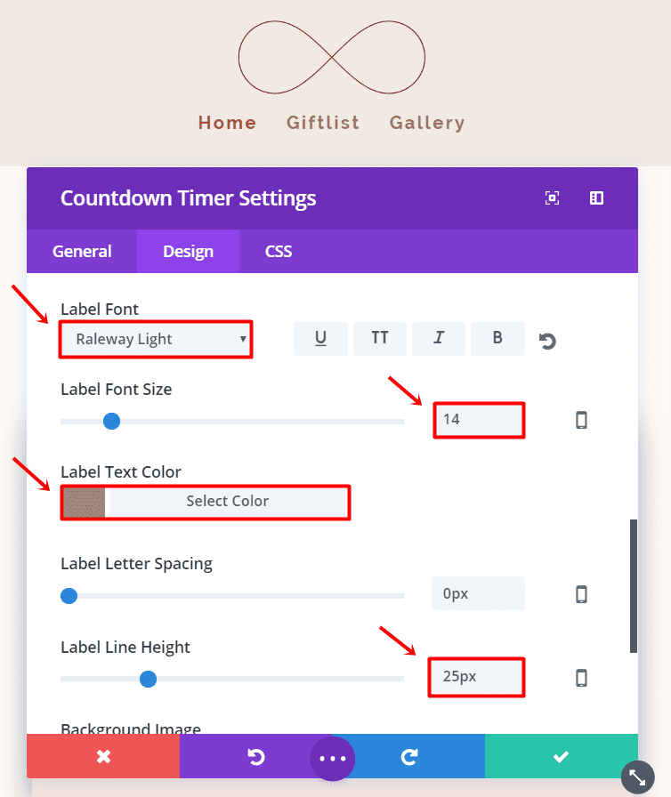
In the same tab, scroll to the bottom and adjust the Top Custom Padding to ‘10%’ and the Bottom Custom Padding to ‘10%’.
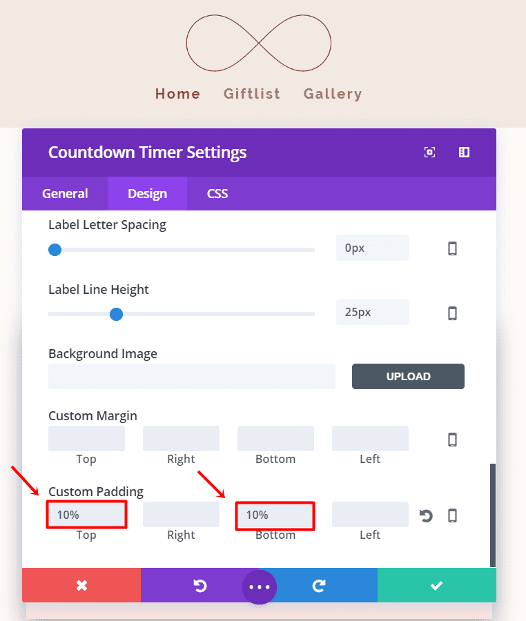
Next, go to the third Custom CSS tab and add the following code to the main element:
max-width: 50%;
margin-left: auto;
margin-right: auto;
box-shadow: 0px 12px 50px #a9a9a9;
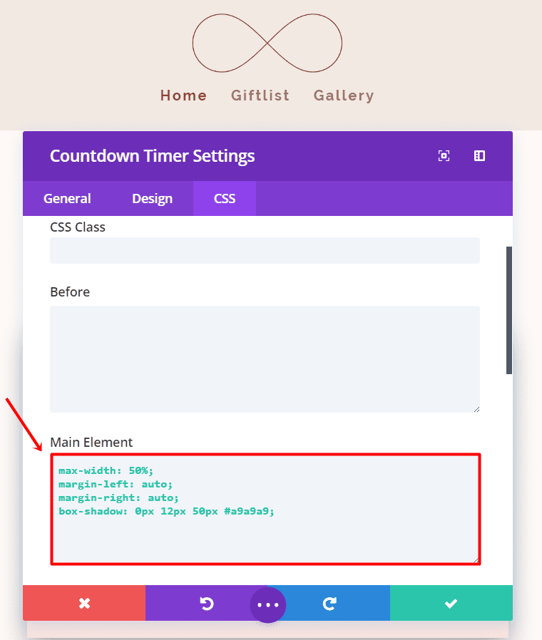
Your countdown will now look exactly like the one in the layout image we’ve shown you above.
Countdown Module (Tablet & Phone)
Now go ahead, clone the previous countdown you made and disable it on desktop (instead of tablet and phone). Next, make the following changes to the module:
- Numbers Font Size: 72px (both tablet and phone)
- Numbers Line Height: 70px
- Label Font Size: 14px (tablet), 12px (phone)
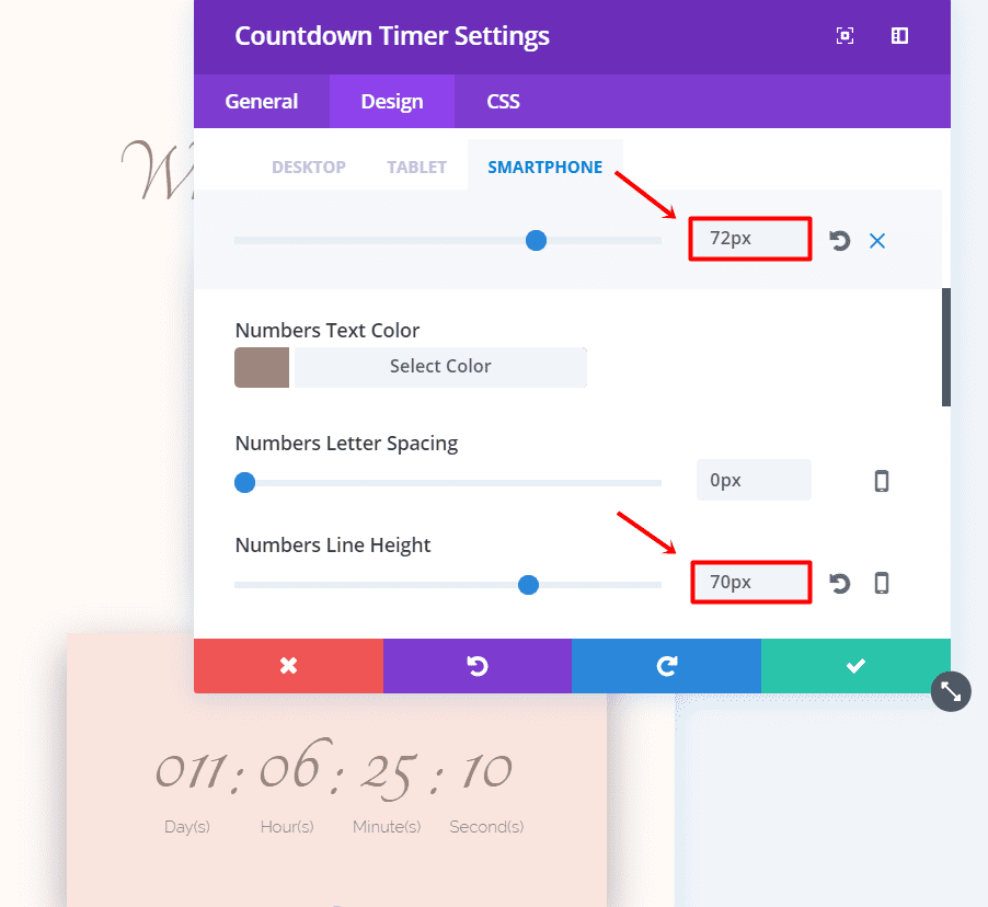
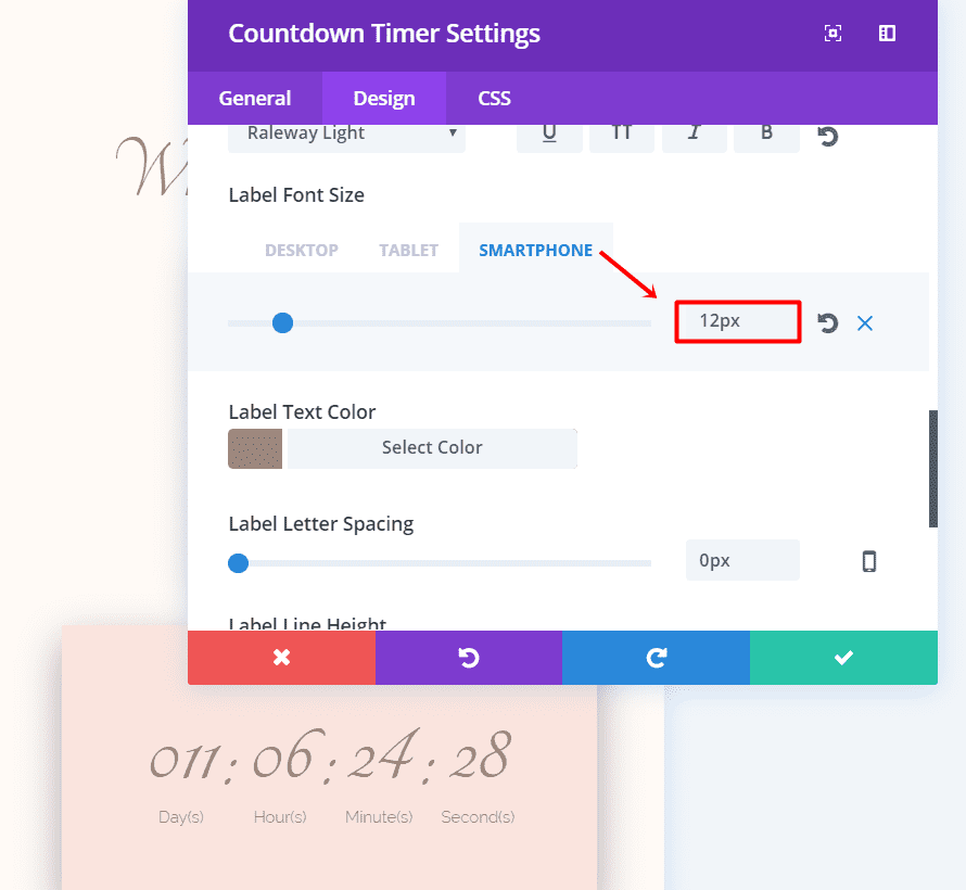
And change the code in the Main Element of the CSS tab into:
margin-left: auto;
margin-right: auto;
box-shadow: 0px 12px 50px #a9a9a9;
Second Text Module
Now, under the Countdown Module, add another Text Module. In the General Settings tab, change the Text Orientation to ‘Center’. Continue by adding the groom and bride’s name and going to the Advanced Design Settings tab.
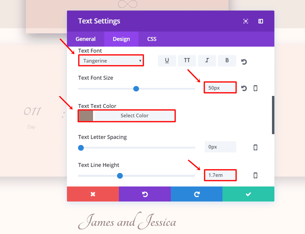
In the Advanced Design Settings, make the following changes:
- Text Font: Tangerine
- Text Font Size: 50px
- Text Color: #9b857b
- Text Line Height: 1.7em
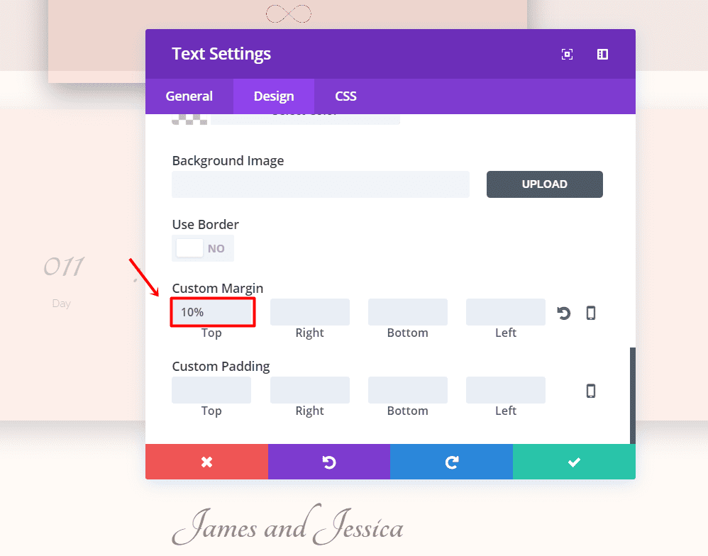
Continue scrolling in the Advanced Design Settings tab to Custom Margin and add ‘10%’ to the top margin.
Divider
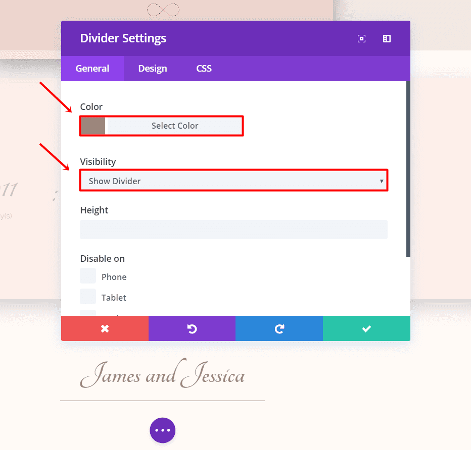
The last part of this hero section is the divider. Add a divider and change the color in the General tab to ‘#9b857b’. Make sure the divider is made ‘visible’ as well.
Next, go to the Design tab and make the Divider Style ‘Solid’, the Divider Position ‘Top’, change the divider weight to ‘1px’ and hide on mobile.
Move on to the CSS tab and add the following code to the main element:
margin-left: auto;
margin-right: auto;
width: 30%;
Click on Save & Exit. You finished the first section of the website, which should look like this:

We can now move on to the second part of this layout where you can begin telling your story to the guests.
Storytelling The Announcement: Second Section
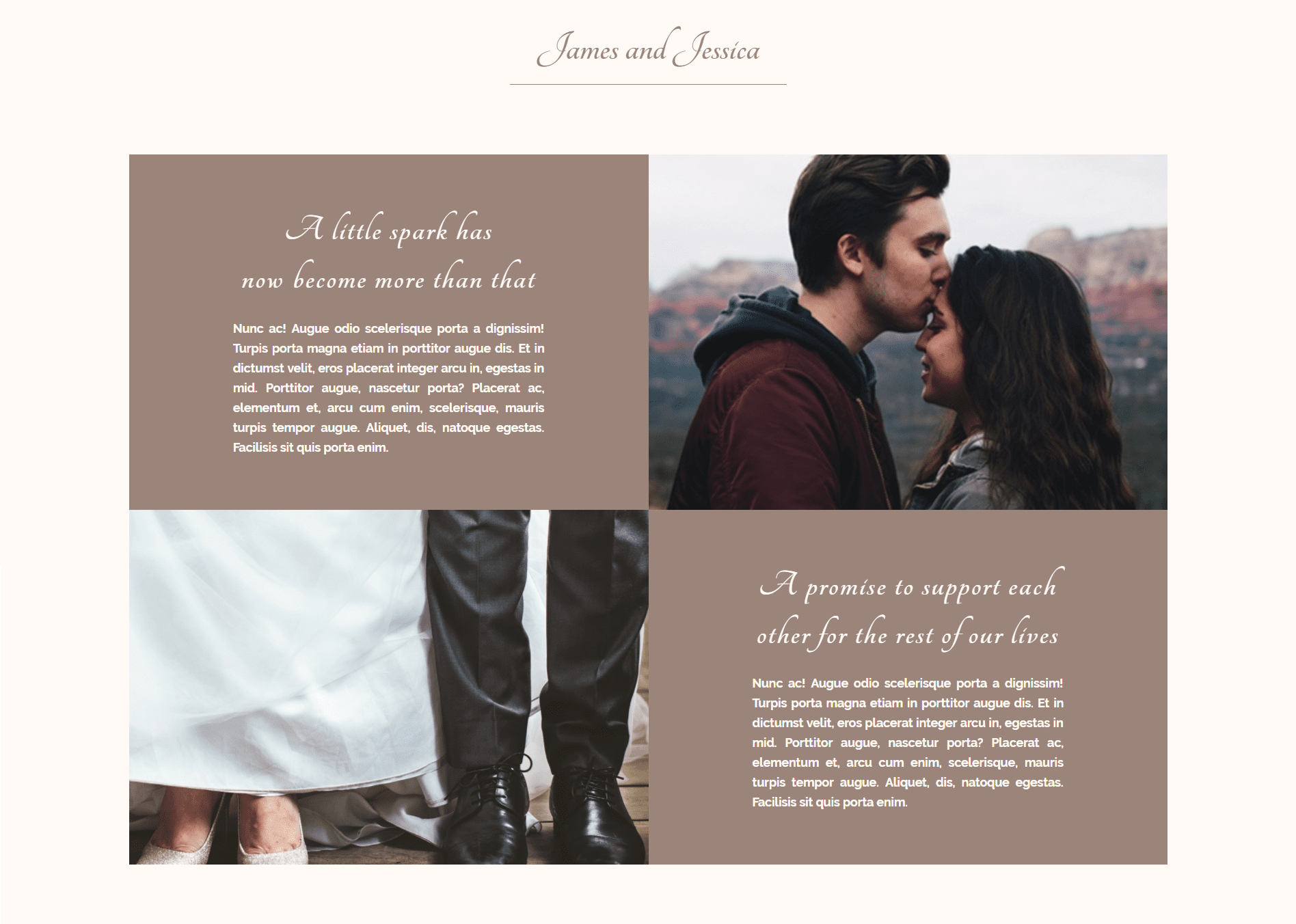
This second section has two symmetric rows that form one part of the wedding homepage. This part has a slightly smaller width that creates a little bit more perspective on your website.
First Row of The Section
Start by making a standard section, change the background color to ‘#fffaf6’ and add ‘5%’ to the Bottom Padding. Next, add a two-column row to this section.
Next, open the row settings. In the General Settings, select ‘YES’ to use custom width, change the unit to percentage and fill in ‘90%’. Scroll down in the same tab, activate Gutter Width and hide for phone & tablet.
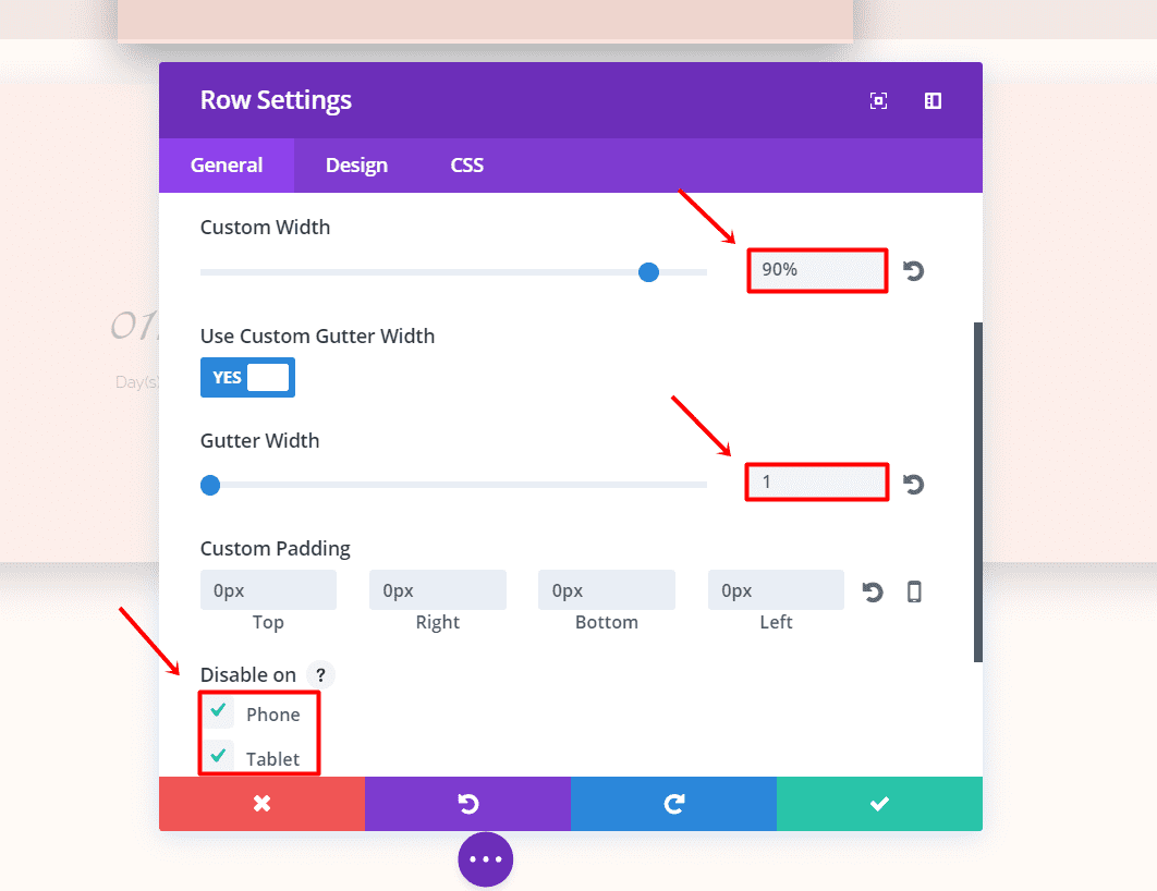
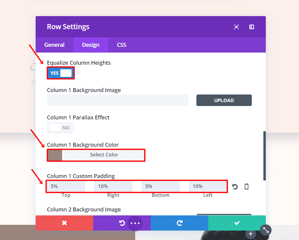
Then, go to the Advanced Design Settings tab, equalize the column heights and add ‘#9b857b’ as the background color of the first column. In that same tab, change the column 1 padding to ‘5%’ top, ‘10%’ right, ‘5%’ bottom and ‘10%’ left.
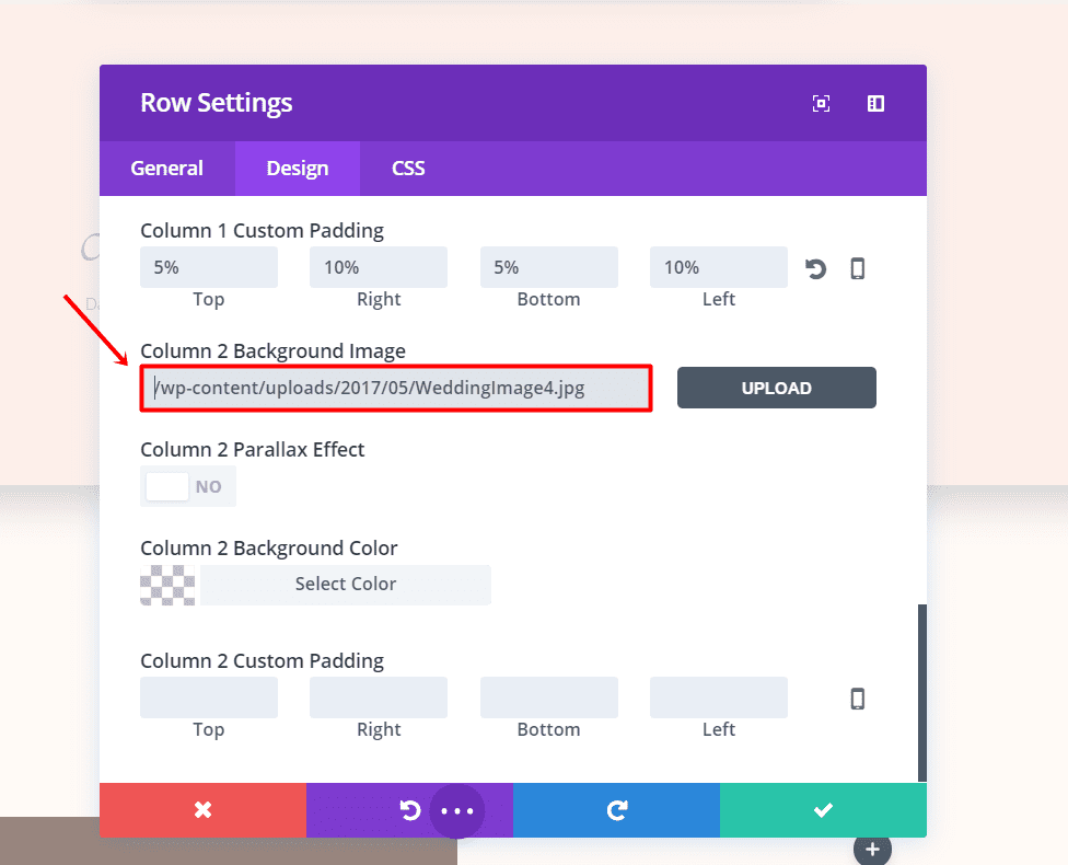
For the second column, we won’t need to set up a background color but upload a background image instead.
Text Module
Now, add a text module in the first column of the row. In the General Settings tab, put the text orientation to ‘Center’ and type the text you want to share in the text box. Then go to the Advanced Design Settings tab.
In the Advanced Design Settings tab, make the following changes:
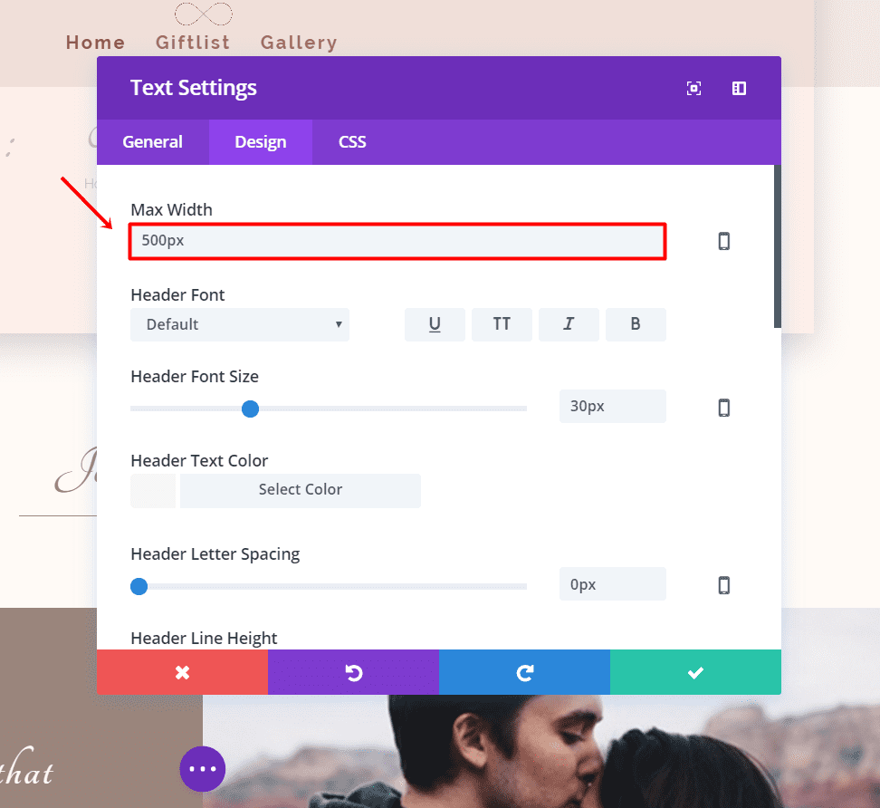
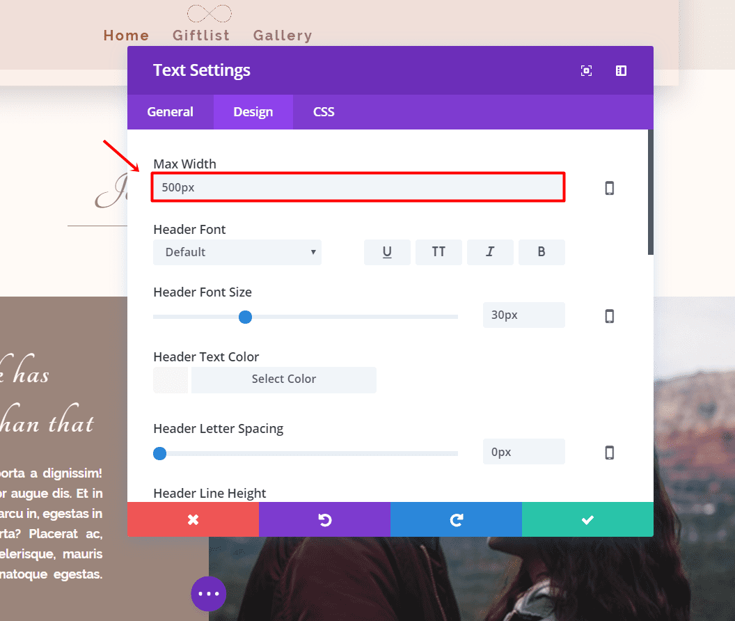
- Max Width: 500px (for desktop only)
- Text Font: Tangerine
- Text Font Size: 44
- Text Color: #fffaf6
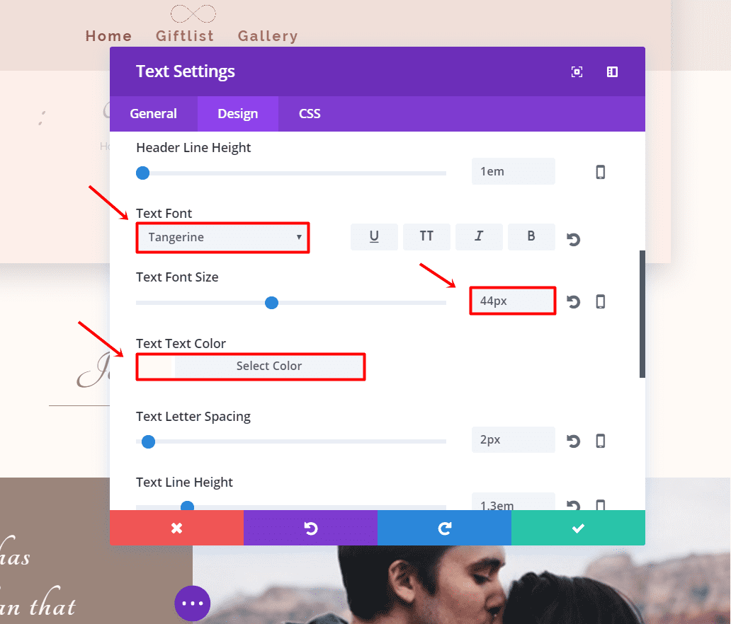
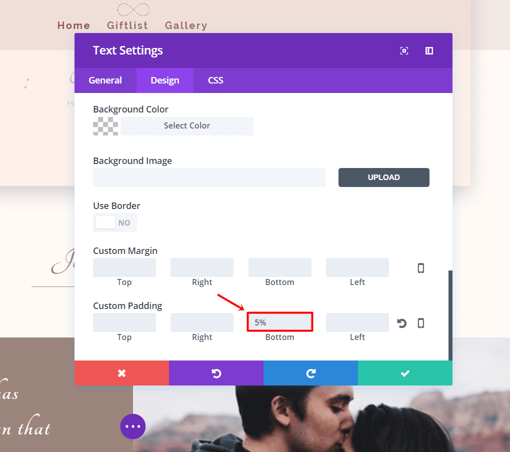
And add 5% to the bottom padding.
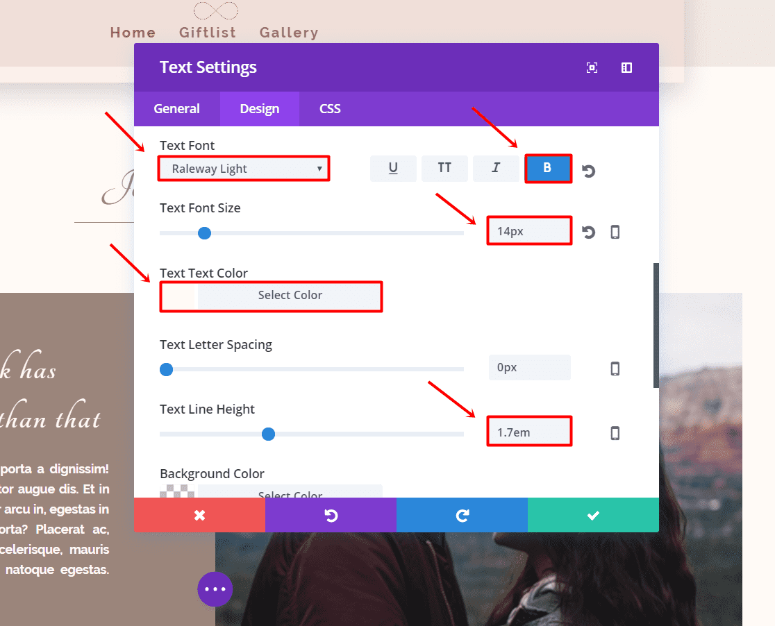
Press Save & Exit and add another Text Module. Make the Text Orientation ‘justified’. Continue by making the following changes to the Text Module in the Design Settings:
- Max Width: 500px
- Text Font Size: 14px
- Text Font: Raleway Light
- Font Style: Bold
- Text Font Color: #fffaf6
- Text Line Height: 1.7em
Press Save and Exit.
Clone The Previous Row
Now, clone the row you just created. The cloned row will automatically be placed beneath the one you just created. But in this case, we need the modules to be on the opposite side. Place the two text modules in the second column instead of the first.
Then, open the row settings and add a background image to the first column. Delete all the padding settings that we’re made in the first column padding and place them in the second column padding.
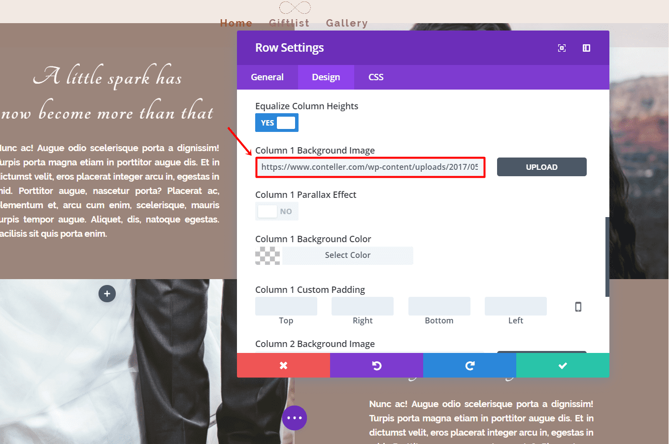
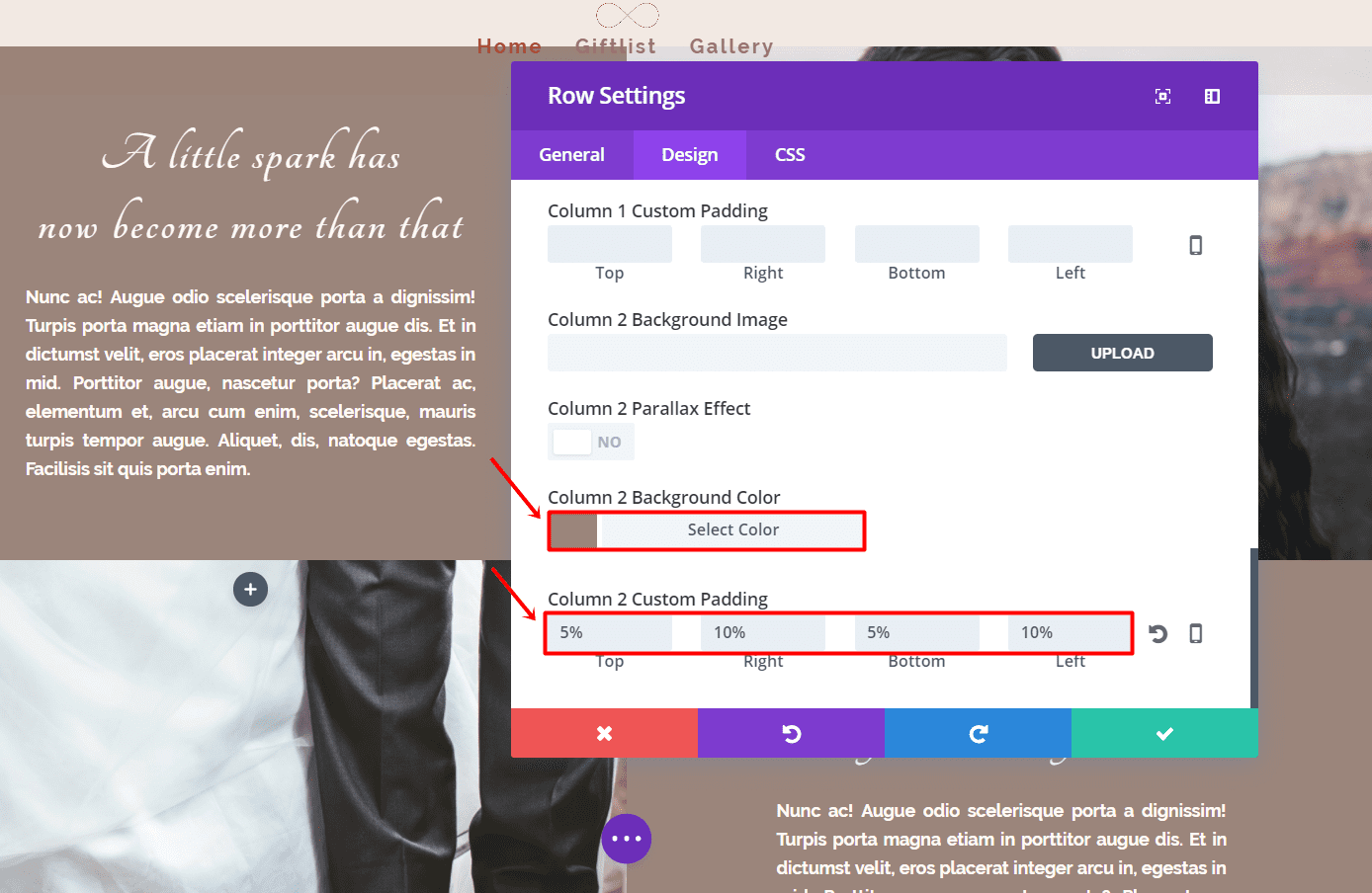
Press Save & Exit and you’re good to go.
Row for Phone & Tablet
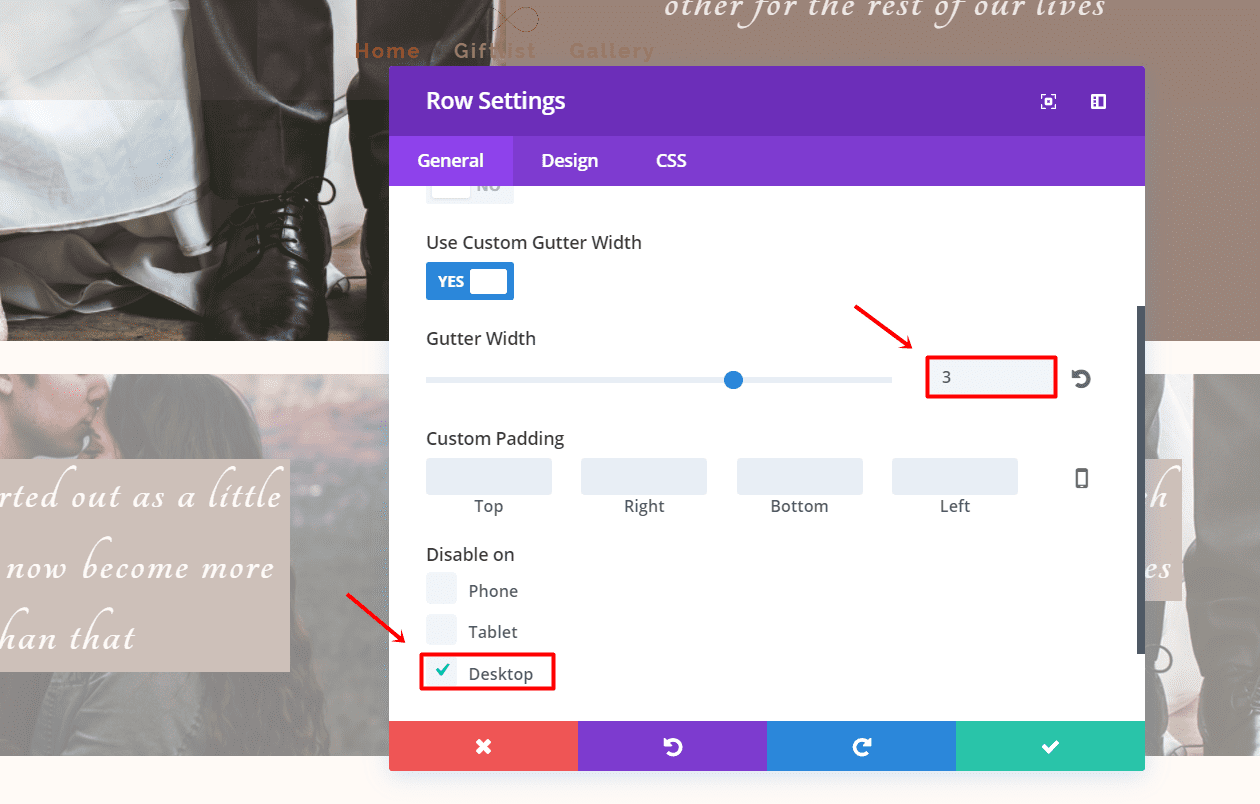
Create another two-column row and hide for desktop. Make the row fullwidth and change the gutter width to ‘3’.
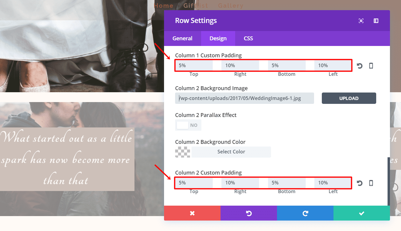
Next, go to the Design tab and upload a background image for both columns and make the following changes to the Custom Padding of both columns:
- Top: 5%
- Right: 10%
- Bottom: 5%
- Left: 10%
After having added this second section, this is how your layout should look like right now:
Best Man, Maid Of Honor, Bridesmen and Groomsmen
Why not put the most important people in your life on your wedding website? Giving away who the best man, maid of honor, bridesmen and groomsmen are going to be, can give that little extra boost to your website.
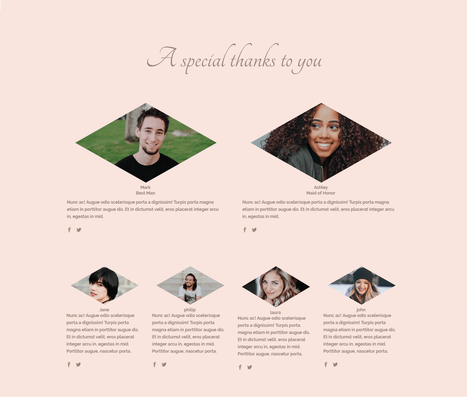
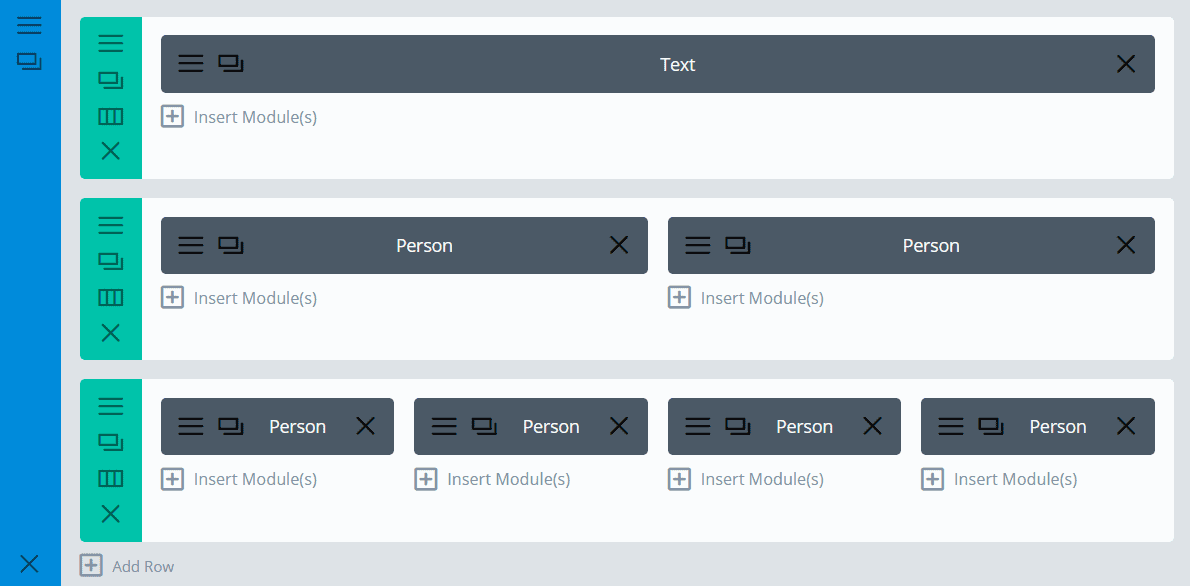
To add this part to your site, start by adding a new standard section to your page. Within that new section, you’ll have to create three rows with different columns and modules.
Now, once you created the section, which is a standard section, give it the following background color: ‘#fae4de’. You won’t have to change anything else in the section’s settings so you can press Save & Exit.
Creating The Text Module
Next, create your first fullwidth row. The only thing you’ll have to put in there is a Text Module. Open the Text Module, fill in the text box and select ‘Center’ in the Text Orientation field.
Then go to Advanced Design Settings, set the Text Font to ‘Tangerine’, Text Font Size to ‘100px’ (desktop & tablet) and ‘68%’ (phone) and the Text Font Color to ‘#9b857b’. Scroll down the same tab and change the margins to ‘10%’ top and ‘5%’ bottom.
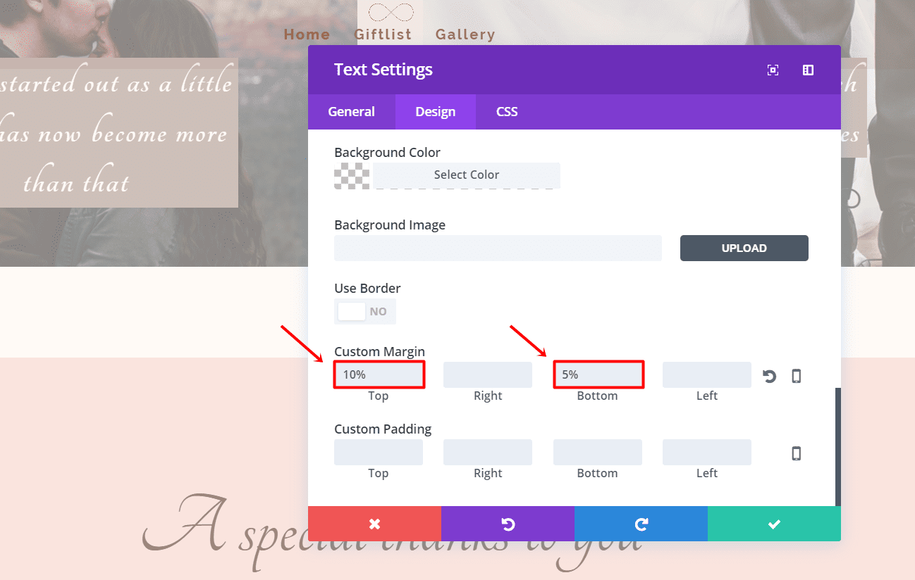
Click on Save & Exit. Your first module and row are now done.
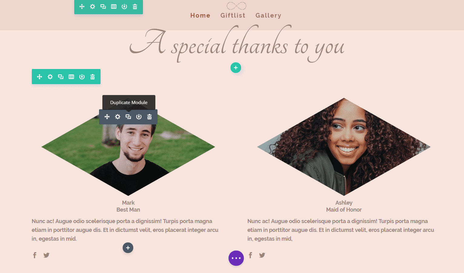
Add another row, in this case with two columns and add 5% to the top and bottom margin. Next, add a person module in the first column of the row.
The Image And Person Module
Moving on, open the settings of the person module. Upload an image, enter the URL of social media channels in the fields and write a little bit about them in the text box. If you’re not sure what dimensions your images should have, take a look at this blog post.
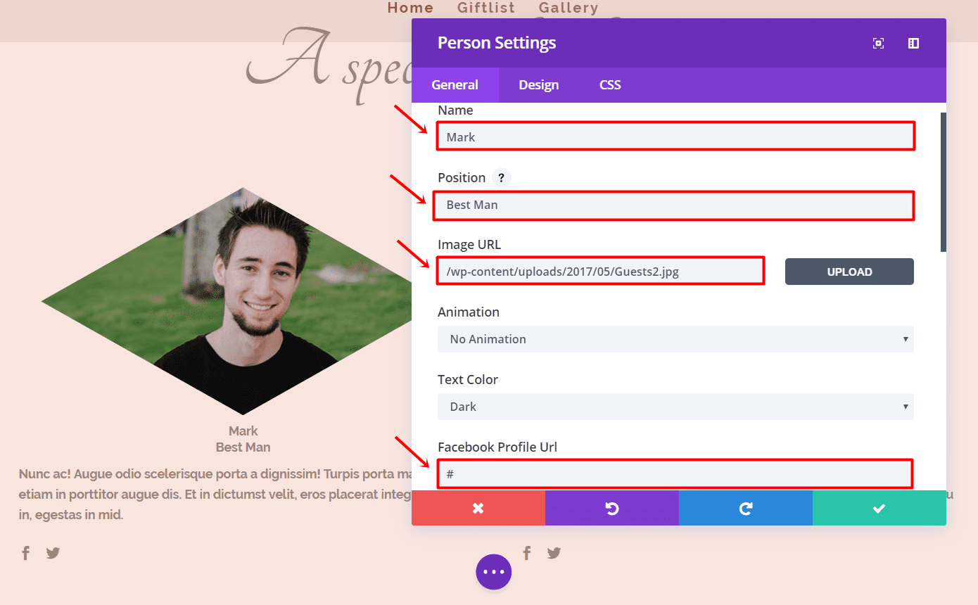
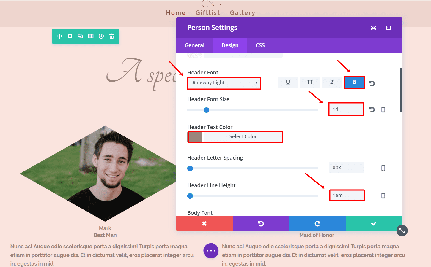
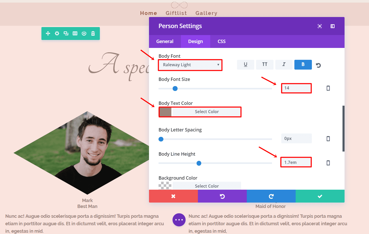
Next, go to the Advanced Design Settings and make the following adjustments:
- Header Font: Raleway Light
- Header Font Style: Bold
- Header Font Size: 14
- Header Text Color: #9b857b
- Header Line Height: 1em
- Body Font: Raleway Light
- Body Font Style: Bold
- Body Font Size: 14
- Body Text Color: #9b857b
- Body Line Height: 1.7em
Open the settings of the person module and go to the CSS tab. Within the Member Image field, add the following code:
-webkit-clip-path: polygon(50% 0%, 100% 50%, 50% 100%, 0% 50%);
clip-path: polygon(50% 0%, 100% 50%, 50% 100%, 0% 50%);
margin-left: 5%;
margin-right: 5%;
Now go ahead and clone both the Image and Person Modules and put them in the right column.
Continue by adding a new row with four columns and clone the Image and Person module again (four times) and put them in each column. The code and settings we used the first time will apply to all of them.
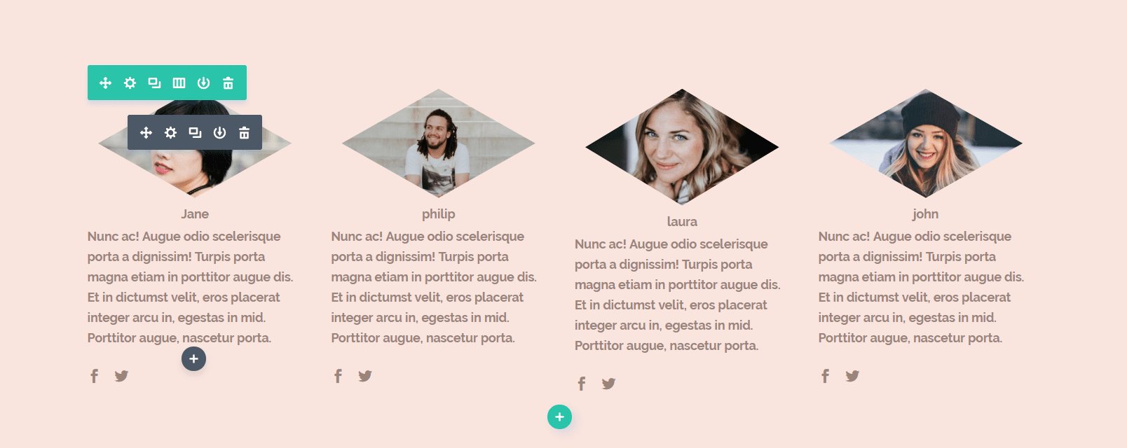
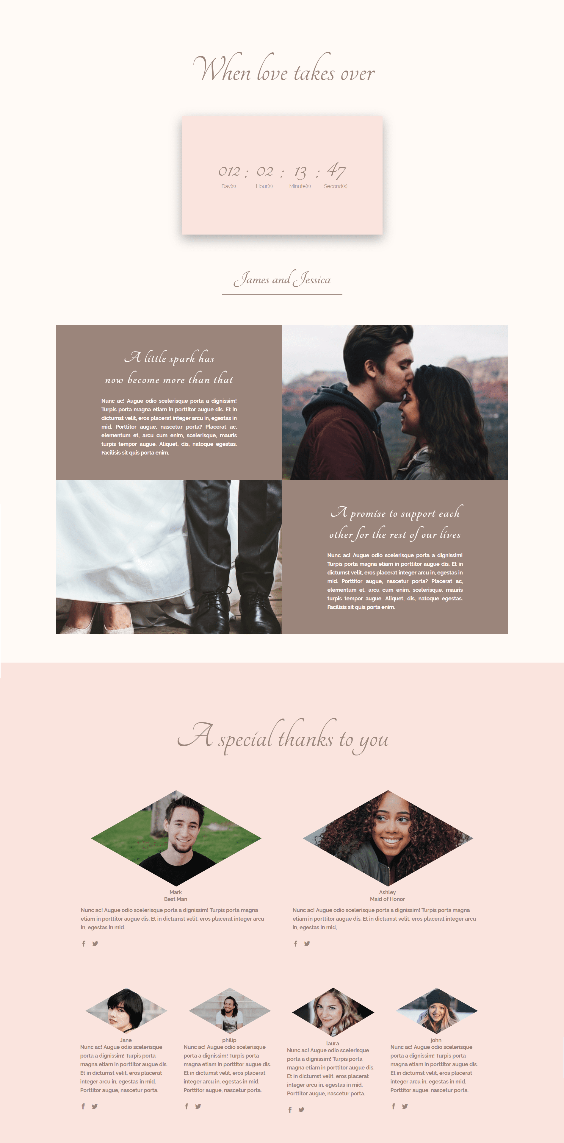
Your layout should look like this by now:
Where and When

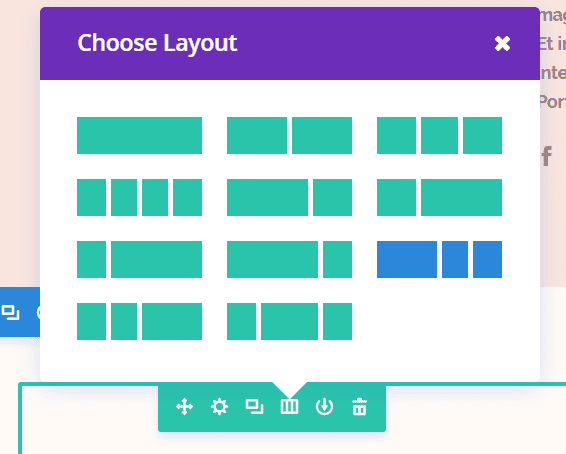
This is the last part of your wedding homepage, where you’ll inform your audience about the place and time of your wedding. For this section, we’ll need a row with 3 columns (1/2, 1/4, 1/4) with the following background color: ‘#fffaf6’.
Adding a Map
In the first column of this section, add a Map module. To be able to use the Map feature, you’ll have to enter a Google API key. If you don’t have an API key, read here how to make one. Enter the address of your wedding and let the module find the location. To create a pin on your map, add a new pin and put the location again, the pin will then show up on the map.
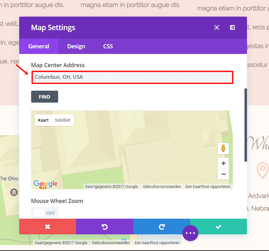
In the other columns, we’ll be making use of text modules and blurbs. Add a text module and set the settings the Text Orientation in the General Settings to ‘Center’. Next, go to the Advanced Design Settings and make the following changes:
- Text Font: Tangerine
- Text Font Size: 50px
- Text Color: #9b857b
- Text Line Height: 1.7em
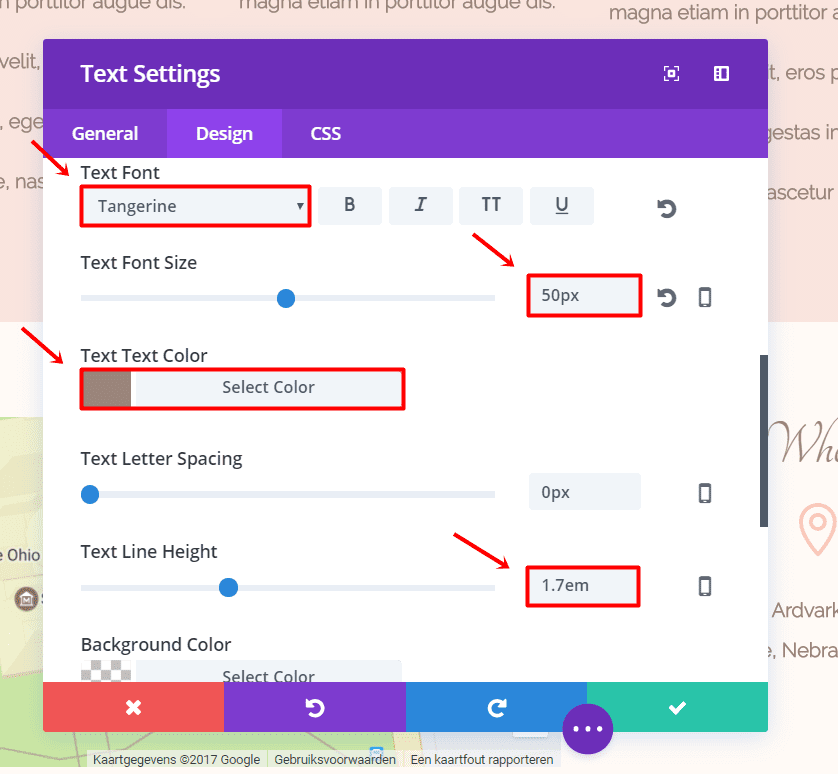
The settings of this text module apply to the text modules in both columns.
Blurb Module
Under the Text Module, add a Blurb Module. Choose the location icon, change its color to ‘#f9c8b8’, add the location in the text box and change the Text Orientation to ‘Center’. Then, go to the Advanced Design Settings and make the following changes:
- Icon Font Size: 42px
- Body Font: Raleway Light
- Font Style: Bold
- Body Font Size: 14
- Body Text Color: #9b857b
- Body Line Height: 1em
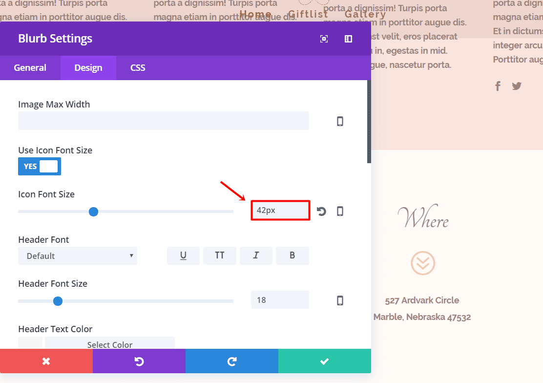
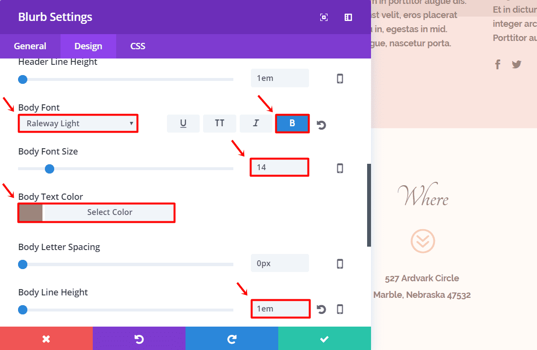
In the next column, do the exact same thing. Only change the blurb icon into a clock and add the ‘when’ details in the text box.
That’s it. Your layout should now look as smooth as the layout in this tutorial:

Next up
In the second part of this miniseries, we’re going to see how you how to create a gallery page dedicated to sharing pictures with your guests after the wedding. If you have any comments on this tutorial, or if you have any requests for future tutorials; make sure you leave a comment in the comment section of this blog post so we can get back at you!
Be sure to subscribe to our email newsletter and YouTube channel so that you never miss a big announcement, useful tip, or Divi freebie!



Hi, I am very interested in this blog, but the images don’t show up. I don’t know if it is just my computer, I have tried on two different browsers.
Thanks
Can I use your images for my demo website to show to my potential clients?
You can simply link them to the article here.
I did not understand you. How can I download & use the images & logo from this artical to my demo website?
Thanks,
Any one can help me on that?
I am having problem with the Person module, How do I align name to center
Hola tengo problema con la parte de las imagenes, las pongo como fondo y al momento de ver pagina no se ven solo con visual biuder se miran cuando cierro visual builder ya no se ve la imagen solo el texto de un lado, alguien me podria ayudar?
Just a little bit problem when i want to setup the countdown timer for desktop. The width look very smaller. But for tablet and smartphone view very nice.
Thank you – great tutorial! I am having an issue with making the 3rd row where you hide from desktop. All settings are correct, however nothing is displayed on a mobile device. If I add a text module it will show some of the background based on how much text I add.
What could I have wrong?
Thank you,
Jason
Hi Jason,
It depends on how your custom padding values are. In this example, we made them 5% for the top and bottom padding. and 10% for the left and right padding. You can make that amount bigger if you want to show more of the background image. Go to the Design tab of your row settings and change the padding in the Spacing subcategory.
Good luck!
My site is in 5 languages. Could you include a tutorial on how to create pages in each language once the original has been created?
fantastic article, Divi plugin is very clever thank you
You’re welcome!
I didn’t understand that Elegantthemes doesnt have any Sport-Theme developged. They never had focus on Sport-Theme the last 10 Years and it seem s to be that they will be the same in the future. So can you please make a sport theme?
Thank you for your suggestion, Ray! We’ll definitely consider it.
Fantastic. I think website is a modern and useful form for wedding. Woocommerce Instead of the wedding list, mailing list Instead of wedding holdings. Alberto
is there a way to give each guest a special qr code to scan and let them open a special personal page for them
Yes, just make the page first then use the url to generate a QR code. There are a number of websites that will generate them for free.
that would be fun…
I know a couple recently who didn’t even hire a photographer. They set up an Instagram account just for their wedding and had all their guests log in and add photos to the account during the wedding. Kinda like a living, online, wedding album.