This post is part 2 of 5 in our miniseries How to Create an Elegant Wedding Website with Divi. In this series, we’ll guide you through the most important parts of creating a wedding website for yourself or a client with Divi.
In the first part of our miniseries, we showed you how to make an elegant wedding announcement page. This second part is going to be dedicated to creating a gallery page within your wedding website. The gallery page is in the same style as the wedding announcement page, which allows you to use both on the same website without having to make a lot of changes.
We’ll show you step by step how to create the following layout with the visual builder of Divi:
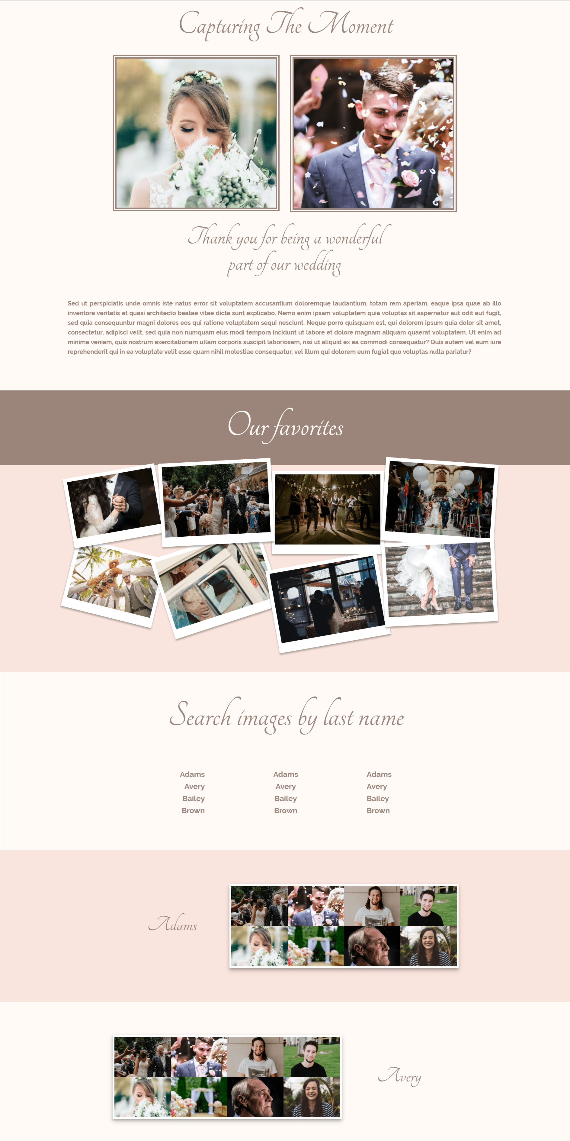
This layout is made of 6 sections that help you create an interactive and beautiful gallery page.
The Hero Section
We decided to go with a very simple header that doesn’t look all too busy. The gallery page will already have a lot of images in it and we want people to focus on that. Having a simple hero section makes it easier for the guests to find the essence of the page without being all too distracted by the visuals in the beginning of the page.
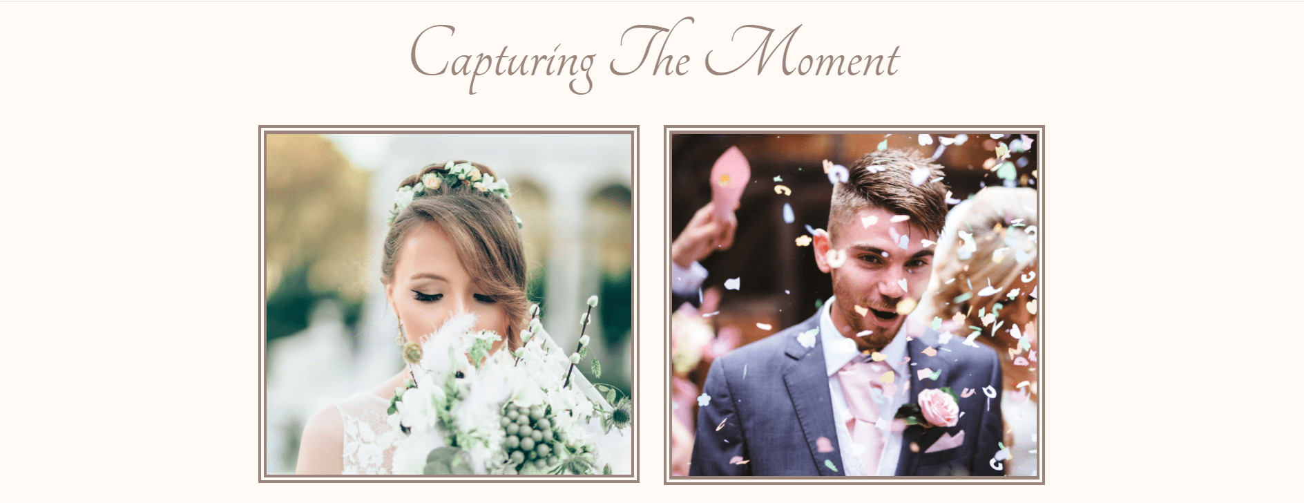
Create a Page
Start by creating a page, using the Divi builder and switch over to Visual Builder.
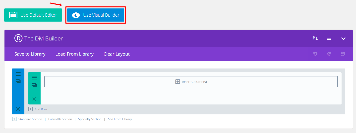
You can see that there’s already one section automatically present within your new page. That section contains a fullwidth row in it. We’ll need a fullwidth row for the first part of this section so continue using it.
Open the settings of the section you just created and open the Background subcategory in the content tab. Then, change the background color to ‘#fffaf6’.
Text Module
Continue by adding a Text Module to the fullwidth column of the row. Enter the text in the text box of the Content tab and move on to the Design tab.
Select the Text subcategory within the Design tab to start editing the design of your content. For the layout we’ve created, we’ll need to make the following adjustments to the Text subcategory of your Text Module:
- Text Orientation: Center
- Text Font: Tangerine
- Text Font Size: 90p (Desktop), 80 (Tablet), 66 (Phone)
- Text Color: #9b857b
- Text Line Height: 1.7em
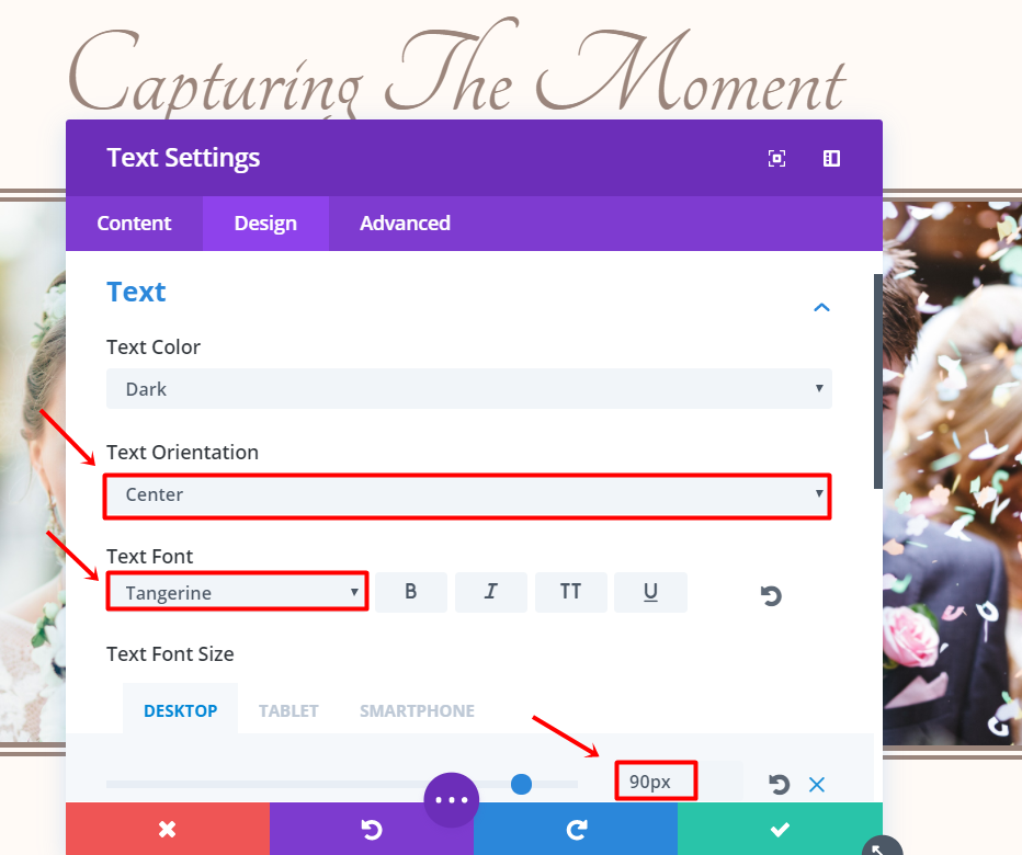
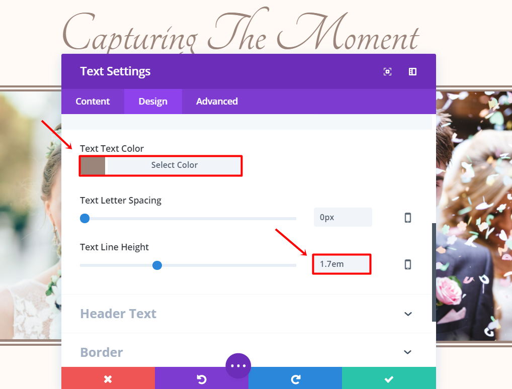
If you don’t feel like scrolling down and looking for the different options to change, you can also make use of the search option. This option helps you become more productive and change things instantly without having to put in a lot of effort. In the example below, we’re simply searching for the terms ‘Text Font’ and we’ll see the option appear right away.
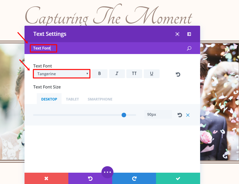
Click Save & Exit.
Bride & Groom
Moving on, you’ll have to create a section with two individual images of the bride and groom.

Go ahead and add a new two-column row right beneath the previous row you’ve created. Open the row settings and go to the Design tab.
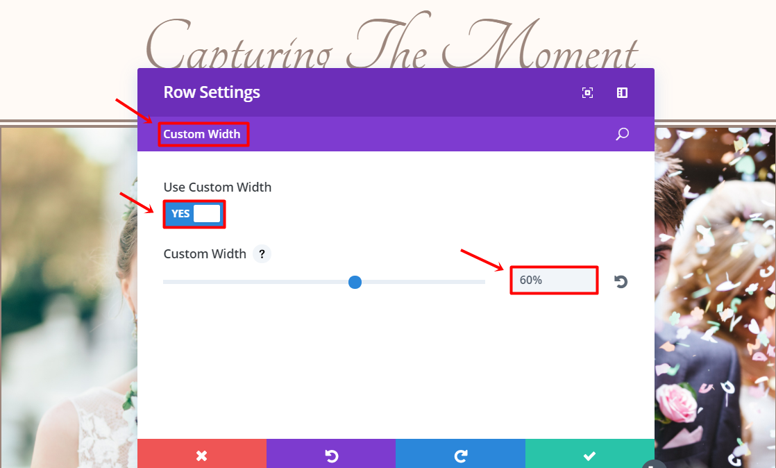
Next, go to the Design tab of the row settings and open the Sizing subcategory. Activate the Custom Width option and change the percentage to ‘60%’. Scroll down the same tab and add ‘5%’ to the bottom margin.
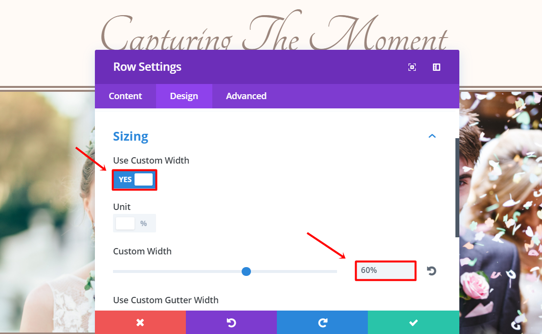
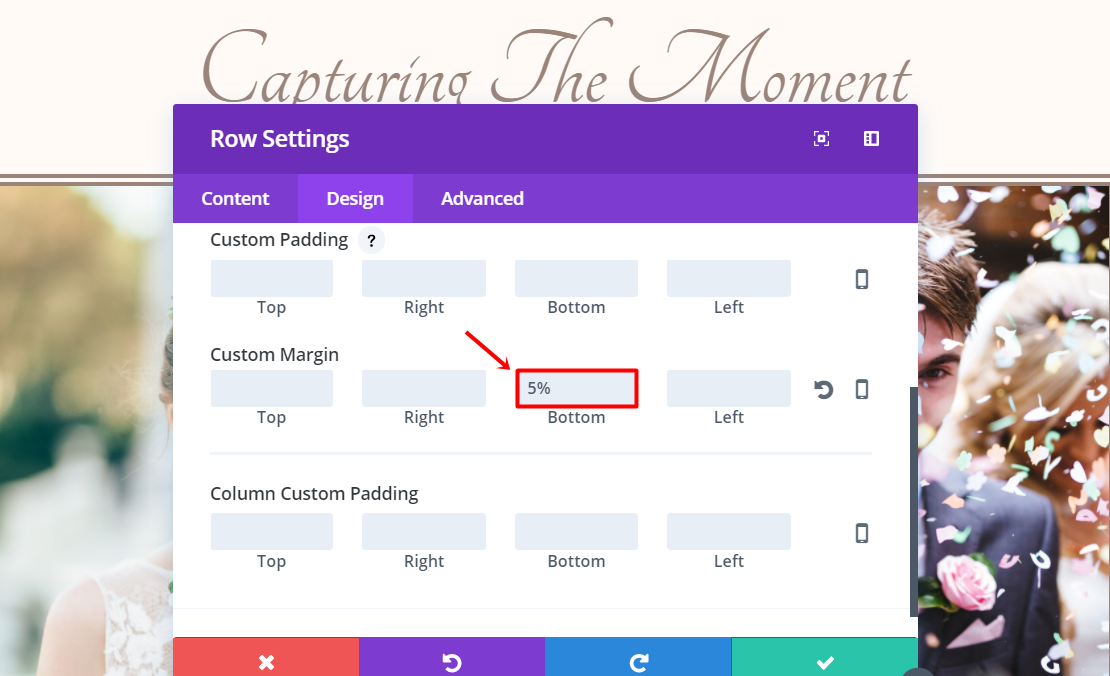
Once again, you can choose the easy way out and just write ‘Custom Width’ in the search bar.
Bride’s Image
Add an Image Module to the first column of the row. Upload an image of the bride in the Content tab under the Image subcategory and move on to the Advanced tab. Click on the Custom CSS subcategory and add the following code line to the Main Element field:
border: 10px double #9b857b;
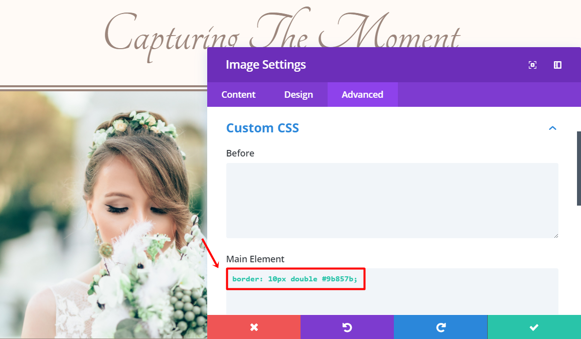
As mentioned before, you can also just type ‘Main Element’ in the search bar and it’ll pop up immediately. Using the search option can be a huge timesaver, especially when you’re trying to follow the steps of a tutorial. You can do exactly what is required without thinking about it too much.
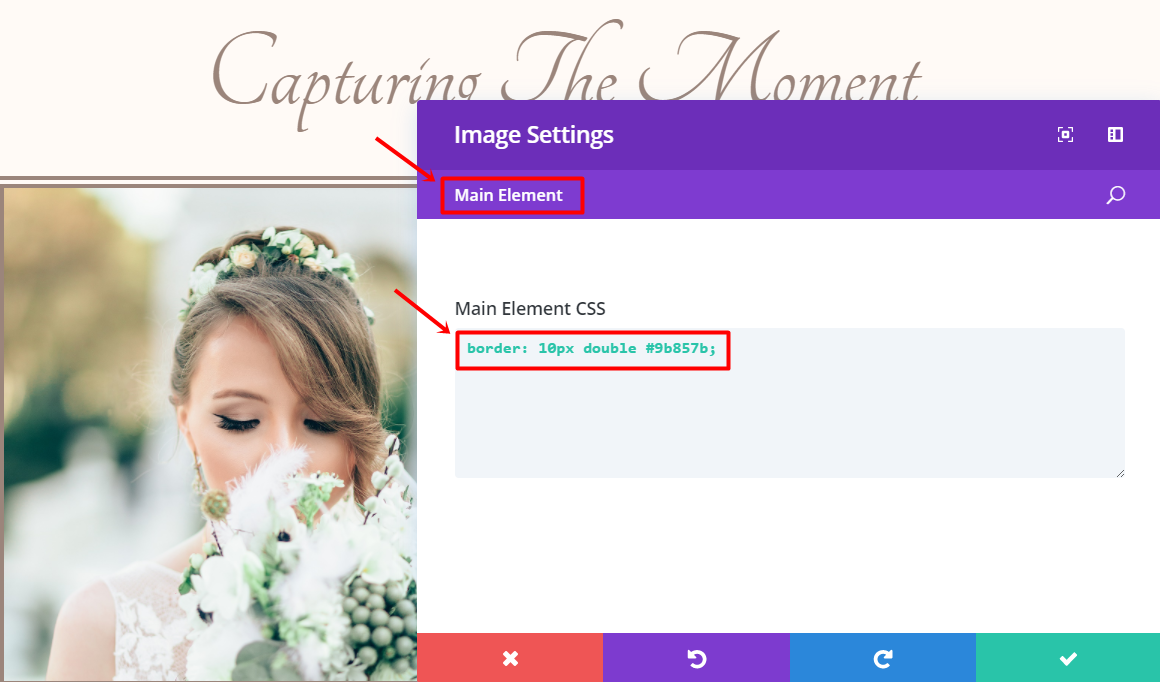
Press Save & Exit.
Groom’s Image
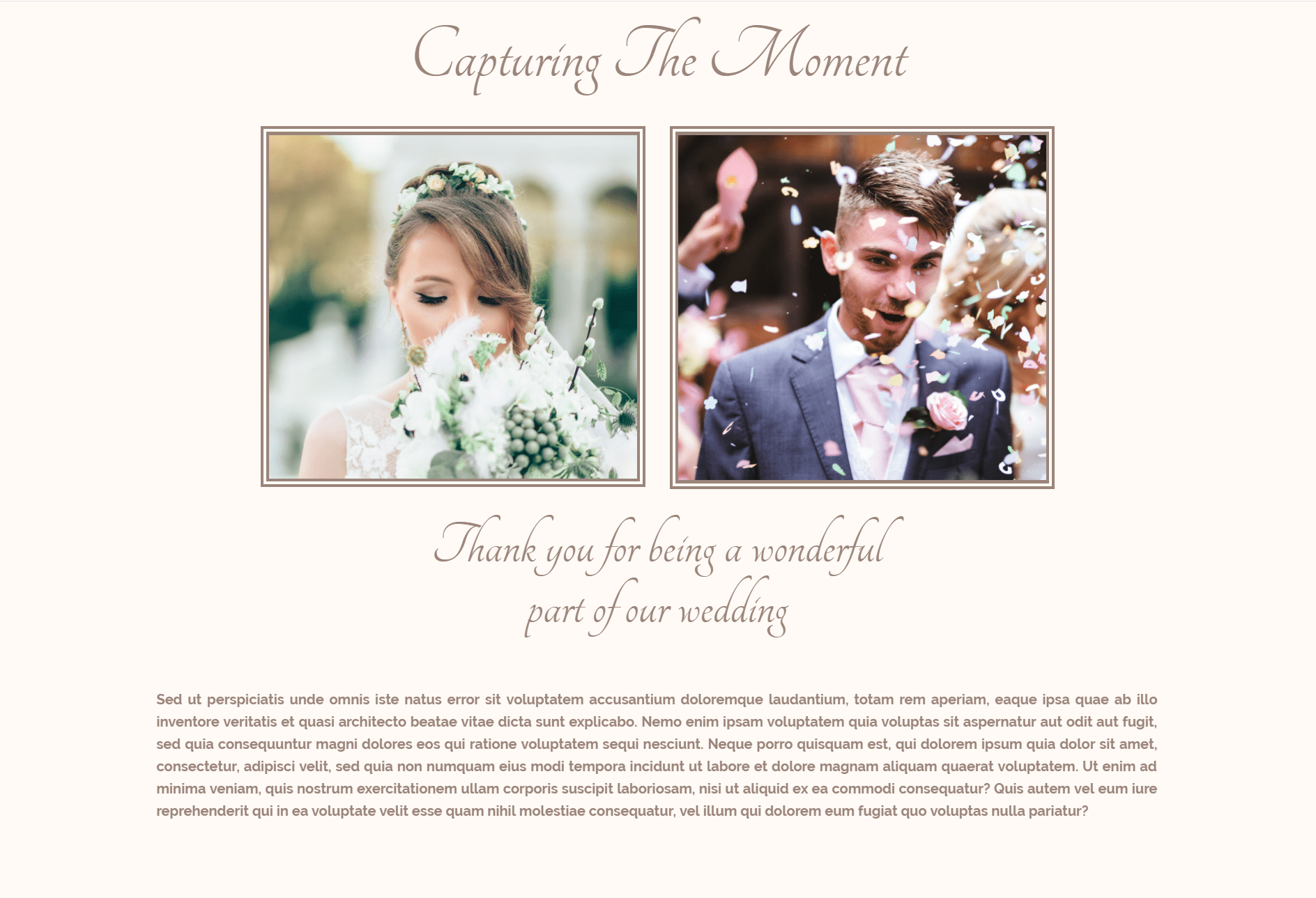
As you can notice, the images have the same settings. Go ahead and clone the image module, the only thing you’ll have to change is the image. This is how your gallery page should be looking so far:

Thank You Note
The gallery page usually pops up on the wedding website after the wedding has taken place. People are excited to see the pictures that were taken, so the chances are likely that all your guests will visit the page. That makes the gallery page the ideal place to say one last thing to the guests.

To start off, add a new standard section to your layout. Within the section, use a fullwidth row.
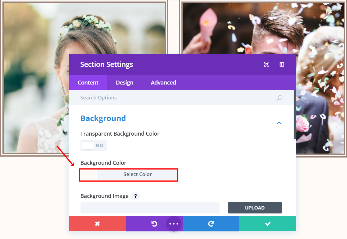
Next, open the section settings and change the background color to ‘#fffaf6’ within the background subcategory.
First Text Module
Add a text module to the row you just created. In the Content tab, enter the text you want to show up on your website in the text box. Continue by moving on to the Design tab.
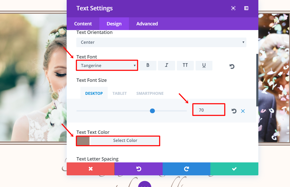
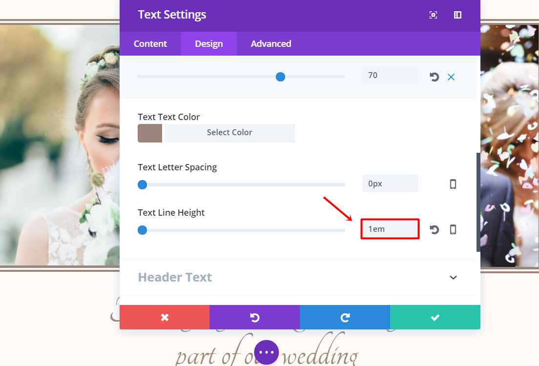
Start by selecting the Text subcategory within the design tab and make the following changes by looking for them manually or search for them in the search bar:
- Text Orientation: Center
- Text Font: Tangerine
- Text Font Size: 70 (Desktop & Tablet), 50 (Phone)
- Text Color: #9b857b
- Text Line Height: 1em
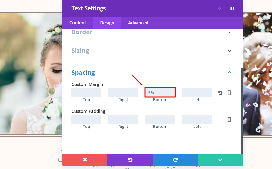
Now, select the Spacing subcategory in the same tab and change the bottom margin to ‘5%’.
Click on Save & Exit.
Second Text Module
Add a new text module under the first text module you created. In the content tab, write the thank you note you want to share with the guests in the text box and move on to the Design tab.
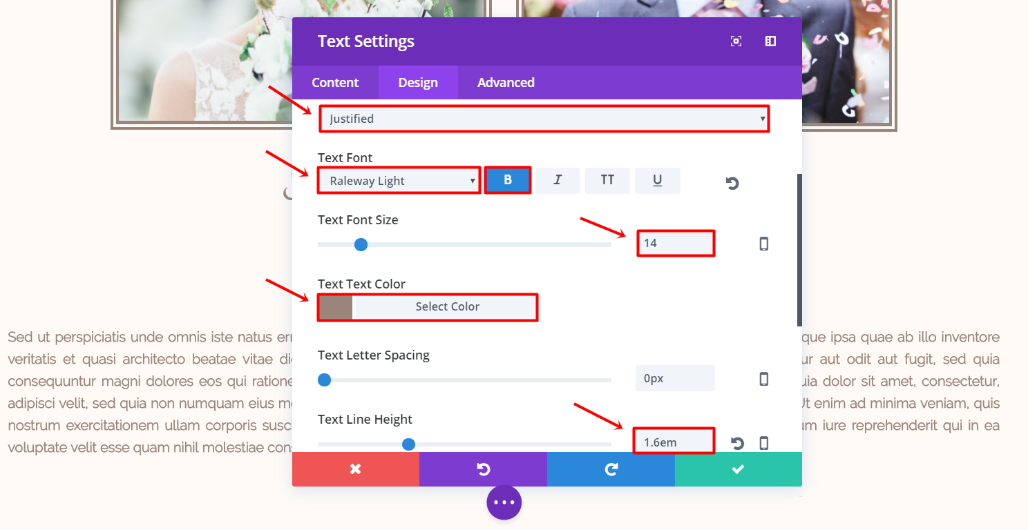
Make the following changes in the Design tab by searching for them manually or by searching the options with the search bar.
- Text Orientation: Justified
- Text Font: Raleway Light
- Text Style: Bold
- Text Font Size: 14
- Text Color: #9b857b
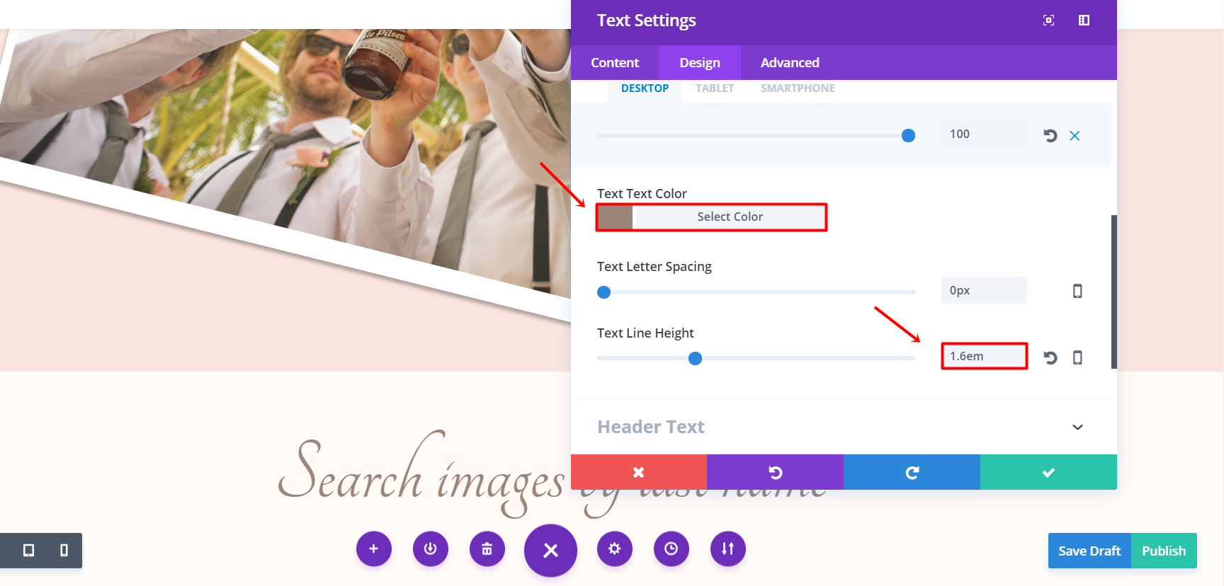
- Text Line Height: 1.6em
Click on Save & Exit and you’re good to go. This is what your gallery page should look like by now:
Favorite Pictures Section
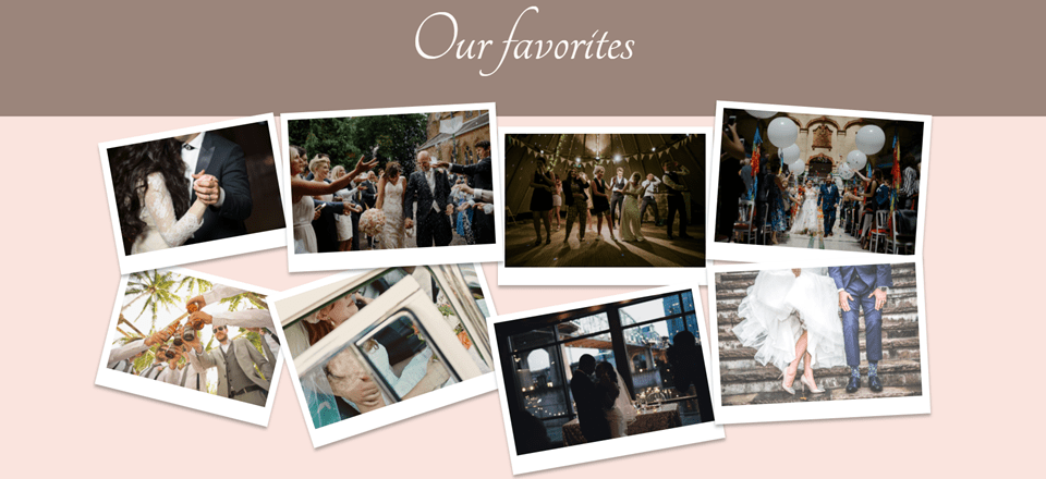
After you’ve finished the thank you note section, you can go over to the section where you show the favorite pictures of the bride and groom. In this part, you’ll be using two sections and apply CSS code to the image modules to make them look polaroid.

Start by adding a standard section. Within that standard section, you’ll be needing a fullwidth row. Open the section settings and change the background color to ‘#9b857b’ in the Background subcategory of the content tab.
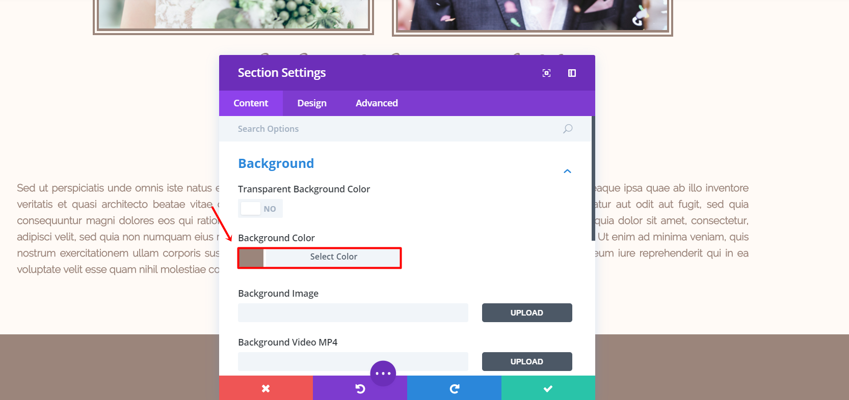
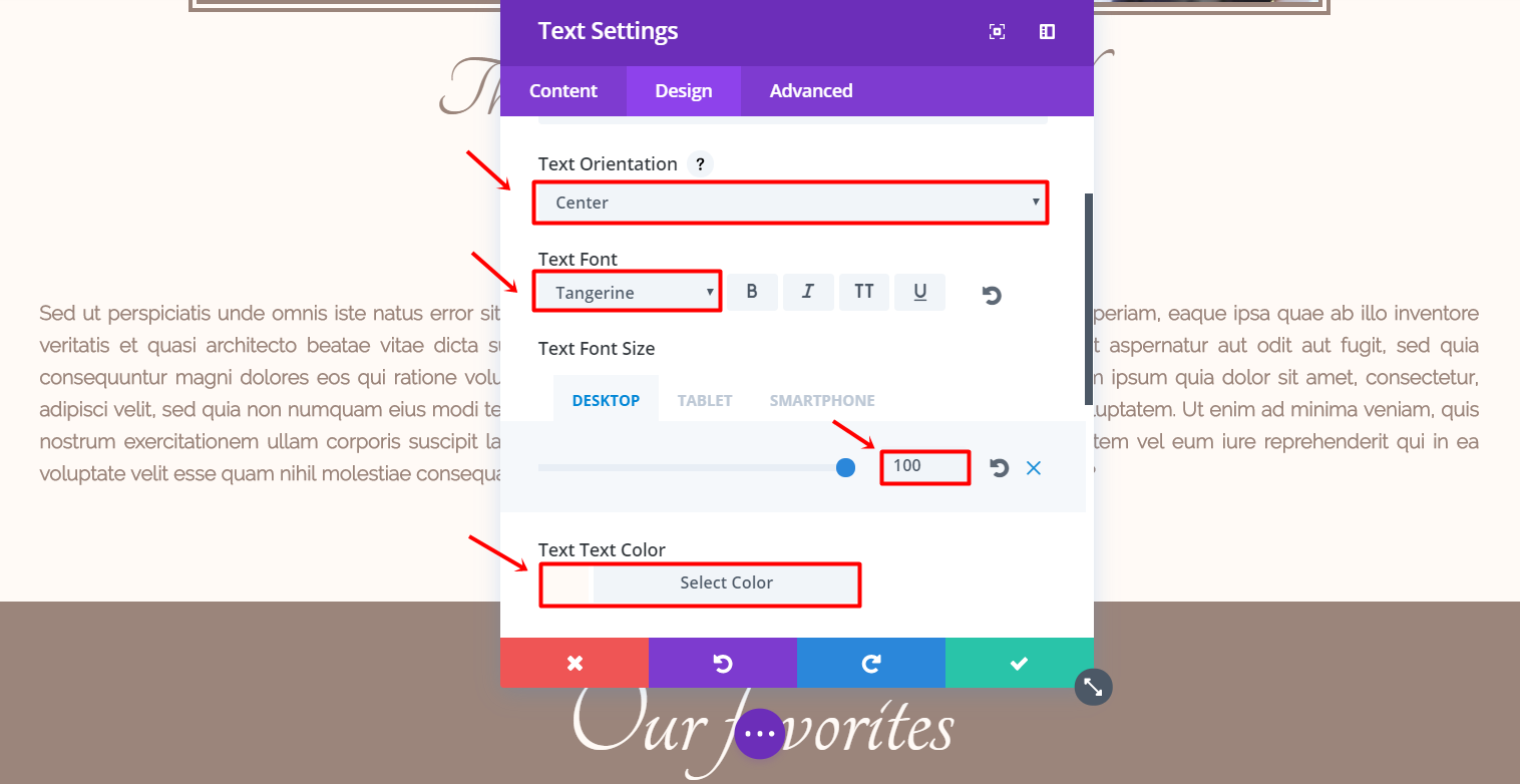
Next, add a text module to the row. Open the settings and enter the title you’d like to show in the text box of the Text subcategory. Moving on, go to the Design tab and make the following changes in the Text subcategory:
- Text Orientation: Center
- Text Font: Tangerine
- Text Font Size: 100 (Desktop & Tablet), 68 (Phone)
- Text Color: #fffaf6
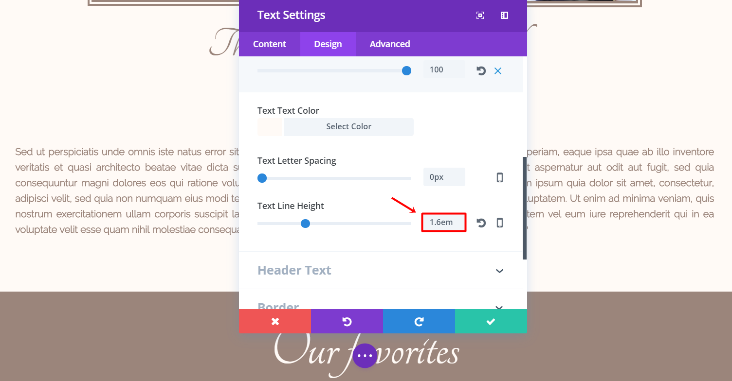
- Text Line Height: 1.6em
Click Save & Exit.
Polaroid Images (Desktop)
For this part, you’ll need another standard section. Within that section, you will need a row that has 4 columns. Change the background color of this section to ‘#fae4de’ in the Content tab under the Background subcategory.
Proceed by adding an Image Module to the first column of the row. Open the settings of the image and upload one of the favorite images withing the Image subcategory of the content tab.
Next, go to the Advanced tab, click on the CSS ID & Classes subcategory and type down ‘polaroid’ in the CSS Class field. In the Main Element field, add the following code:
z-index: 1;
-webkit-transform: rotate(-10deg);
-moz-transform: rotate(-10deg);
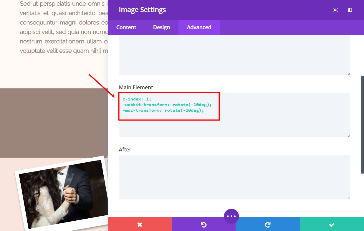
Now, to put the ‘polaroid’ class to action, you’ll have to go to the backend of your website. Go to Divi > Theme options > and insert the following code in the Custom CSS field at the bottom of the page:
.polaroid {
background: white;
display: inline;
float: left;
margin: 0 15px 30px;
padding: 10px 10px 25px;
-webkit-box-shadow: 0 4px 6px rgba(0, 0, 0, .3);
-moz-box-shadow: 0 4px 6px rgba(0,0,0,.3);
box-shadow: 0 4px 6px rgba(0,0,0,.3);
-webkit-transition: all .15s linear;
-moz-transition: all .15s linear;
transition: all .15s linear;
z-index:0;
position:relative;
}

.polaroid::after {
color: #333;
font-size: 20px;
content: attr(title);
position: relative;
top:15px;
}

.polaroid.et_pb_image_2 {
display: block;
width: inherit;
}
After that, you can go back to the Visual Builder. You’ll be needing more than one polaroid image, that’s why you should clone the Image Module 7 times, and make sure you put them in the different columns. Every column should have 2 Image Modules.
To make the polaroid images look playful, you’ll have to change the CSS code in the Main Element field of each Image Module individually. To apply the different code, we’ve given each Image Module a different number in the image bellow:
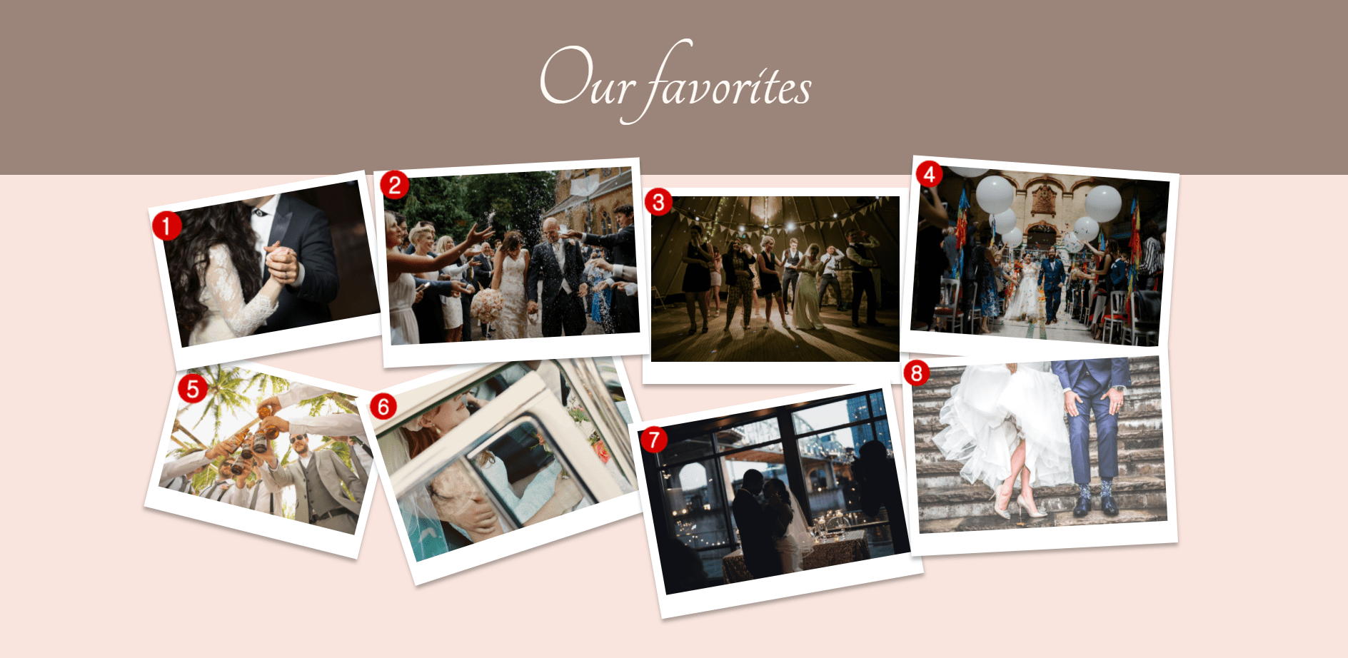
Depending on the assigned number, change the code in the Main Element field accordingly. You can find the Main Element in the Advanced tab under the Custom CSS subcategory. Add a value to the Custom Margin fields in the Spacing subcategory of the Design tab as well:
Image 1
This is the first Image module you made, keep it that way.
Image 2
Custom margins:
Top: -10%
Left: -20%
Main Element:
z-index: 5;
-webkit-transform: rotate(-3deg);
-moz-transform: rotate(-3deg);
Image 3
Custom margins:
Left: -20%
Main Element:
None
Image 4
Custom margins:
Top: -10%
Left: -20%
Main Element:
z-index: 3;
-webkit-transform: rotate(4deg);
-moz-transform: rotate(4deg);
Image 5
Custom margins:
None
Main Element:
-webkit-transform: rotate(14deg);
-moz-transform: rotate(14deg);
transform: rotate(14deg);
Image 6
Custom margins:
Top: -10%
Left: -20%
Main Element:
-webkit-transform: rotate(-18deg);
-moz-transform: rotate(-18deg);
transform: rotate(-18deg);
Image 7
Custom margins:
Left: -20%
Main Element:
z-index: 1;
-webkit-transform: rotate(-10deg);l
-moz-transform: rotate(-10deg);
Image 8
Custom margins:
Top: -10%
Left: -20%
Main Element:
z-index: 5;
-webkit-transform:rotate(-3deg);
-moz-transform: rotate(-3deg);
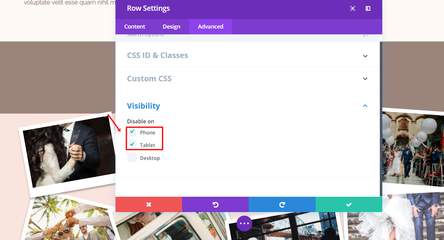
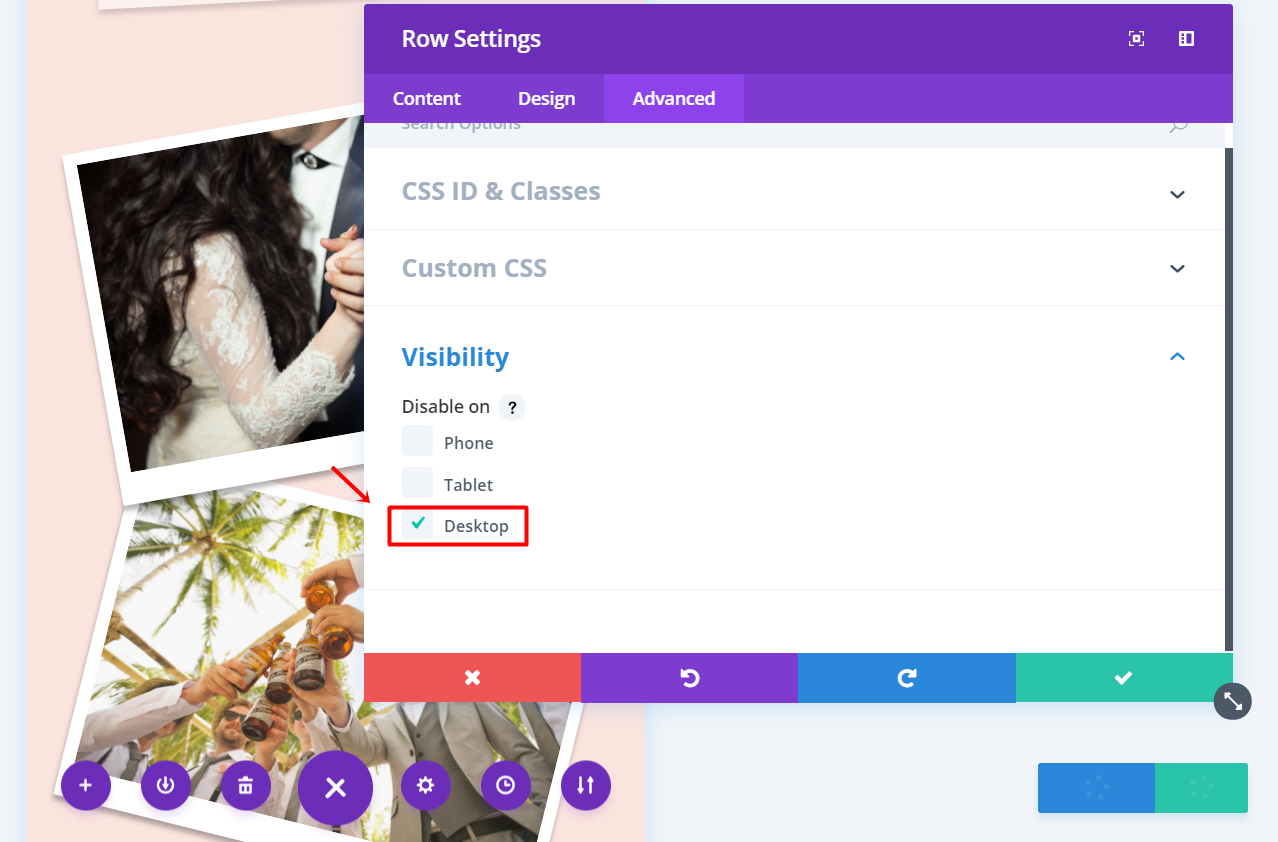
After having set up all the images, open the settings of the row. Go to the Advanced tab and hide the row for phone & tablet within the Visibility subcategory.
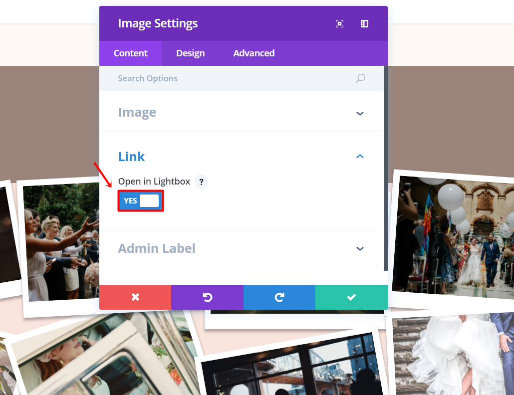
Also, make sure people can open the picture in this section by activating the Lightbox in the Link subcategory of the Content tab.
Favorite Images (Tablet & Phone)
To make sure the images are responsive, we’re going to add another row to the same section. Make it a fullwidth row and clone the number 1 and 5 Image Modules. Place these cloned modules in the new row. For the mobile version, we’re only going to use these two versions of the Image Modules we’ve created.
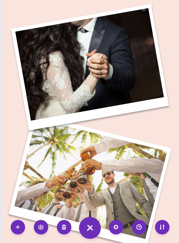
Now, open the settings of the row. Go to the Advanced tab and hide the row on desktops within the Visibility subcategory.
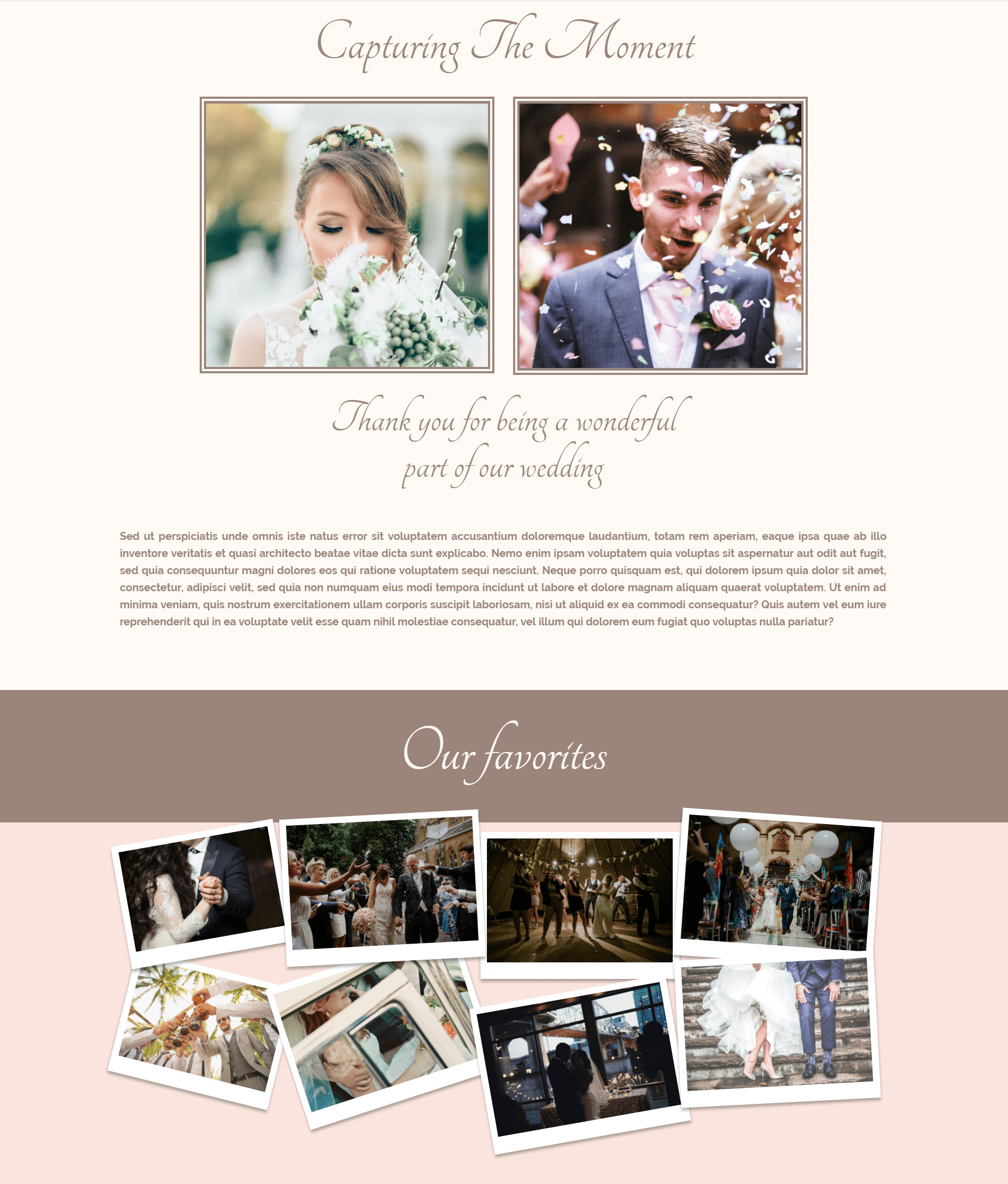
After having made all these changes, your layout should look like this so far on desktop:
Gallery By Last Name (Desktop)
There are usually a lot of pictures taken at weddings which can make it hard to find a certain structure in them. That’s why we decided to make the gallery section of this gallery page a little bit more easy-going. The galleries are going to be displayed based on the last name of guests, which makes it easy for them to find back their own pictures.
List of Names
To start off, you need to show the list of last names and link them the section of the page where they’ll find the images.

Create a new standard section and place a full-width row in it. Next, add a text module. Type down the text you want to show up in the Text subcategory of the Content tab. Then, go to the Design tab and make the following changes to the Text subcategory:
- Text Orientation: Center
- Text Font: Tangerine
- Text Font Size: 100 (Desktop & Tablet), 68 (Phone)
- Text Color: #9b857b
- Text Line Height: 1.6em
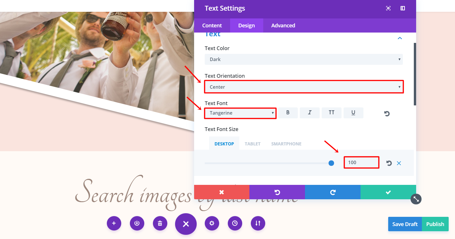
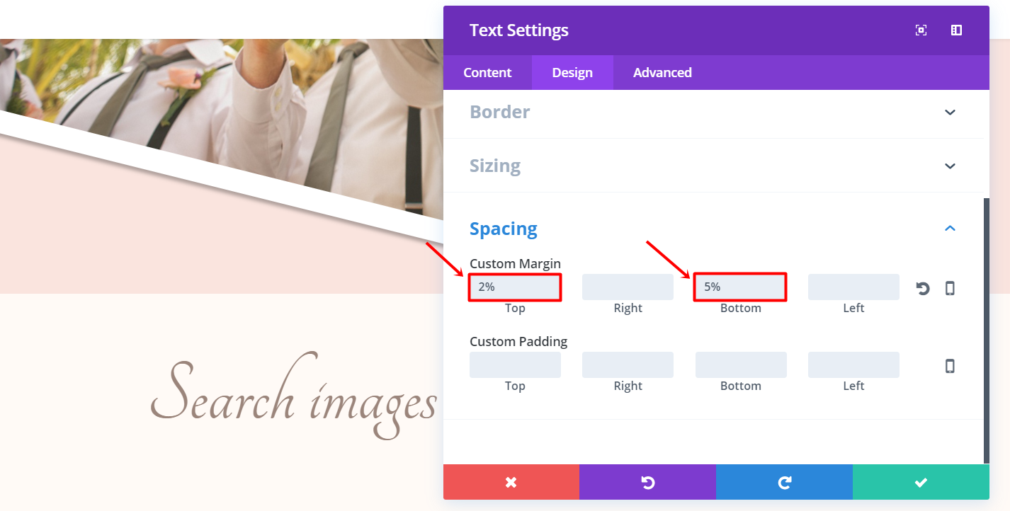
Scroll down the same tab and change the top margin to ‘2%’ and the bottom margin to ‘5%’ in the Spacing subcategory.
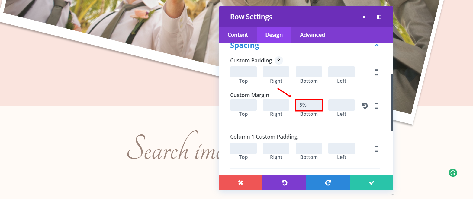
Click Save & Exit. Now, add another row, in this case with three columns. In the Design tab of the row settings, change the bottom margin to ‘5%’ within the Spacing subcategory.
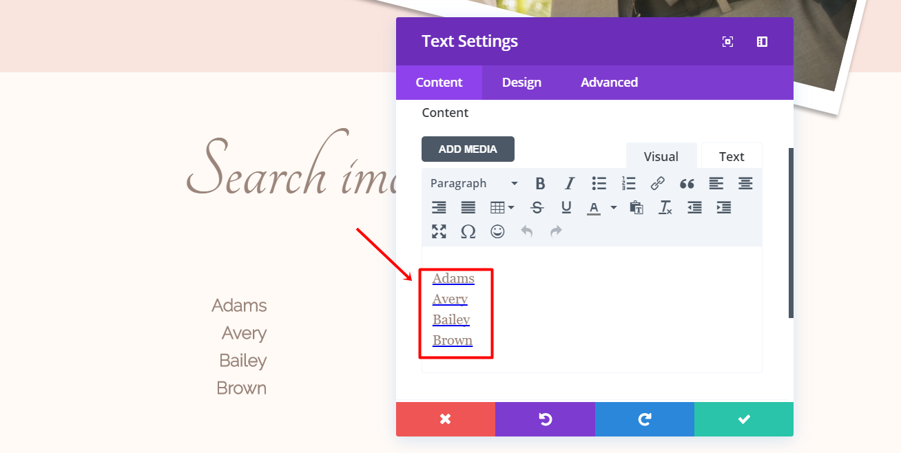
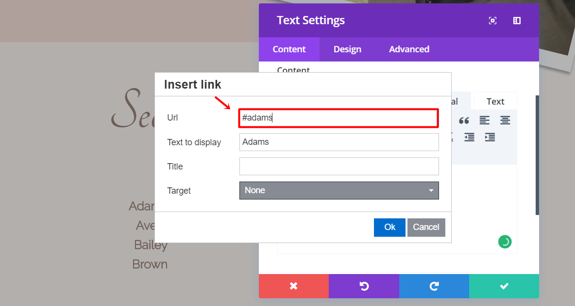
Next, add a text module to the left column of the row. Within the text module, add one-third of the guests’ last names. Each of these last names will need an anchor link to the part of the website you want to bring them to. Select one of the names, click on the link icon and write a ‘#’ + the name. Later on this blog post, you’ll link this name to a certain section. Repeat the same thing for each one of the names on the list.
Select one of the names, click on the link icon and write a ‘#’ + the name. Later on this blog post, you’ll link this name to a certain section. Repeat the same thing for each one of the names on the list.
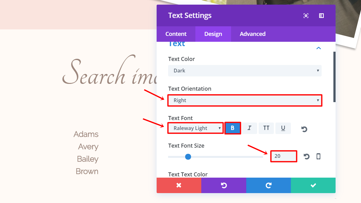
Go to the Design tab and make the following adjustments to the Text subcategory:
- Text Orientation: Right
- Text Font: Raleway Light
- Text Style: Bold
- Text Font Size: 20
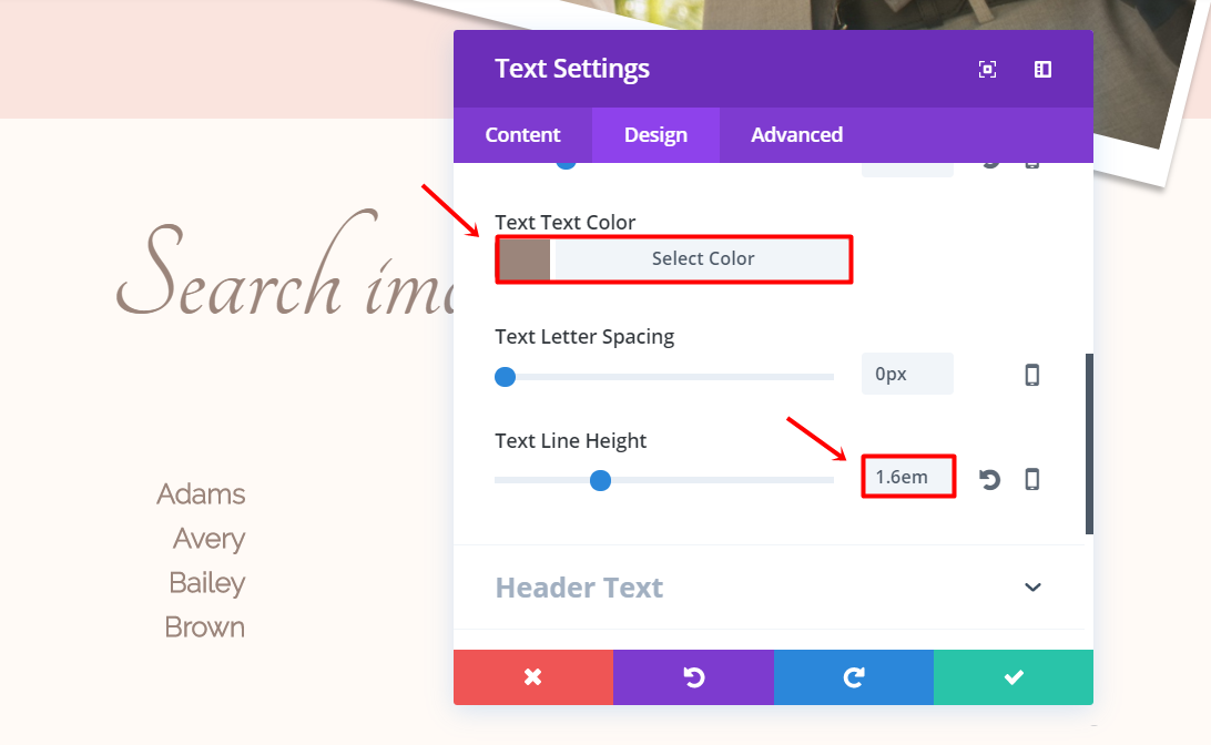
- Text Color: #9b857b
- Text Line Height: 1.6em
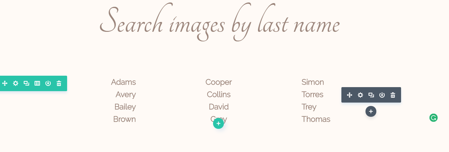
Moving on, clone the Text Module twice and place the cloned modules in the two other columns. Make sure you change the last names in these lists and the Text Orientation to ‘Center’ for the second column and ‘Left’ for the third column.
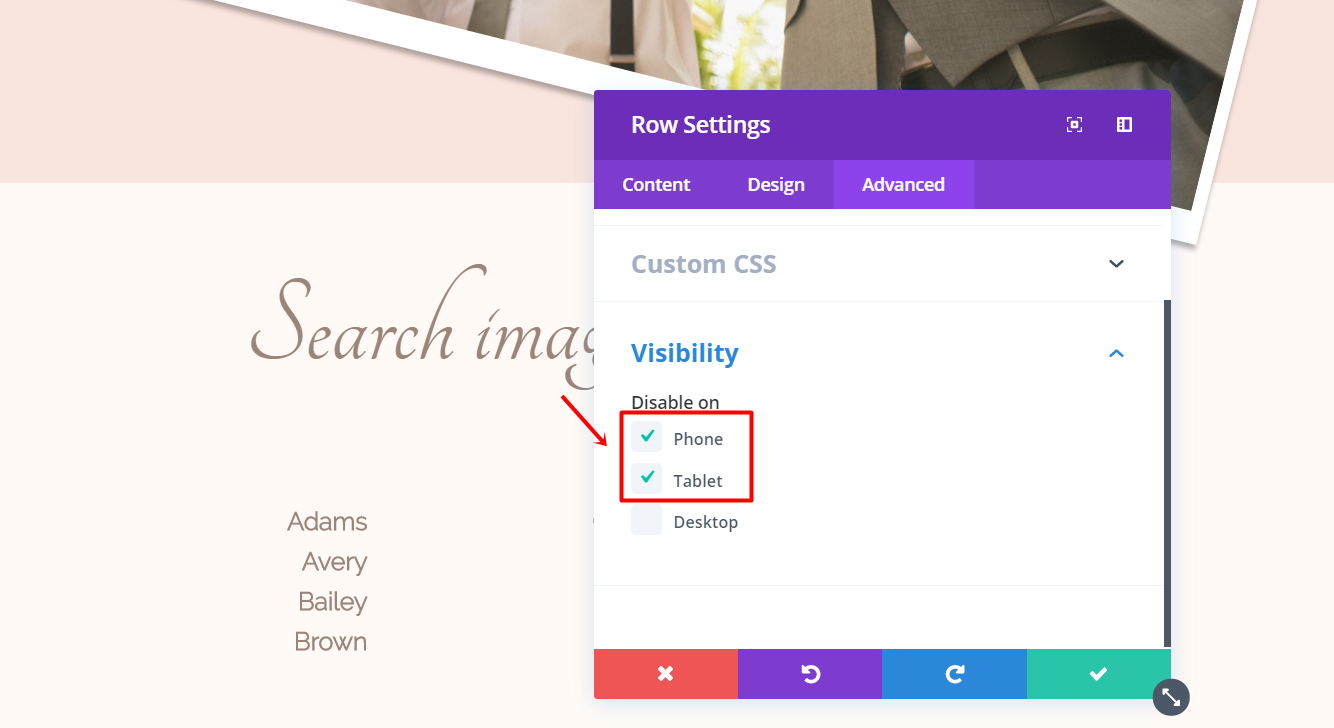
Open the settings of the row and change the visibility to only desktop in the Visibility subcategory of the Advanced tab.
Gallery By Last Name (Tablet & Phone)
To make sure the website is responsive, we’re going to create a new row that fits tablets & phones. Add a new row with a fullwidth column. Next, add a Text Module to that fullwidth row and type down the last names in the text box. You can find the text box within the Text subcategory of the Content tab.
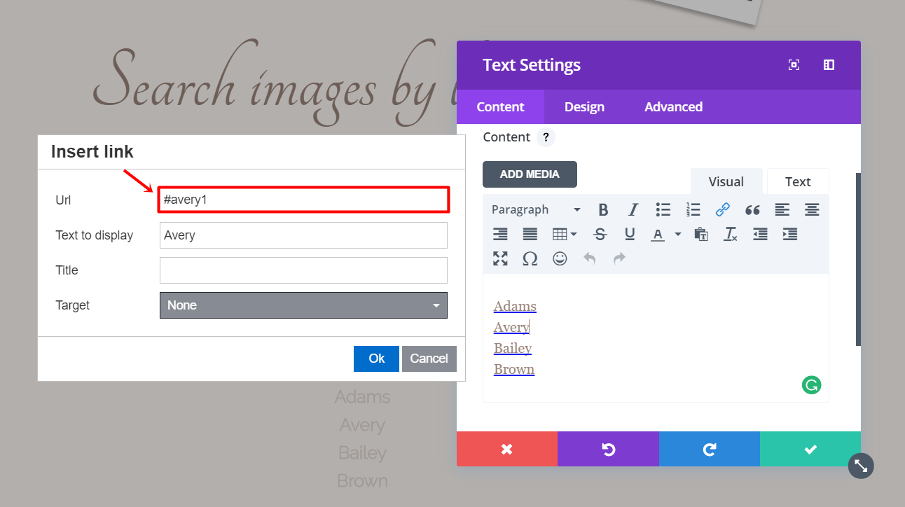
Repeat the same thing we did in the previous row by clicking on the link icon and writing a ‘#’ + the name in the URL box.
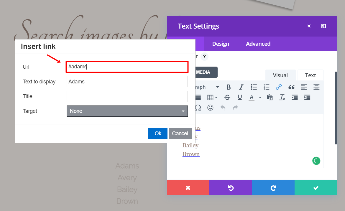
But make sure you assign a different anchor link to every second name. In this example, both Avery and Brown will have a different anchor link than they had on desktops. We have to do this because, in the next part of the website, we’ll have to have two different gallery sections for every second gallery. That way, it’ll be responsive for tablet and phone.
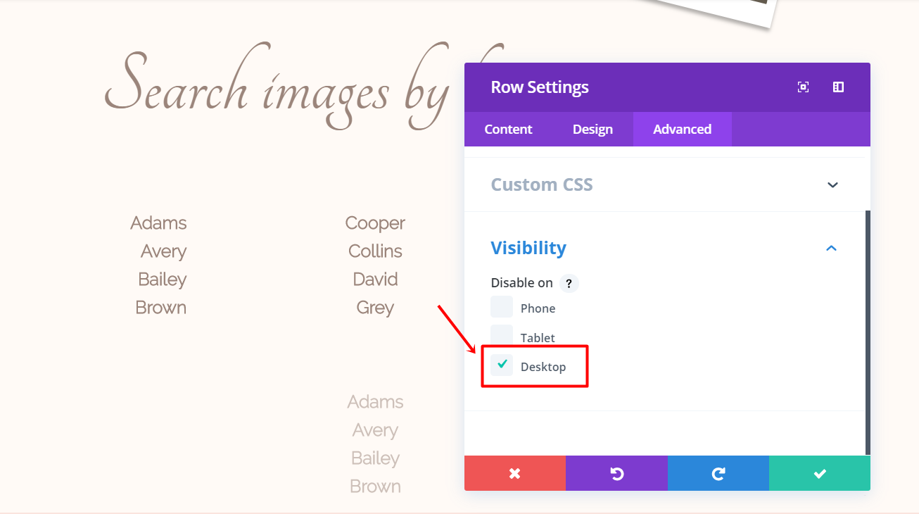
Last but not least, go to the Advanced tab of the row and disable the row for desktops in the Visibility subcategory.
Gallery Section (Desktop)
In the last part of the website, we’ll have to make the different gallery sections that represent different last names. We’re going to show you how to make two of them and then you can add other ones too accordingly.
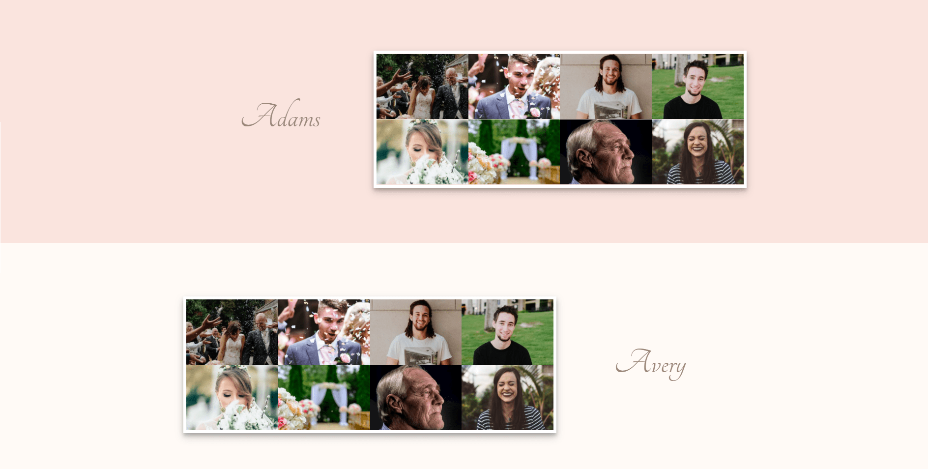
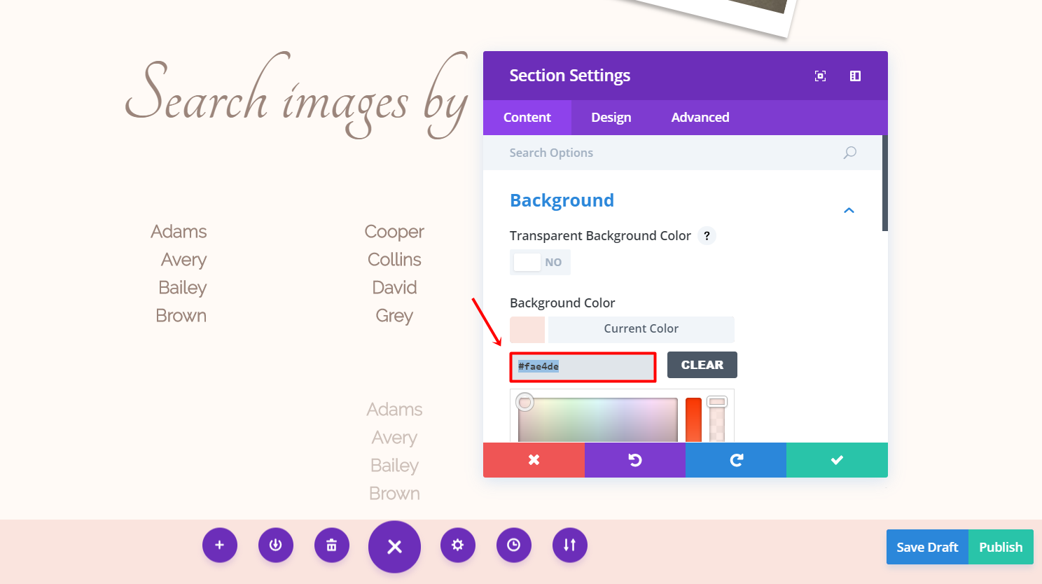
First, add a standard section. Change the background color to ‘#fae4de’ within the Background subcategory of the Content tab
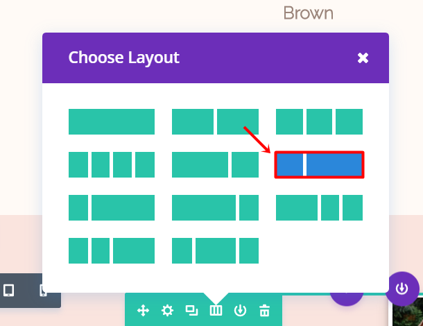
Moving on, add a row like this one:
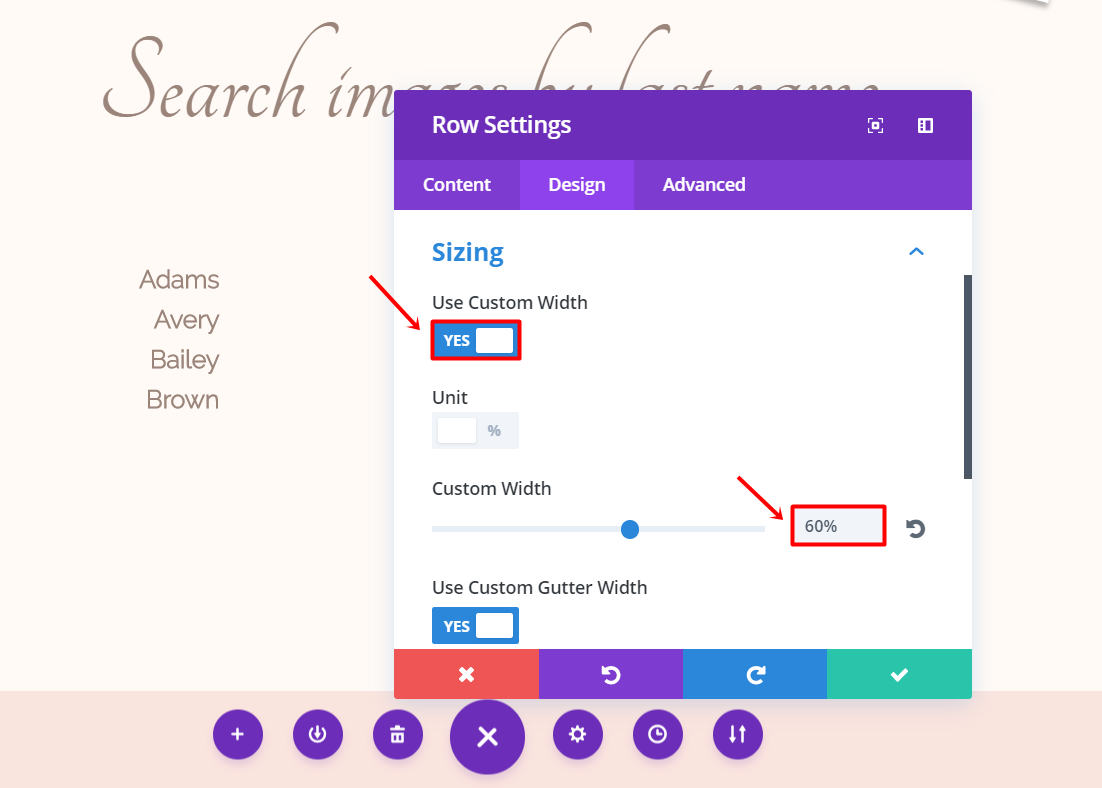
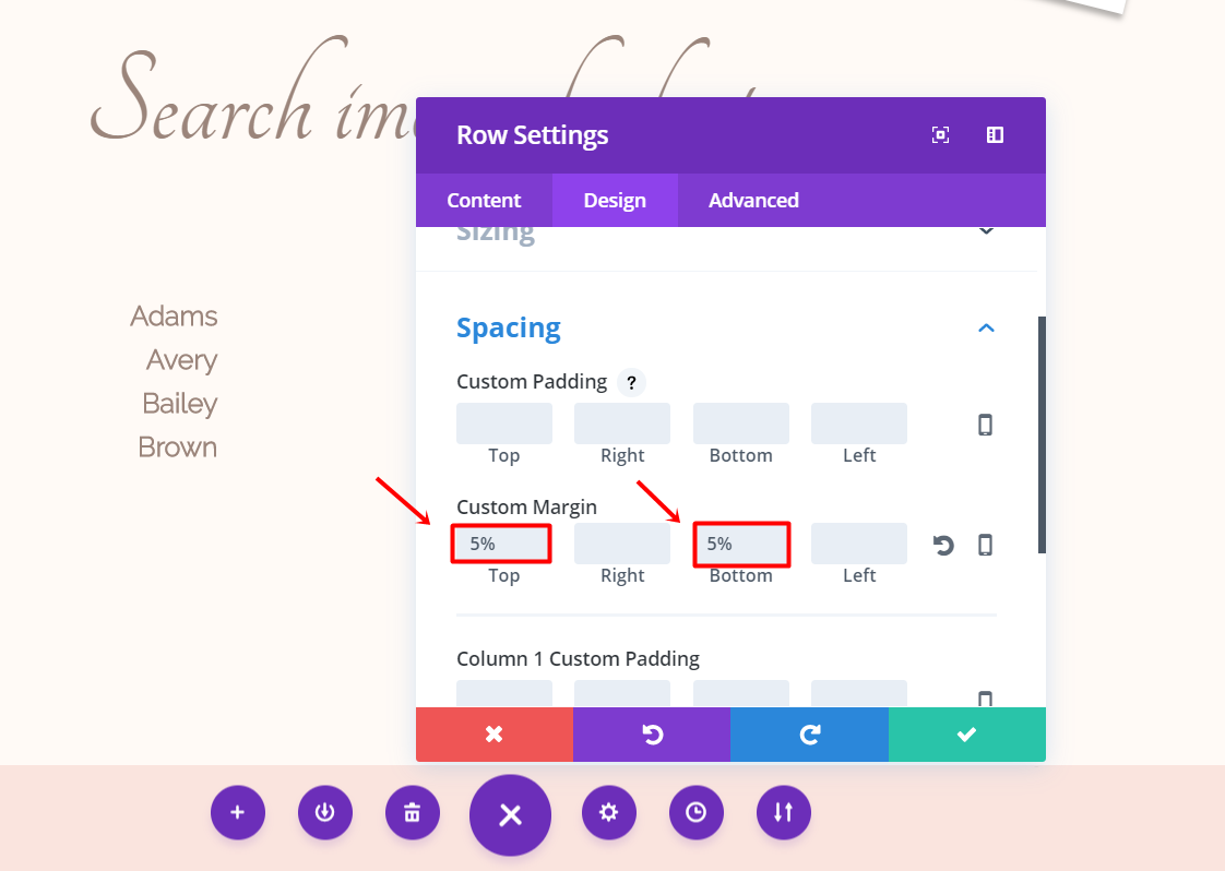
Within the row sections, use Custom Width. Go to the Design tab Select and change the Custom Width to ‘60%’ within the Sizing subcategory.
Then, go to the Design tab and change the top and bottom margin to ‘5%’.
Text Module
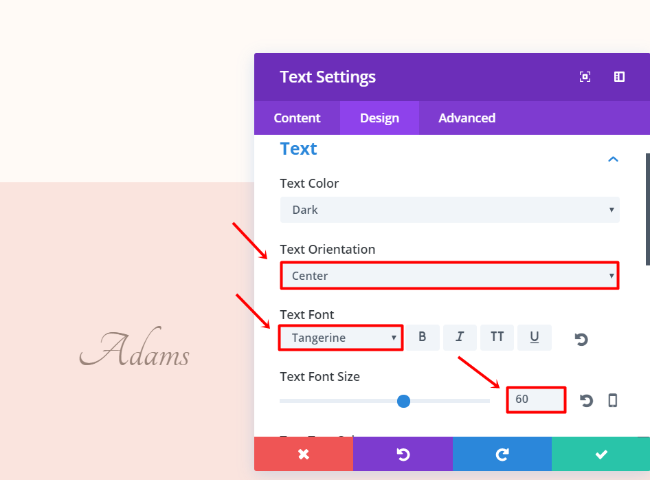
Now, add a Text Module and type down the last name of a family in the text box within the Text subcategory of the Content tab. Continue by going to the Design tab and making the following changes:
- Text Alignment: Center
- Text Font: Tangerine
- Text Font Size: 60
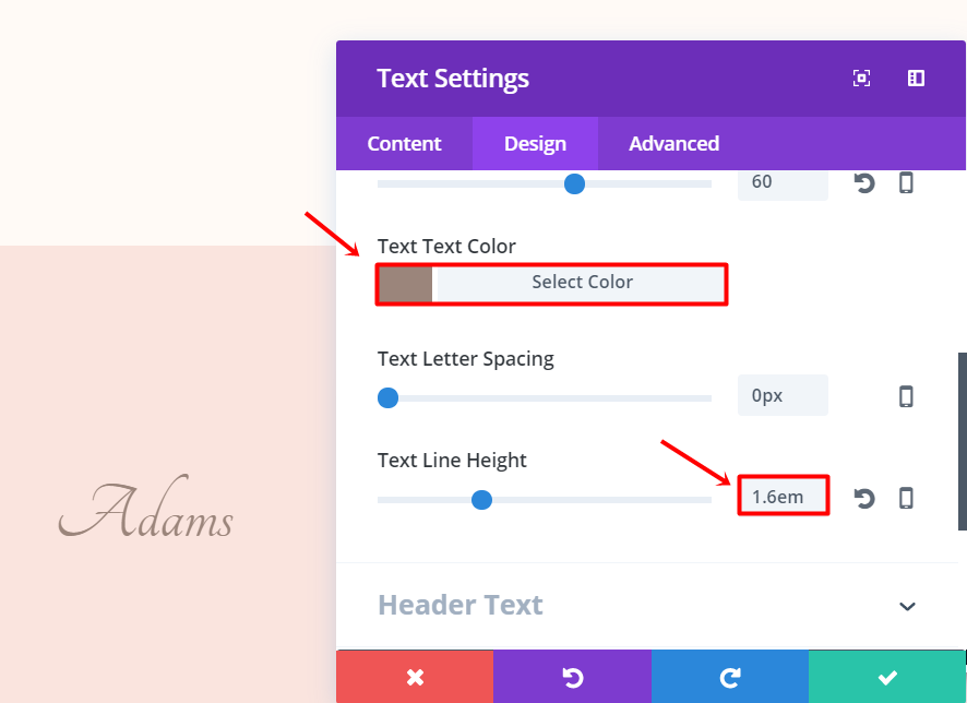
- Text Color: #9b857b
- Text Line Height: 1.6em
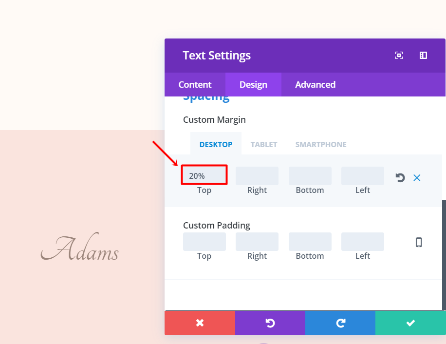
Scroll down the same tab and change the top margin to ‘20%’ within the Spacing subcategory.
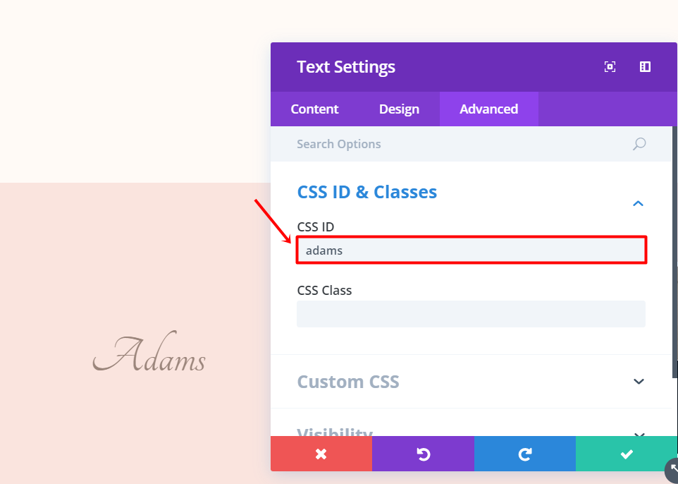
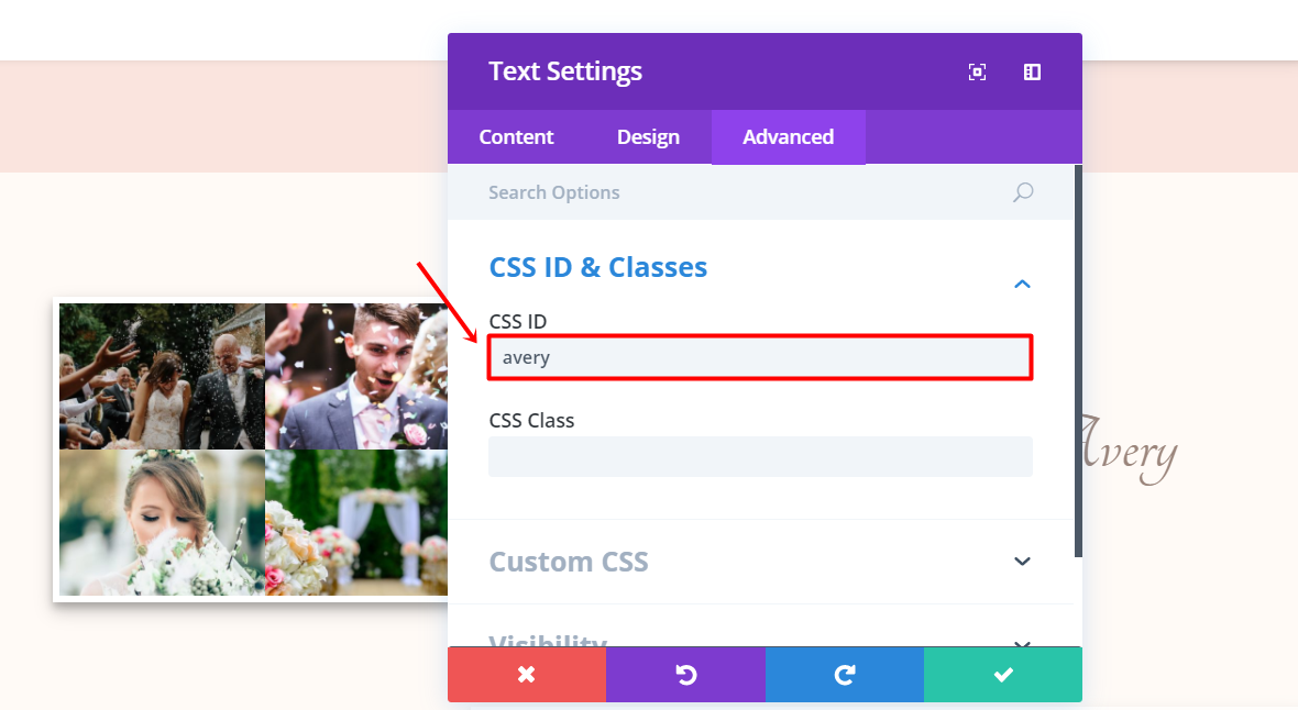
Move on to the Advanced tab. In the CSS ID field of the CSS ID & Classes subcategory, you’ll have to link the anchor link you’ve made above to the Text Module. So, if the first anchor link in the list was ‘#adams’, then you’ll have to fill in ‘adams’. Make sure the ID is the same as the one you linked to the name in the list you’ve made before.
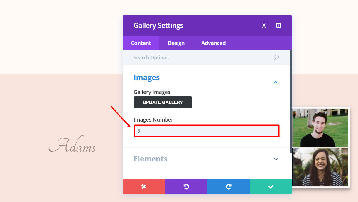
In the second column of the row, you’ll have to add a Gallery Module. Type down ‘8’ in Images Number field in the Images subcategory of the General tab and choose 8 images.
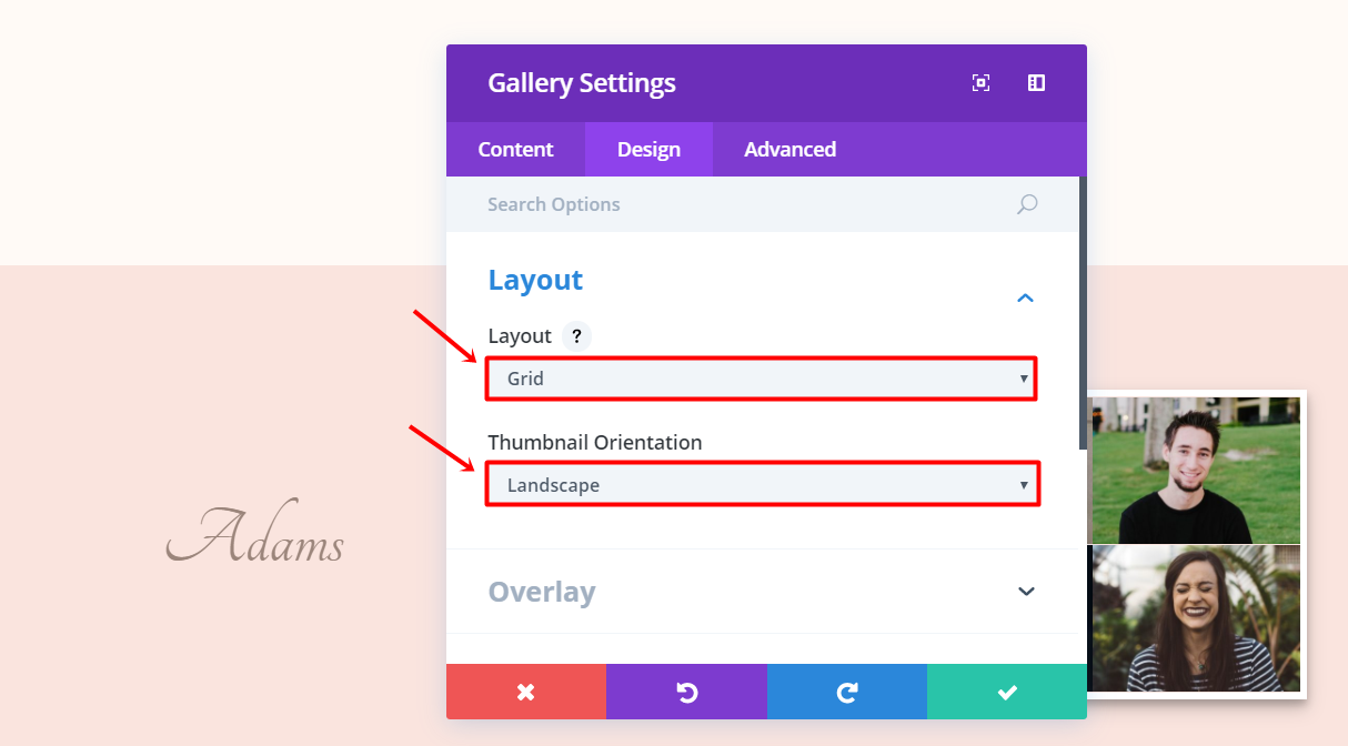
Next, go to the Design tab and make sure your Layout is ‘Grid’ and your Thumbnail Orientation ‘Landscape’ in the Layout subcategory.
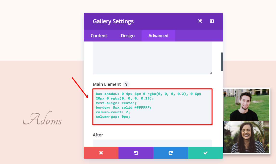
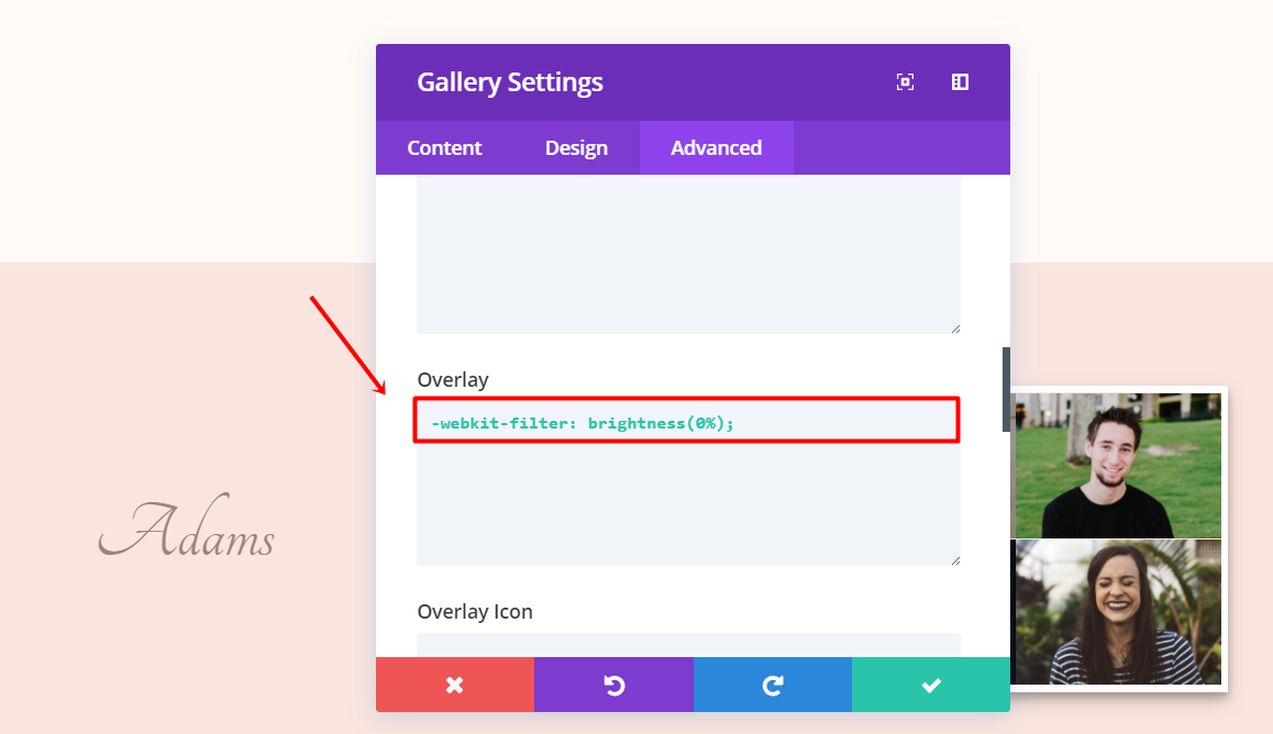
Moving on, go the Advanced tab. In this tab, you’ll have to add code to two different sections of the Custom CSS subcategory; the Main Element and Overlay.
Main Element:
box-shadow: 0 4px 8px 0 rgba(0, 0, 0, 0.2), 0 6px 20px 0 rgba(0, 0, 0, 0.19);
text-align: center;
border: 5px solid #FFFFFF;
column-count: 2;
column-gap: 0px;
Overlay:
-webkit-filter: brightness(0%);
Click on Save & Exit.
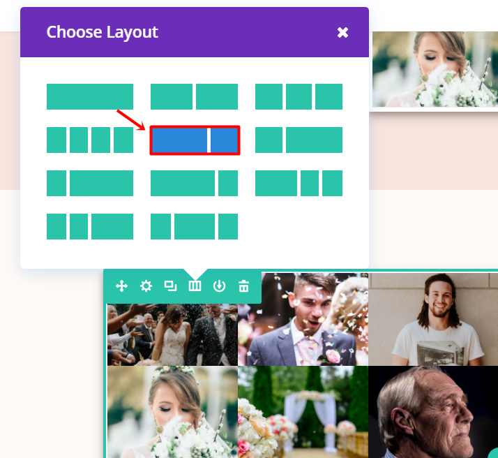
Now, go ahead and clone the section. Change the column structure to the following one and switch places between the Text Module and Gallery Module:
Change the images in the gallery, the last name mentioned in the text box and the Class ID. This section has another background color as well; ‘#fffaf6’.
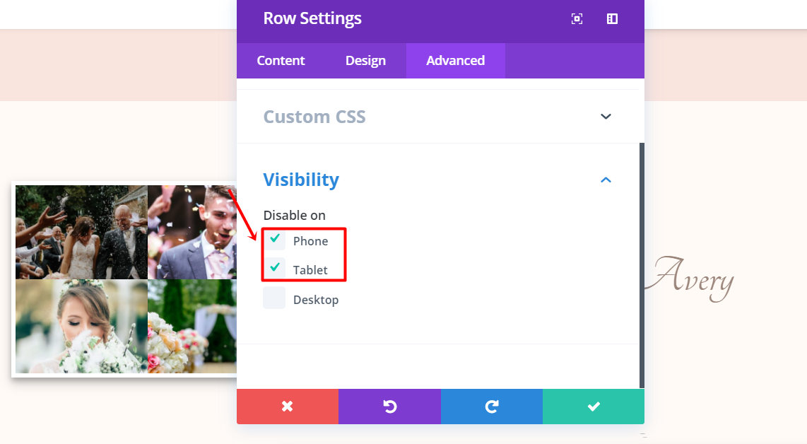
Now, go to the Advanced tab of this row and hide it for tablets and phones within the Visibility subcategory.
You can continue making gallery sections like that, depending on the number of family names that were present at the wedding.
Gallery Section (Mobile)
As we mentioned before, every second gallery section will need an alternative for mobile. Just clone the first gallery row we made and place it in the same section of the last gallery row we created.
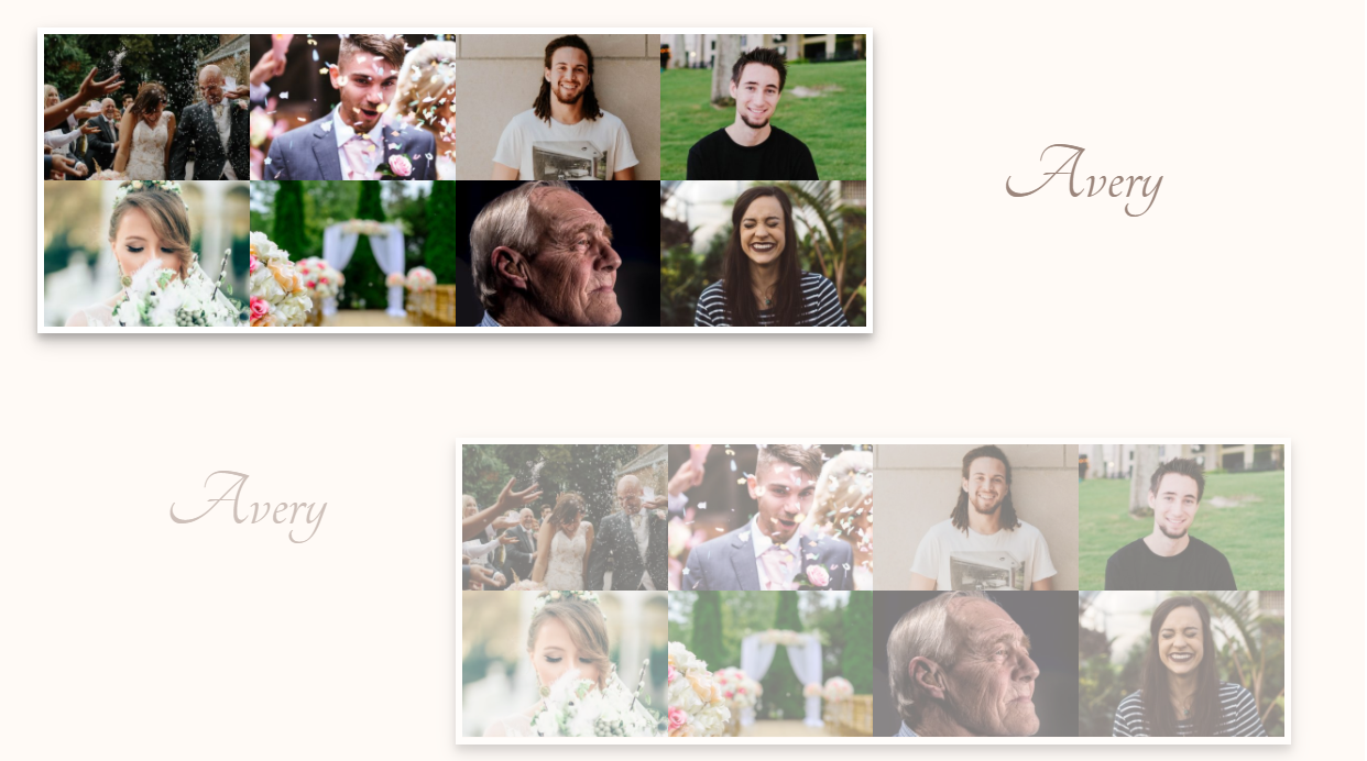
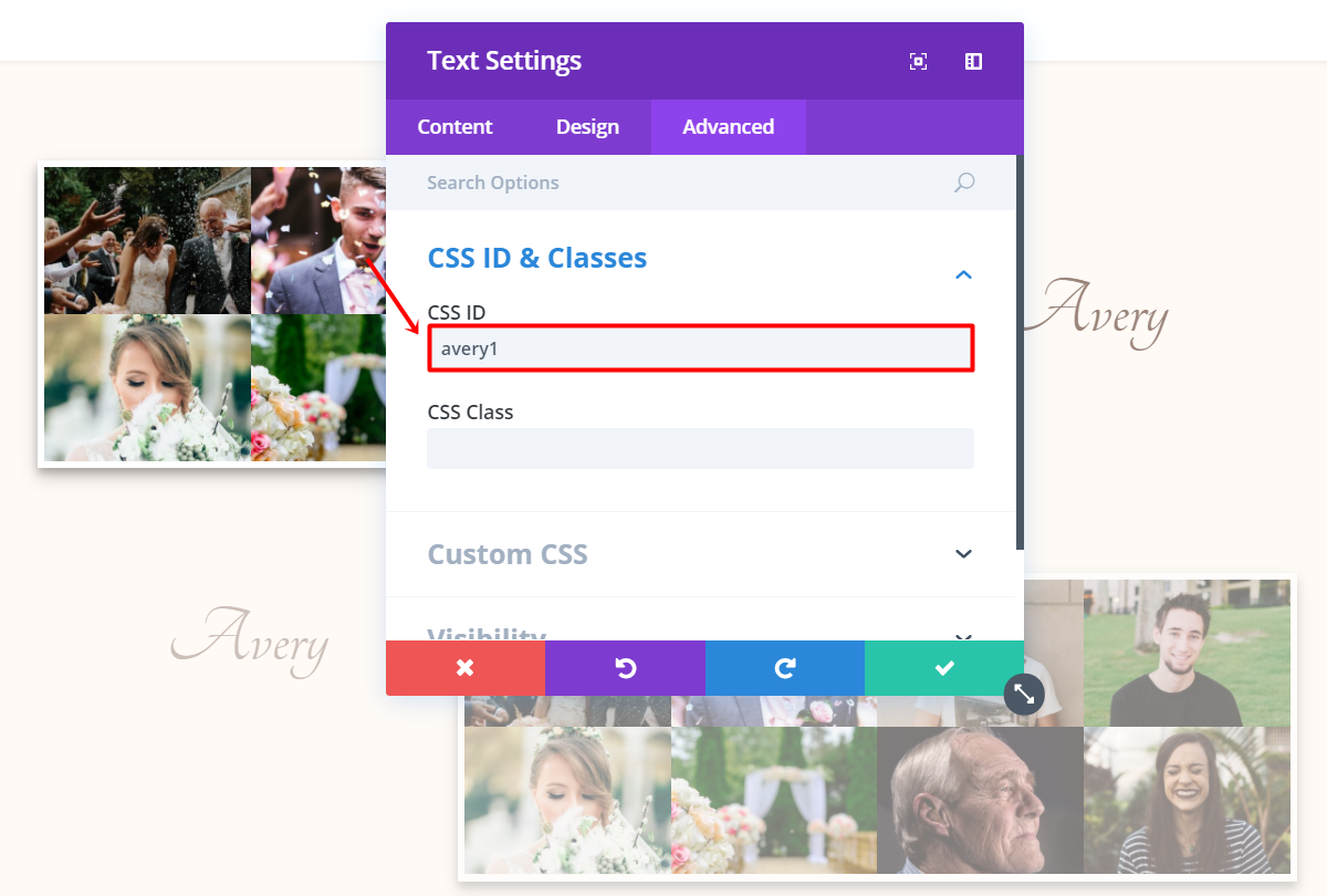
Then, open the Text Module options. Go to the Design tab and remove the top margin in the Spacing subcategory. Next, go to the Advanced tab and change the CSS ID in the CSS ID & Classes subcategory to ‘avery1’. This is the same ID as the in the list that applied to tablets and phones.
That’s it. Your layout should now look exactly like the one we created and showed you at the beginning of this blog post:

Next Up
In the third part of this miniseries, we’re going to see how you how to create a gift list page to add on the wedding website. If you have any questions regarding this tutorial, or if you have any requests for future tutorials; make sure you leave a comment in the comment section of this blog post so get back to you with answers!
Be sure to subscribe to our email newsletter and YouTube channel so that you never miss a big announcement, useful tip, or Divi freebie!




I can’t get the same effect as yours on my gallery.
I followed et check yours steps but it looks not nice.
All the 8 images are only in the half of “gallery space” (like 1 of 2 columns) and I get my pictures in a big gallery of 4 rows and 2 colums, and only on the half of the space.
Please, tell me what’s wrong
Nice themes.
This is awesome whatever tips given by really this pretty cool.
goodjob
Nice again, thanks!
It’s so big that I cannot clip it with Evernote. It seems to be bigger than 50MB…!?
by next up there is the text in the second part, it has to be in the thirth part of this miniseries