The WooCommerce Cart page is essential to any Divi site using WooCommerce(WC) for an online store. But many times the cart page tends to suffer when it comes to design because designing the page usually involves customizing the cart page template externally and then styling the page template purely with external CSS. But with Divi’s new Woo Modules, this process has become easy and enjoyable!
In this tutorial, we will be showing you how to create a WC Cart Page template for your site completely from scratch using the Divi Theme Builder. We’ll show you how to quickly set up a new template for the cart page and design the template using the appropriate dynamic woo modules available in the Divi Builder.
Let’s get started!
- 1 Sneak Peek
- 2 Download the Cart Page Template for FREE
- 3 Download For Free
- 4 About the WooCommerce Cart Page and Divi
-
5
Designing a WooCommerce Cart Page Template with Divi
- 5.1 Creating a Custom Template for the Cart Page
- 5.2 Creating the Section Row and Column Structure
- 5.3 Creating the Custom Navigation Links
- 5.4 Customizing the Row Settings
- 5.5 Designing the Dynamic Woo Notice Module for the Cart Page
- 5.6 Creating the Dynamic Cart Page Title
- 5.7 Designing the Dynamic Woo Cart Products
- 5.8 Designing the Dynamic Woo Cart Totals Module
- 6 Final Result
- 7 Final Thoughts
Sneak Peek
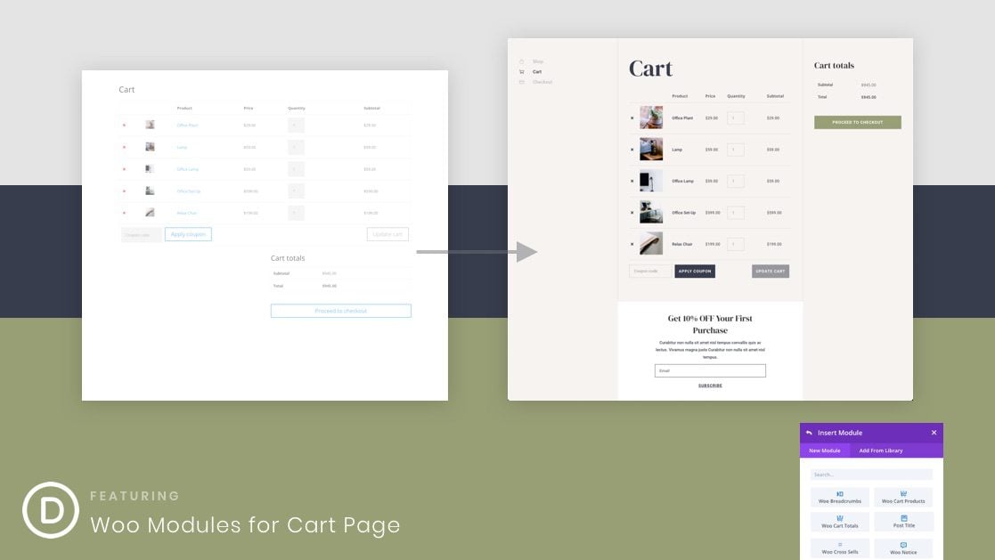
The Before and After
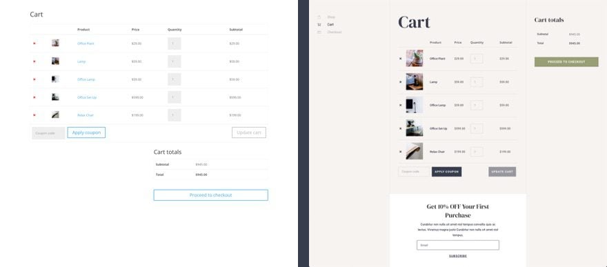
Here is a quick look at Divi’s default cart page compared to the new cart page we’ll design in this tutorial.
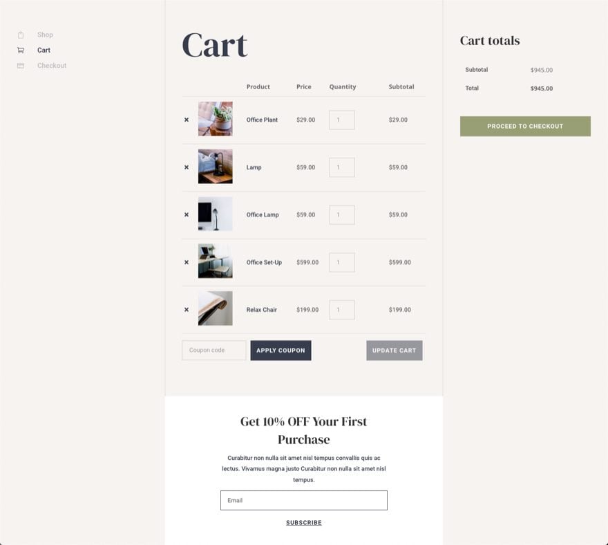
And here is a closer look at the cart page template.
Download the Cart Page Template for FREE
This cart page template is available for download as one of our FREE Cart and Cart Page Template Sets. So feel free to download it from the post featuring those Cart and Checkout Template sets.
To lay your hands on the cart page template design from this tutorial, you will first need to download it using the button below. To gain access to the download you will need to subscribe to our newsletter by using the form below. As a new subscriber, you will receive even more Divi goodness and a free Divi Layout pack every Monday! If you’re already on the list, simply enter your email address below and click download. You will not be “resubscribed” or receive extra emails.
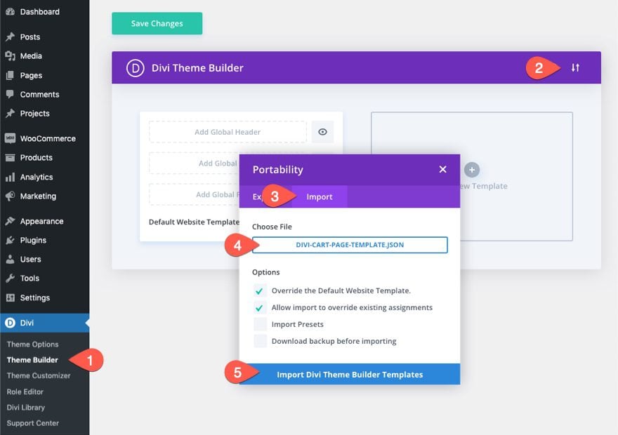
To import the template layout to your website, you will need to go to the Divi Theme Builder and use the portability option to import the .json file to the theme builder.
Once done, the cart template will be available in the Theme Builder. To edit the template, click the edit icon on the body area of the template.
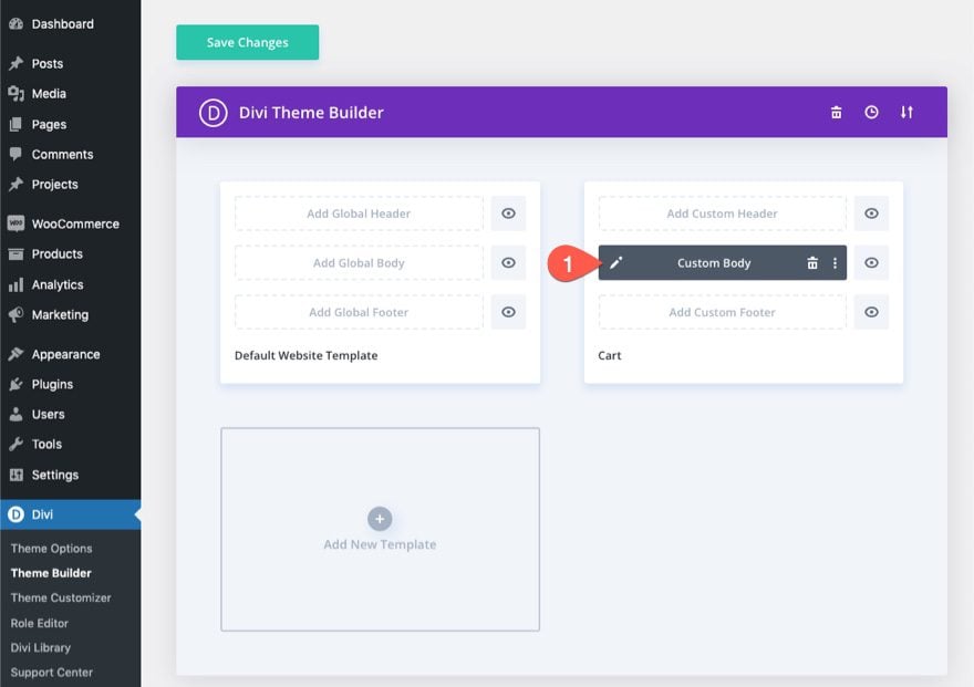
Let’s get to the tutorial, shall we?
About the WooCommerce Cart Page and Divi
Whenever you install WooCommerce on your Divi site, WooCommerce (WC) will generate key WC pages including a shop page, a cart page, a checkout page, and an account page. The content of the page is deployed through the use of a shortcode on the backend WordPress block editor.
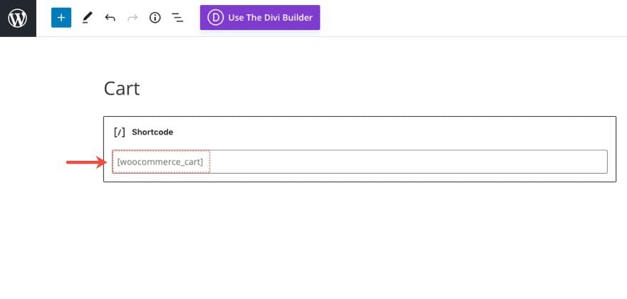
If you activate the Divi Builder on this cart page, each of the content elements of the WooCommerce Cart page will be loaded as Divi Woo Modules that can be used to style the page.
Woo Modules for Designing a Cart Page in Divi
Divi comes with a variety of modules that are key to adding dynamic content to a page template. Some of these include Woo Modules specific to the cart page.
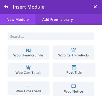
The Modules that are key to building the Cart page or template include:
- Post Title – This will display the title of the cart page dynamically when building a cart page template.
- Woo Notice – This module can be set to different page types (cart page, product page, checkout page). It will display important notifications to the user dynamically as needed.
- Woo Cart Products – This module displays the list of products that a user currently has in their cart.
- Woo Cart Totals – This module displays the current subtotal, shipping and total price for the products in a user’s cart.
Other optional modules include:
- Woo Breadcrumbs – This will display the WooCommerce Breadcrumb navigation bar.
- Woo Cross Sells – This will display any cross sell products linked to items in the cart dynamically.
Design a Cart Page or Template
As mentioned, we can easily use the Divi Woo Modules to design a custom WooCommerce Cart page if you don’t see a need to build a custom template for the cart page. For this tutorial, we are going to build a cart page template using the Divi Theme Builder.
Designing a WooCommerce Cart Page Template with Divi
For this WooCommerce Cart Page template, the goal is to create a custom body area for a template that is assigned to the WooCommerce Cart Page in Divi. We aren’t going to be creating a custom header or footer area for this template, but you can easily use this template on your own website with your own header and footer.
Creating a Custom Template for the Cart Page
To get started, let’s do the following:
- Go to your WordPress Dashboard and navigate to Divi > Theme Builder.
- Then click the Add New Template plus icon inside the empty gray box area to add a new template.
- In the Template Settings modal, under the “Use On” tab, select Cart under the WooCommerce Pages list.
- Finally, click Create Template.
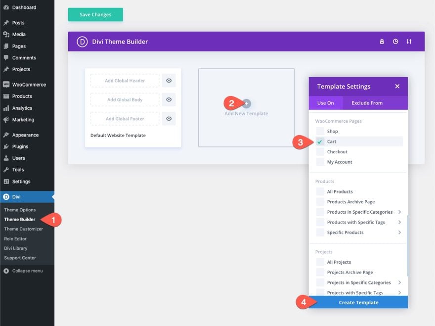
Once the new Cart template has been created, click the “Add Custom Body” area of the template. Inside the popup list, select Build Custom Body.
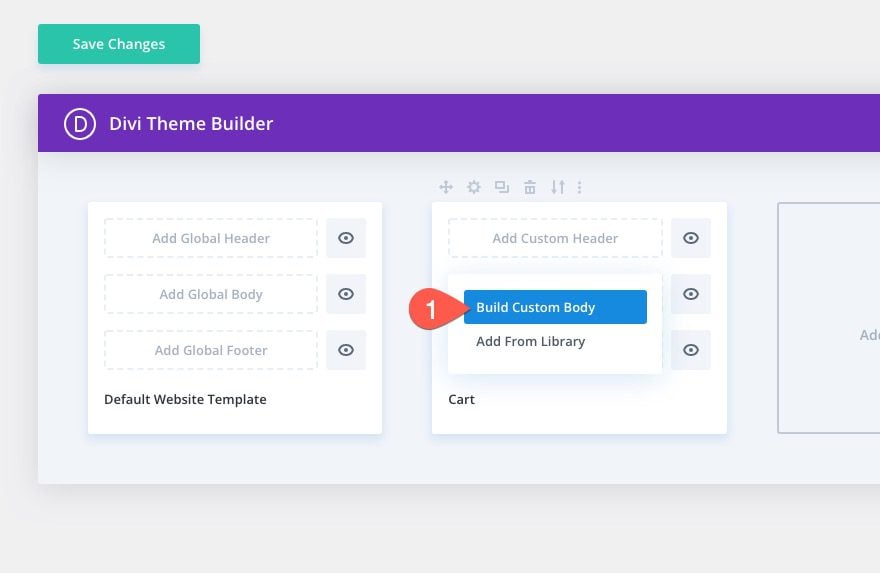
Creating the Section Row and Column Structure
In the Template Layout Editor, insert a new specialty section with a one-fourth one-half 0ne-fourth column structure with two sidebars.
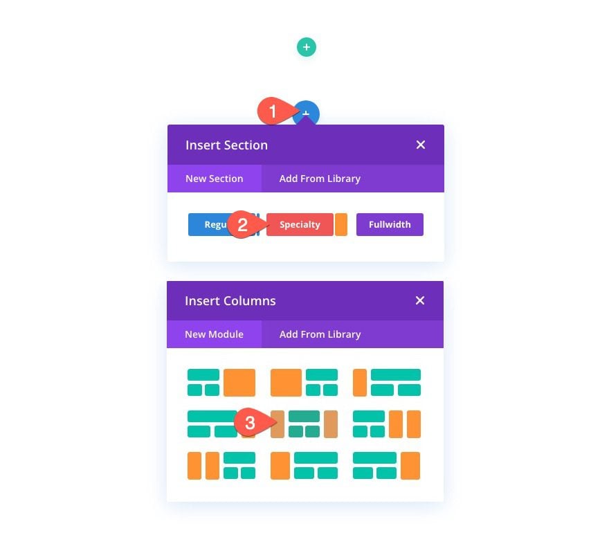
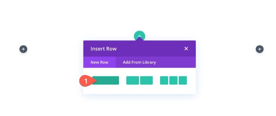
Next, add a one-column row in the middle of the section.
Section Background
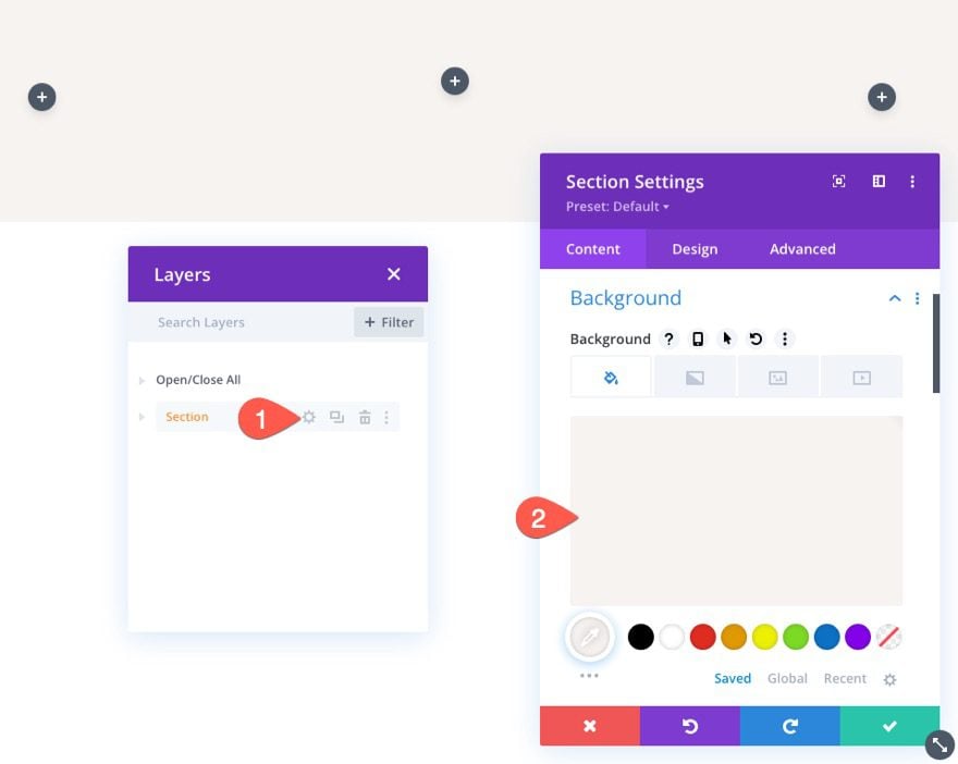
Open the section settings and add a background color as follows:
- Background Color: #f7f3f0
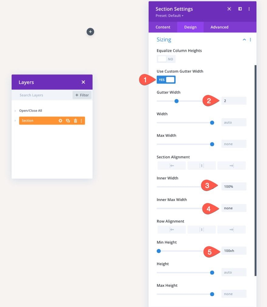
Section Sizing
Under the design tab, update the following:
- Gutter Width: 2
- Inner Width: 100%
- Inner Max Width: none
- Min Height: 100vh
Section Spacing
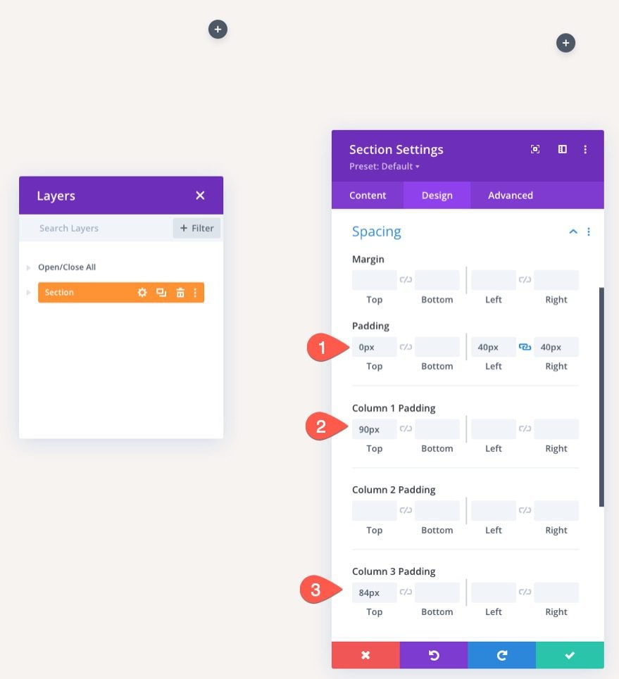
Next add some spacing to the section and columns as follows:
- Padding: 0px top, 40px left, 40px right
- Column 1 Padding: 90px top
- Column 3 Padding: 84px
For this layout, we are going to create a few custom navigation links to the key pages that make up a store – the Shop, the Cart, and the Checkout. This will make it easier for users to navigate through the buying process.
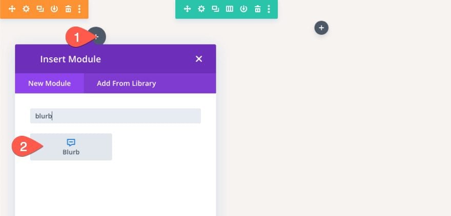
In the left column, add a new blurb module. This will be used as a link to the shop page on your website.
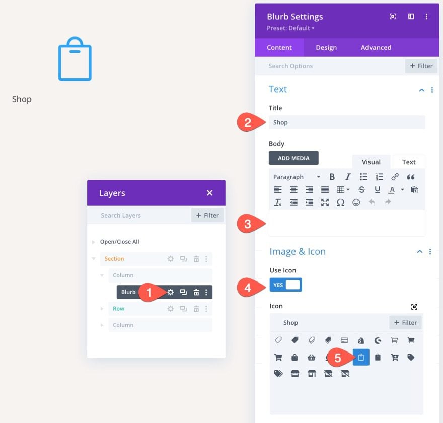
In the Blurb Settings modal, update the content as follows:
- Title: Shop
- Body: leave blank
- Use Icon: YES
- Icon: see screenshot
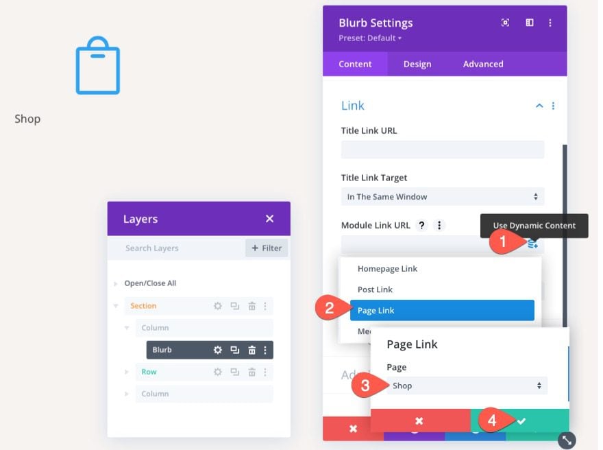
Instead of adding a static link URL, we can add a dynamic link to the Shop page. Here’s how to do it.
- Hover over the Module Link URL input box and click the “use dynamic content” icon.
- In the dropdown, select Page Link from the list.
- In the Page Link modal, select the Shop page from the dropdown list.
- Then save changes.
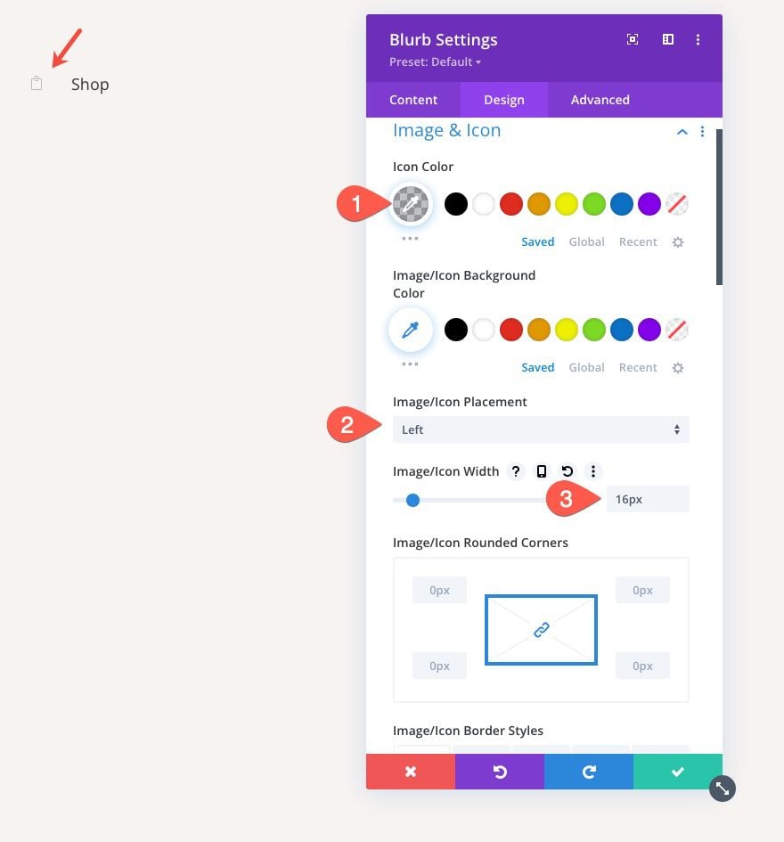
Under the design tab, update the icon style as follows:
- Icon Color: rgba(55,61,75,0.3)
- Image/Icon Placement: Left
- Image/Icon Width: 16px
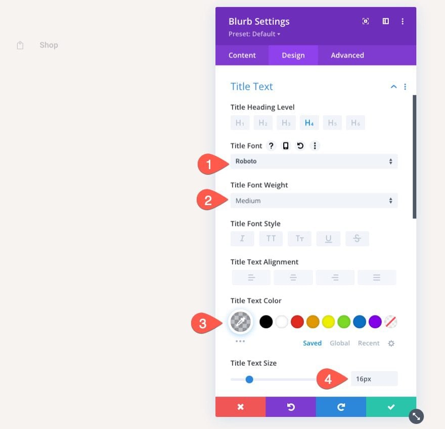
Next, update the title text:
- Title Font: Roboto
- Title Font Weight: Medium
- Title Text Color: rgba(55,61,75,0.3)
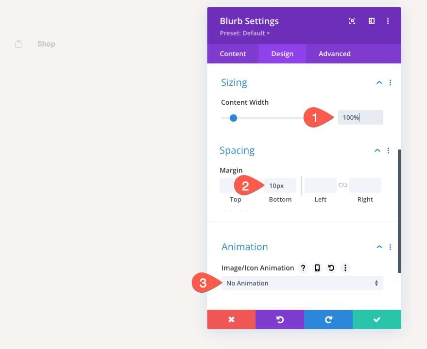
For a final touch, update the size and spacing as follows:
- Content Width: 100%
- Margin: 10px bottom
- Image/Icon Animation: No Animation
This will make sure the blurb (or navigation link) spans the full width of the browser on tablet and phone as well as create some space between the next blurb(s) we are going to add.
To create our next two links, duplicate the existing blurb module we just designed two times so that there are a total of three links.
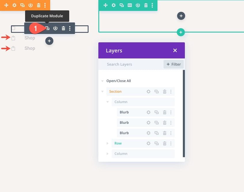
The second link will be the Cart Link which is the page we are currently creating. To make it stand out, open the settings for the second blurb and update the icon and text color:
- Icon Color: #373d4b
- Title Text Color: #373d4b
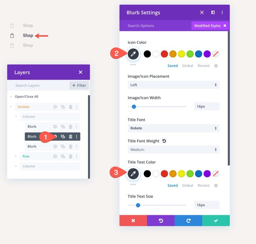
Now all that is left to do is update the Title text and the module Link URLs so that they each have their respective dynamic page link URLs.
Customizing the Row Settings
In the middle part of the page, we will add the woo notice module and woo cart products. But before we add those, we need to optimize the row settings.
Row Padding
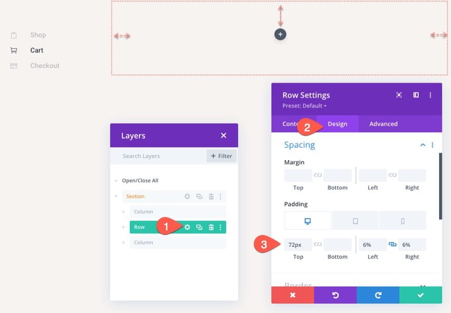
Open the row settings and update the following:
- Padding (desktop): 72px top, 6% left, 6% right
- Padding: (tablet and phone): 0px top, 0px left, 0px right
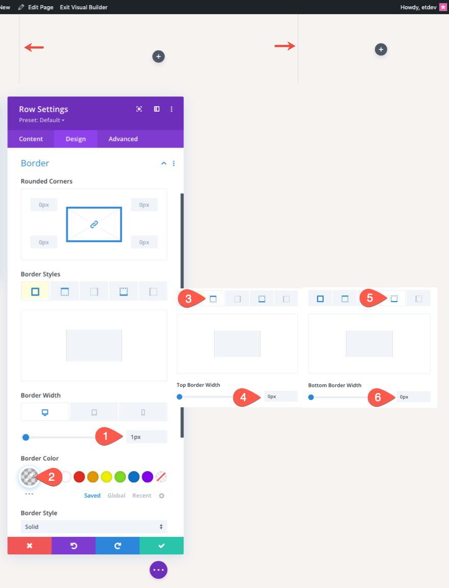
Row Border
- Border Width: 1px
- Border Color: rgba(55,61,75,0.14)
- Top Border Width: 0px
- Bottom Border Width: 0px
Designing the Dynamic Woo Notice Module for the Cart Page
It is always a good idea to add the Woo Notice module at the top of the page so that the notices will be most visible to users when interacting with the cart page. Keep in mind that we are designing notices that will be displayed only when needed.
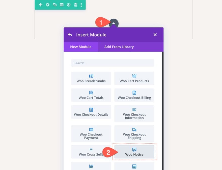
To add the Woo Notice Module, click to add a new Woo Notice module inside the one-column row.
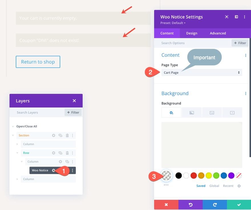
Woo Notice Page Type and Background
Next, update the Page Type and Background color of the Woo Notice as follows:
- Page Type: Cart Page
- Background Color: rgba(153,158,117,0.1)
IMPORTANT: Make sure to select the Cart Page as the Page Type so that the woo notices will work properly.
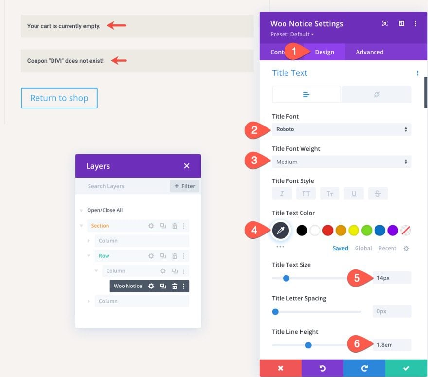
Woo Notice Title Text
Under the design tab, update the title text style as follows:
- Title Font: Roboto
- Title Font Weight: Medium
- Title Text Color: #373d4b
- Title Text Size: 14px
- Title Line Height: 1.8em
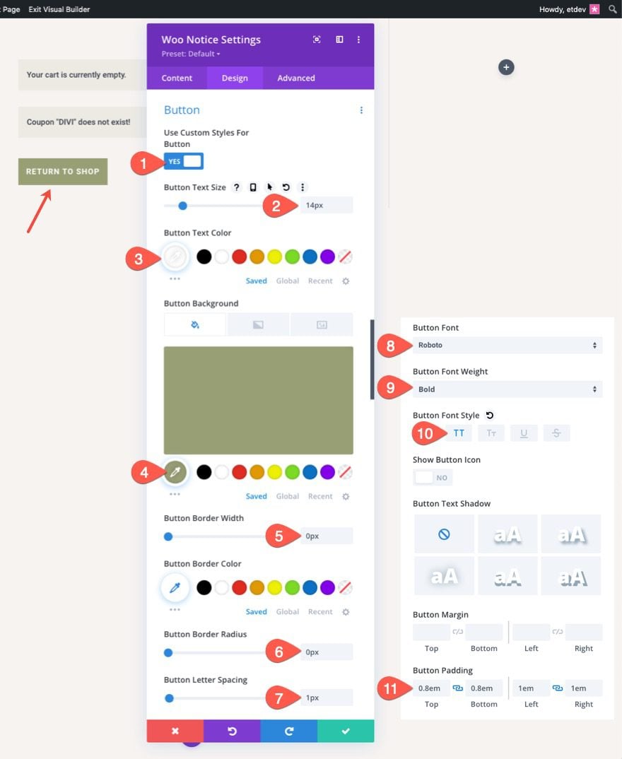
Woo Notice Button
- Use Custom Styles for Button: YES
- Button Text Size: 14px
- Button Text Color: #fff
- Button Background Color: #999e75
- Button Border Width: 0px
- Button Border Radius: 0px
- Button Letter Spacing: 1px
- Button Font: Roboto
- Button Font Weight: Bold
- Button Font Style: TT
- Button Padding: 0.8em top, 0.8em bottom, 1em left, 1em right
Woo Notice Box Shadow
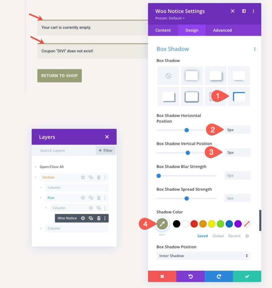
To give the woo notice bar a top border-like design, update the box-shadow options as follows:
- Box Shadow: see screenshot
- Box Shadow Vertical Position: 0px
- Box Shadow Blur Strength: 0px
- Box Shadow Spread Strength: 0px
- Shadow Color: #999e75
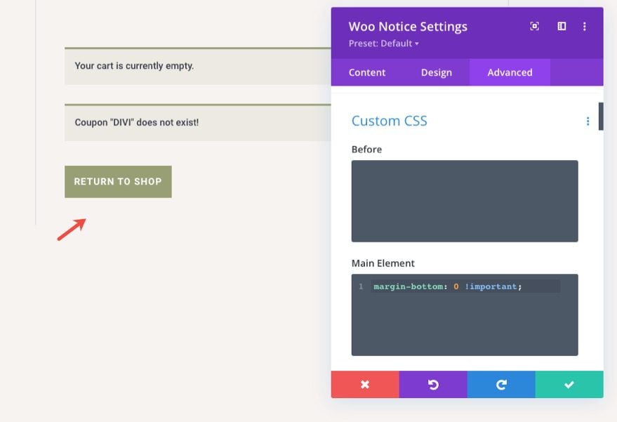
In order to take out the default margin below the woo notice, go to the advanced tab and add the following custom CSS to the Main Element:
margin-bottom: 0 !important;
Creating the Dynamic Cart Page Title
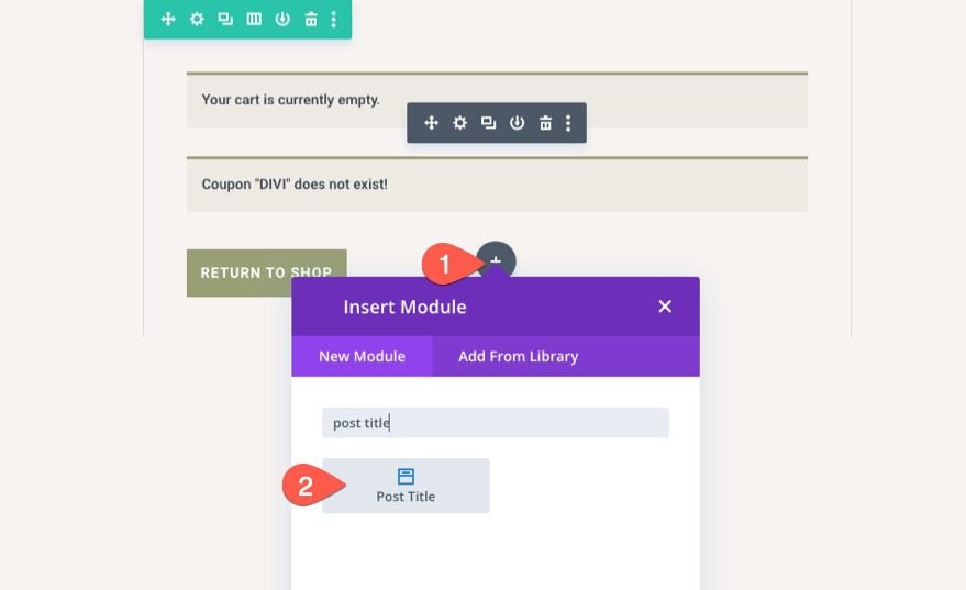
To create the dynamic page title needed for the cart page, add a post title module under the woo notice module.
Post Title Content
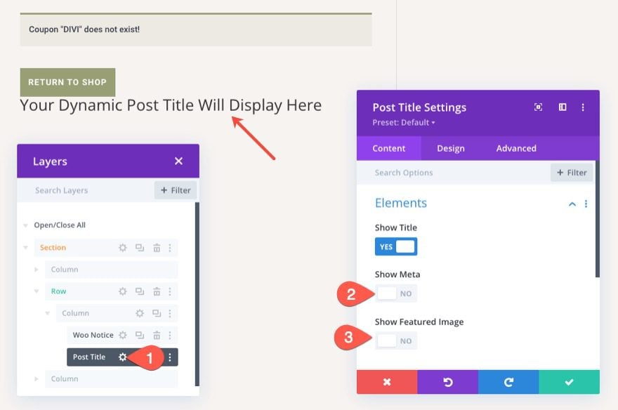
In the post title settings, update the elements to show only the title as follows:
- Show Title: YES
- Show Meta: NO
- Show Featured Image: NO
Post Title Text
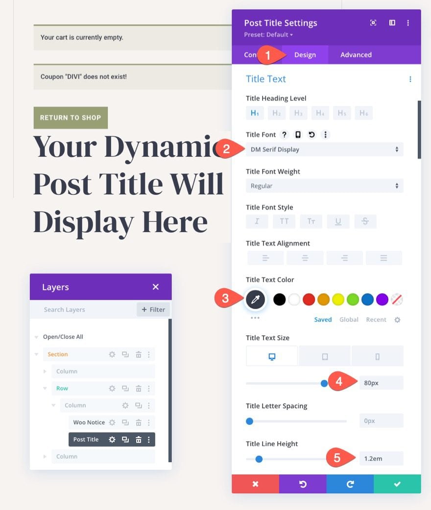
To style the post title text, update the following under the design tab:
- Title Font: DM Serif Display
- Title Text Color: #373d4b
- Title Text Size: 80px (desktop), 60px (tablet), 42px (phone)
- Title Line Height: 1.2em
Designing the Dynamic Woo Cart Products
Now that our page title is in place, we are ready to add the Woo Cart Products, another key element to the cart page template.
Under the post title module, add a Woo Cart Products module.
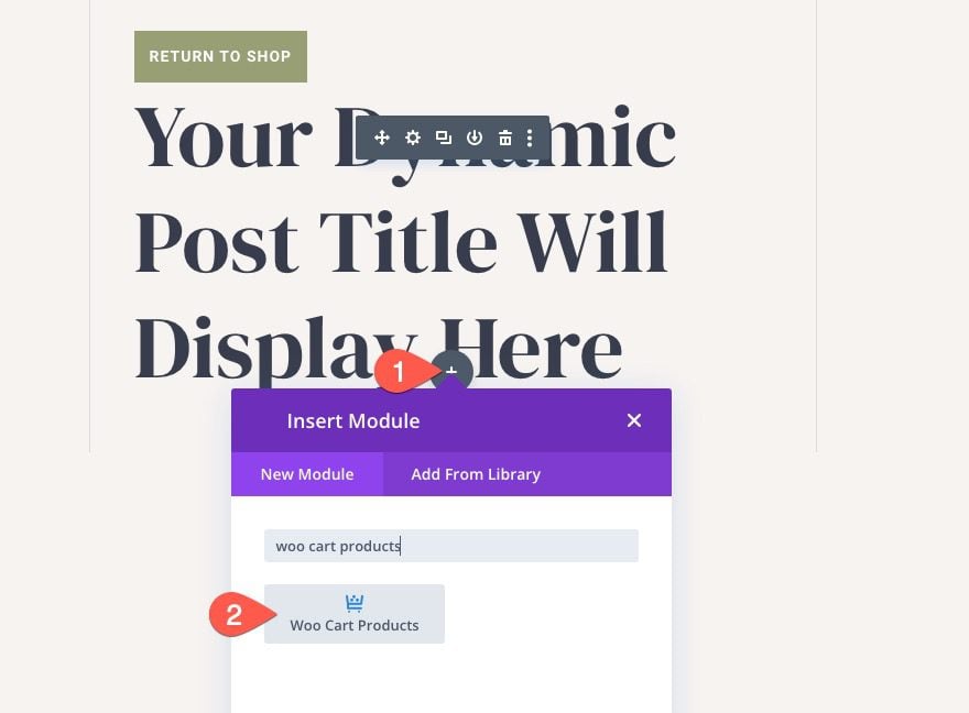
The module should show dummy content unless you already have products in the cart. This will help visualize the design process.
Woo Cart Products Body Text and Links
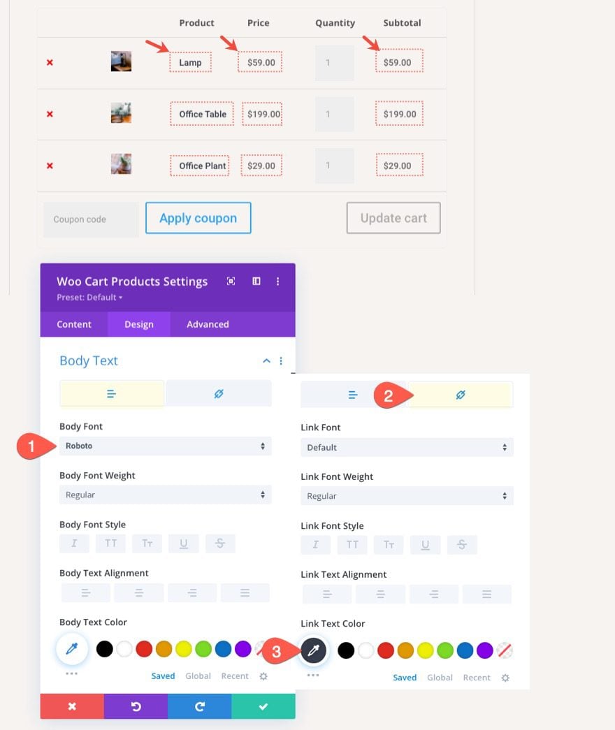
We can target the product title links, price text, and subtotal text by customizing the body text options in the Woo Cart Products settings.
Open the Woo Cart Products settings modal and, under the design tab, update the following:
- Body Font: Roboto
- Link Text Color: #373d4b
Note: The link text will target the product title links under the Product column.
Woo Cart Products Table, Table Cell, and Remove Icon
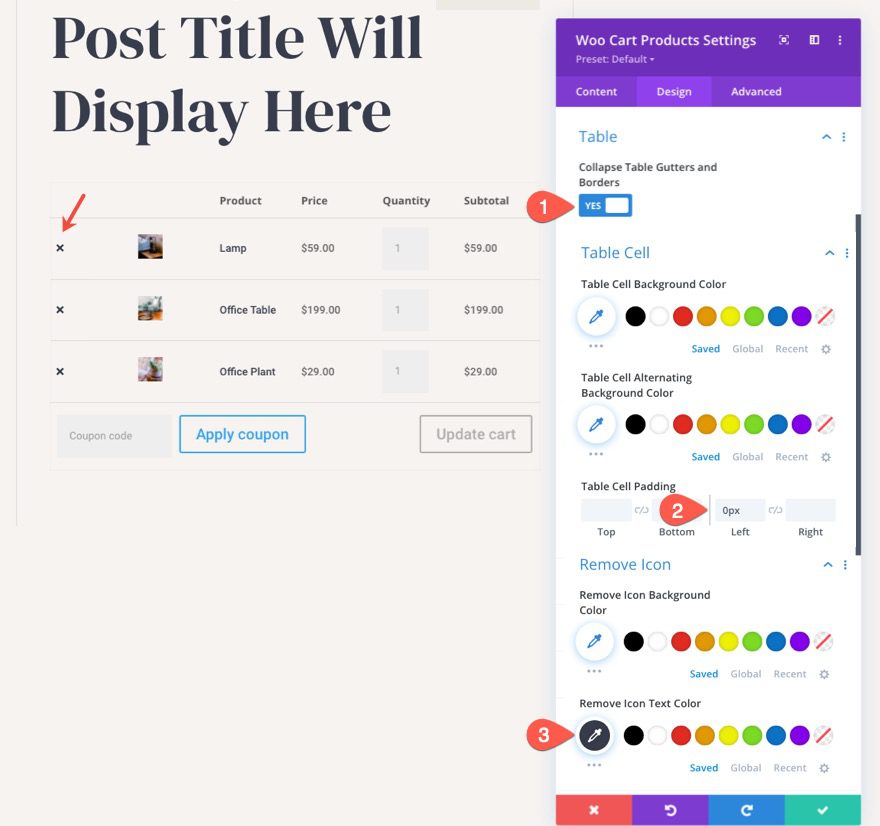
As you can probably tell, the cart products are organized inside a table structure. We can target the style of the table and table cells with the module’s built-in options.
For this example, update the following:
- Collapse Table Gutters and Borders: YES
- Table Cell Padding: 0px
Then update the color of the remove icon (the “x”) on the left side of each product as follows:
- Remove Icon Text Color: #373d4b
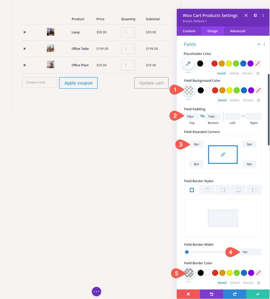
Woo Cart Products Fields
We can also target the cart products fields using the module’s built-in fields options. This will target things like the quantity field boxes and the coupon code field box.
Under the fields options, update the following:
- Field Background Color: transparent
- Field Padding: 10px top, 10px bottom
- Field Rounded Corners: 0px
- Field Border Width: 1px
- Field Border Color: rgba(0,0,0,0.16)
Woo Cart Products Buttons
The Woo Cart Products module contains two buttons (the “Apply Coupon” button and the “Update Cart” button) that can be customized with the module’s built-in button options.
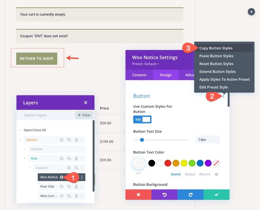
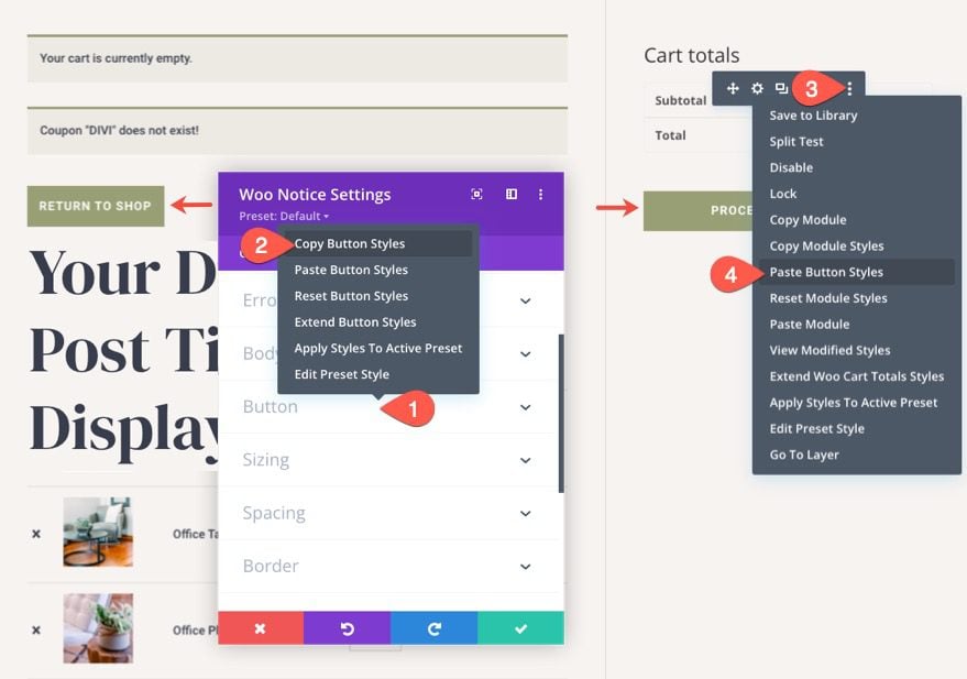
Since we already styled a button in the Woo Notice module, open the Woo Notice module settings and find the button option toggle. Then right-click on the button toggle or click the “three dot” icon to open the more settings menu. There, select copy button styles.
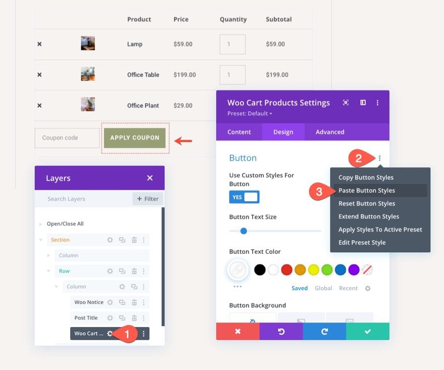
With the button styles now copied, open the Woo Cart Products module settings and open the more settings menu on the button option group and select Paste Button Styles. This will copy the styles of the button from the woo notice module to this one.
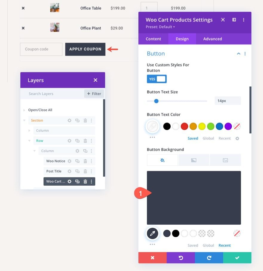
Once the button styles are in place, change the button background color as follows:
- Button Background Color: #373d4b
The Disable Button
The “Update Cart” button has a disabled state whenever it is not needed. We can customize the style of the disabled button as well. For now, just copy the current button styles and paste them to the disabled button styles using the right-click menu settings.
Woo Cart Products Images
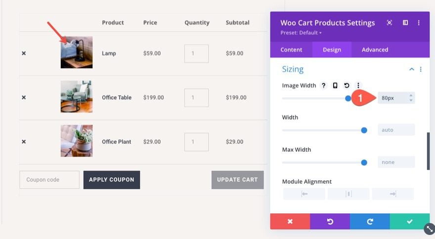
We can also change the style of the product images in this module. For now, let’s change the size of the images under the Sizing options as follows:
- Image Width: 80px
Custom Table Layout
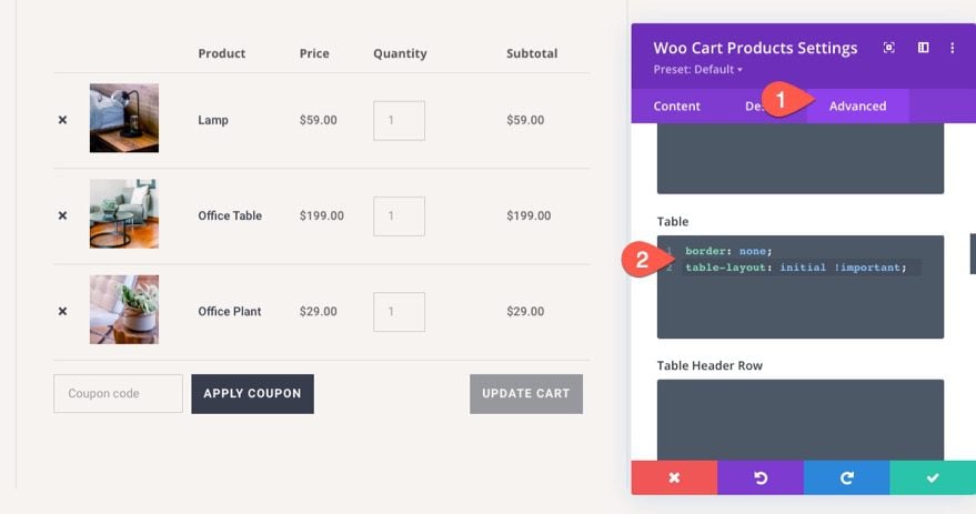
If you want create more horizontal space for the product information in the table, you can override WooCommerce default fixed table layout to initial (or auto). To do this, go to the advanced tab, and add the following custom CSS to the Table:
table-layout: initial !important;
Designing the Dynamic Woo Cart Totals Module
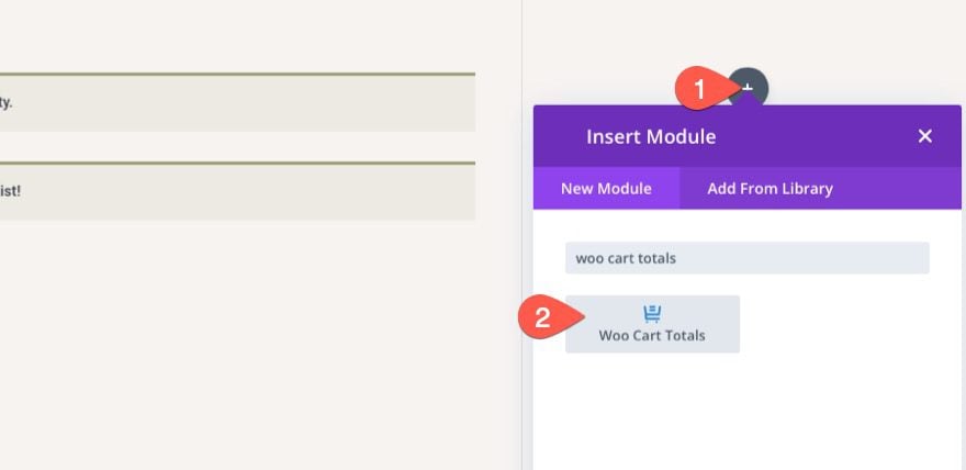
The last key element we need to complete the cart page template is the Woo Cart Totals modules. This module displays the dynamic cart totals content as well as a “Proceed to Checkout” button. For this layout, go ahead and add the cart totals module to the right column of the section.
Cart Totals Button
First, let’s copy the button styles used for the Woo Notice modules (like we did before) and paste the button styles to the cart totals module. This will give us a matching button style for the “Proceed to Checkout” button. Of course, you can easily customize the button styles however you like using the module’s built-in options.
Cart Totals Text
To style the title text of the cart totals module, open the cart totals module and, under the design tab, update the following:
- Title Font: DM Serif Display
- Title Text Size: 30px (desktop), 24px (tablet), 18px (phone)
- Title Line Height: 1.8em
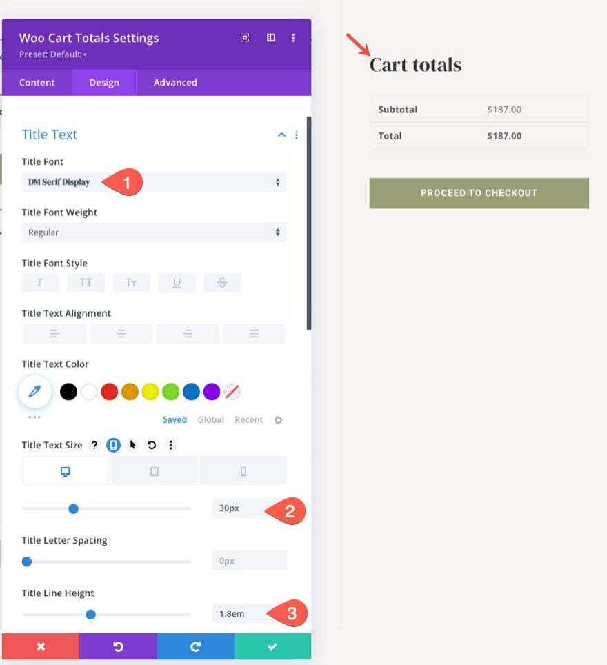
Table Border and Table Cell Border
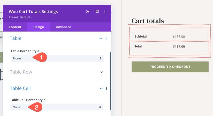
The Cart Totals will have some table styles by default. You can choose to style those with the module’s built-in table and table cell options. For this layout, we are going to take out the border styles for both. To do this, update the following:
- Table Border Style: None
- Table Cell Border Style: None
Cart Totals Fields
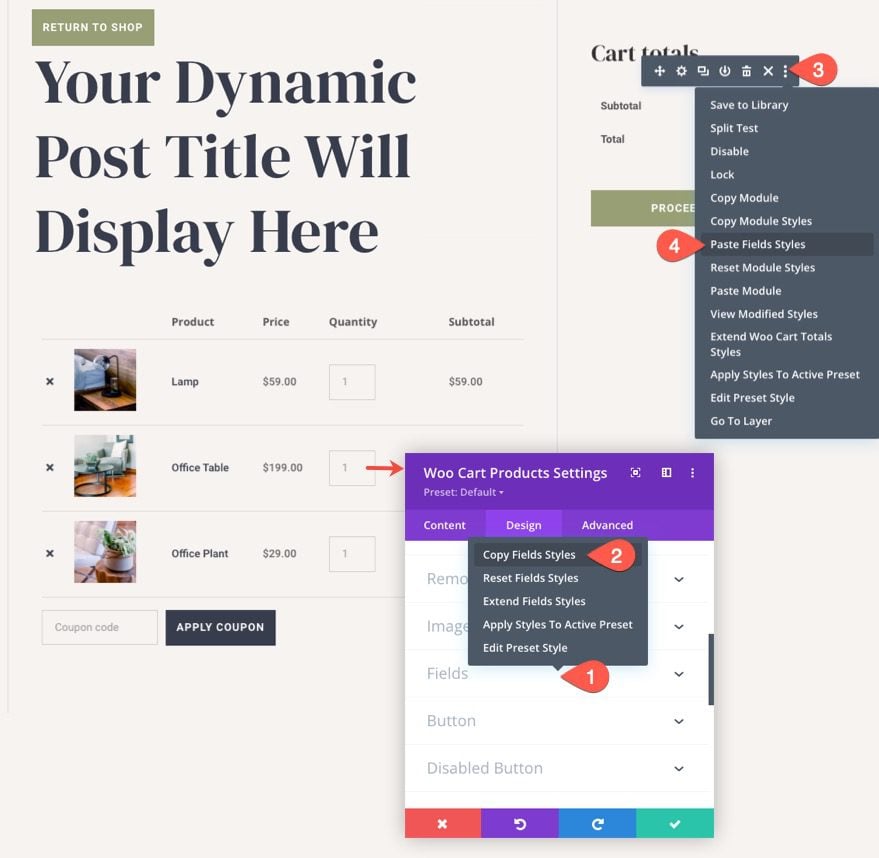
To give the cart totals module the same field styles used in the Woo Cart Products, copy the field styles from the Woo Cart Products module and paste them to the Cart Totals module.
Add More Content as Needed
At this point, we have all the key elements for our cart page template. But you don’t have to stop here. You can add any content you want to the page as needed. Here are a few ideas:
- Add a Woo Cross Sells module to display any cross sell products linked to the products added to the cart.
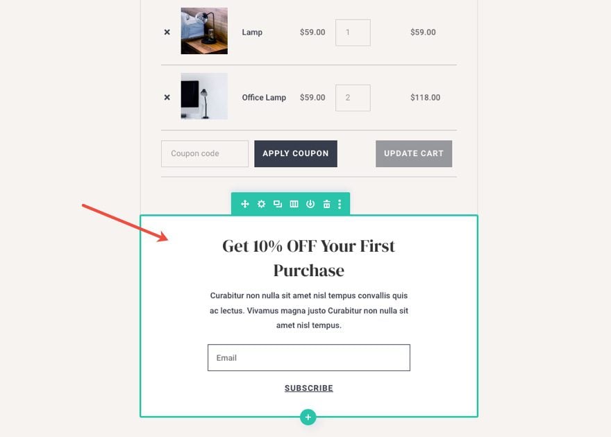
- Add an Email Optin for a discount on first purchases.
- Add a promo displaying a coupon code to incentivize completing the buying process.
For our free demo of this layout, we included a nice email opt-in below the cart products.
Final Result
Let’s check out the final result of our cart page template.

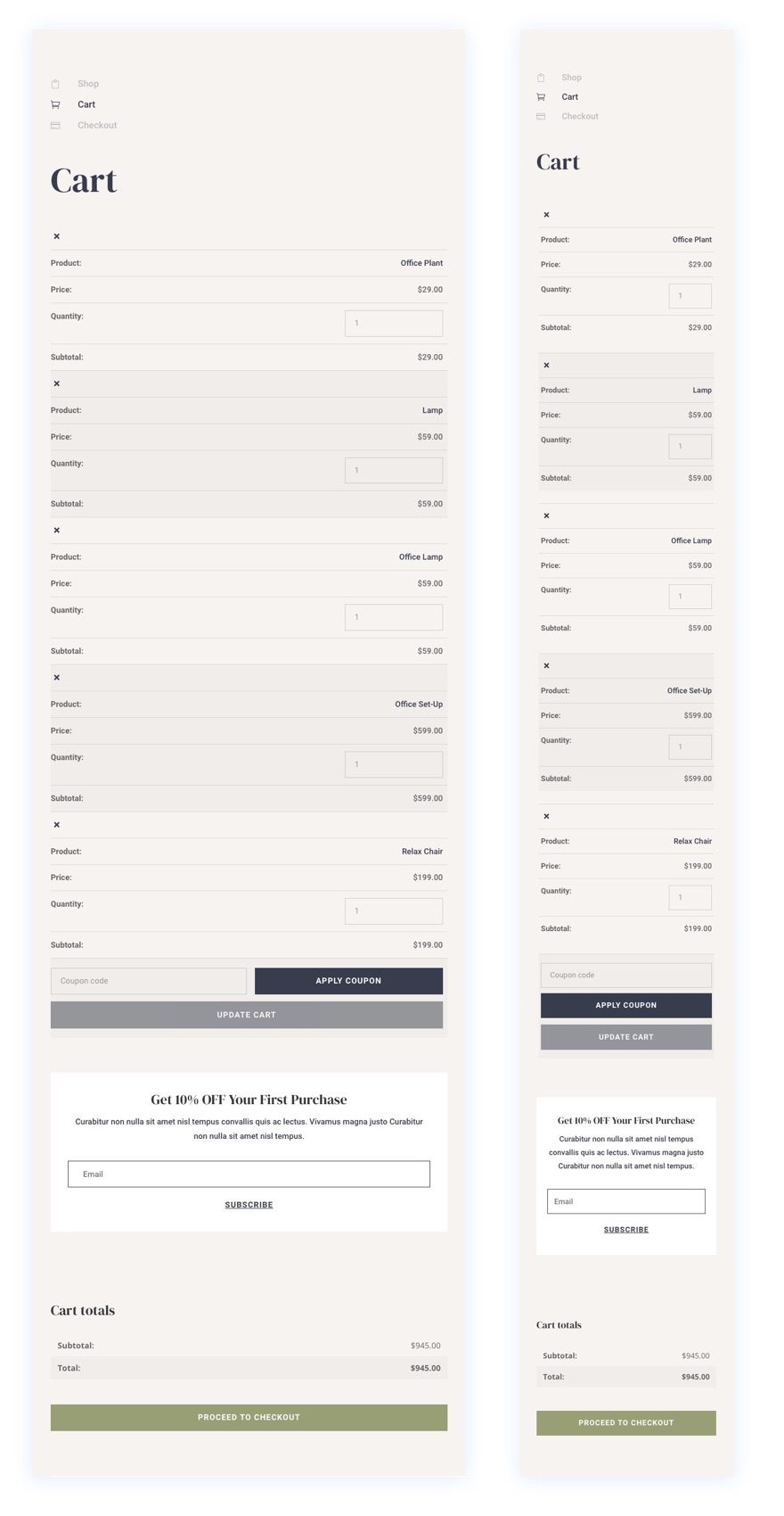
And here is how it looks on tablet and phone devices.

Final Thoughts
The process of designing a custom WooCommerce Cart Page template is drastically simplified and amplified with Divi’s powerful theme builder and intuitive Woo Modules. In this tutorial, we concentrated on incorporating the key elements that make up a cart page. But, keep in mind, all of the other powerful Divi modules and features are at your disposal to take your cart pages to a whole new level. Hopefully, this will help boost your Divi design skills and, more importantly, lead to more conversions.
I look forward to hearing from you in the comments.
Cheers!




Thanks Jason,
The template looks great but unfortunately the shipping does not work properly on Divi’s cart modules so using this or any other template is pointless until that’s fixed.
Shipping works ok if you have a flat rate but if you have different costs for different areas it does not work correctly.
Apparently this is a known fault according to ET’s support team.
I build a lot of ecommerce sites using Divi and WooCommerce, so this error is an annoying problem for me and I’m sure for anyone else who is a serious user.