Creating an A-Z index makes it easier for users to find what they are looking for quickly without much reading and/or scrolling. This kind of indexing is common in the medical field because it makes it easy for patients to find and read about certain diseases or medical conditions.
For this use case tutorial, I’m going to show you how to create an A-Z index of medical conditions for Divi’s Doctor’s Office Layout Pack. I’ll be using Divi’s tabs module to build the A-Z index with some custom design to match the index with the Doctor’s Office Layout. And, if you are looking to add tooltips to your site, I’m going to introduce an extremely easy solution using the Simply Tooltips plugin.
Let’s do this!
Sneak Peek
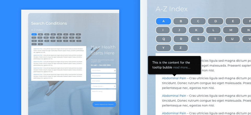
Let’s take a peek at what we are going to create.
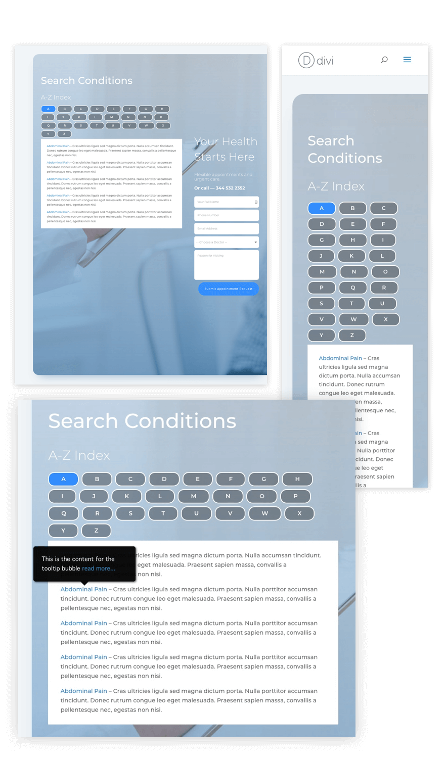
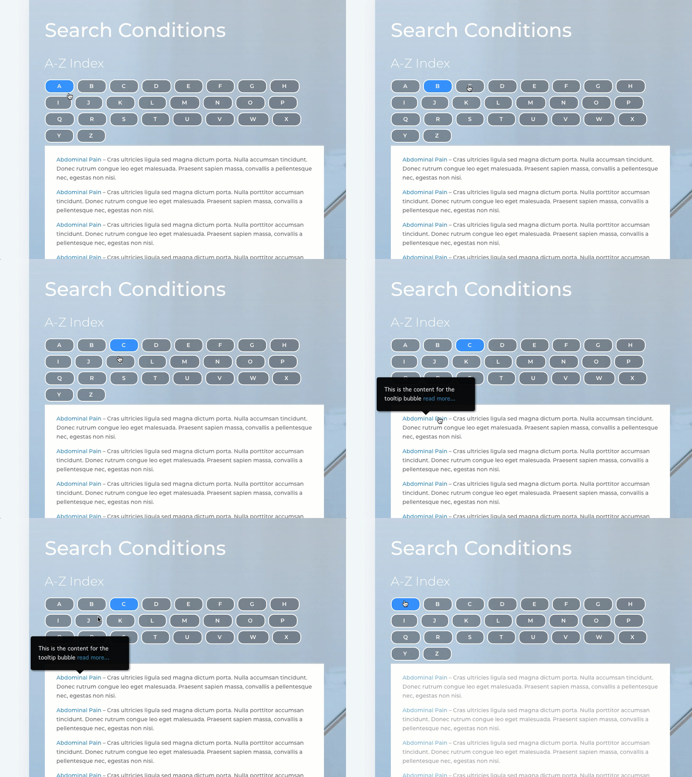
Here is a peek at the functionality.
What You Need
Here is what you need for this tutorial:
- Divi Theme (installed and active)
- Doctor’s Office Layout Pack (accessible from the Divi Builder)
- Simple Tooltips (installed and active)
The Design Strategy
The strategy for designing the A-Z index is to use Divi’s tabs module. Basically, all you need to do is create a tab for every letter of the alphabet and then organize your list of conditions alphabetically under each corresponding tab/letter. All of the conditions starting with “A” will be under the “A” tab and so on. This works well to condense the length of your lists and minimizes the need for scrolling. A user simply clicks a letter and then scrolls through only the conditions starting with that letter.
There are two other ways of adding an A-Z index that I considered for this use case. The first idea was to create an alphabet of anchor links that scroll to sections of the page. The second idea was to build a custom menu with a letter for each menu item that directed the user to a separate page (or post) of conditions starting with the corresponding letter. These are both viable options but I thought this wasn’t as convenient (or simple) as using the tabs module.
Creating the A-Z Index Page
The Doctor’s Office Layout Pack will give us a jumpstart on the design of our A-Z index page. Of course, you can always incorporate the index on an existing page if you want as well.
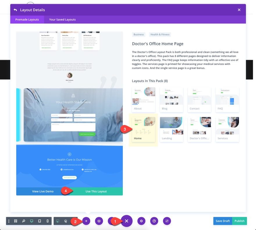
Start by creating a new page (Pages > Add New), enter a page title, and deploy the visual builder. Open the settings menu at the bottom of the page and click the add from library icon. Then select the Doctor’s Office Layout pack and choose the FAQ page template.
Once the layout loads on the page, delete all sections on the layout except for the section titled “Your Health Starts Here” with the appointment request form.

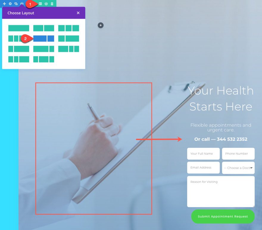
Change the layout of your row to a two-thirds one-third column structure. Then move the existing modules in the left column over to the right column.
Copy the text module in the main header section with the Title “We are Committed to Your Health” and paste it in the left column of the second section.

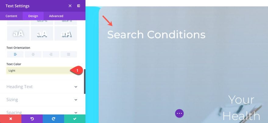
Change the text to read “Search Conditions” and then change the text color to Light.

Add a new text module under that text module in the left column and enter the text “A-Z Index” and save the module.
Now copy the module styles (use right click) of the second text module in the right column and paste the module styles to the “A-Z Index” text module.
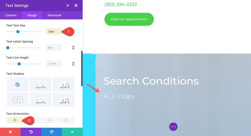
Then update the “A-Z Index” text module design settings as follows:
Text Text Size: 32px
Text Orientation: Left
Save Settings
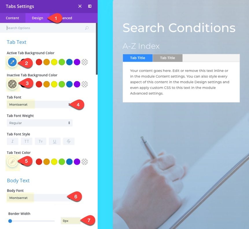
Now we are ready to build our index with the tabs module. Go ahead and add a tabs module under the A-Z Index text module. Before we start adding new tabs to the module, update the tabs settings as follows:
Active Tab Background Color: #2f8cff
Inactive Tab Background Color: rgba(0,0,0,0.33)
Tab Text color: #ffffff
Body Font: Montserrat
Border Width: 0px
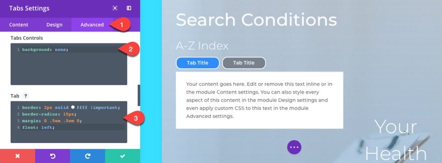
For an added touch of custom design, we can add some custom CSS to style our tabs. Under the advanced tab, add the following CSS to the Tabs Controls input box:
background: none;
This takes out the gray background behind the tabs.
Then add the following CSS to the Tab input box:
border: 2px solid #fff !important;
border-radius: 15px;
margin: 0 .5em .5em 0;
float: left;
This styles the tabs to have a custom border and spacing. Adding float:left will make sure the tabs stay left aligned even on mobile devices.
Now we are ready to add our tabs and tab content. Under the Content tab, delete the second tab and click to edit the settings of the one tab that is left.
Give the tab the title “A” and update the content box with a list of conditions starting with the letter “A”.
Here is the mock content I am adding:
[simple_tooltip content='This is the content for the tooltip bubble <a href="#">read more...</a>']<a href="#">Abdominal Pain</a> [/simple_tooltip]- Cras ultricies ligula sed magna dictum porta. Nulla accumsan tincidunt. Donec rutrum congue leo eget malesuada. Praesent sapien massa, convallis a pellentesque nec, egestas non nisi.

[simple_tooltip content='This is the content for the tooltip bubble <a href="#">read more...</a>']<a href="#">Abdominal Pain</a> [/simple_tooltip] - Cras ultricies ligula sed magna dictum porta. Nulla porttitor accumsan tincidunt. Donec rutrum congue leo eget malesuada. Praesent sapien massa, convallis a pellentesque nec, egestas non nisi.

<a href="#">Abdominal Pain</a> - Cras ultricies ligula sed magna dictum porta. Nulla porttitor accumsan tincidunt. Donec rutrum congue leo eget malesuada. Praesent sapien massa, convallis a pellentesque nec, egestas non nisi.

<a href="#">Abdominal Pain</a> - Cras ultricies ligula sed magna dictum porta. Nulla porttitor accumsan tincidunt. Donec rutrum congue leo eget malesuada. Praesent sapien massa, convallis a pellentesque nec, egestas non nisi.

<a href="#">Abdominal Pain</a> - Cras ultricies ligula sed magna dictum porta. Nulla porttitor accumsan tincidunt. Donec rutrum congue leo eget malesuada. Praesent sapien massa, convallis a pellentesque nec, egestas non nisi.
You may notice that I have included links in there. This could be a great place to redirect users to a page describing that particular condition. I have also included a shortcode that adds a tooltip around the first link in the list. I’ll go over this shortcode more later, but for now, let’s continue setting up the tabs.
Save your settings for that tab and then duplicate the tab 25 times (there are 26 letters in the alphabet in case you forgot). In fact, you can sing the alphabet song as you click the duplicate button for some serious fun 🙂 . Once you are done, save your settings.
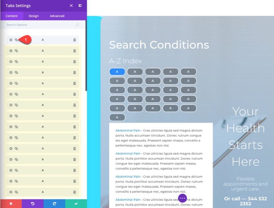
Now you can use the inline editor to change the letters on your tabs. This saves you from having to click into the tab settings each time.
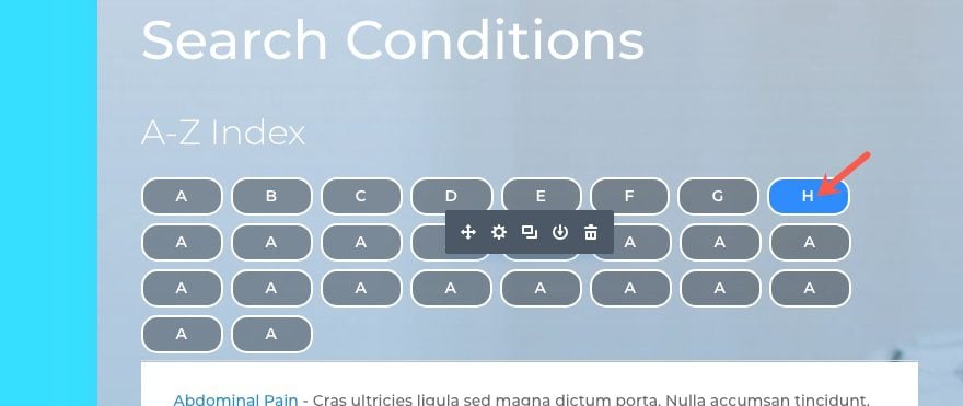
You will need to update the content under each of the tabs to include the conditions corresponding to the tab letter, but the index is now ready to go.
Using the Tooltip Shortcode
As I mentioned earlier, I added an example shortcode to the first link in the tab content. This shortcode works if you have the Simple Tooltips plugin installed and active.
Here is the basic structure of the shortcode:
[simple_tooltip content='This is the content for the tooltip bubble']This triggers the tooltip[/simple_tooltip]
Simply replace “This is the content for the tooltip bubble” with the content you want to show in the tooltip bubble and replace “This triggers the tooltip” with the content that, on hover, will trigger the tooltip bubble.
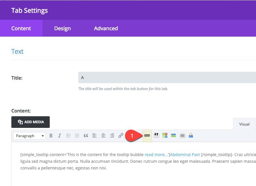
You can also deploy the tooltip shortcode using the plugin’s tooltip shortcode generator. To use this you will need to use the backend builder (not the visual builder). In the backend builder edit the tabs module tab settings and you will see a tooltip button in the wysiwyg editor.
You can also include links in the tooltip bubble. This will be great for redirecting users to a different page for more info. I’ve included a read more link in the first item under the tab content already so you can see how this might look. Check out their blog post for more ideas on how to use this plugin.
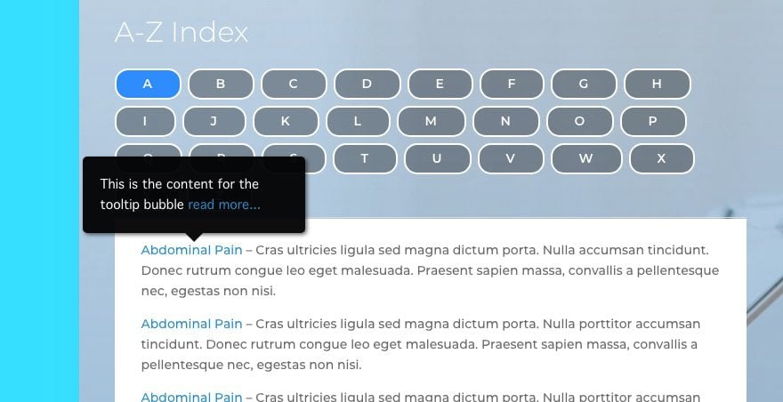
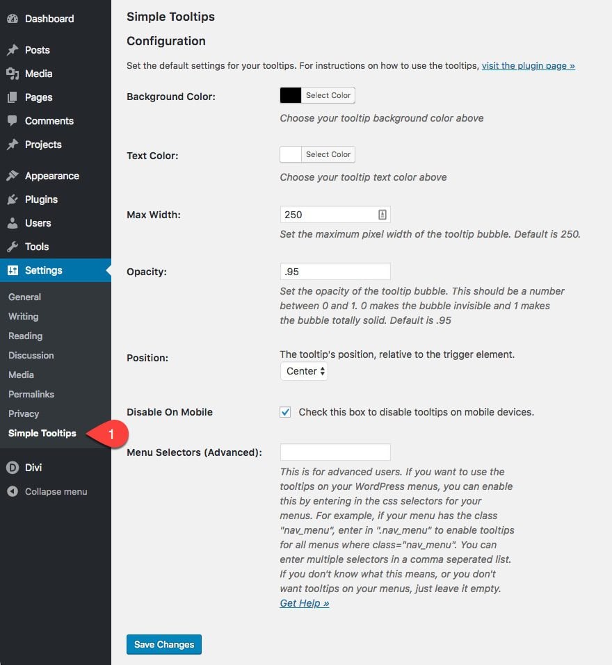
The plugin also has some configurable options to change the color, size, position, and opacity of your tooltip. You can access this settings page by navigating to Settings > Simple Tooltips.
Putting the Final Touches on the Page
You can keep the header section if you want, but for this example, I’m going to delete it so that I only have the A-Z Index section for my page.
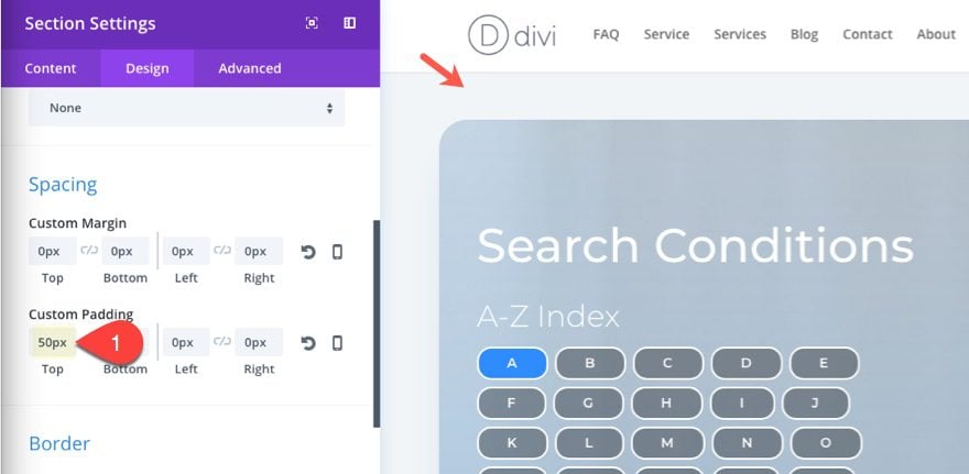
Next, update the section settings to remove the background image and add a top padding of 50px.
For the text modules in the right column, change the text alignment to left.
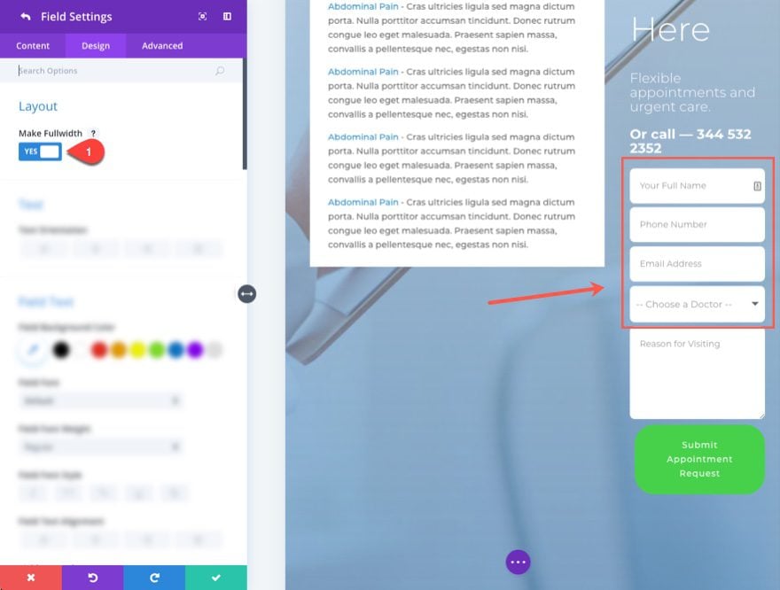
Then update the field settings for your contact form module by making all the fields fullwidth.
Then update the contact form button background color and row color to #2f8cff.
That’s it!
Check out the final result.
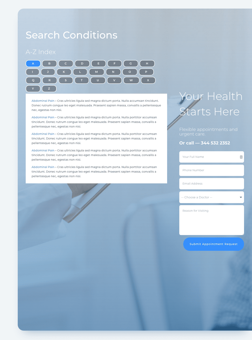
Notice how the tabs work and the tooltip functionality.

Here is what the index will look like on mobile.

Final Thoughts
The A-Z Index seems like a perfect addition to any doctor’s office website. And I’m sure there are many other uses for this type of indexing. Divi’s tabs module does a good job of allowing the user to browse through lists of content without having to leave the page or scroll endlessly. The tooltips are also extremely useful for content heavy pages. Overall, the complete process is pretty easy, and with a few design adjustments, you can have a beautiful index page for your site.
As always, I look forward to hearing from you in the comments.
Cheers!





Is the layout available for download? Seems like a lot of work to go through when a lot of this tutorial is just designing.
Unfortunately, the layout isn’t available for download because it requires a third-party plugin to be installed first. If it were available for download, people might expect the page to look exactly like the layout without having installed the necessary plugin. If you’re having issues achieving the same layout when following the tutorial, feel free to reach out to our Support Team, they will be happy to assist.
Great Video, I do Have a question though. How do you assign an HTML to the CSS code you added for instance Adominal pain.
Question 1. How can I make the tab titles (the A-Z buttons) smaller? They seem too wide for having to accommodate only one letter each. Smaller would mean more tabs on the same row.
Question 2. You mention considering doing the same thing for 26 pages instead of 26 tabs. Can you give details as to how? As Bjarne mentioned, Google is unable to open and index tab content. I’d like to try it with pages instead.
Cheers!
One ord of caution. Tabs are neat for organising content, but horrible for search. Neither WordPress or Google are able to “open” the tabs neither for indexing nor when clicking a search result.
So – in your “symptoms index” – a search for “Headache” won’t yield any results, but just might give you one.
A Custom Post Type is a much better solution for that kind of content, and “dynamic content” may actually be in the works for Divi. I’m hoping to see support for the major CPT’ tools, like Advanced Custom Fields and Pods Framework.
If I have activated plugin “Simple Tooltips”, I get the following error message when I create new modules:
et_pb_row could not be displayed
When deactivated, this problem does not occur.
Are you aware of this and do you have a proposal for a solution?
Thank you
Daniel
Thank You So Very Much.
Hi. Thank you, great thing came up!
I have a question: Is it possible to do this by pressing a few tabs and making a double or triple value in this way? If this is possible, tell me please. Thank you
Unfortunately tabs module doesn’t have this capability. It sounds like you are referring to a filtering functionality. If so, you may want to look into designing an A-Z index using the filterable portfolio. Hope that helps.
thank you, it´s great. it´s look very fine
The line under the tabs is still visible. How do you get rid of that?
Add the following Custom CSS to the theme customizer…
ul.et_pb_tabs_controls:after { border-top:none; }Thanks.
Or you can use Toolset and have so much more.. 🙂
For so much more money. LOL
Hi Jason! You do a great job showing us step by step how to create so many amazing things with Divi. & ALL FOR FREE. Thank You.
Looks great. Is there a way to make it so each tab is the same size for all the tabs?
Thanks,
Jay
Add the following in addition to the current custom css in the tab input box under the advanced tab:
width: 80px; text-align: center;Ótimo tutorial. Parabéns!
It seems like Divi should support tooltips right out of the box…
+1
Agreed.
Hi there,
Any live demo?
Any JSON file to download and upload?
Thanks!
Igor
I would love that as well.
+1
Those would be nice to have