
Every week, we provide you with a new and free Divi layout pack which you can use for your next project. Along with every layout pack, we also share a use case that’ll help you take your website to the next level.
This week, as part of our ongoing Divi design initiative, we’re going to show you how to create an elegant process page using Divi’s Architecture Firm Layout Pack. To create this page, we’ll reuse elements that are already present within the layout pack and modify them along the way. We’ll also create a vertical ‘divider’ or ‘timeline’ that will create a connection between the steps and will help your visitors follow the process. You can create as many steps as you need for your process using this method. Let’s get started!
- 1 Preview
- 2 Part 1: Create New Page Using Architecture Firm Landing Page
-
3
Part 2: Modify Process Step Section
- 3.1 Step 1: Locate Section We’ll Use & Modify
- 3.2 Step 2: Change Section Spacing
- 3.3 Step 3: Remove Image Module
- 3.4 Step 4: Change Column Structure
- 3.5 Step 5: Change Row Spacing
- 3.6 Step 6: Add Box Shadow to Row
- 3.7 Step 7: Change Text Alignment of Text Module #1
- 3.8 Step 8: Remove Negative Left Padding of Divider Module
- 3.9 Step 9: Use Center Module Alignment for Divider Module
- 3.10 Step 10: Change Text Orientation of Text Module #2
- 3.11 Step 11: Change Sizing of Text Module #2
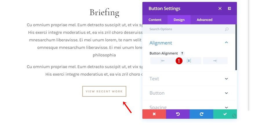
- 3.12 Step 12: Use Center Module Alignment for Button Module
- 4 Part 3: Add Vertical ‘Divider’
- 5 Part 4: Clone Section as Frequently as Needed
- 6 Preview
- 7 Final Thoughts
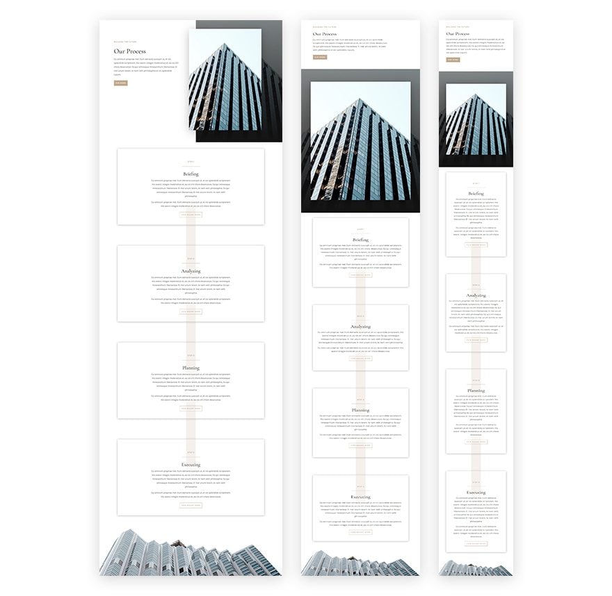
Preview
Before we dive into the use case tutorial, let’s take a quick look at the end result on different screen sizes:
Part 1: Create New Page Using Architecture Firm Landing Page
Step 1: Create New Page & Switch over to Visual Builder
Start by creating a new page, giving your page a title and switching over to Visual Builder.
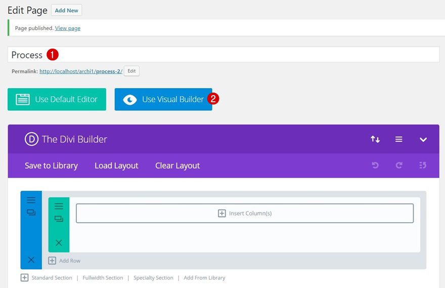
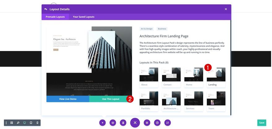
Step 2: Upload Architecture Firm Landing Page
We are using the Architecture Firm Layout Pack‘s landing page to create the process page. It’ll help us maintain the same style and it’ll also save us a lot of time. Go to your premade layouts, scroll down until you come across the Architecture Firm Layout Pack and use the landing page layout.
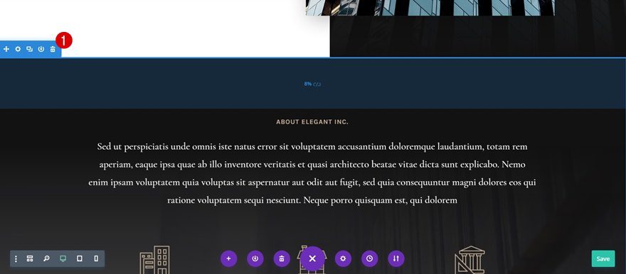
Step 3: Remove Unnecessary Sections
This landing page contains quite a few sections. Go ahead and delete the ones you don’t think are necessary. We’ve deleted the following sections from our layout:
Part 2: Modify Process Step Section
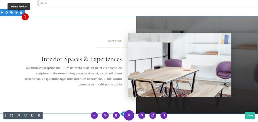
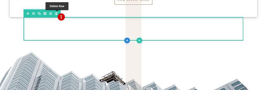
Step 1: Locate Section We’ll Use & Modify
The one section we’ll definitely reuse during this tutorial is the following one:
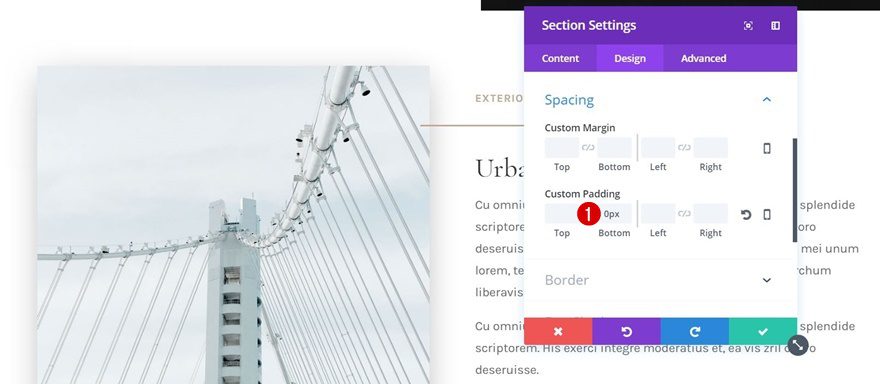
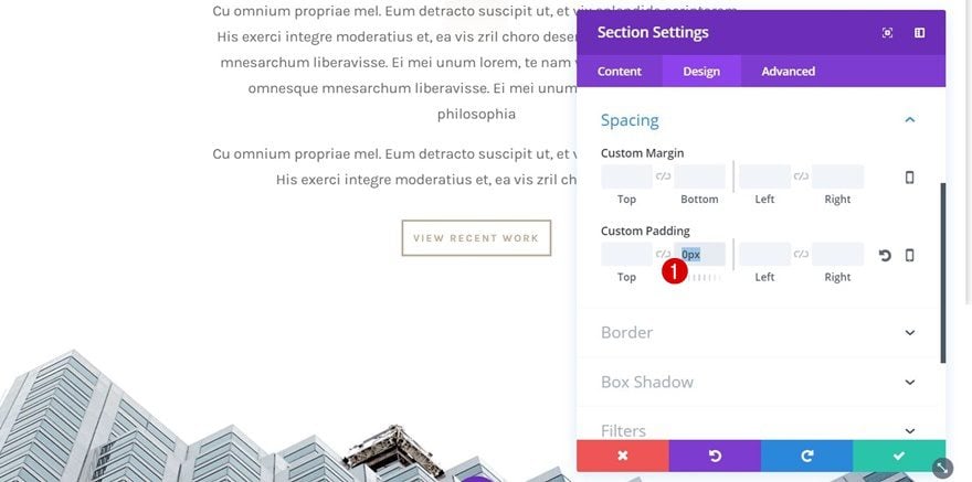
Step 2: Change Section Spacing
Start by opening the settings of this section and add ‘0px’ to the bottom padding of it.
Step 3: Remove Image Module
Remove the Image Module in the first column next.
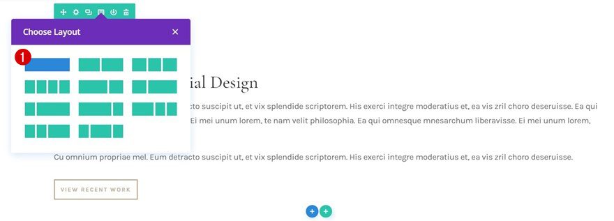
Step 4: Change Column Structure
And change the column structure into a row with one column only.
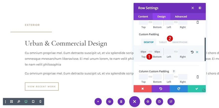
Step 5: Change Row Spacing
Open the row settings and add the following custom padding:
- Top & Bottom Padding: 60px
- Left & Right Padding: 50px (Tablet & Phone Only)
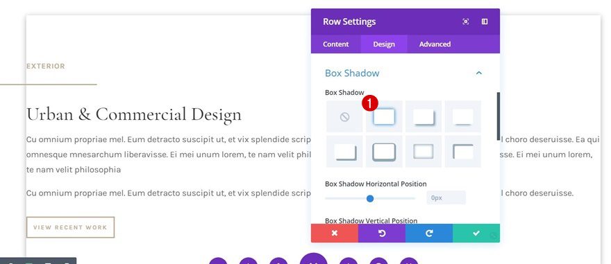
Step 6: Add Box Shadow to Row
We’ll also add some box shadow to our row to create depth. In this tutorial, we’ve enabled the first box shadow without modifying its default settings.
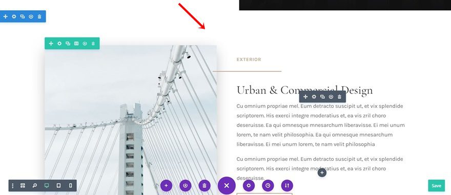
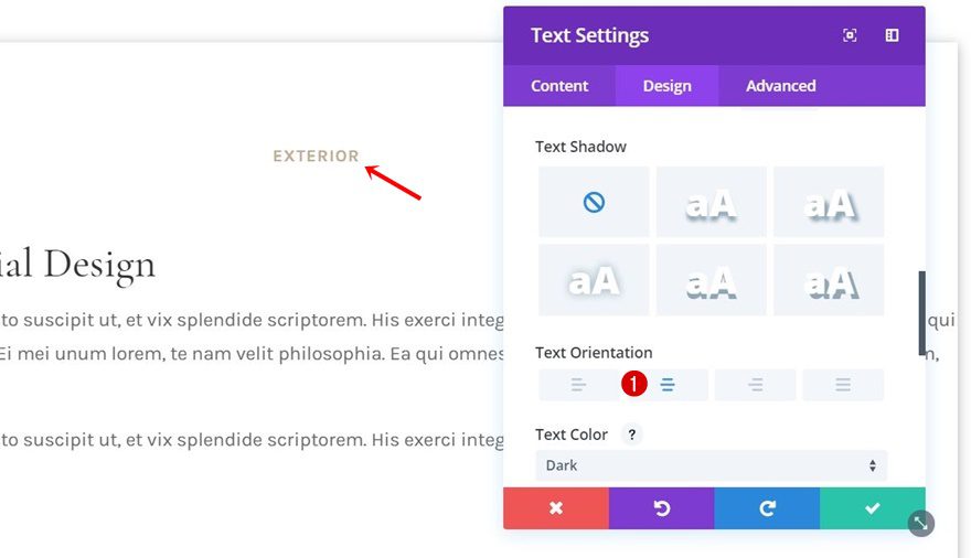
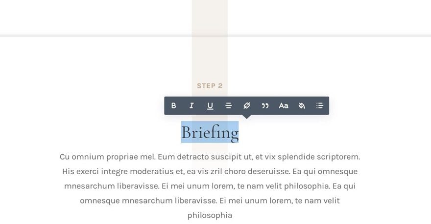
Step 7: Change Text Alignment of Text Module #1
We want to center all the modules of this row, starting with the first Text Module. Open its settings and enable center Text Orientation.
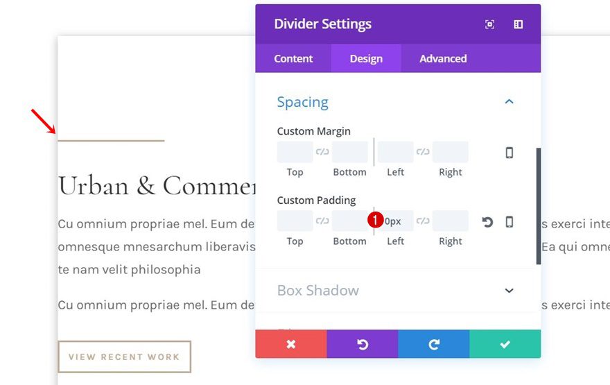
Step 8: Remove Negative Left Padding of Divider Module
Open the settings of the Divider Module next and remove the negative left padding in the spacing settings by adding ‘0px’ instead.
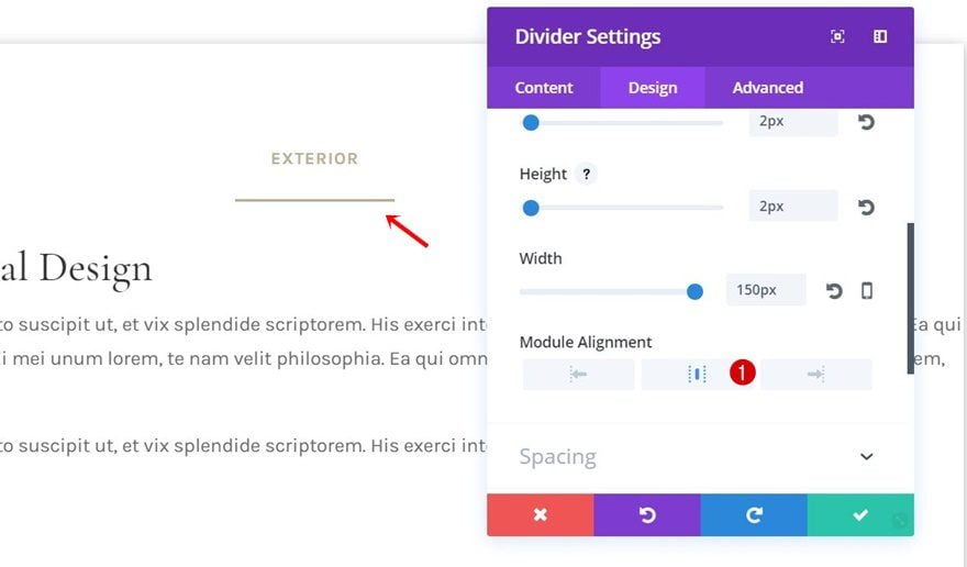
Step 9: Use Center Module Alignment for Divider Module
We’ll also use center Module Alignment for this Divider Module.
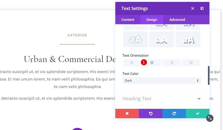
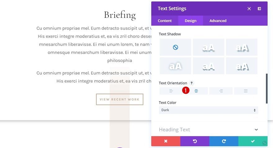
Step 10: Change Text Orientation of Text Module #2
Next, open the Text Module containing all the info and use center Text Orientation.
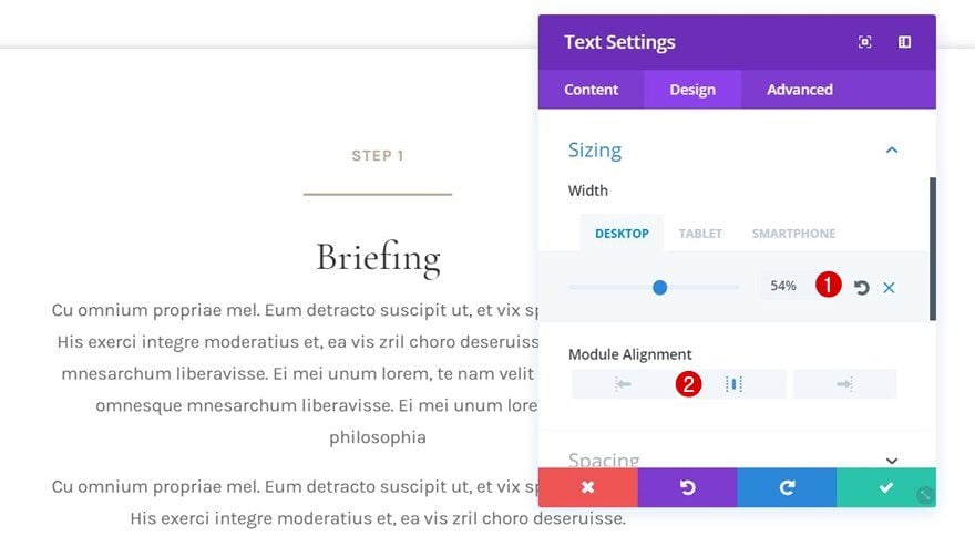
Step 11: Change Sizing of Text Module #2
We’ll also make the width of this Text Module smaller on desktop using the following settings:
- Width: 54% (Desktop), 99% (Tablet & Phone)
- Module Alignment: Center
The last module in your row, the Button Module, needs center Button Alignment as well. At this point, all of your modules are centered and we can move on the next part.
Part 3: Add Vertical ‘Divider’
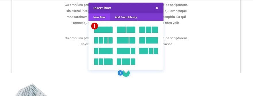
Step 1: Add New One-Column Row to Existing Section
The next part of this tutorial focuses on connecting the different steps to one another. We’re going to use a Text Module for that and place it in a new row right below the previous one we’ve edited. Choose the following column structure for it:
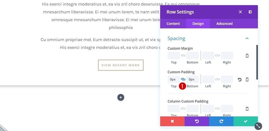
Step 2: Modify Row Spacing
Before adding any modules, open the row settings and add ‘0px’ to the top and bottom padding of this row.
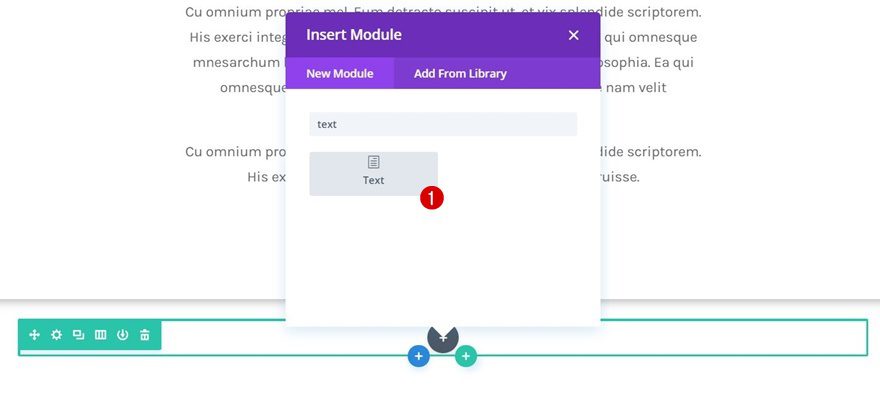
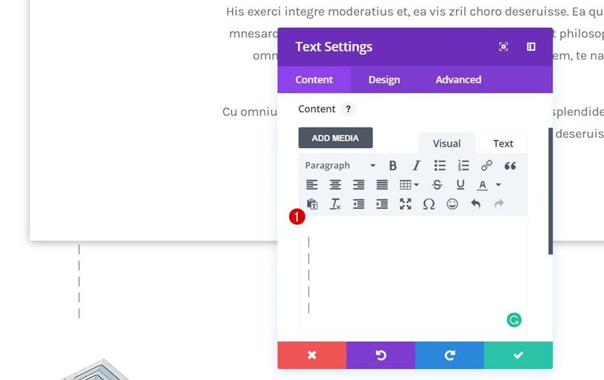
Step 3: Add Text Module to New Row
Continue by adding a Text Module to the column of this row. We’re going to use the following characters within the content box that’ll appear as a vertical line once we’re done editing it:
|
|
|
|
|
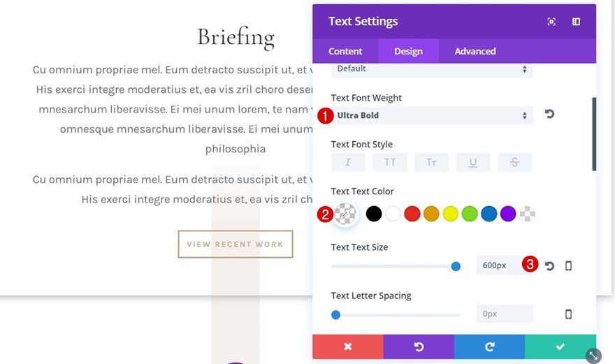
Step 4: Text Settings
There’s one thing, in particular, that’ll help you make this Text Module overlap rows. We’re talking about the Text Line Height. The default value presses your content together when there’s a huge Text Size involved. So, don’t modify the Text Line Height value and use the following text settings instead:
- Text Font Weight: Ultra Bold
- Text Color: rgba(194,171,146,0.04)
- Text Size: 600px
- Text Orientation: Center
Part 4: Clone Section as Frequently as Needed
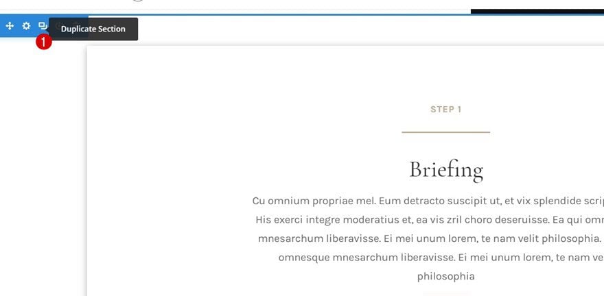
Step 1: Clone Section
We’re done with the first process step! One section contains all the needed elements. Go ahead and clone this section as many times as you need (depending on your number of steps in the process).
Step 2: Change Content
Of course, you can change the content according to your own website. We’re using the first Text Module to indicate the step and the second Text Module to tell more about that step and its role in the process.
Step 3: Remove Vertical Divider Row of Last Process Section
Once you hit the last section, and thus the last step, on your page, you will need to make some small modifications to it. First of all, we’re going to remove the row containing our vertical divider. We don’t need this row since there’s no other step following this section.
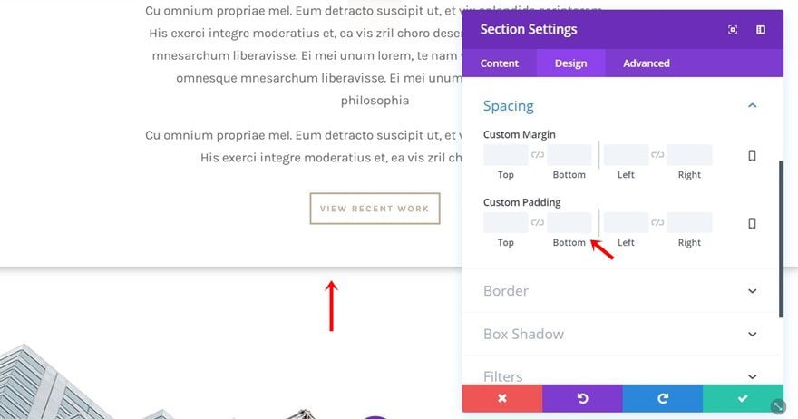
Step 4: Remove Zero Bottom Padding From Last Section
We’ll also remove the ‘0px’ bottom padding that was assigned to the bottom padding of the section. This will allow for the box shadow to show up at the bottom as well.
Preview
That’s it! We’ve gone through all the steps. Let’s take a final look at the result on different screen sizes:
Final Thoughts
In this use case blog post, we have shown you how to create a stunning process page using Divi’s Architecture Firm Layout Pack. You can personalize this process page and include as many steps as you need. This use case is part of our ongoing Divi initiative where our design team shares a new layout pack with you each and every week. If you have any questions, make sure you leave a comment in the comment section below!


This is a great design but even with following the steps precisely my template is not looking like what is shown in screenshots in the blog. Specifically, in the screenshots above there is a space between the bottom of the first section module and the top of the second. However, that is not the case in my template and no matter the amount of tweaking I do the top or bottom padding I cannot get that space. I only get it when tweaking the margins but that has a different effect I do not like.
I agree with all the above. Plus, I thought one could not have a negative padding? “. . . remove the negative left padding . . .”
If the demo was included we could then at least add it to our site and try and figure it out as its complicated.
I think some of this examples are way too complicated for some people, I think examples like this one would be better suited as custom Divi modules, that would ease the workflow and as the result would save lot of time 🙂
Donjete:
I love this! Thanks so much!
Once again you lost me.
In step 11, a section headed Design suddenly appears, where I expected the Exteriors section to show up. Where did the Design section come from? should we create it?
You talk about Text Module 2; the first time it shows the Exteriors section, and in the next step it shows the Design section. Can you give us beginners an explanation of this?