The hero (or above the fold) section of the homepage is prime real estate. And like most real estate developers, you want to maximize your space. That is where an inline contact form comes in handy. An inline form is basically a form in which all its fields or controls stay side-by-side, in-line, and left-aligned. This compact layout is great for increasing conversions on a homepage or a landing page.
Today I’m going to show you how to create an inline contact form for you website using Divi’s Visual Builder. The work needed to pull this off is really all about adjusting both the width and the alignment of the form fields. To accomplish this, we will be taking advantage of the design features of the contact module as well as adding some Custom CSS within the Advanced tab.
If you are new to Divi, don’t let the Advanced tab deter you from tackling this tutorial. I’ve tried my best to keep things simple and clear.
Enjoy.
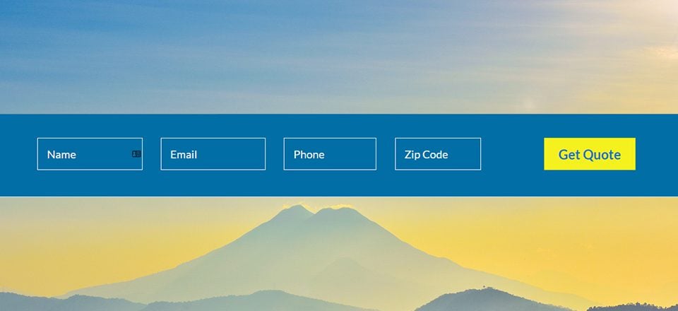
Here is an Example of what the Inline Contact Form Will Look Like
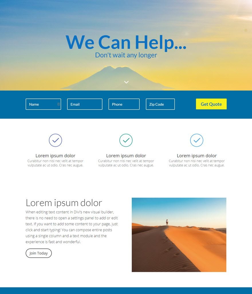
The Concept & Inspiration
If you ever had to shop for car insurance or search for a new home online, you have probably seen an inline form that is purposefully compact with minimal input fields so that you (the user) would be more inclined to get the ball rolling on a new quote. So I wanted to create a simple in-line contact form that would do something similar for Divi users. Although this contact form won’t be able to do things like generate a quote or pull up a list of houses, it does fit the need of business owners or bloggers who want to provide an easy way for clients or users to reach out.
Implementing The Design With Divi
Subscribe To Our Youtube Channel
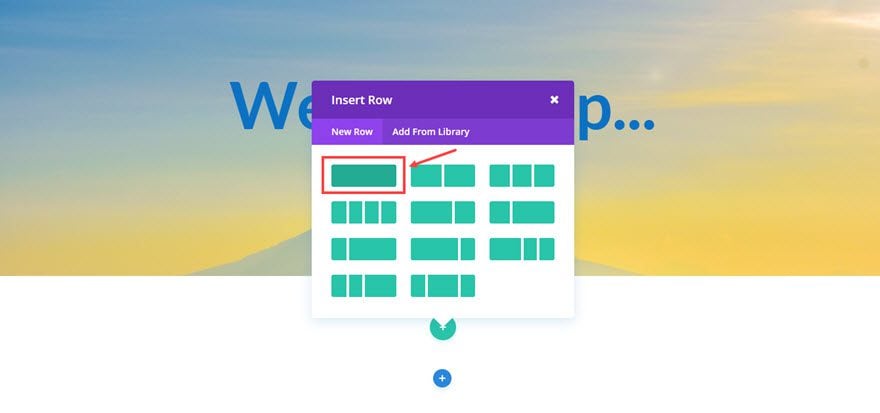
We start by adding a Regular Section with a single column structure row.
Since the rest of our elements will be hard to see on a white backround, let’s go ahead and add the background color to our section by going to Section Settings and updating the following:
Content Options
Background Color: #006ea5
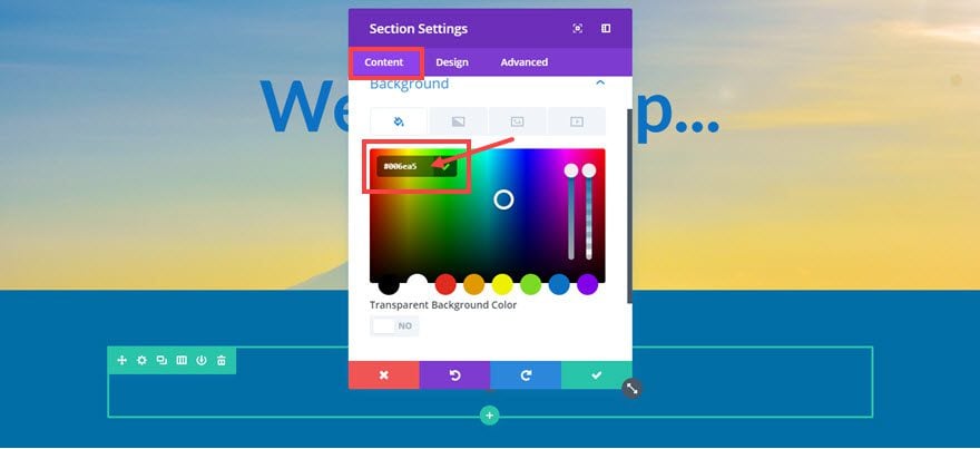
Save settings
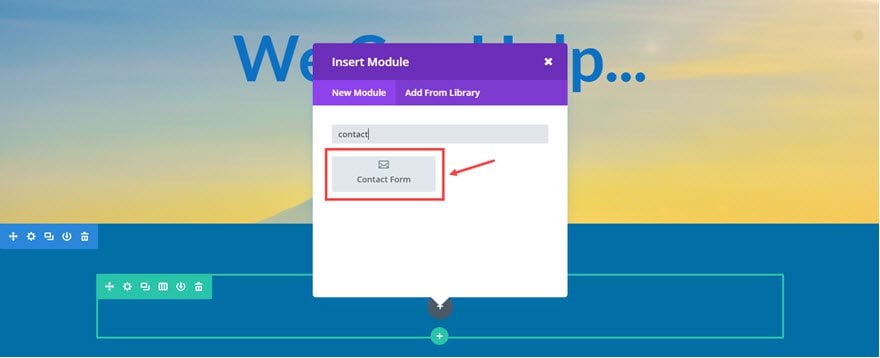
Now we can add our Contact Form Module to the row.
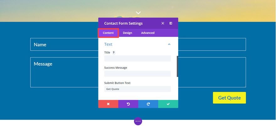
Update the Contact Form Settings as follows:
Content Options
Submit Button Text: “Get Quote”
Email: [Input the email address where messages should be sent]
Display Captcha: NO
Form Background Color: rgba(255,255,255,0)
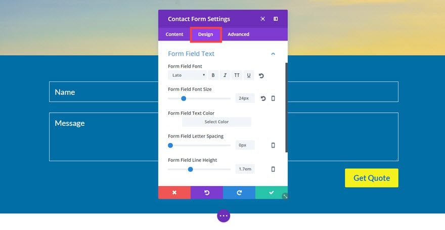
Design Options
Form Field Font: Lato
Form Field Font Size: 24px
Form Field Text Color: #ffffff
Input Border Radius: 3px
Use Border: YES
Border Color: #ffffff
Border Width: 1px
Button Text Size: 24px Desktop, 20px Tablet, 20px Smartphone
Button Text Color: #0c71c3
Button Background Color: #f4f11f
Button Border Width: 3px
Button Border Radius: 3
Save settings
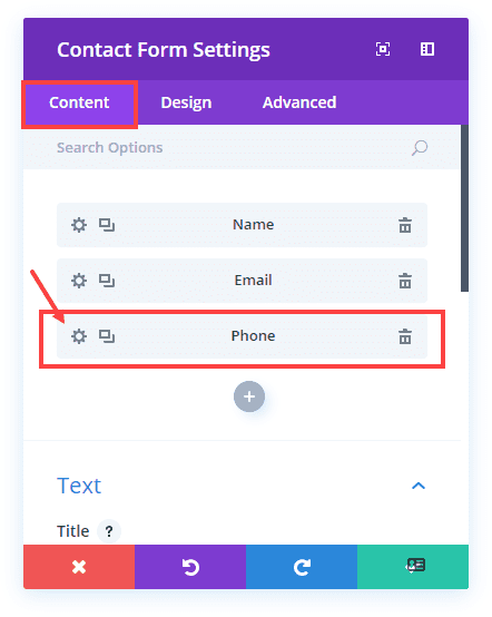
Go back to the Content tab and delete the message field by clicking on the trash can icon on the right of the field bar. Then a add new field by clicking the gray circle button with the white plus sign located under the individual field bars. This will be the Phone field.
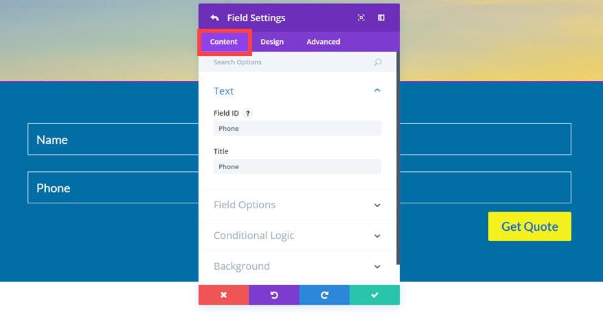
Update the Field Settings as follows:
Content Options
Field ID: “Phone”
Title: Phone
Design Options
Make Fullwidth: NO
Allowed Symbols: Numbers Only (0-9)
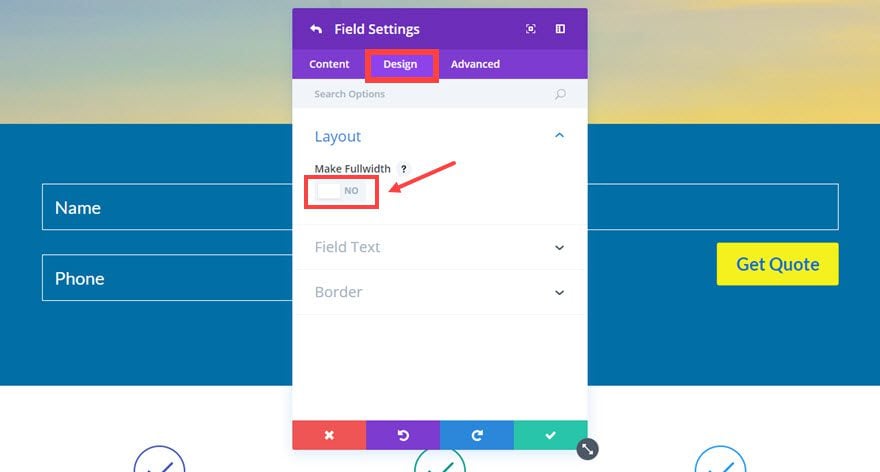
Advanced Options
Enter the following Custom CSS inside the Main Element box:
Max-width: 18%;
Float: left;
Margin-top: -1.5%;
Clear: none !important;
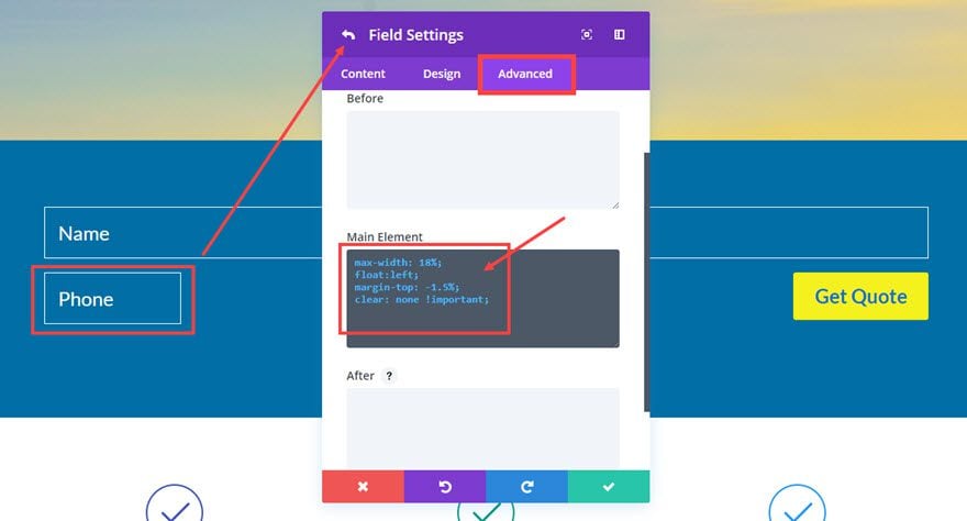
Save settings
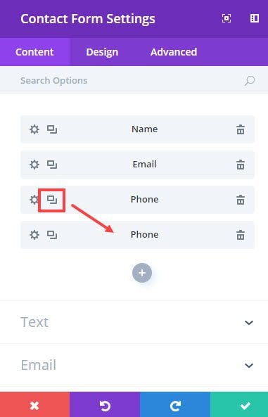
Now go back to the Content tab of your Contact Form Settings and duplicate the Phone field you just created and turn it into a Zip Code field.
Update the Field Settings as follows:
Content Options
Field ID: “Zip”
Title: Zip Code
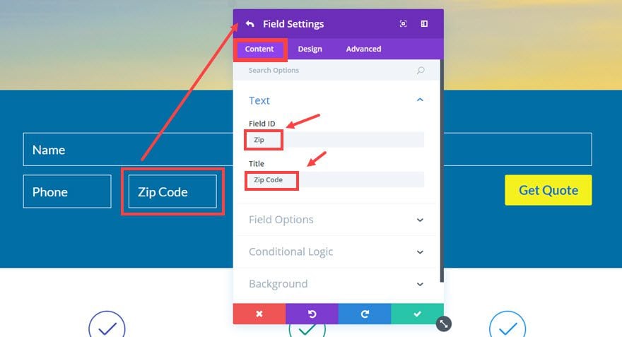
Advanced Options
Enter the following Custom CSS inside the Main Element box:
Max-width: 17%;
Margin-top: -1.5%;
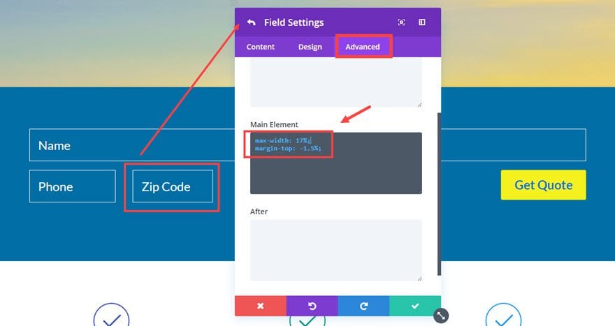
Save Settings
So far we have adjusted the width and alignment of our Phone and Zip Code fields. Now we need to do the same for the Name and Email fields.
Go to the Name field settings and update the Advanced Options with the following Custom CSS inside the Main Element box:
Max-width: 20%;
Margin-top: -1.5%;
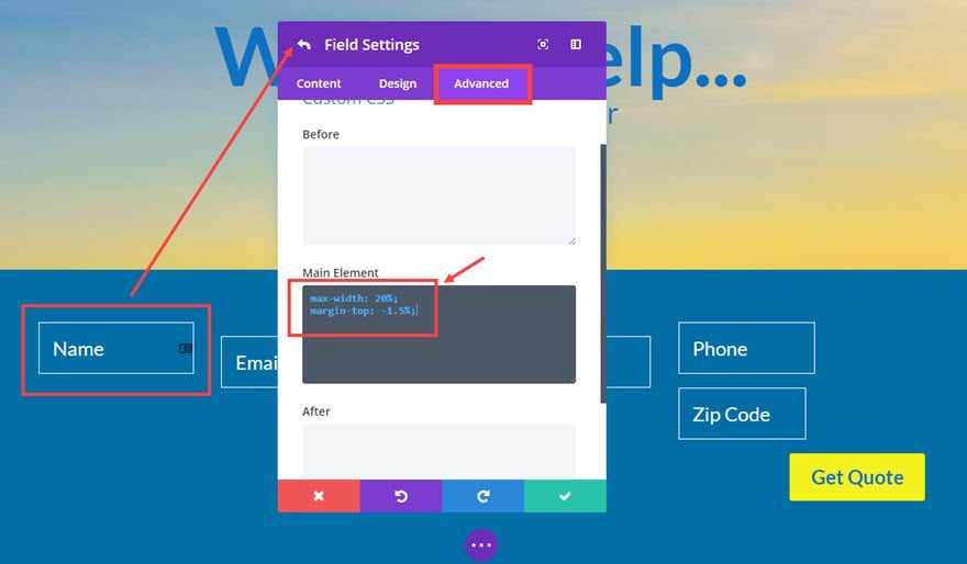
Save Settings
Next go to the Email field settings and update the Advanced Options with the following Custom CSS inside the Main Element box:
Max-width: 20%;
Margin-top: -1.5%;
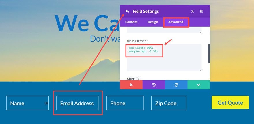
Save Settings
Important Note: Notice that the custom CSS used for each of the fields has a max-width property set to a certain percentage. This percentage dictates how wide your fields will be related to the width of your content area. For example, Divi’s default content area is 1080px so the name field is 20% of 1080px. This is important to know if you want to create more space for your inline form. All you would need to do is adjust the percentage value for the max-width property as needed.
Almost finished. Now all we have to do is clean up the spacing of the section and row that holds the form. Go to the Section Settings, under the Design tab, and update the following:
Custom Padding: 12px Top, 14px Bottom
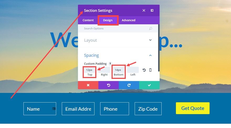
Save Settings
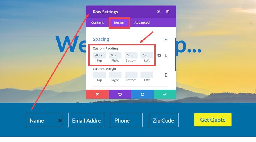
Now go to the Row Settings, under the Design tab, and update the following:
Custom Padding: 48px Top, 0px Right, 0px Bottom, 0px Left
Save Settings
Making it Responsive
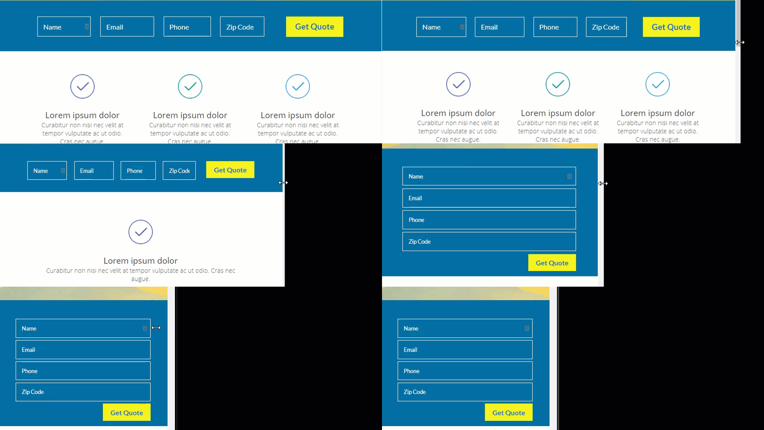
Because this is a horizontal form, the form fields will need to be adjusted on mobile devices. To fix this, all that it takes is one small snippet of custom CSS. Go to Page Settings, under the Advanced tab, and the following in the Custom CSS box:
@media (max-width: 767px) {

p.et_pb_contact_field {
max-width: 100% !important;
}
}
Here is how the form responds to the different screen sizes.
Creating a Three Field Inline Contact Form

Now that you have created a inline form with four fields, you can easily convert it to a three form field by updating a few options. Here are the steps:
- Edit the inline form you just created or duplicate the form.
- Delete Zip Code Field (now you only have three fields)
- Update the Phone Field (or whatever is the third field) Settings, under the Advanced tab, with the following Custom CSS in the
Main Element box:max-width: 25%;
float:left;
margin-top: -1.5%;
clear: none !important;
- Update the Email Field (or whatever is the second field) Settings, under the Advanced tab, with the following Custom CSS in the Main Element box:
max-width: 25%;
margin-top: -1.5%;
- Update the Name Field (or whatever is the first field) Settings, under the Advanced tab, with the following Custom CSS in the Main Element box:
max-width: 25%;
margin-top: -1.5%;
Note: Notice the max-width property for each of the fields is now 25% in order to increase the width of the fields.
Creating a Two Field Inline Contact Form

You can also convert your inline form to a two field form by updating a few options. Here are the steps:
- Edit the inline form you just created or duplicate the form.
- Delete Zip Code Field and the Phone Field so that you only have two fields (name and email)
- Update the Name Field (or whatever is the first field) Settings, under the Advanced tab, with the following Custom CSS in the Main Element box:
max-width: 37%;
margin-top: -1.5%;
- Update the Email Field (or whatever is the second field) Settings, under the Advanced tab, with the following Custom CSS in the Main Element box:
max-width: 37%;
margin-top: -1.5%;
clear: none !important;
Adding Other Field Types
This tutorial is mainly for regular input field types, but you can easily change it to a different field type. For example, if you want to use a select dropdown field type, you can apply all the same styling as you did for the other fields. However, you will need to add a background color (#006ea5) to that particular field so that you can see the options.
Here is what a drop down field would look like…

Final Thoughts
In my experience, inline contact forms can be a powerful tool for your business. There are more advanced plugins out there with more robust options out of the box, but if another plugin is not your cup of tea and a more simple solution makes sense, give this a try. Hope you like it.
Looking forward to hearing from you in the comments.




Looking for a way to convey what page the content form was submitted from. Any suggestion?
I’m curious why the use of width percentages and negative margins? Any reason why there is no using ‘display: flex’?
I follow every step on the video and managed to have the in line contact form. The problem is when i try it, after filling the forms and click “Send” button it say Invalid Email. All the information are correct. Can you please help?
Did you manage to fix it in any way? I have the same issue.
Hi! I made it to the last step but I’m having trouble with the responsiveness. I input the code into my page’s CSS but nothing is happening. When I transition from desktop to tablet to mobile the fields are not lining up vertically. Pretty sure I don’t have any other CSS that should be disturbing it.
Here I found all I can do with divi after purchasing. thanks a lot for all the tutorials, guidance,and ssupports. I really impressed with the features of divi and I have decided to buy it. Such an wonderful multipurpose wordpress theme.
This looks great while I’m in Visual Builder mode, but as soon as I exit Visual builder all of the fields end of up on the left side of the screen. Any ideas?
Sometimes this is a caching issue. Maybe try in an incognito/private browser window.
Where are you saving the custom css?
Hi,
In my case, I have the same design with this tutorial but when I submit by completing all fields, after submit I have the Message fild and the Captcha and the form became the default form till I refresh the page.
How to solve this bug please?
Herchel,
I am not able to replicate the problem on my end. Do you have any other contact forms on the page by chance? Sometimes that will mess it up.
Thanks
here I found all I can do with divi after purchasing. thanks a lot for all the tutorials, guidance,and ssupports. I really impressed with the features of divi and I have decided to buy it. Such an wonderful multipurpose wordpress theme.
Wonderful, Ranita! Thanks for reaching out.
Nice artikel.
Thanks for share jason, i like use divi for my landing site
Thank you so much.
I think this is the easiest way to build & create awesome forms.
Thanks again for the Divi awesome product.
I’m already using Thrive content builder but I think I should Buy this one as well.
You are very welcome, Yasar. Thanks for the comment.
Much easier to do in Caldera forms.
Good point, Paul. After all, Caldera Forms is a specialized plugin designed for this purpose.
However, if Divi is already in use, the extra configuration effort may be well worth it, particularly if it eliminates the need for the Caldera plugin altogether. In this way, this method should result in a relatively lighter load on the site and eliminate one more opportunity for update conflicts over Caldera or any other form plugin.
Thank you this is very useful!
I am a beginner and I have one question though: I am presently working on a divi child theme from April 2017. So, I would like to upgrade and use the new divi module. What happens with all these CSS adjustments?
Do I need to copy all the single CSS I have throughout the site? This seems undoable… Will they be copied automatically and appear in the updated divi theme? … of which I make a new child theme?
Thank you, an explanation would be very much appreciated. I posted this question on the forum, but the answer was not clear to me.
Silvia,
As long as you are working on a divi child theme, you should be able to update to the new version of Divi without any problems. There are a few places you could have stored your custom CSS (theme customizer, theme options, page settings, or your child themes style.css file), but they will all carry over to the updating version of divi because you are using a child theme.
Does that help?
Always love the Eleganttheme blog post, but sometimes wonder if they are guilding the Lily a little to much. Yes, it’s a nice rearrangement of what is currently doable – basic stuff needs sorting first i.e. client just wants a simple user receipt email to confirm to the user what they have sent. Please add the basic stuff before the bells and whistles pretty things please!
Totally agree Paul – there are a few basic things that could be sorted first. To the author’s credit, he says ‘There are more advanced plugins out there with more robust options out of the box’. Would you prefer to use a separate contact form plugin (for example contactform7)?
Hello Paul and Dave,
There are some great basic tutorial at https://www.elegantthemes.com/documentation/divi/. Here at the blog section, ET is showing what Divi is really capable of. Is not the section for basics stuff imo.
Murat
I can’t see the pictures in the two last posts
if I change
cdn.elegantthemes.com/…. for:
http://www.elegantthemes.com/…. I see the pictures
Marco,
I’m not sure why that happens. Might be a caching issue with the CDN. I would suggest opening the blog post in an incognito browser and see if that helps.
At last!!!! Been trying to get this on sites for a while with no joy!
Unfortunatly ive followed the design instructions but its not come out the smae as the form in the tutorial.
The fields have no spacing inbetween and the submit button goes the full width of the section. Please help!!
In the past i have added this css to my theme options to make the contact form button the same width as the forms…….I dont know if this is why its not working.
Here is that css
.et_contact_bottom_container, .et_contact_bottom_container button {
display: block !important;
float: none !important;
margin: 0 !important;
width: 100% !important;
}p.et_pb_contact_field {
padding: 0!important;
}
Any feed back would be great and i must say im really pleased that you guys have sorted the inline form !!!
Thanks
Carlo
Carlo,
Thanks for reaching out. I would suggest disabling your other custom css first to see if that fixes the problem. It seems that your other css is overriding some of the new additions.
Let me know how it goes.
Thanks
NOICE! I did something similar for a client, but I think I may update the code with this tutorial. Many thanks again!
Thanks a lot!
I can’t wait to fix it on my own site.
This is very useful. Thanks
Can’t get mine to work. Doesn’t do the same as yours. 🙁
German,
Maybe I can help. What seems to be the issue?
I can’t see the pictures in some cases.
https://www.screencast.com/t/4uuj42Uq0
Phil,
Are you still not able to see pictures? This may be a caching problem. When that happens, try opening the blog in an incognito browser.
always nice