Borders and Background images continue to be popular design assets when building websites. Using the right background images can add personality and style to your site without having to spend time and money on custom graphics. And borders are helpful for adding structure to your content.
Today, we are going to bring these two assets together by designing background images as borders. Divi has a useful set of options for customizing background images which makes it easy to design background images for unique border designs. This allows us to combine colors, gradients, box shadows, and blend modes in all sorts of creative ways.
Let’s get started.
Sneak Peek
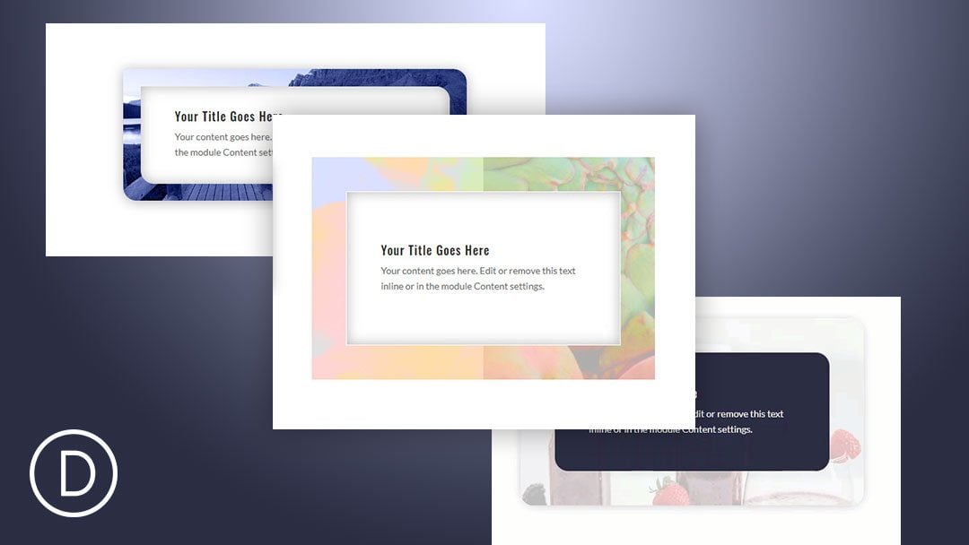
Here are the background image border designs we will build together.
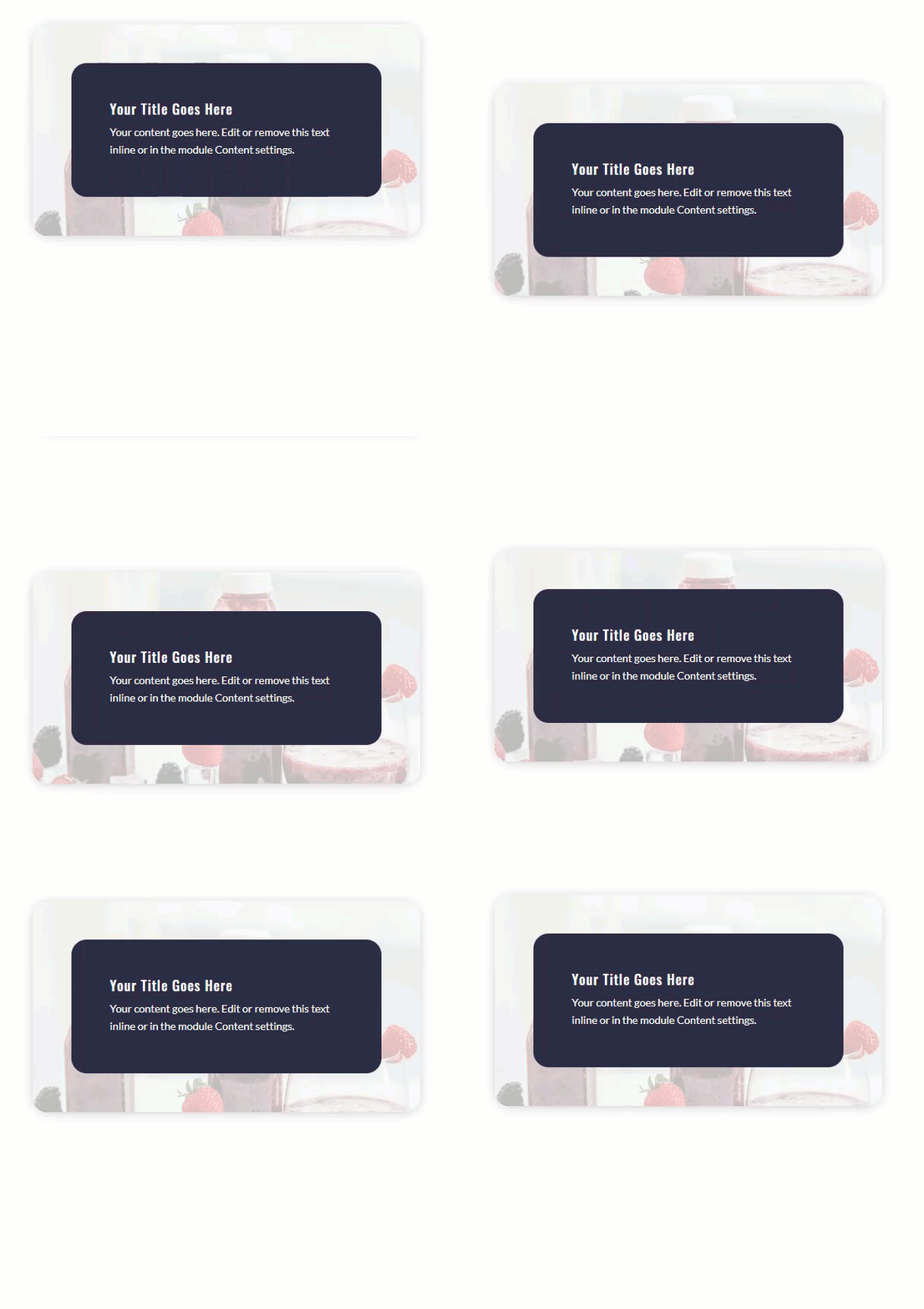
Download the Layout for FREE
To lay your hands on the designs from this tutorial, you will first need to download it using the button below. To gain access to the download you will need to subscribe to our newsletter by using the form below. As a new subscriber, you will receive even more Divi goodness and a free Divi Layout pack every Monday! If you’re already on the list, simply enter your email address below and click download. You will not be “resubscribed” or receive extra emails.
Subscribe To Our Youtube Channel
To import the layout to your page, simply extract the zip file and drag the json file into the Divi Builder.
Let’s get to the tutorial shall we?
What You Need to Get Started
To get started, you will need to have the following:
- The Divi Theme installed and active
- A new page created to build from scratch on the front end (visual builder)
- Images to be used for mock content
After that, you will have a blank canvas to start designing in Divi.
General Tips for Creating Background Image Border Designs
Before we start building, here are a few general tips to keep in mind when creating background image border designs.
#1 Choose Images with a Lot of Texture
Most of the time, you will want your borders to be more on the narrow side. This means you won’t be able to see much of the image. So it helps to use images that have a lot of texture. For example, you can use a photo of a landscape, a bouquet of flowers, or a city high rise. Here are a few images I’m using for this tutorial.

#2 Use Gradients and Transparency with your Background Image Borders
Background Images can sometimes stand alone as a great border for your content. But most of the time, you will want to add some overlays to your background image for some color or to make the backgrounds darker or lighter. Background gradients are a great way to add overlay to your background images and create unique border designs.
#3 Use Blend Modes

Using blend modes on your background images can implement unique colors and textures to the border designs. All you need to do is add a background color or gradient along with your background image and then select a blend mode for the background image. Some great blend modes for background image borders are color, luminosity, multiply, and screen.
Use Rounded Corner Options for Unique Shapes

Not all borders need to have straight edges. Mix it up a little! Divi’s round corner options allow you to shape those corners in creative ways.
Use Parallax Background Images as Borders

The great thing about parallax is that it brings the design alive with movement. Plus, if you use background images with parallax for your border designs, you can create subtle movement that stand out and makes your content pop.
Designing Background Image Borders in Divi
Now that we understand the general idea behind creating background image border designs, let’s design a few together. We are going to build 4 different designs. Each will have a basic blurb module to serve as mock content. And we will use the column settings to add the background image border for the module.
Let’s start with our first design.
Background Image Border Design #1

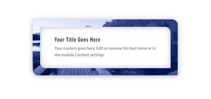
This first design features a narrow background image border that has box shadow to make it look more like a frame for the content.
Here’s how to design it.
First, add a two column row to a regular section.

Add the Blurb Module
Then add a blurb module to the left column.

Once the blurb is in place, open the blurb settings and take out the default image so only the Title and Body Content is visible.
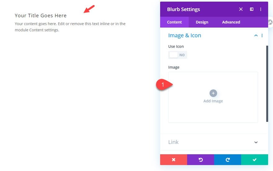
Next, give your blurb a white background color.
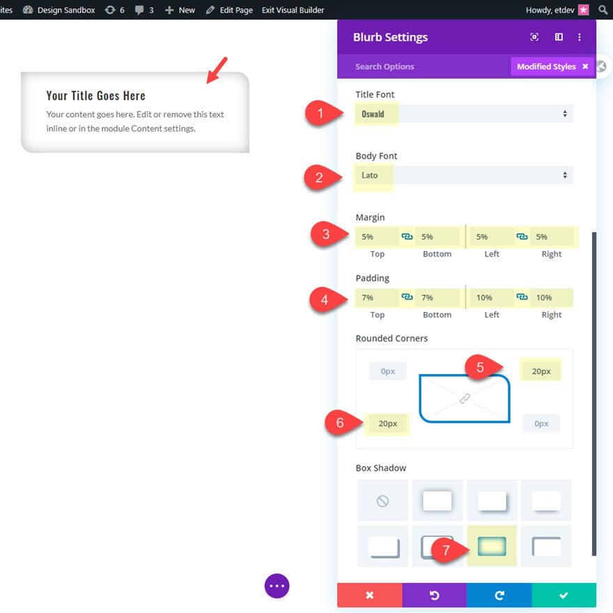
Then update the blurb design settings as follows:
- Title Font: Oswald
- Body Font: Lato
- Margin 5% top, 5% bottom, 5% left, 5% right
- Padding: 7% top, 7% bottom, 10% left, 10% right
- Rounded Corners: 20px top right, 20px bottom left
- Box Shadow: see screenshot
Add the Background Image to the Column
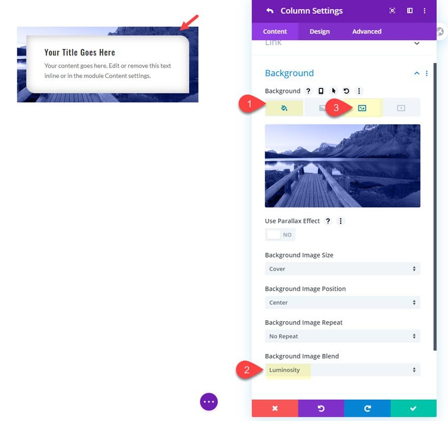
That takes care of our blurb module. Now let’s add our background image border. To do this, we will be adding a background image to the column that holds the blurb module. Open the row settings and then open the settings for column 1 and add the following background:
- Background Image: [upload image of your choice]
- Background Color: #303a7a
- Background Image Blend: Luminosity
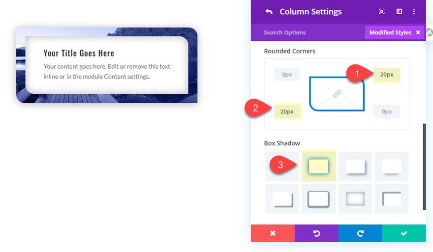
Then update the rounded corners and box shadow as follows:
- Rounded Corners: 20px top right, 20px bottom left
- Box Shadow: see screenshot
Final Result
Now check out the final design.

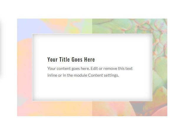
Background Image Border Design #2

This next design highlights how using images with a lot of texture can really make beautiful borders, especially when you combine them with image blend modes.
Here’s how to design it.
Add the Blurb Module
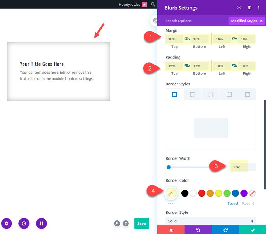
To create the design, we are going to add the blurb to column 2 of the same row that contains design #1. Go ahead and copy the blurb module from design #1 and paste it into column 2. Then update the blurb module settings as follows:
- Rounded Corners: restore to default
- Margin: 10% top, 10% bottom, 10% left, 10% right
- Padding: 15% top, 15% bottom, 10% left, 10% right
- Border Width: 1px
- Border Color: #ffffff
Add the Background Image to the Column
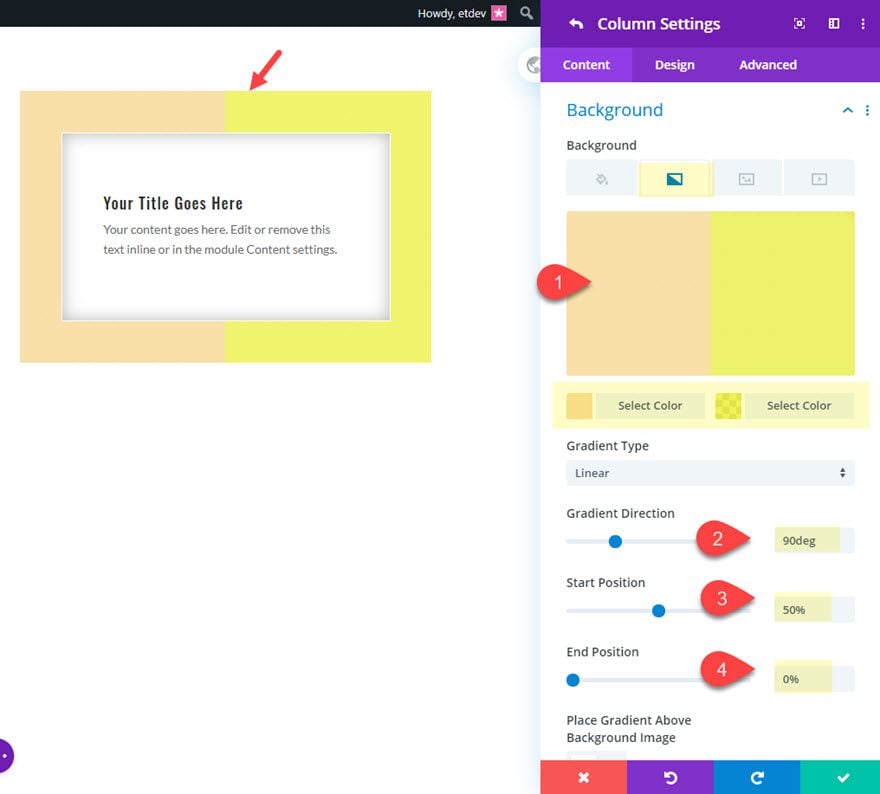
With our module in place, open the row settings and add a background gradient to column 2.
- Background Gradient Left Color: #f7e0a5
- Background Gradient Right Color: rgba(237,240,0,0.79)
- Gradient Direction: 90deg
- Start Position: 50%
- End Position: 0%
Then add a background image with a nice color blend effect.
- Background Image: [upload image]
- Background Image Blend: Color
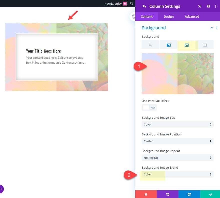
As you can see, the color blend mode preserves the luminosity of the two gradient colors behind the image to create a nice image border design with soft colors.
Final Result
Check out the final result of the design.

Background Image Border Design #3

This next design highlights the use of parallax images in a border design. We will also use a box shadow trick to create an color overlay for the parallax image.
Here’s how to design it.
For starters, add a new two column row below the first row and copy the blurb module from the blurb in column 1 of the top row and paste it in column 1 of the new row.
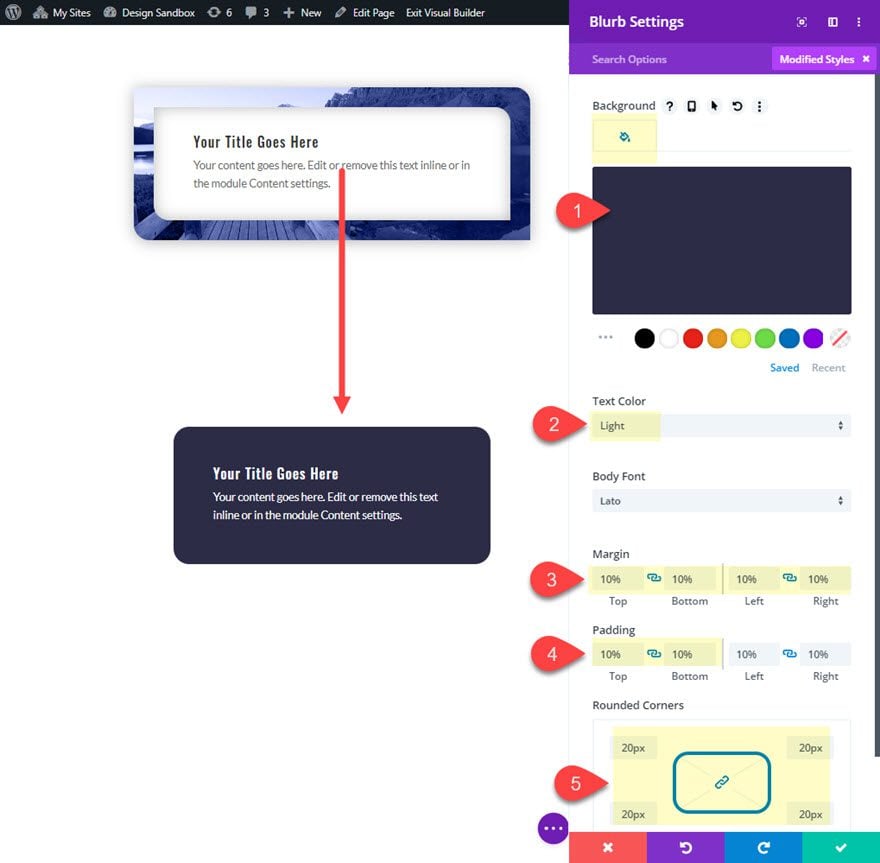
Then update the blurb module as follows.
- Background Color: #333344
- Text Color: Light
- Margin: 10% top, 10% bottom, 10% left, 10% right
- Padding: 10% top, 10% bottom
- Rounded Corners: 20px
- Box Shadow: none
When the blurb is in place, open the row settings and update the settings for column 1 as follows:
- Background Image: [upload image]
- Use Parallax Effect: YES
- Parallax Method: True Parallax
- Rounded Corners: 20px
- Box Shadow: see screenshot
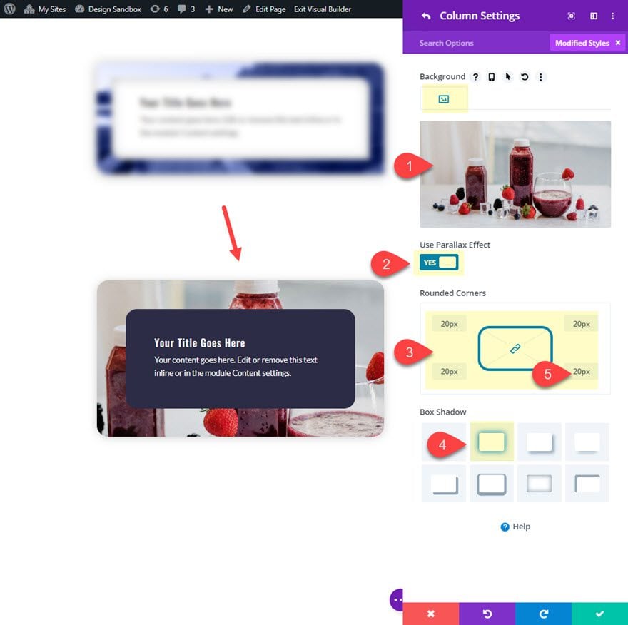
Right now the background image border with parallax is a bit overbearing by default and could distract from the content.
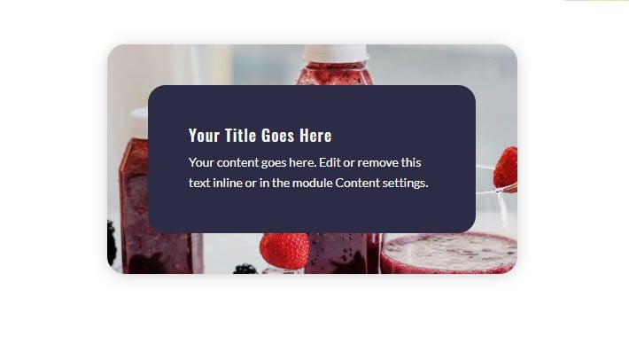
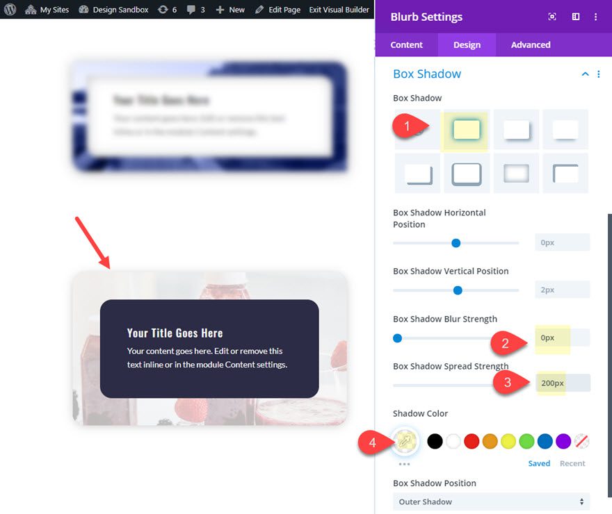
In order to make the background image with parallax lighter, we can add a box shadow to the blurb that will serve as a light overlay.
Open the blurb settings again and add the following:
- Box Shadow: see screenshot
- Box Shadow Blur Strength: 0px
- Box Shadow Spread Strength: 200px
- Shadow Color: #ffffff
Final Design
Now let’s check out the final design.

Background Image Border Design #4

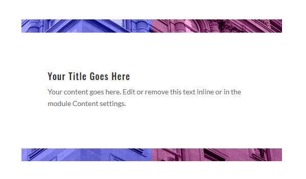
For this next design, we are going to combine a background image with gradients to serve as a top and bottom border for the blurb content.
Add the Blurb Module
To get started, copy the blurb module in column 2 of the top row and paste it in column 2 of the second row.
When finished, update the blurb module settings as follows:
- Border: [Take out the border by restoring the border defaults]
- Box Shadow: none
- Margin: 5% top, 5% bottom, 0% left, 0% right
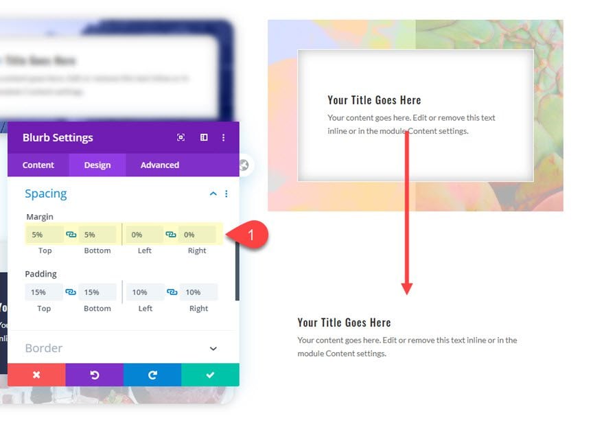
Add the Background Image Border
To add the background image border for this design, open the row settings and update the settings for column 2 as follows:
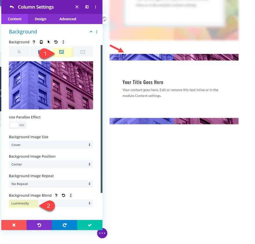
- Background Image: [upload image]
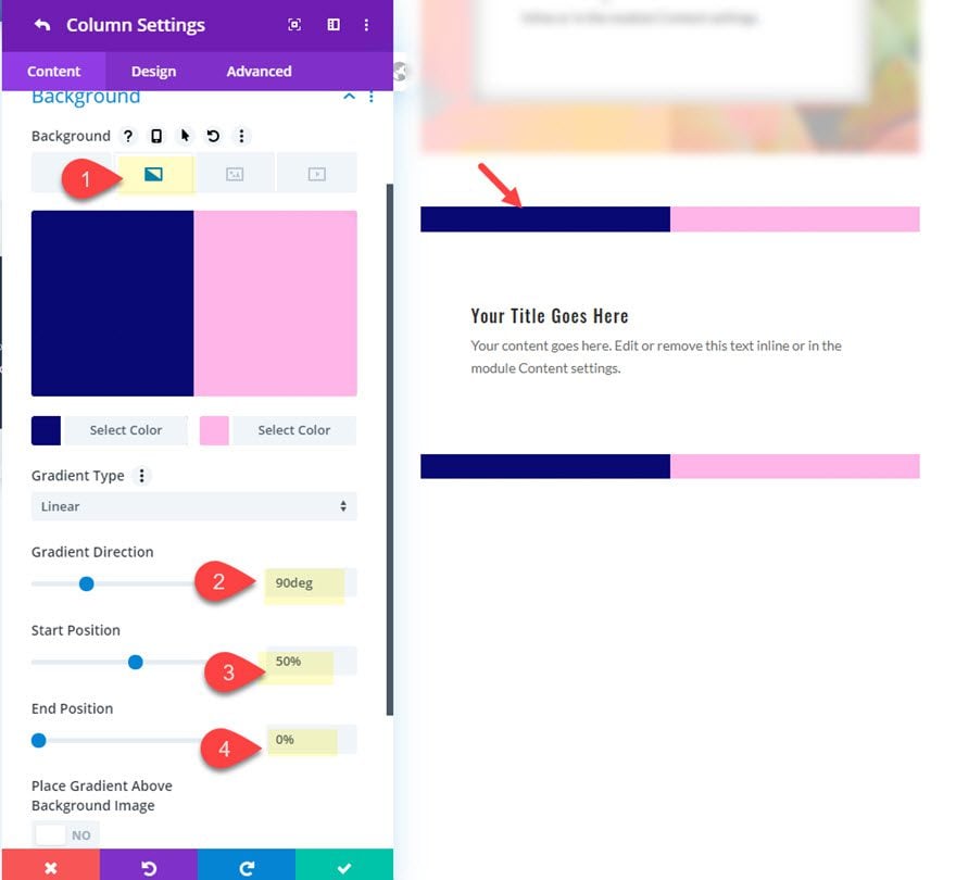
- Background Gradient Left Color: #141777
- Background Gradient Right color: #ffb7eb
- Gradient Direction: 90deg
- Start Position: 50%
- End Position: 0%
- Background Image: [upload image]
- Background Image Blend: luminosity
Final Design
Check out the final design.

Final Thoughts
Creating background image borders with Divi is a simple way to add beauty and personality to your design. The designs featured in this tutorial are meant to showcase the key options available in Divi for making unique border designs. However, with all of the different color combinations and blend modes available, your only limit is your imagination. So, grab some images of your own and explore new and exciting border designs for your next project.
I look forward to hearing from you in the comments.
Cheers!






This is really great. Unfortunately, I’d like to be able to stack these blurbs within the same column (one on top of the other for a vertical layout). This doesn’t seem possible since this approach relies on having each blurb in a separate column. Or might there be a solution for this?
Beautiful, thanks a lot for this article!
Divi platform is too good it really helps us for developing a website
As a web developer i really appreciate it
Blurb module sounds great! I follow your guide and the result is wonderful. I can customize my background image order. Many thanks
That is so good to hear, Rosie! Glad you liked it.
Thanks this article was really helpful
Divi Parallax does not work on tablet and mobile like it does in other similar design tools. Why? It’s such a cool element and a shame.
Looks like that is the case. Thanks for pointing it out.
Love it!