In this Divi tutorial, we’re going to show you how to create beautiful section transitions using nothing else than the built-in Divi options.
Sections are the foundation of all the content you share on your website. Each section is a chapter and going from one section to the other is part of the storytelling process. Making this transition as smooth as possible will emphasize the message you’re trying to articulate. To help you with that, we’re going to show you how you can create beautiful section transitions for your next website project.
Sneak Peek
Before diving into all the different section transitions individually, let’s take a look at what you can expect:
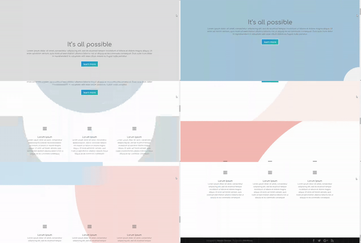
How to Create Beautiful Section Transitions Using Divi’s New Design Features
Subscribe To Our Youtube Channel
Recreate Sections
We’re going to start by recreating the two section we’ll be using in all of the examples. In these two sections, we’ve used the needed padding to get the best out of the transitions. If you’re, however, using sections with a different height, it might be possible that you have to slightly adjust the gradient backgrounds that are being used to match the sections perfectly.
Create First Section
Start by creating the first standard section and choosing a fullwidth row.
Section Settings
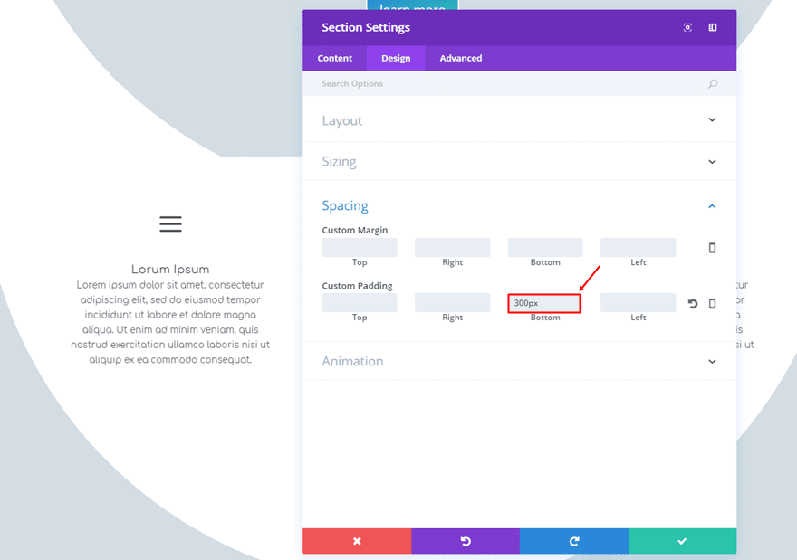
We’re going to need a top and bottom padding of ‘300px’ which you can add within the Spacing subcategory of the Design tab.
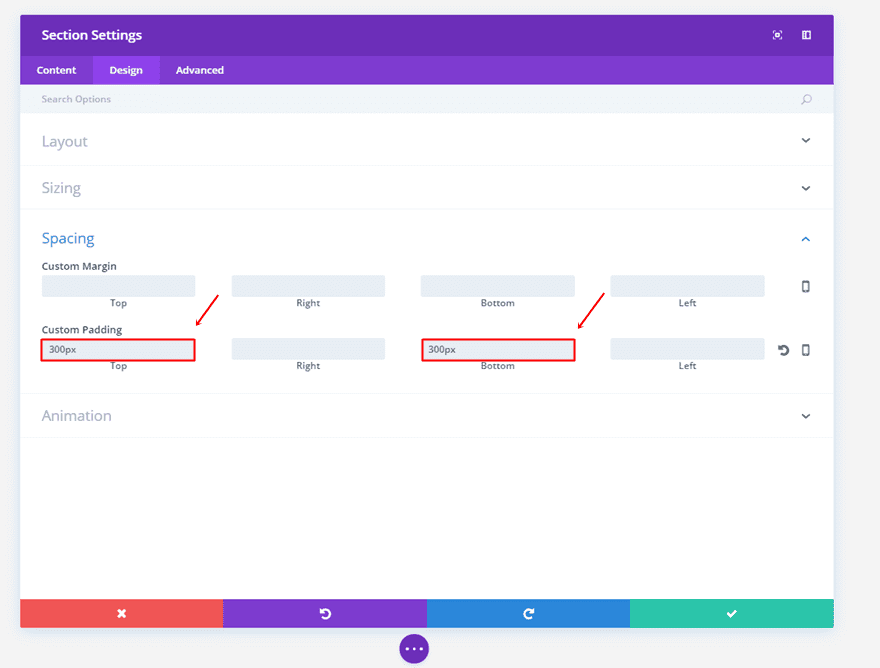
First Text Module
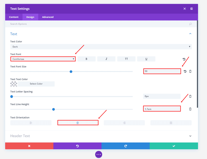
Then, we’re going to add a Text Module to our fullwidth row. Type down the text you want to appear and go to the Design tab. Within the Design tab, use the following settings for the Text subcategory:
- Text Font: Comfortaa
- Text Font Size: 50
- Text Line Height: 1.7em
- Text Orientation: Center
Second Text Module
Do the same for the second Text Module but use the following settings instead:
- Text Font: Comfortaa
- Text Font Size: 16
- Text Line Height: 1.7em
- Text Orientation: Center

Button Module
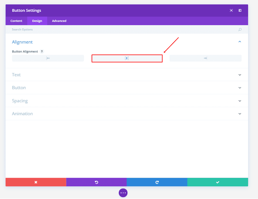
Lastly, we’re also going to add a Button Module. Start by choosing the center alignment in the Design tab.
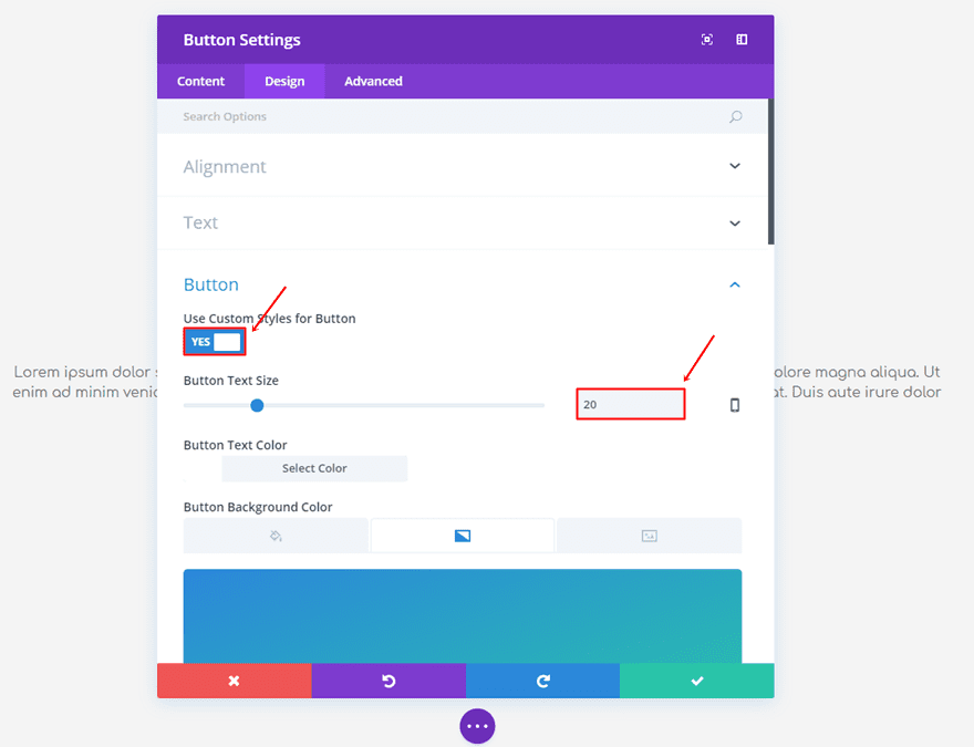
Then, open the Button subcategory, enable the ‘Use Custom Styles for Button’ option and choose ’20’ as the Button Text Size.
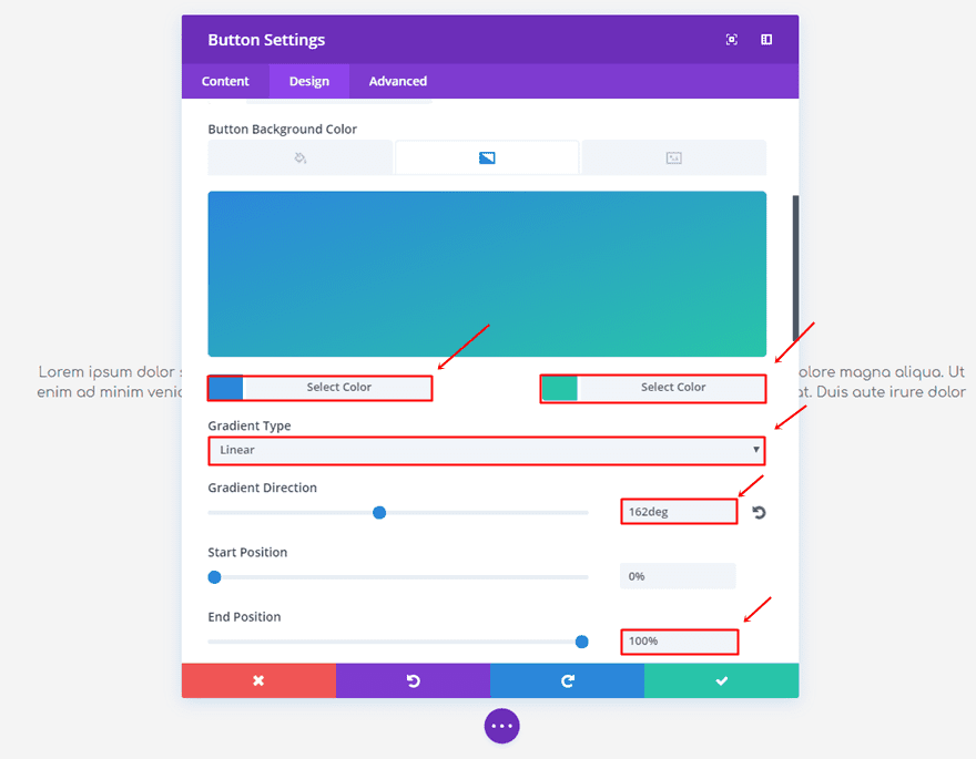
While still in the Button subcategory, use the following gradient background for the button:
- First Color: #2b87da
- Second Color: #29c4a9
- Gradient Type: Linear
- Gradient Direction: 162deg
- Start Position: 0%
- End Position: 100%
Create Second Section
Add another standard section but choose a three-column row instead.
Section Settings
The second section will make use of a ‘300px’ padding for the top and bottom as well.

Blurb Module
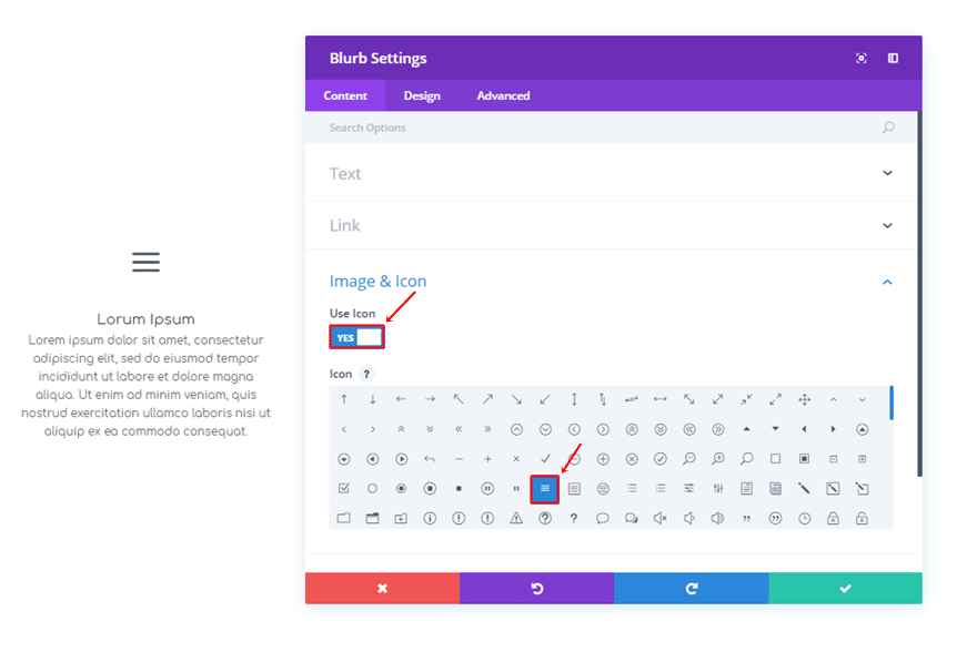
Next, we’re going to add a Blurb Module to the first column of the row. Once you’ve decided on the text you want to appear, scroll down the Content tab, enable the ‘Use Icon’ option and select an icon.
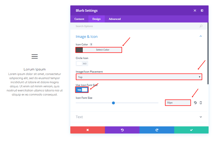
Once you’ve done that, move on to the Design tab and use the following settings for the Icon Subcategory:
- Icon Color: #515151
- Image/Icon Placement: Top
- Use Icon Font Size: Yes
- Icon Font Size: 55px
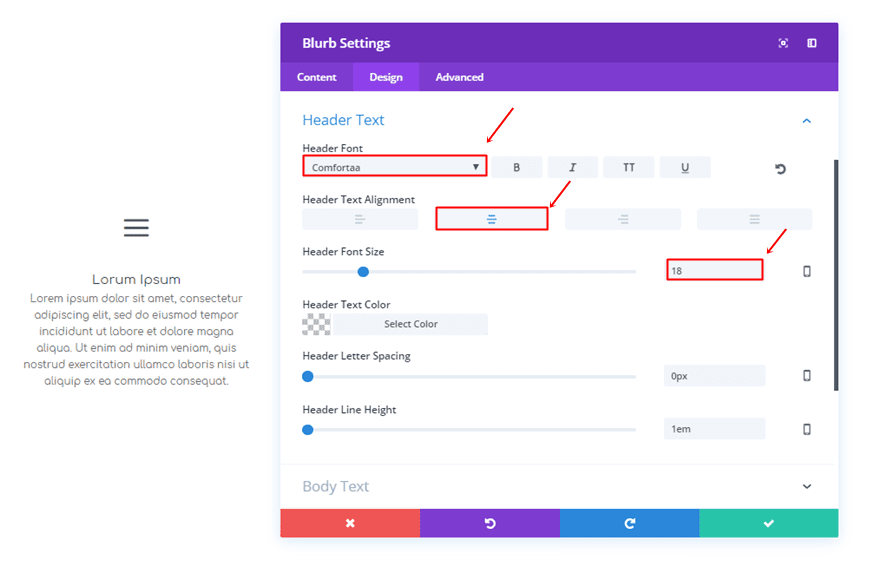
Then, make sure the following settings apply to the Header Text subcategory:
- Header Font: Comfortaa
- Header Text Alignment: Center
- Header Font Size: 18
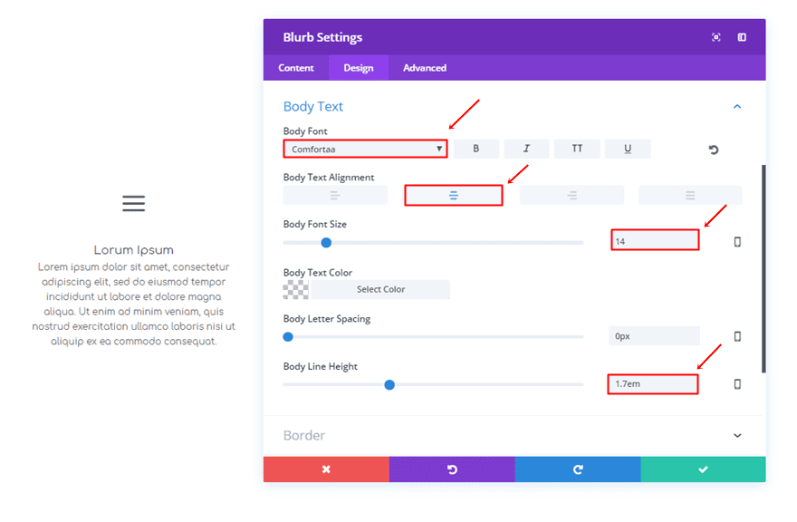
And lastly, these are the settings for the Body Text Subcategory:
- Body Font: Comfortaa
- Body Text Alignment: Center
- Body Font Size: 14
- Body Line Height: 1.7em
Clone Blurb Module
Once you’ve created the Blurb Module, clone it twice and put it in the other two columns of the row.
1. All The Way Diagonal
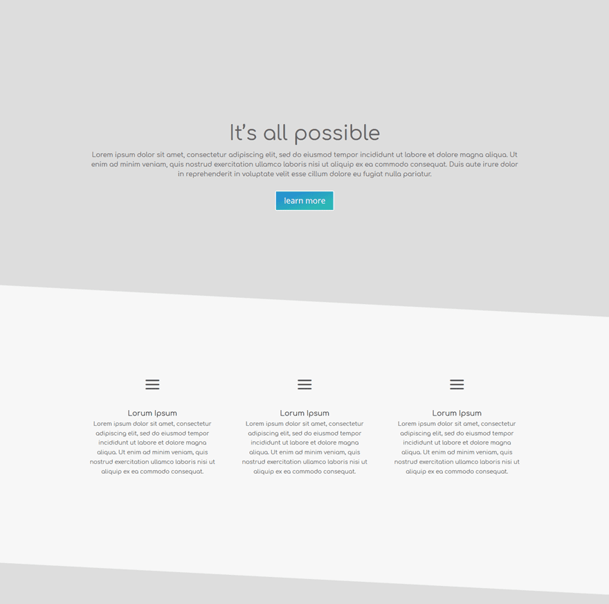
Now that we’ve created the sections, it’s time to start adding the section transitions. The first example we’re going to show you how to create consist of simple diagonal lines.
Gradient Background Settings of First Section
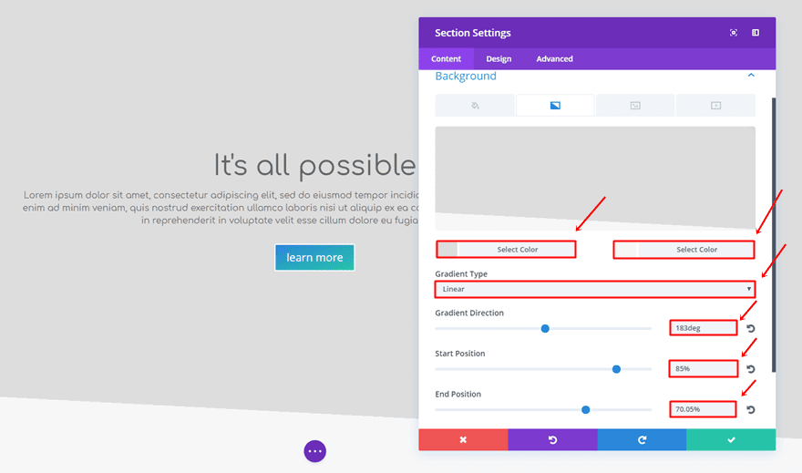
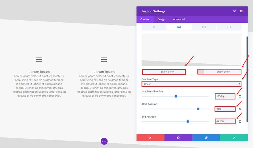
Open the settings of the first section and add the following gradient background:
- First Color: #dddddd
- Second Color: #f7f7f7
- Gradient Type: Linear
- Gradient Direction: 183deg
- Start Position: 85%
- End Position: 70.05%
Gradient Background Settings of Second Section
The second section will need the following gradient background settings instead:
- First Color: #f7f7f7
- Second Color: #dddddd
- Gradient Type: Linear
- Gradient Direction: 183deg
- Start Position: 85%
- End Position: 69.05%
Remove Top Padding of Second Section
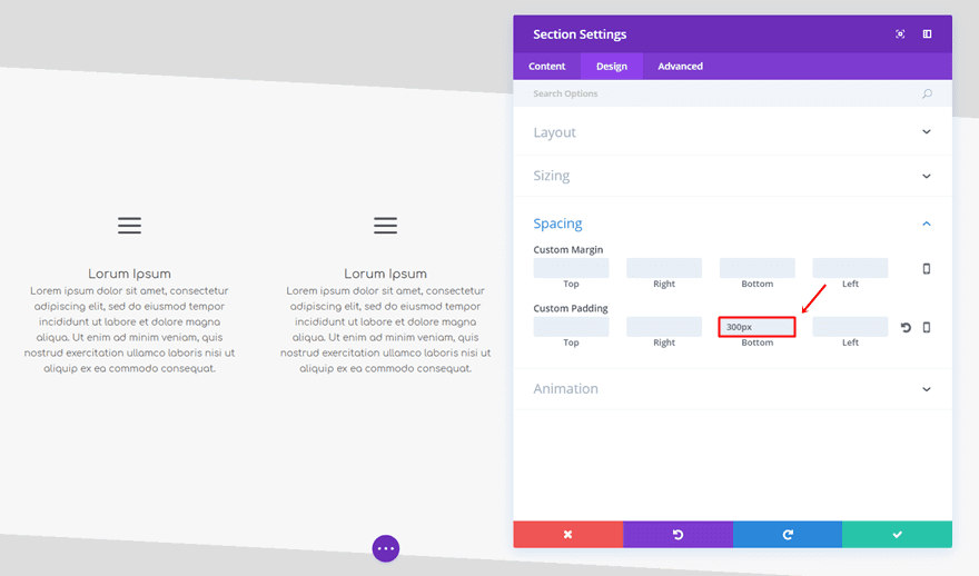
The last thing you’ll need to do for this example is remove the top padding of the second section.
2. Meet me Halfway
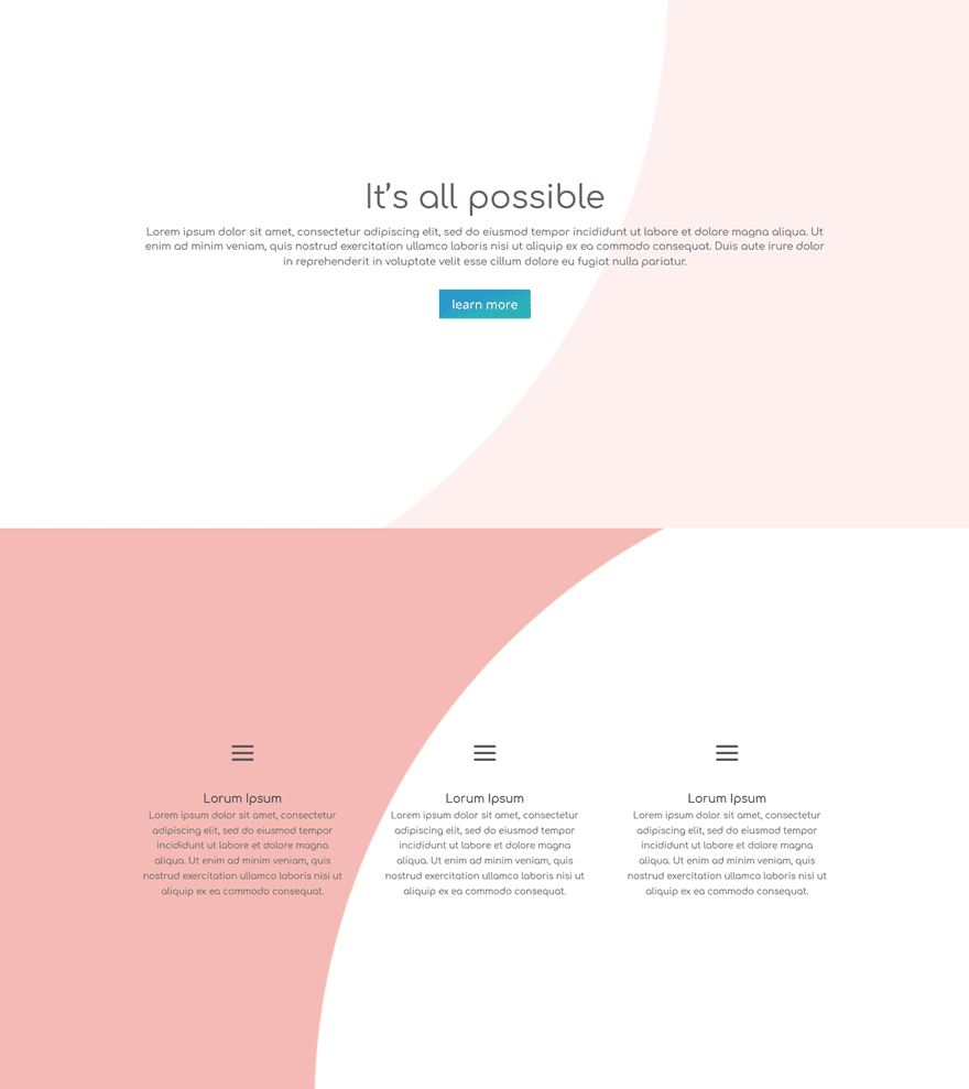
The next example we’d like to share is a very elegant one where two opposite gradient backgrounds are being used. By using this effect, the sections feel like they follow up on each other.
Gradient Background Settings of First Section
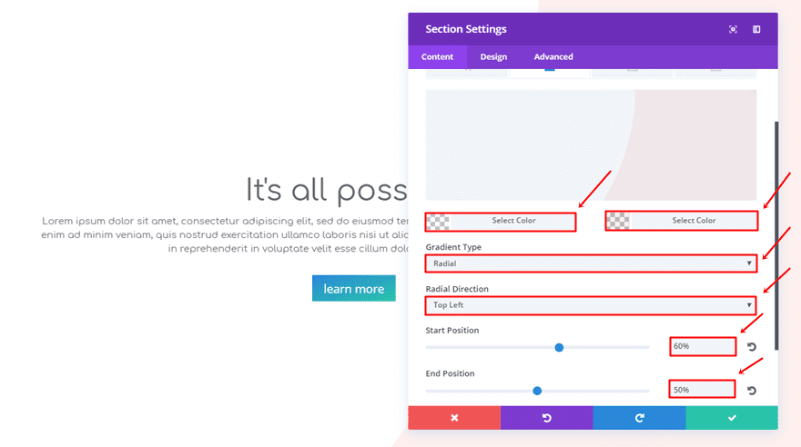
For the first section, we’ll be needing the following gradient background settings:
- First Color: rgba(255,255,255,0)
- Second Color: rgba(224,43,32,0.07)
- Gradient Type: Radial
- Radial Direction: Top Left
- Start Position: 60%
- End Position: 50%
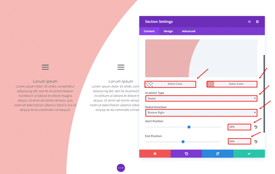
Gradient Background Settings of Second Section
The second section will enjoy the following gradient background:
- First Color: rgba(255,255,255,0)
- Second Color: rgba(224,43,32,0.33)
- Gradient Type: Radial
- Radial Direction: Bottom Right
- Start Position: 58%
- End Position: 50%
3. Fusion
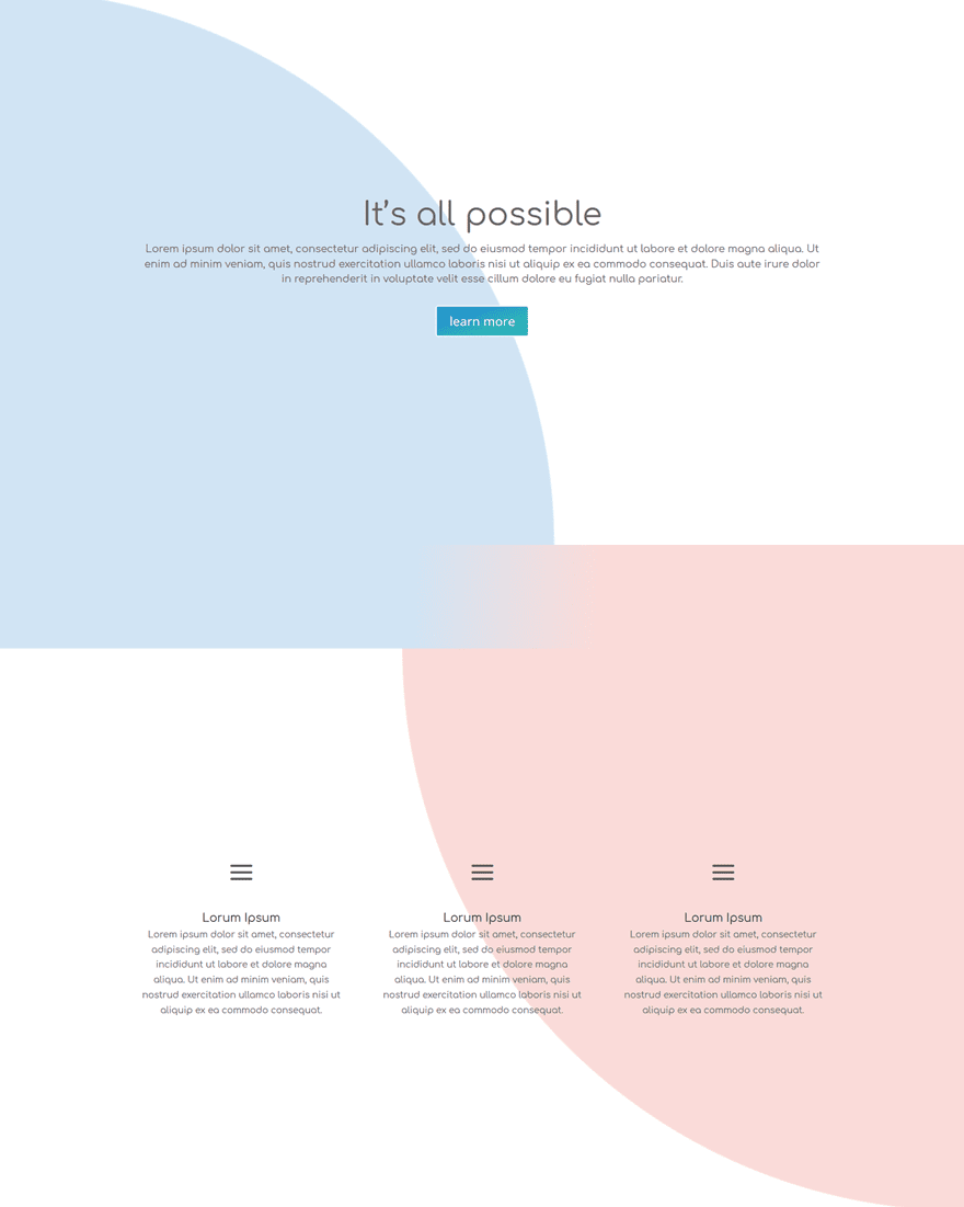
The next example is a little different from the rest. It will need an extra section between both sections to achieve the result you can notice in the image below.
Gradient Background Settings of First Section
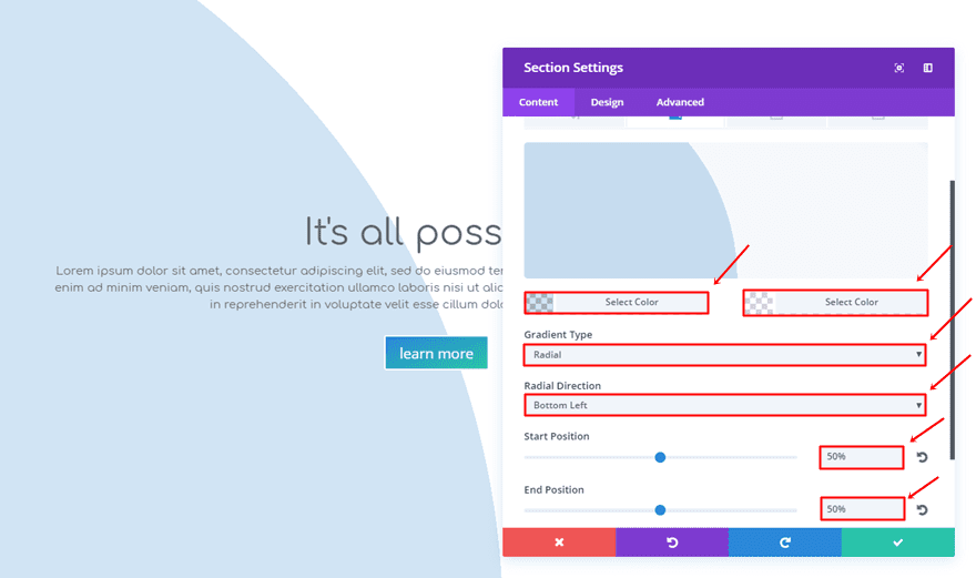
For your first section, you’ll be needing the following gradient background:
- First Color: rgba(12,113,195,0.19)
- Second Color: rgba(255,255,255,0.39)
- Gradient Type: Radial
- Radial Direction: Bottom Left
- Start Position: 50%
- End Position: 50%
Gradient Background Settings of Second Section
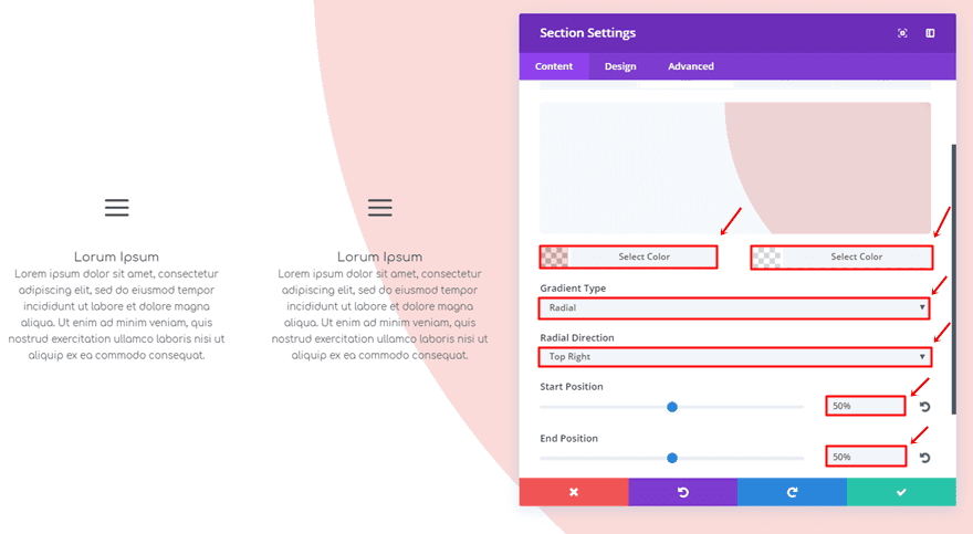
For the second section, we’ll be using the following gradient background settings:
- First Color: rgba(224,43,32,0.17)
- Second Color: rgba(255,255,255,0.39)
- Gradient Type: Radial
- Radial Direction: Top Right
- Start Position: 50%
- End Position: 50%
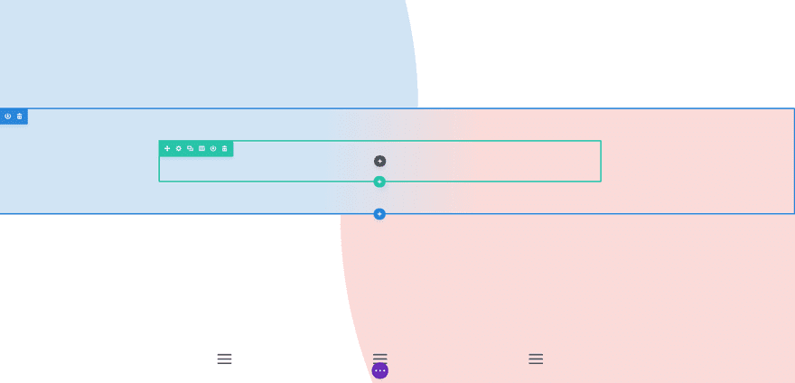
Add New Standard Section in Between
Once you’ve added the gradient backgrounds to both sections, it’s time to add a section right in between them.
Add Gradient Background Color to New Section
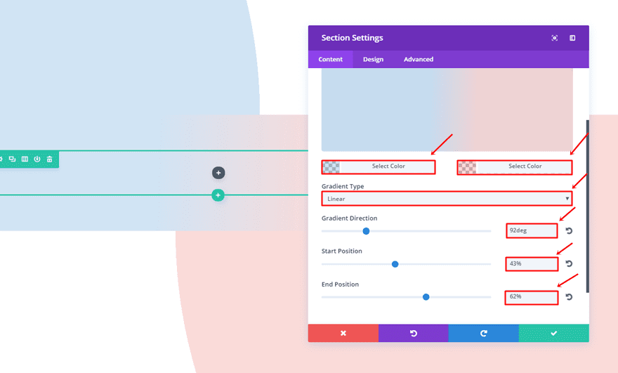
That new section will need a gradient background as well, using the following settings:
- First Color: rgba(12,113,195,0.19)
- Second Color: rgba(224,43,32,0.17)
- Gradient Type: Linear
- Gradient Direction: 92deg
- Start Position: 43%
- End Position: 62%
4. Inverse
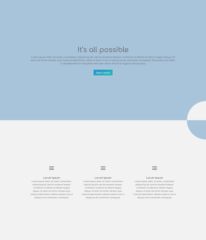
Then, we also have a section transition that is not as striking as the other ones but still manages to add a subtle touch to your sections.
Gradient Background Settings of First Section
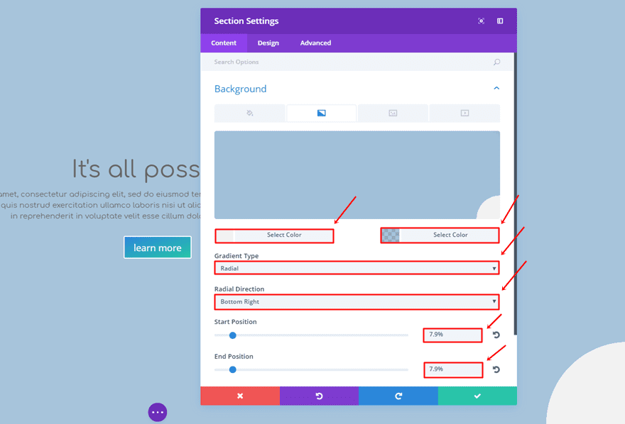
The gradient background for the first section is the following:
- First Color: #f2f2f2
- Second Color: rgba(104,153,193,0.58)
- Gradient Type: Radial
- Radial Direction: Bottom Right
- Start Position: 7.9%
- End Position: 7.9%
Gradient Background Settings of Second Section
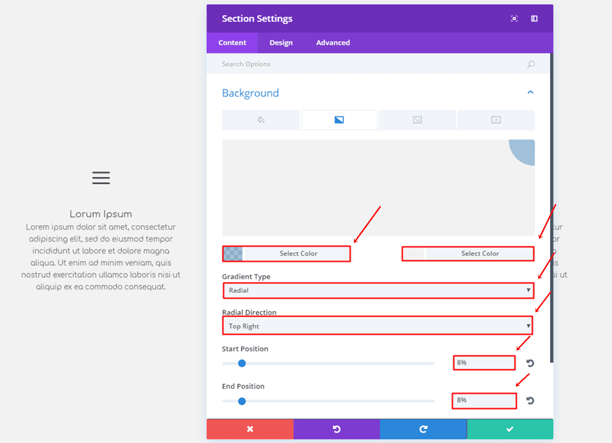
And the second gradient background will need the following gradient background settings:
- First Color: rgba(104,153,193,0.58)
- Second Color: #f2f2f2
- Gradient Type: Radial
- Radial Direction: Top Right
- Start Position: 8%
- End Position: 8%
5. Pointers
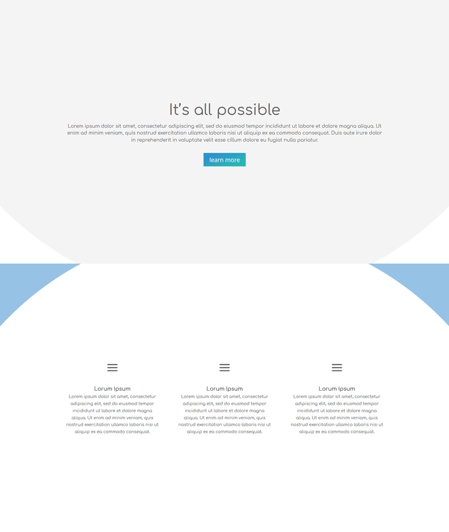
The fifth example looks a bit cleaner and minimalistic than the other ones. You can perceive the transition in two ways by seeing either the pointers or the circles (or both).
Gradient Background Settings of First Section
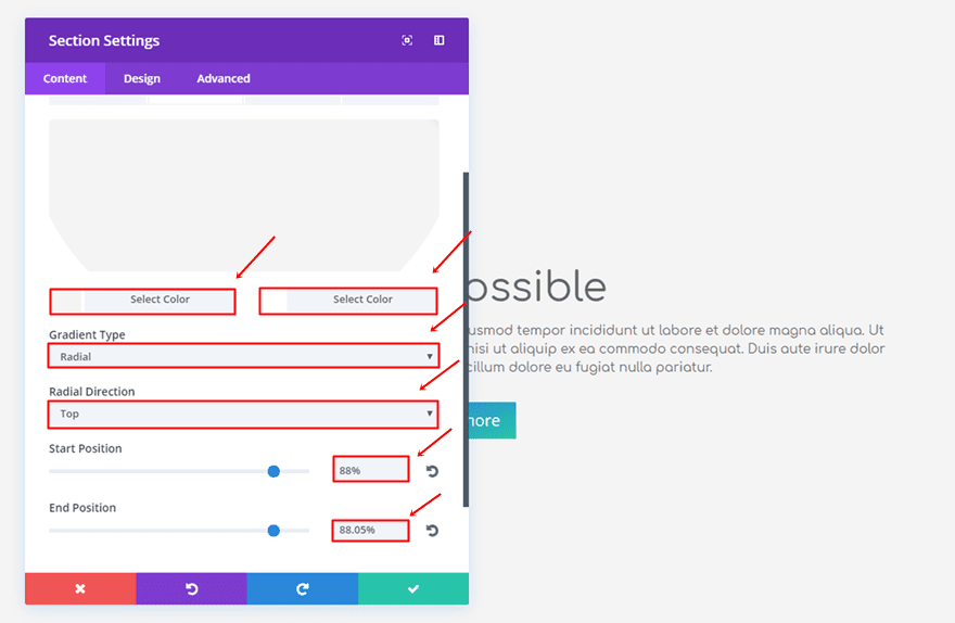
Use the following gradient background for the first section:
- First Color: #f4f4f4
- Second Color: #ffffff
- Gradient Type: Radial
- Radial Direction: Top
- Start Position: 88%
- End Position: 88.05%
Gradient Background Settings of Second Section
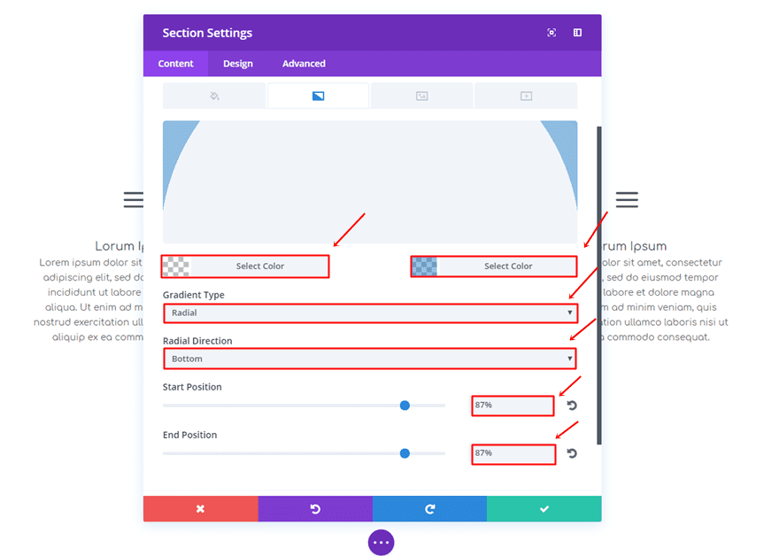
Lastly, apply the following gradient background settings to the second section:
- First Color: rgba(43,135,218,0)
- Second Color: rgba(12,113,195,0.43)
- Gradient Type: Radial
- Radial Direction: Bottom
- Start Position: 87%
- End Position: 87%
6. Puzzle
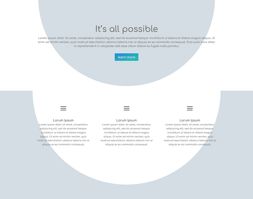
The last example definitely makes the sections feel as if they belong together.
Gradient Background Settings of First Section
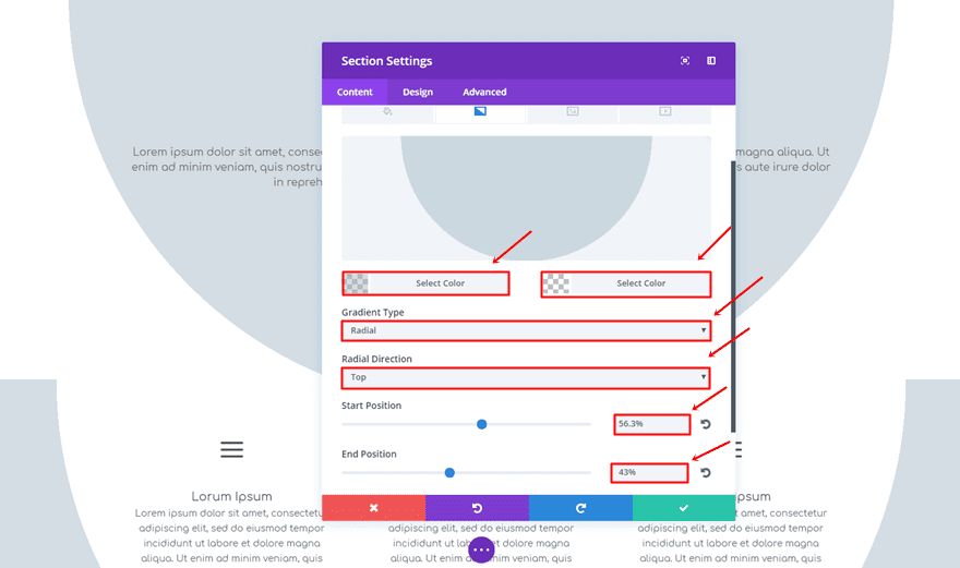
Open the settings of the first section and use the following gradient background:
- First Color: rgba(160,181,193,0.46)
- Second Color: rgba(255,255,255,0)
- Gradient Type: Radial
- Radial Direction: Top
- Start Position: 56.3%
- End Position: 43%
Gradient Background Settings of Second Section
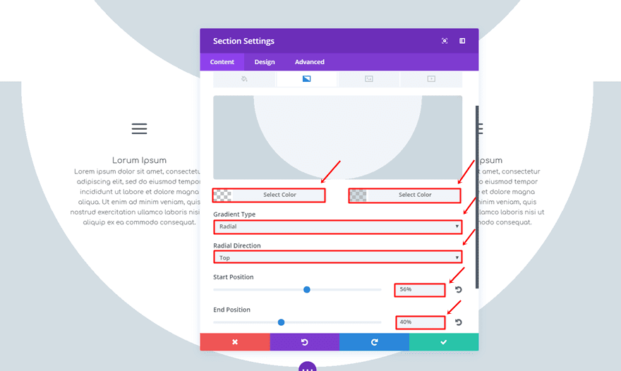
Then, use the following gradient background settings for the second section:
- First Color: rgba(242,242,242,0)
- Second Color: rgba(160,181,193,0.46)
- Gradient Type: Radial
- Radial Direction: Top
- Start Position: 56%
- End Position: 40%
Change Padding of First Section
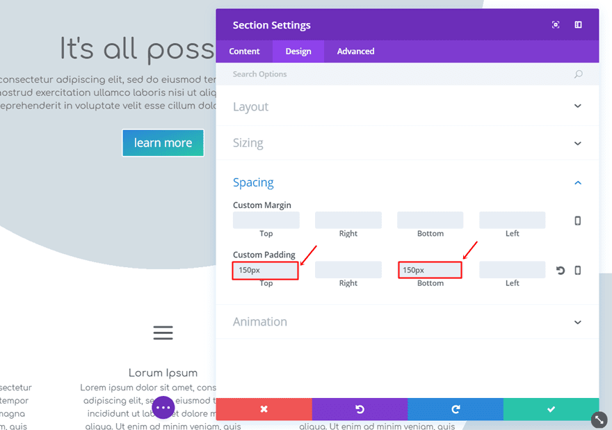
To make the two sections fit better, we’re going to change the top and bottom padding of the first section into ‘150px’.
Remove Top Padding of Second Section
Lastly, we’re going to remove the top padding of the second section as well.
Final Thoughts
Section transitions help connect different sections and their purpose. In this post, we’ve shared 6 examples which you can recreate by using nothing else than the Divi built-in options. If you have any questions or suggestions; feel free to leave a comment in the comment section below!
Be sure to subscribe to our email newsletter and YouTube channel so that you never miss a big announcement, useful tip, or Divi freebie!
Featured Image by NikVector / shutterstock.com



Hi,
looks nice in Your post but …
does not work with me. I only get a staircase transition for the first example. I tried now in small steps (0.01) from 70.00 to 70.10. I always have this staircase effect.
Kind regards Frank
Wow, thank you very much! The Divi tutorials it surprise me every time. The tutorial is well explain and give me some ideas for my website. Great!
Excellent article, however, I would like to see how it looks in mobile version.
I wanted to try out this tutorial… It looks interesting. But, I would settle for Divi Builder actually responding instead of spinning out when I try to use it. (Yes, I been the support route, to no avail.)
Hi Beth,
The “spinning” is most likely caused by a lack of PHP memory. You can contact your host and ask them to increase PHP Memory to at least 128M, which may be enough. However, 256M is best if they will set it that high for you. If you cannot get the memory increased you should find a better host, it may take a lot of searching, but they do exist. I use a host that costs very little, and they allow 256M memory limits, though I usually set my clients to 128M, since it seems to be enough memory for most sites.
You may also want to make sure they are using at least PHP version 5.6 or higher and ask them to increase the max upload and post sizes, which are set very low on some hosts. 32 to 64M should be enough for both of these settings. I usually have mine set to 50M, and I have never had any problems.
Great that this is made possible and simple using Divi. Is there also a way to create a triangle as a transition between sections?
Oops replied on wrong section… 🙂
Looks nice, but couldn’t get them to line up and had followed exactly… oh well
Oops replied on wrong section… 🙂
Looks nice, but couldn’t get them to line up and followed exactly… oh well
Thank you!
Thanks Elegant Themes. Keep the blog posts coming. Since discovering Divi I haven’t used any other themes or frameworks to build websites. The continuous development and support of Divi is what makes the difference. Great stuff, keep up the good work.
can we do that using image background?
Great presentation but when i use this tool the pixels of the edge dont look very good
Hi Marc,
I had the same problem, the edges looked jagged. I spent some time playing with the settings and what worked for me is setting a difference of .03 for the end position. Seems to work for me, but cannot say if it will work for you. However, I would imagine there is a sweet spot that works for everyone, maybe just need to play with it .05, .03, etc.
I tested this in all popular browsers and on my phone, works great for me. Hopefully, this will help you and others who have reported this issue.
Looks nice, but couldn’t get them to line up and followed exactly… oh well
Nice – great post, well-explained.
These are effects that make a site visually engaging without resorting to gimmicks.
+1 asking for
– json files (or a free layout file download) we can use as start point
– a live site with the example where we can test how it would look like on mobile
otherwise, great instructions and transitions
These effects are lovely. However, one thing you never talk about in these posts is what your effects will look like on mobile devices. Bear in mind that most traffic to most sites is now on mobile.
Very good point. I am interested in hearing more about this as well. If they post a demo page to this content, we could just pull it up on our phones and see as well.
Hi, guys. While making these transitions, I made sure to check if they were looking good on mobile as well. Some might look slightly different, but still great. Hope that helps!
Quite long settings to achieve these designs, do you have json file or something that we can import?
wow, that is beautiful. The design as well.