Animated circle counters are a popular way to showcase information (like stats or metrics) on a web page with a fun interaction. In fact, you may already be familiar with Divi and its Circle Counter Module, which makes adding circle counters to your Divi site quick and easy. However, in this tutorial, we are going to show you how to build completely custom circle counters that animate on scroll! We won’t need any external custom CSS to create them. The trick is to take advantage of Divi’s Layers feature to manage multiple modules that are layered and animated with precision.
Let’s get started.
Sneak Peek
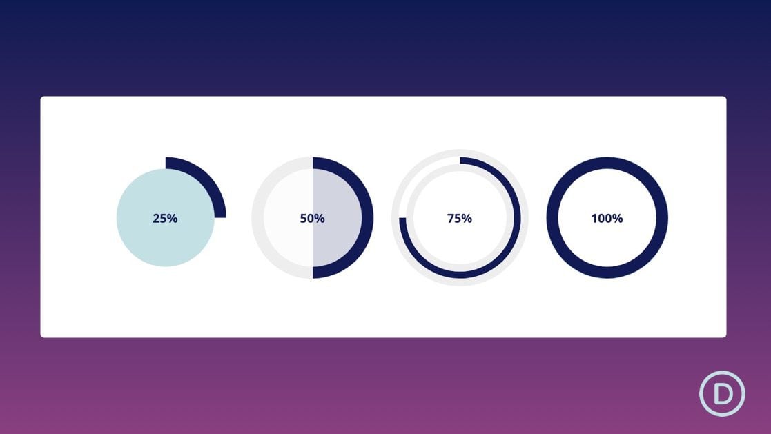
Here is a quick look at the animate circle dividers we will create in this tutorial.


Download the Layout for FREE
To lay your hands on the designs from this tutorial, you will first need to download it using the button below. To gain access to the download you will need to subscribe to our newsletter by using the form below. As a new subscriber, you will receive even more Divi goodness and a free Divi Layout pack every Monday! If you’re already on the list, simply enter your email address below and click download. You will not be “resubscribed” or receive extra emails.
To import the layout to your page, simply extract the zip file and drag the JSON file into the Divi Builder.
Let’s get to the tutorial, shall we?
What You Need to Get Started

To get started, you will need to do the following:
- If you haven’t yet, install and activate the Divi Theme.
- Create a new page in WordPress and use the Divi Builder to edit the page on the front end (visual builder).
- Choose the option “Build From Scratch”.
After that, you will have a blank canvas to start designing in Divi.
Creating the Four Circle Counters that Animate on Scroll with Divi
Setting up the Section and Row
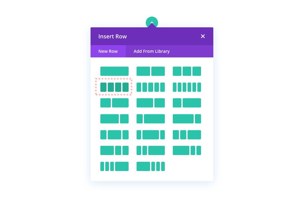
First, add a four-column row to the default section.
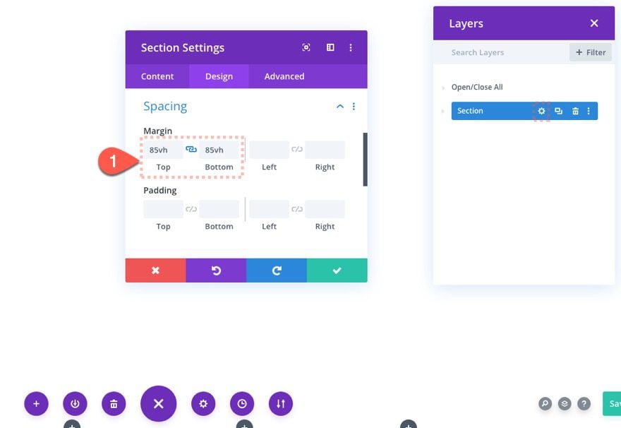
Then open the section settings and add some top and bottom margin so that we have enough space for testing out the scroll effects for the circle counters we will build.
- Margin: 85vh top, 85vh bottom
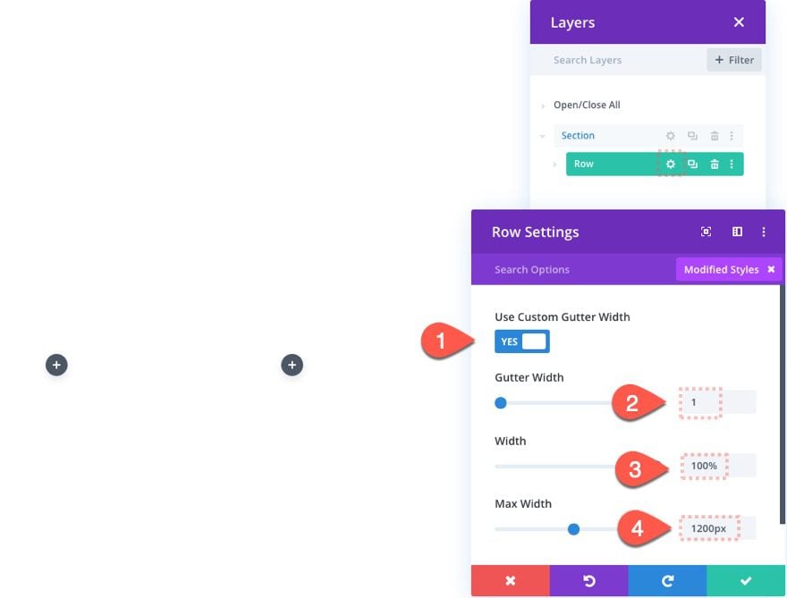
Next, open the row settings and update the following:
- Gutter Width: 1
- Width: 100%
- Max Width: 1200px
Using the Layers View
Before we start creating the animated circle counters, make sure to deploy Divi’s Layers feature. You can do this by clicking on the gray layers icon in the bottom settings menu.

Because we are going to be creating a lot of overlapping elements (or layers), the layers box will definitely come in handy for managing our layers going forward.
Creating Animated Circle Counter #1 (25%)
This first animated circle counter will animate up to 25% of the circle on scroll and have the corresponding percentage text in the center that will fade in on scroll. To build the complete circle counter design we will use multiple dividers and text modules layered on top of each other. Here’s how to do it.
The Back Circle
To create the back circle we are going to use a divider module that we will shape like a circle and give it a background color.
Add Divider Module
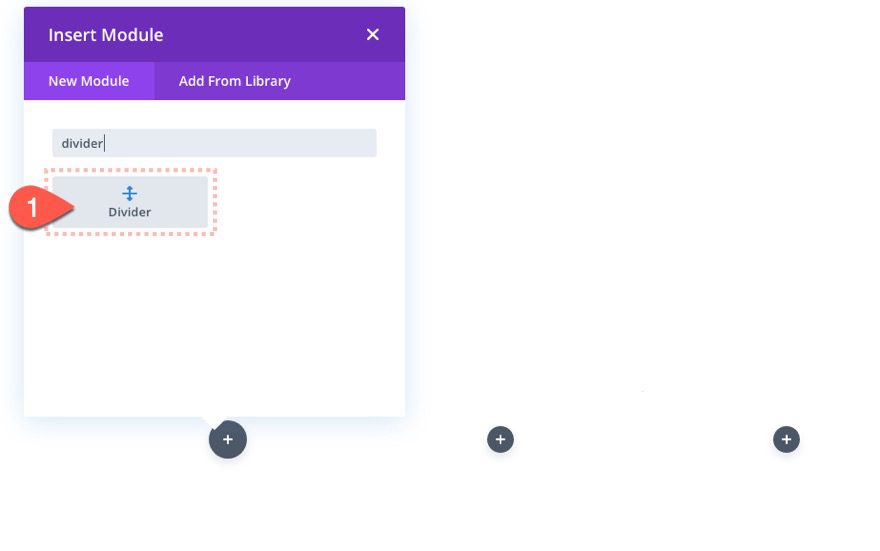
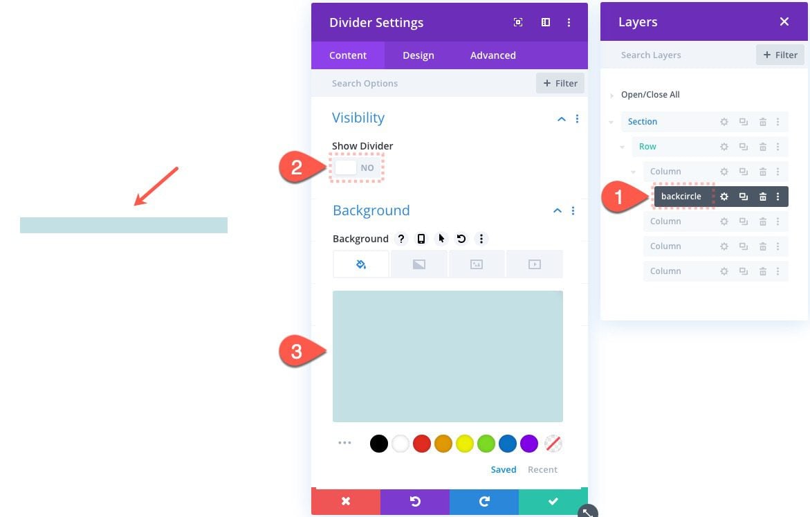
Pull up the divider in the layers view and change the label to read “backcircle”. Then open the divider module settings and update the following:
- Show Divider: NO
- Background Color: #c3e0e5
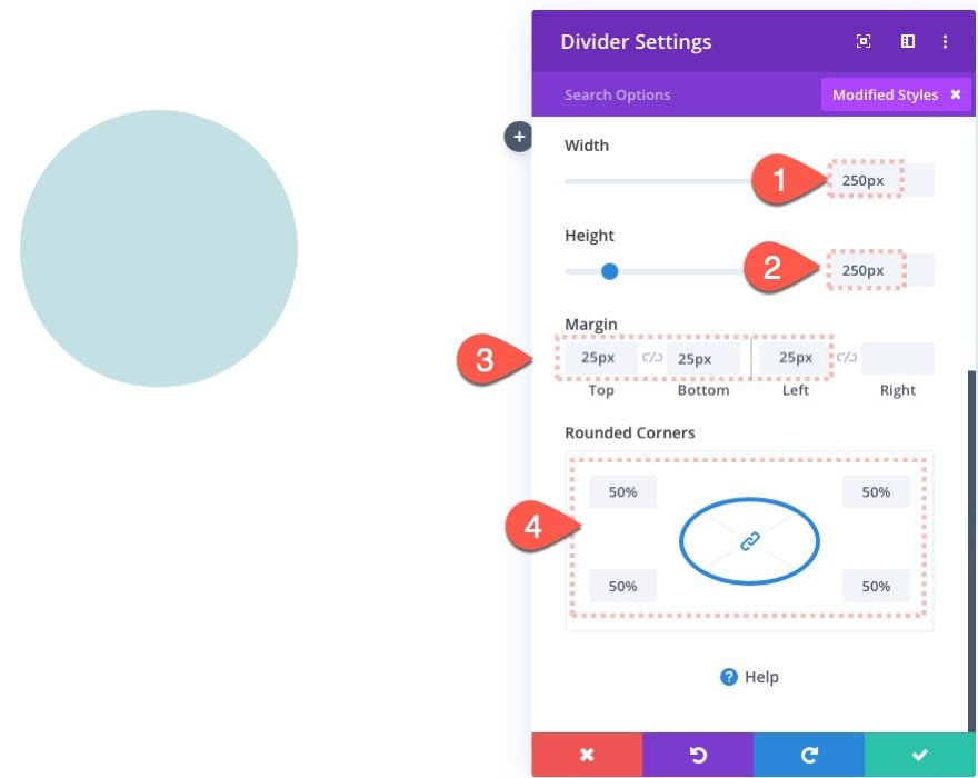
Update the design settings as follows:
- Width: 250px
- Height: 250px
- Margin: 25px top, 25px bottom, 25px left
- Rounded Corners: 50%
The Rotating Color Bar
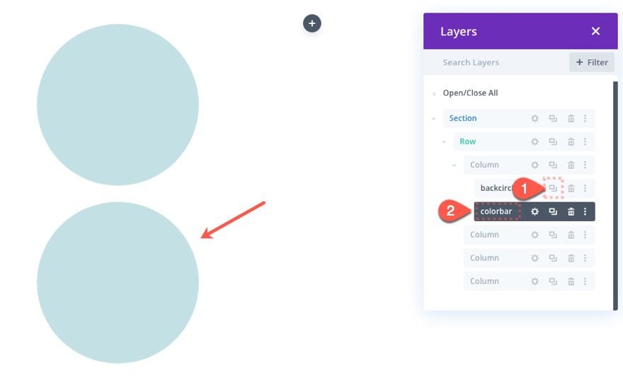
The next piece of the circle counter is going to be the rotating color bar. Duplicate the previous divider (back circle) to jumpstart the design. Then update the new divider with the label “colorbar”.
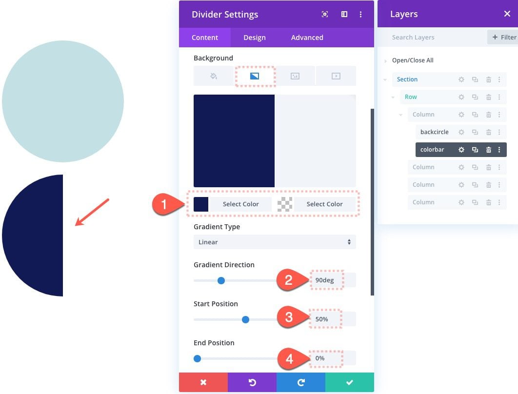
To create the rotating color bar effect, we need to turn this divider into a half-circle with whatever color we want to use for the bar.
Open the Color Bar Divider settings and update the following:
- Background Color: none
- Gradient Background Left Color: #121b55
- Gradient Background Right Color: rgba(255,255,255,0)
- Gradient Direction: 90deg
- Start Position: 50%
- End Position: 0%
On some browsers, there is a little overlapping glitch that shows some unwanted color through the layers. To avoid this, we will make this half-circle slightly smaller and adjust the offset accordingly.
- Width: 248px
- Height: 248px
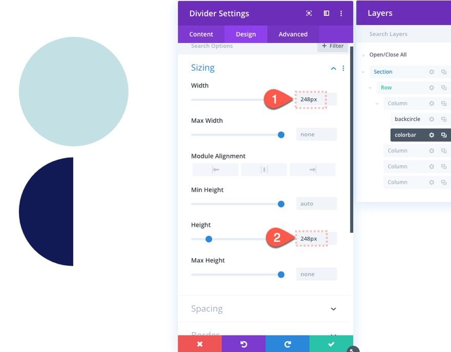
To make the Color Bar circle overlap the Back Circle, give the divider an absolute position as follows:
- Position: Absolute
- Vertical Offset: 26px
- Horizontal Offset: 26px
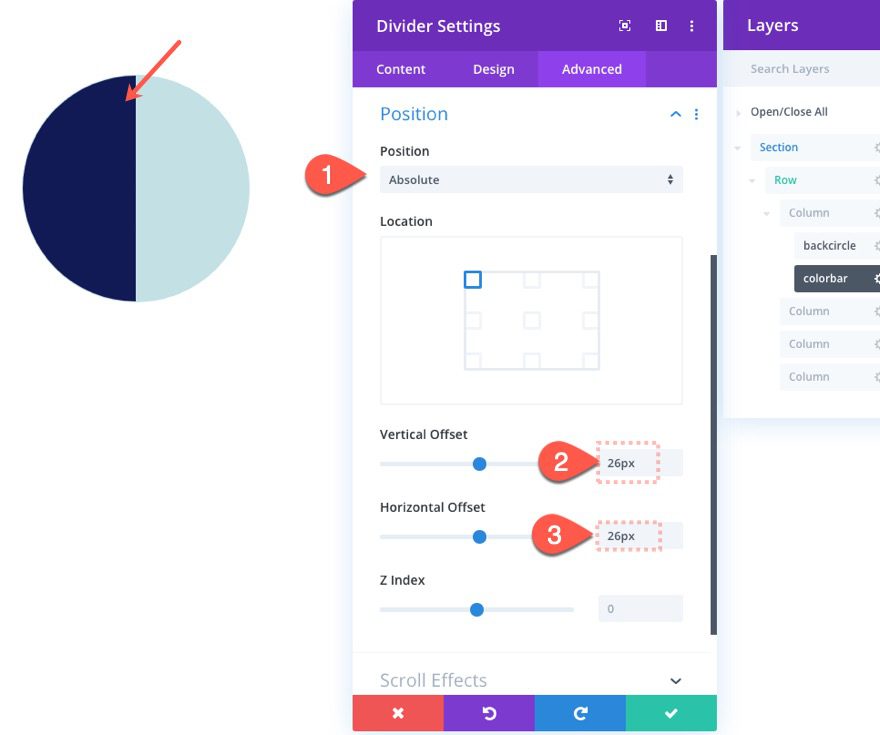
Then add the following scroll effect to rotate the circle bar 90 degrees (or 25% of the circle).
Under the Rotating Effects tab…
- Starting Rotation: 0deg (at 15% viewport)
- Mid Rotation: 90deg (at 20%-25% viewport)
- Ending Rotation: 90deg (at 30% viewport)
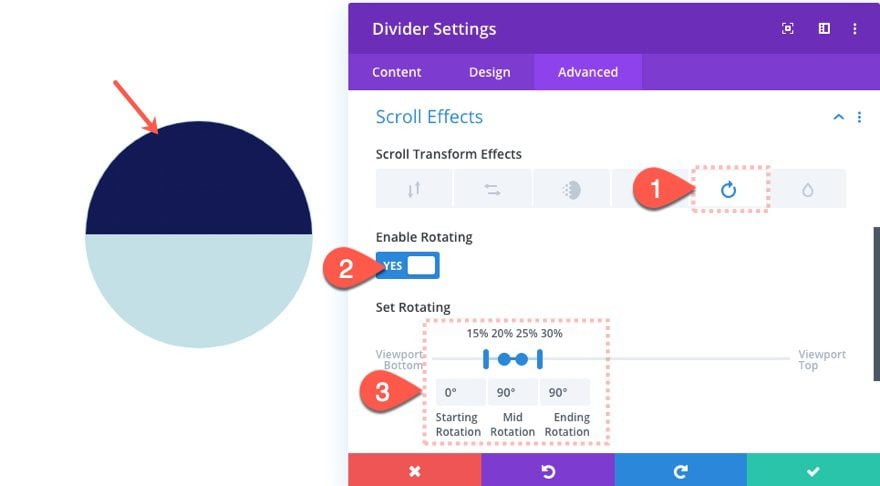
The rotation percentages and values here may not seem to make complete sense at this point. We are making it easy to update the rotation later on when we build the next circle counter that ends at 180deg (50% of the circle). The important thing at this point is that the rotation ends at 90deg (or 25%).
The Shield
The next element to our circle counter is what I call the shield, which is another half circle that hides the left side of the Color Bar circle while it rotates. To create the shield, duplicate the first Back Circle divider module we made earlier. Then drag it below the “Color Bar” divider module and update the label to “shield” for easy reference.
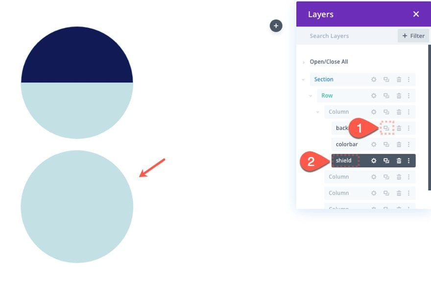
Open the settings for the shield divider module and update the following:
- Background Color: none
- Gradient Background Left Color: #c3e0e5 (same as back circle)
- Gradient Background Right Color: rgba(255,255,255,0)
- Gradient Direction: 90deg
- Start Position: 50%
- End Position: 0%
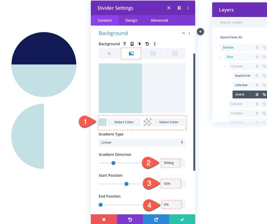
Now give the module an absolute position as follows:
- Position: Absolute
- Vertical Offset: 25px
- Horizontal Offset: 25px
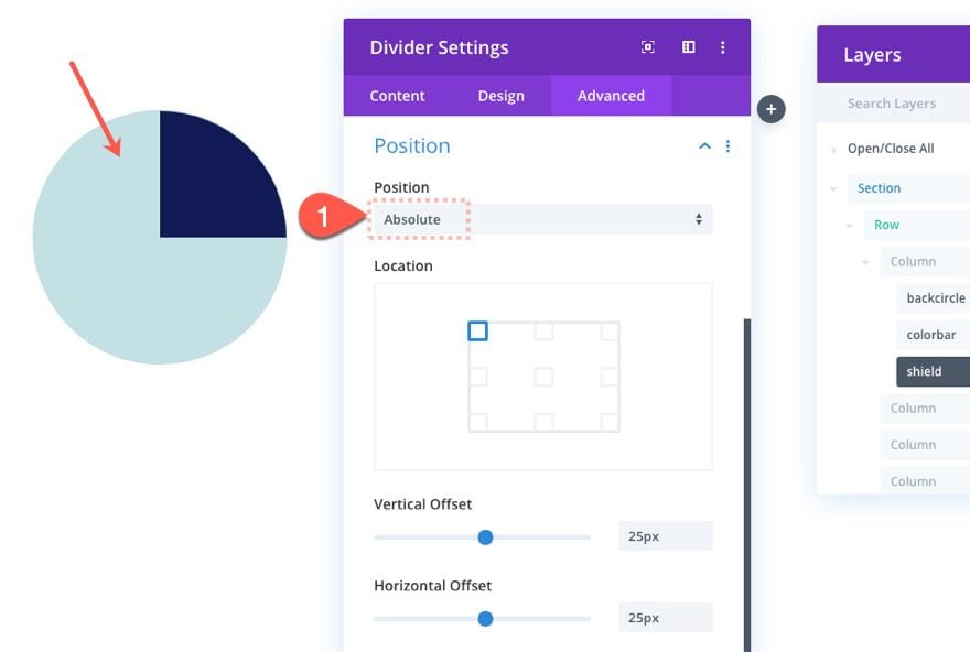
The Front Circle
The next piece of the circle counter is the front circle, which will hide the middle portion of the previous layers and expose the outer rim.
To create it, duplicate the back circle divider, drop it below the shield divider module, and update the label to “frontcircle”.
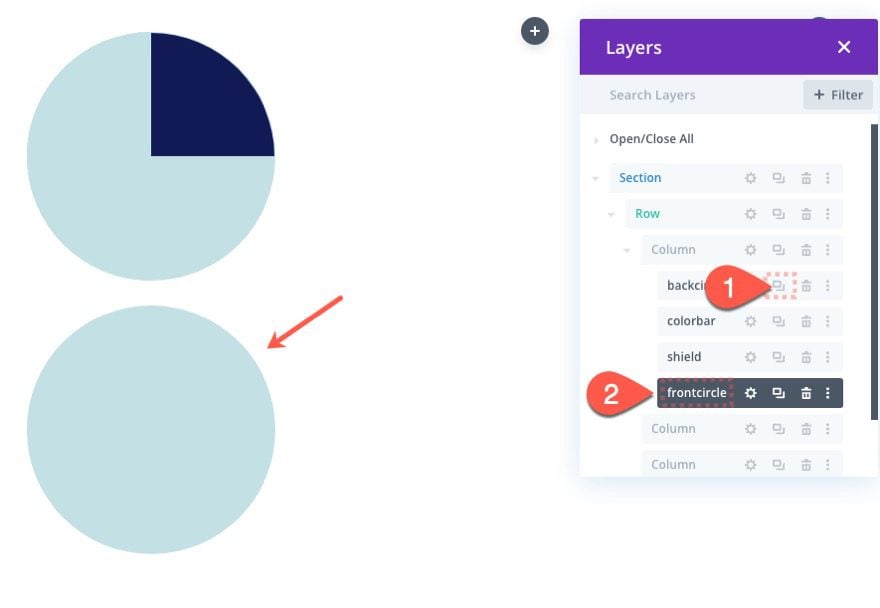
Open the settings for the front circle divider module and update the following:
- Background Color: #ffffff
- Width: 200px
- Height: 200px
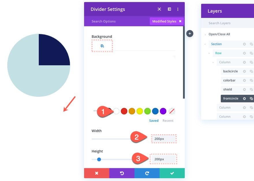
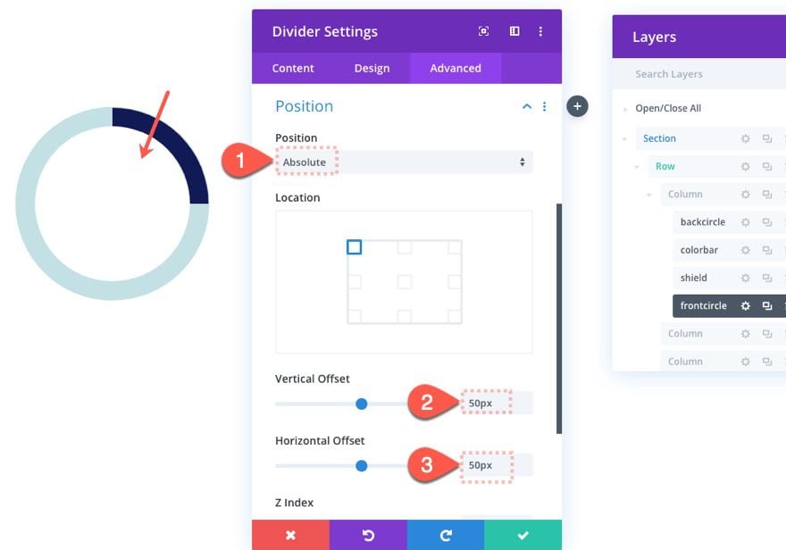
Then add the absolute position as follows:
- Position: Absolute
- Vertical Offset: 50px
- Horizontal Offset: 50px
The Fading Number
The last piece of this first circle counter is the fading number that corresponds to the value indicated by the rotating bar.
To build it, add a new text module below the front circle divider module.
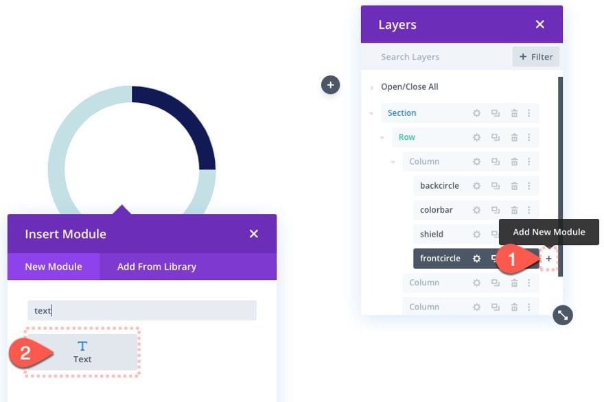
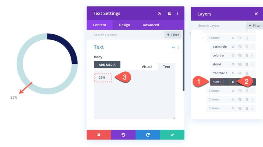
In the Layers box, label the new text module “num1”. Then open the settings and update the body text to read “25%”.
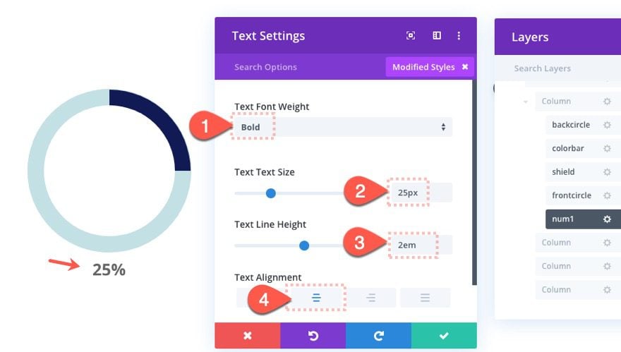
Under the design settings, update the following:
- Text Font Weight: Bold
- Text Text Size: 25px
- Text Line Height: 2em
- Text Alignment: center
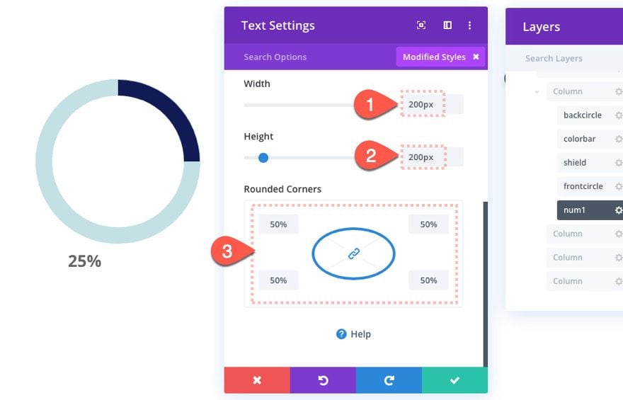
- Width: 200px
- Height: 200px
- Rounded Corners: 50%
- Padding: 75px top
- Position: Absolute
- Vertical Offset: 50px
- Horizontal Offset: 50px
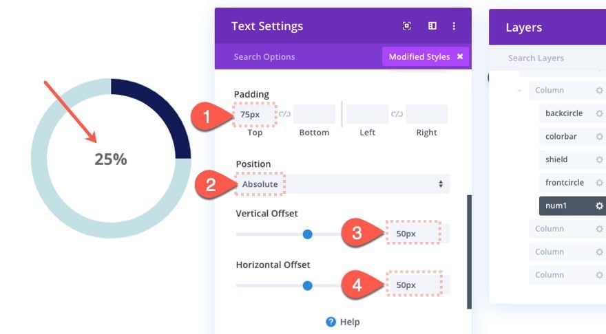
Now the text should be perfectly centered within the circle counter.
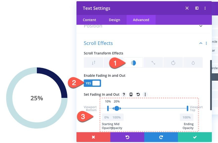
To add the fading in effect, update the following scroll effects:
Under the Fading In and Out tab…
- Enable Fading In and Out: YES
- Starting Opacity: 0% (at 10% viewport)
- Mid Opacity: 100% (at 20% viewport)
- Ending Opacity: 100% (at 100% viewport)
That’s it for our first counter. Check out the result.
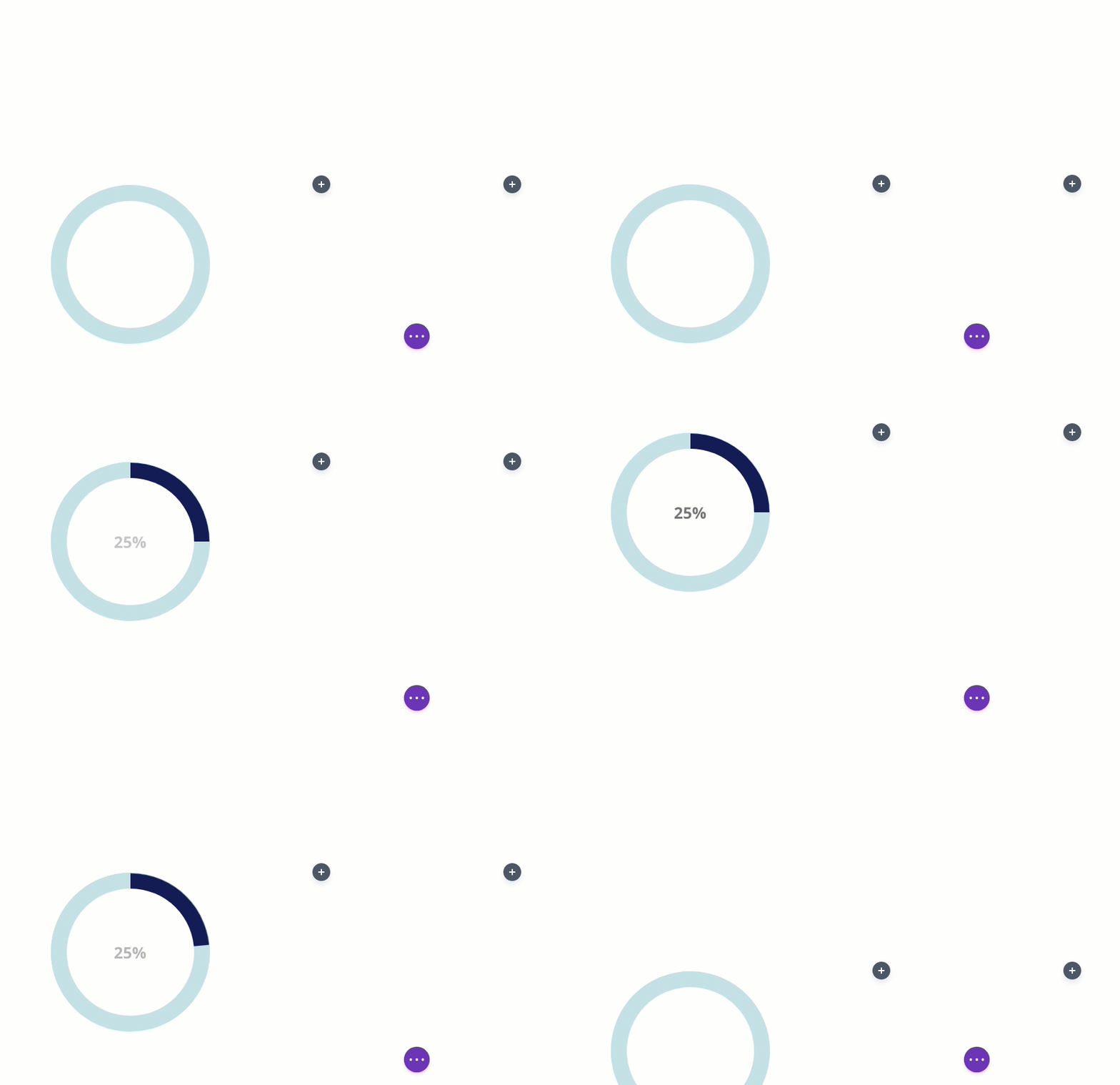
Creating Animated Circle Counter #2 (50%)
Our next animated circle counter will animate to 25% and then continue to animate to 50% as the user scrolls down the page. To build this we will need to update the rotating circle bar to continue rotating all the way to 180deg (or 50% of the circle). Then we will need to add an additional number to fade in after the previous one fades out.
Duplicating Column 1
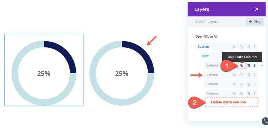
To jumpstart our next circle counter design, duplicate the entire first column. Then delete one of the extra blank columns so that we keep a four column layout.
Update Color Bar Circle Rotation
Inside the new column (now column 2), open the color bar divider module settings and update the following scroll effect value:
- Ending Rotation: 180deg
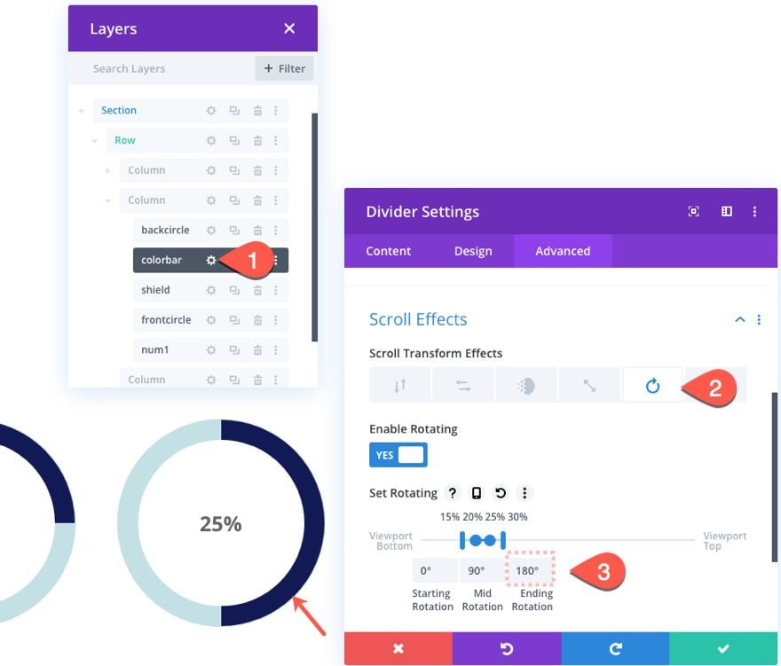
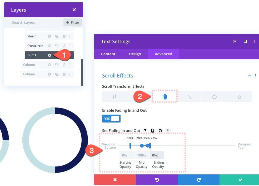
Since we are going to add another number that fades in, we will need to fade out the current text module containing the value 25%. Open the settings for the “num1” text module and update the fading in and out scroll effect as follows:
- Starting Opacity: 0% (at 10% viewport)
- Mid Opacity: 100% (at 20%-25% viewport)
- Ending Opacity: 0% (at 27% viewport)
To create the next fading number, duplicate the “num1” text module and change the duplicate label to “num2”.
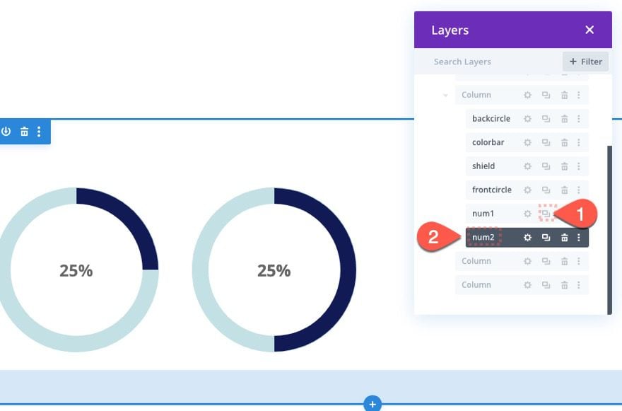
Then open the settings for the new “num2” text module and change the body text to “50%”.
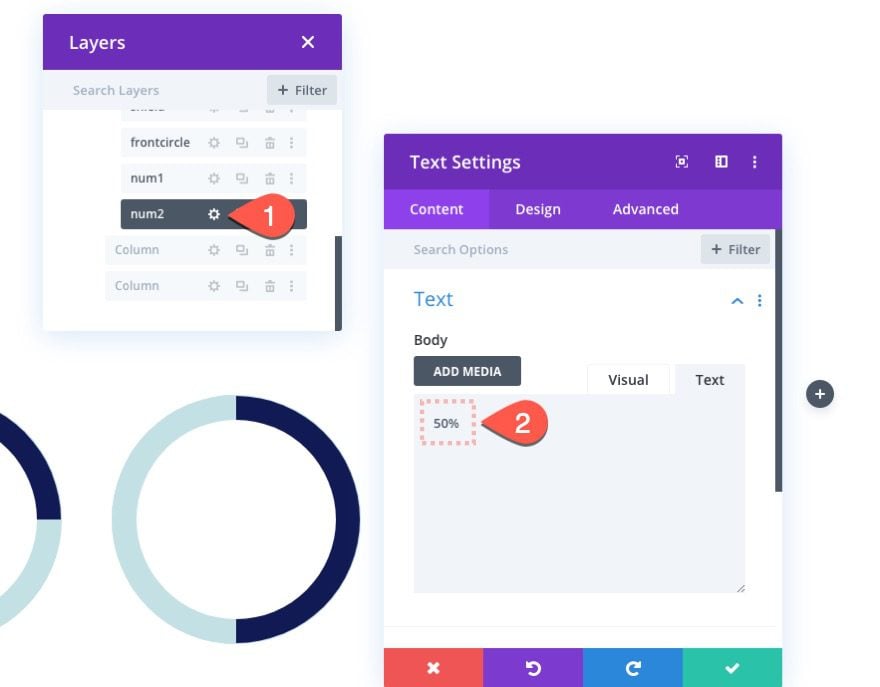
Then update the Fading In and Out scroll effects as follows:
- Starting Opacity: 0% (at 25% viewport)
- Mid Opacity: 100% (at 30%-35% viewport)
- Ending Opacity: 100% (at 40% viewport)
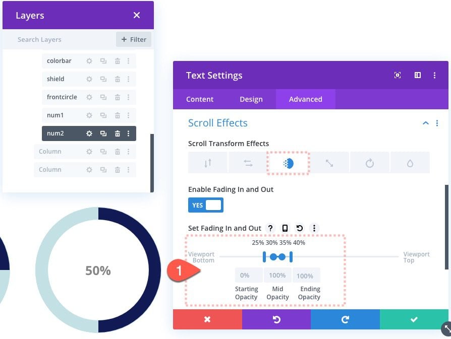
Here is the result of our second circle counter design.
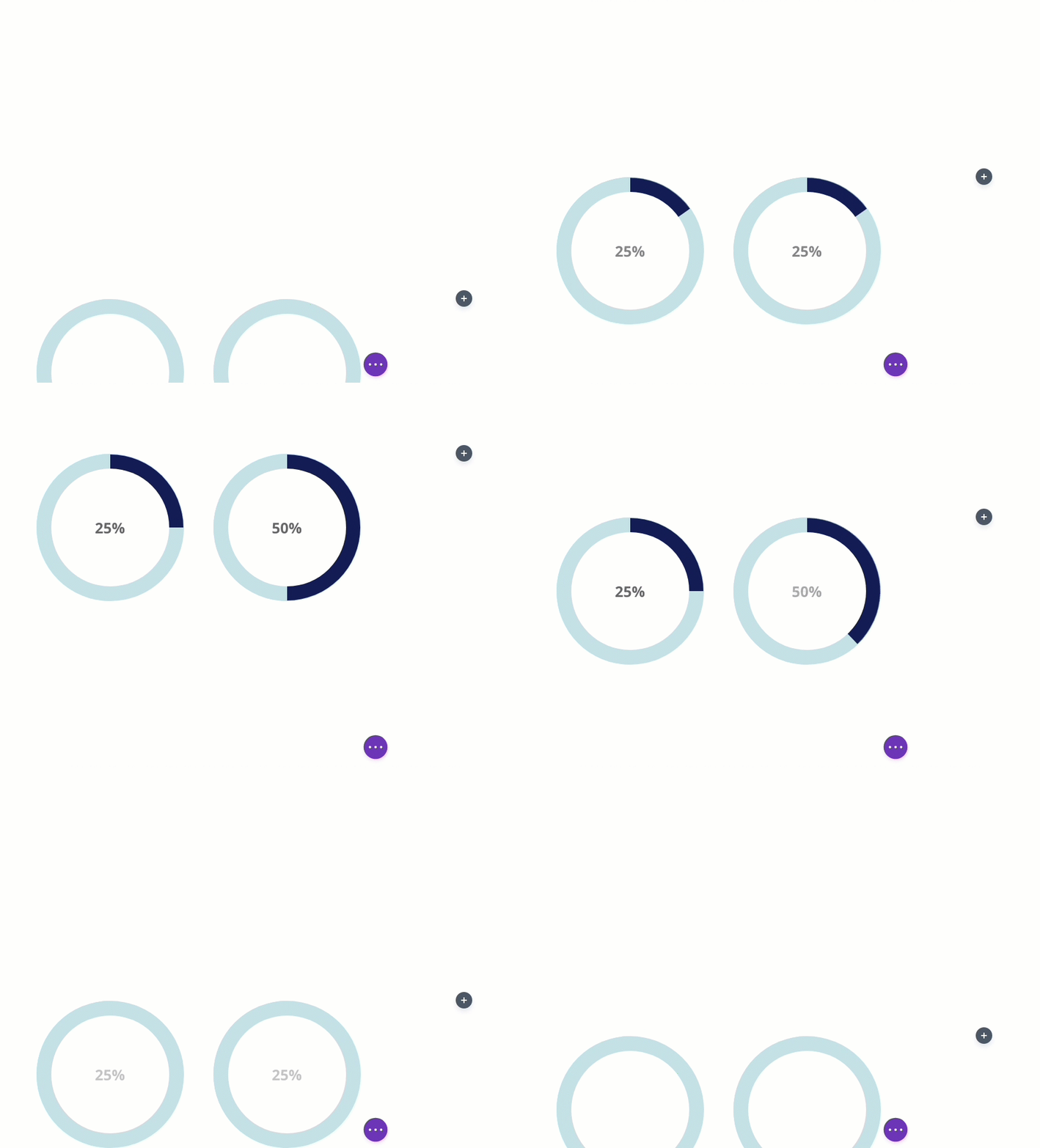
Creating Animated Circle Counter #3 (75%)
Duplicate Column 2
To create the third circle counter that animates to 75% on scroll, duplicate column 2 and delete the extra column 5.

Create a Second Color Bar Divider Module
To continue animating the color bar toward the right side of the circle counter, we will need to create another “colorbar” half circle divider module that’s fades in (at 180deg) once the first color bar reaches 180deg rotation. Then we will need to simultaneously fade out the shield on the left so that we can see the progress of the new color bar rotation.
To create the new second color bar, duplicate the color bar divider module and change the duplicate’s label to “colorbar2”.
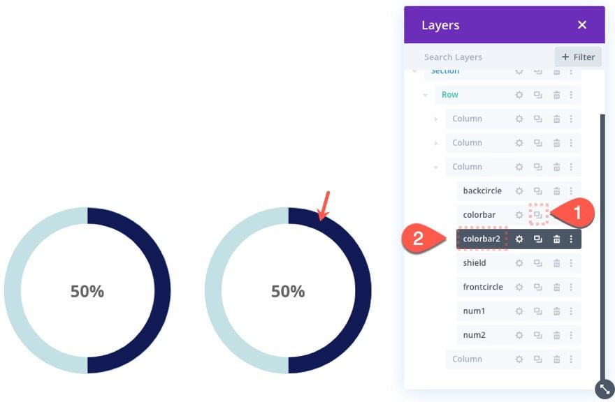
Add Color Bar 2 Scroll Effect
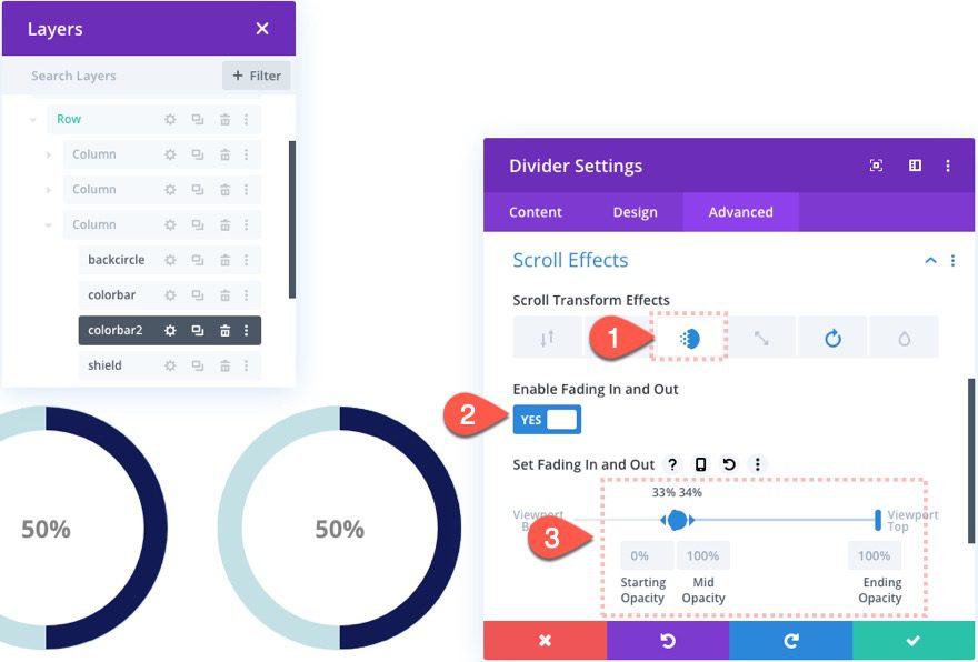
Then open the new “colorbar2” divider settings and update the Fade In and Out scroll effect as follows:
- Enable Fading In and Out: YES
- Starting Opacity: 0% (at 33% viewport)
- Mid Opacity: 100% (at 34% viewport)
- Ending Opacity: 100% (at 100% viewport)
Under the Rotation effect tab…
- Starting Rotation: 180deg (at 35% viewport)
- Mid Rotation: 270deg (at 40%-45% viewport)
- Ending Rotation: 270deg (at 50% viewport)
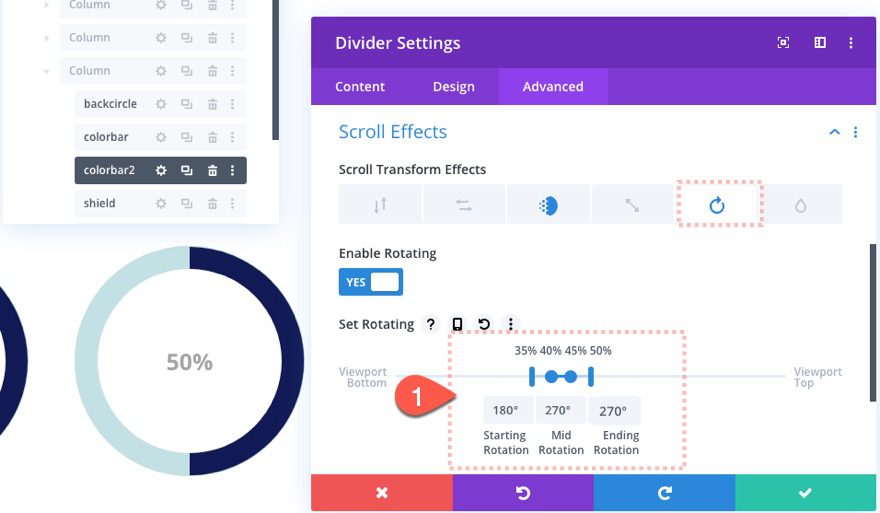
This will animate the circle bar from 180deg to 270deg (or 75% of the circle).
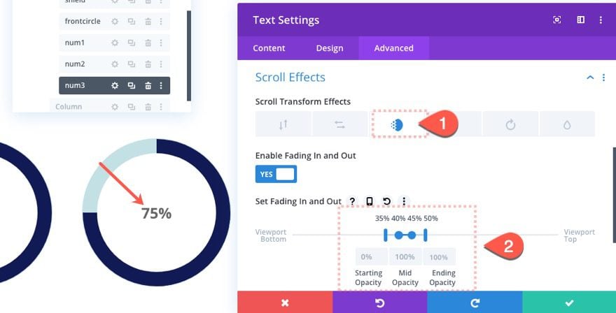
Add Fading Number #3
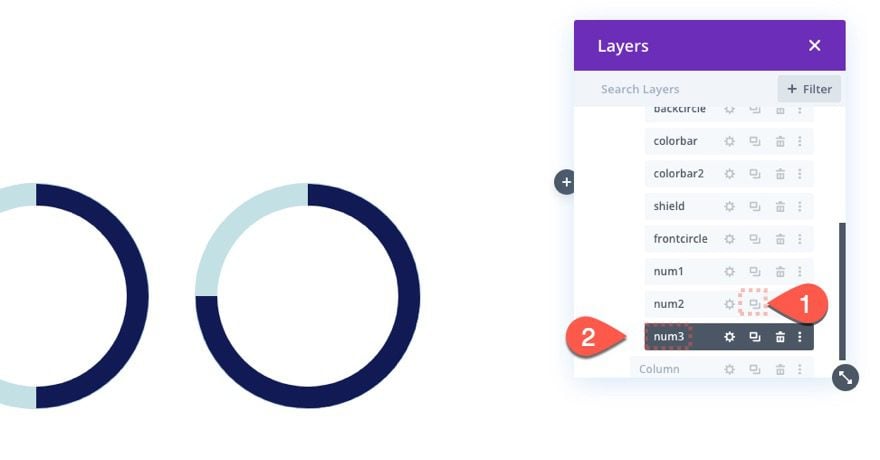
To fade in the “75%” for this next progression on the circle counter, duplicate the “num2” text module and change then duplicate’s label to “num3”.
Then update the content of the new text module with the body text “75%”.
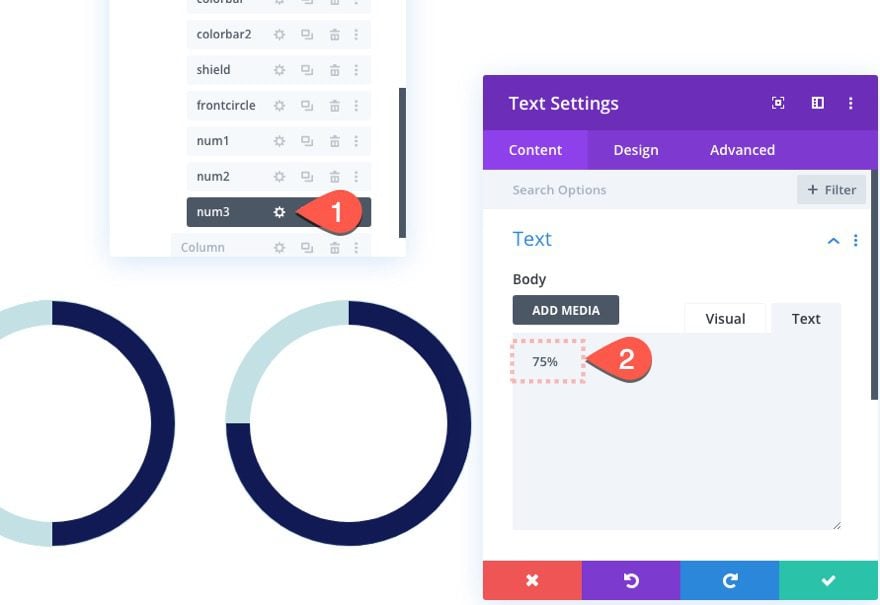
Open the settings for the “num3” text module and update the Fading In and Out Scroll effect as follow:
- Starting Opacity: 0% (at 35% viewport)
- Mid Opacity: 100% (at 40%-45% viewport)
- Ending Opacity: 100% (at 50% viewport)
Update Second Number Scroll Effect
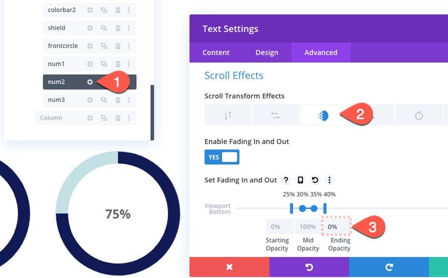
To fade out the second number, open the settings for “num2” text module and update the following Fading In and Out scroll effect:
- Ending Opacity: 0%
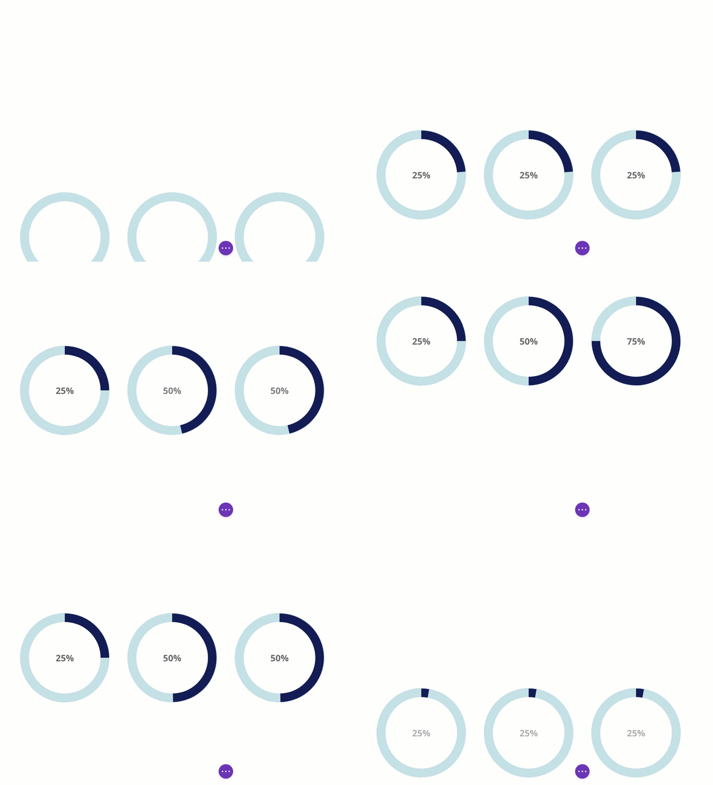
Check out our animated circle bars now.
Creating Animated Circle Counter #4 (100%)
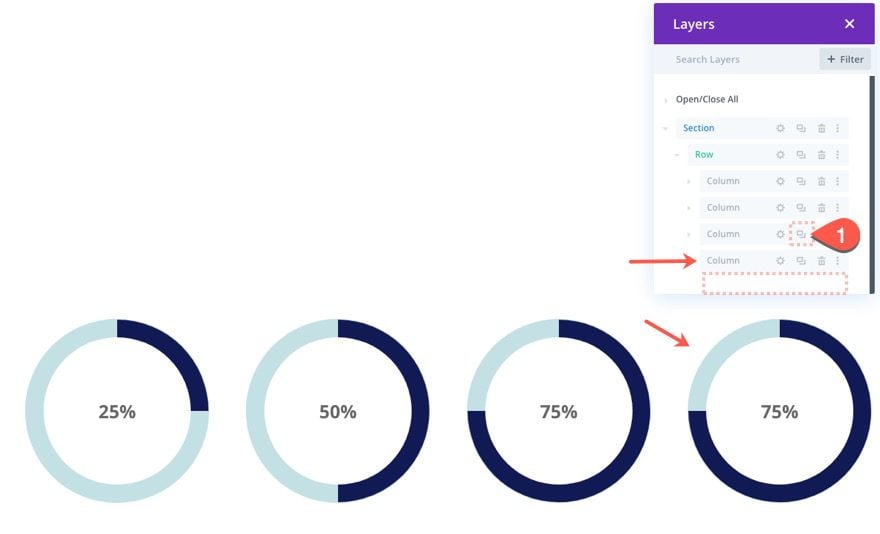
For our final circle counter, duplicate column 3 and then delete the extra empty column.
Open the settings for the “colorbar2” divider module and update the Rotation scroll effect as follows:
- Ending Rotation: 360deg
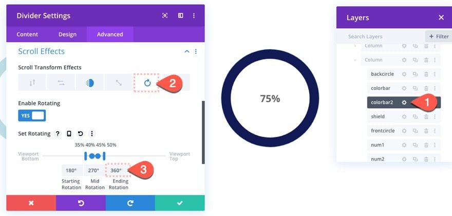
Then create another text module by duplicating the “num3” text module. Then change the label for the new text module to “num4”.
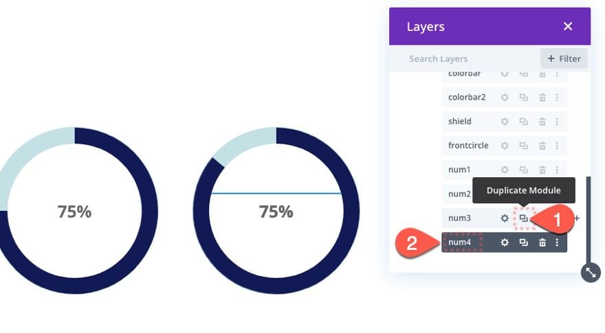
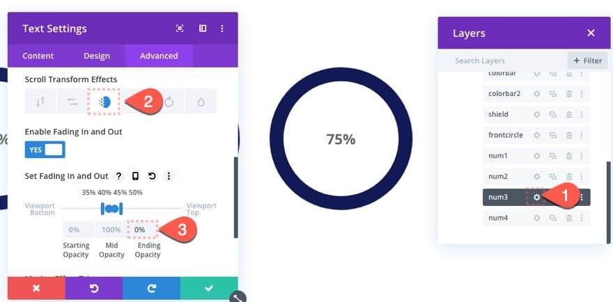
Before we update the new number, open the settings for the “num3” text module and update the Fading In and Out scroll effect as follows:
- Ending Opacity: 0%
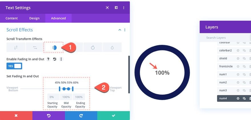
Now open the “num4” text module we just duplicated and update the body content to read “100%”.
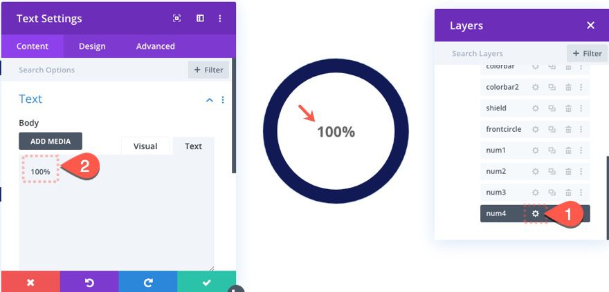
Then update the Fading In and Out Scroll Effect as follows:
- Starting Opacity: 0% (at 45% viewport)
- Mid Opacity: 100% (at 50%-55% viewport)
- Ending Opacity: 100% (at 60% viewport)
Final Result

Here here is how it stacks on tablet and phone.


Have Fun Exploring New Designs
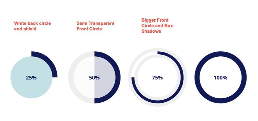
With this basic setup, you can explore all the Divi design options for creating unique animated circle counters with minimal adjustments. Check out the illustration below for an idea of what you can do with just a few tweaks.

Final Thoughts
Building custom circle counters that animate on scroll highlights just how powerful the Divi Builder has become. The layers feature is a must for this kind of design because it simplifies the management of multiple overlapping layers of Divi modules. Hopefully, this gives you another inspirational tool for creating something beautiful and functional for your next project.
I look forward to hearing from you in the comments.
Cheers!



after reading these feature and advantages, I have purchased this theme, but after installing my website slow down in google matrix, I am using Divi theme 4.1+, now tell me how i can optimize my website.
This should help… https://www.elegantthemes.com/blog/divi-resources/speeding-up-your-divi-website
Thanks, Jason Champagne after using Divi resources, my website performs well in google matrix but Gzip Compression is not working well in the bing search engine. Can you suggest to me and anything about this issue?
I currently use the Divi theme 4.0+ version if I use this theme will my website slowdown?
No it won’t slow your website down. If you want to optimize your Divi site, follow this handy guide: https://www.elegantthemes.com/blog/divi-resources/speeding-up-your-divi-website
I currently use the Divi theme 4.0+ version if I use this theme will my website slowdown.
I’m so in love with this theme
Thanks for this amazing article
I am using your services and experience is amazing thank you