Creating text background scroll animation is a unique way to add colorful moving textures to the text on your website as a user scrolls down the page. With Divi, the process is surprisingly easy once you learn a few key techniques.
In this tutorial, we are going to use nothing but the power of Divi’s built-in settings to create 3 unique designs that feature colorful text background scroll animation. We’ll even show you how to create a dark version of each design for a whole new look and feel.
Let’s get started!
- 1 Sneak Peek
- 2 Download the Text Background Scroll Animation Layouts for FREE
- 3 Download For Free
- 4 What You Need to Get Started
- 5 Design 1: Text Background Gradient with Horizontal Scroll Effect
- 6 Design 2: Text Background Gradient with Rotating Scroll Effect
- 7 Design 3: Text Background with Multiple Moving Circles
- 8 Final Results
- 9 Dark Versions
- 10 Final Thoughts
Sneak Peek
Here is a quick look at the designs we will build today.
Download the Text Background Scroll Animation Layouts for FREE
To lay your hands on the designs from this tutorial, you will first need to download it using the button below. To gain access to the download you will need to subscribe to our newsletter by using the form below. As a new subscriber, you will receive even more Divi goodness and a free Divi Layout pack every Monday! If you’re already on the list, simply enter your email address below and click download. You will not be “resubscribed” or receive extra emails.
To import the layout to your page, simply extract the zip file and drag the JSON file into the Divi Builder.
Let’s get to the tutorial, shall we?
What You Need to Get Started
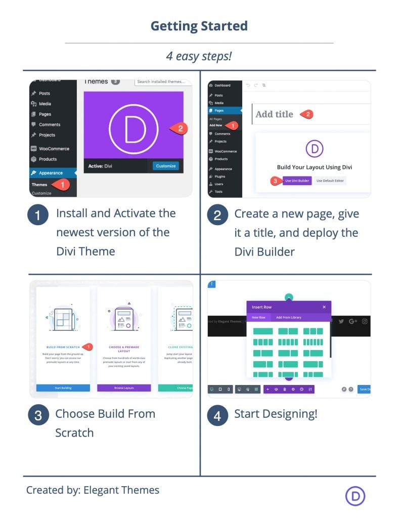
To get started, you will need to do the following:
- If you haven’t yet, install and activate the Divi Theme.
- Create a new page in WordPress and use the Divi Builder to edit the page on the front end (visual builder).
- Choose the option “Build From Scratch”.
After that, you will have a blank canvas to start designing in Divi.
Design 1: Text Background Gradient with Horizontal Scroll Effect
This first design will feature a horizontal scroll effect that animates a colorful divider module behind a text module with the screen filter.
Add Column
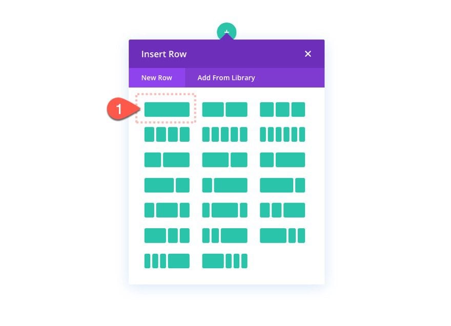
To start, add a one-column row to the default section.
Add Text Module
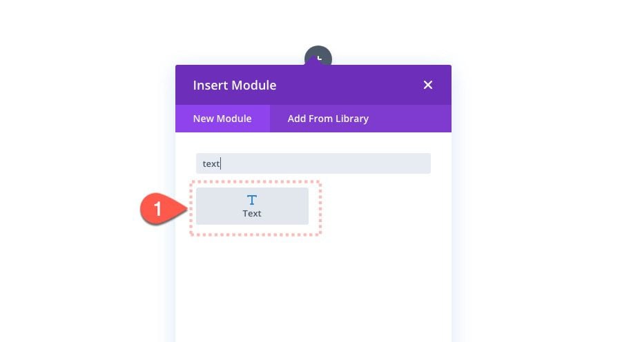
Then add a new text module to the column.
Content
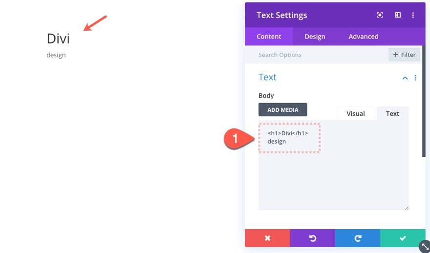
For the column content, paste the following HTML into the content box:
Text Design
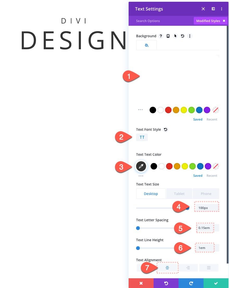
Then update the text design as follows:
- Background Color: #ffffff
- Text Font Style: TT
- Text Text Color: #000000
- Text Text Size: 100px (desktop), 40px (phone)
- Text Letter Spacing: 0.15em
- Text Line Height: 1em
- Text Alignment: Center
- Heading Font: Merriweather
- Heading Font Weight: Bold
- Heading Font Style: TT
- Heading Text Alignment: Center
- Heading Text Color: #000000
- Heading Text Size: 200px (desktop), 80px (phone)
- Heading Letter Spacing: 0.15em
- Heading Line Height: 1em

Padding and Filter
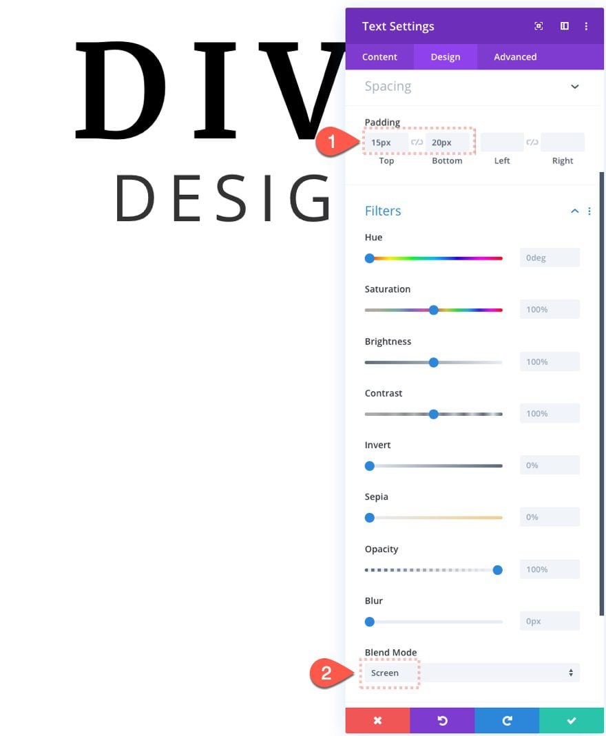
Now we need to add a little padding and a screen filter to the text module. The filter is necessary for this design to work because it is what allows the background colors/modules to show behind the text.
To add the padding and the filter, update the following:
- padding: 15px top, 20px bottom
- Blend Mode: Screen
Note: The screen blend mode works best with black text on a white background. If we wanted to use white text on a black background we would use the Multiply blend mode.
Top and Bottom Divider
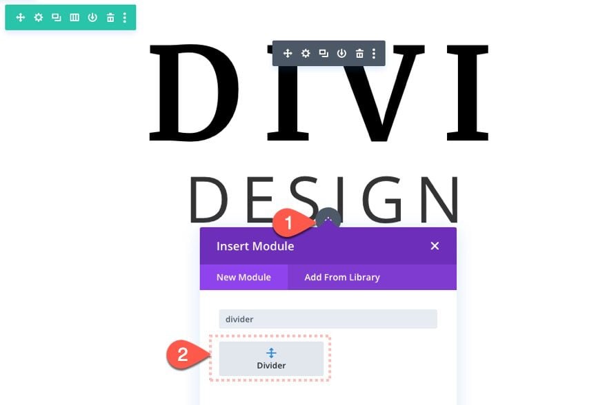
Once our text module is finished, let’s add couple of dividers (above and one below the text module) for an additional design element.
Add Bottom Divider
Add a new divider module below the text module.
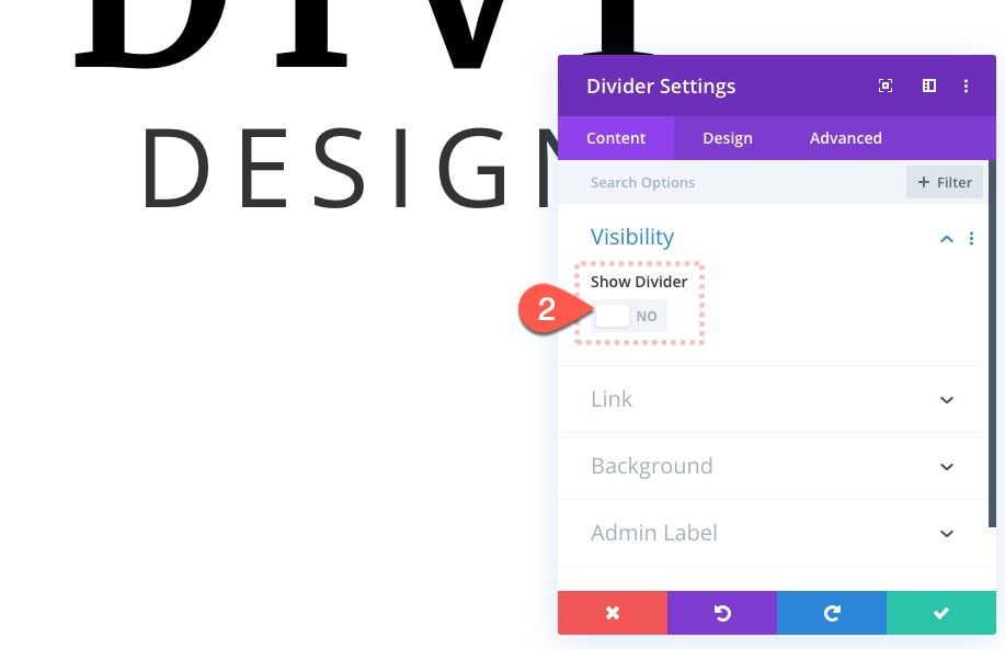
Top Divider Settings
Open the divider settings and select NOT to show the divider.
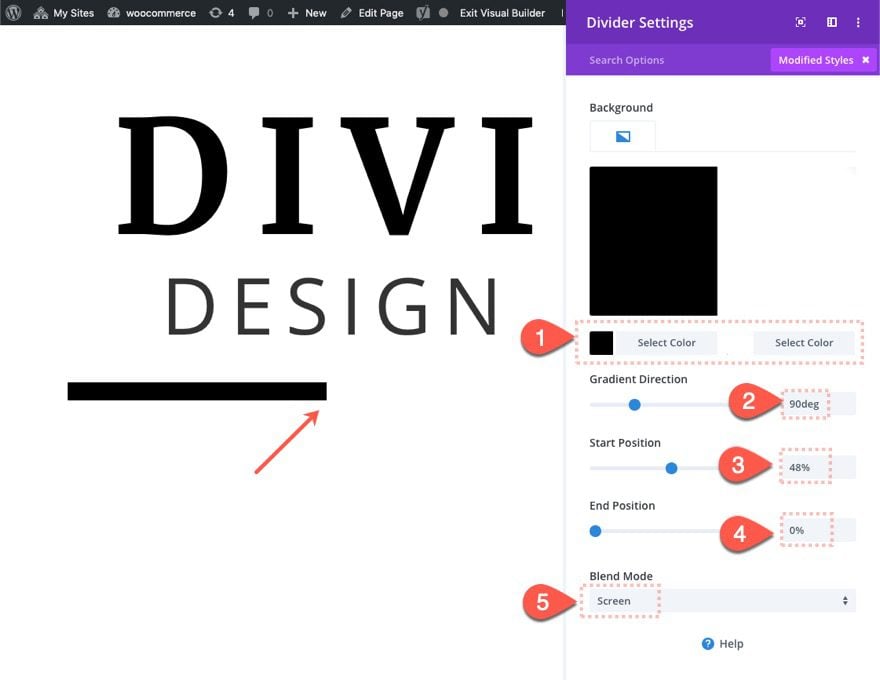
Then update the background and give the divider the same blend mode as the text module as follows:
- Gradient Background Left Color: #000000
- Gradient Background Right Color: #ffffff
- Gradient Direction: 90deg
- Start Position: 48%
- End Position: 0%
- Blend Mode: Screen
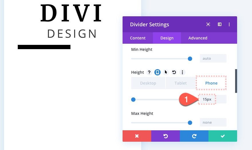
Then update the height of the divider on phone display as follows:
- Height: 15px (phone)
Add Top Divider
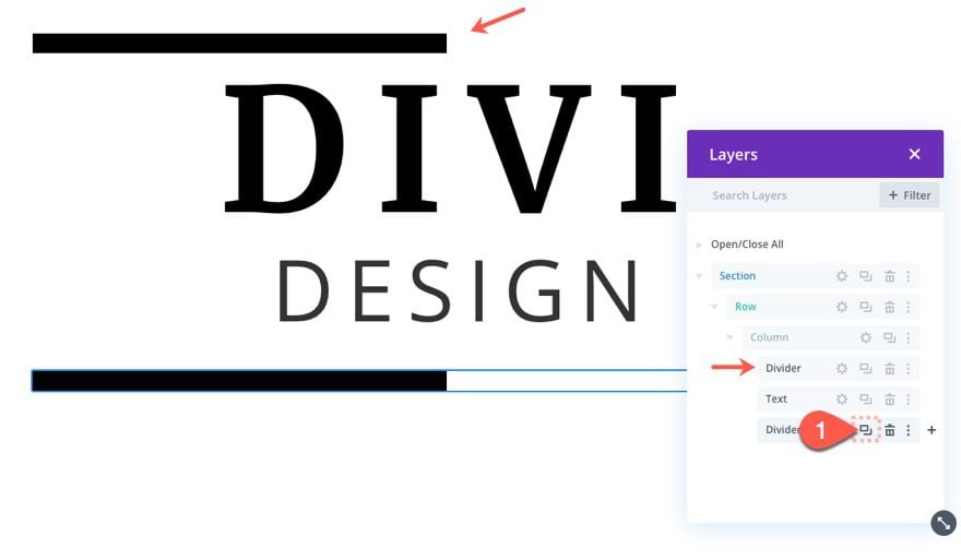
To create the top divider, duplicate the previous bottom divider and drag it above the text module using the layers view box.
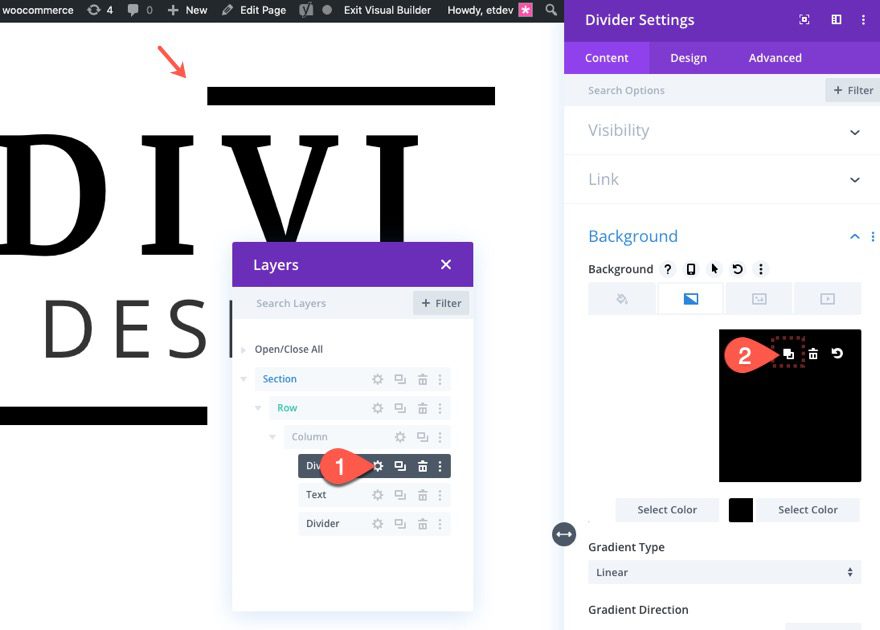
Then reverse the colors on the gradient background.
Update Row Settings
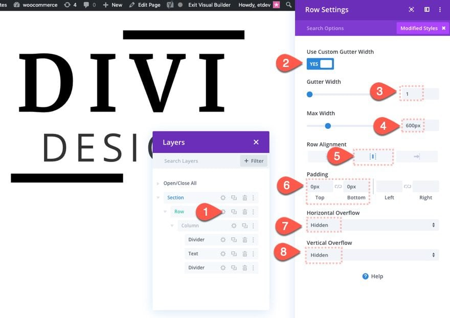
Once our top and bottom dividers are in place, update the row settings as follows:
- Gutter Width: 1 (to take out bottom margins between modules)
- Max Width: 600px (to keep a consistent design on desktop and tablet)
- Row Alignment: Center
- Padding: 0px top, 0px bottom
- Horizontal Overflow: hidden
- Vertical Overflow: hidden
Create Divider for Animated Text Background Color
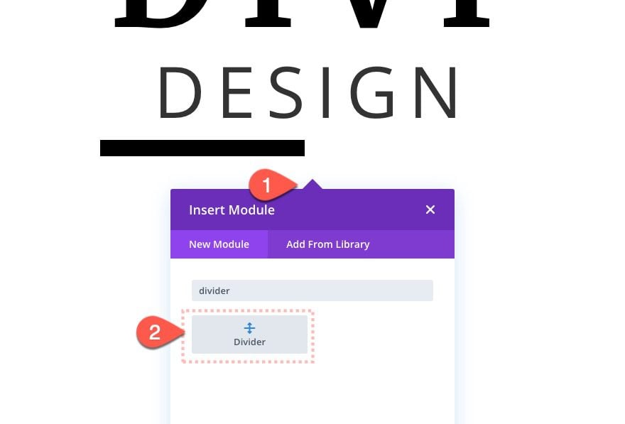
The final element for this first design is the divider that we will use to animate the text background color on scroll. To do this, add a new divider module under the bottom divider.
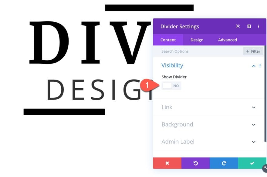
Then select NOT to show the divider.
Background Divider Settings
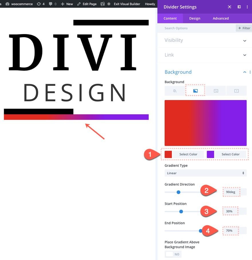
Update the divider with a gradient background as follows:
- Gradient Background Left Color: #e02b20
- Gradient Background Right Color: #8300e9
- Gradient Direction: 90deg
- Start Position: 30%
- End Position: 70%
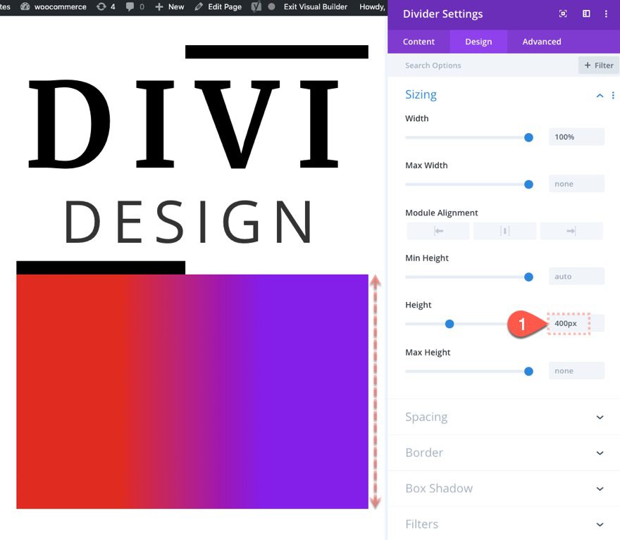
We want to set the height of the divider to be hight enough to color all of our text in the text module and the top and bottom dividers. For this design, set the height to 400px.
- Height: 400px
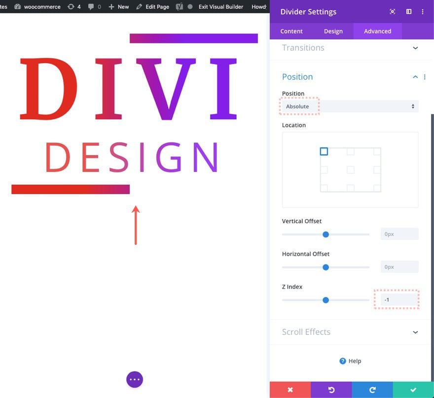
Then give the divider an absolute position to position it directly on top of the other modules. Use the Z Index to make the divider sit behind the other modules.
- Position: Absolute
- Z Index: -1
Background Divider Scroll Effects
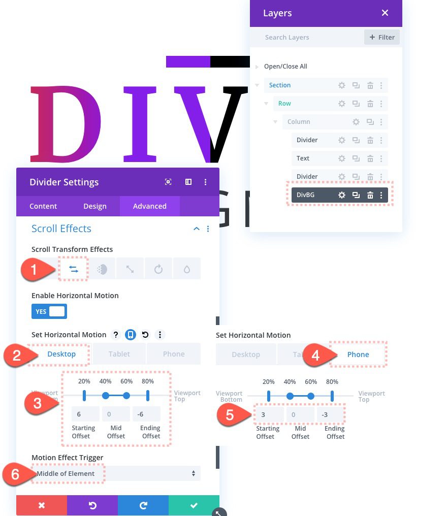
With the divider in position, all we have to do is move the divider behind the text using Divi’s scroll effects. For this design, we are simply going to add a horizontal motion on scroll.
Update the following:
Under the Horizontal Motion tab…
Desktop
- Enable Horizontal Motion: YES
- Starting Offset: 6 (at 20%)
- Mid Offset: 0 (at 40%-60%)
- Ending Offset: -6 (at 80%)
Phone
- Starting Offset: 3
- Ending Offset: -3
Make sure to set the motion effect trigger to the middle of the element as well:
- Motion Effect Trigger: Middle of Element
Add Section Spacing
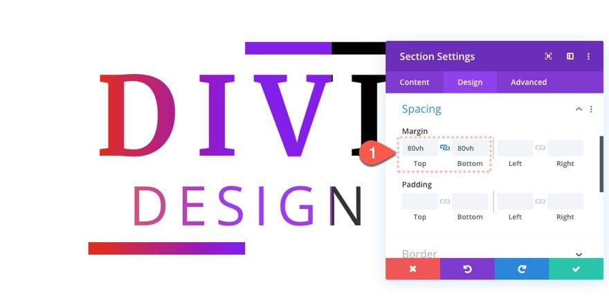
To create temporary scrolling space to test out the design, add the following to the section:
- Margin: 80vh top, 80vh bottom
Result
Here is the final result of the first design.
Design 2: Text Background Gradient with Rotating Scroll Effect
For this second design, we are going to create a rotating gradient background for the text. We are also going to add a fading in and out element as well.
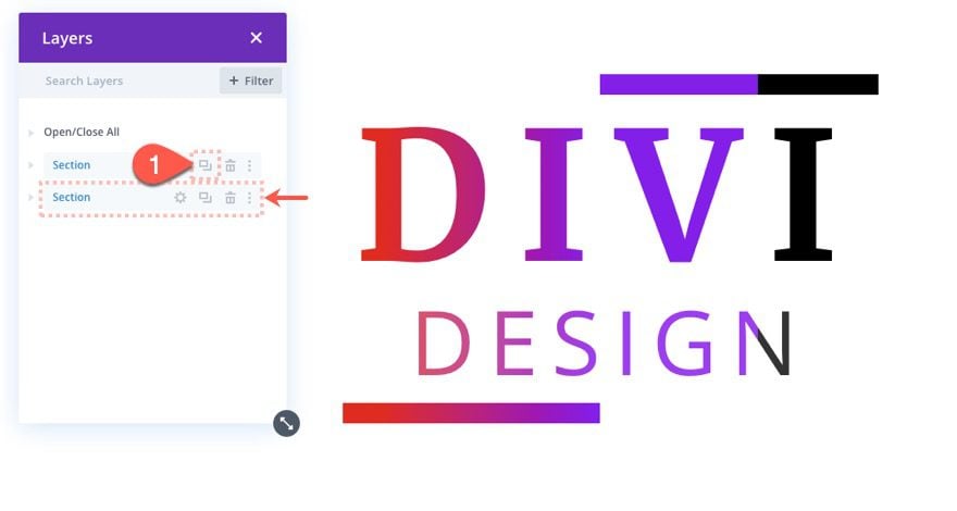
Duplcate Section
To create the next design, duplicate the entire section featuring the first design we created.
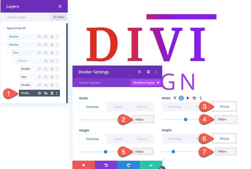
Background Divider Settings
Then update the settings for the Divider being used for the text background as follows:
- Width: 600px (desktop), 300px (phone)
- Height: 600px (desktop), 300px (phone)
Then update the rounded corners as follows:
- Rounded Corners: 50%
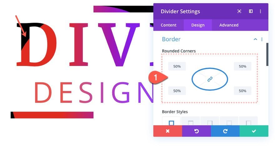
This will give the divider a circular shape which is what we want for the rotation scroll effect we will add to the divider.
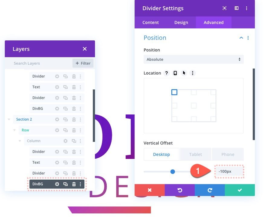
Next adjust the vertical offset to position the circle behind the text content as follows:
- Vertical Offset: -100px (desktop), -50px (phone)
Top and Bottom Divider Updates
Once the divider is in place, update the top divider background as follows:
- Gradient Background Right Color: transparent
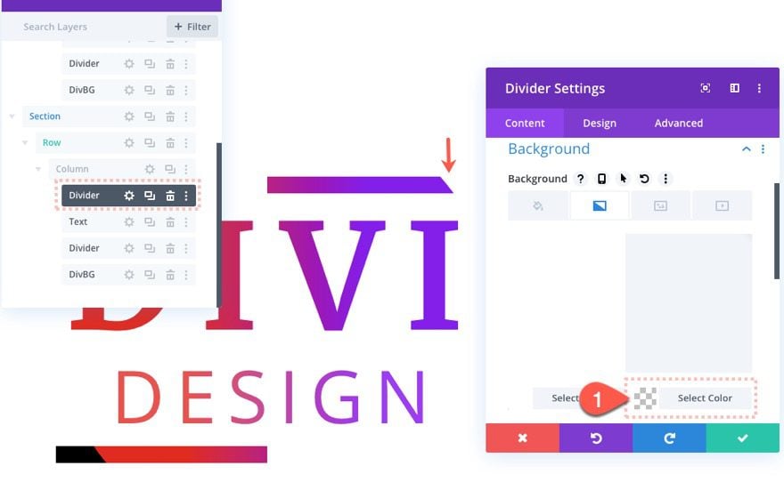
Then update the bottom divider background as follows:
- Gradient Background Left Color: transparent
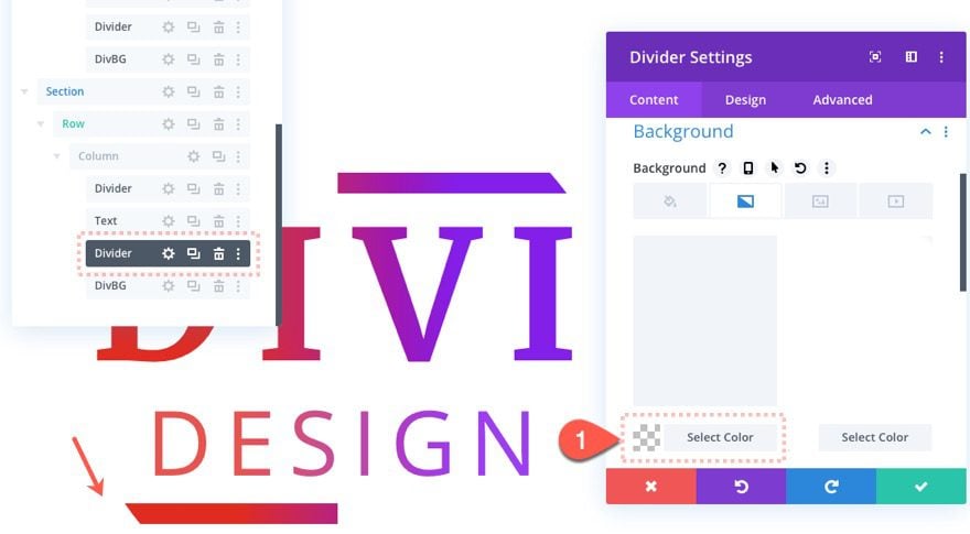
Update Background Divider Scroll Effects
Once the top and bottom dividers are updated, we need to add new scroll effects to the background divider. Open the settings for the background divider and update the following:
Under the Fading In and Out tab…
- Enable Fading In and Out: YES
- Mid Opacity: 100% (at 40%-60%)
- Ending Opacity: 0%
Under the Scaling Up and Down tab…
- Enable Scaling Up and Down: YES
- Starting Scale: 105%
- Mid Scale: 115%
- Ending Scale: 105%
Under the Rotating tab…
- Enable Rotating: YES
- Starting Rotation: 360deg
- Ending Rotation: -360deg
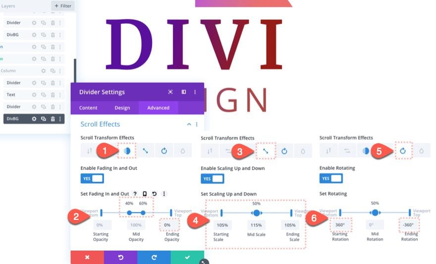
Make sure to disable the Horizontal Motion effect as well.
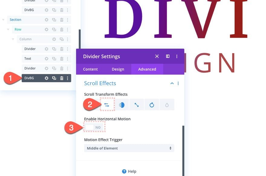
Result
Here is the result of design 2.
Design 3: Text Background with Multiple Moving Circles
For this third and final design, we are going to add multiple circular dividers that move behind the text for a beautiful animation on scroll.
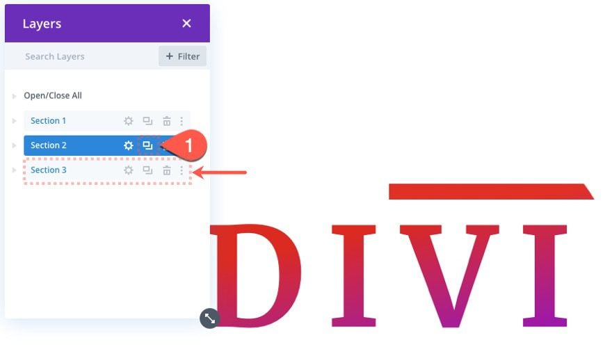
Duplicate Section 2
To do it, first duplicate the section.
Top and Bottom Divider Updates
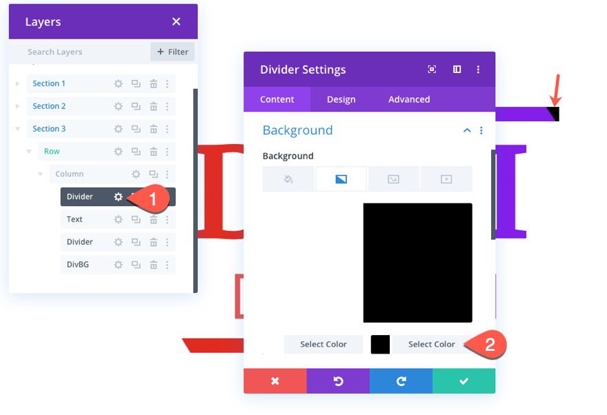
Then open the settings for the top divider in the new/third section and add the black color back to the gradient background as follows:
- Gradient Background Right Color: #000000
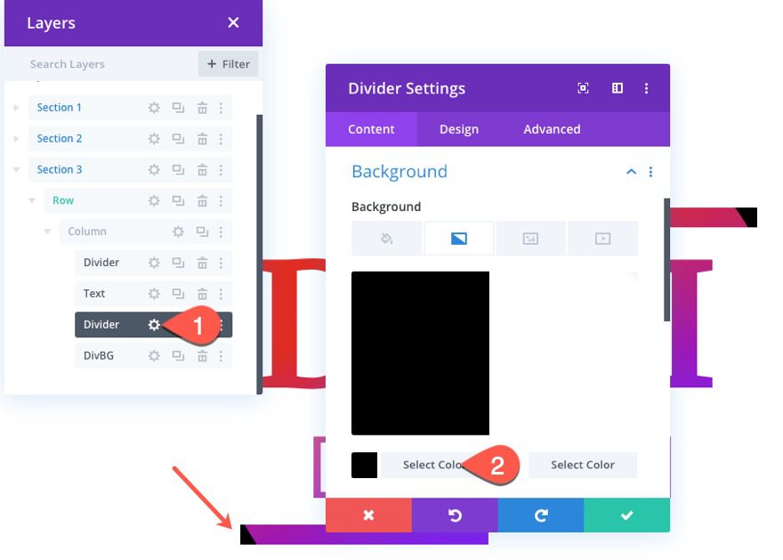
Open the settings for the bottom divider and update the background as well.
- Gradient Background Left Color: #000000
Creating Background Divider 1
The first background divider already exists from the previous design, we are going to make it smaller and animated it differently.
Background Divider 1 Settings
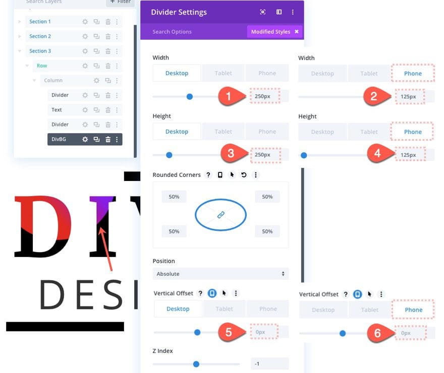
Open the settings for the background divider and update the following:
- Width: 250px (desktop and tablet), 125px (phone)
- Height: 250px (desktop and tablet), 125px (phone)
- Vertical Offset: 0px (desktop, tablet, and phone)
Background Divider 1 Scroll Effects
Then reset the transform effects that were transferred from the previous design by right clicking on the scroll effects option group and selecting “Reset Scroll Transform Effects”.
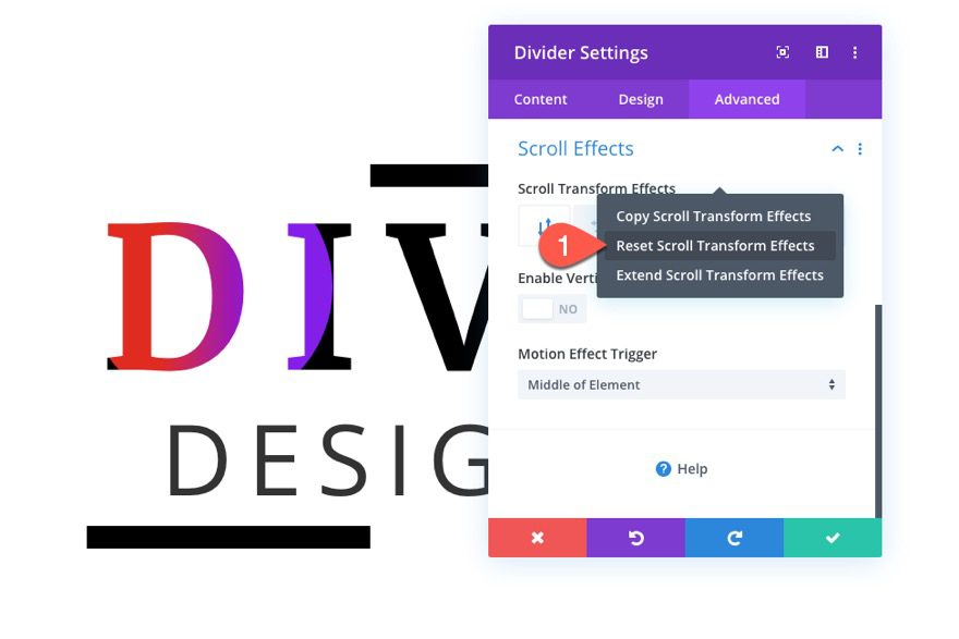
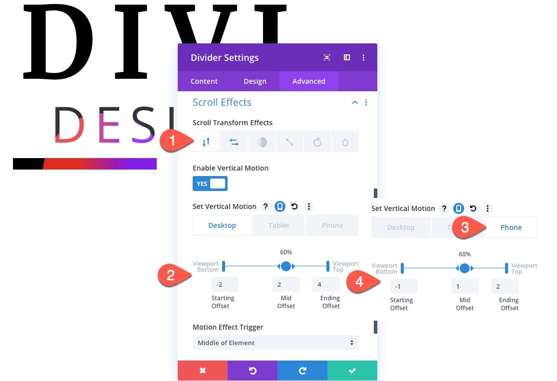
Now we can add new scroll effects as follows:
Under the Vertical Motion tab…
Desktop
- Enable Vertical Motion: YES
- Starting Offset: -2
- Mid Offset: 2 (at 60%)
- Ending Offset: 4
Phone
- Starting Offset: -1
- Mid Offset: 1 (at 60%)
- Ending Offset: 2
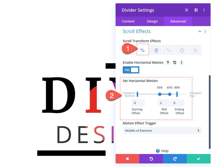
Under the Horizontal Motion tab…
- Enable Horizontal Motion: YES
- Starting Offset: 0
- Mid Offset: 2 (at 45%-65%)
- Ending Offset: 0 (at 80%)
Creating Background Divider 2
To create the second background divider, duplicate the first background divider.
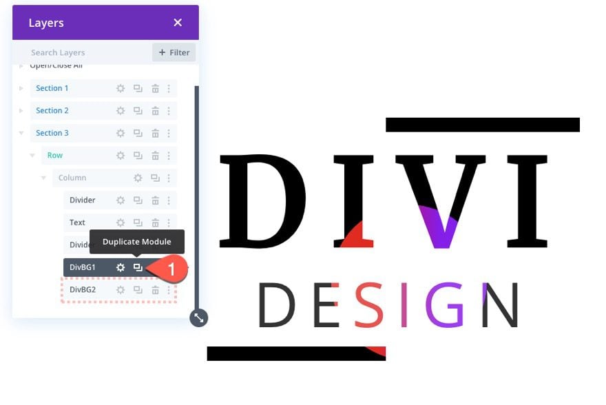
Background Divider 2 Updates
Background
Then open the settings for the second/duplicate background divider and update the following background color:
- Background Gradient Left Color: rgba(224,153,0,0.9)
- Background Gradient Right Color: rgba(255,243,71,0.9)
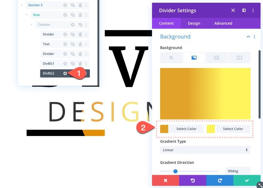
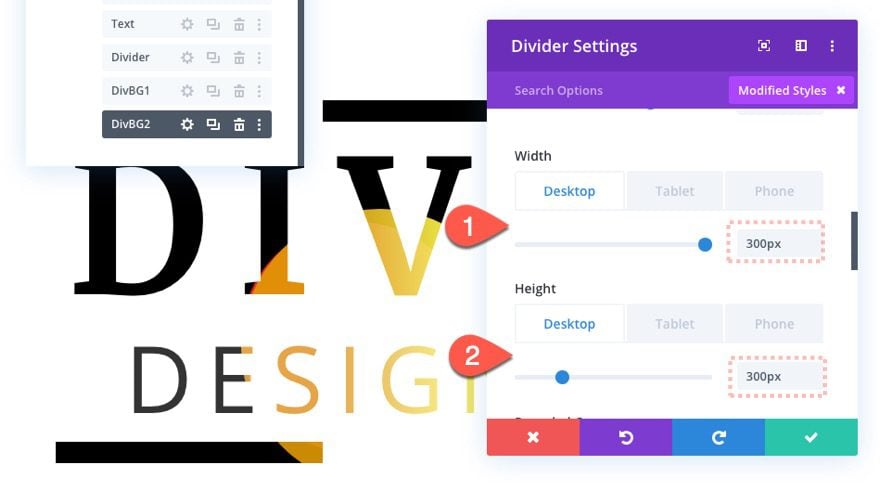
Size
Then update the size as follows:
- Width: 300px (desktop and tablet), 150px (phone)
- Height: 300px (desktop and tablet), 150px (phone)
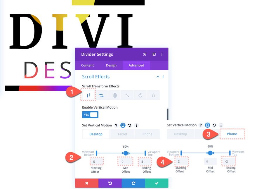
Scroll Effects
Then update the scroll effects as follows:
Under the Vertical Motion tab…
Desktop
- Starting Offset: 5
- Mid Offset: 0
- Ending Offset: -5
Phone
- Starting Offset: 2
- Mid Offset: 0
- Ending Offset: -2
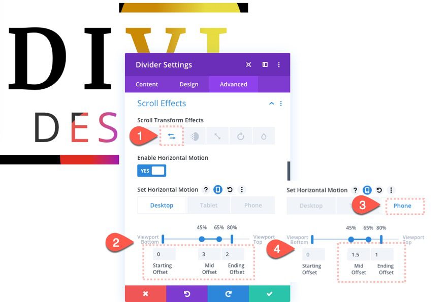
Under the Horizontal Motion tab…
Desktop
- Starting Offset: 0
- Mid Offset: 3
- Ending Offset: 2
Phone
- Mid Offset: 1.5
- Ending Offset: -1
Creating Background Divider 3
To create the third and final background divider, duplicate background divider 2.
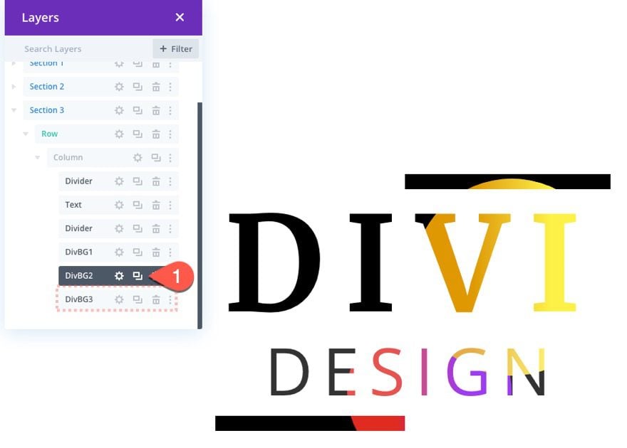
Background Divider 3 Updates
Background
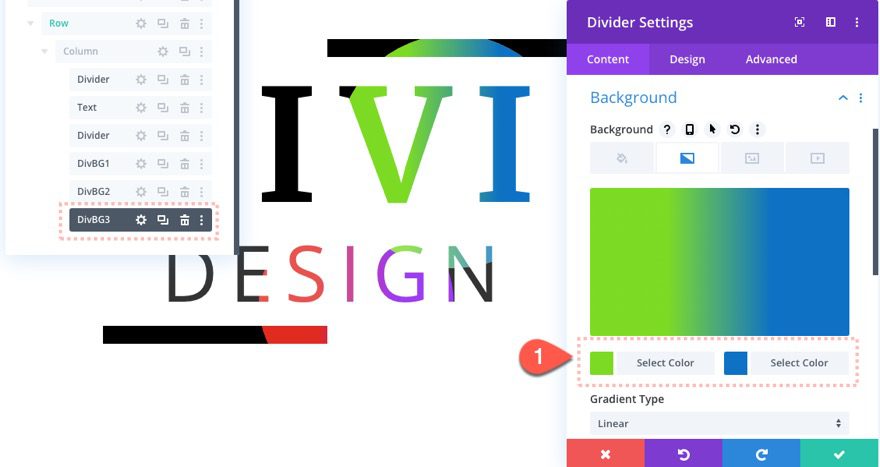
Then update the background gradient colors as follows:
- Background Gradient Left Color: rgba(124,218,36,0.9)
- Background Gradient Right Color: rgba(12,113,195,0.9)
Size
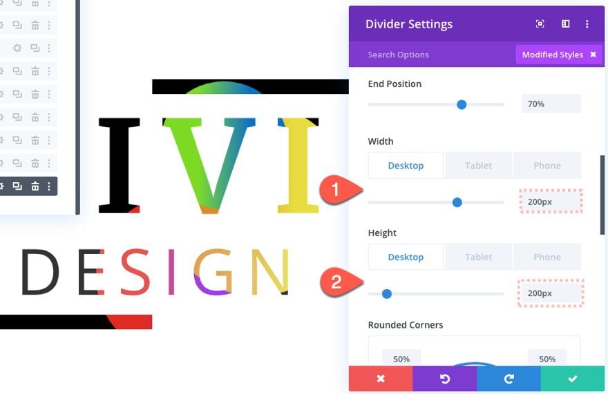
Then update the sizing as follows:
- Width: 200px (desktop and tablet), 100px (phone)
- Height: 200px (desktop and tablet), 100px (phone)
Scroll Effects
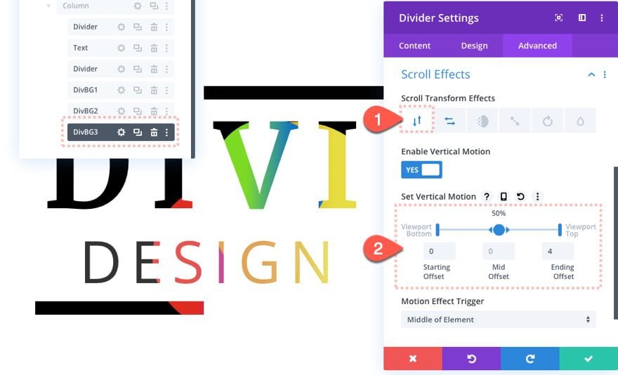
Then update the scroll effects as follows:
Under the Vertical Motion tab…
- Starting Offset: 0
- Mid Offset: 0
- Ending Offset: 4
Under the Horizontal Motion tab…
Desktop
- Starting Offset: 6 (at 20%)
- Mid Offset: 0 (at 40%-60%)
- Ending Offset: 6 (at 80%)
Phone
- Starting Offset: 3
- Ending Offset: 3
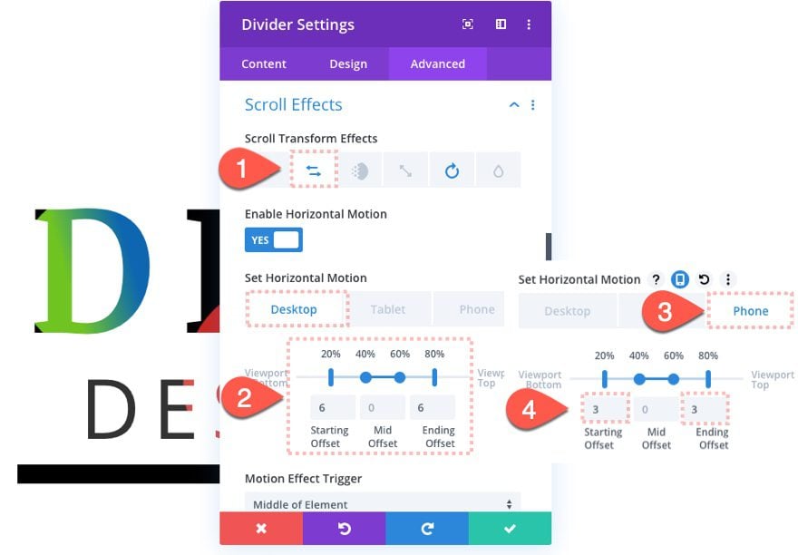
Here is the final result of design 3.
Final Results
Now let’s check out the final results for all three designs.
And here is the design on mobile.
Dark Versions
To create a dark version of these designs, you will need to switch the white color used for black and also switch the black colors used for white. Then use the Multiply blend mode for the text module and top and bottom dividers.
Here’s how to do it for design 3.
First, change the background of the section to black.
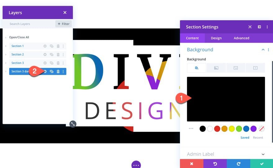
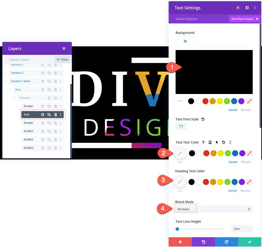
Then update the text module settings as follows:
- Background Color: #000000
- Text Text Color: #fffffff
- Heading Text Color: #ffffff
- Blend Mode: Multiply
Here is the result.
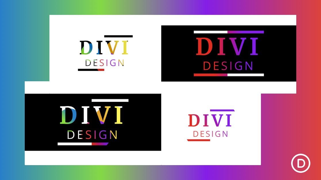
And here is what the rest of the designs will look like with the dark version applied.
Final Thoughts
The text background animation designs featured in this article would actually work great as a static design without the addition motion on scroll. However, the additional scroll effects really do take the design to a whole new level. Feel free to experiment with more colors and effects!
I look forward to hearing from you in the comments.
Cheers!




Thanks for this tutorial!
I’m trying to do this with a different background color, like blue. But even though I imported the JSON file and changed the background color from black to blue, the gradient overrides it and it doesn’t work.
Hey there, Michelle, you’re welcome! Glad you’re finding the tutorial helpful.
The gradient background is layered on top of the background color, so changing the background color alone won’t show through. To use a different color like blue, adjust or remove the gradient settings in the Divider Module behind the text to let your blue background show properly.
If you’re unsure how, or the change still isn’t producing the desired effect, feel free to reach out to friendly support, we’ll help! 😊
Hallo, im trying to get a scroll effect with background images. Particularly with the background from the cloud hosting layout. https://www.elegantthemes.com/layouts/services/hosting-company-landing-page
Does anybody know how to do that?
Great tutorial, thanks Jason.
Has anyone noticed that this technique does not work on smaller screens?
Hello, I downloaded the json file and when I try to import it is says “This file should not be imported in this context.”
Super!!!
wow these tutorials are so creative and it seems the possibilities are unlimited
thanks!
Thanks, Alex. I agree, so many possibilities!