
Using Divi and its new draggable sizing options do not only help you create highly responsive websites, but they can also really help create unique interactions. By playing around with these options, you can customize any website you’re creating and customize your page structures to meet current design trends.
In this tutorial, specifically, we’re going to show you how to create hover sections with Divi. We’ll create a new page and allow all the section titles to show, but each section will only open on hover (desktop) or on click (mobile). As soon as you open another section, the one you opened previously will automatically close. We’ll start off by explaining the general approach and continue by recreating the example you can see below from scratch. We hope this tutorial encourages you to create your own hover section designs as well!
Let’s get to it!
Preview
Before we dive into the tutorial, let’s take a quick look at the outcome across different screen sizes.
Desktop

Mobile

Download The Hover Sections Layout for FREE
To lay your hands on the free hover sections layout, you will first need to download it using the button below. To gain access to the download you will need to subscribe to our newsletter by using the form below. As a new subscriber, you will receive even more Divi goodness and a free Divi Layout pack every Monday! If you’re already on the list, simply enter your email address below and click download. You will not be “resubscribed” or receive extra emails.

Approach
Before we dive into the actual tutorial, we’ll go over the technique that is used to create hover sections. You can apply this technique to any kind of website you’re building, with any kind of design style.
1. Add the first section to your page
Let’s assume you’re starting a new design on a brand new page. The first thing you’ll need to do is add a new regular section to it.
2. Add a new row that includes a section title
Then, you can continue by adding a new row with a Text Module that includes your section title. You can also add a divider module and something that indicates that the row expands on hover or touch (see example in the preview of this post). It’s important to keep the section title separate from the rest of the section content so make sure you leave enough whitespace between the section title and whatever comes next.
3. Fine-tune the rest of the section content (add as many rows and modules as wanted)
The design elements that follow the section titles are entirely up to you. You can make the section as long or as short as you want and make use of any kind of design style.
4. Modify the default and hover max height of the section
Once you’re done fine-tuning the section and all of the design elements in it, it’s time to create the hover effect. The default height of your section is meant to fit the section title only. On hover, the section will take back its initial size.
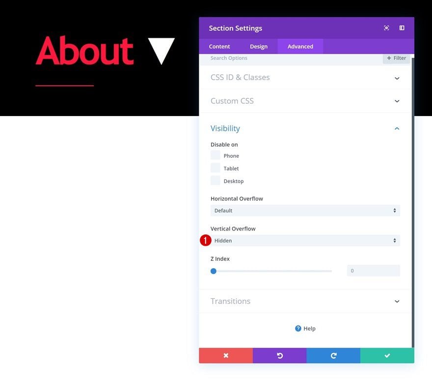
5. Hide the Vertical Overflow
Another important part of this technique is hiding the vertical overflow. Once you’ve set a default max height to your section that is smaller than the initial height of the section, an overflow will be created. To make sure the overflow doesn’t show, you’ll have to make sure it’s hidden in the visibility settings of the section.
5. Repeat steps for all sections on the page
Repeat the same steps for all sections on your page to create an obvious user experience that your visitors will appreciate.
Subscribe To Our Youtube Channel
Let’s Start Recreating!
Add New Section
Default Background Color
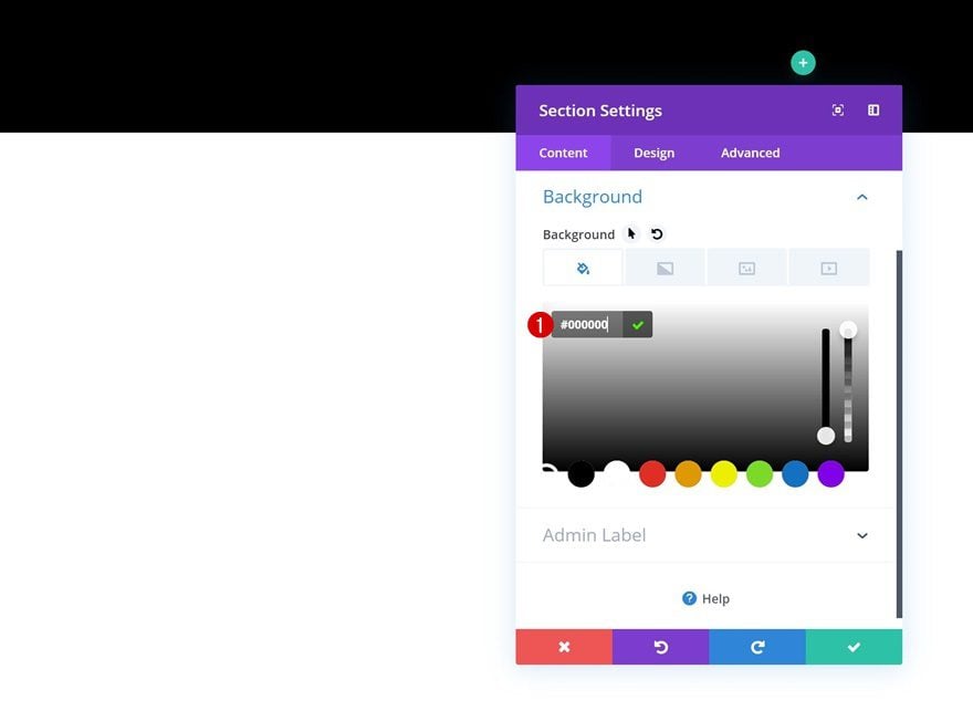
Now that we’ve gone through the approach of this post, it’s time to start putting things into action! Add a first regular section to a brand new page on your WordPress website and open the section settings. Change the default background color of your section into a color of your choice.
- Background Color: #000000
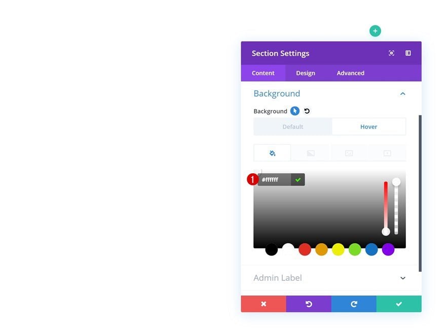
Hover Background Color
Change this background color on hover.
- Background Color: #ffffff
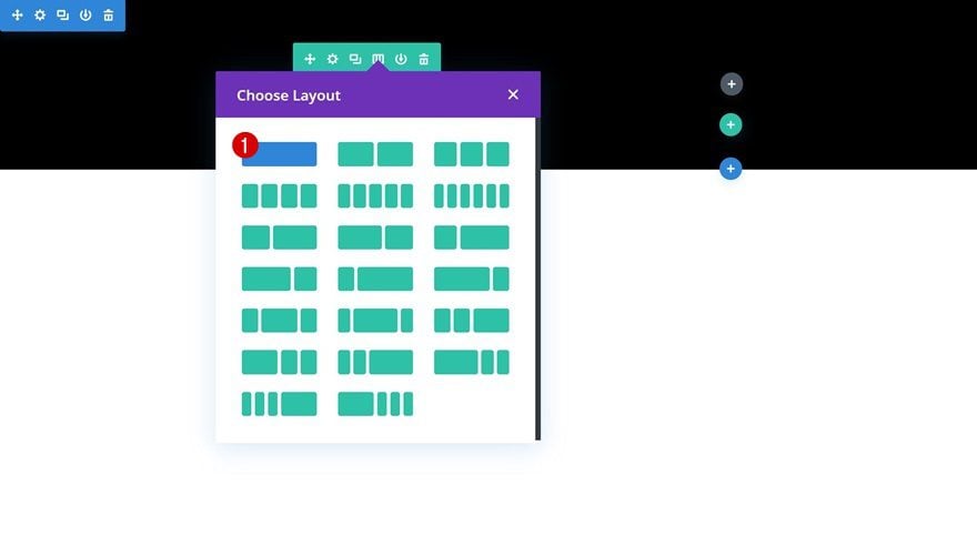
Add Row #1
Column Structure
Continue by adding the first row to your section using the following column structure:
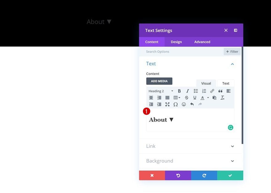
Add Text Module
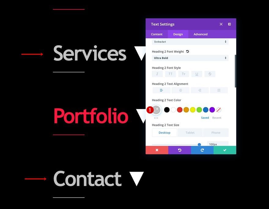
Add H2 Content
Add a Text Module to your new row next. Add some H2 copy with along with the ‘▼’ symbol that indicates something will come next.
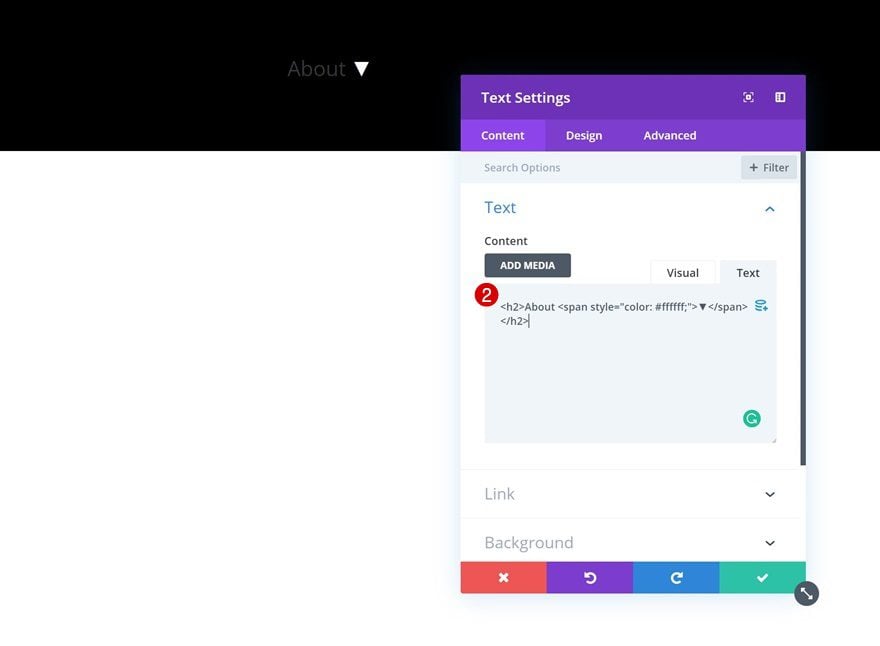
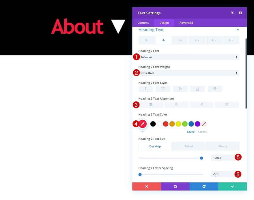
H2 Text Settings
Move on to the design tab of the module and change the H2 text settings.
- Heading 2 Font: Trebuchet
- Heading 2 Font Weight: Ultra Bold
- Heading 2 Text Alignment: Left
- Heading 2 Text Color: #ff0f3b
- Heading 2 Text Size: 100px (Desktop), 80px (Tablet), 60px (Phone)
- Heading 2 Letter Spacing: -5px
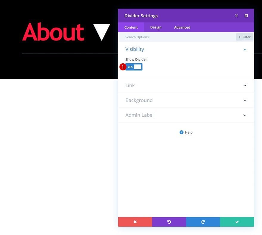
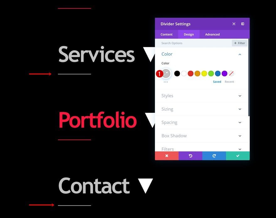
Add Divider Module
Visibility
The second and last module we need in this row is a Divider Module. Make sure you enable the ‘Show Divider’ option in the visibility settings.
- Show Divider: Yes
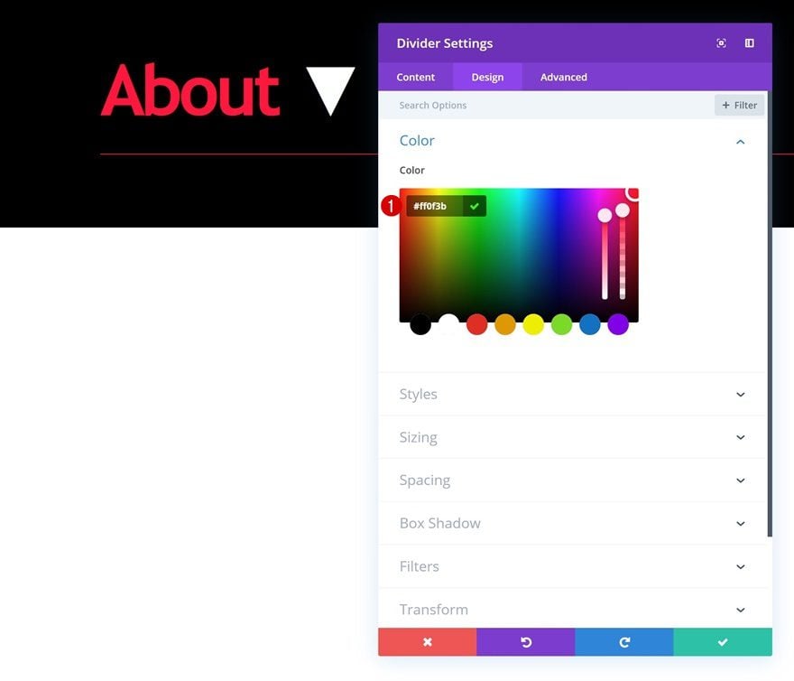
Color
Then, move on to the design tab and change the divider color.
- Color: #ff0f3b
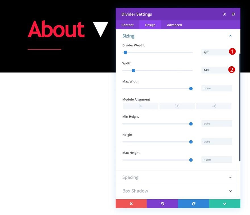
Sizing
Modify the sizing settings of the module as well.
- Divider Weight: 2px
- Width: 14%
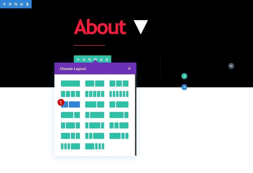
Add Row #2
Column Structure
On to the next row! This is where you’ll need to place all the content you want to show up after hovering (desktop) or clicking (tablet and mobile). We’re using the following column structure, but note that you can add as many rows and modules as you want and style them to your needs:
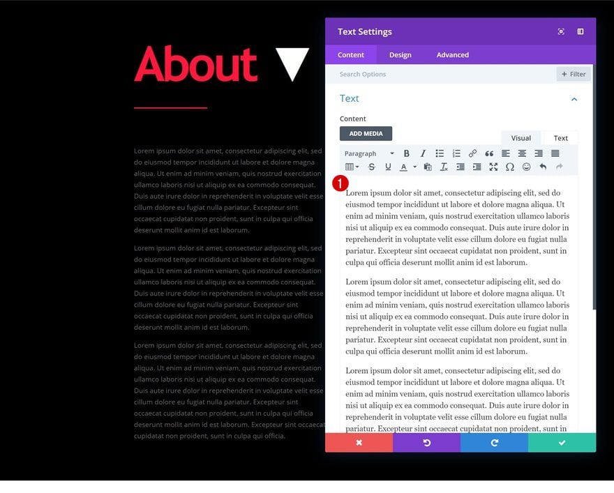
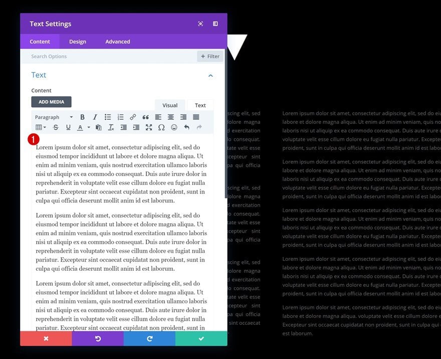
Add Text Module to Column 1
Add Content
Place a Text Module in the first column with some content of your choice.
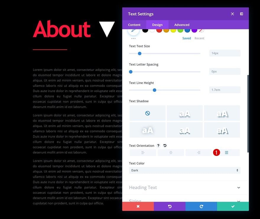
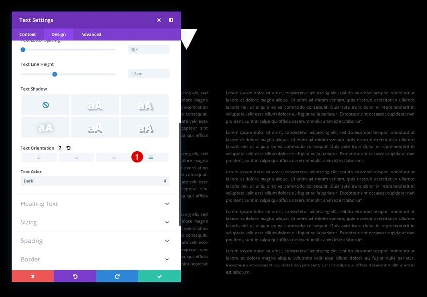
Text Settings
Go to the design tab of the Text Module and change the text orientation.
- Text Orientation: Justify
Add Text Module to Column 2
Add Content
Add a Text Module to the second column as well with some content of your choice.
Text Settings
Again, change the text orientation in the text settings of the module.
- Text Orientation: Justify
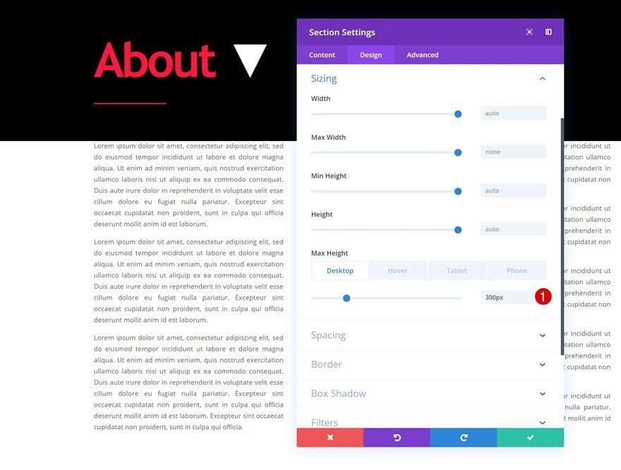
Add Sizing Settings to Section
Default Sizing
Once you have completed your section, it’s time to make the hover effect happen. Open the section settings and change the max height across different screen sizes:
- Max Height: 300px (Desktop), 280px (Tablet), 260px (Phone)
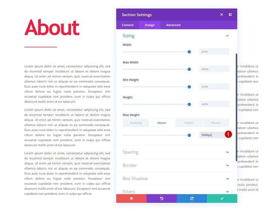
Hover Sizing
Enable the hover option on the max height as well and add a value that is high enough to cover all the elements across different screen sizes. This value makes sure all your elements show up without exceeding the initial size of the section container.
- Max Height: 5000px
Vertical Overflow
Then, go to the advanced tab of the section and change the vertical overflow. This will hide all the content that exceeds the section container.
- Vertical Overflow: Hidden
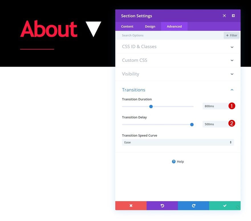
Transitions
To create a smooth transition, we’re also changing the transitions settings in the advanced tab.
- Transition Duration: 800ms
- Transition Delay: 500ms
Clone Entire Section as Many Times as Wanted
Once you’re done creating the first hover section, you can clone it up to as many times as you want.
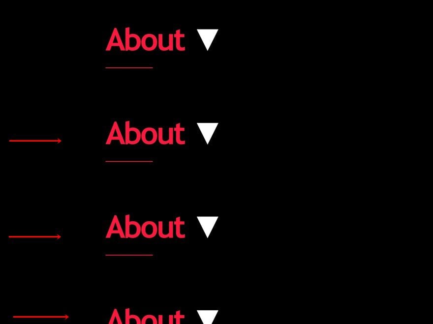
Change Section Titles
Of course, you’ll want to change the section titles of the duplicates.
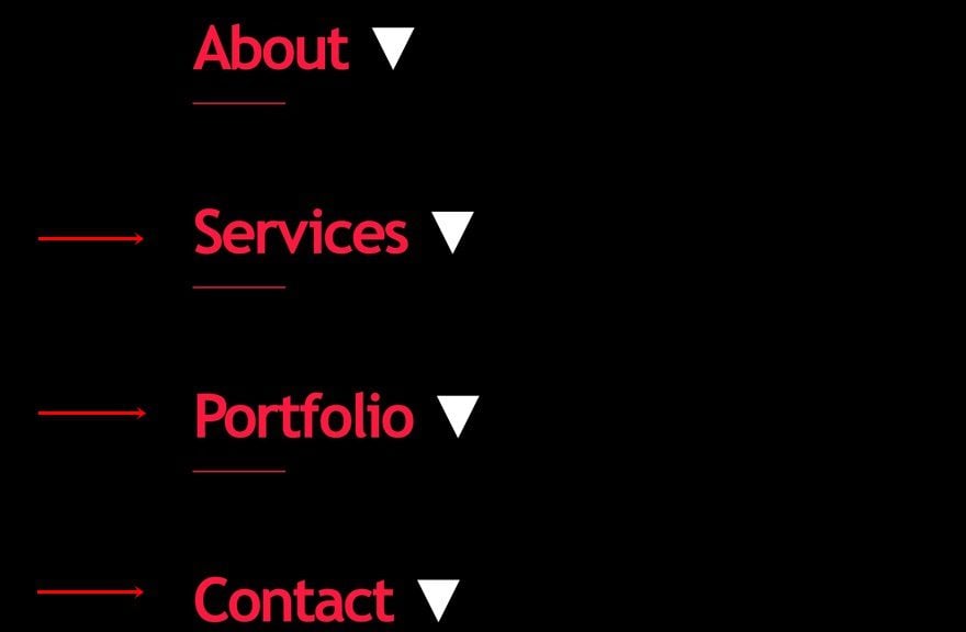
Change H2 Text Colors
To create some variation in design, we’ll also change the text colors of the modules highlighted in the print screen below.
- Heading 2 Text Color: #c4c4c4
Change Divider Colors
Along with the divider colors that accompany the Text Modules.
- Color: #c4c4c4
Preview
Now that we’ve gone through all the steps, let’s take a final look at the outcome across different screen sizes.
Desktop
Mobile
Final Thoughts
In this post, we’ve shown you how to creatively use Divi’s new draggable sizing options to create unique interactions, using hover sections, on any website you’re creating. We’ve started off by explaining the approach and continued by recreating the design example from scratch. You were also able to download the JSON file for free! If you have any questions or suggestions, make sure you leave a comment in the comment section below.
If you’re eager to learn more about Divi and get more Divi freebies, make sure you subscribe to our email newsletter and YouTube channel so you’ll always be one of the first people to know and get benefits from this free content.


It is better to make some video on that makes easy to understand.
I want to ask one question that is divi support by AMP or not.
This Article Help me out with my website having issue on Hover section. Though Divi is the best theme i ever used and this type of Blog Post also very helpful for any customization. Thanks for Sharing.
PLEASE Make A Video Of This ASAP. For Some Of Us That Is The Only Way To Really Follow Your Clever Design.
Hey,
This very nice template. I want implement it in my blog. My Question is Do it support in AMP View?
Could you please help me to implement without effecting my AMP Traffic.
I’m also thinking to install this theme for my blog.
Thank you for this tutorial!
You’re welcome, Joost! 🙂
Thanks Donjete, wonderful post and easy way.
Good to hear. Glad you enjoyed it! 🙂
How your creative brain works is amazing! Well done and thank you for sharing this great trick within Divi.
Is there a way, to eliminate the scroll-effect to the bottom of the paragraph after hovering?
Good job Donjete, as always!
Hello, I’m from Brazil and I came to you when I did a research on wordpress themes.
It is difficult to find sites as cool as yours that speaks of such things as this, I hope you continue with the great work.
Is this content hidden from Google?
No, the content is only visually hidden by the section’s height and overflow settings.
I also would like to know the answer for this questions. I heard that google does not see “toggle” content, is this right? This here is similar as a toggle content, or not?
Greetings, Martina
I also would like to know the answer for this questions. I heard that google does not see “toggle” content, is this right? This here is similar as a toggle content, or not?
Greetings, Martina