Animated number counters are popular throughout the web as a means to display numerical data to highlight the value of services, case studies, and more. Divi has a dedicated number counter module that can be used to generate animated number counters with ease.
However, in this tutorial, we are going to show you how to create number counters that animate on scroll using Divi. Using Divi’s position options and scroll effects, we will design a simple layout to display a date with scrolling numbers.
Check it out!
Sneak Peek
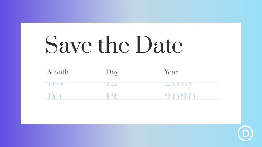
Here is a quick look at the scroll animated counters we will be designing in Divi.
Download the Layout for FREE
To lay your hands on the designs from this tutorial, you will first need to download it using the button below. To gain access to the download you will need to subscribe to our newsletter by using the form below. As a new subscriber, you will receive even more Divi goodness and a free Divi Layout pack every Monday! If you’re already on the list, simply enter your email address below and click download. You will not be “resubscribed” or receive extra emails.
To import the layout to your page, simply extract the zip file and drag the JSON file into the Divi Builder.
Let’s get to the tutorial, shall we?
What You Need to Get Started
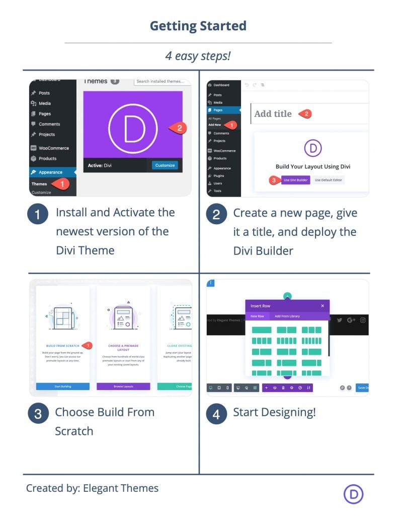
To get started, you will need to do the following:
- If you haven’t yet, install and activate the Divi Theme.
- Create a new page in WordPress and use the Divi Builder to edit the page on the front end (visual builder).
- Choose the option “Build From Scratch”.
After that, you will have a blank canvas to start designing in Divi.
Part 1: Creating the Title Section
In this first part, we are going to create a simple title for the layout.
First, add a one-column row to the section.
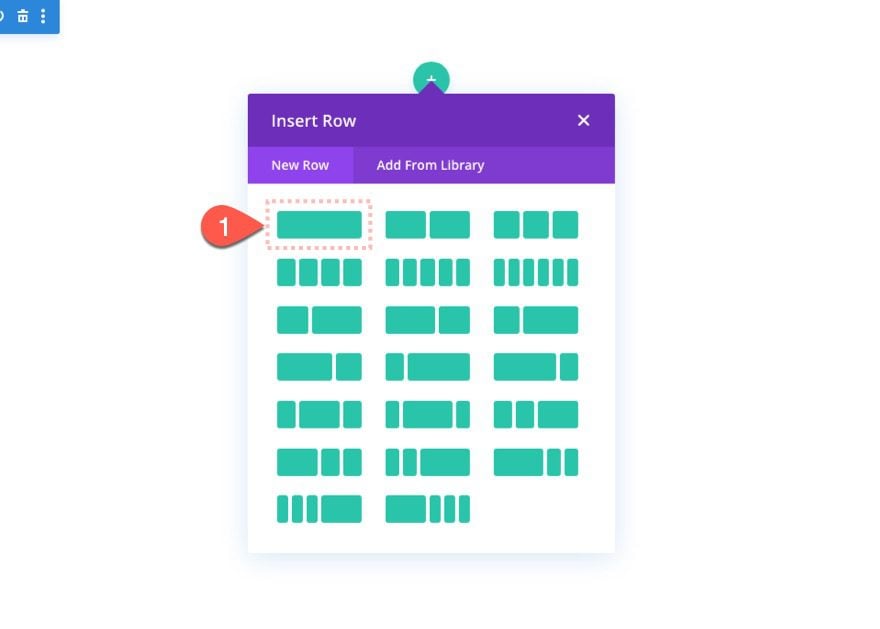
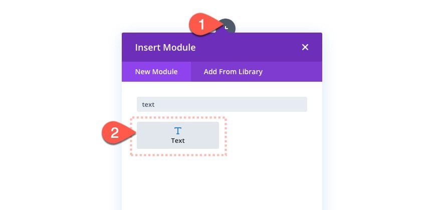
Then add a new text module to the row.
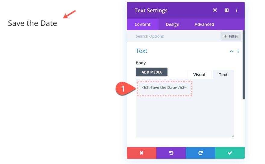
Update the text module content with the following:
<h2>Save The Date<h2>
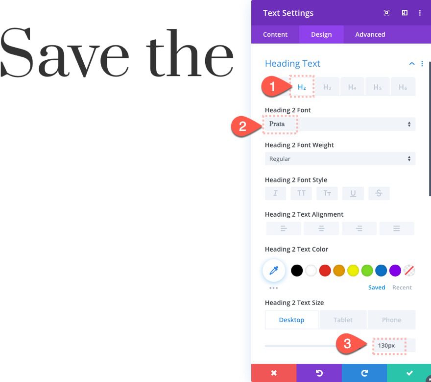
Then update the heading text style as follows:
- Heading 2 Font: Prata
- Heading 2 Text Size: 130px (desktop), 70px (tablet), 40px (phone)
Part 2: Creating the Counters with Scroll Animation
In this next part, we will create the three counters that will animate numbers on scroll until coming to rest to display a date (month, day, and year). Each counter will be built using a total of 5 text modules and a divider module. The first text module will serve as the label of the counter (ie. month, day, year). The next four text modules will each hold a different number (in progression) that will be animated on scroll using the vertical motion offsets in Divi. The bottom divider module will help hide the overflow of the numbers.
Here’s how to do it.
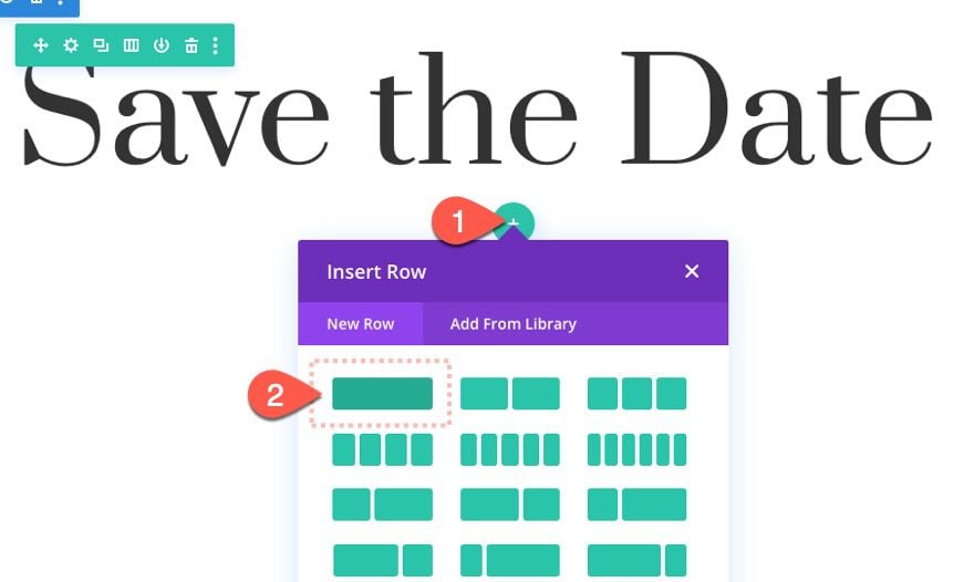
Add Second Row
Under the existing row, add another one-column row.
Row Settings
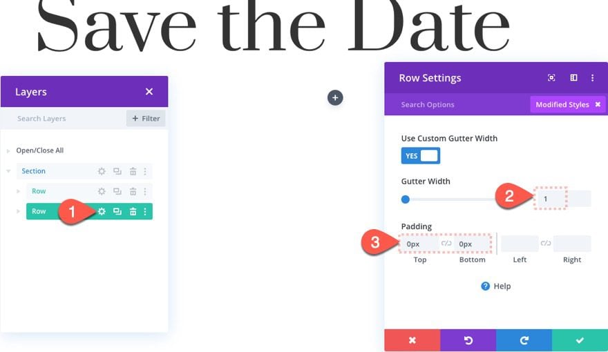
Before adding any module, update the row settings as follows:
- Gutter Width: 1
- Padding: 0px top, 0px bottom
Column Settings
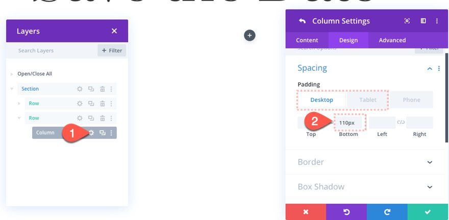
Then open the settings for the column and update the padding as follows:
- Padding (desktop): 100px bottom
- Padding (tablet and phone): 0px bottom
Add Text Module
Then add a text module to the column.
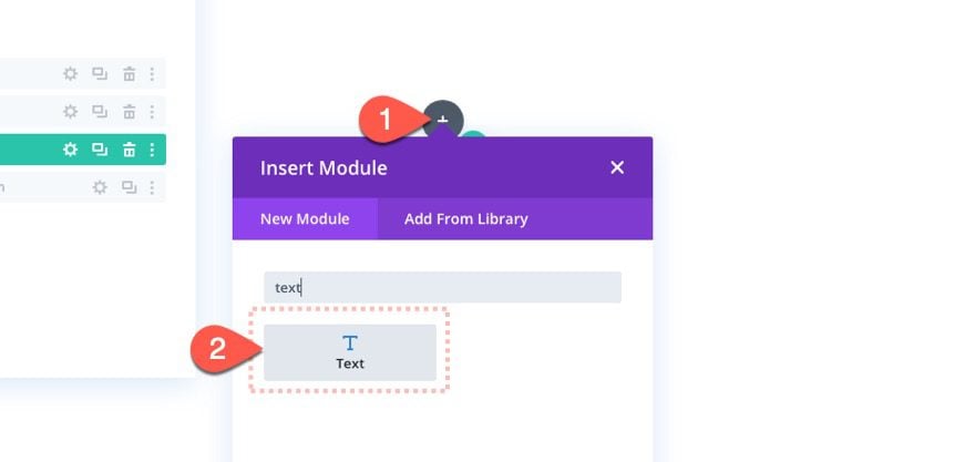
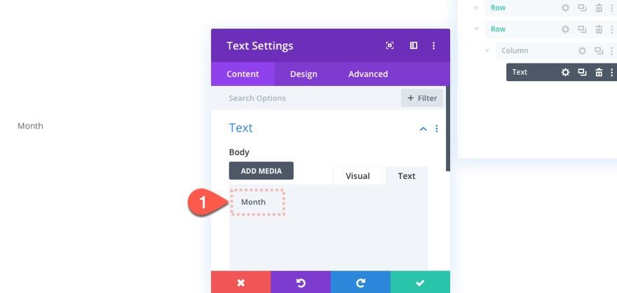
Content/Label
For the text module content, add the word “Month”.
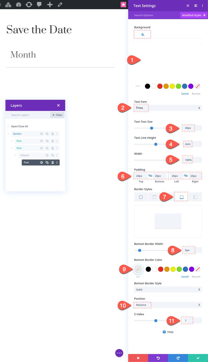
Text Design Settings
Once the content is added, update the design settings as follows:
- Background Color: #ffffff
- Text Font: Prata
- Text Text Size: 40px
- Text Line Height: 2em
- Width: 100%
- Padding: 20px top, 20px bottom, 20px left, 20px right
- Bottom Border Width: 5px
- Bottom Border Color: #eeeeee
Position
Then under the advanced tab, update the position options as follows:
- Position: Relative
- Z Index 1
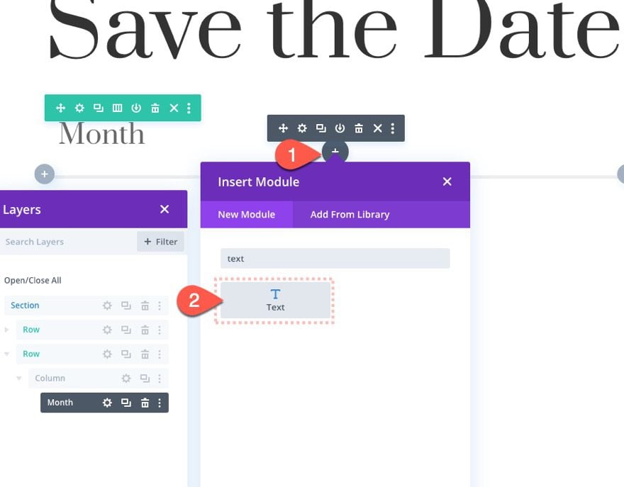
Add Text Module for First Number
Once the first text module is in place, we can start adding the numbers that will move on scroll. To add the first number, add a new text module under the existing “Month” text module.
Add Number/Content
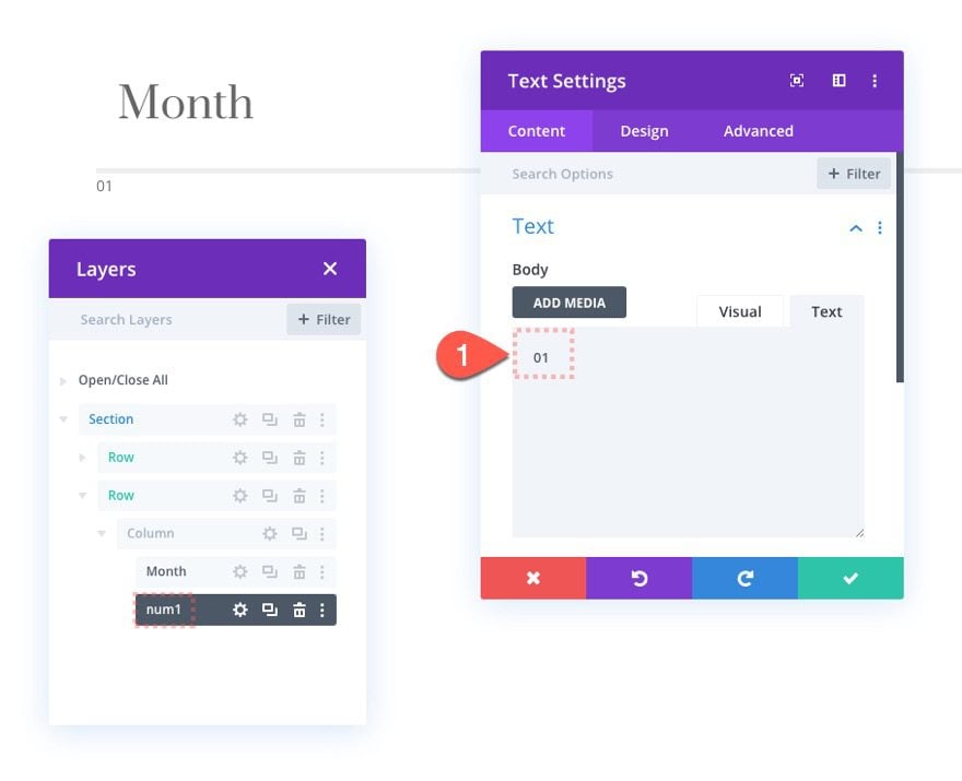
Then update the text module label to read “num1” for easier reference. Then update the content with the number “01”.
Design Settings for Number
Under the design tab, update the following:
- Text Font: Prata
- Text Text Color: #8ab2d3
- Text Text Size: 70px
- Text Letter Spacing: 4px
- Text Line Height: 1.5em
- Padding: 20px left
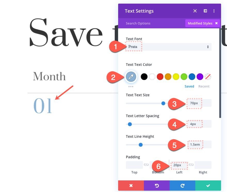
NOTE: The numbers have a text size of 70px and a line-height of 1.5em, which means the total height of the text module will be close to 100px. This is important to keep in mind whenever we start adding the vertical motion offsets. For example, adding a vertical offset of “1” to the text module will move the text module exactly 100px which is the height of the text module.
Scroll Effects for First Number
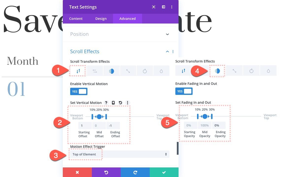
Add the following scroll effects to the text module.
Under the Vertical Motion Tab, update the following:
- Enable Vertical Motion: YES
- Starting Offset: 1 (at 10%)
- Mid Offset: 0 (at 20%)
- Ending Offset: -1 (at 30%)
Under the Fading In and Out tab, update the following:
- Enable Fading In and Out: YES
- Starting Opacity: 0% (at 10%)
- Mid Opacity: 100% (at 20%)
- Ending Opacity: 0% (at 30%)
Make sure to set the motion effect trigger to the top of the element:
- Motion Effect Trigger: Top of Element
Create The Text Module for Second Number
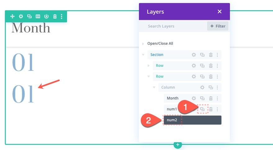
Duplicate First Number
Once the first number has been created, duplicate it to create the text module for the second number. Then update the label in the layers view for better reference.
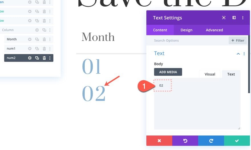
Update Number/Content
Open the settings for the second number text module and update the content with the number “02”.
Update Position
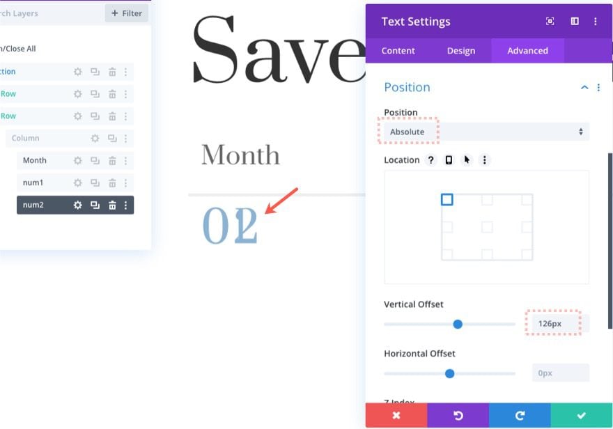
Then update the position options as follows:
- Position: Absolute
- Vertical Offset: 126px
Update Scroll Effects
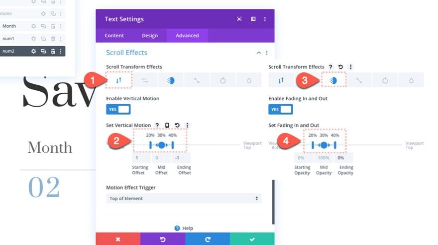
Then update the scroll effects as follows:
Under the Vertical Motion Tab, update the following:
- Starting Offset: 1 (at 20%)
- Mid Offset: 0 (at 30%)
- Ending Offset: -1 (at 40%)
Under the Fading In and Out tab, update the following:
- Starting Opacity: 0% (at 20%)
- Mid Opacity: 100% (at 30%)
- Ending Opacity: 0% (at 40%)
Create Text Module for Third Number
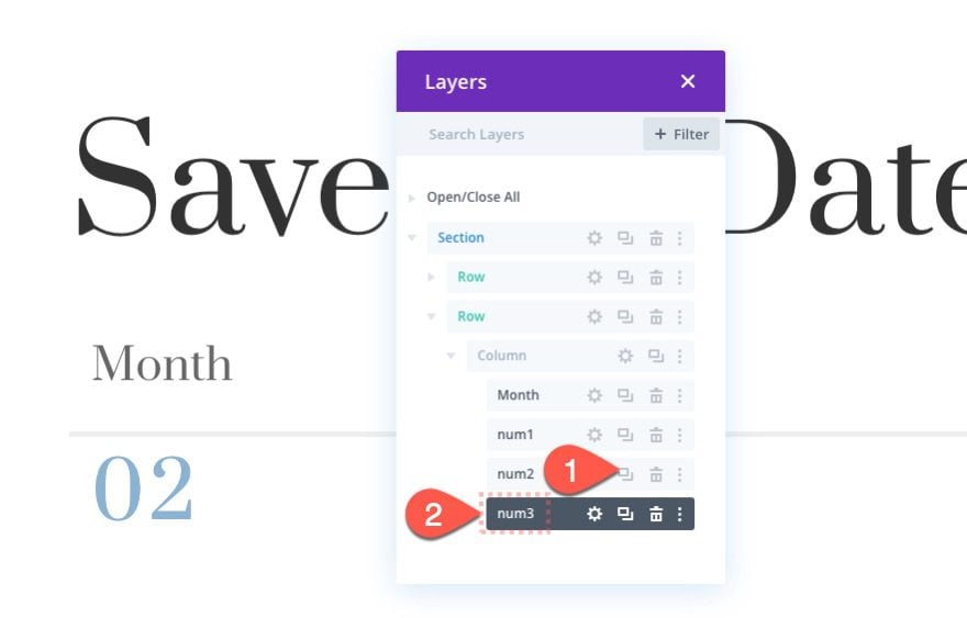
Duplicate Second Number
To create the text module for the third number, duplicate the text module for the second number.
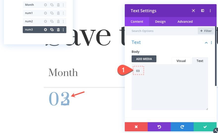
Update Number/Content
Update the content with the number “03”.
Update Scroll Effects
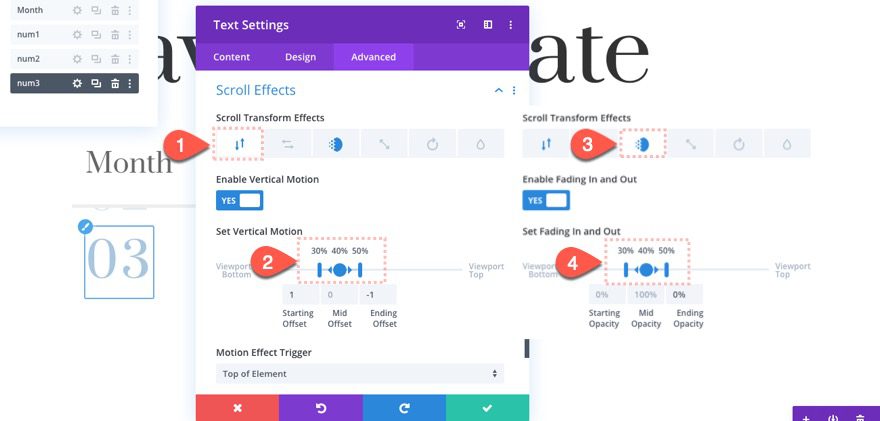
Then update the scroll effects:
Under the Vertical Motion Tab, update the following:
- Starting Offset: 1 (at 30%)
- Mid Offset: 0 (at 40%)
- Ending Offset: -1 (at 50%)
Under the Fading In and Out tab, update the following:
- Starting Opacity: 0% (at 30%)
- Mid Opacity: 100% (at 40%)
- Ending Opacity: 0% (at 50%)
Create Text Module for Fourth Number
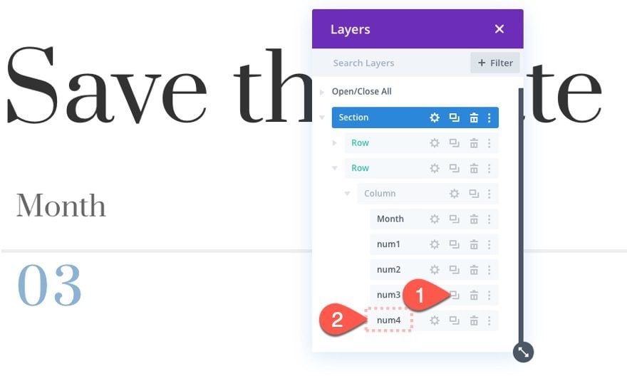
Duplicate Third Number
To create the fourth number for the scroll counter, duplicate the text module for the third number.
Update Number/Content
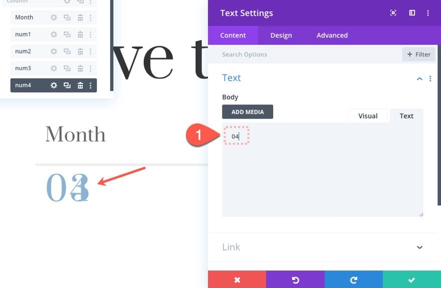
Update the content with the number “04”.
Update Scroll Effects
Then update the scroll effects:
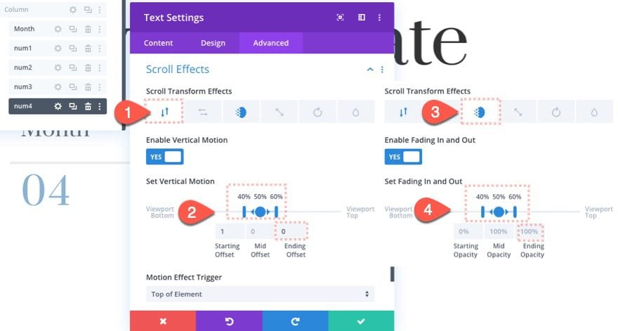
Under the Vertical Motion Tab, update the following:
- Starting Offset: 1 (at 40%)
- Mid Offset: 0 (at 50%)
- Ending Offset: 0 (at 60%)
Under the Fading In and Out tab, update the following:
- Starting Opacity: 0% (at 40%)
- Mid Opacity: 100% (at 50%)
- Ending Opacity: 100% (at 60%)
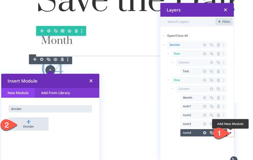
Add Bottom Divider
Under the last text module, add a new divider module. This will be used to hide the bottom overflow of the text that will be scrolling into view.
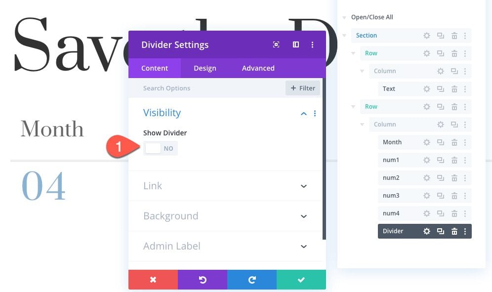
Then select NOT to show the divider.
Style and Position Settings
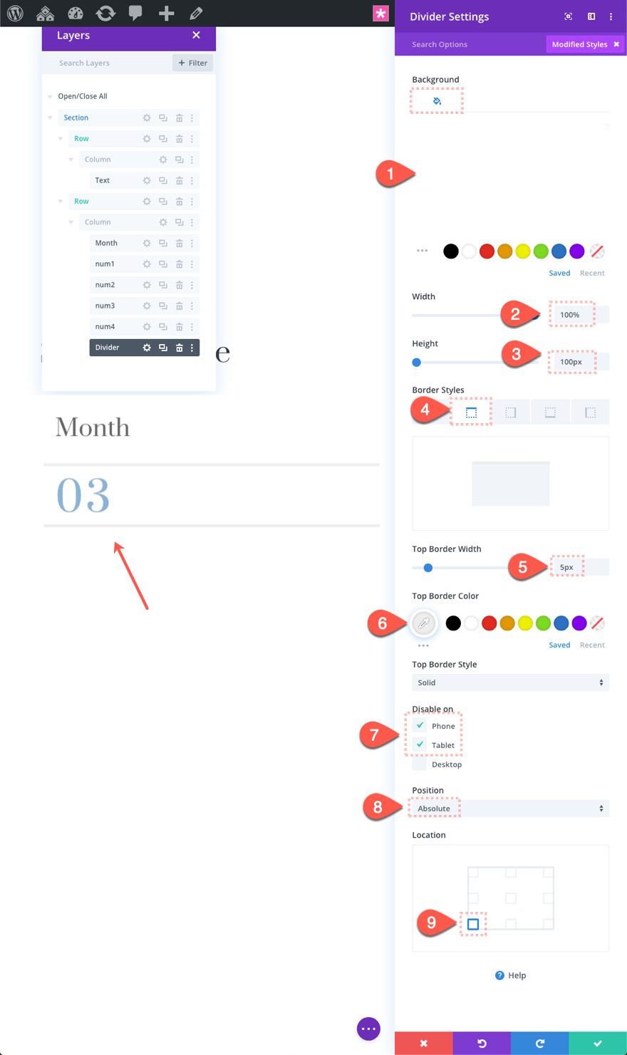
Update the design for the divider as follows:
- Background Color: #ffffff
- Width: 100%
- Height: 100px
- Top Border Width: 5px
Under the advanced tab, update the following:
- Disable on: Phone and Tablet
- Position: Absolute
- Location: Bottom Left
IMPORTANT: The space that the divider will occupy was created earlier by adding a bottom padding of 100px to the column. If you don’t add that padding, the divider will overlap the numbers.
Creating More Counters and Columns
Duplicate Column 1 and Update Content
To create a new counter, duplicate column 1. This will create a second column with all the elements in place automatically.
Then all you need to do is update the content for all the text modules with new text and numbers.
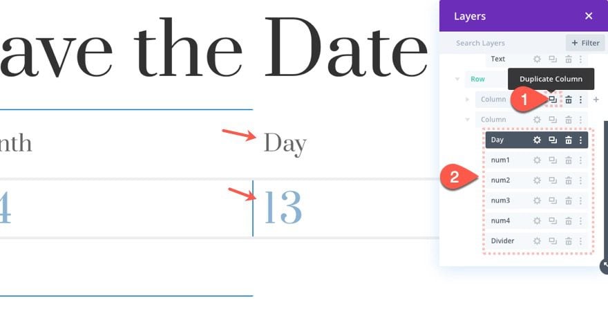
Duplicate Column 2 and Update Content
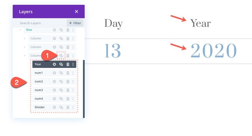
Once the content for all the text modules have been updated in column 2, duplicate column 2 to create a third counter for the year. Then update the content for each text module as needed.
Final Result
Here is the final result.
Final Thoughts
This simple layout with scroll animated number counters should come in handy for displaying numerical data in a fresh and unique way. Feel free to abandon the date concept and use the counters for anything you can dream up!
I look forward to hearing from you in the comments.
Cheers!




Thanks Jason, another thing more we have learn. For some type of layouts w.ll be great.
Glad it was helpful.
Nice content
keep posting quality posts it really helps
I have no words to say how it helped me. There are no any doubt that divi is the best. We defenitely will wait new amazing manuals from you.
Thanks
Can I expect a post on building landing pages?
My comment is not accordingly to the said title.
I just wanted to know what theme would you guys suggest me for my blog
Can elementor plugin will be useful instead of divi.
Thanks Jason, another thing more we have learn. For some type of layouts w.ll be great.
You’re welcome. And yes, I think it would work for certain layouts for sure. It seems to be a versatile resource.
Thanks for sharing such an informative article about animation I love animation and this article helped me how to do animation
keep up the good work and please do not stop sharing these kinds of articles…
Great! Glad you liked it. We’ll keep them coming :).
Wow, that’s very interesting animation using CSS. Thanks for detailed illustrations on how to achieve it.