Creating seamless background design transitions between Divi elements is a great way to elevate the design of your Divi website. The idea is to create matching background designs (both for a row and a section) that share the same size and position respective to the browser width (using vw length units). This allows you to seamlessly transition a background gradient, pattern, and mask between a row and section in creative ways. For example, you could have a pattern or mask transition into different colors without losing the overall alignment and symmetrical aspect of the design.
In this tutorial, we are going to use Divi’s built-in background design options to create a seamless background design transition between a Divi section and row. The application and versatility of this design are boundless, taking Divi’s background design options to a whole new level!
Let’s get started.
Subscribe To Our Youtube Channel
Sneak Peek
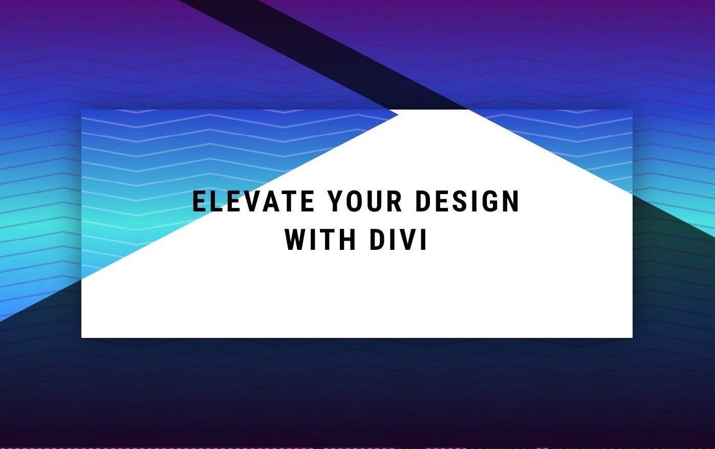
Here is a quick look at the design we’ll build in this tutorial.

Here are a few more example designs that are possible with just a few simple changes to the background masks and patterns.


Download the Layout for FREE
To lay your hands on the design from this tutorial, you will first need to download it using the button below. To gain access to the download you will need to subscribe to our newsletter by using the form below. As a new subscriber, you will receive even more Divi goodness and a free Divi Layout pack every Monday! If you’re already on the list, simply enter your email address below and click download. You will not be “resubscribed” or receive extra emails.
To import the section layout to your Divi Library, do the following:
- Navigate to the Divi Library.
- Click the Import button at the top of the page.
- In the portability popup, select the import tab
- Choose the download file from your computer (make sure to unzip the file first and use the JSON file).
- Then click the import button.
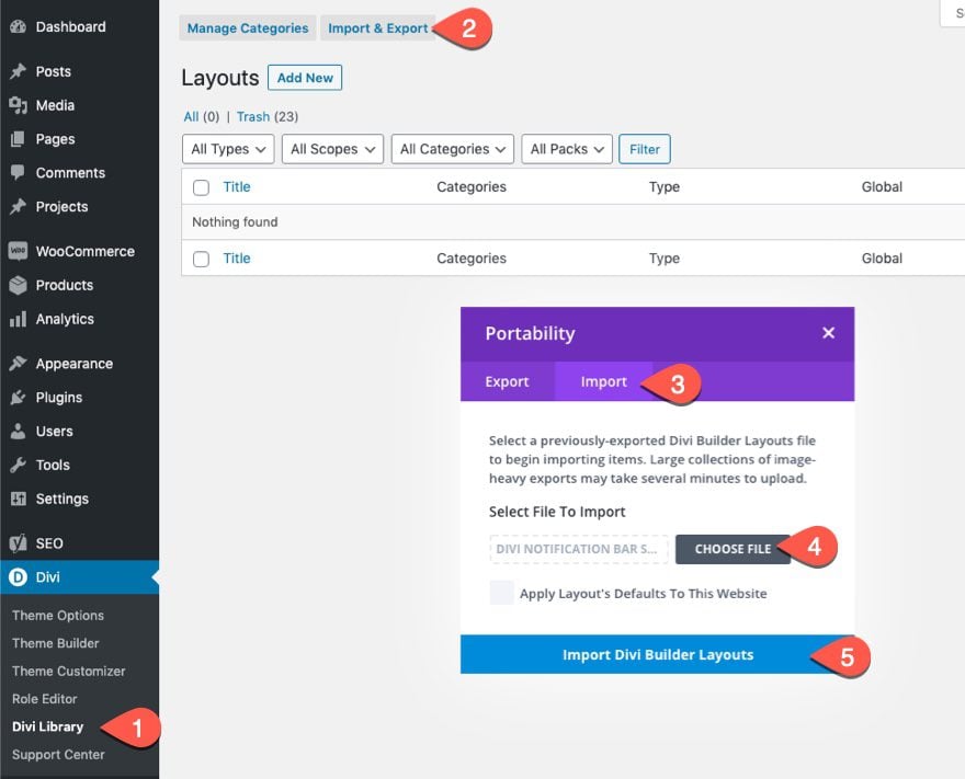
Once done, the section layout will be available in the Divi Builder.
Let’s get to the tutorial, shall we?
What You Need to Get Started
To get started, you will need to do the following:
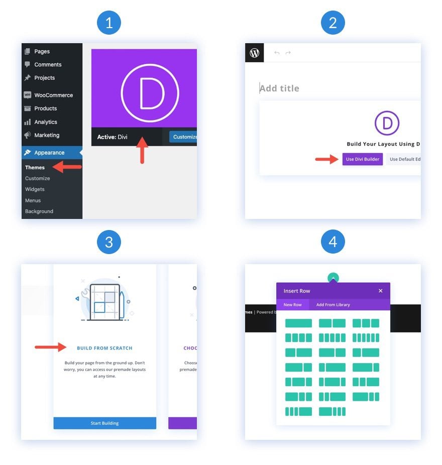
- If you haven’t yet, install and activate the Divi Theme.
- Create a new page in WordPress and use the Divi Builder to edit the page on the front end (visual builder).
- Choose the option “Build From Scratch”.
After that, you will have a blank canvas to start designing in Divi.
Creating a Seamless Background Design Transition Between a Divi Section and Row
Part 1: Creating a Heading as Mock Content
Before we start designing our backgrounds, we need to add a heading as mock content. To begin, add a one-column row to the default section of the page.
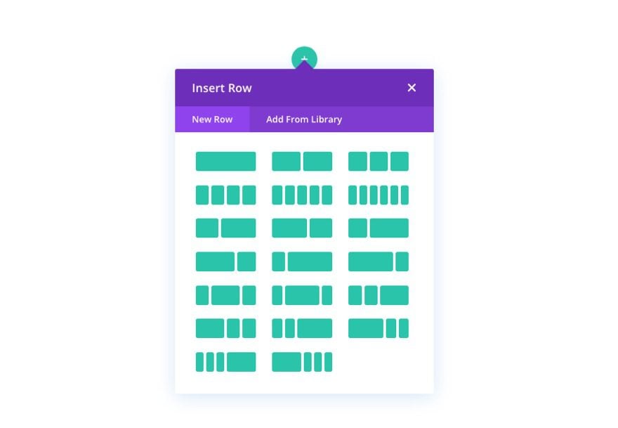
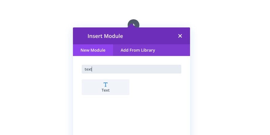
Then add a text module to the row.
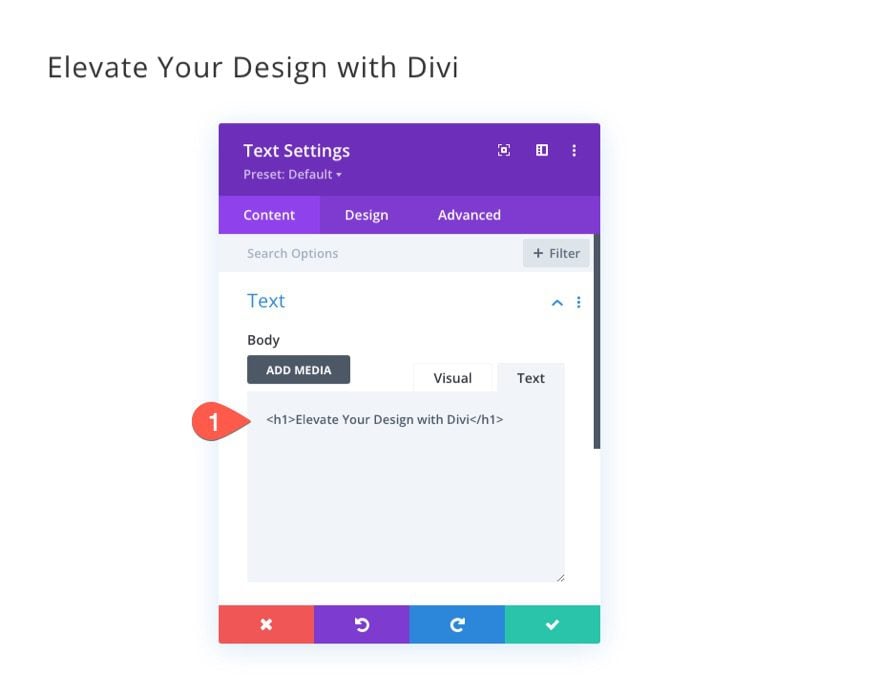
Add an H1 heading to the body content.
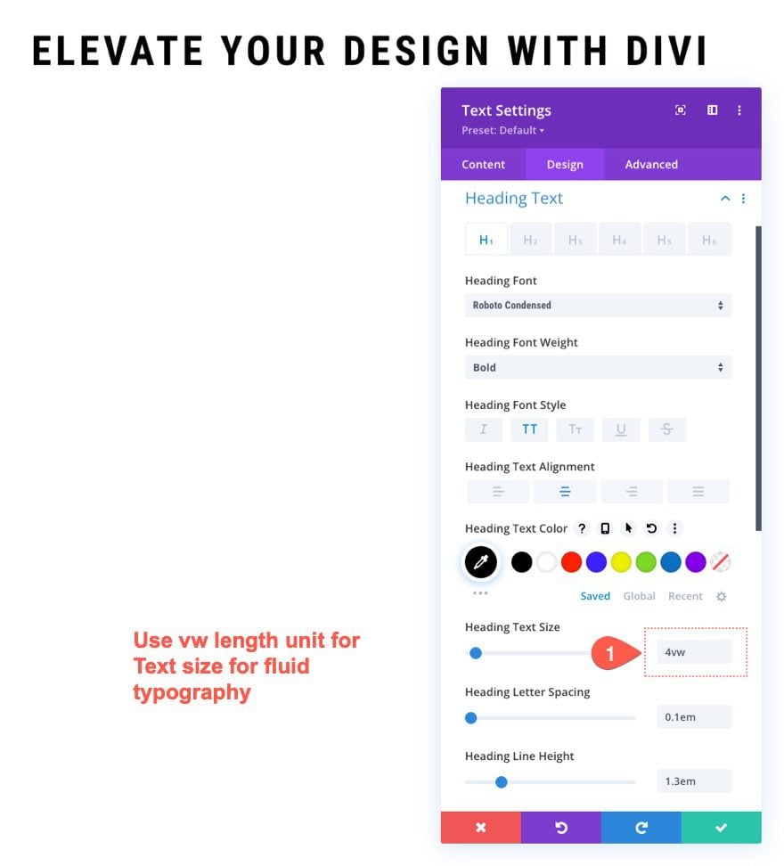
Under the design tab, update the Heading Text design however you like. For this design, it helps to add a VW length unit for the size of the heading text so that it will scale fluidly with the rest of the design.
2. Designing the Section Background
Adding VW Padding to the Section
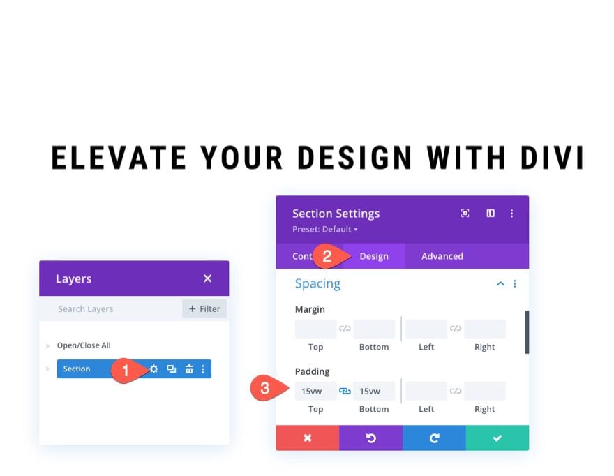
Once the mock heading is in place, open the section settings and update the spacing as follows:
- Padding: 15vw top, 15vw bottom
Adding the background Gradient to the Section
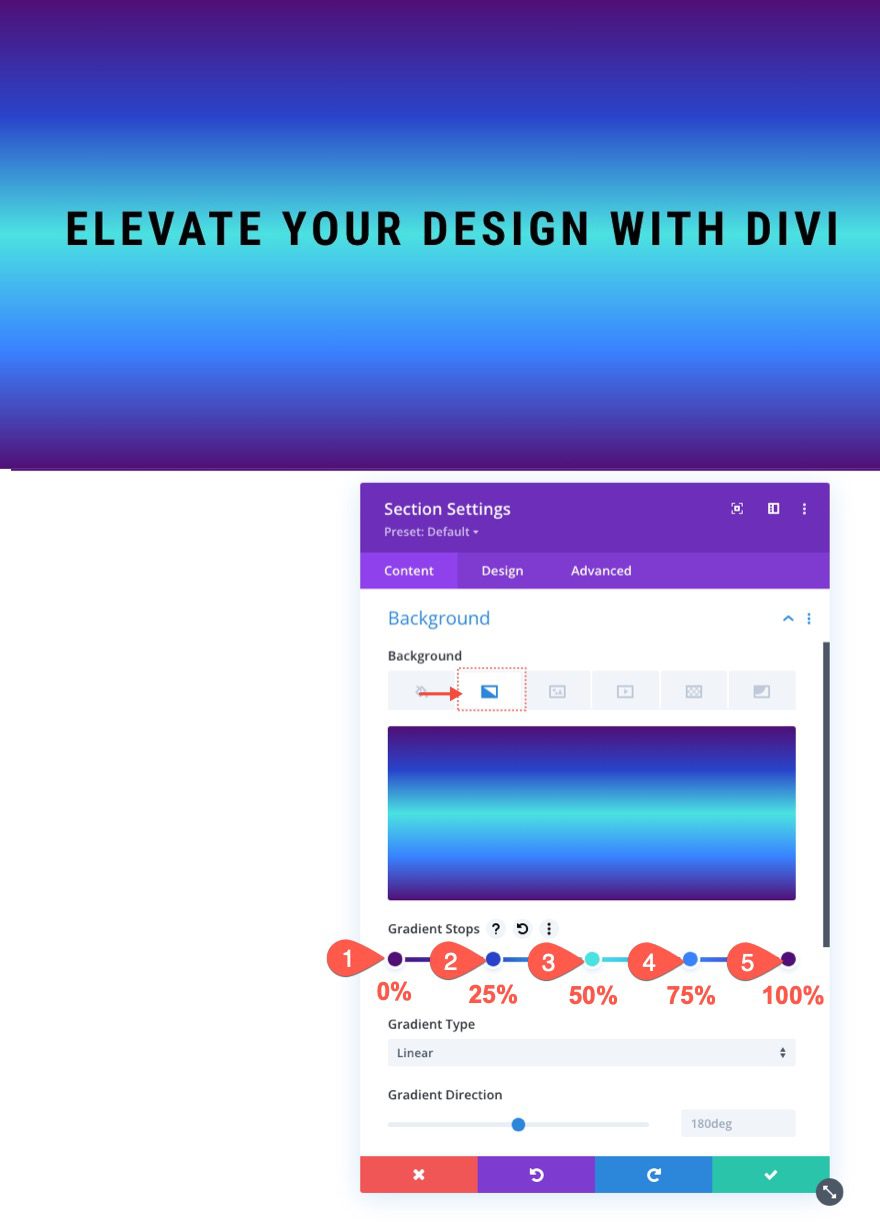
Now that we have more space to work with, we are ready to add our background design to the section. Under the gradient tab, add the following gradient stops:
- Gradient Stop 1: #4f0f75 (at 0%)
- Gradient Stop 2: #2843c9 (at 25%)
- Gradient Stop 3: #4ae2e0 (at 50%)
- Gradient Stop 4: #3881ff (at 75%)
- Gradient Stop 5: #4f0f75 (at 100%)
Adding a Background Pattern to the Section
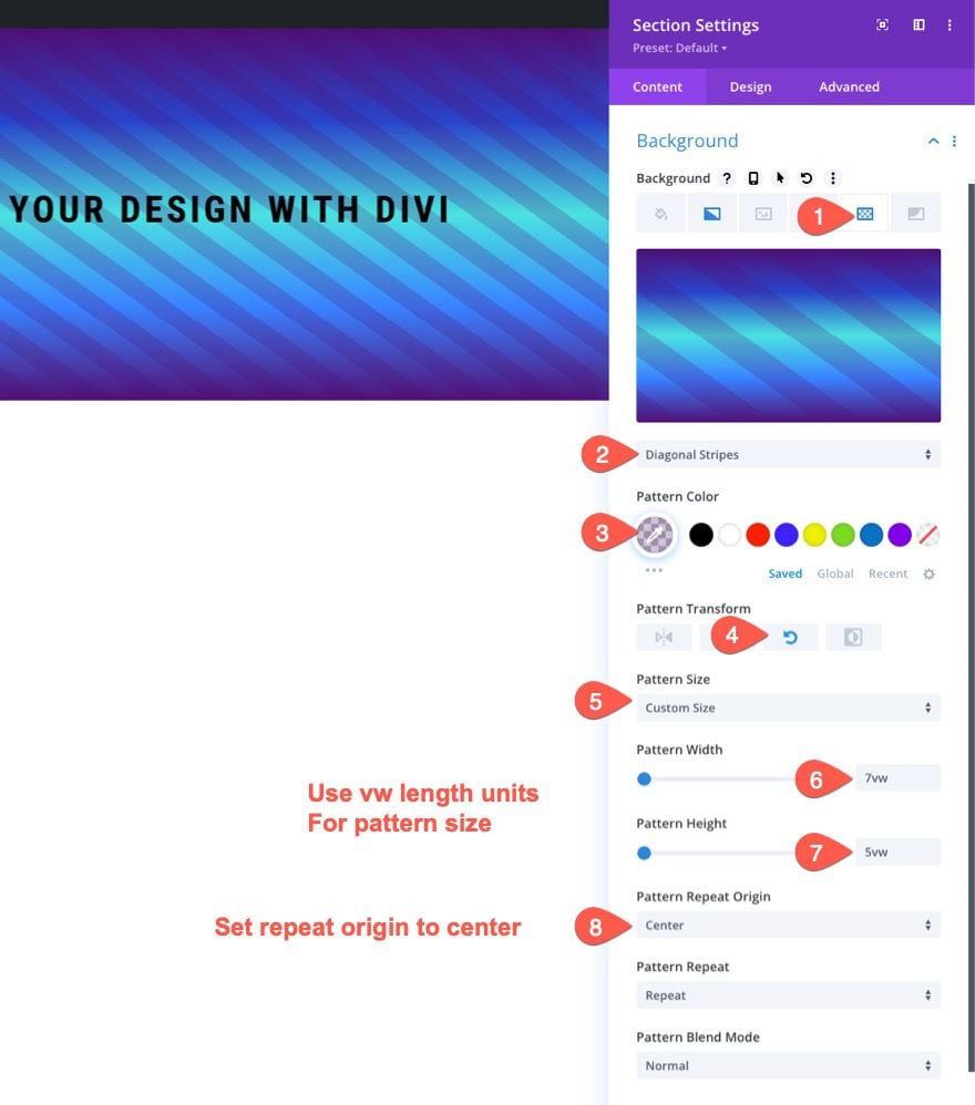
Under the Pattern tab, update the following:
- Patterns: Diagonal Stripes
- Pattern Color: rgba(79,15,117,0.23)
- Pattern Transform: Rotate
- Pattern Size: Custom Size
- Pattern Width: 7vw
- Pattern Height: 5vw
- Pattern Repeat Origin: Center
Note: Make sure to use the VW length unit for the pattern width and height. And, also make sure to set the repeated origin to “center”. This will keep the background pattern in the same place as the background pattern we will add to the row later on.
Adding a Background Mask to the Section
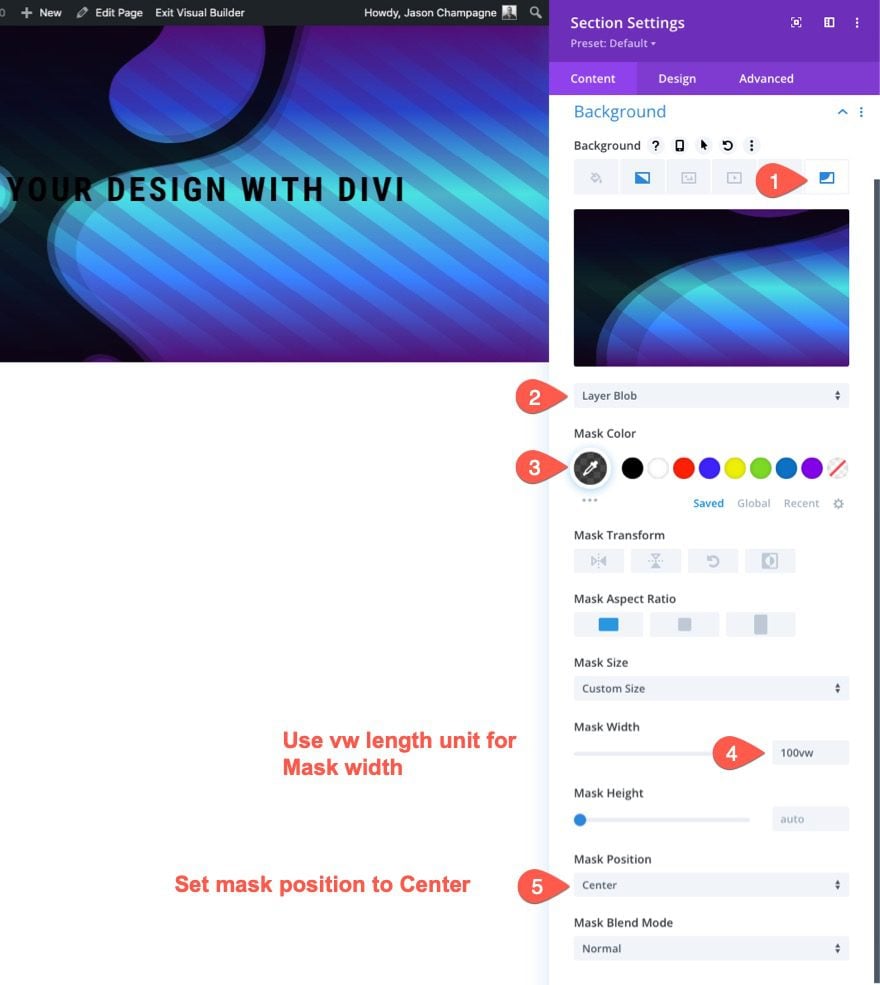
Under the Mask tab, add the following:
- Background Mask: Layer Blob
- Mask Color: rgba(0,0,0,0.7)
- Mask Size: 100vw
- Mask Position: Center
Note: Just like with the pattern, we must give the mask a size using the VW length unit. We must also give the mask a center position.
3. Designing the Row Background
Copy and Paste the Section Background to the Row Background
To speed up the process of designing the row background, copy the section’s background settings.
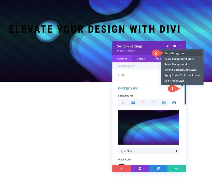
Then paste the background to the existing row.
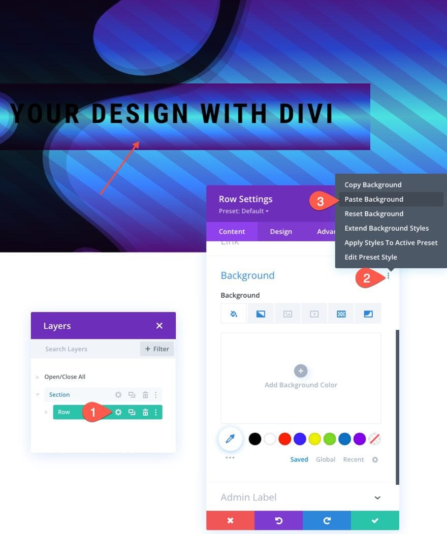
At this point, you can already see how the background pattern and mask on the row as a seamless transition to the section background. It looks like the row has a transparent background, but it is actually the same pattern and mask used in the section with the same size and position.
Adjust Size and Padding of the Row using VW
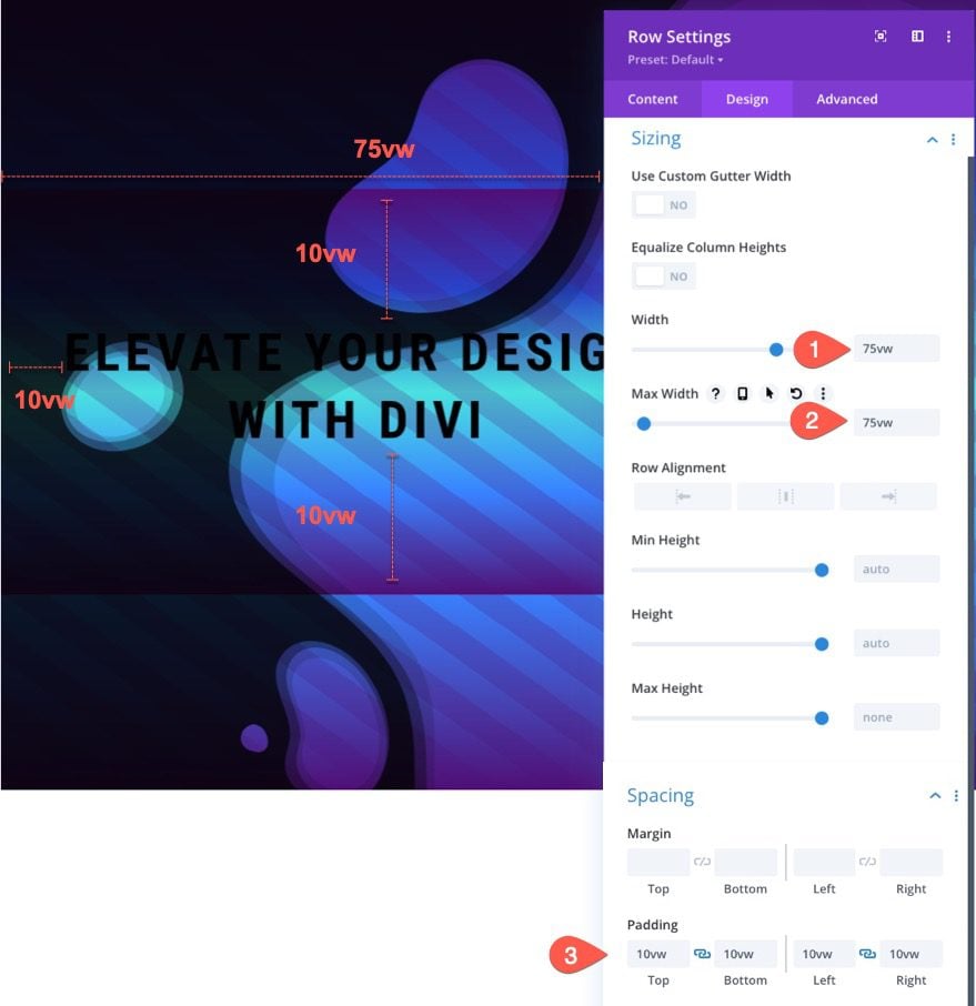
Next, we need to give our row a custom width using the VW length unit. Update the following:
- Width: 75vw
- Max-Width: 75vw
- Padding: 10vw top, 10vw bottom, 10vw left, 10vw right
Overview of Spacing and Sizing in VW Length Units
So far, we have been adding spacing and position values in our layout using the VW length unit. Here is a quick illustration of the values currently being used.
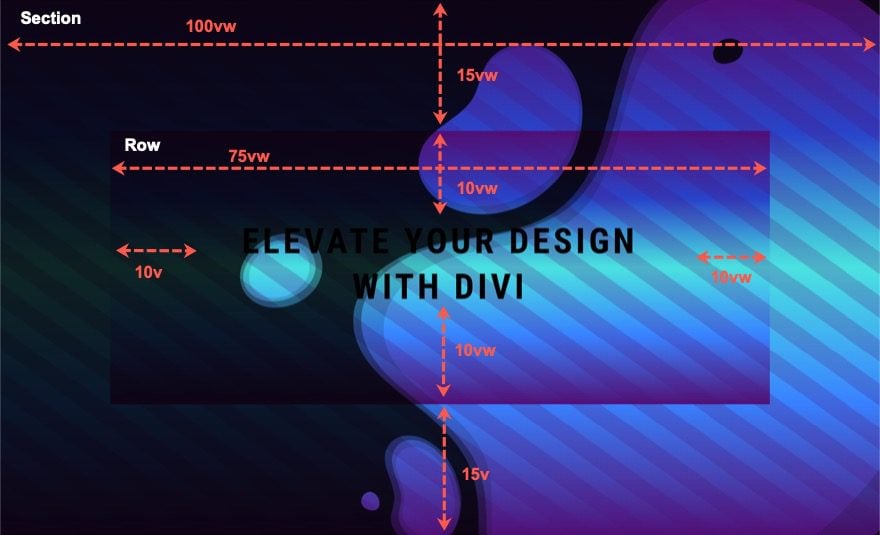
So far, we have a seamless transition between the row background and the section background for the patterns and masks. Next, we are going to update the background gradient of the row so that it is seamless as well.
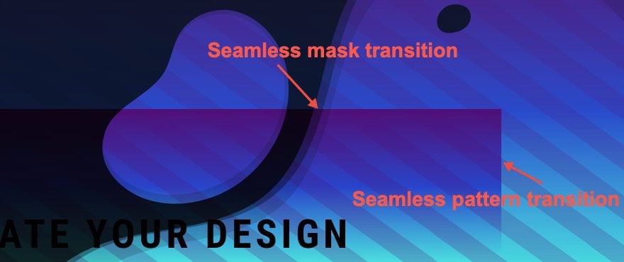
Adjust Gradient Stops on Row
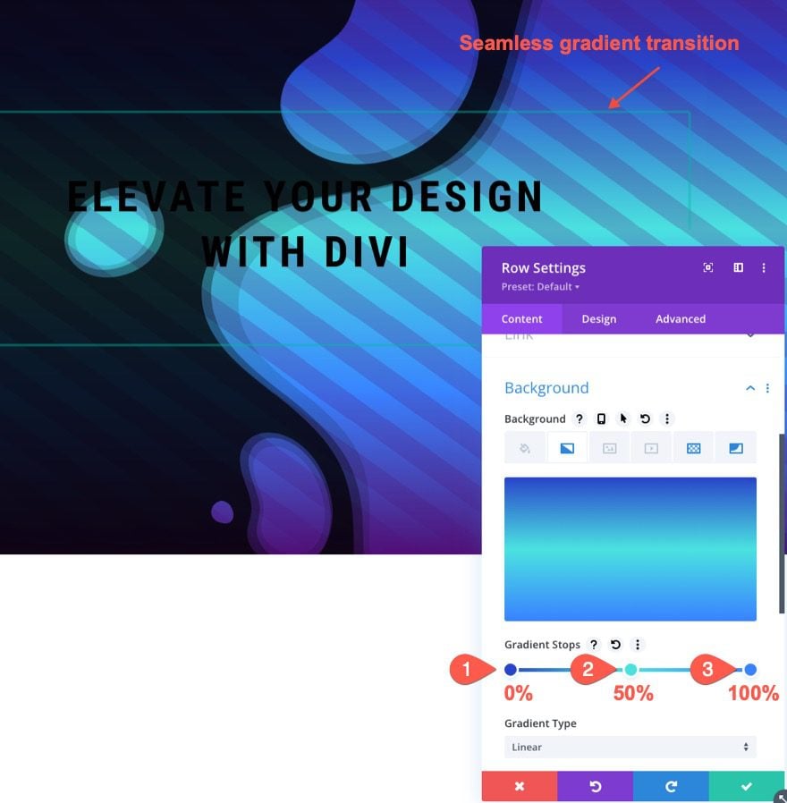
Next, we need to adjust the gradient stops on the row background for a seamless transition into the section background gradient. Under the gradient tab, we are going to keep the three middle gradient stops inherited from the section background) and delete the first and last gradient stop. Then position the first stop at 0% and the third stop at 100%. Once done, you should have the following gradients.
- Gradient Stop 1: #2843c9 (at 0%)
- Gradient Stop 2: #4ae2e0 (at 50%)
- Gradient Stop 3: #3881ff (at 100%)
Add Box Shadow to Row
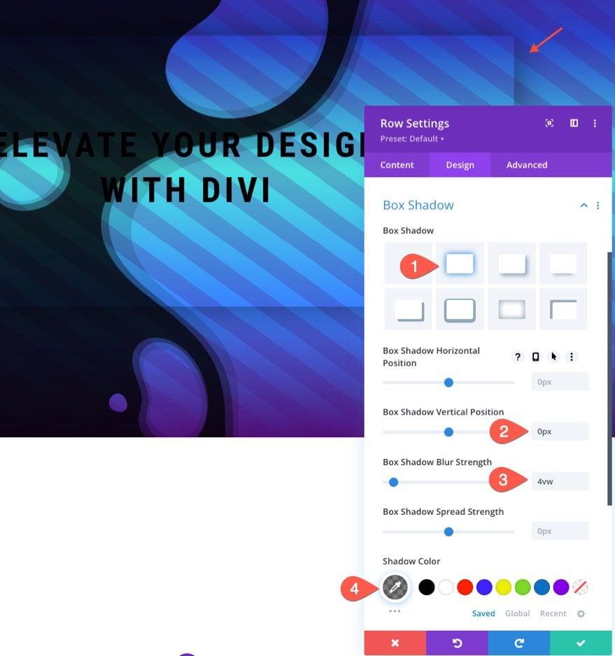
To give the design a bit of elevation and to emphasize the seamless transition of the background, we can add a box shadow to the row.
- Box Shadow: see screenshot
- Box Shadow Vertical Position: 0px
- Box Shadow Blur Strength: 4vw
- Box Shadow Color: rgba(0,0,0,0.5)
Adjust the Row Background Pattern Color
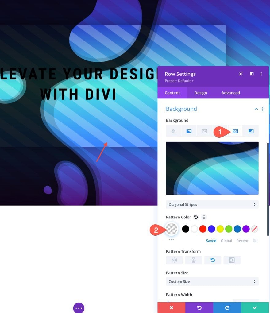
Now that we have all the background elements in their proper place, we can start adjusting the colors for a more creative design. Under the pattern option for the row, update the following:
- Pattern Color: rgba(255,255,255,0.23)
Adjust the Row Background Mask Color
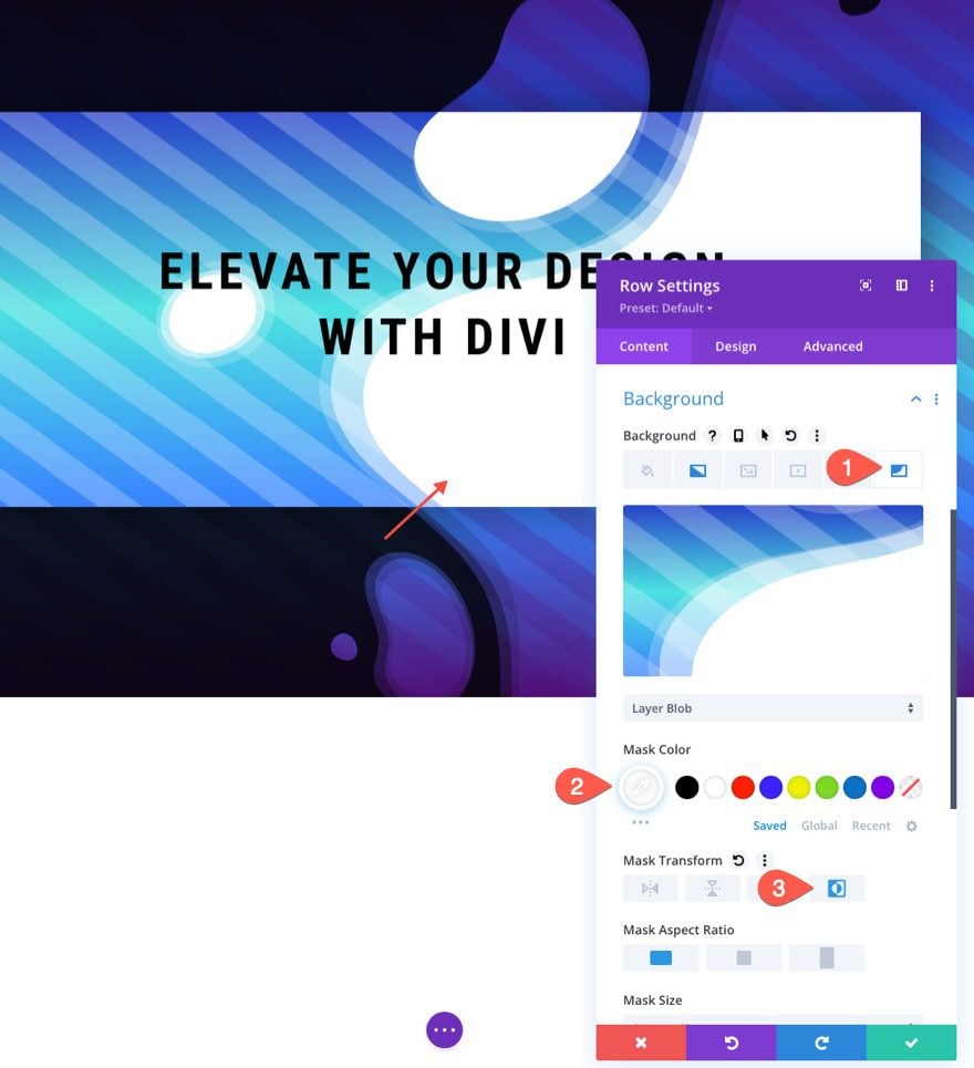
We can also update the mask color for the row to really make the design pop! Under the mask tab, update the following:
- Mask Color: #ffffff
- Mask Transform: Imverted
Final Result
Let’s check out the final result.

More Possibilities
Here are a few more example designs that are possible with just a few simple changes to the background masks and patterns.


Final Thoughts
The key to creating seamless background design transitions in Divi is to use those VW length units wisely. First, we need to create a section background design that scales with the browser viewport width (from a centered position on the page). Once done, we can use the same background design on a row. After that, we just have a make a few adjustments to the gradient and colors for an amazing design. Hopefully, this technique will add another useful design skill for future projects
I look forward to hearing from you in the comments.
Cheers!


I don’t understand, how we supposed to know how it looks like of there is no real case or video to see the transition?
Hi Jason,
You set a great example for everyone around you.
Totally amazing! I love it, love the tutorials and love Divi. But the free layout download are not the jsons from this particular tutorial. I’ll check back in again and hopefully I’ll be able to download the layouts from this great tutorial. many thanks. Sebastian
Thanks, Sebastian! Sorry for the wrong download link. I updated it with the right one. Thanks for letting me know and for your support.
Hi Jason
This post helped me to add something to my knowledge.
Divi theme is always a step forward to help the readers and users with such information.
Excellent resource, overall. Thanks!
You’re welcome, Avinash! Your support is very much appreciated. So glad it was helpful.
Thankyou so much this information was very helpful.
You are most welcome, BlueRoseONE! Glad to help.