Welcome to post 1 of 5 in our miniseries How to Create Stunning Grid Layouts with Divi’s Video Module. In this series we are going to walk you through how to create amazing grid layouts from scratch using the Divi Visual Builder. And if you are worried about this being too complicated, think again! All of these layouts can be created and styled using the Visual Builder without any additional code.
To begin this series, I’m going to show you how to create a grid layout for your videos much like a blog grid layout using a combination of video module stacked on top of a blurb module.
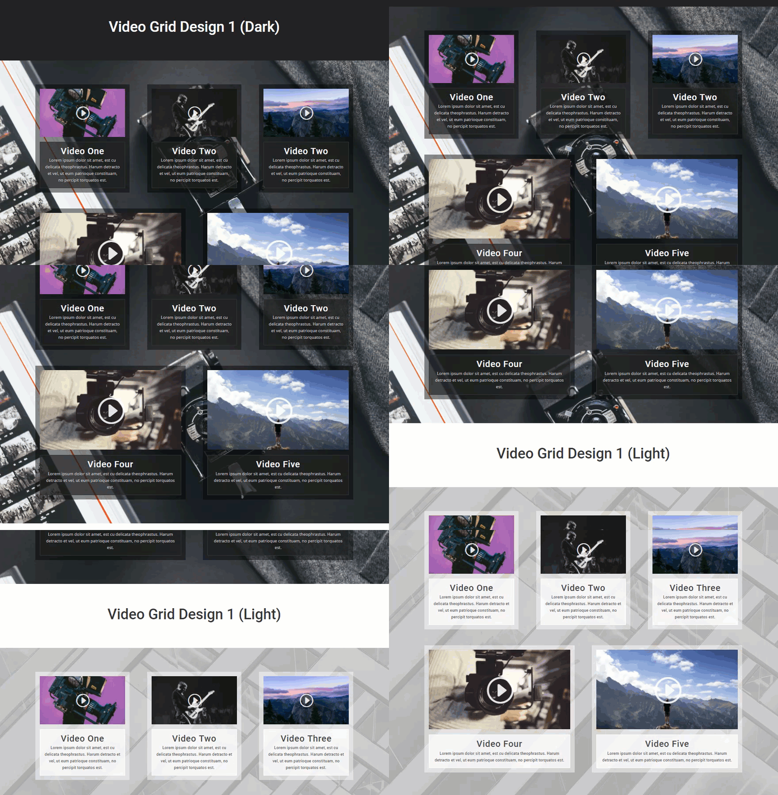
This tutorial will include both a dark and a light version of the grid design. The great thing about this layout design is that it is super easy to implement and I’ve tried to give you a lot of visuals to help along the way.
Let’s get started.
Sneak Peek at The Final Result
The Concept & Inspiration
When it comes to adding videos to a website, a lot of them seem to settle for a simple embed with little or no design. I mean, I get it. Less is more and all that. But, sometimes the way you organize the videos on a page or the way you frame them really can dramatically change the way a person engages with the content. That is why I wanted to do a series on creating great layouts for videos.
This is great for videographers, podcasters, and online courses. My hope is that you take advantage of these concepts for your own project or use them as a springboard for even greater layouts.
Implementing The Design With Divi
Subscribe To Our Youtube Channel
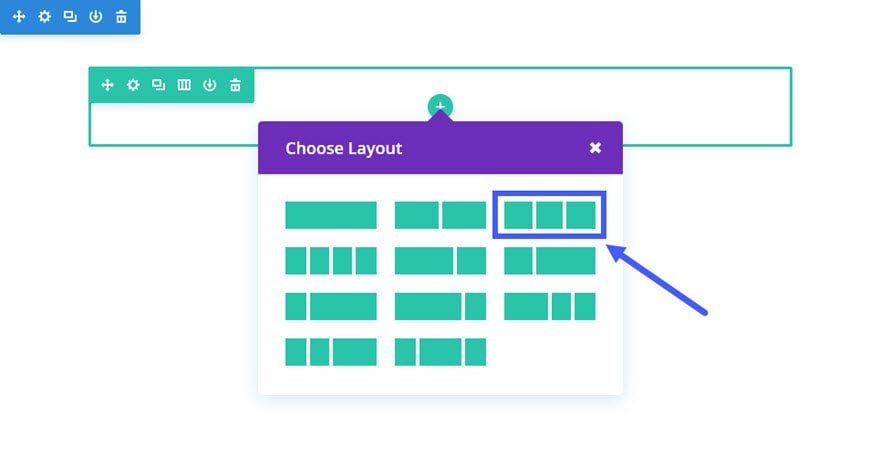
First, add a regular section with a ⅓ ⅓ ⅓ column structure.
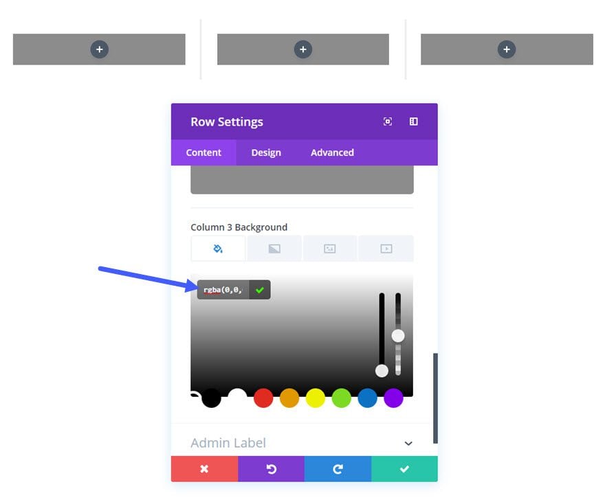
Next we are going to add a dark translucent background to each of the columns which will serve as a frame around each of our videos.
Edit the Row Settings and update the following:
Content Options
Column 1 Background Color: rgba(0,0,0,0.45)
Column 2 Background Color: rgba(0,0,0,0.45)
Column 3 Background Color: rgba(0,0,0,0.45)
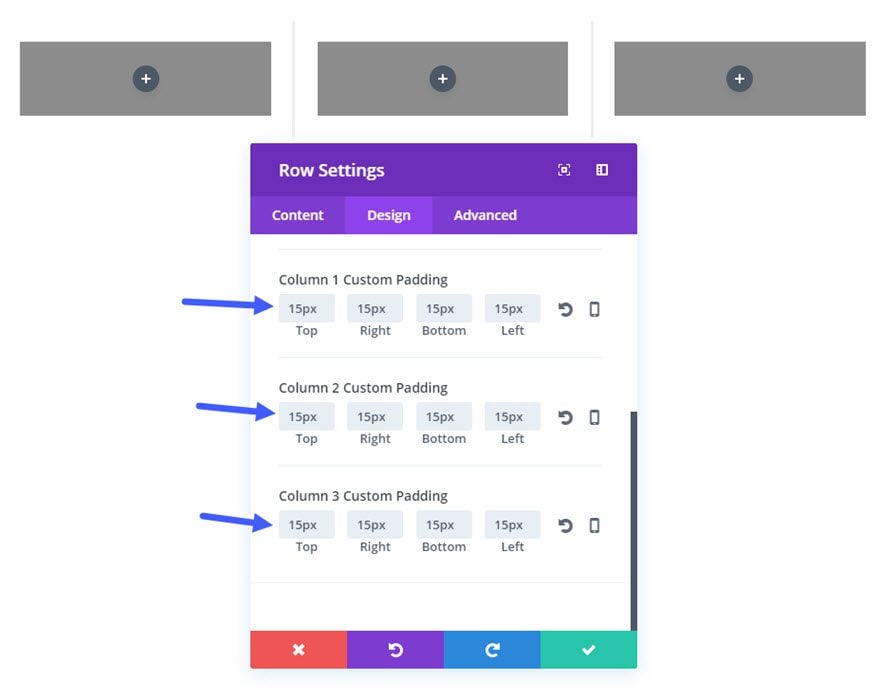
Design Options
Column 1 Custom Padding: 15px Top, 15px Right, 15px Bottom, 15px Left
Column 2 Custom Padding: 15px Top, 15px Right, 15px Bottom, 15px Left
Column 3 Custom Padding: 15px Top, 15px Right, 15px Bottom, 15px Left
Next add the first Video Module to the first column.
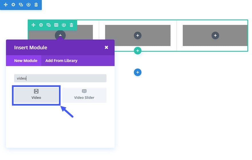
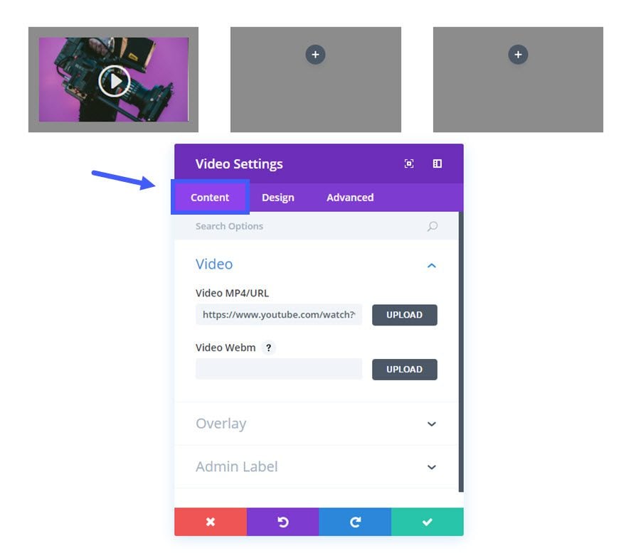
Update the Video Settings as follows:
Content Options:
Video MP4/URL: [enter URL for video]
Image Overlay URL: [upload a custom image for your video or generate one automatically from the video]
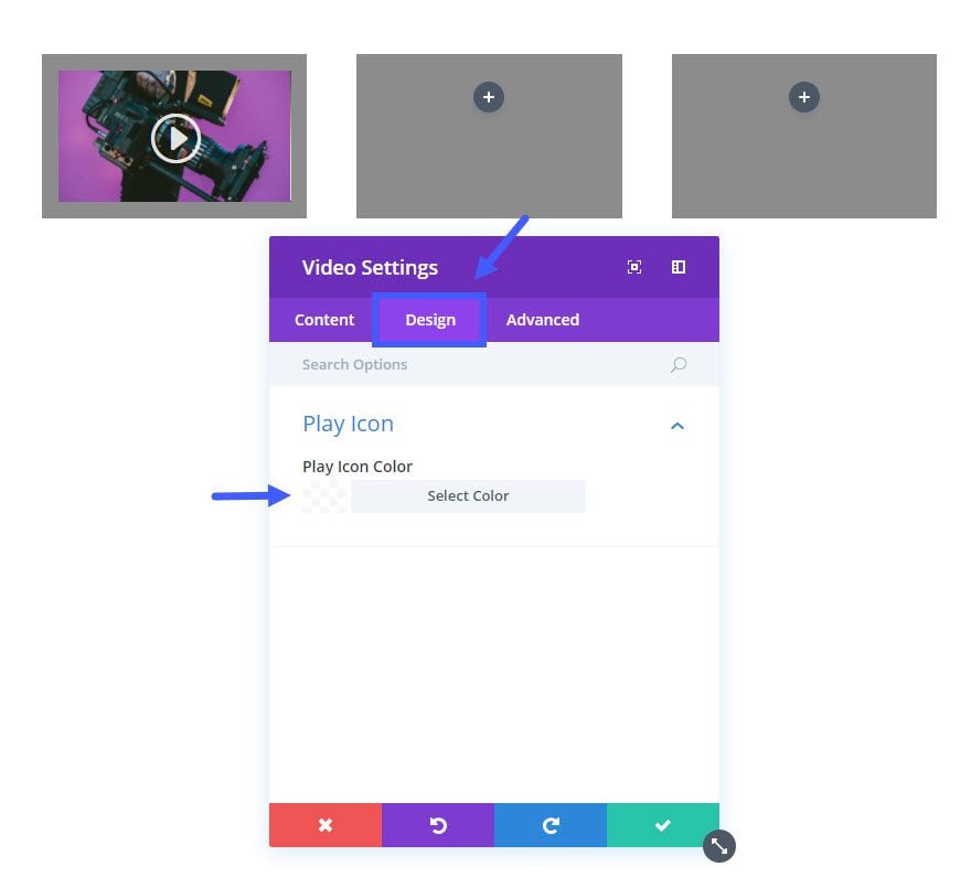
Design Options:
Play Icon Color: rgba(255,255,255,0.87)
Save Settings
Next add a Blurb Module in the first column directly under the Video Module you just created.
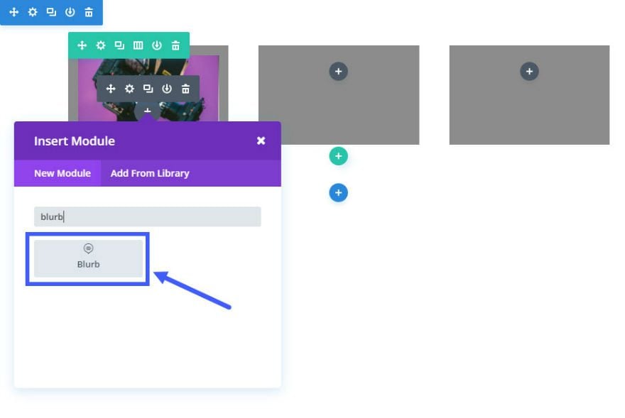
Update Blurb Settings as follows:
Content Options:
Title: [enter title of video]
Content: [enter description of video]
Background Color: rgba(34,34,34,0.68)
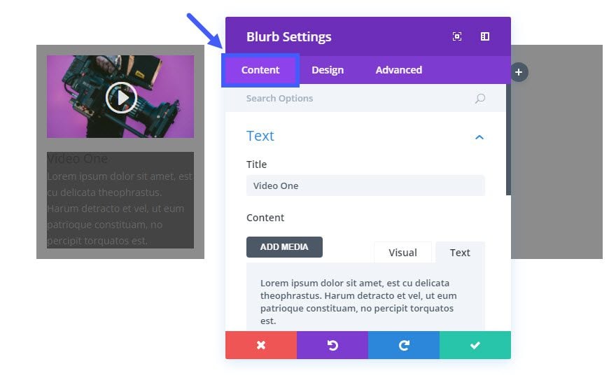
Design Options:
Text Color: Light
Text Orientation: Center
Header Font: Roboto
Header Font Size: 30px
Header Letter Spacing: 1px
Body Font: Open Sans
Body Font Size: 14px
Body Text Color: #cccccc
Use Border: YES
Border Color: #333333
Border Width: 1px
Custom Margin: -10px Top
Custom Padding: 15px Top, 15px Right, 15px Bottom, 15px Left
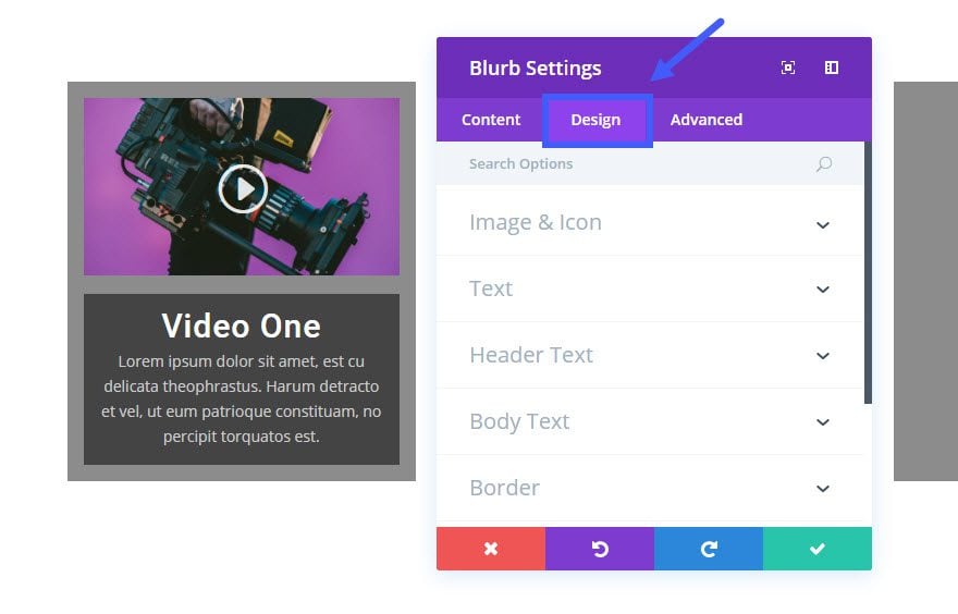
Save Settings
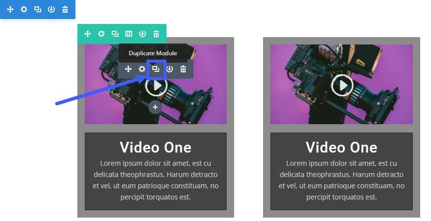
Now that you are finished with the first column content, you are ready to duplicate its contents. Click the duplicate icon on the video module twice and drag each of the duplicated modules to the second and third rows. Repeat this duplication process for the Blurb Module until all three columns are identical.
Now we need to add another row with a ½ ½ column structure directly under our current row. Since we are going to want to carry over our videos and blurbs into the new row, the easiest way to do this is to go ahead and duplicate the current 3 column row. After the row is duplicated, change the column to the ½ ½ column structure.
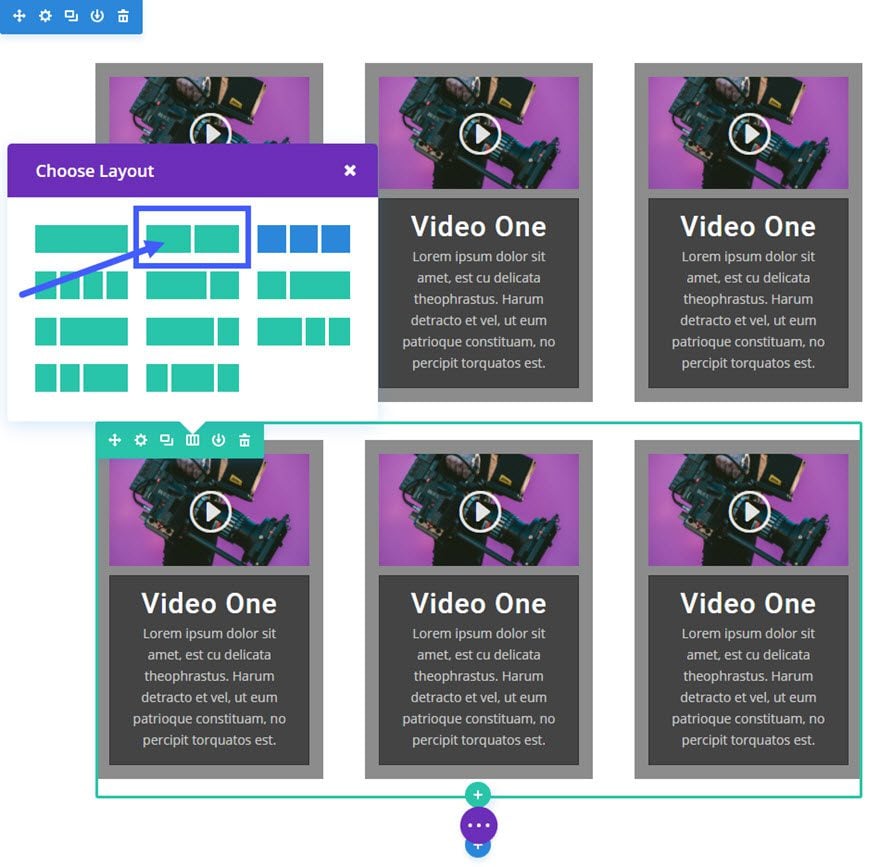
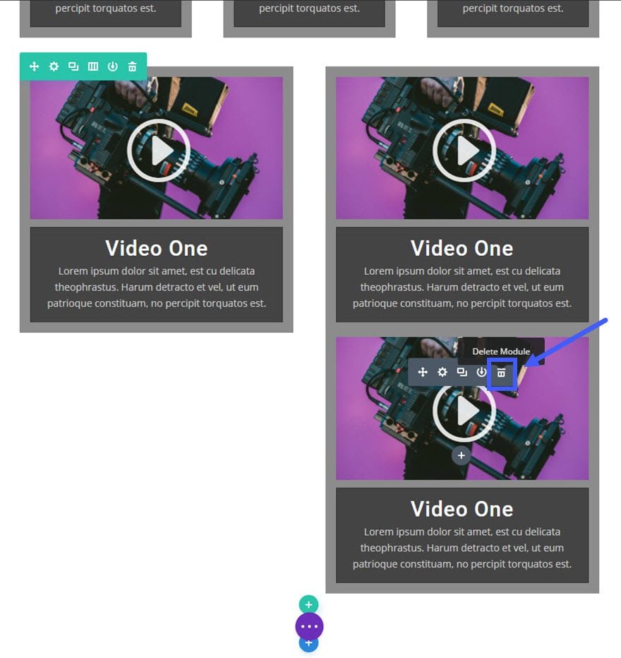
Delete the extra video card.
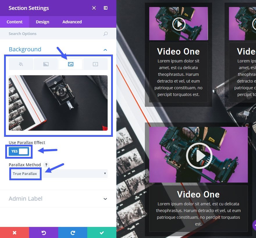
Now lets add a background to our section. Under the section settings update the following options under the Content tab:
Background Image: [upload image]
Use Parallax Effect: YES
Parallax Method: True Parallax
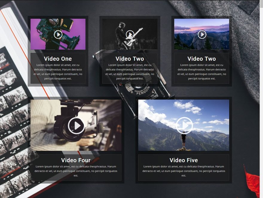
That’s it for the dark version of the first video grid design. Check out your results.
Next is the light version.
Creating the Light Version of the Video Grid Design
To change the previous dark video grid design into a light version, all you need to do is update a few of the design options.
Update Section Settings as follows:
Content Options:
Background Image: [enter a light background image]
Update Row Settings as follows:
Content Options
Column 1 Background Color: rgba(255,255,255,0.45)
Column 2 Background Color: rgba(255,255,255,0.45)
Column 3 Background Color: rgba(255,255,255,0.45)
Update Blurb Settings as follows:
Content Options
Background Color: rgba(255,255,255,0.68)
Design Options
Text Color: Dark
Header Text Color: #444444
Body Font: Roboto
Body Text Color: #666666
Border Color: #ffffff
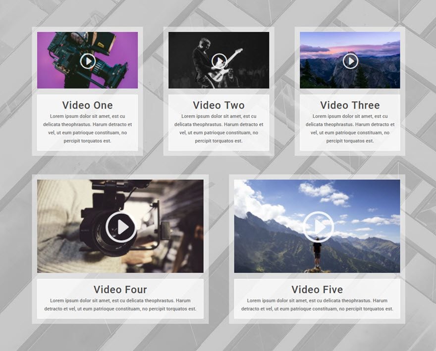
Here is what the light version looks like…
That’s it!
Responsive?
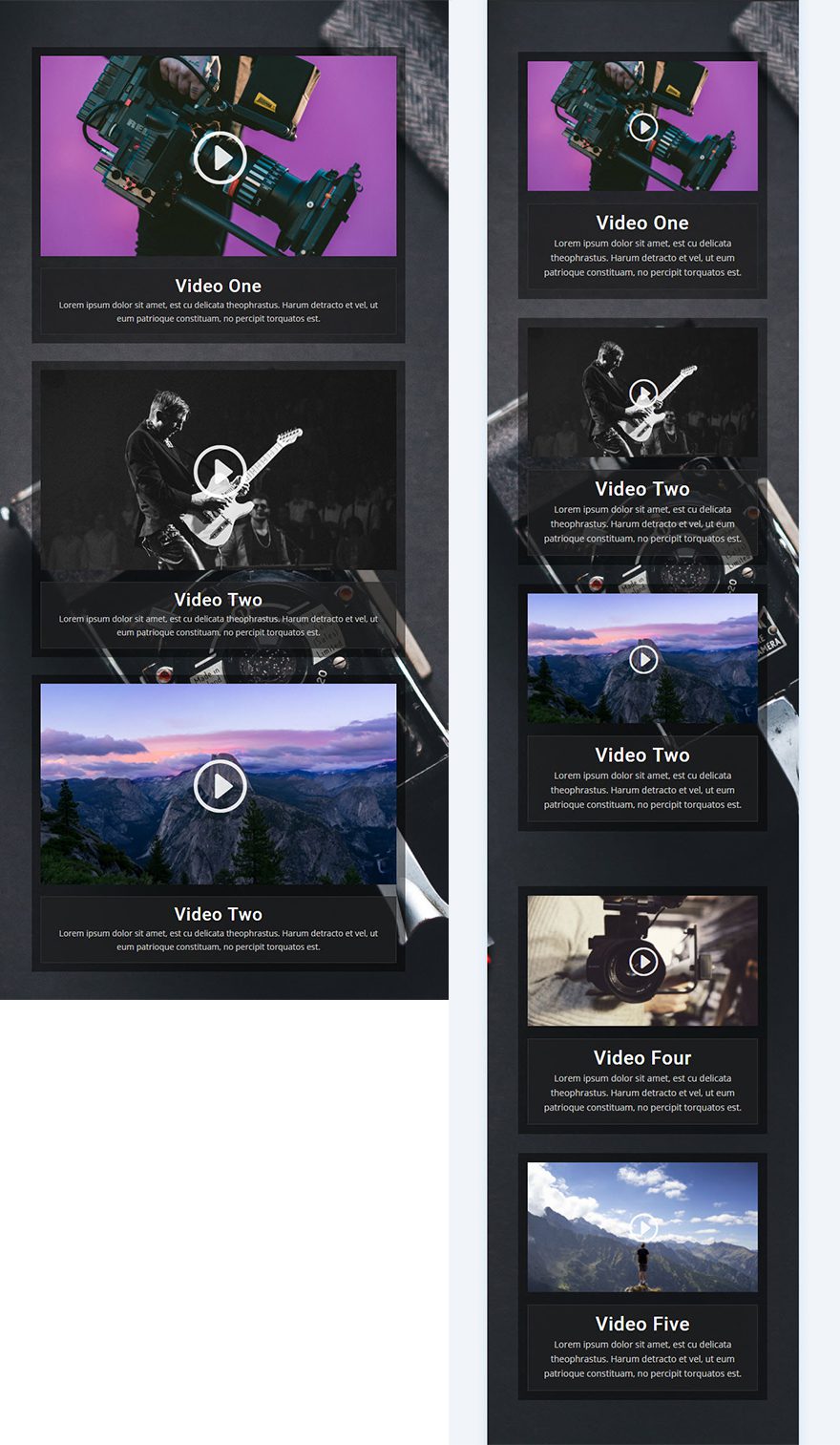
This layout works great on all devices and screen sizes. Here is a quick look at what this layout looks like on tablet and smartphone devices.
Coming Up
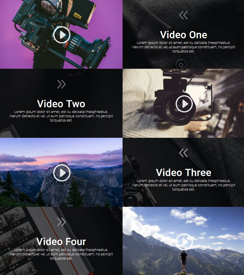
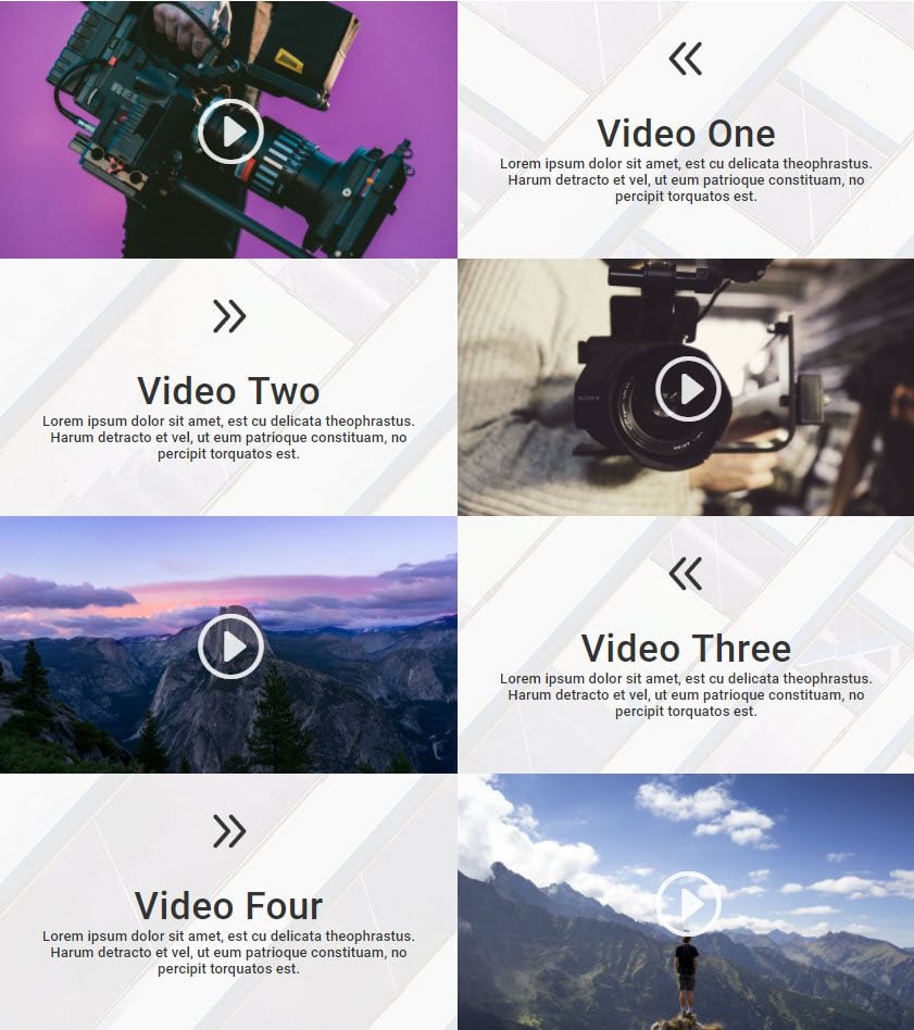
For the next post in this series, I’m going to show you how to create a unique fullwidth, 2-column grid layout for your videos . Here is a preview of what is to come.


Hi, How do we add pagination to this layout then if we have many videos on the page? Could someone please point me in the right direction. ? Also, i had a question regarding the memory used on this page for every video that is loaded via a youtube link..
I suggest that you reach out to the Support Team so you can get possible assistance on this.
I’m wondering if Divi will ever have this module available to accept video feeds and format them with this style? What I mean is, if the videos are going to change on a regular basis, would there be a way to post a feed script in the video module to automatically populate more modules based upon the amount of feeds? Going about it this route manually could turn into a high-maintenance project.
Thank you so much for that fabulous instruction. Clear, concise and replicatable (is that a word?).
Like all things Divi, I love it!
wow, I didn’t know Divi can do this!
Thanks for the article and the MAIL system that sent this to me lol
I’m gonna use it on my next projects..
This is fantastic. I have a client build coming up that will incorporate a lot of videos, so this series will come in handy. Thanks
Really nice design layout on this page. Thanks for the great step by step.
Thanks Jason great article.. I am still using Wistia which hasn’t been the cleanest integration with Divi. I’ve not been able to use the Dviv video module with much success due to constraints that seem to exist with Wistia integration. Do you know if there has been any progress here. I’d like to go try some of what you’ve described in the article but don’t want to waste my time if Wistia is still an issue. THANKS
Rob,
You are correct. Wistia doesn’t seem to integrate well with Divi at the moment. I will look into that further. Thanks for the feedback.
Great. A tutorial that doesn’t use css, it really shows the power of Divi.
I love the effect achieved using the transparency and the parallax effect. Great tutorial.
Jason, Thx for spending the time to detail these instructions. I’m going to try it right now. Needed something to motivate me to get back to adding pages using Divi.
Very nice! Need video tutorial. BTW, I can hear my video but not see it, any idea what’s going on?
My background image is not HOLDING still. What am I doing wrong please?
Sorry for the confusion, Marc. The gif I have on there is misleading. If you want the background to hold still, choose the CSS parallax method for the section background image.
Hi, Is there a chance to get an explanation on how to build a full SCREEN grid layout, with 2 or 3 columns and 2 or 3 rows? That would be great !
Thank you
Hi, quick question. Can Divi be used to make a page like this but more of a YouTube like site with user uploaded videos?
Did it’ and loved the results. Keep em coming. Thank you very much… well done.
Yeah, and also the coming up: Part Two — could you please pay some creativeness and attention to the design like that — but NOT all equal size but e.g. a ‘double size’ of one video-unit (taking as much space as two video’s would have)? Hope to learn from you, and looking forward to it!
This is great! Definitely going to use this on my blog! Thanks for sharing.
You are welcome!
Looks great. Live demos would be helpful for these great tutorials.
Jason, this is exactly what I’ve been wanting to do for my upcoming Pinterest training with over 45 videos, I needed a cohesive way to display them and the current gallery wasn’t working for me.
It’s like you knew I was having a hard time finding a plugin that works.
Thanks a lot
Great to hear! Glad it was helpful.