
As web designers we are always looking out for new ways to add individuality to the websites we create. Divi provides endless opportunities to produce unique layouts but there are always little additions we can include to bring a design together. This is where CSS pseudo-elements come in really handy.
What are CSS pseudo-elements?
Put simply, a CSS pseudo-element can be utilised to style specific parts of an element. There are five types of pseudo-element that do different things. For the purpose of this post we’ll be looking at ::before and ::after.
These two pseudo-elements are used to insert something before or after the content of an element. This is particularly useful since we can use them to add extra visual elements to existing images, text and anything else!
So why would we use these pseudo elements? Before and after are perfect for unlocking design possibilities without needing to add more elements or modules. Equally, they are useful for adding additional elements without having to touch html templates or core theme files.
How do you use before and after elements with Divi?
If this all sounds a little confusing so far, do not worry! If we were to use ::before and ::after when writing the CSS code from scratch, it would look a little like this:
Imagine we have a line of text with the class “text-example” – the CSS to style and customise this line would be:
.text-example {*This is where you add the styles*}
Now if you wanted to add and style a ::before or ::after element, the CSS would look like this:
.text-example::before {*This is where you add before content and styles*}
.text-example::after {*This is where you add after content and styles*}
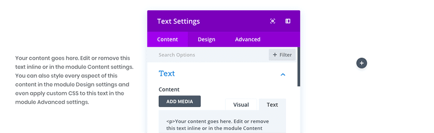
Fortunately Divi provides easy access to ::before and ::after pseudo-elements with much less hassle. In fact, if you have ever opened up the “Advanced” tab for any module to add custom CSS code, you’ll have seen the areas that we are referring to.
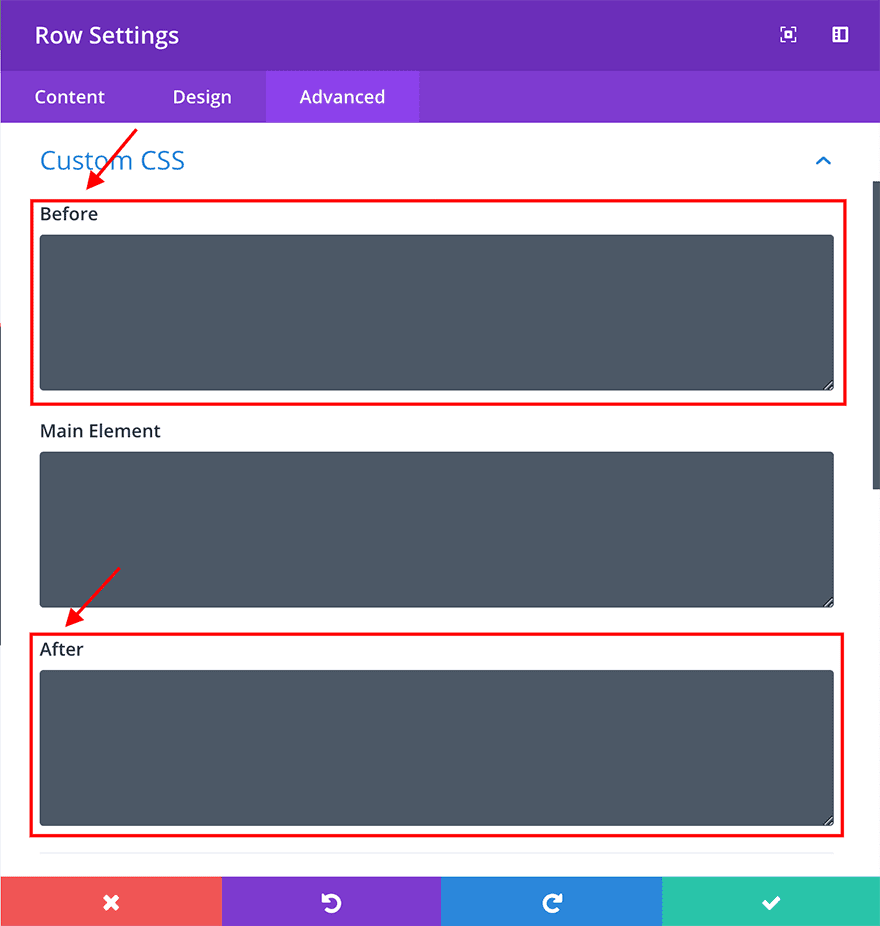
These boxes provide a quick shortcut to add and customise content before and after any existing Divi module and we can utilise them to create some really flexible and interesting designs.
Sneak Peek
This is what we’ll be creating in this tutorial:
Example 1
Example 2

Example 3
Getting Started
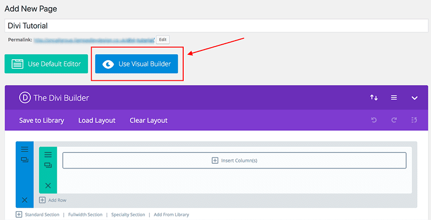
For this tutorial we just need a copy of the Divi theme and a blank slate. To begin with we’ll create a new page and, after adding a page title, click on the visual builder.
Now we’re ready to begin!
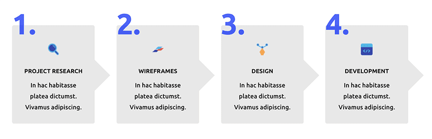
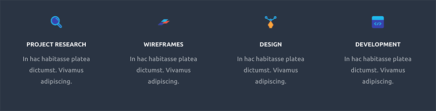
Example 1: Numbered blurb modules using Pseudo Elements
The blurb is probably one of the most flexible Divi modules at your disposal. In this instance we will use pseudo elements to add numbers before each blurb to create a step by step “how it works” section. We’ll also add an arrow shape to the right to indicate the process.
What we’ll be creating:
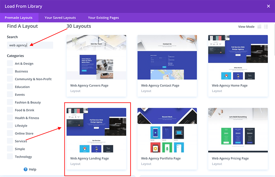
Although this design will work with any blurb design, we’ve borrowed the blurb section from the Web Agency Layout. If you’d like to use these as a starting point you can access the Web Agency Landing Page by creating a new page and accessing the front end builder.
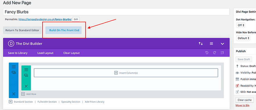
When your page loads you’ll have an option to use a premade layout, one of your saved layouts or build from scratch. Select premade layout and use the search bar to find “Web Agency” Layouts. The blurb section in this tutorial can be found on the Landing Page.
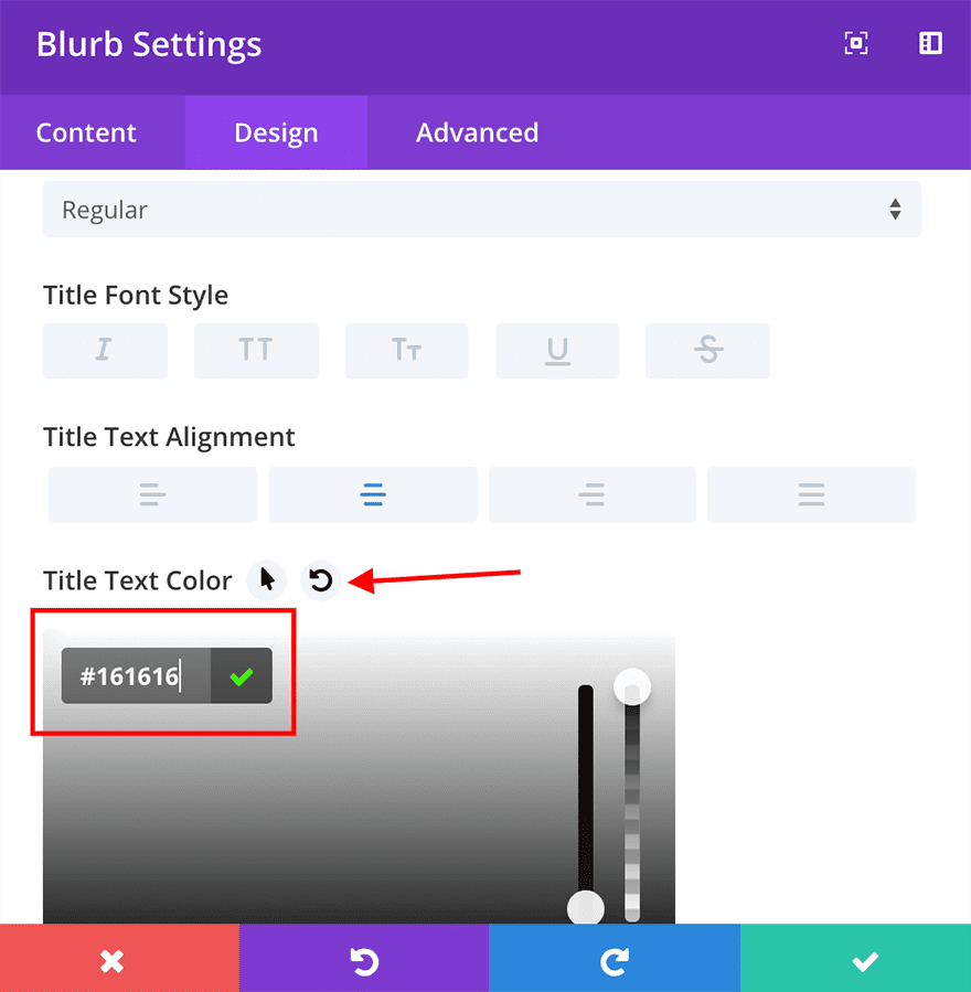
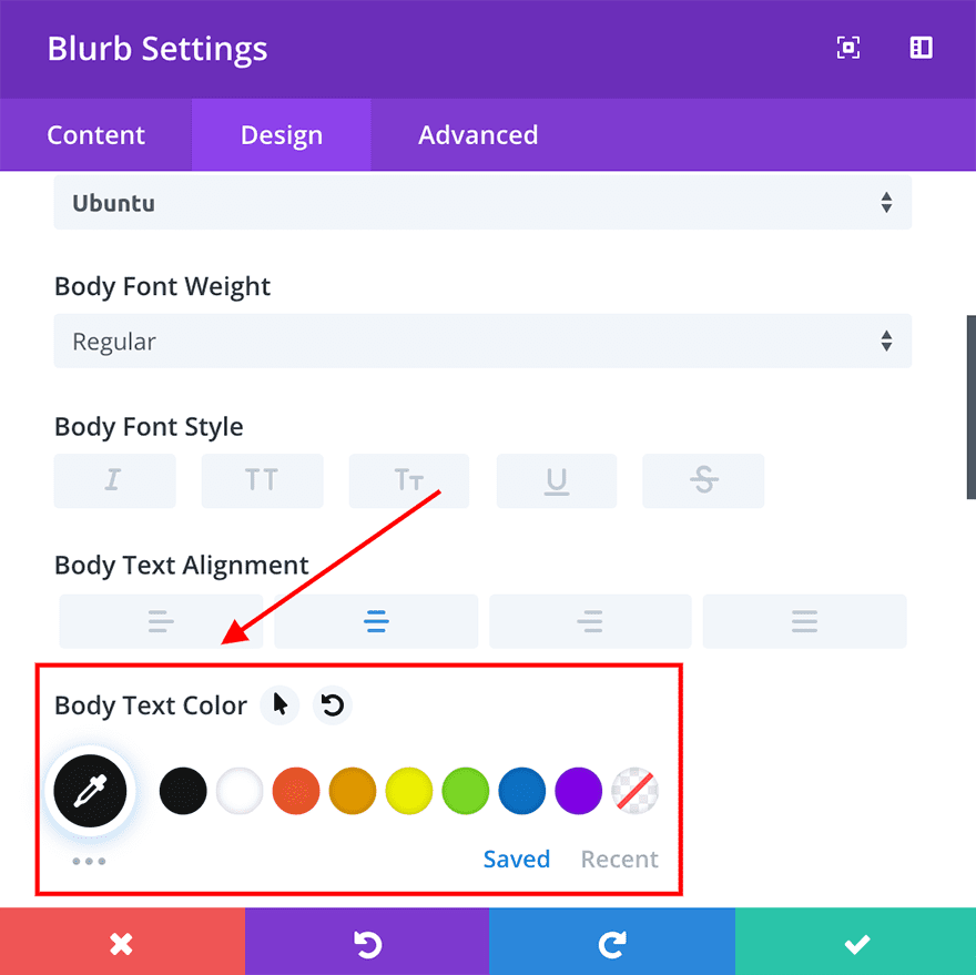
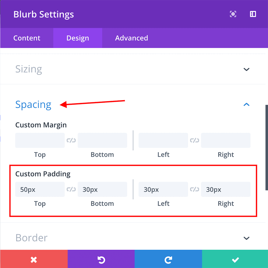
Once loaded, the only difference between the premade layout and our example is that we’ve changed the background of each blurb, the title and text font colour and added a little padding.
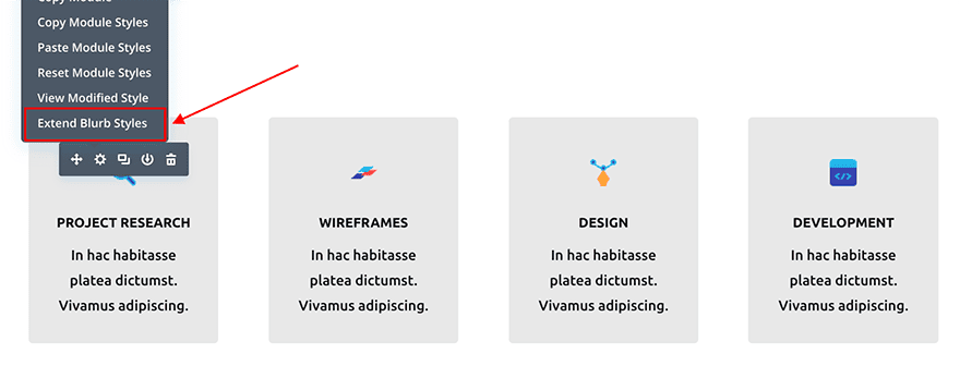
Once you’ve changed these settings on one blurb, you can right click on the module and use the “Extend Styles” to apply them to the other three.
Now that we’ve customised our four blurb modules to look as we want them, it’s time to add some code to create the numbered element. However for this design to work we first need to add one line of css to the Main Element custom css box.
overflow: visible;
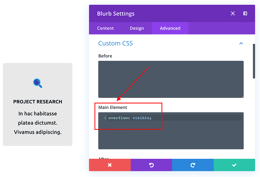
This will simply allow any elements we create in the next steps to be visible wherever they overlap the edges of our blurb module.
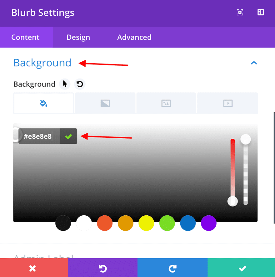
Once you’ve done this, open up the module options and navigate to the “Advanced Tab”. Within the “before” box, add this CSS snippet:
content: '1.'; /* Adds the number 1. as before content */
font-weight: bold;
font-size: 80px;
opacity: 0.7; /* Makes the number slightly transparent */
color: blue; /* Changes the color of the number text */
position: absolute;
z-index: 9999;
left: 0; /* Positions the content 0px away from the left border */
Top:-20px; /* Positions the content 20px above the top border */
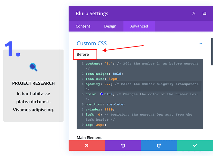
Once you have added this code snippet you’ll see the number appear to the top left of the blurb module. You can amend the number’s position by altering the “left:” and “top:” lines or change the color and font size of the number within this CSS snippet.
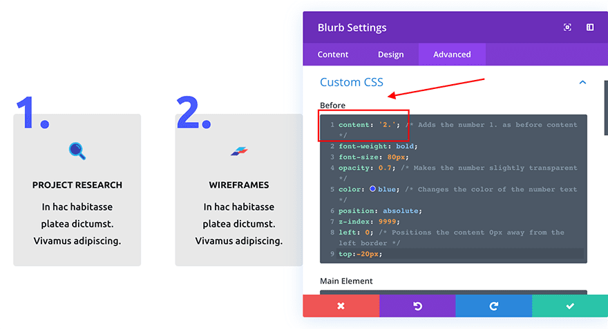
Once you’ve completed this for the first module, go into the three new blurb modules and change the “content:” line to:
content: ‘2.’;
content: ‘3.’;
…and so on.
Now that we’ve got our numbers sorted, we need to add a little bit of css to create the arrow shape.
Open each module and enter this into the After box within the Custom CSS area:
content: '';
display:block;
height:60px; /* Size of the shape */
width:60px; /* Size of the shape */
position:absolute;
top:40%;
right:-30px;
z-index: -1;
background-color: #e8e8e8; /* Colour of the shape */
transform: rotate(45deg);
-ms-transform: rotate(45deg);
-webkit-transform: rotate(45deg);
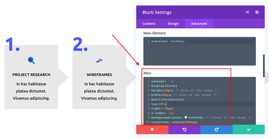
Now your four blurbs should look like this:
Example 2. Adding unique shapes to your existing modules
This design relies on simple but effective little code snippets that are added to both the ::before and ::after custom CSS boxes within each text module.
The beauty of using pseudo-elements here is that we can integrate unique shapes and objects to our existing modules without needing to add any additional elements or modules to our page. Because these pseudo-elements are contained within our existing modules, they don’t add any extra space to our designs and remain looking great on all devices.
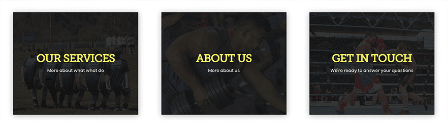
What we’ll be creating:
To create the initial layout we need to add a regular section with a three column row, set to default width. Once you’ve done this, add a text module to one of the new columns.
Again, you can style this text module as you’d like however if you are following along, these are the steps to achieve this design:
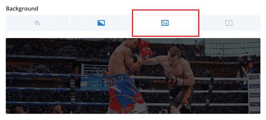
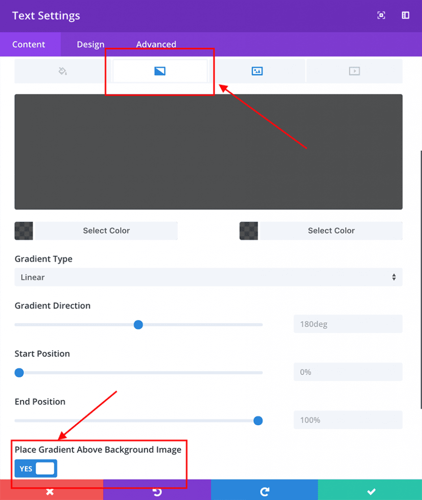
Open the text module options and add your text content and a background image or background colour as required. We’ve used a normal background image with a transparent gradient on top:
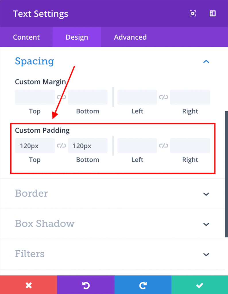
Next, configure the following design options:
1.Top padding: 120px & Bottom padding: 120px
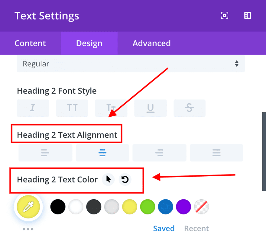
2.Text Alignment: center & Text color: #ffffff
3. Heading Alignment: center & Heading color: #f5ee5d
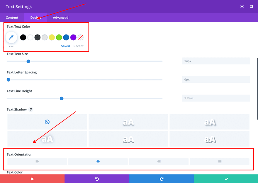
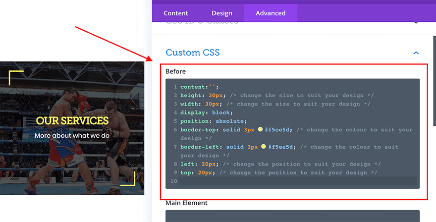
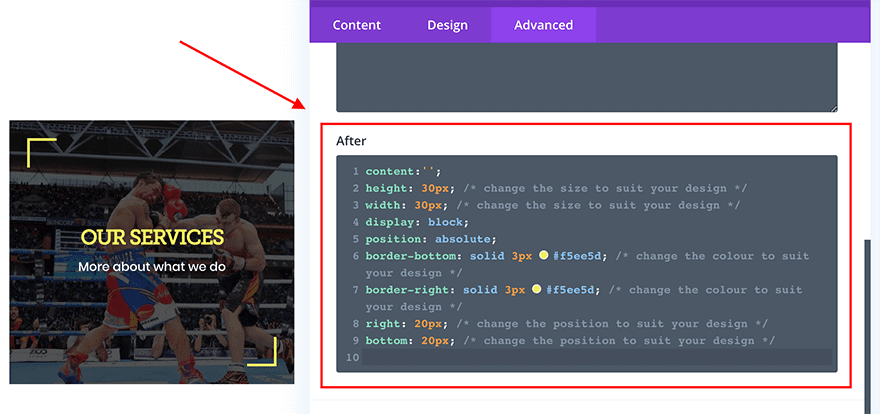
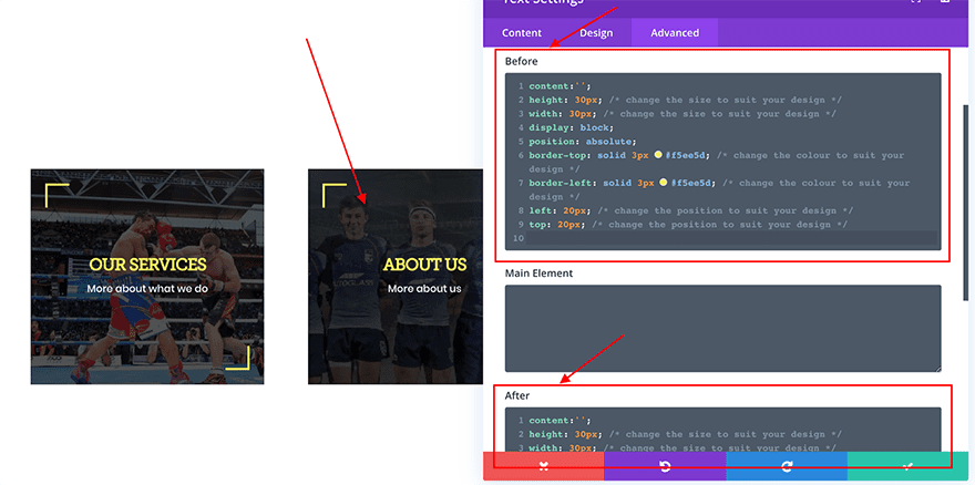
Now that we have all of the visual aspects in place for your first text module, it is time to add the CSS to make the magic happen. In the Advanced tab of the text module, add the following code to the “before” box:
content:'';
height: 30px; /* change the size to suit your design */
width: 30px; /* change the size to suit your design */
display: block;
position: absolute;
border-top: solid 3px #f5ee5d; /* change the colour to suit your design */
border-left: solid 3px #f5ee5d; /* change the colour to suit your design */
left: 20px; /* change the position to suit your design */
top: 20px; /* change the position to suit your design */
And then add the following code to the “after” box:
content:'';
height: 30px; /* change the size to suit your design */
width: 30px; /* change the size to suit your design */
display: block;
position: absolute;
border-bottom: solid 3px #f5ee5d; /* change the colour to suit your design */
border-right: solid 3px #f5ee5d; /* change the colour to suit your design */
right: 20px; /* change the position to suit your design */
bottom: 20px; /* change the position to suit your design */
Once you’ve added these code snippets to the module you will see our fancy new shapes added.
If you wondering what this CSS does, it’s actually quite simple. All we are doing is creating a transparent square that is positioned 20px away from the top and left (and bottom and right) of the text module. We then add two borders to these squares to create the arrow effect.
When you’re happy with the look of this first text module, simply copy and paste it to fill the other columns and change the text content, background and styles to suit.
The bonus of this method is that it will work with pretty much any Divi module with a little customisation. If you want to be more fancy, try adding some additional CSS to rotate, skew and customise the ::before and ::after elements even further. Have fun!
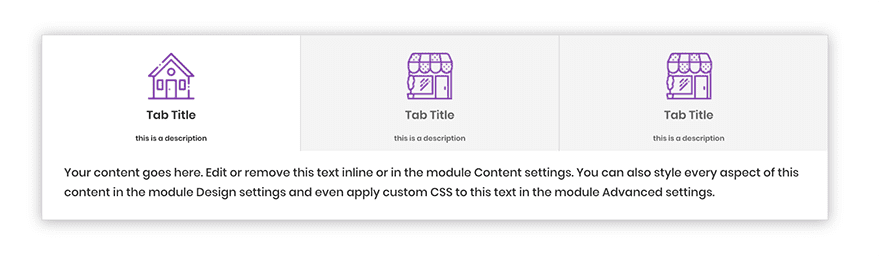
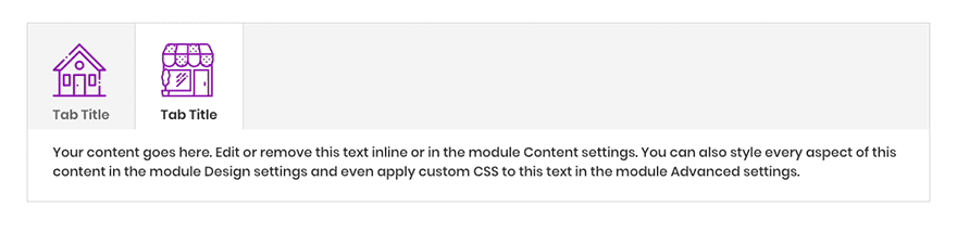
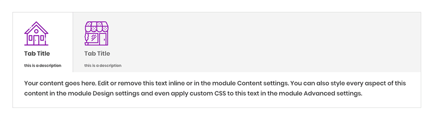
Example 3. Adding icons and descriptions to tab titles
Within this design we will take advantage of the ability to add an image icon before some existing content as well as a small text description below. This is perfect for customising the Divi tabs module a little further than you are normally able to.
Note – Although adding content via css is great for design, it isn’t readily indexed by search engines (although Google does in fact index CSS and Javascript content, it takes much longer and is unreliable at present. Search engines like Bing and DuckDuckGo do not index this content at all). For this reason your content should be minimal and you should not rely on it to influence your ranking potential.
What we’ll be creating:
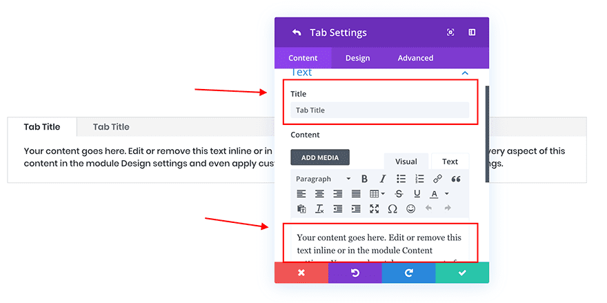
First of all we need to add our standard section and a 1 column row, followed by the Divi tabs module itself. Within the tabs module, we only need to add our titles and content to each tab as we’ll be handling the styles in the next steps.
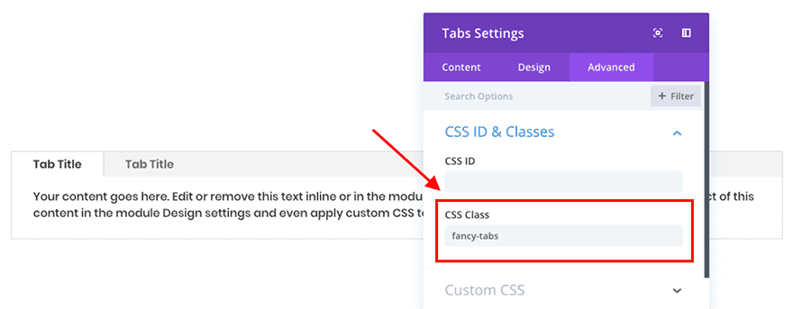
Once our content is in place, we need to begin adding content to the ::before element of the module. Since we cannot add custom CSS to specific tabs using the method we’ve followed above, we’ll need to accomplish this slightly differently.
Open up the tabs module options and within the Advanced tab give the module the class “fancy-tabs”.
Once you’ve added this CSS class we need to do a little preparation. To add some icons or images to your tab titles we obviously need to add these to WordPress. Go to the Media tab in the WordPress dashboard and upload your chosen icons as you normally would.
With your images uploaded, we need to click on each one and copy the URL that WordPress has generated for us. Go through each of your images and copy and paste these URLs into a document or your chosen notes application.
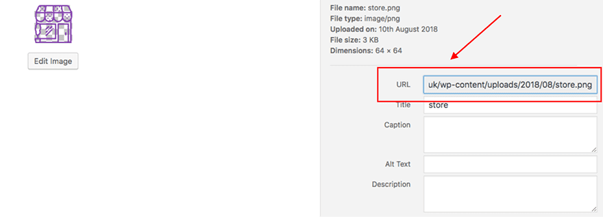
With the URL’s of your chosen images at hand, go to your Divi Theme Options within the Divi menu in the WordPress Dashboard.
At the bottom of this page you’ll see a box where you can add your own custom CSS. It’s within this box that we’ll be pasting some CSS code.
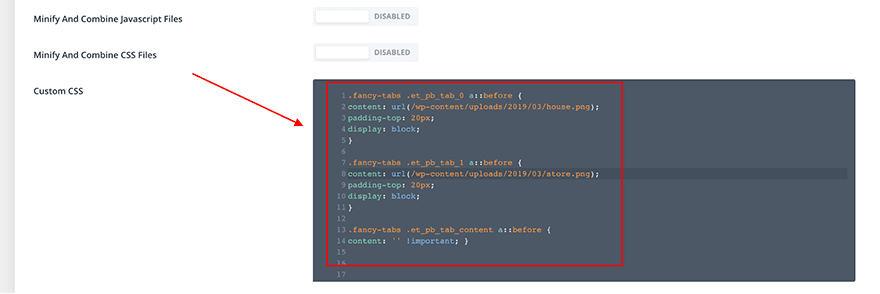
The following snippet will add the images above each tab title. Simply copy and paste this snippet into the custom CSS box and replace the content between (and including) the asterisks (e.g. *Replace this with the URL for your first image*) with the URLs you noted earlier.
.fancy-tabs .et_pb_tab_0 a::before {
content: url(*Replace this with the URL for your first image*);
padding-top: 20px;
display: block;
}

.fancy-tabs .et_pb_tab_1 a::before {
content: url(*Replace this with the URL for your second image*);
padding-top: 20px;
display: block;
}

.fancy-tabs .et_pb_tab_content a::before {
content: '' !important; }
If you return to the page with your tabs module on, you should now see that the images have been added above each title – success!
So what about adding descriptions? Fortunately this is quite simple as well. Right below the code you have just copied into your custom CSS box, paste the following:
.fancy-tabs .et_pb_tab_0 a::after {
content: 'this is a description';
font-size: 10px;
padding-top: 5px;
display: block;
}

.fancy-tabs .et_pb_tab_1 a::after {
content: 'this is a description';
font-size: 10px;
padding-top: 5px;
display: block;
}

.fancy-tabs .et_pb_tab_content a::after {
content: '' !important; }
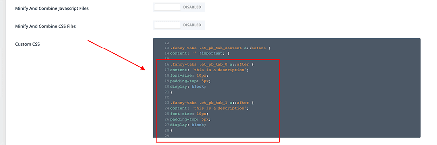
As before with your images, you’ll need to replace “this is a description” with your own content. Returning to the page with your tabs module on you’ll see we now have fancy descriptions too!
Finally, we just have to apply a little more CSS to achieve the complete design shown above. Again, copy the following snippet into the same custom CSS box:
.fancy-tabs .et_pb_tab_content a:after {
content: '' !important; }

.fancy-tabs .et_pb_tabs_controls li {
width: 50% !important;
}
.fancy-tabs .et_pb_tabs_controls li a {
width: 100% !important;
text-align: center;
}

@media (max-width: 768px) {

.fancy-tabs .et_pb_tabs_controls li {
width: 100% !important;
}

.fancy-tabs .et_pb_tabs_controls {
padding: 0 !important;
}
}
This code centers your tab text and images and increases the width of your tabs to cover the entire module.
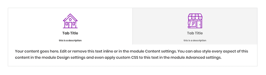
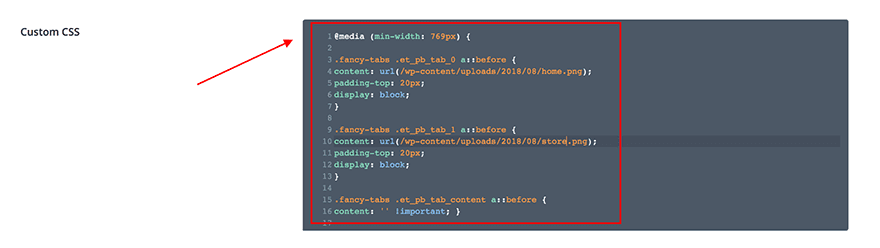
We also added some CSS to ensure the tabs look good on all devices – if you’d prefer to not have your tabs full width and stack on mobile, we’ll need to go back and surround the original CSS code in a media query. This means that on devices the size of a tablet and wider we add the descriptions and icons, however on smaller devices we will revert back to the Divi default styling.
To do this, copy the amended CSS code below and paste it into your custom CSS area in the Divi theme options panel:
@media (min-width: 769px) {

.fancy-tabs .et_pb_tab_0 a::before {
content: url(*Replace this with the URL for your first image*);
padding-top: 20px;
display: block;
}

.fancy-tabs .et_pb_tab_1 a::before {
content: url(*Replace this with the URL for your second image*);
padding-top: 20px;
display: block;
}

.fancy-tabs .et_pb_tab_content a::before {
content: '' !important; }

.fancy-tabs .et_pb_tab_0 a::after {
content: 'this is a description';
font-size: 10px;
padding-top: 5px;
display: block;
}

.fancy-tabs .et_pb_tab_1 a::after {
content: 'this is a description';
font-size: 10px;
padding-top: 5px;
display: block;
}

.fancy-tabs .et_pb_tab_content a::after {
content: '' !important; }
.fancy-tabs .et_pb_tab_content a:after {
content: '' !important; }

.fancy-tabs .et_pb_tabs_controls li {
width: 50% !important;
}
.fancy-tabs .et_pb_tabs_controls li a {
width: 100% !important;
text-align: center;
}
}
Adding more tabs
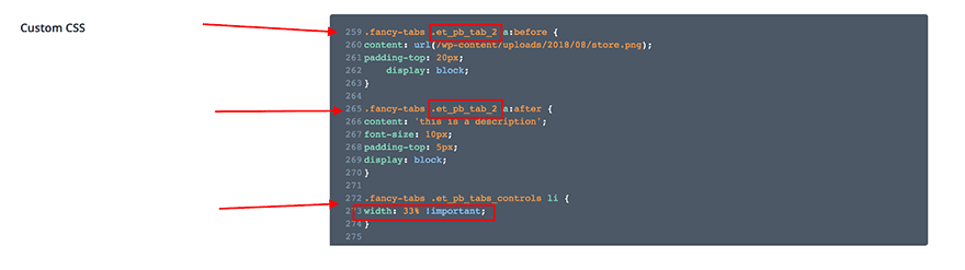
In this instance we have created a tab module that includes 2 different tabs, however in practice we sometimes require more than this. If you are in a position whereby you are seeking to create more than 2 tabs, we will need to amend the code you’ve just added.
As you can see from the snippet, Divi automatically assigns a class to each tab title – the first starting with 0 (.et_pb_tab_0), increasing by 1 each time (.et_pb_tab_1, .et_pb_tab_2 and so on). We’ve already taken care of the first two tabs, so when adding more we can simply copy and paste a section of the code for every new tab:
.fancy-tabs .et_pb_tab_0 a:before {
content: url(*Replace this with the URL for your first image*);
padding-top: 20px;
}
and change the number in the class (.et_pb_tab_0) to 2, 3, 4 etc. You’ll need to do the same for your descriptions too.
The final amendment we need to make is to adjust one more line of CSS. Take the number of your tabs and divide it by 100. Note down this number and navigate to the following section in your custom CSS:
.fancy-tabs .et_pb_tabs_controls li {
width: 50% !important;
}
and swap the 50% with your answer. This will ensure your tabs are equally spaced across the width of the module.
For example, if you are creating a third tab, the additional CSS code you need would be as follows:
.fancy-tabs .et_pb_tabs_controls li {
width: 33% !important;
}
In closing
And there we have it, three great ways to utilise CSS ::before and ::after elements to create new design possibilities. Hopefully this guide will inspire you to explore how you can use pseudo-elements in your future creations – the opportunities really are endless!


For the life of me I can’t seem to find the right format for making the link color white in the custom css.
This works for the text–> color: #fff;
But I’ve tried a million configurations for and links and can’t get the hyperlink to be the right format. a:link color: white;
Have you tried using
a {color:#ffffff !important;}?the text I put in ::before is cut off, why does this happen?
Have you tried defining a CSS width property on the before pseudo?
Great Article, just used it and it works! Thank you
Excellent tutorial and well supported documentation. Great job and I see more tips and tricks coming from Liam I am sure 🙂
Liam, Thanks for the useful information. This is another reason to use Divi to builder to create websites.
Excellent tutorial. I will be using some of these top-tips in my next project.
Kind regards,
Neil.
Hi Liam, I’m using example 3 and everything works fine whilst I’m using the internal Divi stylesheet. But when I move the code into my Divi-child style sheet it stops working, any ideas?
Wow.. nice article. you have done a really brilliant job. i was really not familiar with the option of “Extend Styles”
The css code is a pending issue. Thanks Liam interesting post.
Thanks Liam, this is great!
One of the tutorials I’ve seen on the pseudo ::before and ::after selectors! Great job Liam, hope you can write more of these advanced CSS topics in the near future!
Great article.
Thank you.
you blog is very help full
Hello,
Thank you for this tutorial.
The tab part is really very interesting.
Thanks it’s very beautiful effects
Thanks a lot man you really help me.I don’t even no some settings that you shown us.
Nice work, thanks 🙂