Testimonials are a huge deal for many websites. They show expertise and visitors usually go looking for them if they want to figure out how credible a company or person is. That’s why it’s important to think about the way you visually present testimonials on your website.
With Divi, you can display your testimonials exactly the way you want to. To inspire you, we’ll show you how to create a stunning and unique way to showcase testimonials using hover overlaps.
Let’s get to it!
Preview
Before we dive into the tutorial, let’s take a look at the end result.

Add New Section
Let’s get started! Add a new page or open an existing one and add a new regular section.

Add New Row 1
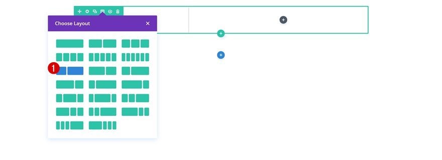
Column Structure
Continue by adding a new row using the following column structure:
Sizing
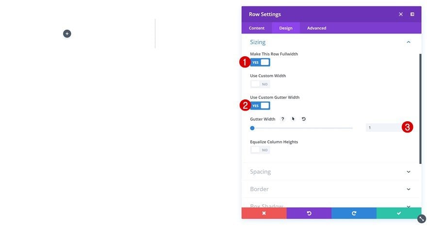
Without adding any modules yet, open the row settings and change the sizing settings.
- Make This Row Fullwidth: Yes
- Use Custom Gutter Width: Yes
- Gutter Width: 1
Spacing
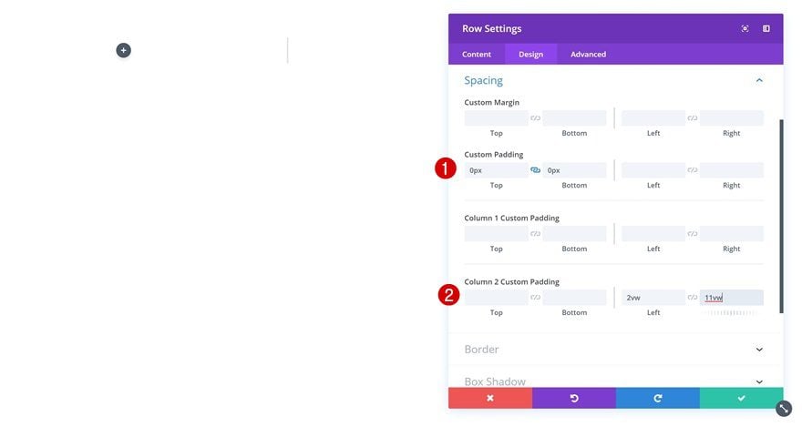
Add some custom spacing values as well.
- Top Padding: 0px
- Bottom Padding: 0px
- Column 2 Left Padding: 2vw (Desktop), 3vw (Tablet & Phone)
- Column 2 Right Padding: 11vw (Desktop), 3vw (Tablet & Phone)
Add Image Module to Column 1
Upload Image
Time to start adding the various modules! Start with an Image Module in the first column. Upload a portrait image of choice.
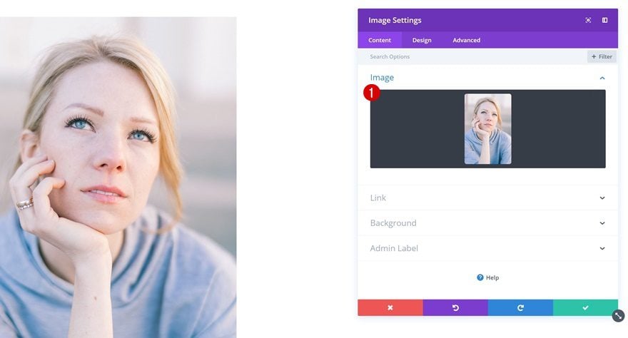
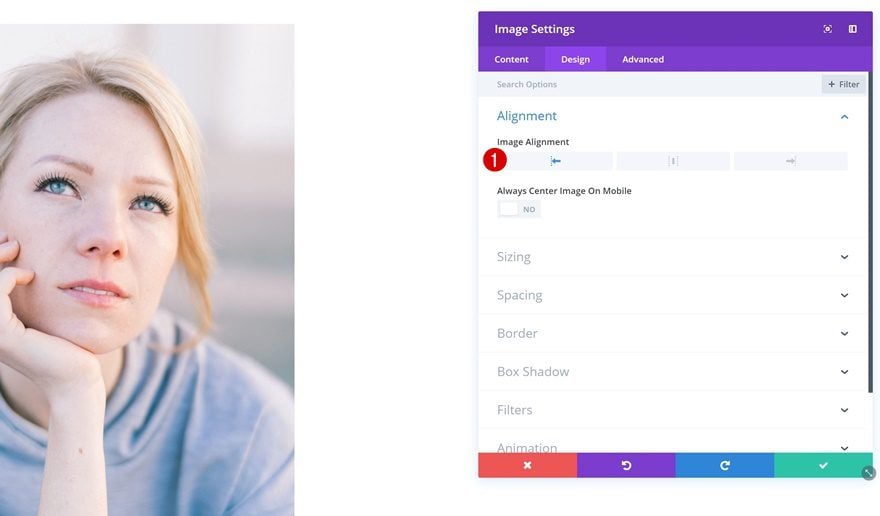
Image Alignment
Open the image settings and change the image alignment.
- Image Alignment: Left
Sizing
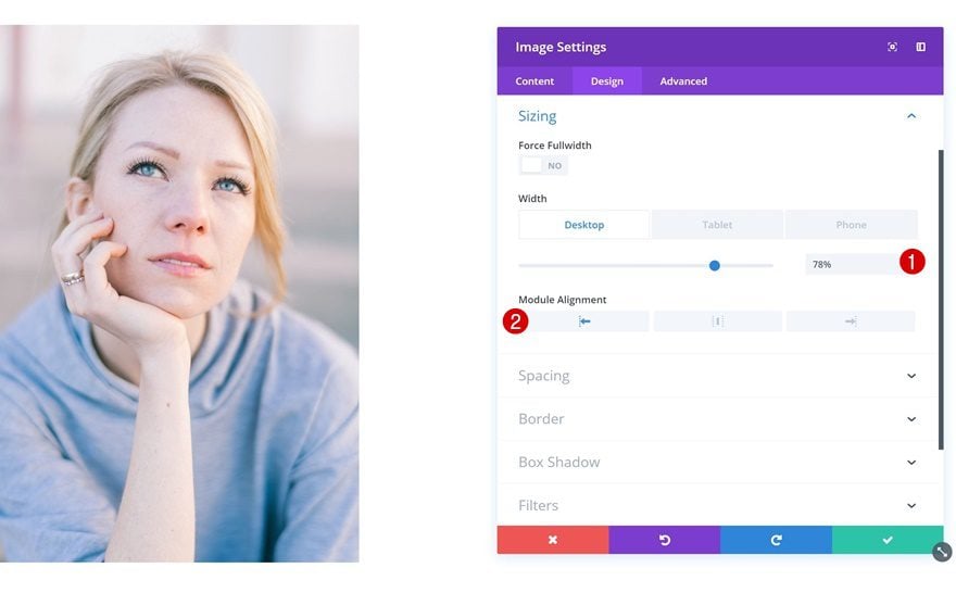
Change the sizing settings next.
- Width: 78% (Desktop), 70% (Tablet & Phone)
- Module Alignment: Left
Add Hover Overlap Text Module to Column 1
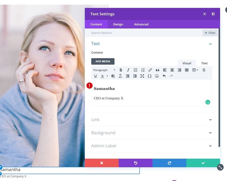
Add Content
Right below the Image Module, add a Text Module. Place the person’s details in the content box.
Default Background
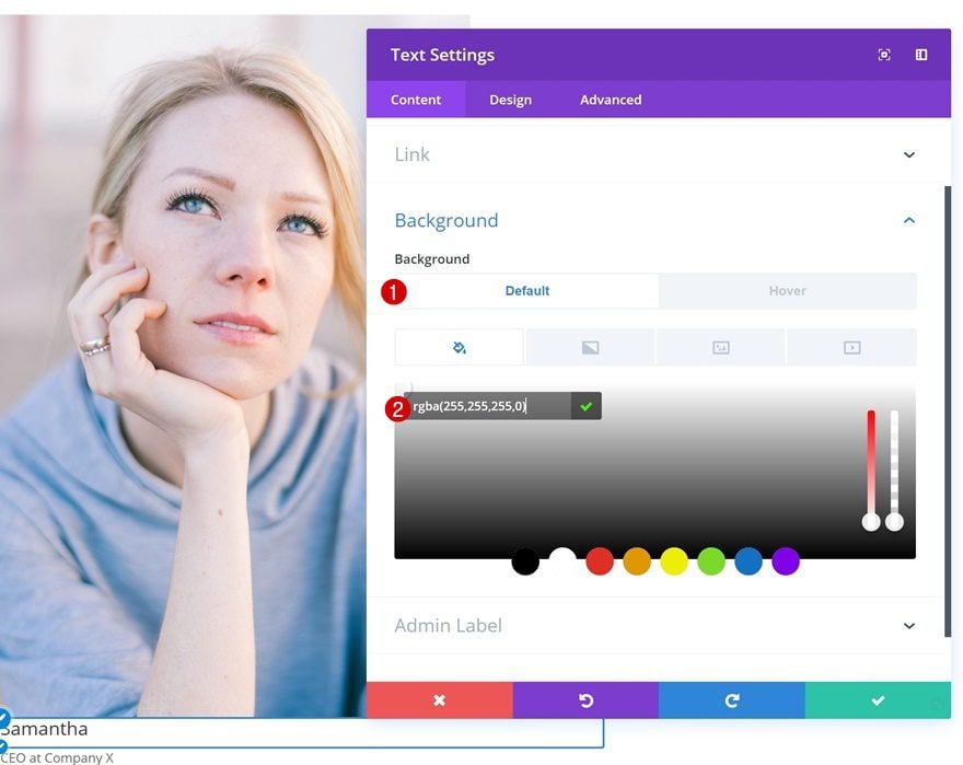
Proceed by adding a background color.
- Background Color: rgba(255,255,255,0)
Hover Background
Add another background color on hover.
- Background Color: #0f1bff
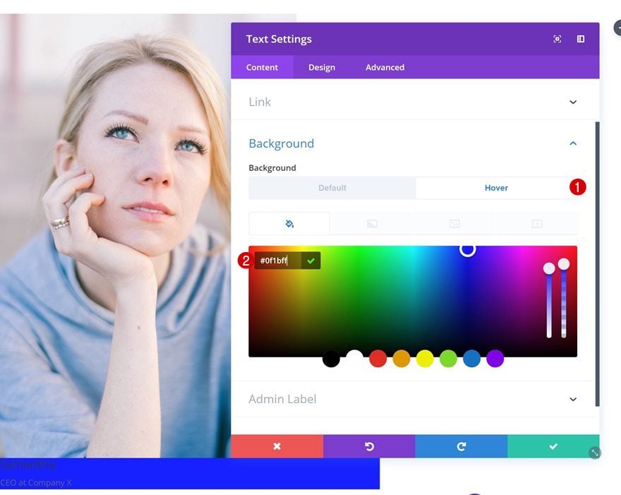
Default Text Settings
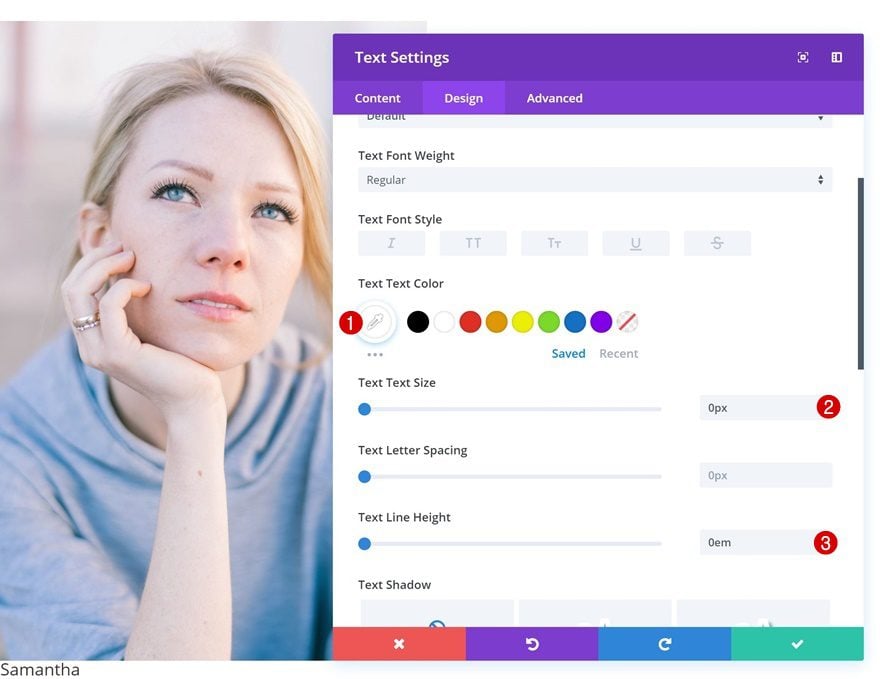
Then, change the text settings.
- Text Color: #ffffff
- Text Size: 0px
- Text Line Height: 0px
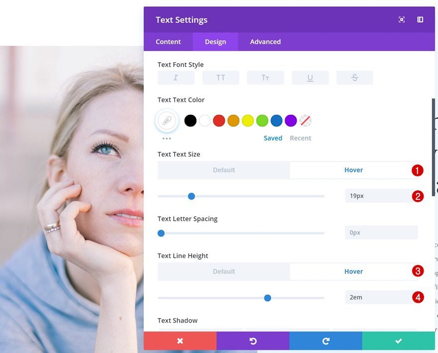
Hover Text Settings
Make some adjustments for the text settings on hover.
- Text Size: 19px
- Text Line Height: 2em
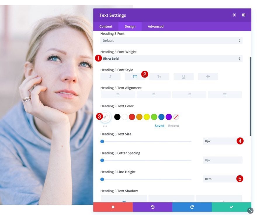
Default Heading Text Settings
The heading text settings need to be modified as well.
- Heading 3 Font Weight: Ultra Bold
- Heading 3 Font Style: Uppercase
- Heading 3 Text Color: #ffffff
- Heading 3 Text Size: 0px
- Heading 3 Line Height: 0em
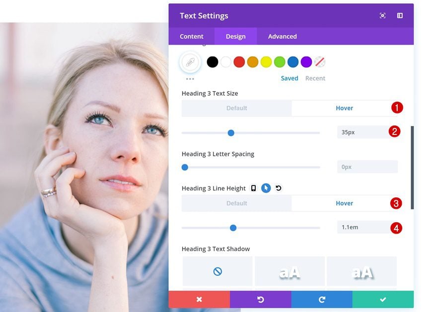
Hover Heading Text Settings
Add different values on hover.
- Heading 3 Text Size: 35px
- Heading 3 Line Height: 1.1em
Spacing
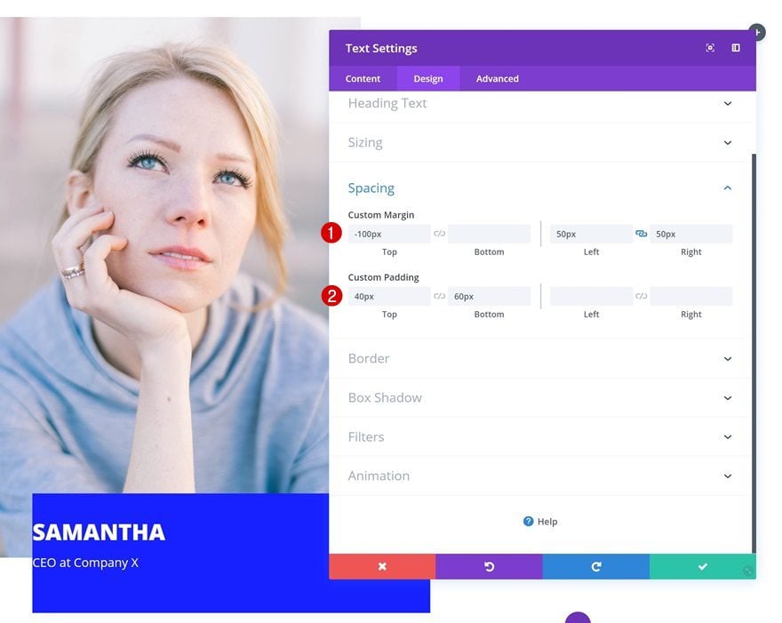
Next, go to the spacing settings and add some values.
- Top Margin: -100px
- Left Margin: 50px
- Right Margin: 50px
- Top Padding: 40px
- Bottom Padding: 60px
Change Text Orientation
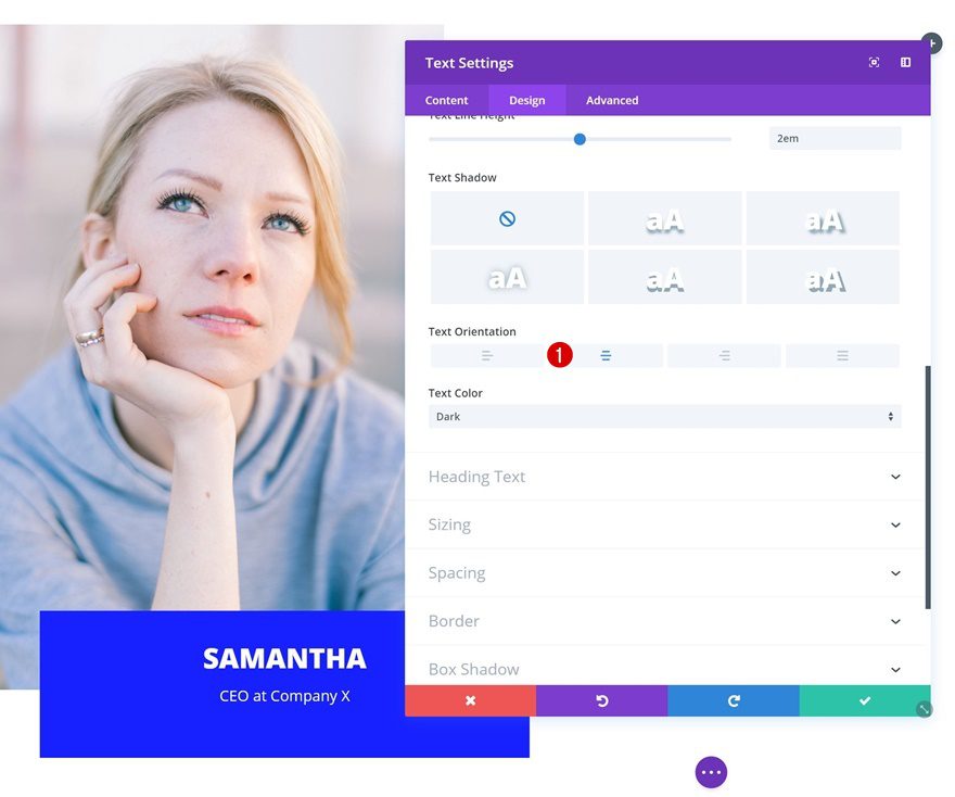
Go back to the text settings and change the text orientation.
- Text Orientation: Center
Default Box Shadow
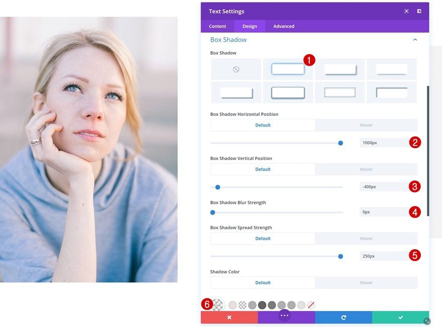
Then, add a default box shadow to the text module. This box shadow will be part of the overall design.
- Box Shadow Horizontal Position: 1000px
- Box Shadow Vertical Position: -400px
- Box Shadow Blur Strength: 0px
- Box Shadow Spread Strength: 250px
- Shadow Color: rgba(175,175,175,0.13)
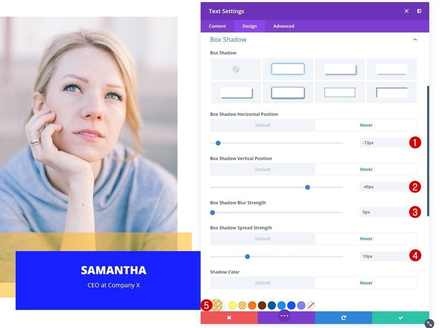
Hover Box Shadow
To create the special hover overlap effect, add a hover box shadow as well.
- Box Shadow Horizontal Position: -73px
- Box Shadow Vertical Position: -49px
- Box Shadow Blur Strength: 0px
- Box Shadow Spread Strength: 10px
- Shadow Color: rgba(255,182,12,0.53)
Transitions
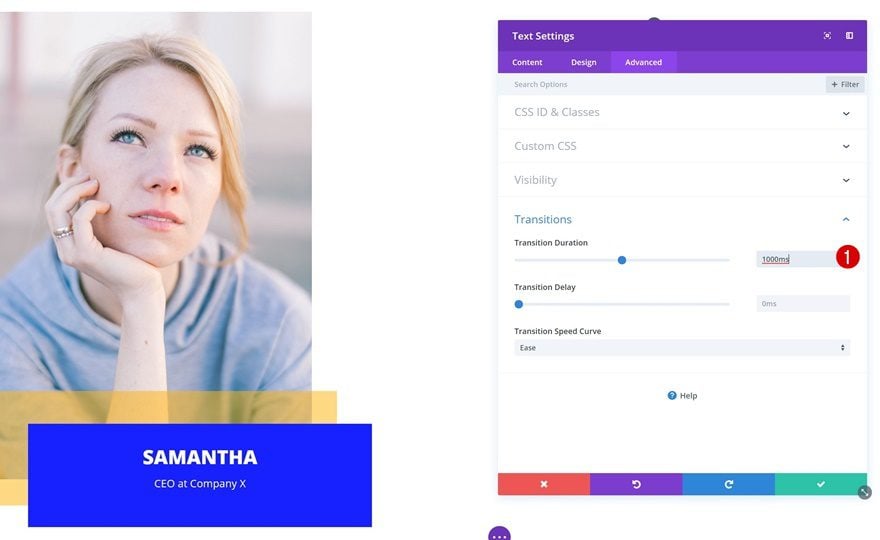
To create a smooth transition, change the transition duration in the advanced tab.
- Transition Duration: 1000ms
Add Testimonial Text Module to Column 2
Add Content
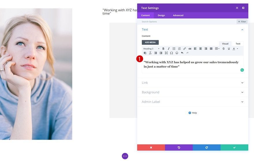
In the second column, the first thing we’ll need is a title Text Module. Go ahead and add a summary of the testimonial.
Heading Text Settings
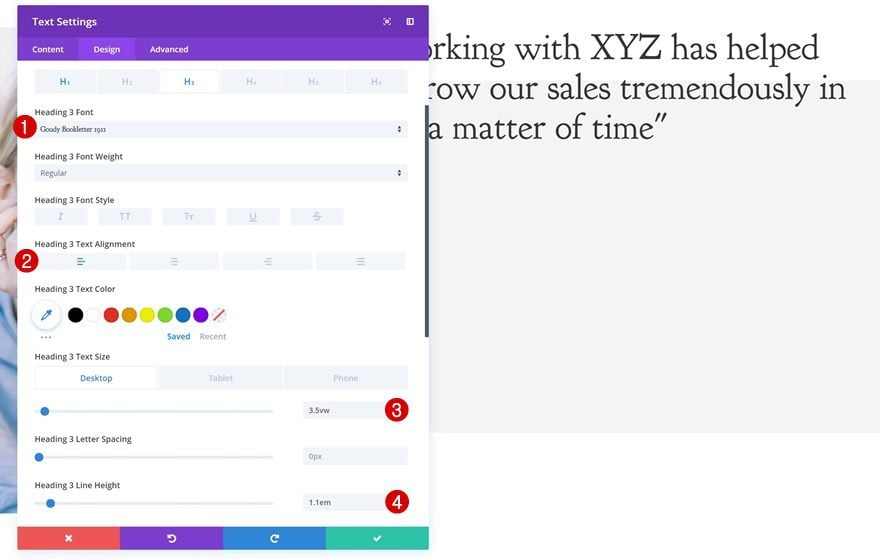
Then, change the heading text settings.
- Heading 3 Font: Goudy Bookletter 1911
- Heading 3 Text Alignment: Left
- Heading 3 Text Size: 3.5vw (Desktop), 40px (Tablet), 30px (Phone)
- Heading 3 Line Height: 1.1em
Spacing
Continue by adding some custom spacing values.
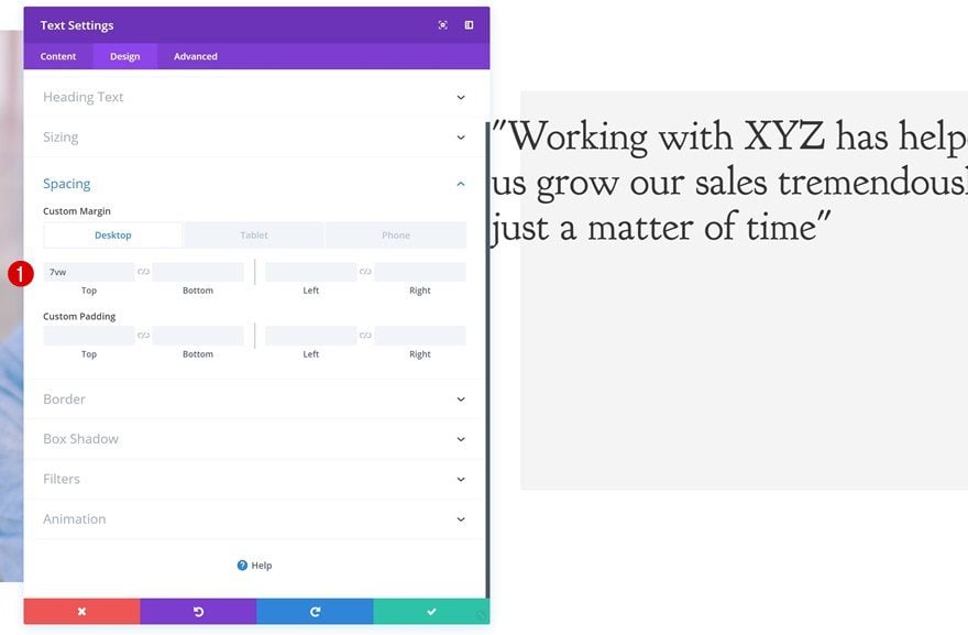
- Top Margin: 7vw (Desktop), 100px (Tablet), 50px (Phone)
Add Description Text Module to Column 2
Add Content
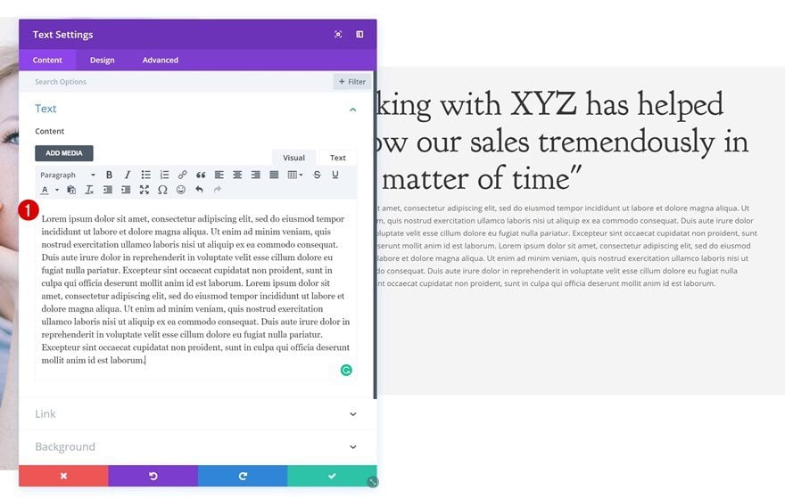
Add another Text Module with the entire testimonial right below the title Text Module.
Text Settings
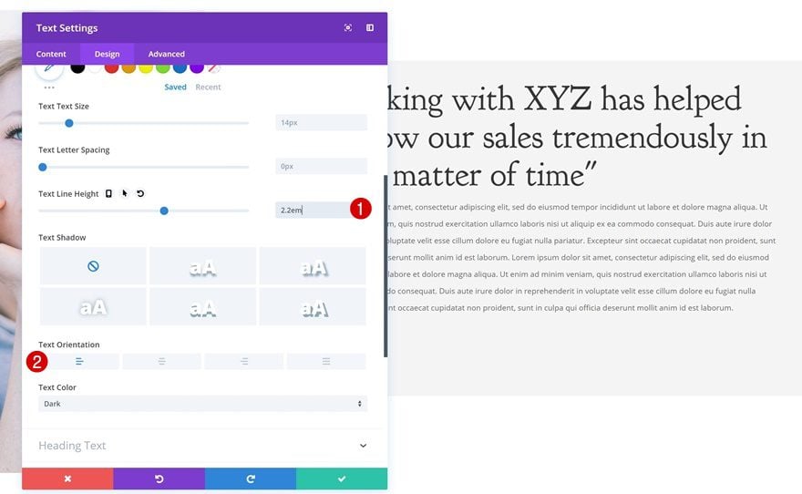
After you’ve added the testimonial, go ahead and change the text settings.
- Text Line Height: 2.2em
- Text Orientation: Left
Spacing
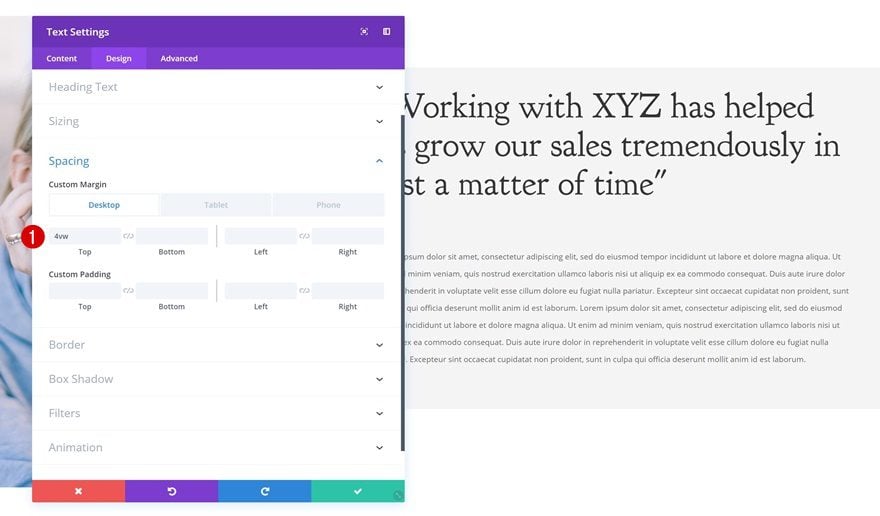
Add some custom top margin as well.
- Top Margin: 4vw (Desktop), 50px (Tablet & Phone)
Add New Row
Column Structure
Now that we’ve finished the first row, let’s add the second one using the following column structure:

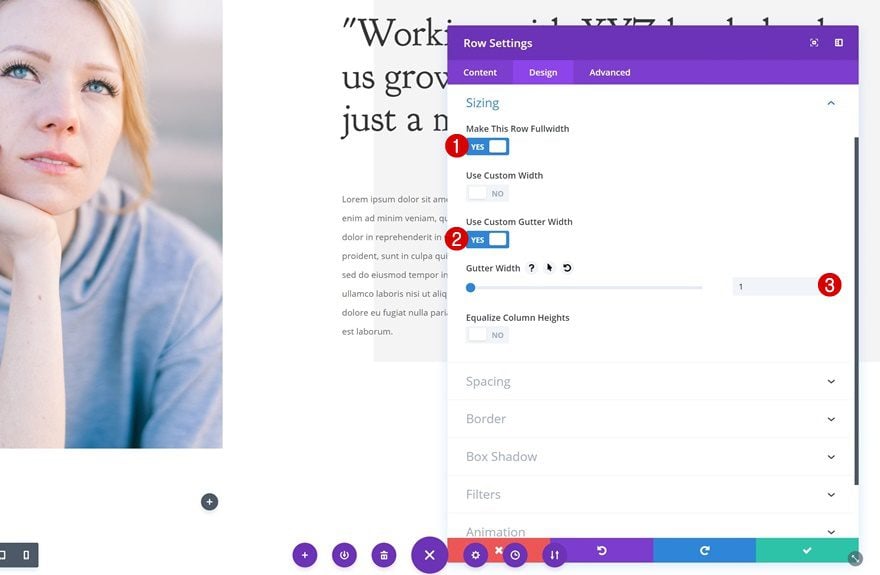
Sizing
Open the row settings and change the sizing settings.
- Make This Row Fullwidth: Yes
- Use Custom Gutter Width: Yes
- Gutter Width: 1
Spacing
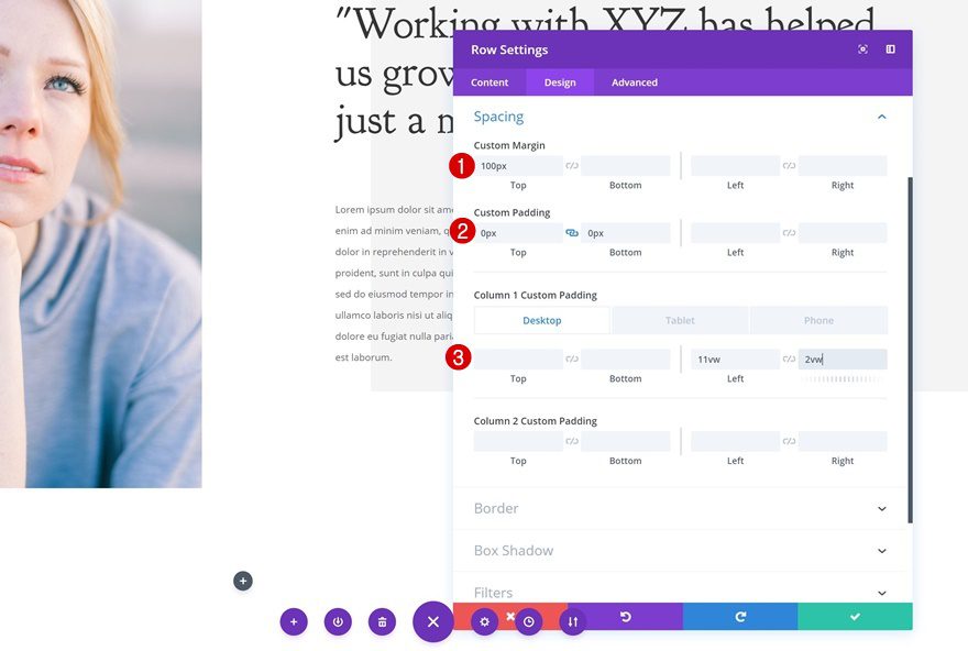
Add some custom spacing values next.
- Top Margin: 100px
- Top Padding: 0px
- Bottom Padding: 0px
- Column 1 Left Padding: 11vw (Desktop), 3vw (Tablet & Phone)
- Column 1 Right Padding: 2vw (Desktop), 3vw (Tablet & Phone)
Clone Text Modules of Previous Row & Place in Column 1
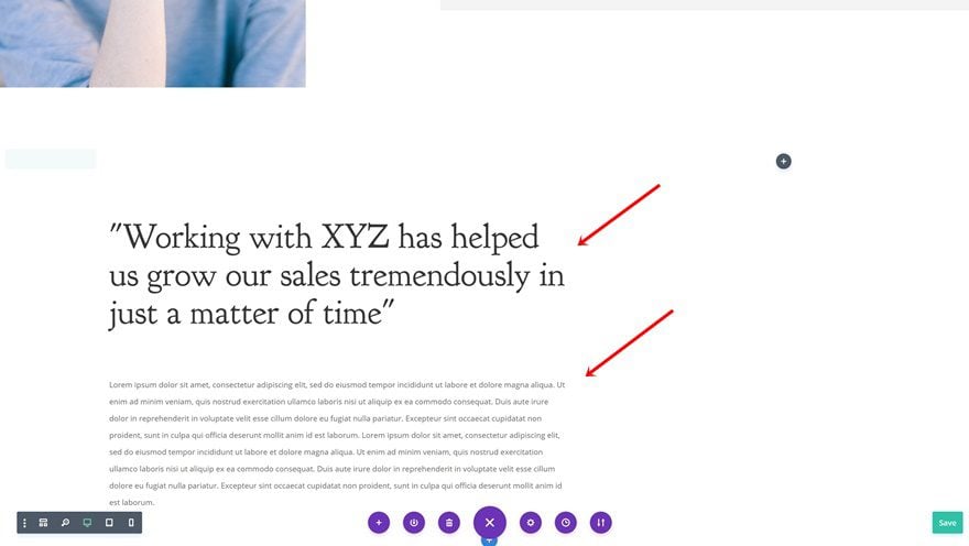
Go back to the previous row and clone both modules in column 2. Once you do, place the duplicates in the first column of the new row.
Change Text Orientation
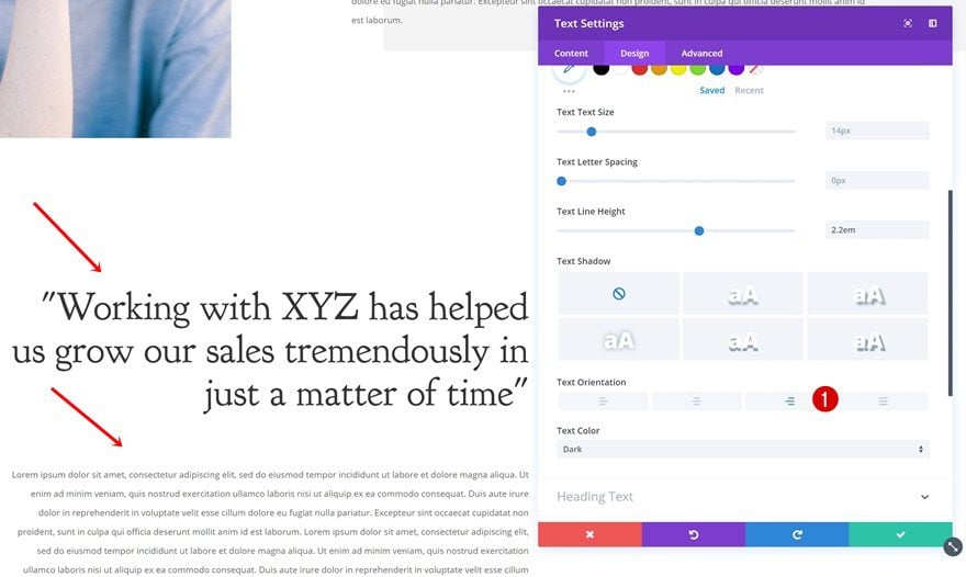
Change the text orientation of both modules.
- Text Orientation: Right
Add Image Module to Column 2
Upload Image
Next, add an Image Module to the second column and upload a new portrait image.
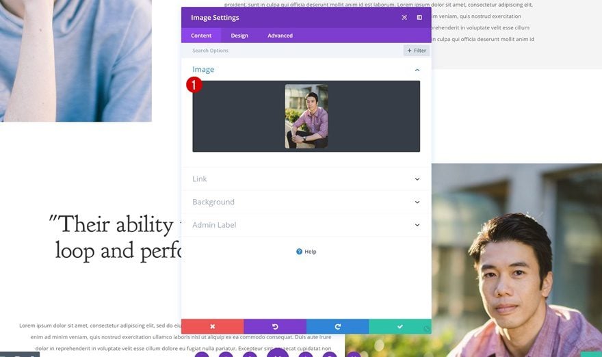
Image Alignment
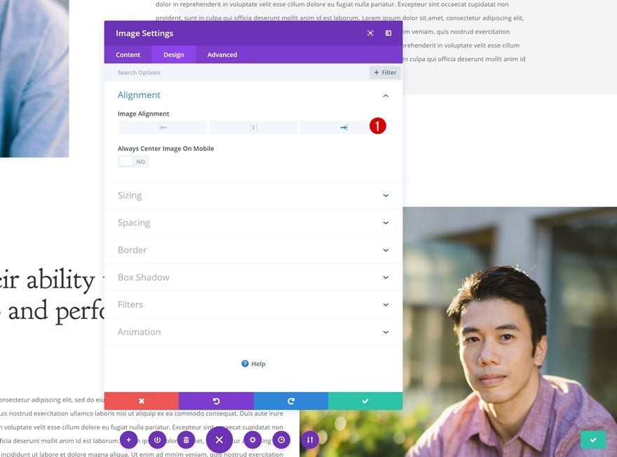
Change the image alignment of the module.
- Image Alignment: Right
Sizing
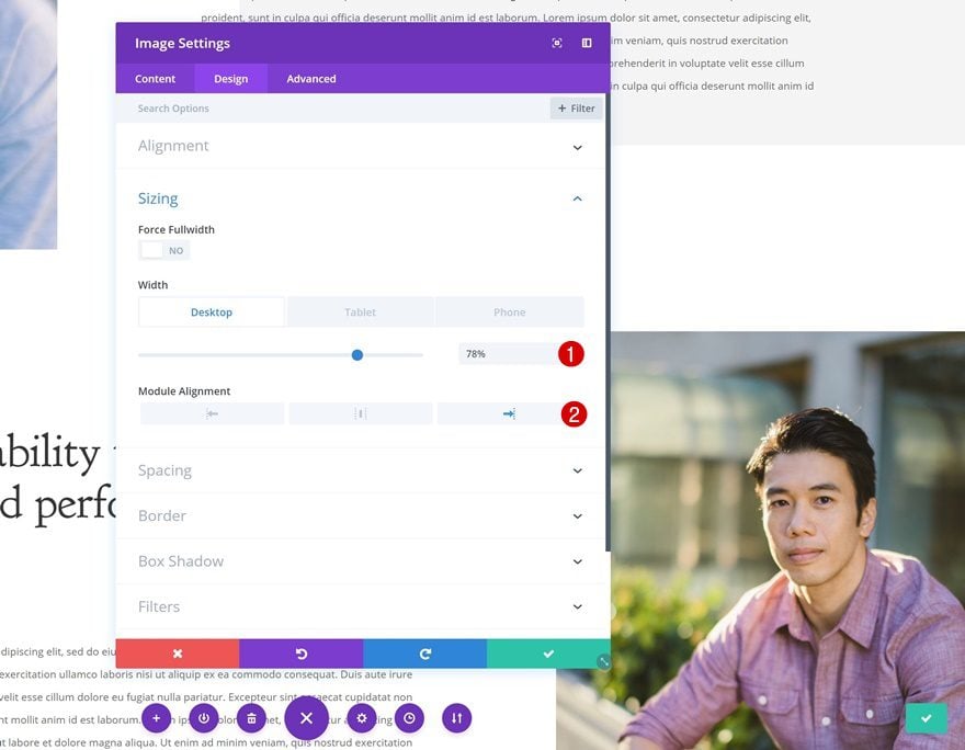
Continue by changing the sizing settings.
- Width: 78% (Desktop), 70% (Tablet & Phone)
- Module Alignment: Right
Spacing
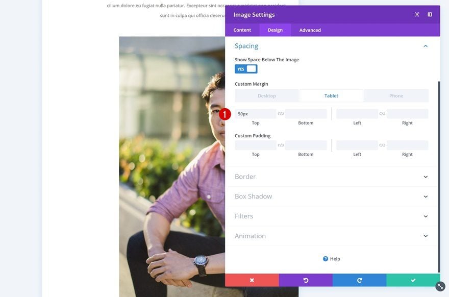
Add some custom spacing values as well.
- Top Margin: 50px (Tablet & Phone)
Add Hover Overlap Text Module to Column 2
Add Content
The last module we need to finish this design is a Text Module below the Image Module. Add the person’s details in the content box.
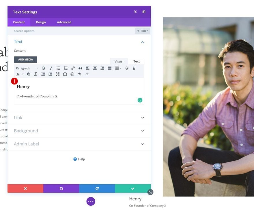
Default Background
Then, add a background image to the module.
- Background Color: rgba(255,255,255,0)
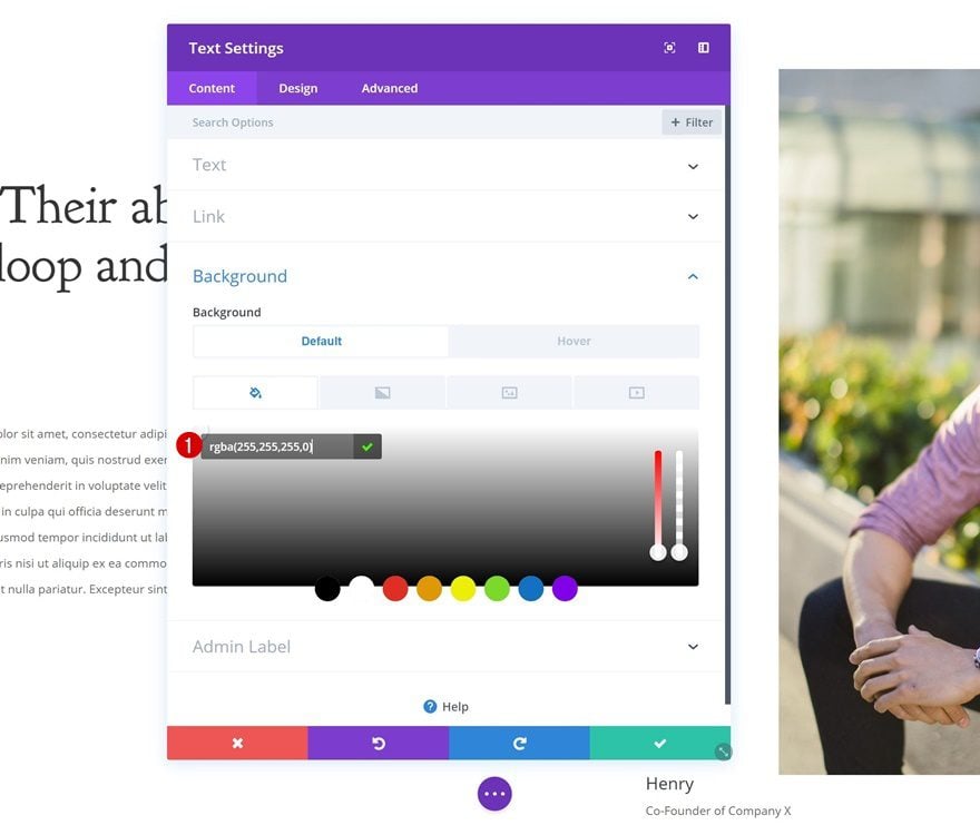
Hover Background
Change the background color on hover.
- Background Color: #690cff
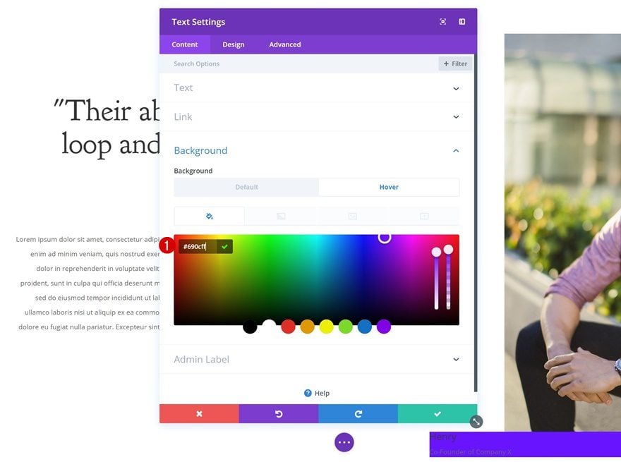
Default Text Settings
Change the text settings next.
- Text Color: #ffffff
- Text Size: 0px
- Text Line Height: 0px
- Text Orientation: Center
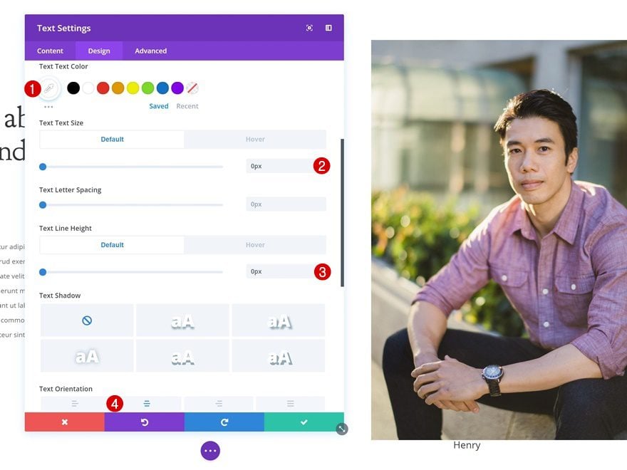
Hover Text Settings
Make some adjustments on hover.
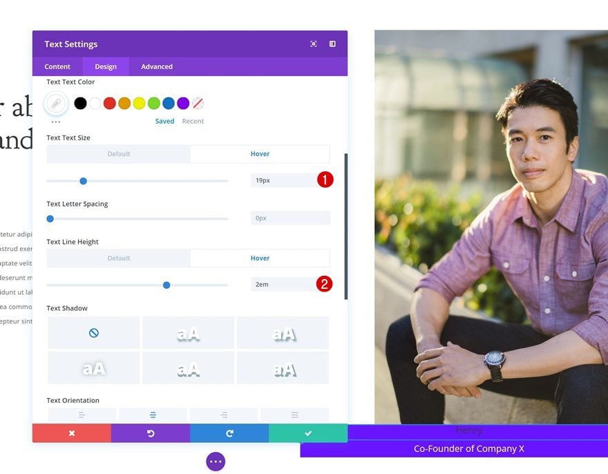
- Text Size: 19px
- Text Line Height: 2em
Default Heading Text Settings
Change the heading text settings as well.
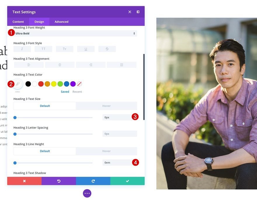
- Heading 3 Font Weight: Ultra Bold
- Heading 3 Text Color: #ffffff
- Heading 3 Text Size: 0px
- Heading 3 Line Height: 0em
Hover Heading Text Settings
With some small tweaks on hover.
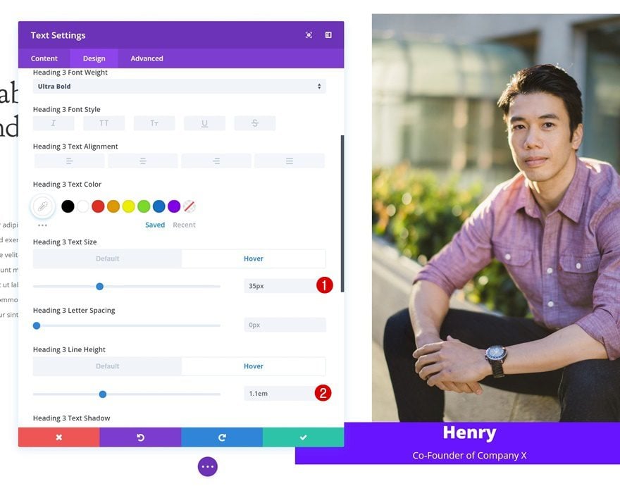
- Heading 3 Text Size: 35px
- Heading 3 Line Height: 1.1em
Spacing
Continue by going to the spacing settings and add some custom values.
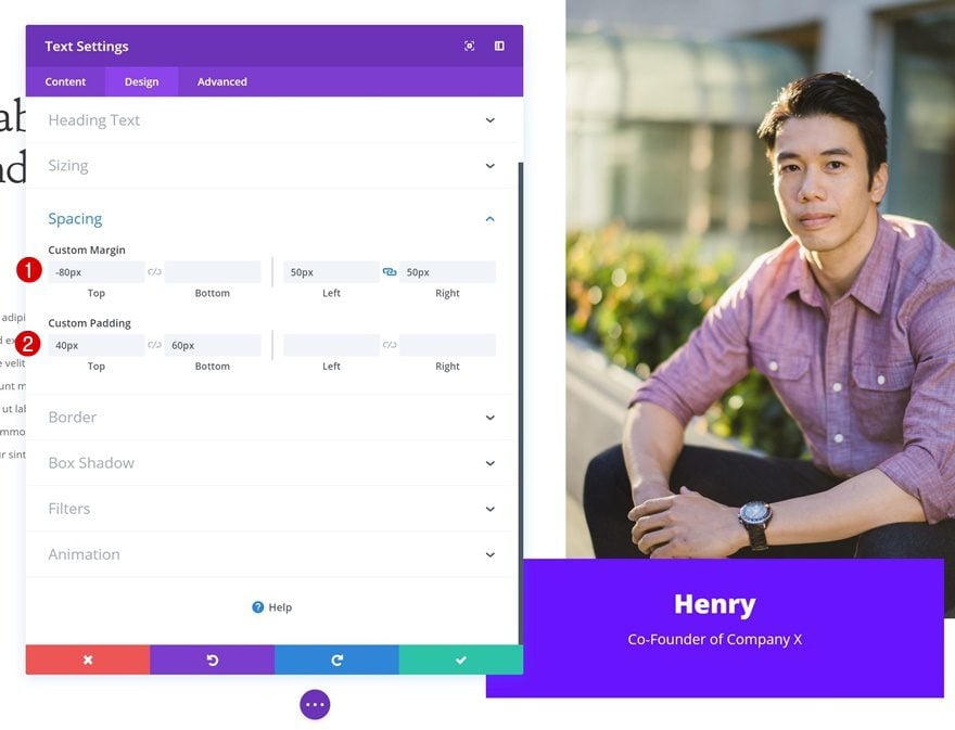
- Top Margin: -80px
- Left Margin: 50px
- Right Margin: 50px
- Top Padding: 40px
- Bottom Padding: 60px
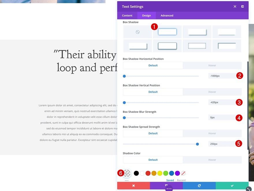
Default Box Shadow
Add a default box shadow to the Text Module.
- Box Shadow Horizontal Position: -1000px
- Box Shadow Vertical Position: -420px
- Box Shadow Blur Strength: 0px
- Box Shadow Spread Strength: 250px
- Shadow Color: rgba(175,175,175,0.13)
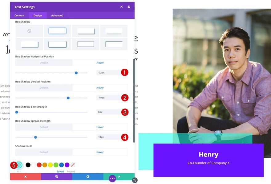
Hover Box Shadow
And change the box shadow on hover.
- Box Shadow Horizontal Position: -73px
- Box Shadow Vertical Position: -49px
- Box Shadow Blur Strength: 0px
- Box Shadow Spread Strength: 10px
- Shadow Color: rgba(12,255,238,0.53)
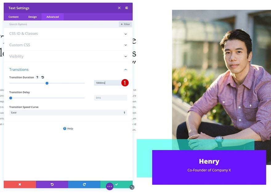
Transitions
Last but not least, create a smooth transition by changing the transition duration.
- Transition Duration: 1000ms
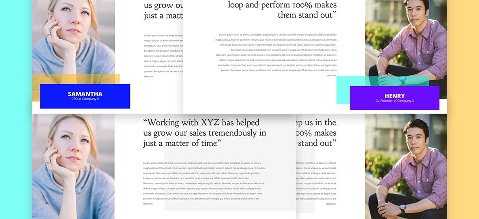
Preview
Now that we’ve gone through all steps, let’s take a final look at the end result!

Final Thoughts
We hope this post inspired you to create stunning testimonial sections using hover overlaps! They really help you add another dimension to your website without having to spend a lot of time coding or figuring things out. If you have any questions or suggestions, make sure you leave a comment in the comment section below!





There’s is one very useful hover effects I appreciate and which make sens in a UI perspective. It’s visible in the Nexus theme (elegantthemes):
https://www.elegantthemes.com/demo/?theme=Nexus
If someone has a clue on how it’s done, I would be pleased to find a tutorial about it.
nice
How does this behave on mobile or touch-screens?
Will touching that spot give same result?
May I suggest that all tutorials now consider these things please?
Hello,
Really a good tutorial and a very good use of the “Hover” mode of Divi.
Thank you
It is awesome. I appreciated it. Your blog information is very knowledgeable, and I like your style to explain your blogging skills. Your blogging toolkit information is excellent and genuine. Thank you for sharing.
I’m glad I read the comments before I read the blog. Webdesign is already as much of a mystery as I can handle without mystic spots.
Donjete,
While it’s very interesting and charming idea, I wonder is it a good practice from UI perspective that there is a ‘mystic’ place on the page where something happens IF the user places his/her cursor? Meaning: wouldn’t it be better to place a button (text box, whatever) with the name and only animate the grey/blue box? Sometimes less is more.
I agree, a lot of user would never get to see the effect, because there is nothing to suggest wher they should hover. Animating just the grey/blue background seems like a better idea. 🙂
I will say this design is fully different from what we usually see and looks nice. I will agree with you that is is a bit of a UI mess as you have to be in a certain spot to get the animation to even show up.
My Blog is beautiful thanks to you