A blog’s “Read More” links can be a crucial element for boosting user experience. So it’s important that we know how to customize it properly. In Divi, the “Read More” link can be customized within the Blog Module along with many other elements that make up the blog content. In this tutorial, we’ll be showing you how to customize the “Read More” link in the Divi Blog Module so that you have more control over the design.
In this post we’ll show you how to:
– Style the Read More” link using Divi’s built-in options
– Align the Read More” link (left, center, right)
– Turn the Read More link into a fullwidth button
– Create a custom “Read More” button design with hover effects
– Change the “Read More” text to something else (like “Visit Post”).
Sneak Peek
Here is a quick look at the design we’ll build in this tutorial.

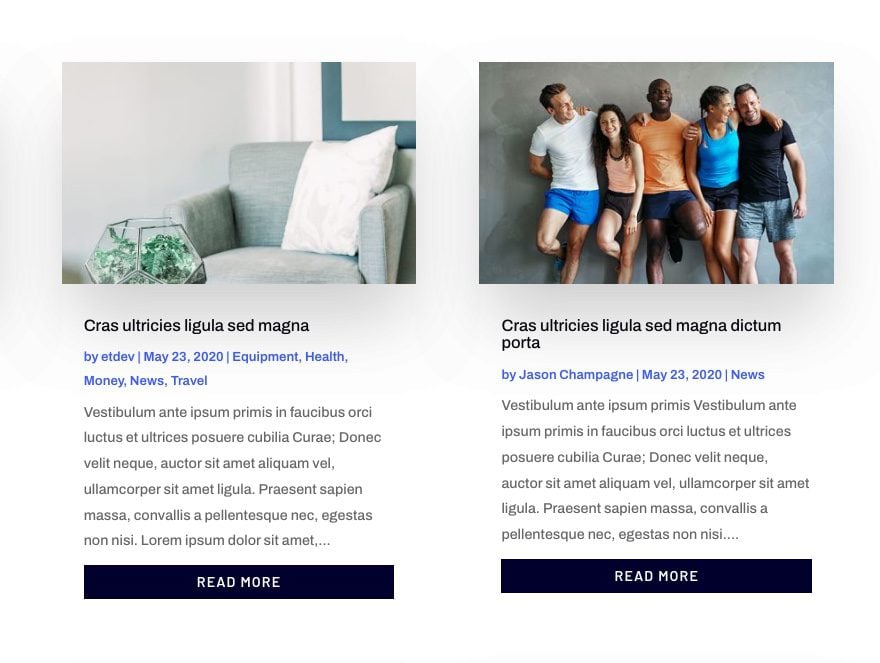
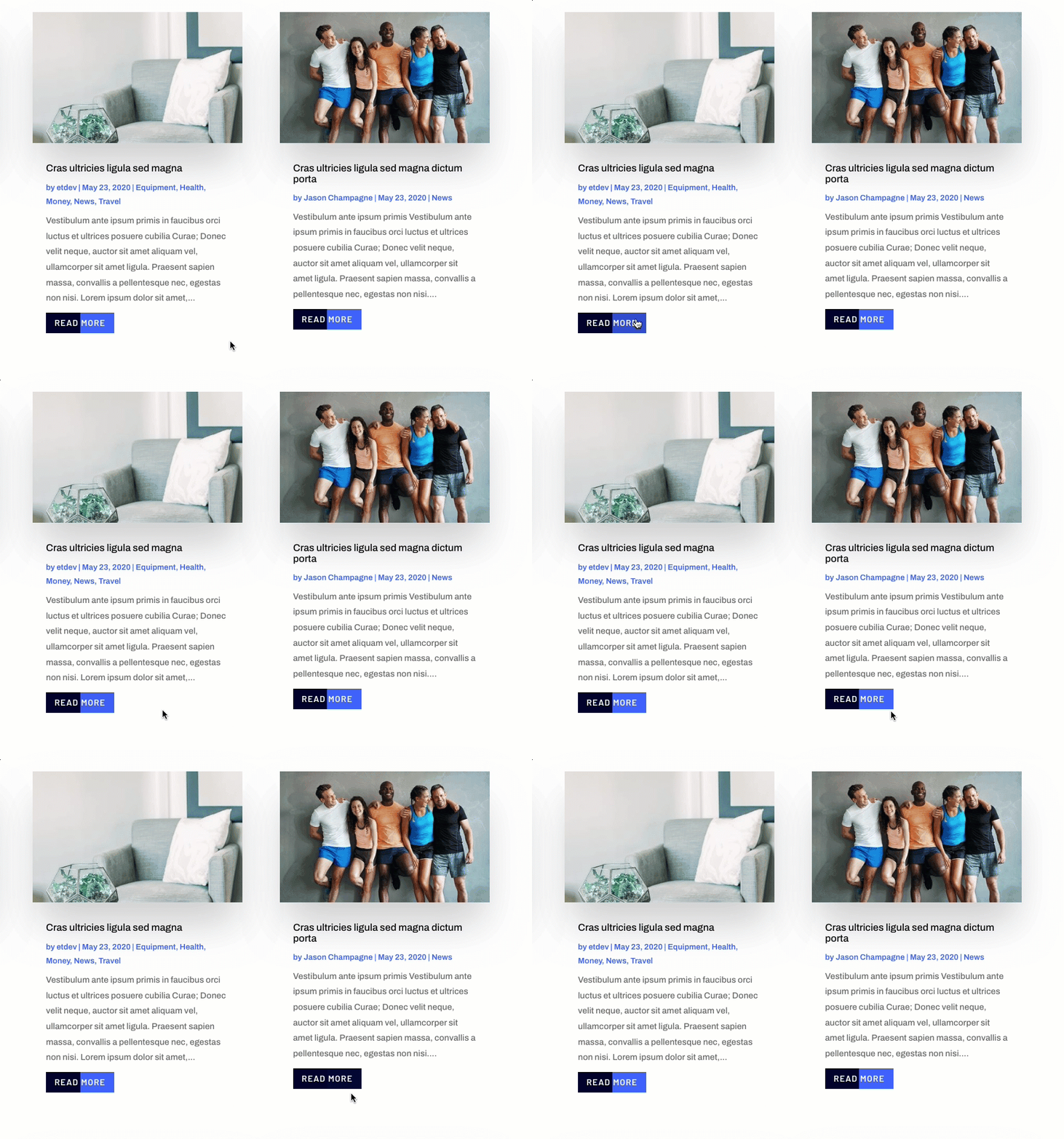
Download the Layout for FREE
To lay your hands on the designs from this tutorial, you will first need to download it using the button below. To gain access to the download you will need to subscribe to our newsletter by using the form below. As a new subscriber, you will receive even more Divi goodness and a free Divi Layout pack every Monday! If you’re already on the list, simply enter your email address below and click download. You will not be “resubscribed” or receive extra emails.
Subscribe To Our Youtube Channel
To import the section layout to your Divi Library, navigate to the Divi Library.
Click the Import button.
In the portability popup, select the import tab and choose the download file from your computer.
Then click the import button.
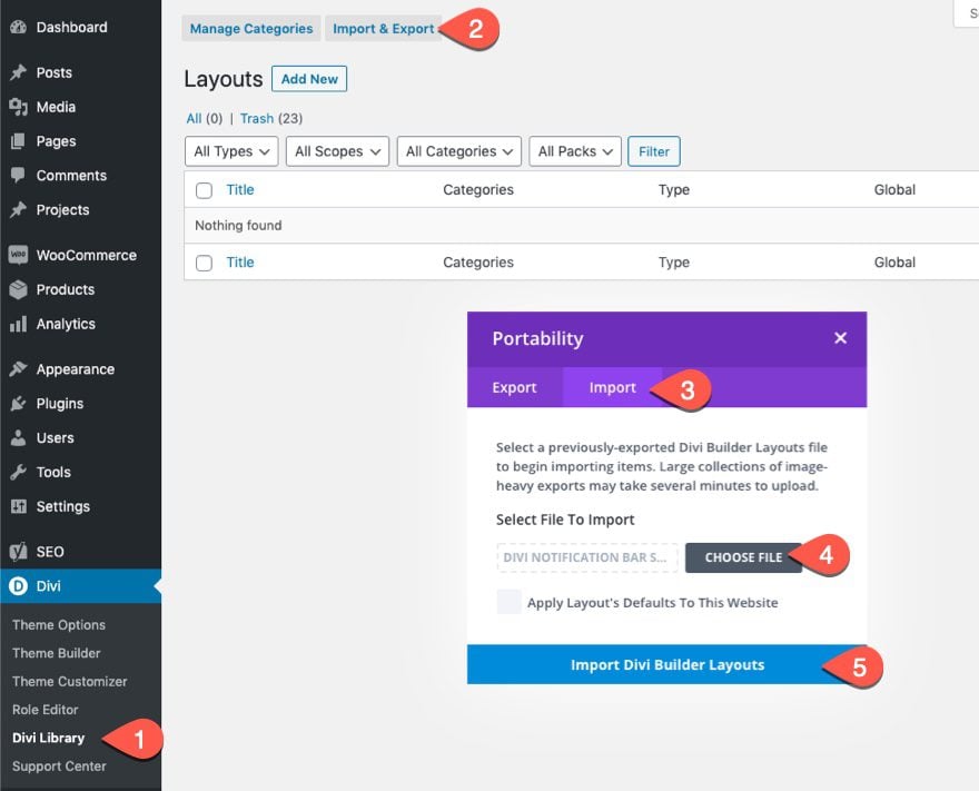
Once done, the section layout will be available in the Divi Builder.
Let’s get to the tutorial, shall we?
How to Customize the “Read More” Link in the Divi Blog Module
Loading a Blog Module to a Page Using the Divi Builder
To get started customizing the “Read More” links, you will need access to a Divi Blog Module when editing a page from the Divi Builder on the front end. You can load a premade layout with any blog module you want or simply add a new blog module to a page. To jump-start the process, we are going to be using the Blog Page Template from the Artificial Intelligence Layout Pack.
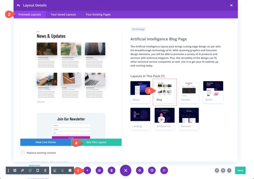
Part 1: Styling and Aligning the Read More Link Text
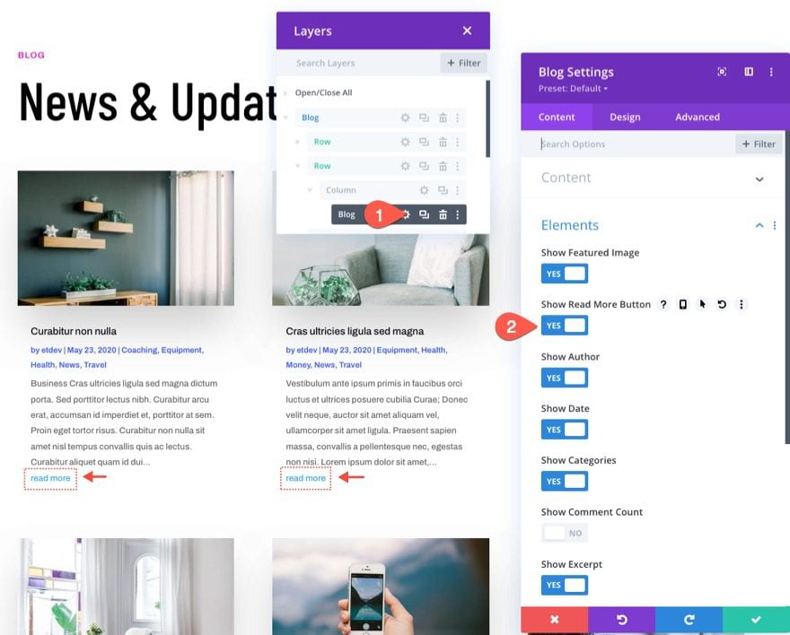
Every Blog Module has the option to show or hide the read more link for each article in the layout. In order to display the read more link, open the blog settings and toggle the “Show Read More Button” option to “YES” from the list of blog elements you want to be displayed.
Styling the Read More Text with Divi’s Built-in Options
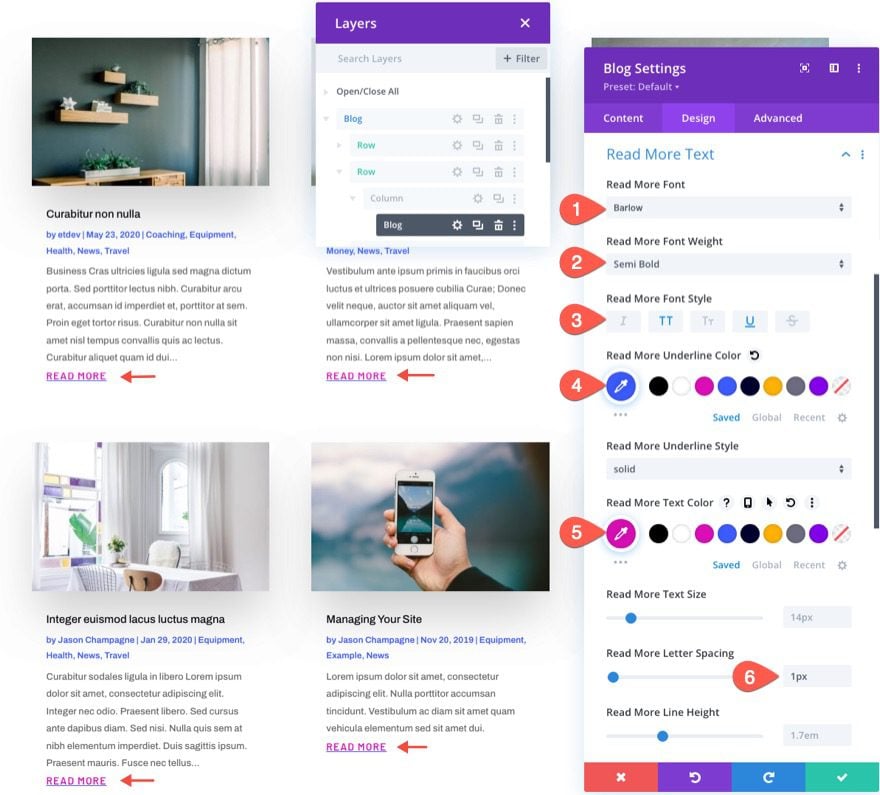
Under the design tab, you can style the read more text using any of the built-in options. For this example, let’s update the following:
- Read More Font: Barlow
- Read More Font Weight: Semi Bold
- Read More Font Style: Uppercase (TT), Underline (U)
- Read More Underline Color: #3c5bff
- Read More Text Color: #db0eb7
- Read More Letter Spacing: 1px
Here is the result.
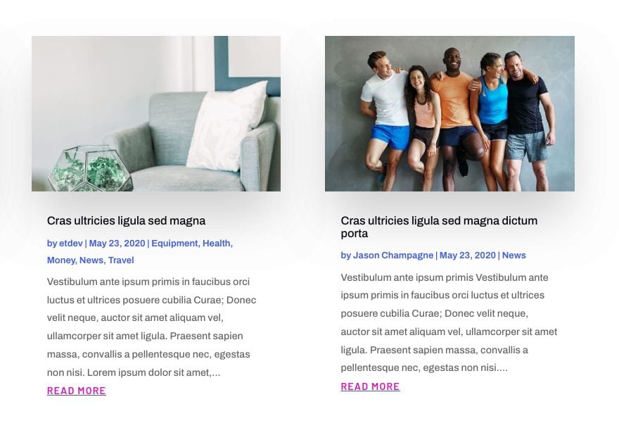
Aligning the Read More Link
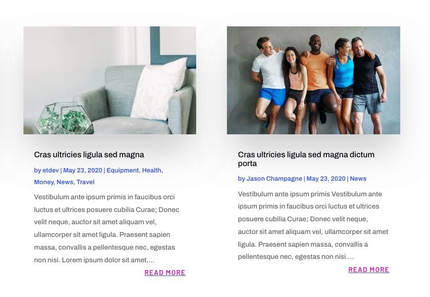
Currently, the “Read More” link will sit inline to the left by default unless you change the text alignment of the body text. To align the link to the center or right of the post, you add a snippet of CSS as follows:
Under the advanced tab of the blog settings, add the following CSS to the Read More Button CSS:
display: block;
text-align: right;
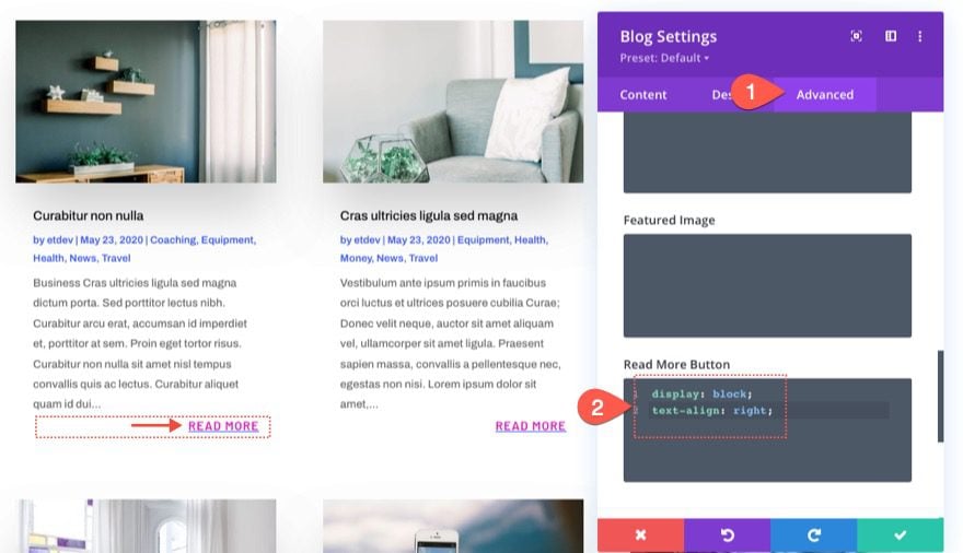
The “display:block” will change the link to a block element that spans the full width of its container (in this case, the post content body). Once a block element, we can align the text to the right using text-align:right.
Here’s the result.
In order to make the link centered, simply replace right with center for the text-align property value as follows:
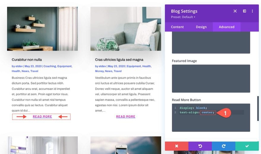
Here is the result.

Creating a Simple Fullwidth Button Style with CSS
For this example, we are going to create a simple fullwidth button style for the “Read More” link. Before we add the custom CSS, open the blog settings and update the Read More Text design as follows:
- Read More Font Style: Uppercase
- Read More Text Color: #fff
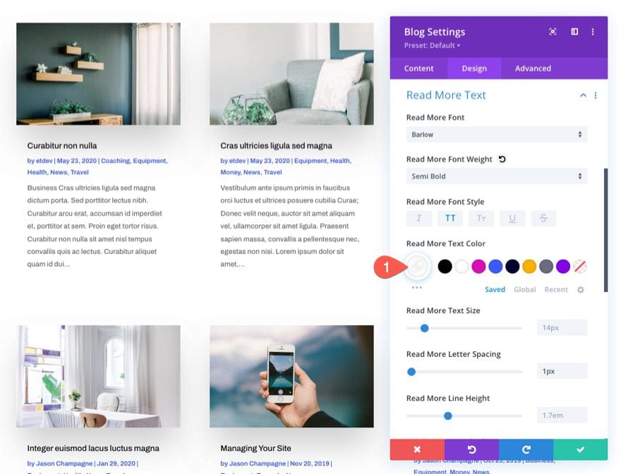
In the previous example, we used display:block and text-align:center to get the link to span the fullwidth of the container and center the text. To make it look like a button, all we need to do is add a background color and spacing with a few more snippets of CSS.
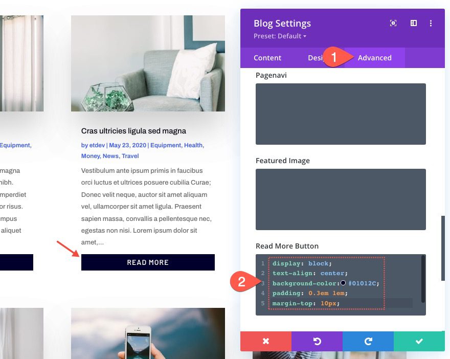
To create a fullwidth button style for the “Read More” link, go to the advanced tab and update the Read More Button CSS as follows:
display: block;
text-align: center;
background-color:#01012C;
padding: 0.3em 1em;
margin-top: 10px;
The Result
Here is the result!

Creating an Advanced Button Style and Hover Effect with CSS
If you are wanting to take the button style to another level, we can add a more advanced background and hover effect.
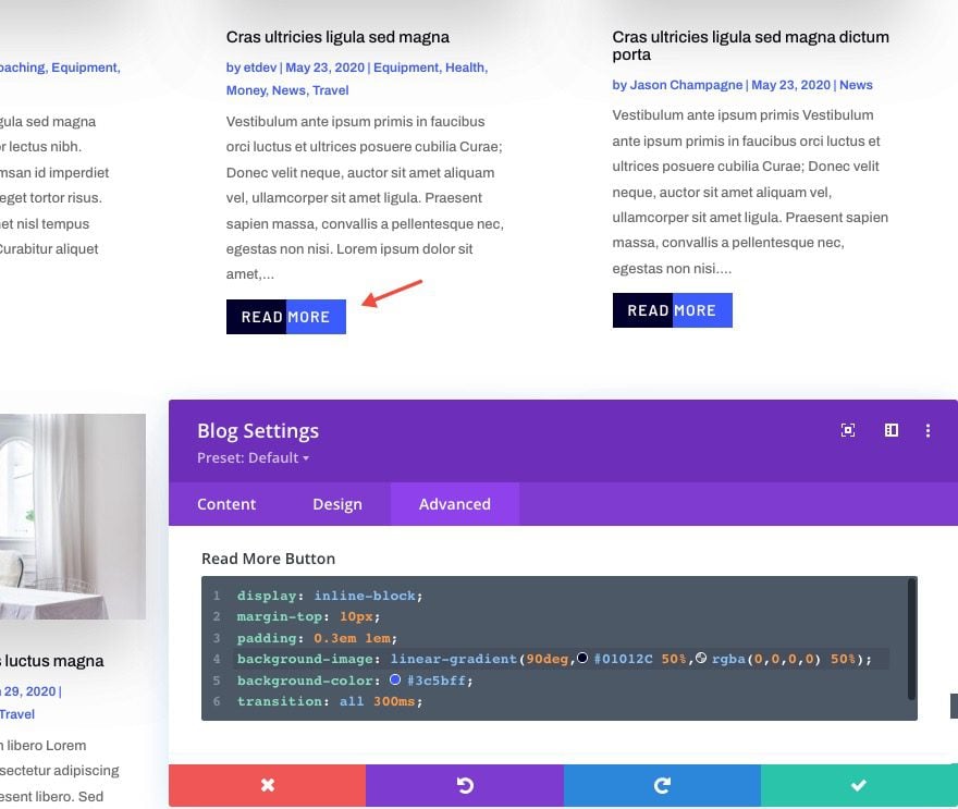
To do this, replace the Read More Button CSS with the following:
display: inline-block;
margin-top: 10px;
padding: 0.3em 1em;
background-image: linear-gradient(90deg,#01012C 50%,rgba(0,0,0,0) 50%);
background-color: #3c5bff;
transition: all 300ms;
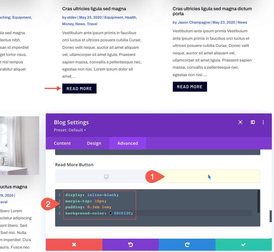
To change the background on hover, you can paste the following CSS to the Read More Button in the hover state:
display: inline-block;
margin-top: 10px;
padding: 0.3em 1em;
background-color: #01012C;
The Result
Here is the result!

Part 3: Changing the “Read More” Text to Something Else
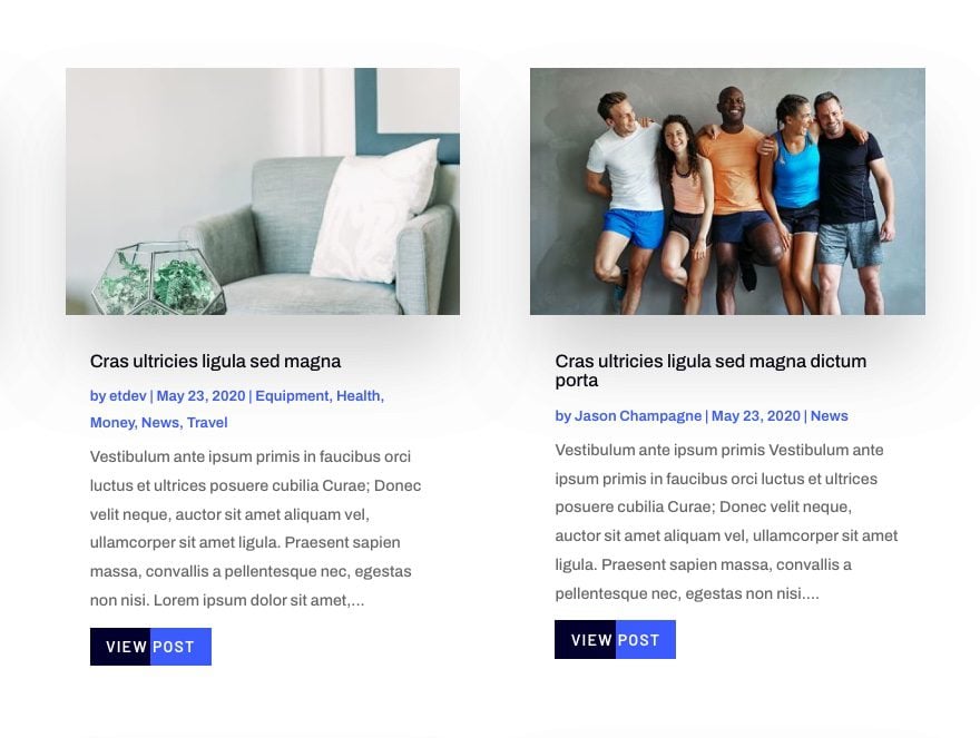
In order to change the text “read more” to something else, like “visit post”, we will need a little jQuery to make it happen. But don’t worry, it is only a few lines.
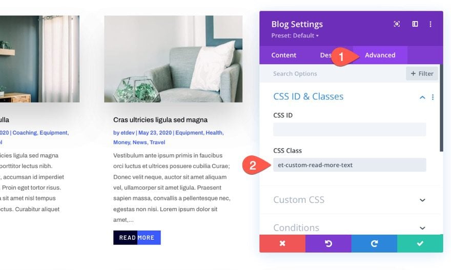
Before we add our jQuery code, add a custom CSS Class to the blog module as follows:
- CSS Class: et-custom-read-more-text
NOTE: Make sure the class name is exact so the jQuery will work.
To add the jQuery that changes the “Read More” text, add a code module under the blog module.
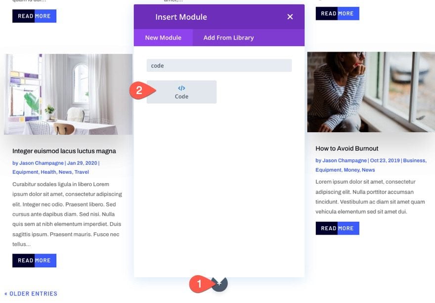
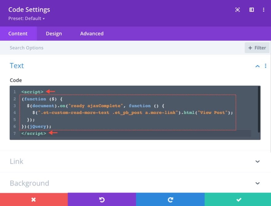
Then paste the following jQuery code making sure to wrap the code with the necessary script tags:
(function ($) {
  $(document).on("ready ajaxComplete", function () {
    $(".et-custom-read-more-text .et_pb_post a.more-link").html("View Post");
  });
})(jQuery);
This code basically tells the browser to change the “Read More” link text to “View Post” once the page loads or once more blog posts are loaded with the blog module’s pagination (ajax).
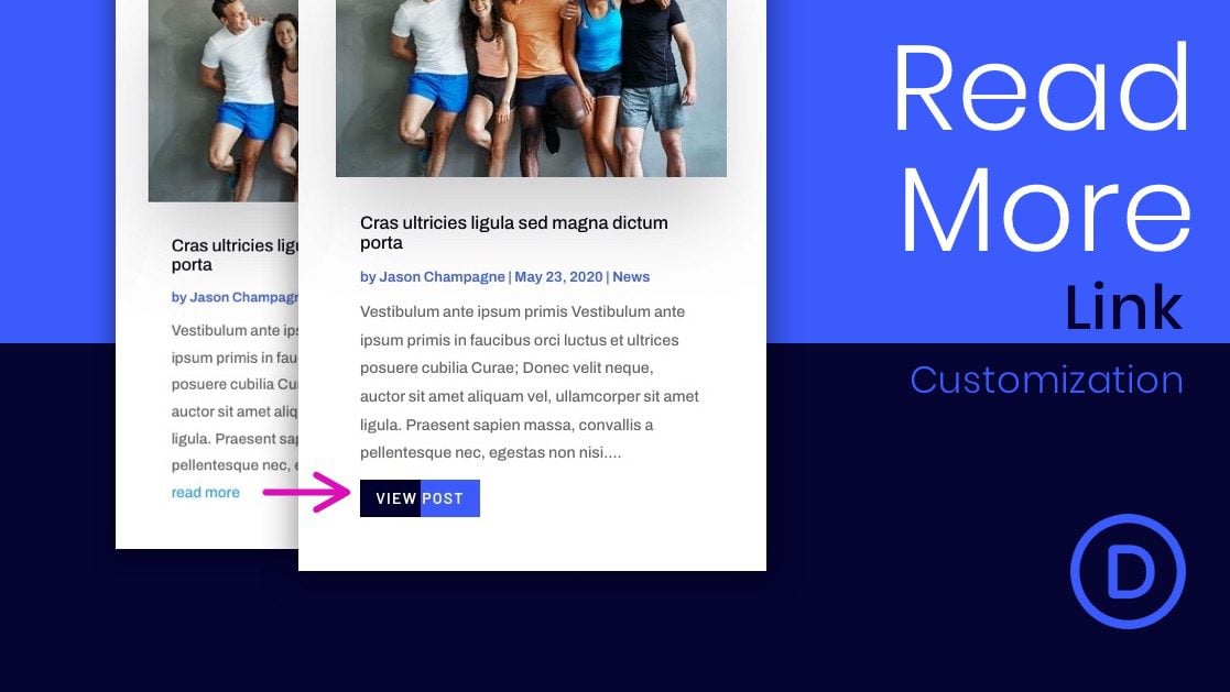
The Result
Here is the result!

Final Results
Here is another look at the final “Read More” link (or button) designs we completed.


Final Thoughts
Divi’s blog module allows you to target the design of the “Read More” link in creative ways. And if you want to experiment with a few snippets of CSS, you can create even more advanced designs of your own. Hopefully, this tutorial will help you take those “Read More” links to the next level.
I look forward to hearing from you in the comments.
Cheers!



Great tutorial, saved my day!
How can I add an icon in the ‘hover’ state? I would like it to appear with the same transition as the standard buttons.
Hi!
I try this tuto to change the text of the blog cards. It works fine, except when navigating through the paginations. Using pgination breaks everything.
Any solution?
Hi I can’t get the changing the text code to work, is there any other way to do it?
Thank you, this was helpful!
Elegant Themes shoud seriously improve Blog Module, we usually need to do a lot of this css customizations as the module doesn’t have too much options.
Interesting, thanks Jason for posting this guide. I actually have quite a lot of “read more” buttons on different sites I made with Divi, but they have the same designs. This will help to switch it up a bit between the sites.
Great! Glad it helped. Thanks for sharing, Julien.
Thanks for sharing the Readmore link in the Divi blog module. I really appreciated your detailed step-by-step guide.
You’re welcome, whinkz. We appreciate your support!
Changing the Read More text….. after all these years…. should just be in the module options by now.
+1
Riaz,
Thanks for the feedback. There is always room for improvement. We’ll get there.
Just came across an issue with “Read More” links not being ADA compliant. The issue being the text is not descriptive enough for screen readers and is there are multiple on a page. Other CMSs add an aria description based on the post title. Is that something Divi can handle? Or WordPress?
Interesting. I’ll have to look into that. I’m not sure if changing the text from “read more” to something else would help. But I did mention how to do that in this post. Thanks.