What happens when visitors subscribe to your email is an important interaction that’s often overlooked. Divi informs the that the subscription was successful by default, but we can customize it even further. Creating and customizing a Divi success message is easy with the email optin module. In this post, we’ll show you how! We’ll also examine the alternative and see a few tips on creating a great Divi success message.
Let’s get started.
Preview
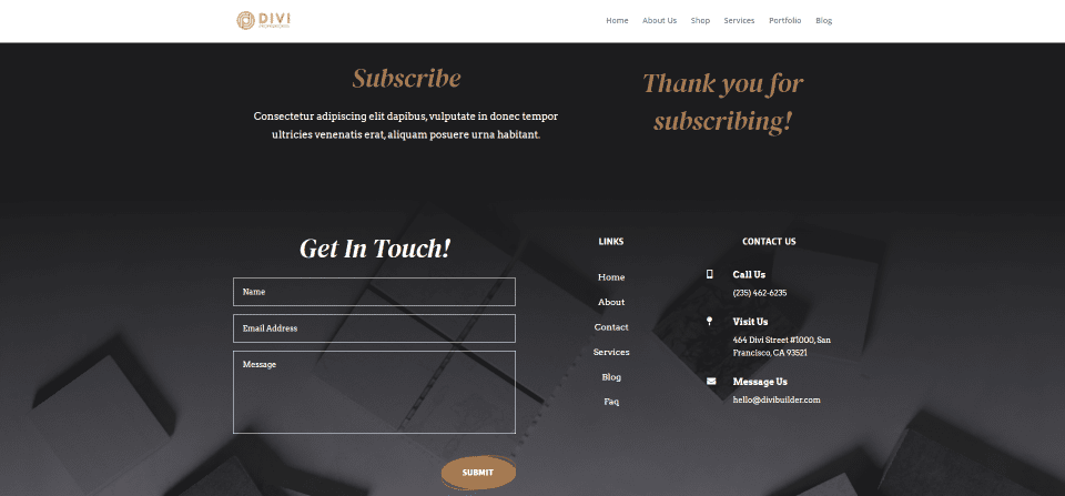
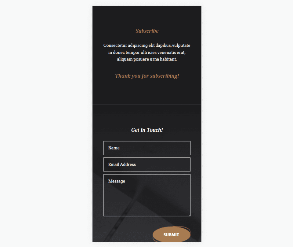
First, let’s take a look at how our Divi success message will appear on desktops and phones.
Desktop
Phone
Divi Success Message Area
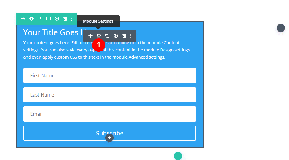
To find the Divi success message area within the email optin module, first, open the module’s settings by clicking the gray gear icon that appears when you hover over the module.
The module’s settings open to the Content tab. Here, you’ll find settings for Text, Email Account, Fields, Success Action, Spam Protection, Link, Background, and Admin Label.
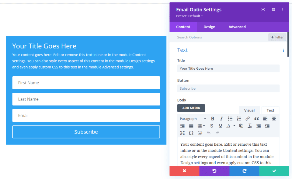
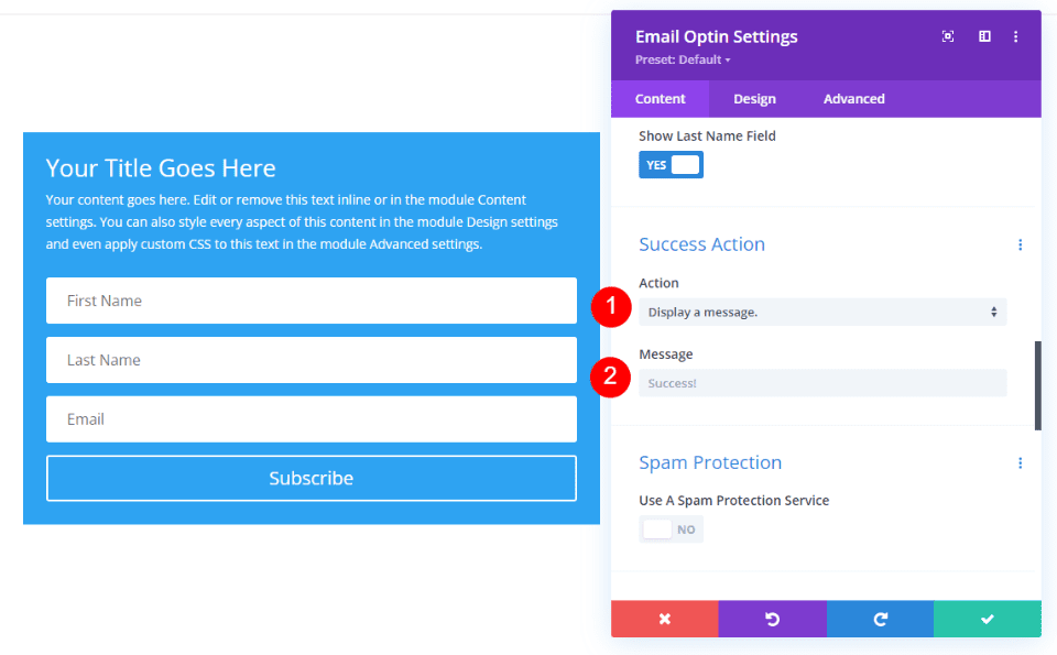
Scroll down to Success Action. Here, you’ll see two default options: Action and Message. Action is what happens after the email form is submitted. Action has a dropdown where you can select to display a message or redirect the user to a different URL. Message is a field where you can enter the text that will display once the Action is triggered.
Display a Divi Success Message
Display a Message is the default Success Action, so we won’t need to make changes in the Action settings. We can move on to the Message field. To display a custom message, simply enter the text into the Message field. The default message is Success! This will display unless you enter a new message into the field.

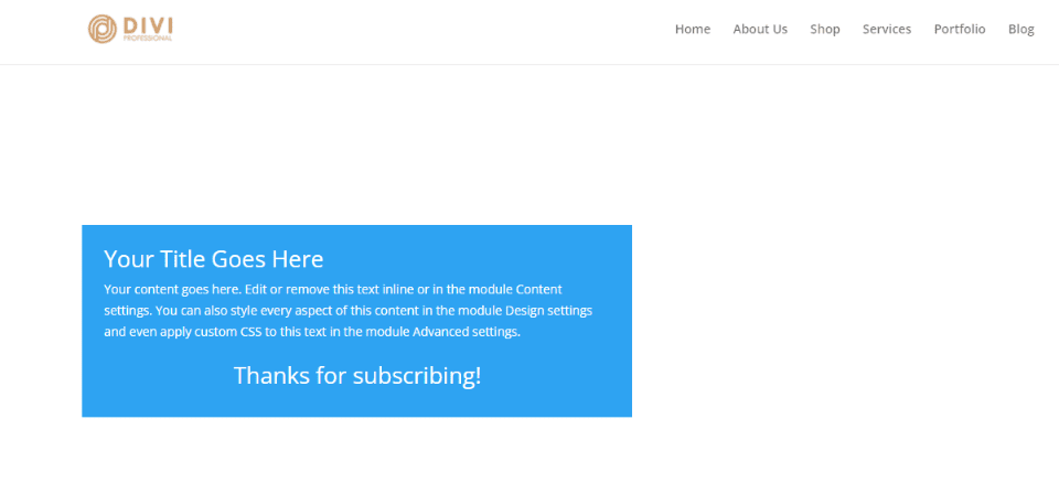
Now, when someone subscribes to your email, the fields and the button in the form are replaced with the success message. The form still includes the title and description as normal, as you can see in the example below.
Alternate Option: Redirect to a Custom URL
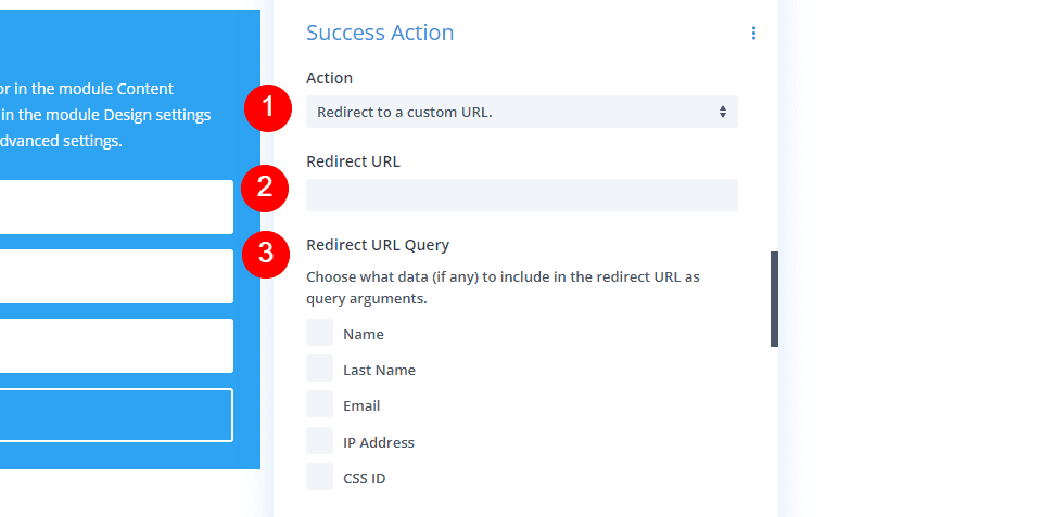
Rather than displaying a message, you also have the option to redirect the user to a new page. This new page can include anything you want, such as a CTA, free download, information, detailed welcome message, etc. To activate it, select the Action dropdown box and click Redirect to a custom URL.
- Action: Redirect to a custom URL

Selecting to redirect to a custom URL opens a different set of options. It includes a field where you’ll enter the URL and a set of boxes to check that allows you to choose the data that will be included with the redirect. As soon as the user submits the form, they’re automatically redirected to the URL you specified.
Style the Divi Success Message
When you select Display a Message, you can style that message using the Divi styling tools within the email optin module. For our example, I’ll use the email optin section from the free Stone Factory Layout Pack that’s available within Divi. The title and description for this section were created with text modules. We’ll use settings from the title.

Here’s a look at the Divi success message that’s displayed for this layout. This is the default message and styling.

We will add a custom Divi success message and style it with design prompts from this layout.
Add a Custom Divi Success Message
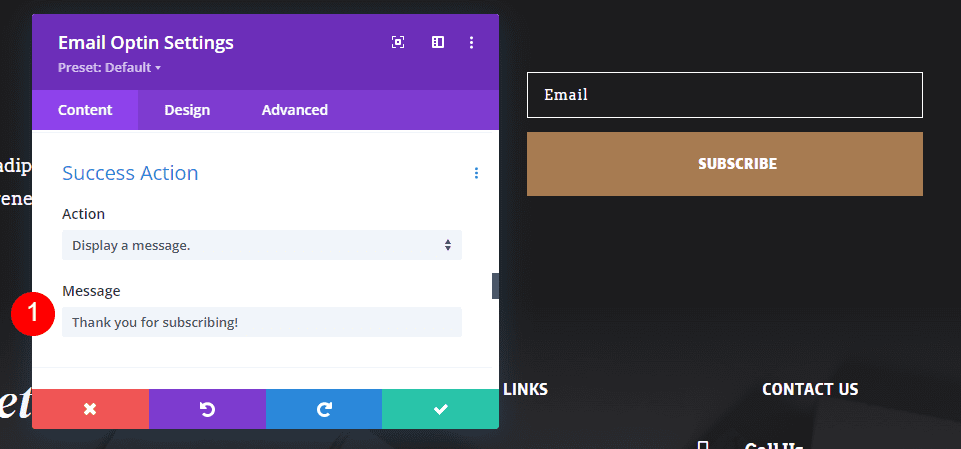
First, let’s replace the default message with one of our own. Open the optin module’s settings, scroll down to Success Action, and enter your text into the Message field. I’m entering Thank you for subscribing!
- Message: Thank you for subscribing!
Add the Divi Success Message Styling
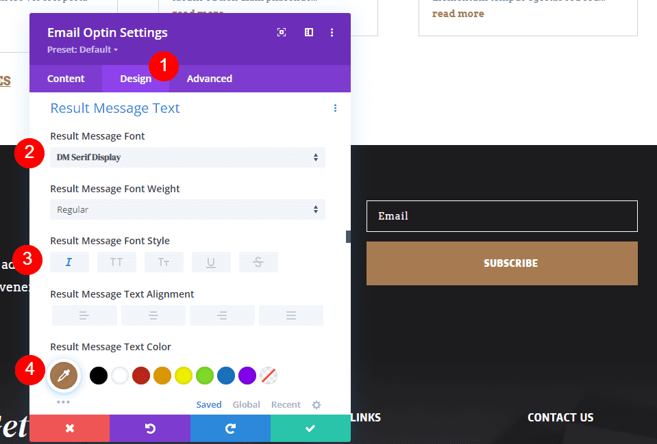
Next, select the Design tab and scroll down to the section labeled Result Message Text. All the styling is done in this section. We won’t see the Divi success message as we style it because the module displays the email form during the design process.
Change the Font to DM Serif Display, the Style to Italic, and the Color to #a77b51.
- Font: DM Serif Display
- Style: Italic
- Color: #a77b51
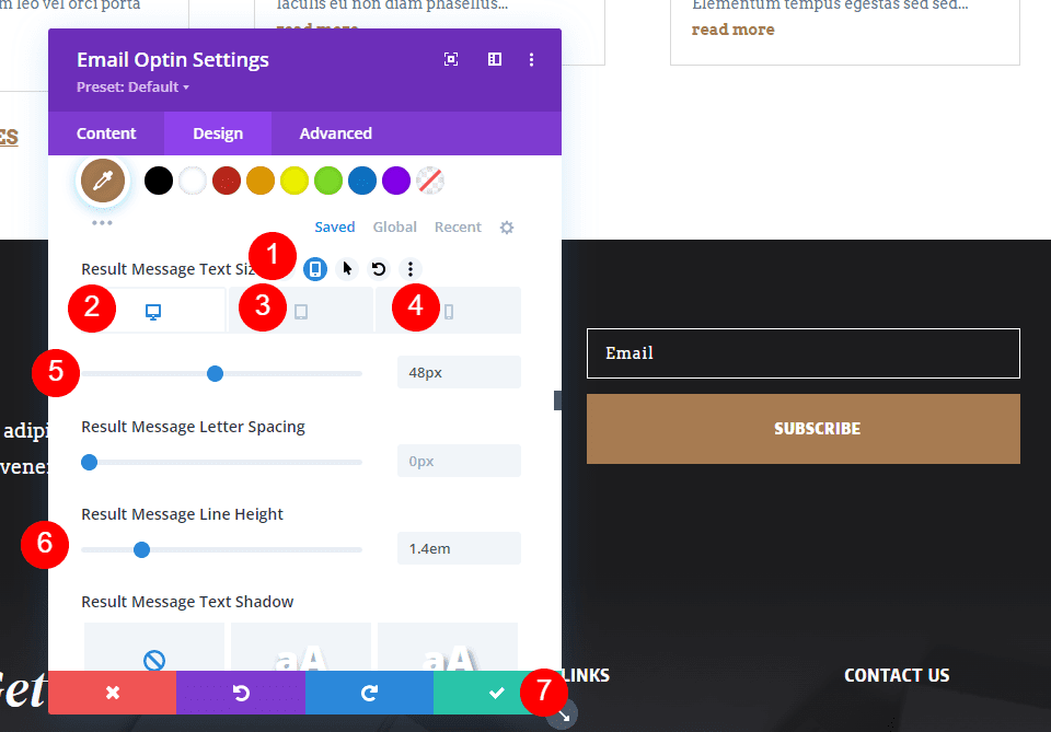
Next, hover over Result Message Text Size and select the tablet icon. Choose the Desktop tab and change the Size to 48px. Select the Tablet tab and set it to 32px. Select the Phone tab and change it to 20px. Finally, set the Line Height to 1.4em. The extra Line Height will give the message some space between the lines to make it easier to read. Lastly, close the email optin settings and save your page.
- Size: Desktop 48px, Tablet 32px, Phone 20px
- Line Height: 1.4em
Here’s the form with the Divi success message.

Crafting a Great Divi Success Message
Next, let’s consider a few tips to improve the success message. It’s important to have a clear sign-up success message so the users know the email form worked. This simple message doesn’t have to provide a lot of information. That can be left to the introductory email, the information provided around the email optin form, or a page you redirect them to if you use that option instead of the success message.
The Divi success message just needs to provide simple feedback that the subscription was a success and that they’ll be receiving emails from you. With this in mind, here are a few tips on crafting your Divi success message.
Divi Success Message Tips
Consider customer behavior and psychology. Think of the success message as feedback from a micro-interaction. This can help humanize your brand. Create the message with your brand in mind.
Remember that an email optin success message is you interacting with your readers. Use the message to provide good interaction with your subscribers. Be professional and on-brand. Use this as an opportunity to tell them you appreciate them.
Focus on the purpose of the message. Keep it simple. Don’t write a paragraph, just a few words. Use informative words that make sense for the situation. A simple Thank You or You’ve Subscribed is better than something that doesn’t describe what’s happened, such as You’ve Done it or Yes!
Good choices include:
- Thanks!
- Thank you!
- Thanks for Subscribing
- You’ve Subscribed
- Welcome!
- Success!
- Thanks! Your first email will arrive soon!
- Success! Please check your inbox
- Thanks for signing up!
- Subscription Successful!
Use the message option unless you need to provide more than a simple message. Don’t use the URL redirect just to say thank you.
Style the message so it matches your website. Also, make sure it’s mobile-friendly. The message should look and feel like it’s a part of your website’s experience and work well on any device.
Results
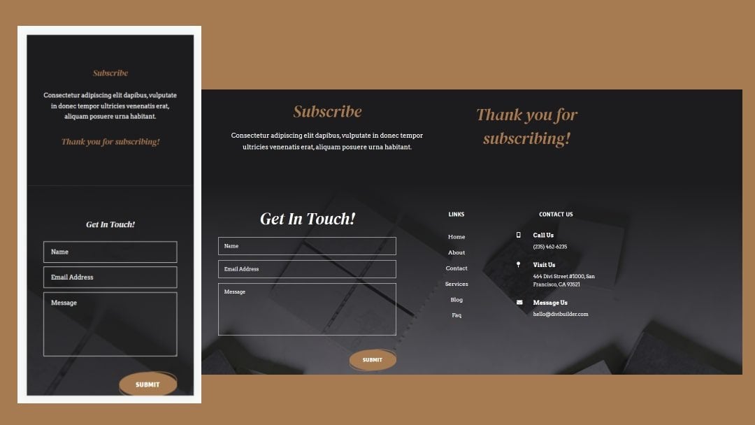
Here’s a look at how our Divi success message looks on desktops and phones.
Desktop

Phone

Ending Thoughts
That’s our look at how to customize the Divi success message in your Divi email optin module. The success message is enabled by default and the module has a default message, but it’s still a good idea to customize it to match your brand. Taking that extra step of customizing the success message can improve your visitor’s impression of your website and brand. Customizing it is simple with the email module’s tools.
We want to hear from you. Have you customized your success action in your Divi email optin form? Let us know about it in the comments.



There doesn’t seem to be an option if the person has already signed up for that list. I know we think a person would remember if they have or not, but I’ve personally signed up a couple of times for the same list either because I forgot or because there was a different reward attached to signing up the additional time. Bloom also doesn’t seem to have that option as well.
Same issue as Wendy. There is no “Result Message Text’ option.
I’m not seeing any settings for the Success message in the Contact Form. Also the validation message when someone does not put their email in correctly is the same colour.
The problem is all the text is the same colour and I’m using a dark background for the form, with light field backgrounds. The light grey works well on the form field light background but it is not good on the dark background.
Is there a way I can customise the Success message text and the validation message to be visible on the dark background without changing the look of the form field text which is fine as it is?
Thanks in advance
Thank you so much. It’s really great help.