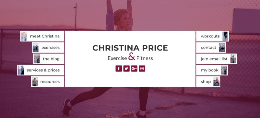
Today’s post is about combining two very important elements on your website: header and navigation. This unique design organizes multiple buttons inside your header to serve as a navigation menu that is both functional and attractive.
This design is inspired by a personal trainer site by Wild Side Design Co. and would work great for sites that want to keep things simple and blogs that need to showcase categories in a fresh way.
If anything, I hope this will inspire you to build another great design with Divi.
- 1 Sneak Peek
- 2 All You Need is Divi
- 3 Designing the Header Section
- 4 Creating the Row
- 5 Designing the Title Section
- 6 Designing Left Column Navigation Header Buttons
- 7 Designing Right Column Navigation Header Buttons
- 8 Add Images to the Buttons
- 9 Responsive Options for the Navigation Header
- 10 Final Thoughts
Sneak Peek

All You Need is Divi
For this tutorial I am going to use the Divi visual builder to design this navigation header. I think you will enjoy the simple yet powerful way Divi enables you to create something completely unique.
I will be offering you an alternative design involving adding an image background to your buttons, so you will want to use images with a size of 100px by 150px if you go down that road.
Designing the Header Section
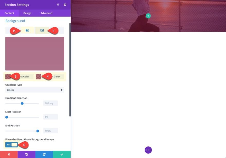
Let’s get things rolling by creating a new page and deploying the visual builder. By default, there will be a section waiting for you to edit at the top of the page. Go to the section settings and add a background image and gradient overlay by updating the following:
Background Image: [insert 1920px by 1080px image]
Background Gradient Left Color: rgba(127,23,60,0.61)
Background Gradient Right Color: rgba(127,23,60,0.59)
Place Gradient Above Background Image: YES
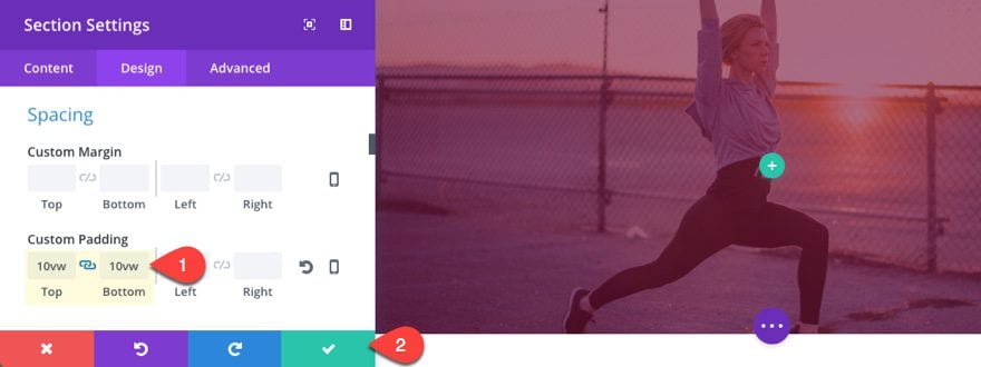
Then add some top and bottom padding to give our future content some breathing room.
Custom Padding: 10vw Top, 10vw Bottom
I like using the vw length unit here because it does a good job keeping content above the fold on different screen sizes.
Creating the Row
Now set your column layout within your row to be one-third one-half one-third.
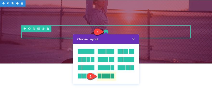
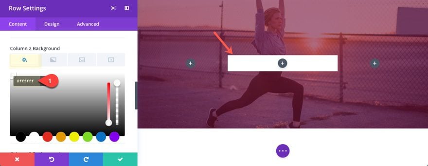
Then edit the row settings to set your column 2 background color to #ffffff.
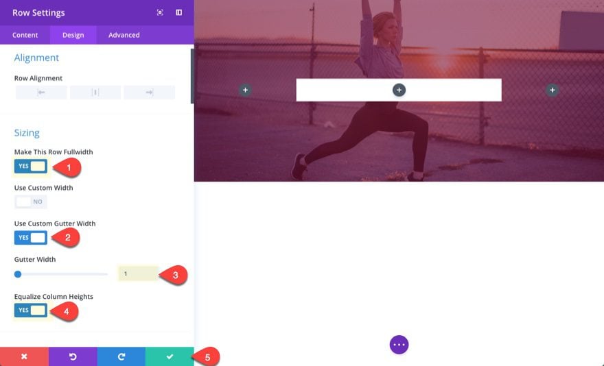
And update the design settings as follows:
Make This Row Fullwidth: YES
Use Custom Gutter Width: YES
Gutter Width: 1
Equalize Column Heights: YES
This creates more space for our future navigation buttons on the left and right. The gutter width set to 1 gets rid of the margins between columns so that our buttons can easily be positioned on each side of our middle column content.
Designing the Title Section
For the middle title section we are going to stack a text module and a social media follow module.
Add the Title
First add a text module to the middle column and update the following:
Content:
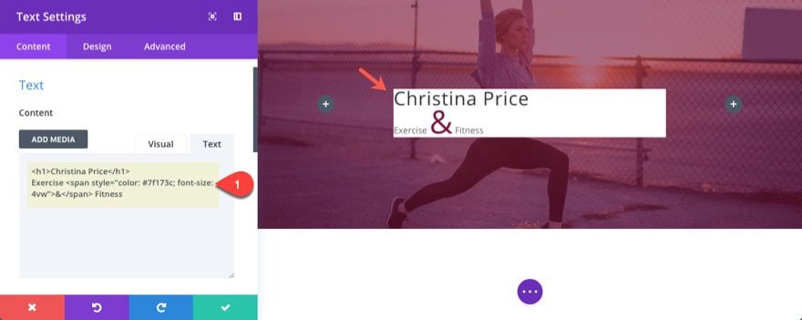
<h1>Christina Price</h1>
Exercise <span style="color: #7f173c; font-size: 4vw;">&</span> Fitness
Since this is a page title, I used the h1 tag. I also wrapped the subtitle text ampersand (&) in a span tag with a custom color and font size to add a little flair to the text design.
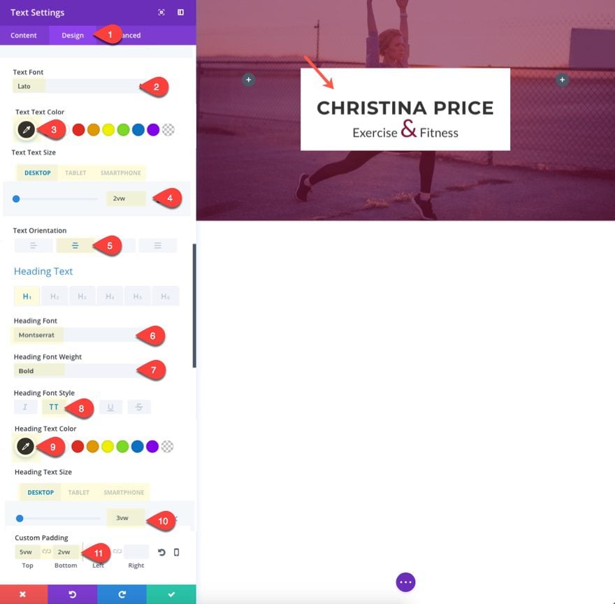
Now go to the design tab and update the following:
Text Font: Lato
Text Text Color: #333333
Text Text Size: 2vw (desktop), 30px (tablet), 22px (smartphone)
Text Orientation : Center
Heading Font: Montserrat
Heading Font Weight: Bold
Heading Font Style: TT
Heading Text Color: #333333
Heading Text Size: 3vw (desktop), 40px (tablet), 32px (smartphone)
Custom Padding: 5vw Top, 2vw Bottom
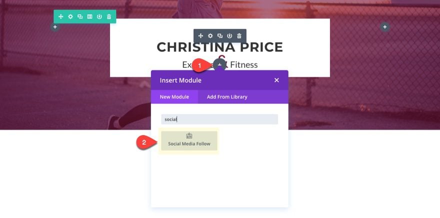
To add the social icons, add a social media follow module under the text module.
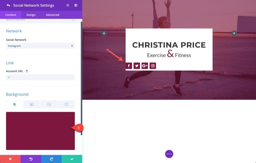
Add four social networks to the module, each with the same background color:
background color: #7f173c
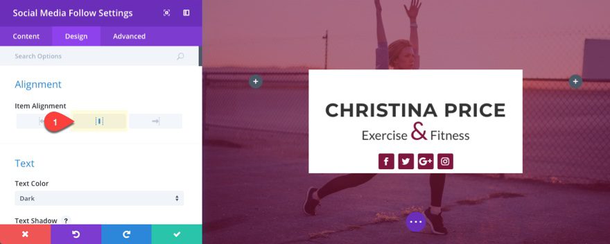
Then set the item alignment to center.
To design the navigation buttons on the left column, we are going to start by designing one button and then duplicating that button to help us create the rest.
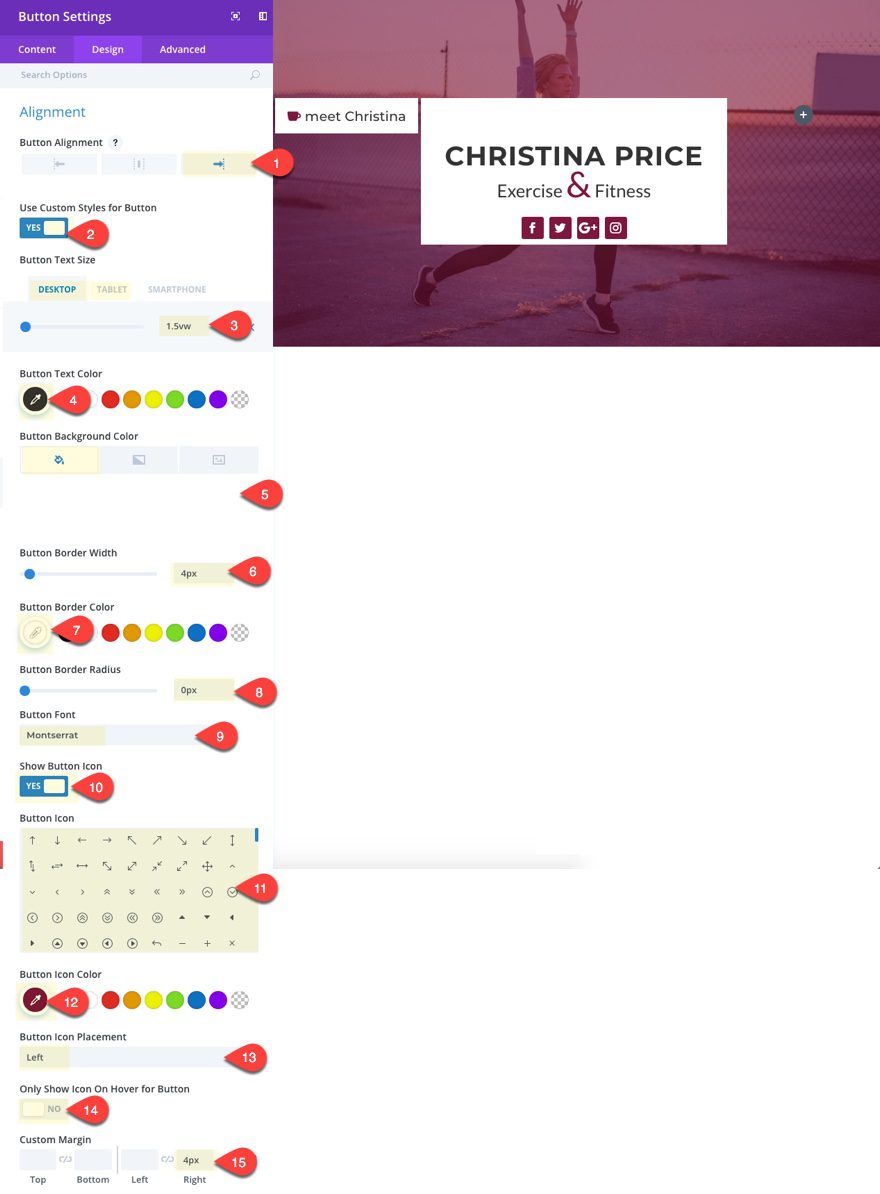
To create the first button, add a button module to the left column and update the following:
Button Text: meet Christina
Under the design tab…
Button Alignment: Right
Use Custom Styles for Button: YES
Button Text Size: 1.5vw (desktop), 16px (tablet)
Button Text Color: #333333
Button Background Color: #ffffff
Button Border Width: 4px
Button Border color: #ffffff
Button Border Radius: 0px
Button Icon: your choice
Button Icon Color: #7f173c
Button Icon Placement: Left
Only Show Icon On Hover For Button: NO
Custom Margin: 4px Right
Save settings.
Then duplicate that button, update the content (button text, icon, link url, etc.) and add a custom top margin of 5px.
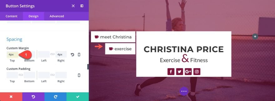
Save Settings.
Now duplicate that module three more times and update the button content for each. You should have a total of five buttons adjacent to the middle column.
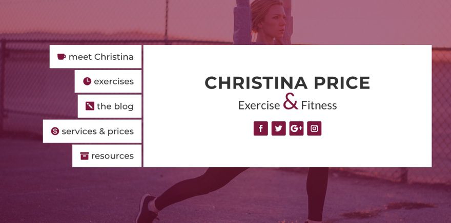
Notice that because our row is set to have equal column heights, the height of the left column with the buttons also pulled down the middle column to match the height.
To create the buttons in the right column go ahead a copy the top button in the left column and paste it into the third column.
Then update the button content (button text, icon, link url, etc.) and update the following settings.
Button Alignment: Left
Button Icon Placement: Right
Custom Margin: 4px Left, 0px Right
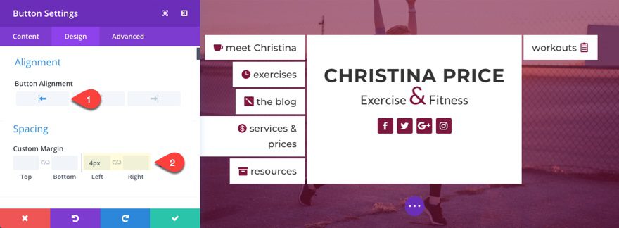
Now duplicate the button you just created and update the spacing to have a custom top margin of 4px.
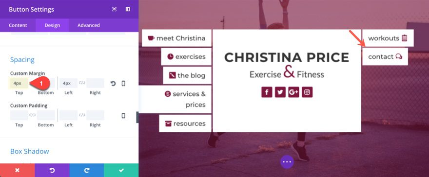
Save settings.
Then duplicate that module three more times and update the button content for each. You should have a total of five buttons adjacent to the middle column.
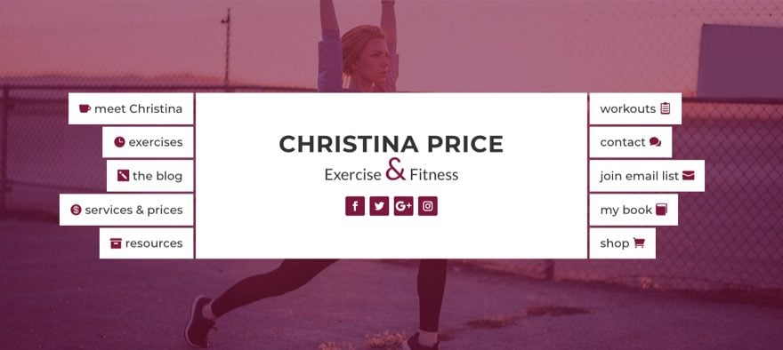
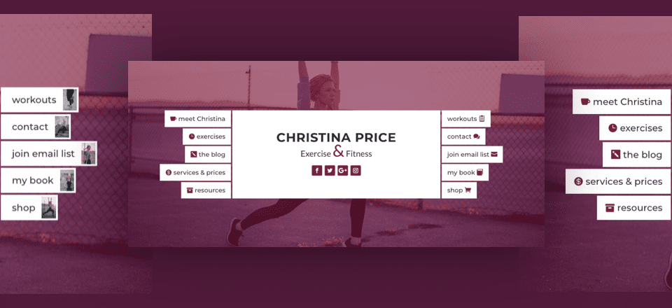
Check out the final design.
As an alternate design option, you can switch you button icons for images. To do this you will need to use images that are 100px by 150px in size.
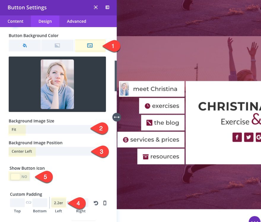
For example, to add an image to the left column buttons, edit the button module settings as follows:
Background Image: [enter 100×150 image]
Background Image Size: Fit
Background Image Position: Center Left
Show Button Icon: NO
Custom Padding: 2.2em Left
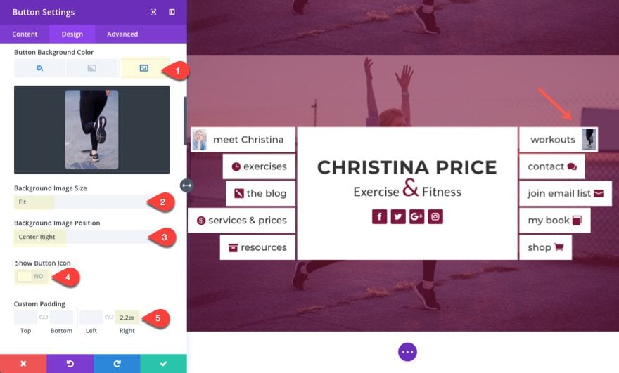
To add an image to the right column buttons, edit each of the button module settings as follows:
Background Image: [enter 100×150 image]
Background Image Size: Fit
Background Image Position: Center Right
Show Button Icon: NO
Custom Padding: 2.2em Right
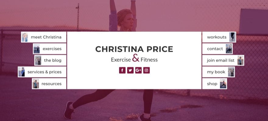
Once you add images to all of your buttons, here is what the design would look like.
Right now the design will work on mobile devices and will look like this:
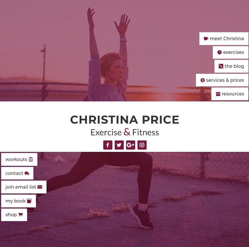
But that may not be exactly how you want it. You may want to think about a couple of other options.
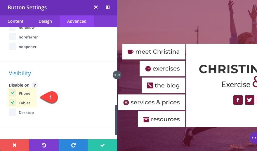
A simple and functional solution for this design on mobile is to hide your buttons on tablet and smartphones and just use your actual primary mobile navigation menu as a fall back.
To hide a button, simply go to the button module advanced settings and check to disable the module on tablet and smartphone.
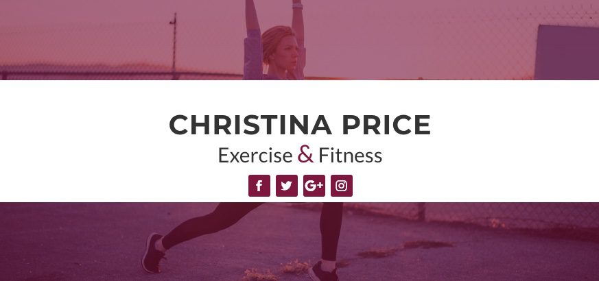
The result would look like this on tablet and smartphone.
Advanced Solution: Change column order on Mobile
If you want to change the column order on mobile so that the title section (currently in the second or middle column) displays at the top (or first in order), you can add a few lines of custom CSS.
Open the main settings menu at the bottom of the visual builder and then click the page settings button. Then enter the following in the Custom CSS input box:
@media (max-width:980px) {
/*** class that will wrap row in a flex box ***/
.change-column-order {
  display: -webkit-box;
  display: -moz-box;
  display: -ms-flexbox;
  display: -webkit-flex;
  display: flex;
  -webkit-flex-wrap: wrap; /* Safari 6.1+ */
  flex-wrap: wrap;

}
/*** custom classes that will designate the order of columns in the flex box row ***/
.one {
     -webkit-order: 1;
     order: 1;
  }
.two {
     -webkit-order: 2;
     order: 2;
  }
.three {
     -webkit-order: 3;
     order: 3;
  }
/*** changes buttons to full width and centers button text ***/
.change-column-order .et_pb_button {
      display:block;
      text-align: center !important;
  }
}
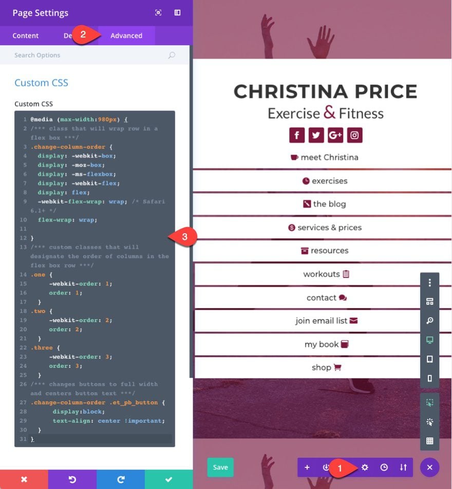
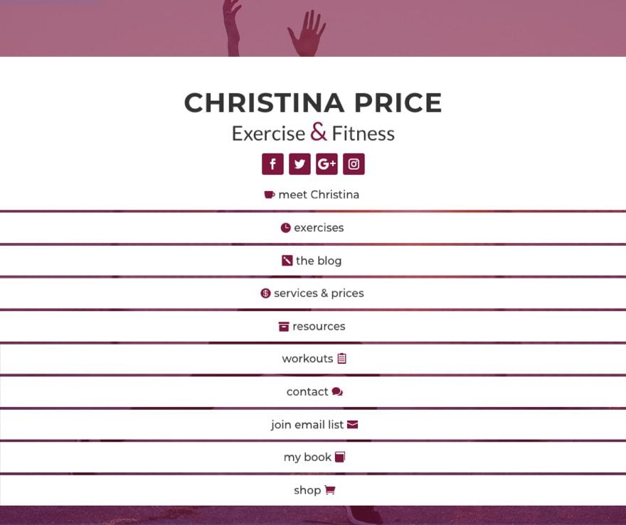
This css reorders the columns and changes your buttons so that they span the fullwidth of the column with the text centered. This method for changing the column stacking order on mobile does come in handy.
Now go to your row settings, under the advanced tab, and add the class “change-column-order” to the CSS Class input box. Then add “one” to the Column 2 CSS Class input box, add “two” to the Column 1 CSS Class input box, and add “three” to the Column 3 CSS Class input box.
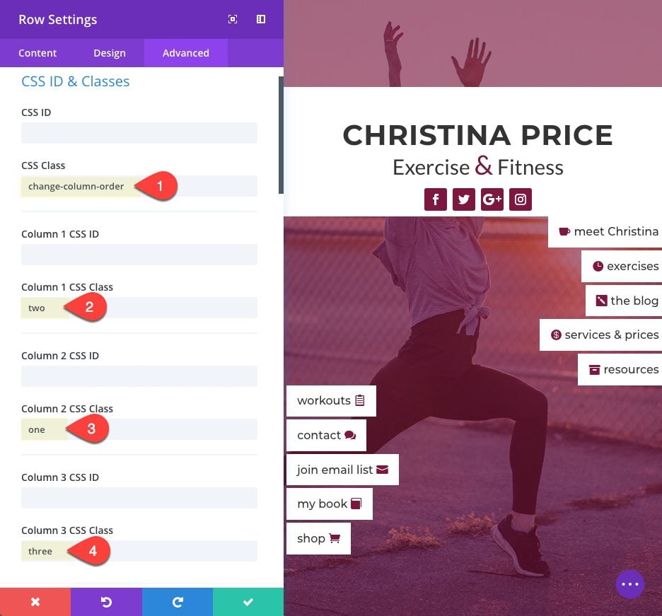
You may have to add 4px margin to the top right column button on tablet and smartphone so that the separation is consistent.
Here is the final result.
Final Thoughts
This custom navigation header design can be a unique alternative to a traditional navigation menu. It is not meant as a replacement for your primary navigation. In fact, this would work really well as a sub navigation for blog categories or something similar.
I hope the responsive fallbacks aren’t too problematic and the solutions offered will be helpful.
I look forward to hearing from you in the comments about other ideas on how to use this design and any other thoughts or questions you may have.
Cheers!



Nice menu idea. Any new option for menus should always be appreciated as it can open a creative door for further (much needed) menu options.
Hi Jason,
I love this option, I didn’t like the original layout and modified it quite a bit but the result for me is superb. I have used it as my main header and it works really well.
These designs are not always 100% initially but thank for the creativity behind it and continuing to develop outstanding ideas!
Hi
please reply ، can we share on our website?
Thank you
Maria
The Universe is using Mobile. ET still want a call to home. 🙂
Really guys. Sience I discover that for the blog part, EXTRA is better then Divi I lost my intention on it.
But for my sales page I don’t use header and footer anymore.
On some pages the footer I made is homemade with modules. Make it global and paste it over the hole domain.
But you must, really must consider the mobile.
50+ websites
1/2 million visitors %98 mobile. %2 tablet. 🙂
I wish I had your knowledge about WP php coding.
cheers.
I reluctantly have to agree with Rich’s comment above that this layout is not particularly attractive (its jagged edges are jarring to my eye). I think this header could be improved if an attractive logo had instead been centered between the side elements replacing the middle section. I do understand that “Christina Price” is used as a logo place marker, but the middle logo section reminds me of a flyer with tear-off tabs.
It also immediately made me wonder whether viewers would scroll down below the header if every web page is linked above the fold. The links that are shown are the same as what is found in a menu, but a traditional menu encourages scrolling and this doesn’t appear to do that. On the other hand, perhaps this design might be successful, depending upon its audience.
What I greatly appreciate is that a standard header was taken outside of the standard web box and I am looking forward to seeing new design concepts.
Hello,
Thanks for this tutorial.
I added :
width: 100%;
in the advanced settings so that the buttons have the same width.
Thaaanks really good tutorial and easy to understand! 🙂
Sorry to say that: Worst header i ever saw!
Wow! AWesome, I want more to see these types of header content in future. Awesome work ET Team.
But the mobile view is not a grate to visual. Why don’t you make some mobile first menu, which looks great on mobile?
Hi from France
I agree with Geo It’s really what we need. Not that kind of useless solution!
Jacques
Excellent work. We need more of this header designs, menus… etc. Thanks, Jason.
…without trying to sound too negative, my first thoughts are not positive! It might open up a number of possibilities but for me at least, my constructive criticism is that it seems a lot of work for something that at first glance is not aesthetically pleasing to my eye! Great ground breaking concept though!
Cheers!
Rich
I have contacted Elegant Themes on the header/nav area issue but it seems that an upgrade to the header / nav area is not on their current programme. Rats!
For you information I have reproduced my ticket and the response:
My ticket
“Are you guys are intending to have an update of the options and customisation of the header / nav area?
I am weighing up whether to use a plugin to give me more options for new builds but I would prefer to wait for an upgrade in Divi core providing it is coming reasonably soon.
I am sure that others are also hanging out for this upgrade.
Would you mind advising accordingly?
Thank you
Martin Fuller
Response from ET
Fri Jun 01, 2018 12:41 pm
Muhammad Farooq
User avatar
SEND PM
Rate this reply
Hi Martin,
Thanks for contacting us. We know that its popular feature request to add more options to customize header and footer area. But i am afraid i do not see it in upcoming updates. Though I can assure you that issues and features are addressed as quickly as possible but it also depends upon our development team’s current workload and their list of priorities. so i do not have exact time line for that. sorry for that
Please let me know if you have any further questions.
Best Regards,
Muhammad Farooq
Hi Martin,
While our support rep Muhammad is correct, those features are not addressed in the next immediate weekly updates. You can see by looking at our recent Sneak Peek posts that header and footer options are currently being worked on in the form of a Divi Theme Builder.
Best,
Nathan
This is scarily similar to a design I submitted a while back: https://wildsidedesign.co/project/lauren-sambataro/
Exact screenshot of the header design: https://wildsidedesign.co/wp-content/uploads/2017/10/Lauren-Website-REVISED-01-min.jpg
Coincidence?
Hey Kelsey, I saw your comment this morning and followed up with our writer. It turns out that yes, your design was the inspiration for this post. I’m terribly sorry we did not initially provide credit but we have added that credit to the top of the post.
Thanks Nathan! Appreciate it 🙂
I love it…but I think the collapsing effect for the mobile website doesn’t do it justice…it would be nice if there were similar features as Elementor Pro…
The real Thought is that DIVI needs Header / Footer BETTER options and we need them AsaP…..
ET please look at Elementor Pro for header/footer ….
sad..
🙁
Ok, so first things:
This is a good idea for a different header/ Menu area that we all want. Creative thoughts are always welcome-
Althoug the design is not perfect, it opens the door for creativity.
But I must agree with GEO, a big BUT: this is only usefull if we can use it as a header instead of the regular Header section that comes with the theme, otherwise we will have a header and then a seperate menu we need to add to every page.
So we really need is more Options for Header / Menu and footer also.
Thanks for listening.
And ET Team keep up the good work and hope to hear about new options for header soon (here’s hoping)
+100. You didn’t REPLACE the header; it’s still up there with 2 “home” links?
+10 on this one.
Support footer and header design request
No need to. You just use blank or hide them (css), than do what you want for header and footer, make them global and use them anywhere. Or maybe you want to change something on every page … so … no global use … If, anyway, you need to, please let me know.
+1
We are going to get that theme builder update that will address some of the header / footer options we need.
Very Impressive Tutorial with well documented to easy follows. Thank you very much.
Not to be nit-picky (well, maybe a little)
“Now set your column layout within your row to be one-third one-half one-third.”
You mean 1/4 1/2 1/4, right?
changing things up is always welcomed, but this looks messy. At the very least buttons should be the same width.
The REAL final thought. This design only looks good on Desktop.
exactly my thoughts..
I would have to agree… It would have been better just to hide it on mobile and customize the mobile nav to match the look.
Which is a bit of a miss considering the staggering number of mobile users that exist nowadays.
Ouch…..