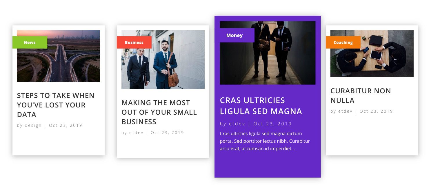
We are all used to seeing recent posts being displayed on a website. They are usually generated using the WordPress Recent Post widget or a plugin to show the most recently published articles on the blog. And they usually show up on the blog page, at the bottom of posts, in sidebars, or as a featured section of a landing page (something like this).
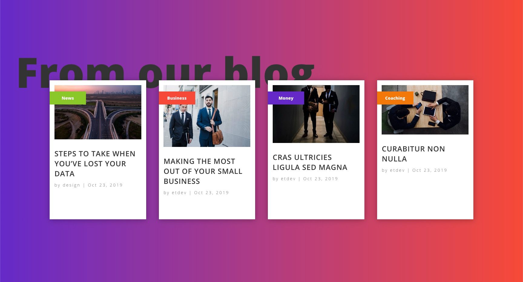
For this tutorial, we are going to show you how to display recent posts by category. Using only the Divi Builder (and a few blog modules), we are going to create a section that displays the latest posts from four different categories. This recent posts by category section will include unique category tags, animations, and hover effects – all without a plugin.
Check it out!
- 1 Sneak Peek
- 2 Download the Recent Posts by Category Layout for FREE
- 3 Download For Free
- 4 What You Need to Get Started
-
5
Creating the Recent Posts by Category Section in Divi
- 5.1 Create a 4 Column Row
- 5.2 Creating Blog Module 1
- 5.3 Creating Category Tag 1
- 5.4 Designing the Category Tag
- 5.5 Update Modules in Column 2
- 5.6 Update Modules in Column 3
- 5.7 Update Modules in Column 4
- 5.8 Updating the Row Settings
- 5.9 Updating the Settings for Each Column
- 5.10 Updating the Section Settings
- 6 Final Result
- 7 Final Thoughts
Sneak Peek
Here is a quick look at the design and functionality of the Recent Posts by Category Layout we will build together.


Download the Recent Posts by Category Layout for FREE
To lay your hands on the designs from this tutorial, you will first need to download it using the button below. To gain access to the download you will need to subscribe to our newsletter by using the form below. As a new subscriber, you will receive even more Divi goodness and a free Divi Layout pack every Monday! If youíre already on the list, simply enter your email address below and click download. You will not be ìresubscribedî or receive extra emails.
To import the layout to your page, simply extract the zip file and drag the json file into the Divi Builder.
Letís get to the tutorial shall we?
What You Need to Get Started
To get started, you will need to do the following:
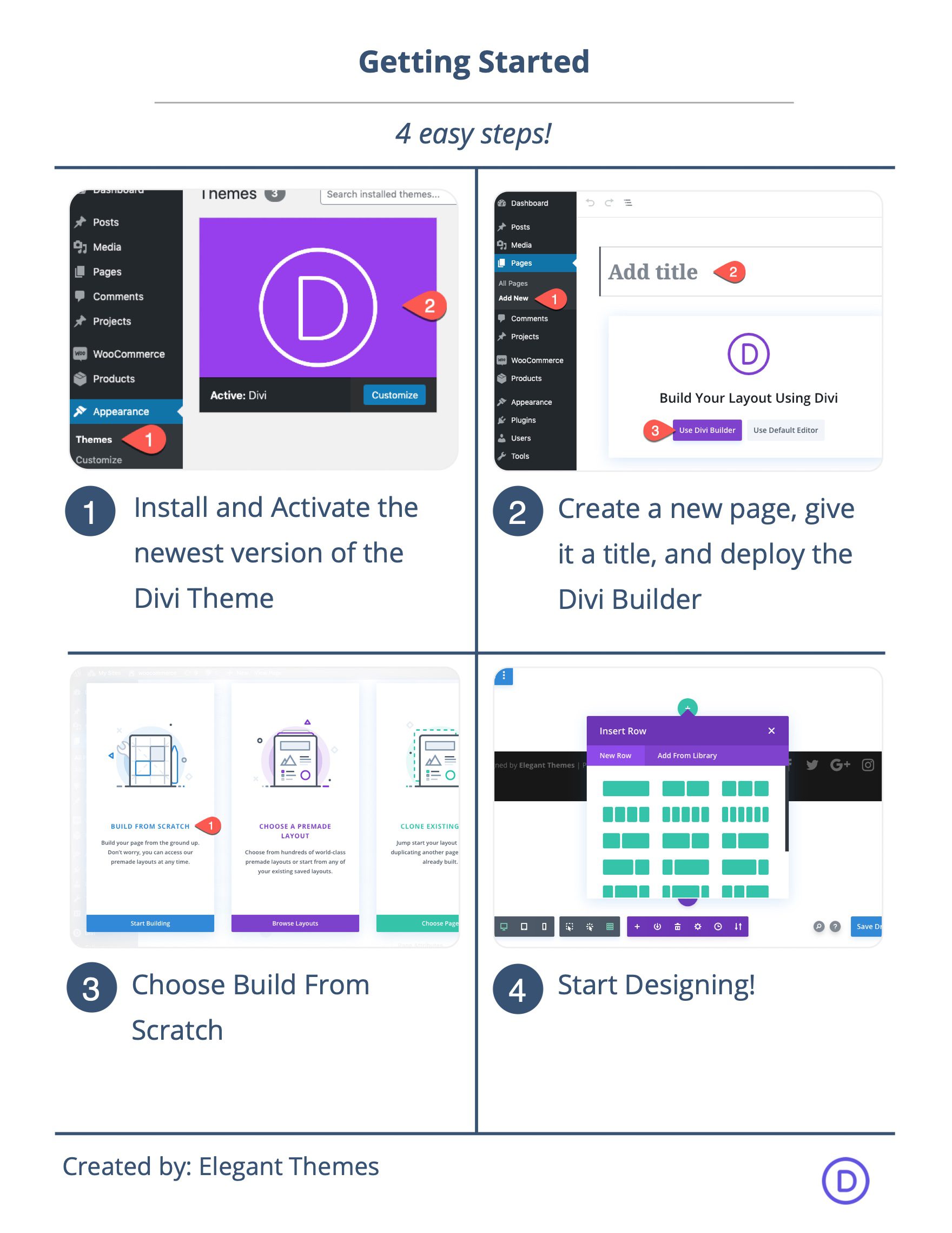
- If you haven’t yet, install and activate the Divi Theme.
- Create a new page in WordPress and use the Divi Builder to edit the page on the front end (visual builder).
- Also, the functionality of the recent posts section depends on having actual blog posts on your site with categories assigned to them. So make sure you have a few mock blog posts setup if you are using a test site.
After that, you will have a blank canvas to start designing in Divi.
Creating the Recent Posts by Category Section in Divi
Create a 4 Column Row
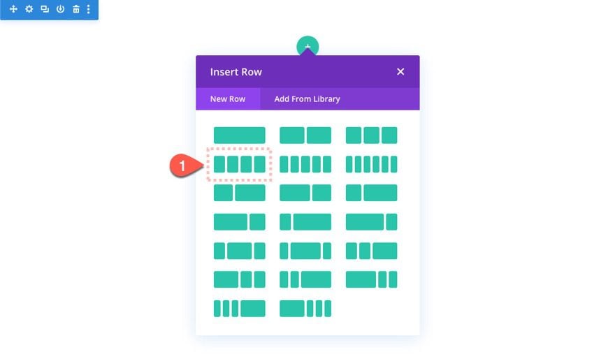
To get things started in the Divi Builder, create a 4 column row.
Creating Blog Module 1
Each of the four columns will hold a separate blog module. Add the first blog module to column 1.
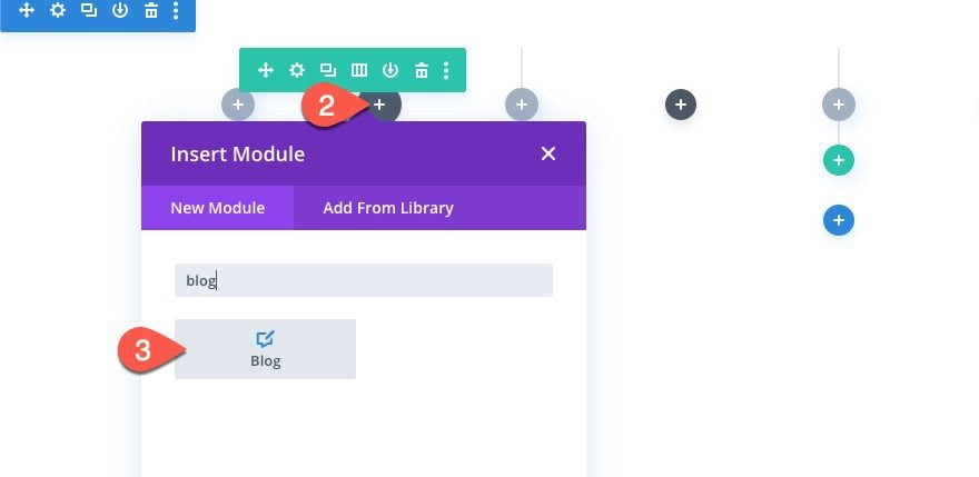
Each of the blog modules will display the most recent post from your site by default. All we are going to do is select a specific category to include for that specific blog module. Then we will limit the post count to 1 so that only one post will show. This will give us the latest blog post for that category dynamically.
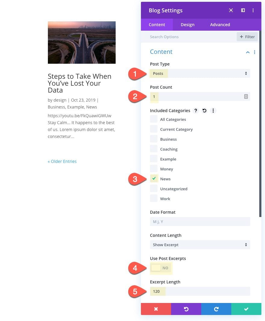
Blog Content
Update the Blog Content options as follows:
- Post Type: Posts
- Post Count: 1
- Included Categories: News (or one of your own)
- Use Post Excerpts: NO
- Excerpt Length: 120
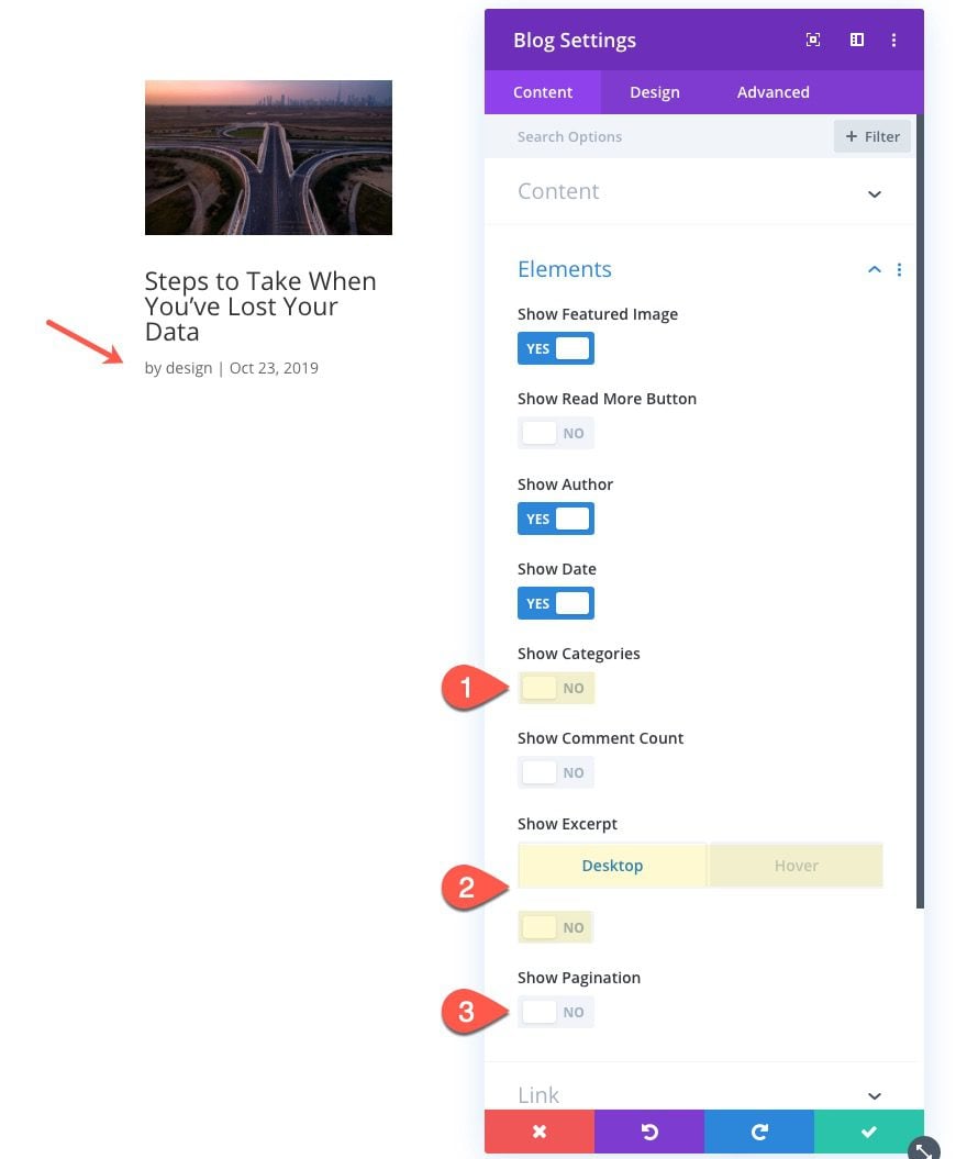
Element Options
Then update the elements options as follows:
- Show Categories: NO
- Show Excerpt: NO (desktop), YES (Hover and Tablet)
- Show Pagination: NO
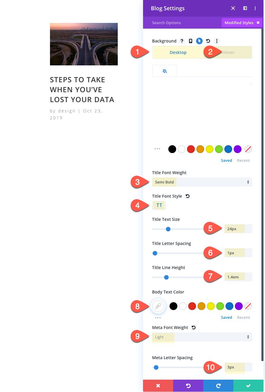
Blog Design
Then update the design as follows:
- Background Color (desktop): #ffffff
- Background Color (hover): #8ac829
- Title Font Weight: Semi Bold
- Title Font Style: TT
- Title Text Size: 24px
- Title Letter Spacing: 1px
- Title Line Height: 1.4em
- Body Text Color: #ffffff
- Meta Font Weight: Light
- Meta Letter Spacing: 3px
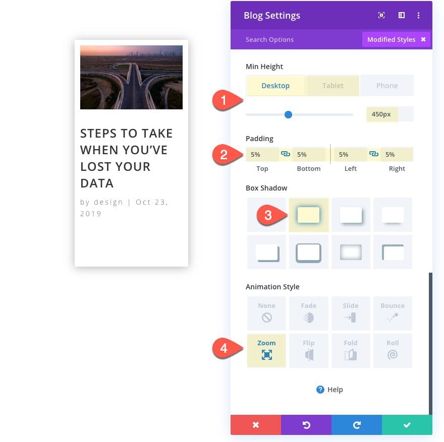
- Min Height: 450px (desktop), auto (tablet)
- Padding: 5% top, 5% bottom, 5% left, 5% right
- Box Shadow: See Screenshot
- Animation Style: Zoom
That takes care of the design of our first blog module. Now we need to create our custom category tag.
Creating Category Tag 1
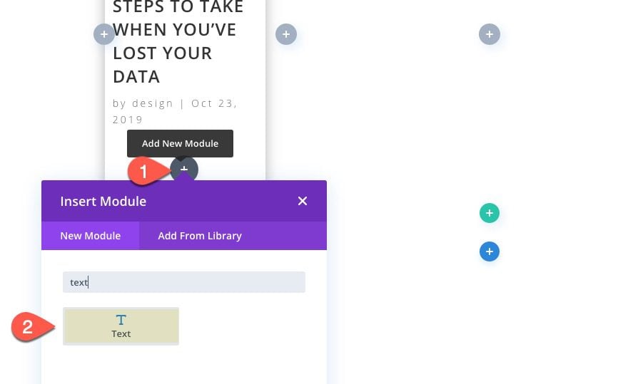
To create the tag, add a new text module under the blog module and then drag it above the blog module.
Text Content
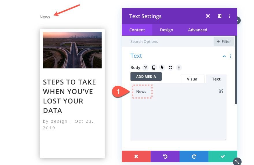
Update the body content with the name of the category you chose for the blog module. In my example, I’m displaying the recent post from the News category so I will add the word “News” to the body content.
Designing the Category Tag
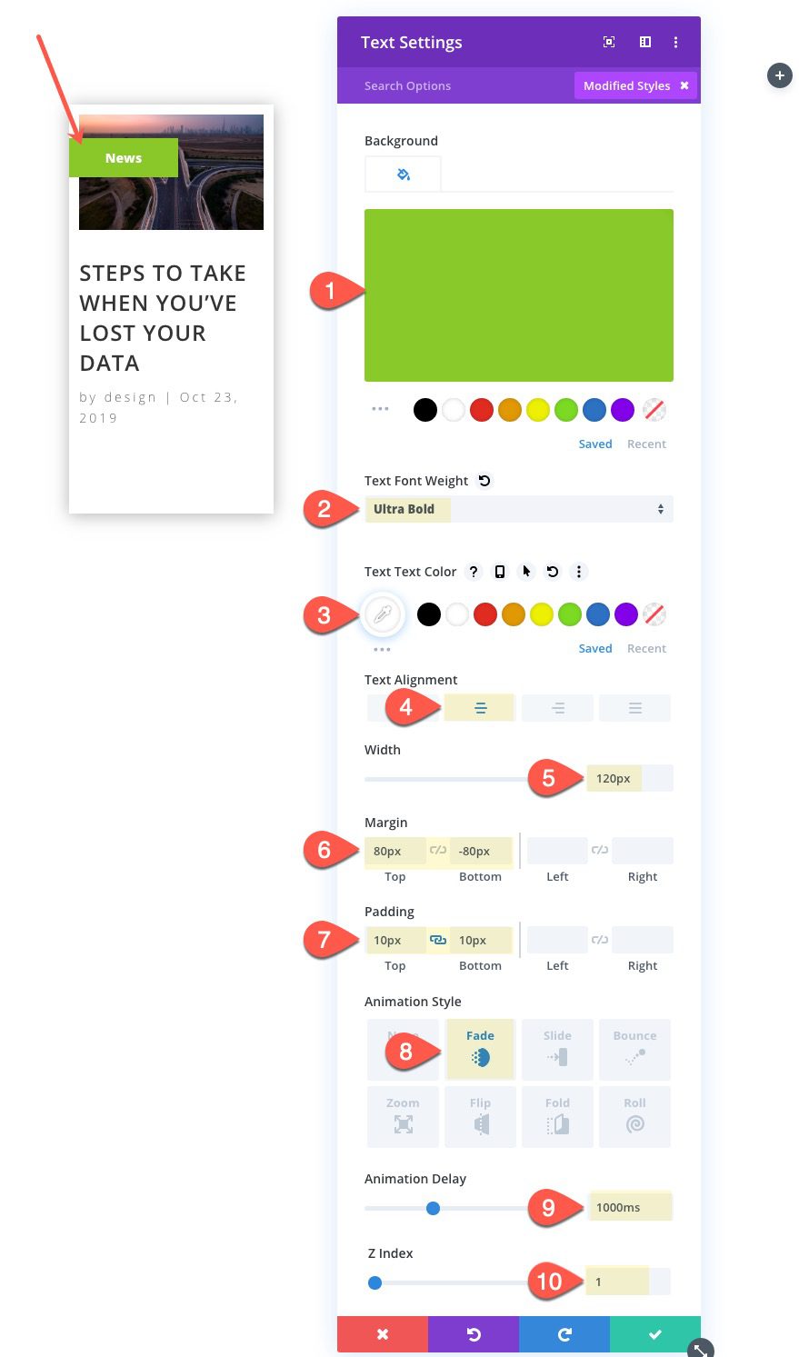
Under the text design settings, update the following:
- Background Color: #8ac829
- Text Font Weight: Ultra Bold
- Text Text Color: #ffffff
- Text Alignment: center
- Width: 120px
- Margin: 80px top, -80px bottom
- Padding : 10px top, 10px bottom
- Animation Style: Fade
- Animation Delay: 1000ms
- Z Index: 1
Since we are using negative margin to drop the tag over the blog card, we will need to set the z index to 1 so that the tag stays above the blog module.
Now that we have one post done, we can deploy the wireframe view mode and copy those modules over to the other columns.
Copy the text and blog module in column 1 and paste them into columns 2,3, and 4 so that you have the exact same modules in each column.
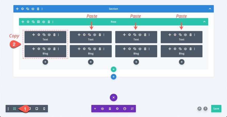
For each duplicate blog module, we need to give it a new blog category and hover background color. And for each duplicate category tag, we need to update the category name to correspond with the category selected for the blog module and then update the background color to match the hover background color of the blog module.
Update Modules in Column 2
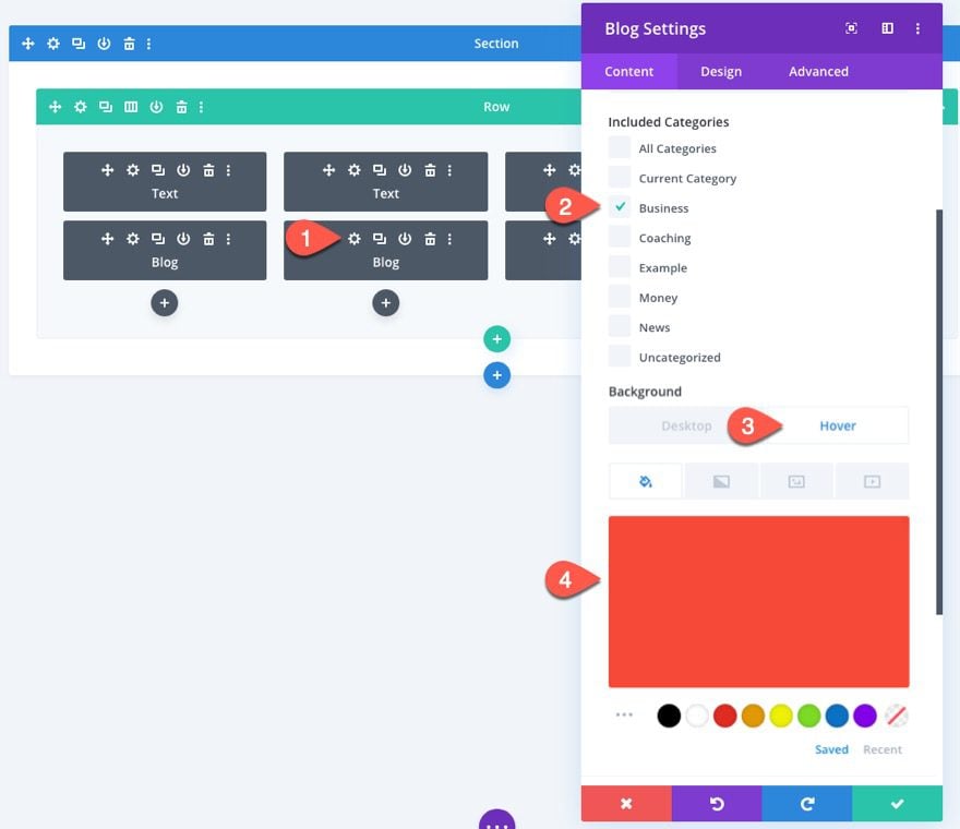
Staying in wireframe view, open the settings for the blog module in column 2, and update the following:
- Included Categories: Business (or your own)
- Background Color (hover): #f64937
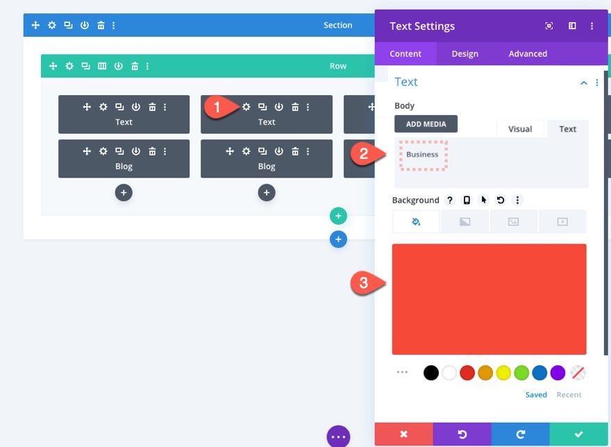
Then update the settings for the text module in column 2 as follows:
- Body: “Business”
- Background Color: #f64937
Update Modules in Column 3
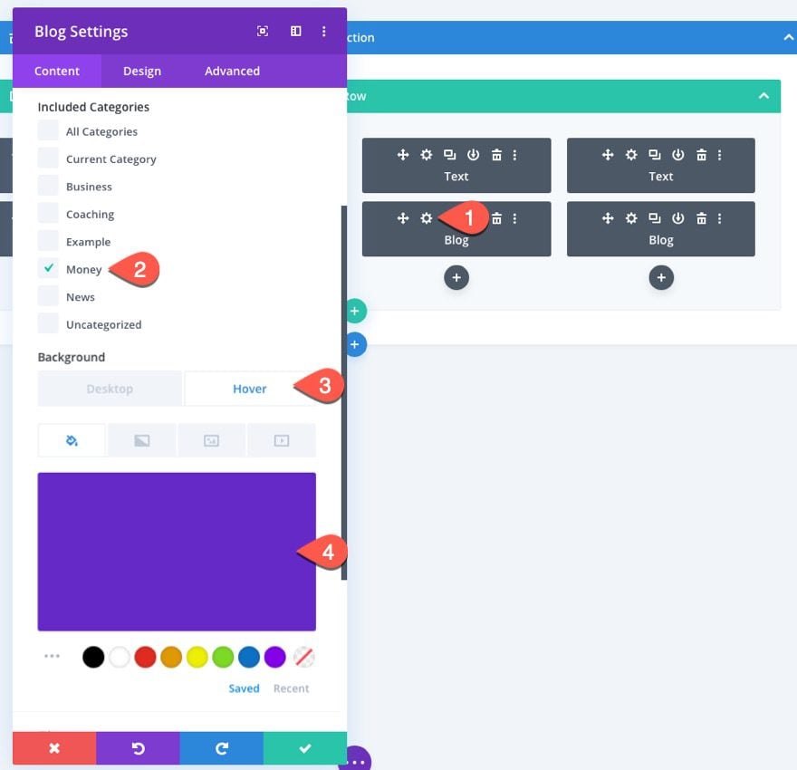
Then open the settings for the blog module in column 3, and update the following:
- Included Categories: Money (or your own)
- Background Color (hover): #6529c7
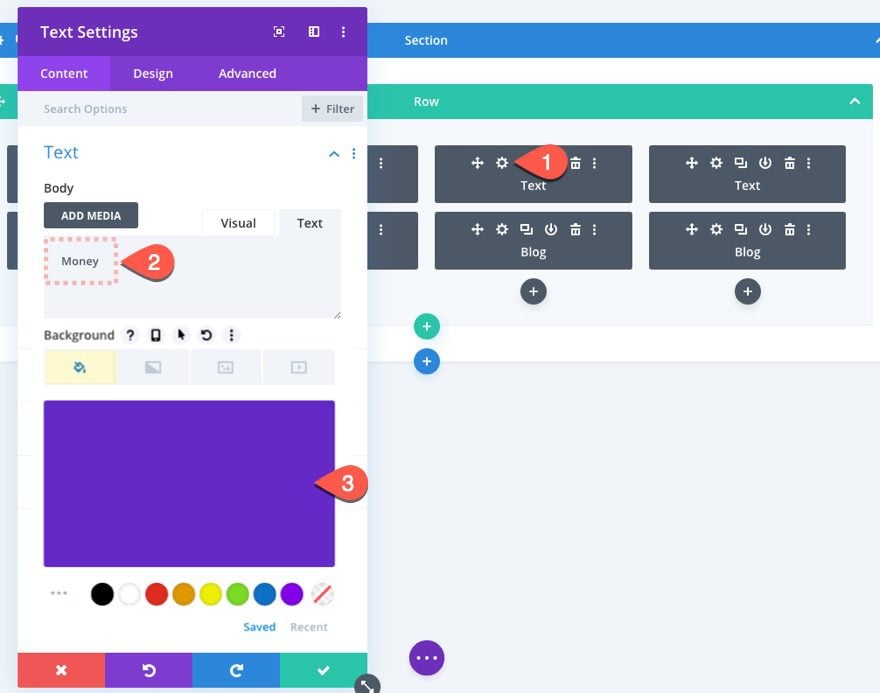
Then update the settings for the text module in column 3 as follows:
- Body: “Money”
- Background Color: #6529c7
Update Modules in Column 4
Then open the settings for the blog module in column 4, and update the following:
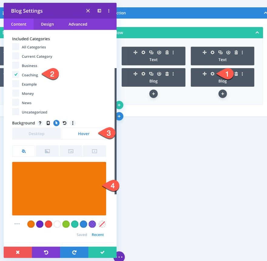
- Included Categories: Coaching (or your own)
- Background Color (hover): #f17809
Then update the settings for the text module in column 4 as follows:
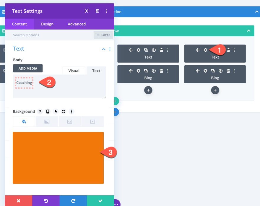
- Body: “Coaching”
- Background Color: #f17809
Updating the Row Settings
There are a few adjustments we need to make to our row, including a set height and custom gutter width. Update the following row settings:
- Use Custom Gutter Width: YES
- Gutter Width: 2
- Width: 94%
- Max Width: 1400px
- Height: 540px (desktop), auto (tablet)
- Padding: 0px top, 0px bottom
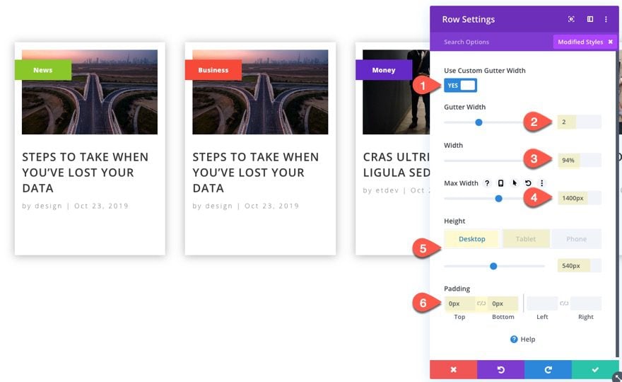
We are setting the row height to 540px on desktop in order to keep the row from expanding and moving other content on the page when hovering over a blog card. Make sure to set the height to auto on tablet so you won’t hide any content.
Updating the Settings for Each Column
To give the recent blog posts a hover effect that is applied to both modules simultaneously, we can add the hover effect to the column that contains the two modules that make up the blog post. Open the settings for each of the columns and update the following:
- Transform Scale (Hover): 115%
Then add the following custom CSS to the main element on tablet display only:
transform: none !important
This little snippet will disable the transform scale hover effect for mobile.
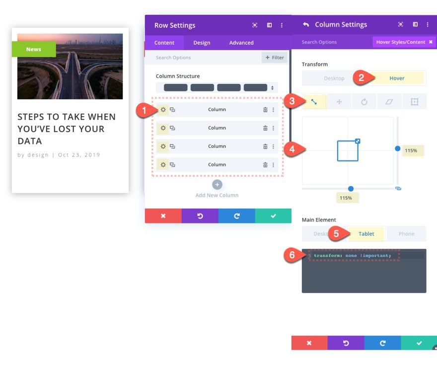
Now whenever the recent posts are all set with a corresponding category tag and a matching background color that show when hovering over the card. Also, the card will get larger and show the excerpt on hover as well.
Updating the Section Settings
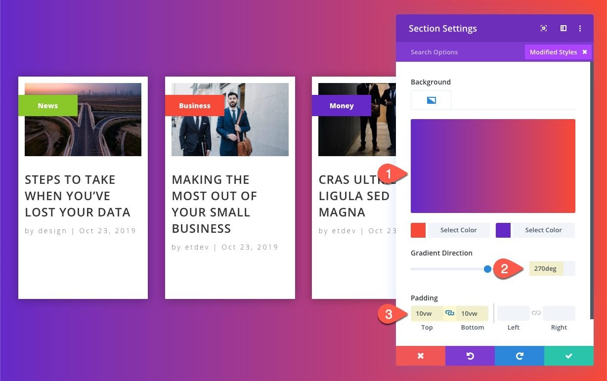
For the section, let’s give it a new background gradient and some padding. Open the section settings and update the following:
- Background Gradient Left Color: #6529c7
- Background Gradient Right Color: #f64937
- Gradient Direction: 270deg
- Padding: 10vw top, 10vw bottom
Final Result
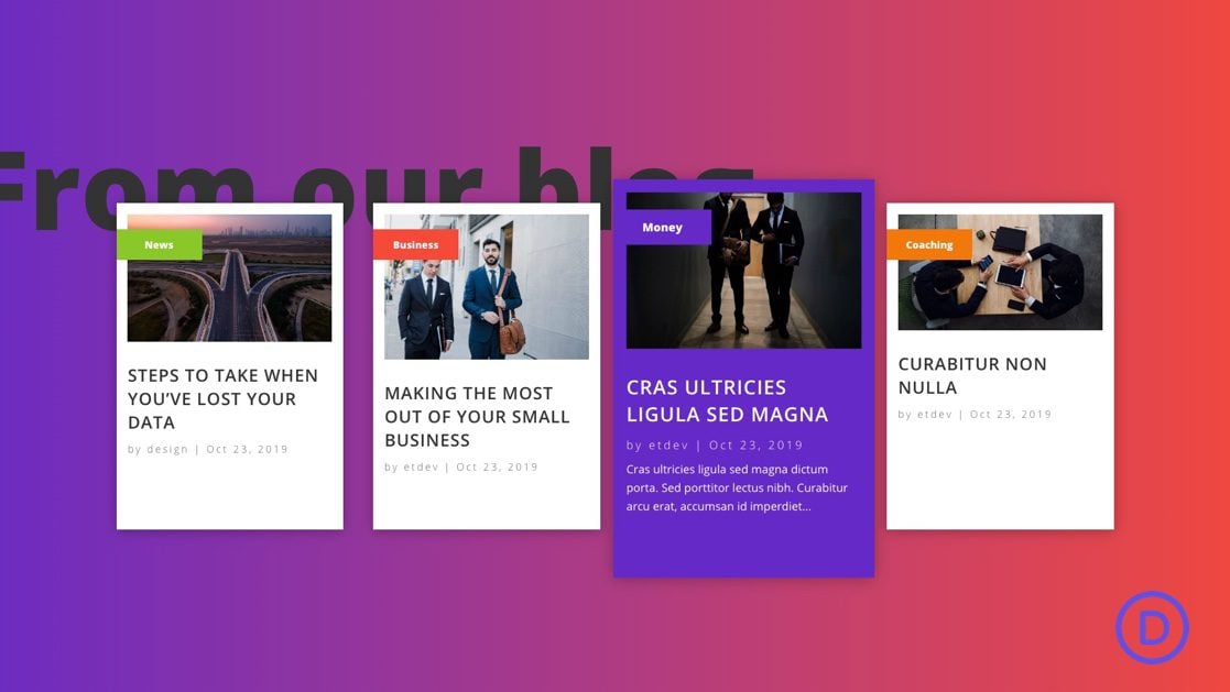
That’s it! Let’s check out the final result. This image includes a title that can easily be added to complete the design.


And here is the animation and hover effects.

Final Thoughts
Creating a Recent Posts by Category Layout really is an easy process once you think outside the box a little. All you really need to do is create a blog module for every category you want to display. Then limit that module to only displaying the most recent post for a certain category. After that, you have the power of Divi at your side to take care of the design.
This layout can be used anywhere on your site, including Theme Builder Templates. So feel free to import them anywhere you need them using the portability options. I hope it comes in handy for your next project or at least gives you a little inspiration to get those wheels turning for even better Divi designs.
I look forward to hearing from you in the comments.
Cheers!





Thank You so Much! Very Helpful! 😀
Really nice effects and thorough explanation. I was even able to replicate it myself. 🙂
This reminds me of one thing in particular I miss in Divi, and that it the opportunity to pick a random post from one or more categories. Not just the latest. I am relying on a third-party plugin to randomly suggest other posts, listed at the bottom of each post. What is it I’ve overlooked?
Sandalsand,
I see what you mean. Looks like the blog module doesn’t include the option to display random posts. But, the post slider module does. So, theoretically, you could display a single random post using a slider with only one slide. That might work. Hope that helps.
Very clear explanation. Thanks for sharing.
Awesome!
Than you for this, I’m trying to find recent post plugin but all of theme sucks. I’m thinking that there is a way to make it carousel the 4 columns?
You could try this… https://www.elegantthemes.com/blog/divi-resources/how-to-create-an-automatic-carousel-with-divi-slick-js
Wonderfull blog. Thank you!
Thanks!
nice posting thanks for sharing this articles
Glad you liked it, sivakumar.
I love hover effects. Never used Divi Themes but the explanation is extremely in-depth. Loved it.
Awesome! You should definitely give Divi a try. Thanks for the comment.
Thank you for giving this kind of content.
You are very welcome.
Super Cool. Really Love the Creativity here!