Adding teaser content to your website can be an effective marketing strategy. This works especially well for promoting things like ebooks. You give them a sneak peek of the content in order to leave them wanting more. In today’s tutorial, we’re going to show you how to showcase teaser content within a scrollable tablet in Divi. To do this, we’ll take advantage of Divi’s built-in options to transform a column into a scrollable container (designed to resemble a tablet) that can include any type of content you want. You can use it to promote the first few chapters of any ebook, display example designs from your portfolio, or any other type of content.
Let’s get started!
Sneak Peek
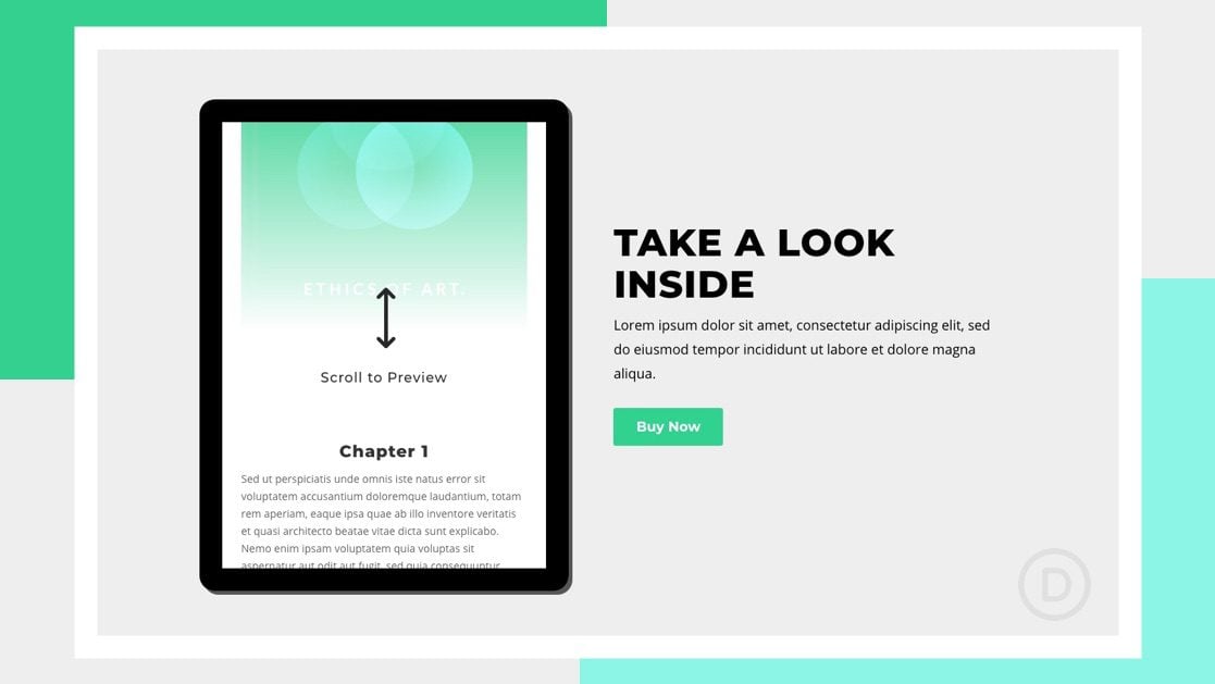
Here is a quick look at the tablet with scrollable teaser content we’ll build in this tutorial.
Download the Layout for FREE
To lay your hands on the designs from this tutorial, you will first need to download it using the button below. To gain access to the download you will need to subscribe to our newsletter by using the form below. As a new subscriber, you will receive even more Divi goodness and a free Divi Layout pack every Monday! If you’re already on the list, simply enter your email address below and click download. You will not be “resubscribed” or receive extra emails.
To import the section layout to your Divi Library, navigate to the Divi Library.
Click the Import button.
In the portability popup, select the import tab and choose the download file from your computer.
Then click the import button.

Once done, the section layout will be available in the Divi Builder.
Let’s get to the tutorial, shall we?
What You Need to Get Started

To get started, you will need to do the following:
- If you haven’t yet, install and activate the Divi Theme.
- Create a new page in WordPress and use the Divi Builder to edit the page on the front end (visual builder).
- Choose the option “Build From Scratch”.
After that, you will have a blank canvas to start designing in Divi.
Part 1: Creating the Scrollable Tablet Container with a Divi Column
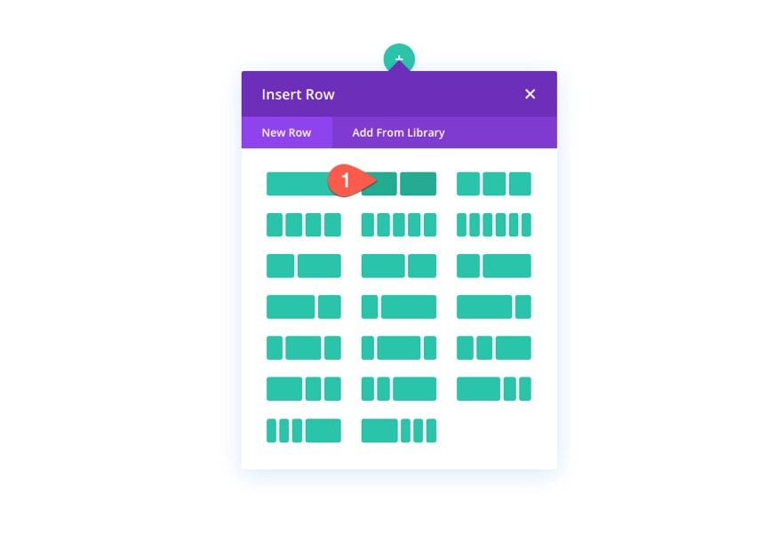
Add Row
To start, create a two-column row with a regular section.
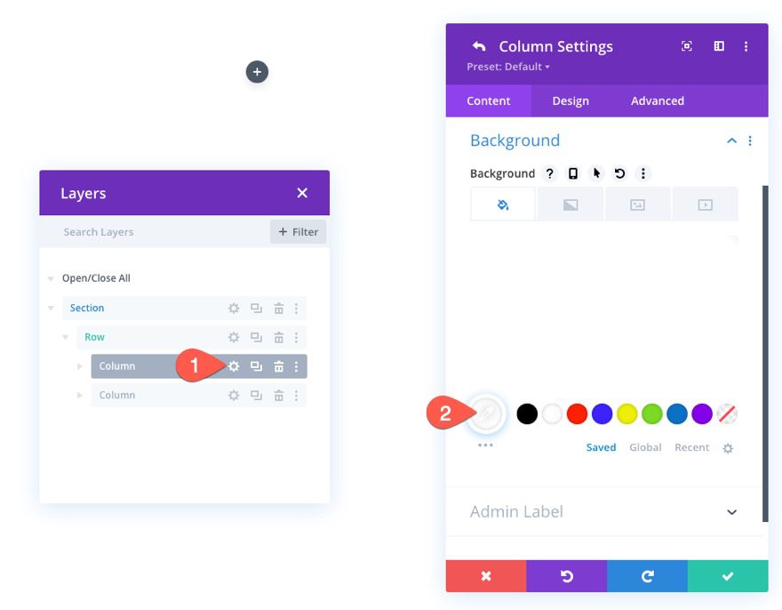
Column 1 Settings
Background Color
Open the settings for column 1, and add a white background to the column.
- Background Color: #ffffff
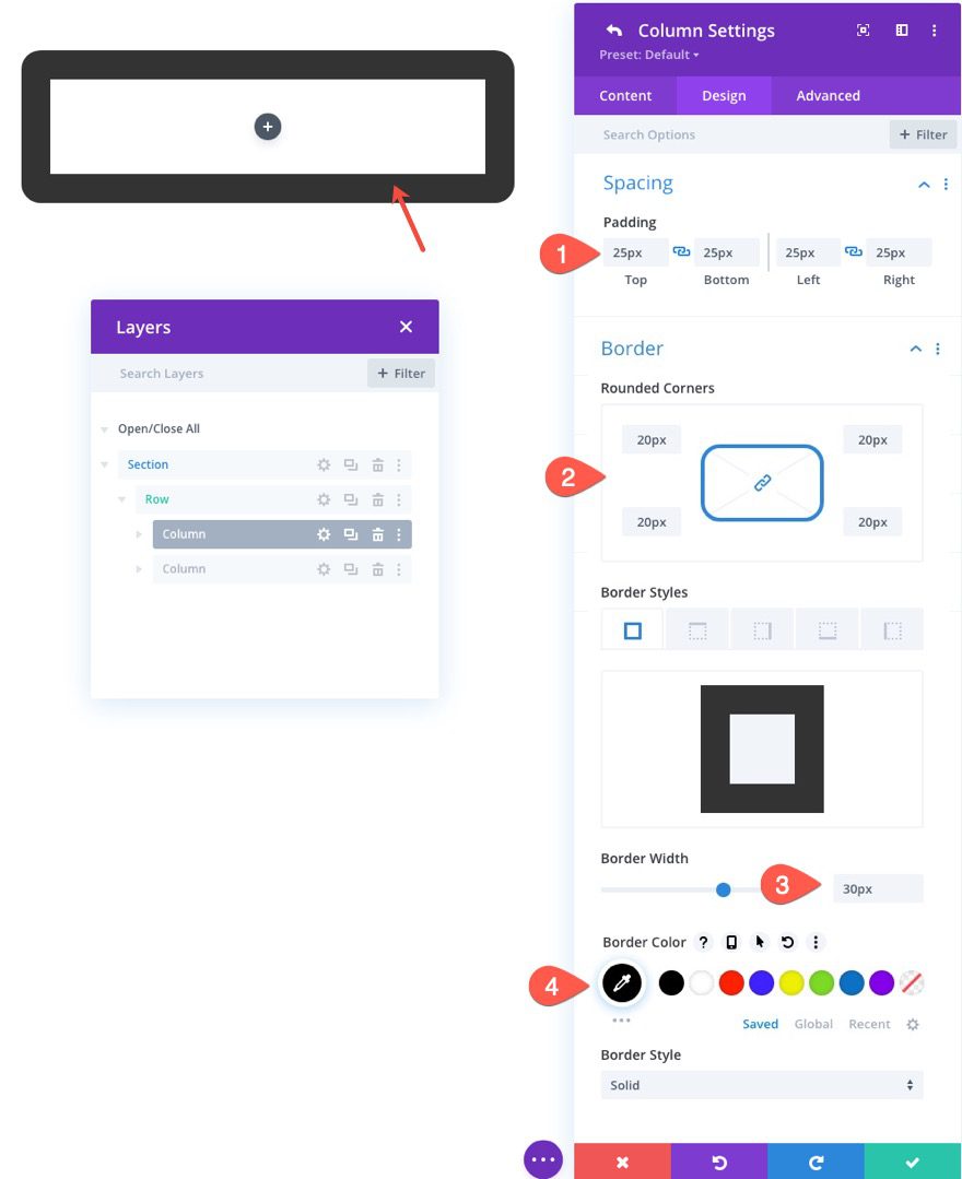
Padding and Border
Then add a border and padding to the column as follows:
- Padding: 25px (top, bottom, left, right)
- Rounded Corners: 20px
- Border Width: 30px
- Border Color: #000000
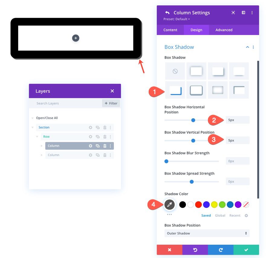
Box Shadow
To give the tablet design a little depth, add the following box shadow:
- Box Shadow: see screenshot
- Box Shadow Horizontal Position: 5px
- Box Shadow Vertical Position: 5px
- Shadow Color: #555555
Custom Column Height and Width with CSS
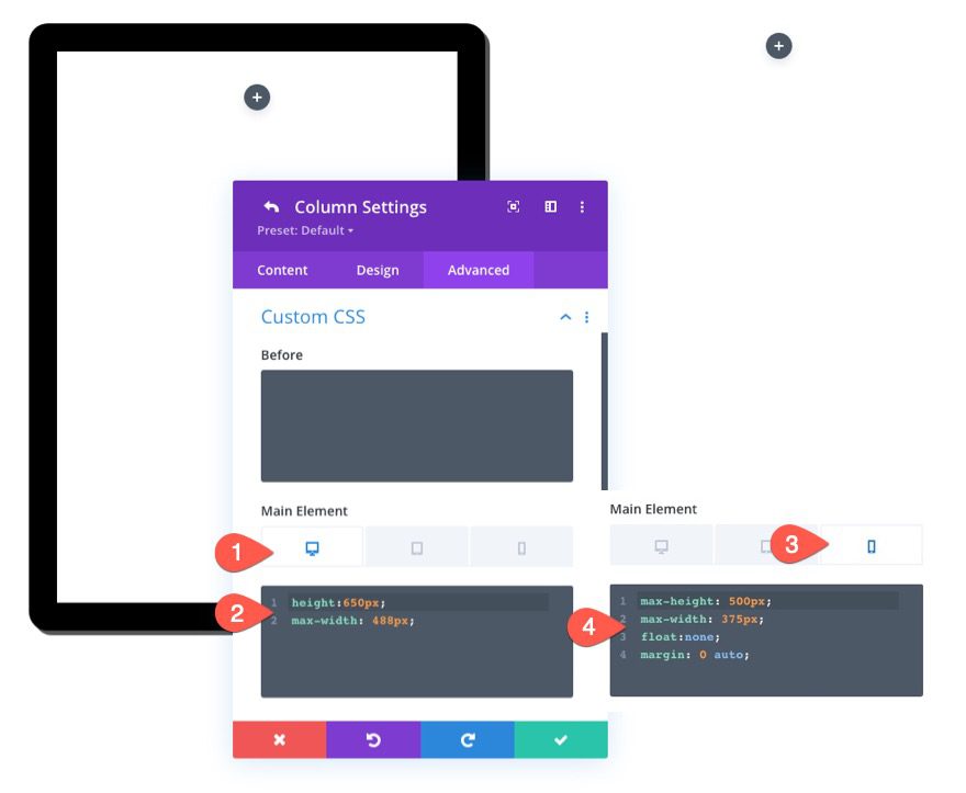
The key to making the column’s content scrollable is to give it a set height. This will make the content overflow the height of the column. We also want to keep the aspect ratio of the tablet consistent, so it is also a good idea to give the column a max-width as well. To give the column a custom height and width, go to the Advanced tab and update the following:
Under Custom CSS, add the following CSS for the Main Element desktop display:
height:650px;
max-width: 488px;
Then activate the responsive tabs and paste the following custom CSS for the main element phone display:
max-height: 500px;
max-width: 375px;
float:none;
margin: 0 auto;
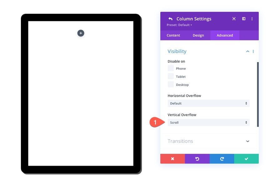
Vertical Overflow: Scroll
As mentioned earlier, the column now has a set height which will cause content inevitably to overflow the column vertically. To make sure the overflowing content can be viewed by scrolling on the column, set the visibility vertical overflow option to “scroll”.
- Vertical Overflow: Scroll
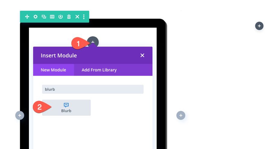
At this point, the column (or tablet) is ready for some content. You can use any Divi module within this column to build your preview content. In this example, we are adding some mock ebook content which will consist of a blurb module (to display the initial call to action), an image module (to display the book cover), and a text module (to display a few chapters of text).
The Scroll CTA with Book Cover Background
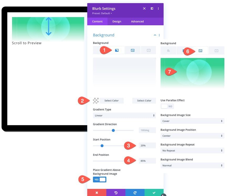
The first piece of teaser content we are going to add is a blurb module that will serve as a “scroll to preview” call to action. We will use a blurb icon, title, and a background with a book cover as the background image and a gradient color overlay.
Inside the tablet column, add a blurb module.
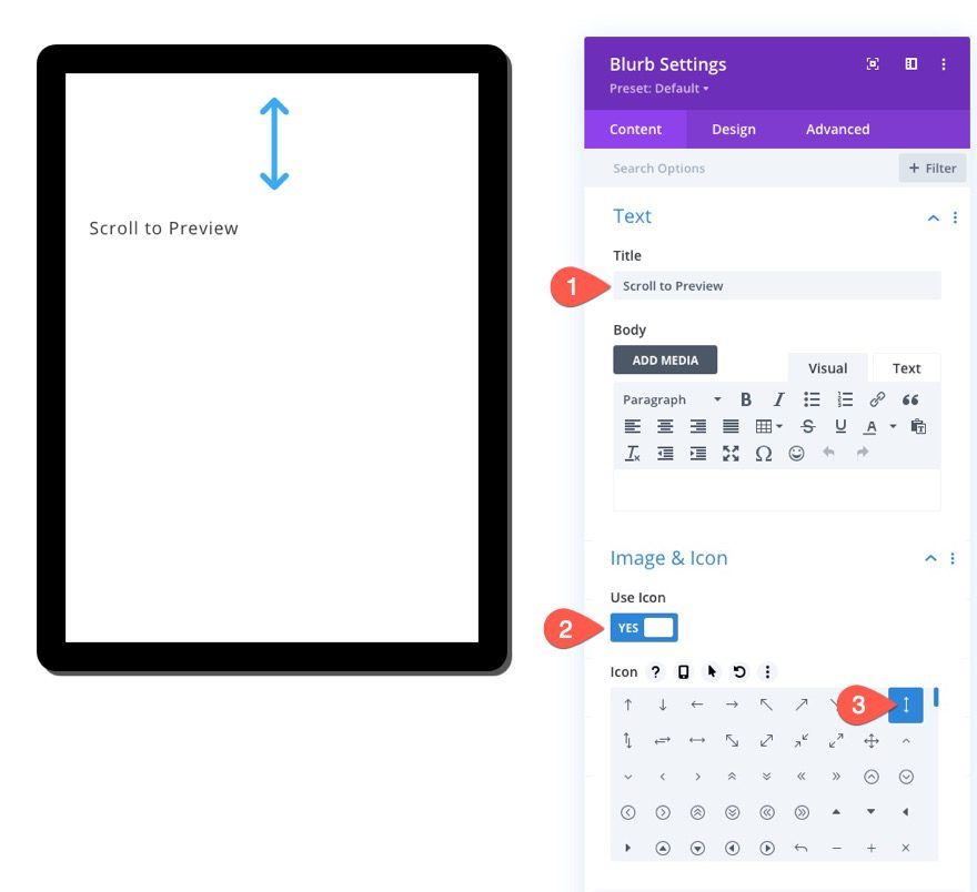
Update the following content:
- Title: Scroll to Preview
- Use Icon: YES
- Icon: see screenshot
- Background Gradient Left Color: transparent
- Background Gradient Right Color: #ffffff
- Start Position: 20%
- End Position: 85%
- Place Gradient Above Background Image: YES
Then add the book cover image. For best results add an image that is about 600px by 850px in size.
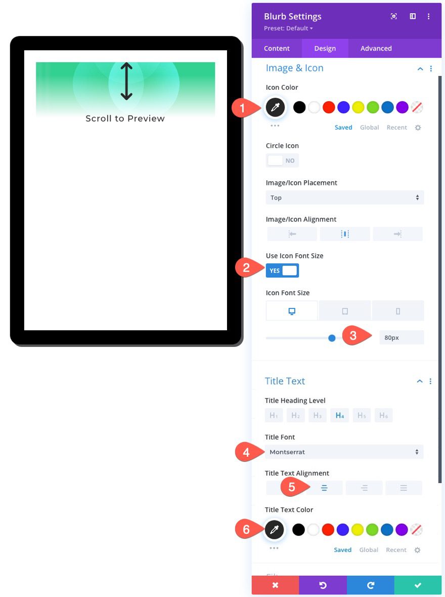
Under the design tab, update the following styles for the icon and title:
- Icon Color: #000000
- Icon Font Size: 80px (desktop and tablet), 70px (phone)
- Title Font: Montserrat
- Title Text Alignment: center
- Title Text Color: #000000
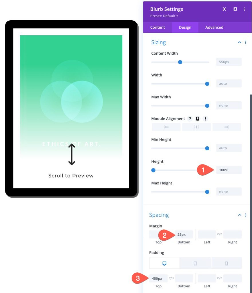
We can adjust the height of the blurb to match the column height so that it fills the tablet using 100% height. This height percentage value only works because our column has a set height. Then we can move the icon and title to the bottom of the column by adding top padding.
To size and space the blurb, update the following:
- Height: 100%
- Margin: 25px bottom
- Padding: 400px (desktop and tablet), 270px (phone)
The Book Cover Image
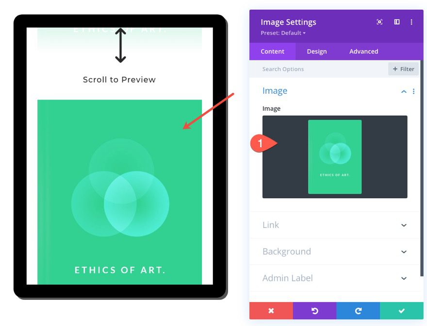
The next piece of teaser content will be an image of the book cover. To add an image, simply add an image module under the blurb module.
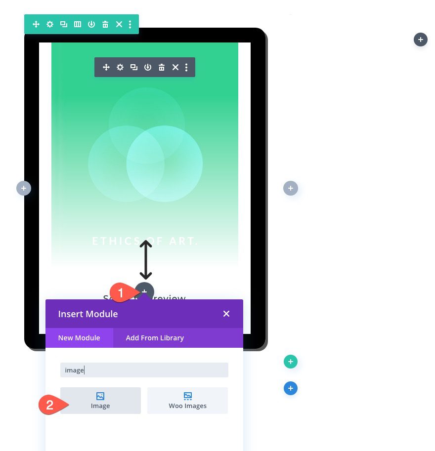
Then upload the same image used for the background of the blurb.
The Text Preview Content
Our last piece of teaser content will be the text which will include a few mock chapters of our ebook. To add the text, add a new text module under the previous image.
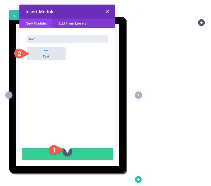
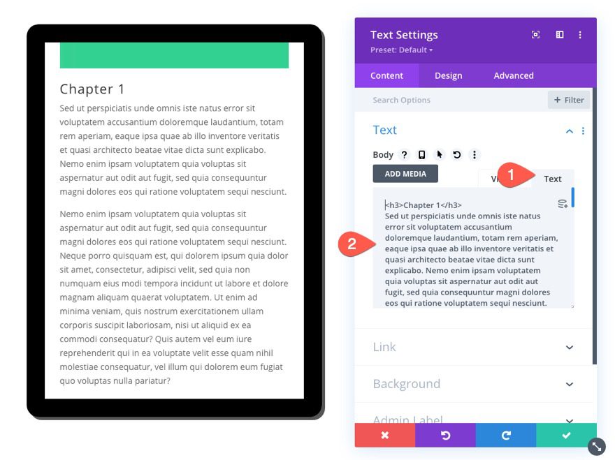
Then paste the following HTML inside the text tab of the body:
<h3>Chapter 1</h3>
Sed ut perspiciatis unde omnis iste natus error sit voluptatem accusantium doloremque laudantium, totam rem aperiam, eaque ipsa quae ab illo inventore veritatis et quasi architecto beatae vitae dicta sunt explicabo. Nemo enim ipsam voluptatem quia voluptas sit aspernatur aut odit aut fugit, sed quia consequuntur magni dolores eos qui ratione voluptatem sequi nesciunt.

Nemo enim ipsam voluptatem quia voluptas sit aspernatur aut odit aut fugit, sed quia consequuntur magni dolores eos qui ratione voluptatem sequi nesciunt. Neque porro quisquam est, qui dolorem ipsum quia dolor sit amet, consectetur, adipisci velit, sed quia non numquam eius modi tempora incidunt ut labore et dolore magnam aliquam quaerat voluptatem. Ut enim ad minima veniam, quis nostrum exercitationem ullam corporis suscipit laboriosam, nisi ut aliquid ex ea commodi consequatur? Quis autem vel eum iure reprehenderit qui in ea voluptate velit esse quam nihil molestiae consequatur, vel illum qui dolorem eum fugiat quo voluptas nulla pariatur?

<h3>Chapter 2</h3>
Sed ut perspiciatis unde omnis iste natus error sit voluptatem accusantium doloremque laudantium, totam rem aperiam, eaque ipsa quae ab illo inventore veritatis et quasi architecto beatae vitae dicta sunt explicabo. Nemo enim ipsam voluptatem quia voluptas sit aspernatur aut odit aut fugit, sed quia consequuntur magni dolores eos qui ratione voluptatem sequi nesciunt. Neque porro quisquam est, qui dolorem ipsum quia dolor sit amet, consectetur, adipisci velit, sed quia non numquam eius modi tempora incidunt ut labore et dolore magnam aliquam quaerat voluptatem. Ut enim ad minima veniam, quis nostrum exercitationem ullam corporis suscipit laboriosam, nisi ut aliquid ex ea commodi consequatur? Quis autem vel eum iure reprehenderit qui in ea voluptate velit esse quam nihil molestiae consequatur, vel illum qui dolorem eum fugiat quo voluptas nulla pariatur?
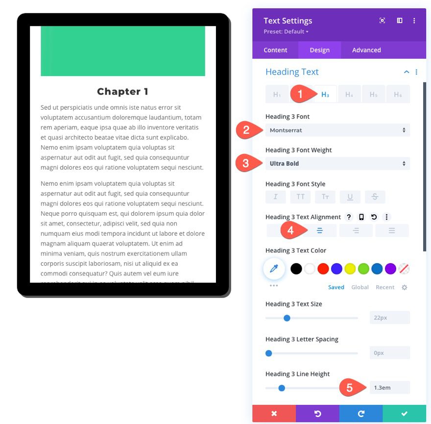
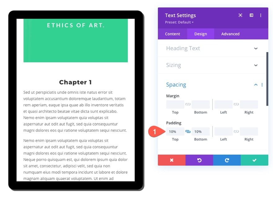
Under the design tab, update the heading style and spacing as follows:
- Heading 3 Font: Montserrat
- Heading 3 Font Weight: Ultra Bold
- Heading 3 Text Alignment: Center
- Heading 3 Line Height: 1.3em
- Padding: 10% (top and bottom)
Part 3: A Few Final Touches
Update Row Settings
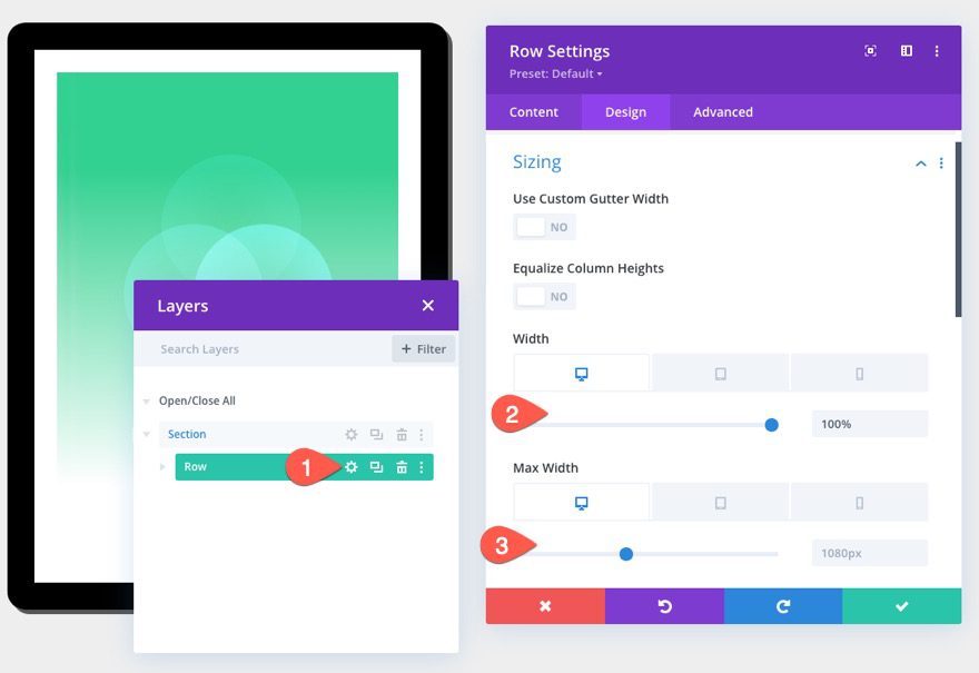
Once the content is in place, we need to make a few adjustments to the row to make the design more responsive. Open the row settings and update the following:
- Width: 100% (desktop), 90% (tablet and phone)
- Max Width: 1080px (desktop), 488px (tablet and phone)
Add Additional Content to Column 2
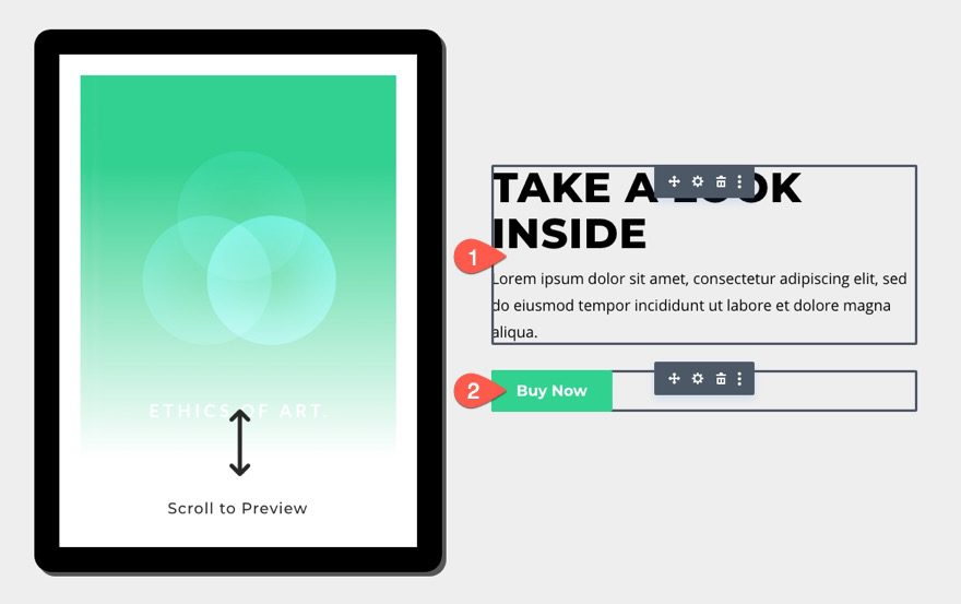
At this point, we can add additional content to column 2 as needed. For this example, I added a text module and button module and styled them similar to the design featured in our Ebook Layout Pack.
Final Result
Now let’s check out the final result.
Check out the scrollable content available inside the tablet.
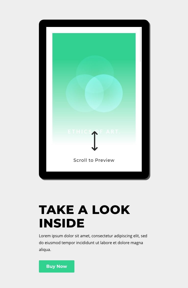
And here is how the design stacks on tablet and phone display.
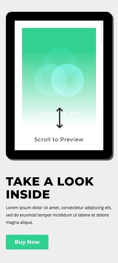
Final Thoughts
Perhaps the best thing about this scrollable tablet design is its versatility. Because the tablet is essentially a Divi column, you can use any number of Divi modules (text, image, button) to design the content you want to feature. Hopefully, this will come in handy the next time you need to showcase teaser content on your website.
I look forward to hearing from you in the comments.
Cheers!





This is awesome guys keep up.
Yes good idea
Your article how to design a tablet is very helpful for me.
I will try it in my new website. I m new wordpress theme customizers. Please send me everyday tips in my email.