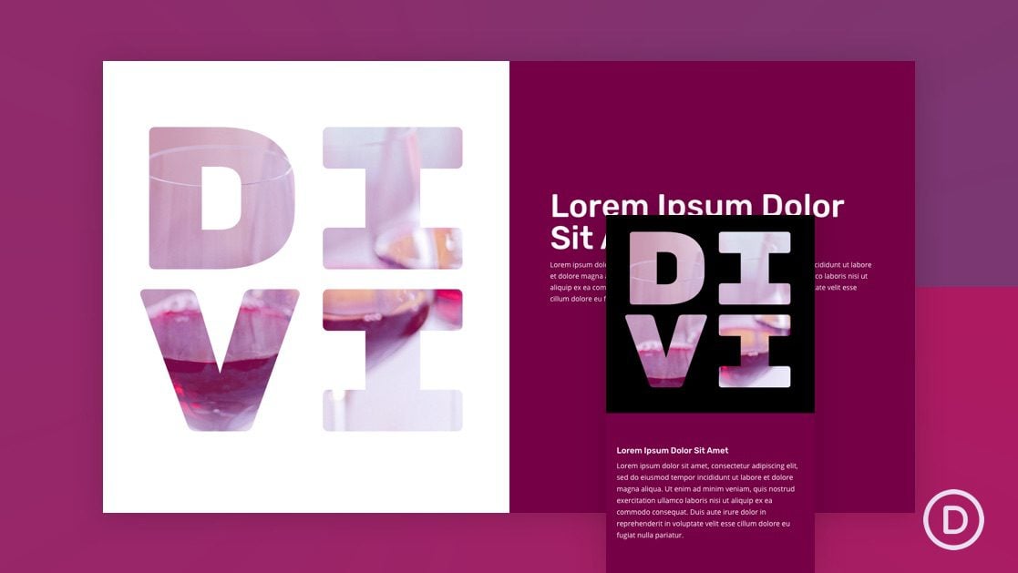
Text Mask designs are surprisingly easy to create using Divi and its built-in options. The builder has all the ingredients for created a text mask effect including options for text styles, backgrounds, and blend modes. In fact, we’ve created text mask designs using blend modes before. But, with scroll effects, we can take text mask designs to a brand new level.
In this tutorial, we are going to show you how to design a text mask with background animation on scroll in Divi. The design is unique and the scroll effect really does make it come alive.
Let’s get started!
Sneak Peek
Here is a quick look at the designs we’ll build in this tutorial.
Download the Layout for FREE
To lay your hands on the designs from this tutorial, you will first need to download it using the button below. To gain access to the download you will need to subscribe to our newsletter by using the form below. As a new subscriber, you will receive even more Divi goodness and a free Divi Layout pack every Monday! If you’re already on the list, simply enter your email address below and click download. You will not be “resubscribed” or receive extra emails.
To import the section layout to your Divi Library, navigate to the Divi Library.
Click the Import button.
In the portability popup, select the import tab and choose the download file from your computer.
Then click the import button.
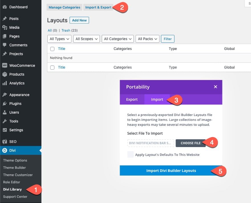
Once done, the section layout will be available in the Divi Builder.
Let’s get to the tutorial, shall we?
What You Need to Get Started
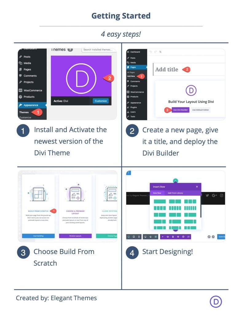
To get started, you will need to do the following:
- If you haven’t yet, install and activate the Divi Theme.
- Create a new page in WordPress and use the Divi Builder to edit the page on the front end (visual builder).
- Choose the option “Build From Scratch”.
After that, you will have a blank canvas to start designing in Divi.
Designing a Text Mask with Background Animation in Divi
Add Row
To kick things off, add a two-column row to the default regular section.

Update Section Settings
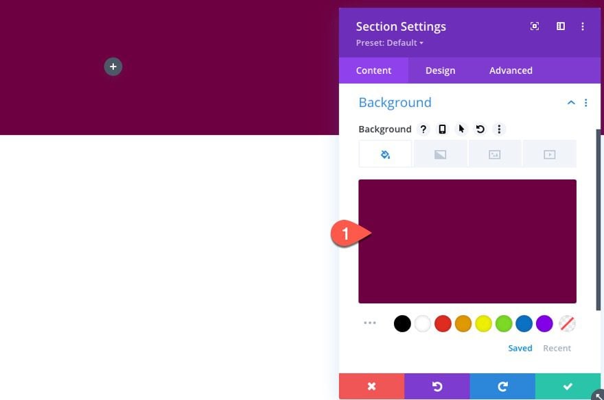
Before adding any modules, open the section settings and update the background color and padding as follows:
- Background Color: #750046
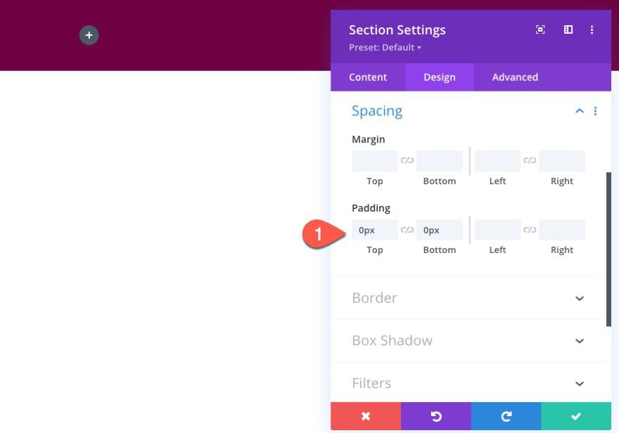
- Padding: 0px top, 0px bottom
Update Row Settings
After the section settings are done, open the settings for the row and update the following design settings:
- Gutter Width: 1
- Width: 100%
- Max Width: 100%
- Padding: 0px top, 0px bottom
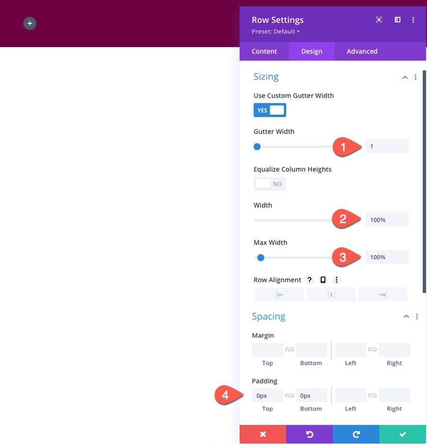
It is important to set the gutter width to 1 and the width to 100% because we are going to be using the vw length unit for our text when creating the text mask design. Since the vw length unit is based on the width of the browser, it is important that the parent containers (section and row) have the same width as the browser which is 100%.
Update Column 1 Settings
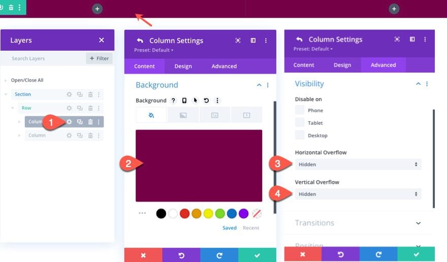
Our text mask and image are going to be added to the left column (column 1). We need to add a background color to the column so that the blend modes we add to the image and text will blend/reveal this color. We also need to set the overflow to hidden so that when we animate the image on scroll, we don’t see the overflowing image outside of the column.
Open the settings for column 1 and update the following:
- Background Color: #750046
- Horizontal Overflow: Hidden
- Vertical Overflow: Hidden
Creating the Text Mask
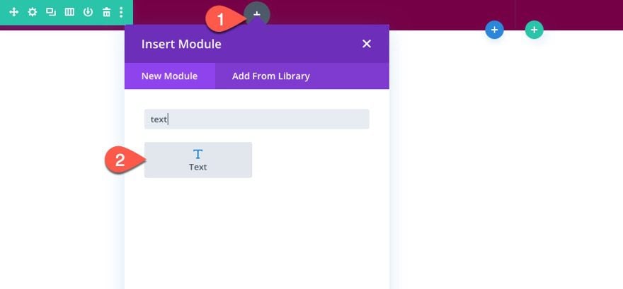
To create the text mask, add a text module to column 1.
The Text Content
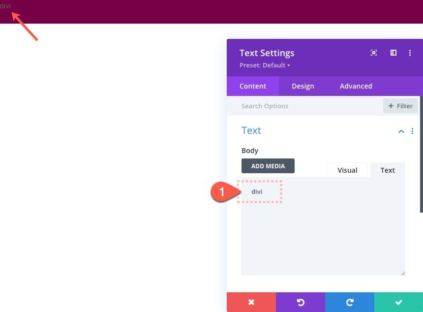
Then add the word “divi” to the body content. We are using a 4 letter word so that it will stack evenly for a square design.
Text Background
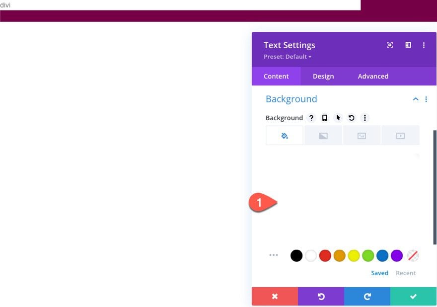
Next, add a white background color to the text module.
- Background Color: #ffffff
Text Design
Then, under the design tab, update the following:
- Text Font: Rubik Mono One
- Text Font style: TT
- Text Text Color: #000000
- Text Text Size: 25vw (desktop), 50vw (tablet and phone)
- Text Line Height: 0.8em
- Text Alignment: center
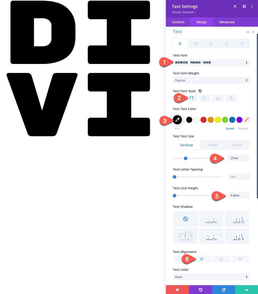
- Padding: 8vw top, 8vw bottom
Text Blend Mode
To complete the text mask design, add the following blend mode:
- Blend Mode: Screen
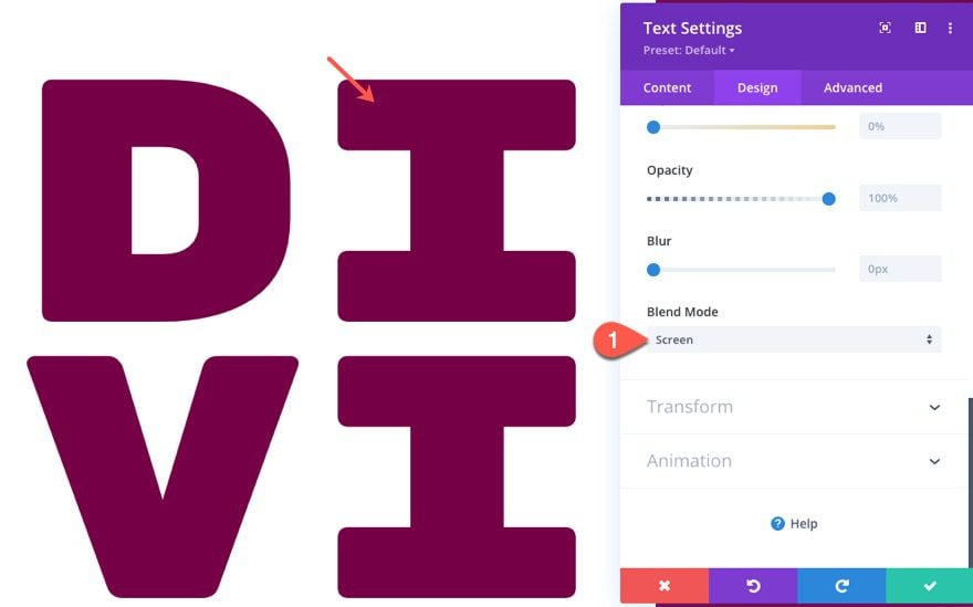
So far, the four key ingredients for this text mask effect is as follows:
- Column Background
- White Text Background
- Black Text
- Screen Blend Mode on Text Module
The screen blend mode multiplies the layers and produces a lighter version of the mix. With the screen blend mode, the black text becomes completely transparent, revealing what is behind it which in this case is a background color.
Add Background Image
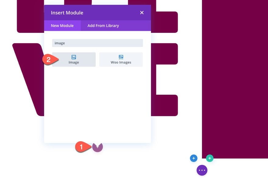
To add the background image to the text mask, create a new image module and upload an image that is roughly 1700px by 2500px. The size of the image is important so that the image will cover the height and width of the column.
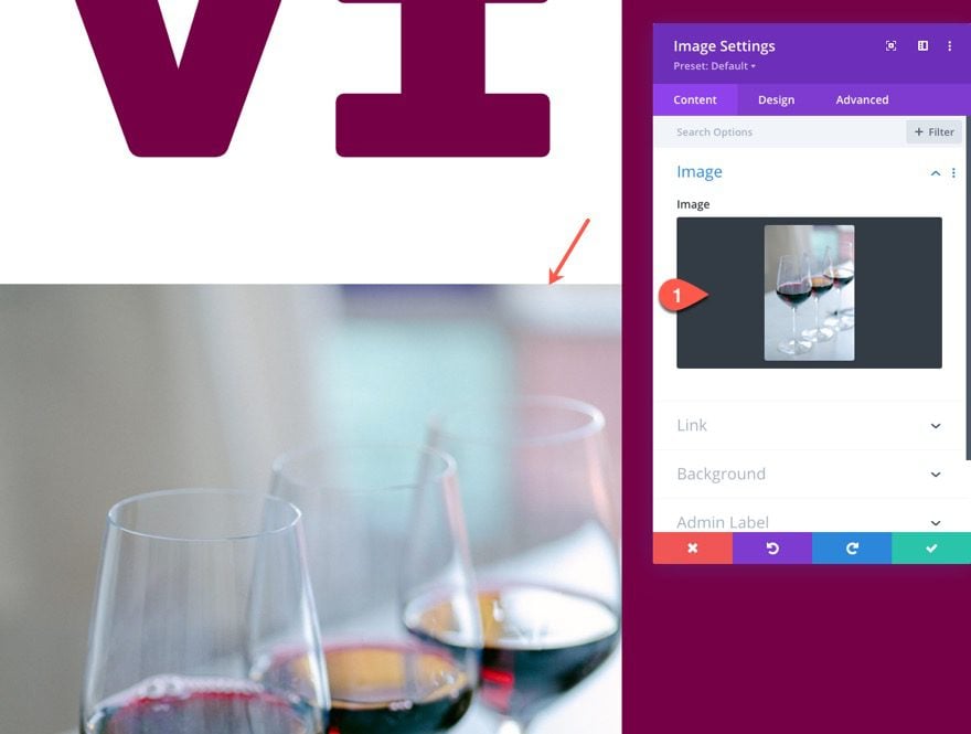
Image Design
Then update the following design settings:
- Force Fullwidth: YES
- Blend Mode: Screen
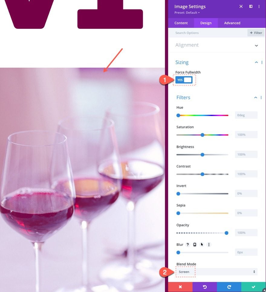
This blend mode isn’t necessary for the text mask effect, but it does blend the image with the background color so that it matches the design better.
Image Position
Next, give the image an absolute position and update the Z Index so that it sits behind the text module.
- Position: Absolute
- Z Index: -1
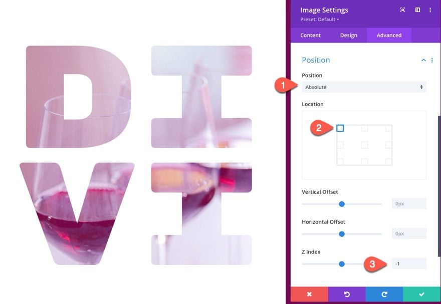
Image Scroll Effects
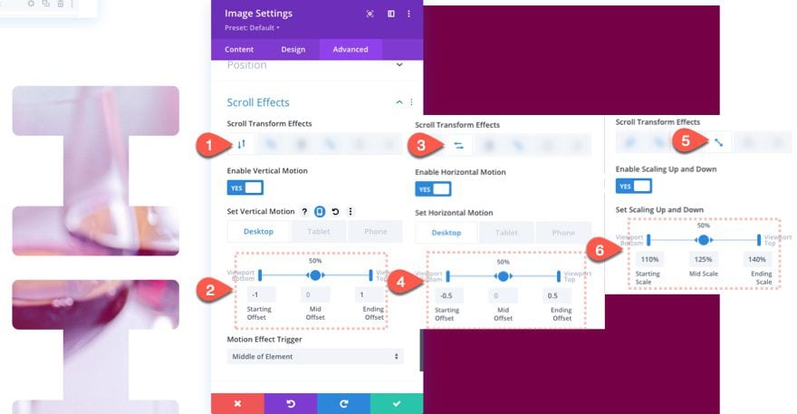
Once the image design is ready, go to the advanced tab and update the scroll effect options as follows:
Under the Vertical Motion tab,
- Starting Offset: -1 (at 0%)
- Mid Offset: 0 (at 50%)
- Ending Offset: 1 (at 100%)
Under the Horizontal Motion tab,
- Starting Offset: -0.5 (at 0%)
- Mid Offset: 0 (at 50%)
- Ending Offset: 0.5 (at 100%)
Under the Scaling Up and Down tab,
- Starting Scale: 110% (at 0%)
- Mid Scale: 125% (at 50%)
- Ending Scale: 140% (at 100%)
Result
You can add some top and bottom margin to the section so that you can check in on the result so far.
Creating the Mock Text
In the right column, add a new text module.
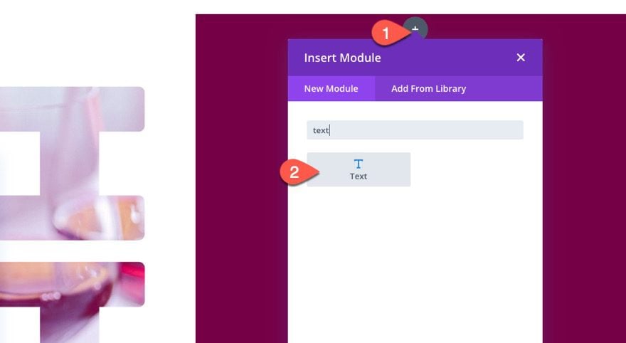
Update the body content with the following:
<h2>Lorem Ipsum Dolor Sit Amet</h2>
<p>Lorem ipsum dolor sit amet, consectetur adipiscing elit, sed do eiusmod tempor incididunt ut labore et dolore magna aliqua. Ut enim ad minim veniam, quis nostrud exercitation ullamco laboris nisi ut aliquip ex ea commodo consequat. Duis aute irure dolor in reprehenderit in voluptate velit esse cillum dolore eu fugiat nulla pariatur.</p>
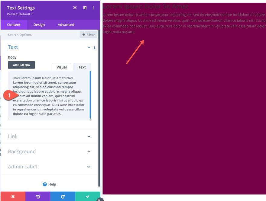
Then update the text design settings ad follows:
- Text Color: Light
- Heading 2 Font: Rubik
- Heading 2 Text Size: 4vw
- Padding (desktop): 16vw top, 5vw left, 5vw right
- Padding (tablet): 16vw top, 16vw bottom, 5vw left, 5vw right
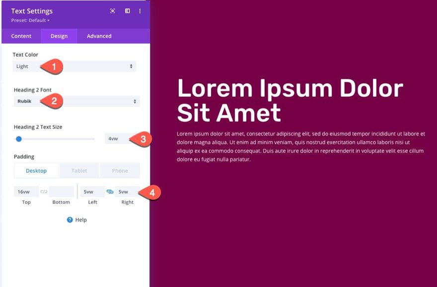
Result
Optional Tweaks
Black Background / White Text
If you want to use a black background for the text mask, all you need to do is update the three key options that make up the text masking effect.
Open the text module settings and change the following:
- Background color: #000000 (black)
- Text Text Color: #ffffff (white)
- Blend Mode: Multiply
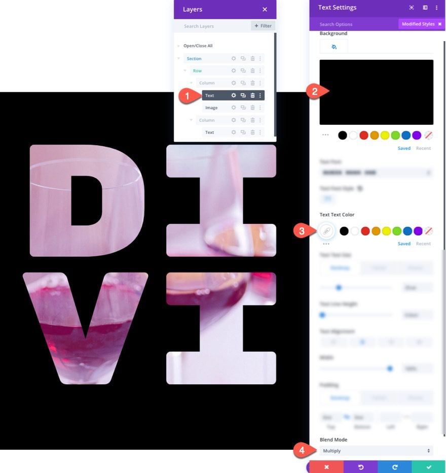
And here is the result…
Rotating PNG Image
And you can change the animated image to one that has a transparent background (a PNG) for another cool effect. Here is an example of a PNG image that I used with a rotating scroll effect added.
Final Results
Here is another look at all of the designs.
Final Thoughts
Hopefully, these text mask designs with background animation on scroll will give the creative edge your site has been needing. Once you know the basic ingredients of creating the text masking effect, you will have no problem creating countless versions of this design to suit your needs.
I look forward to hearing from you in the comments.
Cheers!



I think you’re being quite brave, putting up a post about the use of masks. 🤣
(Unrelated note: I’m not in the United States…)
What happened to the animated previews at the beginning of each post? Is it just me or are they no longer animated?
hello Jason, is creative use of Divi .!thank you, keep up good works , quality tutorial. be good can write something on wordpress 5.5 with divi.
Great Features.
Keep updating this kind of features. I just love it!
Great design and wonderful explanation. Thanks!
Hi Jason,
One more cool effect from you!
Thanks for sharing!
Regards,
Igor
You guys really took time to explain this, love it. please keep us updated on latest things around.
Are the sneak peak previews of the final result no longer animated / gifs?