- 1 It’s Finally Here!
-
2
Cyber Monday
- 2.1 The Boutique Sale Landing Page Design
- 2.2 Get the Exclusive Cyber Monday Boutique Sale Landing Page
- 2.3 Adding the Boutique Sale Landing Page Layout to Your Website
- 2.4 Use Case Tutorial: How to Design a Unique Featured Products Section with Divi and Our Exclusive Boutique Sale Landing Page
- 2.5 Final Thoughts
- 3 Cyber Monday
It’s Finally Here!
Cyber Monday
Did you miss our Black Friday sale over the weekend? Don't worry! Our biggest discount of all time is being extended for a limited time for Cyber Monday. This is the biggest discount we have ever offered, and it's only something we offer during our Black Friday and Cyber Monday sales. Once the sale is over, this discount won't be available until next year. That's a long time to wait!
This Boutique Sale Landing Page is one of the exclusive page layouts we’re providing you with as Lifetime Members and new Cyber Monday customers. The landing page layout and design is remarkable, making it easy to promote discounts and featured products in a fresh new way. The header features a strong call to action to educate users on a valuable discount. And the different sections of the page promote products according to different categories like “new arrivals” and “what’s hot”. The page finishes with a strong call to action in the footer that includes a countdown timer as well.
In this article, I’ll show you how to use the Boutique Sale Landing Page on your own website and I’ll also walk you through how to design a unique featured products section with Divi. To do this I’ll be using Divi’s shop module in creative ways to feature your WooCommerce products with a specific category.
Already a Lifetime Member? You can download the pack right now, no need to partake in our Cyber Monday sale!
The Boutique Sale Landing Page Design

Get the Exclusive Cyber Monday Boutique Sale Landing Page
Before getting into the use case tutorial, you will need to lay your hands on the Exclusive Cyber Monday Boutique Sale Landing Page which you can get by becoming a new Elegant Themes Member, upgrading your existing account, or by already being a Lifetime Member with us. If you are indeed already a Lifetime Member you can log in to our members’ area and download all of our exclusive layout packs here. Everyone else will need to use the button below to buy or upgrade before they can follow along with the rest of the tutorial below.
Claim the Deal Before It Disappears!
Already a Lifetime Member? You can download the pack right now, no need to partake in our Cyber Monday sale!
Adding the Boutique Sale Landing Page Layout to Your Website
For the remainder of this post we’ll assume you’ve either taken advantage of our Cyber Monday (or Black Friday) deal or that you are already a Lifetime Member and have access to the App Launch Landing Page Layout.
Once you’ve downloaded the new Boutique Sale Landing Page Layout from our members area you can watch the video below to see just how easy it is to set up. We would also encourage you to follow along with this tutorial to get your site ready for further customization.
Once you have successfully downloaded the layout, imported it to the Divi Library, and added it to a new page, you are ready to start the use case tutorial below.
Use Case Tutorial: How to Design a Unique Featured Products Section with Divi and Our Exclusive Boutique Sale Landing Page
If you are using WooCommerce to on your ecommerce website, you may already have taken advantage of Divi’s shop module, which allows you to easily display your Products anywhere on your website. In this tutorial, I’m going to show you how to design a unique line up of shop modules, each pulling from a different product category. This allows you to design each product/shop module individually. Plus, you will have the automated functionality that updates the module with a new product whenever a new WooCommerce product is added to the specific category in the shop module.
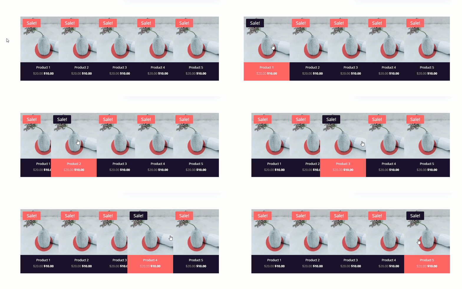
Here is a sneak peek of what we will build together.
Setting up your WooCommerce Products
For this tutorial, you will need to have the WooCommerce Plugin installed and active on your website. Once you have WooCommerce up and running, go to your WordPress Dashboard and navigate to Products > Add New. Then update the following:
Give your new product a Title and a Description.
Set the price and sale price of the product.
Add a new category called “Featured” and select it.
Add a featured image for the product.
Then publish the product.
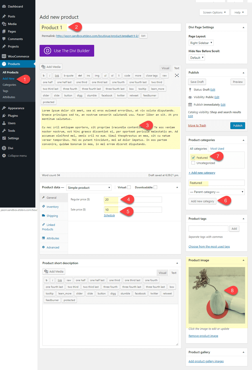
Note: This design works best when your product featured images are all the same size. The one I’m using for this tutorial is 981px by 800px. If the images are not the same size, the featured product boxes on your page will vary in height.
Next, continue the same steps to add four more products. For each new product you add, make sure you assign a different category to each one. This is important so that the shop module will be able to display the most recent product in that category. For this tutorial, I’m just giving my products the following categories: Featured, Featured 1, Featured 2, Featured 3, Featured 4, Featured 5.
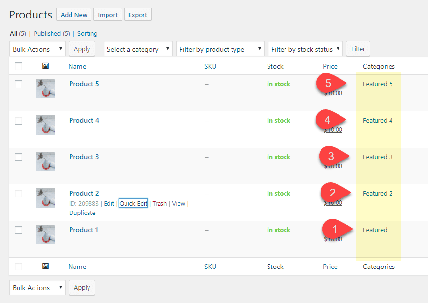
Once done, you are ready to start creating the featured products section on the Boutique Sale Landing Page.
Go to the page where you have imported the Boutique Sale Landing Page and deploy the visual builder.
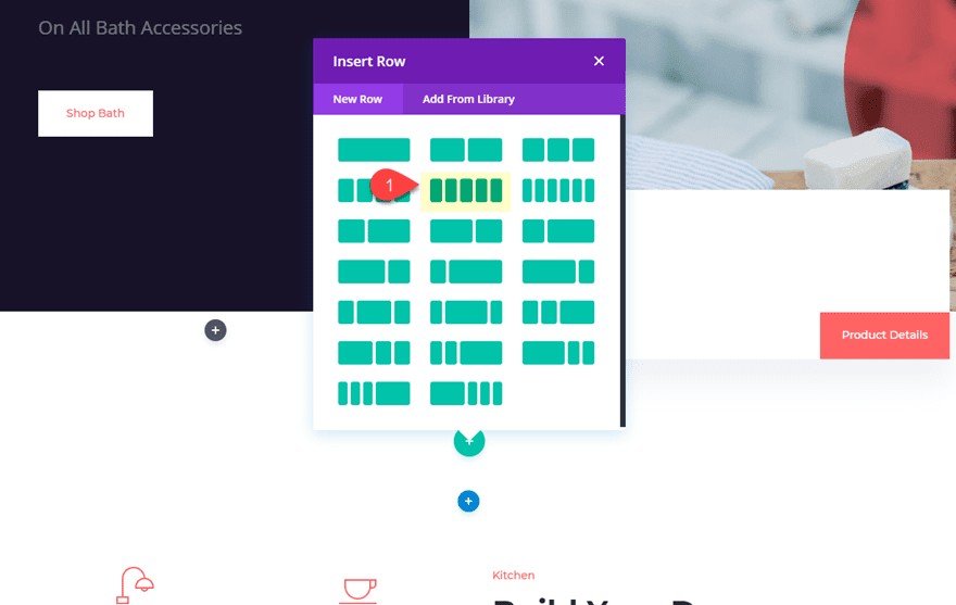
Under the second section of the layout, create a new regular section with a 5 column Row.
Configuring the Shop Modules to Pull from a Certain Category
Now it’s time to start adding our shop modules to our columns. Then we can configure each one to pull from a different category. In the first column add a shop module and update the following:
Type: Product Category
Product Count: 1
Include Categories: Featured
Order By: Sort By Date: Newest to Oldest
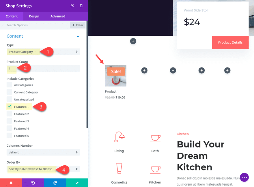
Next, copy and paste the shop module into column 2 and update the shop settings to include only the category “Featured 2”.
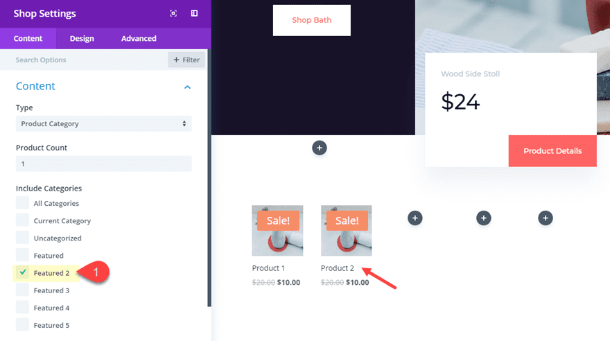
Then continue this process for the remaining columns as follows:
Copy and paste the shop module into column 3 and update the shop settings to include only the category “Featured 3”.
Copy and paste the shop module into column 4 and update the shop settings to include only the category “Featured 4”.
Copy and paste the shop module into column 5 and update the shop settings to include only the category “Featured 5”.
With this functionality in place, everytime you add a new product in any of the categories applied, the shop module will automatically display that product in your featured section. So this is a great way to show the most recent product from 5 different categories all in one place.
Designing the Shop Modules
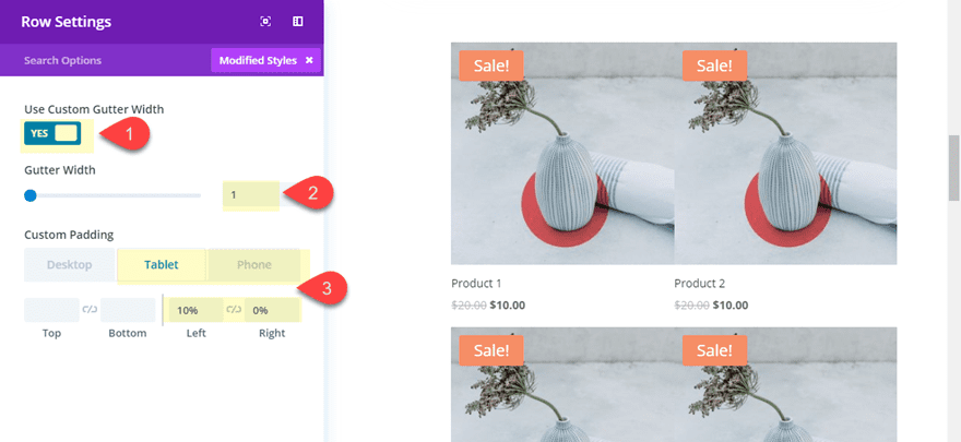
Before we start designing our shop modules, go ahead and open the row settings and update the following:
Gutter Width: 1
Custom Padding (Tablet): 10% left, 0% right
Custom Padding (smartphone): 20% left, 0% right
Since we want to apply the same design for all of our shop modules at once, we can use Divi’s multiselect feature to select all of the shop modules. To do this hold cmd (or ctrl) and click on each of the modules until all are selected. Then click the setting icon on one of the selected modules to open up the element settings modal. Any design changes you make here will be applied to all modules.
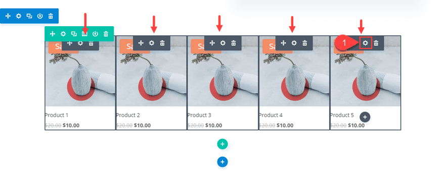
Update the following:
Background color: #241f32
Background color (hover): #ff6363
Icon Hover Color: rgba(0,0,0,0)
Hover Overlay Color: rgba(0,0,0,0)
Sale Badge Color (default): #ff6363
Sale Badge Color (hover): #241f32
Text Orientation: Center
Title Text Color: #ffffff
Price Text Color: #ffffff
Width: 120% (desktop), 100% (tablet), 100% (smartphone)
Custom Margin (desktop): -20% right
Custom Margin (hover): -20% left, 0% right
Custom Margin (tablet): -20% left, 0% right
Custom Padding: 5px bottom
By setting the width (technically max width) to 120%, on hover, you can extend the module beyond its parent column using a negative left margin of -20%.
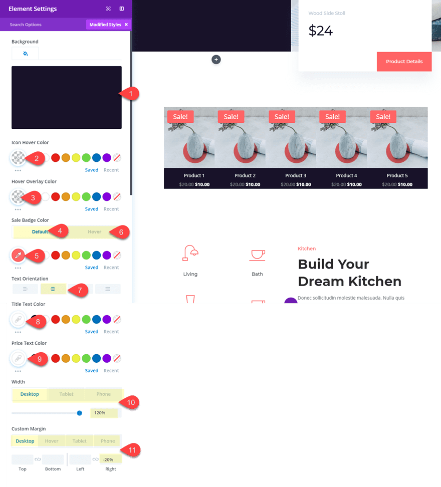
Since the shop module in column 5 doesn’t need the hover effect that moves to the left, go ahead and disable the custom margin hover effect on that module.
Here is the final result.

And because of how we set our custom margins, the hover effect that moves the module to the left is disabled on mobile. And the design does respond nicely.
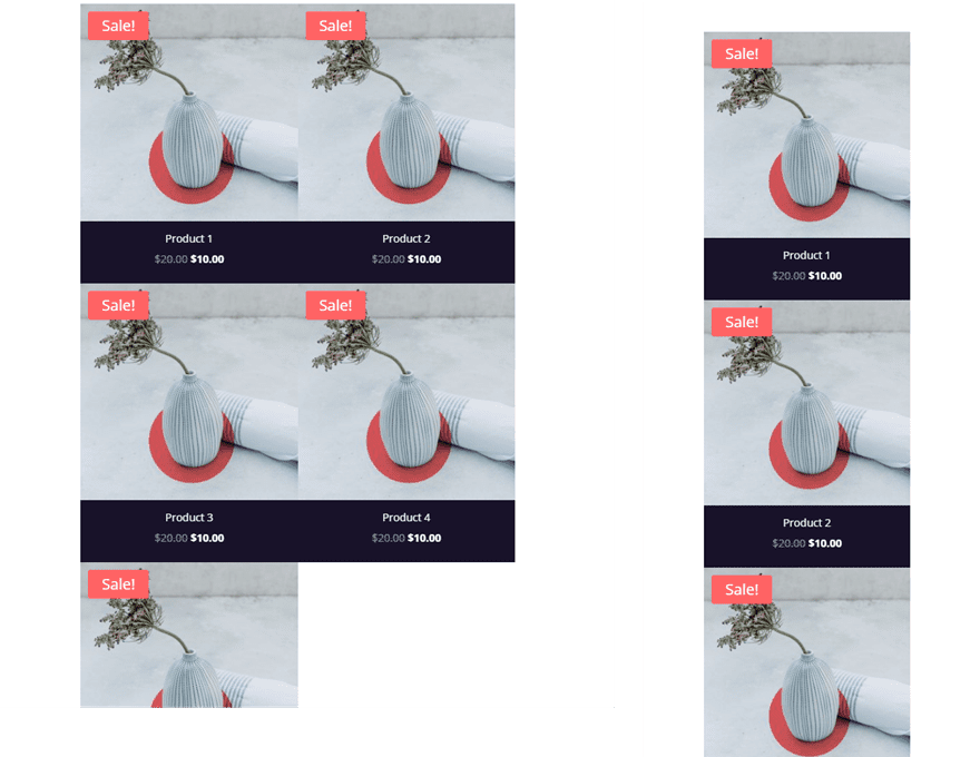
Of course, feel free to experiment with more settings for different designs and hover effects. Also, if you like the design but don’t want to use the shop module, you can always create a similar design using blurb modules. Then you could link each blurb to a product category page or something.
Final Thoughts
This use case is part of our Cyber Monday Deal where we share 6 FREE limited edition landing pages with Black Friday customers and lifetime members. By joining our empowered community during these days and becoming a member, you’ll get:
- 25% OFF EVERYTHING
- All of the 6 landing pages for free
- Access to our awesome themes and plugins
- Bonus Prizes
Seize the opportunity and become a member today!



Thanks for sharing information, Divi themes is a beautiful themes for wordpress.
Thanks for sharing a great information
it really helpful for me
I am a lifetime member. Where can I get the download link to the package?
Thanks for putting light on such a useful topic. I Bought this hjust because of this wonderful guide. Really helpful
That’s awesome Koderey. So glad you found it helpful.