The web is full of sites that need design accents related to time (speed optimization, upcoming events, etc.). In most cases, a clock icon or graphic can work great. But, creating an animated clock design will definitely give a unique “spin” to the design of your website.
With all of the built-in design options available in Divi, we can create an awesome animated clock design from scratch. In this tutorial, we are going to create an animated clock that will turn the hands of the clock as the user scrolls down the page.
Let’s get started!
- 1 Sneak Peek
- 2 Download the Animated Clock Layout for FREE
- 3 Download For Free
- 4 You have successfully subscribed. Please check your email address to confirm your subscription and get access to free weekly Divi layout packs!
- 5 What You Need to Get Started
- 6 Part 1: Designing the Clock Face
- 7 Part 2: Adding the Hour Markers
- 8 Part 3: Creating the Clock Hands (Second, Minute, and Hour)
- 9 Part 4: Adding Rotation Scroll Effects to Each Clock Hand
- 10 Final Results
- 11 Final Thoughts
Sneak Peek
Here is a quick look at the design we’ll build in this tutorial.
Download the Animated Clock Layout for FREE
To lay your hands on the designs from this tutorial, you will first need to download it using the button below. To gain access to the download you will need to subscribe to our newsletter by using the form below. As a new subscriber, you will receive even more Divi goodness and a free Divi Layout pack every Monday! If you’re already on the list, simply enter your email address below and click download. You will not be “resubscribed” or receive extra emails.
To import the section layout to your Divi Library, navigate to the Divi Library.
Click the Import button.
In the portability popup, select the import tab and choose the download file from your computer.
Then click the import button.
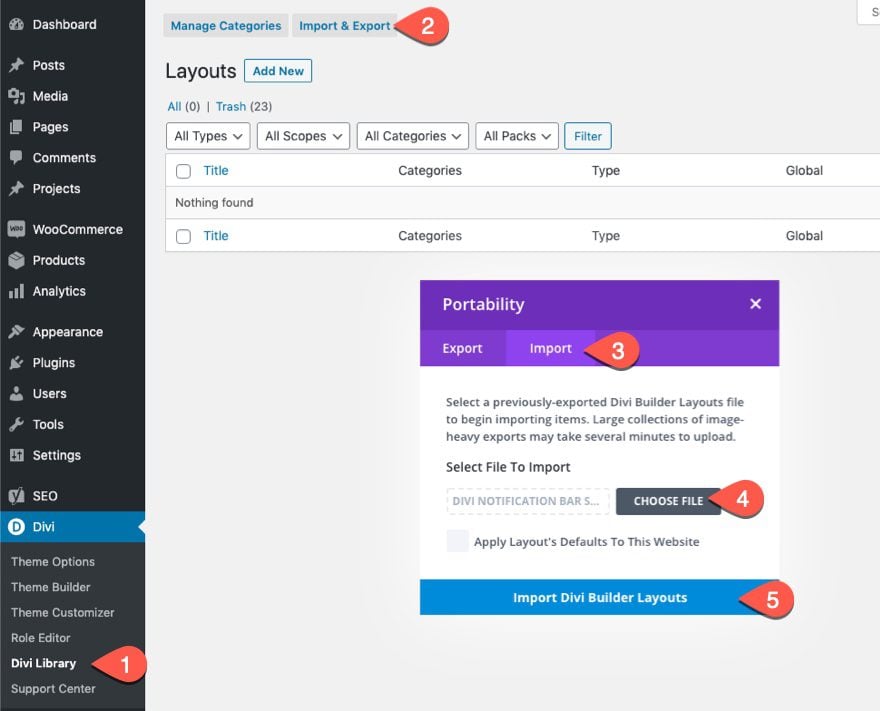
Once done, the section layout will be available in the Divi Builder.
Let’s get to the tutorial, shall we?
What You Need to Get Started
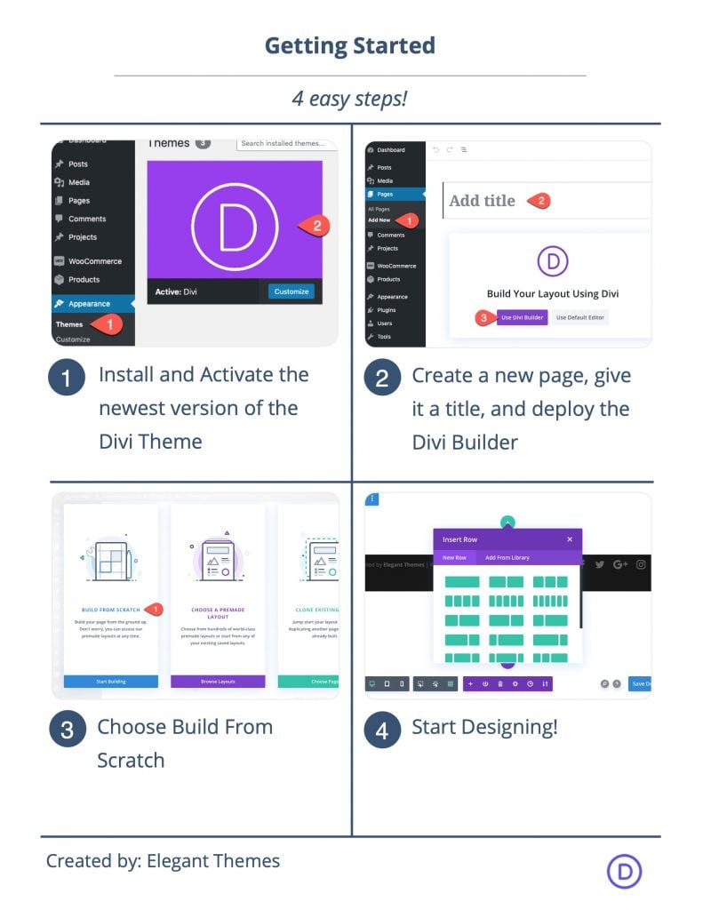
To get started, you will need to do the following:
- If you haven’t yet, install and activate the Divi Theme.
- Create a new page in WordPress and use the Divi Builder to edit the page on the front end (visual builder).
- Choose the option “Build From Scratch”.
After that, you will have a blank canvas to start designing in Divi.
Part 1: Designing the Clock Face
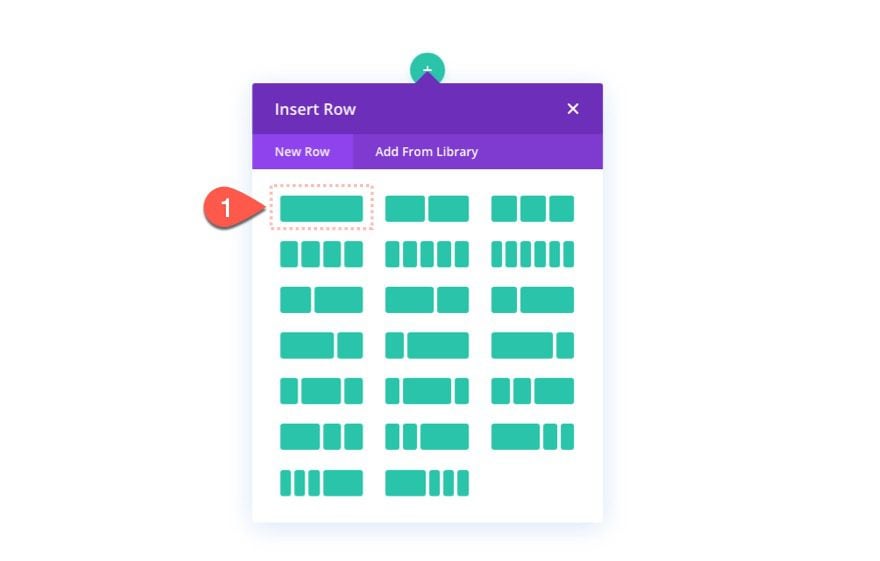
To get started, add a one-column row to the regular section.
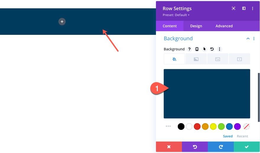
Row Settings
Before adding any modules, open the row settings and update the following:
- Background Color: #003a5c
Under the design tab, update the following:
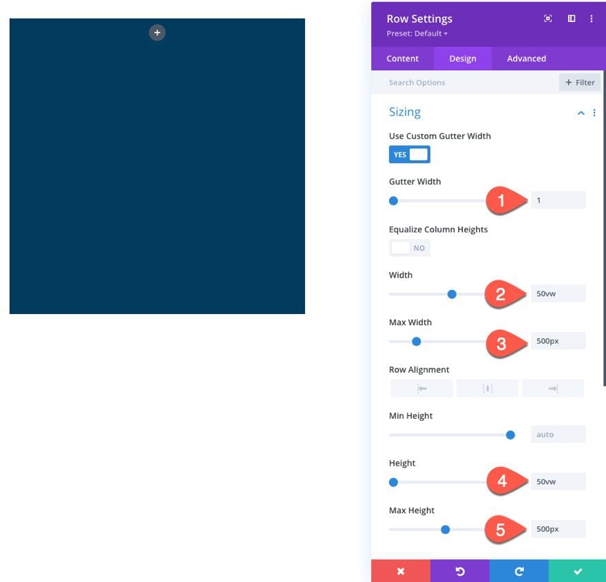
- Gutter Width: 1
- Width: 50vw
- Max Width: 500px
- Height: 50vw
- Max Height: 500px
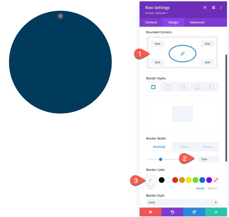
- Rounded Corners: 50%
- Border Width: 15px
- Border Color: #ffffff
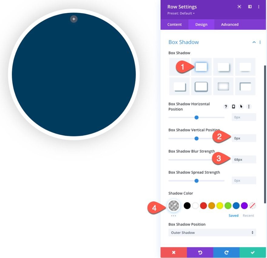
- Box Shadow: see screenshot
- Box Shadow Vertical Position: 0px
- Box Shadow Blur Strength: 68px
- Shadow Color: rgba(0,0,0,0.22)
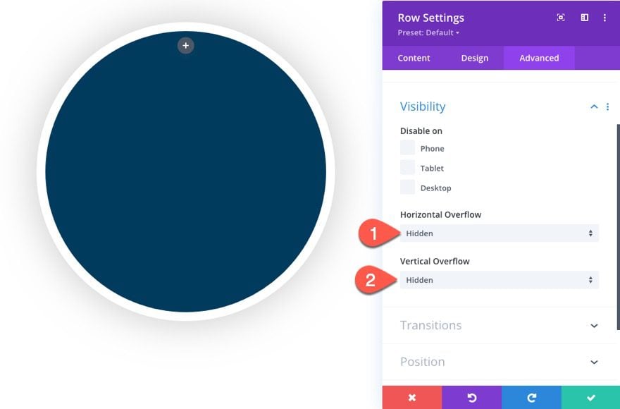
Under the Advanced tab, update the visibility options as follows:
- Horizontal Overflow: Hidden
- Vertical Overflow: Hidden
Part 2: Adding the Hour Markers
Once the row is designed as the clock face, we are ready to add the hour markers that represent twelve 0’clock, three 0’clock, six 0’clock, and nine 0’clock. Each of the markers will be created using a divider module.
The 12 o’Clock Marker
Start by adding a new divider module inside the row.
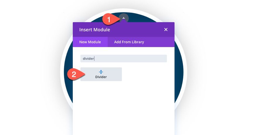
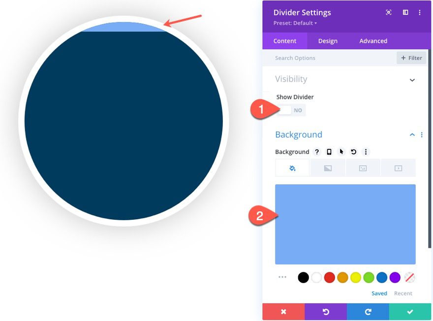
Then update the background color as follows:
- Background Color: #78acf4
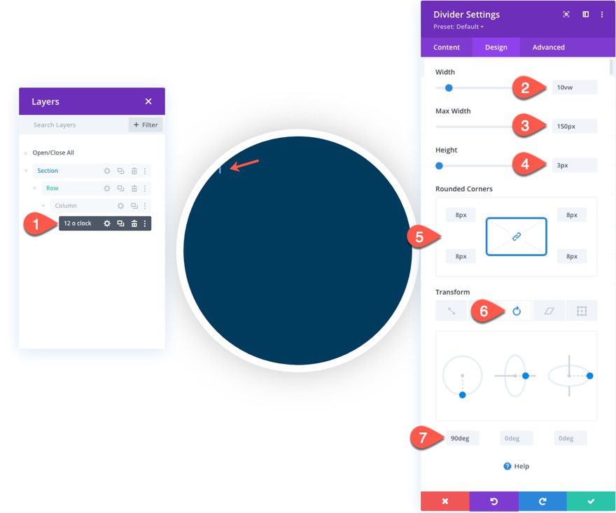
- Width: 10vw
- Max Width: 150px
- Height: 3px
- Rounded Corners : 8px
- Transform Rotate Z Axis: 90deg
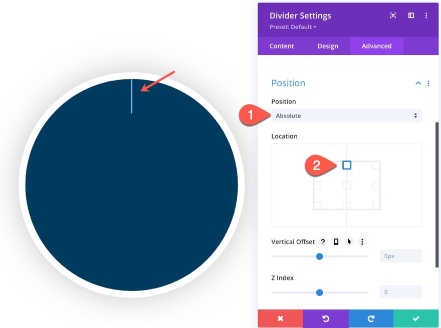
Under the advanced tab, give the divider an absolute position:
- Position: Absolute
- Location: top center
The 6 o’Clock Marker
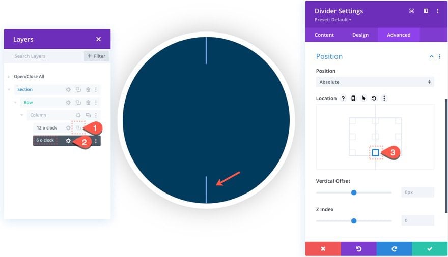
To create the 3 o’clock marker, duplicate the divider used to create the 12 0’clock marker. (At this point it is a good idea to label your modules within the Layers modal.) Then open the duplicate divider and update the position location as follows:
- Location: bottom center
The 3 o’Clock Marker
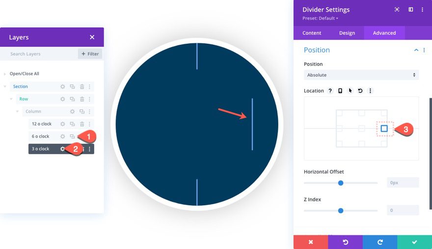
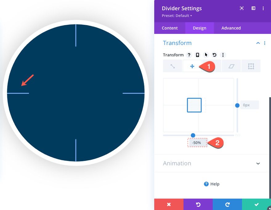
To create the 3 o’clock marker, duplicate the 6 o’clock marker. Then open the settings for the new duplicate (make sure to label it “3 o’clock”) and change the following:
- Location: right center
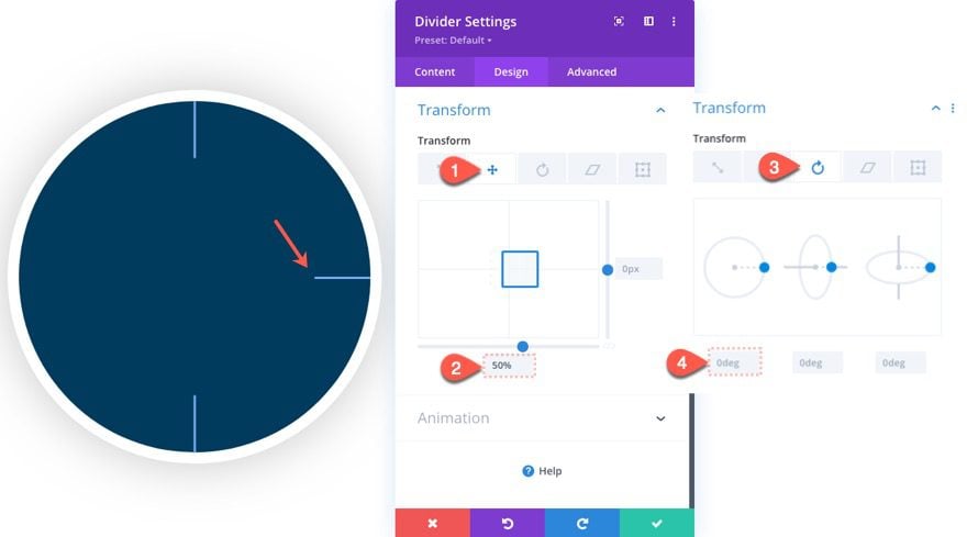
Then update the transform options as follows:
Under the translate tab…
- Transform Translate X Axis: 50%
Under the Rotation tab
- Transform Rotate Z Axis: 0deg
The 9 o’Clock Marker
To create the 3 o’clock marker, duplicate the 6 o’clock marker. Then open the settings for the new duplicate (make sure to label it “9 o’clock”) and change the following:
- Location: left center
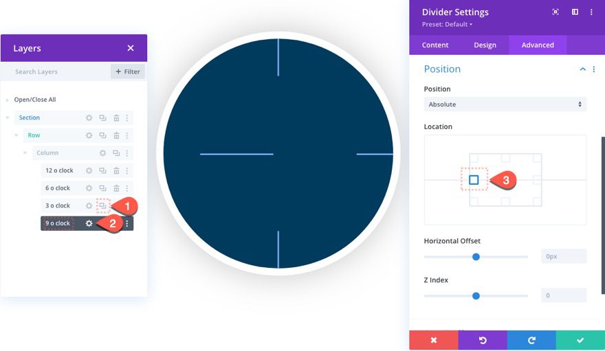
Then update the transform options as follows:
Under the translate tab…
- Transform Translate X Axis: -50%
Part 3: Creating the Clock Hands (Second, Minute, and Hour)
Once the hour markers are in place, we are ready to start creating the clock hands. We’ll start with the second hand.
The Second Hand
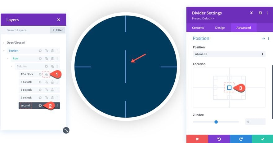
To create the second hand, duplicate the 12 o’clock divider and drag it below the rest of the dividers in the column using the Layers modal.
Then label the new duplicate “second”.
Open the settings of the module and update the position under the Advanced tab:
- Location: center center
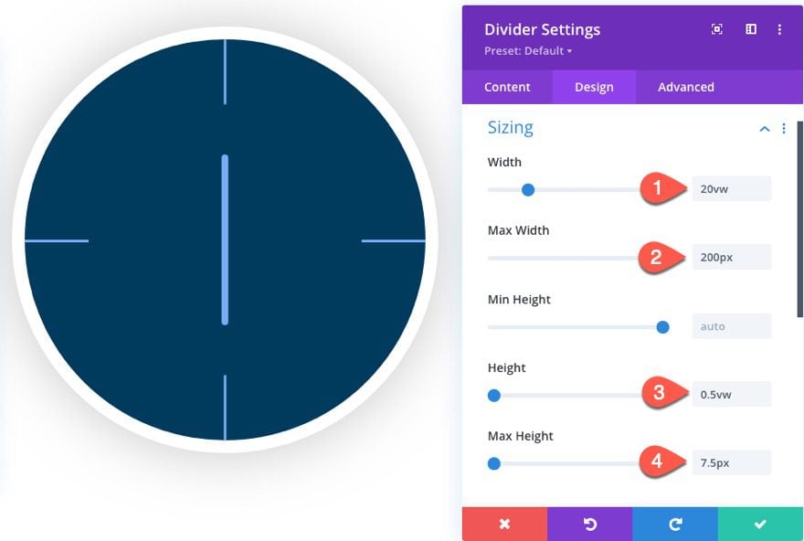
Under the design tab, update the size as follows:
- Width: 20vw
- Max Width: 200px
- Height: 0.5vw
- Max Height: 7.5px
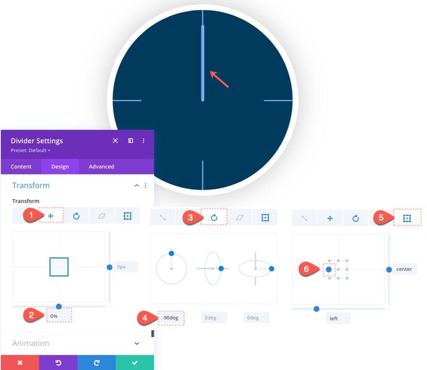
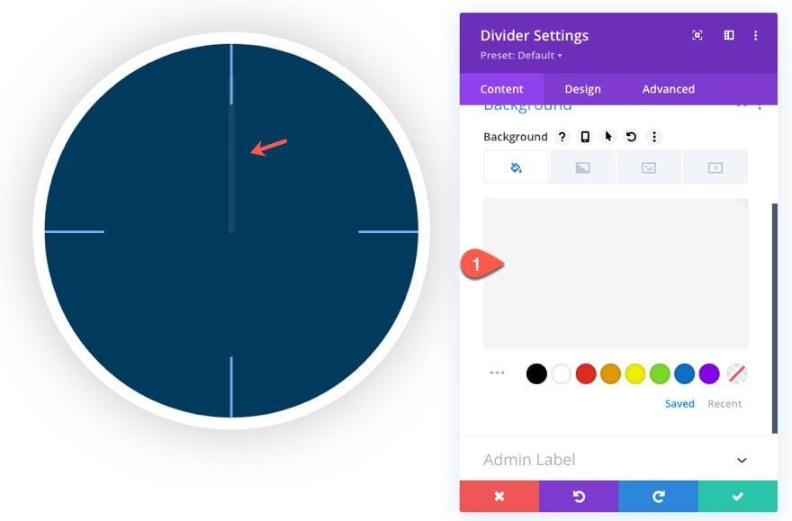
Now the second hand is in the middle of the clock face, but we want the bottom of the second hand to start at the center like a normal clock hand would. Then we want the bottom of the hand to remain in the center as the pivoting origin so that the hand will be able to rotate like it would on an actual clock. To do this we will need to use a combination of transform options to position and rotate the divider from a specific transform-origin.
Update the following:
Under the translate tab…
- Transform Translate X Axis: 0% (this is an important step)
Under the Rotation tab…
- Transform Rotate Z Axis: -90deg
Under the Origin tab…
- Transform Origin: Left Center
Since this hand will be moving really fast once we add the scroll effect, let’s give it a semi-transparent background color so it won’t be too distracting.
- Background Color: rgba(175,175,175,0.12)
The Minute Hand
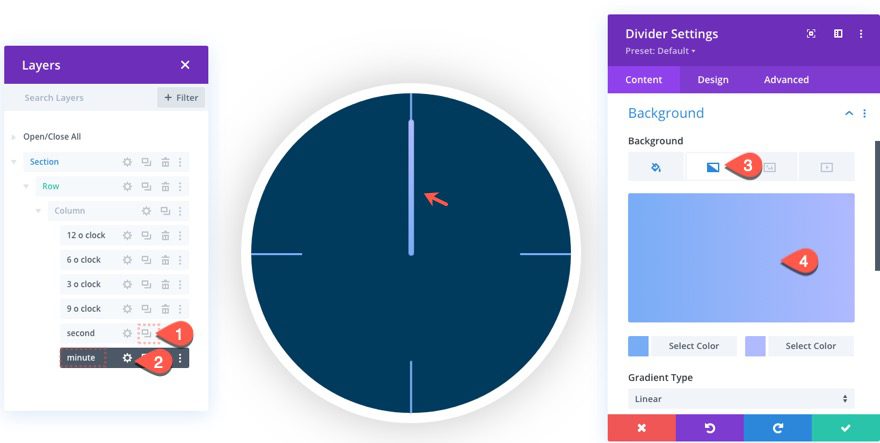
To create the minute hand, duplicate the second hand module and label the duplicate “minute”. Then open the new divider module and update the background color:
- Background Gradient Left Color: #78acf4
- Background Gradient Right Color: #b0b9ff
- Gradient Direction: 90deg
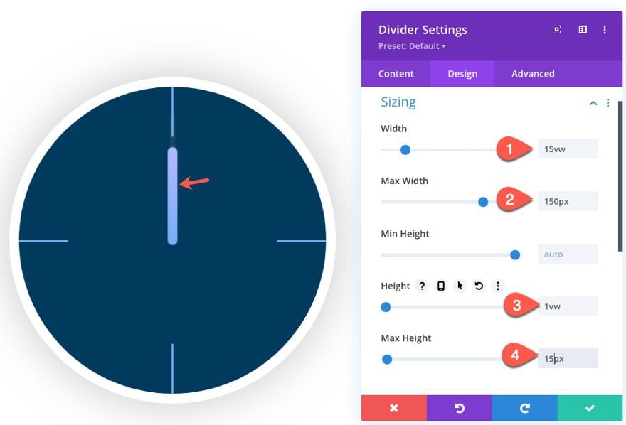
Then update the design as follows:
- Width: 15w
- Max Width: 150px
- Height: 1vw
- Max Height: 15px
The Hour Hand
Once the minute hand is complete, duplicate the Second hand module and label the duplicate “hour”. Then open the new divider module and update the background color as follows:
- Background Color: #ffffff
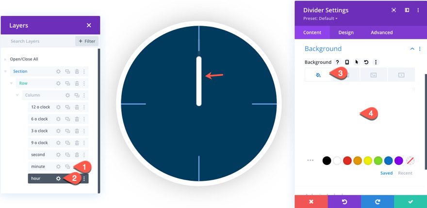
Then update the size under the design tab as follows:
- Width: 10vw
- Max Width: 100px
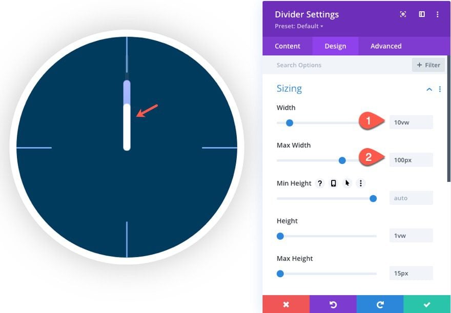
At this point, you will have all three clock hands ready for the scroll effects!
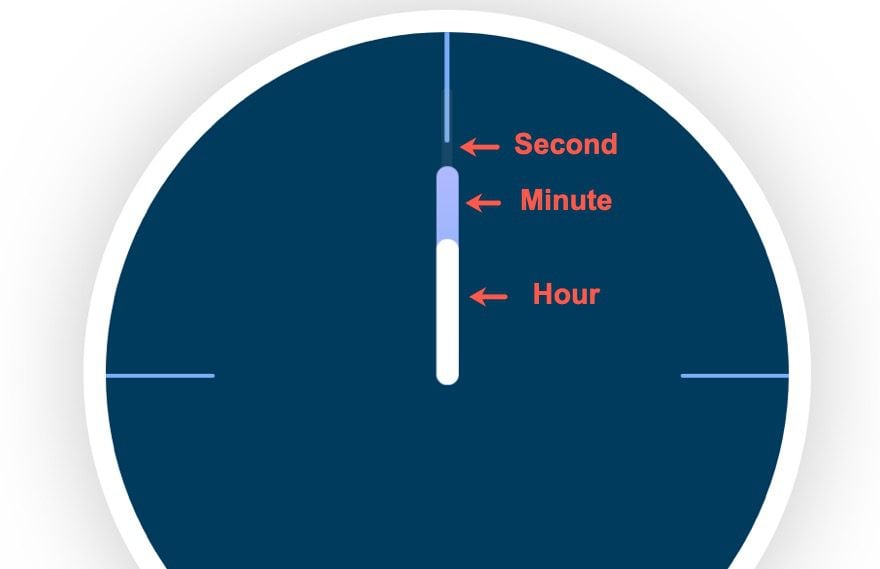
Part 4: Adding Rotation Scroll Effects to Each Clock Hand
To rotate the clock hands, we are going to add the rotation scroll effect to each of the three clock hands. Since we are working with a clock design, it is important to remember that we can use the degrees of rotation on each clock hand to represent actual time. For example, rotating the hour hand 30 degrees would represent 1 o’clock, 60 degrees would be 2 o’clock, and so on.
Hour Hand Rotation Scroll Effect
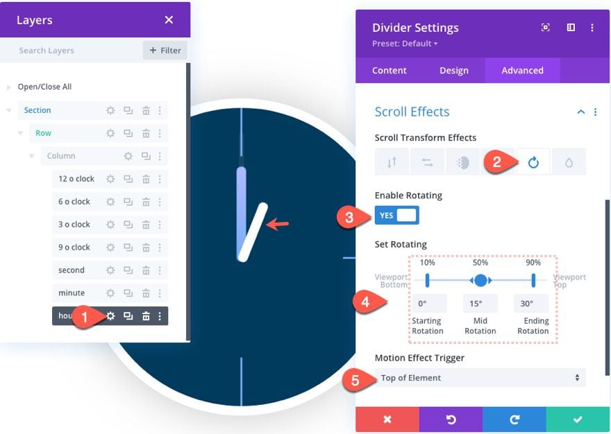
First, we will add a rotation scroll effect to the hour hand. Open the hour hand divider settings and add the following transform effect:
Under the rotation tab…
- Enable Rotating: YES
- Starting Rotation: 0deg (at 10%)
- Mid Rotation: 15deg (at 50%)
- Ending Rotation: 30deg (at 90%)
Minute Hand Rotation Scroll Effect
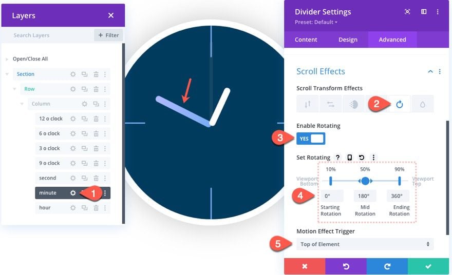
Next, we will add a rotation scroll effect to the minute hand. Open the minute hand divider settings and add the following transform effect:
Under the rotation tab…
- Enable Rotating: YES
- Starting Rotation: 0deg (at 10%)
- Mid Rotation: 180deg (at 50%)
- Ending Rotation: 360deg (at 90%)
Second Hand Rotation Scroll Effect
Next, we will add a rotation scroll effect to the second hand. Open the second hand divider settings and add the following transform effect:
Under the rotation tab…
- Enable Rotating: YES
- Starting Rotation: 0deg (at 10%)
- Mid Rotation: 5400deg (at 50%)
- Ending Rotation: 10800deg (at 90%)
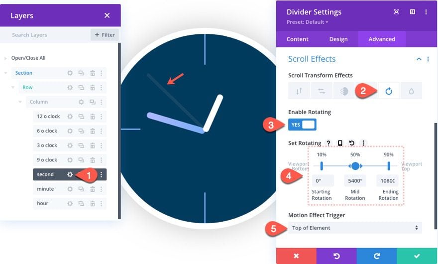
NOTE: An accurate rotation for the second hand to reach 1 hour would require a rotation of 21600 degrees. But since that is way too fast, I thought it best to cut that in half. After all, this is for design purposes.
Final Results
Here is the final design.
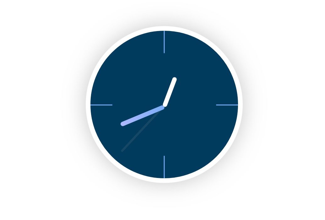
And this is the final result of the scroll effects. Notice how the time passes exactly one hour when scrolling down the page.
Final Thoughts
It is pretty amazing that we can make a clock design like this with scroll effects that represent time so accurately. Feel free to experiment with adding more rotation scroll effects to speed up and slow down time on the clock while scrolling. Plus you can use this clock design to accent plenty of CTAs or headers.
I look forward to hearing from you in the comments.
Cheers!




its amazing now i am able to create real animated clock
Divi themes are just amazing. You can add several effects easily. I loved the fact that you can actually create an animated clock. Looks interesting. Will try for sure.
Thanks
wooww, its amazing now i am able to create real animated clock its look like very intresting and impressive thank you for this post.