Designing business cards that flip on click can be a creative addition to any team member section or page on your website. Business cards are already a familiar and intuitive method for supplying concise information about a person working for a company. So it makes sense to offer that same design on the web. Plus, the information provided on each card can become even more dynamic and interactive, allowing the user to copy info and/or click links within the business card.
In this tutorial, we are going to show you how to design a unique business card in Divi that also has the functionality of flipping over on click to reveal the information about the person, just like a real business card.
Let’s jump in and get started!
- 1 Sneak Peek
- 2 Download the Layout for FREE
- 3 Download For Free
- 4 What You Need to Get Started
-
5
Designing a Business Card that flips on click in Divi
- 5.1 The Row and Column Settings
- 5.2 Duplicate Column
- 5.3 Building the Back Card
- 5.4 Creating the Back Card Logo
- 5.5 The Name
- 5.6 The Job Position (or Role)
- 5.7 The Company
- 5.8 The Phone Number
- 5.9 The Email Address
- 5.10 The Website
- 5.11 The Social Media Follow Icons
- 5.12 Add Same CSS Class to All Card Content Modules
- 5.13 The Front Card
- 5.14 The Custom Code
- 5.15 Creating Additional Business Cards
- 6 Final Result
- 7 Final Thoughts
Sneak Peek
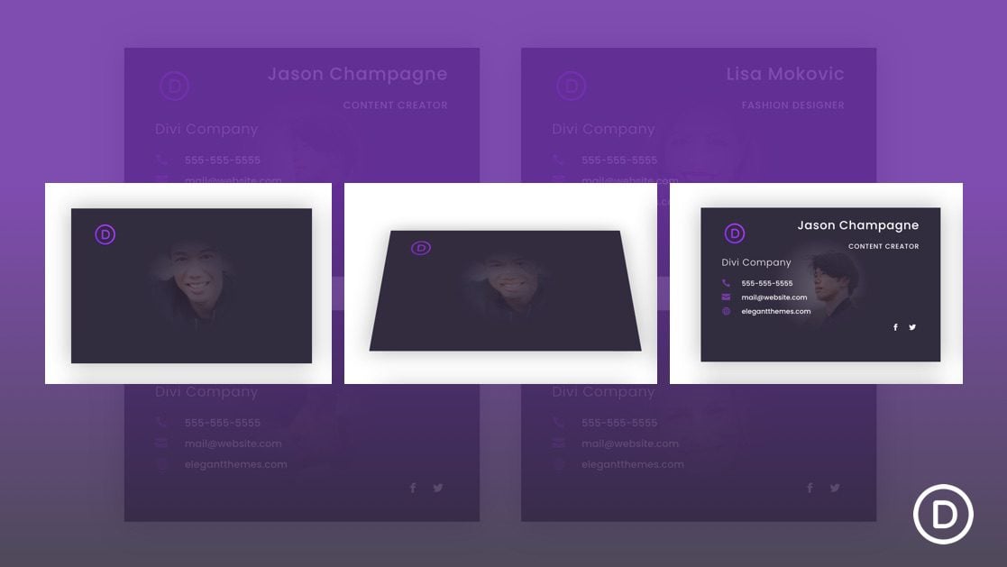
Here is a quick look at the design we’ll build in this tutorial.
Download the Layout for FREE
To lay your hands on the designs from this tutorial, you will first need to download it using the button below. To gain access to the download you will need to subscribe to our newsletter by using the form below. As a new subscriber, you will receive even more Divi goodness and a free Divi Layout pack every Monday! If you’re already on the list, simply enter your email address below and click download. You will not be “resubscribed” or receive extra emails.
To import the section layout to your Divi Library, navigate to the Divi Library.
Click the Import button.
In the portability popup, select the import tab and choose the download file from your computer.
Then click the import button.
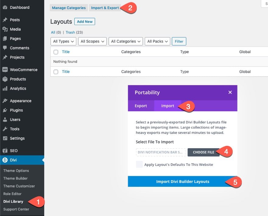
Once done, the section layout will be available in the Divi Builder.
Let’s get to the tutorial, shall we?
What You Need to Get Started

To get started, you will need to do the following:
- If you haven’t yet, install and activate the Divi Theme.
- Create a new page in WordPress and use the Divi Builder to edit the page on the front end (visual builder).
- Choose the option “Build From Scratch”.
After that, you will have a blank canvas to start designing in Divi.
Designing a Business Card that flips on click in Divi
The Row and Column Settings
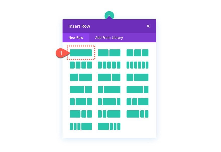
To start, create a one-column row to the regular section.
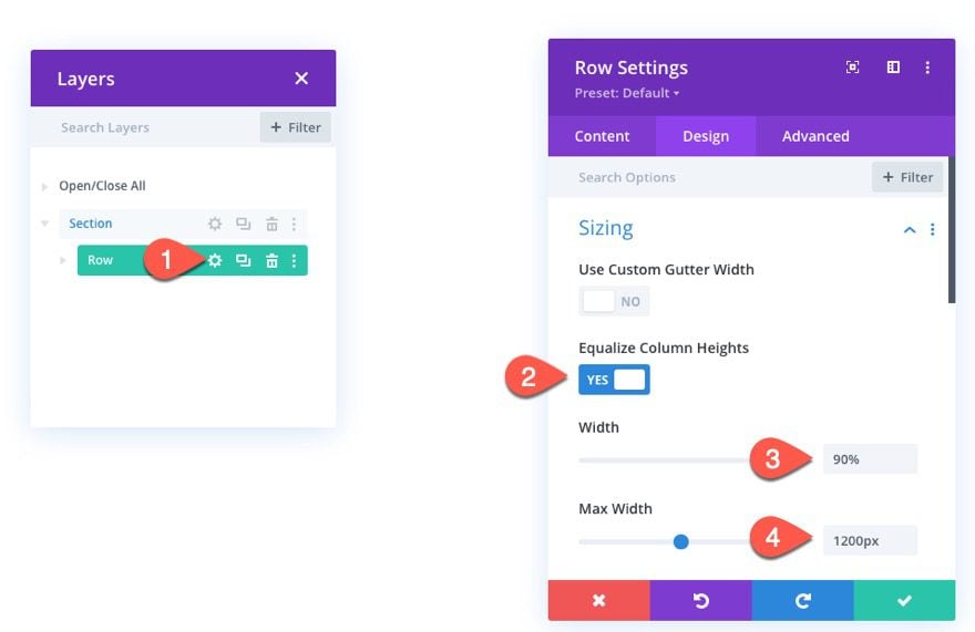
Open the row settings and update the following:
- Equalize Column Heights: YES
- Width: 90%
- Max Width: 1200px
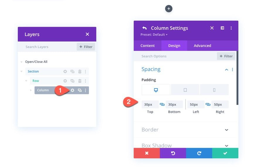
Open the settings for the column and give it some padding as follows:
- Padding (Desktop and Tablet): 30px top, 30px bottom, 50px left, 50px right
- Padding (Phone): 15px top, 15px bottom, 15px left, 15px right
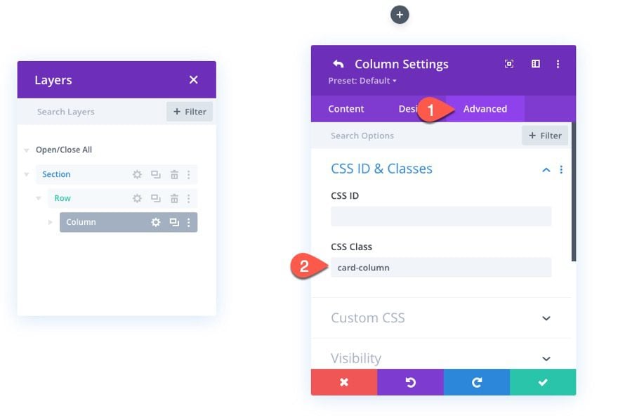
Under the advanced tab, add the following CSS Class to the column:
- CSS Class: card-column
This class will serve as a target in our code to trigger the click event that will cause the flip animation later on.
Duplicate Column
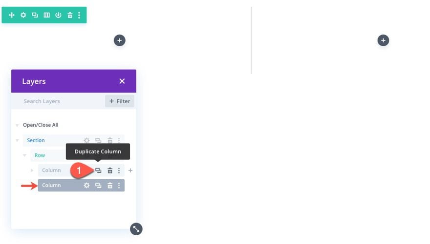
Now that we have one column setup, duplicate the column so that we have a two-column layout with each column having the same padding and CSS Class.
Building the Back Card
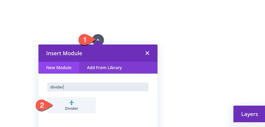
The first element of the business card design is what we are going to call the back card which will serve as the business card background with the card info. To create the front card, add a divider to column 1.
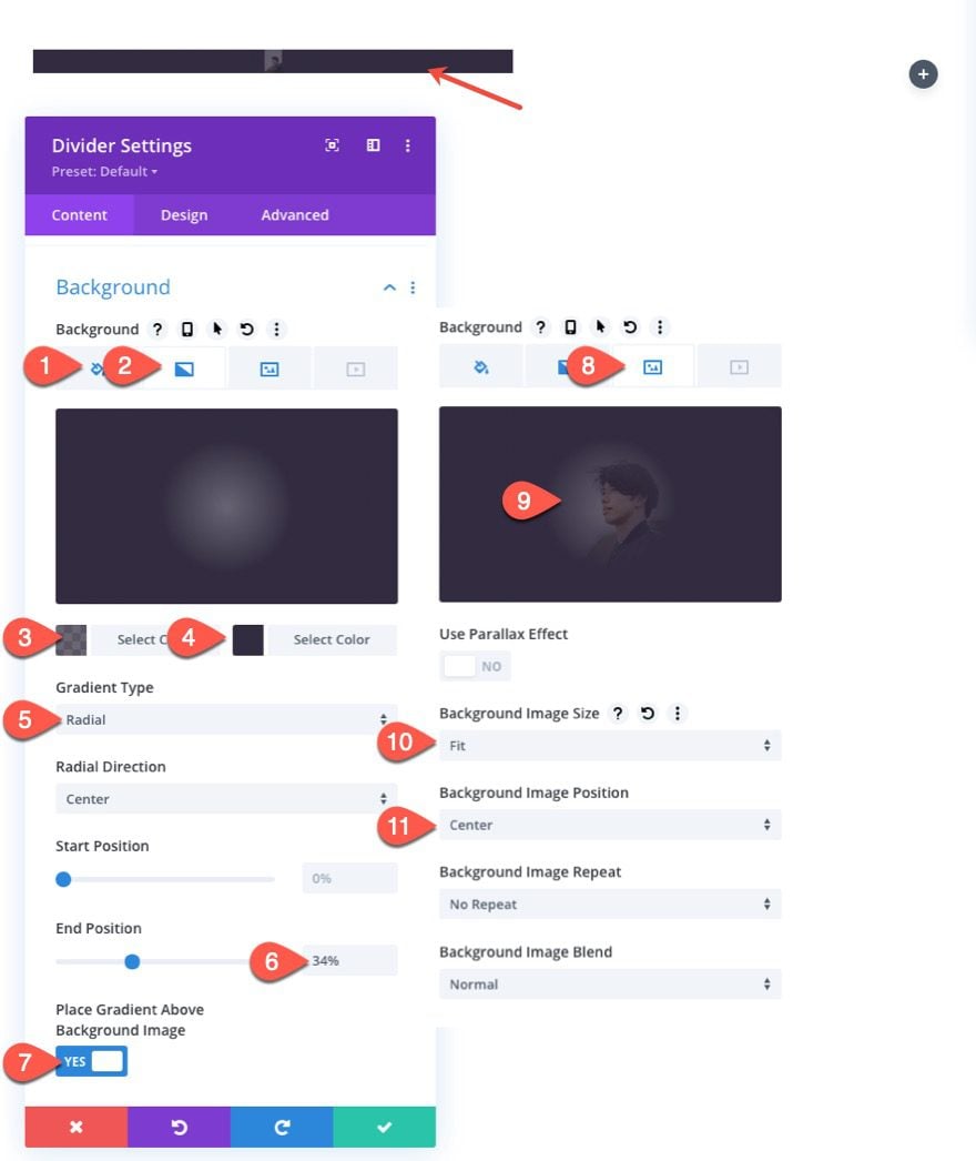
Open the divider settings and click to make the divider NOT visible. We are only using the divider for a background image for the business card.
Then update the following options:
Background Color
- Background Color: #322b3f
Background Gradient
- Background Gradient Left Color: rgba(50,43,63,0.72)
- Background Gradient Right Color: #322b3f
- Gradient Type: Radial
- End Position: 34%
- Place Gradient Above Background Image: YES
Background Image
- Background Image: [upload image or portrait of team member]
- Background Image Size: fit
- Background Image Position: Center
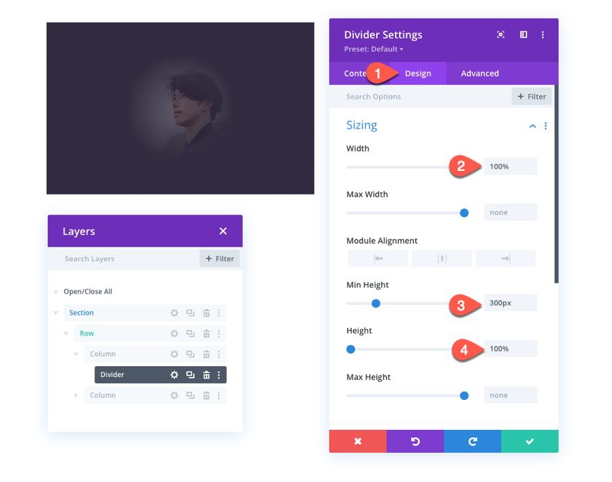
Sizing
- Width: 100%
- Min Height: 300px
- Height: 100%
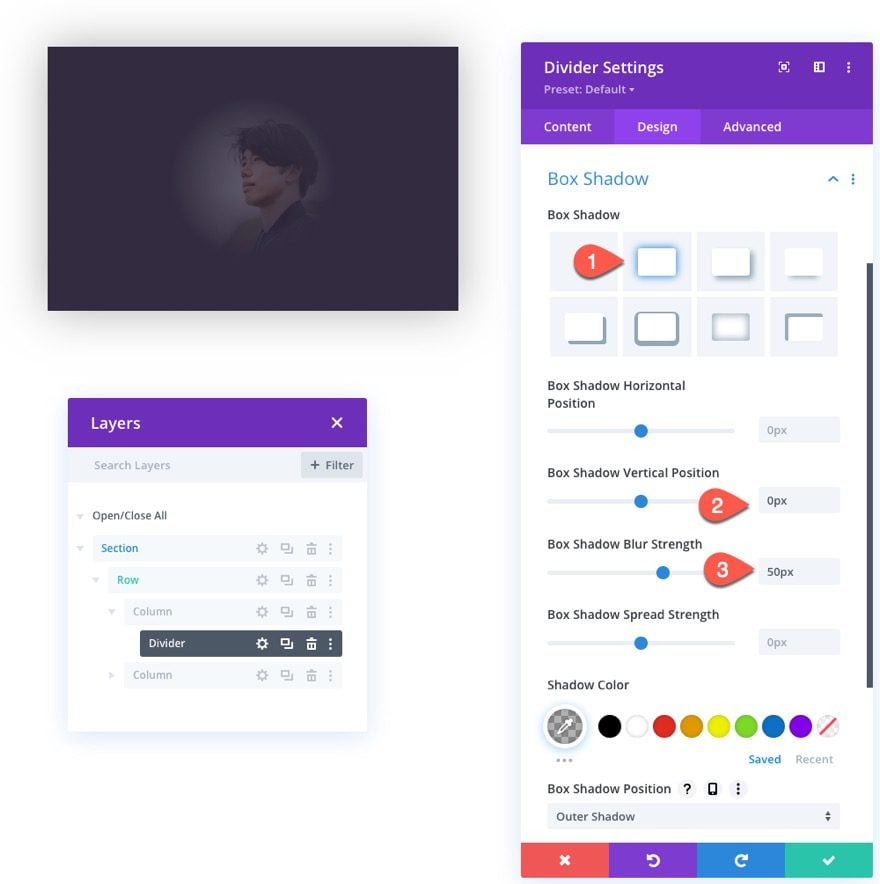
Box Shadow
- Box Shadow: see screenshot
- Box Shadow Vertical Position: 0px
- Box Shadow Blur Strength: 50px
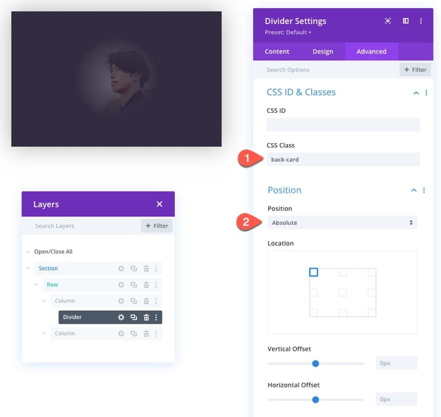
CSS Class and Absolute Position
Next add the following CSS Class to the divider:
- CSS Class: back-card
And update the position to absolute:
- Position: Absolute
Creating the Back Card Logo
With the back card (divider) in place, we can start adding our card info elements. To start, we’ll add a logo to the top left corner.
Add an image module under the divider/back card module.
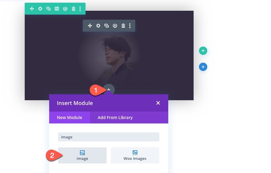
Then upload a logo image that’s around 60px by 60px.
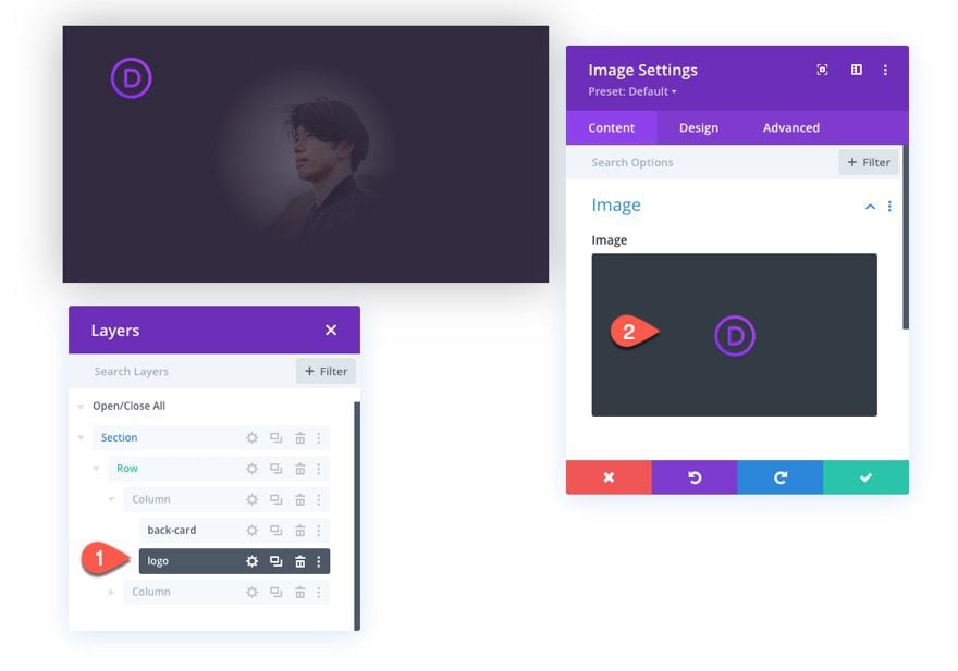
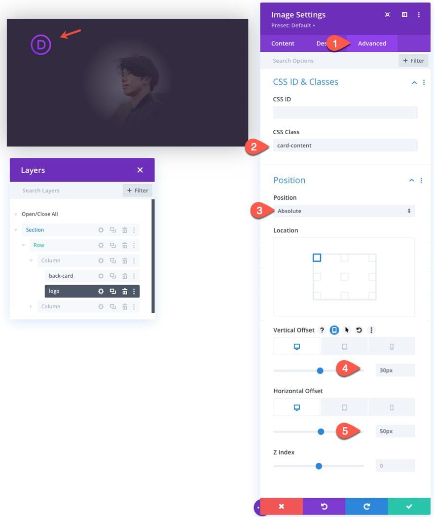
Then update the image with a CSS Class and an absolute position as follows:
CSS Class
- CSS Class: card-content
Position
- Position: Absolute
- Vertical Offset: 30px (desktop and tablet), 15px (phone)
- Horizontal Offset: 50px (desktop and tablet), 10px (phone)
The Name
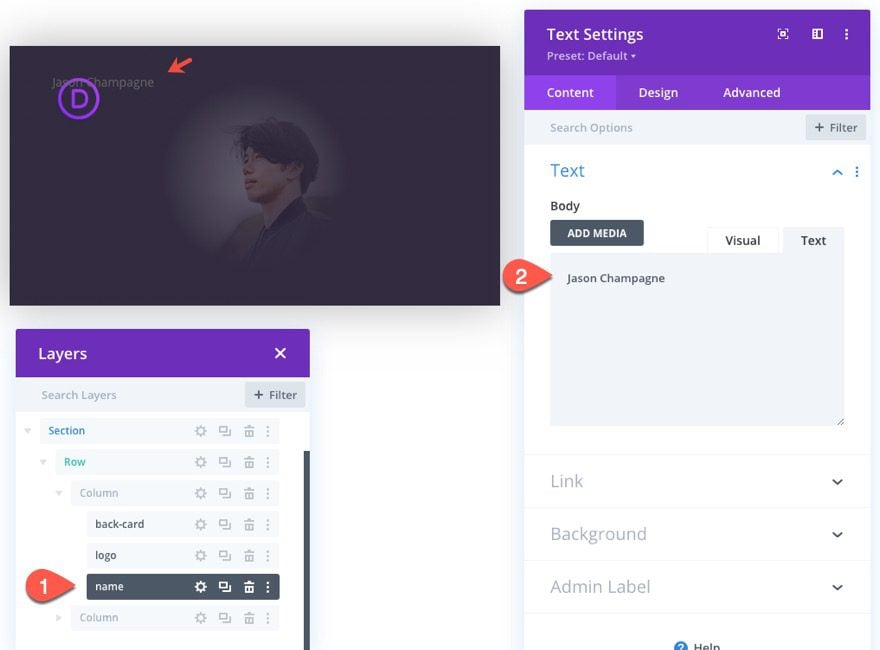
To create the name for the business card, add a new text module under the logo image.
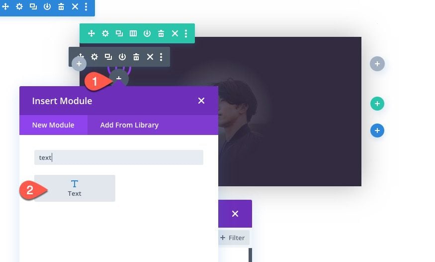
Update the body content with the name of the person you want to be featured on the business card.
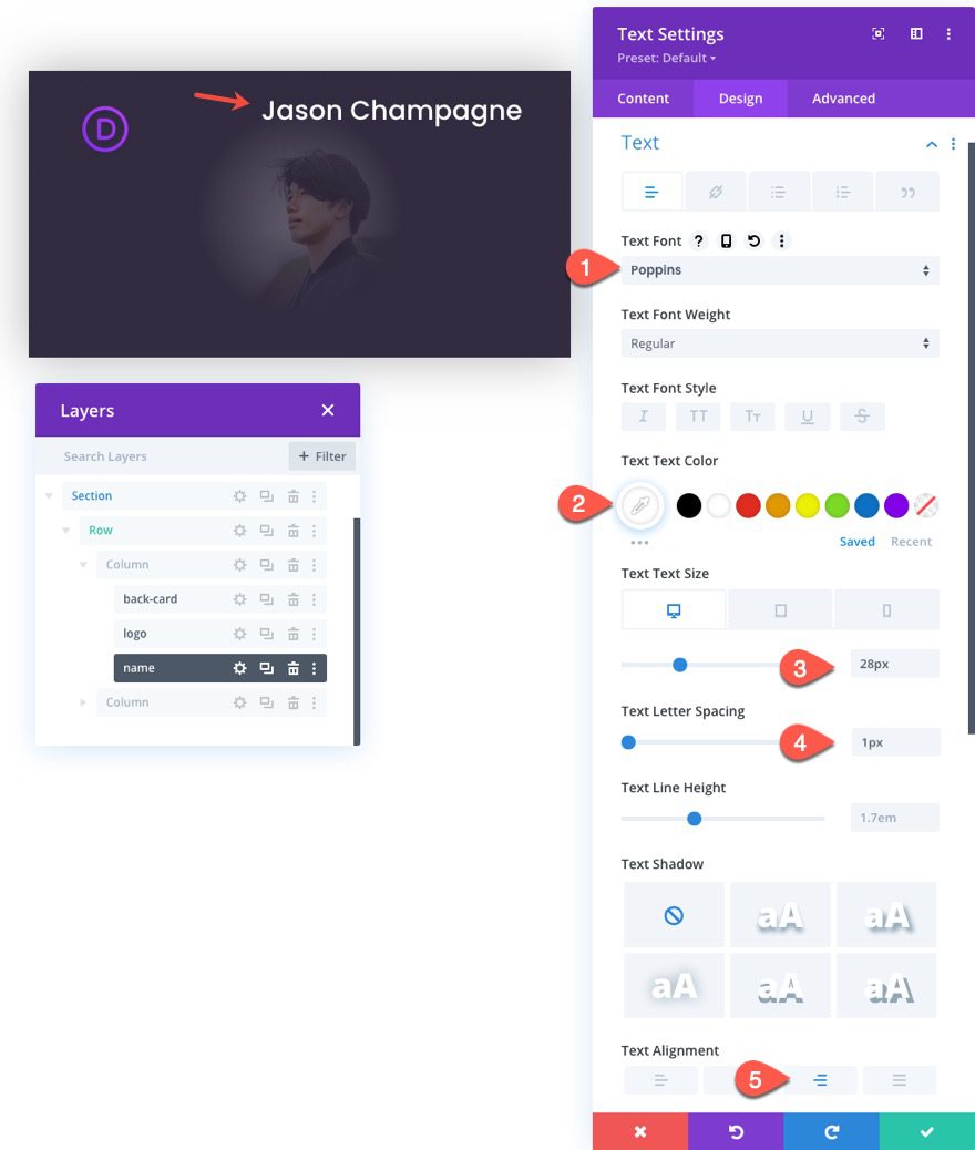
Under the design tab, update the paragraph text style options as follows:
- Text Font: Poppins
- Text Text Color: #ffffff
- Text Text Size: 28px (desktop and tablet), 22px (phone)
- Letter Spacing: 1px
- Text Alignment: Right
The Job Position (or Role)
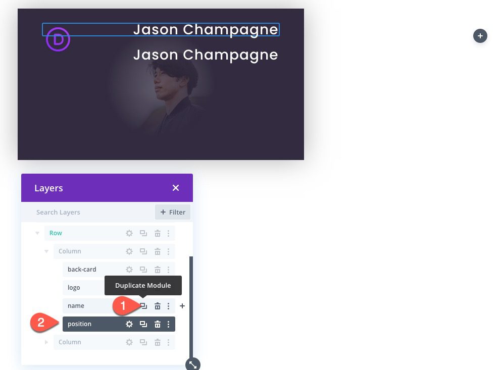
To add the position (or role) of the person on the card, duplicate the previous text module with the name.
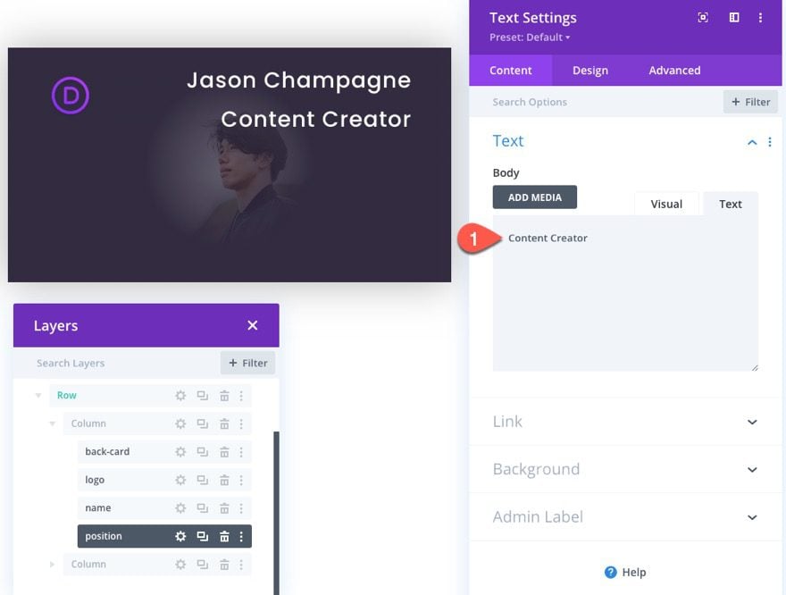
Then update the body content with the position (or role) of the person.
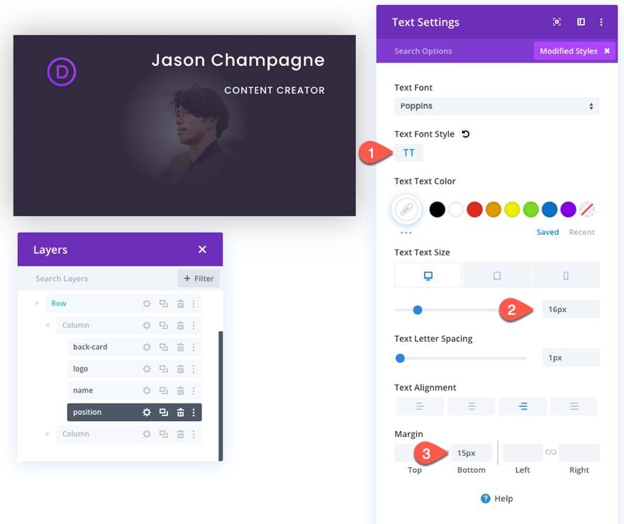
Then update the design settings for the position text module as follows:
- Text Font Style: TT
- Text Text Size: 16px (desktop and tablet), 14px (phone)
- Margin: 15px bottom
The Company
In order to add the company name to the business card, duplicate the previous (position) text module.
Then update the body content with the name of the company.
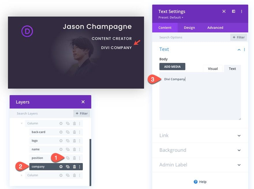
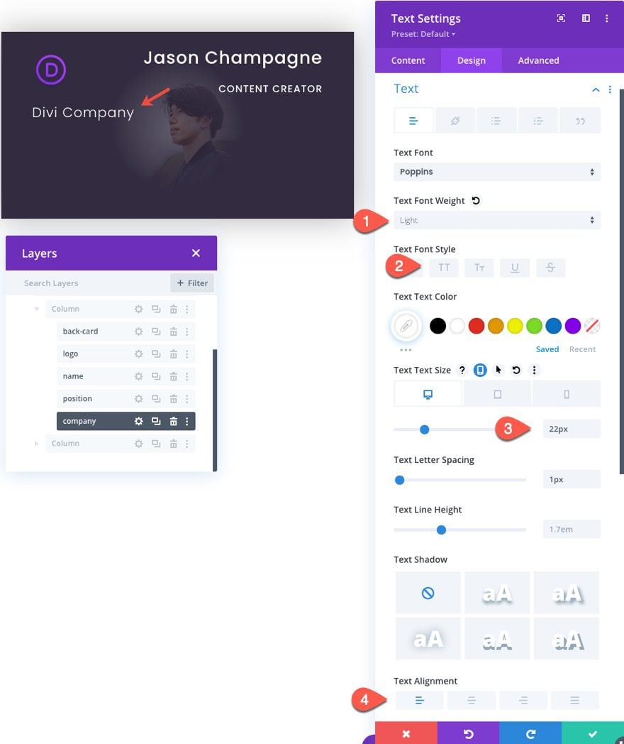
Then update the company text settings as follows:
- Text Font Weight: Light
- Text Font Style: default
- Text Text Size: 22px (desktop and tablet), 18px (phone)
- Text Alignment: Left
The Phone Number
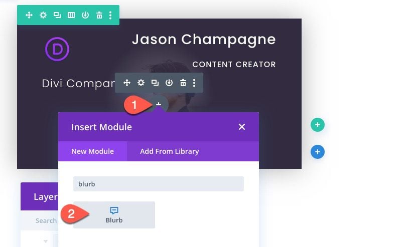
To create the phone number for the business card, add a blurb module under the (company) text module.
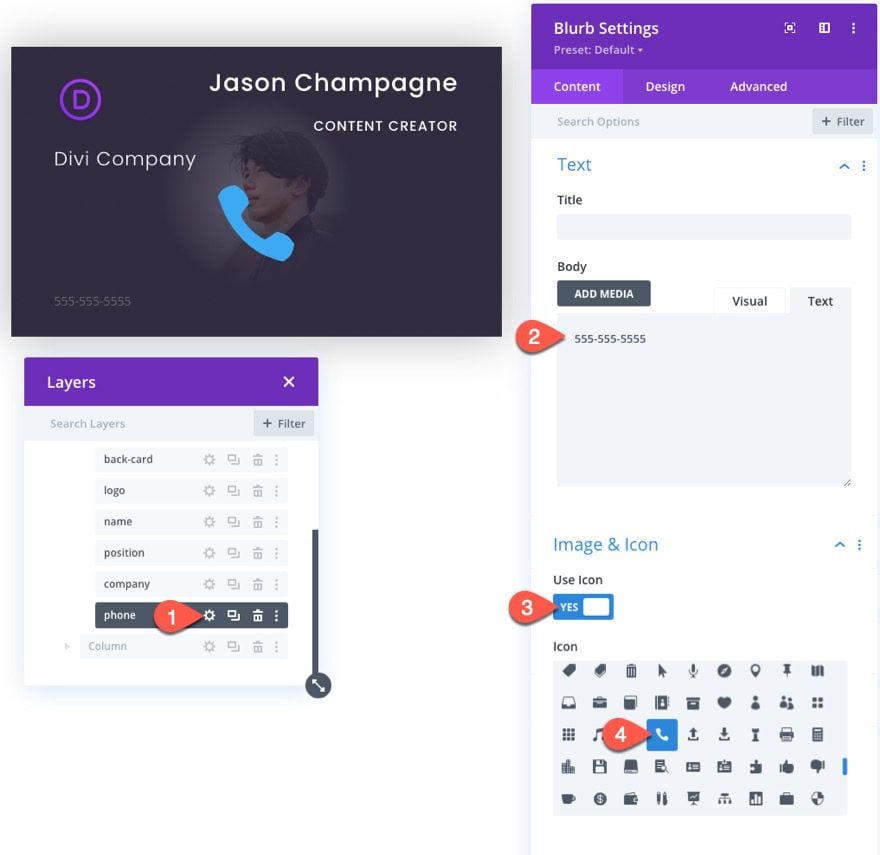
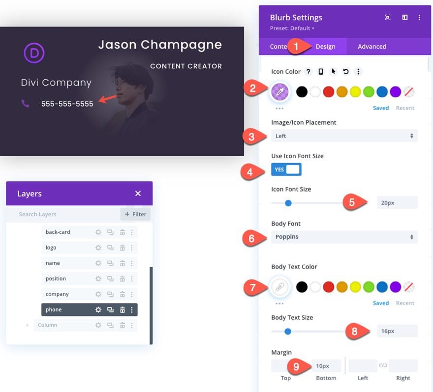
Update the body content of the (phone) blurb with the phone number you want to be featured on the card.
Click to use a phone icon for the blurb.
Under the design settings, update the following:
- Icon Color: rgba(162,71,232,0.6)
- Image/Icon Placement: Left
- Use Icon Font size: YES
- Icon Font Size: 20px
- Body Font: Poppins
- Body Text Color: #ffffff
- Body Text Size: 16px
- Margin: 10px bottom
The Email Address
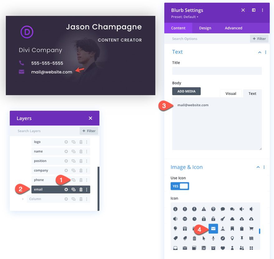
To feature the email address on the card, duplicate the (phone) blurb module and update the body content with the email address.
Then update the icon to an envelope icon.
The Website
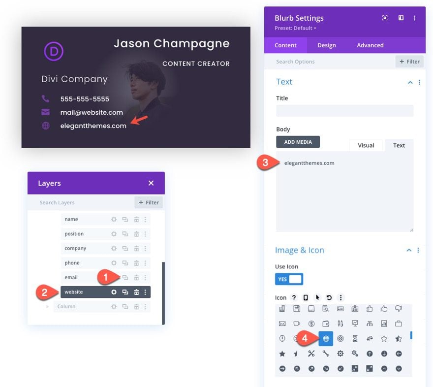
To feature the website on the card, duplicate the (phone) blurb module and update the body content with the website.
Then update the icon with a more appropriate icon.
For our last piece of card content, we are going to add social media follow icons to the card. To do this, add a social media follow module under the (website) blurb.
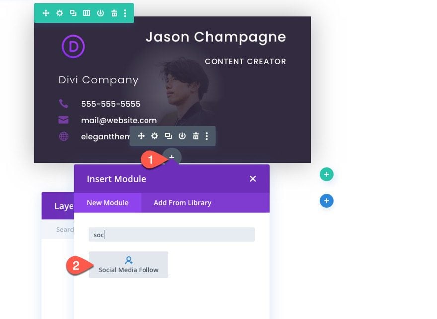
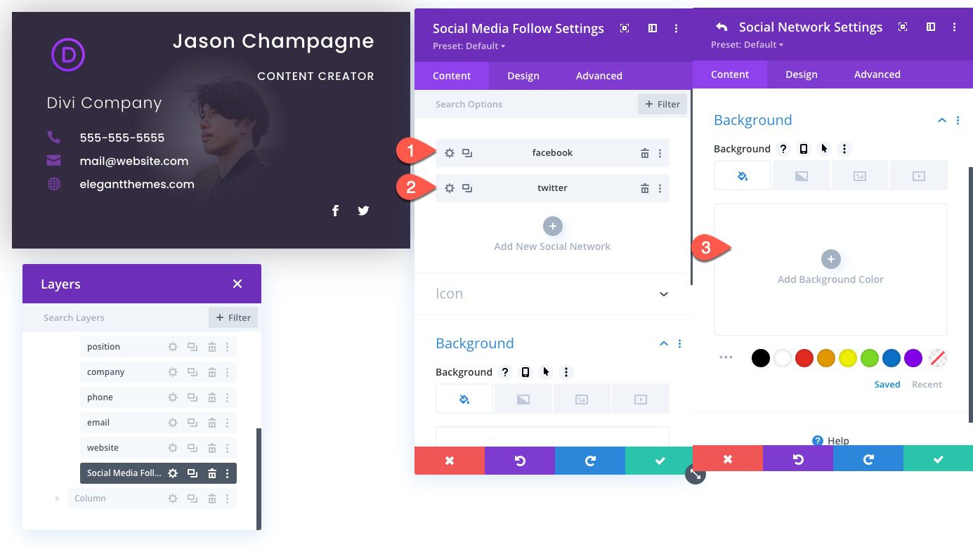
In the Social Media Follow Settings modal, update each of the social networks with a transparent background.
(you can also add the link URLs as needed later)
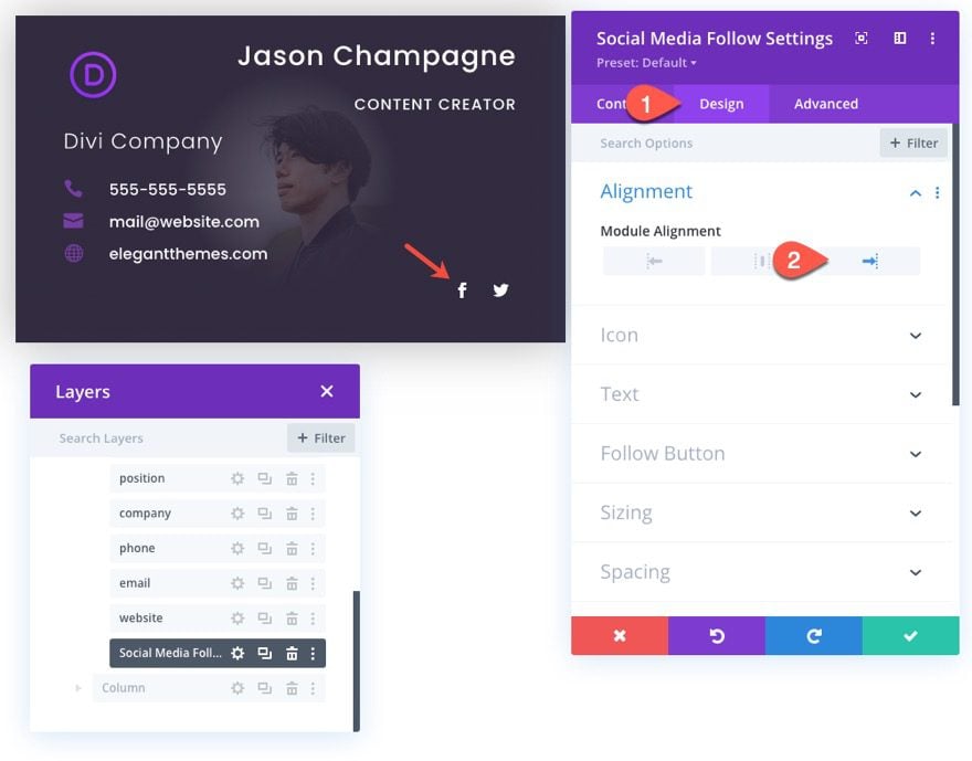
Then give the module a right alignment.
Add Same CSS Class to All Card Content Modules
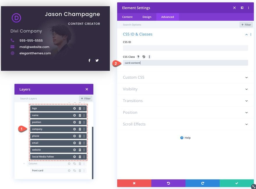
Once we are done creating all the card content modules for the business card, we need to give all those modules the same CSS Class. To do this, use the multiselect feature to select all card content modules (logo, name, position, phone, email, website, and social media icons), then open the element settings, and add the following class:
- CSS Class: card-content
We are going to target this class our custom CSS code to hide and show the content before and after the front card flip animation.
The Front Card
Now that our back card is finished with all of the card content in place, we are ready to create the front card that will sit on top of the back card and back card content. To do this, we are going to design the front card using an image module in column 2. Then we will move it over to sit on top of the back card in column 1.
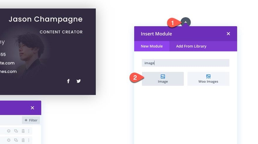
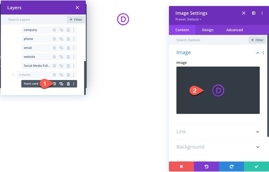
First, add an image module to column 2.
Upload the same logo image (60px by 60px) used for the back card logo to be used as the image.
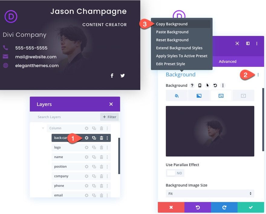
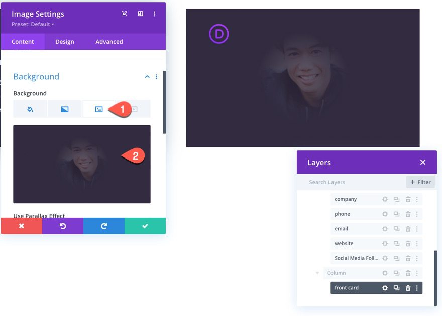
Then open the settings for the back card (divider) module and copy the background design.
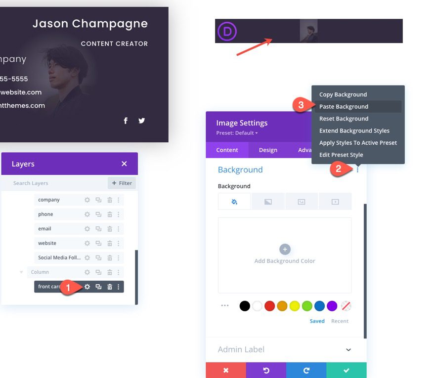
Then open the image settings for the front card we are designing and paste the background design into the image module background option.
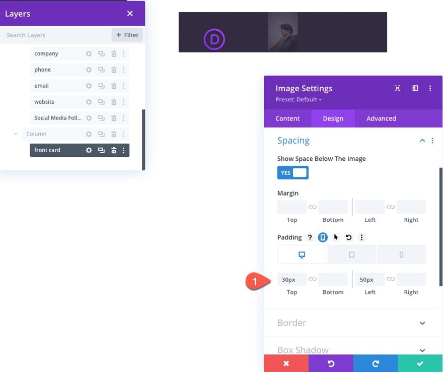
Under the design tab, update the spacing of the image as follows:
- Padding (desktop and tablet): 30px top, 50px left
- Padding (phone): 15px top, 10px left
Advanced Settings
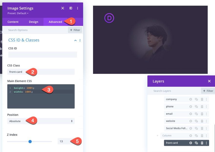
Under the advanced tab, give the image the following CSS Class:
- CSS Class: front-card
Add the following custom CSS to the Main Element:
[/css]
height: 100%;
width: 100%;
[/css]
The update the position options:
- Position Absolute
- Z Index: 13
The custom height and width (combined with the absolute position) makes the module containing the image (or logo) span the full height and width of the parent column. So even though it is one image module, we are using it to display two layered images (the logo and the background image) as a nice front card for our business card design.
Don’t forget to change out the background image for a new one. In this case, I’m using a different portrait of the same person.
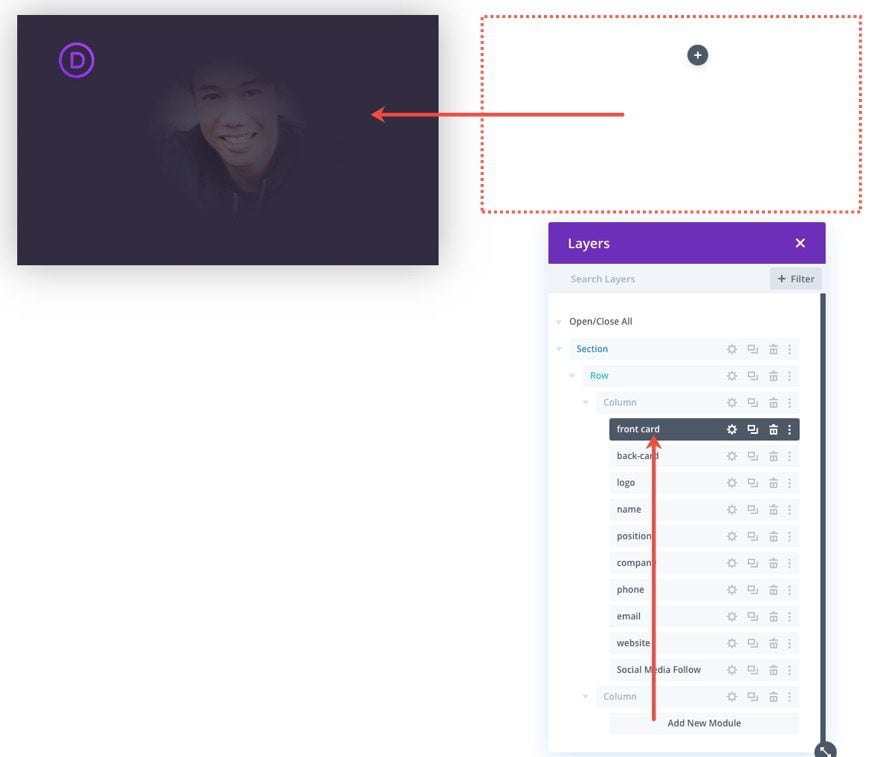
Once done, drag the front card image module over to column 1. It should completely cover the back card.
The Custom Code
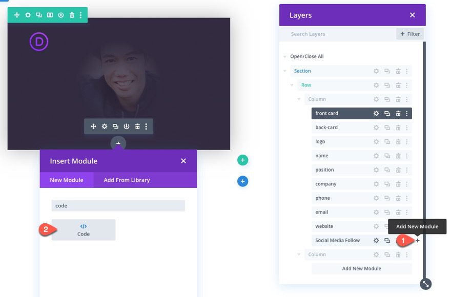
The last step is to add some custom CSS and JQuery to complete functionality of actually making the business card flip animation on click.
To add the code, add a code module below the social media follow module within column 1.
The Custom CSS
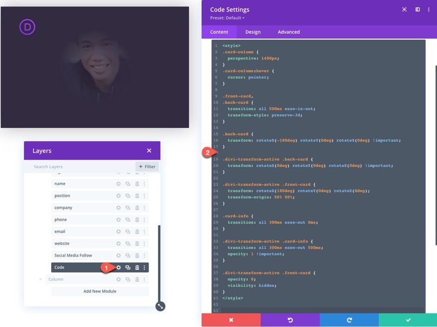
Paste the following CSS code between the style tags:
.card-column {
  perspective: 1400px;
}
.front-card:hover {
  cursor: pointer;
}

.front-card,
.back-card {
  transition: all 500ms ease-in-out;
  transform-style: preserve-3d;
}

.back-card {
  transform: rotateX(-180deg) rotateY(0deg) rotateZ(0deg) !important;
}

.divi-transform-active .back-card {
  transform: rotateX(0deg) rotateY(0deg) rotateZ(0deg) !important;
}

.divi-transform-active .front-card {
  transform: rotateX(180deg) rotateY(0deg) rotateZ(0deg);
  transform-origin: 50% 50%;
}

.card-content {
  transition: all 300ms ease-out 0ms;
}

.divi-transform-active .card-content {
  transition: all 300ms ease-out 500ms;
  opacity: 1 !important;
}

.divi-transform-active .front-card {
  opacity: 0;
  visibility: hidden;
}
The JQuery
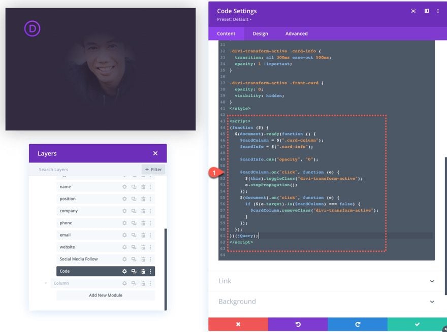
Under the CSS, paste the following JQuery between the script tags
(function ($) {
  $(document).ready(function () {
    $cardColumn = $(".card-column");
    $cardContent = $(".card-content");

    $cardContent.css("opacity", "0");

    $cardColumn.on("click", function (e) {
      $(this).addClass("divi-transform-active");
      e.stopPropagation();
    });
    $(document).on("click", function (e) {
      if ($(e.target).is($cardColumn) === false) {
        $cardColumn.removeClass("divi-transform-active");
      }
    });
  });
})(jQuery);
Creating Additional Business Cards
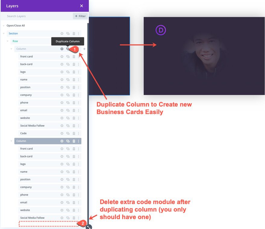
To create additional business cards, all you need to do is duplicate the column containing all of the modules we used to build it. Once you duplicate the column, you will need to delete the extra code module. Having two code modules with duplicate code will not work.
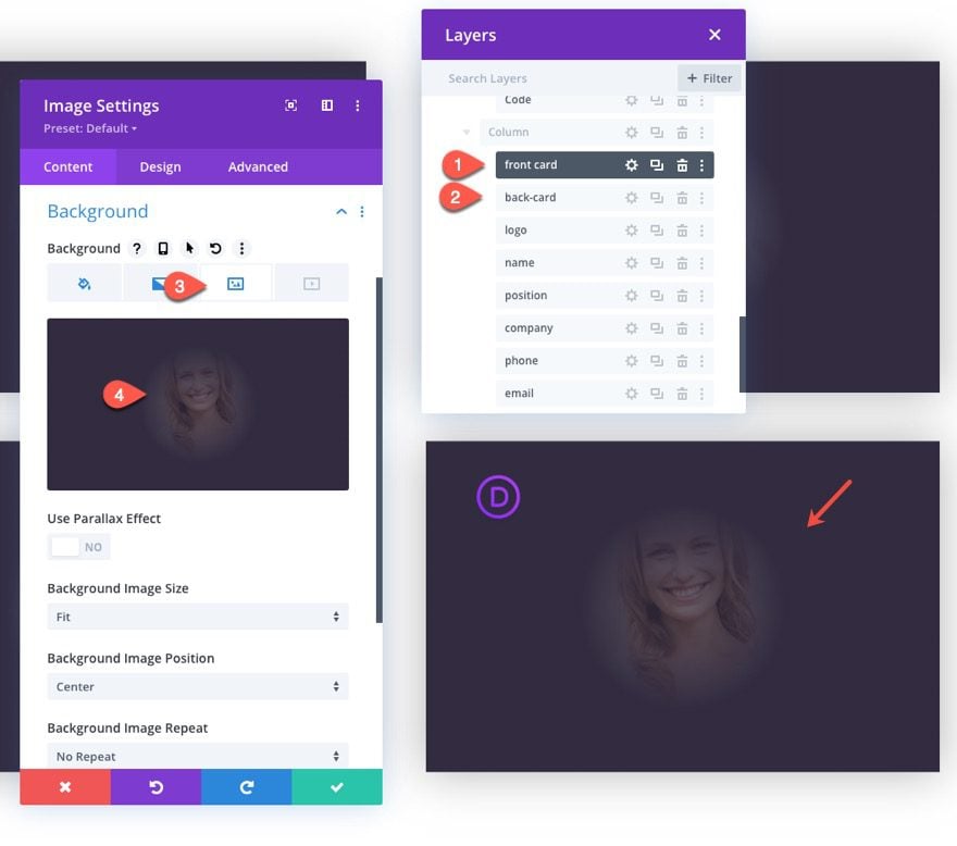
Once the column/card is duplicated, simply update the background images and card content using the modules as needed for a new business card.
Final Result
Here is the final result of the business card design with the flip animation on click. When you click the front card image it will flip and disappear, the back card divider will also flip but remain visible. The card information fades into view after the flip animation is complete. To flip the card back over, all you need to do is click outside of the column containing the card. I didn’t want to have the card flip again when clicking the card (like a toggle) so that the user can click on elements within the card.
Final Thoughts
Hopefully, this interactive business card design will help you get more creative in how you display your team member section or pages on your website. In fact, this technique is not limited to business cards. You can use it for just about any information you want to display. Try it out and see it if is a good fit for your next project.
I look forward to hearing from you in the comments.
Cheers!



I wish to show thanks to you just for bailing me out of this particular trouble.As a result of checking through the How to Design Business Cards with Flip Animation that were not productive.
Thank you for sharing!
And does that work on mobiles without a mouseover?
It should because the animation is activated on click, not hover. Is that what you mean?
Wow, now THAT’S a tutorial.
Thanks so much
Hi Jason,
Very nice Tutorial.
Thank you very much!