Every week, we provide you with new and free Divi layout packs which you can use for your next project. For one of the layout packs, we also share a use case that’ll help you take your website to the next level.
This week, as part of our ongoing Divi design initiative, we’re going to show you how to design eye-catching book reviews for your upcoming ebook landing page using Divi’s Ebook Layout Pack and Divi’s built-in options only. This is a great way to add social proof to your landing pages, increase credibility and share people’s short reviews in an elegant way.
Let’s get to it!
- 1 Preview
- 2 Download The Book Reviews Section Layout for FREE
- 3 Download For Free
- 4 You have successfully subscribed. Please check your email address to confirm your subscription and get access to free weekly Divi layout packs!
-
5
Let’s Start Recreating!
- 5.1 Upload Ebook Layout Pack Landing Page Layout to New Page
- 5.2 Add New Section
- 5.3 Add New Row
- 5.4 Add Image Module to Column 1
- 5.5 Add Text Module #1 to Column 1
- 5.6 Add Text Module #2 to Column 1
- 5.7 Add Text Module #3 to Column 1
- 5.8 Add Text Module #4 to Column 1
- 5.9 Add Image Module to Column 2
- 5.10 Add Button Module to Column 2
- 5.11 Clone Row up to as Many Times as Wanted
- 6 Preview
- 7 Final Thoughts
Preview
Before we dive into the tutorial, let’s take a quick look at the outcome across different screen sizes.
Desktop
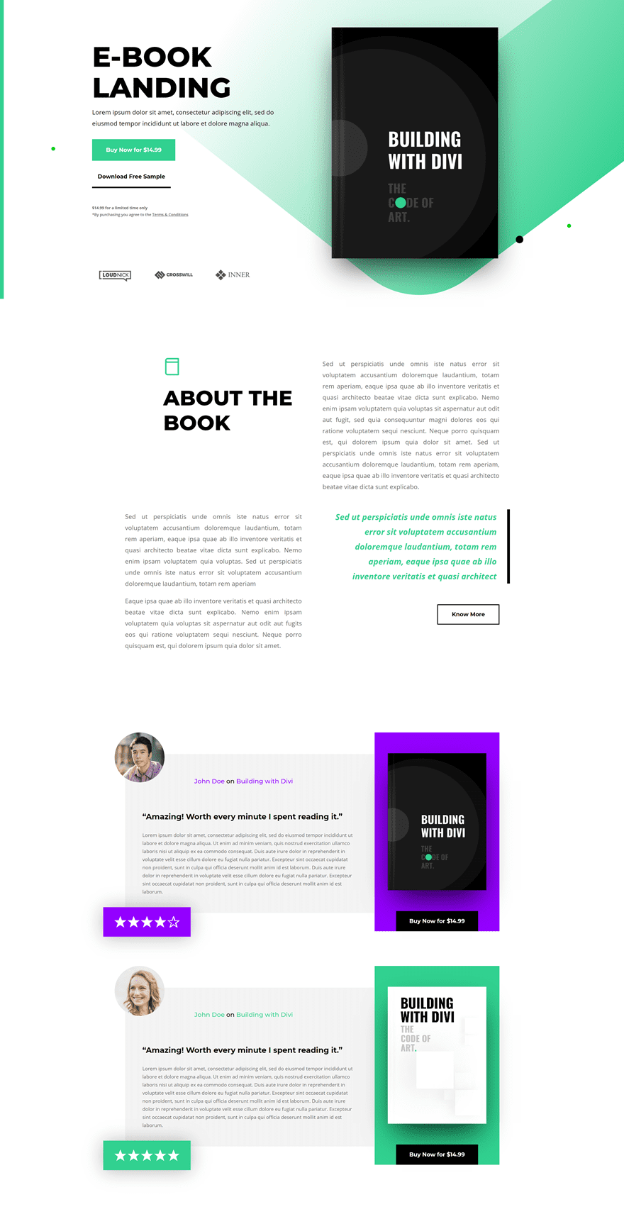
Mobile

Download The Book Reviews Section Layout for FREE
To lay your hands on the free book reviews section layout, you will first need to download it using the button below. To gain access to the download you will need to subscribe to our newsletter by using the form below. As a new subscriber, you will receive even more Divi goodness and a free Divi Layout pack every Monday! If you’re already on the list, simply enter your email address below and click download. You will not be “resubscribed” or receive extra emails.
Let’s Start Recreating!
Upload Ebook Layout Pack Landing Page Layout to New Page
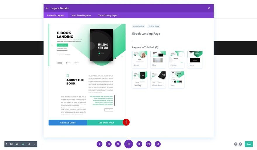
The first thing you’ll need to do is create a new page using the Ebook Layout Pack landing page layout that you can find within the premade layouts.
Add New Section
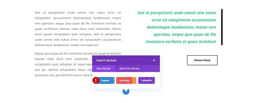
Scroll down the page layout and add a new section wherever you want the book reviews to show up.
Add New Row
Column Structure
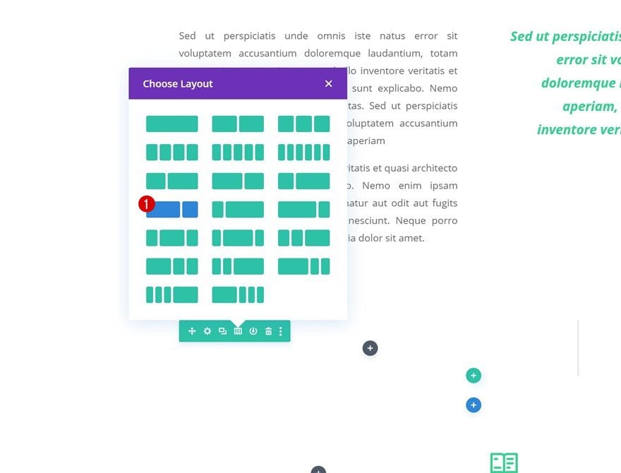
Continue by adding a new row using the following column structure:
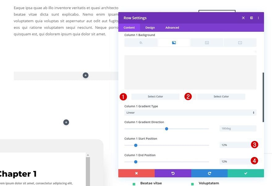
Column 1 Gradient Background
Without adding any modules yet, open the row settings and add a gradient background to the first column.
- Color 1: #ffffff
- Color 2: #f4f4f4
- Column 1 Start Position: 12%
- Column 1 End Position: 12%
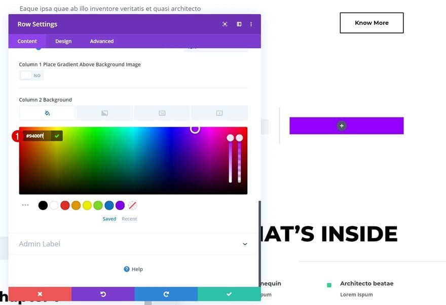
Column 2 Background Color
Add a custom background color to the second column as well.
- Column 2 Background Color: #9400ff
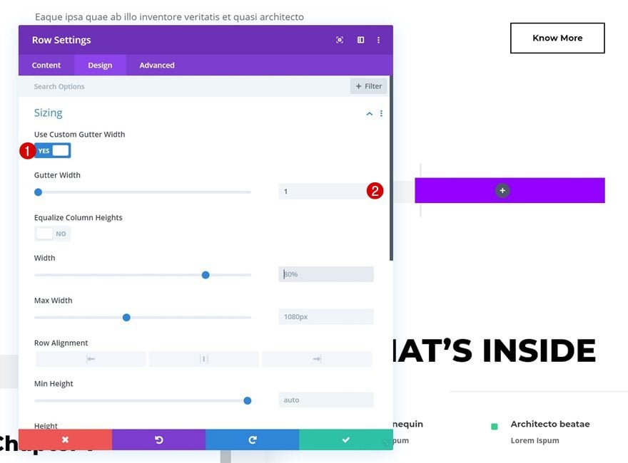
Sizing
Move on to the design tab and remove all the custom space between columns using the following settings:
- Use Custom Gutter Width: Yes
- Gutter Width: 1
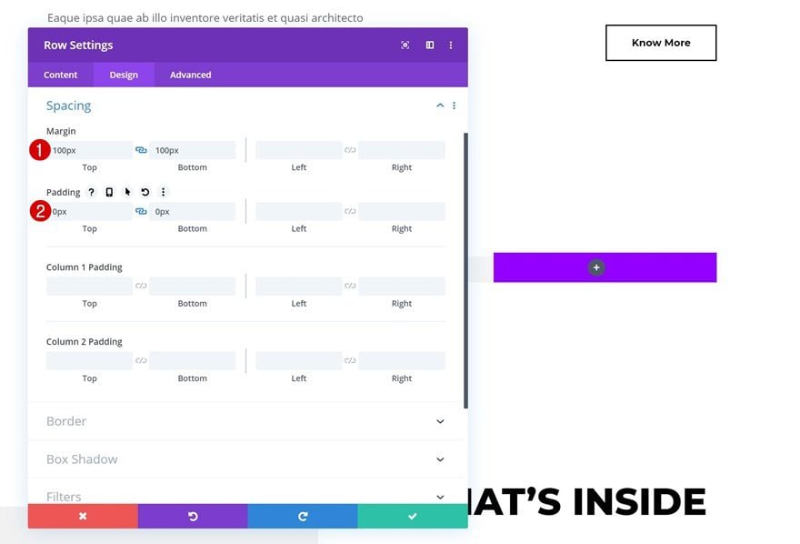
Spacing
We’re also modifying the row spacing settings.
- Top Margin: 100px
- Bottom Margin: 100px
- Top Padding: 0px
- Bottom Padding: 0px
Add Image Module to Column 1
Upload 1:1 Image
Once your row settings are in place, you can start adding the various modules, starting with an Image Module in the first column. Upload an image of your choice but make sure the image ratio is 1:1. This means the height and width should carry the same value.

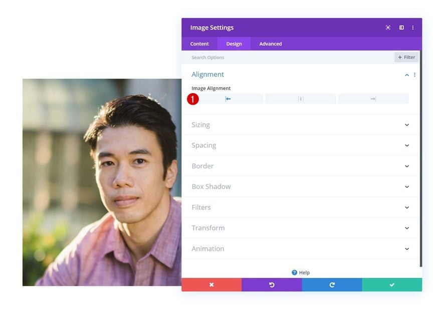
Image Alignment
Select left image alignment in the design tab.
- Image Alignment: Left
Sizing
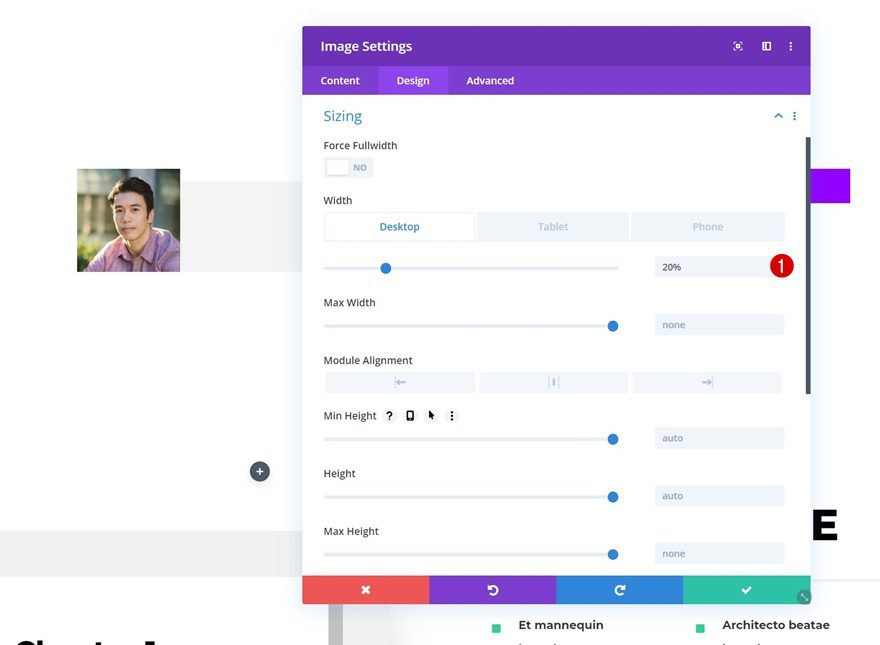
We’re also changing the width of this module across different screen sizes.
- Width: 20% (Desktop & Tablet), 30% (Phone)
Spacing
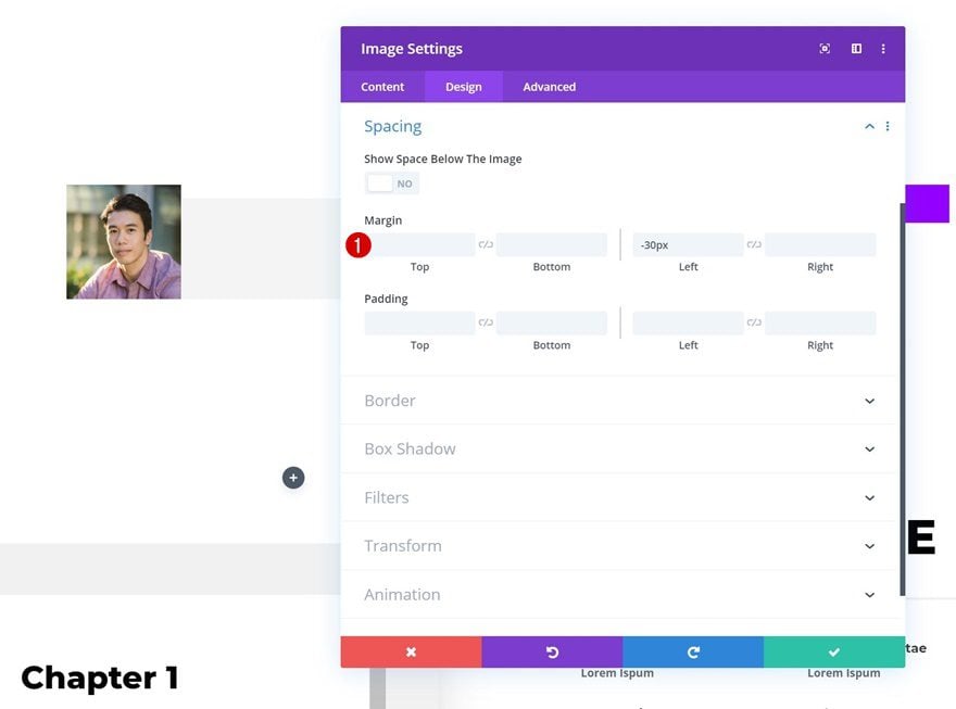
To allow an overlap on the left side of the row, we’re adding a negative left margin value in the spacing settings of the Image Module.
- Left Margin: -30px
Border
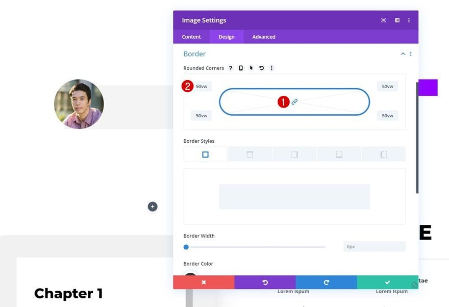
To complete the image design, we’re also adding ’50vw’ to each one of the corners in the border settings. This will make sure the image keeps its circular shape across different screen sizes.
Add Text Module #1 to Column 1
Add Star Symbols to Content Box
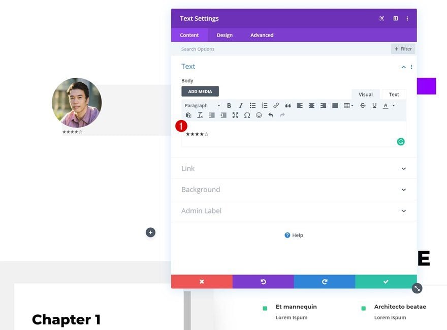
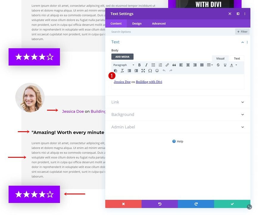
On to the next module, which is the rating Text Module. To showcase the star ratings, we’re going to use symbols. Go ahead and copy the following symbols and paste them into the content box of a new Text Module: ★★★★✰.
Background Color
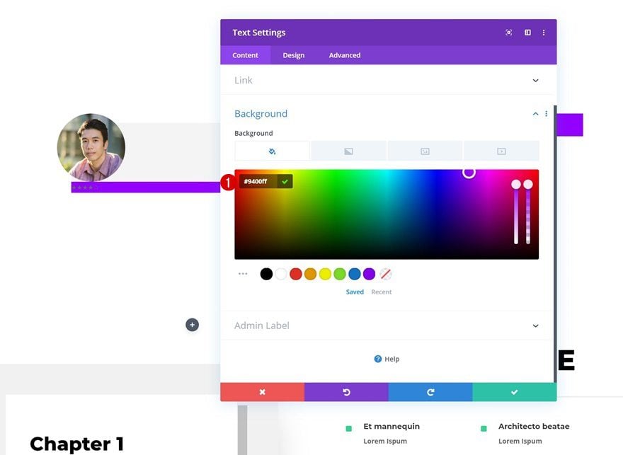
Change the background of the module next.
- Background Color: #9400ff
Text Settings
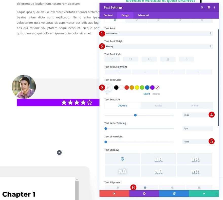
Move on to the design tab and modify the text settings as well.
- Text Font: Montserrat
- Text Font Weight: Heavy
- Text Size: 45px (Desktop), 30px (Tablet), 25px (Phone)
- Text Line Height: 1em
- Text Alignment: Center
Sizing
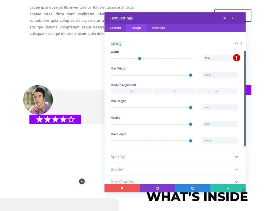
Continue by changing the width of the module.
- Width: 35%
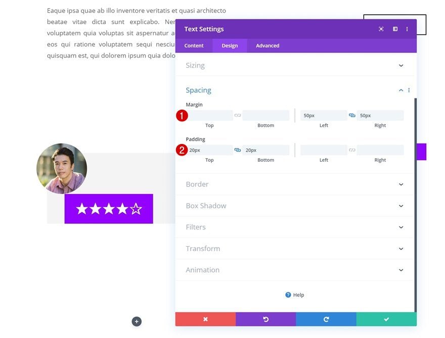
Spacing
And add some custom spacing.
- Left Margin: 50px
- Right Margin: 50px
- Top Padding: 20px
- Bottom Padding: 20px
Box Shadow
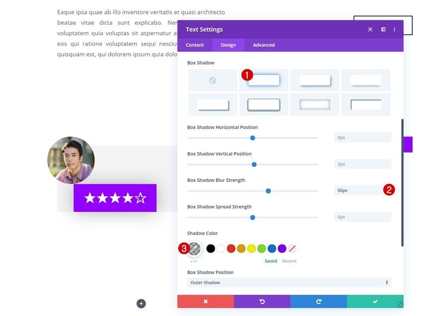
To highlight the rating box, we’ll add a subtle box shadow.
- Box Shadow Blur Strength: 50px
- Shadow Color: rgba(0,0,0,0.3)
Transform Translate
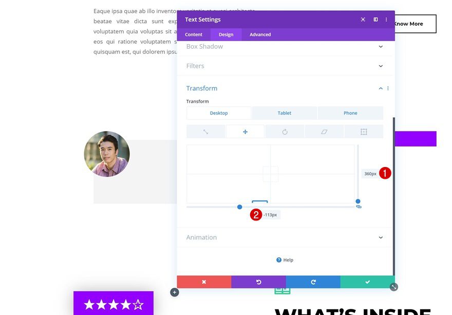
And last but not least, we’ll reposition the Text Module using some custom transform translate values. You can postpone this step until you’ve added all modules to your column as well.
- Right: 360px (Desktop), -84px (Tablet), -70px (Phone)
- Botto,: -113px (Desktop), 190px (Tablet), 141px (Phone)
Add Text Module #2 to Column 1
Add Content
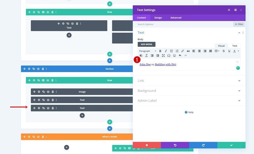
The next module we need in column 1 is another Text Module. Add the content of your choice and link to the reviewer and book.
Text Settings
Move on to the design tab and change the text settings accordingly:
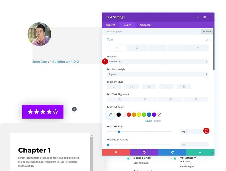
- Text Font: Montserrat
- Text Size: 18px
Link Text Settings
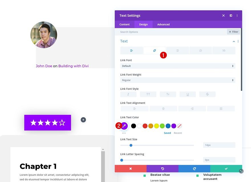
Change the link text color too.
- Link Text Color: #9400ff
Spacing
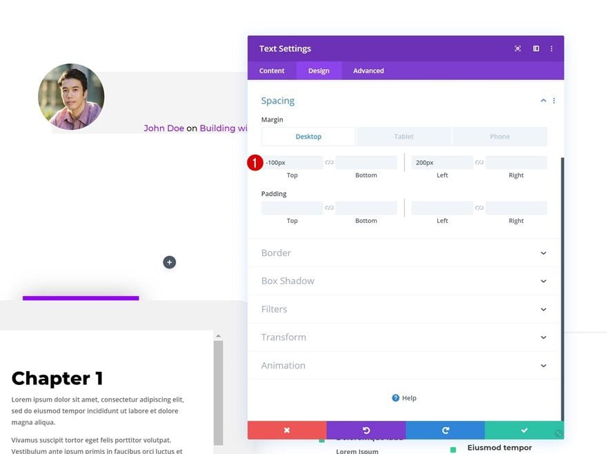
Then, go to the spacing settings and reposition the element using custom margin values.
- Top Margin: -100px (Desktop), 0px (Tablet & Phone)
- Left Margin: 200px (Desktop), 50px (Tablet), 20px (Phone)
- Right Margin: 50px (Tablet), 20px (Phone)
Add Text Module #3 to Column 1
Add H3 Content
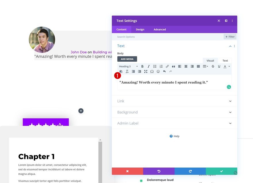
On to the next module, which is a Text Module containing the H3 review title.
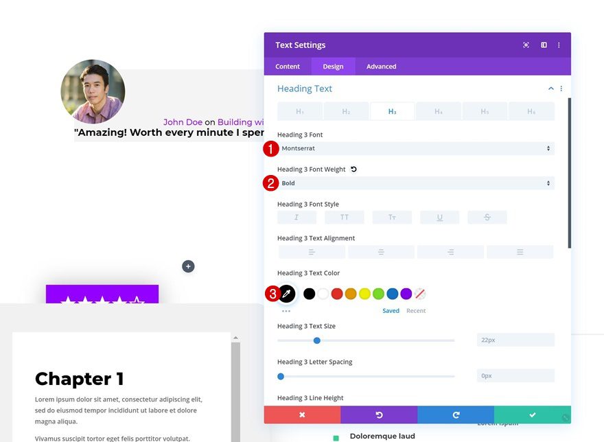
H3 Text Settings
Move on to the design tab and change the H3 text settings.
- Heading 3 Font: Montserrat
- Heading 3 Font Weight: Bold
- Heading 3 Text Color: #000000
Spacing
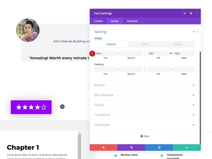
Add some custom margin as well.
- Top Margin: 80px (Desktop), 50px (Tablet & Phone)
- Left Margin: 50px (Desktop & Tablet), 20px (Phone)
- Right Margin: 50px (Desktop & Tablet), 20px (Phone)
Add Text Module #4 to Column 1
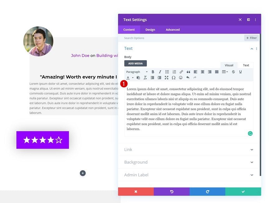
Add Content
On to the next and last module we need in column 1, which is another Text Module with the actual review.
Spacing
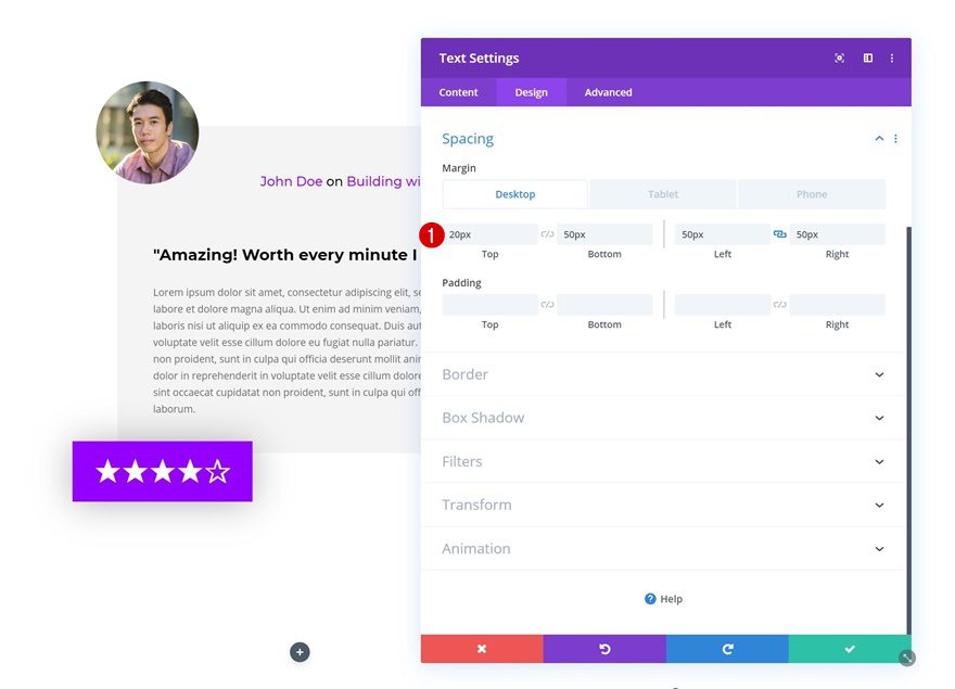
Go to the spacing settings of this module and apply the following settings:
- Top Margin: 20px
- Bottom Margin: 50px
- Left Margin: 50px (Desktop & Tablet), 20px (Phone)
- Right Margin: 50px (Desktop & Tablet), 20px (Phone)
Add Image Module to Column 2
Upload Book Cover Image
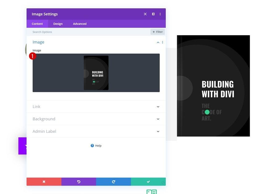
In the second column, we’re going to need two modules, starting with an Image Module that carries the book cover. For this tutorial, we’re using the book covers that come with Divi’s Ebook Layout Pack, but you can add your own book cover instead.
Sizing
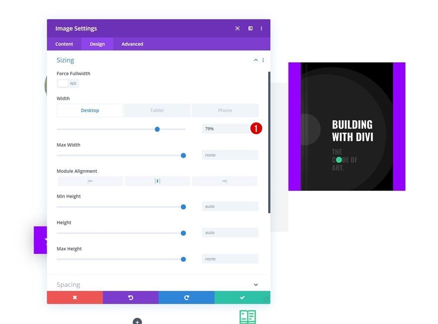
Move on to the design tab of the Image Module and change the width.
- Width: 79% (Desktop), 40% (Tablet & Phone)
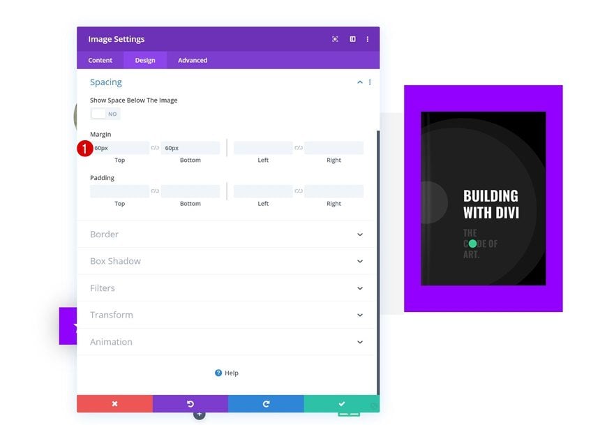
Spacing
Modify the spacing settings as well.
- Top Margin: 60px
- Bottom Margin: 60px
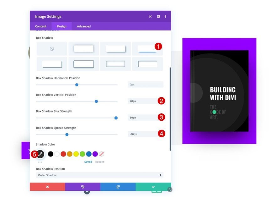
Box Shadow
And add a box shadow to emphasize the book cover.
- Box Shadow Vertical Position: 40px
- Box Shadow Blur Strength: 80px
- Box Shadow Spread Strength: -20px
- Shadow Color: rgba(0,0,0,0.8)
Add Copy
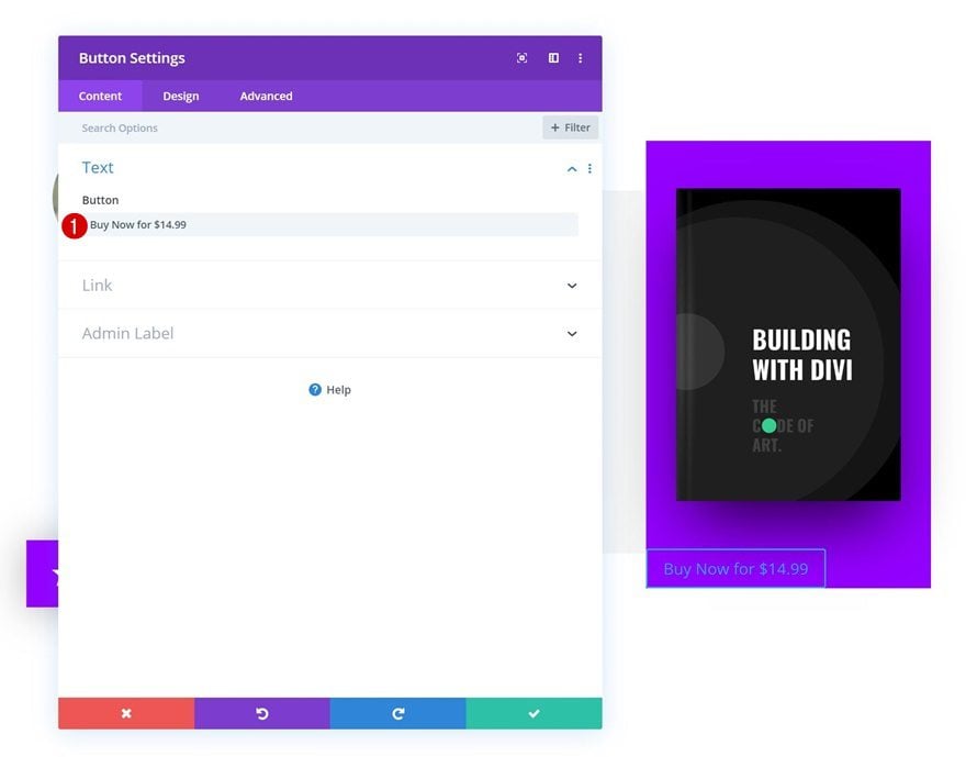
The next and last module we need in column 2 is Button Module. Add some copy of your choice and link to the page where people can purchase your book.
Button Alignment
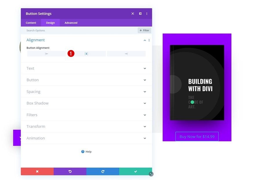
Move on to the design tab and change the button alignment.
- Button Alignment: Center
Button Settings
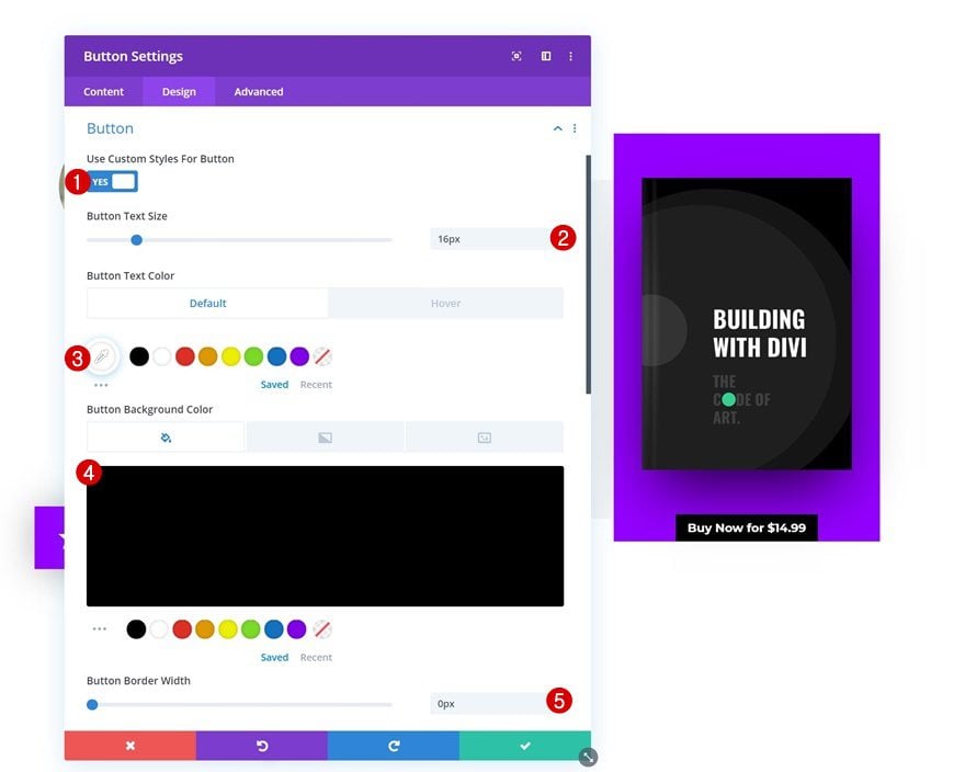
Modify the button settings to match the layout pack’s look and feel.
- Use Custom Styles For Button: Yes
- Button Text Size: 16px
- Button Text Color: #ffffff
- Button Background Color: #000000
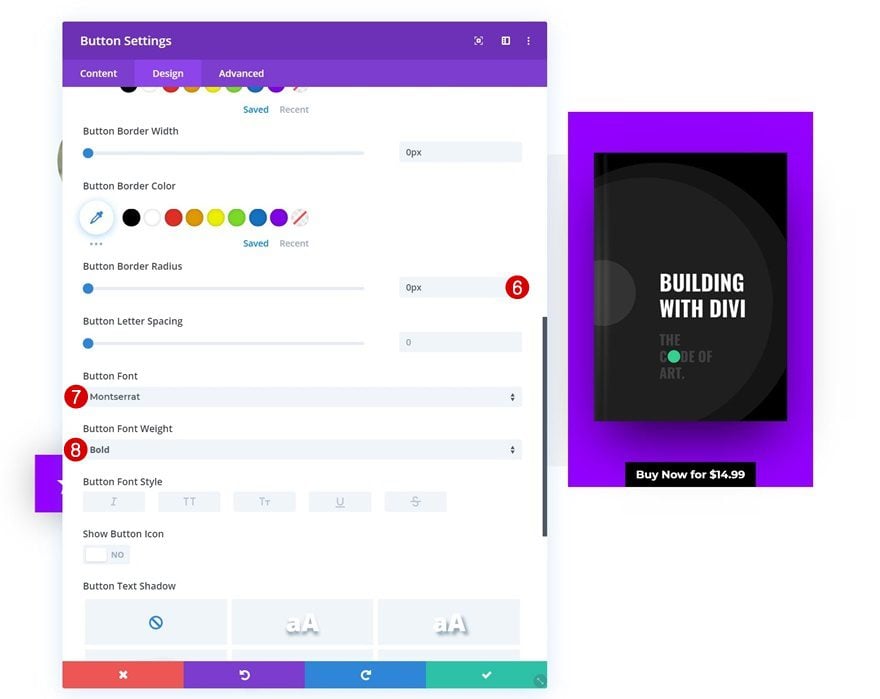
- Button Border Width: 0px
- Button Border Radius: 0px
- Button Font: Montserrat
- Button Font Weight: Bold
Spacing
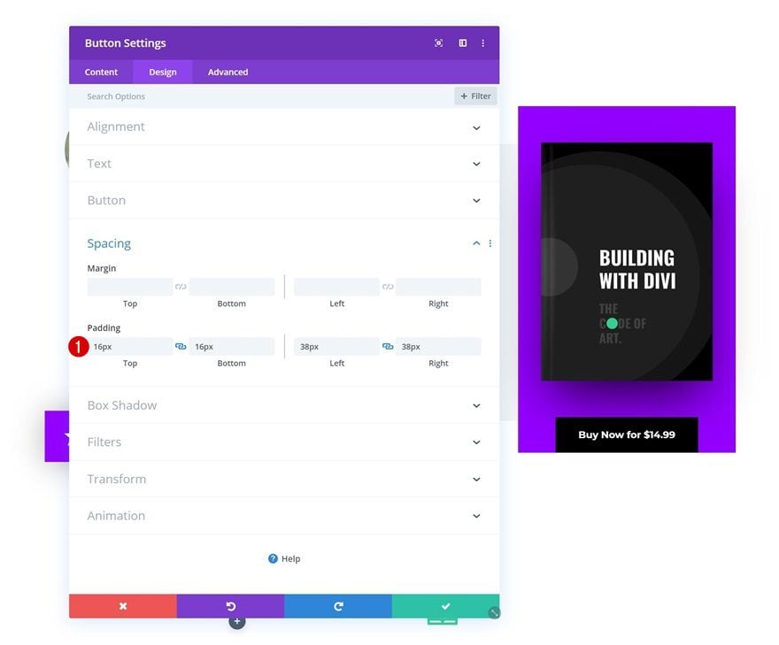
And finish the first book review design by adding some custom padding values to the button.
- Top Padding: 16px
- Bottom Padding: 16px
- Left Padding: 38px
- Right Padding: 38px
Clone Row up to as Many Times as Wanted
Once you’re done creating the first book review, you can clone the entire row up to as many times as you want, depending on how many reviews you want to show up on your landing page.
Upload Different Image
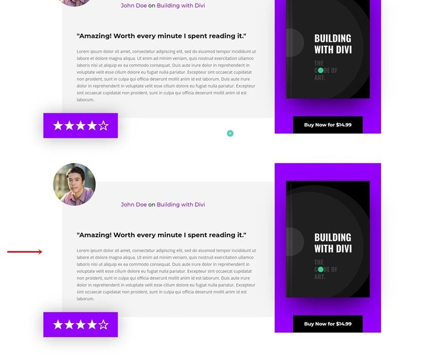
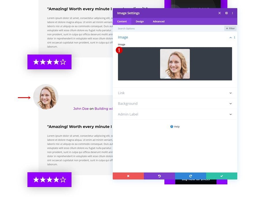
Change the image of the reviewer.
Change Book Cover
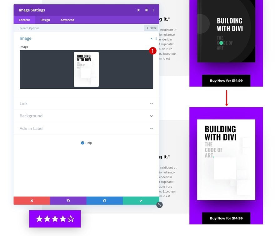
Along with the book cover, if necessary.
Change Copy
And modify all the copy as well.
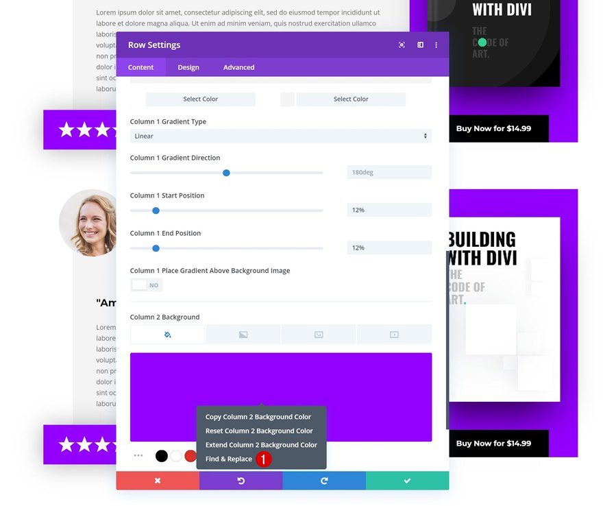
Find & Replace Column 2 Background Color in Row
As you can notice in the preview of this post, we’re using a different color palette for this second review. To make it easy for ourselves, we’re going to open the row settings and right-click on the column 2 background, then click on find & replace.
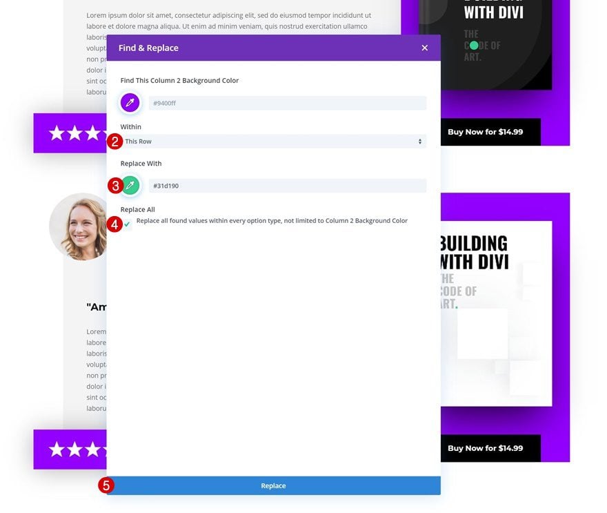
Change the purple color that is being used within the row and you’re done! Make sure you repeat these steps for each one of the duplicate book reviews you add to your page.
- Within: This Row
- Replace With: #31d190
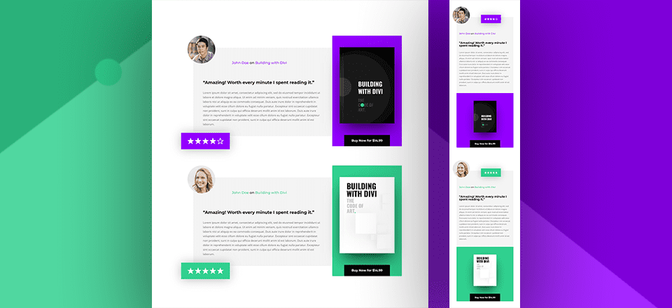
Preview
Now that we’ve gone through all the steps, let’s take a final look at the outcome across different screen sizes.
Desktop

Mobile

Final Thoughts
In this post, we’ve shown you how to design stunning short book reviews for your upcoming ebook landing pages. This helps you add social proof to your page and convince visitors of your book’s credibility. This use case tutorial is part of our ongoing Divi design initiative, where we try to put something extra in your design toolbox each and every week. If you have any questions or suggestions, make sure you leave a comment in the comment section below!
If you’re eager to learn more about Divi and get more Divi freebies, make sure you subscribe to our email newsletter and YouTube channel so you’ll always be one of the first people to know and get benefits from this free content.



Hi Donjete,
Thanks foe the tutorial. I’m planning to use Divi to launch a course in the near future and was wondering if you might be able to share with me what application you used in your tutorial that allows you to switch between screen view, webcam and with your webcam moved to the right corner of the screen view.
Thanks,
TC
Depending on the person we use Camtasia or Screenflow.