Today, we are going to show you a creative way to showcase blog posts as floating cards in Divi. Every blog or website should seek to have great content that is attractive and, perhaps just as important, accessible. One way to make sure content stays accessible to users is to float it on the page. This is also known as making an element fixed (or sticky). And for the bloggers out there, we’re going to show you how to showcase your blog posts as floating cards so they stay in view while scrolling down the page. We’ll even throw in a tip on how to show and reveal those floating cards on hover.
Let’s get to it.
- 1 Sneak Peek
- 2 Download the Layout for FREE
- 3 Download For Free
- 4 What You Need to Get Started
-
5
How to Design Blog Post Floating Cards Using Divi’s Blog Module
- 5.1 Step 1: Creating the section, row, and column as a new container for the blog module
- 5.2 Step 2: Adding a blog module and title to the row/column
- 5.3 Step 3: Customizing the Row with a Fixed Position and Custom Width
- 5.4 Updating the blog module with minimal content and a box-shadow
- 5.5 Making the row of cards pop out on hover
- 5.6 Hiding the Row on Mobile
- 6 Final Result
- 7 Final Thoughts
Sneak Peek
Here is a quick look at the design we’ll build in this tutorial.
Download the Layout for FREE
To lay your hands on the designs from this tutorial, you will first need to download it using the button below. To gain access to the download you will need to subscribe to our newsletter by using the form below. As a new subscriber, you will receive even more Divi goodness and a free Divi Layout pack every Monday! If you’re already on the list, simply enter your email address below and click download. You will not be “resubscribed” or receive extra emails.
Subscribe To Our Youtube Channel
To import the section layout to your Divi Library, follow these steps:
- Navigate to the Divi Library.
- Click the Import button.
- In the portability popup, select the import tab.
- Choose the download file from your computer.
- Then click the import button.

Once done, the section layout will be available in the Divi Builder.
Let’s get to the tutorial, shall we?
What You Need to Get Started
Before you start building this design in Divi, you will need to do the following:
- Create a new page and use the Divi Builder to edit the page on the front end (visual builder).
- Select the option “Choose a Premade Layout”.
- Search for and Select the Blogger Landing Page Layout.
- Click the “Use This Layout” button to load it to the page.
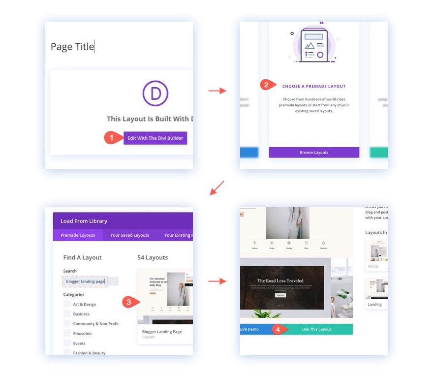
After that, you will have the premade page layout ready to use for this tutorial.
How to Design Blog Post Floating Cards Using Divi’s Blog Module
Now that you have the blogger landing page layout loaded to the page, we are ready to create our blog post floating cards.
Creating the blog post floating cards involves 5 main steps:
- Creating the section, row, and column as a new container for the blog module.
- Adding a blog module and title to the row/column
- Customizing the row with a fixed position and custom width
- Updating the blog module with minimal content and a box-shadow
- Making the row of cards pop out on hover
Step 1: Creating the section, row, and column as a new container for the blog module
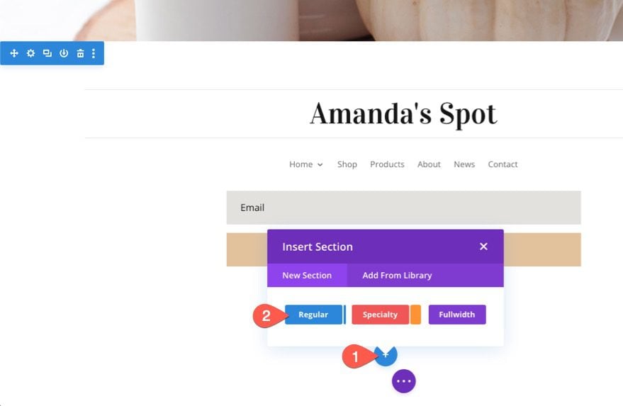
Let’s start by creating a new section at the very bottom of the page layout.
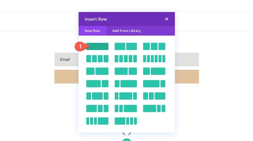
Then add a new one-column row to the section.
Step 2: Adding a blog module and title to the row/column
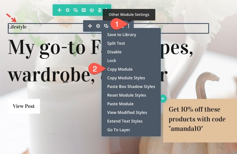
Instead of creating a new blog module here, scroll up and find the existing blog module displaying three blog posts (it is in the third section toward the middle of the page). Open the “Other Module Settings” and select “Copy Module”.
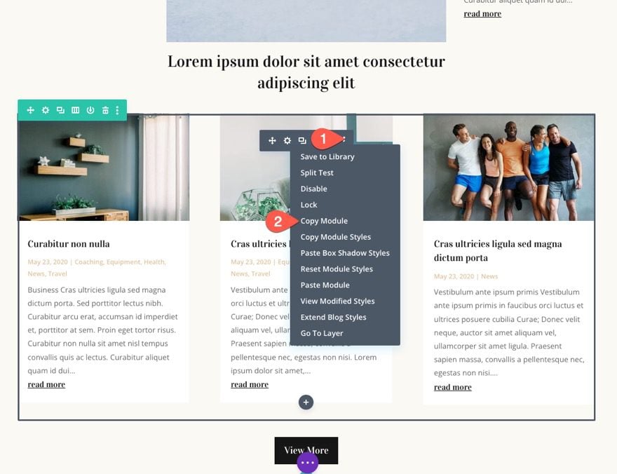
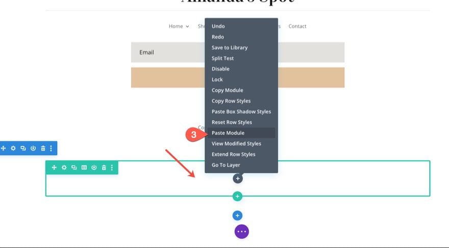
Then paste the module inside the new one-column row we created at the bottom of the page by right-clicking on the gray plus icon and selecting “Paste Module”.
Next, we are going to add a title above our blog posts that will also float above the blog post cards. To do this, copy the existing text module with the small title text that reads “Lifestyle”.
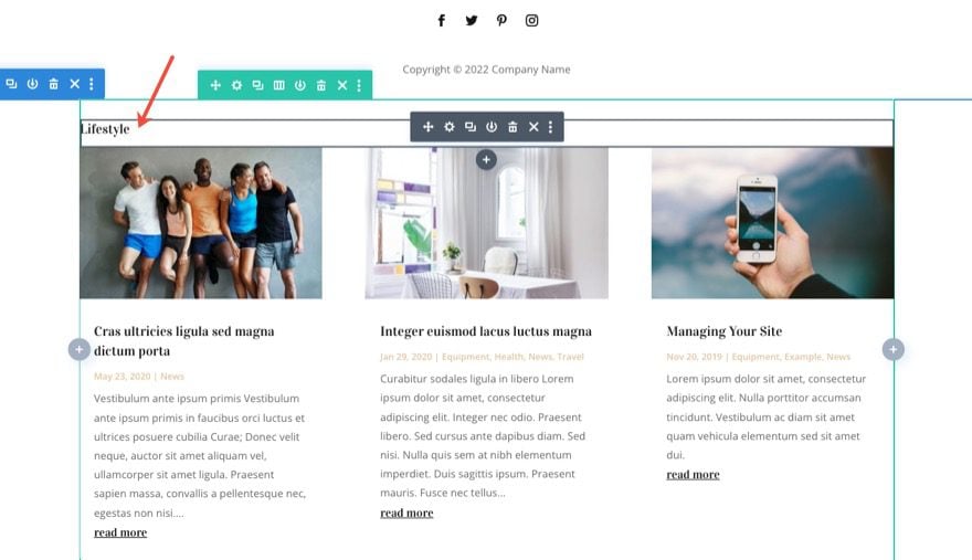
Then paste the module right above the new blog module we just added below.
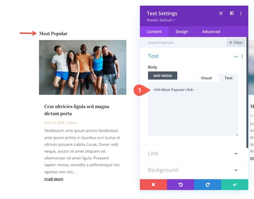
Next, change the title text to describe the kind of blog posts you want to feature. In this example, we’re going to just use “Most Popular”.
Step 3: Customizing the Row with a Fixed Position and Custom Width
We want to make the blog post cards smaller so they don’t take up to much room on the page when they have the fixed position. This would be distracting. To do this, open the row settings and update the following:
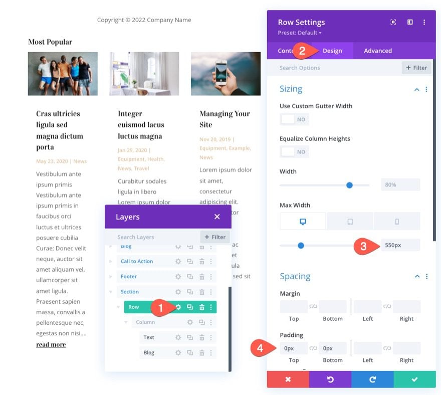
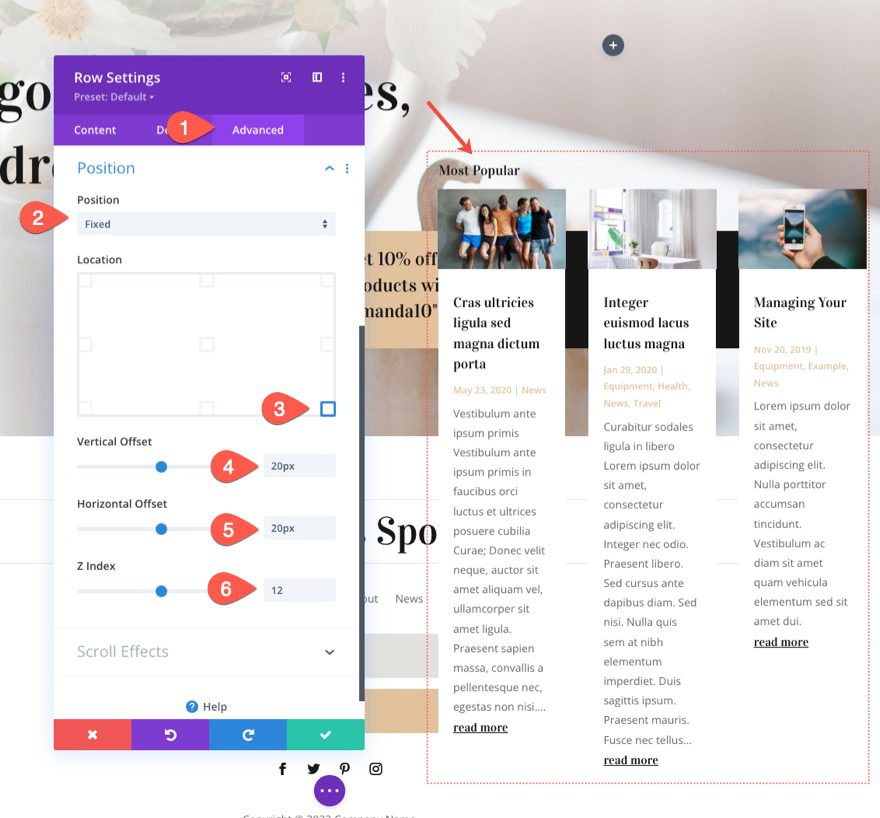
To give make the cards float, we need to give the row a fixed position. Under the advanced tab, update the following:
- Position: Fixed
- Location: Bottom Right
- Vertical offset: 20px
- Horizontal offset: 20px
- Z Index: 12
Updating the blog module with minimal content and a box-shadow
For the most part, the blog module already has a three-column grid layout and a nice style that came with the layout pack design. But there are a couple of things we need to do.
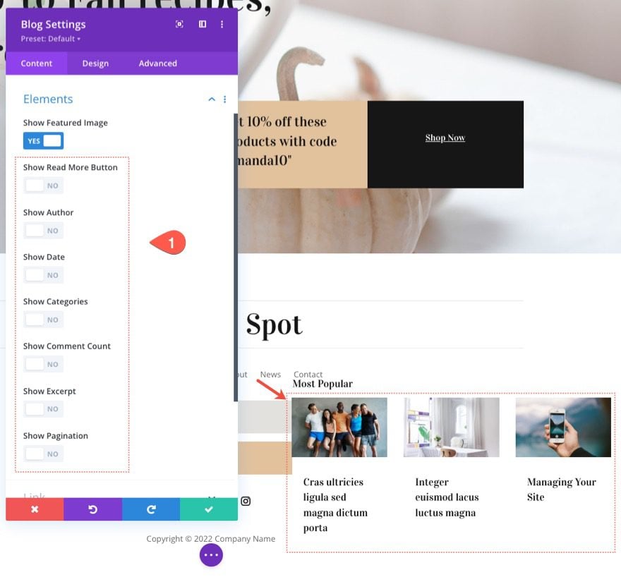
First, we need to make the cards smaller (vertically), we need to take out some of the content elements. To do this, open the blog settings and hide all the elements except the featured image. This will make it so the post only shows the featured image and title.
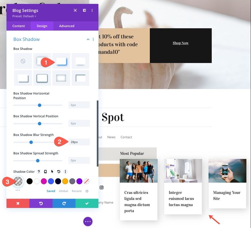
Under the design tab, give the blog cards a box shadow as follows:
- Box Shadow: See Screenshot
- Box Shadow Blur Strength: 28px
- Shadow Color: rgba(0,0,0,0.19)
Preview
Here is a preview of the final result so far.
Making the row of cards pop out on hover
As a final step, we can add a nice hover effect that entices users to interact with the floating cards. To do this, we can take advantage of Divi’s Transform and Hover options.
Open the row settings and update the following transform options:
For Desktop
- Transform Translate Y Axis: 50%
For Hover State
- Transform Translate Y Axis: 0%
For Tablet (and Phone)
- Transform Translate Y Axis: 0%
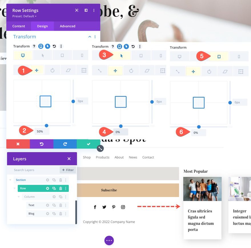
This will bring the entire row of cards outside the browser viewport by 50% initially. Once the user hovers over the row, the row of cards comes back completely in view, allowing the user to click any post they want to read.
Hiding the Row on Mobile
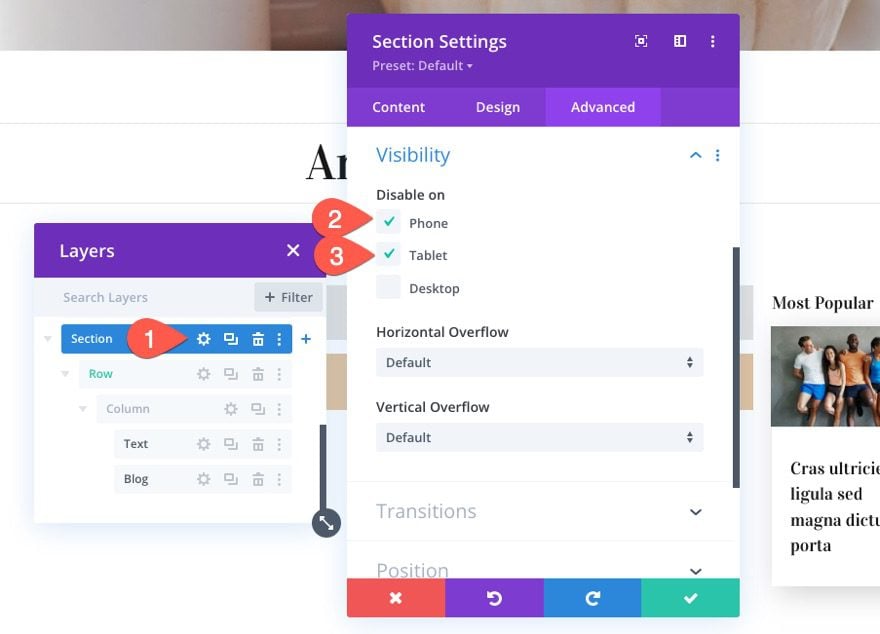
Unless you want to feature a single blog post, it doesn’t make sense to float these blog posts on mobile. It would probably take up way too much space and cause issues when trying to scroll. To hide the cards on mobile, open the section settings and disable the section visibility on phone and tablet.
Final Result
Final Thoughts
I look forward to hearing from you in the comments.
Cheers!



Leave A Reply