Designing reflections for images and text is a classic design technique that can be used to spice up the content of a web page. And, Divi makes it easy to create these reflections right from the Divi Builder without having to use a photo editor.
In this tutorial, I’m going to show you how to design reflections for images and text in Divi. The key to making reflections is to use Divi’s transform scale option to create a mirrored version of the element. After that, you can add a custom overlay which I’ll show you how to do with a text module.
Let’s get started!
Sneak Peek
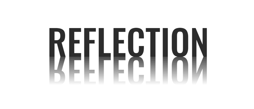
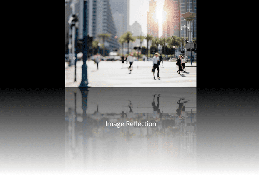
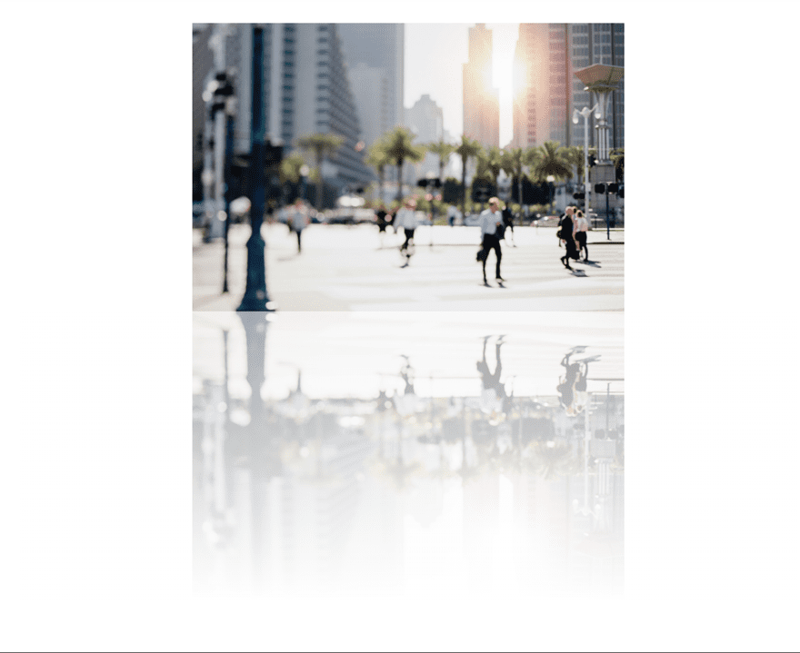
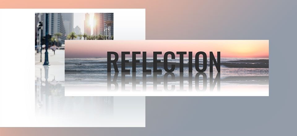
Here is a sneak peek of the designs we will build in this tutorial.

Download the Text and Image Reflections Layout for FREE
To lay your hands on the designs from this tutorial, you will first need to download it using the button below. To gain access to the download you will need to subscribe to our newsletter by using the form below. As a new subscriber, you will receive even more Divi goodness and a free Divi Layout pack every Monday! If you’re already on the list, simply enter your email address below and click download. You will not be “resubscribed” or receive extra emails.
To import the layout to your page, simply extract the zip file and drag the json file into the Divi Builder.
Let’s get to the tutorial shall we?
Subscribe To Our Youtube Channel
What You Need to Get Started
To get started, all you need is Divi. Make sure the Divi Theme is installed and active. We will be creating our designs from scratch using the Divi Builder on the front end (visual builder). You will also need a few mock images for this tutorial (a background image around 1920px x 600px and another image around 500px x 350px).
When you are ready, go to your WordPress Dashboard and navigate to Pages > Add New. Give your new page a title and deploy the Divi Builder on the front end. Select the option “Build from Scratch”. Now you are ready to go!
The Basic Idea Behind Creating Image and Text Reflection in Divi
The basic idea behind creating reflection designs in Divi involves three steps:
- Create a Module with Your Image or Text
- Duplicate the Module and Use Transform scale to create the mirrored image or text
- Add a Gradient Overlay to the mirrored element Using an absolute positioned divider or text module.
This design technique is not limited to individual modules. You can actually add reflections to entire rows within Divi using this method which is helpful for creating unique header designs. We will be adding reflection to a row in our text reflection design a bit later in this tutorial. But for now let’s start with how to create image reflection.
How to Create Image Reflection
To create an image reflection, let’s start with creating a new regular section with a one column row.
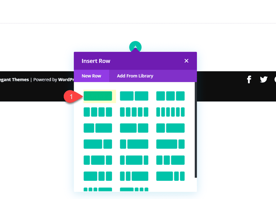
Then add an image module to the row.
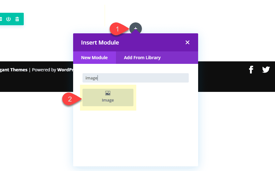
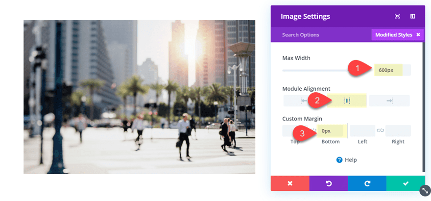
Upload the image you want from the media gallery to the image module. Then update the following image settings:
Max Width: 600px
Module Alignment: center
Custom Margin: 0px bottom
Create the Mirror Image
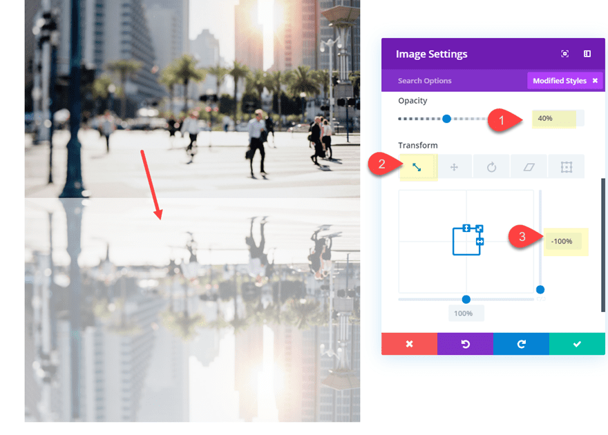
To create the reflection effect, we first need to create a mirrored duplicate of the image directly below the image.
To do this, duplicate the image module. Then update the settings of the duplicate image as follows:
Opacity: 40%
Transform Scale X axis: -100%
The transform scale property is what magically flips the image vertically and horizontally to create a mirrored version of the image.
This takes care of the basic reflection design. However, we can add an additional gradient overlay to our bottom image for a more realistic reflection design.
Add a Gradient Overlay Using a Text Module
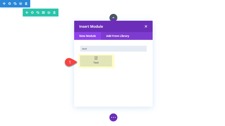
To add a gradient overlay to our bottom image, we can use a text module. We can give the text module an absolute position so that it sits above the bottom image. Then we can add a gradient background to the text module. Using a text module (instead of a divider) will give you the bonus option of adding some content on top of the reflection image later if you want to.
Go ahead and create a text module under the bottom image.
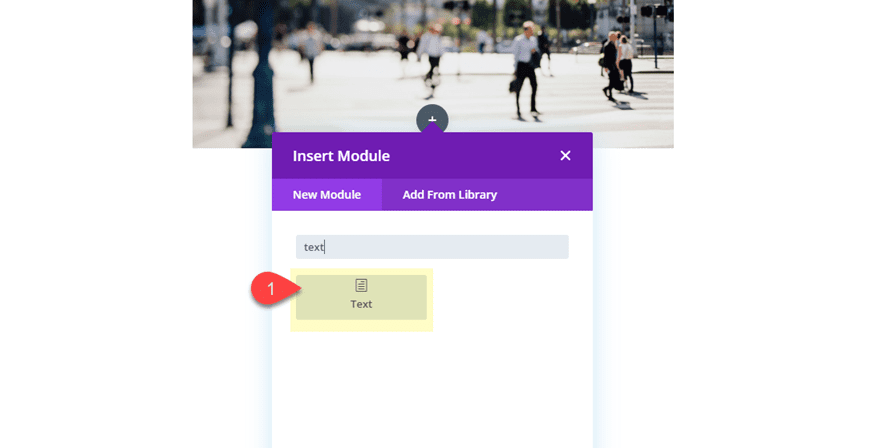
Delete the default content so that the text module is empty.
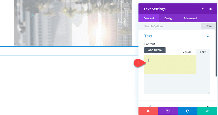
Then update the text module settings as follows:
Background Gradient Left Color: rgba(255,255,255,0)
Background Gradient Right Color: #ffffff
Width: 100%
Height: 50%
Then add the following custom CSS to the Main Element:
position: absolute !important;
top: 50%;
This absolute positioning of the text module overlay the text module on the bottom half of the row.
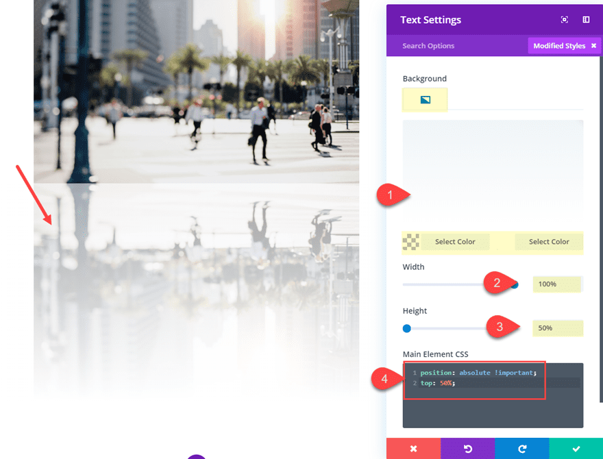
Let’s check out what the design looks like so far.

Adding a Background Color
If you don’t want a white background, you can experiment with other background colors which creates a unique fullwidth reflection design.
To do this, open the row settings and update the following:
Background Color: #000000
Width: 100%:
Max Width: 100%;
Custom Padding: 0px top, 0px bottom
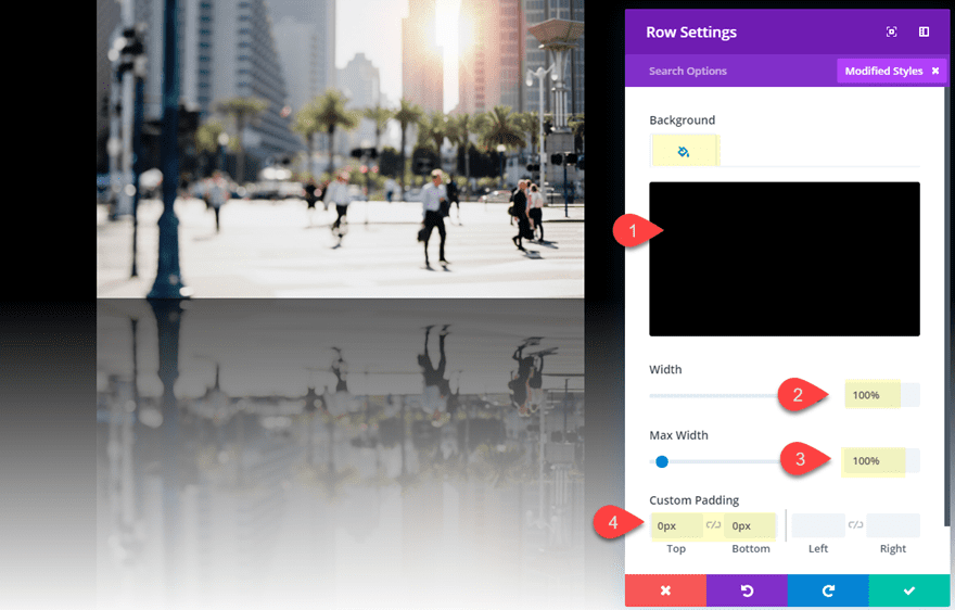
Now let’s check out the result.
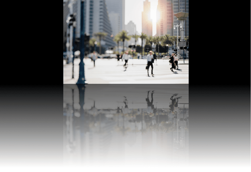
Adding Text to the Text Module Overlay
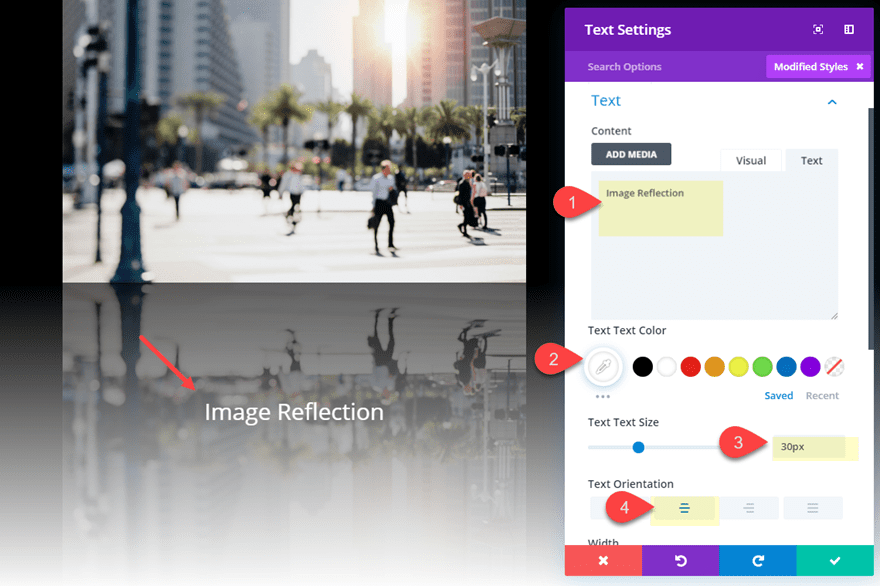
Remember, since we are using text module as the overlay on the bottom image, we can add some content if we want.
To do this, open the text module settings and update the following:
Content: “Image Reflection”
Text Text Color: #ffffff
Text Text Size: 30px
Text Orientation: center
Final Design
Here is the final design of the image reflection.

Creating Text Reflection in Divi
For this next example, we are going to create a text reflection design. The process is very similar to how you would create an image reflection. However, for this example, I’m going to create a reflection for an entire row. This will allow use to reflect both the text and the background image for a nice header design.
Here is how to do it.
First create a new regular section with a one column row. Then add a text module to the row.
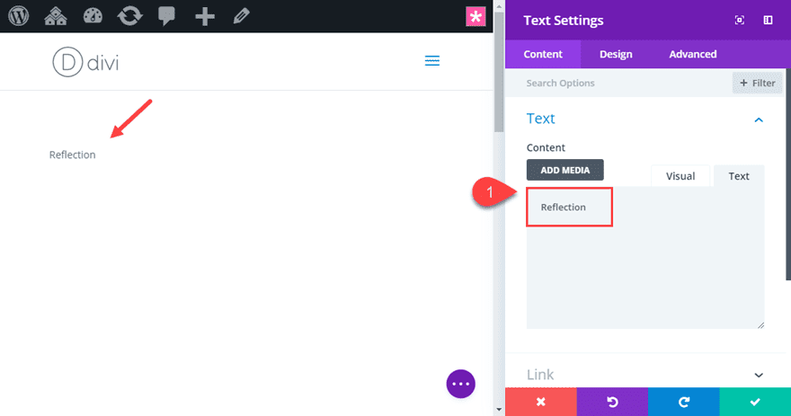
Update the content with the word “Reflection”.
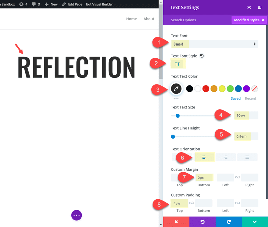
Then update the design settings as follows:
Text Font: Oswald
Text Font Style: TT
Text Text Color: #333333
Text Text Size: 10vw
Text Line Height: .9em
Text Orientation: center
Custom Margin: 0px bottom
Custom Padding: 4vw top
Update the row settings
Now that our text module is customized, it’s time to update the settings of the row.
Open the row settings and update the following:
Background Image: insert background image
Gutter Width: 1
Width: 100%
Max Width: 100%
Custom Padding: 0px top, 0px bottom
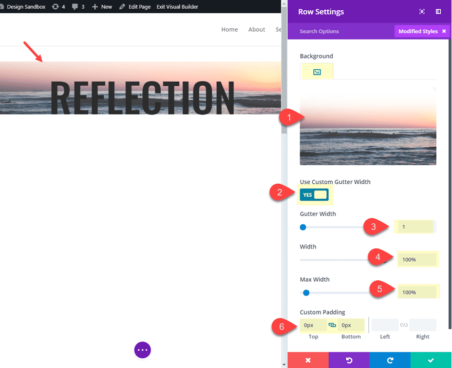
Here is what the design looks like so far.

Creating the Reflection Text Row
To create the reflection text for this design, we are going to reflect the entire row so that we can include the background image in the reflection.
Duplicate the Row and update the following:
Transform Scale Y axis: -100%
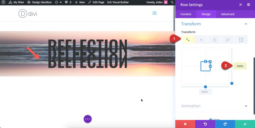
Now the row below is a mirrored image of the row above. Now all we need to do is add an overlay.
Add a Gradient Overlay Using a Text Module
To add a gradient overlay to our bottom row text reflection, we can use a text module like we did in the first image reflection design above. Like before, we can give the text module an absolute position so that it fills the entire row and sits on top of the other text module with our reflection text. Then we can add a gradient background to the text module overlay.
Go ahead and create a new text module under the text module in the bottom row.
Open the new text module settings and delete the content so that the text module is empty.
Then update the settings as follows:
Background Gradient Left Color: #ffffff
Background Gradient Right Color: rgba(255,255,255,0.13)
Start Position: 38%
Width: 100%
Height: 100%
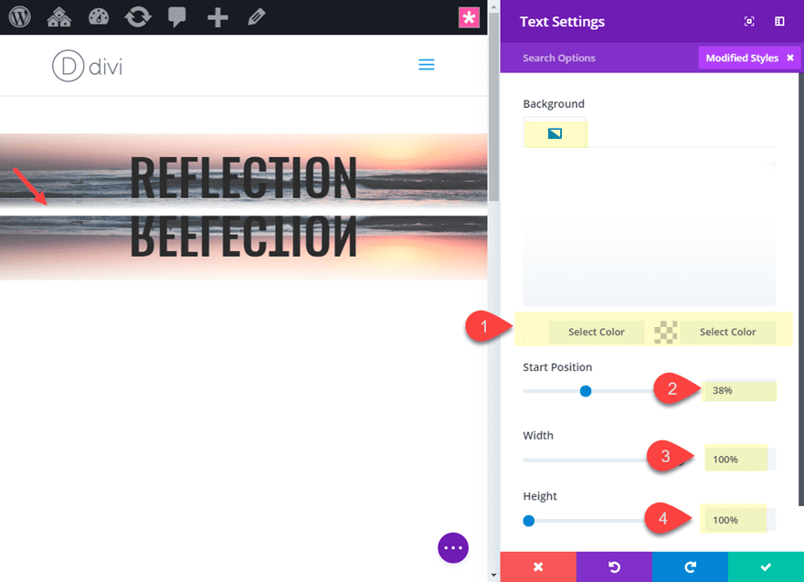
Then add the following custom CSS to the Main Element:
position: absolute !important;
top: 0;
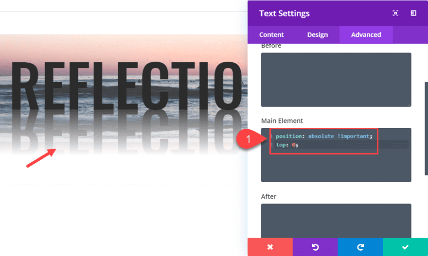
That’s it!
Final Result
Check out the final result.

Here is the same design without any background images.

Final Thoughts
Reflections can look really cool if you take the time to design them the right way. Thankfully, Divi has the tools to make it happen. There are other methods for making CSS reflections, but unfortunately they tend to lack cross browser support. The designs in this tutorial will look good on all browsers.
I have found that reflections look great on page headers and on showcasing images for a portfolio piece. And I’m sure there are many other implementations as well.
I look forward to hearing from you in the comments.
Cheers!





Excellent idea Jason. Loved it.
Jason,
Thanks so much for this demo, however it doesn’t look well in tablet or mobile mode. Suggestions
Thomas,
Can you be more specific? What’s not looking good on tablet or mobile? Thanks
The Wording shifts further apart, I guess I may have to do different settings for tablet and mobile.
Jason,
Thank you for this styling method. It’s what I have always wondered how would I do this without having to prepare the image. Love it that I can do it with Divi.
I always look forward to your articles. You explain the steps so clearly and teach at the same time.
Awesome! Thanks.
Great Job! thanks!
Dani.
Thank you for making this available for download. And I especially like the summary of the process that you included at the beginning. This is easy to follow. Thanks again,
Chris
Good to hear, Chris! Glad you liked it.