Bar counters are used throughout the web to effectively illustrate data or metrics with subtle color animation that represents a certain value. Divi has a dedicated bar counter module that can be used to generate animated bar counters with ease. They are popular additions to about pages, service pages, and case studies
Most bar counters seem to animate as they come into view and can be hard to customize. However, in this tutorial, we are going to show you how to create fully customizable bar counters (from scratch) that animate on scroll using Divi. To do this, we will take advantage of Divi’s position options and scroll effects and used them in uniquely precise ways.
Let’s get started.
Sneak Peek
Here is a quick look at the bar counters we are going to build in this tutorial.
Download the Layout for FREE
To lay your hands on the bar counters with scroll effects layout from this tutorial, you will first need to download it using the button below. To gain access to the download you will need to subscribe to our newsletter by using the form below. As a new subscriber, you will receive even more Divi goodness and a free Divi Layout pack every Monday! If you’re already on the list, simply enter your email address below and click download. You will not be “resubscribed” or receive extra emails.
To import the layout to your page, simply extract the zip file and import the JSON file from the Divi Library.
Let’s get to the tutorial, shall we?
What You Need to Get Started
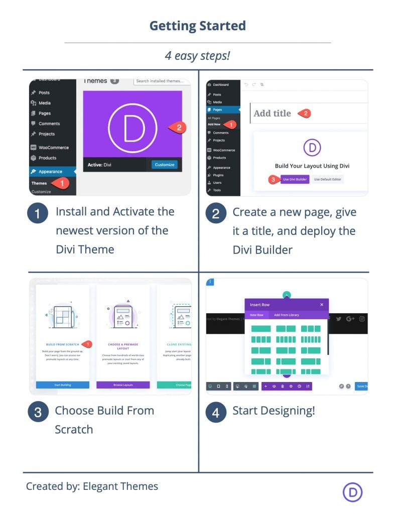
To get started, you will need to do the following:
- If you haven’t yet, install and activate the Divi Theme.
- Create a new page in WordPress and use the Divi Builder to edit the page on the front end (visual builder).
- Choose the option “Build From Scratch”.
After that, you will have a blank canvas to start designing in Divi.
Part 1: Optimizing the Section, Row, and Column
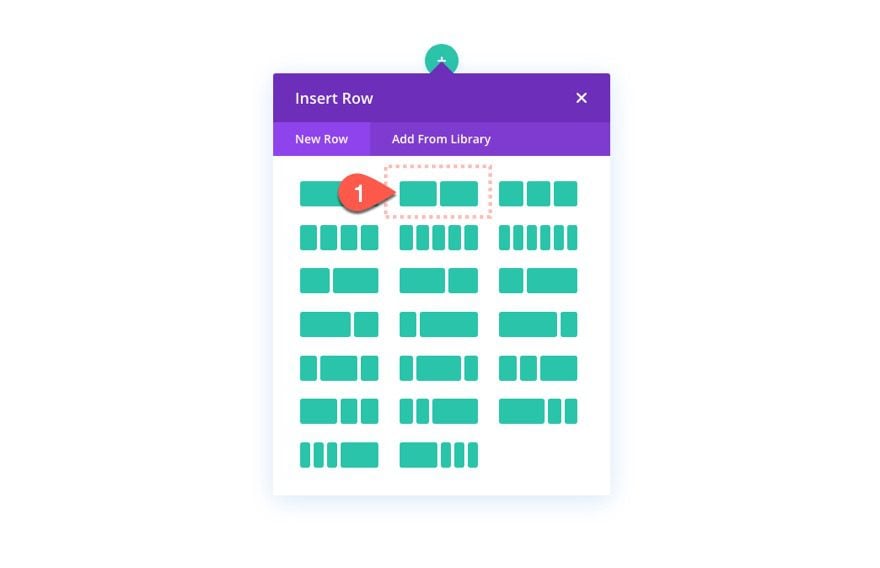
Add Row
T0 start, add a two-column row to the section.
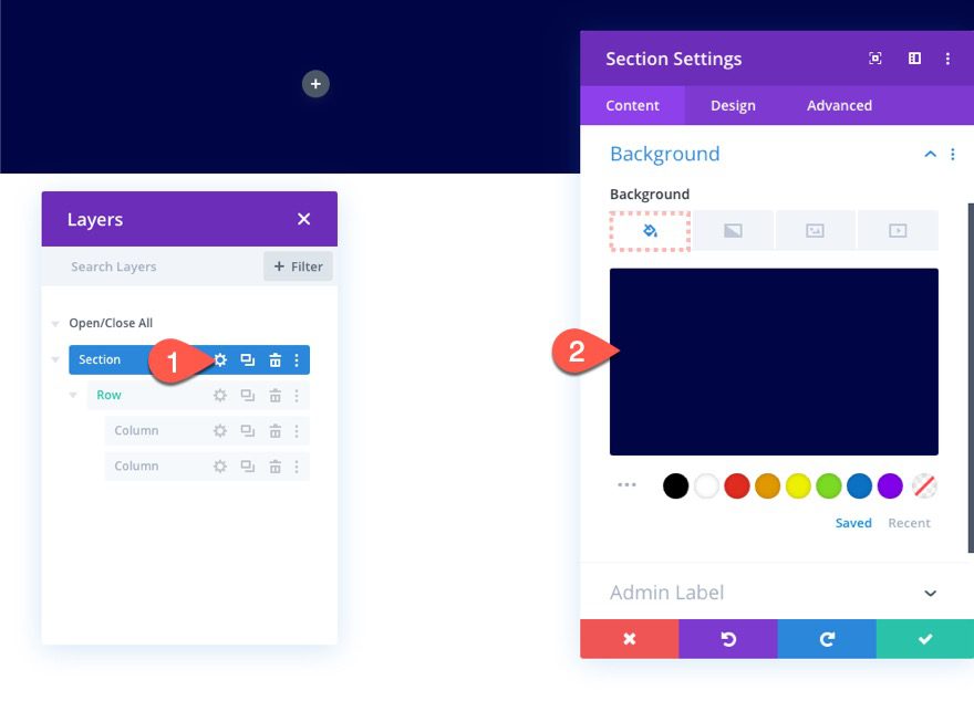
Section Settings
Then open the section settings and add a background color as follows:
- Background Col0r: #000545
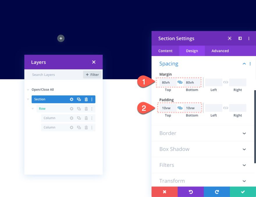
Then give the section some temporary margin to test out the scroll effects and some padding as follows:
- Margin: 80vh top, 80vh bottom
- Padding 10vw top, 10vw bottom
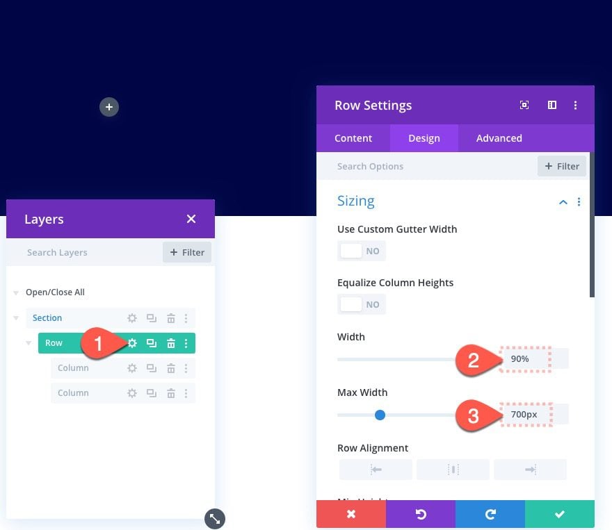
Row Width
Next, open the row settings and add the following width:
- Width: 90%
- Max Width: 700px
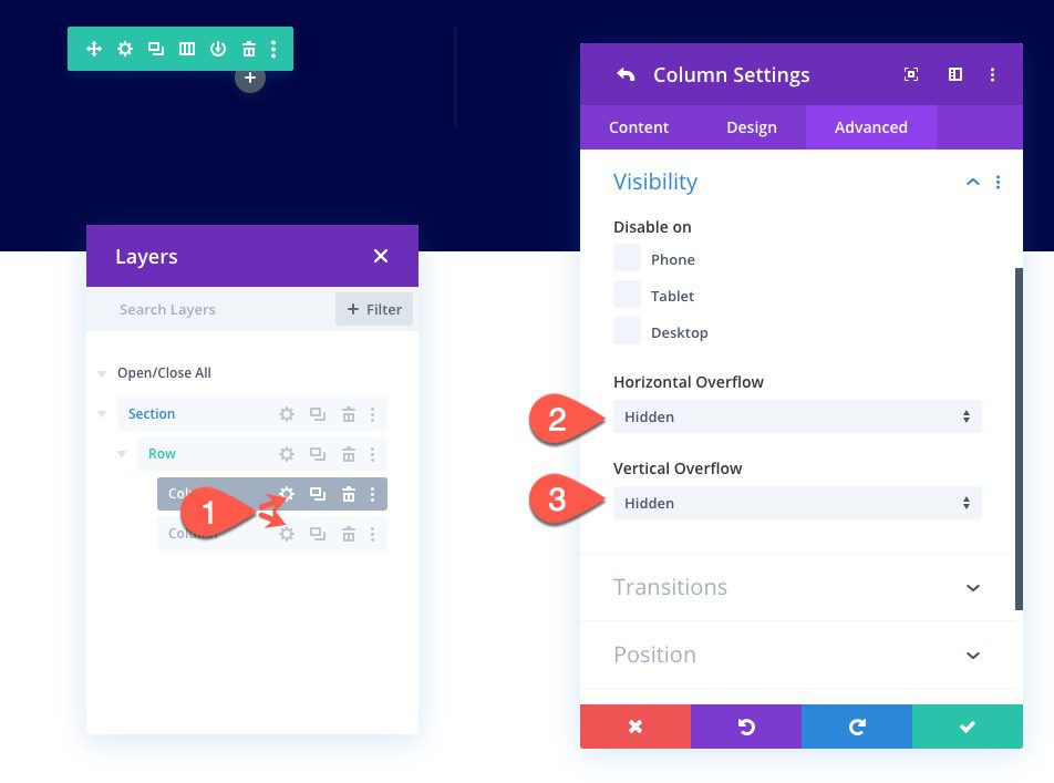
Column Overflow
Make sure to hide the overflow of the two columns inside the row. To do this, open the settings for each of the columns and update the following:
- Horizontal Overflow: Hidden
- Vertical Overflow: Hidden
Part 2: Creating a Bar Counter with Scroll Effects
The bar counter will consist of three elements: A bar background (divider module), A color bar (also divider module), and bar content (blurb module). The colored bar element is what will be animated with horizontal motion scroll effect offsets.
Let’s start with the bar background.
Creating the Bar Background
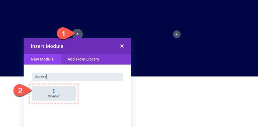
Add Divider Module
Add a new divider module to column 1.
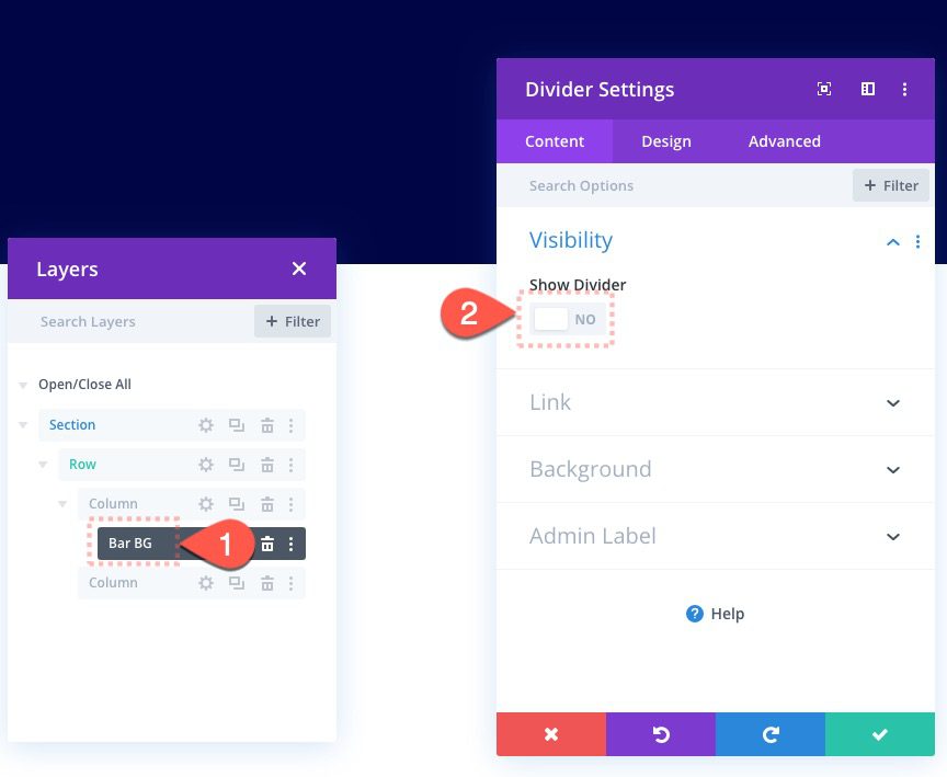
Divider Settings
Show Divider: NO
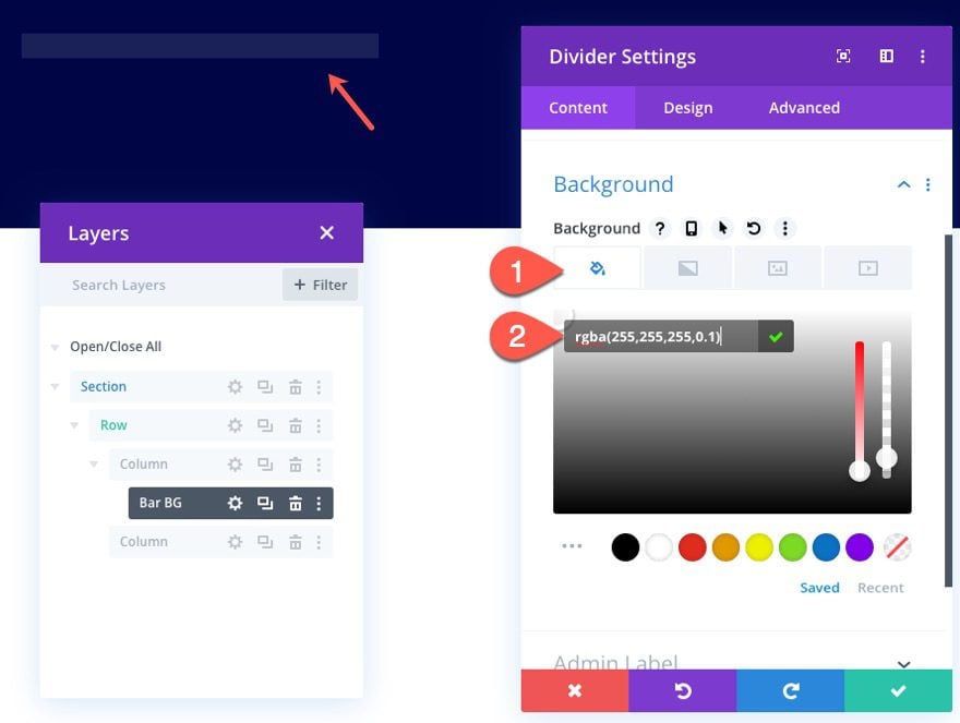
- Background Color: rgba(255,255,255,0.1)
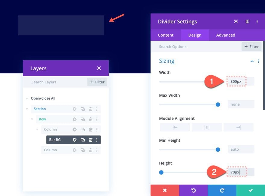
- Width: 300px
- Height: 70px
Create Bar Counter Bar
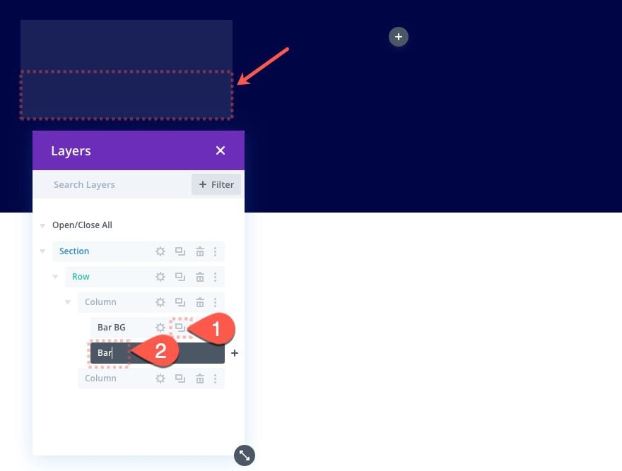
Duplicate Divider Module
To create the colored bar for the bar counter, duplicate the previous divider module we used to make the bar background.
Divider Background
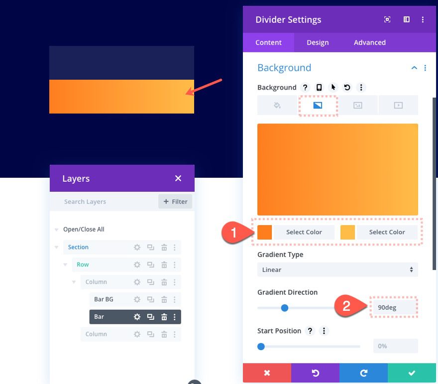
Then update the background with a new gradient background color as follows:
- Gradient Background Left Color: #fe7e1f
- Gradient Background Right Color: #ffbc48
- Gradient Direction: 90deg
Divider Position
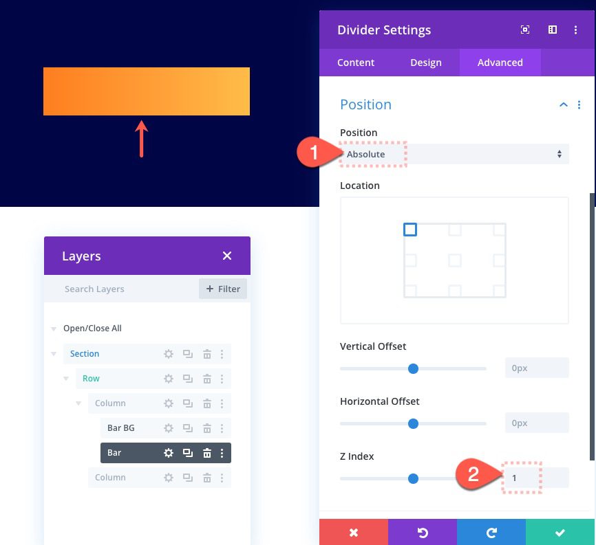
To make the colored bar sit above the bar background, we need to give it an absolute position with a Z Index of 1:
- Position: Absolute
- Z Index: 1
Divider Scroll Effects
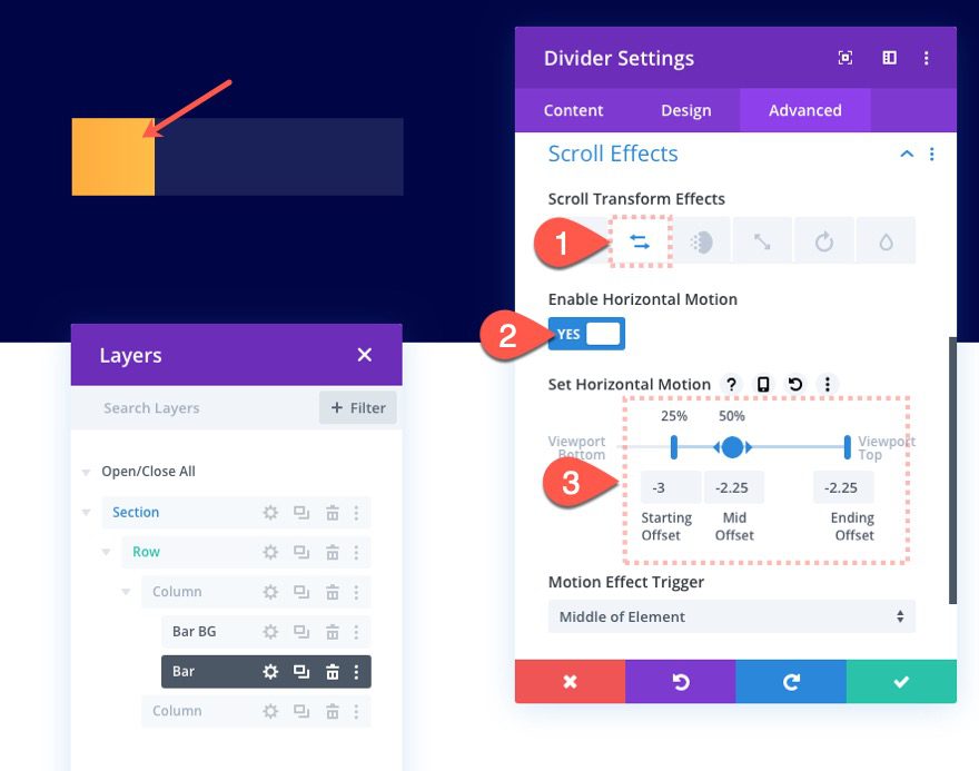
Now we are ready to add the motion to the bar counter bar. To do this we will use a horizontal scroll effect that moves the divider module from left to right. Since the column overflow is hidden, we won’t see the bar as it extends beyond the left side of the column. But we will see it come into view as it moves to the right.
Using the Offset Values to Determine Percentage Values for the Bar Counter
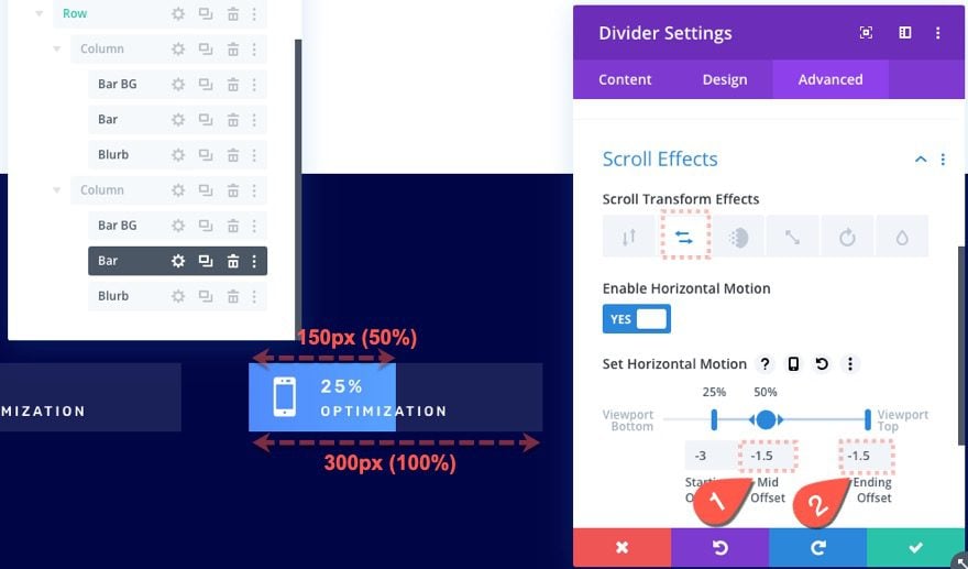
Before we add the horizontal motion to the divider/bar, we need to understand how to determine a percentage value to be displayed on the bar counter. In other words, if we want to represent 25% on the bar counter, we need to know what horizontal motion offset will move the bar to the right exactly 25% of the bar background width.
We can do some simple math to figure this out.
The total width of the bar is 300px.
Each horizontal offset value is relative to 100px (1 equals 100px, -2 equals -200px, etc…)
To move the bar to the left (outside of view), we need to add a starting offset of -3 (-300px). This moves it over to the left 300px out of view.
Then we need to move the bar over 25% of 300px (which is 75px) to complete the scroll animation.
To move the bar over 75px to the right as the bar reaches the vertical center of the page, we need to a mid offset of -2.25 (because -300 plus 75 equals -225). This is probably reminding you of those number lines we used in grade school.
Show 25% with Horizontal Motion
To show 25% with horizontal motion, select the horizontal motion tab and update the following:
- Enable Horizontal Motion: YES
- Starting Offset: -3
- Mid Offset: -2.25
- Ending Offset: -2.25
Create Bar Counter Content
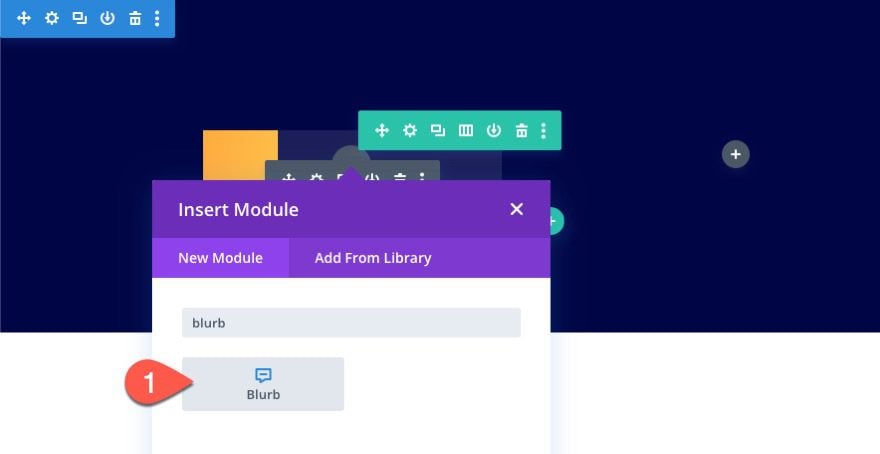
To create the bar content, we are going to use a blurb module. Blurbs allow us to easily add a left-aligned icon along with a title and body text which will be perfect for the bar counter.
Under the colored bar divider module, add a blurb module.
Blurb Content
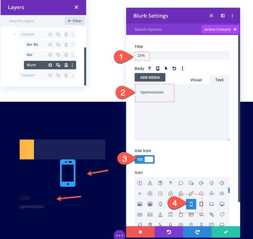
Then update the content as follows:
- Title: 25%
- Body: Optimization
- Icon: see screenshot
Blurb Design
Under the design tab update the following:
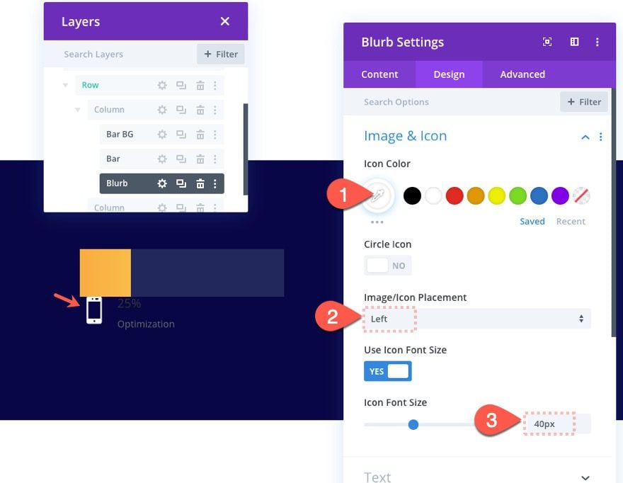
- Icon Color: #ffffff
- Image/Icon Placement: Left
- Use Icon Font Size: YES
- Icon Font Size: 40px
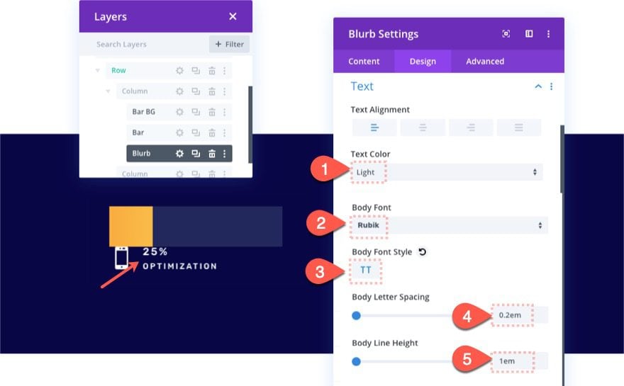
- Text Color: Light
- Body Font: Rubik
- Body Font Style: TT
- Body Letter Spacing: 0.2em
- Body Line Height: 1em
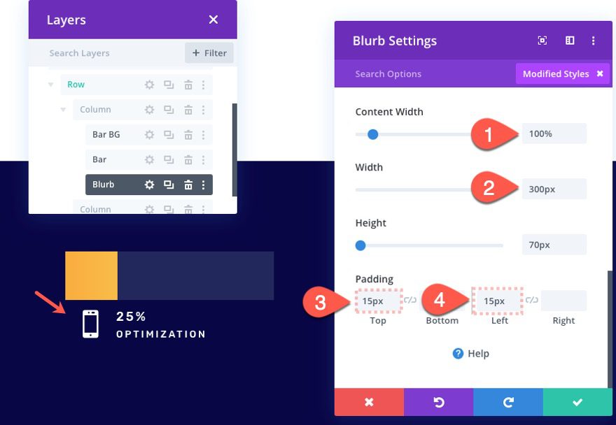
- Content Width: 100%
- Width: 300px
- Height: 70px
- Padding: 15px top, 15px left
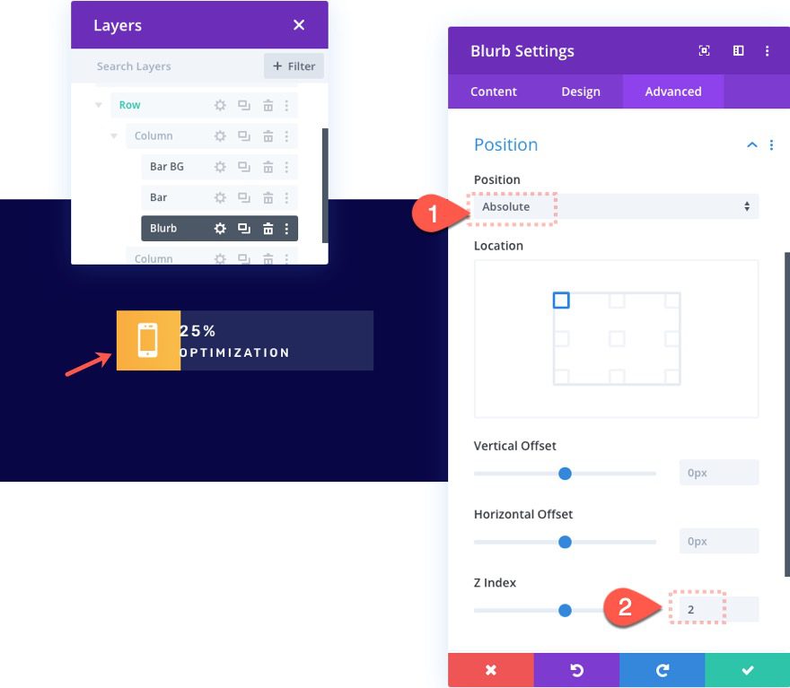
- Position: Absolute
- Z Index: 2
Part 3: Creating Additional Bar Counters
In this next part, we are going to continue making more bar counters using the same technique. We will create a 50%, 75%, and a 100% bar counter to round off the design of the layout. This should give you good working examples to make more on your own.
Creating a 50% Bar Counter
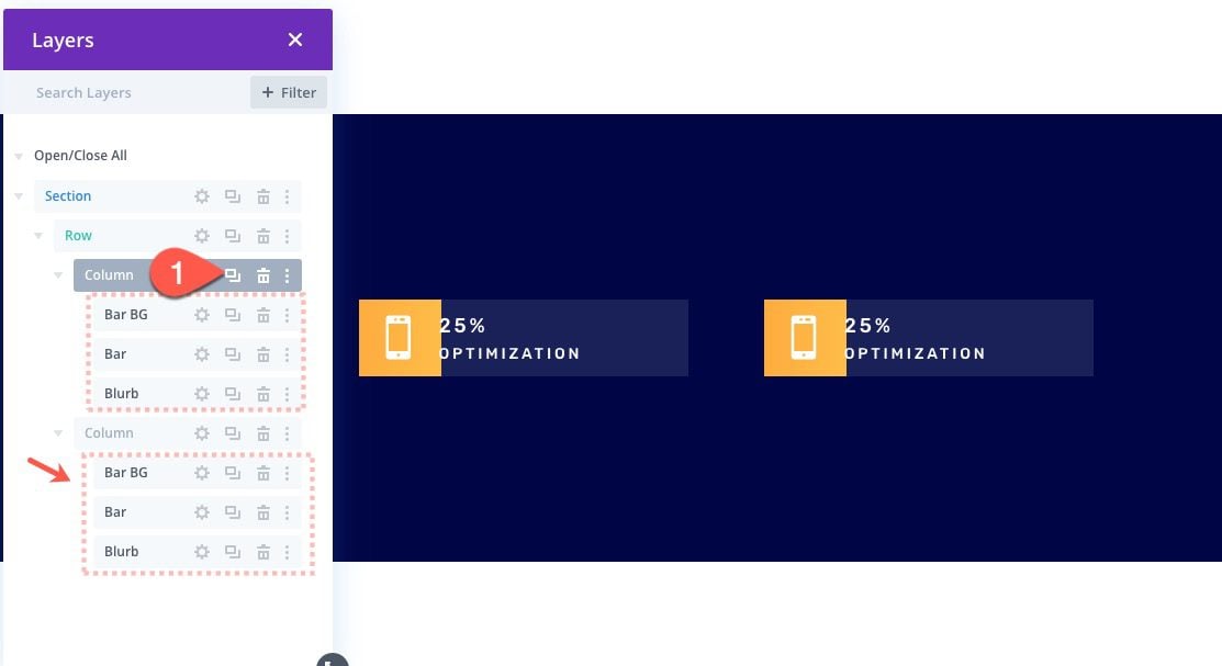
Duplicate Column with Bar Counter
Once you have the first bar counter created in column 1, we can duplicate the entire column or copy and paste the three modules that make up the bar counter into column 2. Now you should have two columns each with identical bar counters.
Update Bar Divider Settings
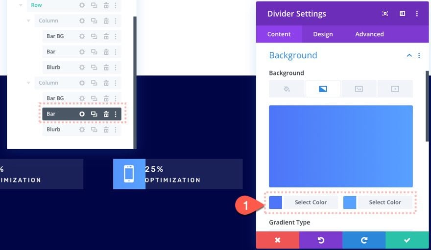
Background
Inside column 2, open the colored bar divider settings and update the gradient background colors:
- Gradient Background Left Color: #4c75f8
- Gradient Background Right Color: #57a1ff
Scroll Effects
Then update the horizontal motion scroll effect so that it fills 50% of the bar on scroll:
- Mid Offset: -1.5
- Ending Offset: -1.5
Update Blurb Content
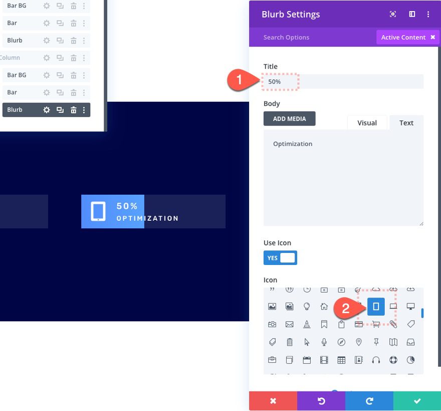
Then open the settings for the blurb in column 2 and update the content:
- Title: 50%
- Icon: see screenshot
Creating a 75% Bar Counter
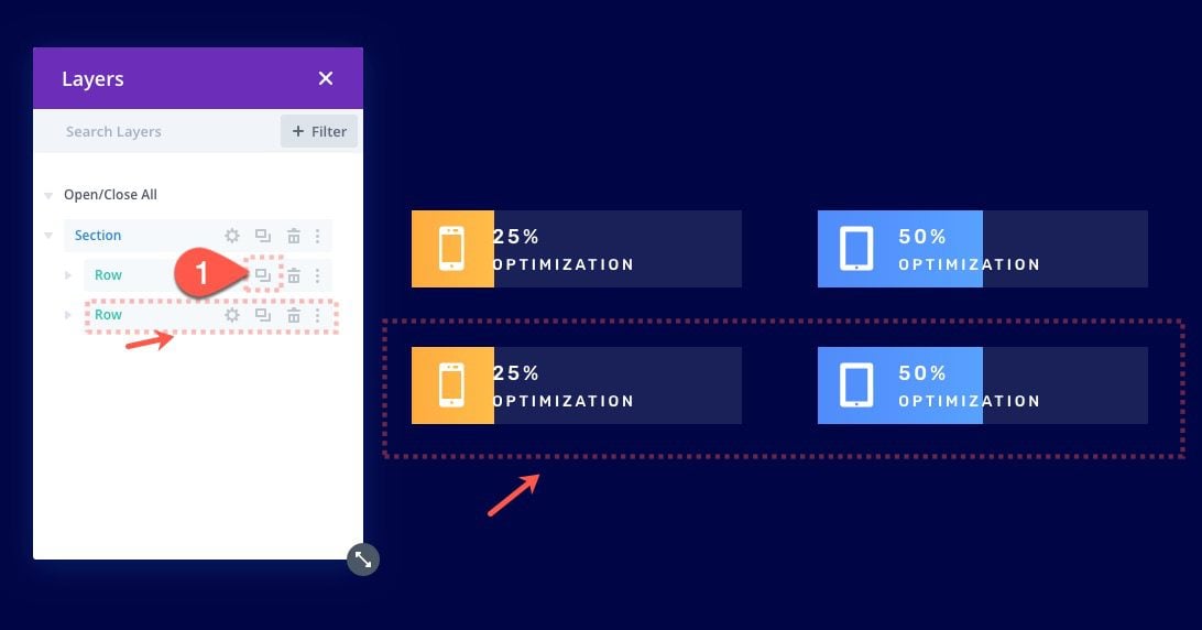
Duplicate the Row
To jumpstart the design of our next two bar counters, duplicate the entire row to create another identical row below it.
Update Bar Background and Scroll Effects
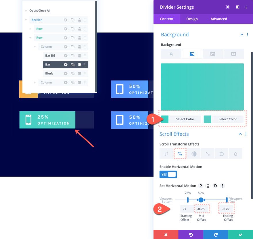
Open the settings for the colored bar divider module and update the following background colors:
- Gradient Background Left Color: #4c75f8
- Gradient Background Right Color: #57a1ff
Then update the horizontal motion offsets as follows:
- Mid Offset: -.075
- Ending Offset: -0.75
Blurb Content
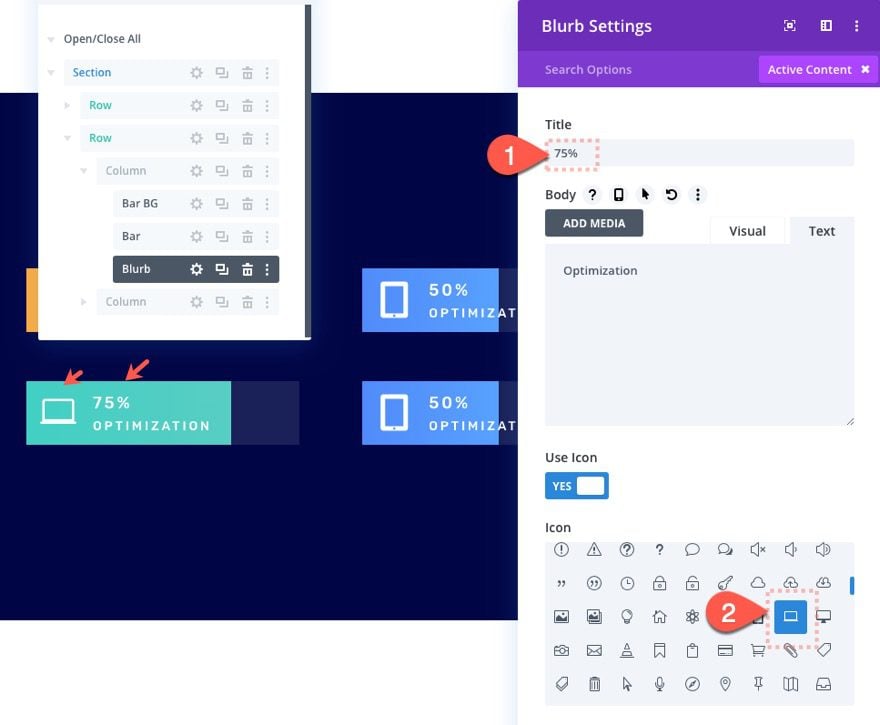
Open the blurb settings and update the content as follows:
- Title: 75%
- Icon: see screenshot
Creating a 100% Bar Counter
Update Bar Color and Scroll Effects
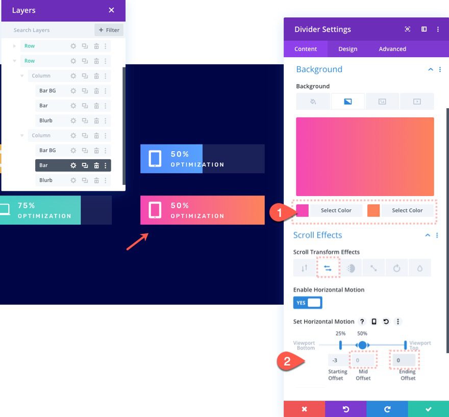
To create a 100% bar counter, go over to column 2 and update the colored bar divider module’s background color as follows:
- Gradient Background Left Color: #f449b4
- Gradient Background Right Color: #fc845b
Then update the horizontal motion offsets as follows:
- Mid Offset: 0
- Ending Offset: 0
Update Blurb Content
Finally, update the blurb content:
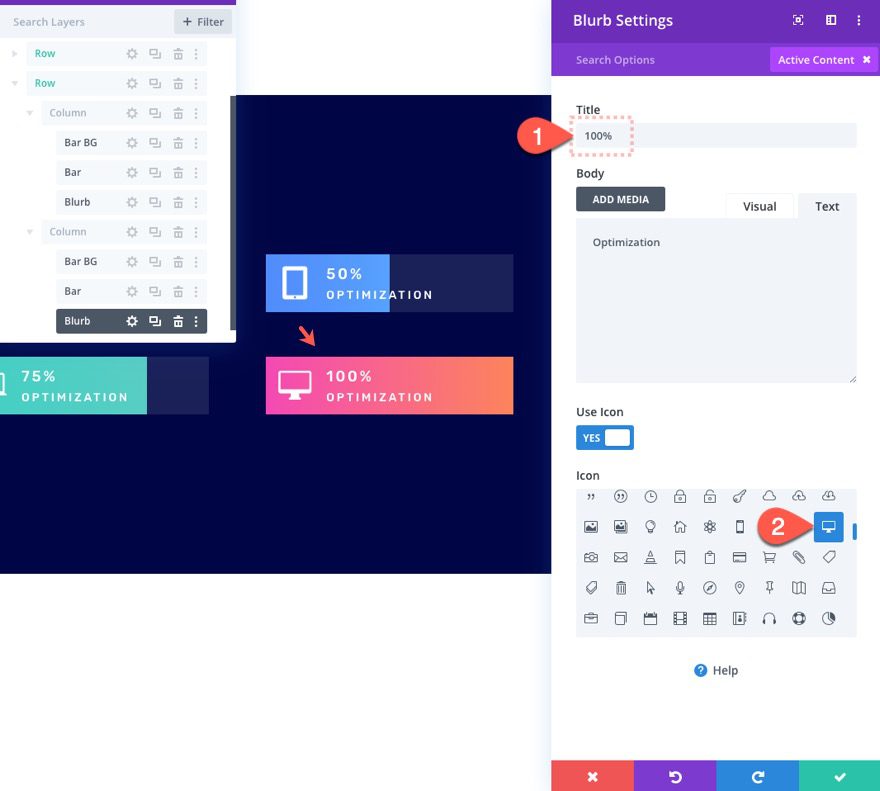
- Title: 100%
- Icon: see screenshot
Final Result
Here is a screenshot of the final result. I added a custom background image from our fifth theme builder pack as a final touch.

Now what the scroll motion in action.
Final Thoughts
Hopefully, these scroll animated bar counters will come in handy for a future project. The downside to having such a custom design is that you have to do a little math to calculate how far to move the colored bar for a certain percentage. But the upside is that you have more opportunities for even more unique and creative designs.
If you are interested, check out our post on creating custom circle counters that animate on scroll as well.
I look forward to hearing from you in the comments.
Cheers!


hi Jason, I downloaded json file but only see 4 blank white space with colour.tq for the scroll idea!
Sorry about that. I replaced the download file. Make sure to import it to the Divi Library first. Thanks for letting me know.