One of the most exciting new features in the Divi 5 Visual Builder is the ability to dock your settings panels. This feature offers enhanced control over your workspace to reduce modal clutter and enable seamless multitasking. allowing you to dock multiple settings panels to either side of the screen and access them as needed. Gone are the days of constantly opening and closing modals—Divi 5 puts everything at your fingertips.
With multi-panel docking, you can customize your interface to suit your workflow. This post will guide you through how to use docking effectively so you can make the most of this game-changing feature.
Download The Divi 5 Alpha Try The Divi 5 Demo Become a Divi 5 Bug Tester
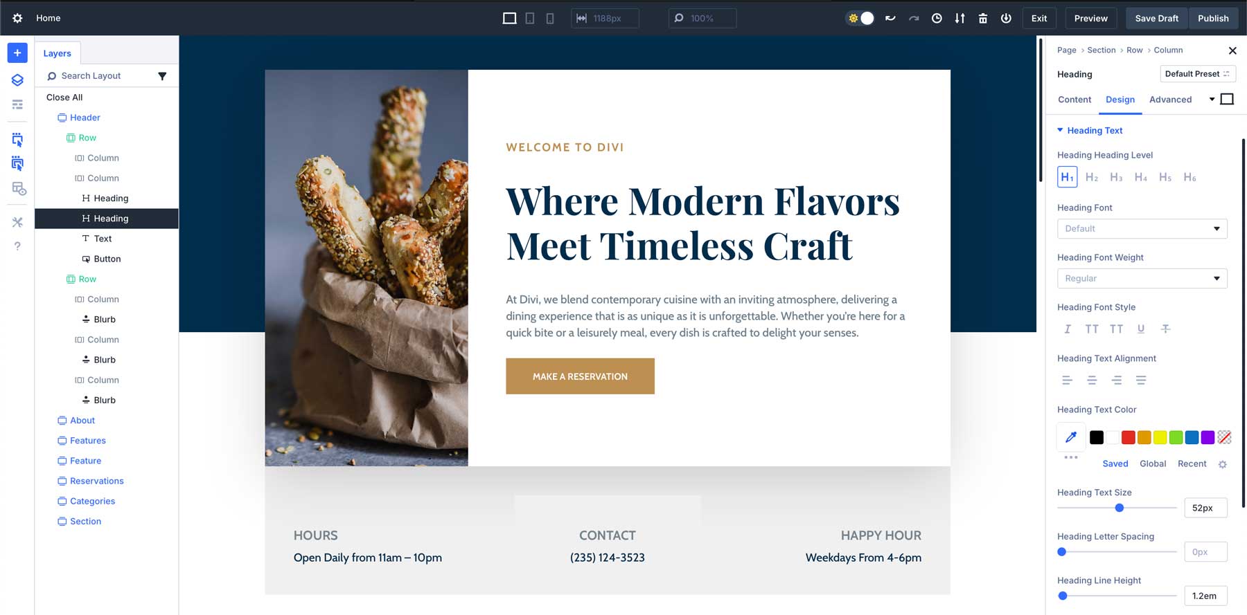
The new Divi 5 Visual Builder with docked panels for an optimized workflow.
What Is Docking In Divi 5?
This might be the productivity hack you’ve always wanted in Divi. It lets you interact with multiple settings simultaneously, reducing clicks and interruptions that can slow you down. As an added bonus, I personally think this will make Divi easier than ever for new users to learn because there aren’t disappearing controls and modals.
Docking in Divi 5 allows you to move and organize your various Visual Builder panels by anchoring them to the sides of the interface. This gives you more than one way to interact with your workspace. Instead of opening and closing different panels as you work, you can now dock them into place, keeping everything you need visible and accessible.
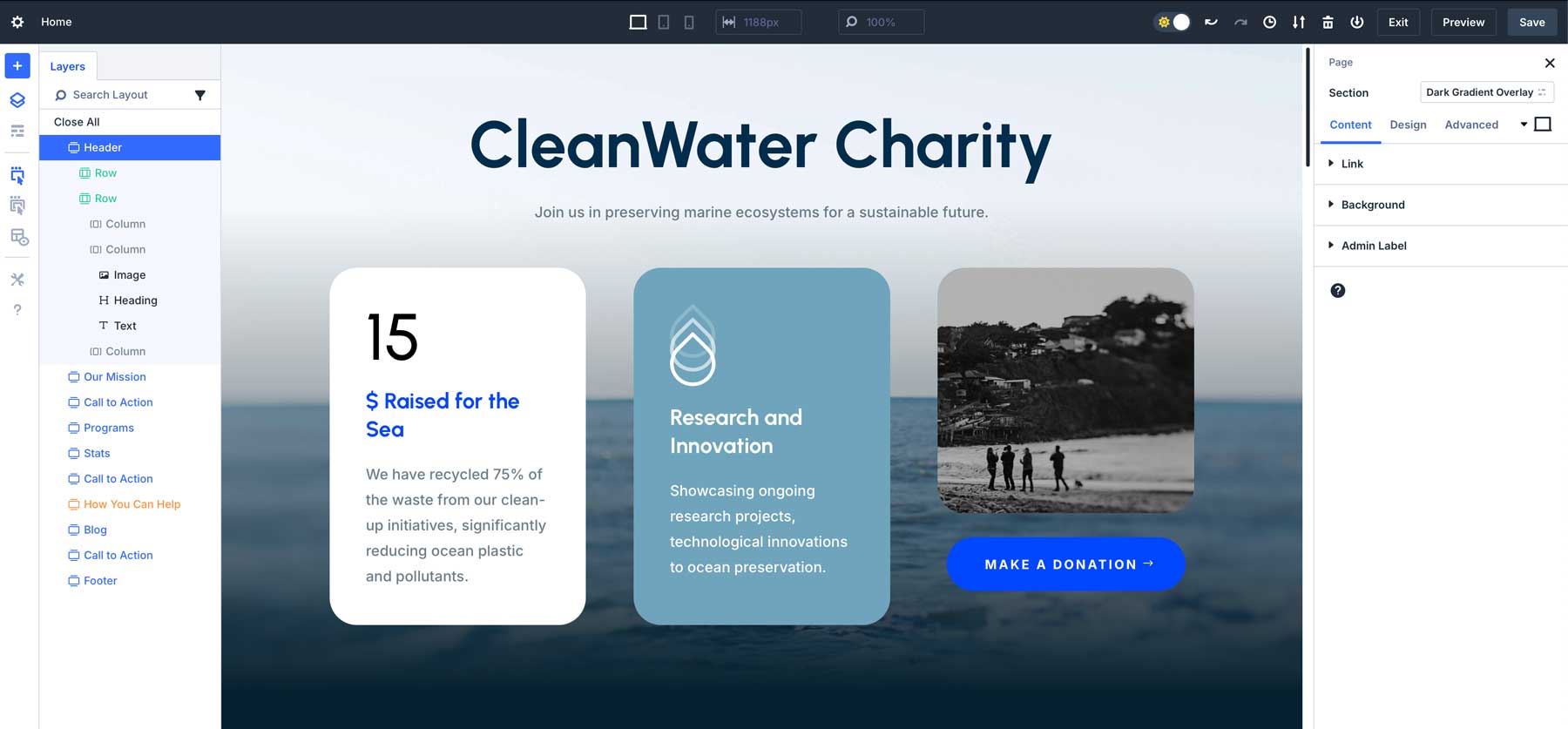
Shown: Layers Panel on the left and Page/Settings Panel docked to the right.
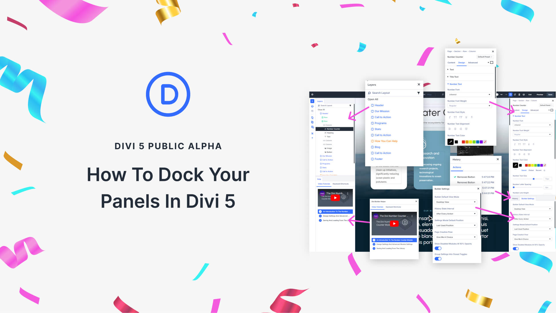
With the introduction of multi-panel docking, multiple panels can be opened simultaneously and organized into tabs, so you can switch between different settings without interrupting your workflow. Personalizing your builder is easy.
Subscribe To Our Youtube Channel
How To Dock Your Panels
This new feature gives you a lot of flexibility, but it all works with the same docking principles.
Step 1: Choose Your Panel
When you come across a particular panel, you can decide to place it wherever you want. Examples of dockable panels are: the Page/Settings Panel, Layers Panel, Help Panel, Builder Settings Panel, and History Panel.
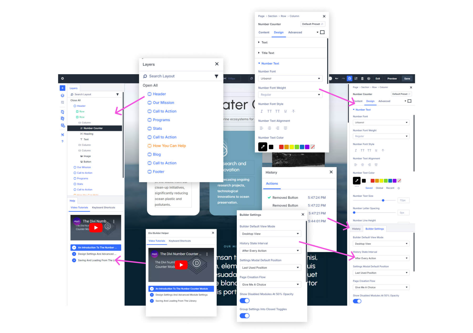
Step 2: Dock the Panel
To dock any panel, click and drag it to the right or left edge of the screen. As soon as you release the panel, it will snap into place and remain docked on the side of your workspace. If needed, you can easily click and drag the docked panel to reposition it on the opposite side or keep it anchored for quick access.
Watch how to dock a panel by dragging it to the left or right of your workspace.
Step 3: Organize with Tabs or Split Docking
Panels can be organized via tabs or split docking, allowing you to easily switch/scroll between multiple panels without ever closing them.
Expert Tip: If you find yourself switching back and forth between the same panels, keep those panels docked and use the tabs to quickly navigate between them. This eliminates the need to repeatedly open and close modals, letting you focus on your design.
Benefits of Multi-Panel Docking
By giving you the power to organize and manage multiple settings panels simultaneously, Divi 5 allows you to design faster and more efficiently.
1. Your Visual Builder Your Way
Divi 4 was pretty much laid out how it was and kept users in that mold (barring a few minor adjustable aspects). Divi 5’s multi-panel docking lets you set up your workspace to fit your unique design process. Instead of jumping between popup settings modals, your most-used panels are always in view and ready for quick adjustments.
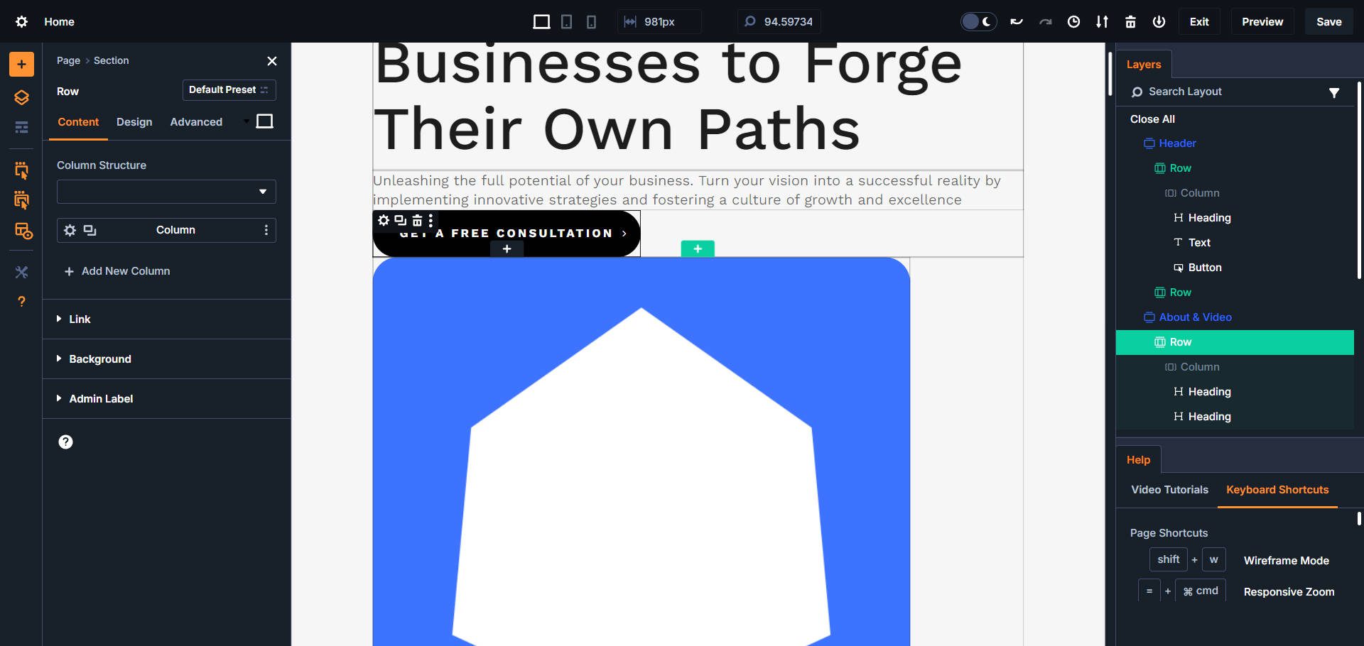
My Divi 5 VB Setup: Help Panel in the bottom-right for shortcuts, layers panel top-right, page/settings panel on the left for design settings, X-Ray to see boundaries of each page element, and a healthy amount of orange.
2. Seamless Panel Switching: Tabs and Split Docking
Docking multiple settings panels allows for easier multitasking. You no longer have to repeatedly open and close various modals as you work. Dock the needed panels and switch between them instantly using tabs or stack multiple panel views to preserve their immediate visibility while editing. When you click into an element, your panels will populate with its settings in their designated locations.
Divi 5 uncovers all those Visual Builder settings that were hidden behind extra clicks in Divi 4. Instead of multiple clicks to get where you’re going, more of those settings are exposed. Dockable panels are a huge part of that, but other UI enhancements also play into that. The first notable feature is the Breadcrumb trail in the Settings Panel. It lets users see and easily navigate to parent items of the selected child item.
Next are the persistent Page Bar (the top bar) and Sidebar controls (on the left-hand side). These both give extremely easy access to several important settings and features at all times. There’s also an option to show/hide the default WordPress admin bar, which I find cleans things up a whole lot.
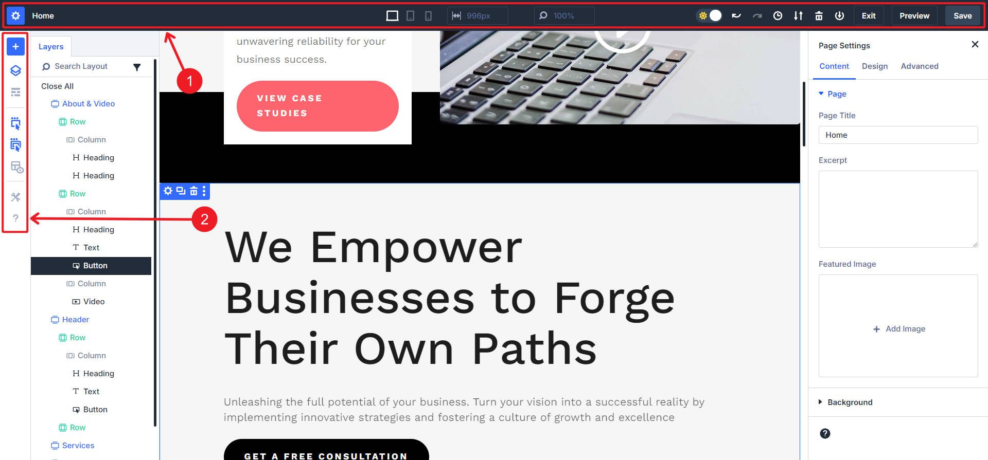
Lastly, you can right-click any on-page element and instantly see additional options.
4. Customizable Color Scheme with Light and Dark Mode
The last customizable feature that I’d like to point out is a very nice quality-of-life feature. Since there is so much on the page that can always be there, having a little control over how those look for you is nice. The ability to toggle between light and dark modes is just such a nice addition. There’s also an option to choose your preferred color scheme (orange is my favorite color, so yes, please).
It’s nice to both style and arrange your panels and docking areas.
Want to learn more about the Divi 5 interface? Read our detailed guide on Getting to Know the Divi 5 Interface.
Ready to give panel docking a try? Download the Divi 5 Public Alpha and start organizing your workspace today.
Report Any Bugs You Find
We need your help improving Divi 5 by participating as a bug tester! You can report bugs through our support chat. Simply go to your member’s area Help tab and click the green “Chat With Our Team” button under Tech Support.
To learn more about the process, check out our Call All Bug Testers post.
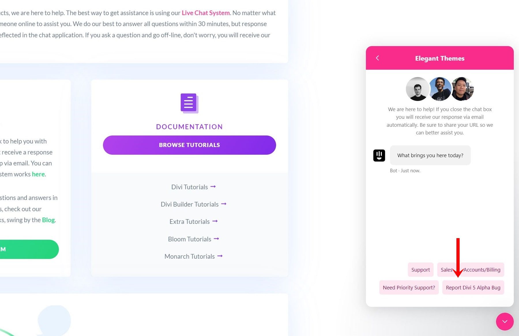
Please let us know if you find a bug in the Visual Builder involving the docking panels feature (or anything else).
Final Thoughts
The multi-panel docking feature in Divi 5 is designed to help you work with fewer disappearing settings and a level of personalization. Divi 5 removes unnecessary clicks and keeps your tools at your fingertips, allowing you to dock and organize multiple panels to fit your workflow.
Now that you know how to make the most of this feature, it’s time to try it out for yourself. Download the Divi 5 Public Alpha and start customizing your workspace today. We’re eager to hear how this feature improves your design experience, and your feedback will help us refine Divi 5 as we move closer to its final release. If you don’t want to or can’t test Divi 5 on your own test environment, you can still play around with the docking feature in our live Divi 5 Demo.
Download The Divi 5 Alpha Try The Divi 5 Demo
Additional Divi 5 Resources
- Read our in-depth post on the Divi 5 interface to learn more about the key changes in the interface.
- For those who want a speedier experience, don’t miss our comparison of Divi 5’s blazing-fast Visual Builder.
- If you’re interested in how Divi 5 will perform across complex projects, we highly recommend exploring why we’ve removed shortcodes in Divi 5.
- Also, check out our detailed installation guide for Divi 5 Public Alpha for a complete walkthrough of downloading and installing Divi 5.
- Finally, we’d appreciate it if you were familiar with how to help improve Divi 5 by participating as a bug tester in the Call All Bug Testers campaign.



The new docking especially multi docking is nice and works good in the demo already. Will there be a possibility to show/hide the persistent page top and side bar? Even if it takes only some pixels it would be a nice feature, because you can already see in the builder how it actually would look in the final screen without switching to the preview, I would find that very helpful!
I hope you’re fixing how the module title menus sometimes overlap because of spacing settings and make it impossible to select a module menu to edit the underlying module. Thanks!