Social media buttons have become a standard component of a website due to the huge rise of social media. And with Divi, you can easily add those social media buttons using the social media follow module. However, by default, the buttons will align horizontally. This is perfect for most sites. But if you are looking for a vertical layout of your icons, you can easily do this with a few simple adjustments to the module.
In this tutorial, I’m going to show you a quick and easy way to create vertical social media buttons to any part of your web page with Divi.
Let’s get started.
Sneak Peek
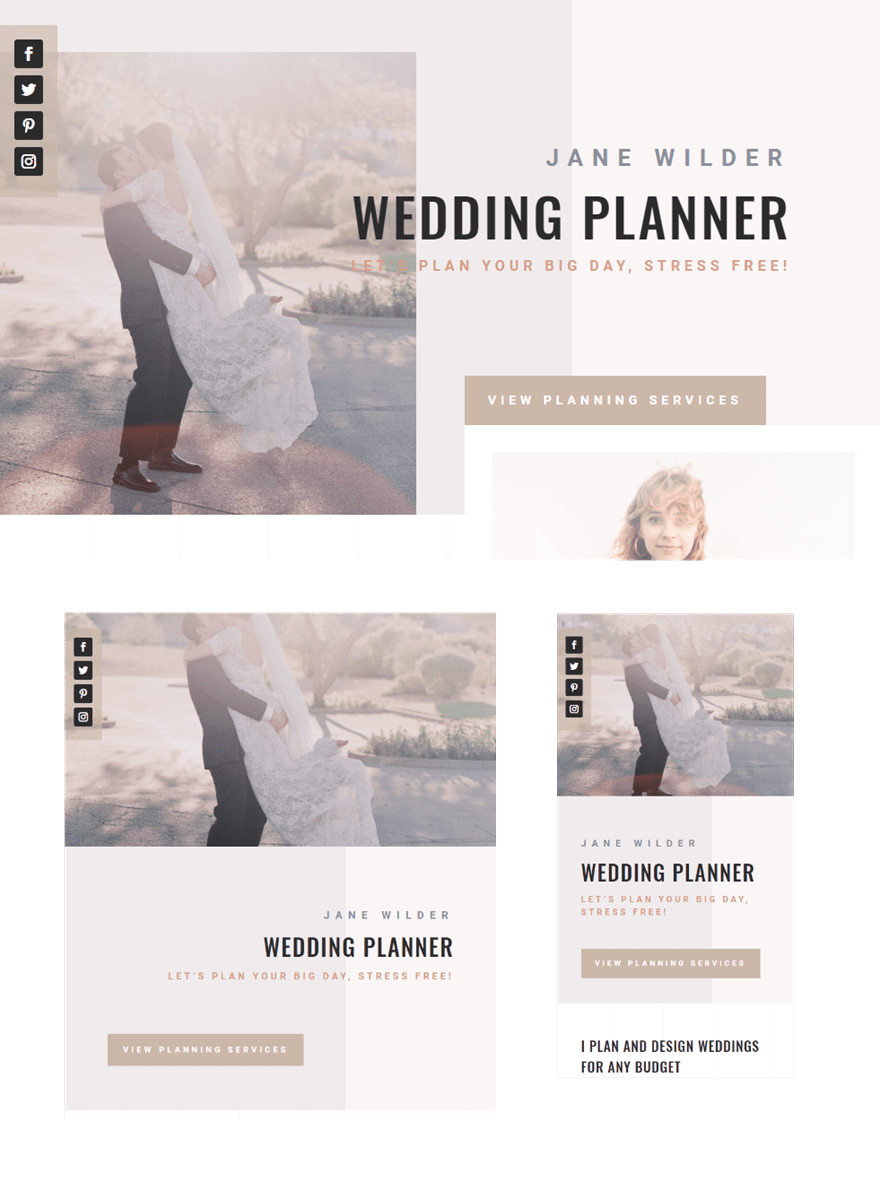
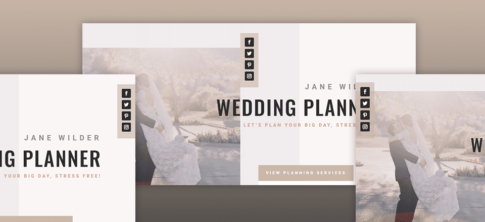
Here is a sneak peek of the design we will be building.


Getting Started
Subscribe To Our Youtube Channel
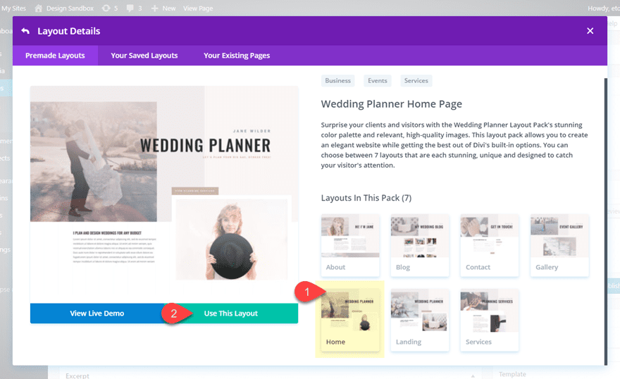
To get things started, create a new page and give your page a title. Then deploy the Divi Builder and select “Choose a Premade Layout”. From the load from library popup, open the Wedding Planner Layout Pack and select to use the Wedding Planner Homepage Layout.
Now you are ready to start building.
Examining the layout, you can see that the top section includes a fullwidth two column row. In the first column, there is an invisible divider module with a column background image. In the second column there is a text module and a button module in the right column. For this example we want to add vertical social media buttons to the top left of the row. To do this, add a Social Media Follow module under the divider in column 1.
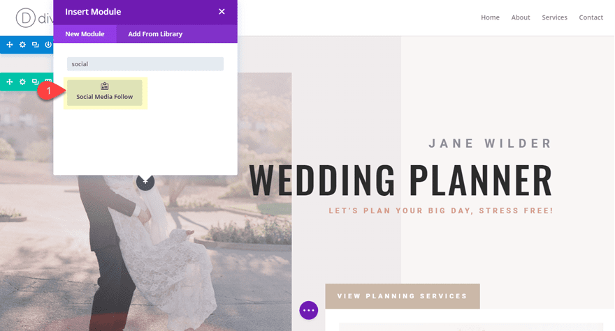
Then drag the social media follow module above the divider module so that it sits at the very top of column 1.
After that, open the social media follow settings. Add new social networks by clicking the plus icon under the content tab and then selecting a social network for the new button. You will eventually need to add the account link url for each button as well so that your links actually redirect to their respective social media pages.
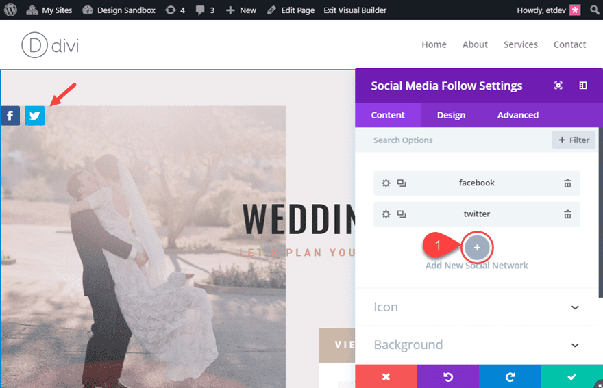
For this example, I added social networks for Facebook, Twitter, Pinterest, and Instagram.
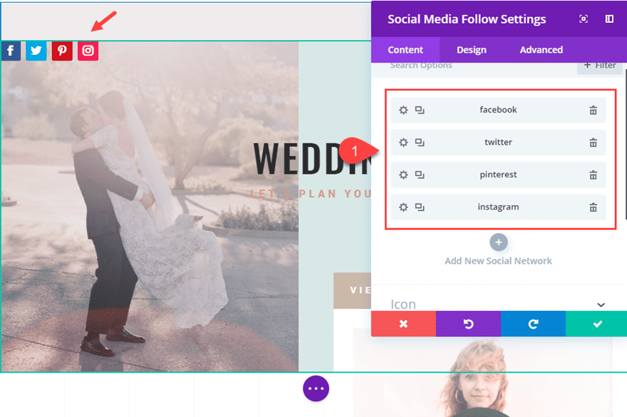
Now let’s jump over to the design tab and update the following:
Background Color: rgba(203,185,168,0.64)
Width: 64px (the sum of the width of an icon plus the left and right padding)
Custom Margin (desktop): -3vw top
Custom Margin (tablet): 30px
Custom Padding: 16px top, 16px bottom, 16px left, 16px right
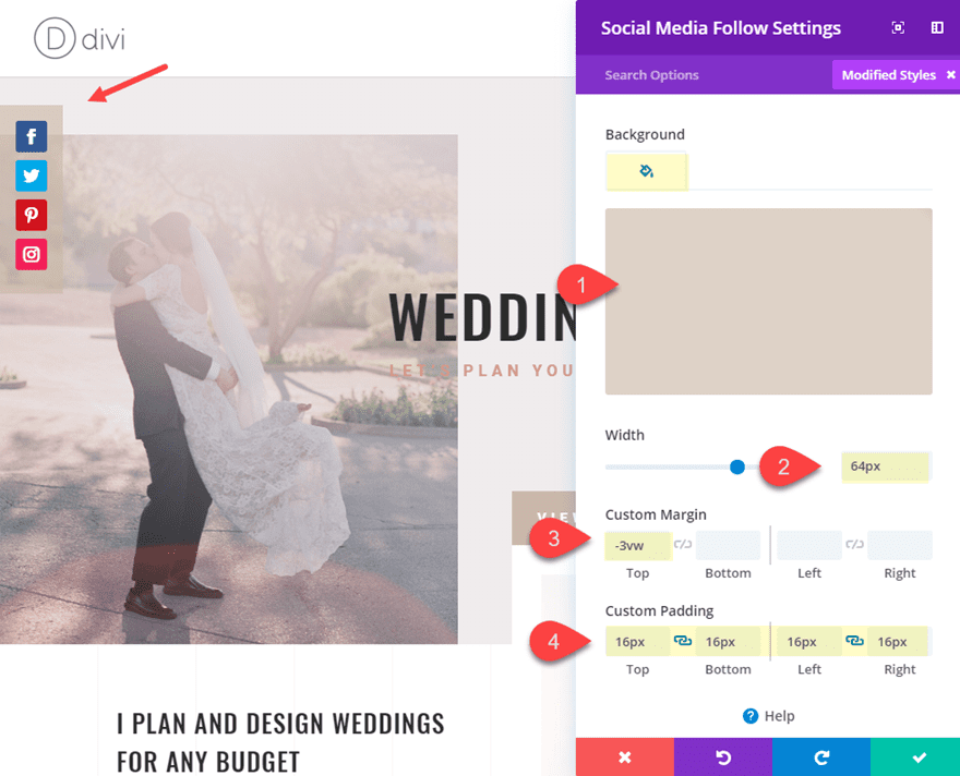
Adjusting the width of the module to stack the icons vertically
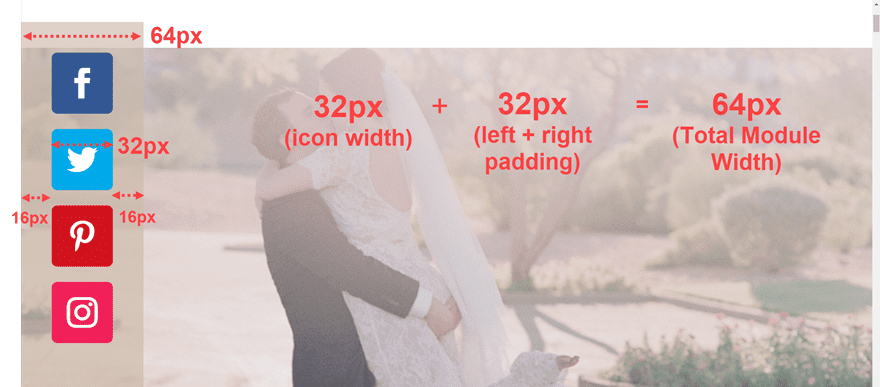
To make the social media buttons stack vertically, we adjusted the size of our social media follow module to force the buttons to stack on top of each other. In order to determine the width of your social media follow vertical display, you need to calculate the sum of the width of an icon (32px) and the left and right padding (16px + 16px = 32px). Therefore in this case, the total width of our social media follow module needs to be 64px.
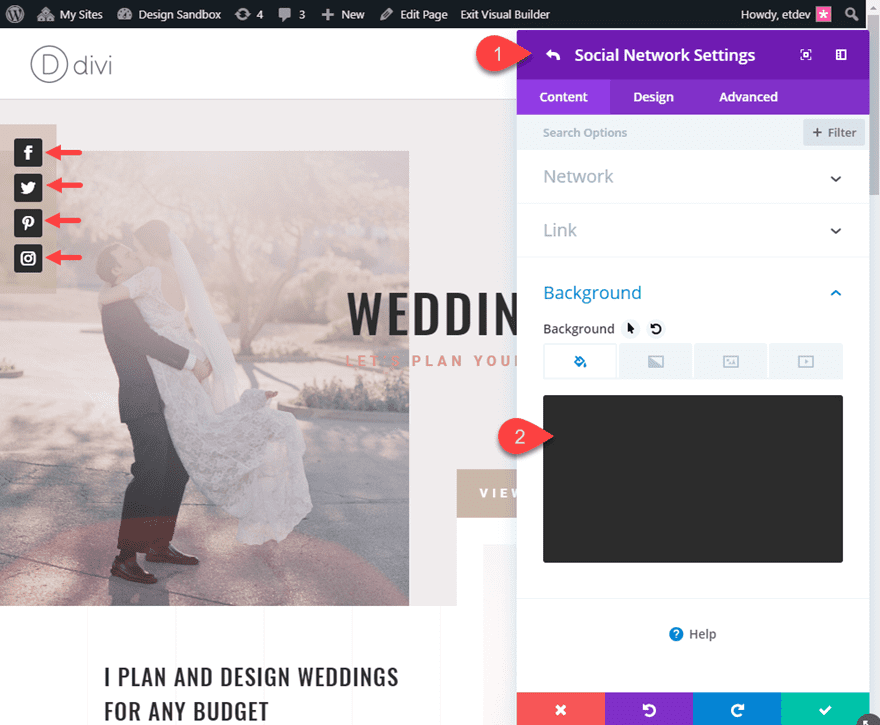
To finish off the design, update the background color of each individual social network button with the following:
Background Color: #333333
Now let’s take a look at the final result.

If you want to gain more control over the positioning of your vertical social media buttons at the top of your page, you can add a new row at the top of the section and add your social media follow module to the row. Then you can easily set the alignment of the module to left, center, or right.
Here is how to do it.
Create a new one-column row and drag it to the top of the section so that it sits at the very top of the page. Then drag your social media follow module into the new row.
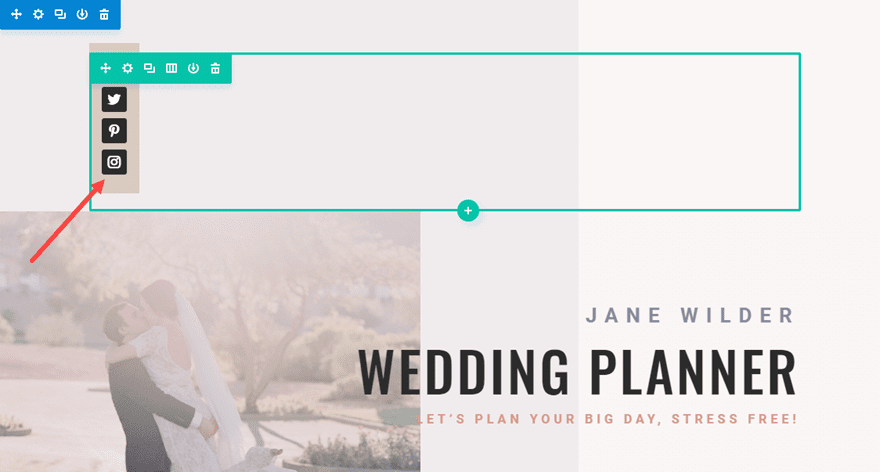
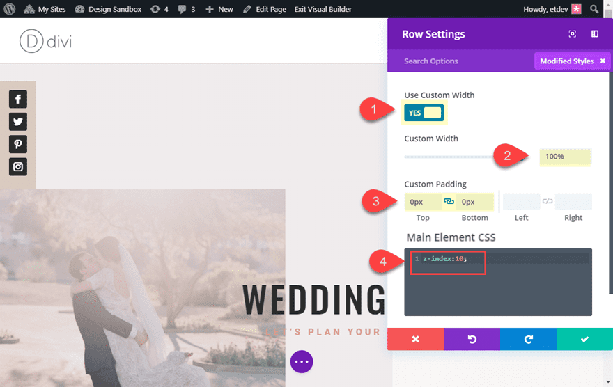
Open the settings for the new row and update the following:
Custom Width: 100%
Custom Padding: 0px top, 0px bottom
Then go to the advanced tab and enter the following custom CSS to the Main Element:
z-index: 10;
This css will allow the content of the column (the social media follow module) to remain visible once we set the negative margin to overlap the content below it.
Now open the social media follow settings and update the following:
Custom Padding: -140px
With our “z-index: 10” css in place, the module is able to overlap the content of the row below it without being hidden.
With this setup, you can now adjust the alignment of the module to display your vertical social media buttons on the left, center, or right of the top of the page.
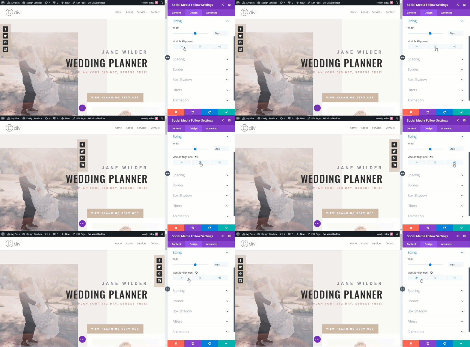
Here is what the final design looks like with the module centered.


Here is what the final design looks like with the module right aligned.


Fixed or Static Positioning
If you are looking to give your vertical social media buttons a fixed (or static) position on your page, please check out of tutorial on how to make any Divi page element sticky.
Final Thoughts
Even though Divi’s Social Media Follow module displays buttons horizontally by default, all it takes is a simple adjustment of the width of the module to create a beautiful vertical display of your social media buttons. And, using the power of Divi’s built-in design options, you can style and position your vertical media buttons anywhere you want. I hope this helps you create a fresh new design element for your next project.
I look forward to hearing from you in the comments.
Cheers!



Hi, thanks for this suggestions. But this is not clear:
“Now open the social media follow settings and update the following:
Custom Padding: -140px”
Which parameter of custom padding should be changed? It looks like the automatic setting are zeroing this value whenever one is trying to set it to -140.
Thanks
John
This is indeed a worth reading article.
Thanks for sharing.
Hello,
Thanks for this tutorial.
You put at the end of the article a link to another article
“how to make any divi page element sticky.”
Could you also give the link to the aricle that proposes
sticky elements, but with code to put in the head of the site?
I had this address on your blog but unfortunately it does not arrive
more at the same places.
Thank you
Deepl translate
I.m going to taste looking also wath John Pierre says. The vertical social is beatiful
What do I miss here?
This is a post to add ‘sociale sharing’ buttons.
And you use the ‘social media follow’ module.
Sharing requires a different link then a follow link to a social media profile. Is such link even possible? And how do you get that link?
Thanks
JP
John-Pierre,
That was an error on my part. I was using the wrong terminology. I updated the post. Sorry for the confusion.
Hahah, you’re right.
Just use the Monarch plugin, it’ll take care of what you need
Cheers!
Damn this is cool. Didn’t know you could do it with just the Social Module.
I’ve been using the Bloom plugin.
DOPE
Thanks for everything fam. Divi changed my life
Nicely done – thanks Jason!